1 Plots in 2.1 with base R
This section will show you (one way of) how to generate those plots in Slide 2.1 with base R.
There is always another approach to achieve the same result. Ask tutor or search online for more resource.
1.1 Set-up
Load the RColorBrewer package to generate palettes, so that plots are not in different shades of black.
R packages are collections of code, data, functions and documentation, R installs a set of packages during installation, more packages are added when they are needed for some specific purpose
library(RColorBrewer)
library(kableExtra)
library(tidyverse)
Set 2 groups of colors, one for plots by gender, one for plots by status.
# use set1 for plots by gender
col1 <- RColorBrewer::brewer.pal(3, "Set1")[c(2,3,1)]
# use set2 for plots by status
col2 <- RColorBrewer::brewer.pal(3, "Set2")[c(3,1,2)]
Generate the two-way table 1.
# use the same data from slides
relationship <- matrix(c(32,10,2,12,7,1,63,45,2),ncol=3,byrow=TRUE)
colnames(relationship) <- c('Female', 'Male', 'Non-Binary')
rownames(relationship) <- c('In a relationship', "It's complicated", 'Single')
The two-way table looks like this:
knitr::kable(relationship,
             align = "ccc",
             caption = "Relation Status and Gender.") %>%
  column_spec(
    column = 2:3,
    border_left = TRUE,
border_right = TRUE)| Female | Male | Non-Binary | |
|---|---|---|---|
| In a relationship | 32 | 10 | 2 |
| It’s complicated | 12 | 7 | 1 |
| Single | 63 | 45 | 2 |
1.2 Side-by-side plot
In a side-by-side chart, separate bar charts are given for each category in one of the categorical variables, where the heights of the bars correspond to the elements of a two-way table. We can choose which categorical variable is clustered.
1.2.1 by gender
In the first plot, the clustering variable is gender (the three clusters are male, female and non-binary).
barplot(relationship,
        legend=FALSE, beside=TRUE, ylim=c(0,70),
        main='Side-by-side Bar chat, by Gender',
        ylab = 'Count')
grid()
barplot(relationship,
        legend=FALSE, beside=TRUE, ylim=c(0,70),
        col=col1, add=TRUE)
legend('topright',
       legend = rownames(relationship),
       fill =col1,
       cex = 0.8)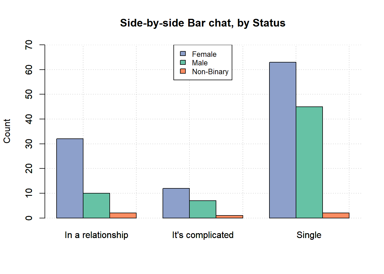
1.2.2 by status
The second plot uses relationship status (the three clusters are in a relationship, it’s complicated and single) as the clustering variable.
barplot(t(relationship),
        legend=FALSE, beside=TRUE, ylim=c(0,70),
        ylab = 'Count',
        main='Side-by-side Bar chat, by Status')
grid()
barplot(t(relationship),
        legend=FALSE, beside=TRUE, ylim=c(0,70),
        col=col2, add=TRUE)
legend("top",
       legend = colnames(relationship),
       fill = col2,
       cex = 0.8)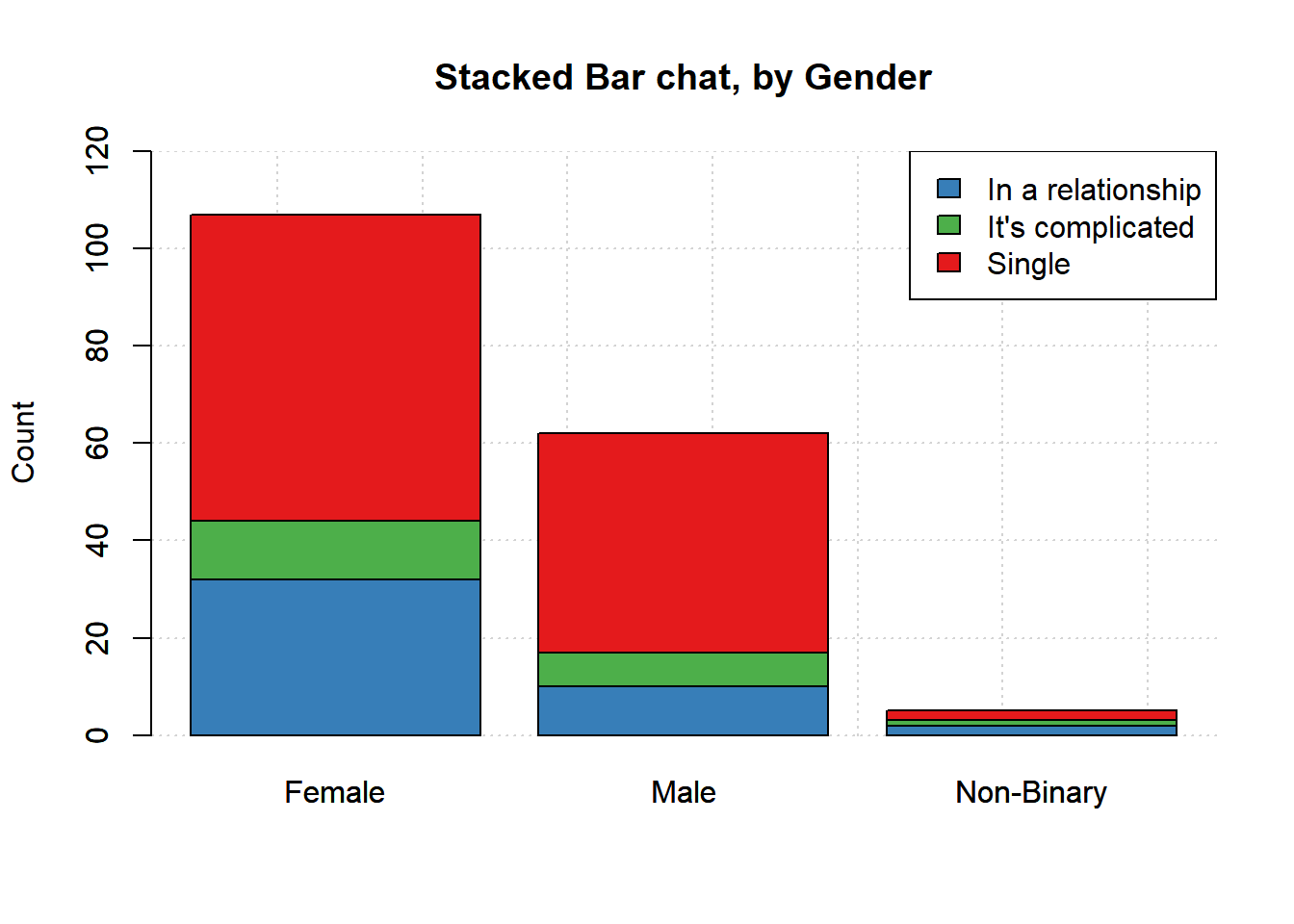
1.3 segmented/Stacked Bar Chart
In a segmented/stacked bar chart, the height of each bar represents the number of cases in each category and colour is used to indicate how many cases of each type were in categories of another categorical variable. Like the side-by-sidebar chart, we can choose which categorical variable is used for the bars.
1.3.1 by gender
In the first plot, the bars are defined using gender.
barplot(relationship,
        legend=FALSE, beside=FALSE, ylim=c(0,120),
        ylab='Count',
        main='Stacked Bar chat, by Gender')
grid()
barplot(relationship,
        legend=FALSE, beside=FALSE, ylim=c(0,120),
        col=col1, add=TRUE)
legend('topright',
       legend = rownames(relationship),
       fill =col1)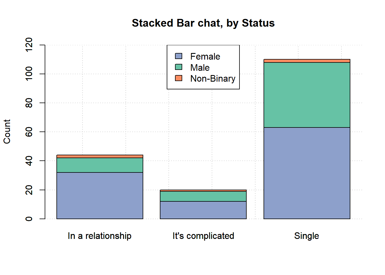
1.3.2 by status
In the second plot the bars are defined using relationship status.
barplot(t(relationship),
        legend=FALSE, beside=FALSE, ylim=c(0,120),
        ylab='Count',
        main='Stacked Bar chat, by Status')
grid()
barplot(t(relationship),
        legend=FALSE, beside=FALSE, ylim=c(0,120),
        col=col2, add=TRUE)
legend("top",
       legend = colnames(relationship),
       fill = col2)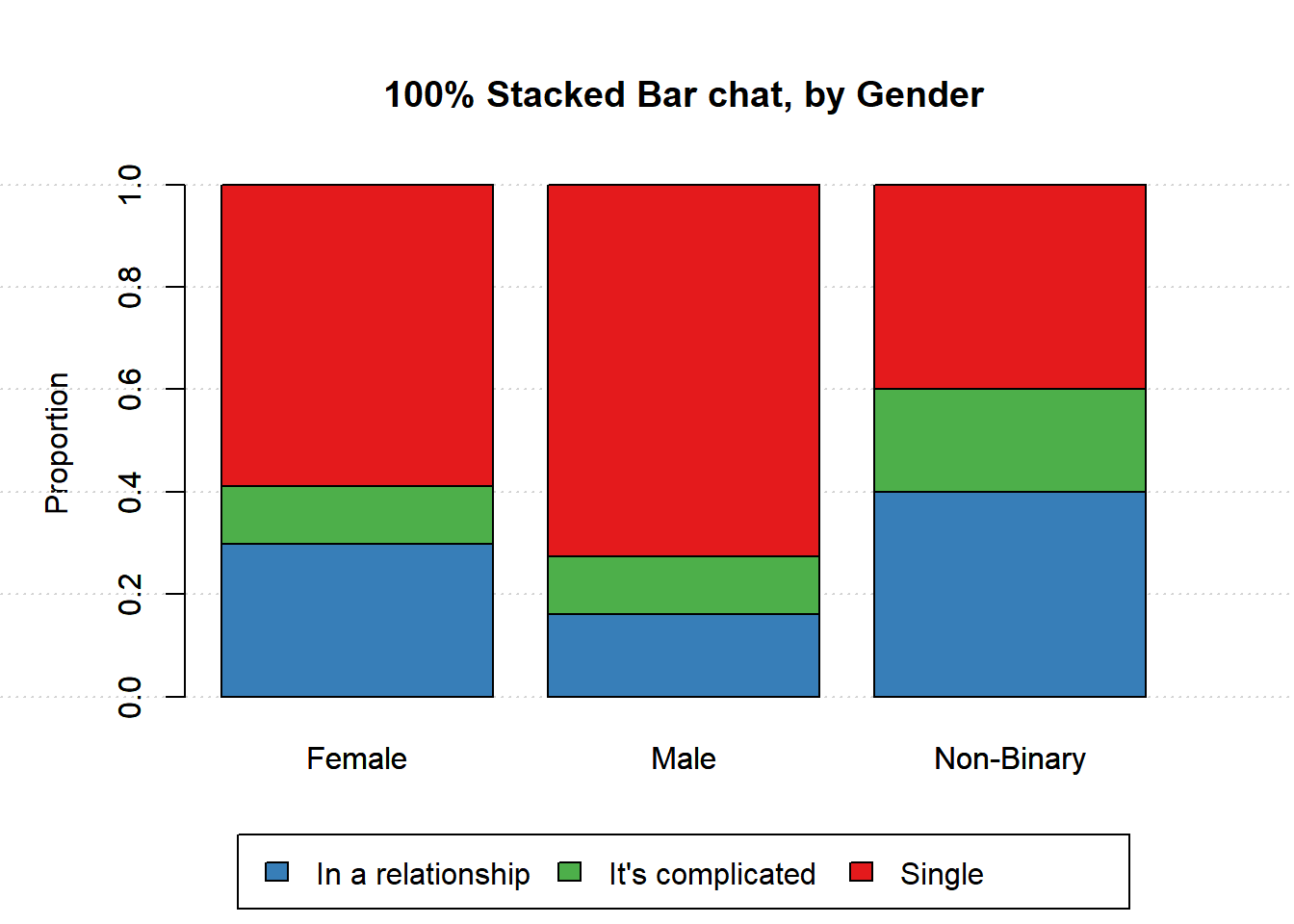
These plots are useful to compare between groups and within groups. For example, more females were included in the survey and single was the largest group for both males and females
1.4 100% Stacked Bar Chart
When there are big differences in the number of cases in each category,segmented bar charts can be difficult to interpret – the categories with the most cases dominate the plot and the categories with relatively few cases are unreadable. Scaling the categories used to define the bars allows us to make comparisons between groups and within groups when there are big differences in the number of cases for each category.
1.4.1 by gender
par(mar=c(6, 5, 5, 3), xpd=TRUE)
barplot(prop.table(relationship, 2),
        legend=FALSE, beside=FALSE,ylab='Proportion',
        main='100% Stacked Bar chat, by Gender')
grid(nx=NA,ny=NULL)
barplot(prop.table(relationship, 2),
        legend=FALSE, beside=FALSE, col=col1, add=TRUE)
legend('bottom', inset=c(0,-0.4),
       legend = rownames(relationship),
       fill =col1, ncol=3)
1.4.2 by status
par(mar=c(6, 5, 5, 3), xpd=TRUE)
barplot(prop.table(t(relationship), 2),
        ylab='Proportion',
        main='100% Stacked Bar chat, by Status',
        legend=FALSE, beside=FALSE)
grid(nx=NA, ny=NULL)
barplot(prop.table(t(relationship), 2),
        legend=FALSE, beside=FALSE, col=col2, add=TRUE)
legend('bottom', inset=c(0, -0.4),
       legend = colnames(relationship),
       fill = col2, ncol=3)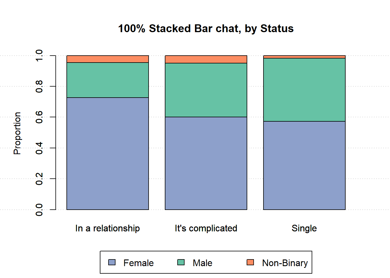
Slide 2.1, page 17↩︎