install.packages(ggplot2)
# หรือ
install.packages(tidyverse)8 การสร้างภาพนิทัศน์ด้วยชุดคำสั่งจีจีพล็อตสอง (ggplot2)
ggplot2 เป็นชุดคำสั่งในภาษาอาร์ ที่ใช้สร้างกราฟและแผนภูมิในรูปแบบต่าง ๆ ที่สวยงามอย่างมาก ถูกสร้างและพัฒนาโดย Hadley Wickham ผู้โด่งดัง เพื่อให้เป็นตัวช่วยในการสร้างกราฟที่สอดคล้องกับแนวคิด Grammar of Graphics ที่กำหนดคำสั่งและโครงสร้างเบื้องหลังของกราฟที่เป็นมาตราฐานและปรับแต่งได้หลากหลายจนมีชุดคำสั่งเสริม เพิ่มความสามารถใช้กับ ggplot2 มากมาย เช่น ggthemes patchwork plotly หรือ esquisse เป็นต้น
ggplot2 ใช้หลักการสร้างกราฟโดยอาศัยแนวคิดของชั้นข้อมูล (data layering) และกฎการกำหนดลักษณะกราฟ (aesthetic mapping) โดยเริ่มต้นด้วยฟังก์ชัน ggplot( ) เพื่อกำหนดข้อมูลหลักและลักษณะของกราฟ และใช้ฟังก์ชันอื่น ๆ เช่น geom_point( ), geom_line( ), geom_bar( ) เพื่อเพิ่มชั้นข้อมูลและปรับแต่งลักษณะของกราฟ
ggplot2 มีความยืดหยุ่นสูงและให้ความสำคัญกับความสวยงามของกราฟ ทำให้เป็นทางเลือกที่ดีสำหรับการสร้างแผนภูมิและกราฟที่ต้องการสื่อสารข้อมูลได้อย่างชัดเจนและมีความน่าสนใจ สำหรับผู้ใช้ภาษาอาร์ การไม่ใช้งาน ggplot2 เป็นสิ่งที่หลีกเลียงได้ยากสำหรับการสร้างภาพนิทัศน์
ggplot2
คำว่า gg มาจากคำว่า grammar of graphics
8.1 การติดตั้งชุดคำสั่ง ggplot2
และสามารถเรียกใช้งานชุดคำสั่งด้วย
library(ggplot2)
# หรือ
library(tidyverse)
8.2 โครงสร้างกราฟฟิกของ ggplot2
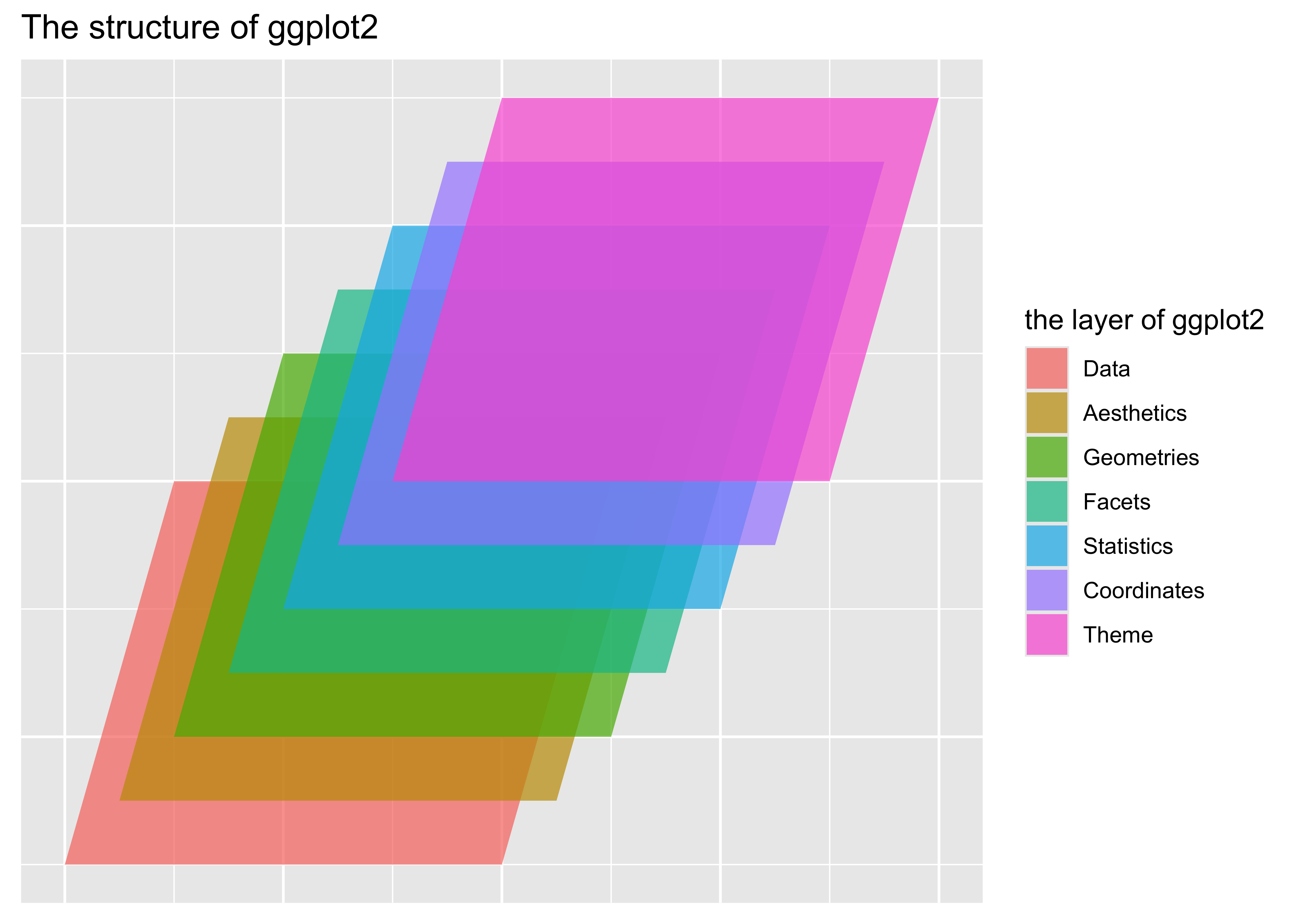
กราฟโดย ggplot2 จะประกอบกันเป็นรูปกราฟ ด้วยเลเยอร์ต่างๆ ซ้อนกันเป็นชั้นๆ สูงสุดที่มีได้คือ 7 เลเยอร์
ในการเขียนกราฟด้วย ggplot มีรูปแบบการเขียนหลากหลายรูปแบบมาก ผู้เขียนจะพยายามเขียนให้เป็นรูปแบบเดียวตลอดทั้งบท
8.2.1 คำสั่งสำหรับแต่ละเลเยอร์ประกอบไปด้วย
คำสั่ง ggplot( )เป็นคำสั่งแรกที่ต้องมีเสมอ สำหรับใส่ข้อมูล ที่เป็นกรอบข้อมูล
คำสั่ง aes( ) aes มาจากคำว่า Aestheticsเป็น คำสั่งเพื่อ ที่จะระบุการส่งค่า (mapping) ของตัวแปรต่างๆ ในกรอบข้อมูล หรือการกำหนดค่าให้ตามต้องการ และจะปรากฎค่าในกราฟ ggplot2 เสมอ เช่น
x ตัวแปรสำหรับแกน x
y ตัวแปรสำหรับแกน y
fill ตัวแปรที่ต้องการใส่สีที่ต้องการไว้ภายใน (เช่นสี ภายในกราฟแท่ง)
color ตัวแปรที่ต้องการใส่สีที่ต้องการไว้ภายนอก เช่นเส้นขอบของกราฟแท่ง กราฟเส้น
alpha ค่าความโปร่งแสง มีค่าอยู่ระหว่าง [0,1] ค่า 0 คือโปร่งแสง และ 1 คือทึบแสง
label คือตัวแปรสำหรับใส่ค่าประเภทตัวอักษร ที่ต้องการแสดงข้อความภายในกราฟ
เป็นต้น
คำสั่ง geom_XXX( ) geom มาจาก Geometries เป็นการระบุประเภทของกราฟที่ต้องการเช่น กราฟแท่ง คือ geom_bar( ) ฮิสโทแกรมคือ geom_histogram( ) เป็นต้น ในหนึ่งกราฟ อาจะประกอบไปหลาย geom ก็ได้
คำสั่ง facet_XXX( ) คือการแตกกราฟออกมาเป็นกราฟย่อยๆ ตามตัวแปรที่ต้องการ
Statistics: stat_XXX( ) คือการสร้างกราฟที่มีการแปลงข้อทางสถิติมาเกี่ยวข้อง (เช่น วาดกราฟฮิสโทแกรม หรือวาดกราฟของฟังก์ชันความหนาแน่นของความน่าจะเป็น)
คำสั่ง coord_XXX( ) coord มาจาก Coordinates เป็นกำหนดการพิกัด เช่น พิกัดเชิงตั้งฉาก (Catesian product) หรือพิกัดเชิงขั่ว (Polar coordinate) หรือการหมุนแกนก็ได้
คำสั่ง theme_XXX( ) คือการกำหนดรูปแบบพื้นหลักฉาก ใส่ตั้งชื่อกราฟ การเปลี่ยนชื่อแกน ชื่อตัวแปร การเปลี่ยนสี การต้ังค่า legend รูปแบบตัวอักษรที่ต้องการ เป็นต้น ซึ่งอาจจะเป็น คำสั่งเฉพาะเลยก็เป็นได้ เช่น labs( ) คือคำสั่งตั้งชื่อกราฟ เป็นต้น
การในสร้างกราฟด้วย ggplot จะต้องประกอบได้ คำสั่งมาตราฐาน 3 คำสั่งนี้ทุกครั้งคือ
ggplot( ) + aes( ) + geom_XXX( )ทุกคำสั่งสามารถปรับแต่งหรือแก้ไขภายหลังได้โดย ถ้าเราต้องการตั้งชื่อให้กราฟ ggplot หรือเปลี่ยนพื้นหลังภายหลัง สามารถทำได้ ถ้ากำหนดให้กราฟ ggplot กำหนดให้เป็นวัตถุ ด้วยการตั้งชื่อให้ เช่น
P1 <- ggplot(data = cars) +
       aes(x = speed, fill = I("blue"), color = I("black")) +
       geom_histogram( )
P1
ถ้าต้องการตั้งชื่อและเปลี่ยนพื้นหลังของวัตถุ P1 สามารถทำได้ง่าย
P1+ labs(title = "The histogram of speed") +
    theme_dark( )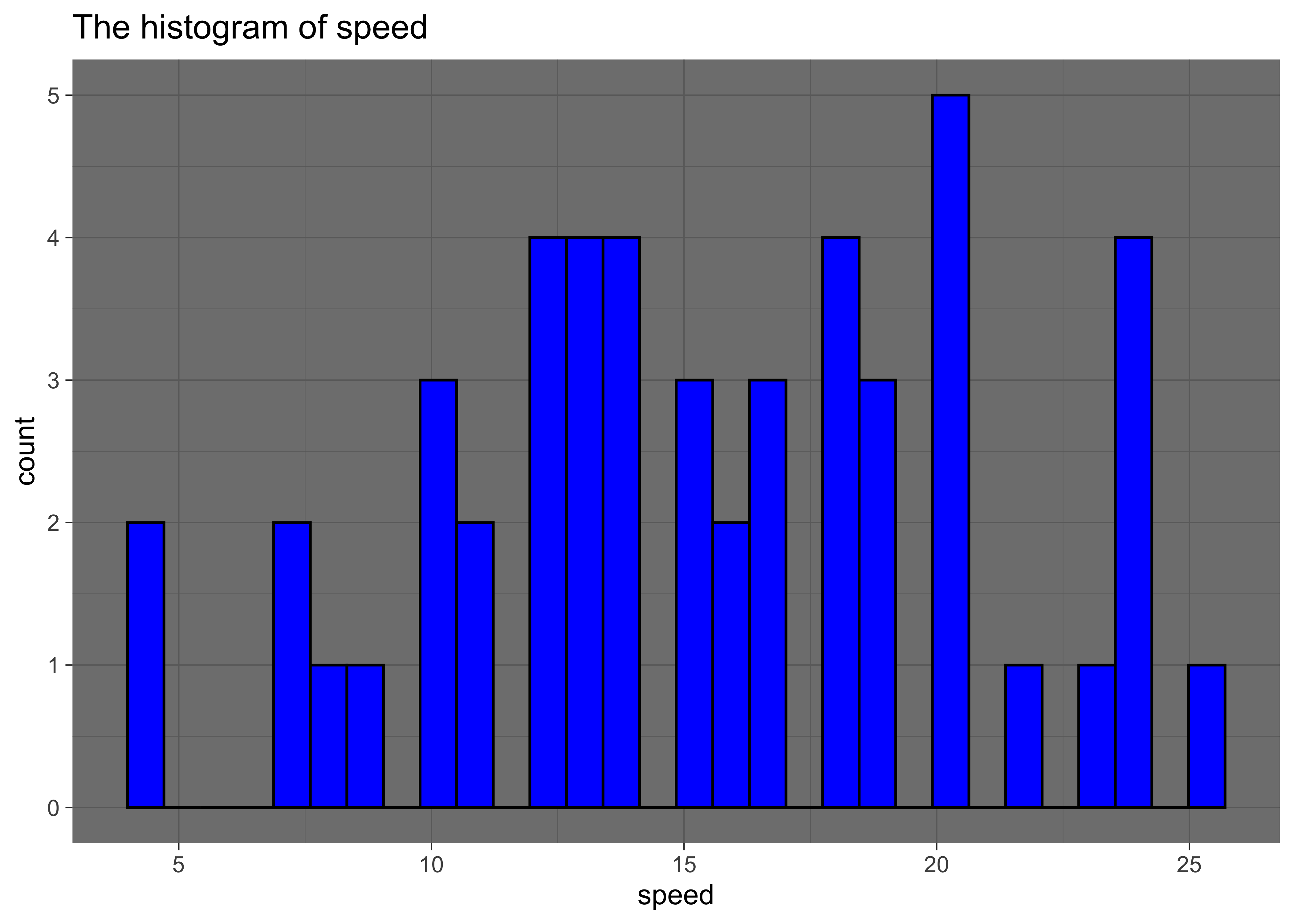
ในบทนี้จะสร้างกราฟจาก ggplot2 ด้วยโครงสร้างข้อมูลแบบกรอบข้อมูลเท่านั้น
ตัวอย่าง จำลองข้อมูลขึ้นมา 100 ชุด ที่ประกอบไปด้วยข้อมูลคณะที่กำลังศึกษา เพศ ชั้นปี มาจากจังหวัดอะไร และรายได้ต่อเดือน ด้วยคำสั่งดังนี้
set.seed(1)
faculty <- c("ECON", "LAW", "SCI", "ENG")
gender <- c("Male", "Female")
year <- factor(c("freshman", "sophomore", "junior", "senior"),
               levels = c("freshman", "sophomore", "junior", "senior"))
faculty <- sample(x = faculty, size = 100, replace = TRUE)
gender <- sample(x = gender, size = 100, replace = TRUE,
                 prob = c(.7,.3))
year <- sample(x = year,  size = 100, replace = TRUE)
province <- sample(c("Chiang Mai", "Chiang Rai"),
                   size = 100, replace = TRUE)
income <- rnorm(n = 100 ,mean = 5000, sd = 300)
Sample <- data.frame(faculty, gender, year, province, income)
8.3 กราฟแท่งโดย geom_bar( )
เริ่มด้วยคำสั่งพื้นฐาน 3 ตัวบวกกัน ดังนี้
# กราฟแท่งของตัวแปร faculty
ggplot(data = Sample) + # ใส่ข้อมูลลงไปในคำสั่ง data
  aes(x = faculty) +    # เลือก แกน x เท่ากับตัวแปรที่ต้องการ
  geom_bar( )            # ชนิดของกราฟที่ต้องการสร้าง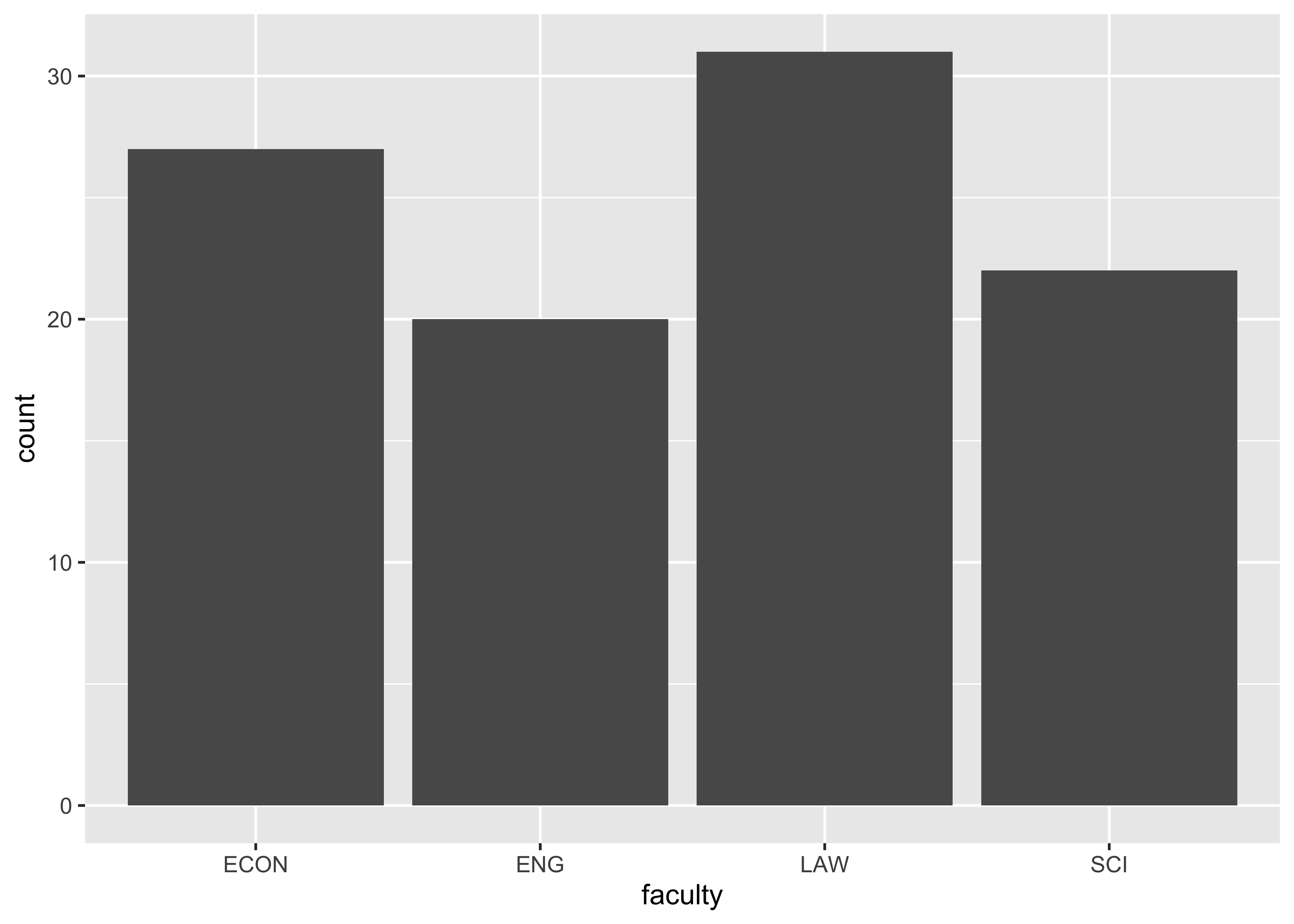
การใส่สีลงไปในแท่งด้วยชื่อสีมาตรฐานใน ggplot2 ทำได้โดย เพิ่มคำสั่งดังนี้
กรณีใช้เพียงสีเดียว
fill = I("ชื่อสีหรือโค้ดที่ต้องการ")ลงไปในคำสั่ง aes( ) เช่น
ggplot(data = Sample) +
  aes(x = faculty, fill = I("red")) +
geom_bar( ) 
ถ้าใส่ ตัวแปรเดียวกันกับแกน x ในคำสั่ง fill = จะได้สีที่แตกต่างกันตามตามจำนวนแท่ง
# กราฟแท่งของตัวแปร faculty
ggplot(data = Sample) +
  aes(x = faculty, fill = faculty) +
geom_bar( ) 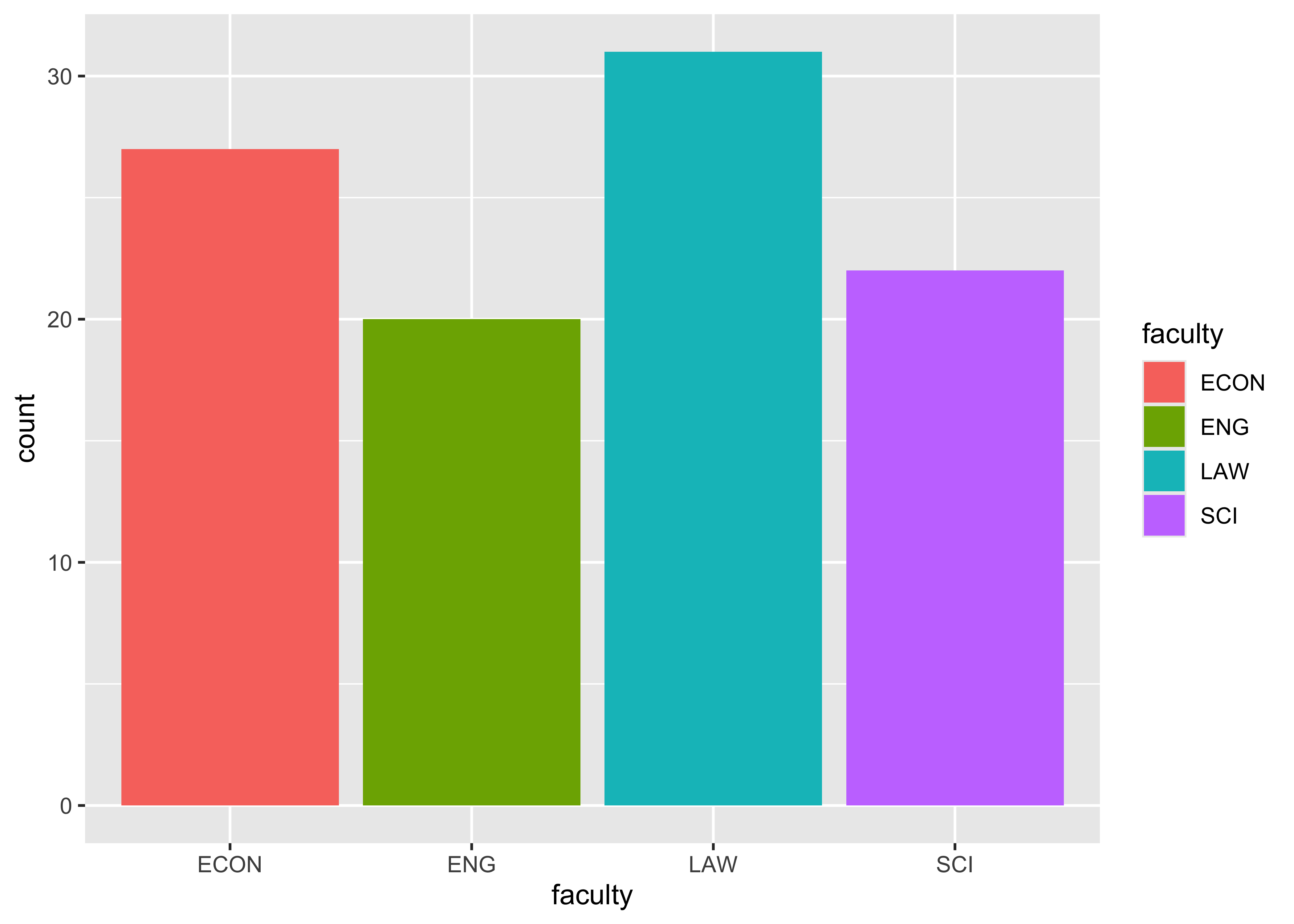
จะได้คำอธิบายสัญลักษณ์( legend) ปรากฏขึ้นมาโดยอัตโนมัติ
การเปลี่ยนสีที่เส้นขอบของแต่ละแท่ง ทำได้เหมือนกับคำสั่ง fill แต่ให้ชื่อว่า color เช่น
# กรณีใส่ เส้นขอบสีดำ
ggplot(data = Sample) +
  aes(x = faculty, fill = I("red"), color = I("black")) +
geom_bar( ) 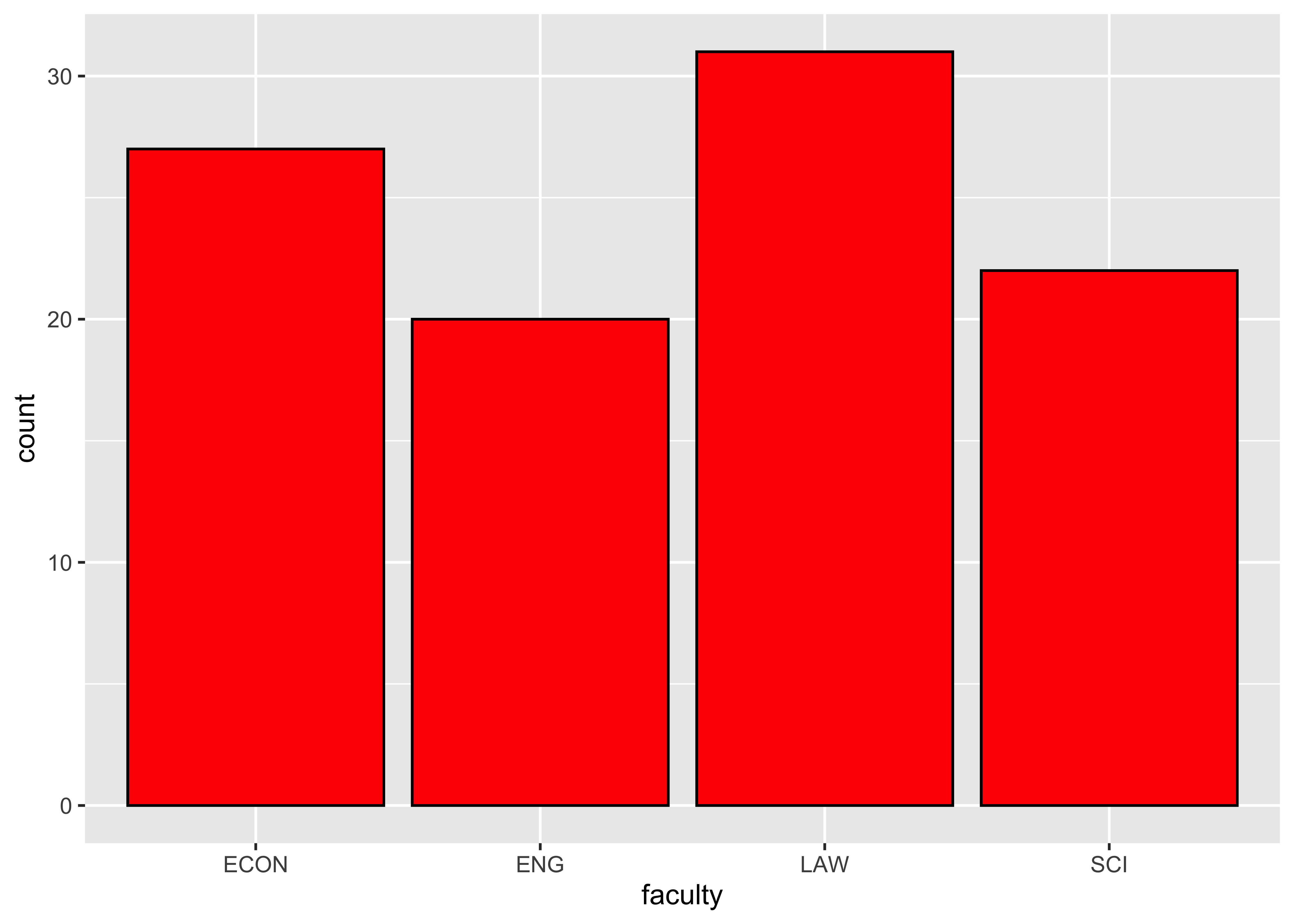
หรือ
ggplot(data = Sample) +
  aes(x = faculty, fill = faculty, color = I("black")) +
geom_bar( ) 
8.4 การเพิ่มชื่อกราฟ ชื่อแกน ด้วยคำสั่ง labs( )
เป็นคำสั่งที่โดยปรกติแล้ว มักจะใช้เป็นคำสั่งสุดท้าย ที่เป็นการเพิ่มชื่อกราฟ เปลี่ยนชื่อแกน x หรือ y หรือ ใส่ข้อความได้ภาพ
คำสั่งภายในที่ควรทราบคือ
title การตั้งชื่อกราฟ
subtitle ข้อความใต้ชื่อกราฟ
x ชื่อแกน x
y ชื่อแกน y
fill เปลี่ยนชื่อของตัวแปร fill ที่อยู่ในคำสั่ง aes( )
color เปลี่ยนชื่อของตัวแปร color ที่อยู่ในคำสั่ง aes( )
caption ข้อความใต้กราฟ
ggplot(data = Sample) +
  aes(x = faculty, fill = faculty, color = I("black")) +
  geom_bar( ) +
  labs(title = "Barplot",
       subtitle = "Number of student from each faculty",
       x = "4 facultys from CMU",
       y = "Number of student",
       fill = "FACULTY",
       caption = "Design by Somsak")
การใส่จำนวนลงไปในกราฟแท่ง ในกรณีที่เป็นการนับจำนวนสมาชิกในตัวแปร ให้กำหนดตัวแปร label = ..count.. ลงคำสั่ง aes( ) และเพิ่มคำสั่ง geom_text( ) ต่อท้ายคำสั่ง โดยกำหนด ค่า stat = \("\)count\("\), vjust คือการกำหนดตัวอักษรจะอยู่ภายในแท่งกราฟ หรืออยู่แท่งกราฟเป็นระยะเท่าไหรตามแนวตั้ง ถ้าค่าเป็นบวก คือภายในแท่งกราฟ ถ้าค่าเป็นลบคืออยู่เหนือแท่งกราฟ และเลือกสีที่ต้องการด้วยคำสั่ง color ดังตัวอย่างต่อไป
ggplot(data = Sample) +
  aes(x = faculty, fill = faculty, color = I("black"), label = ..count..) +
  geom_bar( ) +
  labs(title = "Barplot",
       subtitle = "Number of student from each faculty",
       x = "4 facultys from CMU",
       y = "Number of student",
       fill = "FACULTY",
       caption = "Design by Somsak") +
geom_text(stat = "count", vjust = 2, color = "black")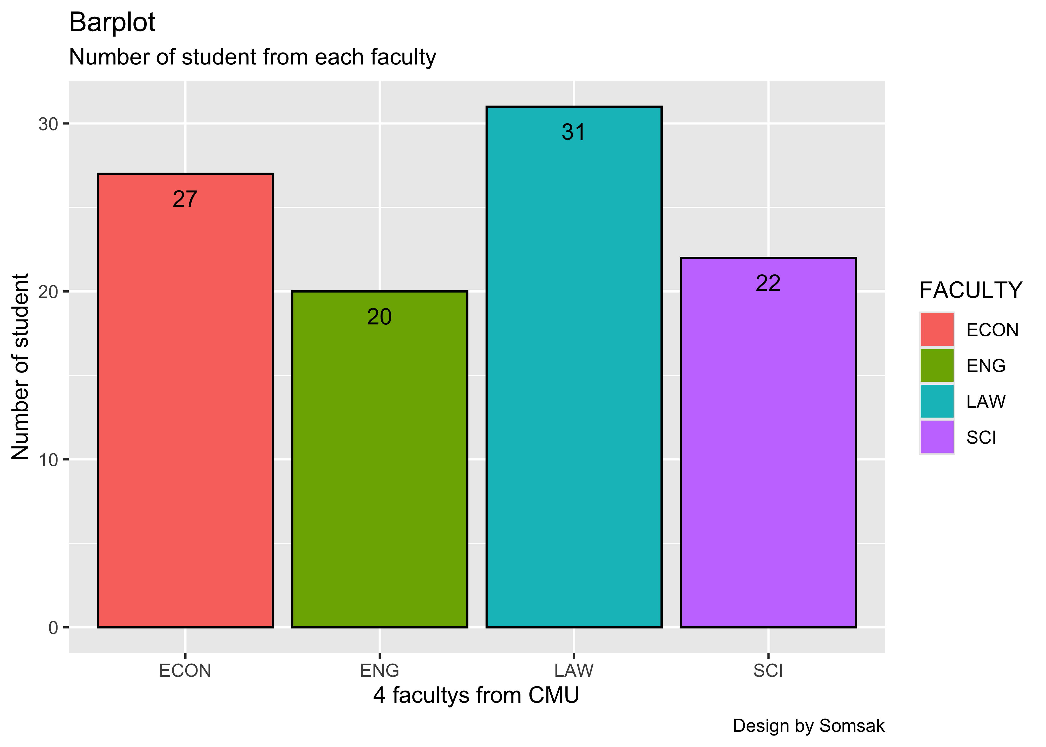
การหมุนแกนให้เพิ่มคำสั่ง coord_flip( ) เข้าไป
ggplot(data = Sample) +
  aes(x = faculty, fill = faculty, color = I("black")) +
  geom_bar( ) +
  labs(title = "Barplot",
       subtitle = "Number of student from each faculty",
       x = "4 facultys from CMU",
       y = "Number of student",
       fill = "FACULTY",
       caption = "Design by Somsak") +
   coord_flip( )
ถ้าต้องการใส่ตัวอักษร ก็ทำเหมือนเดิม เพียงแต่เปลี่ยนจากค่า vjust เป็น hjust เท่านั้น
ggplot(data = Sample) +
  aes(x = faculty, fill = faculty, color = I("black"), label =..count..) +
  geom_bar( ) +
  labs(title = "Barplot",
       subtitle = "Number of student from each faculty",
       x = "4 facultys from CMU",
       y = "Number of student",
       fill = "FACULTY",
       caption = "Design by Somsak") +
  coord_flip( ) +
  geom_text(stat = "count", hjust = -.5, color = "black")
จากตัวอย่างนี้ กรอบข้อมูลมีตัวแปร gender อยู่ ทำให้เราสามารถสร้าง group barplot และ stack barplot ได้
ทำได้โดยกำหนด ตัวแปรที่ต้องการลงไปใน fill
ggplot(data = Sample) +
  aes(x = year, fill = gender, color = I("black")) +
  geom_bar( )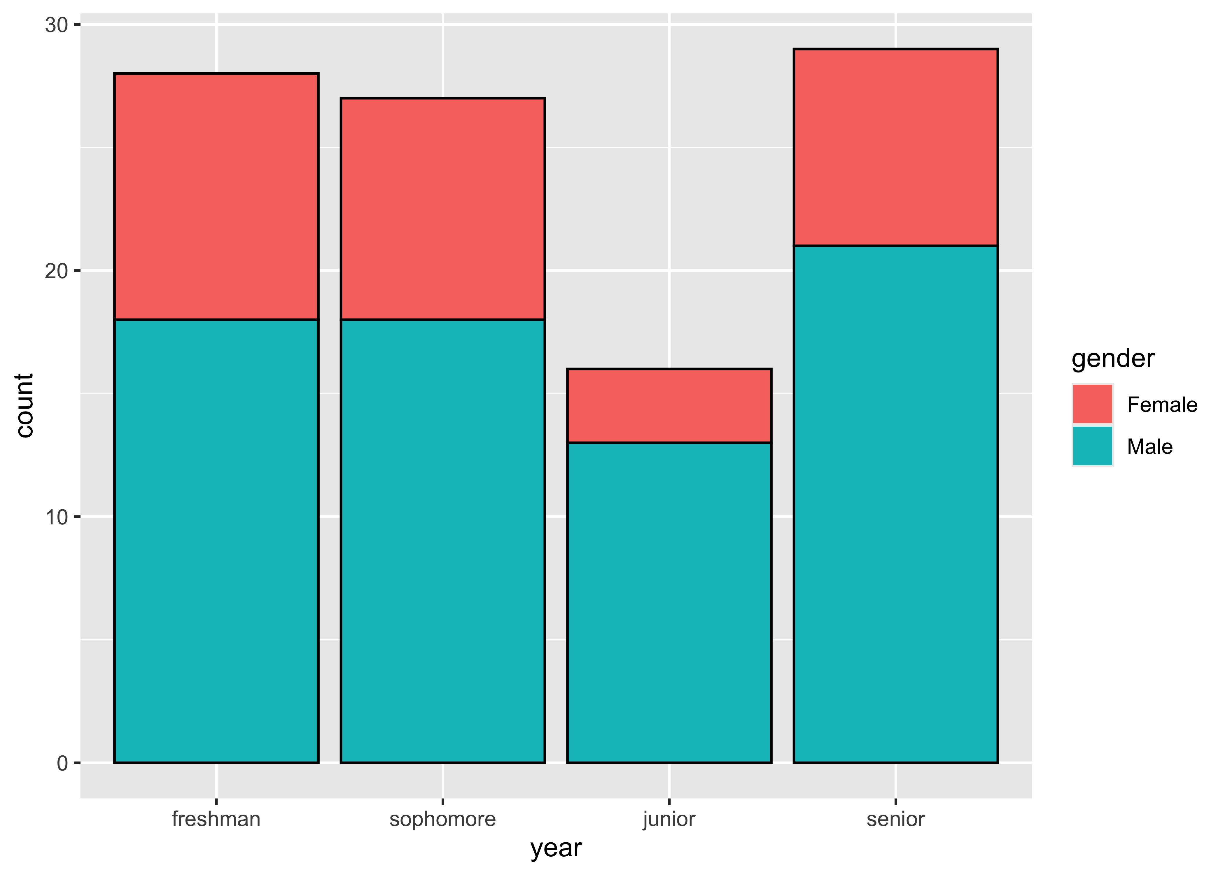
ถ้าต้องการเพิ่มตัวเลข แสดงจำนวนใส่แต่ละแท่ง สามารถทำได้ดังนี้ โดยเหมือนกับกราฟที่ผ่านมา แต่ให้เพิ่ม คำสั่ง position = \("\)stack\("\) ในลงคำสั่ง geom_text( )
ggplot(data = Sample) +
  aes(x = year, fill = gender, color = I("black"), label =..count..) +
  geom_bar( ) +
  geom_text(stat = "count", vjust = 2, color = "black", position = "stack")
ถ้าต้องการแสดงออกมาเป็นสัดส่วน ของแต่ละแต่งที่มีค่าเท่ากับ 100% ให้ใช้คำสั่ง position = \("\)fill\("\) ใส่ลงไปใน geom_bar( )
ggplot(data = Sample) +
  aes(x = year, fill = gender, color = I("black")) +
geom_bar(position="fill") 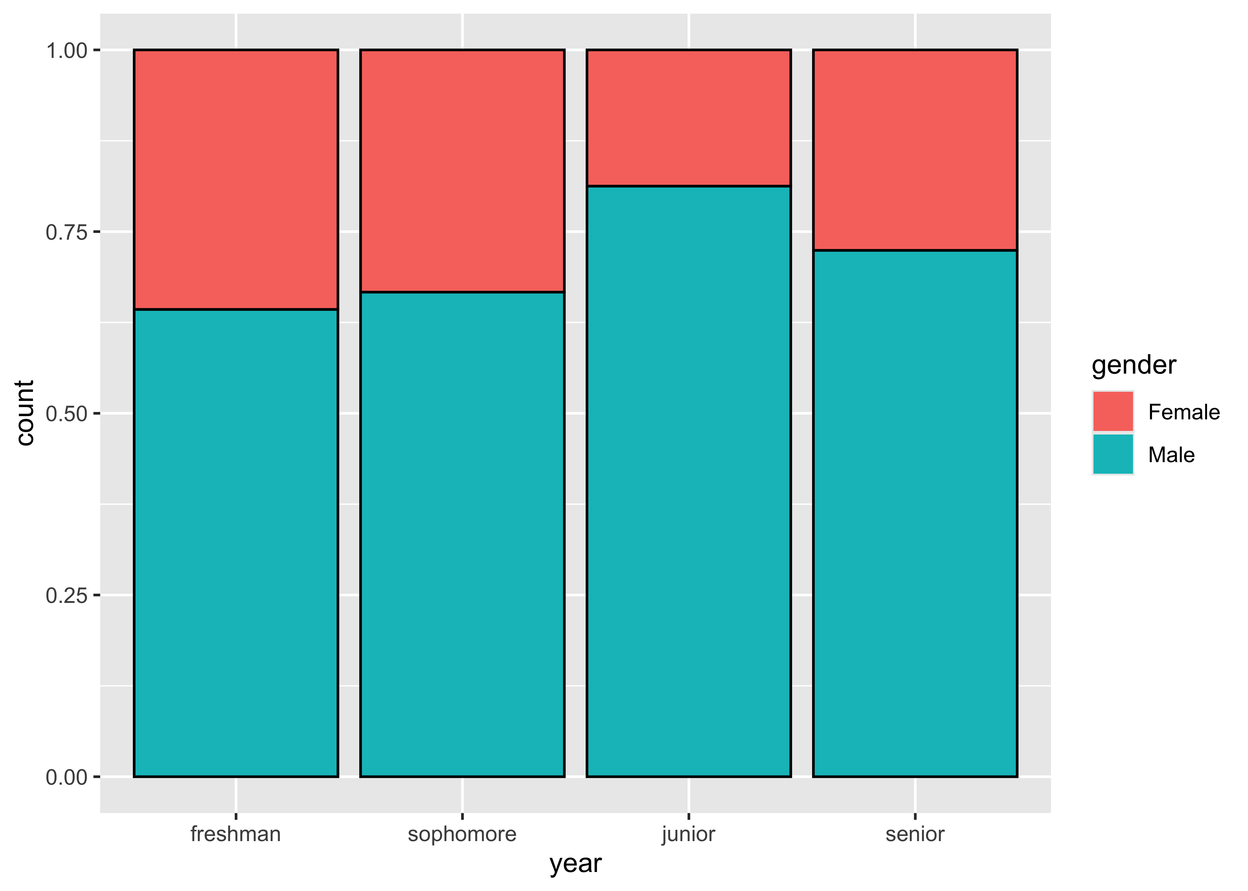
ถ้าต้องการ ใส่ตัวเลขลงไปในตาราง ได้โดยใช้ คำสั่ง percent( ) จากชุดคำสั่ง scales และเขียนคำสั่งได้ตามนี้
library(scales)
ggplot(data = Sample) +
  aes(x = year, fill = gender, color = I("black"),
      label =percent(..count../ tapply(count, x, sum)[x])) +
  geom_bar(position="fill") +
    geom_text(stat = "count", position = position_fill(.5))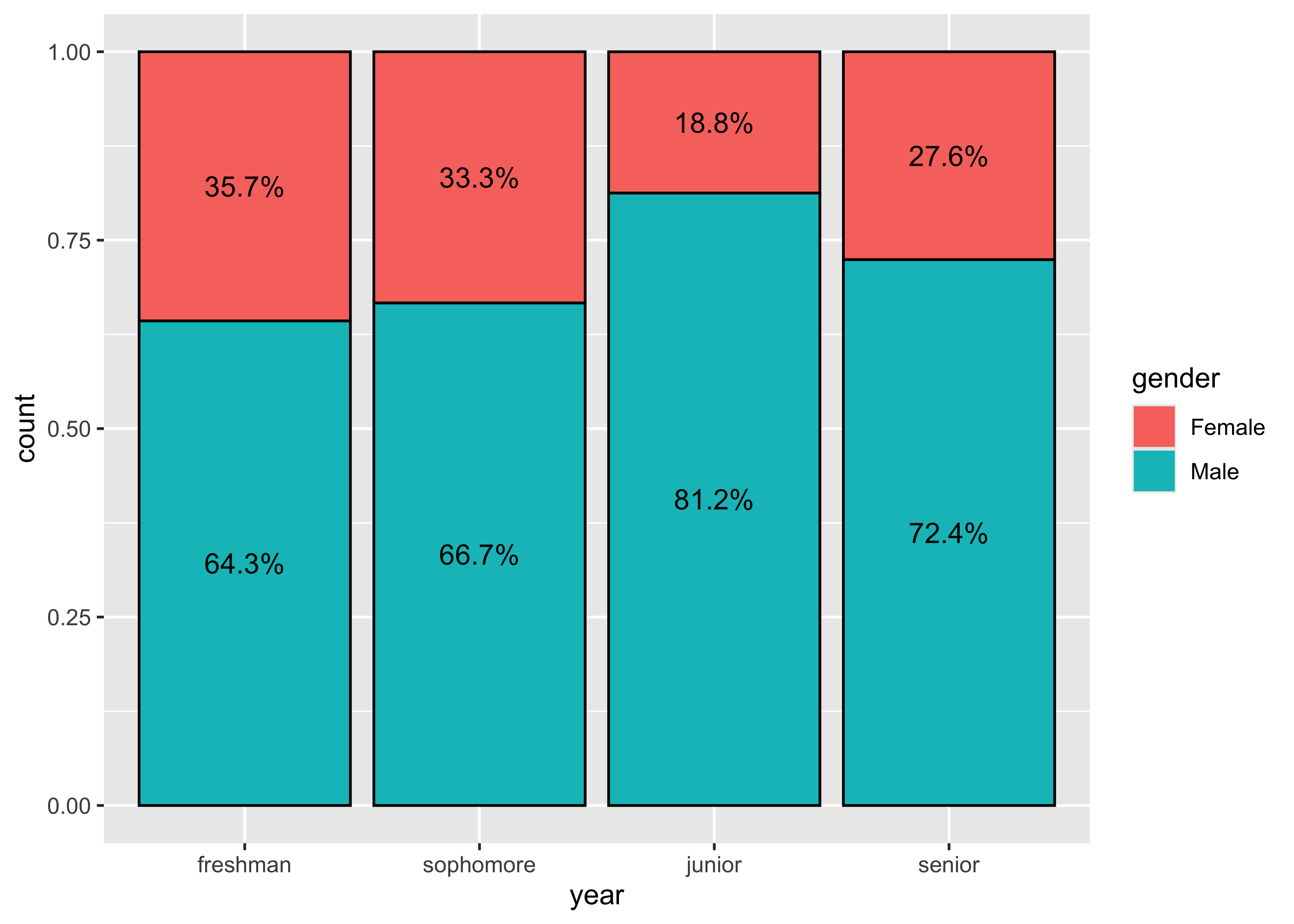
ถ้าต้องการแยกเพศออกเป็นอีกแท่ง
ทำได้โดยกำหนด ตัวแปรที่ต้องการลงในคำสั่ง geom_bar( ) ด้วยคำสั่ง position = \("\)dodge\("\) จะได้
ggplot(data = Sample) +
  aes(x = year, fill = gender, color = I("black")) +
geom_bar(position = "dodge") 
ถ้าต้องการเพิ่มข้อความลงไปทำได้โดย
ggplot(data = Sample) +
  aes(x = year, fill = gender, color = I("black"), label = ..count..) +
  geom_bar(position = "dodge") +
  geom_text(stat = "count", vjust = 2 , color = "black",
             position = position_dodge(.9))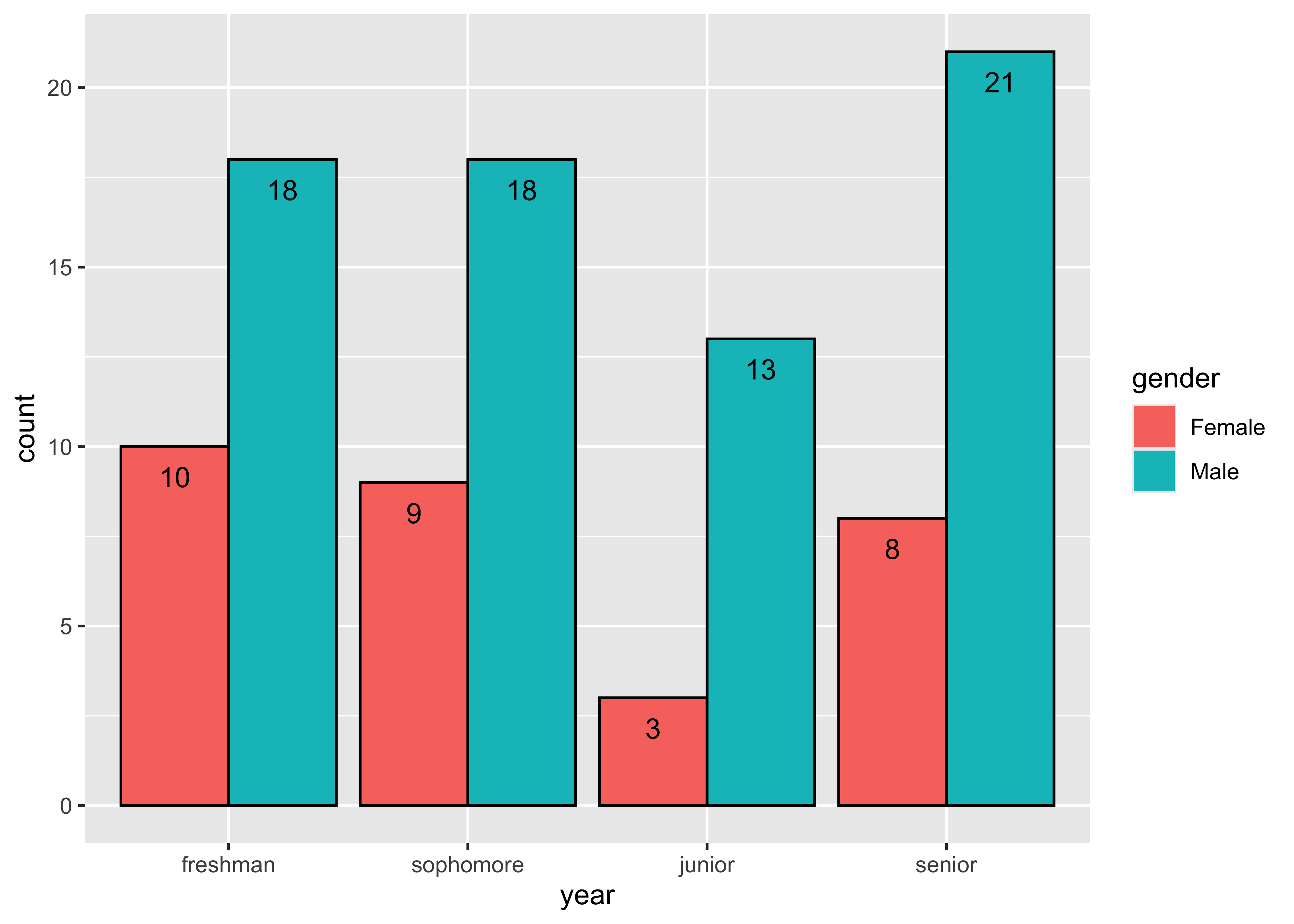
ถ้า position = “dodge2” จะได้
ggplot(data = Sample) +
  aes(x = year, fill = gender, color = I("black")) +
geom_bar(position = "dodge2") 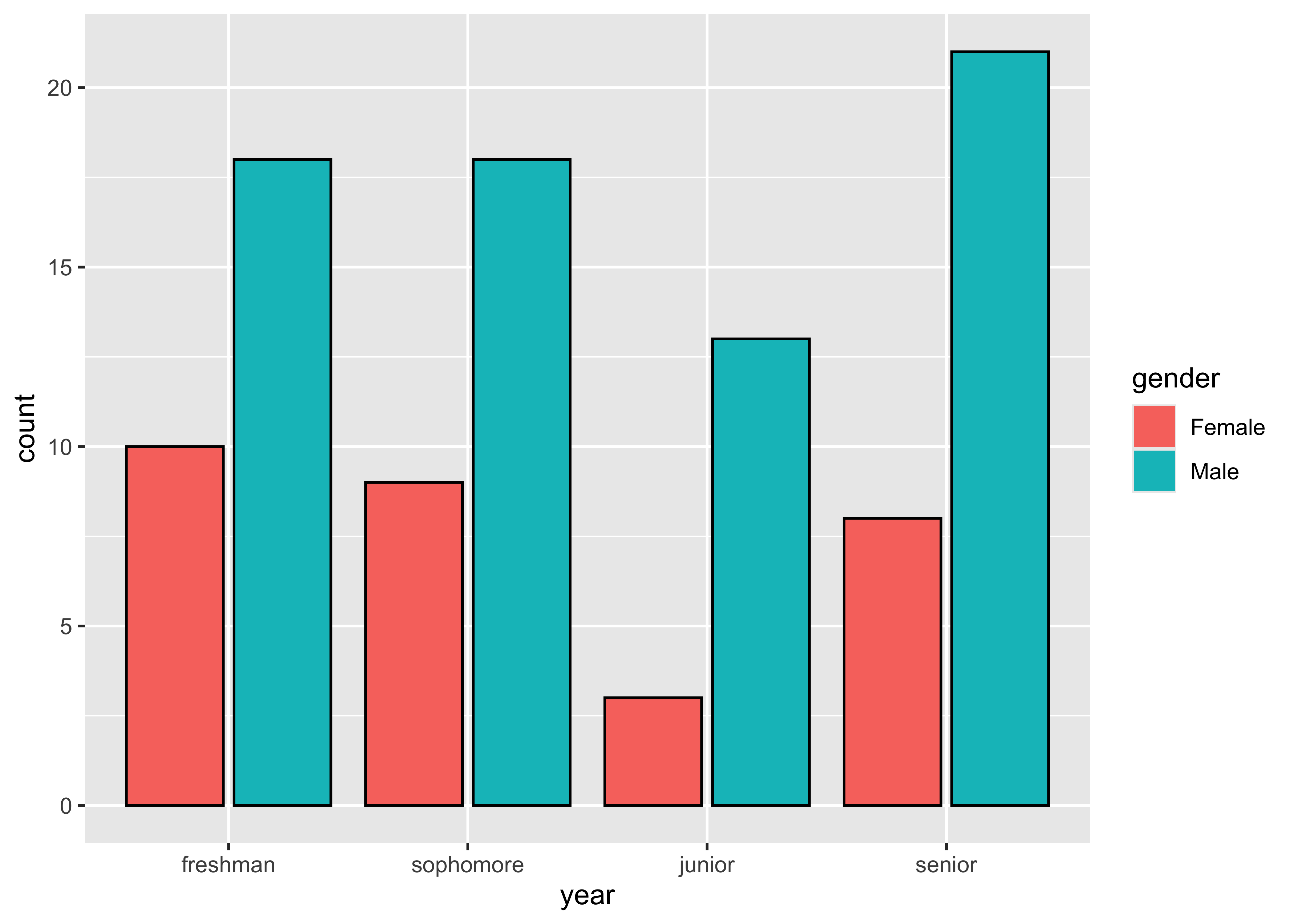
ถ้าต้องการเพิ่มข้อความลงไปทำได้โดย
ggplot(data = Sample) +
  aes(x = year, fill = gender, color = I("black"), label =..count..) +
  geom_bar(position = "dodge2") +
  geom_text(stat = "count", vjust = 2 , color = "black",
             position = position_dodge(.9))
โปรดสังเกตุความต่าง และพิจารณานำไปใช้ให้เหมาะสม
ถ้าต้องการแยกเพศออกมาอีก กราฟให้ใช้ คำสั่ง facet_wrap( ) และ facet_grid( )
ggplot(data = Sample) +
  aes(x = year, fill = faculty, color = I("black")) +
  geom_bar(position = "dodge2") +
  facet_wrap(gender ~ .)
เป็นเป็นสองกราฟตามแนวแกน x ตัวแปร gender
ggplot(data = Sample) +
  aes(x = year, fill = faculty, color = I("black")) +
  geom_bar(position = "dodge2") +
  facet_grid(gender ~ .)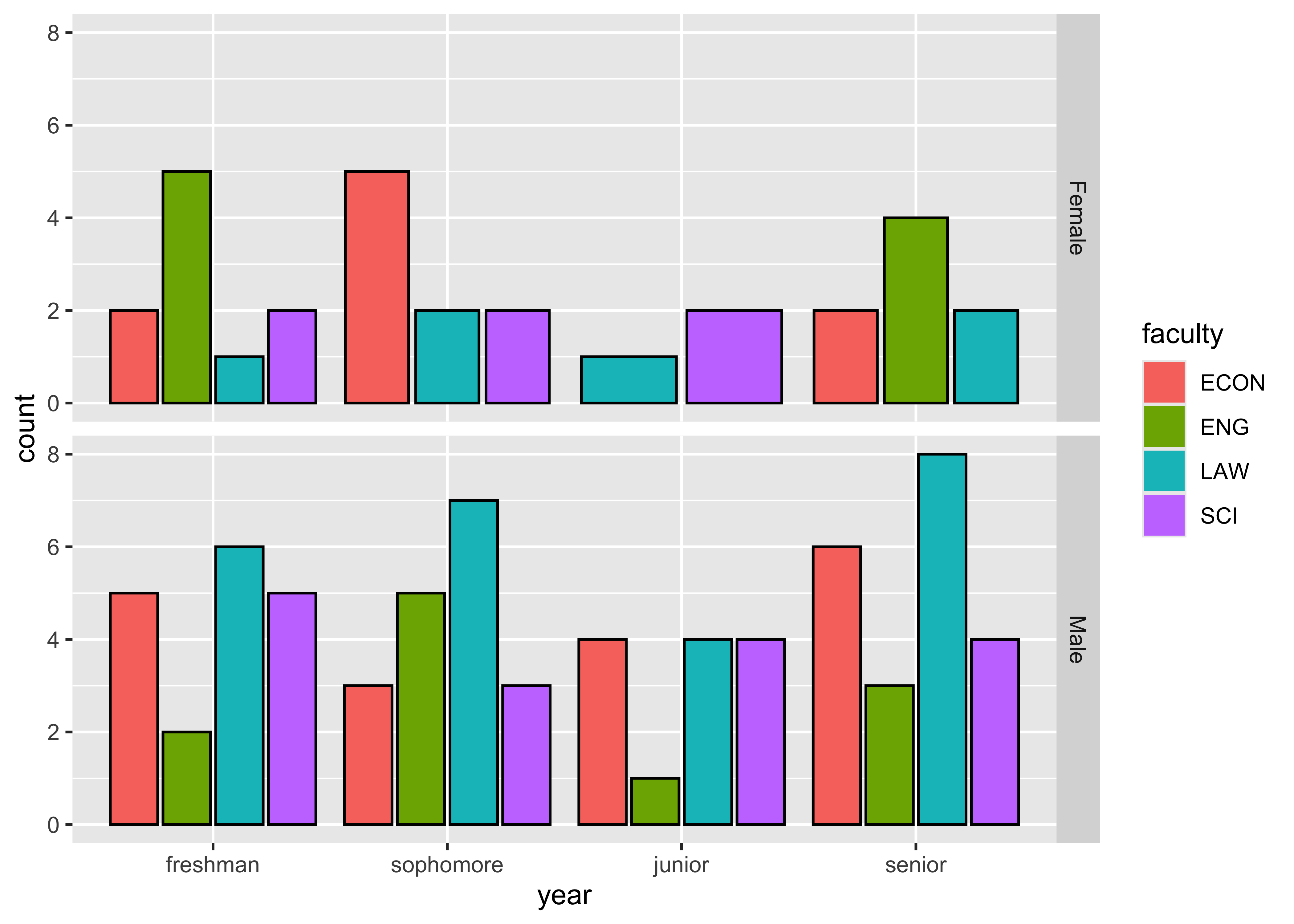
ถ้าต้องการใส่ข้อความจำนวนในแต่ละแท่ง ทำได้โดย
ggplot(data = Sample) +
  aes(x = year, fill = faculty, color = I("black"), label = ..count..) +
  geom_bar(position = "dodge2") +
  facet_grid(gender ~ .) +
  geom_text(stat = "count", vjust = 2 , color = "black",
             position = position_dodge(.9))
เป็นเป็นสองกราฟตามแนวแกน y ตัวแปร gender
ในกรณีที่ตัวแปรตัวอักษร หลายตัว สามารถเปลี่ยนเครื่องหมาย เป็นตัวแปรที่ต้องการได้ จะเป็นการแยกกราฟตามตัวแปรแกน x และแกน y
ggplot(data = Sample) +
  aes(x = year, fill = faculty, color = I("black")) +
  geom_bar(position = "dodge2") +
  facet_grid(gender ~ province)
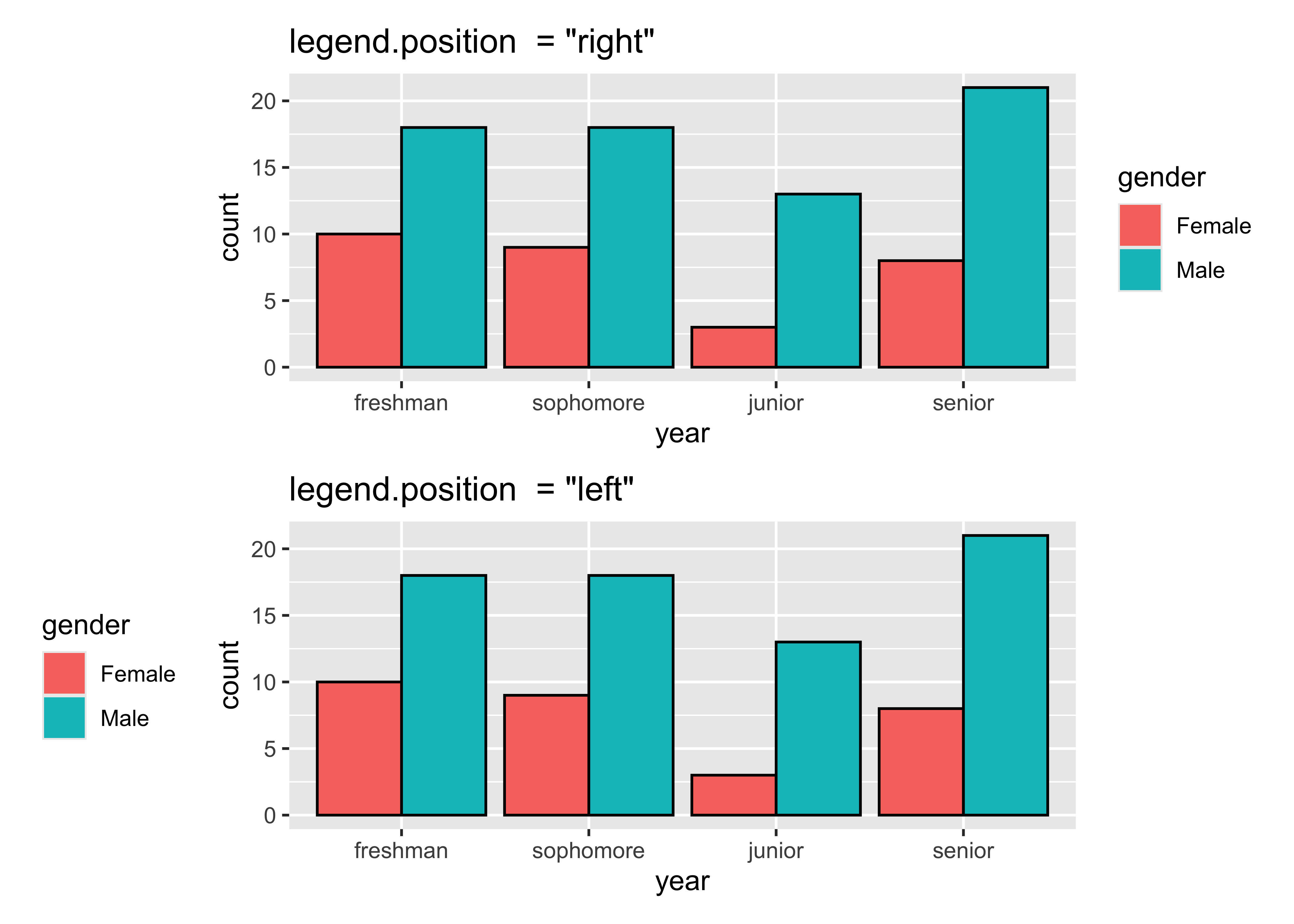
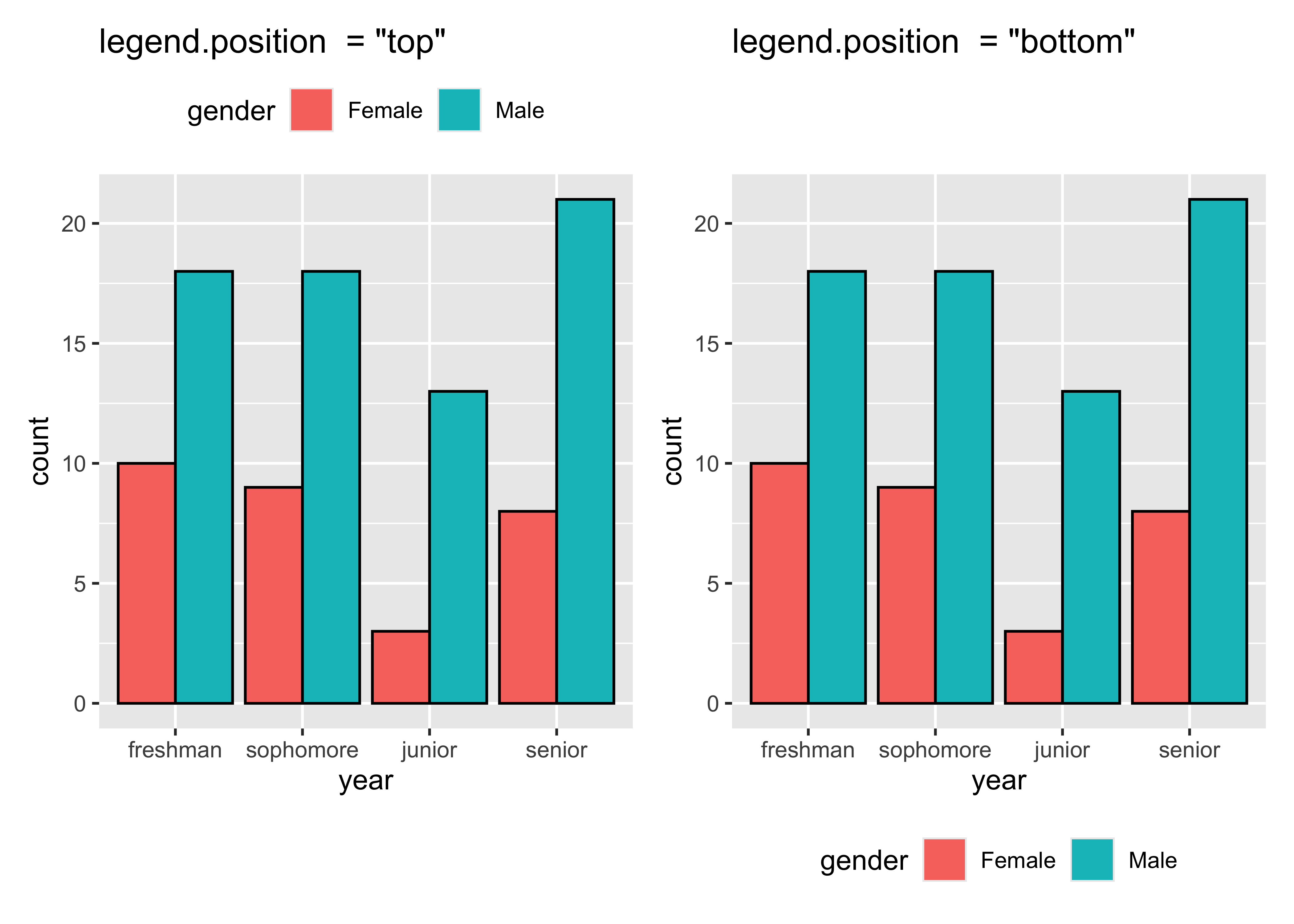
การเปลี่ยนตำแหน่งคำอธิบายสัญลักษณ์ (legend) มีตัวเลือก 5 อย่างคือ
legend.position = \("\)none\("\) ไม่มี
legend.position = \("\)right\("\) ขวามือของกราฟ (มาตราฐาน)
legend.position = \("\)left\("\) ซ้ายมือของกราฟ
legend.position = \("\)bottom\("\) ด้านบนของกราฟ (อยู่ต่ำกว่าชื่อกราฟ)
legend.position = \("\)top\("\) ด้านล่างกราฟ
ลงไปในคำสั่ง theme( ) หรือ theme_XXX( ) (XXX เป็นชื่อของฉากหลังที่ต้องการการเปลี่ยน เช่น dark minimal เป็นต้น)
ggplot(data = Sample) +
  aes(x = year, fill = gender, color = I("black")) +
  geom_bar(position = "dodge") +
  theme(legend.position = "none")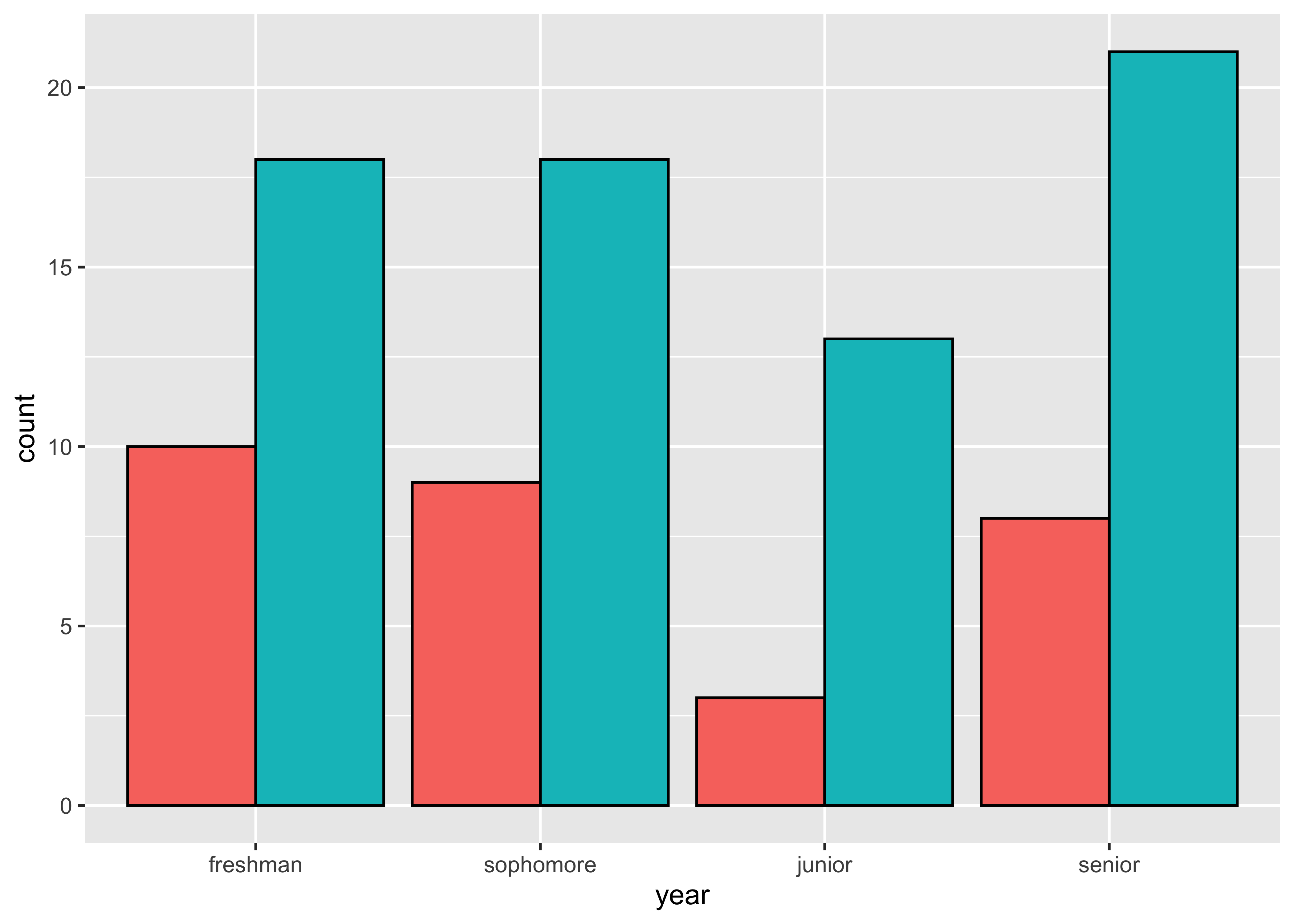
ตัวอย่างอื่นๆ
ในการมีข้อมูลที่มีการสรุป ข้อมูลมาแล้วดังนี้
| Var1 | Freq |
|---|---|
| freshman | 28 |
| sophomore | 27 |
| junior | 16 |
| senior | 29 |
สามารถสร้างกรอบข้อมูลได้โดย
year <- factor(c("freshman", "sophomore", "junior", "senior"),
               levels = c("freshman", "sophomore", "junior", "senior"))
Freq <- c(28, 27, 16, 29)
Data <- data.frame(year, Freq)
ถ้าต้องการสร้างกราฟแท่งจะต้องกำหนดค่า y = Freq ในคำสั่ง aes( ) และกำหนด stat = \("\)identity\("\) ในคำสั่ง geom_bar( )
ggplot(data = Data) +
  aes(x = year, y = Freq) +
  geom_bar(stat ="identity")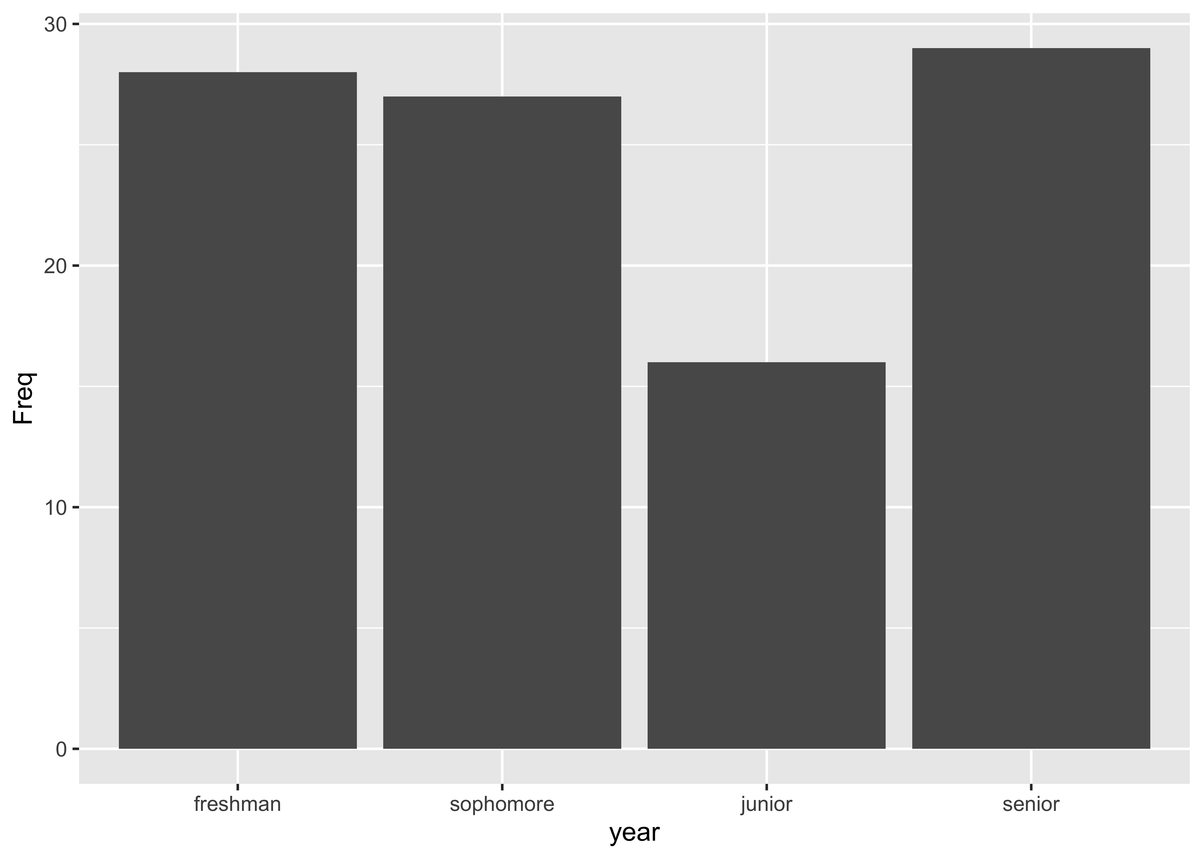
จากข้อมูลในรูปแบบที่ผ่านมา ทำให้สร้างกราฟแท่งได้
set.seed(1)
DF <- data.frame(Group = letters[1:4], Value = rt(4, df = 4))
ggplot(data = DF) +
 aes(x = Group, y = Value) +
 geom_bar(stat = "identity")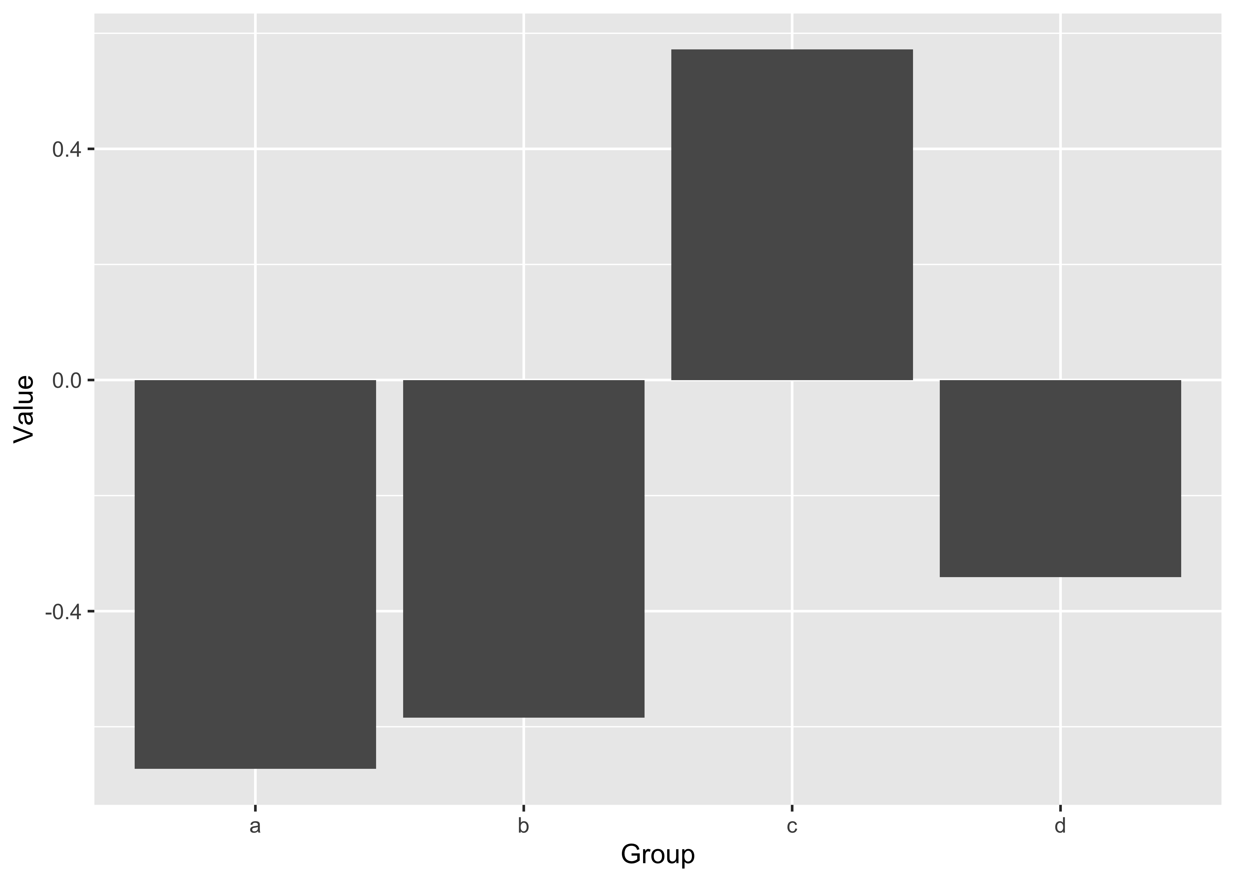
ถ้าต้องกำหนดสีให้กับแท่งที่ค่ามากกว่า 0 เป็นสีน้ำเงิน และน้อยกว่าศูนย์เป็นสีแดง
สามารถทำได้โดย เพิ่มคำสั่ง scale_fill_manual( )
scale_fill_manual(values = "เวคเตอร์ของชื่อสีที่ต้องการตามจำนวนแท่งที่มีทั้งหมด")หมายเหตุ ในคำสั่งมี aes( ) จะต้องมี การใช้คำสั่ง fill ด้วย
ggplot(data = DF) +
  aes(x = Group, y = Value, fill = Group) +
  geom_bar(stat = "identity") +
  scale_fill_manual(values = c("red", "red", "blue","red"))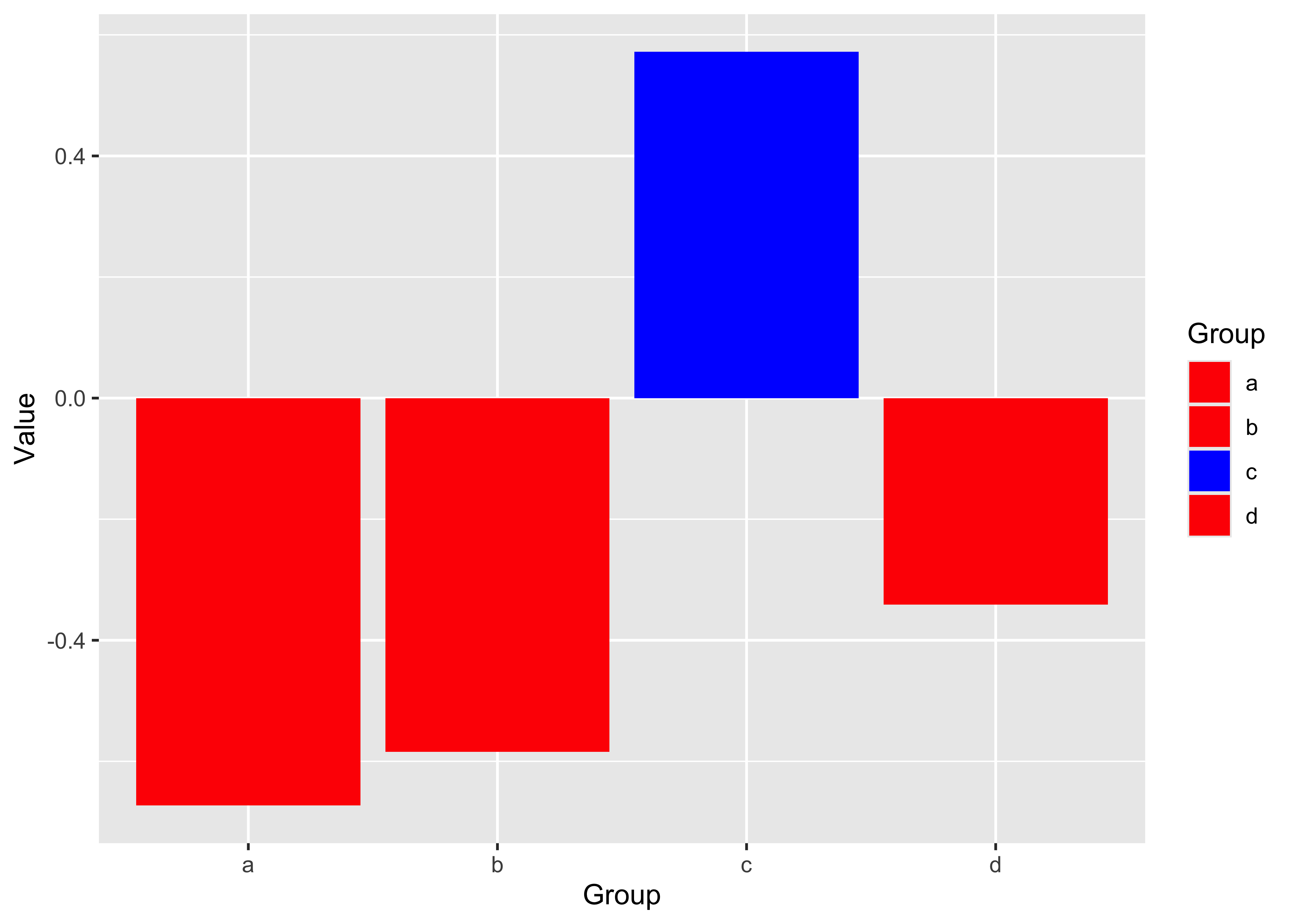
หลังจาก อาจพิจารณา นำ legend ออกด้วยคำสั่งที่เรียนรู้ก่อนหน้านี้
8.5 กราฟวงกลม (pie chart)
กราฟวงกลมใน ggplot2 คือการเปลี่ยนพิกัดฉาก (Cartesian coordinate system) เป็นสู่พิกัดเชิงขั่ว (Polar coordinate system) ดือการใช้ คำสั่ง coord_polar( )
จากตัวอย่าง กราฟแท่งที่ผ่านมา สามารถเป็นกราฟวงกลมได้โดย การเปลี่ยนแปลงดังนี้
ggplot(data = Data) +
  aes(x = " ", y = Freq, fill = year) +
  geom_bar(stat ="identity") +
coord_polar(theta = "y") 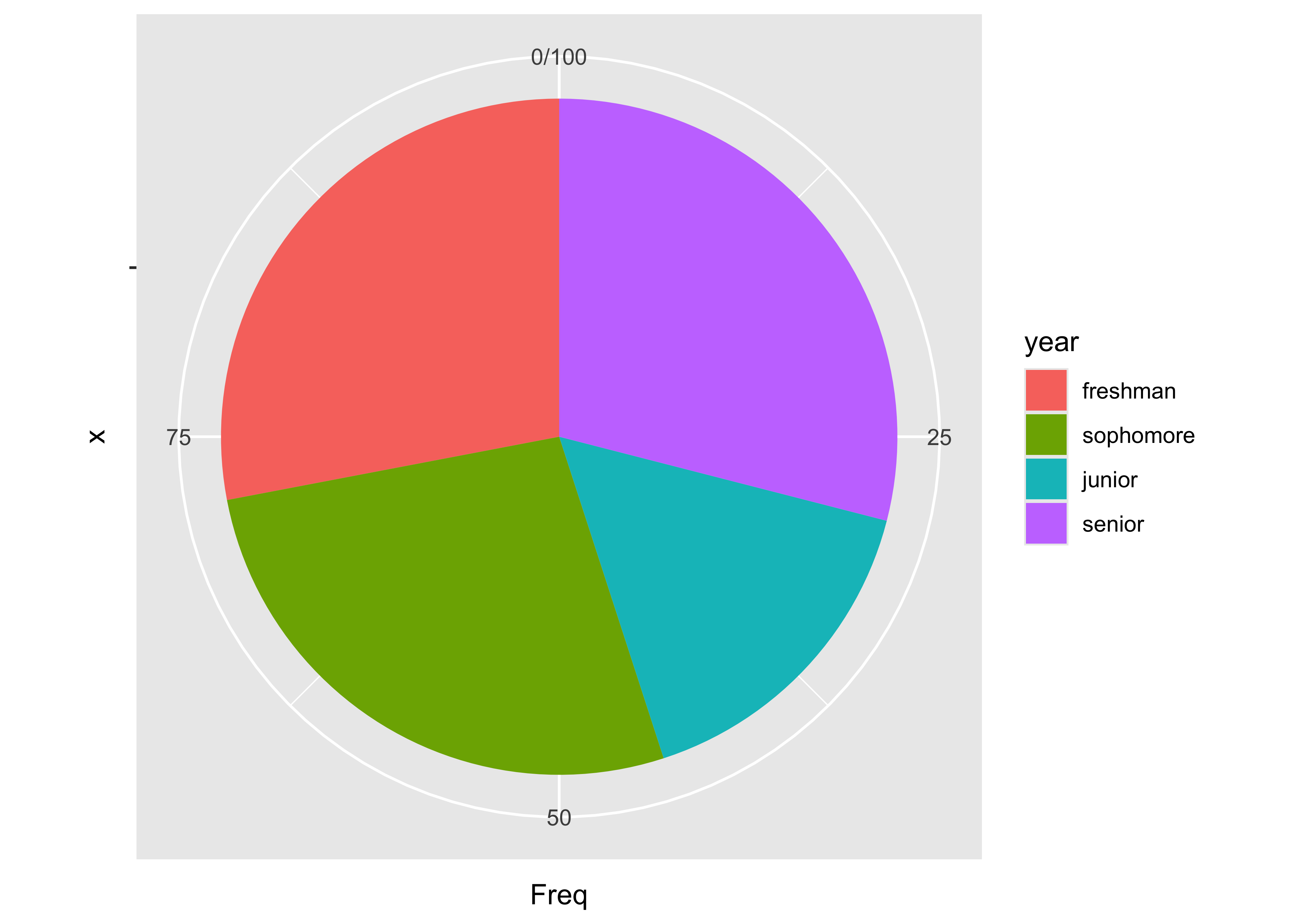
ถ้าต้องนำตัวเลขในแกนออก แนะนำให้ใช้ theme_void( )
ggplot(data = Data) +
  aes(x = " ", y = Freq, fill = year) +
  geom_bar(stat ="identity") +
  coord_polar(theta = "y") +
  theme_void( )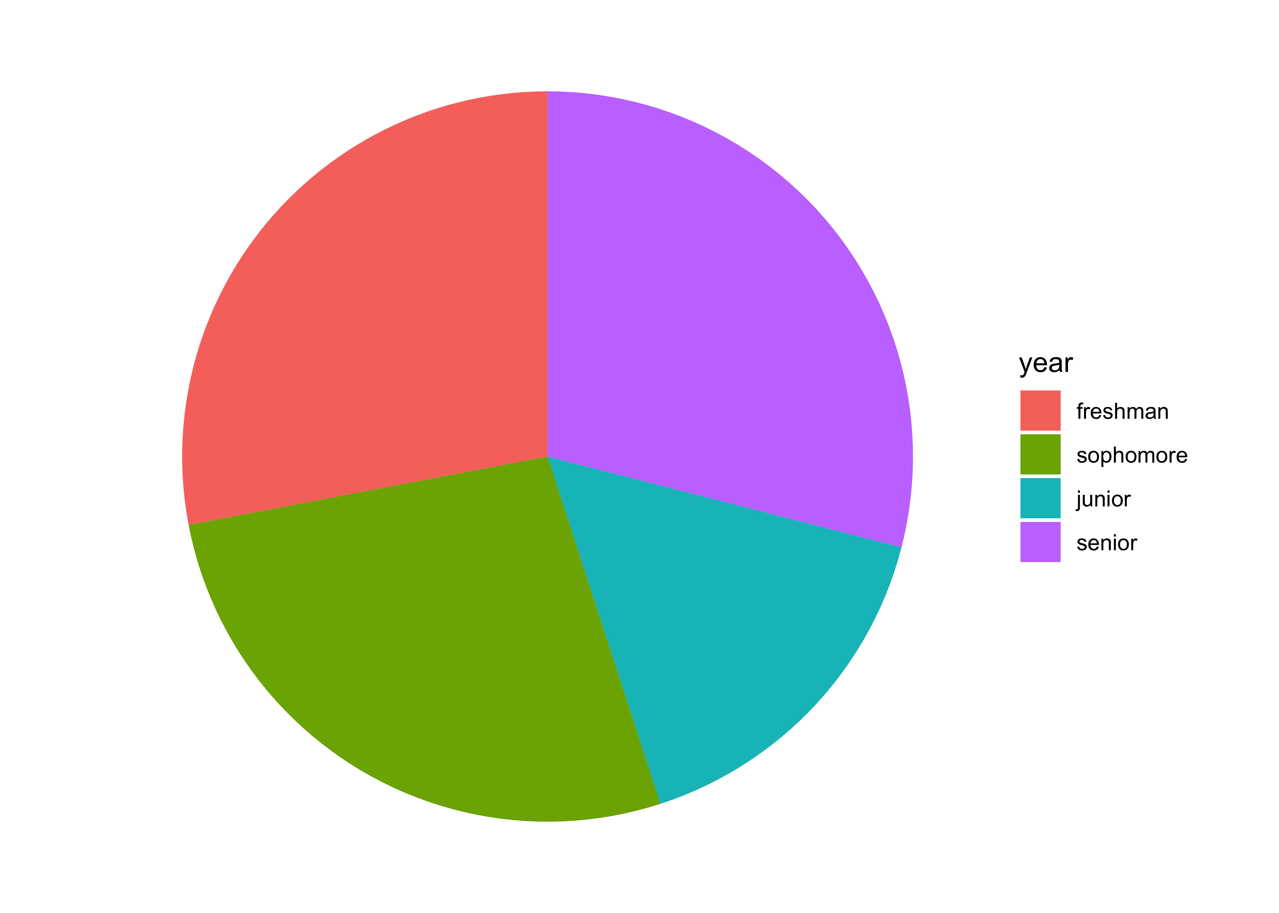
การเพิ่มตัวษร เพื่อระบุจำนวนของกราฟวงกลม แต่ละส่วน ทำได้โดยใช้ คำสั่ง label เพิ่มลงไปใน aes( ) และเพิ่มคำสั่ง geom_text(position = position_stack(vjust = \("\)ตัวเลขระหว่าง 0 กับ 1\("\)))
ggplot(data = Data) +
  aes(x = " ", y = Freq, fill = year, label = Freq) +
  geom_bar(stat ="identity") +
  coord_polar(theta = "y") +
  theme_void( ) +
  geom_text(position = position_stack(vjust = 0.5))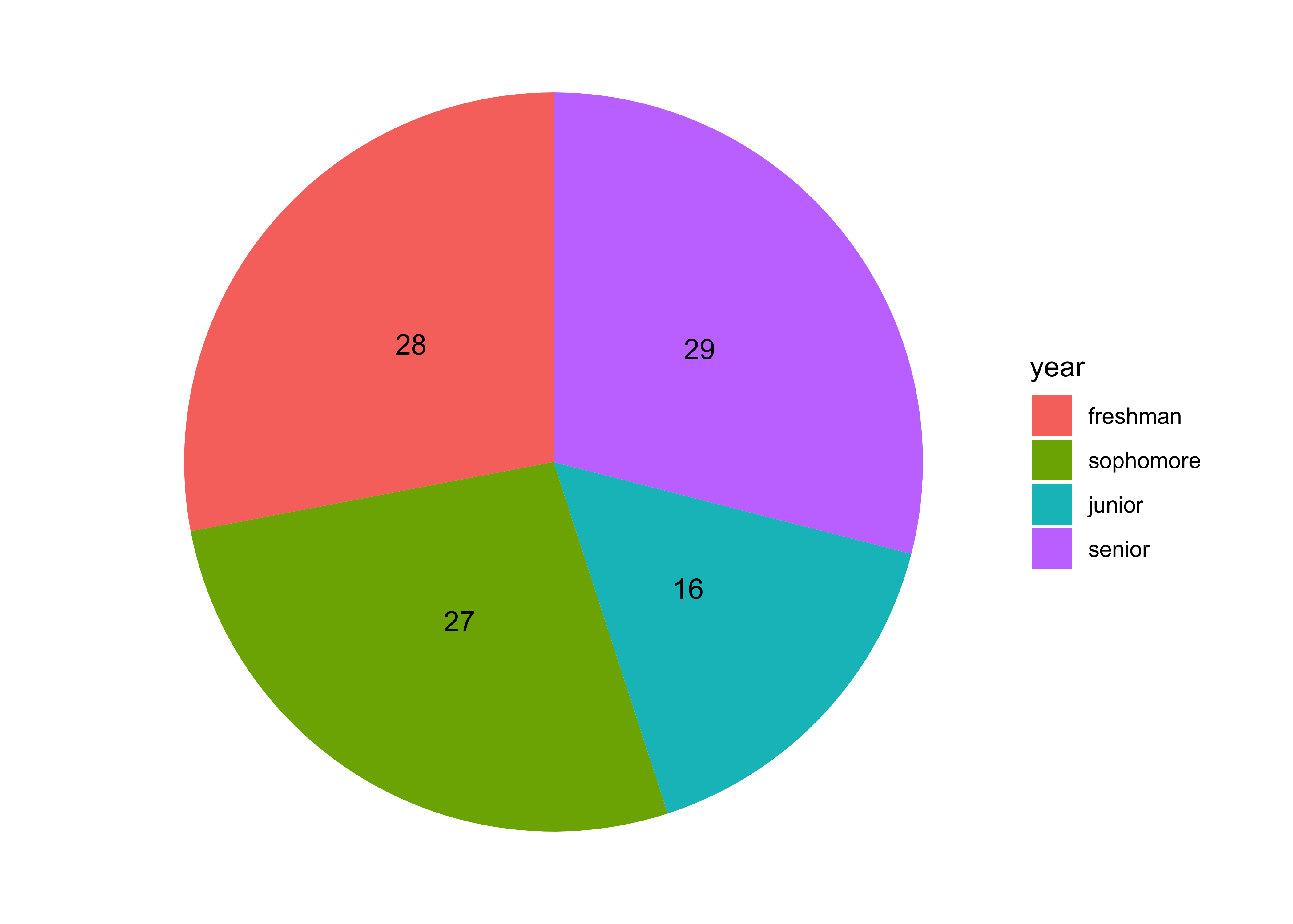
8.6 กราฟฮิสโทแกรมโดย geom_histogram( )
ข้อมูลที่ใช้ต้องตัวเลขเท่านั้น คำสั่งใน aes( ) สามารถนำมาใช้ได้ คือ x fill color และ alpha
ggplot(data = Sample) +
 aes(x = income, fill = I("pink"), col = I("blue"), alpha = I(.6)) +
 geom_histogram( )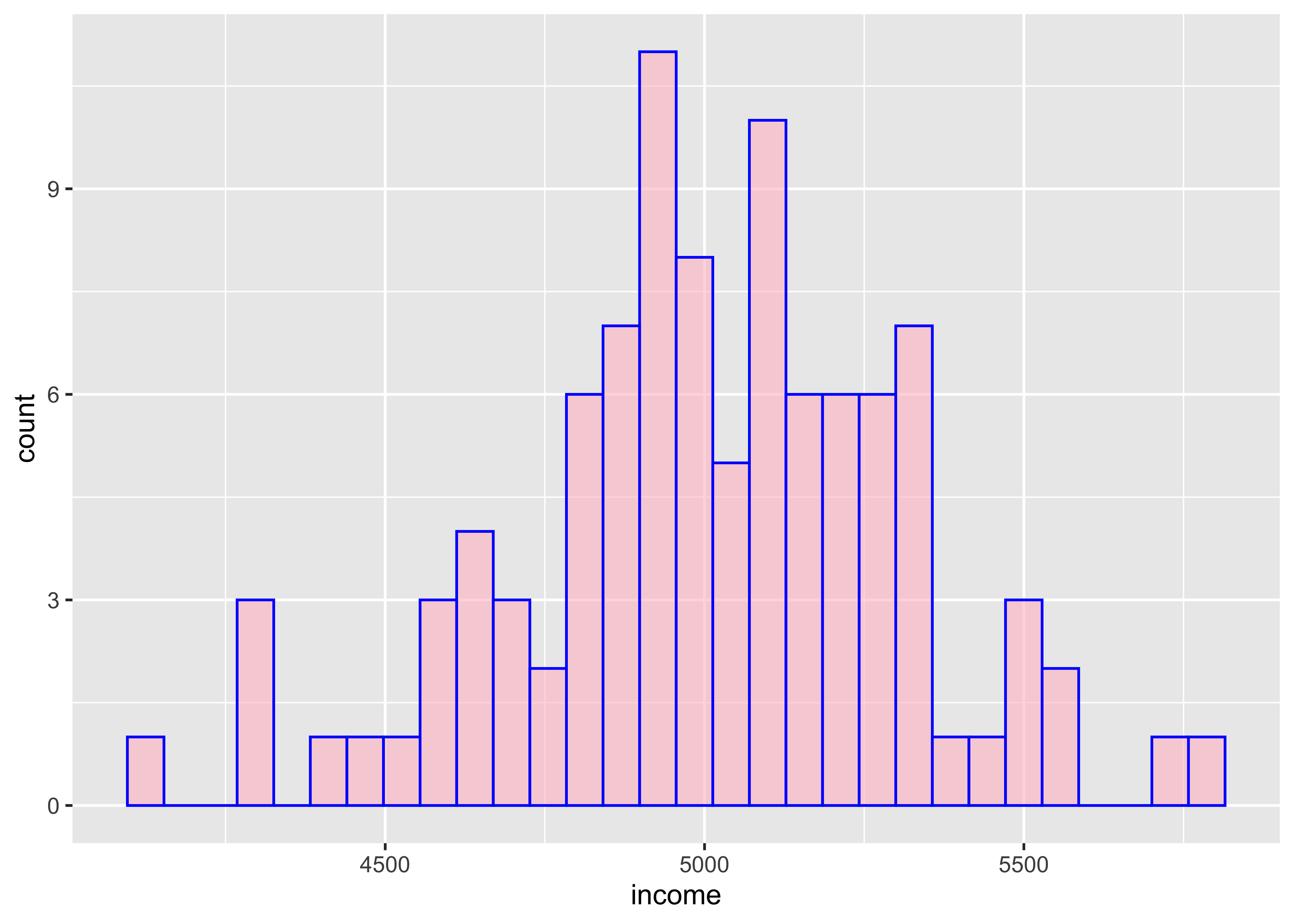
ถ้าต้องการกราฟแบบฟังก์ชันความหนาแน่น (probability density fucntion (PDF)) ต้องกำหนด y = ..density.. ในคำสั่ง aes( )
ggplot(data = Sample) +
 aes(x = income, y = ..density..,
     fill = I("pink"), col = I("blue"), alpha = I(.6)) +
 geom_histogram( )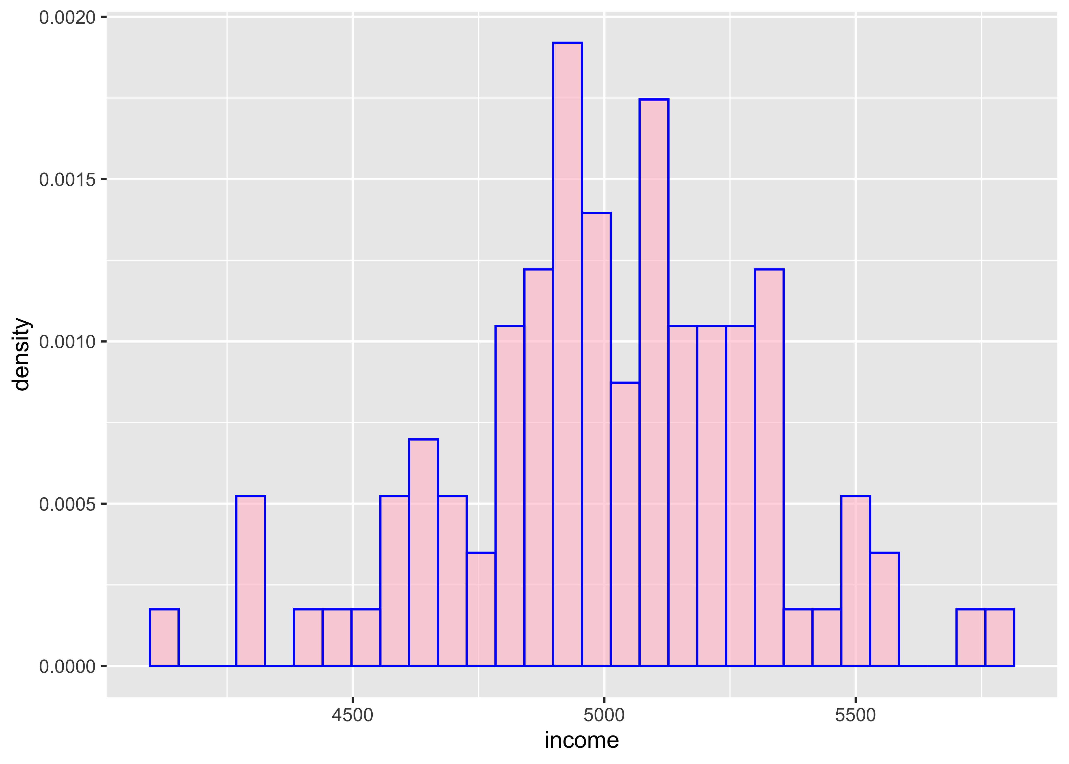
ถ้าต้องการดูการกระจายแยกตามเพศ
ggplot(data = Sample) +
 aes(x = income, y = ..density..,
     fill = gender, col = I("black")) +
  geom_histogram( )
คำสั่งอื่นๆ เช่นการตั้งชื่อ การแยกกราฟ ตั้งชื่อแกน ย้าย/ลบคำอธิบายสัญลักษณ์ (legend) สามารถทำได้โดยคำสั่งเดียวกัน
ggplot(data = Sample) +
 aes(x = income, y = ..density..,
     fill = gender, col = I("black")) +
  geom_histogram( ) +
  scale_fill_manual(values = c("red", "blue")) +
  facet_wrap(year ~ .) +
  labs(title = "The histogram of student income by gender and year")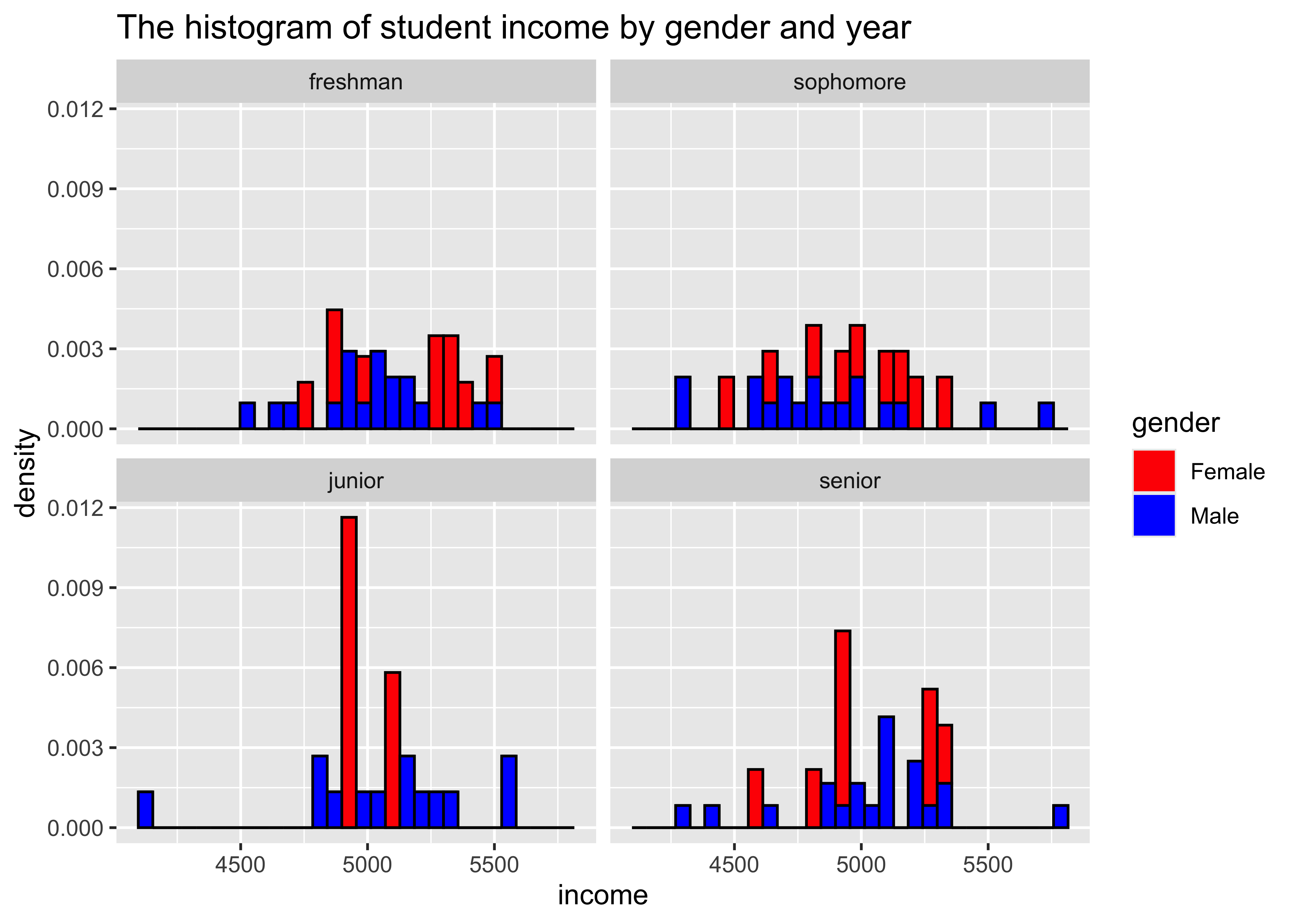
8.7 geom_density( )
เหมือน geom_histogram( ) เกือบทั้งหมด เป็นฮิสโทแกรมของการประมาณค่า PDF ด้วยฟังก์ชันแบบต่อเนื่อง
ggplot(data = Sample) +
 aes(x = income,
     fill = gender, col = I("black")) +
  geom_density( ) +
  scale_fill_manual(values = c("red", "blue")) +
  facet_wrap(year ~ .) +
  labs(title = "The density of student income by gender and year")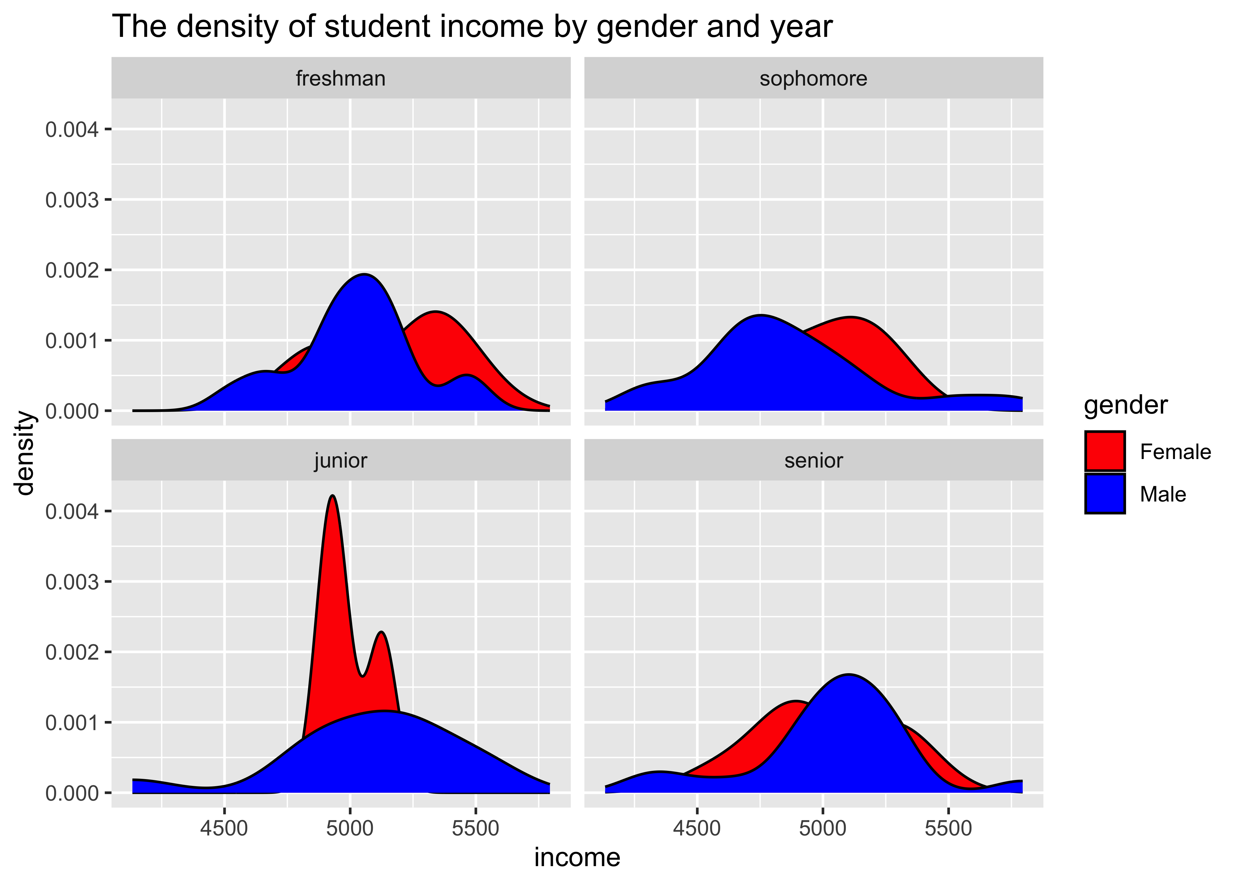
8.8 การแทรก geom อื่นๆ เข้าไปในกราฟ แบบ ggplot
เช่นต้องการ วาดฮิสโทแกรมก่อน ค่อยวาดกราฟ density เพิ่ม
ggplot(data = Sample) +
 aes(x = income, y = ..density..,
     fill = gender, col = I("black")) +
  geom_histogram( ) +
  geom_density( ) +
  facet_wrap(faculty ~ .)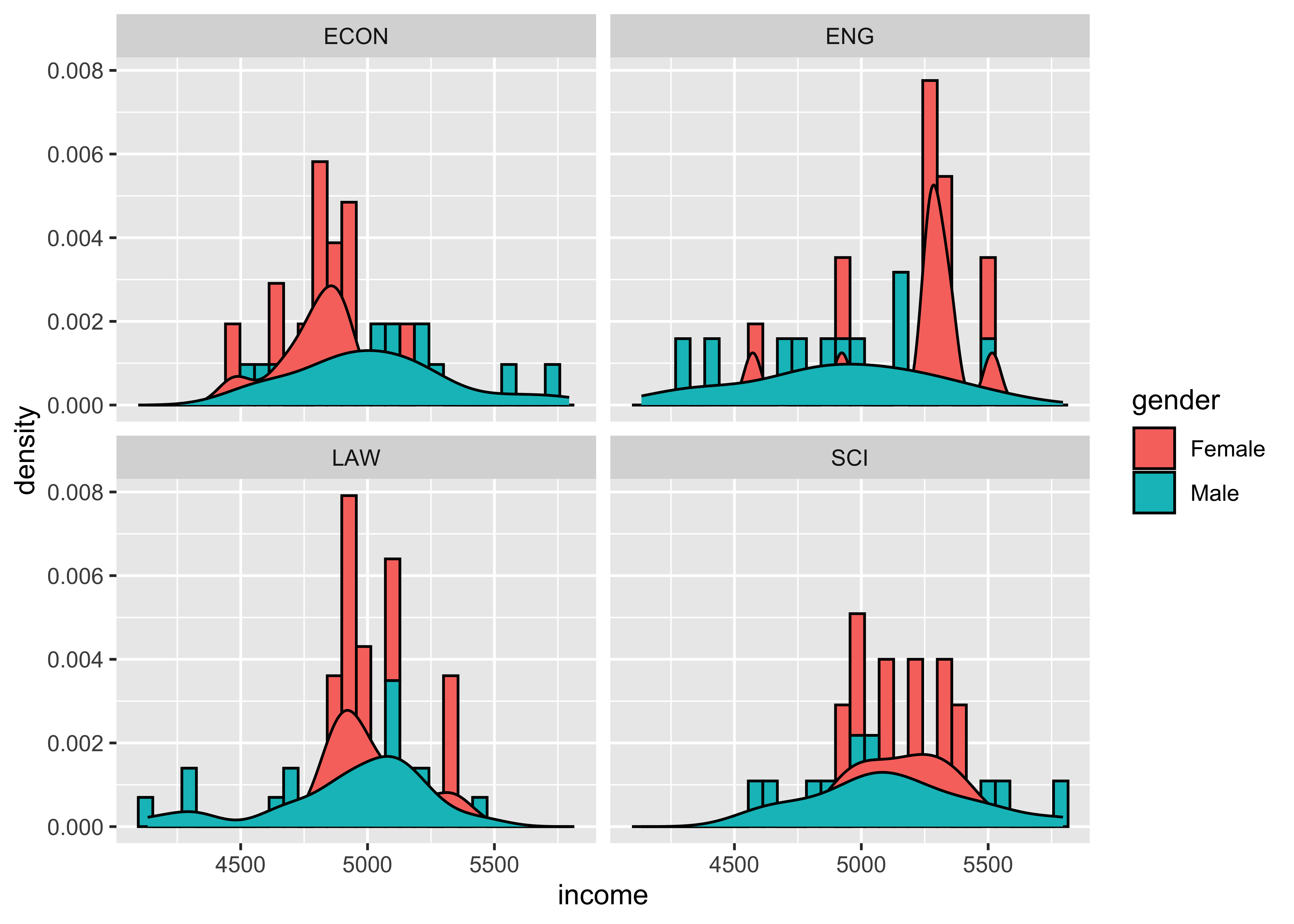
หรืนต้องการวาด density ก่อนแล้วจึงวาดกราฟฮิสโทแกรม
ggplot(data = Sample) +
 aes(x = income, y = ..density..,
     fill = gender, col = I("black")) +
  geom_density( ) +
  geom_histogram( ) +
  facet_wrap(faculty ~ .)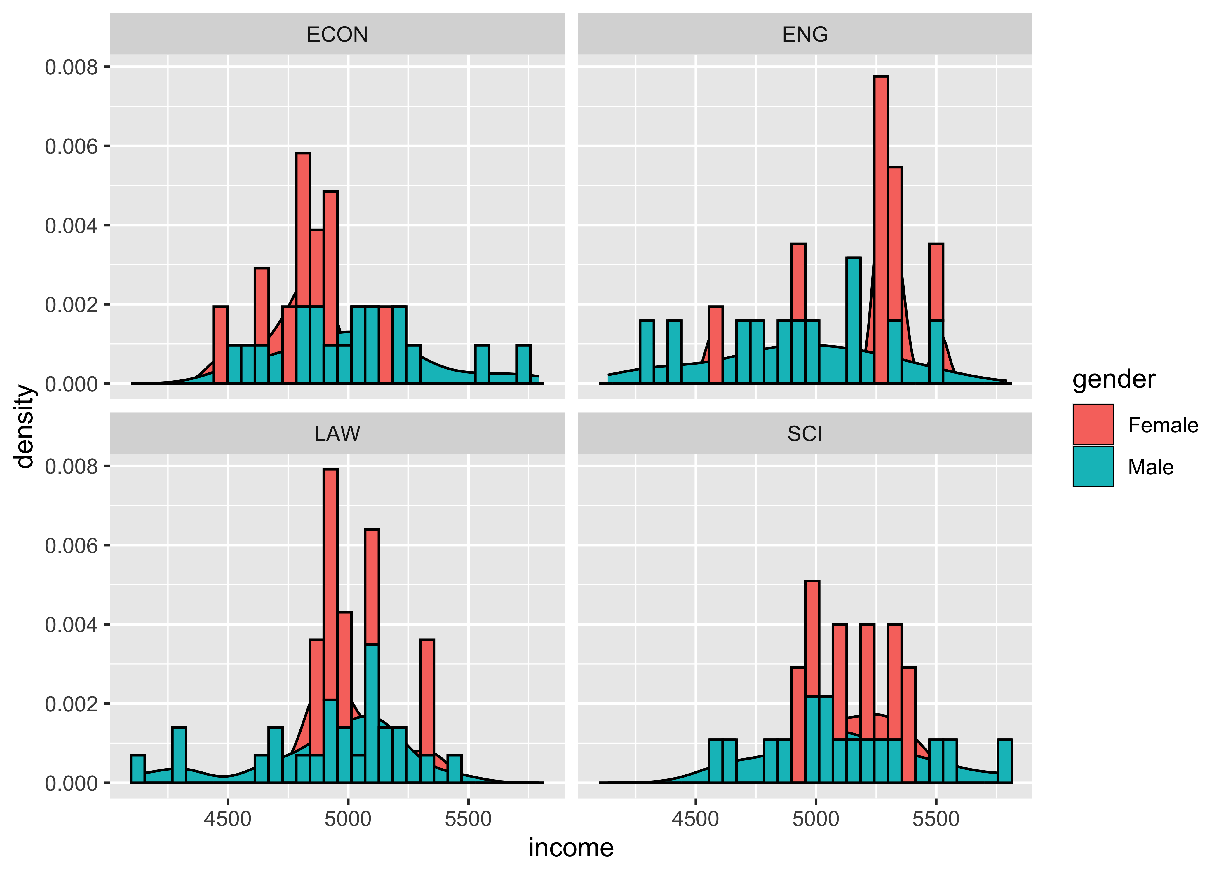
จะเห็นว่ามีความแตกต่างกัน ดังนั้นลำดับก่อนในแต่ geom ต้องพิจารณาเรียงลำดับให้ดี
8.9 geom_boxplot( )
ในคำสั่ง aes( ) ที่สำคัญคือ x เป็นแปรตัวอักษร y เป็นตัวเลขจำนวนจริง
ggplot(data = Sample) +
 aes(x = faculty, y = income) +
 geom_boxplot( )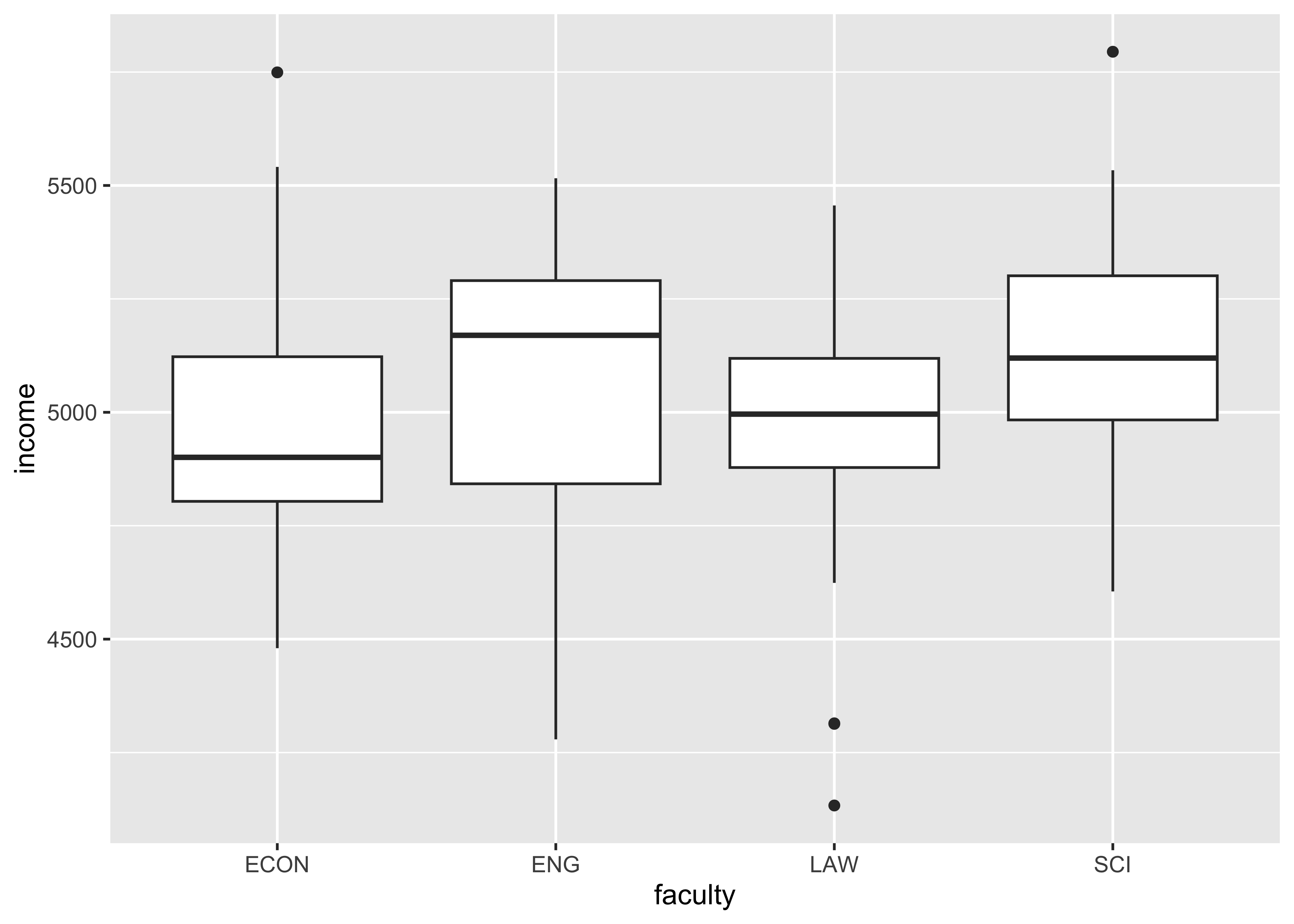
ggplot(data = Sample) +
 aes(x = faculty, y = income, fill = faculty) +
 geom_boxplot( )
ggplot(data = Sample) +
 aes(x = faculty, y = income, fill = gender) +
 geom_boxplot( )
ggplot(data = Sample) +
 aes(x = faculty, y = income, fill = gender) +
  geom_boxplot( ) +
  facet_wrap(year ~ .)
ggplot(data = Sample) +
 aes(x = faculty, y = income, fill = gender) +
  geom_boxplot( ) +
  facet_wrap(year ~ .) +
  scale_fill_manual(values = c("green","yellow"))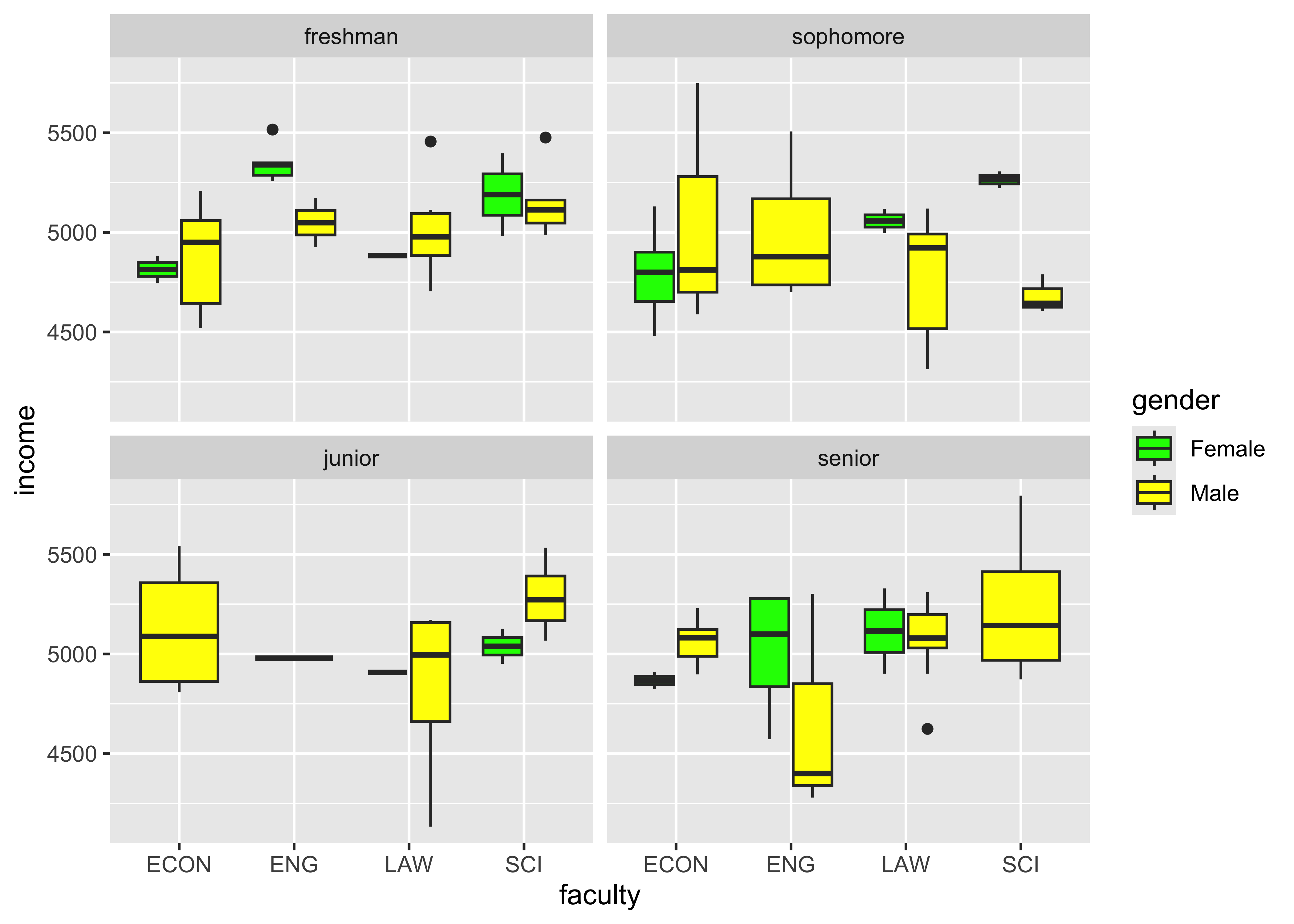
8.10 geom_point( )
สำหรับสร้างแผนภาพการกระจาย โดยในคำสั่ง aes( ) จะต้องค่า x และ y เป็นตัวแปรค่าตัวเลข
สำหรับค่าแแปรอื่นๆ ก็สามารถใส่ได้ปกติ
จากตัวแปร Sample ถ้าสุ่มข้อมูลเพิ่มอีกค่า คือ รายจ่าย
set.seed(2)
Sample$expenditure <- Sample$income - rnorm(n = 100 , mean = 4000, sd = 300)
แผนภาพการกระจายโดย ggplot คือ
ggplot(data = Sample) +
  aes(x = income, y = expenditure) +
  geom_point( )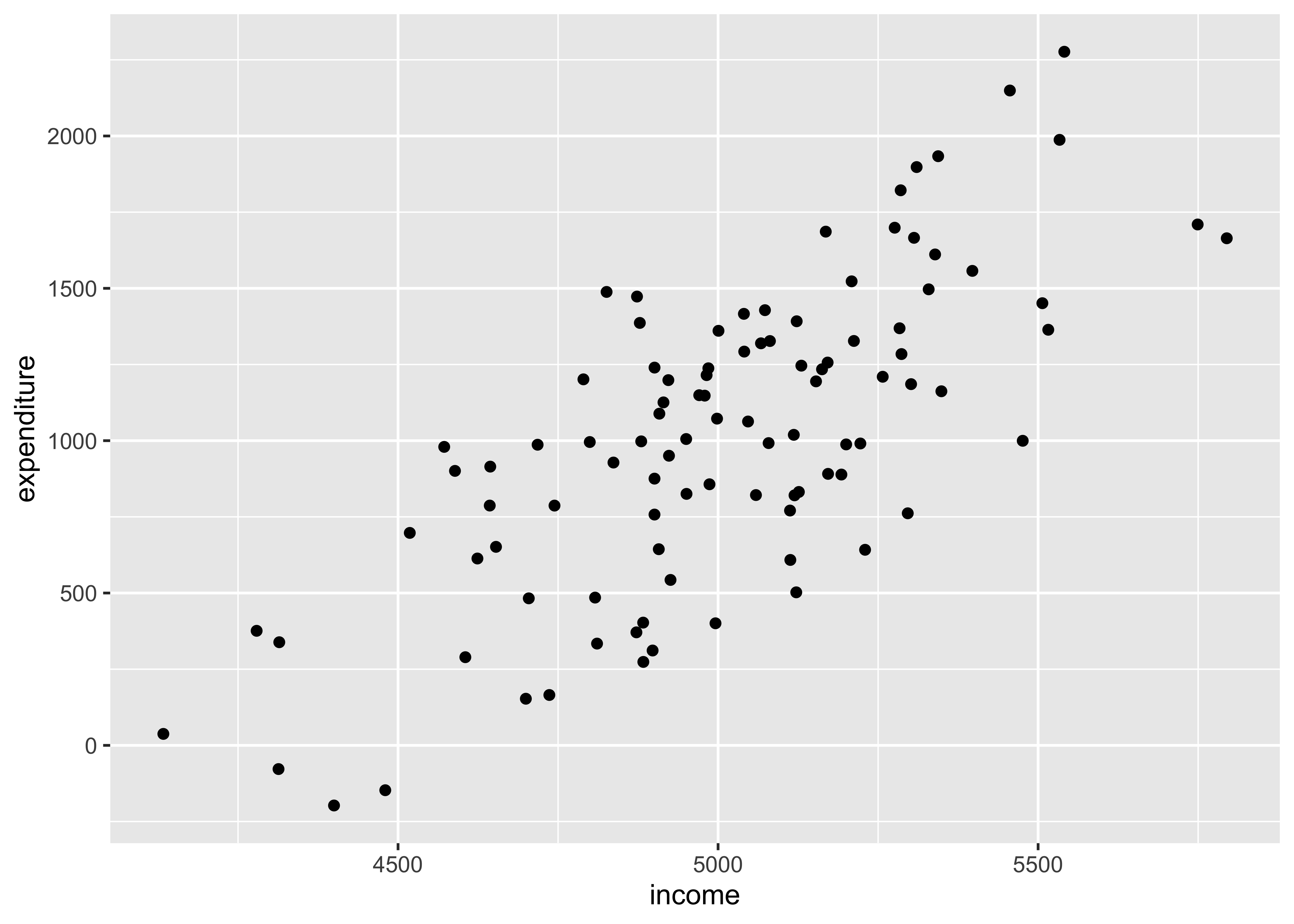
สำหรับกราฟการสีให้จุด ต้องกำหนดค่า color = สีที่ต้องการ 1 สี
ggplot(data = Sample) +
  aes(x = income, y = expenditure, color = I(colors( )[50])) +
  geom_point( )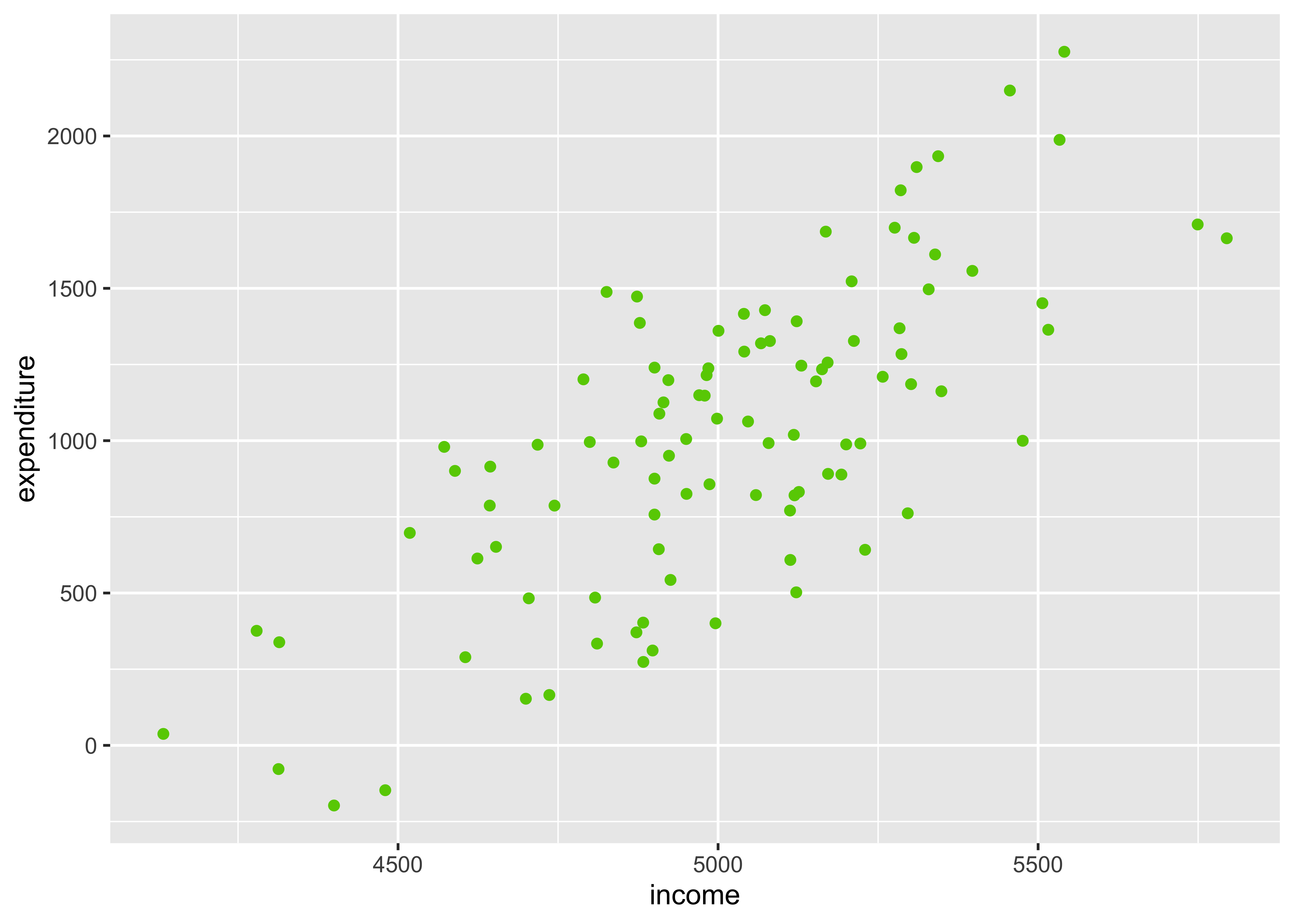
คำสั่ง colors( ) ดูได้จากบทที่ 7 อีกครั้ง
ถ้ากำหนด color = ตัวแปรในกรอบข้อมูล
ggplot(data = Sample) +
  aes(x = income, y = expenditure, color = gender) +
  geom_point( )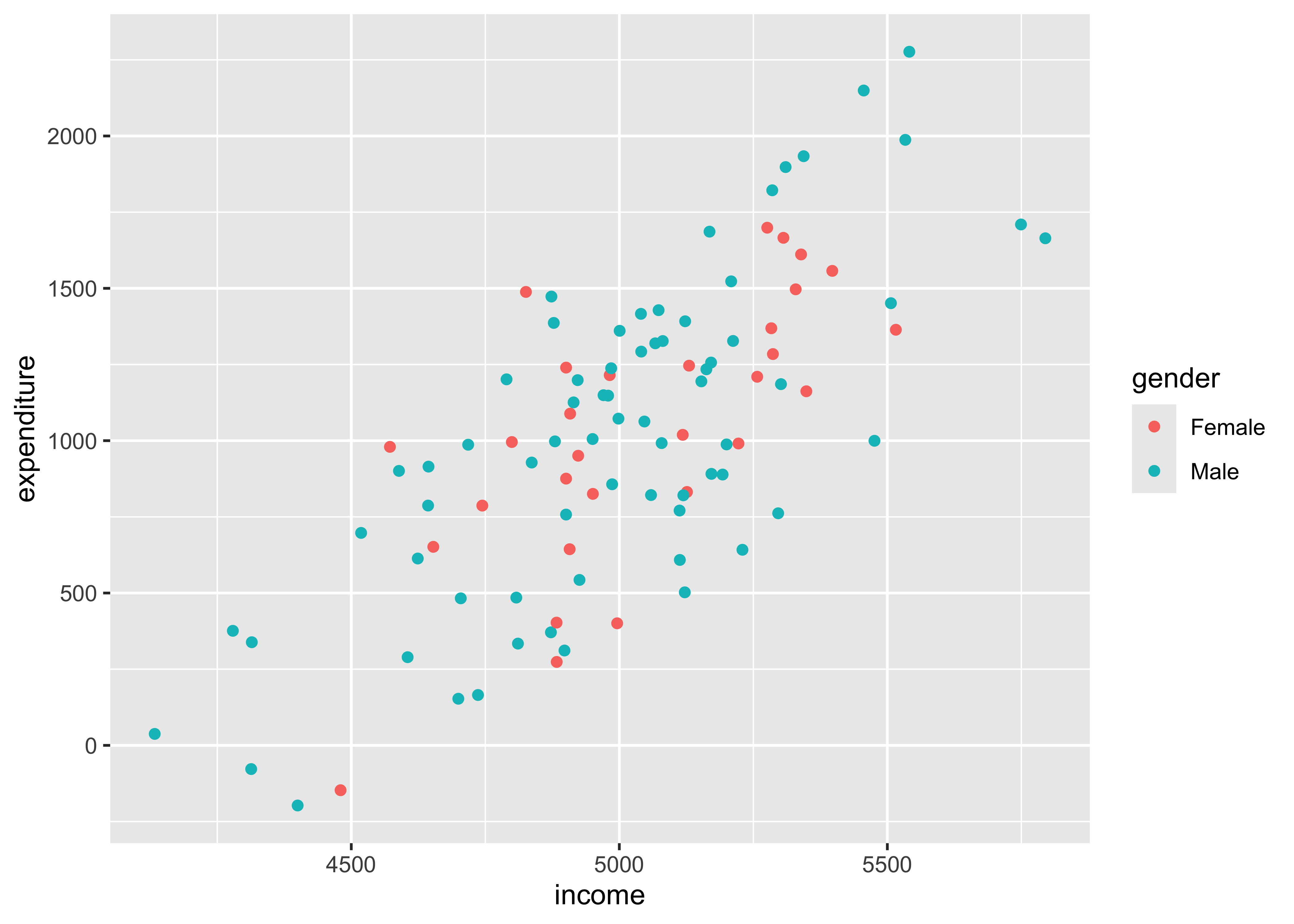
การกำหนดขนาดของจุดโดย คำสั่ง size ใส่ไปในคำสั่ง aes( )
ggplot(data = Sample) +
  aes(x = income, y = expenditure, color = gender, size = I(4)) +
  geom_point( )
ถ้าเพิ่มตัวแปร อายุเข้าไปอีกจะได้
set.seed(5)
Sample$age <- sample(x = 20:25, size = 100, replace = TRUE)
ทำให้สามารถทราบอายุของนศ. จากกราฟนี้ได้ โดยใช่ค่า size = age จะได้
ggplot(data = Sample) +
  aes(x = income, y = expenditure, color = gender, size = age) +
  geom_point( )
8.10.1 จุดแบบต่างใน ggplot
จุดแบบต่างๆ มีทั้งหมด 25 แบบ โดยค่ามาตราฐานคือ หมายเลข 16 การรูปแบบจุดให้ใช้คำสั่ง shape ลงไปในคำสั่ง

การเปลี่ยนรูปทรงโดยคำสั่ง shape ใส่ในคำสั่ง aes( )
ggplot(data = Sample) +
  aes(x = income, y = expenditure, color = gender,
      size = age, shape = I(2)) +
  geom_point( )
การเปลี่ยนสีสำหรับเลข 1-20 ใช้คำสั่ง color ใน aes( ) หมายเลข 21-25 ให้ใช้คำสั่ง fill ในคำสั่ง aes( )
และถ้ากำหนดค่า shape คือตัวแปรที่ไม่ใช่ตัวเลขจะได้
ggplot(data = Sample) +
  aes(x = income, y = expenditure, color = gender,
      size = age, shape = faculty) +
  geom_point( )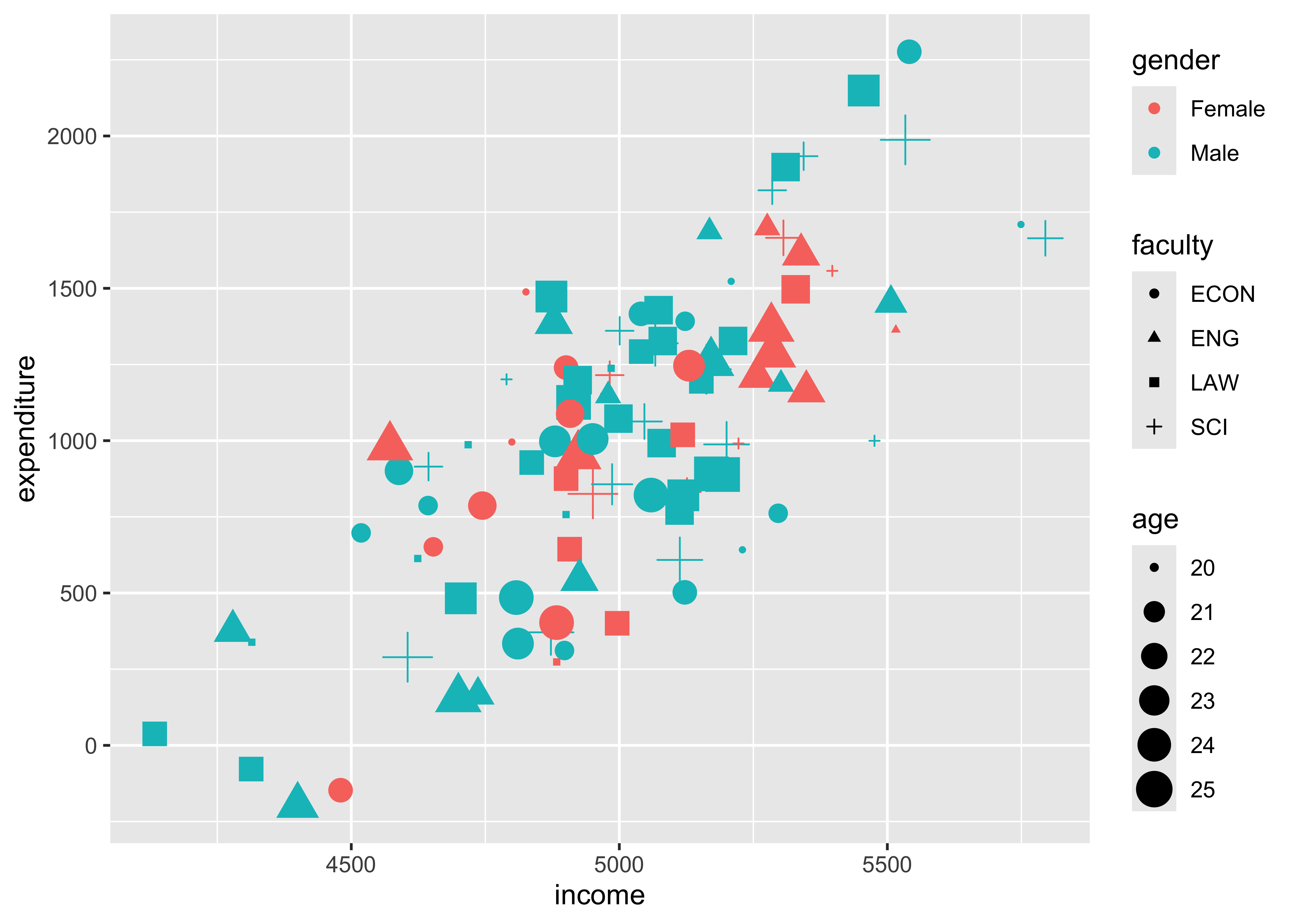
การเลือกตัวเลข shape ที่ต้องการลงลงในคำสั่ง scale_shape_manual( )
scale_shape_manual( values = เวคเตอร์เลขของ shape เท่ากับจำนวนที่ต้องการใช้)ggplot(data = Sample) +
aes(x = income, y = expenditure, color = gender,
size = age, shape = faculty) +
geom_point( ) +
scale_shape_manual(values = 6:10)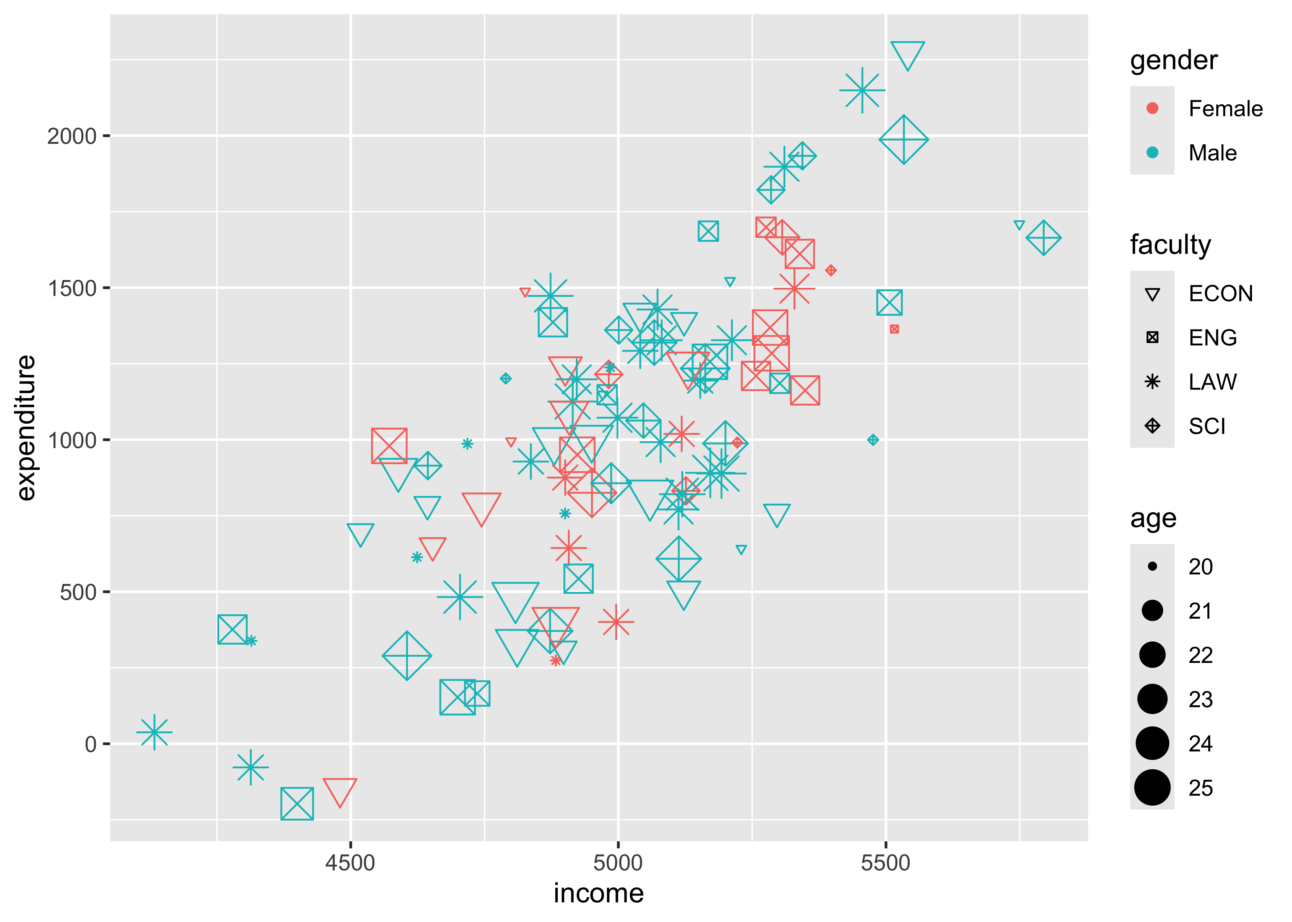
การเปลี่ยนสี ก็เปลี่ยนมาใช้คำสั่ง scale_color_manual
scale_color_manual(values = เวคเตอร์ของชื่อสีตามจำนวนในตัวแปร color)จะได้
ggplot(data = Sample) +
  aes(x = income, y = expenditure, color = gender,
      size = age, shape = faculty) +
  geom_point( ) +
  scale_color_manual(values =colors( )[c(10, 60)])
เรากราฟแบบนี้ว่า bubble plot
การแยกกราฟ ก็สามารถใช้คำสั่ง facet_wrap( )
ggplot(data = Sample) +
  aes(x = income, y = expenditure, color = gender,
      size = age, shape = faculty) +
  geom_point( ) +
  scale_color_manual(values = colors( )[c(10, 60)]) +
  facet_wrap(year ~ .)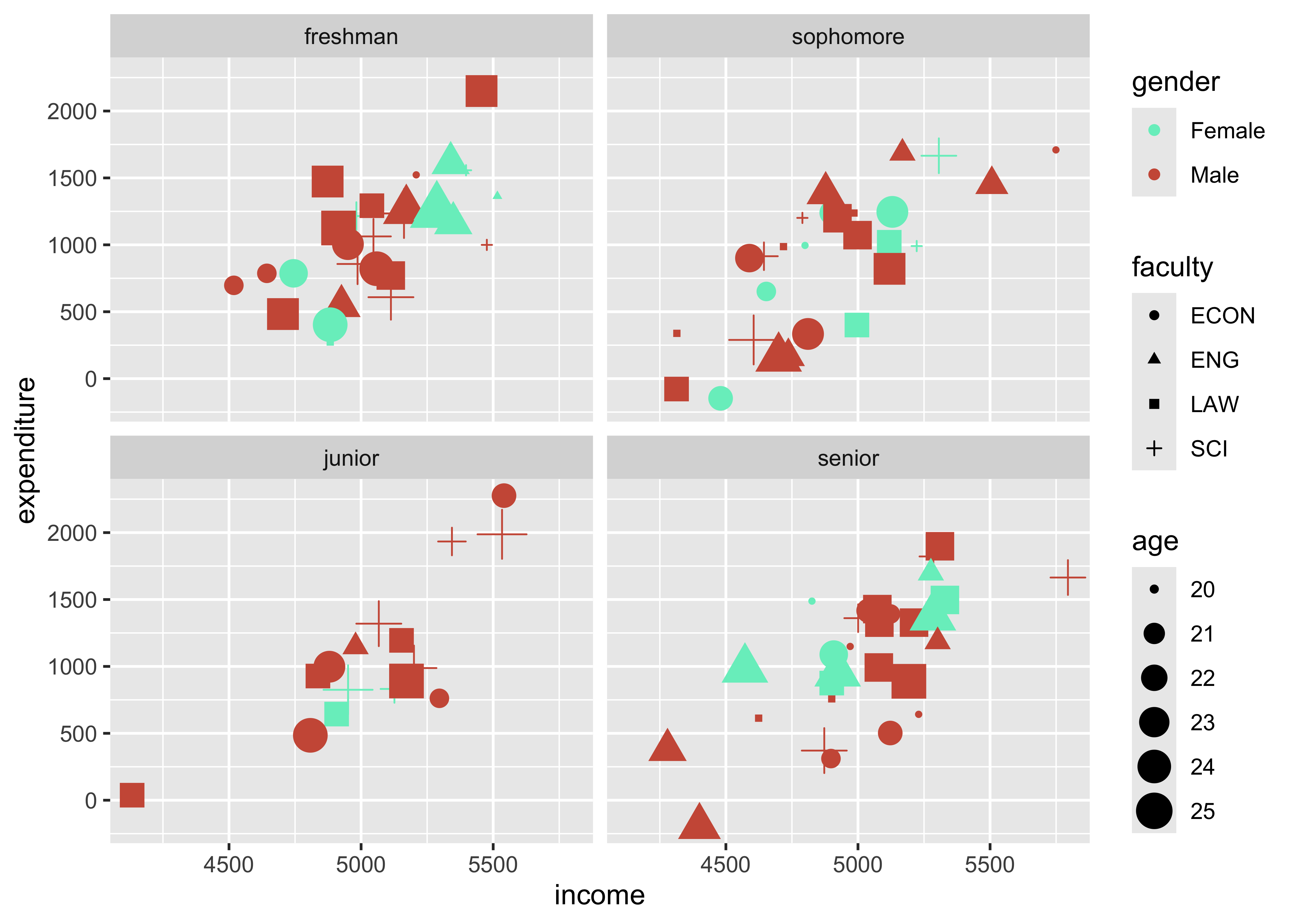
8.10.2 การเพิ่มสมการการถดถอยด้วย geom_smooth( )
จะได้เส้นที่ไม่เป็นสมการเส้นตรง พร้อมพื้นที่ช่วงความเชื่อมั่น
ggplot(data = Sample) +
  aes(x = income, y = expenditure) +
  geom_point( ) +
  geom_smooth( )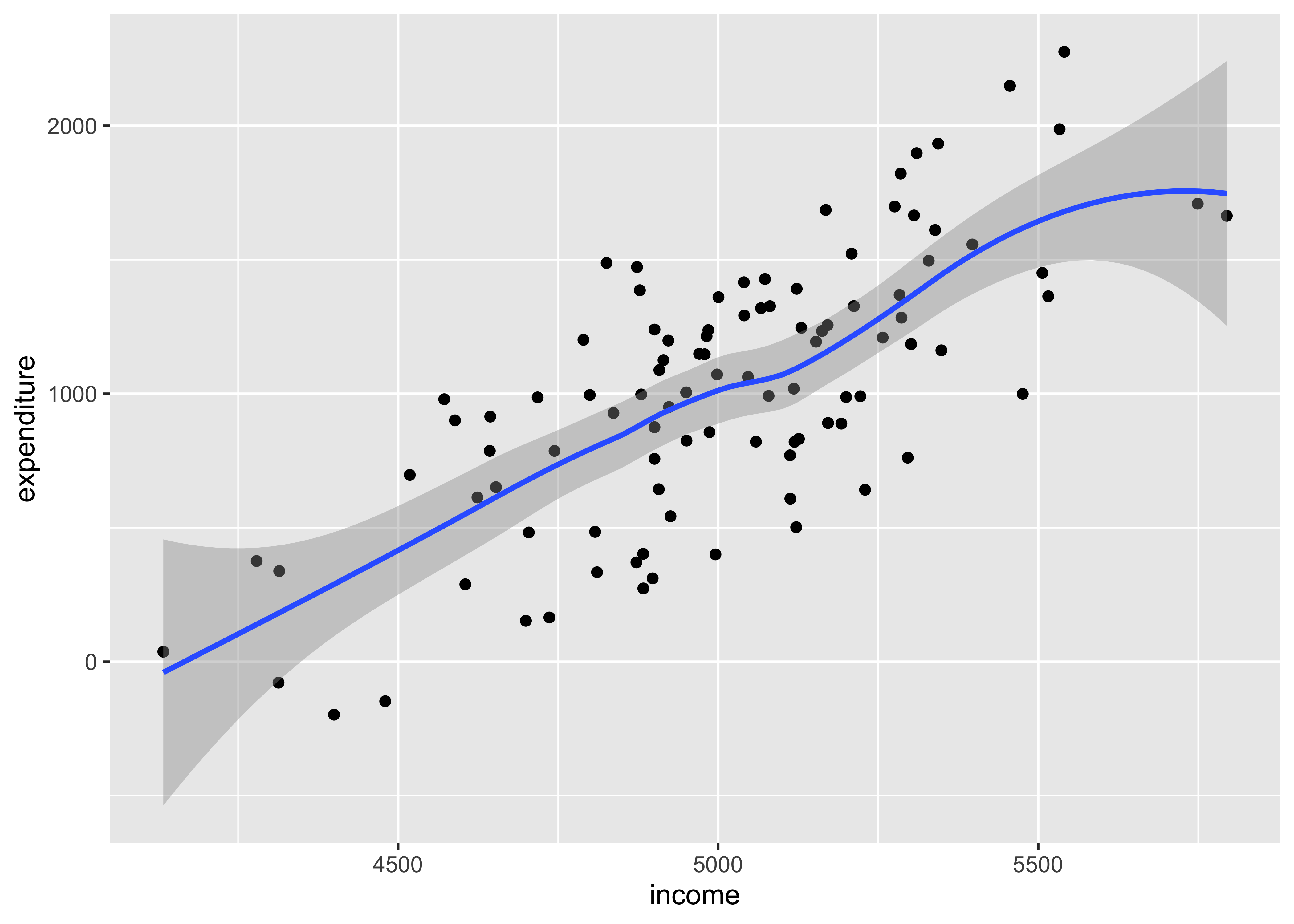
ถ้าต้องการเส้นพยากรณ์เป็นเส้นตรงให้กำหนด
geom_smooth(method = lm)
ggplot(data = Sample) +
  aes(x = income, y = expenditure) +
  geom_point( ) +
  geom_smooth(method = lm)
ลบพื้นช่วงความเชื่อมั่น สามารถทำได้โดยกำหนด se = FALSE ใน geom_smooth( )
ggplot(data = Sample) +
  aes(x = income, y = expenditure) +
  geom_point( ) +
  geom_smooth(method = lm, se = FALSE) +
  geom_smooth( se = FALSE, color ="red")
สามารถกำหนด เส้นพยากรณ์ด้วยสีที่ต้องการได้ ด้วยคำสั่ง color ใส่ใน geom_smooth( )
8.10.3 เพิ่มเส้น ellipse
ใช้คำสั่ง stat_ellipse( ) ต่อจาก geom_point( )
ggplot(data = Sample) +
  aes(x = income, y = expenditure) +
  geom_point( ) +
  stat_ellipse( )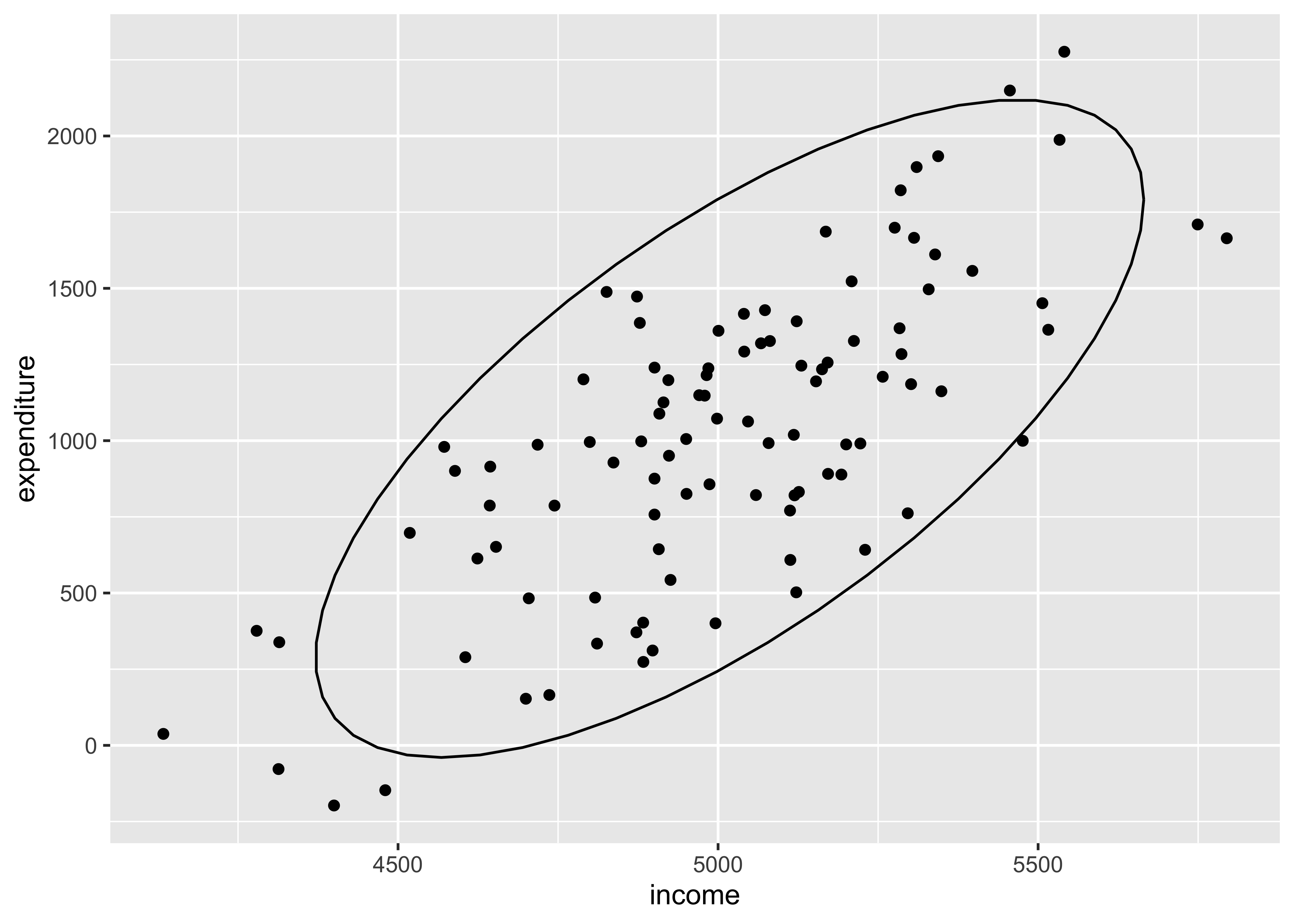
เหมาะสำหรับข้อมูลที่สามารถแบ่งกลุ่มได้เกือบชัดเจน
ยกตัวอย่างจาก ข้อมูล iris
data(iris)
ggplot(data = iris) +
  aes(x = Sepal.Length, y = Sepal.Width, color = Species) +
  geom_point( ) +
  stat_ellipse( )
รายละเอียกข้อมูล iris ให้ใช้คำสั่ง
help(iris)8.11 ฉากหลังที่เลือกเปลี่ยนได้ใน ggplot2
ฉากหลังมาตราฐานใน ggplot2 คือ theme_gray( ) ไม่ต้องใช้คำสั่งนี้ เมื่อต้องการใช้ฉากหลังนี้ ยกเว้นต้องการเปลี่ยนฉากหลังอื่นๆ มาเป็นฉากหลังนี้
D <- data.frame(x = c(-4,4))
p1 <- ggplot(data = D) +
        aes(x = x) +
        geom_area( stat = "function", fun = dnorm, fill = "red",
                 ccolor = "black",xlim = c(-4,4)) +
        labs(title ="theme_gray( )")
p1
p2 <- p1 + theme_dark( ) + labs(title = "theme_dark( )")
p2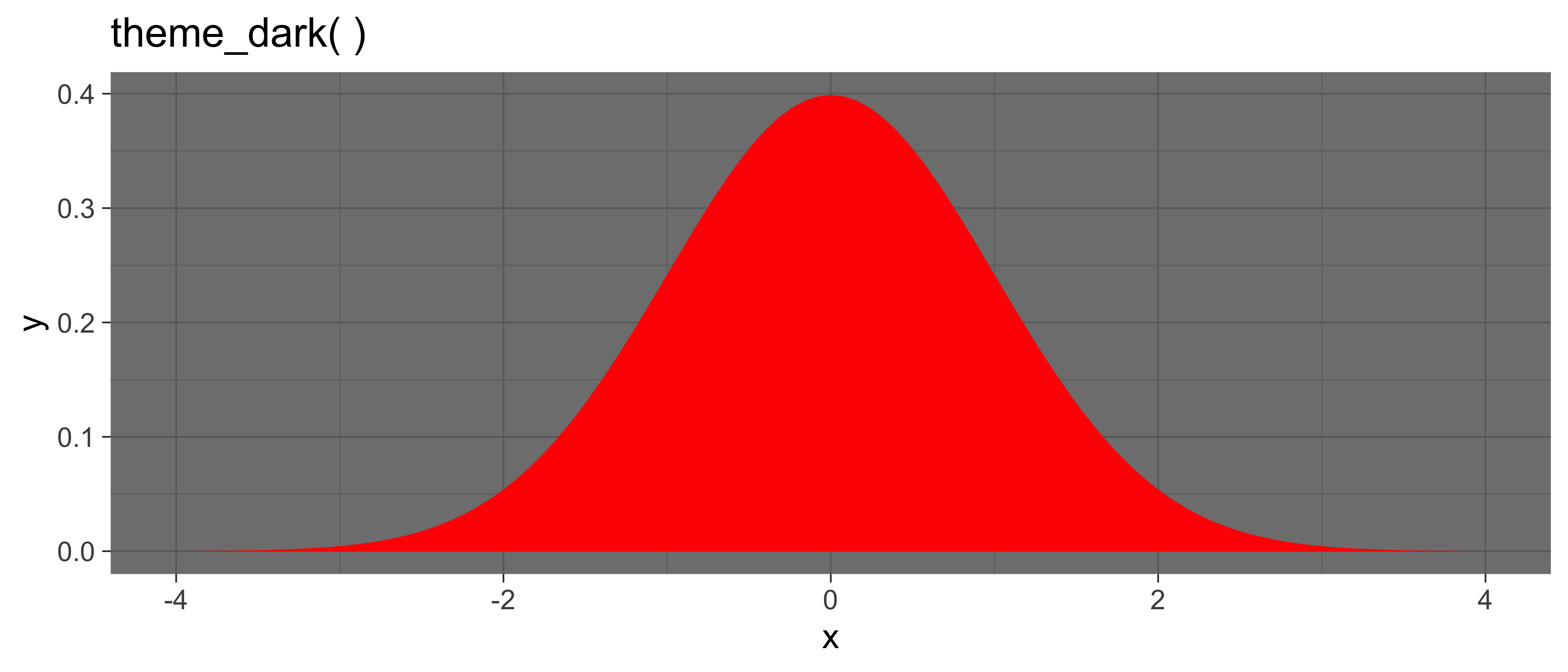
p3 <- p1 + theme_bw( ) + labs(title = "theme_bw( )")
p3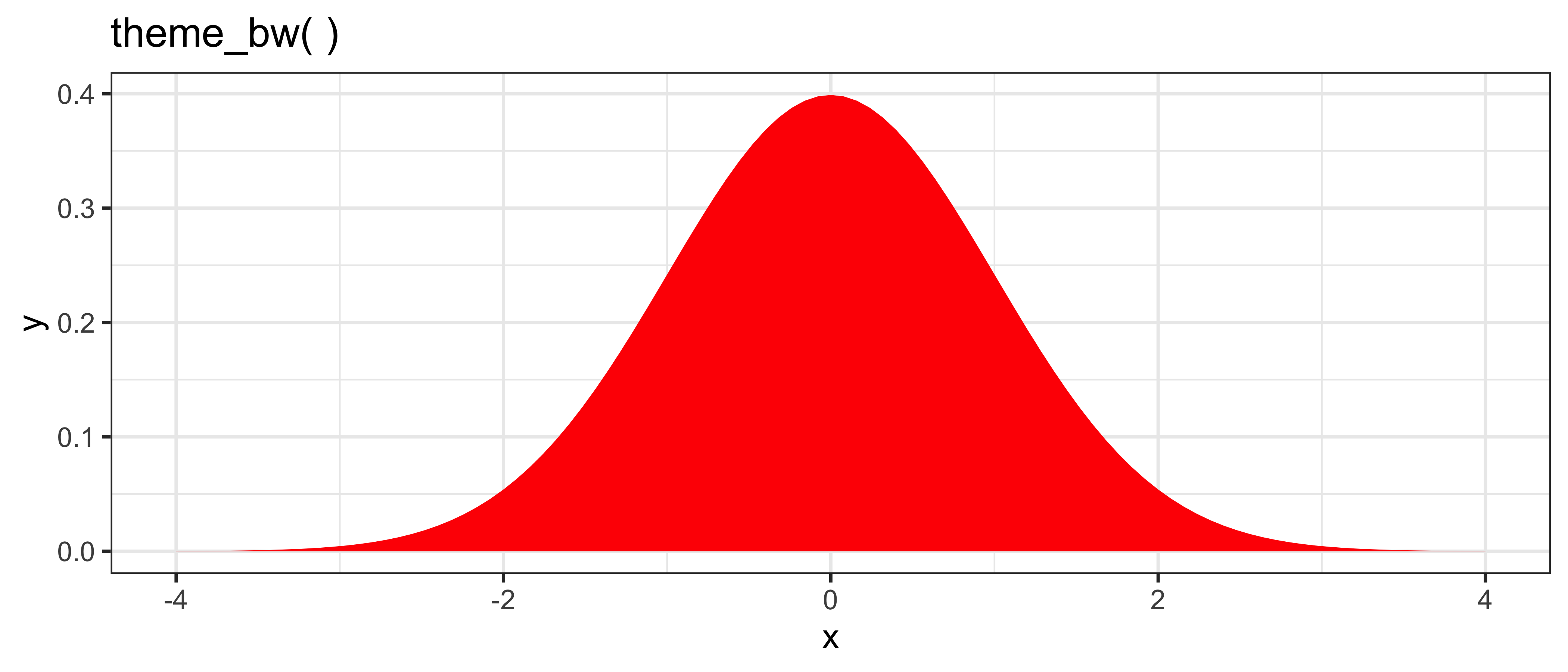
p3 <- p1 + theme_linedraw( ) + labs(title = "theme_linedraw( )")
p3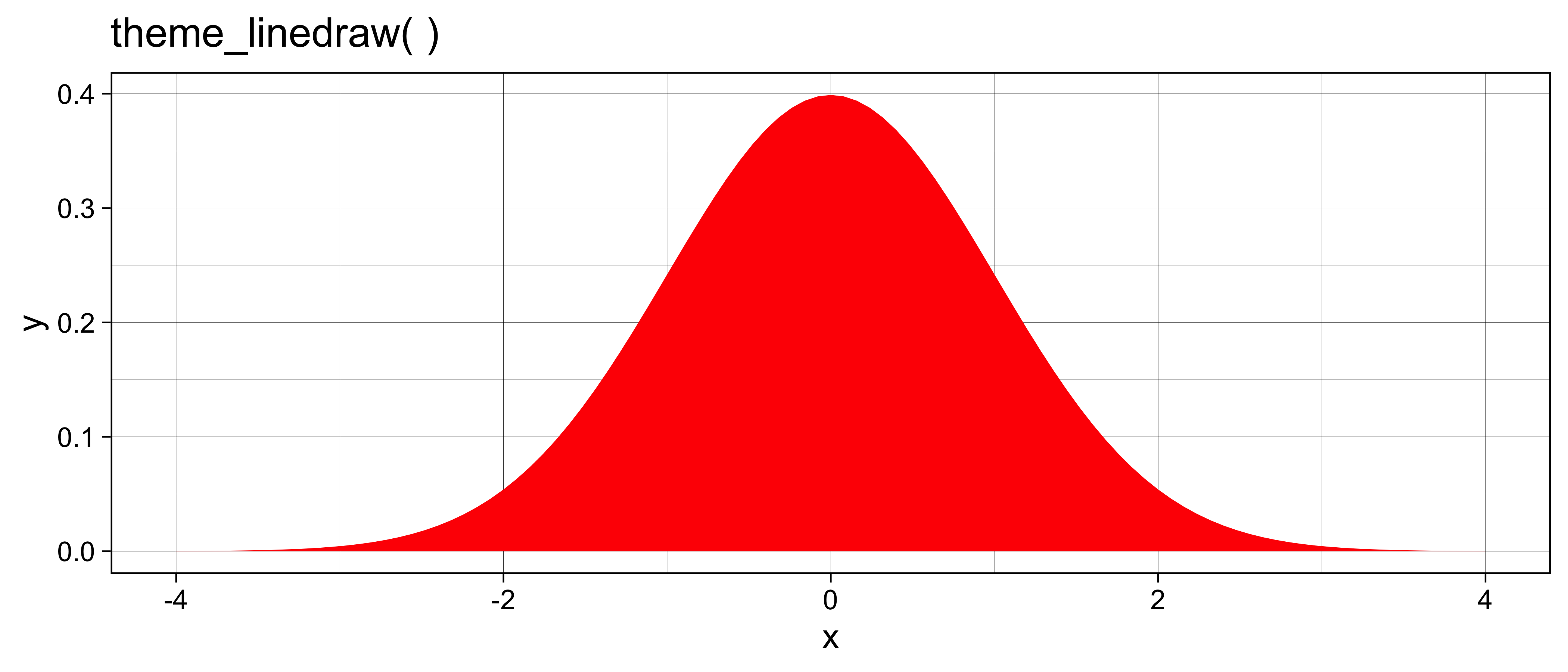
p4 <- p1 + theme_minimal( ) + labs(title = "theme_minimal( )")
p4
p5 <- p1+theme_void( ) + labs(title = "theme_void( )")
p5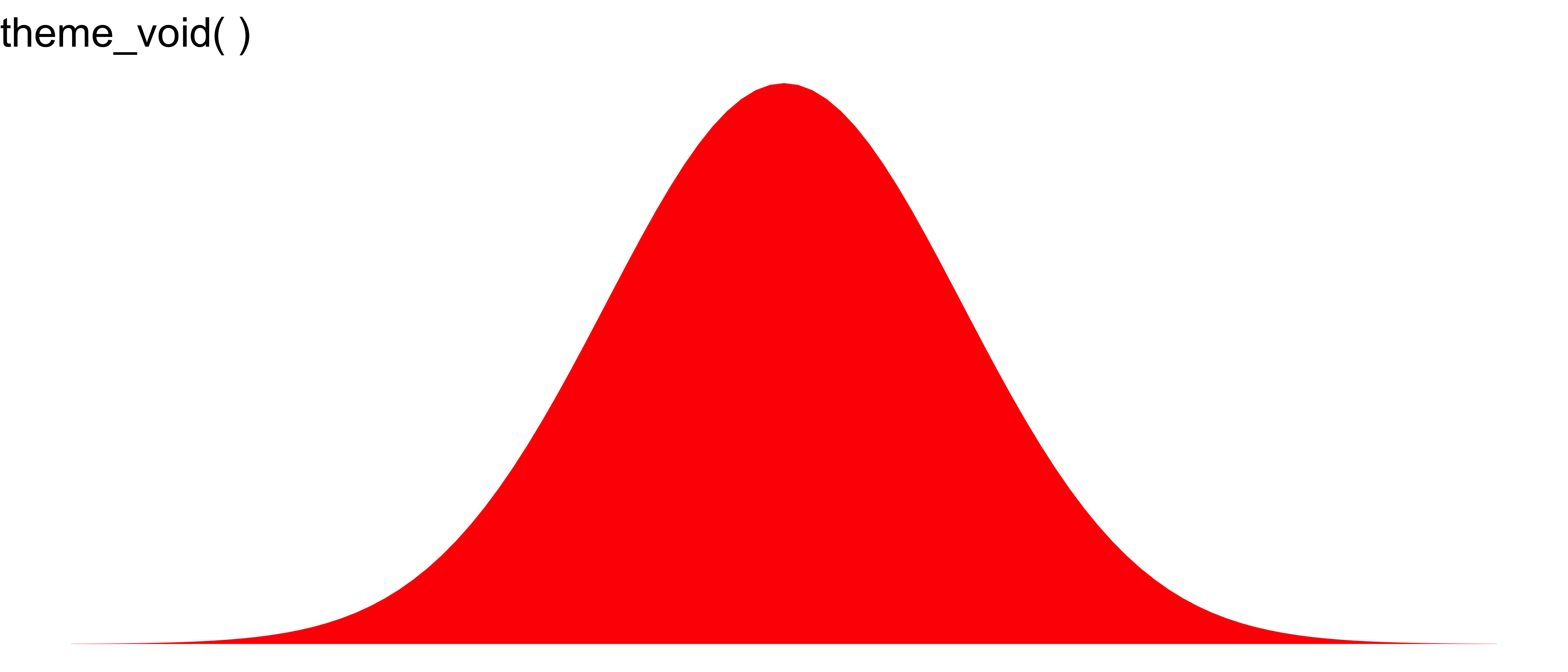
สำหรับฉากหลังเพิ่มเติมสามารถเลือกได้ชุดคำสั่ง ggthemes
install.packages(ggthemes)
library(ggthemes)
จะมีฉากหลังที่เพิ่มขึ้นมาคือ
theme_base
theme_calc
theme_economist
theme_excel
theme_few
theme_fivethirtyeight
theme_gdocs
theme_hc
theme_par
theme_pander
theme_solarized
theme_stata
theme_tufte
theme_wsj
8.11.1 การใช้ภาษาอื่นๆ ใน ggplot2
ปกติแล้ว เราสามารถใช้ภาษาอื่นๆ ในการตั้งชื่อกราฟ ชื่อแกน ชื่อ legend เป็นต้น จากกราฟที่สร้างก่อนหน้า ทำการเปลี่ยนชื่อต่างๆ เป็นภาษาไทย ดังนี้
ggplot(data = Sample) +
  aes(x = faculty, fill = faculty, color = I("black")) +
  geom_bar( ) +
  labs(title = "กราฟแท่ง",
       subtitle = "จำนวนนักศึกษาแต่ละคณะ",
       x = "4 คณะจาก ม.เชียงใหม่",
       y = "จำนวนนักศึกษา",
       fill = "คณะ",
       caption = "ออกแบบโดย สมศักดิ์")
จะเห็นว่าไม่สำเร็จ คือ ไม่สามารถแสดงภาษาไทยได้
สำหรับชุดคำสั่ง ggplot2 เพียงแค่ทำการเปลี่ยนชุดแบบอักษร (font) ที่ต้องการลงไปเท่านั้นเอง ซึ่งทำได้โดย ใช้คำสั่งข้างล่างนี้ต่อท้ายสุด
theme(text = element_text(family = "ชื่อชุดแบบอักษรที่ต้องการ"))ดังนี้
ggplot(data = Sample) +
  aes(x = faculty, fill = faculty, color = I("black")) +
  geom_bar( ) +
  labs(title = "กราฟแท่ง",
       subtitle = "จำนวนนักศึกษาแต่ละคณะ",
       x = "4 คณะจาก ม.เชียงใหม่",
       y = "จำนวนนักศึกษา",
       fill = "คณะ",
       caption = "ออกแบบโดย สมศักดิ์") +
  theme(text = element_text(family = "TH Sarabun New"))
ข้อควรระวัง ต้องเอาคำสั่งนี้ไว้ท้ายสุด เช่น ถ้าต้องการเปลี่ยนฉากหลัง แล้วทำการเพิมคำสั่ง them_dark( ) ลงไปจะได้ผลลัพธ์
ggplot(data = Sample) +
  aes(x = faculty, fill = faculty, color = I("black")) +
  geom_bar( ) +
  labs(title = "กราฟแท่ง",
       subtitle = "จำนวนนักศึกษาแต่ละคณะ",
       x = "4 คณะจาก ม.เชียงใหม่",
       y = "จำนวนนักศึกษา",
       fill = "คณะ",
       caption = "ออกแบบโดย สมศักดิ์ จันทร์เอม") +
  theme(text = element_text(family = "TH Sarabun New")) +
  theme_dark( )
ภาษาไทยไม่สามารถแสดงออกมาได้ แต่ถ้าทำแบบจะได้ผลลัพธ์ที่ต้องการ
ggplot(data = Sample) +
  aes(x = faculty, fill = faculty, color = I("black")) +
  geom_bar( ) +
  labs(title = "กราฟแท่ง",
       subtitle = "จำนวนนักศึกษาแต่ละคณะ",
       x = "4 คณะจาก ม.เชียงใหม่",
       y = "จำนวนนักศึกษา",
       fill = "คณะ",
       caption = "ออกแบบโดย สมศักดิ์จันทร์เอม") +
  theme_dark( ) +
  theme(text = element_text(family = "TH Sarabun New"))
รายละเอียดเพิ่มเติมอื่นๆ ที่ไม่ได้กล่าวถึง คือ ขนาดตัวอักษร ตัวเอียง ตัวหนาอื่นๆ สมการทางคณิตศาสตร์
8.12 เมนู Addins สำหรับช่วยสร้างกราฟ ggplot
ให้ติดตั้งชุดคำสั่ง esquisse จะได้เมนู Addins มาใช้งานใน Rstudio โดยไม่ต้องใช้คำสั่ง library( ) และพิมพ์คำสั่งใดๆ ซึ่งมีประโยชน์มากสำหรับกราฟ ggplot ที่ไม่มีความซับซ้อน หรือมีหลายเลเยอร์ Addins นี้สามารถศึกษาได้ด้วยตนเองได้อย่างง่ายดาย ผู้เขียนไม่มีความจำเป็นต้องระบุวิธีการใช้เครื่องมือ
install.packages("esquisse")
8.13 การเปลี่ยนแปลงลักษณะของกราฟที่ต้องการ
เมื่อได้กราฟที่ต้องการแล้ว อาจจะต้องมีเปลี่ยนแปลง ลักษณะข้อความ เช่น ฟ้อนต์ที่ใช้ สี ขนาดตัวษร สีของพื้นหลังแบบอื่นๆ เส้นตารางในกราฟ เป็นต้น สามารถใช้คำสั่ง ที่เกี่ยวข้องดังนี้
element_text( )
element_rect( )
element_line( )
element_blank( )
8.13.1 การเปลี่ยนฟ้อนต์ ขนาด ลักษณะหรือสีของตัวอักษร ของข้อความต่างๆ ที่ปรากฏในกราฟจาก ggplot2 ด้วยคำสั่ง element_text( )
กราฟนี้จะ แสดงชื่อของค่าตัวแปร (argument) ที่ต้องทราบ ในคำสั่ง theme( ) เพื่อที่จะเปลี่ยนฟ้อนต์ ขนาด ลักษณะหรือสีของตัวอักษรที่ต้องการด้วยคำสั่ง element_text( )
p <- ggplot(data = Sample) +
     aes(x = income, y = expenditure, color = gender,
         size = age, shape = faculty) +
     geom_point( ) +
     scale_shape_manual(values = 6:10) +
     labs(title ="Graph of income vs expenditure",
     subtitle = "Based on facuty, age, and gender variables",
     caption = "Make it by Somsak Chanaim")
กราฟของคำสั่งนี้ แสดงในรูปที่ 8.3 ตัวอักษรสีแดงแสดงถึงชื่อตัวแปร (argument) ที่สามารถจะเปลี่ยนฟ้อนต์ ขนาด ลักษณะหรือสีของตัวอักษรที่ต้องการด้วยคำสั่ง element_text( ) โดยค่าตัวแปรภายในคำสั่ง element_text( ) ค่าที่สำคัญดังนี้
plot.title แก้ไขเปลี่ยนแปลงชื่อกราฟหลัก
plot.subtitle แก้ไขเปลี่ยนแปลงชื่อกราฟรอง
axis.title.x: แก้ไขเปลี่ยนแหลงชื่อแกน x
axis.title.y: แก้ไขเปลี่ยนแหลงชื่อแกน y
axis.text.x: แก้ไขเปลี่ยนลักษณะเส้นขอบแกน x
axis.text.y: แก้ไขเปลี่ยนเปลี่ยนเส้นของแกน y
legend.title: แก้ไขเปลี่ยนแหลงกล่องข้อความ
legend.text: แก้ไขเปลี่ยนข้อความในกล่องข้อความ
plot.caption: แก้ไขเปลี่ยนแปลง caption
element_text(family = "ชื่อชุดแบบอักษรที่ต้องการใช้", # "TH Sarabun New
               face = "ลักษณะตัวษร", #"plain", "bold", "italic", "bold.italic"
              color = "สีของตัวอักษร",#"red", "#AA99FA"
               size = "ขนาดของตัวอักษร") # เลขจำนวนเต็ม
ตัวอย่างการใช้งานเพียงบางส่วน ถ้าต้องการให้
legend.title เป็นตัวอักษร สีแดงตัวหนา
plot.title เป็นตัวหนาเอียง สีฟ้า และใช้ชุดแบบอักษร Times New Roman
axis.title.y เป็นสีแดง
axis.text.y เป็นสีนเงิน
p + theme(legend.title = element_text(face ="bold", color = "red"),
         plot.title = element_text(family = "Times New Roman",
                                   face = "bold.italic", color = "blue"),
       axis.title.y = element_text(color = "red"),
        axis.text.y = element_text(color = "blue"))
8.13.2 การเปลี่ยนสีพื้นหลัง สีเส้นขอบ ขนาดเส้นขอบ ลักษณะเส้นขอบ ที่ปรากฏในกราฟจาก ggplot2 ด้วยคำสั่ง element_rect( )
p+ facet_wrap(gender~.)จากคำสั่งด้านบนและรูปด้านล่าง คำสั่งภายในที่เกี่ยวข้องกับ element_rect( ) มีดังนี้

plot.background
strip.background
panel.background
legend.background
legend.box.background
legend.key
โดยคำสั่งภาย element_rect( ) ที่มีค่าเริ่มต้นเป็นดังนี้
element_rect(
  fill = NULL,
  color = NULL,
  size = NULL,
  linetype = NULL,
  inherit.blank = FALSE
)
ตัวอย่างการใช้งาน
p + facet_wrap(gender~.) +
 theme(plot.background = element_rect(fill = "skyblue", color ="red")) +
 theme(legend.background = element_rect(fill = "blue", color ="red")) +
 theme(legend.box.background = element_rect(fill = "#AAFF00", color ="red")) +
 theme(legend.key = element_rect(fill = "yellow", color ="red")) +
 theme(panel.background = element_rect(fill = "green", color ="black")) +
 theme(strip.background = element_rect(fill = "pink", color ="black"))
8.13.3 การเปลี่ยนลักษณะของเส้นตารางในกราฟ ด้วยคำสั่ง element_line( )

จากรูป ในหัวข้อจะสนใจพิจารณาเปลี่ยนแปลงแค่เส้นหลัก และเส้นรองในแกน x และ y เท่านั้น โดยมีคำสั่งภายในคำสั่ง theme( ) คือ แล้วกำหนดค่าด้วยคำสั่ง element_line( )
panel.grid.major.x
panel.grid.minor.x
panel.grid.major.y
panel.grid.minor.y
คำสั่ง element_line( ) ค่าภายในดังนี้
element_line(
  size = NULL,
  linetype = NULL,
  lineend = NULL,
  color = NULL,
  arrow = NULL,
  inherit.blank = FALSE
)
ตัวอย่างการใช้งาน
p +
  theme(panel.grid.major.x =element_line(color = "red")) +
  theme(panel.grid.major.y =element_line(color = "red")) +
  theme(panel.grid.minor.x =element_line(color = "blue", linetype = 2)) +
  theme(panel.grid.minor.y =element_line(color = "blue", linetype = 2))
8.13.4 การนำสิ่งที่ไม่ต้องการในกราฟออก โดยใช้คำสั่ง element_blank( )
จากที่ผ่านทั้งหมดคือการแก้ไข เปลี่ยนแปลง ด้วยคำสั่ง element_blank( ) คือนำออกไปนั่นเอง เช่นจากกราฟที่ผ่านมา ถ้าเส้นตารางออกทั้งหมดคือ
p +
  theme(panel.grid.major.x =element_blank( )) +
  theme(panel.grid.major.y =element_blank( )) +
  theme(panel.grid.minor.x =element_blank( )) +
  theme(panel.grid.minor.y =element_blank( ))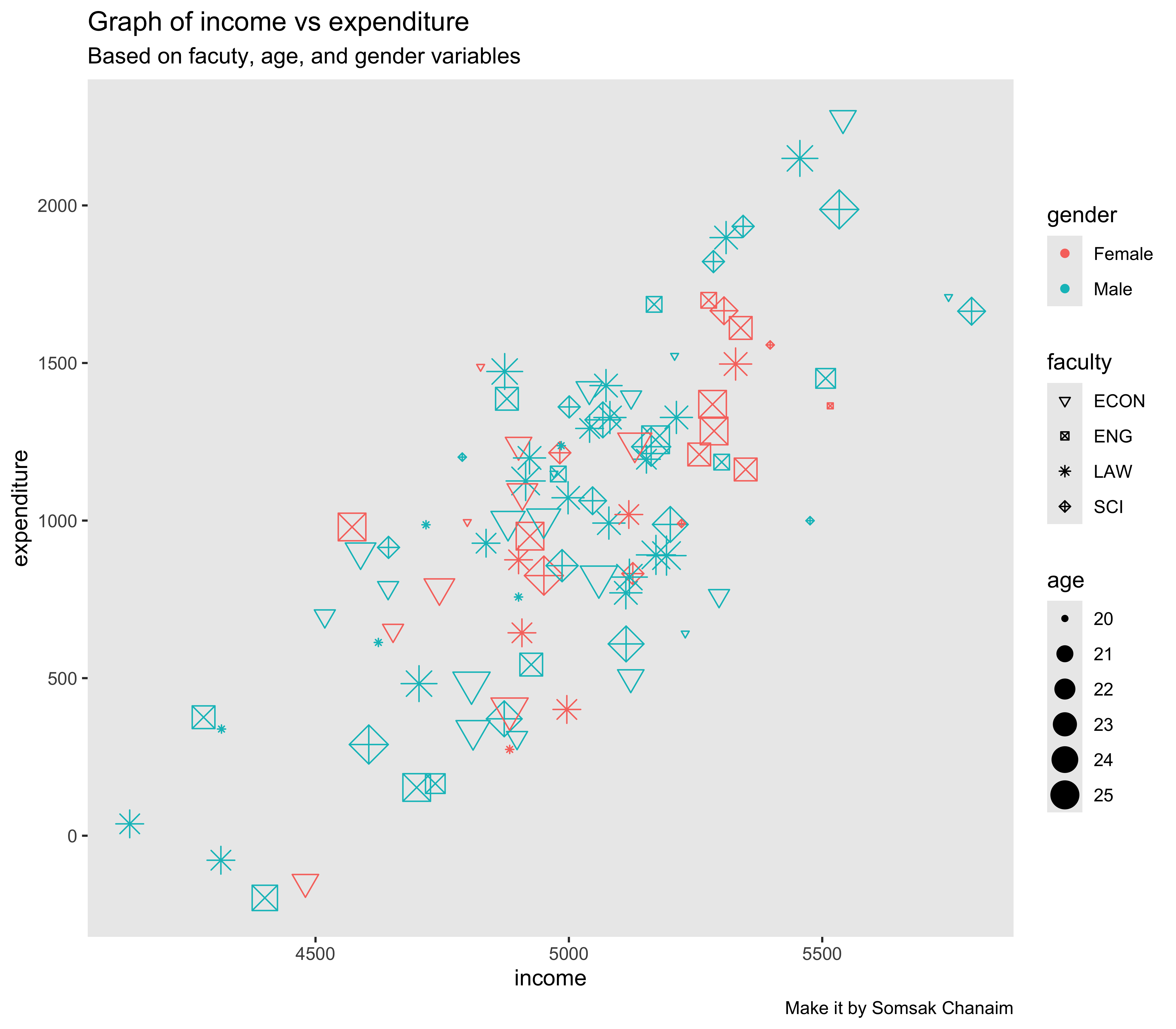
8.14 การแทรกข้อความ พื้นที่แรเงา เส้นตรงลงในกราฟ ด้วยคำสั่ง annotate( )
คำสั่ง annotation เป็นคำสั่งที่ไม่ขึ้นคำสั่ง aes( ) เป็นคำสั่งเสริมที่สามารถแทรก ข้อความ พื้นที่แรเงา หรือเส้นตรงลงไปในกราฟ ggplot2 ได้
ตัวอย่างกราฟ
P1 <- ggplot(data = mtcars) +
       aes(x = mpg, y = disp) +
       geom_point( )
P1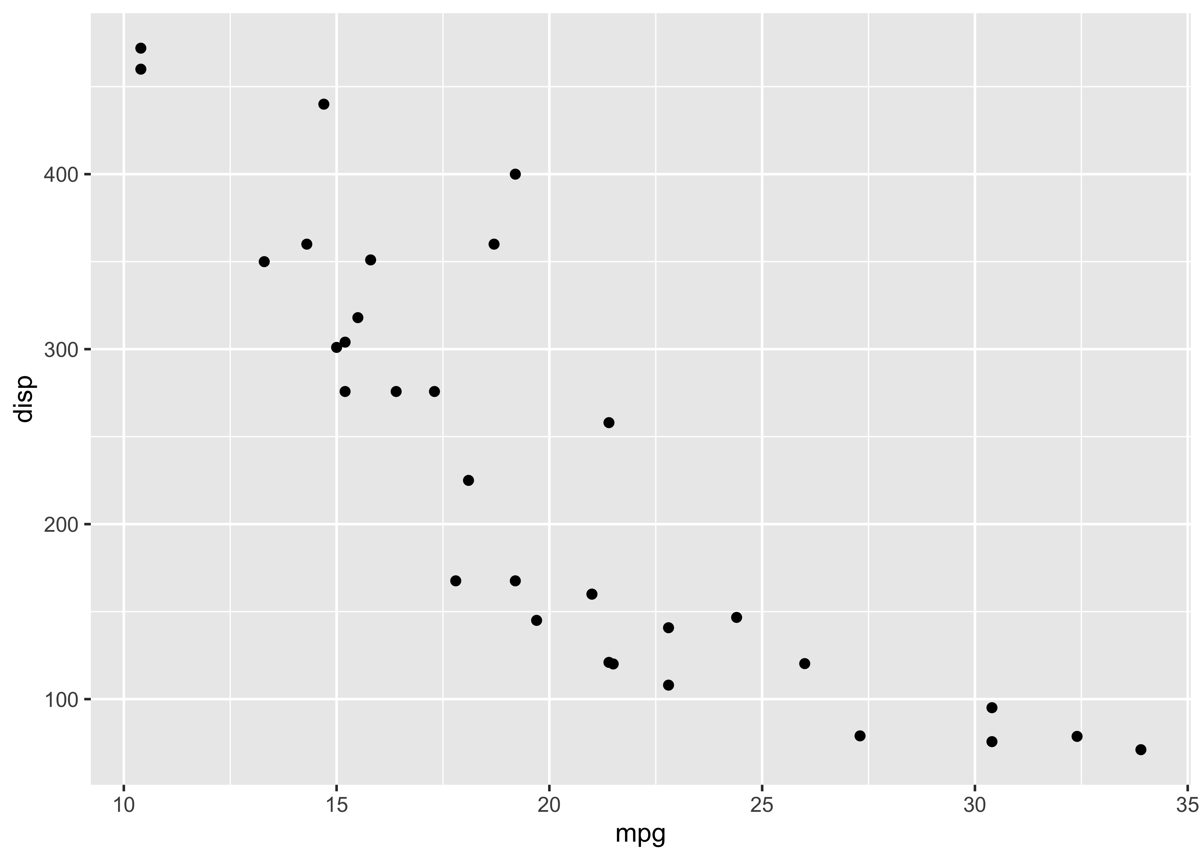
8.14.1 แทรกข้อความ
ถ้าต้องแทรกข้อความ 1 ข้อความด้วยคำว่า text และมีสีแดง ด้วยขนาดจ้อความเท่ากับ 20 จะต้องระบุพิกัด x และ พิกัด y ที่ต้องการในคำสั่ง annotation
P1 + annotate(geom = "text", label = "Text", x = 25, y = 400, color = "red", size = 20)
8.14.2 แทรกพื้นที่แรเงา
เป็นการแทรกพื้นที่แรเงา ด้วยรูปสี่เหลี่ยม ทำได้โดยการกำหนด พิกัด xmin, xmax, ymin, ymax เลือกสีที่ต้องการใส่ใน fill และกำหนดความโปรงแสงด้วยคำสั่ง alpha
P1+ annotate(geom = "rect",
             xmin = 20 , xmax = 30, ymin = 100, ymax = 400,
             fill = "blue", alpha = .3)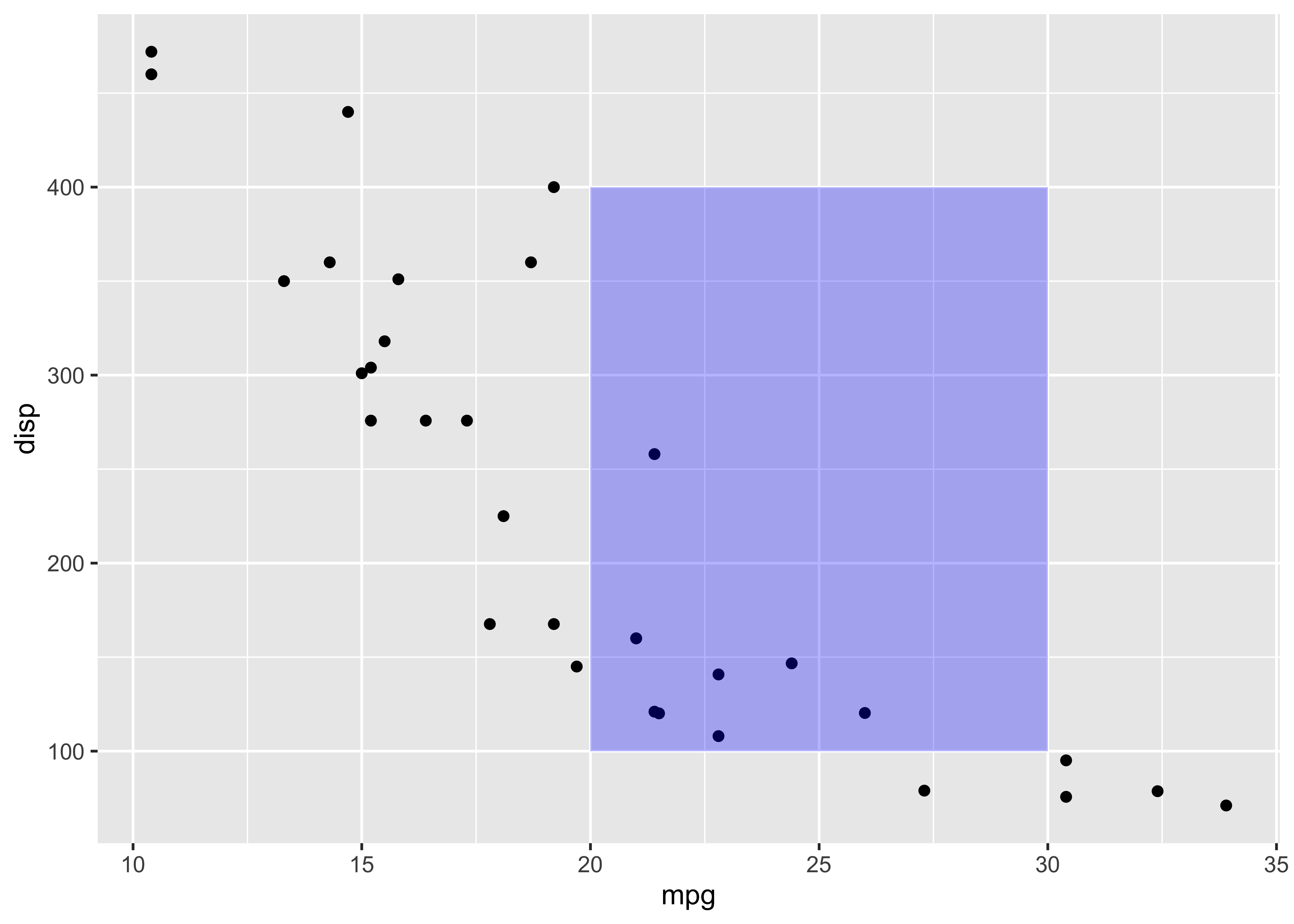
8.14.3 การแทรกเส้นตรง
เป็นการแทรกเส้นตรงลงในกราฟ โดยการกำหนด พิกัดเริ่มต้น x, y และพิกัดปลายทาง xend, yend กำหนดเส้นสีที่ต้องการด้วย color กำหนดขนาดของเส้นด้วย lwd รูปแบบของเส้นด้วย lty
P1+ annotate(geom = "segment",
                x = 12.5, y = 450, xend = 33, yend = 100,
             color = "blue", lwd = 2, lty = 2 )
8.15 การแสดงกราฟมากกว่า 1 รูปด้วยชุดคำสั่ง patchwork
ชุดคำสั่ง patchwork มีประโยชน์มาก สำหรับการแสดงผลกราฟ ที่มีหลายรูปแบบในภาพเดียว จากกราฟ ที่แสดงมาจาก ggplot2 เป็นการรวม วัตถุแบบ ggplot2 เป็นรูปแบบที่ต้องการ ซึ่งจะมีความแตกต่างกับ คำสั่ง facet_wrap( ) และ facet_grid( ) ที่จะแสดงผลของกราฟรูปแบบเดียวกัน แต่แยกออกมาตามตัวแปรที่ กำหนด
การติดตั้งชุคคำสั่ง patchwork
install.packages("patchwork")การเรียกใช้ชุดคำสั่ง patchwork ควรต้องเรียกชุดคำสั่ง ggplot2 ก่อนเสมอ
library(ggplot2)
library(patchwork)
สำหรับการแสดงผลกราฟหลายรูปด้วย patchwork ในเบื้องต้นในเครื่องเครื่องหมาย + และเครื่องการ / ก็เพียงพอ
เครื่องหมาย + คือการแสดงรูปในตำแหน่งแถว
เครื่องหมาย - คือการแสดงรูปในตำแหน่งหลัก
ตัวอย่าง
data("mtcars")

P1 <- ggplot(data = mtcars) +
       aes(x = mpg, y = disp) +
       geom_point( ) +
       labs(title = "The scatter plot: mpg vs disp")
P1
P2 <- ggplot(data = mtcars) +
       aes(x = as.character(cyl), y = mpg) +
       geom_boxplot( ) +
       labs(title = "The boxplot:  mpg~ cyl",
                x = "cyl")
P2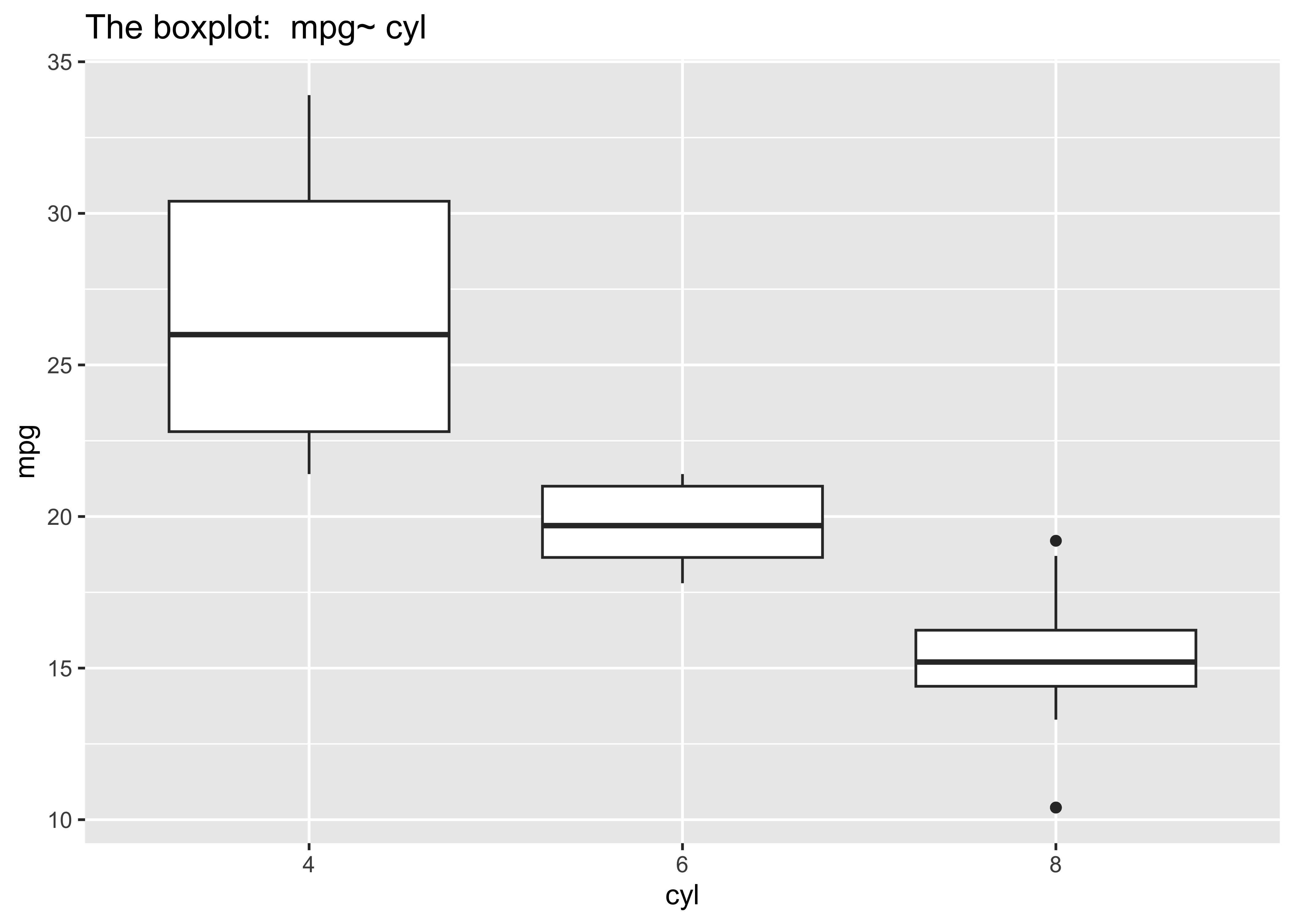
P3 <- ggplot(data = mtcars) +
       aes(x = mpg, y = hp, color = as.character(am), size = disp) +
       geom_point(alpha = .5) +
       labs(title = "The scatter plot: mpg vs hp",
            color = "am")
P3
P4 <- ggplot(mtcars) +
  aes(x = as.character(cyl), y = mpg, fill = as.character(gear)) +
  geom_boxplot( ) +
         labs(title = "The boxplot: mpg ~ hp + gear",
                  x = "cyl",
               fill = "gear")
P4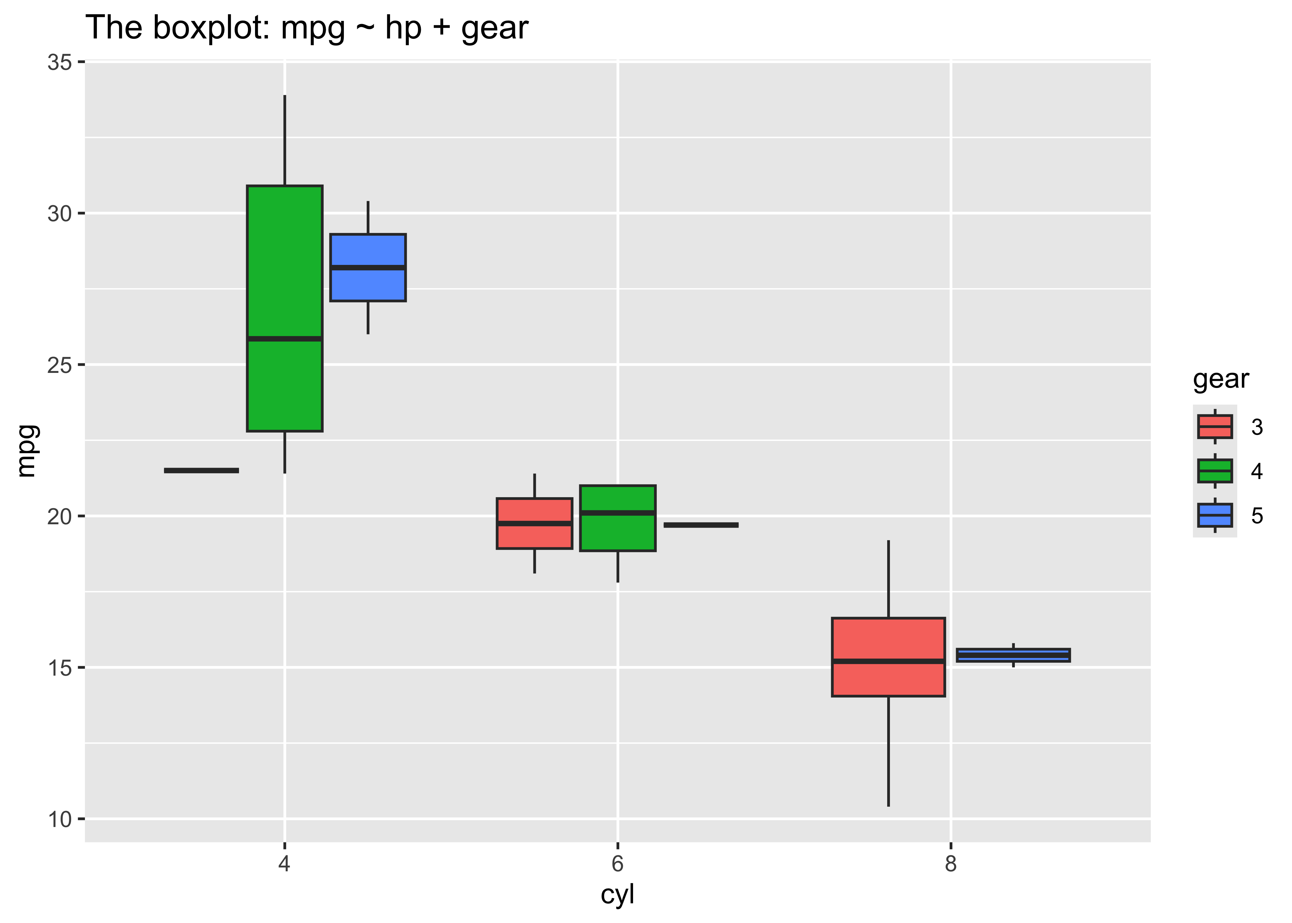
8.15.1 การใช้งาน patchwork
ถ้านำวัตถุ ggplot2 มาจากบวกกัน
P1+P2
ถ้านำวัตถุ ggplot2 มาจากหารกันจะได้
P3/P4
นำวัตถุ ggplot2 มาผสมกันด้วยเครื่องหมายบวก ลบ อาจจะมี เครื่องหมายวงเล็บด้วยก็ได้
(P1+P2)/P3P1+ (P3/P4)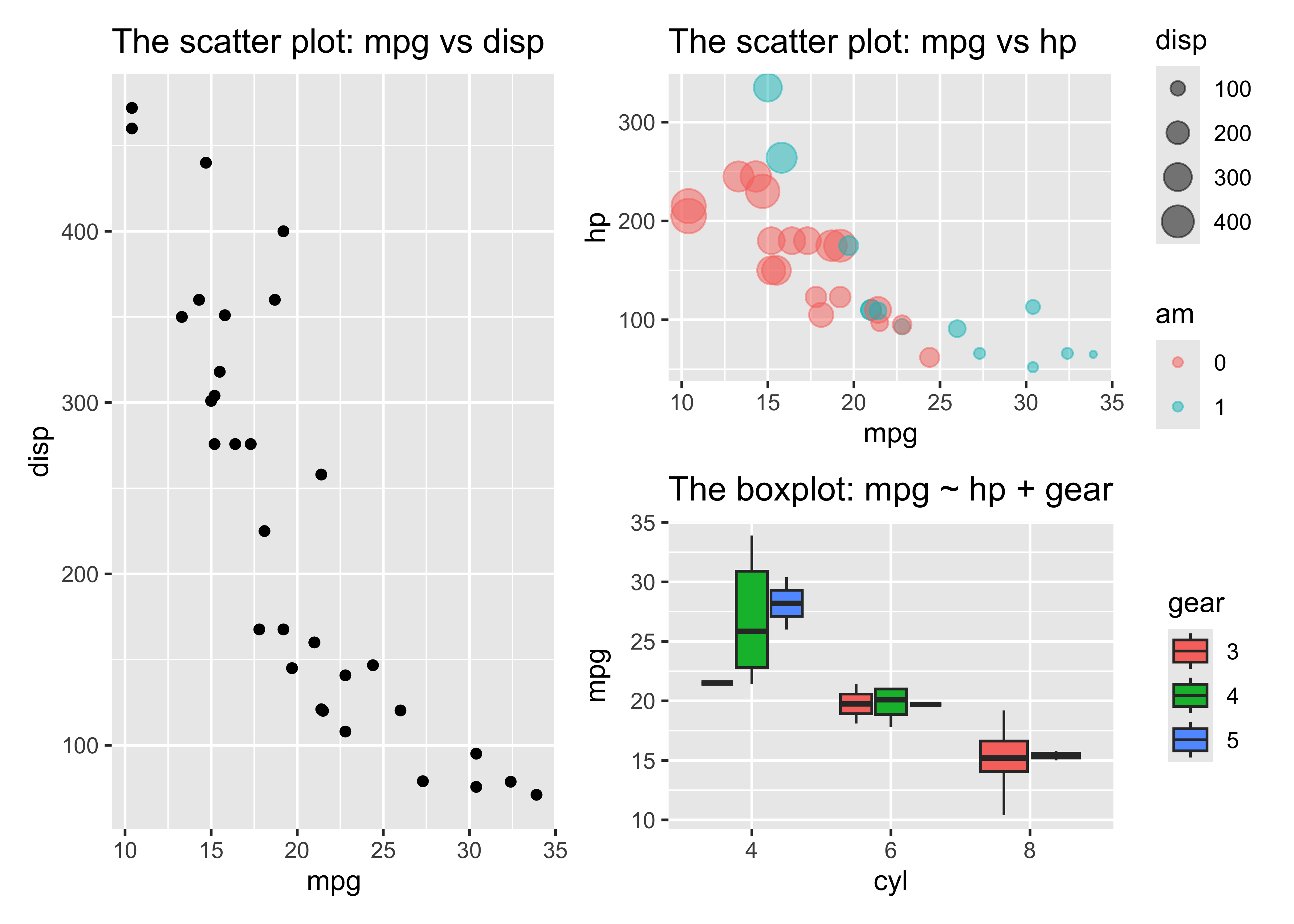
นี่เป็นแค่เพียงตัวอย่างหนึ่งของความสามารถของชุดคำสั่ง patchwork ผู้สามารถศึกษาเพิ่มเติมได้จาก คู่มือการใช้งาน Pedersen (2023) หรือเวบไซต์ https://patchwork.data-imaginist.com
เรายังสามารถสร้างกราฟด้วย ggplot2 ในรูปแบบกราฟอื่นๆ หรือชุดคำสั่งเสริมที่จะช่วยในการสร้างกราฟพิเศษได้อีกมากมาย โดยสามารถค้นหาได้จาก https://exts.ggplot2.tidyverse.org/gallery/
หนังสือเกี่ยวกับ ggplot2 มีมากมายหลายเล่ม เช่น Wickham (2016) หรือศึกษาจากเวบไซต์ต่างๆ หรือ ggplot2 โดยตรง เช่น https://ggplot2.tidyverse.org