Code
## R code 4.7 not executed! #######################
# library(rethinking)
# data(Howell1)
# d_a <- Howell1Learning Objectives:
“This chapter introduces linear regression as a Bayesian procedure. Under a probability interpretation, which is necessary for Bayesian work, linear regression uses a Gaussian (normal) distribution to describe our golem’s uncertainty about some measurement of interest.” (McElreath, 2020, p. 71) (pdf)
Why are there so many distribution approximately normal, resulting in a Gaussian curve? Because there will be more combinations of outcomes that sum up to a “central” value, rather than to some extreme value.
Why are normal distributions normal?
“Any process that adds together random values from the same distribution converges to a normal.” (McElreath, 2020, p. 73) (pdf)
“Whatever the average value of the source distribution, each sample from it can be thought of as a fluctuation from that average value. When we begin to add these fluctuations together, they also begin to cancel one another out. A large positive fluctuation will cancel a large negative one. The more terms in the sum, the more chances for each fluctuation to be canceled by another, or by a series of smaller ones in the opposite direction. So eventually the most likely sum, in the sense that there are the most ways to realize it, will be a sum in which every fluctuation is canceled by another, a sum of zero (relative to the mean).” (McElreath, 2020, p. 73) (pdf)
“It doesn’t matter what shape the underlying distribution possesses. It could be uniform, like in our example above, or it could be (nearly) anything else. Depending upon the underlying distribution, the convergence might be slow, but it will be inevitable. Often, as in this example, convergence is rapid.” (McElreath, 2020, p. 74) (pdf)
Resources: Why normal distributions?
See the excellent article Why is normal distribution so ubiquitous? which also explains the example of random walks from SR2. See also the scientific paper Why are normal distribution normal? of the The British Journal for the Philosophy of Science.
This is not only valid for addition but also for multiplication of small values: Multiplying small numbers is approximately the same as addition.
But even the multiplication of large values tend to produce Gaussian distributions on the log scale.
The justifications for using the Gaussian distribution fall into two broad categories:
WATCH OUT! Many processes have heavier tails than the Gaussian distribution
“… the Gaussian distribution has some very thin tails—there is very little probability in them. Instead most of the mass in the Gaussian lies within one standard deviation of the mean. Many natural (and unnatural) processes have much heavier tails.” (McElreath, 2020, p. 76) (pdf)
Definition 4.1 : Probability mass and probability density
Probability distributions with only discrete outcomes, like the binomial, are called probability mass functions and denoted Pr.
Continuous ones like the Gaussian are called probability density functions, denoted with \(p\) or just plain old \(f\), depending upon author and tradition.
“Probability density is the rate of change in cumulative probability. So where cumulative probability is increasing rapidly, density can easily exceed 1. But if we calculate the area under the density function, it will never exceed 1. Such areas are also called probability mass.” (McElreath, 2020, p. 76) (pdf)
For example dnorm(0,0,0.1) which is the way to make R calculate \(p(0 \mid 0, 0.1)\) results to 3.9894228.
“The Gaussian distribution is routinely seen without σ but with another parameter, \(\tau\) . The parameter \(\tau\) in this context is usually called precision and defined as \(\tau = 1/σ^2\). When \(\sigma\) is large, \(\tau\) is small.” (McElreath, 2020, p. 76) (pdf)
“This form is common in Bayesian data analysis, and Bayesian model fitting software, such as BUGS or JAGS, sometimes requires using \(\tau\) rather than \(\sigma\).” (McElreath, 2020, p. 76) (pdf)
Procedure 4.1 : General receipt for describing models
Definition 4.2 : What are statistical models?
Models are “mappings of one set of variables through a probability distribution onto another set of variables.” (McElreath, 2020, p. 77) (pdf)
Example 4.1 : Describe the globe tossing model from Chapter 3
\[ \begin{align*} W \sim \operatorname{Binomial}(N, p) \space \space (1)\\ p \sim \operatorname{Uniform}(0, 1) \space \space (2) \end{align*} \tag{4.1}\]
W: observed count of waterN: total number of tossesp: proportion of water on the globeThe first line in these kind of models always defines the likelihood function used in Bayes’ theorem. The other lines define priors.
Read the above statement as:
N and probability p.p is assumed to be uniform between zero and one.Both of the lines in the model of Equation 4.1 are stochastic, as indicated by the ~ symbol. A stochastic relationship is just a mapping of a variable or parameter onto a distribution. It is stochastic because no single instance of the variable on the left is known with certainty. Instead, the mapping is probabilistic: Some values are more plausible than others, but very many different values are plausible under any model. Later, we’ll have models with deterministic definitions in them.
In this section we want a single measurement variable to model as a Gaussian distribution. It is a preparation for the linear regression model in Section 4.4 where we will construct and add a predictor variable to the model.
“There will be two parameters describing the distribution’s shape, the mean
μand the standard deviationσ. Bayesian updating will allow us to consider every possible combination of values for μ and σ and to score each combination by its relativ // plausibility, in light of the data. These relative plausibilities are the posterior probabilities of each combination of values μ, σ.” (McElreath, 2020, p. 78/79) (pdf)
Resource: Nancy Howell data
The data contained in data(Howell1) are partial census data for the Dobe area !Kung San, compiled from interviews conducted by Nancy Howell in the late 1960s.
Much more raw data is available for download from the University of Toronto Library
“For the non-anthropologists reading along, the !Kung San are the most famous foraging population of the twentieth century, largely because of detailed quantitative studies by people like Howell.” (McElreath, 2020, p. 79) (pdf)
WATCH OUT! Loading data without attaching the package with library()
Loading data from a package with the data() function is only possible if you have already loaded the package.
R Code 4.1 : Data loading from a package – Standard procedure
## R code 4.7 not executed! #######################
# library(rethinking)
# data(Howell1)
# d_a <- Howell1The standard loading of data from packages with
`library(rethinking)`
`data(Howell1)`
is in this book not executed: I want to prevent clashes with loading {rethinking} and {brms} at the same time, because of their similar functions.
Because of many function name conflicts with {brms} I do not want to load {rethinking} and will call the function of these conflicted packages with <package name>::<function name>() Therefore I have to use another, not so usual loading strategy of the data set.
R Code 4.2 a: Data loading from a package – Unusual procedure (Original)
The advantage of this unusual strategy is that I have not always to detach the {rethinking} package and to make sure {rethinking} is detached before using {brms} as it is necessary in the Kurz’s {tidyverse} / {brms} version.
Because of many function name conflicts with {brms} I do not want to load {rethinking} and will call the function of these conflicted packages with <package name>::<function name>() Therefore I have to use another, not so usual loading strategy of the data set.
R Code 4.3 b: Data loading from a package – Unusual procedure (Tidyverse)
The advantage of this unusual strategy is that I have not always to detach the {rethinking} package and to make sure {rethinking} is detached before using {brms} as it is necessary in the Kurz’s {tidyverse} / {brms} version.
Example 4.2 : Show and inspect the data
R Code 4.4 a: Compactly Display the Structure of an Arbitrary R Object (Original)
## R code 4.8 ####################
str(d_a)
#> 'data.frame': 544 obs. of 4 variables:
#> $ height: num 152 140 137 157 145 ...
#> $ weight: num 47.8 36.5 31.9 53 41.3 ...
#> $ age : num 63 63 65 41 51 35 32 27 19 54 ...
#> $ male : int 1 0 0 1 0 1 0 1 0 1 ...utils::str() displays compactly the internal structure of any reasonable R object.
Our Howell1 data contains four columns. Each column has 544 entries, so there are 544 individuals in these data. Each individual has a recorded height (centimeters), weight (kilograms), age (years), and “maleness” (0 indicating female and 1 indicating male).
R Code 4.5 a: Displays concise parameter estimate information for an existing model fit (Original)
## R code 4.9 ###################
rethinking::precis(d_a)
#> mean sd 5.5% 94.5% histogram
#> height 138.2635963 27.6024476 81.108550 165.73500 ▁▁▁▁▁▁▁▂▁▇▇▅▁
#> weight 35.6106176 14.7191782 9.360721 54.50289 ▁▂▃▂▂▂▂▅▇▇▃▂▁
#> age 29.3443934 20.7468882 1.000000 66.13500 ▇▅▅▃▅▂▂▁▁
#> male 0.4724265 0.4996986 0.000000 1.00000 ▇▁▁▁▁▁▁▁▁▇rethinking::precis() creates a table of estimates and standard errors, with optional confidence intervals and parameter correlations.
In this case we see the mean, the standard deviation, the width of a 89% posterior interval and a small histogram of four variables: height (centimeters), weight (kilograms), age (years), and “maleness” (0 indicating female and 1 indicating male).
Additionally there is also a console output. In our case: 'data.frame': 544 obs. of 4 variables: .
R Code 4.6 b: Get a glimpse of your data (Tidyverse)
d_b |>
    dplyr::glimpse()
#> Rows: 544
#> Columns: 4
#> $ height <dbl> 151.7650, 139.7000, 136.5250, 156.8450, 145.4150, 163.8300, 149…
#> $ weight <dbl> 47.82561, 36.48581, 31.86484, 53.04191, 41.27687, 62.99259, 38.…
#> $ age <dbl> 63.0, 63.0, 65.0, 41.0, 51.0, 35.0, 32.0, 27.0, 19.0, 54.0, 47.…
#> $ male <int> 1, 0, 0, 1, 0, 1, 0, 1, 0, 1, 0, 1, 0, 0, 0, 1, 1, 0, 1, 0, 0, …pillar::glimpse() is re-exported by {dplyr} and is the tidyverse analogue for str(). It works like a transposed version of print(): columns run down the page, and data runs across.
dplyr::glimpse() shows that the Howell1 data contains four columns. Each column has 544 entries, so there are 544 individuals in these data. Each individual has a recorded height (centimeters), weight (kilograms), age (years), and “maleness” (0 indicating female and 1 indicating male).
R Code 4.7 : Object summaries (Tidyverse)
d_b |>
    base::summary()
#> height weight age male
#> Min. : 53.98 Min. : 4.252 Min. : 0.00 Min. :0.0000
#> 1st Qu.:125.09 1st Qu.:22.008 1st Qu.:12.00 1st Qu.:0.0000
#> Median :148.59 Median :40.058 Median :27.00 Median :0.0000
#> Mean :138.26 Mean :35.611 Mean :29.34 Mean :0.4724
#> 3rd Qu.:157.48 3rd Qu.:47.209 3rd Qu.:43.00 3rd Qu.:1.0000
#> Max. :179.07 Max. :62.993 Max. :88.00 Max. :1.0000Kurz tells us that the {brms} package does not have a function that works like rethinking::precis() for providing numeric and graphical summaries of variables, as seen in R Code 4.5 Kurz suggests therefore to use base::summary() to get some of the information from rethinking::precis().
R Code 4.8 b: Skim a data frame, getting useful summary statistics
I think skimr::skim() is a better option as an alternative to rethinking::precis() as base::summary() because it also has a graphical summary of the variables. {skimr} has many other useful functions and is very adaptable. I propose to install and to try it out.
d_b |>
skimr::skim() | Name | d_b |
| Number of rows | 544 |
| Number of columns | 4 |
| _______________________ | |
| Column type frequency: | |
| numeric | 4 |
| ________________________ | |
| Group variables | None |
Variable type: numeric
| skim_variable | n_missing | complete_rate | mean | sd | p0 | p25 | p50 | p75 | p100 | hist |
|---|---|---|---|---|---|---|---|---|---|---|
| height | 0 | 1 | 138.26 | 27.60 | 53.98 | 125.10 | 148.59 | 157.48 | 179.07 | ▁▂▂▇▇ |
| weight | 0 | 1 | 35.61 | 14.72 | 4.25 | 22.01 | 40.06 | 47.21 | 62.99 | ▃▂▃▇▂ |
| age | 0 | 1 | 29.34 | 20.75 | 0.00 | 12.00 | 27.00 | 43.00 | 88.00 | ▇▆▅▂▁ |
| male | 0 | 1 | 0.47 | 0.50 | 0.00 | 0.00 | 0.00 | 1.00 | 1.00 | ▇▁▁▁▇ |
R Code 4.9 : Show a random number of data records
set.seed(4)
d_b |>
  dplyr::slice_sample(n = 6)
#> # A tibble: 6 × 4
#> height weight age male
#> <dbl> <dbl> <dbl> <int>
#> 1 124. 21.5 11 1
#> 2 130. 24.6 13 1
#> 3 83.8 9.21 1 0
#> 4 131. 25.3 15 0
#> 5 112. 17.8 8.90 1
#> 6 162. 51.6 36 1R Code 4.10 b: Randomly select a small number of observations and put it into knitr::kable()
set.seed(4)
d_b |>
bayr::as_tbl_obs() | Obs | height | weight | age | male |
|---|---|---|---|---|
| 62 | 164.4650 | 45.897841 | 50.0 | 1 |
| 71 | 129.5400 | 24.550667 | 13.0 | 1 |
| 130 | 149.2250 | 42.155707 | 27.0 | 0 |
| 307 | 130.6068 | 25.259404 | 15.0 | 0 |
| 312 | 111.7600 | 17.831836 | 8.9 | 1 |
| 371 | 83.8200 | 9.213587 | 1.0 | 0 |
| 414 | 161.9250 | 51.596090 | 36.0 | 1 |
| 504 | 123.8250 | 21.545620 | 11.0 | 1 |
I just learned another method to print variables from a data frame. In base R there is utils::head() and utils::tail() with the disadvantage that the start resp. the end of data file could be atypical for the variable values. The standard tibble printing method has the same problem. In contrast bayr::as_tbl_obs() prints a random selection of maximal 8 rows as a compact and nice output, that works on both, console and {knitr} output.
Although bayr::as_tbl_obs() does not give a data summary as discussed here in Example 4.2 but I wanted mention this printing method as I have always looked for an easy way to display a representative sample of some values of data frame.
R Code 4.11 b: Show data with the internal printing method of tibbles
print(d_b, n = 10)#> # A tibble: 544 × 4
#> height weight age male
#> <dbl> <dbl> <dbl> <int>
#> 1 152. 47.8 63 1
#> 2 140. 36.5 63 0
#> 3 137. 31.9 65 0
#> 4 157. 53.0 41 1
#> 5 145. 41.3 51 0
#> 6 164. 63.0 35 1
#> 7 149. 38.2 32 0
#> 8 169. 55.5 27 1
#> 9 148. 34.9 19 0
#> 10 165. 54.5 54 1
#> # ℹ 534 more rowsAnother possibility is to use the tbl_df internal printing method, one of the main features of tibbles. Printing can be tweaked for a one-off call by calling print() explicitly and setting arguments like \(n\) and \(width\). More persistent control is available by setting the options described in pillar::pillar_options.
Again this printing method does not give a data summary as is featured in Example 4.2. But it is an easy method – especially as you are already working with tibbles – and sometimes this method is enough to get a sense of the data.
“All we want for now are heights of adults in the sample. The reason to filter out nonadults for now is that height is strongly correlated with age, before adulthood.” (McElreath, 2020, p. 80) (pdf)
Example 4.3 : Select the height data of adults (individuals older or equal than 18 years)
R Code 4.12 a: Select individuals older or equal than 18 years (Original)
## R code 4.11a ###################
d2_a <- d_a[d_a$age >= 18, ]
str(d2_a)
#> 'data.frame': 352 obs. of 4 variables:
#> $ height: num 152 140 137 157 145 ...
#> $ weight: num 47.8 36.5 31.9 53 41.3 ...
#> $ age : num 63 63 65 41 51 35 32 27 19 54 ...
#> $ male : int 1 0 0 1 0 1 0 1 0 1 ...R Code 4.13 b: Select individuals older or equal than 18 years (Tidyverse)
#> Rows: 352
#> Columns: 4
#> $ height <dbl> 151.7650, 139.7000, 136.5250, 156.8450, 145.4150, 163.8300, 149…
#> $ weight <dbl> 47.82561, 36.48581, 31.86484, 53.04191, 41.27687, 62.99259, 38.…
#> $ age    <dbl> 63.0, 63.0, 65.0, 41.0, 51.0, 35.0, 32.0, 27.0, 19.0, 54.0, 47.…
#> $ male <int> 1, 0, 0, 1, 0, 1, 0, 1, 0, 1, 0, 1, 0, 0, 0, 1, 1, 0, 1, 0, 1, …Our goal is to model the data using a Gaussian distribution.
Example 4.4 : Plotting the distribution of height
R Code 4.14 a: Plot the distribution of the heights of adults, overlaid by an ideal Gaussian distribution (Original)
rethinking::dens(d2_a$height, adj = 1, norm.comp = TRUE)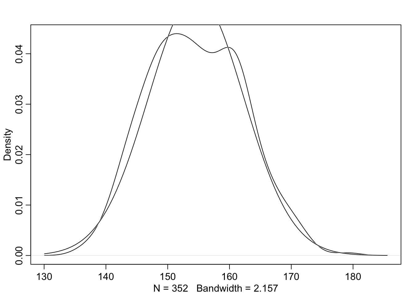
With the option norm.comp = TRUE I have overlaid a Gaussian distribution to see the differences to the actual data. There are some differences locally, especially on the peak of the distribution. But the tails looks nice and we can say that the overall impression of the curve is Gaussian.
R Code 4.15 b: Plot the distribution of the heights of adults, overlaid by an ideal Gaussian distribution (Tidyverse)
d2_b |>
    ggplot2::ggplot(ggplot2::aes(height)) +
    ggplot2::geom_density() +

    ggplot2::stat_function(
        fun = dnorm,
        args = with(d2_b, c(mean = mean(height), sd = sd(height)))
        ) +
    ggplot2::labs(
      x = "Height in cm",
      y = "Density"
    ) +
    ggplot2::theme_bw()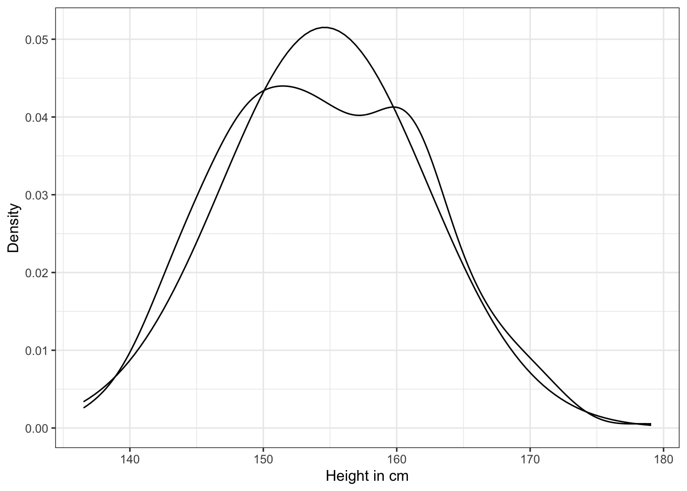
The plot of the heights distribution compared with the standard Gaussian distribution is missing in Kurz’s version. I added this plot after an internet research by using the last example of How to Plot a Normal Distribution in R. It uses the ggplot2::stat_function() to compute and draw a function as a continuous curve. This makes it easy to superimpose a function on top of an existing plot.
WATCH OUT! Looking at the raw data is not enough for a model decision
“Gawking at the raw data, to try to decide how to model them, is usually not a good idea. The data could be a mixture of different Gaussian distributions, for example, and in that case you won’t be able to detect the underlying normality just by eyeballing the outcome distribution.” (McElreath, 2020, p. 81) (pdf)
Theorem 4.1 : Define the heights as normally distributed with a mean \(\mu\) and standard deviation \(\sigma\)
\[ h_{i} \sim \operatorname{Normal}(σ, μ) \tag{4.2}\]
d2_a$height). As such, the model above is saying that all the golem knows about each height measurement is defined by the same normal distribution, with mean \(\mu\) and standard deviation \(\sigma\).Equation 4.2 assumes that the values \(h_{i}\) are i.i.d. (independent and identically distributed)
“The i.i.d. assumption doesn’t have to seem awkward, as long as you remember that probability is inside the golem, not outside in the world. The i.i.d. assumption is about how the golem represents its uncertainty. It is an epistemological assumption. It is not a physical assumption about the world, an ontological one. E. T. Jaynes (1922–1998) called this the mind projection fallacy, the mistake of confusing epistemological claims with ontological claims.” (McElreath, 2020, p. 81) (pdf)
“To complete the model, we’re going to need some priors. The parameters to be estimated are both \(\mu\) and \(\sigma\), so we need a prior \(Pr(\mu, \sigma)\), the joint prior probability for all parameters. In most cases, priors are specified independently for each parameter, which amounts to assuming \(Pr(\mu, \sigma) = Pr(\mu)Pr(\sigma)\).” (McElreath, 2020, p. 82) (pdf)
Theorem 4.2 : Define the linear heights model
\[ \begin{align*} h_{i} \sim \operatorname{Normal}(\mu, \sigma) \space \space (1) \\ \mu \sim \operatorname{Normal}(178, 20) \space \space (2) \\ \sigma \sim \operatorname{Uniform}(0, 50) \space \space (3) \end{align*} \tag{4.3}\]
Let’s think about the chosen value for the priors more in detail:
1. Choosing the mean prior
\[ \begin{align} \Pr(\mu-1\sigma \le X \le \mu+1\sigma) & \approx 68.27\% \\ \Pr(\mu-2\sigma \le X \le \mu+2\sigma) & \approx 95.45\% \\ \Pr(\mu-3\sigma \le X \le \mu+3\sigma) & \approx 99.73\% \end{align} \]
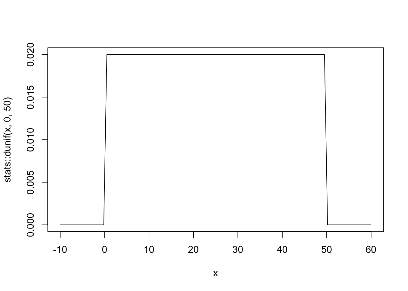
2. Choosing the sigma prior
Plot the chosen priors!
It is important to plot the priors to get an idea about the assumptions they build into your model.
Example 4.5 : Numbered Example Title
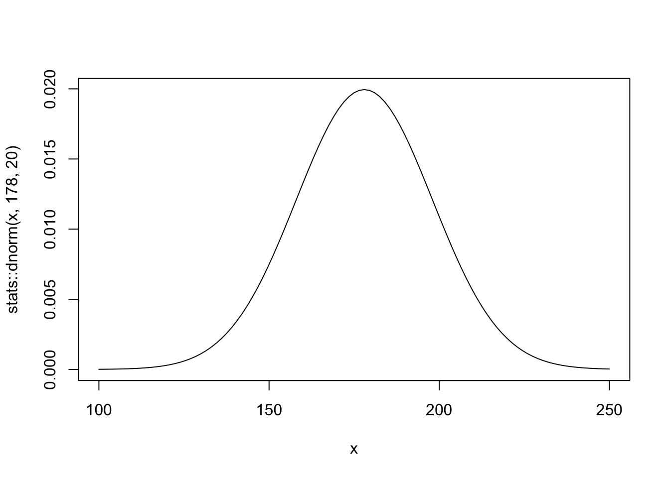
R Code 4.16 a: Plot the chosen mean prior (Original)
You can see that the golem is assuming that the average height (not each individual height) is almost certainly between 140 cm and 220 cm. So this prior carries a little information, but not a lot.
b: Plot the chosen mean prior (Tidyverse)
tibble::tibble(x = base::seq(from = 100, to = 250, by = .1)) |>

  ggplot2::ggplot(ggplot2::aes(x = x, y = stats::dnorm(x, mean = 178, sd = 20))) +
  ggplot2::geom_line() +
  ggplot2::scale_x_continuous(breaks = base::seq(from = 100, to = 250, by = 25)) +
  ggplot2::labs(title = "mu ~ dnorm(178, 20)",
       y = "density") +
  ggplot2::theme_bw()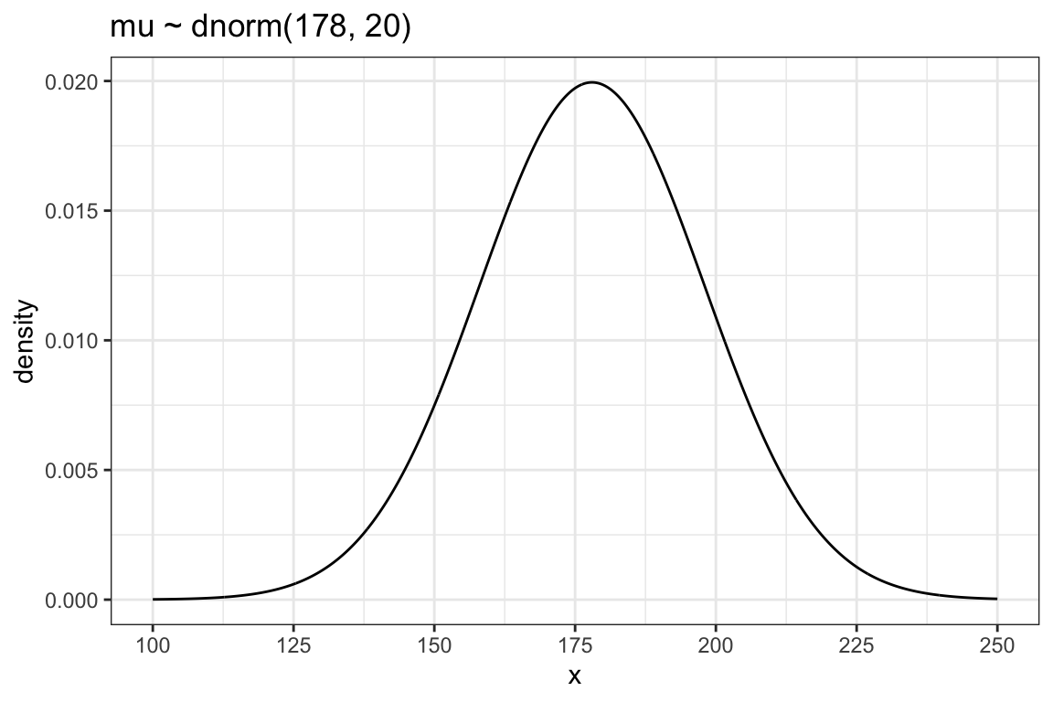
As there is only one variable \(y\) (= dnorm(x, mean = 178, sd = 20)) we need to specify \(x\) as a sequence of 1501 points to provide a \(x\) and \(y\) aesthetic for the plot.
b: Plot the chosen prior for the standard deviation (Tidyverse)
tibble::tibble(x = base::seq(from = -10, to = 60, by = .1)) |>

  ggplot2::ggplot(ggplot2::aes(x = x, y = stats::dunif(x, min = 0, max = 50))) +
  ggplot2::geom_line() +
  ggplot2::scale_x_continuous(breaks = c(0, 50)) +
  ggplot2::scale_y_continuous(NULL, breaks = NULL) +
  ggplot2::ggtitle("sigma ~ dunif(0, 50)") +
  ggplot2::theme_bw()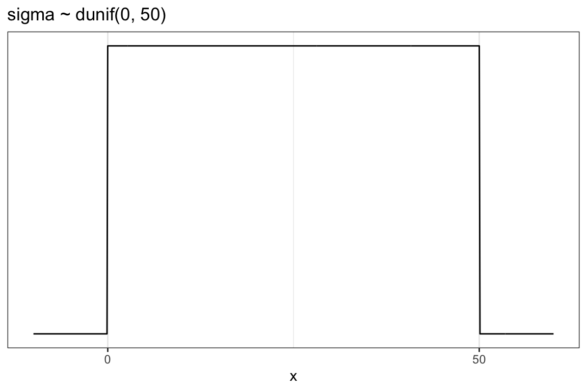
We don’t really need the \(y\)-axis when looking at the shapes of a density, so we’ll just remove it with scale_y_continuous(NULL, breaks = NULL).
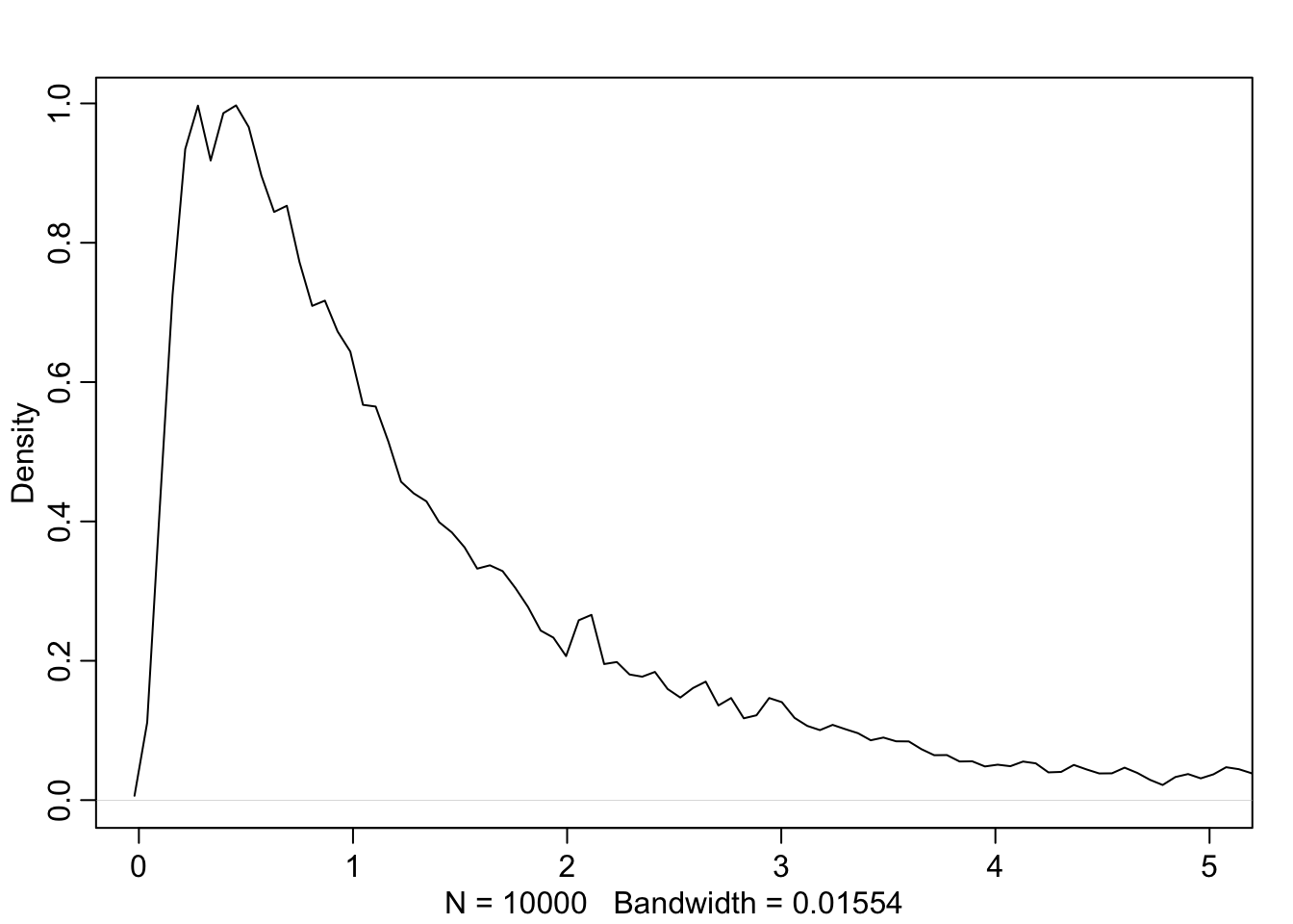
Simulate the prior predictive distribution!
“Prior predictive simulation is very useful for assigning sensible priors, because it can be quite hard to anticipate how priors influence the observable variables.” (McElreath, 2020, p. 83) (pdf)
To see the difference we will look at two prior predictive distributions:
“Okay, so how to do this? You can quickly simulate heights by sampling from the prior, like you sampled from the posterior back in Chapter 3. Remember, every posterior is also potentially a prior for a subsequent analysis, so you can process priors just like posteriors.” (McElreath, 2020, p. 82) (pdf)
Example 4.6 : Prior Predictive Simulation
R Code 4.18 a: Simulate heights by sampling from the priors with \(\mu \sim Normal(178, 20)\) (Original)
N_sim_height_a <- 1e4
set.seed(4) # to make example reproducible

## R code 4.14a adapted #######################################
sample_mu_a <- rnorm(N_sim_height_a, 178, 20)
sample_sigma_a <- runif(N_sim_height_a, 0, 50)
priors_height_a <- rnorm(N_sim_height_a, sample_mu_a, sample_sigma_a)
rethinking::dens(priors_height_a,
                 adj = 1,
                 norm.comp = TRUE,
                 show.zero = TRUE,
                 col = "red")
graphics::abline(v = 272, lty = 2)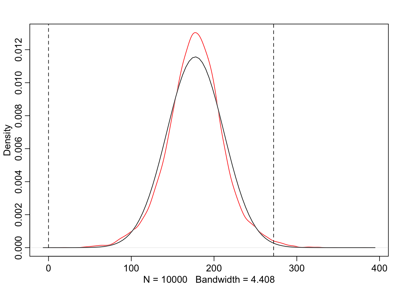
The prior predictive simulation generates a plausible distribution; There are no values negative (left dashed vertical line at 0) and one of the tallest people in recorded history, Robert Pershing Wadlow (1918–1940) with 272 cm (right dashed vertical line) has only a small probability.
The prior probability distribution of height is not itself Gaussian because it is approaching the mean too thin and to high, respectively its tails are too thick. But this is ok.
“The distribution you see is not an empirical expectation, but rather the distribution of relative plausibilities of different heights, before seeing the data.” (McElreath, 2020, p. 83) (pdf)
R Code 4.19 a: Simulate heights by sampling from the priors with \(\mu \sim Normal(178, 100)\) (Original)
N_sim_height_a <- 1e4
set.seed(4) # to make example reproducible

## R code 4.14a adapted #######################################
sample_mu2_a <- rnorm(N_sim_height_a, 178, 100)
sample_sigma2_a <- runif(N_sim_height_a, 0, 50)
priors_height2_a <- rnorm(N_sim_height_a, sample_mu2_a, sample_sigma2_a)
rethinking::dens(priors_height2_a,
                 adj = 1,
                 norm.comp = TRUE,
                 show.zero = TRUE,
                 col = "red")
graphics::abline(v = 272, lty = 2)
The results of Graph 4.8 contradicts our scientific knowledge — but also our common sense — about possible height values of humans. Now the model, before seeing the data, expects people to have negative height. It also expects some giants. One of the tallest people in recorded history, Robert Pershing Wadlow (1918–1940) stood 272 cm tall. In our prior predictive simulation many people are taller than this.
“Does this matter? In this case, we have so much data that the silly prior is harmless. But that won’t always be the case. There are plenty of inference problems for which the data alone are not sufficient, no matter how numerous. Bayes lets us proceed in these cases. But only if we use our scientific knowledge to construct sensible priors. Using scientific knowledge to build priors is not cheating. The important thing is that your prior not be based on the values in the data, but only on what you know about the data before you see it.” (McElreath, 2020, p. 84) (pdf)
R Code 4.20 b: Simulate heights by sampling from the priors with \(\mu \sim Normal(178, 20)\) (Tidyverse)
N_sim_height_b <- 1e4
set.seed(4) # to make example reproducible

## R code 4.14b #######################################

sim_height_b <-
  tibble::tibble(sample_mu_b = stats::rnorm(N_sim_height_b, mean = 178, sd  = 20),
                 sample_sigma_b = stats::runif(N_sim_height_b, min = 0, max = 50)) |>
  dplyr::mutate(priors_height_b = stats::rnorm(N_sim_height_b,
                                               mean = sample_mu_b,
                                               sd = sample_sigma_b))

sim_height_b |>
  ggplot2::ggplot(ggplot2::aes(x = priors_height_b)) +
  ggplot2::geom_density(color = "red") +
  ggplot2::stat_function(
        fun = dnorm,
        args = with(sim_height_b, c(mean = mean(priors_height_b), sd = sd(priors_height_b)))
        ) +
  ggplot2::geom_vline(xintercept = c(0, 272), linetype = "dashed") +
  ggplot2::ggtitle("height ~ dnorm(178, 20)") +
  ggplot2::labs(x = "Height in cm", y = "Density") +
  ggplot2::theme_bw()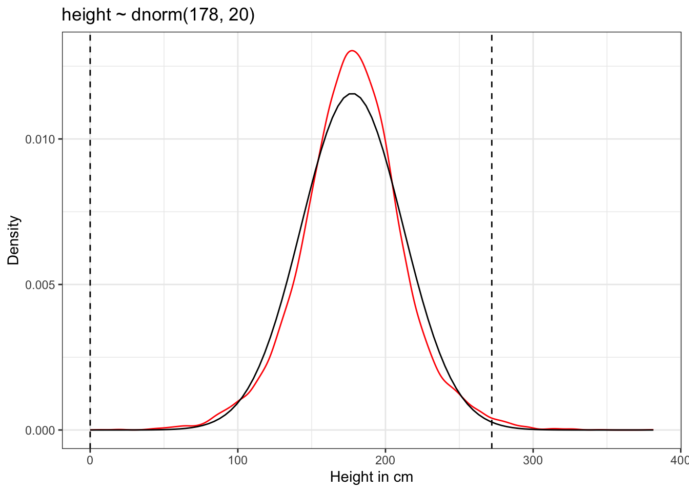
ggplot2::geom_density() computes and draws kernel density estimates, which is a smoothed version of the histogram. Note that there is no data mentioned explicitly in the call of ggplot2::geom_density(). When this is the case (data = NULL) then the data will be inherited from the plot data as specified in the call to ggplot2::ggplot(). Otherwise the function needs a data frame or a function with a single argument to override the plot data. (geom_density() help file).
The prior predictive simulation generates a plausible distribution; There are no values negative (left dashed vertical line at 0) and one of the tallest people in recorded history, Robert Pershing Wadlow (1918–1940) with 272 cm (right dashed vertical line) has only a small probability.
The prior probability distribution of height is not itself Gaussian because it is approaching the mean too thin and to high, respectively its tails are too thick. But this is ok.
“The distribution you see is not an empirical expectation, but rather the distribution of relative plausibilities of different heights, before seeing the data.” (McElreath, 2020, p. 83) (pdf)
R Code 4.21 b: Simulate heights by sampling from the priors with \(\mu \sim Normal(178, 100)\) (Tidyverse)
N_sim_height_b <- 1e4
set.seed(4) # to make example reproducible

## R code 4.14b #######################################

sim_height2_b <-
  tibble::tibble(sample_mu2_b = stats::rnorm(N_sim_height_b, mean = 178, sd  = 100),
                 sample_sigma2_b = stats::runif(N_sim_height_b, min = 0, max = 50)) |>
  dplyr::mutate(priors_height2_b = stats::rnorm(N_sim_height_b,
                                               mean = sample_mu2_b,
                                               sd = sample_sigma2_b))

sim_height2_b |>
  ggplot2::ggplot(ggplot2::aes(x = priors_height2_b)) +
  ggplot2::geom_density(color = "red") +
  ggplot2::stat_function(
        fun = dnorm,
        args = with(sim_height2_b, c(mean = mean(priors_height2_b), sd = sd(priors_height2_b)))
        ) +
  ggplot2::geom_vline(xintercept = c(0, 272), linetype = "dashed") +
  ggplot2::ggtitle("height ~ dnorm(178, 100)") +
  ggplot2::labs(x = "Height in cm", y = "Density") +
  ggplot2::theme_bw()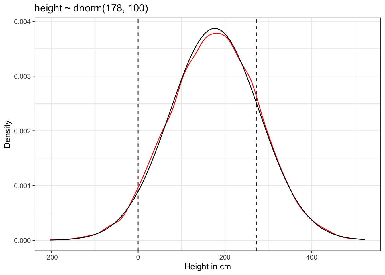
The results of Graph 4.10 contradicts our scientific knowledge — but also our common sense — about possible height values of humans. Now the model, before seeing the data, expects people to have negative height. It also expects some giants. One of the tallest people in recorded history, Robert Pershing Wadlow (1918–1940) stood 272 cm tall. In our prior predictive simulation many people are taller than this.
“Does this matter? In this case, we have so much data that the silly prior is harmless. But that won’t always be the case. There are plenty of inference problems for which the data alone are not sufficient, no matter how numerous. Bayes lets us proceed in these cases. But only if we use our scientific knowledge to construct sensible priors. Using scientific knowledge to build priors is not cheating. The important thing is that your prior not be based on the values in the data, but only on what you know about the data before you see it.” (McElreath, 2020, p. 84) (pdf)
We are going to map out the posterior distribution through brute force calculations.
This is not recommended because it is
Therefore the grid approximation technique has limited relevance. Later on we will use the quadratic approximation with rethinking::quap().
The strategy is the same grid approximation strategy as before in Section 2.4.3. But now there are two dimensions, and so there is a geometric (literally) increase in bother.
Procedure 4.2 : Grid approximation as R code (compare with Procedure 2.3)
post_a.base::sapply() passes the unique combination of \(\mu\) and \(\sigma\) on each row of post_a to a function that computes the log-likelihood of each observed height, and adds all of these log-likelihoods together with base::sum().base::exp(post_a$prod) but have to scale all log-products by the maximum log-product.Use log-probability to prevent rounding to zero!
“Remember, in large samples, all unique samples are unlikely. This is why you have to work with log-probability.” (McElreath, 2020, p. 562) (pdf)
: Grid approximation of the posterior distribution
R Code 4.22 a: Grid approximation of the posterior distribution (Original)
## R code 4.16a Grid approx. ##################################

## 1. Define the grid ##########
mu.list_a <- seq(from = 150, to = 160, length.out = 100)
sigma.list_a <- seq(from = 7, to = 9, length.out = 100)

## 2. All Combinations of μ & σ ##########
post_a <- expand.grid(mu_a = mu.list_a, sigma_a = sigma.list_a)

## 3. Compute log-likelihood #######
post_a$LL <- sapply(1:nrow(post_a), function(i) {
  sum(
    dnorm(d2_a$height, post_a$mu[i], post_a$sigma[i], log = TRUE)
  )
})

## 4. Multiply prior by likelihood ##########
## as the priors are on the log scale adding = multiplying
post_a$prod <- post_a$LL + dnorm(post_a$mu_a, 178, 20, TRUE) +
  dunif(post_a$sigma_a, 0, 50, TRUE)

## 5. Back to probability scale #########
## without rounding error
post_a$prob <- exp(post_a$prod - max(post_a$prod))

## define plotting area as one row and two columns
par(mfrow = c(1, 2))

## R code 4.17a Contour plot ##################################
rethinking::contour_xyz(post_a$mu_a, post_a$sigma_a, post_a$prob)

## R code 4.18a Heat map ##################################
rethinking::image_xyz(post_a$mu_a, post_a$sigma_a, post_a$prob)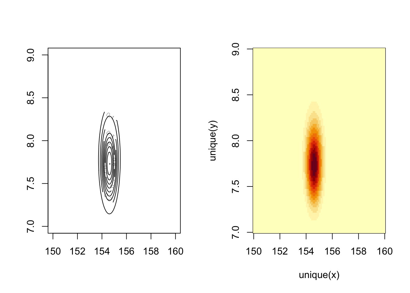
b: Numbered R Code Title (Tidyverse)
## R code 4.16b Grid approx ##################################

## 1./2. Define grid & combinations ##########
d_grid_b <-
  tidyr::expand_grid(mu_b = base::seq(from = 150, to = 160, length.out = 100),
                  sigma_b = base::seq(from = 7, to = 9, length.out = 100))

## 3a. Compute log-likelihood #######
grid_function <- function(mu, sigma) {
  stats::dnorm(d2_b$height, mean = mu, sd = sigma, log = TRUE) |>
    sum()
}

d_grid2_b <-
  d_grid_b |>

  ## 3b. Compute log-likelihood #######
  dplyr::mutate(log_likelihood_b = purrr::map2(mu_b, sigma_b, grid_function)) |>
  tidyr::unnest(log_likelihood_b) |>
  dplyr::mutate(prior_mu_b  = stats::dnorm(mu_b, mean = 178, sd = 20, log = T),
         prior_sigma_b      = stats::dunif(sigma_b, min = 0, max = 50, log = T)) |>

  ## 4. Multiply prior by likelihood ##########
  ## as the priors are on the log scale adding = multiplying
  dplyr::mutate(product_b = log_likelihood_b + prior_mu_b + prior_sigma_b) |>

  ## 5. Back to probability scale #########
  dplyr::mutate(probability_b = exp(product_b - max(product_b)))


## R code 4.17b Contour plot ##################################
p1_b <-
  d_grid2_b |>
    ggplot2::ggplot(ggplot2::aes(x = mu_b, y = sigma_b, z = probability_b)) +
    ggplot2::geom_contour() +
    ggplot2::labs(x = base::expression(mu),
                  y = base::expression(sigma)) +
    ggplot2::coord_cartesian(xlim = c(153.5, 155.7),
                         ylim = c(7, 8.5)) +
    ggplot2::theme_bw()

## R code 4.18b Heat map ##################################
p2_b <-
  d_grid2_b |>
    ggplot2::ggplot(ggplot2::aes(x = mu_b, y = sigma_b, fill = probability_b)) +
    ggplot2::geom_raster(interpolate = TRUE) +
    ggplot2::scale_fill_viridis_c(option = "B") +
    ggplot2::labs(x = base::expression(mu),
         y = base::expression(sigma)) +
    ggplot2::coord_cartesian(xlim = c(153.5, 155.7),
                         ylim = c(7, 8.5)) +
    ggplot2::theme_bw()

library(patchwork)
p1_b + p2_b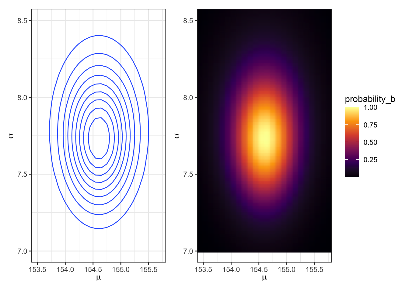
tidyr::unnest() function to expand the list-column containing data frames into rows and columns.ggplot2::coord_cartesian() I zoomed into the graph to concentrate on the most important x/y ranges.base::expression().| PURPOSE | ORIGINAL | TIDYVERSE |
|---|---|---|
| All combinations | base::expand.grid() | tidyr::expand_grid() |
| Apply function to each element | base::sapply() | purrr::map2() |
| Contour plot | rethinking::contour_xyz() | ggplot2::geom_contour() |
| Heat map | rethinking::image_xyz() | ggplot2::geom_raster() |
Creating data frame resp. tibble of all combinations
There are several related function for base::expand.grid() in {tidyverse}:
tidyr::expand_grid(): Create a tibble from all combination of inputs. This is the most similar function to base::expand.grid() as its input are vectors rather than a data frame. But it different in five aspects:
tidyr::expand(): Generates all combination of variables found in a dataset. It is paired with
tidyr::crossing(): A wrapper around tidyr::expand_grid() the de-duplicates and sorts the inputs.tidyr::nesting(): Finds only combinations already present in the data.“To study this posterior distribution in more detail, again I’ll push the flexible approach of sampling parameter values from it. This works just like it did in R Code 3.6, when you sampled values of \(p\) from the posterior distribution for the globe tossing example.” (McElreath, 2020, p. 85) (pdf)
Procedure 4.3 : Sampling from the posterior
Since there are two parameters, and we want to sample combinations of them:
post_a in proportion to the values in post_a$prob.Example 4.7 : Sampling from the posterior
R Code 4.23 a: Samples from the posterior distribution for the heights data (Original)
## R code 4.19a ###########################
# 1. Sample row numbers #########
# randomly sample row numbers in post_a
# in proportion to the values in post_a$prob.
sample.rows <- sample(1:nrow(post_a),
size = 1e4, replace = TRUE,
prob = post_a$prob
)
# 2. pull out parameter values ########
sample.mu_a <- post_a$mu[sample.rows]
sample.sigma_a <- post_a$sigma[sample.rows]
## R code 4.20a ###########################
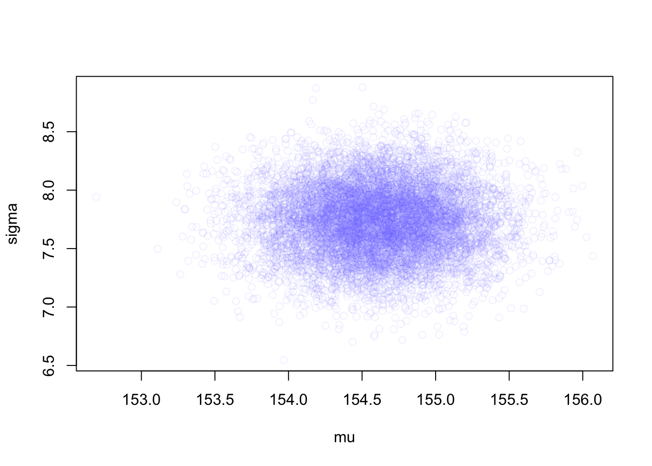
plot(sample.mu_a, sample.sigma_a,
cex = 0.8, pch = 21,
col = rethinking::col.alpha(rethinking:::rangi2, 0.1)
)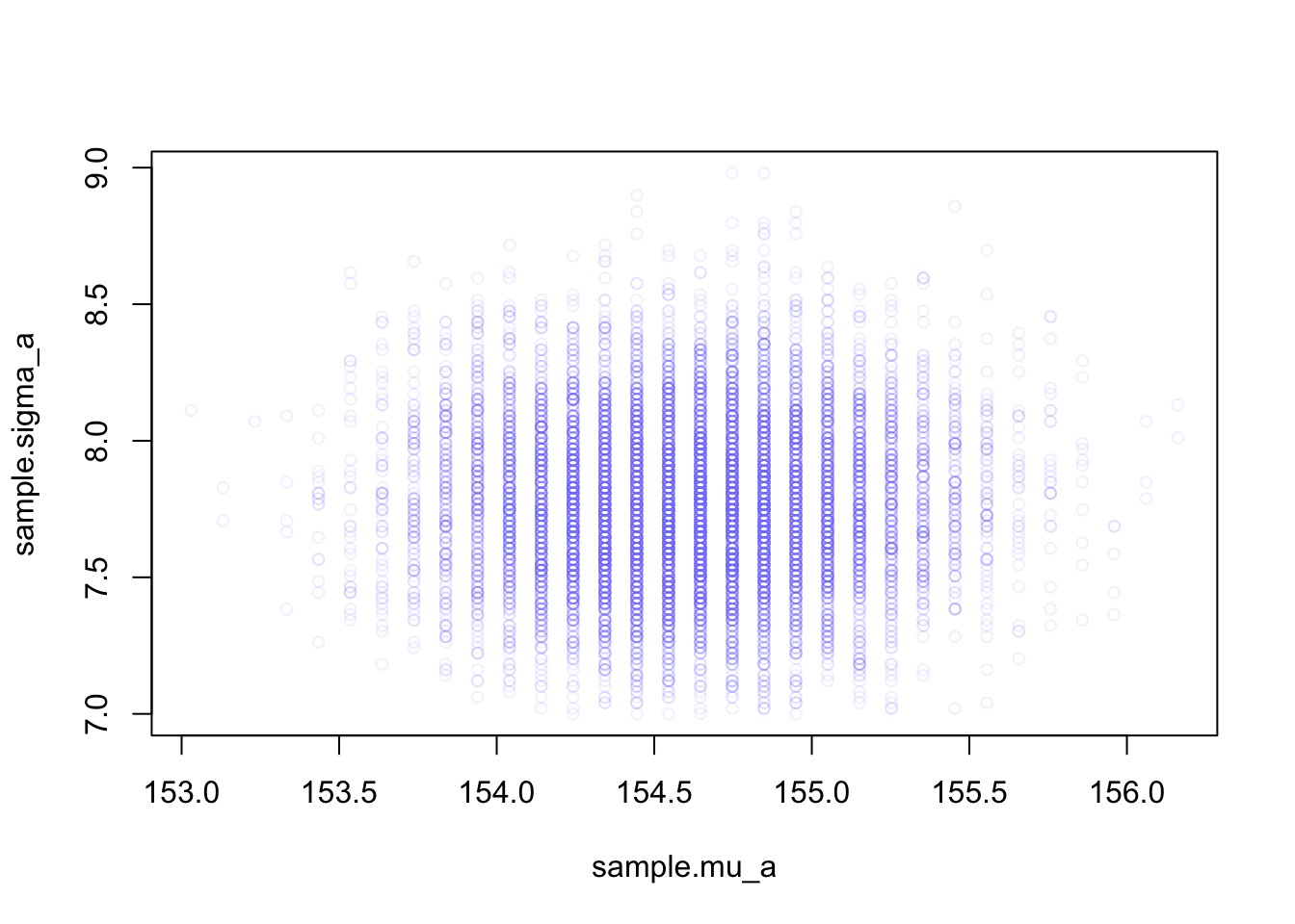
rethinking::col.alpha() is part of the {rethinking} R package. It makes colors transparent for a better inspections of values where data overlap.rethinking:::rangi2 itself is just the definition of a hex color code (“#8080FF”) specifying the shade of blue.Adjust the plot to your tastes by playing around with cex (character expansion, the size of the points), pch (plot character), and the \(0.1\) transparency value.
The density of points is highest in the center, reflecting the most plausible combinations of \(\mu\) and \(\sigma\). There are many more ways for these parameter values to produce the data, conditional on the model.
R Code 4.24 b: Samples from the posterior distribution for the heights data (Tidyverse)
set.seed(4)

d_grid_samples_b <-
  d_grid2_b |>
  dplyr::slice_sample(n = 1e4,
               replace = TRUE,
               weight_by = probability_b
               )

d_grid_samples_b |>
  ggplot2::ggplot(ggplot2::aes(x = mu_b, y = sigma_b)) +
  ggplot2::geom_point(size = 1.8, alpha = 1/15, color = "#8080FF") +
  ggplot2::scale_fill_viridis_c() +
  ggplot2::labs(x = expression(mu[samples]),
       y = expression(sigma[samples])) +
  ggplot2::theme_bw()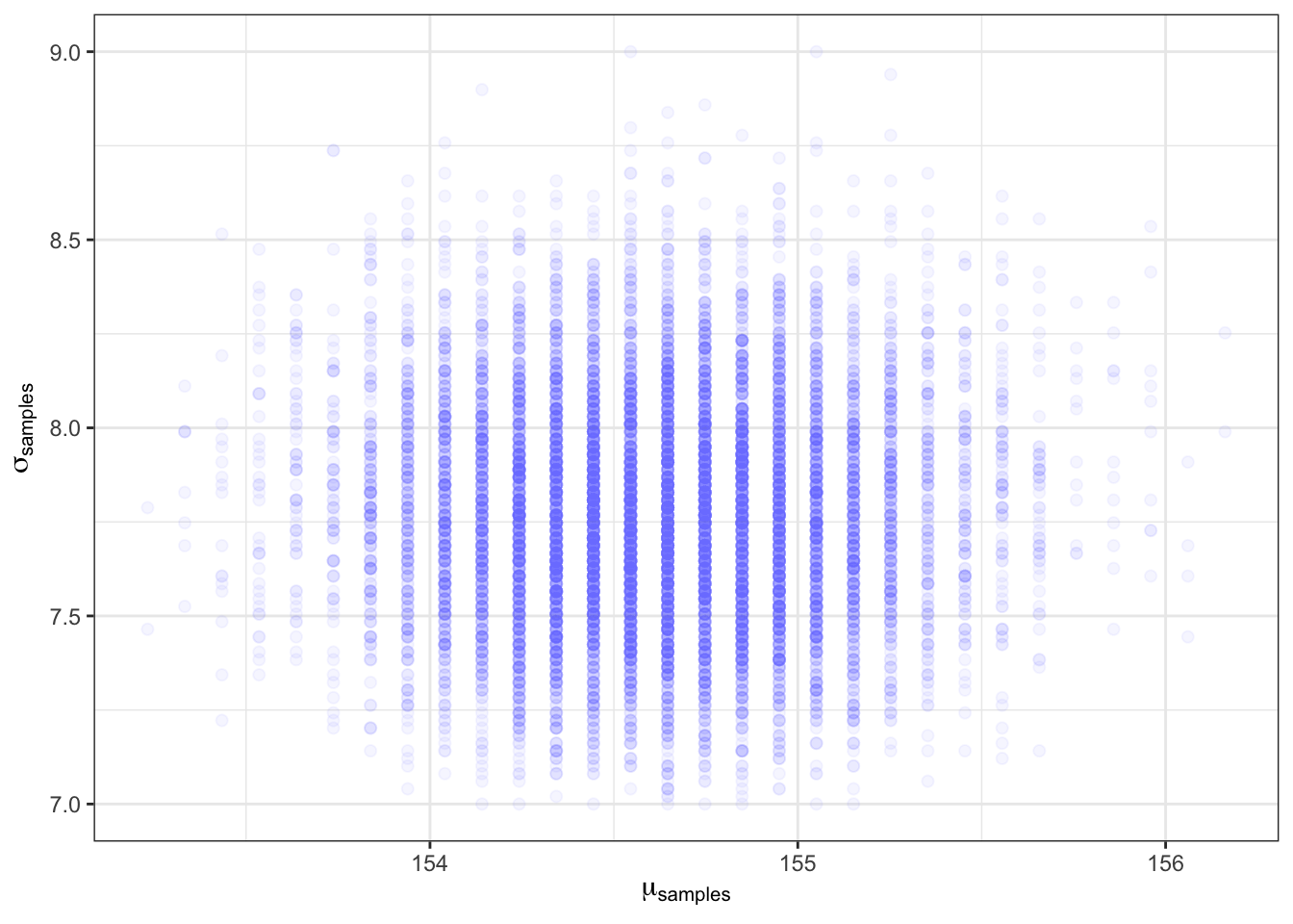
Kurz used the superseded dplyr::sample_n() to sample rows with replacement from d_grid2_b. I used instead the newer dplyr::slice_sample() that should used to sample rows.
The density of points is highest in the center, reflecting the most plausible combinations of μ and σ. There are many more ways for these parameter values to produce the data, conditional on the model.
The jargon marginal here means “averaging over the other parameters.”
We described the distribution of confidence in each combination of \(\mu\) and \(\sigma\) by summarizing the samples. Think of them like data and describe them, just like in Section 3.2. For example, to characterize the shapes of the marginal posterior densities of \(\mu\) and \(\sigma\), all we need to do is to call rethinking::dens() with the appropriate vector sample.mu_a resp. sample.sigma_a.
Example 4.8 : Marginal posterior densities of \(\mu\) and \(\sigma\) for the heights data
R Code 4.25 a: Marginal posterior densities of \(\mu\) and \(\sigma\) for the heights data (Original)
## define plotting area as one row and two columns
par(mfrow = c(1, 2))

## R code 4.21a adapted #########################
rethinking::dens(sample.mu_a, adj = 1, show.HPDI = 0.89,
                 norm.comp = TRUE, col = "red")
rethinking::dens(sample.sigma_a, adj = 1, show.HPDI = 0.89,
                 norm.comp = TRUE, col = "red")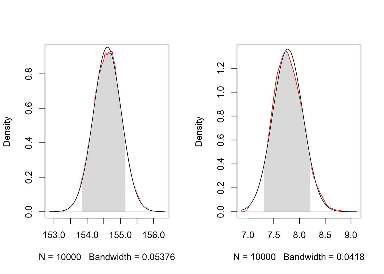
For a comparison I have overlaid the normal distribution and shown the .89% HPDI. Compare the grayed area with the calculation of the values in Example 4.9.
R Code 4.26 b: Marginal posterior densities of \(\mu\) and \(\sigma\) for the heights data (Tidyverse)
d_grid_samples_b |>
  tidyr::pivot_longer(mu_b:sigma_b) |>

  ggplot2::ggplot(ggplot2::aes(x = value)) +
  ggplot2::geom_density(color = "red") +
  # ggplot2::scale_y_continuous(NULL, breaks = NULL) +
  # ggplot2::xlab(NULL) +
  ggplot2::stat_function(
      fun = dnorm,
      args = with(d_grid_samples_b, c(
        mean = mean(mu_b),
        sd = sd(mu_b)))
      ) +
  ggplot2::stat_function(
    fun = dnorm,
    args = with(d_grid_samples_b, c(
      mean = mean(sigma_b),
      sd = sd(sigma_b)))
    ) +
  ggplot2::labs(x = "mu (left), sigma (right)",
                y = "Density") +
  ggplot2::theme_bw() +
  ggplot2::facet_wrap(~ name, scales = "free",
                      labeller = ggplot2::label_parsed)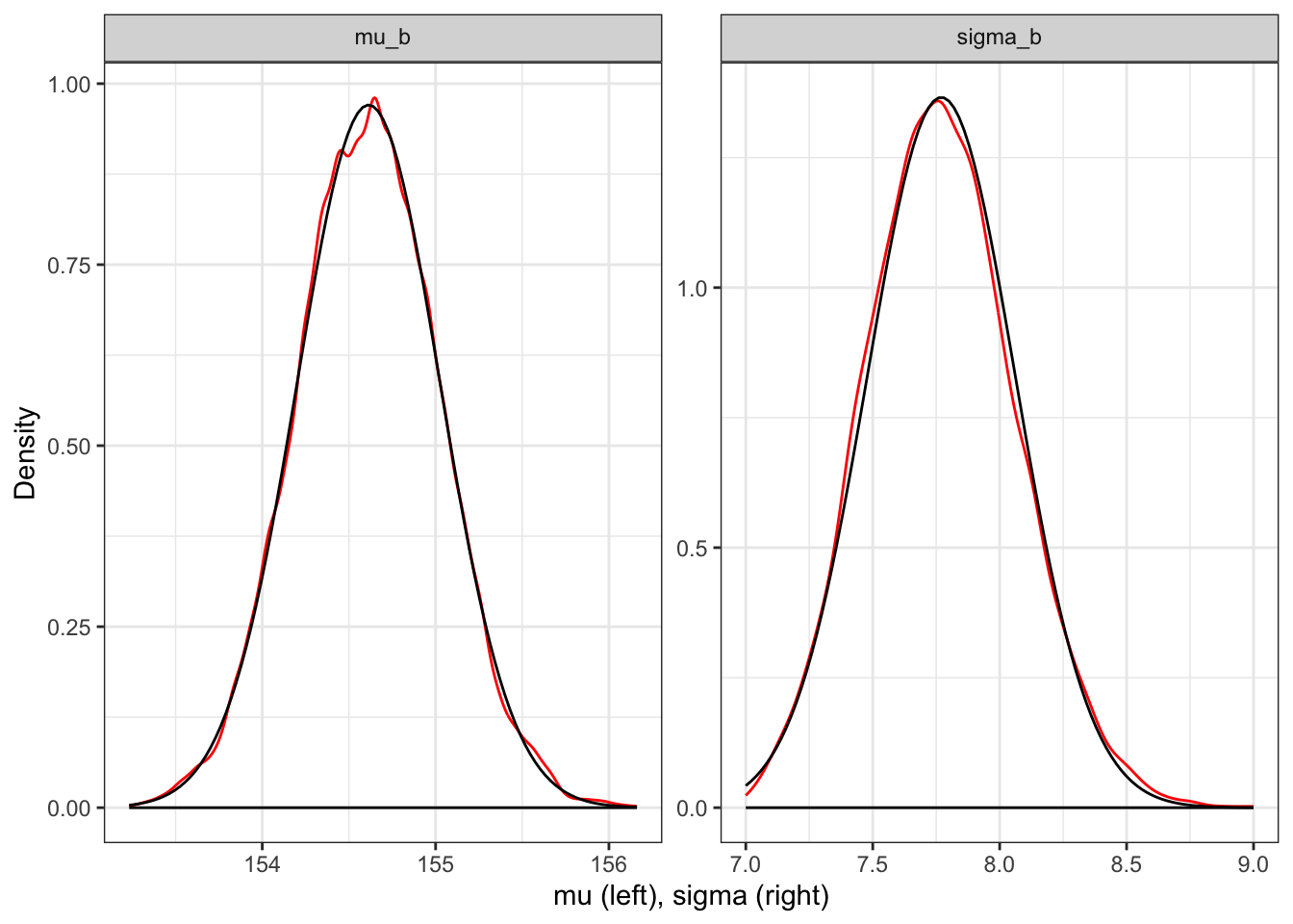
Kurz used tidyr::pivot_longer() and then ggplot2::facet_wrap() to plot the densities for both mu and sigma at once. For a comparison I have overlaid the normal distribution. But I do not know how to prevent the base line at density = 0. See Tidyverse 2 (Graph 4.15) where I have constructed the plots of both distribution separately.
R Code 4.27 b: Marginal posterior densities of \(\mu\) and \(\sigma\) for the heights data (Tidyverse)
plot_mu_b <-
  d_grid_samples_b |>
    ggplot2::ggplot(ggplot2::aes(x = mu_b)) +
    ggplot2::geom_density(color = "red") +
    ggplot2::stat_function(
        fun = dnorm,
        args = with(d_grid_samples_b, c(
          mean = mean(mu_b),
          sd = sd(mu_b)))
        ) +
    ggplot2::labs(x = expression(mu),
                  y = "Density") +
    ggplot2::theme_bw()

plot_sigma_b <-
  d_grid_samples_b |>
    ggplot2::ggplot(ggplot2::aes(x = sigma_b)) +
    ggplot2::geom_density(color = "red") +
    ggplot2::stat_function(
        fun = dnorm,
        args = with(d_grid_samples_b, c(
          mean = mean(sigma_b),
          sd = sd(sigma_b)))
        ) +
    ggplot2::labs(x = expression(sigma),
                  y = "Density") +
    ggplot2::theme_bw()

library(patchwork)
plot_mu_b + plot_sigma_b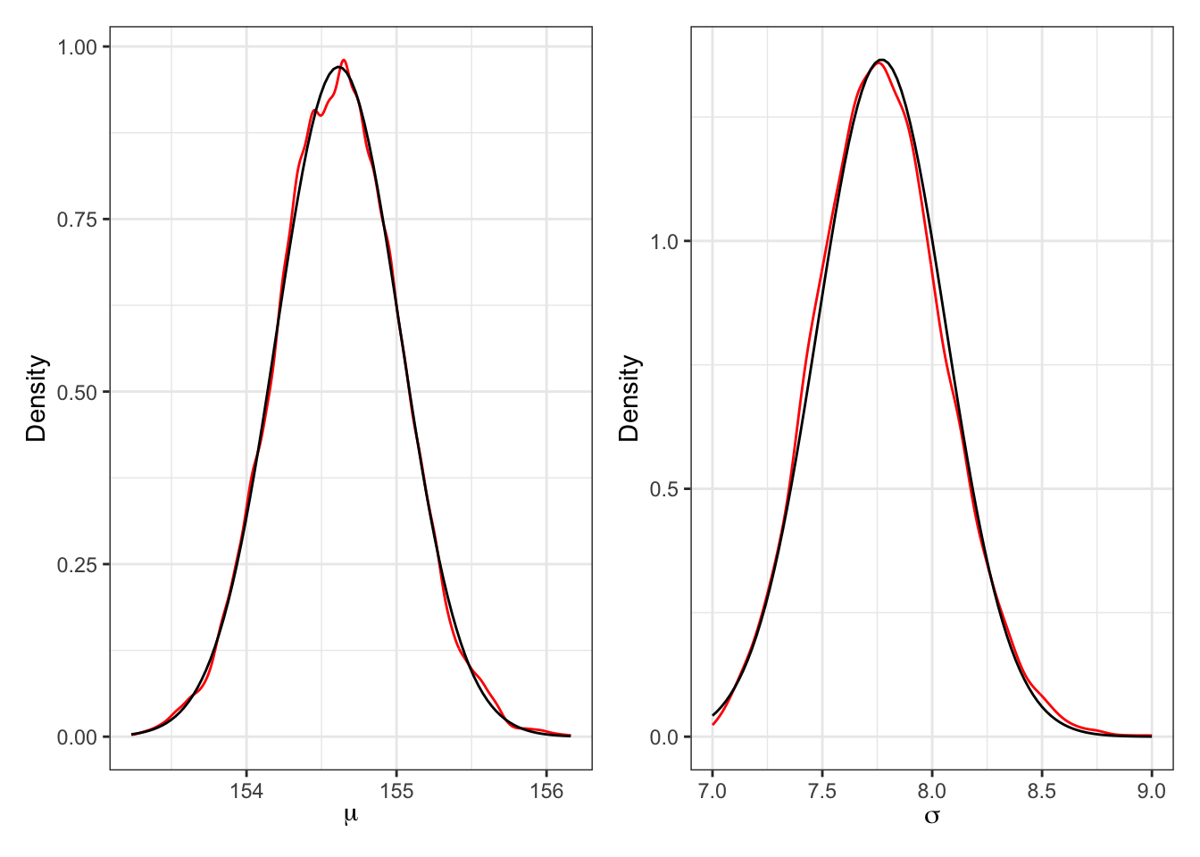
“These densities are very close to being normal distributions. And this is quite typical. As sample size increases, posterior densities approach the normal distribution. If you look closely, though, you’ll notice that the density for \(\sigma\) has a longer right-hand tail. I’ll exaggerate this tendency a bit later, to show you that this condition is very common for standard deviation parameters.” (McElreath, 2020, p. 86) (pdf)
Since the drawn samples of Example 4.7 are just vectors of numbers, you can compute any statistic from them that you could from ordinary data: mean, median, or quantile, for example.
As examples we will compute PI and HPDI/HDCI.
We’ll use the {tidybayes} resp. {ggdist} package to compute their posterior modes of the 89% HDIs (and not the standard 95% intervals, as recommended by McElreath).
{tidybayes} has a companion package {ggdist}
There is a companion package {ggdist} which is imported completely by {tidybayes}. Whenever you cannot find the function in {tidybayes} then look at the documentation of {ggdist}. This is also the case for the tidybayes::mode_hdi() function. In the help files of {tidybayes} you will just find notes about a deprecated tidybayes::mode_hdih() function but not the arguments of its new version without the last h (for horizontal) tidybayes::mode_hdi(). But you can look up these details in the {ggdist} documentation. This observation is valid for many families of deprecated functions.
There is a division of functionality between {tidybayes} and {ggdist}:
Example 4.9 : Summarize the widths with posterior compatibility intervals
R Code 4.28 a: Posterior compatibility interval (PI) (Original)
R Code 4.29 a: Highest Posterior Density Interval (HPDI) (Original)
R Code 4.30 b: Posterior compatibility interval (PI) (Tidyverse)
d_grid_samples_b |>
  tidyr::pivot_longer(mu_b:sigma_b) |>
  dplyr::group_by(name) |>
  ggdist::mode_hdi(value, .width = 0.89)
#> # A tibble: 2 × 7
#> name value .lower .upper .width .point .interval
#> <chr> <dbl> <dbl> <dbl> <dbl> <chr> <chr>
#> 1 mu_b 155. 154. 155. 0.89 mode hdi
#> 2 sigma_b 7.75 7.30 8.23 0.89 mode hdiR Code 4.31 b: Highest Density Continuous Interval (HDCI) (Tidyverse)
d_grid_samples_b |>
  tidyr::pivot_longer(mu_b:sigma_b) |>
  dplyr::group_by(name) |>
  ggdist::mode_hdci(value, .width = 0.89)
#> # A tibble: 2 × 7
#> name value .lower .upper .width .point .interval
#> <chr> <dbl> <dbl> <dbl> <dbl> <chr> <chr>
#> 1 mu_b 155. 154. 155. 0.89 mode hdci
#> 2 sigma_b 7.75 7.30 8.23 0.89 mode hdciIn {tidybayes} resp. {ggdist} the shortest probability interval (= Highest Posterior Density Interval (HPDI)) is called Highest Density Continuous Interval (HDCI).
{rethinking} versus {tidybayes/ggdist}
There are small differences in the results of both packages (rethinking) and {ggdist/tidybayes} that are not important.
“Before moving on to using quadratic approximation (quap) as shortcut to all of this inference, it is worth repeating the analysis of the height data above, but now with only a fraction of the original data. The reason to do this is to demonstrate that, in principle, the posterior is not always so Gaussian in shape. There’s no trouble with the mean, μ. For a Gaussian likelihood and a Gaussian prior on μ, the posterior distribution is always Gaussian as well, regardless of sample size. It is the standard deviation σ that causes problems. So if you care about σ—often people do not—you do need to be careful of abusing the quadratic approximation.” (McElreath, 2020, p. 86) (pdf)
Example 4.10 : Sample size and the normality of \(\sigma\)’s posterior
R Code 4.32 a: Sample size and the normality of \(\sigma\)’s posterior (Original)
## R code 4.23a ######################################
d3_a <- sample(d2_a$height, size = 20)

## R code 4.24a ######################################
mu2_a.list <- seq(from = 150, to = 170, length.out = 200)
sigma2_a.list <- seq(from = 4, to = 20, length.out = 200)
post2_a <- expand.grid(mu = mu2_a.list, sigma = sigma2_a.list)
post2_a$LL <- sapply(1:nrow(post2_a), function(i) {
  sum(dnorm(d3_a,
    mean = post2_a$mu[i], sd = post2_a$sigma[i],
    log = TRUE
  ))
})
post2_a$prod <- post2_a$LL + dnorm(post2_a$mu, 178, 20, TRUE) +
  dunif(post2_a$sigma, 0, 50, TRUE)
post2_a$prob <- exp(post2_a$prod - max(post2_a$prod))
sample2_a.rows <- sample(1:nrow(post2_a),
  size = 1e4, replace = TRUE,
  prob = post2_a$prob
)
sample2_a.mu <- post2_a$mu[sample2_a.rows]
sample2_a.sigma <- post2_a$sigma[sample2_a.rows]

## define plotting area as one row and two columns
par(mfrow = c(1, 2))
plot(sample2_a.mu, sample2_a.sigma,
  cex = 0.5,
  col = rethinking::col.alpha(rethinking:::rangi2, 0.1),
  xlab = "mu", ylab = "sigma", pch = 16
)

## R code 4.25a ############
rethinking::dens(sample2_a.sigma,
                 norm.comp = TRUE,
                 col = "red")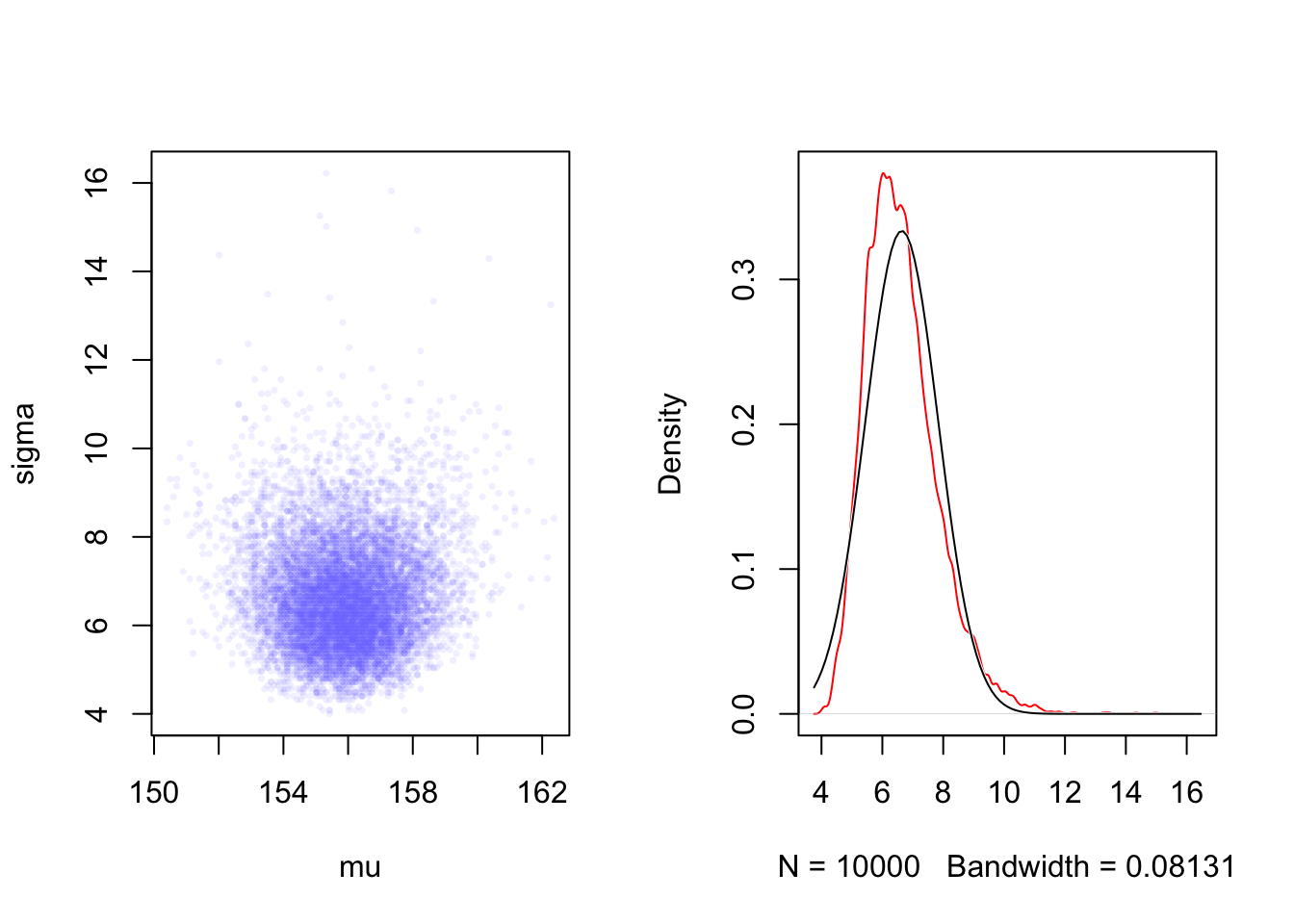
R Code 4.33 b: Sample size and the normality of \(\sigma\)’s posterior (Tidyverse)
set.seed(4)
d3_b <- sample(d2_b$height, size = 20)

n <- 200

# note we've redefined the ranges of `mu` and `sigma`
d3_grid_b <-
  tidyr::crossing(mu3_b    = seq(from = 150, to = 170, length.out = n),
           sigma3_b = seq(from = 4, to = 20, length.out = n))

grid_function3_b <- function(mu, sigma) {
  dnorm(d3_b, mean = mu, sd = sigma, log = T) |>
    sum()
}

d3_grid_b <-
  d3_grid_b |>
  dplyr::mutate(log_likelihood3_b =
         purrr::map2_dbl(mu3_b, sigma3_b, grid_function3_b))  |>
  dplyr::mutate(prior3_mu_b    = stats::dnorm(mu3_b, mean = 178, sd = 20, log = T),
         prior3_sigma_b = stats::dunif(sigma3_b, min = 0, max = 50, log = T)) |>
  dplyr::mutate(product3_b = log_likelihood3_b + prior3_mu_b + prior3_sigma_b) |>
  dplyr::mutate(probability3_b = base::exp(product3_b - base::max(product3_b)))

set.seed(4)

d3_grid_samples_b <-
  d3_grid_b |>
  dplyr::slice_sample(n = 1e4,
           replace = T,
           weight_by = probability3_b)

plot3_d3_scatterplot <-
  d3_grid_samples_b |>
    ggplot2::ggplot(ggplot2::aes(x = mu3_b, y = sigma3_b)) +
    ggplot2::geom_point(size = 1.8, alpha = 1/15, color = "#8080FF") +
    ggplot2::labs(x = base::expression(mu[samples]),
         y = base::expression(sigma[samples])) +
    ggplot2::theme_bw()

plot3_d3_sigma3_b <-
  d3_grid_samples_b |>
    ggplot2::ggplot(ggplot2::aes(x = sigma3_b)) +
    ggplot2::geom_density(color = "red") +
    ggplot2::stat_function(
        fun = dnorm,
        args = with(d3_grid_samples_b, c(
          mean = mean(sigma3_b),
          sd = sd(sigma3_b)))
        ) +
    ggplot2::labs(x = expression(sigma),
                  y = "Density") +
    ggplot2::theme_bw()

library(patchwork)
plot3_d3_scatterplot + plot3_d3_sigma3_b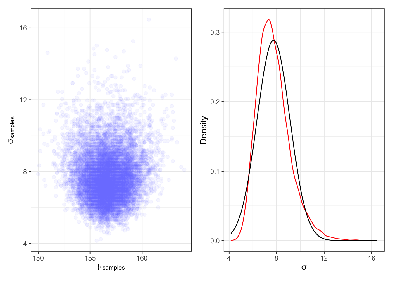
Compare the left panel with Graph 4.12 and the right panel with the right panel of Graph 4.15 to see that now \(\sigma\) has a long right tail and does not follow a Gaussian distribution.
“The deep reasons for the posterior of σ tending to have a long right-hand tail are complex. But a useful way to conceive of the problem is that variances must be positive. As a result, there must be more uncertainty about how big the variance (or standard deviation) is than about how small it is.” (McElreath, 2020, p. 86) (pdf)
“For example, if the variance is estimated to be near zero, then you know for sure that it can’t be much smaller. But it could be a lot bigger.” (McElreath, 2020, p. 87) (pdf)
“To build the quadratic approximation, we’ll use
quap(), a command in the {rethinking} package. Thequap()function works by using the model definition you were introduced to earlier in this chapter. Each line in the definition has a corresponding definition in the form of R code. The engine inside quap then uses these definitions to define the posterior probability at each combination of parameter values. Then it can climb the posterior distribution and find the peak, its MAP (Maximum A Posteriori estimate). Finally, it estimates the quadratic curvature at the MAP to produce an approximation of the posterior distribution. Remember: This procedure is very similar to what many non-Bayesian procedures do, just without any priors.” (McElreath, 2020, p. 87, parenthesis and emphasis are mine) (pdf)
Procedure 4.4 : Finding the posterior distribution
Howell1 data frame for adults (age >= 18) (Code 4.26).base::alist() We are going to use the Equation 4.3 (Code 4.27).Example 4.11 : Finding the posterior distribution
R Code 4.34 a: Finding the posterior distribution with rethinking::quap() (Original)
## R code 4.26a ######################
data(package = "rethinking", list = "Howell1")
d_a <- Howell1
d2_a <- d_a[d_a$age >= 18, ]

## R code 4.27a ######################
flist <- alist(
  height ~ dnorm(mu, sigma),
  mu ~ dnorm(178, 20),
  sigma ~ dunif(0, 50)
)

## R code 4.30a #####################
start <- list(
  mu = mean(d2_a$height),
  sigma = sd(d2_a$height)
)

## R code 4.28a ######################
m4.1a <- rethinking::quap(flist, data = d2_a, start = start)
m4.1a
#>
#> Quadratic approximate posterior distribution
#>
#> Formula:
#> height ~ dnorm(mu, sigma)
#> mu ~ dnorm(178, 20)
#> sigma ~ dunif(0, 50)
#>
#> Posterior means:
#> mu sigma
#> 154.607024 7.731333
#>
#> Log-likelihood: -1219.41The rethinking::quap() function returns a “map” object.
Sometimes I got an error message when computing this code chunk. The reason was that quap() has chosen an inconvenient value to start for its estimation of the posterior. I believe that one could visualize the problem with a metaphor: Instead of climbing up the hill quap() started with a value where it was captured in a narrow valley.
The three parts of rethinking::quap()
base::alist() of formulas that define the likelihood and priors.list(), not an alist() like the formula list is.R Code 4.35 a: Printing with rethinking::precis (Original)
## R code 4.29a ######################
(precis_m4.1a <- rethinking::precis(m4.1a))
#> mean sd 5.5% 94.5%
#> mu 154.607024 0.4119947 153.948576 155.265471
#> sigma 7.731333 0.2913860 7.265642 8.197024“These numbers provide Gaussian approximations for each parameter’s marginal distribution. This means the plausibility of each value of μ, after averaging over the plausibilities of each value of σ, is given by a Gaussian distribution with mean 154.6 and standard deviation 0.4. The 5.5% and 94.5% quantiles are percentile interval boundaries, corresponding to an 89% compatibility interval. Why 89%? It’s just the default. It displays a quite wide interval, so it shows a high-probability range of parameter values. If you want another interval, such as the conventional and mindless 95%, you can use precis(m4.1,prob=0.95). But I don’t recommend 95% intervals, because readers will have a hard time not viewing them as significance tests. 89 is also a prime number, so if someone asks you to justify it, you can stare at them meaningfully and incant,”Because it is prime.” That’s no worse justification than the conventional justification for 95%.” (McElreath, 2020, p. 88) (pdf)
When you compare the 89% boundaries with the result of the grid approximation in Example 4.9 you will see that they are almost identical as the posterior is approximately Gaussian.
R Code 4.36 b: Finding the posterior distribution with brms::brm()
## R code 4.26b ######################
data(package = "rethinking", list = "Howell1")
d_b <- Howell1
d2_b <-
  d_b |>
  dplyr::filter(age >= 18)


## R code 4.27b ######################
## R code 4.28b ######################
m4.1b <-
  brms::brm(
      formula = height ~ 1,                                           # 1
      data = d2_b,                                                    # 2
      family = gaussian(),                                            # 3
      prior = c(brms::prior(normal(178, 20), class = Intercept),      # 4
                brms::prior(uniform(0, 50), class = sigma, ub = 50)), # 4
      iter = 2000,               # 5
      warmup = 1000,             # 6
      chains = 4,                # 7
      cores = 4,                 # 8
      seed = 4,                  # 9
      file = "brm_fits/m04.01b") # 10
m4.1b
#> Family: gaussian
#> Links: mu = identity; sigma = identity
#> Formula: height ~ 1
#> Data: d2_b (Number of observations: 352)
#> Draws: 4 chains, each with iter = 2000; warmup = 1000; thin = 1;
#> total post-warmup draws = 4000
#>
#> Population-Level Effects:
#> Estimate Est.Error l-95% CI u-95% CI Rhat Bulk_ESS Tail_ESS
#> Intercept 154.60 0.41 153.81 155.42 1.00 2763 2635
#>
#> Family Specific Parameters:
#> Estimate Est.Error l-95% CI u-95% CI Rhat Bulk_ESS Tail_ESS
#> sigma 7.77 0.29 7.21 8.39 1.00 3400 2561
#>
#> Draws were sampled using sampling(NUTS). For each parameter, Bulk_ESS
#> and Tail_ESS are effective sample size measures, and Rhat is the potential
#> scale reduction factor on split chains (at convergence, Rhat = 1).The brms::brm() function returns a “brmsfit” object.
If you don’t want to specify the result more in detail (for instance to change the PI) than you get the same result with brms:::print.brmsfit(m4.1b) and brms:::summary.brmsfit(m4.1b).
Description of the convergence diagnostics Rhat, Bulk_ESS, and Tail_ESS
Rhat, Bulk_ESS, and Tail_ESS are described in detail in (Vehtari et al. 2021).brms::brm() has more than 40 arguments but only three (formula, data and prior) are for our case mandatory. All the other have sensible default values. The correspondence of these three arguments to the {rethinking} version is obvious.
In the simple demonstration of brms::brm() in the toy globe example (R Code 2.25), I have just used Kurz’ code lines without any explanation. This time I will explain all 10 arguments from Kurz’ example.
~ 1, the trend component is a single value, e.g. the mean value of the data, i.e. the linear model only has an intercept. (StackOverflow) In other words, it is the value the dependent variable is expected to have when the independent variables are zero or have no influence. (StackOverflow). The formula y ~ 1 is just a model with a constant (intercept) and no regressor (StackOverflow). Or more understandable for our case are Kurz’ explication: “… the intercept of a typical regression model with no predictors is the same as its mean. In the special case of a model using the binomial likelihood, the mean is the probability of a 1 in a given trial, \(\theta\).” (Kurz) .gaussian model is applied. So this line would not have been necessary. There are standard family functions stats::family()that will work with {brms}, but there are also special family functions brms::brmsfamily() that work only for {brms} models. Additionally you can specify custom families for use in brms with the brms::custom_family() function.brms::brm() function work. — class specifies the parameter class. It defaults to “b” ((i.e. population-level – ‘fixed’ – effects)). (There is also the argument group for grouping of factors for group-level effects. Not used in this code example.) — Besides the “b” class there are other classes for the “Intercept” and the standard deviation “Sigma” on the population level: There is also a “sd” class for the standard deviation of group-level effects. Finally there is the special case of class = "cor" to set the same prior on every correlation matrix. — ub = 50 sets the upper bound to 50. There is also a lb (lower bound). Both bounds are for parameter restriction, so that population-level effects must fall within a certain interval using the lb and ub arguments. lb and ub default to NULL, i.e. there is no restriction.warmup; defaults to 2000).iter and the default is \(iter/2\).mc.cores option to be as many processors as the hardware and RAM allow (up to the number of chains).set.seed() in other code chunks the chapter number. If NA (the default), Stan will set the seed randomly.NULL or a character string. In the latter case, the fitted model object is saved via base::saveRDS() in a file named after the string supplied in file. The .rds extension is added automatically. If the file already exists, brms::brm() will load and return the saved model object instead of refitting the model. Unless you specify the file_refit argument as well, the existing files won’t be overwritten, you have to manually remove the file in order to refit and save the model under an existing file name. The file name is stored in the brmsfit object for later usage.brm() function, you use the init argument for the start values for the sampler. “If NULL (the default) or”random”, Stan will randomly generate initial values for parameters in a reasonable range. If 0, all parameters are initialized to zero on the unconstrained space. This option is sometimes useful for certain families, as it happens that default random initial values cause draws to be essentially constant. Generally, setting init = 0 is worth a try, if chains do not initialize or behave well. Alternatively, init can be a list of lists containing the initial values …” (Help file)R Code 4.37 b: Print the specified results of the brmsfit object
## R code 4.29b print ######################
brms:::print.brmsfit(m4.1b, prob = .89)

## brms:::summary.brmsfit(m4.1b, prob = .89) # (same result)
#> Family: gaussian
#> Links: mu = identity; sigma = identity
#> Formula: height ~ 1
#> Data: d2_b (Number of observations: 352)
#> Draws: 4 chains, each with iter = 2000; warmup = 1000; thin = 1;
#> total post-warmup draws = 4000
#>
#> Population-Level Effects:
#> Estimate Est.Error l-89% CI u-89% CI Rhat Bulk_ESS Tail_ESS
#> Intercept 154.60 0.41 153.94 155.25 1.00 2763 2635
#>
#> Family Specific Parameters:
#> Estimate Est.Error l-89% CI u-89% CI Rhat Bulk_ESS Tail_ESS
#> sigma 7.77 0.29 7.33 8.26 1.00 3400 2561
#>
#> Draws were sampled using sampling(NUTS). For each parameter, Bulk_ESS
#> and Tail_ESS are effective sample size measures, and Rhat is the potential
#> scale reduction factor on split chains (at convergence, Rhat = 1).Description of the convergence diagnostics Rhat, Bulk_ESS, and Tail_ESS
Rhat, Bulk_ESS, and Tail_ESS are described in detail in (Vehtari et al. 2021).brms:::summary.brmsfit() results in the same output as brms:::print.brmsfit(). Both return a brmssummary object. But there are some internal differences:
There is also a \(print() method that prints the same summary stats but removes the extra formatting used for printing tibbles and returns the fitted model object itself. The \)print() method may also be faster than \(summary() because it is designed to only compute the summary statistics for the variables that will actually fit in the printed output whereas \)summary() will compute them for all of the specified variables in order to be able to return them to the user.
Using print.brmsfit() or summary.brmsfit() defaults to 95% intervals. As {rethinking} defaults to 89% intervals, I have changed the prob parameter of the print method also to 89%.
WATCH OUT! Using three colons to address generic functions of S3 classes
As I have learned shortly: print() or summary() are generic functions where one can add new printing methods with new classes. In this case class(m4.1b) = brmsfit. This means I do not need to add brms:: to secure that I will get the {brms} printing or summary method as I didn’t load the {brms} package. Quite the contrary: Adding brms:: would result into the message: “Error: ‘summary’ is not an exported object from ‘namespace:brms’”.
As I really want to specify explicitly the method these generic functions should use, I need to use the syntax with three colons, like brms:::print.brmsfit() or brms:::summary.brmsfit() respectively.
Learning more about S3 classes in R
In this respect I have to learn more about S3 classes. There are many important web resources about this subject that I have found with the search string “r what is s3 class”. Maybe I should start with the S3 chapter in Advanced R.
For the interpretation of this output I am going to use the explication in the How to use brms section of the {brms} GitHup page.
Estimate) and the standard deviation (Est.Error) of the posterior distribution as well as two-sided 95% credible intervals (l-95% CI and u-95% CI) based on quantiles. The last three values (ESS_bulk, ESS_tail, and Rhat) provide information on how well the algorithm could estimate the posterior distribution of this parameter. If Rhat is considerably greater than 1, the algorithm has not yet converged and it is necessary to run more iterations and / or set stronger priors.R Code 4.38 b: Print a Stan like summary
## R code 4.29b stan like summary ######################
m4.1b$fit
#> Inference for Stan model: anon_model.
#> 4 chains, each with iter=2000; warmup=1000; thin=1;
#> post-warmup draws per chain=1000, total post-warmup draws=4000.
#>
#> mean se_mean sd 2.5% 25% 50% 75% 97.5%
#> b_Intercept 154.60 0.01 0.41 153.81 154.31 154.59 154.88 155.42
#> sigma 7.77 0.01 0.29 7.21 7.57 7.76 7.97 8.39
#> lprior -8.51 0.00 0.02 -8.56 -8.53 -8.51 -8.50 -8.46
#> lp__ -1227.04 0.02 0.97 -1229.63 -1227.44 -1226.75 -1226.33 -1226.06
#> n_eff Rhat
#> b_Intercept 2778 1
#> sigma 3404 1
#> lprior 2773 1
#> lp__ 1798 1
#>
#> Samples were drawn using NUTS(diag_e) at Mon Dec 4 22:27:38 2023.
#> For each parameter, n_eff is a crude measure of effective sample size,
#> and Rhat is the potential scale reduction factor on split chains (at
#> convergence, Rhat=1).Kurz refers to RStan: the R interface to Stan for a detailed description. I didn’t study the extensive documentation but I found out two items:
lp__ is the logarithm of the (unnormalized) posterior density as calculated by Stan. This log density can be used in various ways for model evaluation and comparison.Rhat estimates the degree of convergence of a random Markov Chain based on the stability of outcomes between and within chains of the same length. Values close to one indicate convergence to the underlying distribution. Values greater than 1.1 indicate inadequate convergence.R Code 4.39 b: Plot the visual chain diagnostics of the brmsfit object
## R code 4.29b plot ######################
brms:::plot.brmsfit(m4.1b)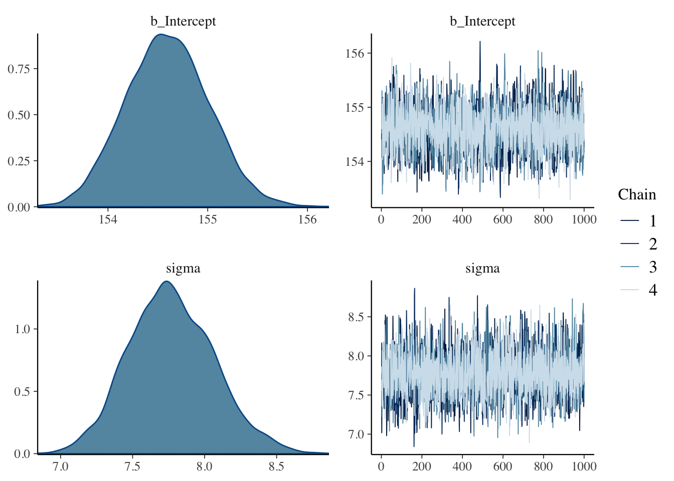
After running a model fit with HMC, it’s a good idea to inspect the chains. As we’ll see, McElreath covered visual chain diagnostics in ?sec-chap09. … If you want detailed diagnostics for the HMC chains, call
launch_shinystan(m4.1b). (Kurz)
Just a quick preview: It is important over the whole length of the samples (not counting the warmups, e.g., in our case: 1000 iteration) the width is constant and that the graph show all (four) chains at the top resp. bottom. Unfortunately is looking at the (small) graph not always conclusive. (See also tab “trace plot” in Example 4.19.)
Learn more about {shinystan}
I haven’t applied launch_shinystan(m4.1b) as it takes much time and I do not (yet) understand the detailed report anyway. To learn to work with {shinystan} see the ShinyStan website and the vignettes of the R package vignettes (Deploying to shinyapps.io, Getting Started) and documentation.
Package documentation of Stan and friends
brms::launch_shinystan)Ooops, this opens up Pandora’s box!
I do not even understand completely what the different packages do. What follows is a first try where I copied from the documentation pages:
{rstanarm} is an R package that emulates other R model-fitting functions but uses Stan (via the {rstan} package) for the back-end estimation. The primary target audience is people who would be open to Bayesian inference if using Bayesian software were easier but would use frequentist software otherwise.
RStan is the R interface to Stan. It is distributed on CRAN as the {rstan} package and its source code is hosted on GitHub.
Stan is a state-of-the-art platform for statistical modeling and high-performance statistical computation.
The next example shows the effect a very narrow \(\mu\) prior has. Instead of a sigma of 20 we provide only a standard deviation of 0.1.
Example 4.12 : The same model but with a more informative, e.g., very narrow \(\mu\) prior
R Code 4.40 a: Model with a very narrow \(\mu\) prior (Original)
## R code 4.27a ######################
flist <- alist(
  height ~ dnorm(mu, sigma),
  mu ~ dnorm(178, .1),
  sigma ~ dunif(0, 50)
)

## R code 4.30a #####################
start <- list(
  mu = mean(d2_a$height),
  sigma = sd(d2_a$height)
)

## R code 4.28a ######################
m4.2a <- rethinking::quap(flist, data = d2_a, start = start)
rethinking::precis(m4.2a)
#> mean sd 5.5% 94.5%
#> mu 177.86382 0.1002354 177.70363 178.0240
#> sigma 24.51934 0.9290875 23.03448 26.0042“Notice that the estimate for μ has hardly moved off the prior. The prior was very concentrated around 178. So this is not surprising. But also notice that the estimate for σ has changed quite a lot, even though we didn’t change its prior at all. Once the golem is certain that the mean is near 178—as the prior insists—then the golem has to estimate σ conditional on that fact. This results in a different posterior for σ, even though all we changed is prior information about the other parameter.” (McElreath, 2020, p. 89) (pdf)
R Code 4.41 b: Model with a very narrow \(\mu\) prior (brms)
m4.2b <-
  brms::brm(
      formula = height ~ 1,
      data = d2_b,
      family = gaussian(),
      prior = c(prior(normal(178, 0.1), class = Intercept),
                prior(uniform(0, 50), class = sigma, ub = 50)),
      iter = 2000, warmup = 1000, chains = 4, cores = 4,
      seed = 4,
      file = "brm_fits/m04.02b")

base::rbind(
      brms:::summary.brmsfit(m4.1b, prob = .89)$fixed,
      brms:::summary.brmsfit(m4.2b, prob = .89)$fixed
      )
#> Estimate Est.Error l-89% CI u-89% CI Rhat Bulk_ESS Tail_ESS
#> Intercept 154.5959 0.4144632 153.9365 155.2540 1.000708 2762.982 2635.159
#> Intercept1 177.8647 0.1052528 177.6973 178.0278 1.001224 2720.796 2586.491Subsetting the summary.brmsfit() output of the brmssummary object with $fixed provides a convenient way to compare the Intercept summaries between m4.1b and m4.2b.
rethinking::quap()
How do we get samples from the quadratic approximate posterior distribution?
“… a quadratic approximation to a posterior distribution with more than one parameter dimension—μ and σ each contribute one dimension—is just a multi-dimensional Gaussian distribution.” (McElreath, 2020, p. 90) (pdf)
“As a consequence, when R constructs a quadratic approximation, it calculates not only standard deviations for all parameters, but also the covariances among all pairs of parameters. Just like a mean and standard deviation (or its square, a variance) are sufficient to describe a one-dimensional Gaussian distribution, a list of means and a matrix of variances and covariances are sufficient to describe a multi-dimensional Gaussian distribution.” (McElreath, 2020, p. 90) (pdf)
WATCH OUT! Rethinking and Tidyverse (brms) Codes in separate examples
As there are quite big differences in the calculation of the variance-covariance matrix, I will explain the appropriate steps in different examples.
Example 4.13 a: Sampling from a quap() (Original)
R Code 4.42 a: Variance-covariance matrix (Original)
## R code 4.32a vcov #########
rethinking::vcov(m4.1a)
#> mu sigma
#> mu 0.1697396109 0.0002180307
#> sigma 0.0002180307 0.0849058224“The above is a variance-covariance matrix. It is the multi-dimensional glue of a quadratic approximation, because it tells us how each parameter relates to every other parameter in the posterior distribution. A variance-covariance matrix can be factored into two elements: (1) a vector of variances for the parameters and (2) a correlation matrix that tells us how changes in any parameter lead to correlated changes in the others. This decomposition is usually easier to understand.” (McElreath, 2020, p. 90) (pdf)
vcov() returns the variance-covariance matrix of the main parameters of a fitted model object. In the above {rethinking} version is uses the class map2stan for a fitted Stan model as m4.1a is of class map.
WATCH OUT! Two different vcov() functions
I am explicitly using the package {rethinking} for the vcov() function. The same function is also available as a base R function with stats::vcov(). But this generates an error because there is no method known for an object of class map from the {rethinking} package. The help file for stats::vcov() only says that the vcov object is an S3 method for classes lm, glm, mlm and aov but not for map.
Error in UseMethod(“vcov”) : no applicable method for ‘vcov’ applied to an object of class “map”
I could have used only vcov(). But this only works when the {rethinking} package is already loaded. In that case R knows because of the class of the object which vcov() version to use. In this case: class of object = class(m4.1a) map.
R Code 4.43 a: List of variances (Original)
## R code 4.33a var adapted ##########
(var_list <- base::diag(rethinking::vcov(m4.1a)))#> mu sigma
#> 0.16973961 0.08490582“The two-element vector in the output is the list of variances. If you take the square root of this vector, you get the standard deviations that are shown in
rethinking::precis()(Example 4.11) output.” (McElreath, 2020, p. 90) (pdf)
Let’s check this out:
| Result / Parameter | mu sd, sigma sd |
|---|---|
sqrt(base::unname(var_list)) |
0.4119947, 0.291386 |
precis_m4.1a[["sd"]] |
0.4119947, 0.291386 |
R Code 4.44 a: Correlation matrix (Original)
## R code 4.33a cor #############
stats::cov2cor(rethinking::vcov(m4.1a))#> mu sigma
#> mu 1.000000000 0.001816174
#> sigma 0.001816174 1.000000000“The two-by-two matrix in the output is the correlation matrix. Each entry shows the correlation, bounded between −1 and +1, for each pair of parameters. The 1’s indicate a parameter’s correlation with itself. If these values were anything except 1, we would be worried. The other entries are typically closer to zero, and they are very close to zero in this example. This indicates that learning μ tells us nothing about σ and likewise that learning σ tells us nothing about μ. This is typical of simple Gaussian models of this kind. But it is quite rare more generally, as you’ll see in later chapters.” (McElreath, 2020, p. 90) (pdf)
a: Compute covariance matrix from the correlation using base::sweep() (Original)
#>                 mu        sigma
#> mu    0.1697396109 0.0002180307
#> sigma 0.0002180307 0.0849058224I wonder how to compute the correlation matrix by hand form the covariance-variance matrix. I thought that I have to use sqrt(), but it didn’t work. After I inspected the code of the cov2cor() function I noticed that it uses the expression sqrt(1/diag(V)).
From the stats::cor() help file:
Scaling a covariance matrix into a correlation one can be achieved in many ways, mathematically most appealing by multiplication with a diagonal matrix from left and right, or more efficiently by using
base::sweep(.., FUN = "/")twice. Thestats::cov2cor()function is even a bit more efficient, and provided mostly for didactical reasons.
For computing the covariance matrix with base::sweep() see the answer in StackOverflow.
R Code 4.45 a: Samples from the multi-dimensional posterior (Original)
## R code 4.34a ########################
set.seed(4)
post3_a <- rethinking::extract.samples(m4.1a, n = 1e4)

bayr::as_tbl_obs(post3_a)| Obs | mu | sigma |
|---|---|---|
| 1349 | 153.8802 | 7.432261 |
| 2281 | 154.8268 | 7.526618 |
| 3240 | 154.1099 | 7.540981 |
| 3418 | 154.1668 | 7.634100 |
| 4467 | 155.0349 | 7.321992 |
| 6128 | 154.0472 | 7.421992 |
| 7317 | 154.7729 | 8.097497 |
| 7892 | 154.1290 | 7.631920 |
“You end up with a data frame, post, with 10,000 (1e4) rows and two columns, one column for μ and one for σ. Each value is a sample from the posterior, so the mean and standard deviation of each column will be very close to the MAP values from before.” (McElreath, 2020, p. 91) (pdf)
R Code 4.46 a: Summary from the samples of the multi-dimensional posterior (Original)
## R code 4.35a precis ##################
rethinking::precis(post3_a)
#> mean sd 5.5% 94.5% histogram
#> mu 154.61196 0.4106276 153.960323 155.272265 ▁▁▅▇▂▁▁
#> sigma 7.73298 0.2936393 7.267091 8.199897 ▁▁▁▁▂▅▇▇▃▁▁▁▁Compare these values to the output from the summaries with rethinking::precis() in Example 4.11.
R Code 4.47 a: Plot the samples distribution from the multi-dimensional posterior (Original)
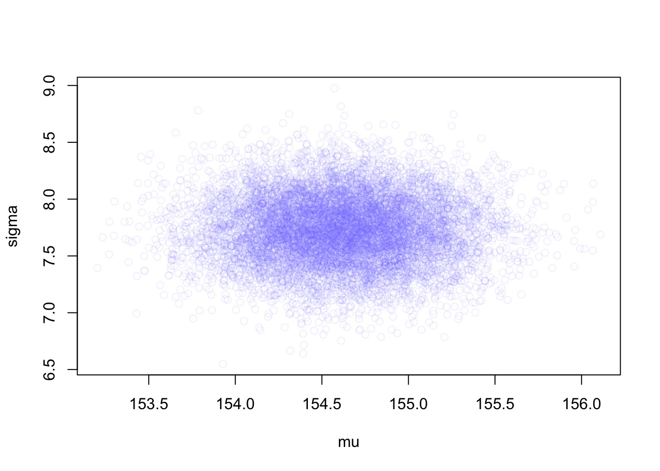
“see how much they resemble the samples from the grid approximation in Graph 4.11. These samples also preserve the covariance between \(\mu\) and \(\sigma\). This hardly matters right now, because \(\mu\) and \(\sigma\) don’t covary at all in this model. But once you add a predictor variable to your model, covariance will matter a lot.” (McElreath, 2020, p. 91) (pdf)
R Code 4.48 a: Extract samples from the vectors of values from a multi-dimensional Gaussian distribution with MASS::mvrnorm() and plot the result (Original)
MASS::mvrnorm()The function rethinking::extract.samples() in the “Sample1” tab is for convenience. It is just running a simple simulation of the sort you conducted near the end of Chapter 3 with R Code 3.52.
Under the hood the work of rethinking::extract.samples() is done by a multi-dimensional version of stats::rnorm(), MASS::mvrnorm(). The function stats::rnorm() simulates random Gaussian values, while MASS::mvrnorm() simulates random vectors of multivariate Gaussian values.
How to interpret covariances?
A large covariance can mean a strong relationship between variables. However, you can’t compare variances over data sets with different scales (like pounds and inches). A weak covariance in one data set may be a strong one in a different data set with different scales.
The main problem with interpretation is that the wide range of results that it takes on makes it hard to interpret. For example, your data set could return a value of 3, or 3,000. This wide range of values is caused by a simple fact: The larger the X and Y values, the larger the covariance. A value of 300 tells us that the variables are correlated, but unlike the correlation coefficient, that number doesn’t tell us exactly how strong that relationship is. The problem can be fixed by dividing the covariance by the standard deviation to get the correlation coefficient. (Statistics How To)
WATCH OUT! Confusing m4.1a with m4.3a
Frankly speaking I had troubles to understand why the correlation in m4.1a is almost 0. It turned out that I had unconsciously in mind a correlation between height and weight, an issue that is raised later in the chapter with m4.3a.
Although with m4.1bis a multi-dimensional Gaussian distribution in discussion but only with the height correlation of \(\mu\) and \(\sigma\). \(\mu\) of the height distribution does not help you in the estimation of \(\sigma\) in this distribution – and vice-versa.
brms::brm() fitIn contrast to the {rethinking} approach the {brms} doesn’t seem to have the same convenience functions and therefore we have to use different workarounds to get the same results. To get equivalent output it is the best strategy to put the Hamilton Monte Carlo (HMC) chains in a data frame and then apply the appropriate functions.
Example 4.14 b: Sampling with as_draw() functions from a brms::brm() fit
R Code 4.49 b: Variance-covariance matrix (Original)
brms:::vcov.brmsfit(m4.1b)#> Intercept
#> Intercept 0.1717797The vcov() function working with brmsfit objects only returns the first element in the matrix it did for {rethinking}. That is, it appears brms::vcov.brmsfit() only returns the variance/covariance matrix for the single-level _β_ parameters.
If we want the same information as with rethinking::vcov(), we have to put the HMC chains in a data frame with the brms::as_draws_df() function as shown in the next tab “draws”.
R Code 4.50 b: Extract the iteration of the Hamilton Monte Carlo (HMC) chains into a data frame (Tidyverse)
set.seed(4)
post_b <- brms::as_draws_df(m4.1b)

bayr::as_tbl_obs(post_b)| Obs | b_Intercept | sigma | lprior | lp__ | .chain | .iteration | .draw |
|---|---|---|---|---|---|---|---|
| 71 | 154.9925 | 7.868132 | -8.488375 | -1226.553 | 1 | 71 | 71 |
| 587 | 154.3334 | 7.626869 | -8.526828 | -1226.342 | 1 | 587 | 587 |
| 684 | 154.8032 | 8.290861 | -8.499311 | -1227.720 | 1 | 684 | 684 |
| 1528 | 154.4008 | 7.591280 | -8.522846 | -1226.302 | 2 | 528 | 1528 |
| 1795 | 155.7369 | 7.777169 | -8.446249 | -1229.762 | 2 | 795 | 1795 |
| 2038 | 154.7231 | 7.355423 | -8.503959 | -1227.029 | 3 | 38 | 2038 |
| 2419 | 154.5437 | 7.982696 | -8.514439 | -1226.377 | 3 | 419 | 2419 |
| 2867 | 154.8770 | 7.750134 | -8.495038 | -1226.252 | 3 | 867 | 2867 |
Family of as_draws() functions and the {posterior} package
The functions of the family as_draws() transform brmsfit objects to draws objects, a format supported by the {posterior} package. {brms} currently imports the family of as_draws()functions from the {posterior} package, a tool for working with posterior distributions, i.e. for fitting Bayesian models or working with output from Bayesian models. (See as an introduction The posterior R package)
It’s also noteworthy that the as_draws_df() is part of a larger class of as_draws() functions {brms} currently imports from the {posterior} package.
R Code 4.51 b: Class of as_draws() functions {brms}
class(post_b)#> [1] "draws_df" "draws" "tbl_df" "tbl" "data.frame"Besides of class tbl_df and tbl, subclasses of data.frame with different behavior the as_draws_df() function has created the draws class, the parent class of all supported draws formats.
b: Vector of variances and correlation matrix for b_Intercept and \(\sigma\) (Original)
#> Warning: Dropping 'draws_df' class as required metadata was removed.#> b_Intercept sigma
#> 0.17177971 0.08681616This result is now the equivalent of the rethinking::vcov() in panel “vcov” of Example 4.13.
R Code 4.52 b: Covariance matrix (Tidyverse)
brms:::vcov.brmsfit(m4.1b)#> Intercept
#> Intercept 0.1717797R Code 4.54 b: Variance-covariance matrix (Original)
utils::str(post_b)#> draws_df [4,000 × 7] (S3: draws_df/draws/tbl_df/tbl/data.frame)
#> $ b_Intercept: num [1:4000] 155 155 154 154 155 ...
#> $ sigma : num [1:4000] 7.55 7.02 7.58 7.95 7.63 ...
#> $ lprior : num [1:4000] -8.49 -8.49 -8.52 -8.52 -8.52 ...
#> $ lp__ : num [1:4000] -1227 -1230 -1226 -1226 -1226 ...
#> $ .chain : int [1:4000] 1 1 1 1 1 1 1 1 1 1 ...
#> $ .iteration : int [1:4000] 1 2 3 4 5 6 7 8 9 10 ...
#> $ .draw : int [1:4000] 1 2 3 4 5 6 7 8 9 10 ...The
post_bobject is not just a data frame, but also of classdraws_df, which means it contains three metadata variables —-.chain,.iteration, and.draw— which are often hidden from view, but are there in the background when needed. As you’ll see, we’ll make good use of the.drawvariable in the future. Notice how our post data frame also includes a vector namedlp__. That’s the log posterior. (Kurz, Sec.4.3.6)
For details, see: - The Log-Posterior (function and gradient) section of the Stan Development Team’s (2023) vignette RStan: the R interface to Stan and - Stephen Martin’s explanation of the log posterior on the Stan Forums.
R Code 4.55 b: Summarize the extracted iterations of the HMC chains: base() version
base::summary(post_b[, 1:2])#> Warning: Dropping 'draws_df' class as required metadata was removed.#> b_Intercept sigma
#> Min. :153.3 Min. :6.841
#> 1st Qu.:154.3 1st Qu.:7.567
#> Median :154.6 Median :7.757
#> Mean :154.6 Mean :7.771
#> 3rd Qu.:154.9 3rd Qu.:7.971
#> Max. :156.2 Max. :8.864b: Summarize the extracted iterations of the HMC chains: posterior() version
posterior:::summary.draws(post_b[, 1:2])#> Warning: Dropping 'draws_df' class as required metadata was removed.#> # A tibble: 2 × 10
#> variable mean median sd mad q5 q95 rhat ess_bulk ess_tail
#> <chr> <dbl> <dbl> <dbl> <dbl> <dbl> <dbl> <dbl> <dbl> <dbl>
#> 1 b_Intercept 155. 155. 0.414 0.421 154. 155. 1.00 2722. 2624.
#> 2 sigma 7.77 7.76 0.295 0.301 7.31 8.27 1.00 3369. 2537.R Code 4.56 b: Summarize with skimr::skim()
skimr::skim(post_b[, 1:2])#> Warning: Dropping 'draws_df' class as required metadata was removed.| Name | post_b[, 1:2] |
| Number of rows | 4000 |
| Number of columns | 2 |
| _______________________ | |
| Column type frequency: | |
| numeric | 2 |
| ________________________ | |
| Group variables | None |
Variable type: numeric
| skim_variable | n_missing | complete_rate | mean | sd | p0 | p25 | p50 | p75 | p100 | hist |
|---|---|---|---|---|---|---|---|---|---|---|
| b_Intercept | 0 | 1 | 154.60 | 0.41 | 153.29 | 154.31 | 154.59 | 154.88 | 156.22 | ▁▆▇▂▁ |
| sigma | 0 | 1 | 7.77 | 0.29 | 6.84 | 7.57 | 7.76 | 7.97 | 8.86 | ▁▆▇▂▁ |
Create summaries of samples that include tiny histograms
Kurz didn’t mention my suggestion to use skimr::skim() to get tiny histograms as part of the summary but proposes several other methods:
stats::quantile() call nested within base::apply()
brm() fit object into posterior_summary()
tidybayes::mean_hdi() if you’re willing to drop the posterior sd andhistospark() (from the unfinished {precis} package by Hadley Wickham supposed to replace base::summary()) to get the tiny histograms and to add them into the tidyverse approach.“What we’ve done above is a Gaussian model of height in a population of adults. But it doesn’t really have the usual feel of”regression” to it. Typically, we are interested in modeling how an outcome is related to some other variable, a predictor variable. If the predictor variable has any statistical association with the outcome variable, then we can use it to predict // the outcome. When the predictor variable is built inside the model in a particular way, we’ll have linear regression.” (McElreath, 2020, p. 91/92) (pdf)
Example 4.15 : Scatterplot of adult height versus weight
R Code 4.57 a: Scatterplot of adult height versus weight (Original)
## R code 4.37a #####################
plot(d2_a$height ~ d2_a$weight)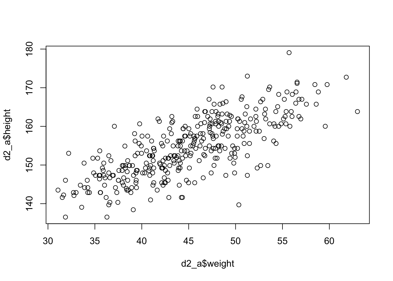
R Code 4.58 b: Scatterplot of adult height versus weight (Tidyverse)
## R code 4.37b #####################
d2_b |>
    ggplot2::ggplot(ggplot2::aes(height, weight)) +
    ggplot2::geom_point() +
    ggplot2::theme_bw()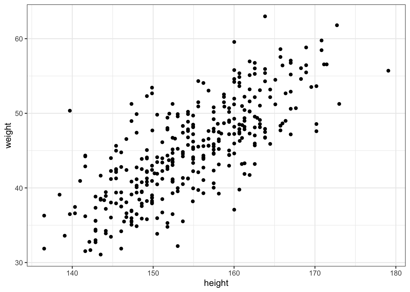
There’s obviously a relationship: Knowing a person’s weight helps to predict height.
“To make this vague observation into a more precise quantitative model that relates values of
weightto plausible values ofheight, we need some more technology. How do we take our Gaussian model from Section 4.3 and incorporate predictor variables?” (McElreath, 2020, p. 92) (pdf)
“The linear model strategy instructs the golem to assume that the predictor variable has a constant and additive relationship to the mean of the outcome. The golem then computes the posterior distribution of this constant relationship.” (McElreath, 2020, p. 92) (pdf)
“For each combination of values, the machine computes the posterior probability, which is a measure of relative plausibility, given the model and data. So the posterior distribution ranks the infinite possible combinations of parameter values by their logical plausibility.” (McElreath, 2020, p. 92) (pdf)
Example 4.16 : Linear model definition: Height against weight
: Define the linear heights model
\[ \begin{align*} h_{i} \sim \operatorname{Normal}(\mu, \sigma) \space \space (1) \\ μ \sim \operatorname{Normal}(178, 20) \space \space (2) \\ μ \sim \operatorname{Uniform}(0, 50) \space \space (3) \end{align*} \tag{4.4}\]
Remember Equation 4.3:
: Define the linear model heights against weights (V1)
\[ \begin{align*} h_{i} \sim \operatorname{Normal}(μ_{i}, σ) \space \space (1) \\ μ_{i} = \alpha + \beta(x_{i}-\overline{x}) \space \space (2) \\ \alpha \sim \operatorname{Normal}(178, 20) \space \space (3) \\ \beta \sim \operatorname{Normal}(0,10) \space \space (4) \\ \sigma \sim \operatorname{Uniform}(0, 50) \space \space (5) \end{align*} \tag{4.5}\]
Compare the differences with definition inside the Tab “only height”.
Likelihood (Probability of the data): The first line is nearly identical to before, except now there is a little index \(i\) on the \(μ\) as well as on the \(h\). You can read \(h_{i}\) as “each height” and \(\mu_{i}\) as “each \(μ\)” The mean \(μ\) now depends upon unique values on each row \(i\). So the little \(i\) on \(\mu_{i}\) indicates that the mean depends upon the row.
Linear model: The mean \(μ\) is no longer a parameter to be estimated. Rather, as seen in the second line of the model, \(\mu_{i}\) is constructed from other parameters, \(\alpha\) and \(\beta\), and the observed variable \(x\). This line is not a stochastic relationship —– there is no ~ in it, but rather an = in it —– because the definition of \(\mu_{i}\) is deterministic. That is to say that, once we know \(\alpha\) and \(\beta\) and \(x_{i}\), we know \(\mu_{i}\) with certainty. (More details follow in Section 4.4.1.2.)
includes (3),(4) and(5) with \(\alpha, \beta, \sigma\) priors: The remaining lines in the model define distributions for the unobserved variables. These variables are commonly known as parameters, and their distributions as priors. There are three parameters: \(\alpha, \beta, \sigma\). You’ve seen priors for \(\alpha\) and \(\sigma\) before, although \(\alpha\) was called \(\mu\) back then. (More details in Section 4.4.1.3)
“The value \(x_{i}\) in the second line of 4.5 is just the weight value on row \(i\). It refers to the same individual as the height value, \(h_{i}\), on the same row. The parameters \(\alpha\) and \(\beta\) are more mysterious. Where did they come from? We made them up. The parameters \(\mu\) and \(\sigma\) are necessary and sufficient to describe a Gaussian distribution. But \(\alpha\) and \(\beta\) are instead devices we invent for manipulating \(\mu\), allowing it to vary systematically across cases in the data.” (McElreath, 2020, p. 93) (pdf)
The second line \(μ_{i} = \alpha + \beta(x_{i}-\overline{x})\) of the model definition in Equation 4.7 tells us
“that you are asking two questions about the mean of the outcome:
- What is the expected height when \(x_{i} = \overline{x}\)? The parameter \(\alpha\) answers this question, because when \(x_{i} = \overline{x}\), \(\mu_{i} = \alpha\). For this reason, \(\alpha\) is often called the intercept. But we should think not in terms of some abstract line, but rather in terms of the meaning with respect to the observable variables.
- What is the change in expected height, when \(x_{i}\) changes by 1 unit? The parameter \(\beta\) answers this question. It is often called a slope, again because of the abstract line. Better to think of it as a rate of change in expectation.
Jointly these two parameters ask the golem to find a line that relates x to h, a line that passes through α when \(x_{i} = \overline{x}\) and has slope \(\beta\).” (McElreath, 2020, p. 94) (pdf)
“The prior for \(\beta\) in Equation 4.5 deserves explanation. Why have a Gaussian prior with mean zero? This prior places just as much probability below zero as it does above zero, and when \(\beta = 0\), // weight has no relationship to height. To figure out what this prior implies, we have to simulate the prior predictive distribution.” (McElreath, 2020, p. 94/95) (pdf)
The goal in Example 4.17 is to simulate heights from the model, using only the priors.
Example 4.17 : Simulating heights from the model, using only the priors
R Code 4.59 a: Simulating heights from the model, using only the priors (Original)
## range of weight values to simulate
## R code 4.38a #####################
N_100_a <- 100 # 100 lines

## set seed for exact reproduction
set.seed(2971)

## simulate lines implied by the priors for alpha and beta
a <- rnorm(N_100_a, 178, 20)
b <- rnorm(N_100_a, 0, 10)


## R code 4.39a #####################
plot(NULL,
  xlim = range(d2_a$weight), ylim = c(-100, 400),
  xlab = "weight", ylab = "height"
)

## added reference line for 0 and biggest man ever
abline(h = 0, lty = 2)
abline(h = 272, lty = 1, lwd = 0.5)
mtext("b ~ dnorm(0,10)")
xbar <- mean(d2_a$weight)
for (i in 1:N_100_a) {
  curve(a[i] + b[i] * (x - xbar),
    from = min(d2_a$weight), to = max(d2_a$weight), add = TRUE,
    col = rethinking::col.alpha("black", 0.2)
  )
}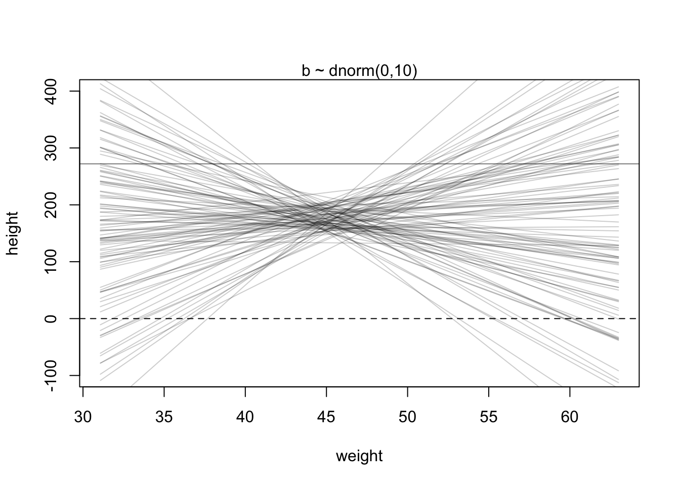
R Code 4.60 b: Simulating heights from the model, using only the priors (Tidyverse)
set.seed(2971)
# how many lines would you like?
n_lines <- 100

lines <-
  tibble::tibble(n = 1:n_lines,
         a = stats::rnorm(n_lines, mean = 178, sd = 20),
         b = stats::rnorm(n_lines, mean = 0, sd = 10)) |>
  tidyr::expand_grid(weight = base::range(d2_b$weight)) |>
  dplyr::mutate(height = a + b * (weight - base::mean(d2_b$weight)))


lines |>
  ggplot2::ggplot(ggplot2::aes(x = weight, y = height, group = n)) +
  ggplot2::geom_hline(yintercept = c(0, 272), linetype = 2:1, linewidth = 1/3) +
  ggplot2::geom_line(alpha = 1/10) +
  ggplot2::coord_cartesian(ylim = c(-100, 400)) +
  ggplot2::ggtitle("b ~ dnorm(0, 10)") +
  ggplot2::theme_classic()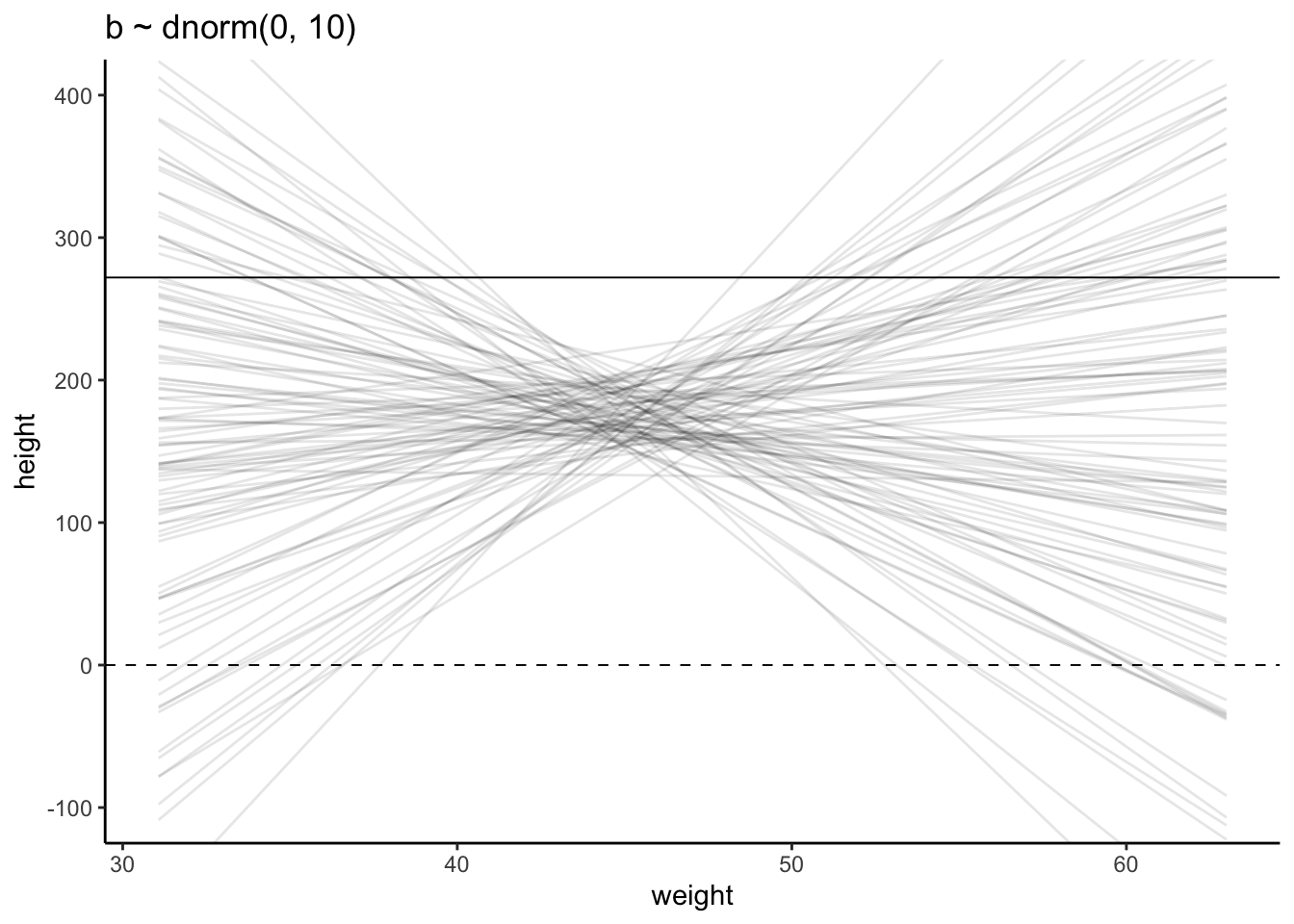
The dashed line are reference lines. One at zero—no one is shorter than zero—and one at 272 cm for Robert Wadlow the world’s tallest person.
“The pattern doesn’t look like any human population at all. It essentially says that the relationship // between weight and height could be absurdly positive or negative. Before we’ve even seen the data, this is a bad model.” (McElreath, 2020, p. 94/95) (pdf)
Theorem 4.3 : Defining the \(\beta\) prior as a Log-Normal distribution
\[ \beta \sim \operatorname{Log-Normal}(0,1) \tag{4.6}\]
Defining \(\beta\) as \(Log-Normal(0,1)\) means to claim that the logarithm of \(\beta\) has a \(Normal(0,1)\) distribution.” (McElreath, 2020, p. 96) (pdf)
: Log-Normal distribution
R Code 4.62 b: Log-Normal distribution (Tidyverse)
set.seed(4)

tibble::tibble(b = stats::rlnorm(1e4, meanlog = 0, sdlog = 1)) |>
  ggplot2::ggplot(ggplot2::aes(x = b)) +
  ggplot2::geom_density() +
  ggplot2::coord_cartesian(xlim = c(0, 5)) +
  ggplot2::theme_bw()
WATCH OUT! Argument matching
Kurz wrote just mean and sd instead of meanlog and sdlog. These shorter argument names work because of the partial matching feature in argument evaluation of R functions. But for educational reason (misunderstanding, clashing with other matching arguments and less readable code) I apply this technique only sometimes in interactive use.
Base R provides the dlnorm() and rlnorm() densities for working with log-normal distributions.
Using the Log-Normal distribution prohibits negative values. This is an important constraint for height and weight as these variables cannot be under \(0\).
“The reason is that
exp(x)is greater than zero for any real number \(x\). This is the reason that Log-Normal priors are commonplace. They are an easy way to enforce positive relationships.” (McElreath, 2020, p. 96) (pdf)
R Code 4.63 b: Compare Normal(0,1) with log(Log-Normal(0,1))”
If you’re unfamiliar with the log-normal distribution, it is the distribution whose logarithm is normally distributed. For example, here’s what happens when we compare Normal(0,1) with log(Log-Normal(0,1)). (Kurz)
set.seed(4)

tibble::tibble(rnorm             = stats::rnorm(1e5, mean = 0, sd = 1),
       `log(rlognorm)` = base::log(stats::rlnorm(1e5, meanlog = 0, sdlog = 1))) |>
  tidyr::pivot_longer(tidyr::everything()) |>

  ggplot2::ggplot(ggplot2::aes(x = value)) +
  ggplot2::geom_density(fill = "grey92") +
  ggplot2::coord_cartesian(xlim = c(-3, 3)) +
  ggplot2::theme_bw() +
  ggplot2::facet_wrap(~ name, nrow = 2)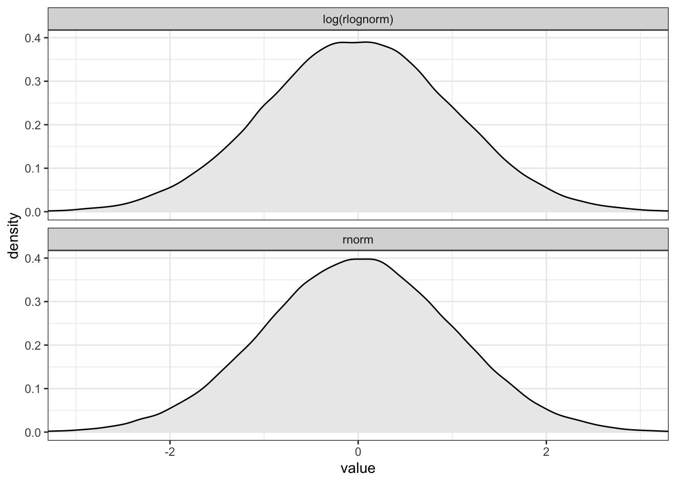
Those values are
whatthe mean and standard deviation of the output from therlnorm()function after they are log transformed. The formulas for the actual mean and standard deviation for the log-normal distribution itself are complicated (see Wikipedia). (Kurz)
: Prior predictive simulation again, now with the Log-Normal prior: (Original)
## R code 4.41a ###################
set.seed(2971)
N_100_a <- 100 # 100 lines
a <- rnorm(N_100_a, 178, 20)
b <- rlnorm(N_100_a, 0, 1)

## R code 4.39a ###################
plot(NULL,
  xlim = range(d2_a$weight), ylim = c(-100, 400),
  xlab = "weight", ylab = "height"
)
abline(h = 0, lty = 2)
abline(h = 272, lty = 1, lwd = 0.5)
mtext("b ~ dnorm(0,10)")
xbar <- mean(d2_a$weight)
for (i in 1:N_100_a) {
  curve(a[i] + b[i] * (x - xbar),
    from = min(d2_a$weight), to = max(d2_a$weight), add = TRUE,
    col = rethinking::col.alpha("black", 0.2)
  )
}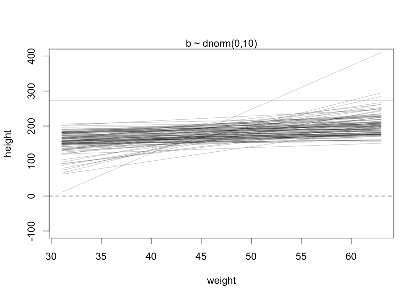
This is much more sensible. There is still a rare impossible relationship. But nearly all lines in the joint prior for \(\alpha\) and \(\beta\) are now within human reason.
R Code 4.64 b: Prior predictive simulation again, now with the Log-Normal prior (Tidyverse)
# make a tibble to annotate the plot
text <-
  tibble::tibble(weight = c(34, 43),
         height = c(0 - 25, 272 + 25),
         label  = c("Embryo", "World's tallest person (272 cm)"))

# simulate
base::set.seed(2971)

tibble::tibble(n = 1:n_lines,
       a = stats::rnorm(n_lines, mean = 178, sd = 20),
       b = stats::rlnorm(n_lines, mean = 0, sd = 1)) |>
  tidyr::expand_grid(weight = base::range(d2_b$weight)) |>
  dplyr::mutate(height = a + b * (weight - base::mean(d2_b$weight))) |>

  # plot
  ggplot2::ggplot(ggplot2::aes(x = weight, y = height, group = n)) +
  ggplot2::geom_hline(yintercept = c(0, 272), linetype = 2:1, linewidth = 1/3) +
  ggplot2::geom_line(alpha = 1/10) +
  ggplot2::geom_text(data = text,
            ggplot2::aes(label = label),
            size = 3) +
  ggplot2::coord_cartesian(ylim = c(-100, 400)) +
  ggplot2::ggtitle("log(b) ~ dnorm(0, 1)") +
  ggplot2::theme_bw()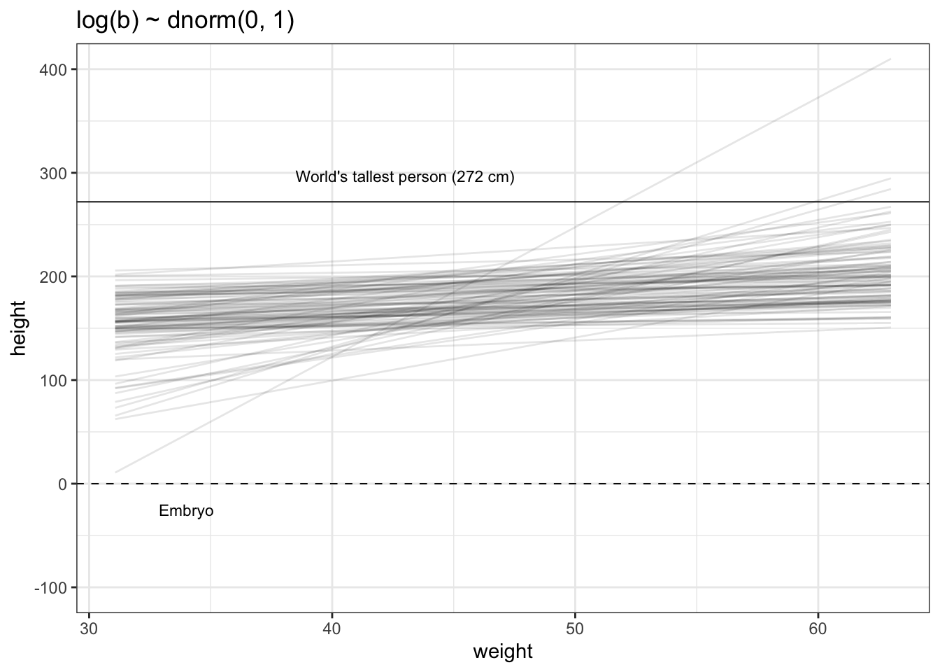
What is the correct prior?
“There is no more a uniquely correct prior than there is a uniquely correct likelihood. …
In choosing priors, there are simple guidelines to get you started. Priors encode states of information before seeing data. So priors allow us to explore the consequences of beginning with different information. In cases in which we have good prior information that discounts the plausibility of some parameter values, like negative associations between height and weight, we can encode that information directly into priors. When we don’t have such information, we still usually know enough about the plausible range of values. And you can vary the priors and repeat the analysis in order to study // how different states of initial information influence inference. Frequently, there are many reasonable choices for a prior, and all of them produce the same inference.” (McElreath, 2020, p. 95/96) (pdf)
WATCH OUT! Prior predictive simulation and p-hacking
“A serious problem in contemporary applied statistics is p-hacking, the practice of adjusting the model and the data to achieve a desired result. The desired result is usually a p-value less then 5%. The problem is that when the model is adjusted in light of the observed data, then p-values no longer retain their original meaning. False results are to be expected.” (McElreath, 2020, p. 97) (pdf)
Prior predictive simulation and p-hacking
The paper by Simmons, Nelson and Simonsohn (2011), False-positive psychology: Undisclosed flexibility in data collection and analysis allows presenting anything as significant, is often cited as an introduction to the problem.
Another more recent publication is: MacCoun, R. J. (2022). MacCoun, R. J. (2022). P-hacking: A Strategic Analysis. In L. Jussim, J. A. Krosnick, & S. T. Stevens (Eds.), Research Integrity: Best Practices for the Social and Behavioral Sciences (pp. 295–315). Oxford University Press. https://doi.org/10.1093/oso/9780190938550.003.0011.
A book wide treatment is: Chambers, C. (2017). Seven Deadly Sins of Psychology: A Manifesto for Reforming the Culture of Scientific Practice (Illustrated Edition). Princeton University Press.
In Example 4.16 we have compared the linear heights model (Equation 4.4) with the linear model heights against weights (Equation 4.5). Now we repeat the linear model heights against weights and compare it with the corresponding R Code.
Example 4.18 : Compare formula and R code for linear model heights against weights (V2)
Theorem 4.4 : Formula of the linear model heights against weights (V2)
\[ \begin{align*} h_{i} \sim \operatorname{Normal}(μ_{i}, σ) \space \space (1) \\ μ_{i} = \alpha + \beta(x_{i}-\overline{x}) \space \space (2) \\ \alpha \sim \operatorname{Normal}(178, 20) \space \space (3) \\ \beta \sim \operatorname{Log-Normal}(0,10) \space \space (4) \\ \sigma \sim \operatorname{Uniform}(0, 50) \space \space (5) \end{align*} \tag{4.7}\]
R Code 4.65 : R Code of the linear model heights against weights (V2)
height ~ dnorm(mu, sigma)     # (1)
mu <- a + b * (weight - xbar) # (2)
a ~ dnorm(178, 20)            # (3)
b ~ dlnorm(0, 10)             # (4)
sigma ~ dunif(0, 50)          # (5)
Notice that the linear model, in the R code on the right-hand side, uses the R assignment operator, <- instead of the symbol =.
Example 4.19 : Find the posterior distribution of the linear height-weight model
R Code 4.66 a: Find the posterior distribution of the linear height-weight model (Original)
## R code 4.42a #############################

# define the average weight, x-bar
xbar_a <- mean(d2_a$weight)

# fit model
m4.3a <- rethinking::quap(
  alist(
    height ~ dnorm(mu, sigma),
    mu <- a + b * (weight - xbar_a),
    a ~ dnorm(178, 20),
    b ~ dlnorm(0, 1),
    sigma ~ dunif(0, 50)
  ),
  data = d2_a
)

# summary result
## R code 4.44a ############################
rethinking::precis(m4.3a)
#> mean sd 5.5% 94.5%
#> a 154.6012591 0.27030995 154.1692516 155.0332666
#> b 0.9033071 0.04192398 0.8363045 0.9703097
#> sigma 5.0719240 0.19115884 4.7664153 5.3774327R Code 4.67 a: Find the posterior distribution of the linear height-weight model: Log version (Original)
#>               mean         sd        5.5%        94.5%
#> a     154.60136683 0.27030697 154.1693641 155.03336957
#> log_b  -0.09957465 0.04626322  -0.1735122  -0.02563709
#> sigma   5.07186793 0.19115333   4.7663680   5.37736786
Note the exp(log_b) in the definition of mu. This is the same model as m4.3. It will make the same predictions. But instead of β in the posterior distribution, you get log((β). It is easy to translate between the two, because \(\beta = exp(log(\beta))\). In code form: b <- exp(log_b).
R Code 4.68 b: Find the posterior distribution of the linear height-weight model (Tidyverse)
d2_b <-
  d2_b |>
  dplyr::mutate(weight_c = weight - base::mean(weight))

m4.3b <-
  brms::brm(data = d2_b,
      family = gaussian,
      height ~ 1 + weight_c,
      prior = c(brms::prior(normal(178, 20), class = Intercept),
                brms::prior(lognormal(0, 1), class = b, lb = 0),
                brms::prior(uniform(0, 50), class = sigma, ub = 50)),
      iter = 2000, warmup = 1000, chains = 4, cores = 4,
      seed = 4,
      file = "brm_fits/m04.03b")

brms:::summary.brmsfit(m4.3b)
#> Family: gaussian
#> Links: mu = identity; sigma = identity
#> Formula: height ~ 1 + weight_c
#> Data: d2_b (Number of observations: 352)
#> Draws: 4 chains, each with iter = 2000; warmup = 1000; thin = 1;
#> total post-warmup draws = 4000
#>
#> Population-Level Effects:
#> Estimate Est.Error l-95% CI u-95% CI Rhat Bulk_ESS Tail_ESS
#> Intercept 154.61 0.27 154.09 155.14 1.00 4546 2895
#> weight_c 0.90 0.04 0.82 0.99 1.00 4278 2978
#>
#> Family Specific Parameters:
#> Estimate Est.Error l-95% CI u-95% CI Rhat Bulk_ESS Tail_ESS
#> sigma 5.11 0.20 4.72 5.51 1.00 4439 2773
#>
#> Draws were sampled using sampling(NUTS). For each parameter, Bulk_ESS
#> and Tail_ESS are effective sample size measures, and Rhat is the potential
#> scale reduction factor on split chains (at convergence, Rhat = 1).Remember: The detailed explication of the syntax for the following brms::brm() function is in the “Tidyverse” tab of Example 4.11.
Unlike with McElreath’s rethinking::quap() formula syntax, Kurz is not aware if we can just specify something like weight – xbar in the formula argument in brms::brm().
However, the alternative is easy: Just make a new variable in the data that is equivalent to weight – mean(weight). We’ll call it weight_c.
R Code 4.69 Find the posterior distribution of the linear height-weight model (log version) (Tidyverse)
m4.3b_log <-
  brms::brm(data = d2_b,
      family = gaussian,
      brms::bf(height ~ a + exp(lb) * weight_c,
         a ~ 1,
         lb ~ 1,
         nl = TRUE),
      prior = c(brms::prior(normal(178, 20), class = b, nlpar = a),
                brms::prior(normal(0, 1), class = b, nlpar = lb),
                brms::prior(uniform(0, 50), class = sigma, ub = 50)),
      iter = 2000, warmup = 1000, chains = 4, cores = 4,
      seed = 4,
      file = "brm_fits/m04.03b_log")

brms:::summary.brmsfit(m4.3b_log)
#> Family: gaussian
#> Links: mu = identity; sigma = identity
#> Formula: height ~ a + exp(lb) * weight_c
#> a ~ 1
#> lb ~ 1
#> Data: d2_b (Number of observations: 352)
#> Draws: 4 chains, each with iter = 2000; warmup = 1000; thin = 1;
#> total post-warmup draws = 4000
#>
#> Population-Level Effects:
#> Estimate Est.Error l-95% CI u-95% CI Rhat Bulk_ESS Tail_ESS
#> a_Intercept 154.61 0.27 154.08 155.12 1.00 3524 2646
#> lb_Intercept -0.10 0.05 -0.20 -0.01 1.00 4412 2848
#>
#> Family Specific Parameters:
#> Estimate Est.Error l-95% CI u-95% CI Rhat Bulk_ESS Tail_ESS
#> sigma 5.11 0.19 4.75 5.51 1.00 3697 2629
#>
#> Draws were sampled using sampling(NUTS). For each parameter, Bulk_ESS
#> and Tail_ESS are effective sample size measures, and Rhat is the potential
#> scale reduction factor on split chains (at convergence, Rhat = 1).Remember: The detailed explication of the syntax for the following brms::brm() function is in the “Tidyverse” tab of Example 4.11.
The difference is for the \(\beta\) parameter, which we called lb in the m4.3b_log model. If we term that parameter from m4.3b as \(\beta^{m4.3b}\) and the one from our new log model \(\beta^{m4.3b_log}\), it turns out that \(\beta^{m4.3b} = exp(\beta^{m4.3b_log})\).
Compare the result with the previous tab “Tidyverse” in R Code 4.68.
R Code 4.70 b: Extract and compare the population-level (fixed) effects from object m4.3b and the form log version m4.3b_log
They’re the same within simulation variance.
R Code 4.71 Display trace plots (Tidyverse)
brms:::plot.brmsfit(m4.3b, widths = c(1, 2))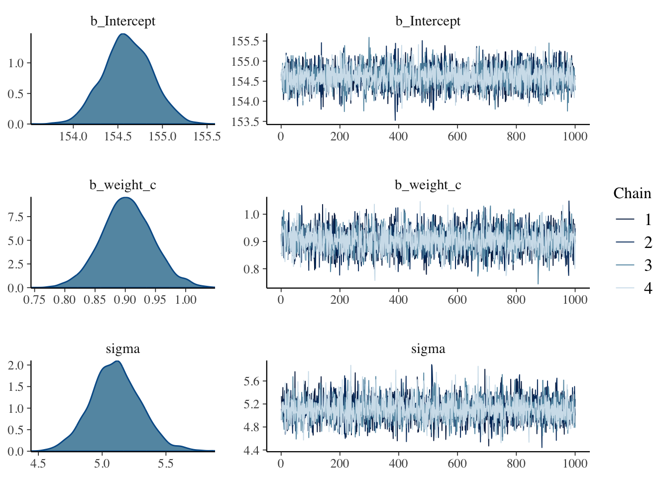
Checking MCMC chains with trace plots and trank plots
At the moment I didn’t learn how to interpret these types of graphic output. McElreath’s explains in later video lectures that it is important that trace plot cover the same location in the vertical axis (e.g. they do not jump around) and show that all different chains alternate in their (top) positions. I mentioned here the top position because this is the place where irregularities can be detected more easily.
In the above example it is difficult to decide if this is the case because the color differences of the different chains are weak. But it is general difficult to inspect trace plot, therefore McElreath proposes trace rank plots or trank plot (his terminus) in ?sec-chap09.
To understand the differences in syntax between {rethinking} and {brms} it is also quite revealing to look at Table 4.2. I have inserted the following table from Kurz’ explanation of model b4.3.
| {rethinking} package | {brms} package: |
|---|---|
| \(\text{height}_i \sim \operatorname{Normal}(\mu_i, \sigma)\) | family = gaussian |
| \(\mu_i = \alpha + \beta \text{weight}_i\) | height ~ 1 + weight_c |
| \(\alpha \sim \operatorname{Normal}(178, 20)\) | prior(normal(178, 20), class = Intercept |
| \(\beta \sim \operatorname{Log-Normal}(0, 1)\) | prior(lognormal(0, 1), class = b) |
| \(\sigma \sim \operatorname{Uniform}(0, 50)\) | prior(uniform(0, 50), class = sigma) |
What do parameters mean?
“Posterior probabilities of parameter values describe the relative compatibility of different states of the world with the data, according to the model. These are small world (Chapter 2) numbers.” (McElreath, 2020, p. 99) (pdf)
Statistical models are hard to interpret. Plotting posterior distributions and posterior predictions is better than attempting to understand a table.
There are many different options in the tidyverse approach, repsectively with {brms}. The most
Example 4.20 Inspect the marginal posterior distributions of the parameters
R Code 4.72 a: Inspect the marginal posterior distributions of the parameters (Original)
## R code 4.44 ##########
rethinking::precis(m4.3a)
#> mean sd 5.5% 94.5%
#> a 154.6012591 0.27030995 154.1692516 155.0332666
#> b 0.9033071 0.04192398 0.8363045 0.9703097
#> sigma 5.0719240 0.19115884 4.7664153 5.3774327Let’s focus on b (\(\beta\)), because it’s the new parameter. Since (\(\beta\)) is a slope, the value 0.90 can be read as a person 1 kg heavier is expected to be 0.90 cm taller. 89% of the posterior probability (\(94.5-5.5\)) lies between 0.84 and 0.97. That suggests that (\(\beta\)) values close to zero or greatly above one are highly incompatible with these data and this model. It is most certainly not evidence that the relationship between weight and height is linear, because the model only considered lines. It just says that, if you are committed to a line, then lines with a slope around 0.9 are plausible ones.
R Code 4.73 b: Display variance-covariance matrix (Original)
The numbers in the default rethinking::precis() output aren’t sufficient to describe the quadratic posterior completely. Therefore we also need to inspect the variance-covariance matrix.
## R code 4.45a ################
round(rethinking::vcov(m4.3a), 3)
#> a b sigma
#> a 0.073 0.000 0.000
#> b 0.000 0.002 0.000
#> sigma 0.000 0.000 0.037There is very little covariation among the parameters in this case.
R Code 4.74 b: Display variance-covariance matrix (Original)
rethinking::pairs(m4.3a)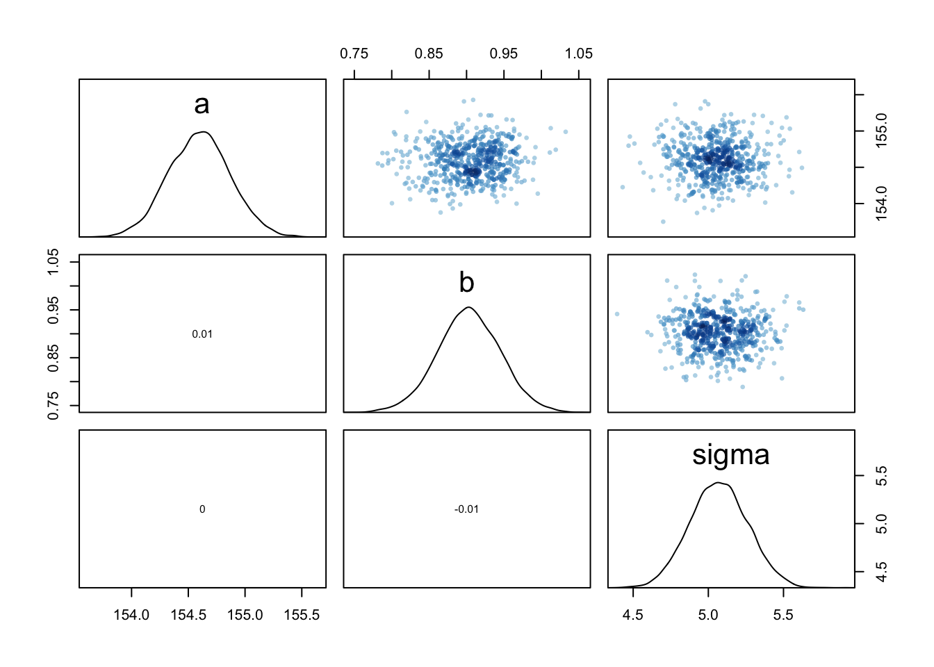
The graphic shows both the marginal posteriors and the covariance.
R Code 4.75 b: Display the marginal posterior distributions of the parameters (brms)
brms::posterior_summary(m4.3b, probs = c(0.055, 0.945))[1:3, ] |>
  round(digits = 2)
#> Estimate Est.Error Q5.5 Q94.5
#> b_Intercept 154.61 0.27 154.18 155.05
#> b_weight_c 0.90 0.04 0.84 0.97
#> sigma 5.11 0.20 4.80 5.43Looking up brms::posterior_summary() I learned that the “function mainly exists to retain backwards compatibility”. It will eventually be replaced by functions of the {posterior} package”. (brms)
WATCH OUT! How to insert coefficients into functions with {brms}?
{brms} does not allow users to insert coefficients into functions like
exp()within the conventionalformulasyntax. We can fit a {brms} model like McElreath’sm4.3aif we adopt what’s called the non-linear syntax. The non-linear syntax is a lot like the syntax McElreath uses in {rethinking} in that it typically includes both predictor and variable names in theformula. (Kurz)
Kurz promises to explain later in his ebook what non-linear syntax exactly means.
R Code 4.76 b: Display the marginal posterior distributions of the parameters with summarize_draws() from {posterior}
posterior::summarize_draws(m4.3b, "mean", "median", "sd",
                           ~quantile(., probs = c(0.055, 0.945)),
                           .num_args = list(sigfig = 2))[1:3, ]
#> # A tibble: 3 × 6
#> variable mean median sd `5.5%` `94.5%`
#> <chr> <dbl> <dbl> <dbl> <dbl> <dbl>
#> 1 b_Intercept 155. 155. 0.27 154. 155.
#> 2 b_weight_c 0.90 0.90 0.042 0.84 0.97
#> 3 sigma 5.1 5.1 0.20 4.8 5.4R Code 4.77 b: Display the marginal posterior distributions of the parameters of brms::as_draws_array() objects
## summary for draws object
summary(brms::as_draws_array(m4.3b))[1:3, ]
#> # A tibble: 3 × 10
#> variable mean median sd mad q5 q95 rhat ess_bulk ess_tail
#> <chr> <dbl> <dbl> <dbl> <dbl> <dbl> <dbl> <dbl> <dbl> <dbl>
#> 1 b_Inter… 155. 155. 0.272 0.275 154. 155. 1.00 4546. 2895.
#> 2 b_weigh… 0.903 0.903 0.0424 0.0414 0.834 0.973 1.00 4278. 2978.
#> 3 sigma 5.11 5.10 0.198 0.190 4.79 5.44 1.00 4439. 2773.R Code 4.78 b: Display variance-covariance matrix (brms)
brms:::vcov.brmsfit(m4.3b) |>
  round(3)
#> Intercept weight_c
#> Intercept 0.074 0.000
#> weight_c 0.000 0.002We got the variance/covariance matrix of the intercept and weight_c coefficient but not \(\sigma\) however. To get that, we’ll have to extract the posterior draws and use the cov() function, instead. (See next tab “vcov2 (T)”)
R Code 4.79 b: Variance-covariance matrix with {posterior} draws objects (brms)
brms::as_draws_df(m4.3b) |>
  dplyr::select(b_Intercept:sigma) |>
  stats::cov() |>
  base::round(digits = 3)
#> b_Intercept b_weight_c sigma
#> b_Intercept 0.074 0.000 0.000
#> b_weight_c 0.000 0.002 0.000
#> sigma 0.000 0.000 0.039R Code 4.80 b: Display variance-covariance matrix (brms)
brms:::pairs.brmsfit(m4.3b)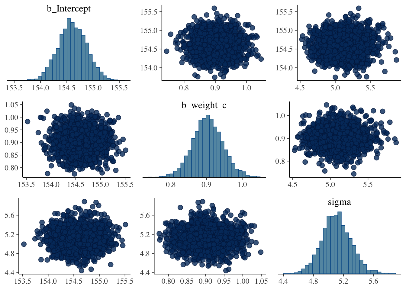
The graphic shows both the marginal posteriors and the covariance.
Example 4.21 : Height plotted against weight with linear regression (line at the posterior mean)
R Code 4.81 a: Height in centimeters (vertical) plotted against weight in kilograms (horizontal), with the line at the posterior mean plotted in black (Original)
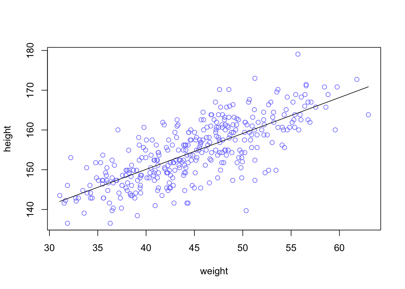
Each point in this plot is a single individual. The black line is defined by the mean slope \(\beta\) and mean intercept \(\alpha\). This is not a bad line. It certainly looks highly plausible. But there are an infinite number of other highly plausible lines near it. See next tab
R Code 4.82 b: Height in centimeters (vertical) plotted against weight_c (horizontal), with the line at the posterior mean plotted in black with standardized centered weight values (Tidyverse)
d2_b |>
  ggplot2::ggplot(ggplot2::aes(x = weight_c, y = height)) +
  ggplot2::geom_abline(intercept = brms:::fixef.brmsfit(m4.3b)[1],
              slope     = brms:::fixef.brmsfit(m4.3b)[2]) +
  ggplot2::geom_point(shape = 1, size = 2, color = "royalblue") +
  ggplot2::theme_bw()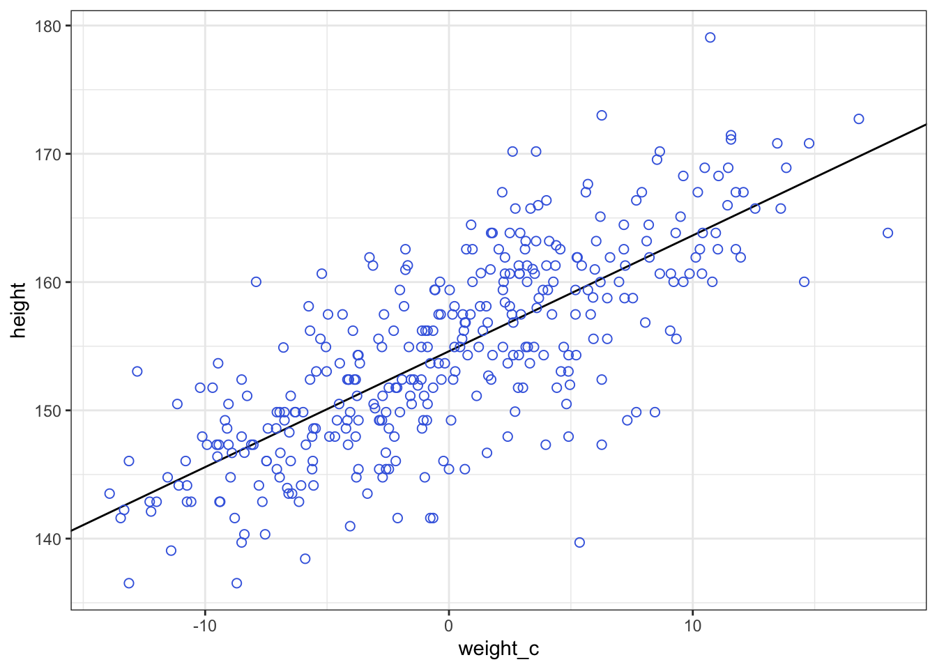
Note how the breaks on our x-axis look off. That’s because we fit the model with weight_c and we plotted the points in that metric, too. Since we computed weight_c by subtracting the mean of weight from the data, we can adjust the x-axis break point labels by simply adding that value back. (See next tab “Tidyverse2”)
Further note the use of the brms:::fixef.brmsfit() function within ggplot2::geom_abline(). The function extracts the population-level (‘fixed’) effects from a brmsfit object.
R Code 4.83 b: Height in centimeters (vertical) plotted against weight_c (horizontal), with the line at the posterior mean plotted in black with centered weights in kg (Tidyverse)
labels <-
  c(-10, 0, 10) + base::mean(d2_b$weight) |>
  base::round(digits = 0)

d2_b |>
  ggplot2::ggplot(ggplot2::aes(x = weight_c, y = height)) +
  ggplot2::geom_abline(intercept = brms::fixef(m4.3b, probs = c(0.055, 0.945))[[1]],
              slope     = brms::fixef(m4.3b, probs = c(0.055, 0.945))[[2]]) +
  ggplot2::geom_point(shape = 1, size = 2, color = "royalblue") +
  ggplot2::scale_x_continuous("weight",
                     breaks = c(-10, 0, 10),
                     labels = labels) +
  ggplot2::theme_bw()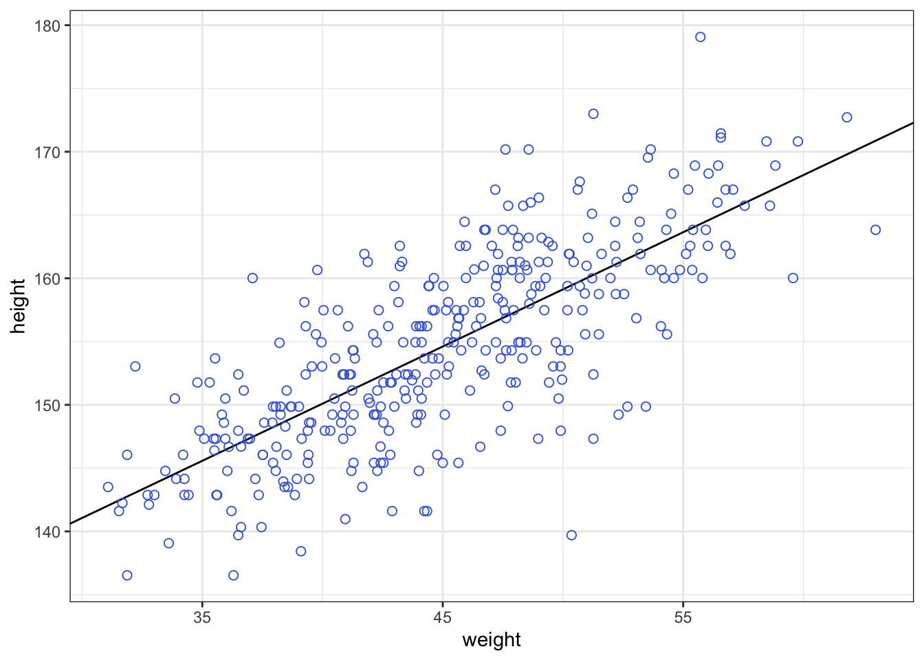
Note the use of the brms:::fixef.brmsfit() function within ggplot2::geom_abline(). The function extracts the population-level (‘fixed’) effects from a brmsfit object.
What are population-level (“fixed”) effects?
I didn’t know what it meant exactly that brms::fixef() extracts the population-level (‘fixed’) effect from a brmsfit object. After reading other books I now understand that this means effects of the whole population in contrast to effects on the idividual level (so-called “random effect”). (The terms “fixed” and “random” effects are misleading, as both effects are random.)
“Generally, these are the three types of parameters in multi-level models: the population-level estimate (commonly called fixed effects), the participant-level estimates (random effects) and the participant-level variation.” (Schmettow, 2022, p. 268) (pdf)
“There is a lot of confusion about the type of models that we deal with in this chapter. They have also been called hierarchical models or mixed effects models. The”mixed” stands for a mixture of so called fixed effects and random effects. The problem is: if you start by understanding what fixed effects and random effects are, confusion is programmed, not only because there exist several very different definitions. In fact, it does not matter so much whether an estimate is a fixed effect or random effect. As we will see, you can construct a multi-level model by using just plain descriptive summaries. What matters is that a model contains estimates on population level and on participant level. The benefit is, that a multi-level model can answer the same question for the population as a whole and for every single participant.” (Schmettow, 2022, p. 278) (pdf)
Fixed and random effects
After I googled it turned out that there is a great discussion about Fixed Effects in Linear Regression and generally about fixed, random and mixed models (See Cross Validated here and here).
There is also a glossary entry in statistics.com.
And last but not least there are academic papers on this topic:
“Plots of the average line, like Graph 4.30, are useful for getting an impression of the magnitude of the estimated influence of a variable. But they do a poor job of communicating uncertainty. Remember, the posterior distribution considers every possible regression line connecting height to weight. It assigns a relative plausibility to each. This means that each combination of \(\alpha\) and \(\beta\) has a posterior probability. It could be that there are many lines with nearly the same posterior probability as the average line. Or it could be instead that the posterior distribution is rather narrow near the average line.” (McElreath, 2020, p. 101) (pdf)
Example 4.22 : Inspect the uncertainty around the mean
R Code 4.84 a: Show some posterior data rows (Original)
## R code 4.47a ################
# post_m4.3a <- rethinking::extract.samples(m4.3a) # already in previous listing
set.seed(4)
bayr::as_tbl_obs(post_m4.3a)| Obs | a | b | sigma |
|---|---|---|---|
| 307 | 154.2976 | 0.9186361 | 4.841837 |
| 587 | 154.9650 | 0.8467550 | 4.994881 |
| 684 | 154.2021 | 0.9094732 | 5.415900 |
| 1795 | 155.1948 | 0.8750700 | 5.593173 |
| 2867 | 154.8796 | 0.8997763 | 5.146971 |
| 4167 | 153.9071 | 0.9294830 | 5.028728 |
| 4794 | 154.6078 | 0.8424997 | 4.918431 |
| 5624 | 154.7940 | 0.9329589 | 5.006664 |
“Each row is a correlated random sample from the joint posterior of all three parameters, using the covariances provided by
vcov(m4.3a)in Tab”vcov (O)” in Example 4.20. The paired values ofaandbon each row define a line. The average of very many of these lines is the posterior mean line. But the scatter around that average is meaningful, because it alters our confidence in the relationship between the predictor and the outcome” (McElreath, 2020, p. 101) (pdf)
R Code 4.85 a: Plot 20 sampled lines of 10 data points to the uncertainty around the mean (Original)
## R code 4.48a ##########################
N10_a <- 10
dN10_a <- d2_a[1:N10_a, ]
mN10_a <- rethinking::quap(
  alist(
    height ~ dnorm(mu, sigma),
    mu <- a + b * (weight - mean(weight)),
    a ~ dnorm(178, 20),
    b ~ dlnorm(0, 1),
    sigma ~ dunif(0, 50)
  ),
  data = dN10_a
)

## R code 4.49a ##############################
# extract 20 samples from the posterior
set.seed(4)
post_20_m4.3a <- rethinking::extract.samples(mN10_a, n = 20)

# display raw data and sample size
plot(dN10_a$weight, dN10_a$height,
  xlim = range(d2_a$weight), ylim = range(d2_a$height),
  col = rethinking::rangi2, xlab = "weight", ylab = "height"
)
mtext(rethinking:::concat("N = ", N10_a))

# plot the lines, with transparency
for (i in 1:20) {
  curve(post_20_m4.3a$a[i] + post_20_m4.3a$b[i] * (x - mean(dN10_a$weight)),
    col = rethinking::col.alpha("black", 0.3), add = TRUE
  )
}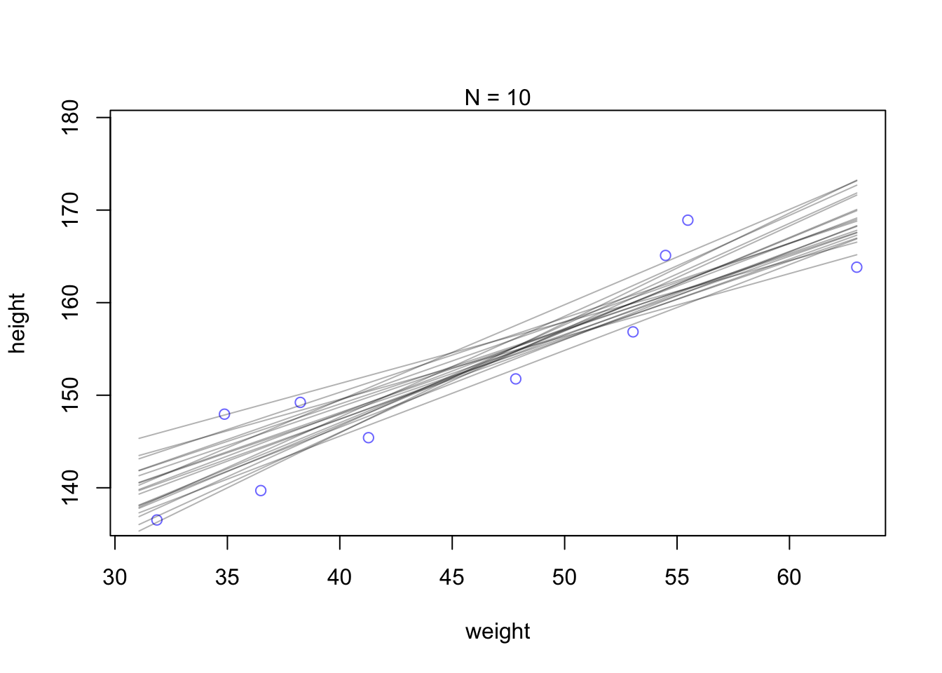
“By plotting multiple regression lines, sampled from the posterior, it is easy to see both the highly confident aspects of the relationship and the less confident aspects. The cloud of regression lines displays greater uncertainty at extreme values for weight.” (McElreath, 2020, p. 102) (pdf)
R Code 4.86 a: Plot 20 sampled lines of 50 data points to the uncertainty around the mean (Original)
## R code 4.48a ######################
N50_a <- 50
dN50_a <- d2_a[1:N50_a, ]
mN50_a <- rethinking::quap(
  alist(
    height ~ dnorm(mu, sigma),
    mu <- a + b * (weight - mean(weight)),
    a ~ dnorm(178, 20),
    b ~ dlnorm(0, 1),
    sigma ~ dunif(0, 50)
  ),
  data = dN50_a
)

## R code 4.49a ######################
# extract 20 samples from the posterior
set.seed(4)
post_50_m4.3a <- rethinking::extract.samples(mN50_a, n = 20)

# display raw data and sample size
plot(dN50_a$weight, dN50_a$height,
  xlim = range(d2_a$weight), ylim = range(d2_a$height),
  col = rethinking::rangi2, xlab = "weight", ylab = "height"
)
mtext(rethinking:::concat("N = ", N50_a))

# plot the lines, with transparency
for (i in 1:20) {
  curve(post_50_m4.3a$a[i] + post_50_m4.3a$b[i] * (x - mean(dN50_a$weight)),
    col = rethinking::col.alpha("black", 0.3), add = TRUE
  )
}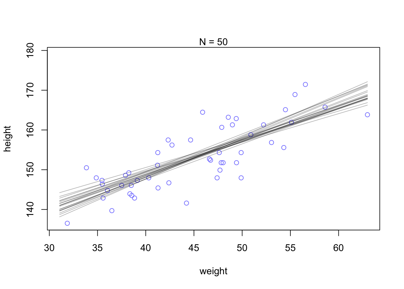
“Notice that the cloud of regression lines grows more compact as the sample size increases. This is a result of the model growing more confident about the location of the mean.” (McElreath, 2020, p. 102) (pdf)
R Code 4.87 a: Plot 20 sampled lines of 352 data points to the uncertainty around the mean (Original)
## R code 4.48, 4.49 ###########################
N352_a <- 352
dN352_a <- d2_a[1:N352_a, ]
mN352_a <- rethinking::quap(
  alist(
    height ~ dnorm(mu, sigma),
    mu <- a + b * (weight - mean(weight)),
    a ~ dnorm(178, 20),
    b ~ dlnorm(0, 1),
    sigma ~ dunif(0, 50)
  ),
  data = dN352_a
)

# extract 20 samples from the posterior
post_352_m4.3a <- rethinking::extract.samples(mN352_a, n = 20)

# display raw data and sample size
plot(dN352_a$weight, dN352_a$height,
  xlim = range(d2_a$weight), ylim = range(d2_a$height),
  col = rethinking::rangi2, xlab = "weight", ylab = "height"
)
mtext(rethinking:::concat("N = ", N352_a))

# plot the lines, with transparency
for (i in 1:20) {
  curve(post_352_m4.3a$a[i] + post_352_m4.3a$b[i] * (x - mean(dN352_a$weight)),
    col = rethinking::col.alpha("black", 0.3), add = TRUE
  )
}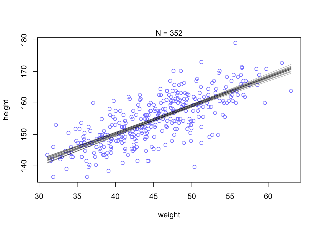
“Notice that the cloud of regression lines grows more compact as the sample size increases. This is a result of the model growing more confident about the location of the mean.” (McElreath, 2020, p. 102) (pdf)
R Code 4.88 b: Extract the iteration of the Hamiliton Monte Carlo (HMC) chains into a data frame and show 8 rows (Tidyverse)”
post_m4.3b <- brms::as_draws_df(m4.3b)
set.seed(4)
bayr::as_tbl_obs(post_m4.3b)| Obs | b_Intercept | b_weight_c | sigma | lprior | lp__ | .chain | .iteration | .draw |
|---|---|---|---|---|---|---|---|---|
| 71 | 154.4093 | 0.9211252 | 4.990186 | -9.362502 | -1079.373 | 1 | 71 | 71 |
| 587 | 154.5356 | 0.8923309 | 5.097617 | -9.326425 | -1079.011 | 1 | 587 | 587 |
| 684 | 154.9519 | 0.8758742 | 5.187928 | -9.285901 | -1080.125 | 1 | 684 | 684 |
| 1528 | 154.0199 | 0.8707605 | 4.943669 | -9.335626 | -1081.977 | 2 | 528 | 1528 |
| 1795 | 155.0464 | 0.8917125 | 5.051194 | -9.296172 | -1080.359 | 2 | 795 | 1795 |
| 2038 | 154.6438 | 0.8601186 | 5.262894 | -9.288191 | -1079.917 | 3 | 38 | 2038 |
| 2419 | 154.6285 | 1.0054228 | 5.048592 | -9.433840 | -1081.835 | 3 | 419 | 2419 |
| 2867 | 154.4709 | 0.8487887 | 5.262154 | -9.287149 | -1080.317 | 3 | 867 | 2867 |
Printout interpreted
b_Intercept represents a in the rethinking version.b_weight_c represents b in the rethinking version. But why did we have to calculate it different?sigma is the quadratic approximation of the standard deviation.lprior is – I assume – the log prior.l__ is what??Instead of rethinking::extract.samples() the {brms} packages extract all the posterior draws with brms::as_draws_df(). We have already done this with model m4.1b (Example 4.14 in tab “draws1”).
b: Plot 20 sampled lines of 10, 50, 150 and 352 data points to the uncertainty around the mean (Original)
## 1. Calculate all four models ################
dN10_b <- 10

m4.3b_010 <-
  brms::brm(data = d2_b |>
      dplyr::slice(1:dN10_b),  # note our tricky use of `N` and `slice()`
      family = gaussian,
      height ~ 1 + weight_c,
      prior = c(brms::prior(normal(178, 20), class = Intercept),
                brms::prior(lognormal(0, 1), class = b),
                brms::prior(uniform(0, 50), class = sigma, ub = 50)),
      iter = 2000, warmup = 1000, chains = 4, cores = 4,
      seed = 4,
      file = "brm_fits/m04.03b_010")

dN50_b <- 50

m4.3b_050 <-
  brms::brm(data = d2_b |>
      dplyr::slice(1:dN50_b),
      family = gaussian,
      height ~ 1 + weight_c,
      prior = c(brms::prior(normal(178, 20), class = Intercept),
                brms::prior(lognormal(0, 1), class = b),
                brms::prior(uniform(0, 50), class = sigma, ub = 50)),
      iter = 2000, warmup = 1000, chains = 4, cores = 4,
      seed = 4,
      file = "brm_fits/m04.03b_050")

dN150_b <- 150

m4.3b_150 <-
  brms::brm(data = d2_b |>
      dplyr::slice(1:dN150_b),
      family = gaussian,
      height ~ 1 + weight_c,
      prior = c(brms::prior(normal(178, 20), class = Intercept),
                brms::prior(lognormal(0, 1), class = b),
                brms::prior(uniform(0, 50), class = sigma, ub = 50)),
      iter = 2000, warmup = 1000, chains = 4, cores = 4,
      seed = 4,
      file = "brm_fits/m04.03b_150")

dN352_b <- 352

m4.3b_352 <-
  brms::brm(data = d2_b |>
      dplyr::slice(1:dN352_b),
      family = gaussian,
      height ~ 1 + weight_c,
      prior = c(brms::prior(normal(178, 20), class = Intercept),
                brms::prior(lognormal(0, 1), class = b),
                brms::prior(uniform(0, 50), class = sigma, ub = 50)),
      iter = 2000, warmup = 1000, chains = 4, cores = 4,
      seed = 4,
      file = "brm_fits/m04.03b_352")


## 2. put model chains into dfs ##########
post010_m4.3b <- brms::as_draws_df(m4.3b_010)
post050_m4.3b <- brms::as_draws_df(m4.3b_050)
post150_m4.3b <- brms::as_draws_df(m4.3b_150)
post352_m4.3b <- brms::as_draws_df(m4.3b_352)


## 3. prepare plots ##########
p10 <-
  ggplot2::ggplot(data =  d2_b[1:10, ],
         ggplot2::aes(x = weight_c, y = height)) +
  ggplot2::geom_abline(data = post010_m4.3b |> dplyr::slice(1:20),
              ggplot2::aes(intercept = b_Intercept, slope = b_weight_c),
              linewidth = 1/3, alpha = .3) +
  ggplot2::geom_point(shape = 1, size = 2, color = "royalblue") +
  ggplot2::coord_cartesian(xlim = base::range(d2_b$weight_c),
                  ylim = base::range(d2_b$height)) +
  ggplot2::labs(subtitle = "N = 10")

p50 <-
  ggplot2::ggplot(data =  d2_b[1:50, ],
         ggplot2::aes(x = weight_c, y = height)) +
  ggplot2::geom_abline(data = post050_m4.3b |> dplyr::slice(1:20),
              ggplot2::aes(intercept = b_Intercept, slope = b_weight_c),
              linewidth = 1/3, alpha = .3) +
  ggplot2::geom_point(shape = 1, size = 2, color = "royalblue") +
  ggplot2::coord_cartesian(xlim = base::range(d2_b$weight_c),
                  ylim = base::range(d2_b$height)) +
  ggplot2::labs(subtitle = "N = 50")

p150 <-
  ggplot2::ggplot(data =  d2_b[1:150, ],
         ggplot2::aes(x = weight_c, y = height)) +
  ggplot2::geom_abline(data = post150_m4.3b |> dplyr::slice(1:20),
              ggplot2::aes(intercept = b_Intercept, slope = b_weight_c),
              linewidth = 1/3, alpha = .3) +
  ggplot2::geom_point(shape = 1, size = 2, color = "royalblue") +
  ggplot2::coord_cartesian(xlim = base::range(d2_b$weight_c),
                  ylim = base::range(d2_b$height)) +
  ggplot2::labs(subtitle = "N = 150")

p352 <-
  ggplot2::ggplot(data =  d2_b[1:352, ],
         ggplot2::aes(x = weight_c, y = height)) +
  ggplot2::geom_abline(data = post352_m4.3b |> dplyr::slice(1:20),
              ggplot2::aes(intercept = b_Intercept, slope = b_weight_c),
              linewidth = 1/3, alpha = .3) +
  ggplot2::geom_point(shape = 1, size = 2, color = "royalblue") +
  ggplot2::coord_cartesian(xlim = base::range(d2_b$weight_c),
                  ylim = base::range(d2_b$height)) +
  ggplot2::labs(subtitle = "N = 352")

## 4. display plots {patchwork} ########
library(patchwork)
(p10 + p50 + p150 + p352) &
  ggplot2::scale_x_continuous("weight",
                     breaks = c(-10, 0, 10),
                     labels = labels) &
  ggplot2::theme_bw()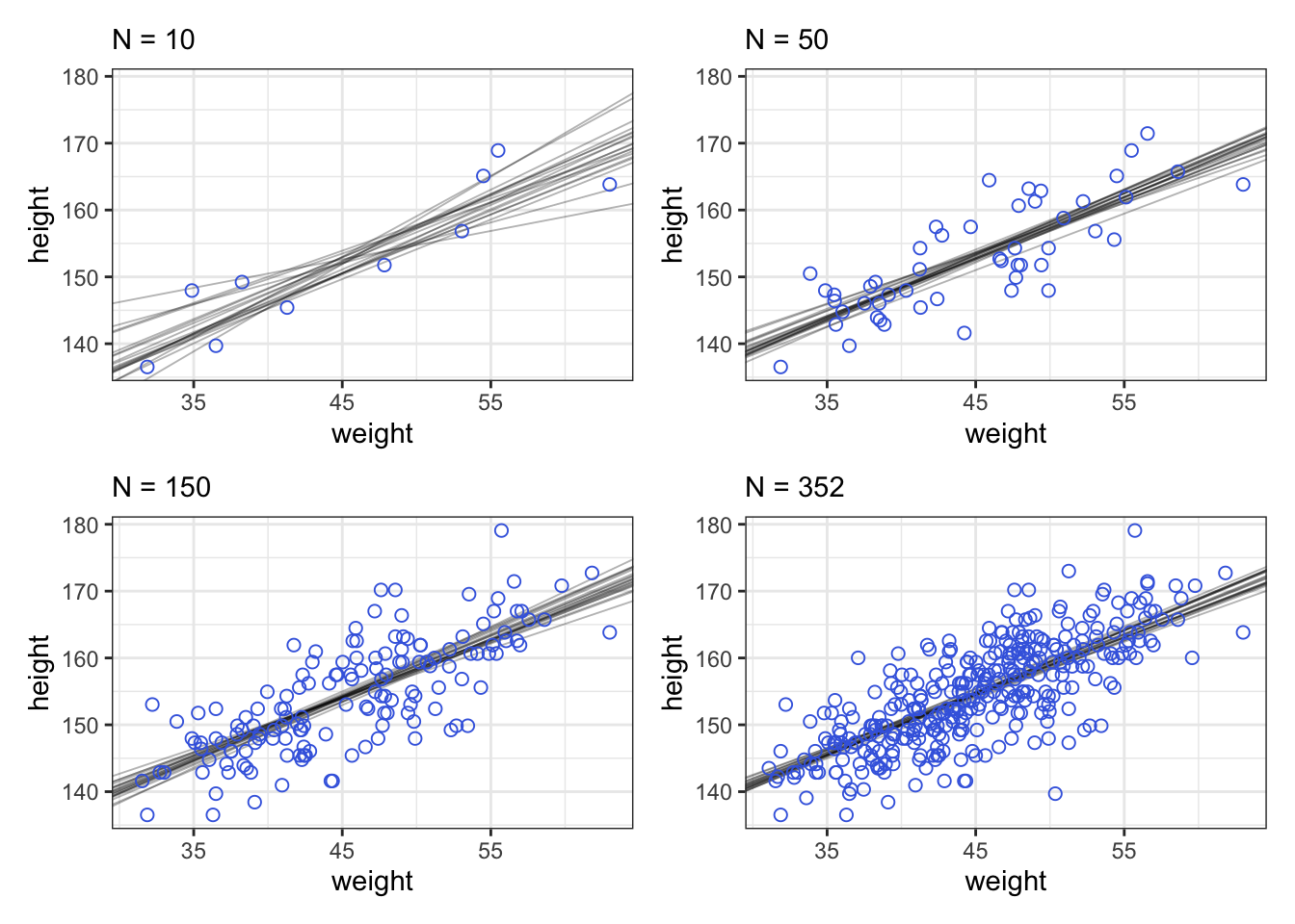
“Notice that the cloud of regression lines grows more compact as the sample size increases. This is a result of the model growing more confident about the location of the mean.” (McElreath, 2020, p. 102) (pdf)
“The cloud of regression lines in Example 4.22 is an appealing display, because it communicates uncertainty about the relationship in a way that many people find intuitive. But it’s more common, and often much clearer, to see the uncertainty displayed by plotting an interval or contour around the average regression line.” (McElreath, 2020, p. 102) (pdf)
Procedure 4.5 : Generating predictions and intervals from the posterior of a fit model
- Use link to generate distributions of posterior values for \(\mu\). The default behavior of link is to use the original data, so you have to pass it a list of new horizontal axis values you want to plot posterior predictions across.
- Use summary functions like
base::mean()orrethinking::PI()to find averages and lower and upper bounds of \(\mu\) for each value of the predictor variable.- Finally, use plotting functions like
graphics::lines()andrethinking::shade()to draw the lines and intervals. Or you might plot the distributions of the predictions, or do further numerical calculations with them. (McElreath, 2020, p. 107) (pdf)
To understand the first task of Procedure 4.5 McElreath explains several preparation steps. As there are for the whole procedure nine different steps I will separate original and tidyverse approach into Example 4.23 (Original) and Example 4.24 (Tidyverse).
Example 4.23 a: Plotting regression intervals and contours (Original)
R Code 4.89 a: Calculate uncertainty around the average regression line at mean of 50kg (Original)
## R code 4.50a ##########################

set.seed(4)                                             # 1
post_m4.3a <- rethinking::extract.samples(m4.3a)        # 2
mu_at_50_a <- post_m4.3a$a + post_m4.3a$b * (50 - xbar) # 3
str(mu_at_50_a)                                         # 4
#> num [1:10000] 159 159 160 159 160 ...Comments for the different R code lines:
m4.3a (already done in Graph 4.30). extract.samples() returns from a map object a data.frame containing samples for each parameter in the posterior distribution. These samples are cleaned of dimension attributes and the lp__, dev, and log_lik traces that are used internally. For map and other types, it uses the variance-covariance matrix and coefficients to define a multivariate Gaussian posterior to draw \(n\) samples from.<- takes it’s form from the equation for \(\mu_{i} = \alpha + \beta(x_{i} - \overline{x})\). The value of \(x_{i}\) in this case is \(50\).a and b went into computing each, the variation across those means incorporates the uncertainty in and correlation between both parameters. (McElreath 2023, 103 and help file from extract.samples())
R Code 4.90 a: The quadratic approximate posterior distribution of the mean height, \(\mu\), when weight is \(50\) kg. This distribution represents the relative plausibility of different values of the mean (Original)
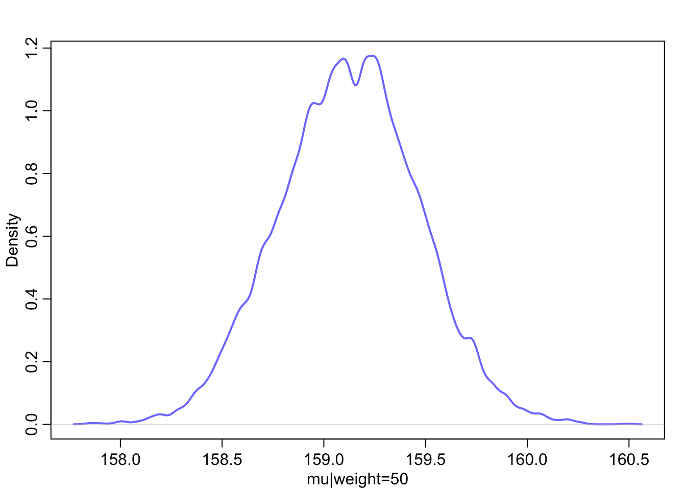
R Code 4.91 a: 89% compatibility interval of μ at 50 kg (Original)
## R code 4.52a ##############
rethinking::PI(mu_at_50_a, prob = 0.89)
#> 5% 94%
#> 158.5758 159.6682“What these numbers mean is that the central 89% of the ways for the model to produce the data place the average height between about 159 cm and 160 cm (conditional on the model and data), assuming the weight is 50 kg. That’s good so far, but we need to repeat the above calculation for every weight value on the horizontal axis, not just when it is 50 kg.” (McElreath, 2020, p. 104) (pdf)
R Code 4.92 a: Calculate \(\mu\) for each case in the data and sample from the posterior distribution (Original)
“You end up with a big matrix of values of \(\mu\). Each row is a sample from the posterior distribution. The default is 1000 samples, but you can use as many or as few as you like. Each column is a case (row) in the data. There are 352 rows in
d2_a, corresponding to 352 individuals. So there are 352 columns in the matrixmu_m4.3aabove.” (McElreath, 2020, p. 105) (pdf)
“The function
link()provides a posterior distribution of \(\mu\) for each case we feed it. So above we have a distribution of \(\mu\) for each individual in the original data. We actually want something slightly different: a distribution of \(\mu\) for each unique weight value on the horizontal axis. It’s only slightly harder to compute that, by just passinglink()some new data.” (McElreath, 2020, p. 105) (pdf) (See next tab “link2”.)
R Code 4.93 a: Calculate a distribution of \(\mu\) for each unique weight value on the horizontal axis (Original)
## R code 4.54a ###############################
# define sequence of weights to compute predictions for
# these values will be on the horizontal axis
weight.seq <- seq(from = 25, to = 70, by = 1)

# use link to compute mu
# for each sample from posterior
# and for each weight in weight.seq
mu_46_m4.3a <- rethinking::link(m4.3a, data = data.frame(weight = weight.seq))
str(mu_46_m4.3a)
#> num [1:1000, 1:46] 136 136 137 136 136 ...And now there are only 46 columns in \(\mu\), because we fed it 46 different values for weight.
R Code 4.94 a: The first 100 values in the distribution of \(\mu\) at each weight value (Original)
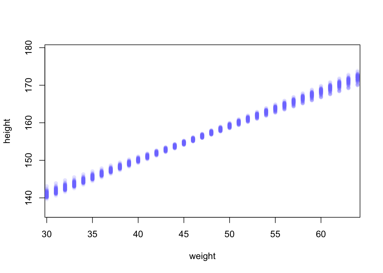
At each weight value in weight.seq, a pile of computed \(\mu\) values are shown. Each of these piles is a Gaussian distribution, like that in tab “dens” of Example 4.23. You can see now that the amount of uncertainty in \(\mu\) depends upon the value of weight. And this is the same fact you saw in Example 4.22.
R Code 4.95 a: Summary of the distribution for each weight value (Original)
#>  num [1:1000, 1:46] 136 136 137 136 136 ...
#> [1] 136.5276 137.4315 138.3354 139.2393 140.1433 141.0472
#>         [,1]     [,2]     [,3]     [,4]     [,5]     [,6]
#> 5%  135.1206 136.0954 137.0654 138.0321 139.0101 139.9782
#> 94% 137.9998 138.8414 139.6767 140.5174 141.3442 142.1896apply(mu_46_m4.3a,2,mean) as “compute the mean of each column (dimension ‘2’) of the matrix mu46_m4.3a”. Now mu_46.mean_m4.3a contains the average \(\mu\) at each weight value.mu_46.PI_m4.3a contains 89% lower and upper bounds for each weight value.mu_46_m4-3a, because we fed it 46 different values for weight.mu46_m4.3a (= mu_46.mean_m4.3a)
weight value.mu_46.mean_m4.3a and mu_46.PI_m4.3a are just different kinds of summaries of the distributions in mu_46_m4.3a, with each column being for a different weight value. These summaries are only summaries. The “estimate” is the entire distribution.
R Code 4.96 a: The !Kung height data with 89% compatibility interval of the mean indicated by the shaded region (Original)
## R code 4.57a ###########################
# plot raw data
# fading out points to make line and interval more visible
plot(height ~ weight, data = d2_a, col = rethinking::col.alpha(rethinking::rangi2, 0.5))

# plot the MAP line, aka the mean mu for each weight
graphics::lines(weight.seq, mu_46.mean_m4.3a)

# plot a shaded region for 89% PI
rethinking::shade(mu_46.PI_m4.3a, weight.seq)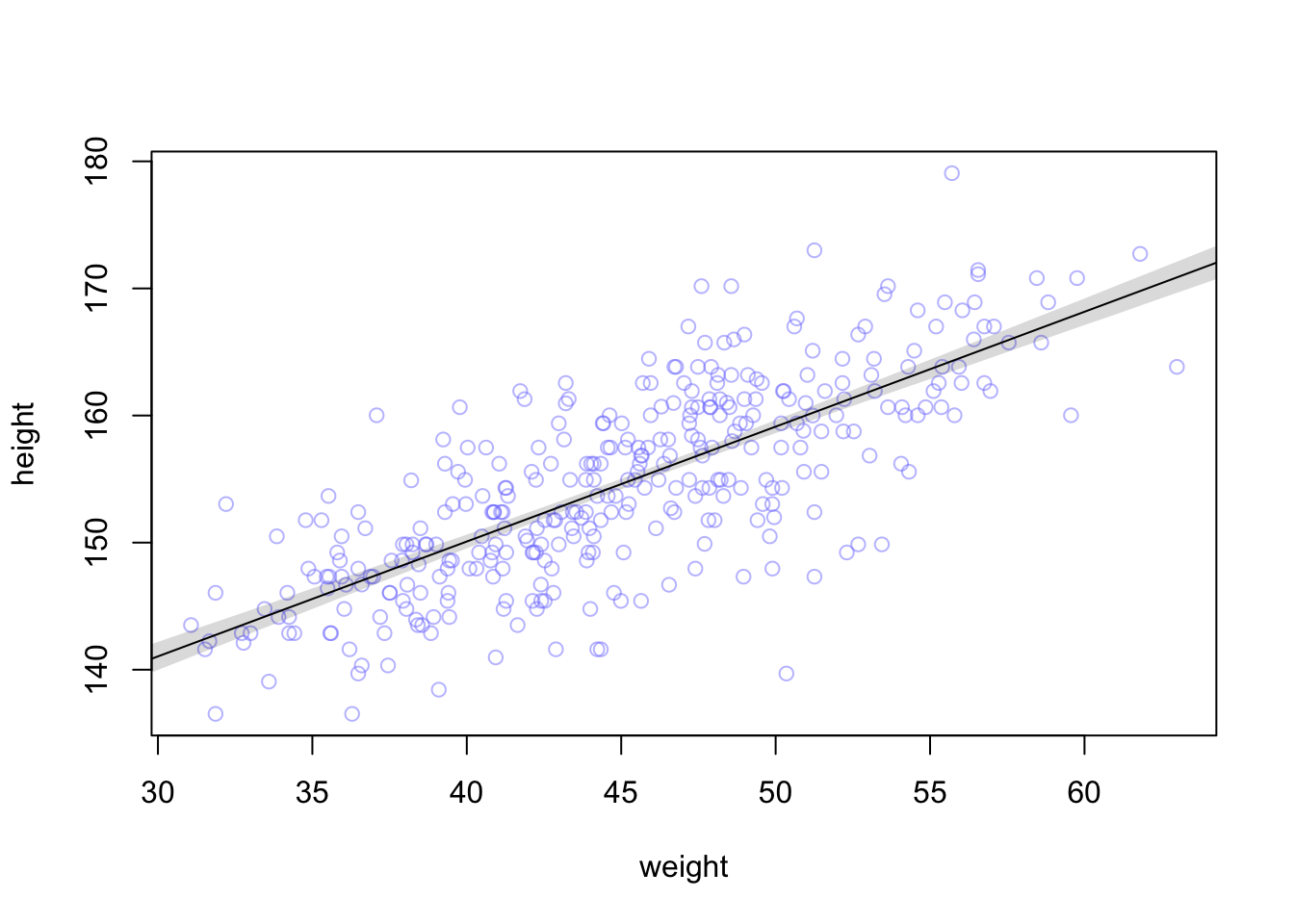
R Code 4.97 : Writing your own link() function (Original)
## R code 4.58a ################################
post_m4.3a <- rethinking::extract.samples(m4.3a)
mu.link_m4.3a <- function(weight) post_m4.3a$a + post_m4.3a$b * (weight - xbar)
weight.seq <- seq(from = 25, to = 70, by = 1)
mu3_m4.3a <- sapply(weight.seq, mu.link_m4.3a)
mu3.mean_m4.3a <- apply(mu3_m4.3a, 2, mean)
mu3.CI_m4.3a <- apply(mu3_m4.3a, 2, rethinking::PI, prob = 0.89)
head(mu3.mean_m4.3a)
head(mu3.CI_m4.3a)[ , 1:6]
#> [1] 136.5589 137.4615 138.3641 139.2666 140.1692 141.0718
#> [,1] [,2] [,3] [,4] [,5] [,6]
#> 5% 135.1421 136.1088 137.0737 138.0387 139.0046 139.9712
#> 94% 137.9686 138.8058 139.6454 140.4852 141.3257 142.1673And the values in mu3.mean_m4.3a and mu3.CI_m4.3a should be very similar (allowing for simulation variance) to what you got the automated way, using rethinking::link() in tab ‘sum’.
What follows now is the tidyverse procedure: Since we used weight_c to fit our model, we might first want to understand what exactly the mean value is for weight: mean(d2_b$weight) = 44.9904855. “Just a hair under 45. If we’re interested in \(\mu\) at weight = 50, that implies we’re also interested in \(\mu\) at weight_c + 5.01. Within the context of our model, we compute this with \(\alpha + \beta \cdot 5.01\).” (Kurz)
Example 4.24 b: Plotting regression intervals and contours (Tidyverse)
R Code 4.98 a: Calculate uncertainty around the average regression line at mean of 50kg (Tidyverse)
R Code 4.99 a: The quadratic approximate posterior distribution of the mean height, \(\mu\), when weight is \(50\) kg. This distribution represents the relative plausibility of different values of the mean (Tidyverse)
mu_at_50_b |>
  ggplot2::ggplot(ggplot2::aes(x = mu_at_50_b)) +
  tidybayes::stat_halfeye(point_interval = tidybayes::mode_hdi, .width = .95,
               fill = "deepskyblue") +
  ggplot2::scale_y_continuous(NULL, breaks = NULL) +
  ggplot2::xlab(expression(mu["height | weight = 50"])) +
  ggplot2::theme_bw()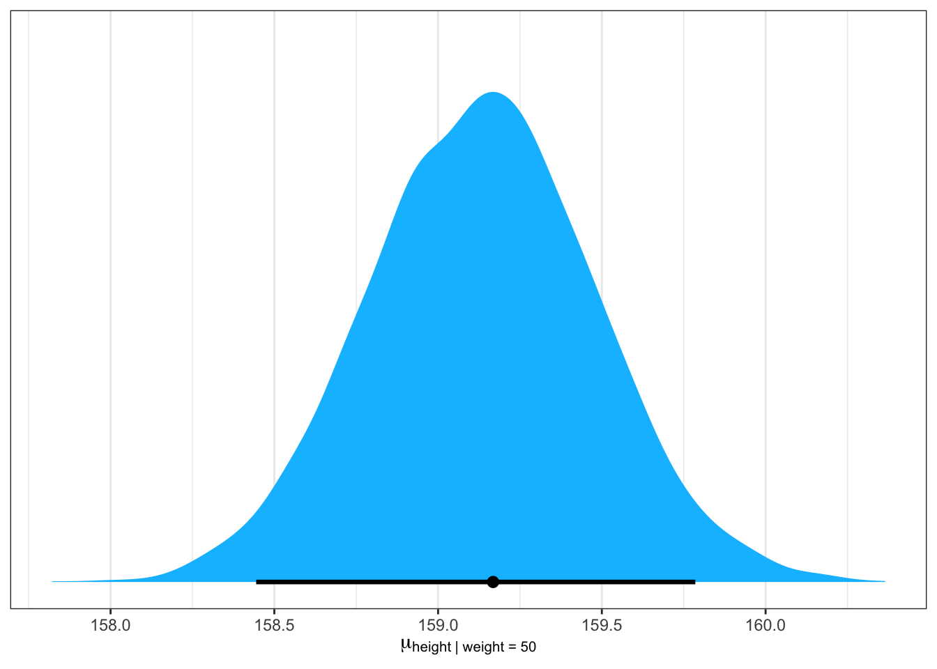
Here we expressed the 95% HPDIs on the density plot with tidybayes::stat_halfeye(). Since tidybayes::stat_halfeye() also returns a point estimate, we’ll throw in the mode.
R Code 4.100 b: 89% and 95% Highest Priority Intensity Intervals (HPDIs) of \(\mu\) at 50 kg (Tidyverse)
R Code 4.101 b: Calculate \(\mu\) for each case in the data and sample from the posterior distribution (Tidyverse)
mu2_m4.3b <- brms:::fitted.brmsfit(m4.3b, summary = F)
str(mu2_m4.3b)
#> num [1:4000, 1:352] 157 157 157 157 157 ...With {brms} the equivalence for rethinking::link() (tab “link1” in Example 4.23) is the fitted() function.
With brms:::fitted.brmsfit(), it’s quite easy to plot a regression line and its intervals. Just omit the summary = T argument.
“When you specify
summary = F,brms:::fitted.brmsfit()returns a matrix of values with as many rows as there were post-warmup draws across your Hamilton Monte Carlo (HMC) chains and as many columns as there were cases in your analysis. Because we had 4,000 post-warmup draws and \(n=352\),brms:::fitted.brmsfit()returned a matrix of 4,000 rows and 352 vectors. If you omitted thesummary = Fargument, the default is TRUE andbrms:::fitted.brmsfit()will return summary information instead.” (Kurz)
WATCH OUT! How to apply fitted()?
Kurz applies the function fitted() in the code, but in the text he uses twice brms::fitted() which doesn’t exist. I used brms:::fitted.brmsfit().
But with stats::fitted() you will get the same result!
The object m4.3b is of class brmsfit but in the help file of stats::fitted() you can read: “fitted is a generic function which extracts fitted values from objects returned by modeling functions. All object classes which are returned by model fitting functions should provide a fitted method. (Extract Model Fitted Values, emphasis is mine)
My interpretation therefore is that stats::fitted() is using brms:::fitted.brmsfit(). That’s why the results are identical.
R Code 4.102 b: Calculate a distribution of \(\mu\) for each unique weight value on the horizontal axis (Tidyverse)
weight_seq <-
  tibble::tibble(weight = 25:70) |>
  dplyr::mutate(weight_c = weight - base::mean(d2_b$weight))

mu3_m4.3b <-
  brms:::fitted.brmsfit(m4.3b,
         summary = F,
         newdata = weight_seq) |>
  tibble::as_tibble() |>
  # here we name the columns after the `weight` values from which they were computed
  rlang::set_names(25:70) |>
  dplyr::mutate(iter = 1:dplyr::n())
#> Warning: The `x` argument of `as_tibble.matrix()` must have unique column names if
#> `.name_repair` is omitted as of tibble 2.0.0.
#> ℹ Using compatibility `.name_repair`.mu3_m4.3b[1:6, 1:6]#> # A tibble: 6 × 6
#> `25` `26` `27` `28` `29` `30`
#> <dbl> <dbl> <dbl> <dbl> <dbl> <dbl>
#> 1 137. 138. 139. 140. 141. 142.
#> 2 137. 138. 139. 140. 141. 142.
#> 3 136. 137. 138. 139. 140. 141.
#> 4 137. 138. 139. 139. 140. 141.
#> 5 137. 138. 139. 140. 141. 141.
#> 6 136. 137. 138. 139. 140. 141.Much like rethinking::link(), brms:::fitted.brmsfit() can accommodate custom predictor values with its newdata argument.
To differentiate: The {rethinking} version used the variable weight.seq whereas here I am using weight_seq.
R Code 4.103 b: The first 100 values in the distribution of \(\mu\) at each weight value (Tidyverse)
mu4_m4.3b <-
  mu3_m4.3b |>
  tidyr::pivot_longer(-iter,
               names_to = "weight",
               values_to = "height") |>
  # we might reformat `weight` to numerals
  dplyr::mutate(weight = base::as.numeric(weight))

d2_b |>
  ggplot2::ggplot(ggplot2::aes(x = weight, y = height)) +
  ggplot2::geom_point(data = mu4_m4.3b |> dplyr::filter(iter < 101),
             color = "navyblue", alpha = .05) +
  ggplot2::coord_cartesian(xlim = c(30, 65)) +
  ggplot2::theme_bw()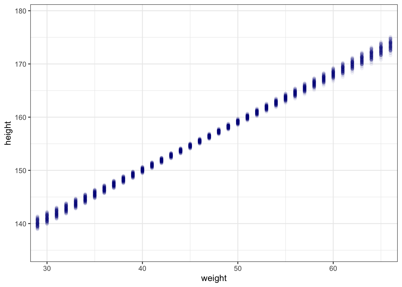
But did a little more data processing with the aid of tidyr::pivot_longer(), which will convert the data from the wide format to the long format.
Wide and long data
If you are new to the distinction between wide and long data, you can learn more from the
R Code 4.104 b: Draws predicted mean response values from the posterior predictive distribution (Tidyverse)
mu_summary_m4.3b <-
  brms:::fitted.brmsfit(m4.3b,
         newdata = weight_seq,
         probs = c(0.055, 0.945)) |>
  tibble::as_tibble() |>
  dplyr::bind_cols(weight_seq)

set.seed(4)
mu_summary_m4.3b |>
  dplyr::slice_sample(n = 6)
#> # A tibble: 6 × 6
#> Estimate Est.Error Q5.5 Q94.5 weight weight_c
#> <dbl> <dbl> <dbl> <dbl> <int> <dbl>
#> 1 146. 0.506 145. 146. 35 -9.99
#> 2 138. 0.813 137. 140. 27 -18.0
#> 3 142. 0.655 141. 143. 31 -14.0
#> 4 163. 0.467 162. 163. 54 9.01
#> 5 170. 0.769 169. 171. 62 17.0
#> 6 137. 0.853 136. 139. 26 -19.0How to change the {brms) default CI value form 95% to 89%?
In {brms} I had to change the probs argument to c(0.055, 0.945) and the resulting third and fourth vectors from the fitted() object to Q5.5 and Q94.5. This was necessary to get the same 89% interval as in the book version. The default probs value for brms:::fitted.brmsfit() would have been c(0.025, 0.975) resulting in quantiles of Q2.5 and Q97.5. The Q prefix stands for quantile. See Rename summary columns of predict() and related methods.
R Code 4.105 a: The !Kung height data with 89% compatibility interval of the mean indicated by the shaded region (Tidyverse)
d2_b |>
  ggplot2::ggplot(ggplot2::aes(x = weight, y = height)) +
  ggplot2::geom_smooth(data = mu_summary_m4.3b,
              ggplot2::aes(y = Estimate, ymin = Q5.5, ymax = Q94.5),
              stat = "identity",
              fill = "grey70", color = "black", alpha = 1, linewidth = 1/2) +
  ggplot2::geom_point(color = "navyblue", shape = 1, size = 1.5, alpha = 2/3) +
  ggplot2::coord_cartesian(xlim = range(d2_b$weight)) +
  ggplot2::theme_bw()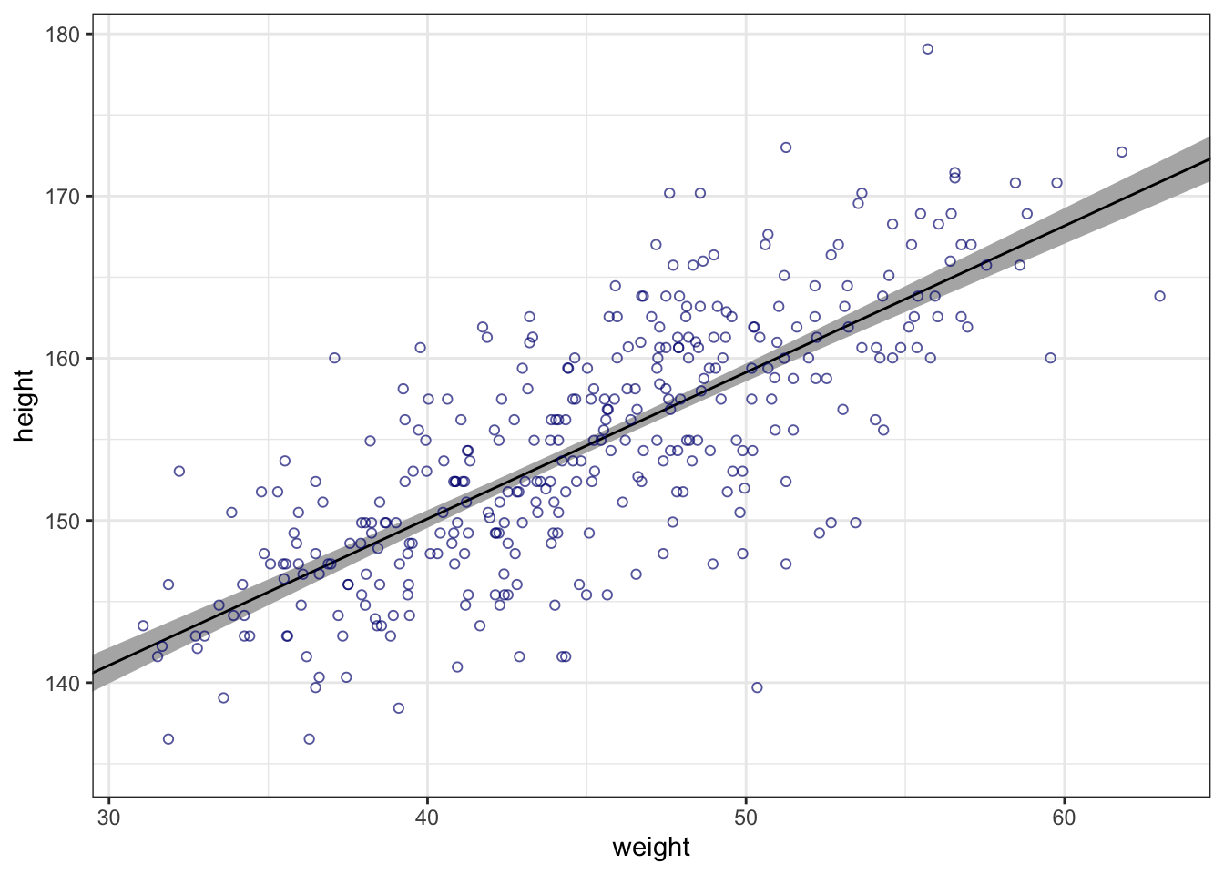
If you wanted to use intervals other than the default 89% ones, you’d include the probs argument like this: brms:::fitted.brmsfit(b4.3, newdata = weight.seq, probs = c(.25, .75)). The resulting third and fourth vectors from the fitted() object would be named Q25 and Q75 instead of the default Q5.5 and Q94.5. The Q prefix stands for quantile.
Similar to rethinking::link(), brms:::fitted.brmsfit() uses the formula from your model to compute the model expectations for a given set of predictor values. I used it a lot in this project. If you follow along, you’ll get a good handle on it.
How to use brms:::fitted.brmsfit()
To dive deeper about the fitted() function, you can go for the documentation. Though Kurz won’t be using it in this project, {brms} he informs users that fitted() is also an alias for the brms::posterior_epred() function, about which you might learn more here. Users can always learn more about them and other functions in the {brms} reference manual.
“What you’ve done so far is just use samples from the posterior to visualize the uncertainty in \(μ_{i}\), the linear model of the mean.” (McElreath, 2020, p. 107) (pdf)
“Now let’s walk through generating an 89% prediction interval for actual heights, not just the average height, \(\mu\). This means we’ll incorporate the standard deviation \(\sigma\) and its uncertainty as well.” (McElreath, 2020, p. 107) (pdf)
Procedure 4.6 : Simulating heights
Example 4.25 : Generate an 89% prediction interval for actual heights
R Code 4.106 a: Simulation of the posterior observations (Original)
#> num [1:1000, 1:46] 138 133 137 136 134 ...This matrix is much like the earlier one in tab ‘sum’ of Example 4.23, but it contains simulated heights, not distributions of plausible average height, \(\mu\).
R Code 4.107 a: Summarize simulated heights of the 89% posterior prediction interval of observable heights (Original)
R Code 4.108 a: 89% prediction interval for height, as a function of weight by sampling 1e3 times (Original)
## R code 4.61a ##################
# plot raw data
plot(height ~ weight, d2_a, col = rethinking::col.alpha(rethinking::rangi2, 0.5))

# draw MAP line
graphics::lines(weight.seq, mu_46.mean_m4.3a)

# draw PI region for line
# rethinking::shade(mu_46.PI_m4.3a, weight.seq)

# draw HPDI region for line
mu_46.HPDI_m4.3a <- apply(mu_46_m4.3a, 2,
                      rethinking::HPDI, prob = .89)
rethinking::shade(mu_46.HPDI_m4.3a, weight.seq)

# draw PI region for simulated heights
rethinking::shade(height.PI_m4.3a, weight.seq)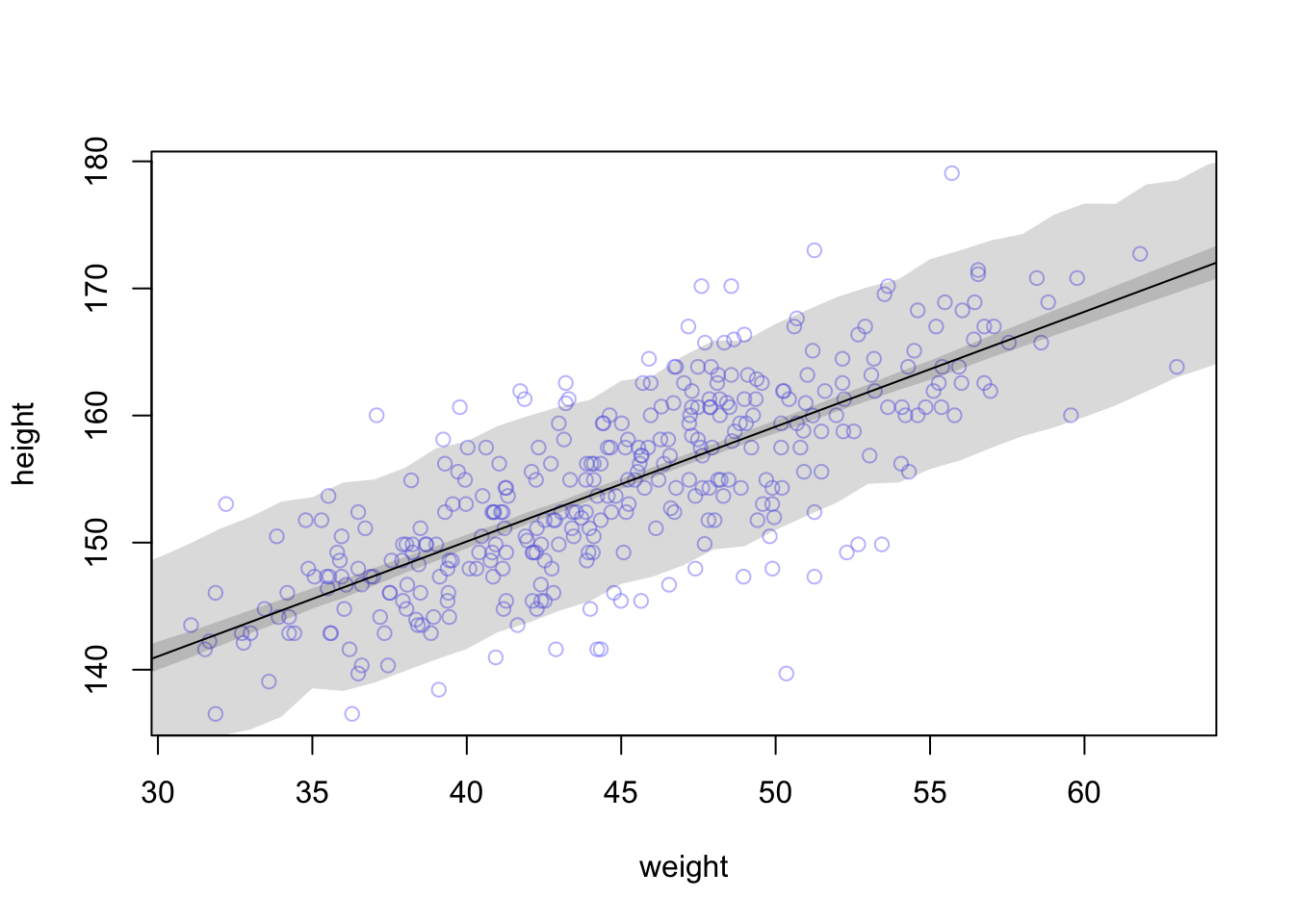
“Notice that the outline for the wide shaded interval is a little rough. This is the simulation variance in the tails of the sampled Gaussian values. If it really bothers you, increase the number of samples you take from the posterior distribution. The optional \(n\) parameter for
sim.height_m4.3acontrols how many samples are used.” (McElreath, 2020, p. 109) (pdf)
Try for example \(1e4\) samples.
“Run the plotting code again, and you’ll see the shaded boundary smooth out some.” (McElreath, 2020, p. 109) (pdf)
See the next tab ‘plot2’.
R Code 4.109 a: 89% prediction interval for height, as a function of weight by sampling 1e4 times (Original)
## R code 4.59a adapted ################
sim2.height_m4.3a <- rethinking::sim(m4.3a, data = list(weight = weight.seq), n = 1e4)

## R code 4.60a adapted ################
height2.PI_m4.3a <- apply(sim2.height_m4.3a, 2, rethinking::PI, prob = 0.89)

## R code 4.61a ##################

# plot raw data
plot(height ~ weight, d2_a, col = rethinking::col.alpha(rethinking::rangi2, 0.5))

mu_46.HPDI_m4.3a <- apply(mu_46_m4.3a, 2,
                      rethinking::HPDI, prob = 0.89)

# draw MAP line
graphics::lines(weight.seq, mu_46.mean_m4.3a)

# draw HPDI region for line
rethinking::shade(mu_46.HPDI_m4.3a, weight.seq)

# draw PI region for simulated heights
rethinking::shade(height2.PI_m4.3a, weight.seq)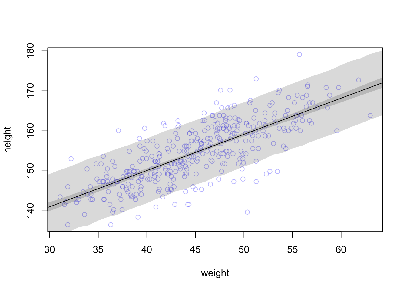
“With extreme percentiles, it can be very hard to get out all of the roughness. Luckily, it hardly matters, except for aesthetics. Moreover, it serves to remind us that all statistical inference is approximate. The fact that we can compute an expected value to the 10th decimal place does not imply that our inferences are precise to the 10th decimal place” (McElreath, 2020, p. 109) (pdf)
R Code 4.110 a: Writing you own rethinking:sim() function
## R code 4.63a ########################################

# post <- extract.samples(m4.3)
# weight.seq <- 25:70
post_m4.3a <- rethinking::extract.samples(m4.3a)
sim.height2_m4.3a <- sapply(weight.seq, function(weight) {
  rnorm(
    n = nrow(post_m4.3a),
    mean = post_m4.3a$a + post_m4.3a$b * (weight - xbar),
    sd = post_m4.3a$sigma
  )
})
height2.PI_m4.3a <- apply(sim.height2_m4.3a, 2, rethinking::PI, prob = 0.89)
head(height.PI_m4.3a)[ , 1:6]
head(height2.PI_m4.3a)[ , 1:6]
#> [,1] [,2] [,3] [,4] [,5] [,6]
#> 5% 128.3733 129.3550 129.9023 131.2129 132.5578 132.3555
#> 94% 144.7671 145.5569 146.4105 147.6139 147.9741 148.8141
#> [,1] [,2] [,3] [,4] [,5] [,6]
#> 5% 128.4286 129.1754 130.1301 131.2844 131.9124 132.9920
#> 94% 144.7992 145.5424 146.7206 147.4119 148.2944 149.4395The small differences are the result of the randomized sampling process.
R Code 4.111 b: Predict the posterior observations (Tidyverse)
pred_height_m4.3b <-
  brms:::predict.brmsfit(m4.3b,
          newdata = weight_seq,
          probs = c(0.055, 0.945)) |>
  tibble::as_tibble() |>
  dplyr::bind_cols(weight_seq)

set.seed(4)
pred_height_m4.3b |>
  dplyr::slice_sample(n = 6)
#> # A tibble: 6 × 6
#> Estimate Est.Error Q5.5 Q94.5 weight weight_c
#> <dbl> <dbl> <dbl> <dbl> <int> <dbl>
#> 1 145. 5.08 137. 153. 35 -9.99
#> 2 138. 5.27 130. 147. 27 -18.0
#> 3 142. 5.16 134. 150. 31 -14.0
#> 4 163. 4.98 155. 171. 54 9.01
#> 5 170. 5.04 162. 178. 62 17.0
#> 6 137. 5.19 129. 146. 26 -19.0The predict() code looks a lot like what we used for the tab in fitted3 of Example 4.24.
{brms} equivalence of rethinking::link() and rethinking::sim()
Much as brms:::fitted.brmsfit() was our analogue to rethinking::link(), brms:::predict.brmsfit() is our analogue to rethinking::sim(). (Kurz)
map or map2stan fit to simulate outcomes that average over the posterior distribution.R Code 4.112 b: Plot 89% prediction interval for height, as a function of weight with 2e3 iterations (Tidyverse)
d2_b |>
  ggplot2::ggplot(ggplot2::aes(x = weight)) +
  ggplot2::geom_ribbon(data = pred_height_m4.3b,
              ggplot2::aes(ymin = Q5.5, ymax = Q94.5),
              fill = "grey83") +
  ggplot2::geom_smooth(data = mu_summary_m4.3b,
              ggplot2::aes(y = Estimate, ymin = Q5.5, ymax = Q94.5),
              stat = "identity",
              fill = "grey70", color = "black", alpha = 1, linewidth = 1/2) +
  ggplot2::geom_point(ggplot2::aes(y = height),
             color = "navyblue", shape = 1, size = 1.5, alpha = 2/3) +
  ggplot2::coord_cartesian(xlim = base::range(d2_b$weight),
                  ylim = base::range(d2_b$height)) +
  ggplot2::theme_bw()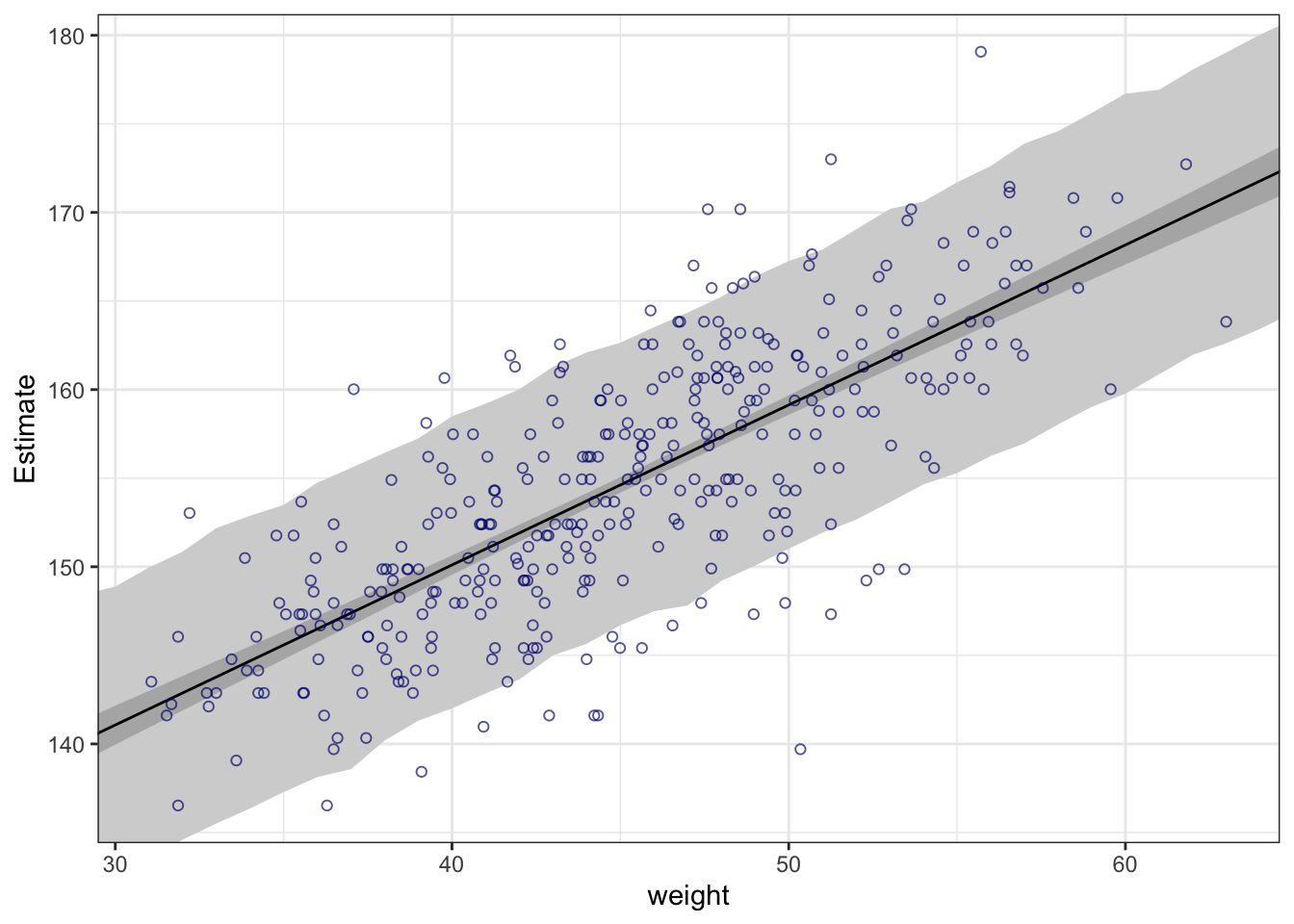
To smooth out the rough shaded interval we would have in the {brms} model fitting approach to refit m4.3b into m4.3b_smooth after specifying a larger number of post-warmup iterations with alterations to the iter and warmup parameters.
R Code 4.113 b: Plot 89% prediction interval for height, as a function of weight with 2e4 iterations (Tidyverse)
m4.3b_smooth <-
  brms::brm(data = d2_b,
      family = gaussian,
      height ~ 1 + weight_c,
      prior = c(brms::prior(normal(178, 20), class = Intercept),
                brms::prior(lognormal(0, 1), class = b, lb = 0),
                brms::prior(uniform(0, 50), class = sigma, ub = 50)),
      iter = 20000, warmup = 1000, chains = 4, cores = 4,
      seed = 4,
      file = "brm_fits/m04.03b_smooth")

mu_summary_m4.3b_smooth <-
  brms:::fitted.brmsfit(m4.3b_smooth,
         newdata = weight_seq,
         probs = c(0.055, 0.945)) |>
  tibble::as_tibble() |>
  dplyr::bind_cols(weight_seq)

pred_height_m4.3b_smooth <-
  brms:::predict.brmsfit(m4.3b_smooth,
          newdata = weight_seq,
          probs = c(0.055, 0.945)) |>
  tibble::as_tibble() |>
  dplyr::bind_cols(weight_seq)


d2_b |>
  ggplot2::ggplot(ggplot2::aes(x = weight)) +
  ggplot2::geom_ribbon(data = pred_height_m4.3b_smooth,
              ggplot2::aes(ymin = Q5.5, ymax = Q94.5),
              fill = "grey83") +
  ggplot2::geom_smooth(data = mu_summary_m4.3b_smooth,
              ggplot2::aes(y = Estimate, ymin = Q5.5, ymax = Q94.5),
              stat = "identity",
              fill = "grey70", color = "black", alpha = 1, linewidth = 1/2) +
  ggplot2::geom_point(ggplot2::aes(y = height),
             color = "navyblue", shape = 1, size = 1.5, alpha = 2/3) +
  ggplot2::coord_cartesian(xlim = base::range(d2_b$weight),
                  ylim = base::range(d2_b$height)) +
  ggplot2::theme_bw()
This is the same graphic as in tab ‘plot1’ but with a factor 10 more iterations to smooth out the rough shaded interval.
R Code 4.114 b: Write you own predict for the posterior observations: Model-based predictions without {brms} and predict(): mean with quantiles of 0.055 and .945 (Tidyverse)
set.seed(4)

post_m4.3b |>
  tidyr::expand_grid(weight = 25:70) |>
  dplyr::mutate(weight_c = weight - base::mean(d2_b$weight)) |>
  dplyr::mutate(sim_height = stats::rnorm(dplyr::n(),
                            mean = b_Intercept + b_weight_c * weight_c,
                            sd   = sigma)) |>
  dplyr::group_by(weight) |>
  dplyr::summarise(mean = base::mean(sim_height),
            ll   = stats::quantile(sim_height, prob = .055),
            ul   = stats::quantile(sim_height, prob = .945)) |>

  # plot
  ggplot2::ggplot(ggplot2::aes(x = weight)) +
  ggplot2::geom_smooth(ggplot2::aes(y = mean, ymin = ll, ymax = ul),
              stat = "identity",
              fill = "grey83", color = "black", alpha = 1, linewidth = 1/2) +
  ggplot2::geom_point(data = d2_b,
             ggplot2::aes(y = height),
             color = "navyblue", shape = 1, size = 1.5, alpha = 2/3) +
  ggplot2::coord_cartesian(xlim = base::range(d2_b$weight),
                           ylim = base::range(d2_b$height)) +
  ggplot2::theme_bw()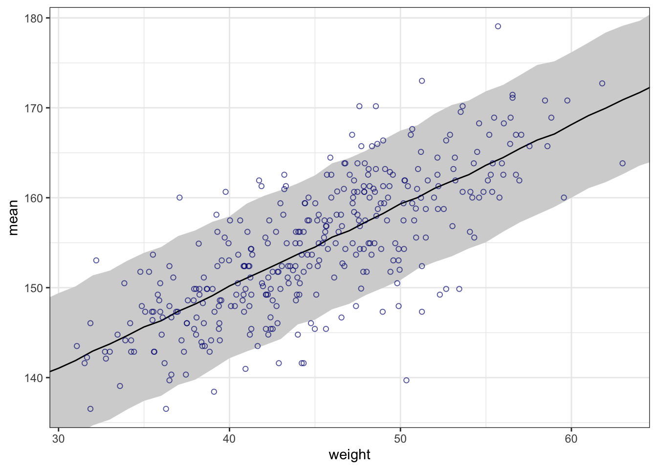
Here we followed McElreath’s example and calculated our model-based predictions “by hand”. Instead of relying on base R apply() and sapply(), the main action in the {tidyverse} approach is in tidyr::expand_grid(), the second dplyr::mutate() line with stats:rnomr() and the dplyr::group_by() + dplyr::summarise() combination.
We specifically left out the fitted() intervals to make it more apparent what we were simulating.
R Code 4.115 b: Write you own predict for the posterior observations, now using {tidybayes} HDI of 89%: mode with quantiles of 0.055 and 0.945
set.seed(4)

post_m4.3b |>
  tidyr::expand_grid(weight = 25:70) |>
  dplyr::mutate(weight_c = weight - base::mean(d2_b$weight)) |>
  dplyr::mutate(sim_height = stats::rnorm(dplyr::n(),
                            mean = b_Intercept + b_weight_c * weight_c,
                            sd   = sigma)) |>
  # dplyr::group_by(weight) |>
  # dplyr::summarise(mean = base::mean(sim_height),
  #           ll   = stats::quantile(sim_height, prob = .055),
  #           ul   = stats::quantile(sim_height, prob = .945)) |>

  dplyr::group_by(weight) |>
  tidybayes::mode_hdi(sim_height, .width = .89) |>

  # plot
  ggplot2::ggplot(ggplot2::aes(x = weight)) +
  ## instead of "aes(y = mean, ymin = ll, ymax = ul)"
  ggplot2::geom_smooth(ggplot2::aes(y = .point, ymin = .lower, ymax = .upper),
              stat = "identity",
              fill = "grey83", color = "black", alpha = 1, linewidth = 1/2) +
  ggplot2::geom_point(data = d2_b,
             ggplot2::aes(y = height),
             color = "navyblue", shape = 1, size = 1.5, alpha = 2/3) +
  ggplot2::coord_cartesian(xlim = base::range(d2_b$weight),
                           ylim = base::range(d2_b$height)) +
  ggplot2::labs(y = "mode") +
  ggplot2::theme_bw()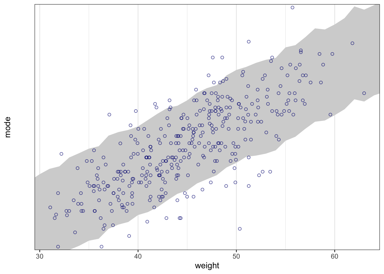
Here we replaced that three-line summarize() code with a single line of tidybayes::mean_qi(sim_height), or whatever combination of central tendency and interval type you wanted (here we used: tidybayes::mode_hdi(sim_height, .width = .89)).
“We’ll consider two commonplace methods that use linear regression to build curves. The first is polynomial regression. The second is b-splines.” (McElreath, 2020, p. 110) (pdf)
“Polynomial regression uses powers of a variable—squares and cubes—as extra predictors.” (McElreath, 2020, p. 110) (pdf)
Example 4.26 : Scatterplot of height against weight
R Code 4.116 a: Height in centimeters (vertical) plotted against weight in kilograms (horizontal) (Original)
R Code 4.117 b: Height in centimeters (vertical) plotted against weight in kilograms (horizontal) (Tidyverse)
d_b |>
  ggplot2::ggplot(ggplot2::aes(x = weight, y = height)) +
  ggplot2::geom_point(color = "navyblue", shape = 1, size = 1.5, alpha = 2/3) +
  ggplot2::annotate(geom = "text",
           x = 42, y = 115,
           label = "This relation is\nvisibly curved.",
           family = "Times") +
  ggplot2::theme_bw()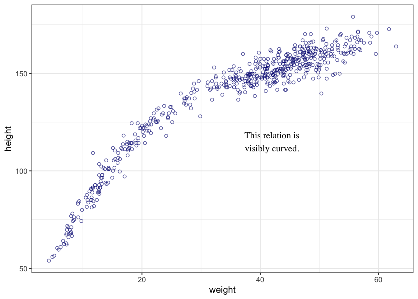
The relationship is visibly curved, now that we’ve included the non-adult individuals. (Compare with adult data in Graph 4.30).
What is a quadratic polynomial?
A quadratic function (also called a quadratic, a quadratic polynomial, or a polynomial of degree 2) is special type of polynomial function where the highest-degree term is second degree. … The graph of a quadratic function is a parabola, a 2-dimensional curve that looks like either a cup(∪) or a cap(∩). (Statistis How To)
Example 4.27 : Parabolic and cubic equation for the mean height
Theorem 4.5 : Parabolic equation for the mean height
“The most common polynomial regression is a parabolic model of the mean. Let x be standardized body weight.” (McElreath, 2020, p. 110) (pdf)
\[ \mu_{i} = \alpha + \beta_{1}x_{i} + \beta_{2}x_{i}^2 \tag{4.8}\]
“The above is a parabolic (second order) polynomial. The \(\alpha + \beta_{1}x_{i}\) part is the same linear function of \(x\) in a linear regression, just with a little ‘1’ subscript added to the parameter name, so we can tell it apart from the new parameter. The additional term uses the square of \(x_{i}\) to construct a parabola, rather than a perfectly straight line. The new parameter \(\beta_{2}\) measures the curvature of the relationship.” (McElreath, 2020, p. 110) (pdf)
\[ \begin{align*} h_{i} \sim \operatorname{Normal}(μ_{i}, σ) \space \space (1) \\ μ_{i} = \alpha + \beta_{1}x_{i} + \beta_{2}x_{i}^2 \space \space (2) \\ \alpha \sim \operatorname{Normal}(178, 20) \space \space (3) \\ \beta_{1} \sim \operatorname{Log-Normal}(0,10) \space \space (4) \\ \beta_{2} \sim \operatorname{Normal}(0,10) \space \space (5) \\ \sigma \sim \operatorname{Uniform}(0, 50) \space \space (6) \end{align*} \tag{4.9}\]
height ~ dnorm(mu, sigma)                  # (1)
mu <- a + b1 * weight.s + b2 * weight.s2^2 # (2)
a ~ dnorm(178, 20)                         # (3)
b1 ~ dlnorm(0, 10)                         # (4)
b2 ~ dnorm(0, 10)                          # (5)
sigma ~ dunif(0, 50)                       # (6)
“The confusing issue here is assigning a prior for \(\beta_{2}\), the parameter on the squared value of \(x\). Unlike \(\beta_{1}\), we don’t want a positive constraint.” (McElreath, 2020, p. 111) (pdf)
Theorem 4.6 : Cubic equation for the mean height
\[ \begin{align*} h_{i} \sim \operatorname{Normal}(μ_{i}, σ) \space \space (1) \\ μ_{i} = \alpha + \beta_{1}x_{i} + \beta_{2}x_{i}^2 + \beta_{3}x_{i}^3 \space \space (2) \\ \alpha \sim \operatorname{Normal}(178, 20) \space \space (3) \\ \beta_{1} \sim \operatorname{Log-Normal}(0,10) \space \space (4) \\ \beta_{2} \sim \operatorname{Normal}(0,10) \space \space (5) \\ \beta_{3} \sim \operatorname{Normal}(0,10) \space \space (6) \\ \sigma \sim \operatorname{Uniform}(0, 50) \space \space (7) \end{align*} \tag{4.10}\]
height ~ dnorm(mu, sigma)                                      # (1)
mu <- a + b1 * weight.s +  b2 * weight.s2^2 + b3 * weight.s3^3 # (2)
a ~ dnorm(178, 20)                                             # (3)
b1 ~ dlnorm(0, 10)                                             # (4)
b2 ~ dnorm(0, 10)                                              # (5)
b3 ~ dnorm(0, 10)                                              # (6)
sigma ~ dunif(0, 50) # (7)“The first thing to do is to standardize the predictor variable. We’ve done this in previous examples. But this is especially helpful for working with polynomial models. When predictor variables have very large values in them, there are sometimes numerical glitches. Even well-known statistical software can suffer from these glitches, leading to mistaken estimates. These problems are very common for polynomial regression, because the square or cube of a large number can be truly massive. Standardizing largely resolves this issue. It should be your default behavior.” (McElreath, 2020, p. 111) (pdf)
Example 4.28 : Posterior distribution of a parabolic model of height on weight
R Code 4.118 a: Finding the posterior distribution of a parabolic model of height on weight (Original)
## R code 4.65a #######################

## standardization ########
d_a$weight_s <- (d_a$weight - mean(d_a$weight)) / sd(d_a$weight)
d_a$weight_s2 <- d_a$weight_s^2

## find posterior distribution ########
m4.5a <- rethinking::quap(
  alist(
    height ~ dnorm(mu, sigma),
    mu <- a + b1 * weight_s + b2 * weight_s2,
    a ~ dnorm(178, 20),
    b1 ~ dlnorm(0, 1),
    b2 ~ dnorm(0, 1),
    sigma ~ dunif(0, 50)
  ),
  data = d_a
)

## R code 4.66a ################
## precis results ###########
rethinking::precis(m4.5a)
#> mean sd 5.5% 94.5%
#> a 146.057415 0.3689756 145.467720 146.647109
#> b1 21.733063 0.2888890 21.271363 22.194764
#> b2 -7.803268 0.2741839 -8.241467 -7.365069
#> sigma 5.774474 0.1764651 5.492449 6.056500\(\alpha\) (a): Intercept. Expected value of height when weight is at its mean value.
“But it is no longer equal to the mean height in the sample, since there is no guarantee it should in a polynomial regression.” (McElreath, 2020, p. 112) (pdf)
“The implied definition of α in a parabolic model is \(\alpha = Ey_{i} − \beta_{1}Ex_{i} − \beta_{2} Ex_{i}^2\). Now even when the average \(x_{i}\) is zero, \(Ex_{i} = 0\), the average square will likely not be zero. So \(\alpha\) becomes hard to directly interpret again.” (McElreath, 2020, p. 562) (pdf)
\(\beta_{1}\) and \(\beta_{2}\) (b1 and b2): Linear and square components of the curve. But that doesn’t make them transparent.
“Now, since the relationship between the outcome height and the predictor weight depends upon two slopes, \(\beta_{1}\) and \(\beta_{2}\), it isn’t so easy to read the relationship off a table of coefficients.” (McElreath, 2020, p. 111) (pdf)
“You have to plot these model fits to understand what they are saying.” (McElreath, 2020, p. 112) (pdf)
R Code 4.119 b: Finding the posterior distribution of a parabolic model of height on weight (Tidyverse)
## R code 4.65b #######################
## standardization ###########
d3_m4.5b <-
  d_b |>
  dplyr::mutate(weight_s = (weight - base::mean(weight)) / stats::sd(weight)) |>
  dplyr::mutate(weight_s2 = weight_s^2)

## fitting model ############
m4.5b <-
  brms::brm(data = d3_m4.5b,
      family = gaussian,
      height ~ 1 + weight_s + weight_s2,
      prior = c(brms::prior(normal(178, 20), class = Intercept),
                brms::prior(lognormal(0, 1), class = b, coef = "weight_s"),
                brms::prior(normal(0, 1), class = b, coef = "weight_s2"),
                brms::prior(uniform(0, 50), class = sigma, ub = 50)),
      iter = 2000, warmup = 1000, chains = 4, cores = 4,
      seed = 4,
      file = "brm_fits/m04.05b")

## R code 4.66a ################
## print.brmsfit results ###############
brms:::print.brmsfit(m4.5b)
#> Family: gaussian
#> Links: mu = identity; sigma = identity
#> Formula: height ~ 1 + weight_s + weight_s2
#> Data: d3_m4.5b (Number of observations: 544)
#> Draws: 4 chains, each with iter = 2000; warmup = 1000; thin = 1;
#> total post-warmup draws = 4000
#>
#> Population-Level Effects:
#> Estimate Est.Error l-95% CI u-95% CI Rhat Bulk_ESS Tail_ESS
#> Intercept 146.05 0.38 145.30 146.77 1.00 3544 2516
#> weight_s 21.74 0.29 21.15 22.32 1.00 3106 2604
#> weight_s2 -7.79 0.28 -8.33 -7.25 1.00 3298 2631
#>
#> Family Specific Parameters:
#> Estimate Est.Error l-95% CI u-95% CI Rhat Bulk_ESS Tail_ESS
#> sigma 5.81 0.18 5.47 6.18 1.00 3788 2881
#>
#> Draws were sampled using sampling(NUTS). For each parameter, Bulk_ESS
#> and Tail_ESS are effective sample size measures, and Rhat is the potential
#> scale reduction factor on split chains (at convergence, Rhat = 1).Note our use of the coef argument within our prior statements. Since \(\beta_{1}\) and \(\beta_{2}\) are both parameters of class = b within the {brms} set-up, we need to use the coef argument when we want their priors to differ.
R Code 4.120 : Display trace plot (Tidyverse)
brms:::plot.brmsfit(m4.5b, widths = c(1, 2))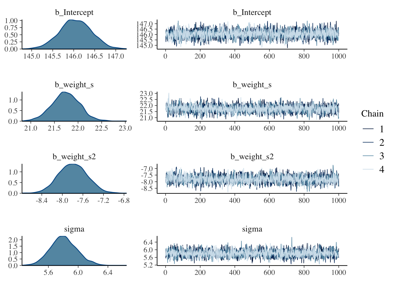
Example 4.29 : Different regressions (linear, parabolic and cubic) of height on weight (standardized), for the full !Kung data
R Code 4.121 a: Posterior distribution of the linear height-weight model with the full !Kung data set (Original)
## R code 4.42a #############################
# define the average weight, x-bar
xbar_m4.4a <- mean(d_a$weight_s)

# fit model
m4.4a <- rethinking::quap(
  alist(
    height ~ dnorm(mu, sigma),
    mu <- a + b * (weight_s - xbar_m4.4a),
    a ~ dnorm(178, 20),
    b ~ dlnorm(0, 1),
    sigma ~ dunif(0, 50)
  ),
  data = d_a
)


## R code 4.46a ############################################
plot(height ~ weight_s, data = d_a, col = rethinking::rangi2)
post_m4.4a <- rethinking::extract.samples(m4.4a)
a_map_m4.4a <- mean(post_m4.4a$a)
b_map_m4.4a <- mean(post_m4.4a$b)
curve(a_map_m4.4a + b_map_m4.4a * (x - xbar_m4.4a), add = TRUE)

## R code 4.58a ################################
mu.link_m4.4a <- function(weight) post_m4.4a$a + post_m4.4a$b * (weight - xbar_m4.4a)
weight.seq_m4.4a <- seq(from = -3, to = 3, by = 1)
mu_m4.4a <- sapply(weight.seq_m4.4a, mu.link_m4.4a)
mu.mean_m4.4a <- apply(mu_m4.4a, 2, mean)
mu.CI_m4.4a <- apply(mu_m4.4a, 2, rethinking::PI, prob = 0.89)


## R code 4.59a #######################
sim.height_m4.4a <- rethinking::sim(m4.4a, data = list(weight_s = weight.seq_m4.4a))

## R code 4.60a ###################
height.PI_m4.4a <- apply(sim.height_m4.4a, 2, rethinking::PI, prob = 0.89)

## R code 4.61a ##################
# plot raw data
# plot(height ~ weight, d_a, col = rethinking::col.alpha(rethinking::rangi2, 0.5))

# draw MAP line
graphics::lines(weight.seq_m4.4a, mu.mean_m4.4a)

# draw HPDI region for line
rethinking::shade(mu.CI_m4.4a, weight.seq_m4.4a)

# draw PI region for simulated heights
rethinking::shade(height.PI_m4.4a, weight.seq_m4.4a)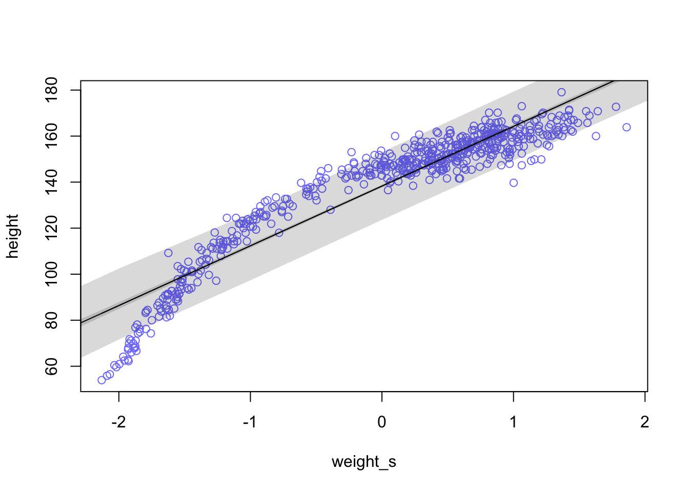
“[The graphic] shows the familiar linear regression from earlier in the chapter, but now with the standardized predictor and full data with both adults and non-adults. The linear model makes some spectacularly poor predictions, at both very low and middle weights.” (McElreath, 2020, p. 113) (pdf)
R Code 4.122 a: Parabolic regression of height on weight (standardized), for the full !Kung data (Original)
## R code 4.67a ################
weight.seq_m4.5a <- seq(from = -2.2, to = 2, length.out = 30)
pred_dat_m4.5a <- list(weight_s = weight.seq_m4.5a, weight_s2 = weight.seq_m4.5a^2)
mu_m4.5a <- rethinking::link(m4.5a, data = pred_dat_m4.5a)
mu.mean_m4.5a <- apply(mu_m4.5a, 2, mean)
mu.PI_m4.5a <- apply(mu_m4.5a, 2, rethinking::PI, prob = 0.89)
sim.height_m4.5a <- rethinking::sim(m4.5a, data = pred_dat_m4.5a)
height.PI_m4.5a <- apply(sim.height_m4.5a, 2, rethinking::PI, prob = 0.89)


## R code 4.68a #################
plot(height ~ weight_s, d_a, col = rethinking::col.alpha(rethinking::rangi2, 0.5))
graphics::lines(weight.seq_m4.5a, mu.mean_m4.5a)
rethinking::shade(mu.PI_m4.5a, weight.seq_m4.5a)
rethinking::shade(height.PI_m4.5a, weight.seq_m4.5a)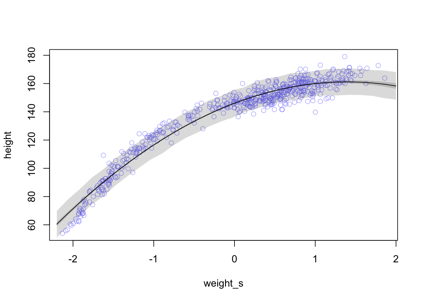
The quadratic regression does a pretty good job. It is much better than a linear regression for the full Howell1 data set.
R Code 4.123 a: Cubic regressions of height on weight (standardized), for the full !Kung data (Original)
## R code 4.69a ####################
d_a$weight_s3 <- d_a$weight_s^3
m4.6a <- rethinking::quap(
  alist(
    height ~ dnorm(mu, sigma),
    mu <- a + b1 * weight_s + b2 * weight_s2 + b3 * weight_s3,
    a ~ dnorm(178, 20),
    b1 ~ dlnorm(0, 1),
    b2 ~ dnorm(0, 10),
    b3 ~ dnorm(0, 10),
    sigma ~ dunif(0, 50)
  ),
  data = d_a
)

## R code 4.67a ################
weight.seq_m4.6a <- seq(from = -2.2, to = 2, length.out = 30)
pred_dat_m4.6a <- list(weight_s = weight.seq_m4.6a, weight_s2 = weight.seq_m4.6a^2,
                    weight_s3 = weight.seq_m4.6a^3)
mu_m4.6a <- rethinking::link(m4.6a, data = pred_dat_m4.6a)
mu.mean_m4.6a <- apply(mu_m4.6a, 2, mean)
mu.PI_m4.6a <- apply(mu_m4.6a, 2, rethinking::PI, prob = 0.89)
sim.height_m4.6a <- rethinking::sim(m4.6a, data = pred_dat_m4.6a)
height.PI_m4.6a <- apply(sim.height_m4.6a, 2, rethinking::PI, prob = 0.89)


## R code 4.68a #################
plot(height ~ weight_s, d_a, col = rethinking::col.alpha(rethinking::rangi2, 0.5))
graphics::lines(weight.seq_m4.6a, mu.mean_m4.6a)
rethinking::shade(mu.PI_m4.6a, weight.seq_m4.6a)
rethinking::shade(height.PI_m4.6a, weight.seq_m4.6a)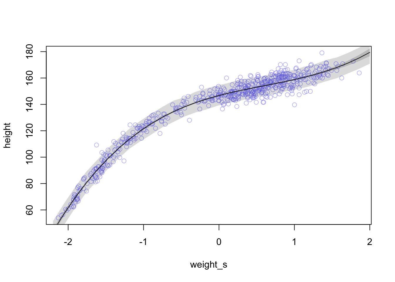
“This cubic curve is even more flexible than the parabola, so it fits the data even better.” (McElreath, 2020, p. 113) (pdf)
R Code 4.124 b: Fit a linear regression model of height on weight (standardized), for the full !Kung data (Tidyverse)
d_m4.4b <-
  d_b |>
  dplyr::mutate(weight_s = (weight - base::mean(weight)) / stats::sd(weight))


## fit model m4.4b #############
m4.4b <-
  brms::brm(data = d_m4.4b,
      family = gaussian,
      height ~ 1 + weight_s,
      prior = c(brms::prior(normal(178, 20), class = Intercept),
                brms::prior(lognormal(0, 1), class = b, coef = "weight_s"),
                brms::prior(uniform(0, 50), class = sigma, ub = 50)),
      iter = 2000, warmup = 1000, chains = 4, cores = 4,
      seed = 4,
      file = "brm_fits/m04.04b")

weight_seq_m4.4b <-
  tibble::tibble(weight_s = base::seq(from = -2.5, to = 2.5, length.out = 30))


## data wrangling: fitted, predict #########
fitd_m4.4b <-
  brms:::fitted.brmsfit(m4.4b,
         newdata = weight_seq_m4.4b,
         probs = c(0.055, 0.945)) |>
  tibble::as_tibble() |>
  dplyr::bind_cols(weight_seq_m4.4b)

pred_m4.4b <-
  brms:::predict.brmsfit(m4.4b,
          newdata = weight_seq_m4.4b,
         probs = c(0.055, 0.945)) |>
  tibble::as_tibble() |>
  dplyr::bind_cols(weight_seq_m4.4b)


## plot linear model ############
ggplot2::ggplot(data = d_m4.4b,
     ggplot2::aes(x = weight_s)) +
ggplot2::geom_ribbon(data = pred_m4.4b,
            ggplot2::aes(ymin = Q5.5, ymax = Q94.5),
            fill = "grey83") +
ggplot2::geom_smooth(data = fitd_m4.4b,
            ggplot2::aes(y = Estimate, ymin = Q5.5, ymax = Q94.5),
            stat = "identity",
            fill = "grey70", color = "black", alpha = 1, linewidth = 1/4) +
ggplot2::geom_point(ggplot2::aes(y = height),
           color = "navyblue", shape = 1, size = 1.5, alpha = 1/3) +
ggplot2::labs(subtitle = "linear",
     y = "height") +
ggplot2::coord_cartesian(xlim = base::range(d_m4.4b$weight_s),
                         ylim = base::range(d_m4.4b$height)) +
ggplot2::theme_bw()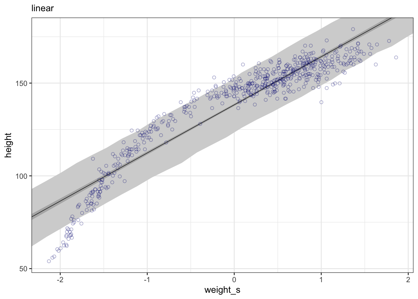
“[The graphic] shows the familiar linear regression from earlier in the chapter, but now with the standardized predictor and full data with both adults and non-adults. The linear model makes some spectacularly poor predictions, at both very low and middle weights.” (McElreath, 2020, p. 113) (pdf)
R Code 4.125 b: Parabolic regression of height on weight (standardized), for the full !Kung data (Tidyverse)
## data wrangling: fitted, predict ##############
weight_seq_m4.5b <-
  tibble::tibble(weight_s = base::seq(from = -2.5, to = 2.5, length.out = 30)) |>
  dplyr::mutate(weight_s2 = weight_s^2)

fitd_m4.5b <-
  brms:::fitted.brmsfit(m4.5b,
         newdata = weight_seq_m4.5b,
         probs = c(0.055, 0.945)) |>
  tibble::as_tibble() |>
  dplyr::bind_cols(weight_seq_m4.5b)

pred_m4.5b <-
  brms:::predict.brmsfit(m4.5b,
          newdata = weight_seq_m4.5b,
          probs = c(0.055, 0.945)) |>
  tibble::as_tibble() |>
  dplyr::bind_cols(weight_seq_m4.5b)

## plot quadratic model #########
ggplot2::ggplot(data = d3_m4.5b,
       ggplot2::aes(x = weight_s)) +
ggplot2::geom_ribbon(data = pred_m4.5b,
            ggplot2::aes(ymin = Q5.5, ymax = Q94.5),
            fill = "grey83") +
ggplot2::geom_smooth(data = fitd_m4.5b,
            ggplot2::aes(y = Estimate, ymin = Q5.5, ymax = Q94.5),
            stat = "identity",
            fill = "grey70", color = "black", alpha = 1, linewidth = 1/2) +
ggplot2::geom_point(ggplot2::aes(y = height),
           color = "navyblue", shape = 1, size = 1.5, alpha = 1/3) +
ggplot2::labs(subtitle = "quadratic",
     y = "height") +
ggplot2::coord_cartesian(xlim = base::range(d3_m4.5b$weight_s),
                         ylim = base::range(d3_m4.5b$height)) +
ggplot2::theme_bw()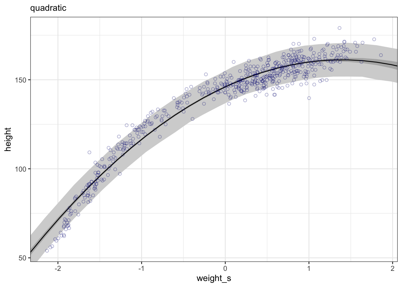
The quadratic regression does a pretty good job. It is much better than a linear regression for the full Howell1 data set.
R Code 4.126 b: Cubic regressions of height on weight (standardized), for the full !Kung data (Tidyverse)
## data wrangling: cubic ##############
d3_m4.6b <-
  d3_m4.5b |>
  dplyr::mutate(weight_s3 = weight_s^3)

m4.6b <-
  brms::brm(data = d3_m4.6b,
      family = gaussian,
      height ~ 1 + weight_s + weight_s2 + weight_s3,
      prior = c(brms::prior(normal(178, 20), class = Intercept),
                brms::prior(lognormal(0, 1), class = b, coef = "weight_s"),
                brms::prior(normal(0, 1), class = b, coef = "weight_s2"),
                brms::prior(normal(0, 1), class = b, coef = "weight_s3"),
                brms::prior(uniform(0, 50), class = sigma, ub = 50)),
      iter = 2000, warmup = 1000, chains = 4, cores = 4,
      seed = 4,
      file = "brm_fits/m04.06b")

## data wrangling: fitted, predict ##############
weight_seq_m4.6b <-
  weight_seq_m4.5b |>
  dplyr::mutate(weight_s3 = weight_s^3)

fitd_m4.6b <-
  brms:::fitted.brmsfit(m4.6b,
         newdata = weight_seq_m4.6b,
          probs = c(0.055, 0.945)) |>
  tibble::as_tibble() |>
  dplyr::bind_cols(weight_seq_m4.6b)

pred_m4.6b <-
  brms:::predict.brmsfit(m4.6b,
          newdata = weight_seq_m4.6b,
          probs = c(0.055, 0.945)) |>
  tibble::as_tibble() |>
  dplyr::bind_cols(weight_seq_m4.6b)

## plot quadratic model #########
ggplot2::ggplot(data = d3_m4.6b,
     ggplot2::aes(x = weight_s)) +
ggplot2::geom_ribbon(data = pred_m4.6b,
            ggplot2::aes(ymin = Q5.5, ymax = Q94.5),
            fill = "grey83") +
ggplot2::geom_smooth(data = fitd_m4.6b,
            ggplot2::aes(y = Estimate, ymin = Q5.5, ymax = Q94.5),
            stat = "identity",
            fill = "grey70", color = "black", alpha = 1, linewidth = 1/4) +
ggplot2::geom_point(aes(y = height),
           color = "navyblue", shape = 1, size = 1.5, alpha = 1/3) +
ggplot2::labs(subtitle = "cubic",
     y = "height") +
ggplot2::coord_cartesian(xlim = base::range(d3_m4.6b$weight_s),
                         ylim = base::range(d3_m4.6b$height)) +
ggplot2::theme_bw()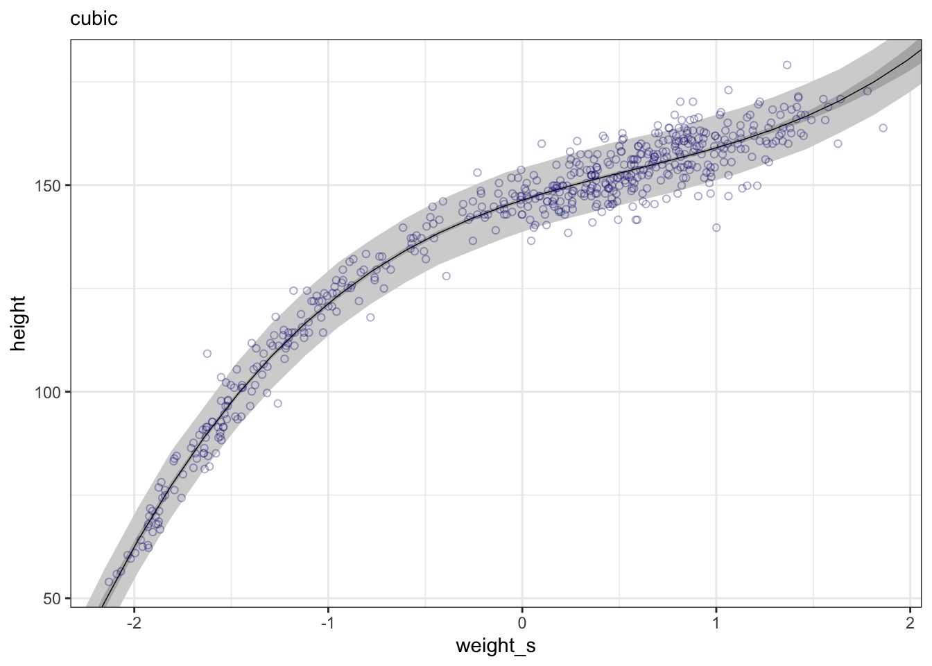
“This cubic curve is even more flexible than the parabola, so it fits the data even better.” (McElreath, 2020, p. 113) (pdf)
WATCH OUT! Models are just geocentric descriptions, not more!
“… it’s not clear that any of these models make a lot of sense. They are good geocentric descriptions of the sample, yes. But there are two problems. First, a better fit to the sample might not actually be a better model. That’s the subject of ?sec-chap07. Second, the model contains no biological information. We aren’t learning any causal relationship between height and weight. We’ll deal with this second problem much later, in ?sec-chap16.” (McElreath, 2020, p. 113) (pdf)
From Z-scores to natural scale
“The plots in Example 4.29 have standard units on the horizontal axis. These units are sometimes called z-scores. But suppose you fit the model using standardized variables, but want to plot the estimates on the original scale.” (McElreath, 2020, p. 114) (pdf)
Example 4.30 : From Z-scores back to natural scale
R Code 4.127 a: From Z-scores back to natural scale (Original)
## R code 4.71a #############
plot(height ~ weight_s, d_a, col = rethinking::col.alpha(rethinking::rangi2, 0.5), xaxt = "n", xlab = "Weight in kg", ylab = "Height in cm")

at_a <- c(-2, -1, 0, 1, 2)                           # 1
labels <- at_a * sd(d_a$weight) + mean(d_a$weight)   # 2
axis(side = 1, at = at_a, labels = round(labels, 1)) # 3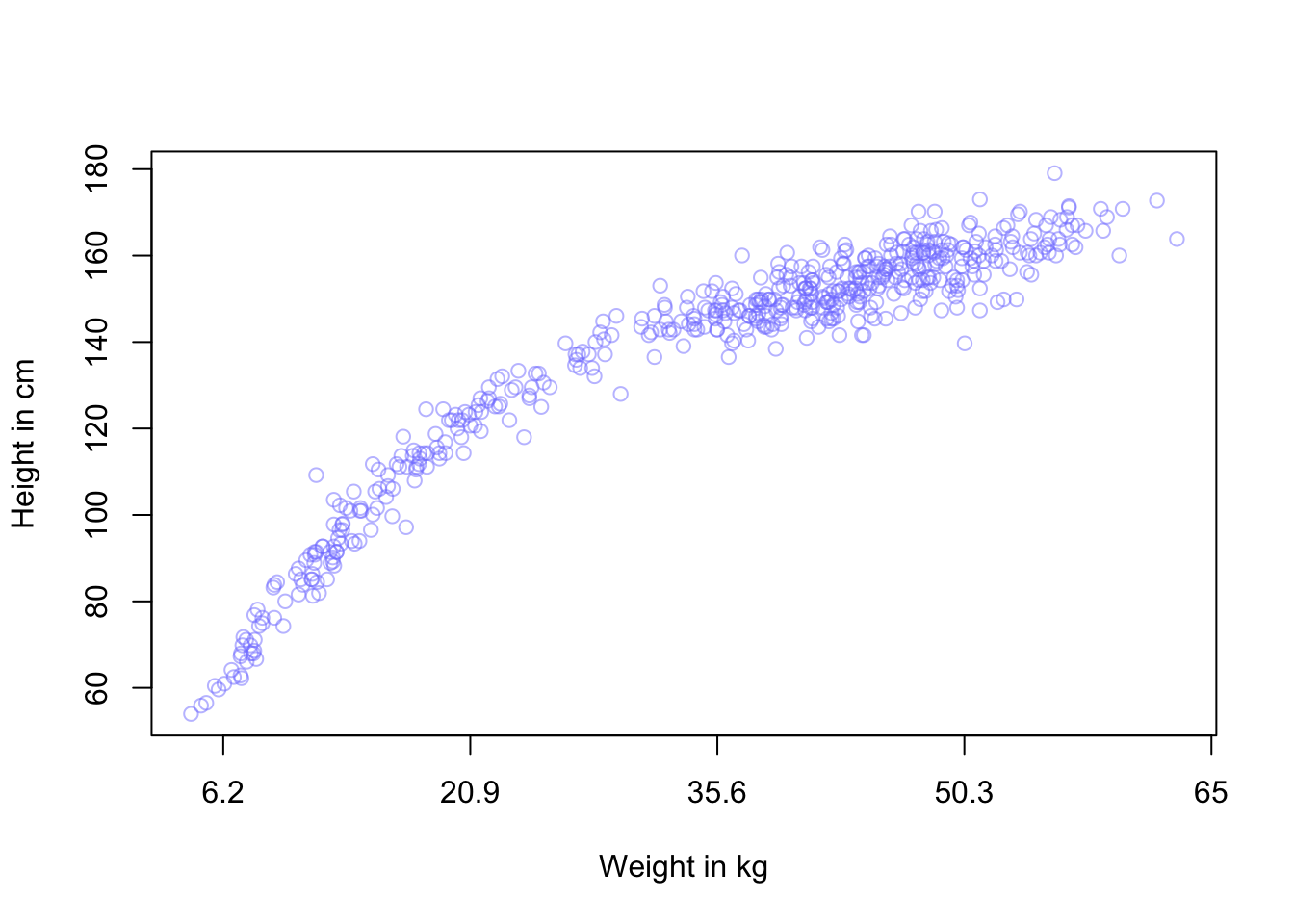
Take a look at the help ?axis for more details.
R Code 4.128 b: From Z-scores back to natural scale (Tidyverse)
at_b <- c(-2, -1, 0, 1, 2)

## plot linear model ############
ggplot2::ggplot(data = d_m4.4b,
     ggplot2::aes(x = weight_s)) +
ggplot2::geom_ribbon(data = pred_m4.4b,
            ggplot2::aes(ymin = Q5.5, ymax = Q94.5),
            fill = "grey83") +
ggplot2::geom_smooth(data = fitd_m4.4b,
            ggplot2::aes(y = Estimate, ymin = Q5.5, ymax = Q94.5),
            stat = "identity",
            fill = "grey70", color = "black", alpha = 1, linewidth = 1/4) +
ggplot2::geom_point(ggplot2::aes(y = height),
           color = "navyblue", shape = 1, size = 1.5, alpha = 1/3) +
ggplot2::labs(subtitle = "linear",
              y = "height in cm", x = "weight in kg") +
ggplot2::coord_cartesian(xlim = base::range(d_m4.4b$weight_s),
                         ylim = base::range(d_m4.4b$height)) +
ggplot2::theme_bw() +

# here it is!
ggplot2::scale_x_continuous("standardized weight converted back: Weight in kg",
                   breaks = at_a,
                   labels = base::round(at_b*sd(d_m4.4b$weight) +
                            base::mean(d_m4.4b$weight), 1))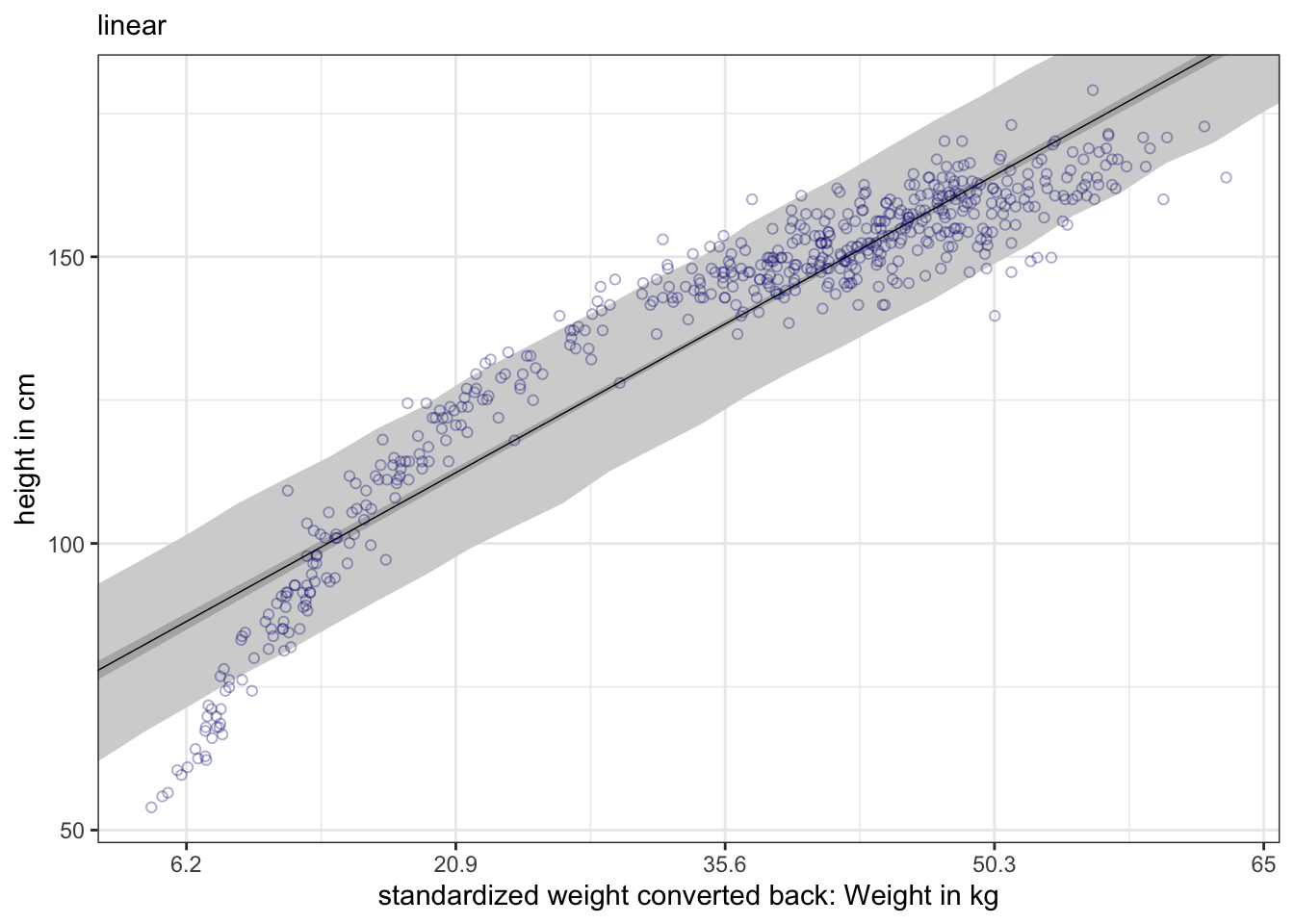
“The second way to introduce a curve is to construct something known as a spline. The word spline originally referred to a long, thin piece of wood or metal that could be anchored in a few places in order to aid drafters or designers in drawing curves. In statistics, a spline is a smooth function built out of smaller, component functions. There are actually many types of splines. The b-spline we’ll look at here is commonplace. The “B” stands for “basis,” which here just means “component.” B-splines build up wiggly functions from simpler less-wiggly components. Those components are called basis functions.” (McElreath, 2020, p. 114) (pdf)
“The short explanation of B-splines is that they divide the full range of some predictor variable, like
year, into parts. Then they assign a parameter to each part. These parameters are gradually turned on and off in a way that makes their sum into a fancy, wiggly curve.” (McElreath, 2020, p. 115) (pdf)
“With B-splines, just like with polynomial regression, we do this by generating new predictor variables and using those in the linear model, \(\mu_{i}\). Unlike polynomial regression, B-splines do not directly transform the predictor by squaring or cubing it. Instead they invent a series of entirely new, synthetic predictor variables. Each of these synthetic variables exists only to gradually turn a specific parameter on and off within a specific range of the real predictor variable. Each of the synthetic variables is called a basis function.” (McElreath, 2020, p. 115) (pdf)
Theorem 4.7 : Linear model with B-splines
\[ \mu_{i} = \alpha + w_{1}B_{i,1} + w_{2}B_{i,2} + w_{3}B_{i,3} + ... \] > “… \(B_{i,n}\) is the \(n\)-th basis function’s value on row \(i\), and the \(w\) parameters are corresponding weights for each. The parameters act like slopes, adjusting the influence of each basis function on the mean \(\mu_{i}\). So really this is just another linear regression, but with some fancy, synthetic predictor variables.” (McElreath, 2020, p. 115) (pdf)
Procedure 4.7 : How to generate B-splines?
Example 4.31 : Fit Cherry Blossoms data (Original)
R Code 4.129 a: Load Cherry Blossoms data, filter by complete cases and display summary precis
## R code 4.72 modified ######################
data(package = "rethinking", list = "cherry_blossoms")
d_m4.7a <- cherry_blossoms
d2_m4.7a <- d_m4.7a[ complete.cases(d_m4.7a$doy) , ] # complete cases on doy
rethinking::precis(d2_m4.7a)
#> mean sd 5.5% 94.5% histogram
#> year 1548.841596 304.1497740 1001.7200 1969.5700 ▁▂▂▃▅▃▇▇▇▇▇▇▁
#> doy 104.540508 6.4070362 94.4300 115.0000 ▁▂▅▇▇▃▁▁
#> temp 6.100356 0.6834104 5.1000 7.3662 ▁▃▅▇▃▁▁▁
#> temp_upper 6.937560 0.8119865 5.8100 8.4177 ▁▃▅▇▅▃▂▁▁▁▁▁▁▁▁
#> temp_lower 5.263545 0.7621943 4.1923 6.6277 ▁▁▁▂▅▇▃▁▁▁▁The original data set has 1,215 observation but only 827 records have values in day-of-year (doy, Day of the year of first blossom) column.
See ?cherry_blossoms for details and sources.
R Code 4.130 a: Display raw data for doy (Day of the year of first blossom) against the year
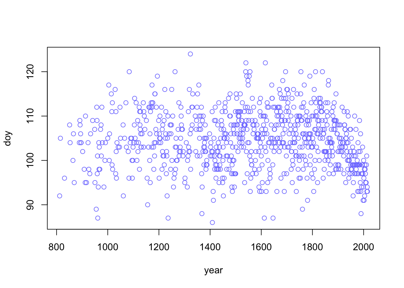
doy (Day of the year of first blossom) against the year (Original)“We’re going to work with the historical record of first day of blossom,
doy, for now. It ranges from 86 (late March) to 124 (early May). The years with recorded blossom dates run from 812 CE to 2015 CE.” (McElreath, 2020, p. 114) (pdf)
You can see that the doy data are sparse in the early years. Their number increases steadily approaching the year 2000.
R Code 4.131 a: Choose number of knots and distribute them over the data points of the year variable. (Original)
#> # A tibble: 15 × 2
#>    name      value
#>    <chr>     <dbl>
#>  1 0%          812
#>  2 7.142857%  1036
#>  3 14.28571%  1174
#>  4 21.42857%  1269
#>  5 28.57143%  1377
#>  6 35.71429%  1454
#>  7 42.85714%  1518
#>  8 50%        1583
#>  9 57.14286%  1650
#> 10 64.28571%  1714
#> 11 71.42857%  1774
#> 12 78.57143%  1833
#> 13 85.71429%  1893
#> 14 92.85714%  1956
#> 15 100%       2015
The locations of the knotsare part of the model. Therefore you are responsible for them. We placed the knots at different evenly-spaced quantiles of the predictor variable.
Explanation of code lines
year into 15 parts named after the percentiles. It is important to understand that not the range of the variable year was divided but the available data points.knot_list wrapped into a tibble and output with print(tibble::enframe(knot_list), n = 15), so that one can inspect the content of the vector more easily.Again you can see that the doy data are sparse in the early years. Starting with a the 16th century the we get similar intervals for the distances between years. This can be inspected better graphically in the next “parts” tab.
R Code 4.132 a: Plot data with equally number of doy data points for each segment against year
Starting with a the 16th century the we get similar intervals for the distances between years, e.g. the number of doy data points is approximately evenly distributed (59 - 67 years)
#> # A tibble: 15 × 3
#>    name      value  diff
#>    <chr>     <dbl> <dbl>
#>  1 0%          812    NA
#>  2 7.142857%  1036   224
#>  3 14.28571%  1174   138
#>  4 21.42857%  1269    95
#>  5 28.57143%  1377   108
#>  6 35.71429%  1454    77
#>  7 42.85714%  1518    64
#>  8 50%        1583    65
#>  9 57.14286%  1650    67
#> 10 64.28571%  1714    64
#> 11 71.42857%  1774    60
#> 12 78.57143%  1833    59
#> 13 85.71429%  1893    60
#> 14 92.85714%  1956    63
#> 15 100%       2015    59
R Code 4.133 a: Calculate basis functions of a cubic spline (degree = 3) with 15 areas (knots) to fit (Original)
#>  'bs' num [1:827, 1:17] 1 0.96 0.767 0.563 0.545 ...
#>  - attr(*, "dimnames")=List of 2
#>   ..$ : NULL
#>   ..$ : chr [1:17] "1" "2" "3" "4" ...
#>  - attr(*, "degree")= int 3
#>  - attr(*, "knots")= Named num [1:13] 1036 1174 1269 1377 1454 ...
#>   ..- attr(*, "names")= chr [1:13] "7.142857%" "14.28571%" "21.42857%" "28.57143%" ...
#>  - attr(*, "Boundary.knots")= int [1:2] 812 2015
#>  - attr(*, "intercept")= logi TRUE
Explanation of code lines
splines::bs() generate the B-spline basis matrix for a polynomial spline:knots is generated without the two boundary knots (fist and last knot) that are placed at the minimum and maximum of the variable. These two knots are excluded with the tricky code knot_list[-c(1, num_knots)] to prevent redundancies as splines::bs() places by default knots at the boundaries. So we have 13 internal knots.degree = 3 a cubic B-spline is chosen. The polynomial degree determines how basis functions combine, which determines how the parameters interact to produce the spline. For degree 1, (= line), two basis functions combine at each point. For degree 2 (= quadratic), three functions combine at each point. For degree 3 (= cubic), there are four basis functions combined. This should give enough flexibility for each region to fit.intercept = TRUE: > “We’ll also have an intercept to capture the average blossom day. This will make it easier to define priors on the basis weights, because then we can just conceive of each as a deviation from the intercept.” (McElreath, 2020, p. 117) (pdf)bs() default is intercept = FALSE.” (Kurz).intercept = TRUE as the difference to FALSE is marginal. The first B-spline (third hill) starts on the left edge of the graph with \(1.0\) instead of \(0\).year variable:dplyr::first(d2_m4.7a$year): 812dplyr::last(d2_m4.7a$year) : 2015R Code 4.134 a: Draw raw basis functions for the year variable for 15 areas (knots) and degree 3 (= cubic polynomial) (Original)
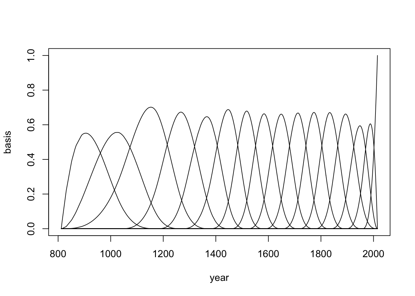
Theorem 4.8 a: Linear model for Cherry Blossoms data
\[ \begin{align*} \text{day of year}_{i} \sim \operatorname{Normal}(\mu_{i}, \sigma) \\ \mu_{i} = \alpha + {\sum_{k=1}^K w_{k} B_{k, i}} \\ \alpha \sim \operatorname{Normal}(100, 10) \\ w_{j} \sim \operatorname{Normal}(0, 10) \\ \sigma \sim \operatorname{Exponential}(1) \end{align*} \tag{4.11}\]
where \(\alpha\) is the intercept, \(B_{k, i}\) is the value of the \(k^\text{th}\) bias function on the \(i^\text{th}\) row of the data, and \(w_k\) is the estimated regression weight for the corresponding \(k^\text{th}\) bias function. (](https://bookdown.org/content/4857/geocentric-models.html#splines.))
“The model is multiplying each basis value by a corresponding parameter \(w_{k}\) and then adding up all \(K\) of those products. This is just a compact way of writing a linear model. The rest should be familiar. … the \(w\) priors influence how wiggly the spline can be.” (McElreath, 2020, p. 118) (pdf)
“This is also the first time we’ve used an exponential distribution as a prior. Exponential distributions are useful priors for scale parameters, parameters that must be positive. The prior for \(\sigma\) is exponential with a rate of \(1\). The way to read an exponential distribution is to think of it as containing no more information than an average deviation. That average // is the inverse of the rate. So in this case it is \(1/1 = 1\). If the rate were \(0.5\), the mean would be \(1/0.5 = 2\). We’ll use exponential priors for the rest of the book, in place of uniform priors. It is much more common to have a sense of the average deviation than of the maximum.” (McElreath, 2020, p. 118/119) (pdf)
Exponential distributions in R
To learn more about the exponential distribution and it’s single parameter \(\lambda\) lambda), which is also called the rate and how to apply it in R read Exponential distribution in R.
R Code 4.135 a: Fit model and show summary (Original)
#>               mean        sd         5.5%       94.5%
#> w[1]   -0.74907825 3.8699046  -6.93393317   5.4357767
#> w[2]    0.46260929 3.0138007  -4.35402625   5.2792448
#> w[3]    5.75074086 2.6352108   1.53916511   9.9623166
#> w[4]    0.29257647 2.4850428  -3.67900190   4.2641548
#> w[5]    5.33551430 2.6157766   1.15499802   9.5160306
#> w[6]   -4.24900191 2.4432842  -8.15384200  -0.3441618
#> w[7]    8.89031186 2.4660377   4.94910731  12.8315164
#> w[8]    0.05414883 2.5463000  -4.01533036   4.1236280
#> w[9]    4.08605901 2.5841481  -0.04390883   8.2160269
#> w[10]   5.71821727 2.5609005   1.62540361   9.8110309
#> w[11]   0.90260492 2.5360789  -3.15053899   4.9557488
#> w[12]   6.60934377 2.5575674   2.52185710  10.6968304
#> w[13]   1.77695187 2.6804345  -2.50690017   6.0608039
#> w[14]   0.23168278 3.0115420  -4.58134299   5.0447085
#> w[15]  -5.89934783 3.0966563 -10.84840275  -0.9502929
#> w[16]  -6.64967713 2.9471305 -11.35976093  -1.9395933
#> a     102.29008683 1.9474030  99.17776076 105.4024129
#> sigma   5.87829936 0.1438198   5.64844752   6.1081512
The model conforms to the content in tab “formula”.
“To build this model in quap, we just need a way to do that sum. The easiest way is to use matrix multiplication.” (McElreath, 2020, p. 119) (pdf)
“Matrix algebra is just a new way to represent ordinary algebra. It is often much more compact. So to make model
m4.7aeasier to program, we used a matrix multiplication of the basis matrixB_m4.7aby the vector of parameters \(w\): (McElreath, 2020, p. 120) ([pdf](zotero://open-pdf/groups/5243560/items/CPFRPHX8?page=139&annotation=FXMD6NR9
\[B %\*% w\].
This notation is just linear algebra shorthand for (1) multiplying each element of the vector w by each value in the corresponding row of B and then (2) summing up each result.” (McElreath, 2020, p. 120) (pdf)
The difference between matrix multiplication and traditional style is seen in the line with the basis matrix B_m4.7a
\[ \begin{align*} \text{mu <- a + B %*% w, (1)} \\ \text{mu <- a + sapply(1:827, function(i) sum(B[i, ] * w)), (2)} \\ \end{align*} \] (1) Matrix multiplication (2) Less elegant code but with the same result
We looked with precis(m4.7a, depth = 2) at the posterior means. We see 17 \(w\) parameters. But this didn’t help much. We need to plot the posterior prediction (see last tab “plot2”)
R Code 4.136 a: Draw weighted basis functions (B-splines)
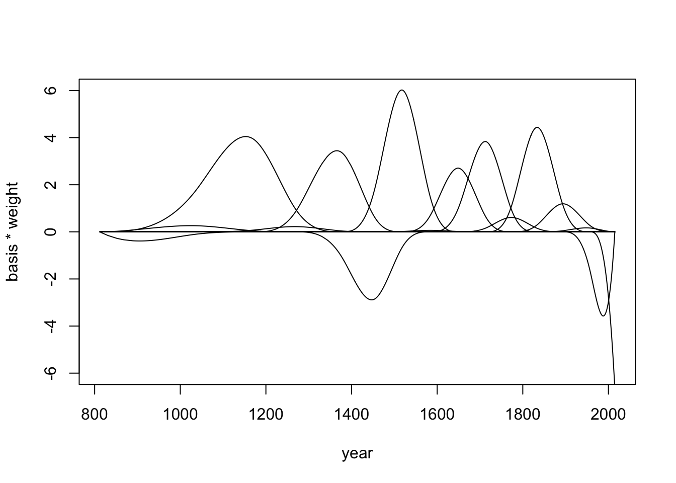
To get the parameter weights for each basis function, we had to define the model (tab “formula”) and make it run (tab “fit”).
Compare the weighted basis functions with the raw basis function (tab “basis”) and with the wiggles in the Cherry Blossoms data (tab “plot2”).
R Code 4.137 a: Plot the 97% posterior interval for \(\mu\), at each year
## R code 4.78a ###############
mu_m4.7a <- rethinking::link(m4.7a)
mu_PI_m4.7a <- apply(mu_m4.7a, 2, rethinking::PI, 0.97)
plot(d2_m4.7a$year, d2_m4.7a$doy,
     col = rethinking::col.alpha(rethinking::rangi2, 0.3), pch = 16)
rethinking::shade(mu_PI_m4.7a, d2_m4.7a$year,
     col = rethinking::col.alpha("black", 0.5))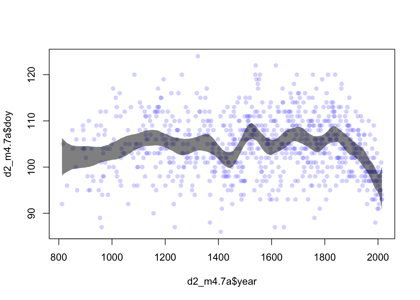
“The spline is much wigglier now. Something happened around 1500, for example. If you add more knots, you can make this even wigglier. You might wonder how many knots is correct. We’ll be ready to address that question in a few more chapters” (McElreath, 2020, p. 119) (pdf)
Example 4.32 b: Fit Cherry Blossoms data (Tidyverse)
R Code 4.138 b: Load Cherry Blossoms data, complete cases and display summary
## R code 4.72b modified ######################
data(package = "rethinking", list = "cherry_blossoms")
d_m4.7b <- cherry_blossoms

d2_m4.7b <-
  d_m4.7b |>
  tidyr::drop_na(doy)


# ground-up tidyverse way to summarize
(
    d2_m4.7b |>
      tidyr::gather() |>
      dplyr::group_by(key) |>
      dplyr::summarise(mean = base::mean(value, na.rm = T),
                sd   = stats::sd(value, na.rm = T),
                ll   = stats::quantile(value, prob = .055, na.rm = T),
                ul   = stats::quantile(value, prob = .945, na.rm = T)) |>
      dplyr::mutate(dplyr::across(where(is.double),
                                  \(x) round(x, digits = 2)))
)
#> # A tibble: 5 × 5
#> key mean sd ll ul
#> <chr> <dbl> <dbl> <dbl> <dbl>
#> 1 doy 105. 6.41 94.4 115
#> 2 temp 6.1 0.68 5.1 7.37
#> 3 temp_lower 5.26 0.76 4.19 6.63
#> 4 temp_upper 6.94 0.81 5.81 8.42
#> 5 year 1549. 304. 1002. 1970.Within the tidyverse, we can drop NA’s with the tidyr::drop_na() function. – This is a much easier way than my approach originally used with dplyr::filter() (See also the different ways in StackOverflow
WATCH OUT! across() supersedes the family of “scoped variants” like mutate_if()
I am using Kurz’ “ground-up {tidyverse} way” to summarize the data. But instead of the superseded dplyr::mutate_if() function I used the new dplyr::across(). At first I wrote dplyr::mutate(dplyr::across(where(is.double), round, digits = 2)) but after I warning I changed it to an anonymous function:
  # Previously
  across(a:b, mean, na.rm = TRUE)

  # Now
  across(a:b, \(x) mean(x, na.rm = TRUE))
R Code 4.139 b: Display summary with skimr::skim()
d2_m4.7b |>
skimr::skim()| Name | d2_m4.7b |
| Number of rows | 827 |
| Number of columns | 5 |
| _______________________ | |
| Column type frequency: | |
| numeric | 5 |
| ________________________ | |
| Group variables | None |
Variable type: numeric
| skim_variable | n_missing | complete_rate | mean | sd | p0 | p25 | p50 | p75 | p100 | hist |
|---|---|---|---|---|---|---|---|---|---|---|
| year | 0 | 1.00 | 1548.84 | 304.15 | 812.00 | 1325.00 | 1583.00 | 1803.50 | 2015.00 | ▂▅▆▇▇ |
| doy | 0 | 1.00 | 104.54 | 6.41 | 86.00 | 100.00 | 105.00 | 109.00 | 124.00 | ▁▅▇▅▁ |
| temp | 40 | 0.95 | 6.10 | 0.68 | 4.69 | 5.62 | 6.06 | 6.46 | 8.30 | ▃▇▇▂▁ |
| temp_upper | 40 | 0.95 | 6.94 | 0.81 | 5.45 | 6.38 | 6.80 | 7.38 | 12.10 | ▇▇▂▁▁ |
| temp_lower | 40 | 0.95 | 5.26 | 0.76 | 2.61 | 4.77 | 5.25 | 5.65 | 7.74 | ▁▃▇▂▁ |
Kurz’s version does not have the mini histograms. I added another summary with skimr::skim() to add tiny graphics.
R Code 4.140 b: Display raw data for doy (Day of the year of first blossom) against the year
d2_m4.7b |>
  ggplot2::ggplot(ggplot2::aes(x = year, y = doy)) +
  ## color from https://www.colorhexa.com/ffb7c5
  ggplot2::geom_point(color = "#ffb7c5", alpha = 1/2) +
  ggplot2::theme() +
  ggplot2::theme(panel.grid = ggplot2::element_blank(),
    panel.background = ggplot2::element_rect(fill = "#4f455c"))

## color from https://www.colordic.org/w/,
## inspired by
## https://chichacha.netlify.com/2018/11/29/plotting-traditional-colours-of-japan/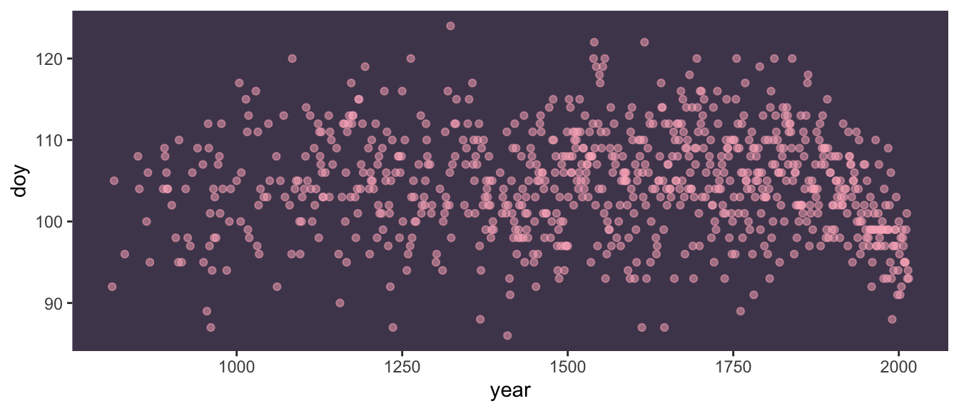
doy (Day of the year of first blossom) against the year (Tidyverse)By default {ggplot2} removes missing data records with a warning. But I had already removed missing data for the doy variable (see: tab “data”).
This is the same code and text as in tab “knots” of Example 4.31.
R Code 4.141 b: Choose number of knots and distribute them over the data points of the year variable.
#> # A tibble: 15 × 2
#> name value
#> <chr> <dbl>
#> 1 0% 812
#> 2 7.142857% 1036
#> 3 14.28571% 1174
#> 4 21.42857% 1269
#> 5 28.57143% 1377
#> 6 35.71429% 1454
#> 7 42.85714% 1518
#> 8 50% 1583
#> 9 57.14286% 1650
#> 10 64.28571% 1714
#> 11 71.42857% 1774
#> 12 78.57143% 1833
#> 13 85.71429% 1893
#> 14 92.85714% 1956
#> 15 100% 2015The locations of the knots are part of the model. Therefore you are responsible for them. We placed the knots at different evenly-spaced quantiles of the predictor variable.
Explanation of code lines
year into 15 parts named after the percentiles. It is important to understand that not the range of the variable year was divided but the available data points.knot_list wrapped into a tibble and output with print(tibble::enframe(knot_list_b), n = 15), so that one can inspect the content of the vector more easily.Again you can see that the doy data are sparse in the early years. Starting with a the 16th century the we get similar intervals for the distances between years. This can be inspected better graphically in the next “parts” tab.
TThe code is different but the text is the same as in tab “parts” of Example 4.31.
R Code 4.142 b: Plot data with equally number of doy data points for each segment against year
d2_m4.7b |>
ggplot2::ggplot(ggplot2::aes(x = year, y = doy)) +
ggplot2::geom_vline(xintercept = knot_list_b,
color = "white", alpha = 1/2) +
ggplot2::geom_point(color = "#ffb7c5", alpha = 1/2) +
ggplot2::theme_bw() +
ggplot2::theme(panel.background = ggplot2::element_rect(fill = "#4f455c"),
panel.grid = ggplot2::element_blank())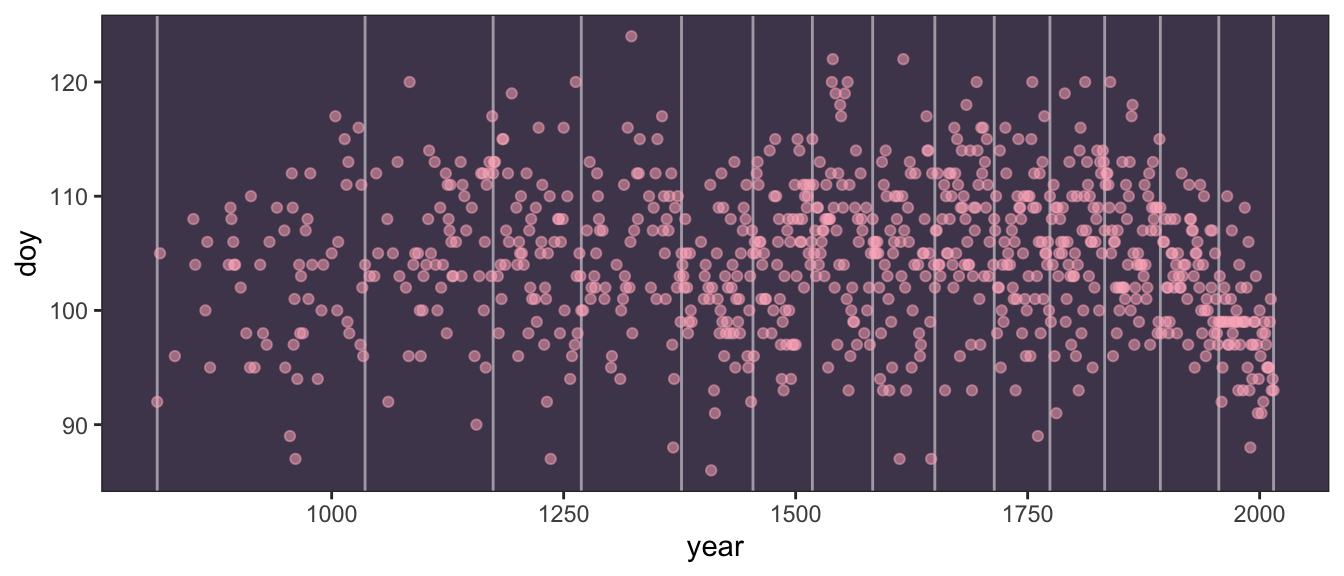
doy (Day of the year of first blossom) against the year with vertical lines at the knots positions (Tidyverse)Starting with a the 16th century the we get similar intervals for the distances between years, e.g. the number of doy data points is approximately evenly distributed (59 - 67 years)
#> # A tibble: 15 × 3
#> name value diff
#> <chr> <dbl> <dbl>
#> 1 0% 812 NA
#> 2 7.142857% 1036 224
#> 3 14.28571% 1174 138
#> 4 21.42857% 1269 95
#> 5 28.57143% 1377 108
#> 6 35.71429% 1454 77
#> 7 42.85714% 1518 64
#> 8 50% 1583 65
#> 9 57.14286% 1650 67
#> 10 64.28571% 1714 64
#> 11 71.42857% 1774 60
#> 12 78.57143% 1833 59
#> 13 85.71429% 1893 60
#> 14 92.85714% 1956 63
#> 15 100% 2015 59This is the same code and text as in tab “calc” of Example 4.31.
R Code 4.143 b: Calculate basis functions of a cubic spline (degree = 3) with 15 areas (knots) to fit
#> 'bs' num [1:827, 1:17] 1 0.96 0.767 0.563 0.545 ...
#> - attr(*, "dimnames")=List of 2
#> ..$ : NULL
#> ..$ : chr [1:17] "1" "2" "3" "4" ...
#> - attr(*, "degree")= int 3
#> - attr(*, "knots")= Named num [1:13] 1036 1174 1269 1377 1454 ...
#> ..- attr(*, "names")= chr [1:13] "7.142857%" "14.28571%" "21.42857%" "28.57143%" ...
#> - attr(*, "Boundary.knots")= int [1:2] 812 2015
#> - attr(*, "intercept")= logi TRUEExplanation of code lines
splines::bs() generate the B-spline basis matrix for a polynomial spline:knots is generated without the two boundary knots (fist and last knot) that are placed at the minimum and maximum of the variable. These two knots are excluded with the tricky code knot_list[-c(1, num_knots)] to prevent redundancies as splines::bs() places by default knots at the boundaries. So we have 13 internal knots.degree = 3 a cubic B-spline is chosen. The polynomial degree determines how basis functions combine, which determines how the parameters interact to produce the spline. For degree 1, (= line), two basis functions combine at each point. For degree 2 (= quadratic), three functions combine at each point. For degree 3 (= cubic), there are four basis functions combined. This should give enough flexibility for each region to fit.intercept = TRUE: > “We’ll also have an intercept to capture the average blossom day. This will make it easier to define priors on the basis weights, because then we can just conceive of each as a deviation from the intercept.” (McElreath, 2020, p. 117) (pdf)bs() default is intercept = FALSE.” (Kurz).intercept = TRUE as the difference to FALSE is marginal. The first B-spline (third hill) starts on the left edge of the graph with \(1.0\) instead of \(0\).year variable:dplyr::first(d2_m4.7b$year): 812dplyr::last(d2_m4.7b$year) : 2015R Code 4.144 a: Draw raw basis functions for the year variable for 15 areas (knots) and degree 3 (= cubic polynomial)
# wrangle a bit
d_B_m4.7b <-
B_m4.7b |>
base::as.data.frame() |>
rlang::set_names(stringr::str_c(0, 1:9), 10:17) |>
dplyr::bind_cols(dplyr::select(d2_m4.7b, year)) |>
tidyr::pivot_longer(-year,
names_to = "bias_function",
values_to = "bias")
# plot
d_B_m4.7b |>
ggplot2::ggplot(ggplot2::aes(x = year, y = bias, group = bias_function)) +
ggplot2::geom_vline(xintercept = knot_list_b, color = "white", alpha = 1/2) +
ggplot2::geom_line(color = "#ffb7c5", alpha = 1/2, linewidth = 1.5) +
ggplot2::ylab("bias value") +
ggplot2::theme_bw() +
ggplot2::theme(panel.background = ggplot2::element_rect(fill = "#4f455c"),
panel.grid = ggplot2::element_blank())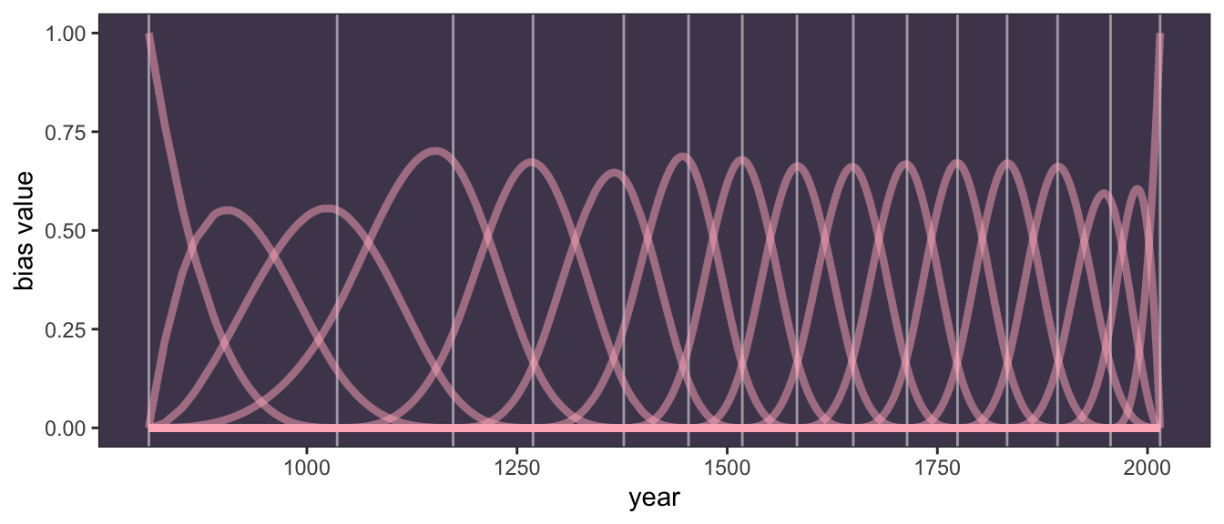
WATCH OUT! Warning with tibble::as_tibble() instead of base::as.data.frame()
At first I used as always tibble::as_tibble(). But this generated a warning message.
Don’t know how to automatically pick scale for object of type
. Defaulting to continuous.
I learned that it has to do with the difference of a variable name versus a function name in aes(). For instance “mean” versus variable “Mean” (statology) or “sample” versus “Sample” (StackOverflow).
But why this is the case with tibble::as_tibble() but not with base::as.data.frame() I do not know. Perhaps it has to do with the somewhat stricter tibble naming rules? (see: tibble overview and tbl_df class).
R Code 4.145 b: Basis functions of a cubic spline with 15 knots broken up in different facets
d_B_m4.7b |>
dplyr::mutate(bias_function = stringr::str_c("bias function ",
bias_function)) |>
ggplot2::ggplot(ggplot2::aes(x = year, y = bias)) +
ggplot2::geom_vline(xintercept = knot_list_b,
color = "white", alpha = 1/2) +
ggplot2::geom_line(color = "#ffb7c5", linewidth = 1.5) +
ggplot2::ylab("bias value") +
ggplot2::theme_bw() +
ggplot2::theme(panel.background = ggplot2::element_rect(fill = "#4f455c"),
panel.grid = ggplot2::element_blank(),
strip.background = ggplot2::element_rect(
fill = scales::alpha("#ffb7c5", .25), color = "transparent"),
strip.text = ggplot2::element_text(
size = 8, margin = ggplot2::margin(0.1, 0, 0.1, 0, "cm"))) +
ggplot2::facet_wrap(~ bias_function, ncol = 1)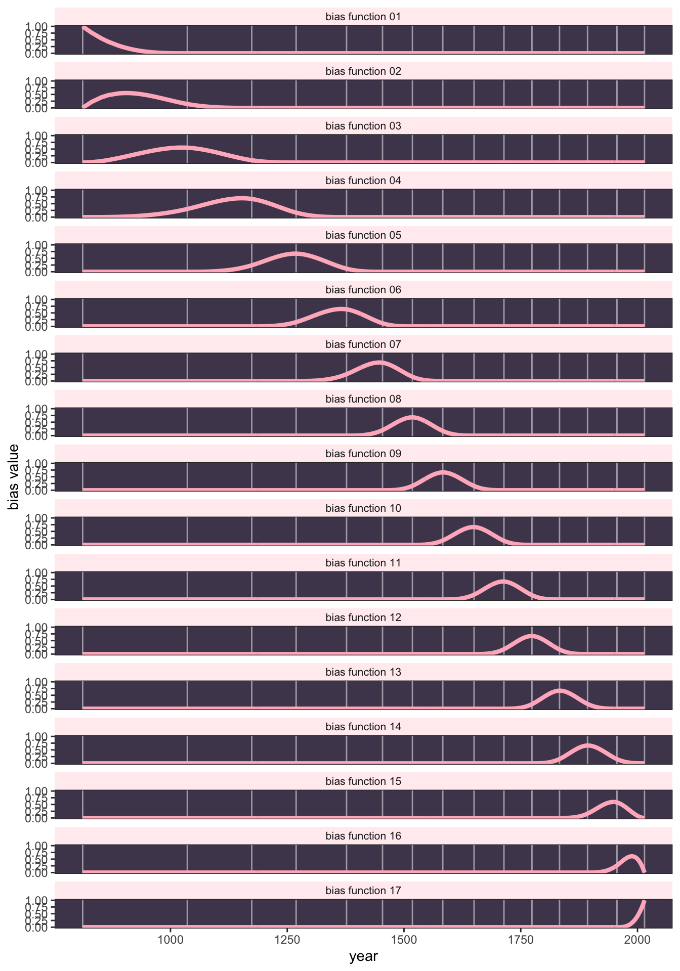
To see what’s going on in that plot, we tool Kurz code to break the graphic up for displaying all basis function in an extra slot with ggplot2::facet_wrap().
R Code 4.146 b: Using the density of the exponential distribution dexp() to show the prior
dexp() to show the priorWe used the dexp() function for the model (see tab “formula” in Example 4.31). To get a sense of what that prior looks like, we displayed the dexp() function.
R Code 4.147 b: Add B-splines matrix for 15 knots to the data frame by creating a new data frame
#> Rows: 827
#> Columns: 6
#> $ year <int> 812, 815, 831, 851, 853, 864, 866, 869, 889, 891, 892, 894,…
#> $ doy <int> 92, 105, 96, 108, 104, 100, 106, 95, 104, 109, 108, 106, 10…
#> $ temp <dbl> NA, NA, NA, 7.38, NA, 6.42, 6.44, NA, 6.83, 6.98, 7.11, 6.9…
#> $ temp_upper <dbl> NA, NA, NA, 12.10, NA, 8.69, 8.11, NA, 8.48, 8.96, 9.11, 8.…
#> $ temp_lower <dbl> NA, NA, NA, 2.66, NA, 4.14, 4.77, NA, 5.19, 5.00, 5.11, 5.5…
#> $ B_m4.7b <bs[,17]> <bs[26 x 17]>In R code 4.76a (tab “quap” in Example 4.32), McElreath defined his data in a list (list(D = d2_m4.7a$doy, B_m4.7a = B_m4.7a)). The approach with {brms} will be a little different. We’ll add the B_m4.7b matrix to our d2_m4.7b data frame and name the results as d3_m4.7b.
In the
d3_m4.7bdata, columnsyearthroughtemp_lowerare all standard data columns. TheB_m4-7bcolumn is a matrix column, which contains the same number of rows as the others, but also smuggled in 17 columns within that column. Each of those 17 columns corresponds to one of our synthetic \(B_{k}\) variables. The advantage of such a data structure is we can simply define ourformulaargument as \(doy \sim 1 + B_m4-7b\), whereB_m4-7bis a stand-in forB_m4-7b.1 + B_m4-7b.2 + ... + B_m4-7b.17. (Kurz)
See next tab “brm”.
R Code 4.148 b: Fit model m4.7b with brms::brm()
m4.7b <-
brms::brm(data = d3_m4.7b,
family = gaussian,
doy ~ 1 + B_m4.7b,
prior = c(brms::prior(normal(100, 10), class = Intercept),
brms::prior(normal(0, 10), class = b),
brms::prior(exponential(1), class = sigma)),
iter = 2000, warmup = 1000, chains = 4, cores = 4,
seed = 4,
file = "brm_fits/m04.07b")
brms:::print.brmsfit(m4.7b)#> Family: gaussian
#> Links: mu = identity; sigma = identity
#> Formula: doy ~ 1 + B_m4.7b
#> Data: d3_m4.7b (Number of observations: 827)
#> Draws: 4 chains, each with iter = 2000; warmup = 1000; thin = 1;
#> total post-warmup draws = 4000
#>
#> Population-Level Effects:
#> Estimate Est.Error l-95% CI u-95% CI Rhat Bulk_ESS Tail_ESS
#> Intercept 103.48 2.44 98.62 108.27 1.00 590 932
#> B_m4.7b1 -3.14 3.89 -10.68 4.52 1.00 1780 2472
#> B_m4.7b2 -0.92 4.02 -8.63 6.92 1.00 1331 1862
#> B_m4.7b3 -1.25 3.61 -8.20 6.12 1.00 1233 1842
#> B_m4.7b4 4.73 3.02 -1.27 10.59 1.00 875 1345
#> B_m4.7b5 -0.98 2.93 -6.63 4.90 1.00 792 1394
#> B_m4.7b6 4.18 2.96 -1.66 10.07 1.00 883 1470
#> B_m4.7b7 -5.44 2.84 -11.00 0.20 1.00 820 1325
#> B_m4.7b8 7.71 2.88 2.06 13.19 1.00 719 1430
#> B_m4.7b9 -1.13 2.94 -6.81 4.63 1.00 812 1371
#> B_m4.7b10 2.87 2.94 -2.95 8.58 1.00 851 1393
#> B_m4.7b11 4.53 2.96 -1.15 10.53 1.00 820 1265
#> B_m4.7b12 -0.31 2.95 -6.20 5.45 1.00 805 1411
#> B_m4.7b13 5.43 2.98 -0.34 11.27 1.00 849 1315
#> B_m4.7b14 0.55 3.02 -5.38 6.39 1.00 953 1506
#> B_m4.7b15 -0.90 3.38 -7.52 5.78 1.00 1012 1742
#> B_m4.7b16 -7.08 3.42 -13.99 -0.42 1.00 1116 1982
#> B_m4.7b17 -7.79 3.29 -14.37 -1.20 1.00 1074 1763
#>
#> Family Specific Parameters:
#> Estimate Est.Error l-95% CI u-95% CI Rhat Bulk_ESS Tail_ESS
#> sigma 5.95 0.15 5.66 6.25 1.00 5900 2573
#>
#> Draws were sampled using sampling(NUTS). For each parameter, Bulk_ESS
#> and Tail_ESS are effective sample size measures, and Rhat is the potential
#> scale reduction factor on split chains (at convergence, Rhat = 1).Each of the 17 columns in our
Bmatrix was assigned its own parameter. If you fit this model using McElreath’s rethinking code, you’ll see the results are very similar. (Kurz, ibid.)
R Code 4.149 b: Glimpse at transformed data of model m4.7b to draw objects
post_m4.7b <- brms::as_draws_df(m4.7b)
glimpse(post_m4.7b)#> Rows: 4,000
#> Columns: 24
#> $ b_Intercept <dbl> 100.6156, 100.4937, 103.1678, 102.5159, 101.5559, 101.7562…
#> $ b_B_m4.7b1 <dbl> 2.90164141, 3.32435081, -2.70015340, -0.02253457, -1.97050…
#> $ b_B_m4.7b2 <dbl> -2.1067230, -0.5311967, 0.6794133, -2.8772090, 3.4878935, …
#> $ b_B_m4.7b3 <dbl> 2.9992344, 6.5131175, 0.8860770, 1.2321642, -1.3893031, 1.…
#> $ b_B_m4.7b4 <dbl> 6.1257337, 4.9927835, 5.3287564, 4.6657258, 7.8084901, 4.9…
#> $ b_B_m4.7b5 <dbl> 1.16796045, 2.69443262, -1.14483788, -0.87995893, 3.187535…
#> $ b_B_m4.7b6 <dbl> 9.5029937, 5.2401181, 4.1763796, 7.3521813, 3.7853630, 7.5…
#> $ b_B_m4.7b7 <dbl> -3.8974486, -2.5350548, -3.8448680, -1.7500613, -3.5003478…
#> $ b_B_m4.7b8 <dbl> 10.234376, 12.795946, 5.555182, 7.698008, 11.170412, 8.328…
#> $ b_B_m4.7b9 <dbl> -1.516545385, 0.965091340, 3.329924529, 0.450062993, 1.554…
#> $ b_B_m4.7b10 <dbl> 6.48286406, 6.06286271, 0.64513422, 4.83968514, 3.35499895…
#> $ b_B_m4.7b11 <dbl> 7.79660448, 7.56857405, 5.66668708, 3.36413271, 9.02955370…
#> $ b_B_m4.7b12 <dbl> 1.8447173, -0.7395718, 1.8709336, 1.6117838, -0.9294026, 2…
#> $ b_B_m4.7b13 <dbl> 10.26433473, 10.88433479, 4.55267435, 8.00798110, 6.444273…
#> $ b_B_m4.7b14 <dbl> -1.8069079, -0.8779897, 5.5164497, -0.4733169, 7.1190998, …
#> $ b_B_m4.7b15 <dbl> 9.7734694, 8.8519378, -4.2358415, -1.7802159, 0.1933067, 0…
#> $ b_B_m4.7b16 <dbl> -9.2641966, -14.0515369, -3.1279428, 0.1699908, -7.1740999…
#> $ b_B_m4.7b17 <dbl> -0.007993781, -1.342456078, -13.852015496, -9.733215118, -…
#> $ sigma <dbl> 5.639404, 5.677425, 6.229067, 6.289891, 6.191738, 5.977885…
#> $ lprior <dbl> -67.06532, -67.63332, -66.43315, -66.13359, -66.75463, -65…
#> $ lp__ <dbl> -2723.712, -2724.698, -2719.803, -2721.983, -2720.532, -27…
#> $ .chain <int> 1, 1, 1, 1, 1, 1, 1, 1, 1, 1, 1, 1, 1, 1, 1, 1, 1, 1, 1, 1…
#> $ .iteration <int> 1, 2, 3, 4, 5, 6, 7, 8, 9, 10, 11, 12, 13, 14, 15, 16, 17,…
#> $ .draw <int> 1, 2, 3, 4, 5, 6, 7, 8, 9, 10, 11, 12, 13, 14, 15, 16, 17,…We used brms::as_draws_df() to transform m4.7b to a draw object so that it can processed easier by the {posterior} package.
R Code 4.150 b: Weight each basis function by its corresponding parameter
post_m4.7b |>
dplyr::select(b_B_m4.7b1:b_B_m4.7b17) |>
rlang::set_names(base::c(stringr::str_c(0, 1:9), 10:17)) |>
tidyr::pivot_longer(tidyselect::everything(),
names_to = "bias_function") |>
dplyr::group_by(bias_function) |>
dplyr::summarise(weight = base::mean(value)) |>
## add weight column to year & bias via "bias_function"
dplyr::full_join(d_B_m4.7b, by = "bias_function") |>
# plot
ggplot2::ggplot(ggplot2::aes(x = year,
y = bias * weight,
group = bias_function)) +
ggplot2::geom_vline(xintercept = knot_list_b,
color = "white", alpha = 1/2) +
ggplot2::geom_line(color = "#ffb7c5",
alpha = 1/2, linewidth = 1.5) +
ggplot2::theme_bw() +
ggplot2::theme(panel.background =
ggplot2::element_rect(fill = "#4f455c"),
panel.grid = ggplot2::element_blank()) 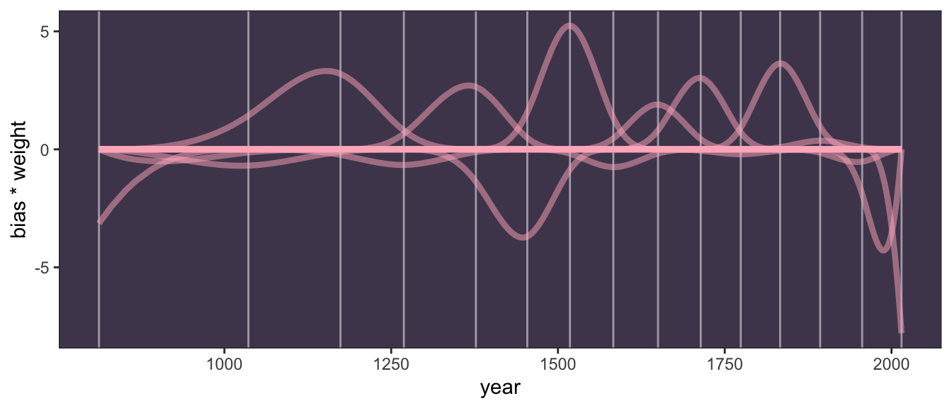
In case you missed it, the main action in the {ggplot2} code was
y = bias * weight, where we defined the \(y\)-axis as the product ofbiasandweight. This is fulfillment of the \(w_k B_{k, i}\) parts of the model. (Kurz, ibid.)
R Code 4.151 b: Expected values of the posterior predictive distribution
f_m4.7b <- brms:::fitted.brmsfit(m4.7b, probs = c(0.055, 0.945))
f_m4.7b |>
base::as.data.frame() |>
dplyr::bind_cols(d3_m4.7b) |>
ggplot2::ggplot(ggplot2::aes(x = year, y = doy,
ymin = Q5.5, ymax = Q94.5)) +
ggplot2::geom_vline(xintercept = knot_list_b,
color = "white", alpha = 1/2) +
ggplot2::geom_hline(yintercept =
brms::fixef(m4.7b,
probs = c(0.055, 0.945))[1, 1],
color = "white", linetype = 2) +
ggplot2::geom_point(color = "#ffb7c5", alpha = 1/2) +
ggplot2::geom_ribbon(fill = "white", alpha = 2/3) +
ggplot2::labs(x = "year", y = "day in year") +
ggplot2::theme_bw() +
ggplot2::theme(panel.background =
ggplot2::element_rect(fill = "#4f455c"),
panel.grid = ggplot2::element_blank())
If it wasn’t clear, the dashed horizontal line intersecting a little above \(100\) on the \(y\)-axis is the posterior mean for the intercept. (Kurz, ibid.)
In contrast to Kurz’ code I have used probs = c(0.055, 0.945) to get the same 89% (Q5.5 and Q94.5) intervals as in the book.
“The splines in the previous section are just the beginning. A entire class of models, generalized additive models (GAMs), focuses on predicting an outcome variable using smooth functions of some predictor variables.” (McElreath, 2020, p. 120) (pdf)
Resources for working with Generalized Additive Models (GAMs)
mgcv
In the bonus section Kurz added some more references for GAMs:
In this reference Kurz announces that in ?sec-chap13 we will understand better what’s going on with the s() function that he described in his first bonus section. As I didn’t understand this bonus section I skipped it and will come back to this section when I have understood more on GAMs and related model fitting procedures.
In the second bonus section Kurz explained that compact syntax to pass a matrix column of predictors into the formula as used in tab “matrix” in Example 4.32 was not an isolated trick but is a general approach. He referenced an example of a multiple regression model in Section 11.2.6 of the book “Regression and Other Stories”, by Gelman, Hill, and Vehtari. I skip this second bonus section too as I do not have sufficient knowledge to fully understand the procedure.
Problems are labeled Easy (E), Medium (M), and Hard (H).
Exercise 4E1: In the model definition below, which line is the likelihood?
\[ \begin{align*} y_{i} \sim \operatorname{Normal}(\mu, \sigma) \\ \mu \sim \operatorname{Normal}(0, 10) \\ \sigma \sim \operatorname{Exponential}(1) \end{align*} \tag{4.12}\]
In this kind of model description the first line is always the likelihood, the other lines are the priors.
Exercise 4E2: In the model definition Equation 4.12, how many parameters are in the posterior distribution?
There are two priors: \(\mu\) and \(\sigma\).
Exercise 4E3: Using the model definition Equation 4.12, write down the appropriate form of Bayes’ theorem that includes the proper likelihood and priors.
Remember Equation 2.7:
\[ \text{Posterior} = \frac{\text{Probability of data} \times \text{Prior}}{\text{Average probability of data}} \] \[ Pr{(\mu, \sigma\mid y)} = \frac{\operatorname{Normal}(\mu, \sigma)\operatorname{Normal}(0, 10)\operatorname{Exponential}(1)}{\int\int\operatorname{Normal}(\mu, \sigma)\operatorname{Normal}(0, 10)\operatorname{Exponential}(1)d\mu d\sigma} \tag{4.13}\]
WATCH OUT! I didn’t know the answer and had to look it up at the solutions by Jake Thompson.
Exercise 4E4: In the model definition below, which line is the linear model?
\[ \begin{align*} y_{i} \sim \operatorname{Normal}(\mu, \sigma) \\ \mu_{i} = \alpha + \beta{x_{i}} \\ \alpha \sim \operatorname{Normal}(0, 10) \\ \beta \sim \operatorname{Normal}(0, 1) \\ \sigma \sim \operatorname{Exponential}(1) \end{align*} \tag{4.14}\]
The second line (\(\mu_{i} = \alpha + \beta{x_{i}}\)) is the linear model.
Exercise 4E5: In the model definition Equation 4.14, how many parameters are in the posterior distribution?
Distinguish between deterministic (=) and stochastic (~) equations!
There are now three model parameters: \(\alpha, \beta\), and $. The mean, \(\mu\) is no longer a parameter, as it is defined deterministically, as a function of other parameters in the model.
WATCH OUT! \(\alpha\) and \(\beta\) are unobserved variables and therefore parameters!
Here comes my completely wrong answer:
There are two parameters in the posterior distribution: \(\mu\) and \(\sigma\).
I did not understand, that \(\mu\) is not a parameter anymore and thought — exactly the reverse — that \(\alpha\) and \(\beta\) are not parameters but \(\mu\) and \(\sigma\).
Exercise 4M1: For the model definition below, simulate observed \(y\) values from the prior (not the posterior).
\[ \begin{align*} y_{i} \sim \operatorname{Normal}(\mu, \sigma) \\ \mu \sim \operatorname{Normal}(0, 10) \\ \sigma \sim \operatorname{Exponential}(1) \end{align*} \]
See the discussion under Section 4.3.2.2 and the code in Example 4.6.
R Code 4.152 a: Exercise 4M1a: Simulate observed \(y\) values from the prior
k.sim_4m1a <- 1e4
set.seed(4) # to make exercise reproducible
## R code 4.14a adapted #######################################
sample_mu_4m1a <- rnorm(k.sim_4m1a, mean = 0, sd = 10)
sample_sigma_4m1a <- rexp(k.sim_4m1a, rate = 1)
priors_4m1a <- rnorm(k.sim_4m1a, sample_mu_4m1a, sample_sigma_4m1a)
rethinking::dens(priors_4m1a,
adj = 1,
norm.comp = TRUE,
show.zero = TRUE,
col = "red")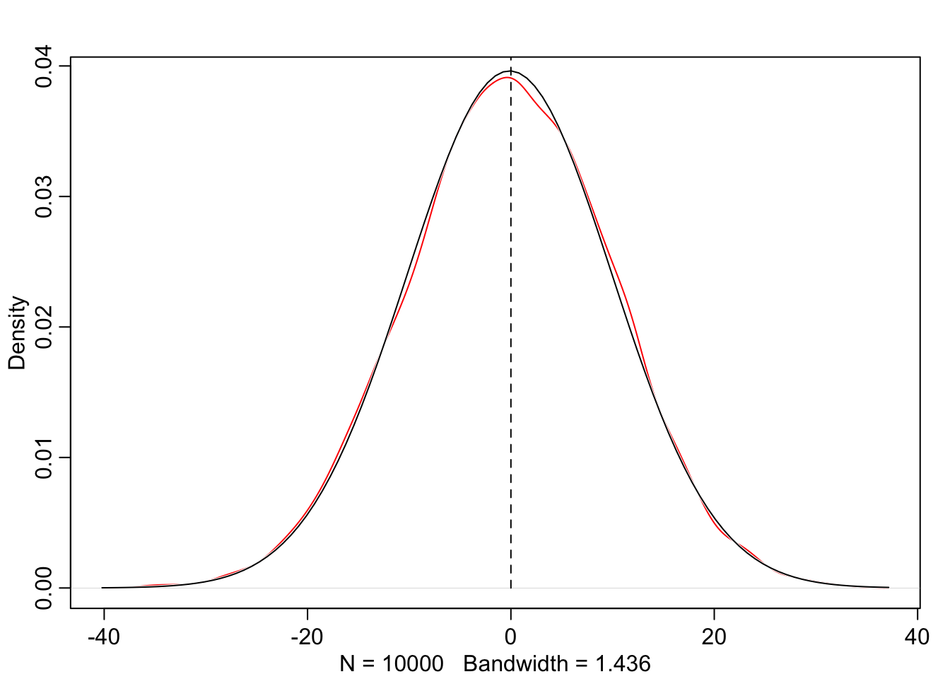
R Code 4.153 b: Exercise 4M1b: Simulate observed \(y\) values from the prior
k.sim_4m1b <- 1e4
set.seed(4) # to make exercise reproducible
## R code 4.14b #######################################
sim_4m1b <-
tibble::tibble(
sample_mu_4m1b = stats::rnorm(k.sim_4m1b, mean = 0, sd = 10),
sample_sigma_4m1b = stats::rexp(k.sim_4m1b, rate = 1)) |>
dplyr::mutate(priors_4m1b = stats::rnorm(k.sim_4m1b,
mean = sample_mu_4m1b,
sd = sample_sigma_4m1b))
sim_4m1b |>
ggplot2::ggplot(ggplot2::aes(x = priors_4m1b)) +
ggplot2::geom_density(color = "red") +
ggplot2::stat_function(
fun = dnorm,
args = with(sim_4m1b,
c(mean = mean(priors_4m1b),
sd = sd(priors_4m1b)))
) +
ggplot2::theme_bw()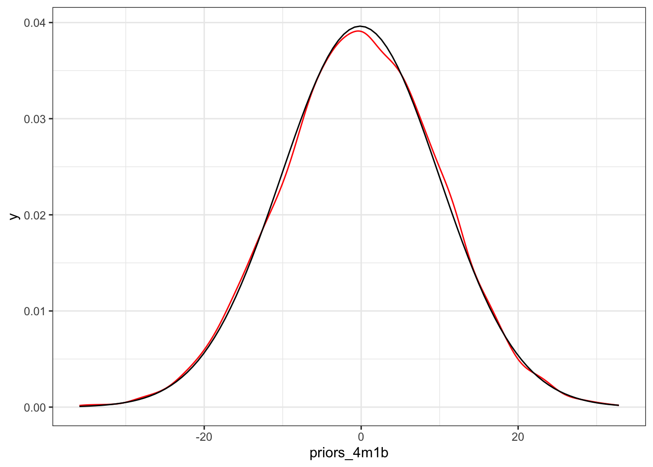
Example 4.33 : Translate the model of Section 4.6.2.1 into a quap() and brm() formula
R Code 4.154 a: Translate the model of Section 4.6.2.1 into a quap() formula. (Original)
R Code 4.155 b: Translate the model of Section 4.6.2.1 into a quap() formula. (Tidyverse)
Example 4.34 : Translate the quap() model formula below into a mathematical model definition
y ~ dnorm(mu ,sigma),
mu <- a + b * x,
a ~ dnorm(0, 10),
b ~ dunif(0, 1),
sigma ~ dexp(1)R Code 4.156 : Translate the quap() model formula into a mathematical model definition
\[ \begin{align*} y_{i} \sim Normal(\mu_{i},\sigma) \\ \mu_{i} = \alpha + \beta x_{i} \\ \alpha \sim Normal(0, 10) \\ \beta \sim Uniform(0, 1) \\ \sigma \sim Exponential(1) \end{align*} \]
Exercise 4M4: A sample of students is measured for height each year for 3 years. After the third year, you want to fit a linear regression predicting height using year as a predictor. Write down the mathematical model definition for this regression, using any variable names and priors you choose. Be prepared to defend your choice of priors.
\[ \begin{align*} height_{i} \sim Normal(\mu_{i}, \sigma) \\ \mu_{i} = \alpha + \beta(x_{i} - \overline{x}) \\ \alpha \sim Normal(180, 20) \\ \beta \sim Log-Normal(0, 10) \\ \sigma \sim Exponential(1) \end{align*} \]
Exercise 4M7: Refit model m4.3 from the chapter, but omit the mean weight xbar this time. Compare the new model’s posterior to that of the original model. In particular, look at the covariance among the parameters. What is different? Then compare the posterior predictions of both models.
Example 4.35 : Example 4M7: Refit model m4.3 without mean weight xbar
R Code 4.157 a: Example 4M7a: Refit model m4.3a without mean weight xbar (Original)
## R code 4.42a adapted #############################
# fit model
exr_4m7a <- rethinking::quap(
alist(
height ~ dnorm(mu, sigma),
mu <- a + (b * weight),
a ~ dnorm(178, 20),
b ~ dlnorm(0, 1),
sigma ~ dunif(0, 50)
),
data = d2_a
)
## R code 4.44a ############################
cat("**************** Summary **********************\n")
rethinking::precis(exr_4m7a)
## R code 4.45 ################
cat("\n\n*************** Covariances ********************\n")
round(rethinking::vcov(exr_4m7a), 3)
# rethinking::pairs(exr_4m7a)
## R code 4.46a ############################################
plot(height ~ weight, data = d2_a, col = rethinking::rangi2)
post_exr_4m7a <- rethinking::extract.samples(exr_4m7a)
a_map <- mean(post_exr_4m7a$a)
b_map <- mean(post_exr_4m7a$b)
curve(a_map + (b_map * x) , add = TRUE)#> **************** Summary **********************
#> mean sd 5.5% 94.5%
#> a 114.5351396 1.89774923 111.5021698 117.5681094
#> b 0.8907121 0.04175803 0.8239747 0.9574495
#> sigma 5.0727199 0.19124908 4.7670670 5.3783729
#>
#>
#> *************** Covariances ********************
#> a b sigma
#> a 3.601 -0.078 0.009
#> b -0.078 0.002 0.000
#> sigma 0.009 0.000 0.037
R Code 4.158 b: Example 4M7a: Refit model m4.3b without mean weight xbar (Tidyverse)
exr_4m7b <-
brms::brm(data = d2_b,
formula = height ~ 1 + weight,
family = gaussian(),
prior = c(brms::prior(normal(178, 20), class = Intercept),
brms::prior(lognormal(0, 1), class = b, lb = 0),
brms::prior(uniform(0, 50), class = sigma, ub = 50)),
iter = 2000, warmup = 1000, chains = 4, cores = 4,
seed = 4,
file = "brm_fits/exr_4m7b")
cat("**************** Summary **********************\n")
brms:::summary.brmsfit(exr_4m7b)
cat("\n\n*************** Covariances ********************\n")
brms::as_draws_df(exr_4m7b) |>
dplyr::select(b_Intercept:sigma) |>
stats::cov() |>
base::round(digits = 3)
d2_b |>
ggplot2::ggplot(ggplot2::aes(x = weight, y = height)) +
ggplot2::geom_abline(
intercept = brms::fixef(exr_4m7b, probs = c(0.055, 0.945))[[1]],
slope = brms::fixef(exr_4m7b, probs = c(0.055, 0.945))[[2]]) +
ggplot2::geom_point(shape = 1, size = 2, color = "royalblue") +
ggplot2::labs(x = "weight", y = "height") +
ggplot2::theme_bw()#> **************** Summary **********************
#> Family: gaussian
#> Links: mu = identity; sigma = identity
#> Formula: height ~ 1 + weight
#> Data: d2_b (Number of observations: 352)
#> Draws: 4 chains, each with iter = 2000; warmup = 1000; thin = 1;
#> total post-warmup draws = 4000
#>
#> Population-Level Effects:
#> Estimate Est.Error l-95% CI u-95% CI Rhat Bulk_ESS Tail_ESS
#> Intercept 113.95 1.91 110.17 117.71 1.00 3822 2916
#> weight 0.90 0.04 0.82 0.98 1.00 3789 2817
#>
#> Family Specific Parameters:
#> Estimate Est.Error l-95% CI u-95% CI Rhat Bulk_ESS Tail_ESS
#> sigma 5.10 0.20 4.73 5.51 1.00 4014 2686
#>
#> Draws were sampled using sampling(NUTS). For each parameter, Bulk_ESS
#> and Tail_ESS are effective sample size measures, and Rhat is the potential
#> scale reduction factor on split chains (at convergence, Rhat = 1).
#>
#>
#> *************** Covariances ********************
#> b_Intercept b_weight sigma
#> b_Intercept 3.660 -0.079 -0.012
#> b_weight -0.079 0.002 0.000
#> sigma -0.012 0.000 0.039
In contrast to the vcov() values of the centered weight version in Example 4.20 we have now big covariances. But the posterior predictions of both models (centered and uncentered version) are nearly the same. Compare with Graph 4.30 (Original) and Graph 4.32 (Tidyverse).
R Code 4.159 : Session Info
#> R version 4.3.2 (2023-10-31)
#> Platform: x86_64-apple-darwin20 (64-bit)
#> Running under: macOS Sonoma 14.1.2
#>
#> Matrix products: default
#> BLAS: /Library/Frameworks/R.framework/Versions/4.3-x86_64/Resources/lib/libRblas.0.dylib
#> LAPACK: /Library/Frameworks/R.framework/Versions/4.3-x86_64/Resources/lib/libRlapack.dylib; LAPACK version 3.11.0
#>
#> locale:
#> [1] en_US.UTF-8/en_US.UTF-8/en_US.UTF-8/C/en_US.UTF-8/en_US.UTF-8
#>
#> time zone: Europe/Vienna
#> tzcode source: internal
#>
#> attached base packages:
#> [1] parallel stats graphics grDevices utils datasets methods
#> [8] base
#>
#> other attached packages:
#> [1] rethinking_2.40 posterior_1.5.0 cmdstanr_0.5.3
#> [4] patchwork_1.1.3 lubridate_1.9.3 forcats_1.0.0
#> [7] stringr_1.5.1 dplyr_1.1.4 purrr_1.0.2
#> [10] readr_2.1.4 tidyr_1.3.0 tibble_3.2.1
#> [13] ggplot2_3.4.4 tidyverse_2.0.0 glossary_1.0.0.9000
#>
#> loaded via a namespace (and not attached):
#> [1] gridExtra_2.3 inline_0.3.19 sandwich_3.1-0
#> [4] rlang_1.1.2 magrittr_2.0.3 multcomp_1.4-25
#> [7] matrixStats_1.2.0 compiler_4.3.2 loo_2.6.0
#> [10] vctrs_0.6.5 reshape2_1.4.4 shape_1.4.6
#> [13] pkgconfig_2.0.3 fastmap_1.1.1 backports_1.4.1
#> [16] ellipsis_0.3.2 utf8_1.2.4 threejs_0.3.3
#> [19] promises_1.2.1 rmarkdown_2.25 tzdb_0.4.0
#> [22] markdown_1.12 xfun_0.41 jsonlite_1.8.8
#> [25] later_1.3.2 R6_2.5.1 dygraphs_1.1.1.6
#> [28] stringi_1.8.3 StanHeaders_2.26.28 estimability_1.4.1
#> [31] Rcpp_1.0.11 rstan_2.32.3 knitr_1.45
#> [34] zoo_1.8-12 base64enc_0.1-3 bayesplot_1.10.0
#> [37] timechange_0.2.0 httpuv_1.6.13 Matrix_1.6-4
#> [40] splines_4.3.2 igraph_1.6.0 tidyselect_1.2.0
#> [43] rstudioapi_0.15.0 abind_1.4-5 yaml_2.3.8
#> [46] timeDate_4032.109 codetools_0.2-19 miniUI_0.1.1.1
#> [49] curl_5.2.0 pkgbuild_1.4.3 lattice_0.22-5
#> [52] plyr_1.8.9 withr_2.5.2 shiny_1.8.0
#> [55] bridgesampling_1.1-2 coda_0.19-4 evaluate_0.23
#> [58] survival_3.5-7 RcppParallel_5.1.7 xts_0.13.1
#> [61] xml2_1.3.6 pillar_1.9.0 tensorA_0.36.2
#> [64] checkmate_2.3.1 DT_0.31 stats4_4.3.2
#> [67] shinyjs_2.1.0 distributional_0.3.2 generics_0.1.3
#> [70] hms_1.1.3 rstantools_2.3.1.1 munsell_0.5.0
#> [73] commonmark_1.9.0 scales_1.3.0 timeSeries_4031.107
#> [76] gtools_3.9.5 xtable_1.8-4 glue_1.6.2
#> [79] emmeans_1.8.9 tools_4.3.2 shinystan_2.6.0
#> [82] colourpicker_1.3.0 mvtnorm_1.2-4 grid_4.3.2
#> [85] QuickJSR_1.0.8 crosstalk_1.2.1 colorspace_2.1-0
#> [88] nlme_3.1-164 cli_3.6.2 fansi_1.0.6
#> [91] Brobdingnag_1.2-9 V8_4.4.1 rversions_2.1.2
#> [94] gtable_0.3.4 digest_0.6.33 TH.data_1.1-2
#> [97] brms_2.20.4 htmlwidgets_1.6.4 farver_2.1.1
#> [100] htmltools_0.5.7 lifecycle_1.0.4 mime_0.12
#> [103] shinythemes_1.2.0 MASS_7.3-60