This chapter teaches the basic skills for working with samples from the posterior distribution. We’ll begin to use samples to summarize and simulate model output. The skills learned here will apply to every problem in the remainder of the book, even though the details of the models and how the samples are produced will vary.
The chapter exploits the fact that people are better in counts than in probabilities. We will take the probability distributions from the previous chapter and sampling from them to produce counts.
What is the probability of \(2\) after throwing a dice? \[P(A) = \frac{1}{6}\]
\(P(B \mid A)\) means “Probability of Event B given A”.
This is a conditional probability. After event \(A\) has happened, what is the probability of \(B\)? If the events are independent from each other than the changes do not influence each other.
Independent Conditional Events
The probability to throw \(2\) in a second dice throw are still \(P(B \mid A) = \frac{1}{6}\). If the events are dependent of each other then “Probability of event A and event B equals the probability of event A times the probability of event B given event A.”
\[
P(A \space and\space B) = P(A) \times P(B \mid A)
\]
Dependent Conditional Events
Typical example is removing marble from a bag without replacement. Let’s take a red marble from a bag of \(5\) red and \(5\) blue marbles without replacement. Here the probability of a red marble (in the second draw) given the probability of a red marble (in the first draw) is
“suppose there is a blood test that correctly detects vampirism 95% of the time. In more precise and mathematical notation, \(Pr(\text{positive test result} \mid vampire) = 0.95\). It’s a very accurate test, nearly always catching real vampires. It also make mistakes, though, in the form of false positives. One percent of the time, it incorrectly diagnoses normal people as vampires, \(Pr(\text{positive test result}|mortal) = 0.01\). The final bit of information we are told is that vampires are rather rare, being only \(0.1\%\) of the population, implying \(Pr(vampire) = 0.001\). Suppose now that someone tests positive for vampirism. What’s the probability that he or she is a bloodsucking immortal?” (McElreath, 2020, p. 49) (pdf)
“The correct approach is just to use Bayes’ theorem to invert the probability, to compute \(Pr(vampire|positive)\). The calculation can be presented as:
\[
\begin{align*}
Pr(vampire\mid positive) = \frac{Pr(positive\mid vampire) Pr(vampire)}{Pr(positive)}\\
\text{where Pr(positive) is the average probability of a positive test result, that is,}\\ Pr(positive) = Pr(positive \mid vampire) Pr(vampire) \\
+ Pr(positive \mid mortal) 1 − Pr(vampire)
\end{align*}
\tag{3.1}\] ” (McElreath, 2020, p. 49) (pdf)
R Code 3.1 a: Performing vampire calculation with Bayes’ theorem in Base R
Code
## R code 3.1a Vampire ##################pr_positive_vampire_a<-0.95pr_positive_mortal_a<-0.01pr_vampire_a<-0.001pr_positive_a<-pr_positive_vampire_a*pr_vampire_a+pr_positive_mortal_a*(1-pr_vampire_a)(pr_vampire_positive_a<-pr_positive_vampire_a*pr_vampire_a/pr_positive_a)
#> [1] 0.08683729
There is only an 0.0868373% chance that the suspect is actually a vampire.
“Most people find this result counterintuitive. And it’s a very important result, because it mimics the structure of many realistic testing contexts, such as HIV and DNA testing, criminal profiling, and even statistical significance testing (see the Rethinking box at the end of this section). Whenever the condition of interest is very rare, having a test that finds all the true cases is still no guarantee that a positive result carries much information at all. The reason is that most positive results are false positives, even when all the true positives are detected correctly” (McElreath, 2020, p. 49) (pdf)
b) Medical test scenario with natural frequencies
“There is a way to present the same problem that does make it more intuitive” (McElreath, 2020, p. 50) (pdf)
(1)  In a population of 100,000 people, 100 of them are vampires.
(2)  Of the 100 who are vampires, 95 of them will test positive for vampirism.
(3)  Of the 99,900 mortals, 999 of them will test positive for vampirism.
There are 999 + 95 = 1094 people tested positive. But from these people only 95 / (999 + 95) = 8.6837294 % are actually vampires.
Or with a slightly different wording it is still easier to understand:
We can just count up the number of people who test positive: \(95 + 999 = 1094\).
Out of these \(1094\) positive tests, \(95\) of them are real vampires, so that implies:
\[
Pr(positive \mid vampire) = \frac{95}{1094}
\]
R Code 3.2 a: Performing vampire calculation with frequencies in Base R
“The second presentation of the problem, using counts rather than probabilities, is often called the frequency format or natural frequencies. Why a frequency format helps people intuit the correct approach remains contentious. Some people think that human psychology naturally works better when it receives information in the form a person in a natural environment would receive it. In the real world, we encounter counts only. No one has ever seen a probability, the thinking goes. But everyone sees counts (”frequencies”) in their daily lives.” (McElreath, 2020, p. 50) (pdf)
“many scientists are uncomfortable with integral calculus, even though they have strong and valid intuitions about how to summarize data. Working with samples transforms a problem in calculus into a problem in data summary, into a frequency format problem. An integral in a typical Bayesian context is just the total probability in some interval. That can be a challenging calculus problem. But once you have samples from the probability distribution, it’s just a matter of counting values in the interval. An empirical attack on the posterior allows the scientist to ask and answer more questions about the model, without relying upon a captive mathematician. For this reason, it is easier and more intuitive to work with samples from the posterior, than to work with probabilities and integrals directly.” (McElreath, 2020, p. 51) (pdf)
TIDYVERSE
a) Medical Test Scenario with Bayes theorem
Vectors in Base R are tibble columns in tidyverse
Whenever there is a calculation with vectors the pendant in tidyverse mode is to generate columns in a tibble with tibble::tibble() or if there is already a data frame with dplyr::mutate() and to do the appropriate calculation with these columns.
The following R Code 3.1 transformed the Base R calculation R Code 3.3 into a computation using the tidyverse approach.
R Code 3.3 b: Performing the calculation using Bayes’ theorem with tidyverse approach in R
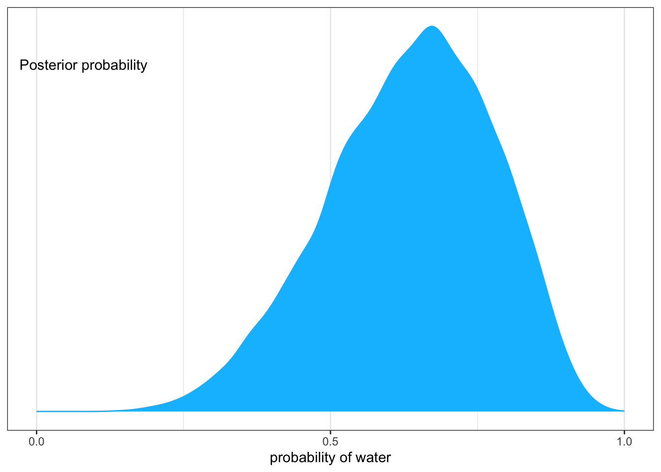
Before we are going to draw samples from the posterior distribution we need to compute the distribution similar as we had done in the globe tossing example.
“Here’s a reminder for how to compute the posterior for the globe tossing model, using grid approximation. Remember, the posterior here means the probability of p conditional on the data.” (McElreath, 2020, p. 52) (pdf)
R Code 3.5 a: Generate the posterior distribution for the globe-tossing example (Original)
Code
### R code 3.2a Grid Globe ########################### change prob_b to prior# change prob_data to likelihood# added variables: n_grid_a, n_success_a, n_trials_an_grid_a<-1000L# number of grid pointsn_success_a<-6L# observed watern_trials_a<-9L# number of trialsp_grid_a<-seq(from =0, to =1, length.out =n_grid_a)prior_a<-rep(1, n_grid_a)# = prior, = uniform distribution, 1000 times 1likelihood_a<-dbinom(n_success_a, size =n_trials_a, prob =p_grid_a)# = likelihoodposterior_a<-likelihood_a*prior_aposterior_a<-posterior_a/sum(posterior_a)
“Now we wish to draw 10,000 samples from this posterior. Imagine the posterior is a bucket full of parameter values, numbers such as \(0.1, 0.7, 0.5, 1,\) etc. Within the bucket, each value exists in proportion to its posterior probability, such that values near the peak are much more common than those in the tails. We’re going to scoop out 10,000 values from the bucket. Provided the bucket is well mixed, the resulting samples will have the same proportions as the exact posterior density. Therefore the individual values of \(p\) will appear in our samples in proportion to the posterior plausibility of each value.” (McElreath, 2020, p. 52) (pdf)
R Code 3.6 a: Draw 1000 samples from the posterior distribution (Original)
Code
n_samples_a<-1e4base::set.seed(3)# for reproducibility## R code 3.3a Sample Globe ##########################################samples_a<-sample(p_grid_a, prob =posterior_a, # from previous code chunk size =n_samples_a, replace =TRUE)
The probability of each value is given by posterior_a, which we computed with R Code 3.5.
Note 3.1 : Details for a better understanding and comparison with the tidyverse version
To compare with the tidyverse version, I collected the three vectors with base::cbind() into a matrix and displayed the first six lines with utils::head(). Additionally I also displayed the first 10 values of samples_a vector.
R Code 3.7 a: Excursion for better comparison (Base R)
Code
# display grid results to compare with variant bd_a<-cbind(p_grid_a, prior_a, likelihood_a, posterior_a)head(d_a, 10)
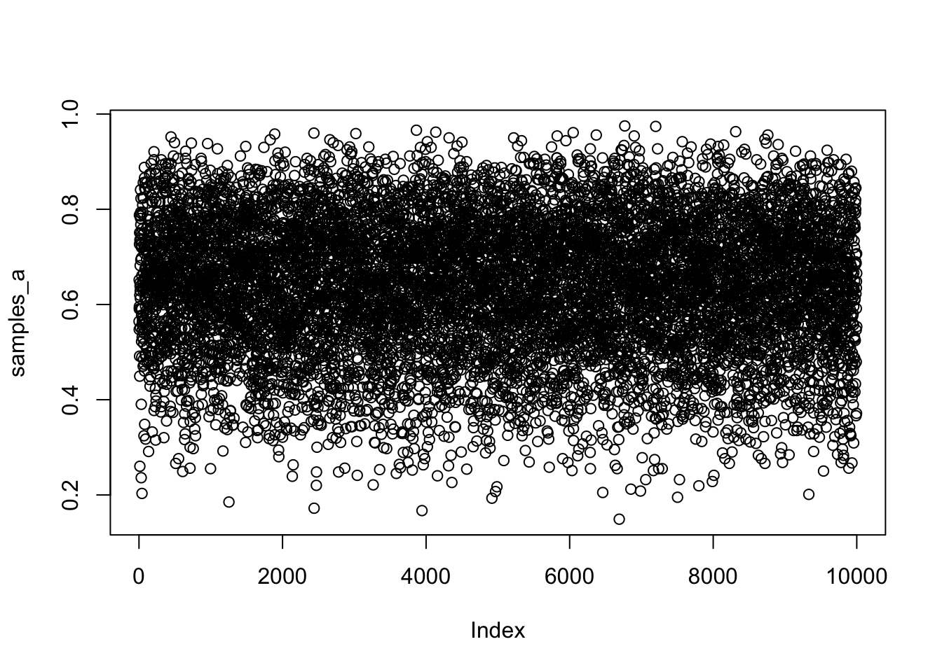
R Code 3.8 a: Scatterplot of the drawn samples (Base R)
Code
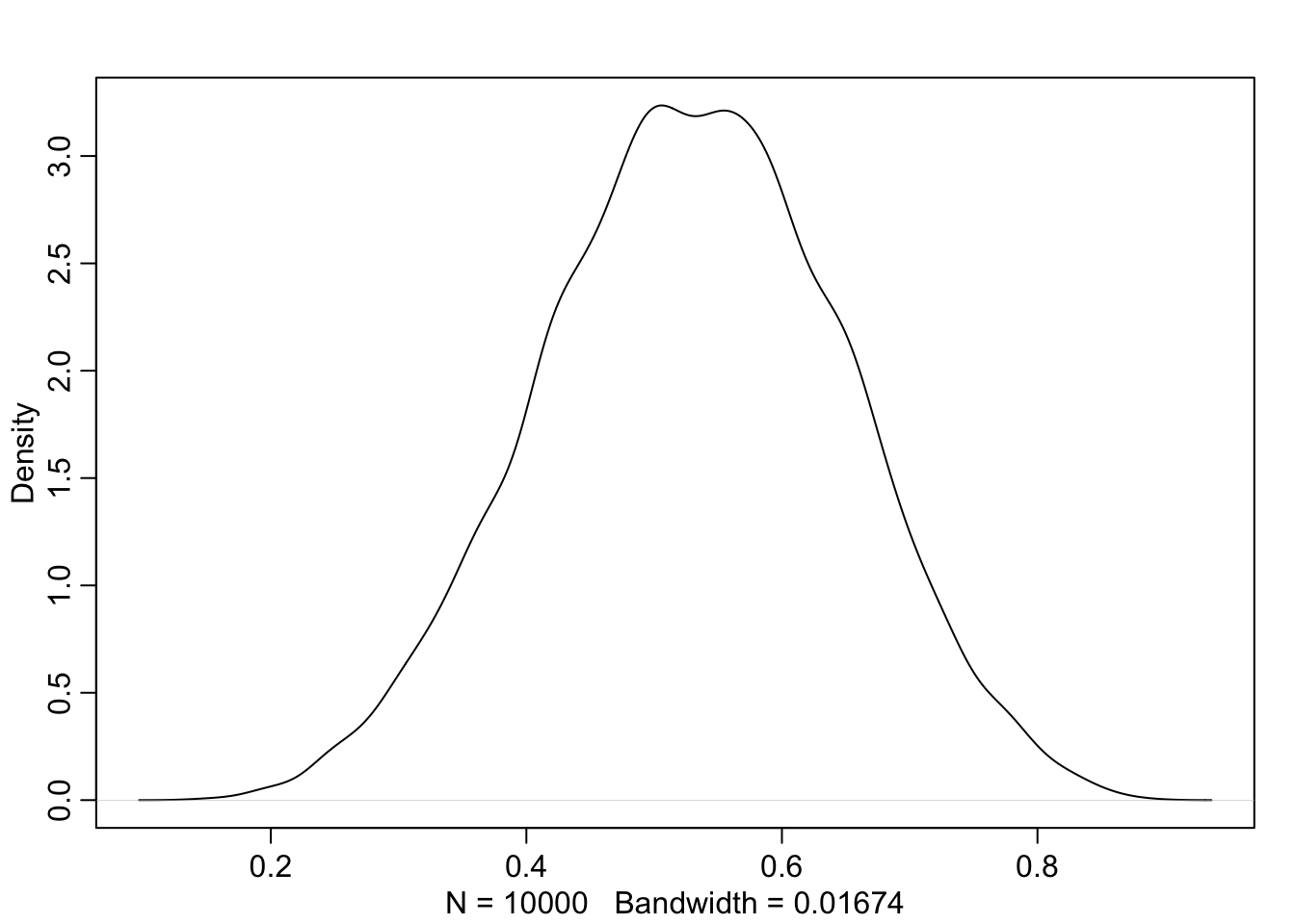
## R code 3.4a Globe Scatterplot #############plot(samples_a)
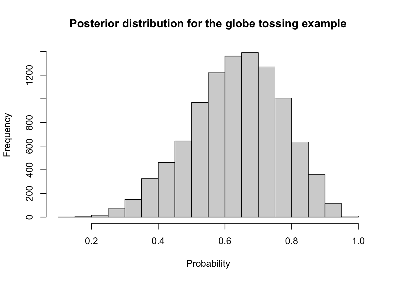
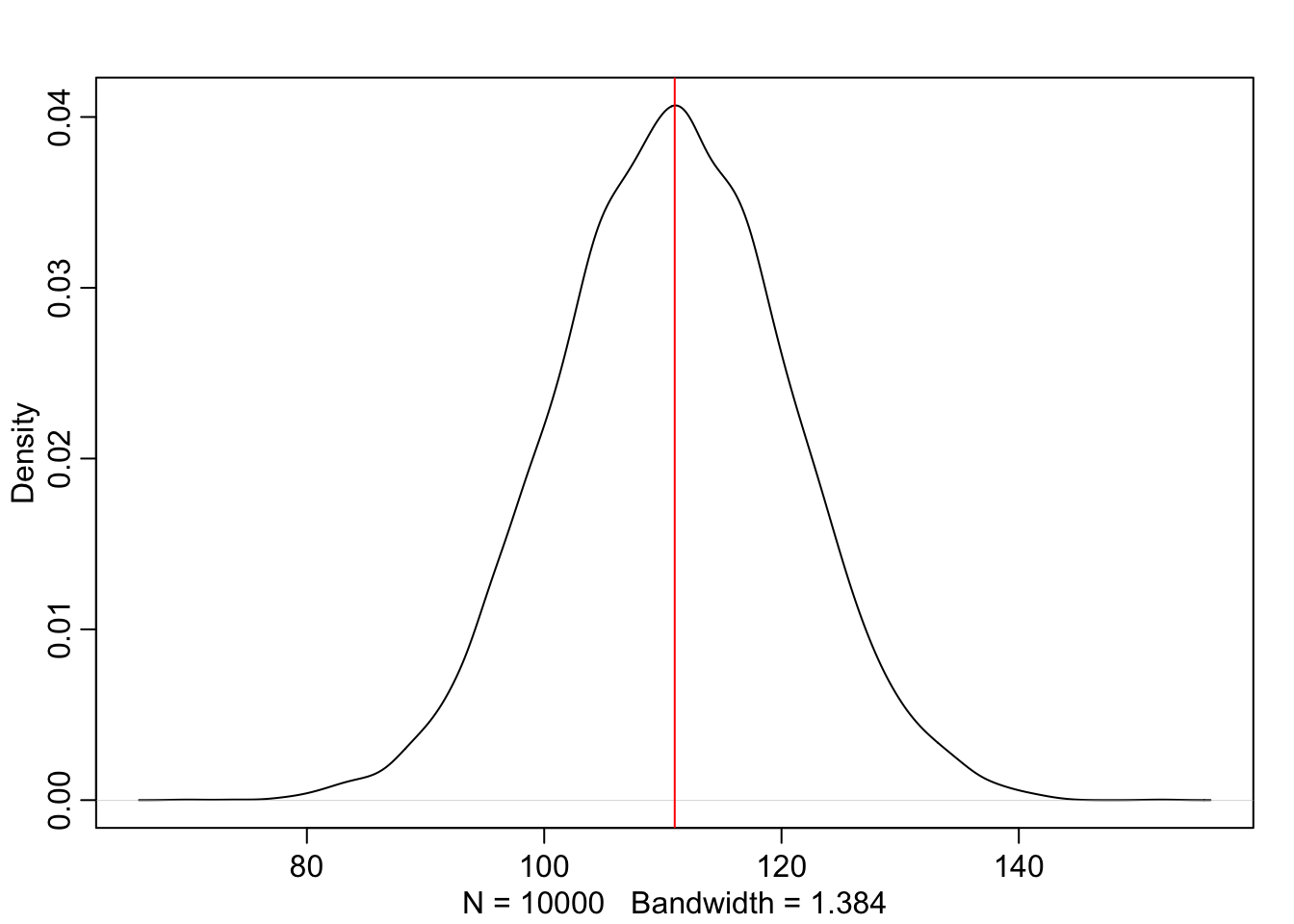
Graph 3.1: Scatterplot of the drawn samples (Base R)
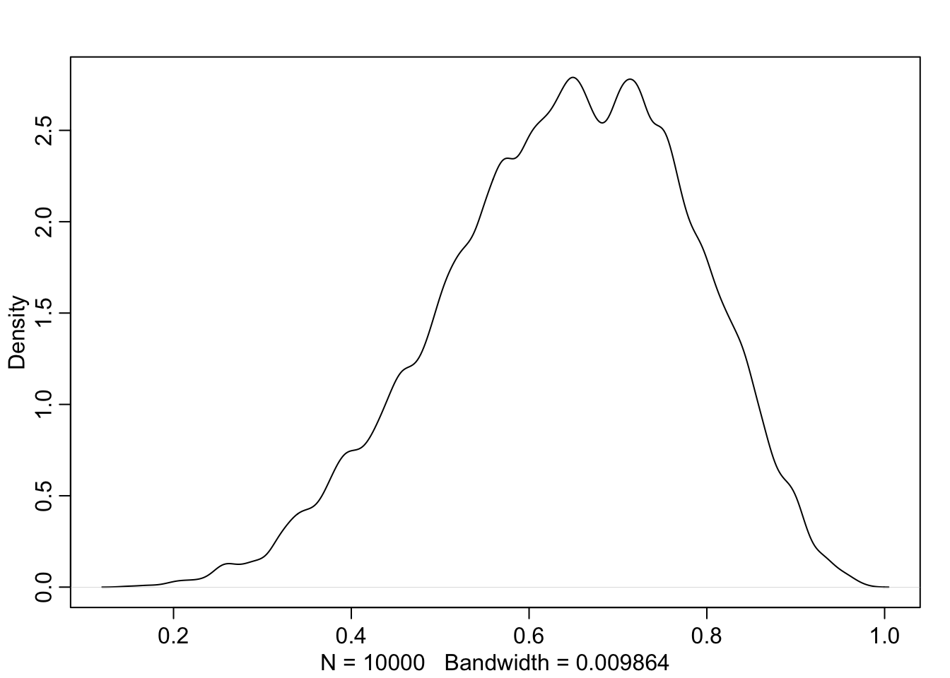
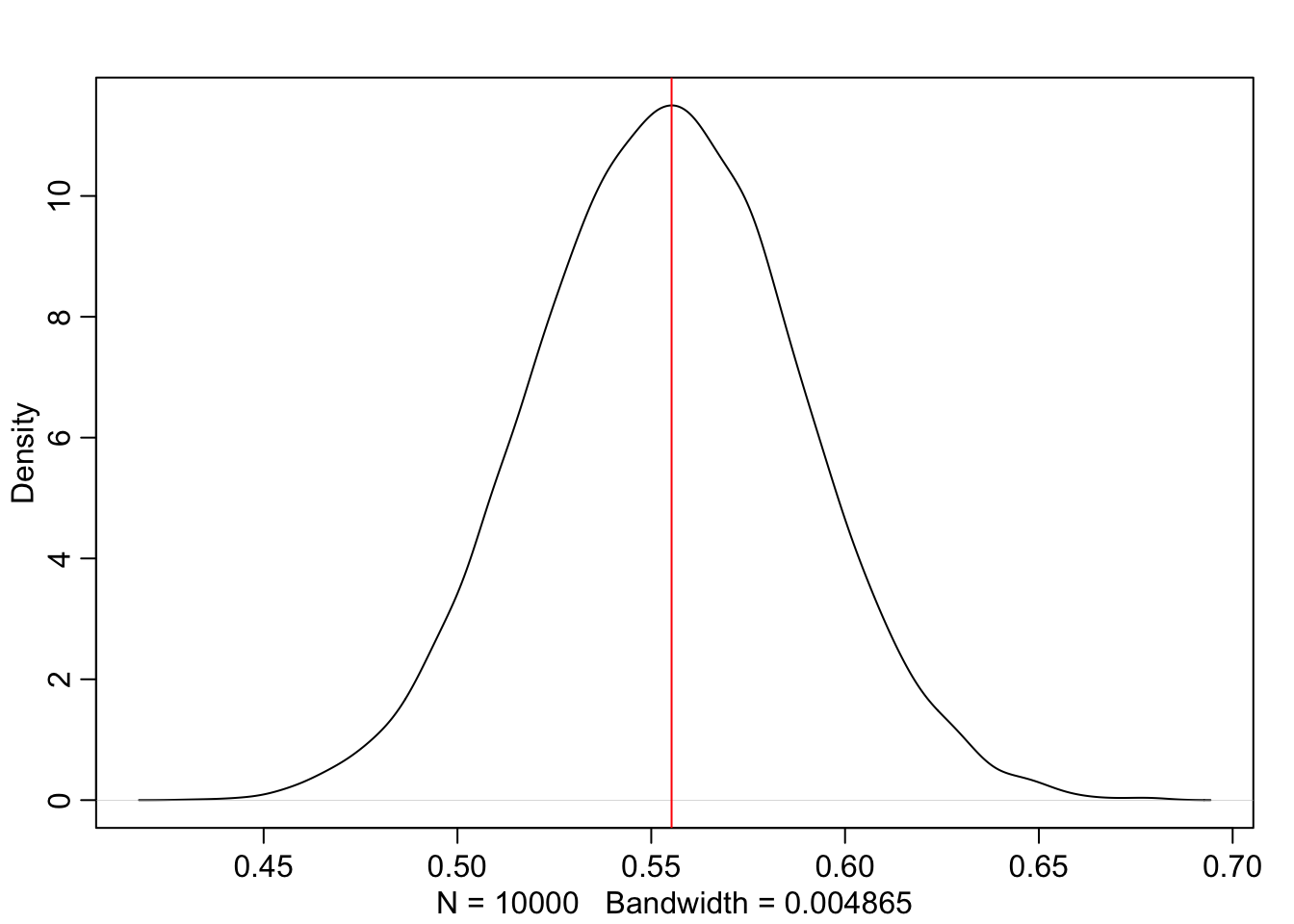
In fig-globe-glossing-plot-a “it’s as if you are flying over the posterior distribution, looking down on it. There are many more samples from the dense region near 0.6 and very few samples below 0.25. On the right, the plot shows the density estimate computed from these samples.” (McElreath, 2020, p. 53) (pdf)
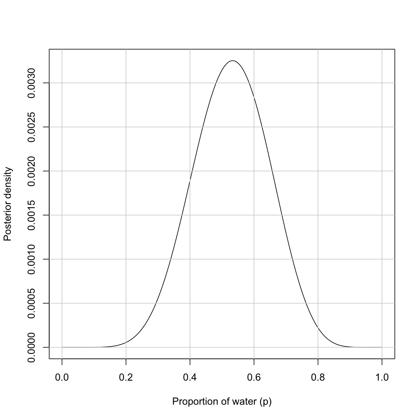
R Code 3.9 a: Density estimate of the drawn samples (Rethinking)
Code
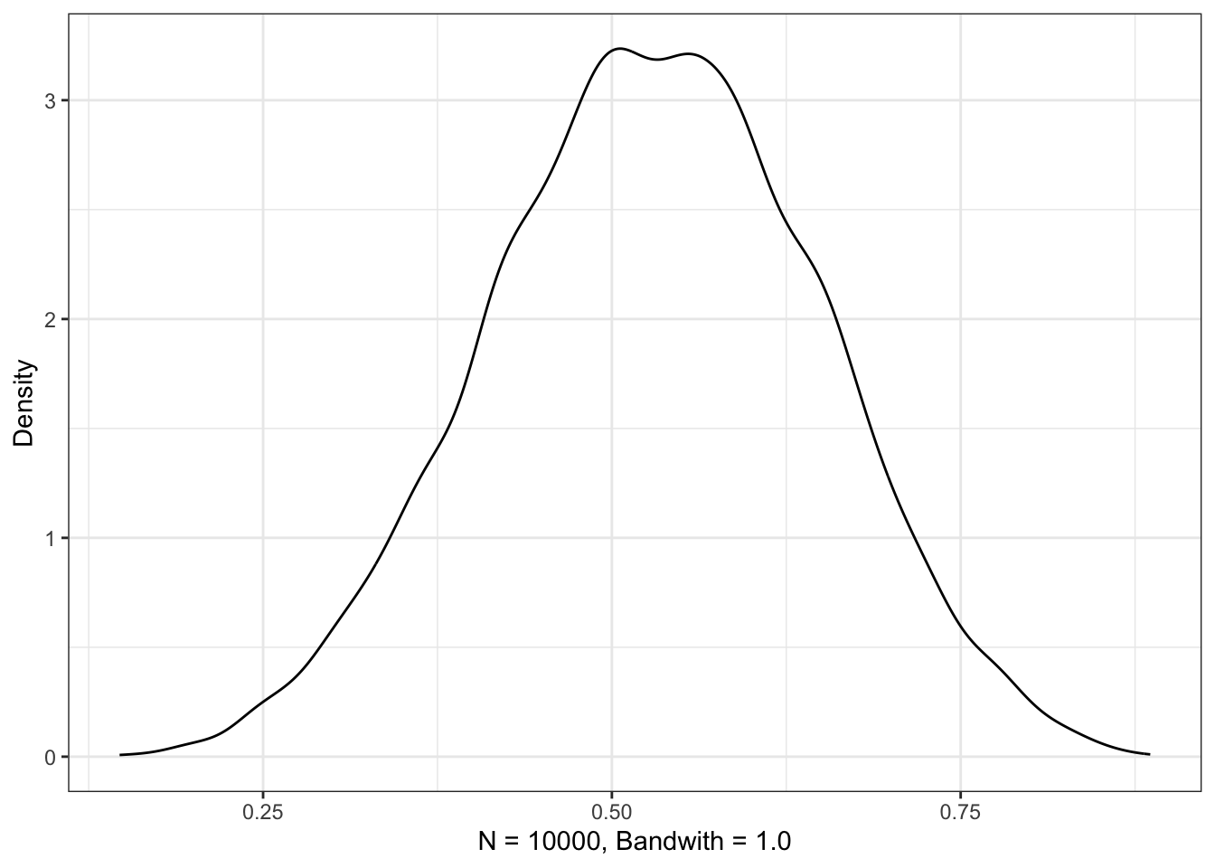
## R code 3.5a Globe Density plot #############rethinking::dens(samples_a)
Graph 3.2: Density estimate of the drawn samples (Rethinking)
3.1.2 TIDYVERSE
R Code 3.10 b: Generate the posterior distribution form the globe-tossing example (Tidyverse)
Code
## R code 3.2b Grid Globe ###################### how many grid points would you like?n_grid_b<-1000Ln_success_b<-6Ln_trials_b<-9Ld_b<-tibble::tibble(p_grid_b =seq(from =0, to =1, length.out =n_grid_b), prior_b =1)|># flat uniform prior, vector 1L recyclingdplyr::mutate(likelihood_b =stats::dbinom(n_success_b, size =n_trials_b, prob =p_grid_b))|>dplyr::mutate(posterior_b =(likelihood_b*prior_b)/sum(likelihood_b*prior_b))head(d_b)
I have changed McElreath’s variable name prob_p and prob_data as prior_x and likelihood_x, where x stands for a (Base R) or b (Tidyverse).
To see the difference between grid and samples I will add “_sample” to all the other variable names.
R Code 3.11 b: Draw 1000 samples from the posterior distribution (Tidyverse)
Code
## R code 3.3b Sample Globe ###################### how many samples would you like?n_samples_b<-1e4# make it reproduciblebase::set.seed(3)df_samples_b<-d_b|>dplyr::slice_sample(n =n_samples_b, weight_by =posterior_b, replace =T)df_samples_b<-df_samples_b|>dplyr::rename(samples_b =p_grid_b, likelihood_samples_b =likelihood_b, prior_samples_b =prior_b, posterior_samples_b =posterior_b)head(df_samples_b)
The column samples_b is identical with vector samples_a, because I have used in both sampling processes base::set.seed(3), so that I (and you) could reproduce the data.
There are different possibilities to display data frames respectively tibbles:
You can use the internal print facility of tibbles. It shows only the first ten rows and all columns that fit on the screen. You see an example in R Code 3.11.
With the utils::str() function you will get a result with shorter figures that is better adapted to a small screen.
Another alternative is the tidyverse approach of dplyr::glimpse().
With skimr::skim() you will get a compact summary of all data.
R Code 3.12 b: Excursion: Printing varieties for better comparison (Tidyverse)
Code
glue::glue('USING THE str() FUNCTION:')utils::str(df_samples_b)glue::glue('#####################################################\n\n')glue::glue('USING THE dplyr::glimpse() FUNCTION:')dplyr::glimpse(df_samples_b)glue::glue('#####################################################\n\n')glue::glue('USING THE skimr::skim() FUNCTION:')skimr::skim(df_samples_b)
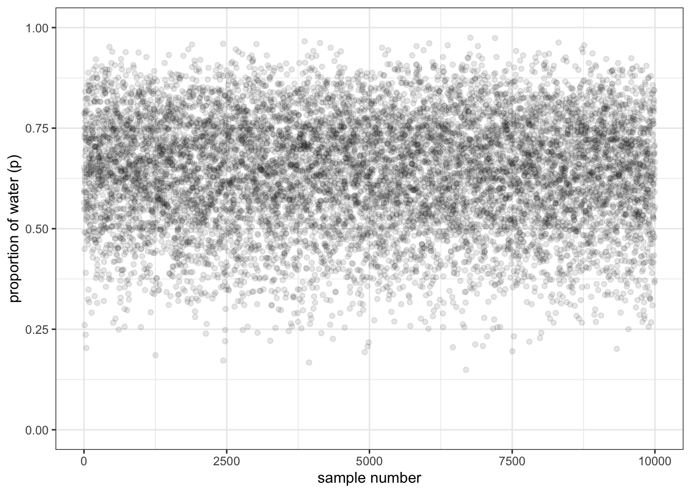
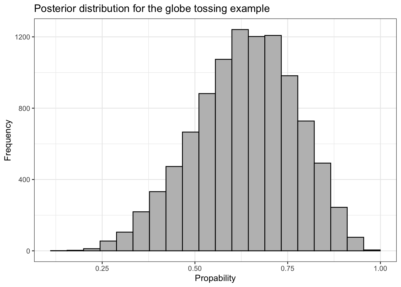
We can plot the left panel of Figure 3.1 from the book with ggplot2::geom_point(). But before we do, we’ll need to add a variable numbering the samples. This is necessary as the x-parameter of the plot.
R Code 3.13 b: Scatterplot of the drawn samples (Tidyverse)
Code
## R code 3.4b Globe Scatterplot ########################df_samples_b|>dplyr::mutate(sample_number =1:dplyr::n())|>ggplot2::ggplot(ggplot2::aes(x =sample_number, y =samples_b))+ggplot2::geom_point(alpha =1/10)+ggplot2::scale_y_continuous("proportion of water (p)", limits =c(0, 1))+ggplot2::xlab("sample number")+ggplot2::theme_bw()
Graph 3.3: Scatterplot of the drawn samples (Tidyverse)
If you hover over this link from Graph 3.1 you can compare the Base R version with the tidyverse result.
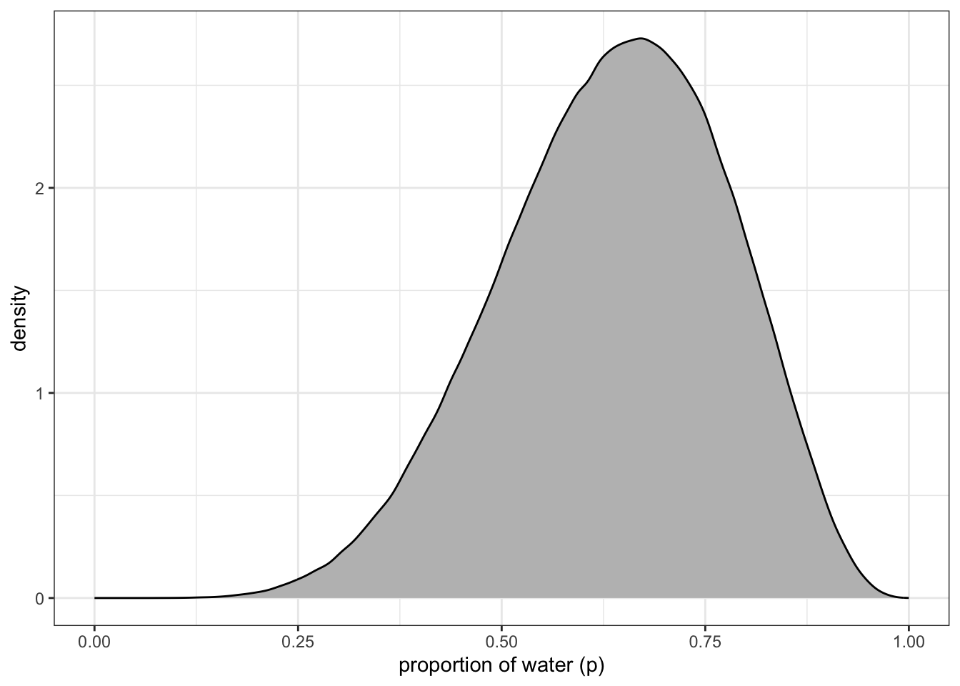
R Code 3.14 b: Density estimate of the drawn samples with 1e4 grid points (Tidyverse)
Code
## R code 3.5b(1) Globe Density ###########################df_samples_b|>ggplot2::ggplot(ggplot2::aes(x =samples_b))+ggplot2::geom_density(fill ="grey")+ggplot2::scale_x_continuous("proportion of water (p)", limits =c(0, 1))+ggplot2::theme_bw()
Graph 3.4: Density estimate of the drawn samples with 1e4 grid points (Tidyverse)
Compare this somewhat smoother tidyverse plot with Graph 3.2.
“You can see that the estimated density is very similar to ideal posterior you computed via grid approximation. If you draw even more samples, maybe 1e5 or 1e6, the density estimate will get more and more similar to the ideal.” (McElreath, 2020, p. 53) (pdf)
Here’s what it looks like with 1e6.
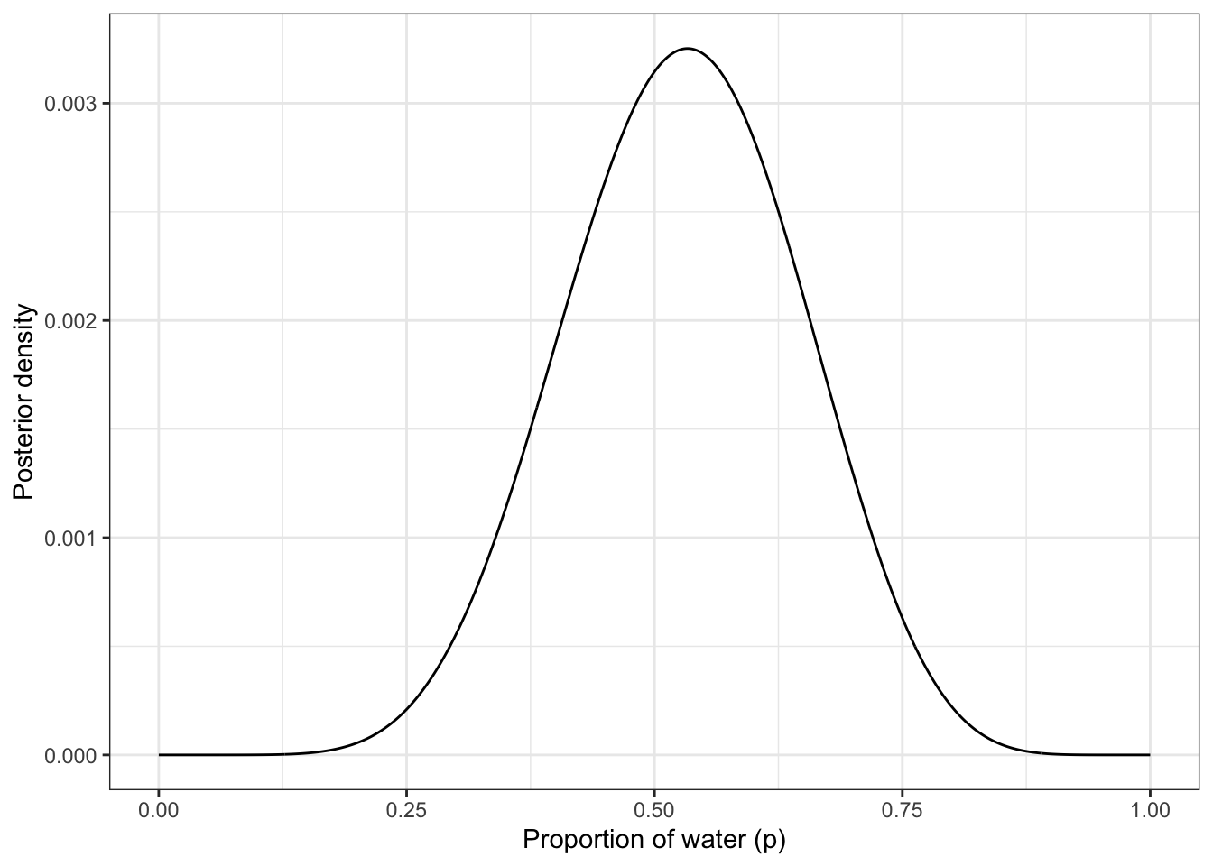
R Code 3.15 b: Density estimate of the drawn samples with 1e6 grid points (Tidyverse)
Code
base::set.seed(3)## R code 3.5b(2) Globe Density ###########################d_b|>dplyr::slice_sample(n =1e6, weight_by =posterior_b, replace =T)|>ggplot2::ggplot(ggplot2::aes(x =p_grid_b))+ggplot2::geom_density(fill ="grey")+ggplot2::scale_x_continuous("proportion of water (p)", limits =c(0, 1))+ggplot2::theme_bw()
Graph 3.5: Density estimate of the drawn samples with 1e6 grid points (Tidyverse)
3.2 Sampling to Summarize
All we have done so far is crudely replicate the posterior density we had already computed in the previous chapter. Now it is time to use these samples to describe and understand the posterior.
The description to understand the posterior can be divided into three inquiries:
Questions about intervals of defined boundaries. See Section 3.2.1.
Questions about intervals of defined probability mass. See Section 3.2.2.
Questions about point estimates. See: Section 3.2.3.
3.2.1 Intervals of Defined Boundaries
3.2.1.1 ORIGINAL
3.2.1.1.1 Grid-approximate Posterior
For instance: What is the probability that the proportion of water is less than 0.5?
“Using the grid-approximate posterior, you can just add up all of the probabilities, where the corresponding parameter value is less than 0.5:” (McElreath, 2020, p. 53) (pdf)
R Code 3.16 a: Define boundaries using the grid-approximate posterior (Base R)
Code
## R code 3.6a Grid Posterior Boundary ############################### add up posterior probability where p < 0.5sum(posterior_a[p_grid_a<0.5])
#> [1] 0.1718746
About 17% of the posterior probability is below 0.5.
3.2.1.1.2 Samples from the Posterior
But this easy calculation based on grid approximation is often not practical when there are more parameters. In this case you can draw samples from the posterior. But this approach requires a different calculation:
“This approach does generalize to complex models with many parameters, and so you can use it everywhere. All you have to do is similarly add up all of the samples below 0.5, but also // divide the resulting count by the total number of samples. In other words, find the frequency of parameter values below 0.5” (McElreath, 2020, p. 53/54)” (McElreath, 2020, p. 53) (pdf)
R Code 3.17 a: Compute posterior probability below 0.5 using the sampling approach (Base R)
Code
## R code 3.7a Sample Boundary #############################(p_boundary_a<-sum(samples_a<0.5)/1e4)
#> [1] 0.1629
Different values with samples from the posterior
In comparison with the value of the posterior probability below 0.5 in the book of 0.1726 the result in 0.1629 from R Code 3.17 is quite different.
The reason for the difference is that you can’t get the same values in a sampling processes. This is the nature of randomness. And McElreath did not include the base::set.seed() function for (exact) reproducibility.
Using the same approach, you can ask how much posterior probability lies between 0.5 and 0.75:
R Code 3.18 a: Compute posterior probability between 0.5 and 0.75 using the sampling approach (Base R)
Code
## R code 3.8a Sample Interval #############################(p_boundary_a8<-sum(samples_a>0.5&samples_a<0.75)/1e4)
#> [1] 0.6061
3.2.1.2 TIDYVERSE
3.2.1.2.1 Grid-approximate Posterior
To get the proportion of water less than some value of p_grid_b within the {tidyverse}, you might first filter() by that value and then take the sum() within summarise(). (Kurz)
R Code 3.19 b: Compute posterior probability below 0.5 using the grid approach (Tidyverse)
Code
## R code 3.6b Grid Boundary ####################### add up posterior probability where p < 0.5d_b|>dplyr::filter(p_grid_b<0.5)|>dplyr::summarize(sum =base::sum(posterior_b))
#> # A tibble: 1 × 1
#>     sum
#>   <dbl>
#> 1 0.172
3.2.1.2.2 Samples from the Posterior
Kurz offers several methods to calculate the posterior probability below 0.5:
R Code 3.20 b: Compute posterior probability below 0.5 using the sampling approach with different methods (Tidyverse)
Code
# add up all posterior probabilities of samples under .5## R code 3.7b Sample Boundary ############################### Method (1) #######method_1<-df_samples_b|>dplyr::filter(samples_b<.5)|>dplyr::summarize(sum =dplyr::n()/n_samples_b)glue::glue('Method 1:\n')method_1glue::glue('##################################################\n\n')###### Method (2) #######method_2<-df_samples_b|>dplyr::count(samples_b<.5)|>dplyr::mutate(probability =n_samples_b/base::sum(n_samples_b))glue::glue('Method 2:\n')method_2glue::glue('##################################################\n\n')###### Method (3) #######method_3<-df_samples_b|>dplyr::summarize(sum =mean(samples_b<.5))glue::glue('Method 3:\n')method_3
#> Method 1:
#> # A tibble: 1 × 1
#>     sum
#>   <dbl>
#> 1 0.163
#> ##################################################
#>
#> Method 2:
#> # A tibble: 2 × 3
#>   `samples_b < 0.5`     n probability
#>   <lgl>             <int>       <dbl>
#> 1 FALSE              8371           1
#> 2 TRUE               1629           1
#> ##################################################
#>
#> Method 3:
#> # A tibble: 1 × 1
#>     sum
#>   <dbl>
#> 1 0.163
To determine the posterior probability between 0.5 and 0.75, you can use & within filter(). Just multiply that result by 100 to get the value in percent.
R Code 3.21 b: Compute posterior probability between 0.5 and 0.75 using the sampling approach (Tidyverse)
Code
## R code 3.8b Sample Interval ##############df_samples_b|>dplyr::filter(samples_b>.5&samples_b<.75)|>dplyr::summarize(sum =dplyr::n()/n_samples_b)
#> # A tibble: 1 × 1
#>     sum
#>   <dbl>
#> 1 0.606
And, of course, you can do this calculation with the other methods as well.
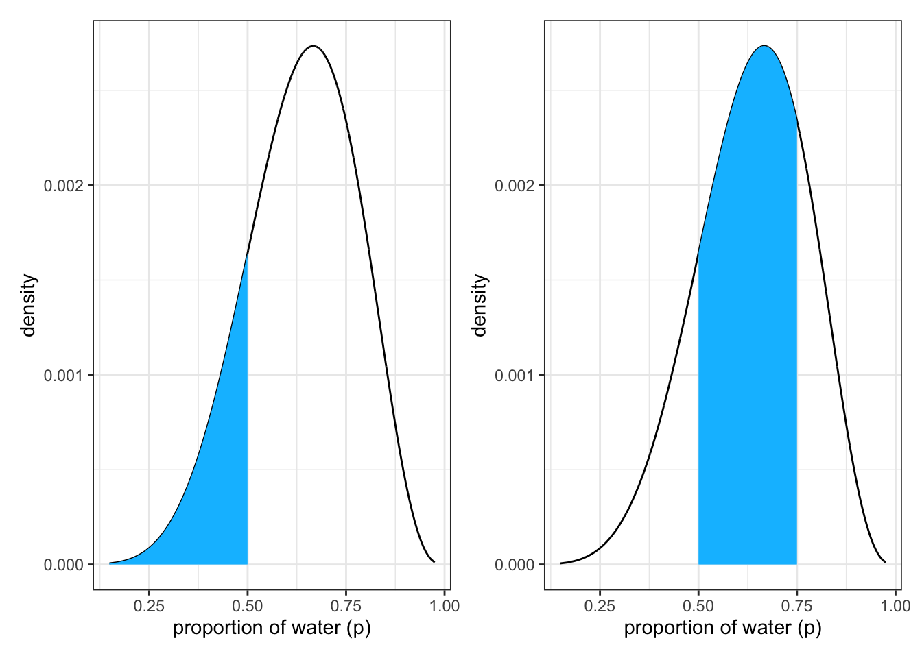
To produce the top part of Figure 3.2 of the book we apply following code lines:
R Code 3.22 b: Posterior distribution produced with {tidyverse} approach
Code
## R Code Fig 3.2 Upper Part ############## upper left panelp1<-df_samples_b|>ggplot2::ggplot(ggplot2::aes(x =samples_b, y =posterior_samples_b))+ggplot2::geom_line()+ggplot2::geom_area(data =df_samples_b|>dplyr::filter(samples_b<.5), fill ="deepskyblue")+ggplot2::labs(x ="proportion of water (p)", y ="density")+ggplot2::theme_bw()# upper right panelp2<-df_samples_b|>ggplot2::ggplot(ggplot2::aes(x =samples_b, y =posterior_samples_b))+ggplot2::geom_line()+ggplot2::geom_area(data =df_samples_b|>dplyr::filter(samples_b>.5&samples_b<.75), fill ="deepskyblue")+ggplot2::labs(x ="proportion of water (p)", y ="density")+ggplot2::theme_bw()library(patchwork)p1+p2
Graph 3.6: Upper part of SR2 Figure 3.2: Intervals of defined boundaries produced with {tidyverse} tools: Left: The blue area is the posterior probability below a parameter value of 0.5. Right: The posterior probability between 0.5 and 0.75.
3.2.2 Intervals of Defined Probability Mass
3.2.2.1 ORIGINAL
3.2.2.1.1 Quantiles
Definition 3.2 : Several Terms for Intervals of Defined Probability Mass
The abbreviation for all three versions of probability mass intervals is “CI”.
McElreath tries to avoid the semantic of “confidence” or “credibility” because
“What the interval indicates is a range of parameter values compatible with the model and data. The model and data themselves may not inspire confidence, in which case the interval will not either.” (McElreath, 2020, p. 54) (pdf)
The values of these intervals can be found easier by using samples from the posterior than by using a grid approximation.
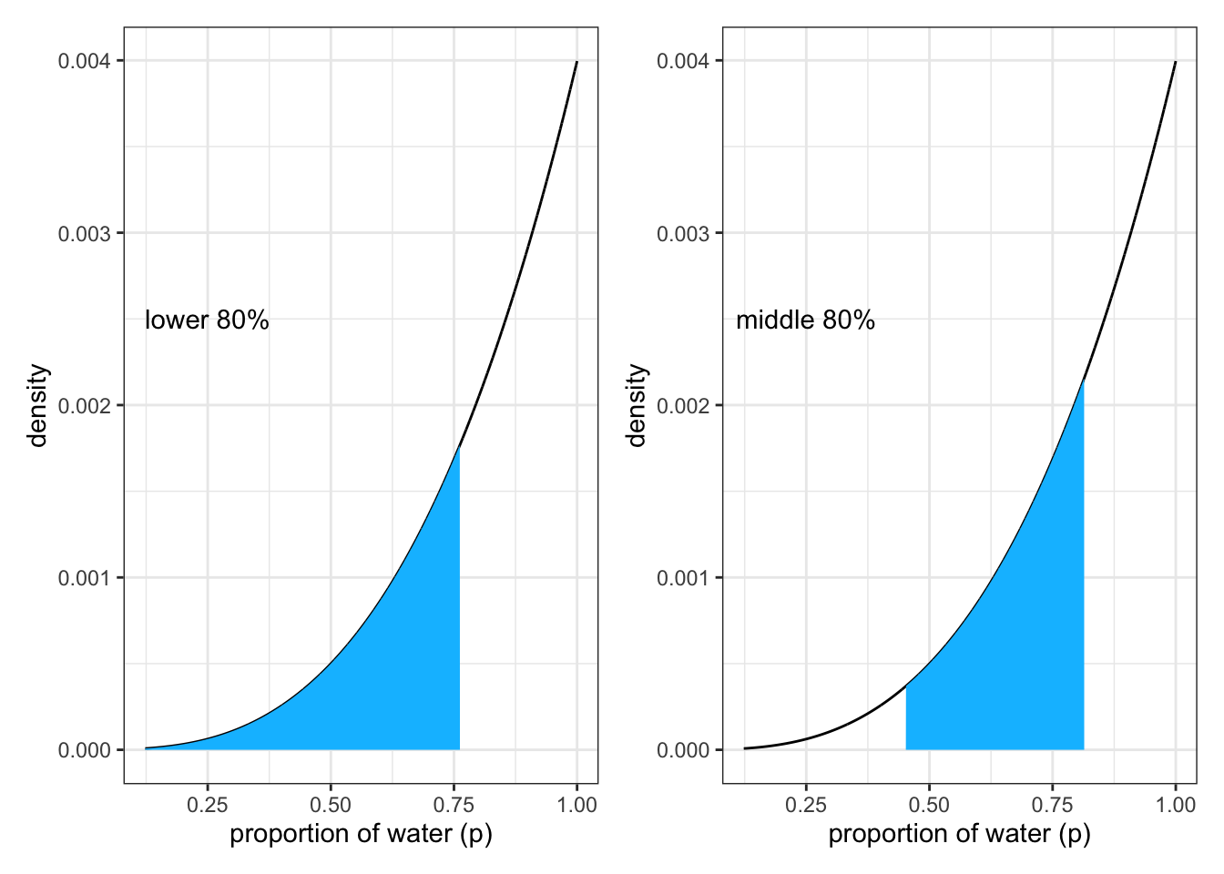
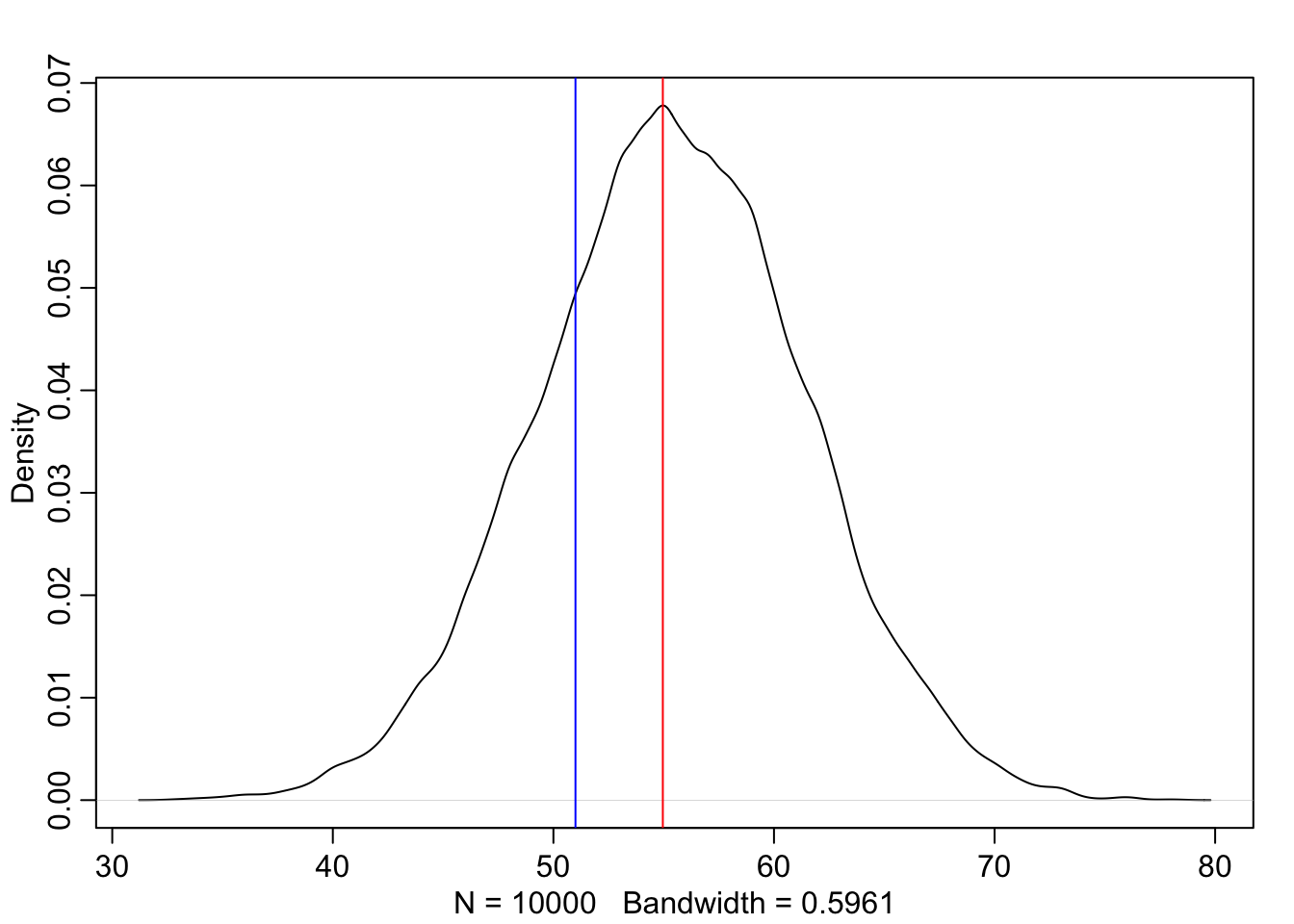
“Suppose for example you want to know the boundaries of the lower \(80\%\) posterior probability. You know this interval starts at \(p = 0\). To find out where it stops, think of the samples as data and ask where the \(80th\) percentile lies:” (McElreath, 2020, p. 54) (pdf)
R Code 3.23 a: Compute posterior probability intervals lower \(80\%\) and from 10th to 90th percentile
Code
## R code 3.9a Quantile 0.8 #######################q8<-quantile(samples_a, 0.8)## R code 3.10a PI = Quantile 0.1-0.9 ###################q1_9<-quantile(samples_a, c(0.1, 0.9))
Lower \(80\%\) = 0.7627628
Between \(10\%\) = 0.4514515 and \(90\%\) = 0.8148148
3.2.2.1.2 Percentile Interval (PI)
The second calculation returns the middle 80% of the distribution
“Intervals of this sort, which assign equal probability mass to each tail, are very common in the scientific literature. We’ll call them percentile intervals (PI). These intervals do a good job of communicating the shape of a distribution, as long as the distribution isn’t too asymmetrical. But in terms of supporting inferences about which parameters are consistent with the data, they are not perfect.” (McElreath, 2020, p. 55) (pdf)
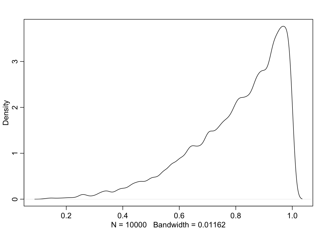
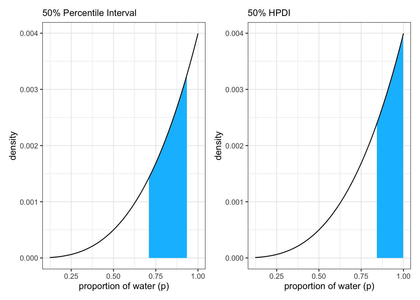
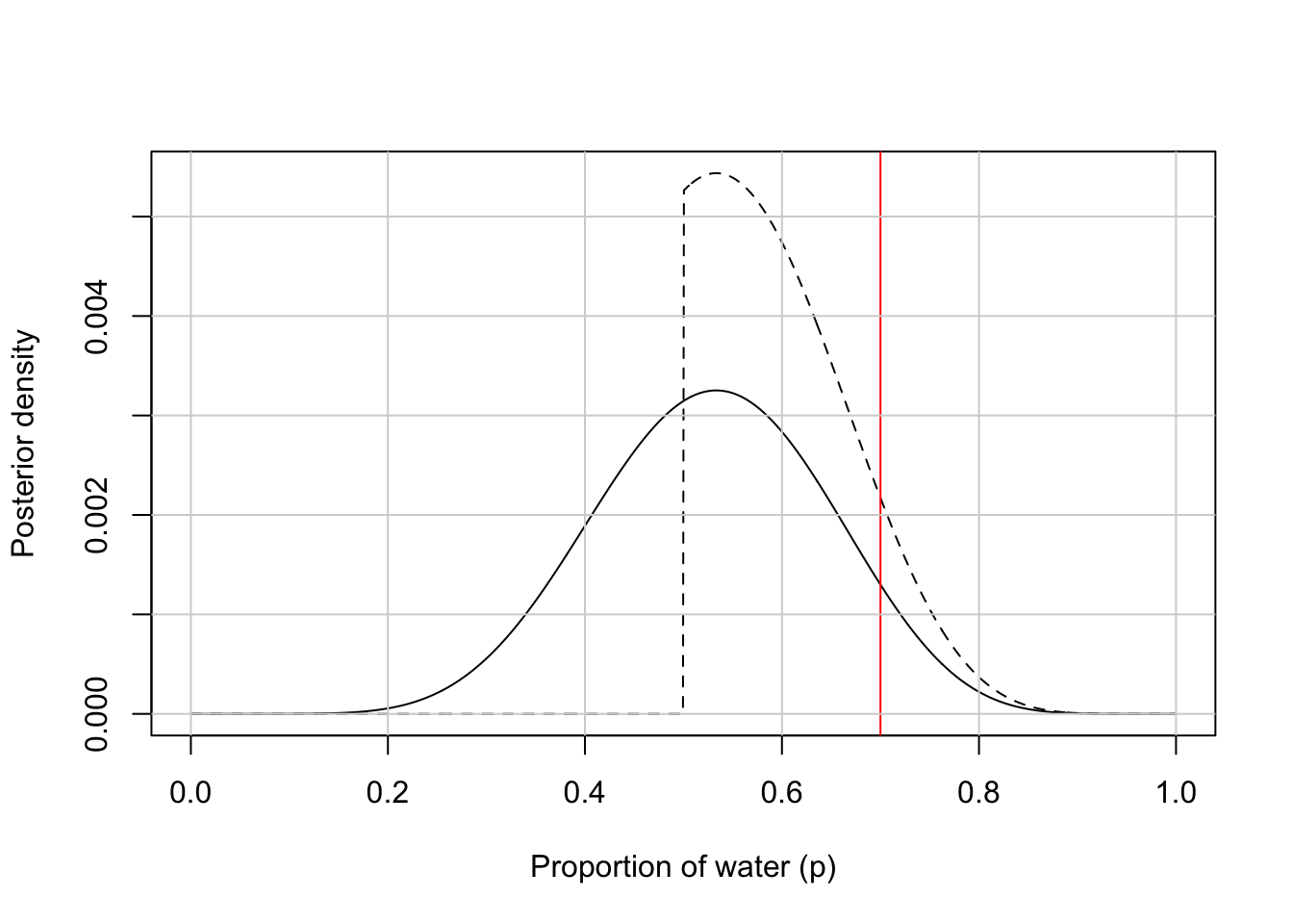
But they do not work well with highly skewed data. See Graph 3.7 where the posterior is consistent with observing three waters in three tosses and a uniform (flat) prior.
R Code 3.24 a: Skewed posterior distribution observing three waters in three tosses and a uniform (flat) prior (Base R)
Code
## R code 3.11a Skewed data #####################p_grid_skewed_a<-seq(from =0, to =1, length.out =1000)prior_skewed_a<-rep(1, 1000)likelihood_skewed_a<-dbinom(3, size =3, prob =p_grid_skewed_a)posterior_skewed_a<-likelihood_skewed_a*prior_skewed_aposterior_skewed_a<-posterior_skewed_a/sum(posterior_skewed_a)base::set.seed(3)# added to make sampling distribution reproducible (pb)samples_skewed_a<-sample(p_grid_skewed_a, size =1e4, replace =TRUE, prob =posterior_skewed_a)# added to show the skewed posterior distribution (pb)rethinking::dens(samples_skewed_a)
Graph 3.7: Skewed posterior distribution observing three waters in three tosses and a uniform (flat) prior. It is highly skewed, having its maximum value at the boundary where p equals 1.
“[The percentile interval] assigns 25% of the probability mass above and below the interval. So it provides the central 50% probability. But in this example, it ends up excluding the most probable parameter values, near p = 1. So in terms of describing the shape of the posterior distribution—which is really all these intervals are asked to do—the percentile interval can be misleading.” (McElreath, 2020, p. 56) (pdf)
R Code 3.25 a: Computing the Percentile Interval (PI)
Code
## R code 3.12a(1) PI ############################rethinking::PI(samples_skewed_a, prob =0.5)
#>       25%       75%
#> 0.7087087 0.9349349
Procedure 3.1 : Probability mass (PI) prob = 0.6 equals the interval between \(20-80\%\)
rethinking::PI() is just a shorthand for the base R stats::quantile() function. Instead of providing the interval explicitly (for instance \(20-80\%\)) we just say that we want the central \(60\%\) = PI of prob = 0.6.
We divide always the percentage assigned to the prob value by 2: 60% / 2 = 30%$
We subtract, respectively add this value to 50: 50% - 30% = 20% and 50% + 30% = 80%
The result is the probability mass between 20-80%.
R Code 3.26 a: Compute PI between \(20-80\%\) (Rethinking and Base R)
Code
## R code 3.12a(2) PI ############################glue::glue('Central Propbability Mass calculated with rethinking::PI()\n')rethinking::PI(samples_skewed_a, prob =0.6)glue::glue('########################################################\n\n')glue::glue('Central Propbability Mass calculated with stats::quantile()\n')quantile(samples_skewed_a, prob =c(.20, .80))
#> Central Propbability Mass calculated with rethinking::PI()
#>       20%       80%
#> 0.6706707 0.9481481
#> ########################################################
#>
#> Central Propbability Mass calculated with stats::quantile()
#>       20%       80%
#> 0.6706707 0.9481481
3.2.2.1.3 Highest Posterior Density Interval (HPDI)
To include the most probable parameter value, the modus or MAP we should calculate the HPDI:
“The HPDI is the narrowest interval containing the specified probability mass. If you think about it, there must be an infinite number of posterior intervals // with the same mass. But if you want an interval that best represents the parameter values most consistent with the data, then you want the densest of these intervals. That’s what the HPDI is.” (McElreath, 2020, p. 56/57)
R Code 3.27 a: Compute Highest Posterior Density Interval (HPDI) (Rethinking / Base R)
Code
## R code 3.13a HPDI ###############################rethinking::HPDI(samples_skewed_a, prob =0.5)
#>      |0.5      0.5|
#> 0.8418418 0.9989990
Note 3.2 : HPDI versus PI
Advantages of HPDI
HPDI captures the parameters with highest posterior probability
HPDI is noticeably narrower than PI. In our example 0.157 versus rround(rethinking::PI(samples_skewed_a, prob = 0.5)[[2]] - rethinking::PI(samples_skewed_a, prob = 0.5)[[1]], 3)`.
But this is only valid if we have a very skewed distribution.
Disadvantages of HPDI
HPDI is more computationally intensive than PI
HPDI is sensitive of the number of samples drawn (= greater simulation variance)
HPDI is more difficult to understand
Remember, the entire posterior distribution is the Bayesian estimate
“Overall, if the choice of interval type makes a big difference, then you shouldn’t be using intervals to summarize the posterior. Remember, the entire posterior distribution is the Bayesian ‘estimate.’ It summarizes the relative plausibilities of each possible value of the parameter. Intervals of the distribution are just helpful for summarizing it. If choice of interval leads to different inferences, then you’d be better off just plotting the entire posterior distribution.” (McElreath, 2020, p. 58) (pdf)
“[I]n most cases, these two types of interval are very similar.58 They only look so different in this case because the posterior distribution is highly skewed.” (McElreath, 2020, p. 57) (pdf)n
R Code 3.28 a: Compare PI and HPDI of symmetric distributions: Six ‘Water’, 9 tosses
PI 80% = 0.4514515, 0.8148148 versus HPDI 80% = 0.4874875, 0.8448448.
PI 95% = 0.3493493, 0.8788789 versus HPDI 95% = 0.3703704, 0.8938939.
The 95% interval in frequentist statistics is just a convention, there are no analytical reasons why you should choose exactly this interval. But convenience is not a serious criterion. So what to do instead?
Instead of 95% intervals use the widest interval that excludes the value you want to report or provide a series of nested intervals
“If you are trying to say that an interval doesn’t include some value, then you might use the widest interval that excludes the value. Often, all compatibility intervals do is communicate the shape of a distribution. In that case, a series of nested intervals may be more useful than any one interval. For example, why not present 67%, 89%, and 97% intervals, along with the median? Why these values? No reason. They are prime numbers, which makes them easy to remember. But all that matters is they be spaced enough to illustrate the shape of the posterior. And these values avoid 95%, since conventional 95% intervals encourage many readers to conduct unconscious hypothesis tests.” (McElreath, 2020, p. 56) (pdf)
Boundaries versus Probability Mass Intervals
Boundaries:
We ask for a probability of frequencies.
Result is a percentage of probability.
Boundaries are grounded on the probability (prob) values (\(0-1\)).
Probability Mass:
We ask for a specified amount of posterior probability.
Result is the probability value of the percentage of frequencies we looked for.
Probability Mass is grounded on the percentage of probabilities (\(0-100\%\)).
3.2.2.2 TIDYVERSE
3.2.2.2.1 Quantiles
Kurz offers again different methods — this time to calculate probability mass:
Method: Since we saved our samples_b samples within the df_samples_b tibble, we’ll have to index with $ within stats::quantile().
pull() is similar to $. It’s mostly useful because it looks a little nicer in pipes, it also works with remote data frames, and it can optionally name the output. (dplyr::pull() help file “Extract a single column”)
While summarise() requires that each argument returns a single value, and mutate() requires that each argument returns the same number of rows as the input, reframe() is a more general workhorse with no requirements on the number of rows returned per group.
reframe() creates a new data frame by applying functions to columns of an existing data frame. It is most similar to summarise(), with two big differences:
reframe() can return an arbitrary number of rows per group, while summarise() reduces each group down to a single row.
reframe() always returns an ungrouped data frame, while summarise() might return a grouped or rowwise data frame, depending on the scenario.
We expect that you’ll use summarise() much more often than reframe(), but reframe() can be particularly helpful when you need to apply a complex function that doesn’t return a single summary value.
reframe(): Takes a data frame, returns a data frame
The functions of the tidyverse approach typically returns a data frame. But sometimes you just want your values in a numeric vector for the sake of quick indexing. In that case, base R stats::quantile() shines: (Kurz in the section: Intervals of defined mass)
R Code 3.32 b: Using stats::quantile() to get a vector of a probability mass calculation
Code
## R code 3.12b(1) PI = Quantile 0.1-0.9#############################(q10_q90=quantile(df_samples_b$samples_b, probs =c(.1, .9)))
#>       10%       90%
#> 0.4514515 0.8148148
This is the same method as in R base with the difference that we are working with tibbles and need therefore to use the $ operator.
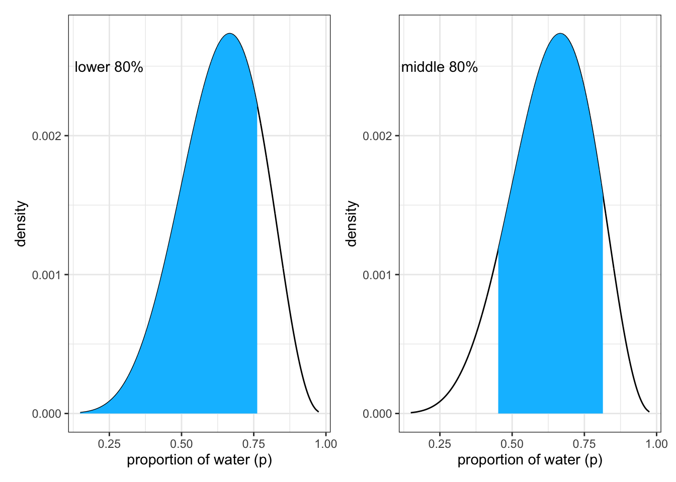
To produce the bottom part of Figure 3.2 of the book we apply following code lines.
R Code 3.33 b: Plots of defined mass intervals lower of 80% and the middle 80%
Code
## R Code Fig 3.2b Lower Part #############p1<-df_samples_b|>ggplot2::ggplot(ggplot2::aes(x =samples_b, y =posterior_samples_b))+ggplot2::geom_line()+ggplot2::geom_area(data =df_samples_b|>dplyr::filter(samples_b<q80), fill ="deepskyblue")+ggplot2::annotate(geom ="text", x =.25, y =.0025, label ="lower 80%")+ggplot2::labs(x ="proportion of water (p)", y ="density")+ggplot2::theme_bw()# upper right panelp2<-df_samples_b|>ggplot2::ggplot(ggplot2::aes(x =samples_b, y =posterior_samples_b))+ggplot2::geom_line()+ggplot2::geom_area(data =df_samples_b|>dplyr::filter(samples_b>q10_q90[[1]]&samples_b<q10_q90[[2]]), fill ="deepskyblue")+ggplot2::annotate(geom ="text", x =.25, y =.0025, label ="middle 80%")+ggplot2::labs(x ="proportion of water (p)", y ="density")+ggplot2::theme_bw()library(patchwork)p1+p2
Graph 3.8: Lower part of SR2 Figure 3.2: Intervals of defined mass produced with {tidyverse} tools: Left: Lower 80% posterior probability exists below a parameter value of about 0.75. Right: Middle 80% posterior probability lies between the 10% and 90% quantiles.
Again we will demonstrate the misleading character of Percentile Intervals (PIs) with a very skewed distribution.
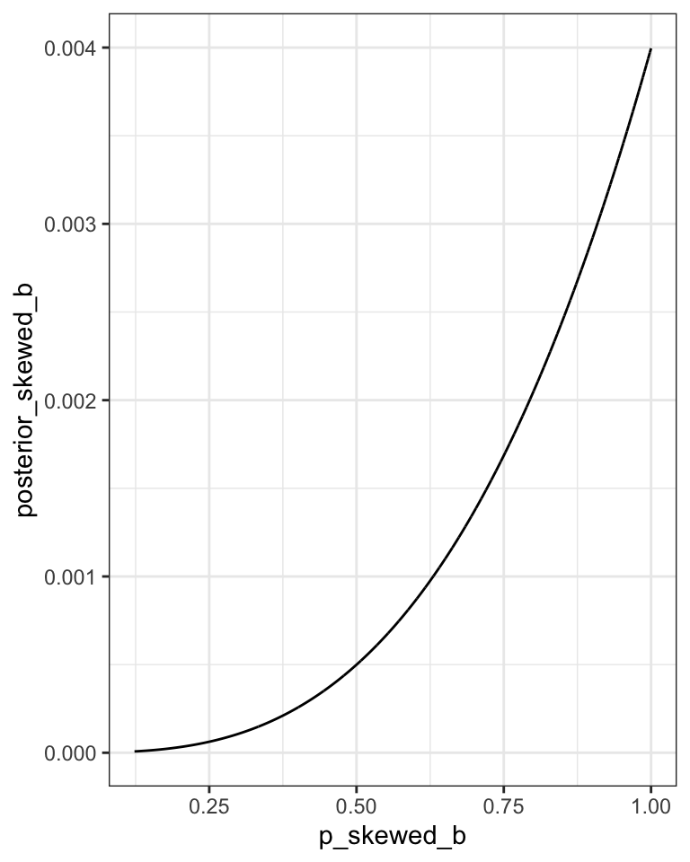
We’ve already defined p_grid_b and prior_b within d_b, above. Here we’ll reuse them and create a new tibble by updating all the columns with the skewed parameters of three ‘Water’ in three tosses.
To see the difference how the skewed distribution is different to the Figure 3.2 lower part, I will draw the appropriate figure here myself.
R Code 3.34 b: Skewed posterior distribution observing three waters in three tosses and a uniform (flat) prior (Tidyverse)
Code
## R code 3.11b Skewed data ########################## here we update the `dbinom()` parameters # for values for a skewed distribution# assuming three trials results in 3 W (Water)n_samples_skewed_b<-1e4n_success_skewed_b<-3n_trials_skewed_b<-3# update `d_b` to d_skewed_bd_skewed_b<-d_b|>dplyr::mutate(likelihood_skewed_b =stats::dbinom(n_success_skewed_b, size =n_trials_skewed_b, prob =p_grid_b))|>dplyr::mutate(posterior_skewed_b =(likelihood_skewed_b*prior_b)/sum(likelihood_skewed_b*prior_b))# make the next part reproduciblebase::set.seed(3)# here's our new samples tibblesamples_skewed_b<-d_skewed_b|>dplyr::slice_sample(n =n_samples_skewed_b, weight_by =posterior_skewed_b, replace =T)|>dplyr::rename(p_skewed_b =p_grid_b, prior_skewed_b =prior_b)# added to see the skewed distributionsamples_skewed_b|>ggplot2::ggplot(ggplot2::aes(x =p_skewed_b, y =posterior_skewed_b))+ggplot2::geom_line()+ggplot2::theme_bw()
Graph 3.9: Skewed posterior distribution observing three waters in three tosses and a uniform (flat) prior. The distribution is highly skewed, having its maximum value where p equals 1.
To see how the skewed distribution is different to the book’s Figure 3.2 lower part, I will draw the appropriate figure here.
R Code 3.35 b: Lower 80% and middle 80% of probability mass intervals in the skewed distribution
Code
## R code 3.12b(2) PI < 80 & middle 80% #############################p1<-samples_skewed_b|>ggplot2::ggplot(ggplot2::aes(x =p_skewed_b, y =posterior_skewed_b))+ggplot2::geom_line()+ggplot2::geom_area(data =samples_skewed_b|>dplyr::filter(p_skewed_b<q80), fill ="deepskyblue")+ggplot2::annotate(geom ="text", x =.25, y =.0025, label ="lower 80%")+ggplot2::labs(x ="proportion of water (p)", y ="density")+ggplot2::theme_bw()# upper right panelp2<-samples_skewed_b|>ggplot2::ggplot(ggplot2::aes(x =p_skewed_b, y =posterior_skewed_b))+ggplot2::geom_line()+ggplot2::geom_area(data =samples_skewed_b|>dplyr::filter(p_skewed_b>q10_q90[[1]]&p_skewed_b<q10_q90[[2]]), fill ="deepskyblue")+ggplot2::annotate(geom ="text", x =.25, y =.0025, label ="middle 80%")+ggplot2::labs(x ="proportion of water (p)", y ="density")+ggplot2::theme_bw()library(patchwork)p1+p2
Graph 3.10: Probability mass intervals in a skewed distribution. Left: Lower 80%. right: Middle 80% = 80% Percentile Interval (PI)
Introducing tidybayes
Introducing the {tidybayes} package by Matthew Kay
The {tidybayes} package by Matthew Kay offers an array of convenience functions for summarizing Bayesian models.
{tidybayes} is an R package that aims to make it easy to integrate popular Bayesian modeling methods into a tidy data + ggplot workflow. It builds on top of (and re-exports) several functions for visualizing uncertainty from its sister package, {ggdist}.
Besides supporting many types of models there is an additional {tidybayes.rethinking} package available on GitHub that extends {tidybayes} to work with the {rethinking} package. I think this package is a new development because Kurz didn’t mention it. (As far as I know, because at the moment I have read his version 0.40 only until chapter 4.)
The mentioned vignettes above are long articles I haven’t read yet. I plan to do this in the next future but for now I am concentrating and trusting on Kurz’ text to apply and explain the most important function parallel to McElreath book chapters.
Many function names used by Kurz do not apply anymore
I had difficulties to use Kurz’s functions because there was an overhaul in the naming scheme of {tidybayes} version 1.0 and a deprecation of horizontal shortcut geoms and stats in {tidybayes} 2.1. Because {tidybayes} integrates function of the sister package {ggdist} the function descriptions and references of {ggdist} are also important to consult. For instance all the function on point and interval summaries are now documented in {ggdist}.
There is a systematic change of the function names: The h (for ‘horizontal’) in parameter name of the point estimate was removed. For instance: Instead of median_qih(), median_hdih() and median_hdcih() it is now tidybayes::median_qi(), tidybayes::median_hdi() and tidybayes::median_hdci(). Similar with point_inverhalh(), mean\_\* and mode\_\*.
There is another adaption compared to the Kurz’ version: I can’t reproduce the codes with his samples (my samples_b) data frame, because the data has changed values recently to the skewed sampling version. To get the same results as Kurz I have to use in my naming scheme the skewed version.
The {tidybayes} package contains a family of functions that make it easy to summarize a distribution with a measure of central tendency accompanied by intervals. With tidybayes::median_qi(), we will ask for the median and quantile-based intervals — just like we’ve been doing with stats::quantile(). (Kurz)
R Code 3.36 : Computing the median quantile interval with {tidybayes}
#>           y      ymin      ymax .width .point .interval
#> 1 0.8428428 0.7087087 0.9349349    0.5 median        qi
Note how the .width argument within tidybayes::median_qi() worked the same way the prob argument did within rethinking::PI(). With .width = .5, we indicated we wanted a quantile-based 50% interval, which was returned in the ymin and ymax columns.
Note 3.4 : Point and interval summaries for tidy data frames of draws from distributions
The qi in tidybayes::median_qi() stands for “quantile interval”. The explanation of this function family (median_qi(), mean_qi() and mode_qi()) is now documented in the {ggdist} package.
The qi-variants is the short form of the function family of tidybayes::point_interval(..., .point = median, .interval = qi).
There are several point intervals that {tidybayes} respectively {ggdist} computes:
qi yields the quantile interval (also known as the percentile interval or equi-tailed interval) as a 1x2 matrix.
hdi yields the highest-density interval(s) (also known as the highest posterior density interval). Note: If the distribution is multimodal, hdi may return multiple intervals for each probability level (these will be spread over rows). You may wish to use hdci (below) instead if you want a single highest-density interval, with the caveat that when the distribution is multimodal hdci is not a highest-density interval.
hdci yields the highest-density continuous interval, also known as the shortest probability interval. Note: If the distribution is multimodal, this may not actually be the highest-density interval (there may be a higher-density discontinuous interval, which can be found using hdi).
ll and ul yield lower limits and upper limits, respectively (where the opposite limit is set to either Inf or -Inf). (ggdist reference)
The {tidybayes} framework makes it easy to request multiple types of intervals. In the following code chunk we’ll request 50%, 80%, and 99% intervals.
R Code 3.37 b: Requesting multiple type of intervals with {tidybayes}
Code
## R code 3.12b(3) different PIs ##############tidybayes::median_qi(samples_skewed_b$p_skewed_b, .width =c(.5, .8, .99))
#>           y      ymin      ymax .width .point .interval
#> 1 0.8428428 0.7087087 0.9349349   0.50 median        qi
#> 2 0.8428428 0.5705706 0.9749750   0.80 median        qi
#> 3 0.8428428 0.2562563 0.9989990   0.99 median        qi
The .width column in the output indexed which line presented which interval. The value in the y column remained constant across rows. That’s because that column listed the measure of central tendency, the median in this case.
3.2.2.2.3 Highest Posterior Density Interval (HPDI)
Now let’s use the rethinking::HPDI() function to return 50% highest posterior density intervals (HPDIs).
R Code 3.38 b: Compute Highest Posterior Density Interval (HPDI) (Rethinking / Tidyverse)
Code
## R code 3.13b(1) HPDI ###############################rethinking::HPDI(samples_skewed_b$p_skewed_b, prob =.5)
#>      |0.5      0.5|
#> 0.8418418 0.9989990
The reason I introduce {tidybayes} now is that the functions of the {brms} package only support percentile-based intervals of the type we computed with quantile() and median_qi(). But {tidybayes} also supports HPDIs.
: Two Version for Highest Density Intervals
As already mentioned in Note 3.4 there is hdiand hcdi. Both functions produce the same result in unimodal distributions.
But in the case of an extreme skewed distribution like our data frame with the observation of 3 ‘Water’ with 3 tosses the tidybayes::hdi() functions generates an error.
Error in quantile.default(dist_y, probs = 1 - .width) :
missing values and NaN’s not allowed if ‘na.rm’ is FALSE
My error message with hdi is in contrast to Kurz’ version where this function seems to work. BTW: I got the same error message providing the vector samples_skewed_a. from the Base R version.
R Code 3.39 : High Density Intervals with {tidybayes}
In contrast to R Code 3.37 and R Code 3.38 we used this time the mode as the measure of central tendency. With this family of {tidybayes} functions, you specify the measure of central tendency in the prefix (i.e., mean, median, or mode) and then the type of interval you’d like (i.e., qi() or hdci()).
If all you want are the intervals without the measure of central tendency or all that other technical information, {tidybayes} also offers the handy qi() and hdi() functions.
R Code 3.40 : Numbered R Code Title
Code
## R code 3.12b4 PI 0.5 ##############################tidybayes::qi(samples_skewed_b$p_skewed_b, .width =.5)
#>           [,1]      [,2]
#> [1,] 0.7087087 0.9349349
We have now all necessary skills to plot book’s Figure 3.3:
R Code 3.41 b: Plot the difference between percentile interval (PI) and highest posterior density intervals (HPDI)
Code
## R code Figure 3.3 ######################## left panelp1<-samples_skewed_b|>ggplot2::ggplot(ggplot2::aes(x =p_skewed_b, y =posterior_skewed_b))+# check out our sweet `qi()` indexingggplot2::geom_area(data =samples_skewed_b|>dplyr::filter(p_skewed_b>tidybayes::qi(samples_skewed_b$p_skewed_b, .width =.5)[1]&p_skewed_b<tidybayes::qi(samples_skewed_b$p_skewed_b, .width =.5)[2]), fill ="deepskyblue")+ggplot2::geom_line()+ggplot2::labs(subtitle ="50% Percentile Interval", x ="proportion of water (p)", y ="density")+ggplot2::theme_bw()# right panelp2<-samples_skewed_b|>ggplot2::ggplot(ggplot2::aes(x =p_skewed_b, y =posterior_skewed_b))+ggplot2::geom_area(data =samples_skewed_b|>dplyr::filter(p_skewed_b>tidybayes::hdci(samples_skewed_b$p_skewed_b, .width =.5)[1]&p_skewed_b<tidybayes::hdci(samples_skewed_b$p_skewed_b, .width =.5)[2]), fill ="deepskyblue")+ggplot2::geom_line()+ggplot2::labs(subtitle ="50% HPDI", x ="proportion of water (p)", y ="density")+ggplot2::theme_bw()# combine!library(patchwork)p1|p2
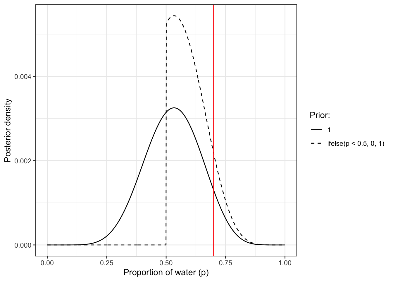
Graph 3.11: Reproduction of Figure 3.3 (p.57): The difference between percentile and highest posterior density compatibility intervals. The posterior density here corresponds to a flat prior and observing three water samples in three total tosses of the globe. Left: 50% percentile interval. This interval assigns equal mass (25%) to both the left and right tail. As a result, it omits the most probable parameter value, where p equals 1. Right: 50% highest posterior density interval, HPDI. This interval finds the narrowest region with 50% of the posterior probability. Such a region always includes the most probable parameter value.
Comparing the two panels of the plot you can see that in contrast to the 50% HPDI the 50% of PI does not include the highest probability value.
{magrittr} and native R pipe
Kurz uses the {magrittr} paipe whereas I am using the native R pipe. These two pipes are not in every aspect equivalent. One difference is the dot (.) syntax, “since the dot syntax is a feature of {magrittr} and not of base R.” (Understanding the native R pipe).
The native pipe is available starting with R 4.1.0. It is constructed with | followed by > resulting in the symbol |> to differentiate it from the {magrittr} pipe (%>%). To understand the details of the differences of |> and the native R pipe |> read this elaborated blog article by Isabella Velásquez, an employee of Posit (formerly RStudio).
So the following trick does not work with the native R pipe:
In the geom_area() line for the HPDI plot, did you notice how we replaced data = samples_skewed_b with data = .? When using the pipe (i.e., %>%), you can use the . as a placeholder for the original data object. It’s an odd and handy trick to know about.
Therefore I had to replace the dot with the name of the data frame.
PI and HPDI are only different if you have a very skewed distribution. This means that in unimodal somewhat normal distribution hdi and hdci are exactly the same and pretty similar to qi calculation. In skewed distribution they differ. assertion:
Because of the disadvantages of HPDI (more computationally intensive, greater simulation variance and harder to understand) Kurz will primarily stick to the PI-based intervals. And he will not use the 5.5% and 94.5% quantiles that are percentile intervals boundaries, corresponding to an 89% compatibility interval but stick to the 95% standard (frequentist) confidence interval.
3.2.3 Point Estimates
3.2.3.1 ORIGINAL
3.2.3.1.1 Measures of Central Tendency
“Given the entire posterior distribution, what value should you report? This seems like an innocent question, but it is difficult to answer. The Bayesian parameter estimate is precisely the entire posterior distribution, which is not a single number, but instead a function that maps each unique parameter value onto a plausibility value. So really the most important thing to note is that you don’t have to choose a point estimate. It’s hardly ever necessary and often harmful. It discards information.” (McElreath, 2020, p. 58) (pdf)
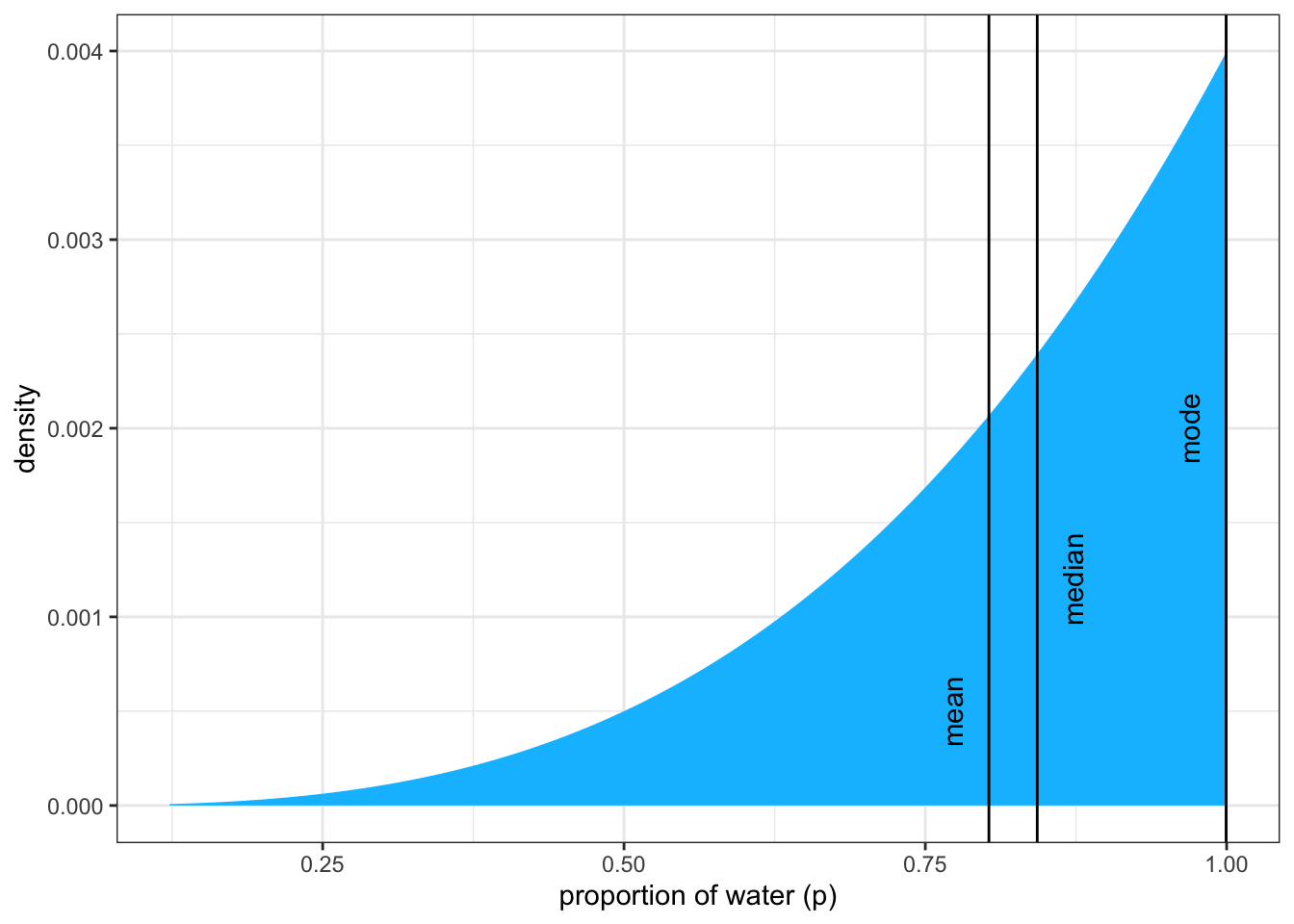
But whenever you have to do it, you must choose between mean, median and MAP (= the parameter value with highest posterior probability, a maximum a posteriori, essentially the “peak” or mode of the posterior distribution.
In the very skewed globe tossing example where we observed 3 waters out of 3 tosses they are all different.
R Code 3.42 a: Compute MAP, median and mean
Code
## R code 3.14a MAP (from grid) ###############map_skewed_a_1<-p_grid_skewed_a[which.max(posterior_skewed_a)]## R code 3.15a MAP from posterior samples ################map_skewed_a_2<-rethinking::chainmode(samples_skewed_a, adj =0.01)## R code 3.16a mean and median #############mean_skewed_a<-mean(samples_skewed_a)median_skewed_a<-median(samples_skewed_a)
I have observed small differences between the MAP calculation in R Code 3.42 and the mode calculation of other packages. I wonder why all these other methods give 0.95/0.96 whereas the MAP calculation results in 0.99/1.0.
One explanation I could think is that the mode is defined by the maximum frequency of observations, whereas the MAP is calculated from the maximum of the weighted probability frequency .
The graphical representation as shown in Figure 3.4 will be calculated in the tidyverse version of this section. See: Graph 3.12 for the left panel and Graph 3.14 for the right panel of Figure 3.4.
3.2.3.1.2 Loss function to support particular decisions
“Here’s an example to help us work through the procedure. Suppose I offer you a bet. Tell me which value of p, the proportion of water on the Earth, you think is correct. I will pay you \(\$100\), if you get it exactly right. But I will subtract money from your gain, proportional to the distance of your decision from the correct value. Precisely, your loss is proportional to the absolute value of \(d − p\), where \(d\) is your decision and \(p\) is the correct answer. We could change the precise dollar values involved, without changing the important aspects of this // problem. What matters is that the loss is proportional to the distance of your decision from the true value. Now once you have the posterior distribution in hand, how should you use it to maximize your expected winnings? It turns out that the parameter value that maximizes expected winnings (minimizes expected loss) is the median of the posterior distribution.” (McElreath, 2020, p. 59/60) (pdf)
“Calculating expected loss for any given decision means using the posterior to average over our uncertainty in the true value. Of course we don’t know the true value, in most cases. But if we are going to use our model’s information about the parameter, that means using the entire posterior distribution. So suppose we decide \(p = 0.5\) will be our decision.” (McElreath, 2020, p. 60) (pdf).
R Code 3.44 a: Calculated expected loss for \(p = 0.5\)
Code
## R code 3.17a weighted average loss ##################loss_avg_a<-sum(posterior_skewed_a*abs(0.5-p_grid_skewed_a))## R code 3.18a for every possible value #############################loss_a<-sapply(p_grid_skewed_a, function(d)sum(posterior_skewed_a*abs(d-p_grid_skewed_a)))## R code 3.19a minimized loss value #############################loss_min_a<-p_grid_skewed_a[which.min(loss_a)]
Results:
Weighted average loss value = 0.3128752.
Parameter value that minimizes the loss = 0.8408408. This is the posterior median that we already have calculated in R Code 3.42. Because of sampling variation it is not identical but pretty close (0.8428428 versus 0.8408408).
Learnings: Point estimates
“In order to decide upon a point estimate, a single-value summary of the posterior distribution, we need to pick a loss function. Different loss functions nominate different point estimates. The two most common examples are the absolute loss as above, which leads to the median as the point estimate, and the quadratic loss \((d − p)^{2}\), which leads to the posterior mean (mean(samples_a)) as the point estimate. When the posterior distribution is symmetrical and normal-looking, then the median and mean converge to the same point, which relaxes some anxiety we might have about choosing a loss function. For the original globe tossing data (6 waters in 9 tosses), for example, the mean and median are barely different.” (McElreath, 2020, p. 60) (pdf)
“Usually, research scientists don’t think about loss functions. And so any point estimate like the mean or MAP that they may report isn’t intended to support any particular decision, but rather to describe the shape of the posterior. You might argue that the decision to make is whether or not to accept an hypothesis. But the challenge then is to say what the relevant costs and benefits would be, in terms of the knowledge gained or lost. Usually it’s better to communicate as much as you can about the posterior distribution, as well as the data and the model itself, so that others can build upon your work. Premature decisions to accept or reject hypotheses can cost lives.” (McElreath, 2020, p. 61) (pdf)
3.2.3.2 TIDYVERSE
3.2.3.2.1 Measures of Central Tendency
If we sort the posterior values of d_skewed_b (three tosses with three W) from highest to lowest values then the first row (= the maximum value of posterior_skewed_b) will give us the MAP as the corresponding p_grid_b value. Additionally the {tidybayes} has other options to compute the MAP. To calculate mean and median we will use the Base R functions. In the following code chunk I have collected all these different calculations.
R Code 3.45 b: Compute MAP, median and mean
Code
## R code 3.14b MAP (from grid) ###############################glue::glue('MAP computed with dplyr::arrange(dplyr::desc())\n')map_skewed_b<-d_skewed_b|>dplyr::arrange(dplyr::desc(posterior_skewed_b))map_skewed_b[1, c(1,6)]glue::glue('#####################################################\n\n')## R code 3.15b MAP (from posterior sample) ###############################glue::glue('MAP computed with tidybayes::mode_qi()\n')samples_skewed_b|>tidybayes::mode_qi(p_skewed_b)glue::glue('#####################################################\n\n')glue::glue('MAP computed with tidybayes::mode_hdci()\n')samples_skewed_b|>tidybayes::mode_hdci(p_skewed_b)glue::glue('#####################################################\n\n')glue::glue('MAP computed with tidybayes::Mode()\n')tidybayes::Mode(samples_skewed_b$p_skewed_b)glue::glue('#####################################################\n\n')## R code 3.16b mean and median #############################glue::glue('Mean & Median computed with mean() & median()\n')samples_skewed_b|>dplyr::summarize(mean =mean(p_skewed_b), median =median(p_skewed_b))
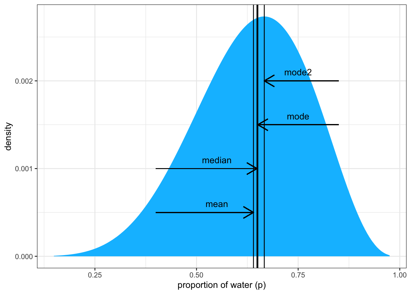
We can now plot a graph to reproduce the left panel of the books Figure 3.4 where we will see the three different measures of central tendency. I will compare the skewed (three ‘W’, three tosses) with the somewhat normal version (six ‘W’, nine tosses).
R Code 3.46 : Posterior density for skewed and symmetric distribution
## 1. bundle three types of estimates into a tibble. #######point_estimates_b1<-dplyr::bind_rows(samples_skewed_b|>tidybayes::mean_qi(p_skewed_b),samples_skewed_b|>tidybayes::median_qi(p_skewed_b),samples_skewed_b|>tidybayes::mode_qi(p_skewed_b))|>dplyr::select(p_skewed_b, .point)|>## 2. create two columns to annotate the plot #######dplyr::mutate(x =p_skewed_b+c(-.03, .03, -.03), y =c(.0005, .0012, .002))## 3. plot #######samples_skewed_b|>ggplot2::ggplot(ggplot2::aes(x =p_skewed_b))+ggplot2::geom_area(ggplot2::aes(y =posterior_skewed_b), fill ="deepskyblue")+ggplot2::geom_vline(xintercept =point_estimates_b1$p_skewed_b)+ggplot2::geom_text(data =point_estimates_b1,ggplot2::aes(x =x, y =y, label =.point), angle =90)+ggplot2::labs(x ="proportion of water (p)", y ="density")+ggplot2::theme(panel.grid =ggplot2::element_blank())+ggplot2::theme_bw()
Graph 3.12: Posterior distribution after observing 3 ‘water’ in 3 tosses of the globe. Vertical lines show the locations of the mode, median, and mean. All three measures of central tendency differ because of the skewness of the distribution. Therefore each point implies a different loss function.
Code
## 0. compute mode with different methodmode2_b<-df_samples_b|>dplyr::arrange(dplyr::desc(posterior_samples_b))|>dplyr::slice(1)|>dplyr::rename(.point =prior_samples_b)|>dplyr::select(samples_b, .point)|>dplyr::mutate(.point ="mode2")## 1. bundle three types of estimates into a tibble ######point_estimates_b2<-dplyr::bind_rows(df_samples_b|>tidybayes::mean_qi(samples_b),df_samples_b|>tidybayes::median_qi(samples_b),df_samples_b|>tidybayes::mode_qi(samples_b))|>dplyr::select(samples_b, .point)|>dplyr::bind_rows(mode2_b)|>## 2. create two columns to annotate the plot #######dplyr::mutate(x =c(.55, .55, .75, .75), y =c(.0006, .0011, .0016, .0021))## 3. plot ##########################################df_samples_b|>ggplot2::ggplot(ggplot2::aes(x =samples_b))+ggplot2::geom_area(ggplot2::aes(y =posterior_samples_b), fill ="deepskyblue")+ggplot2::geom_vline(xintercept =point_estimates_b2$samples_b)+ggplot2::geom_text(data =point_estimates_b2,ggplot2::aes(x =x, y =y, label =.point))+ggplot2::labs(x ="proportion of water (p)", y ="density")+ggplot2::theme(panel.grid =ggplot2::element_blank())+ggplot2::theme_bw()+## 4. annotation (arrows & text) ####################ggplot2::geom_segment(ggplot2::aes(x =0.4, y =.0005, xend =point_estimates_b2$samples_b[[1]], yend =.0005), arrow =grid::arrow(length =grid::unit(0.5, "cm")))+ggplot2::geom_segment(ggplot2::aes(x =0.4, y =.001, xend =point_estimates_b2$samples_b[[2]], yend =.001), arrow =grid::arrow(length =grid::unit(0.5, "cm")))+ggplot2::geom_segment(ggplot2::aes(x =0.85, y =.0015, xend =point_estimates_b2$samples_b[[3]], yend =.0015), arrow =grid::arrow(length =grid::unit(0.5, "cm")))+ggplot2::geom_segment(ggplot2::aes(x =0.85, y =.002, xend =point_estimates_b2$samples_b[[4]], yend =.002), arrow =grid::arrow(length =grid::unit(0.5, "cm")))
Graph 3.13: Point estimates in the almost symmetrical distribution of 6 ‘water’ in 9 tosses. Vertical lines show the locations of the mode, median, and mean. All three points are in a similar locatioon and have approximately the same loss function.
MAP (mode) is not the highest point in the more symmetric version (6 ‘W’, n=9)
I wounder if the calculation of the MAP of the somewhat symmetrical version is correct, because the MAP or mode is not the highest value in the distribution. In addition to calculate the mode with {tidybayes}, I have also used R code 3.14b from R Code 3.45 to compute MAP with dplyr::arrange(dplyr::desc()).
It turns out that there is difference: In contrast to {tidybayes} arranging the data frame results in a MAP value (mode2) which is indeed the highest point of the distribution. I don’t know how to interpret this disparity.
3.2.3.2.2 Loss function to support particular decisions
R Code 3.47 b: Calculated expected loss for \(p = 0.5\) with proportional and quadratic loss function
The absolute proportional loss \(d-p\) for the decision \(p = 0.5\) results into the median.
Code
## R code 3.17b weighted average loss ##################loss_avg_b<-d_skewed_b|>dplyr::summarise(`expected loss` =base::sum(posterior_skewed_b*base::abs(0.5-p_grid_b)))## R code 3.18b for every possible value ############################### write functionmake_loss_b<-function(our_d){d_skewed_b|>dplyr::mutate(loss_b =posterior_skewed_b*base::abs(our_d-p_grid_b))|>dplyr::summarise(weighted_average_loss_b =base::sum(loss_b))}## calculate loss for all possible values glue::glue("Every possible loss values for decision 0.5 with proportional loss function\n")l_b<-d_skewed_b|>dplyr::select(p_grid_b)|>dplyr::rename(decision_b =p_grid_b)|>dplyr::mutate(weighted_average_loss_b =purrr::map(decision_b, make_loss_b))|>tidyr::unnest(weighted_average_loss_b)head(l_b)## R code 3.19b minimized loss value ############################## this will help us find the x and y coordinates for the minimum valueloss_min_b<-l_b|>dplyr::filter(weighted_average_loss_b==base::min(weighted_average_loss_b))|>base::as.numeric()
#> Every possible loss values for decision 0.5 with proportional loss function
#> # A tibble: 6 × 2
#>   decision_b weighted_average_loss_b
#>        <dbl>                   <dbl>
#> 1    0                         0.800
#> 2    0.00100                   0.799
#> 3    0.00200                   0.798
#> 4    0.00300                   0.797
#> 5    0.00400                   0.796
#> 6    0.00501                   0.795
Results:
Weighted average loss value = 0.3128752.
Parameter value that minimizes the loss = 0.8408408. This is the posterior median that we already have calculated in R Code 3.45. Because of sampling variation it is not identical but pretty close (0.8428428 versus 0.8408408).
The quadratic loss \((d−p)^{2}\) for the decision \(p = 0.5\) suggests we should use the mean.
Code
## R code 3.17b weighted average loss ##################loss_avg_b2<-d_skewed_b|>dplyr::summarise(`expected loss` =base::sum(posterior_skewed_b*base::sqrt(abs(0.5-p_grid_b))))## R code 3.18b for every possible value ############################## amend our loss functionmake_loss2_b<-function(our_d2){d_skewed_b|>dplyr::mutate(loss2_b =posterior_skewed_b*(our_d2-p_grid_b)^2)|>dplyr::summarise(weighted_average_loss2_b =base::sum(loss2_b))}# remake our `l` dataglue::glue("Every possible loss values for decision 0.5 with quadratic loss function\n")l2_b<-d_skewed_b|>dplyr::select(p_grid_b)|>dplyr::rename(decision2_b =p_grid_b)|>dplyr::mutate(weighted_average_loss2_b =purrr::map(decision2_b, make_loss2_b))|>tidyr::unnest(weighted_average_loss2_b)head(l2_b)## R code 3.19b minimized loss value ############################## update to the new minimum loss coordinatesloss_min_b2<-l2_b|>dplyr::filter(weighted_average_loss2_b==base::min(weighted_average_loss2_b))|>base::as.numeric()
#> Every possible loss values for decision 0.5 with quadratic loss function
#> # A tibble: 6 × 2
#>   decision2_b weighted_average_loss2_b
#>         <dbl>                    <dbl>
#> 1     0                          0.667
#> 2     0.00100                    0.666
#> 3     0.00200                    0.664
#> 4     0.00300                    0.663
#> 5     0.00400                    0.661
#> 6     0.00501                    0.659
Results:
Weighted average loss value = 0.5390867.
Parameter value that minimizes the loss = 0.8008008. This is the posterior mean that we already have calculated in R Code 3.45. Because of sampling variation it is not identical but pretty close (0.8027632 versus 0.8008008).
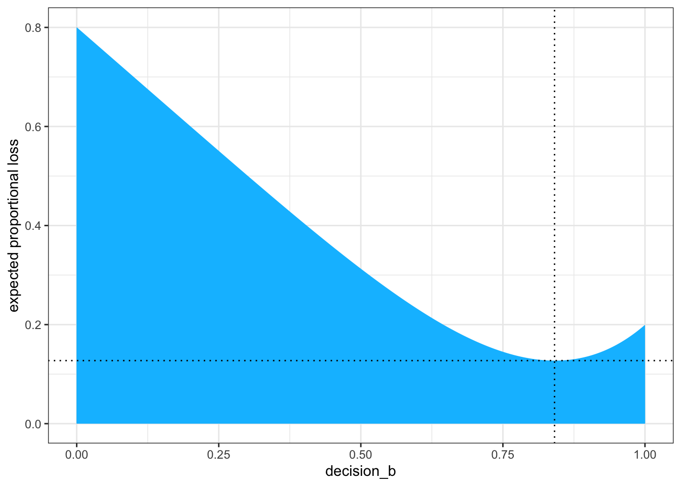
Now we’re ready to reproduce the right panel of Figure 3.4., e.g., displaying the the loss function and computing the minimum loss value. Remember: Different loss functions imply different point estimates.
R Code 3.48 b: Plot expected loss for \(p = 0.5\) with proportional and quadratic loss function
The absolute proportional loss \(d-p\) for the decision \(p = 0.5\) results into the median.
Code
## right panel figure 3.4 ########################l_b|>ggplot2::ggplot(ggplot2::aes(x =decision_b, y =weighted_average_loss_b))+ggplot2::geom_area(fill ="deepskyblue")+ggplot2::geom_vline(xintercept =loss_min_b[1], color ="black", linetype =3)+ggplot2::geom_hline(yintercept =loss_min_b[2], color ="black", linetype =3)+ggplot2::ylab("expected proportional loss")+ggplot2::theme(panel.grid =ggplot2::element_blank())+ggplot2::theme_bw()
Graph 3.14: Expected loss under the rule that loss is proportional to absolute distance of decision (horizontal axis) from the true value. The point marks the value of p that minimizes the expected loss, the posterior median.
We saved the exact minimum value as loss_min_b[1], which is 0.8408408. Within sampling error, this is the posterior median as depicted by our samples (0.8428428 versus 0.8408408).
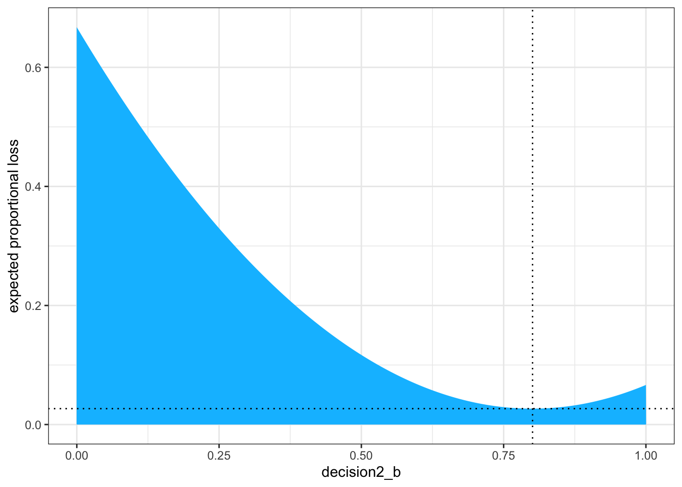
The quadratic loss \((d−p)^{2}\) for the decision \(p = 0.5\) suggests we should use the mean.
Code
# update the plotl2_b|>ggplot2::ggplot(ggplot2::aes(x =decision2_b, y =weighted_average_loss2_b))+ggplot2::geom_area(fill ="deepskyblue")+ggplot2::geom_vline(xintercept =loss_min_b2[1], color ="black", linetype =3)+ggplot2::geom_hline(yintercept =loss_min_b2[2], color ="black", linetype =3)+ggplot2::ylab("expected proportional loss")+ggplot2::theme(panel.grid =ggplot2::element_blank())+ggplot2::theme_bw()
Graph 3.15: Expected loss under the rule that loss is quadratic to the distance of decision (horizontal axis) from the true value. The point marks the value of p that minimizes the expected loss, the posterior mean
Based on quadratic loss \((d−p)^{2}\), the exact minimum value is 0.8008008. Within sampling error, this is the posterior mean of our samples (0.8027632 versus 0.8008008).
3.3 Sampling to simulate prediction
3.3.1 ORIGINAL
Procedure 3.2 : 5 Reasons to simulate implied observations
“Another common job for samples is to ease simulation of the model’s implied observations. Generating implied observations from a model is useful for at least four five reasons.” (McElreath, 2020, p. 61) (pdf)
Model design
Model checking
Software validation
Research design
Forecasting
“We will call such simulated data dummy data, to indicate that it is a stand-in for actual data.” (McElreath, 2020, p. 62) (pdf)
3.3.1.1 Dummy data
Likelihood functions work in both directions:
They help to infer the plausibility of each possible value of p. “With the globe tossing model, the dummy data arises from a binomial likelihood:” (McElreath, 2020, p. 62) (pdf)
They can be used to simulate the observations that the model implies. “You could use base::sample() to do this, but R provides convenient sampling functions for all the ordinary probability distributions, like the binomial.” (McElreath, 2020, p. 62) (pdf)
“Given a realized observation, the likelihood function says how plausible the observation is. And given only the parameters, the likelihood defines a distribution of possible observations that we can sample from, to simulate observation.” (McElreath, 2020, p. 62) (pdf)
R Code 3.49 a: Suppose \(N = 2\), two tosses of the globe with \(p = 0.7\)
base::set.seed(3)## R code 3.22a #############################rbinom(10, size =2, prob =0.7)
#> [1] 2 1 2 2 1 1 2 2 1 1
Code
base::set.seed(3)## R code 3.23a #############################dummy_w_a<-rbinom(1e5, size =2, prob =0.7)table(dummy_w_a)/1e5
#> dummy_w_a
#>       0       1       2
#> 0.09000 0.42051 0.48949
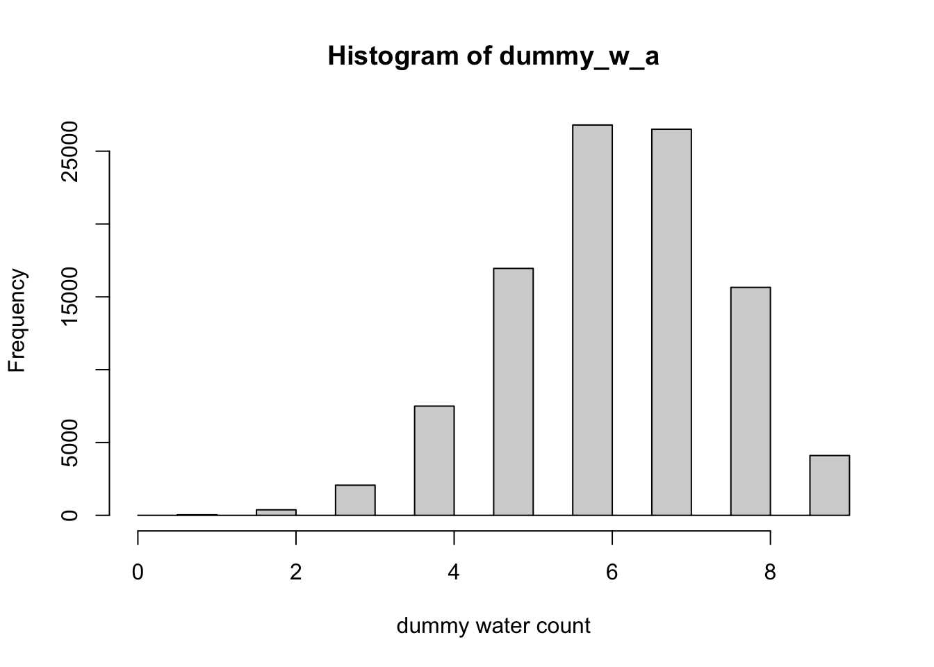
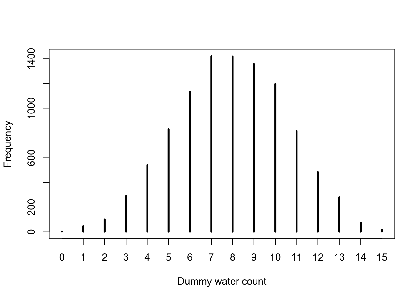
Now let’s simulate the same amount of tosses (sample size = 9) as we have used previously. I will provide two kinds of R graphs: One for rethinking::simplehist() as in the book and one using base R with graphics::hist().
R Code 3.51 a: Distribution of simulated sample observations from 9 tosses of the globe
base::set.seed(3)## R code 3.24a with hist() ##############dummy_w_a<-rbinom(1e5, size =9, prob =0.7)hist(dummy_w_a, xlab ="dummy water count")
Graph 3.16: Distribution of simulated sample observations from 9 tosses of the globe. These samples assume the proportion of water is 0.7. The plot uses the base R hist() function
Code
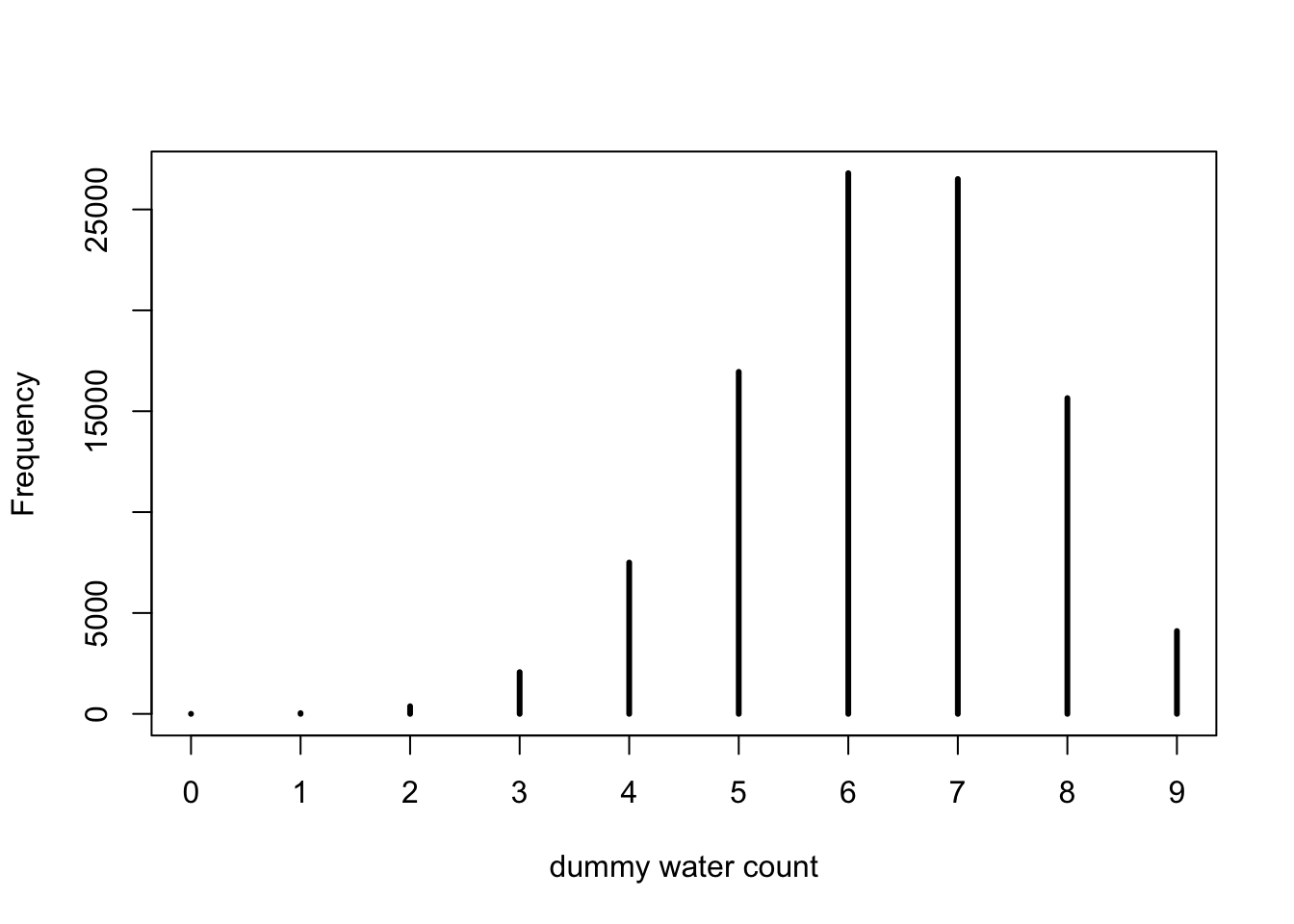
base::set.seed(3)## R code 3.24a with simplehist() #############################dummy_w_a<-stats::rbinom(1e5, size =9, prob =0.7)rethinking::simplehist(dummy_w_a, xlab ="dummy water count")
Graph 3.17: Distribution of simulated sample observations from 9 tosses of the globe. These samples assume the proportion of water is 0.7. the plot uses the `rethinking::simplehist()``` function
Note that in our example using base::set.seed(3) the simulation does not generate the water in its true proportion of \(0.7\).
“That’s the nature of observation: There is a one-to-many relationship between data and data-generating processes. You should [delete the base::set.seed() line and] experiment with sample size, the size input in the code above, as well as the prob, to see how the distribution of simulated samples changes shape and location.” (McElreath, 2020, p. 63) (pdf)
Sampling distributions versus Samples drawn from the posterior
“Many readers will already have seen simulated observations. Sampling distributions are the foundation of common non-Bayesian statistical traditions. In those approaches, inference about parameters is made through the sampling distribution. In this book, inference about parameters is never done directly through a sampling distribution. The posterior distribution is not sampled, but deduced logically. Then samples can be drawn from the posterior, as earlier in this chapter, to aid in inference. In neither case is ‘sampling’ a physical act. In both cases, it’s just a mathematical device and produces only small world (Chapter 2) numbers.” (McElreath, 2020, p. 63) (pdf)
3.3.1.2 Model checking
Two main purposes:
Checking if software is working correctly
Evaluation the adequacy of the model
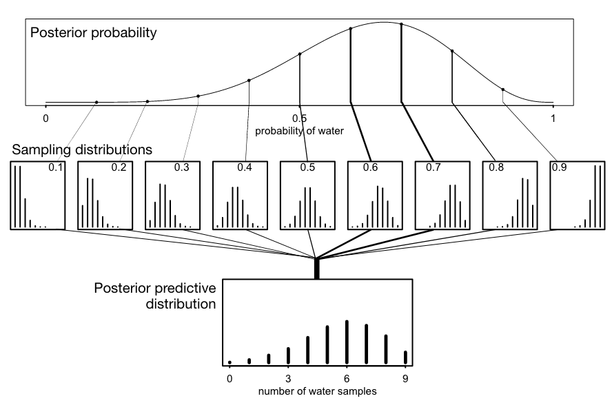
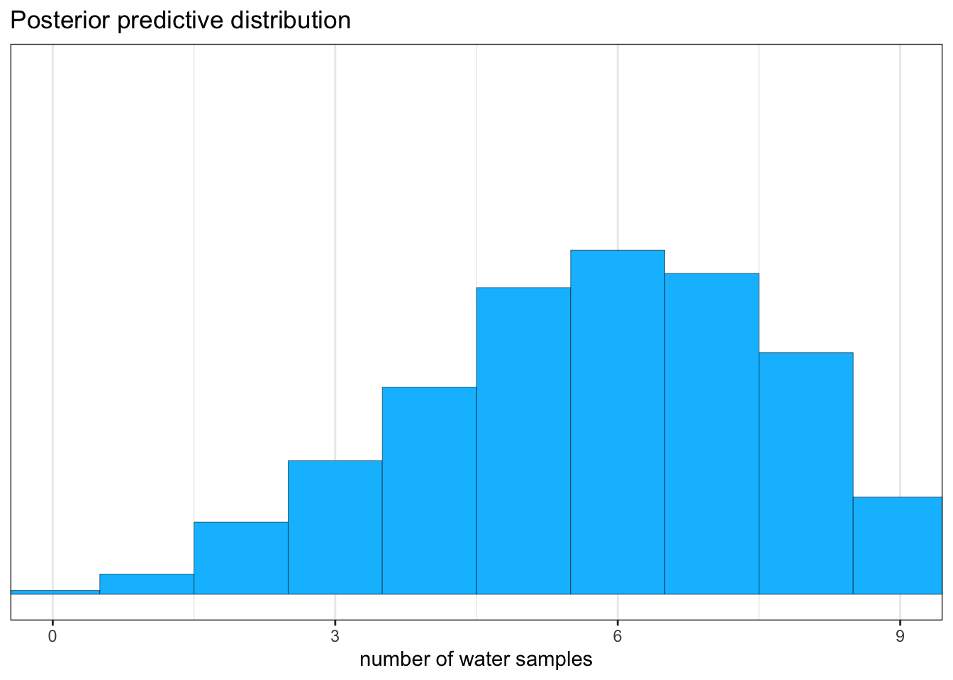
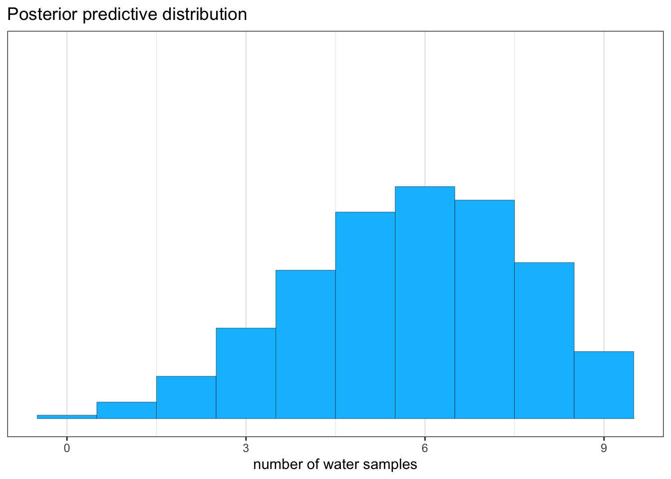
“All that is required is averaging over the posterior density for \(p\), while computing the predictions. For each possible value of the parameter \(p\), there is an implied distribution of outcomes. So if you were to compute the sampling distribution of outcomes at each value of \(p\), then you could average all of these prediction distributions together, using the posterior probabilities of each value of \(p\), to get a posterior predictive distribution.” (McElreath, 2020, p. 65) (pdf)
Use as prob value not a single value but samples from the posterior
I will not reproduce Figure 3.6 in the upcoming section. The complex procedure to plot the graph does not add much understanding in Bayesian statistics. But the content of the picture itself is very important to understand how the posterior predictive distribution is generated.
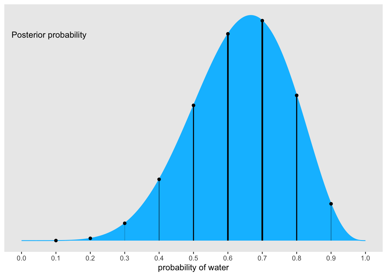
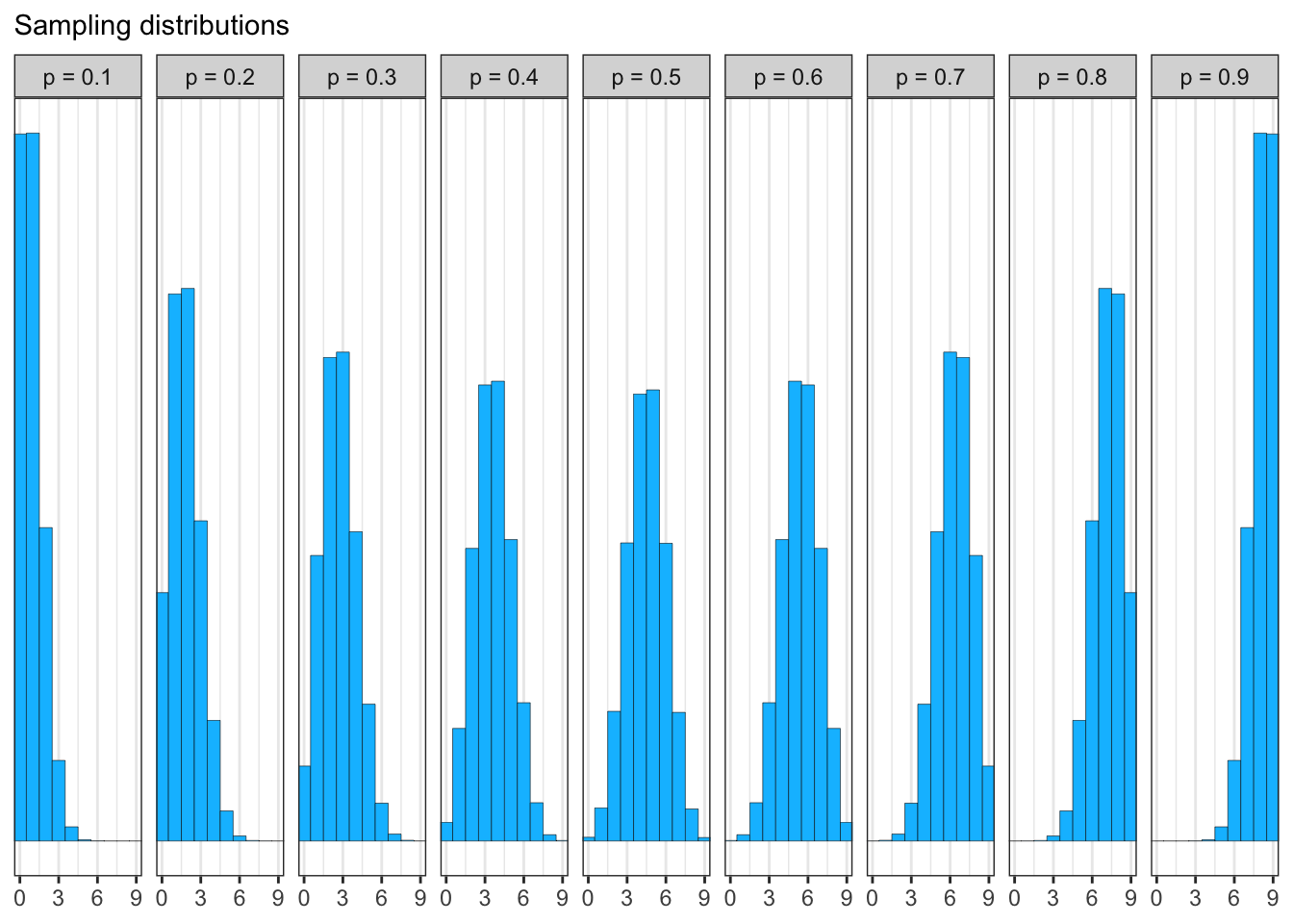
Graph 3.18: “Simulating predictions from the total posterior. Top: The familiar posterior distribution for the globe tossing data. Ten example parameter values are marked by the vertical lines. Values with greater posterior probability indicated by thicker lines. Middle row: Each of the ten parameter values implies a unique sampling distribution of predictions. Bottom: Combining simulated observation distributions for all parameter values (not just the ten shown), each weighted by its posterior probability, produces the posterior predictive distribution. This distribution propagates uncertainty about parameter to uncertainty about prediction.” (McElreath, 2020, p. 65) (pdf)
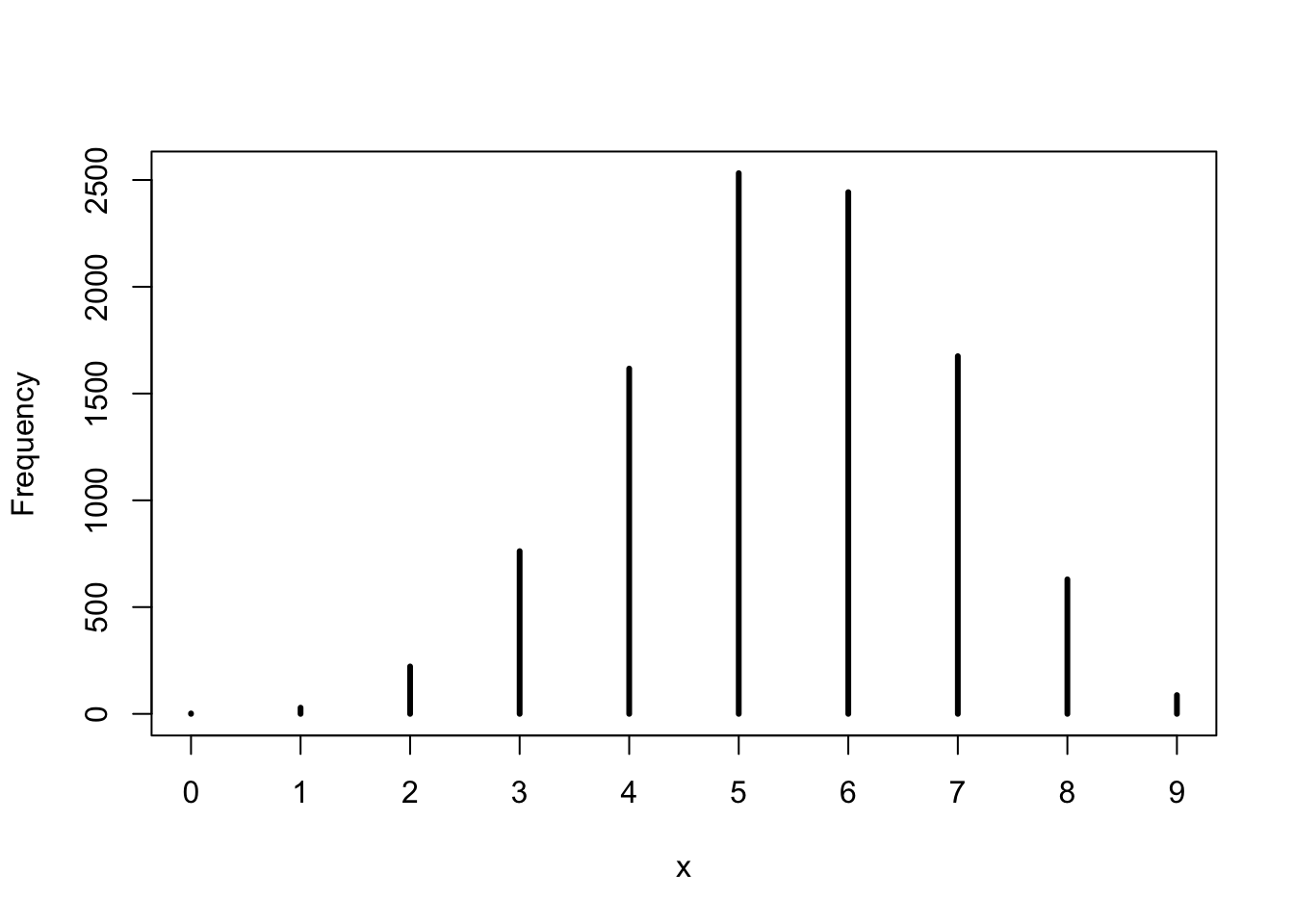
We will generates 10,000 (1e4) simulated predictions of 9 globe tosses (size = 9)
R Code 3.52 a: Simulate predicted observations for a single value (\(p = 0.6\)) and with samples of the posterior
base::set.seed(3)## R code 3.25a #############################w_a1<-rbinom(1e4, size =9, prob =0.6)rethinking::simplehist(w_a1)
Graph 3.19: Simulate predicted observations for a single value p value of 0.6
The predictions are stored as counts of water, so the theoretical minimum is zero and the theoretical maximum is nine. Although our fix prob value = 0.6 the samples show 5 as the mode of the randomly generated distribution.
Code
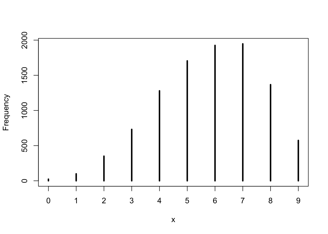
base::set.seed(3)## R code 3.26a #############################w_a2<-rbinom(1e4, size =9, prob =samples_a)rethinking::simplehist(w_a2)
Graph 3.20: Simulate predicted observations with samples of the posterior
The code propagate parameter uncertainty into the predictions by replacing a fixed prob value by the vector samples_a. The symbol samples_a is the same list of random samples from the posterior distribution that we have calculated in ?cnj-sample-globe-tossing and used in previous sections.
“For each sampled value, a random binomial observation is generated. Since the sampled values appear in proportion to their posterior probabilities, the resulting simulated observations are averaged over the posterior. You can manipulate these simulated observations just like you manipulate samples from the posterior—you can compute intervals and point statistics using the same procedures.” (McElreath, 2020, p. 66) (pdf)
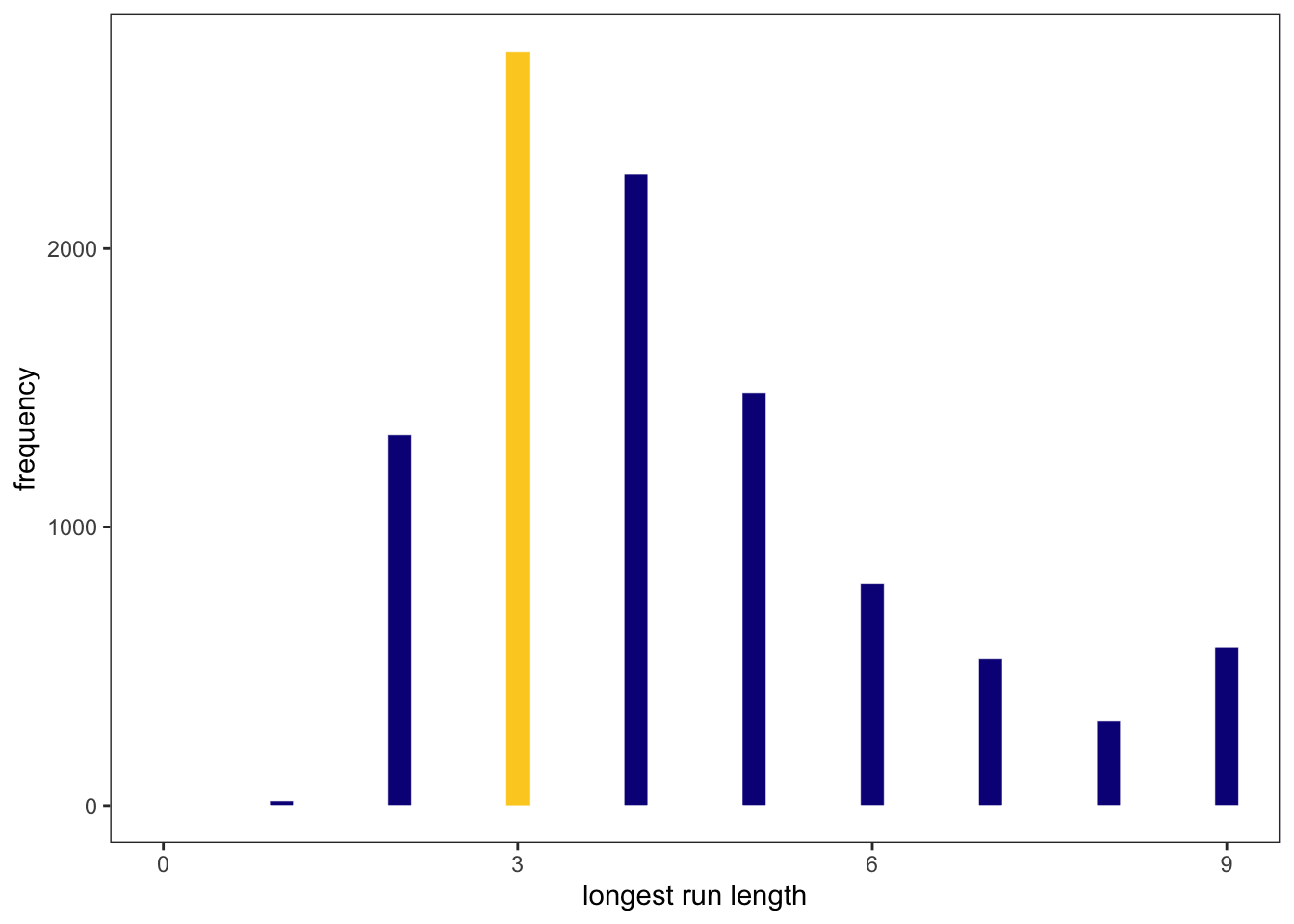
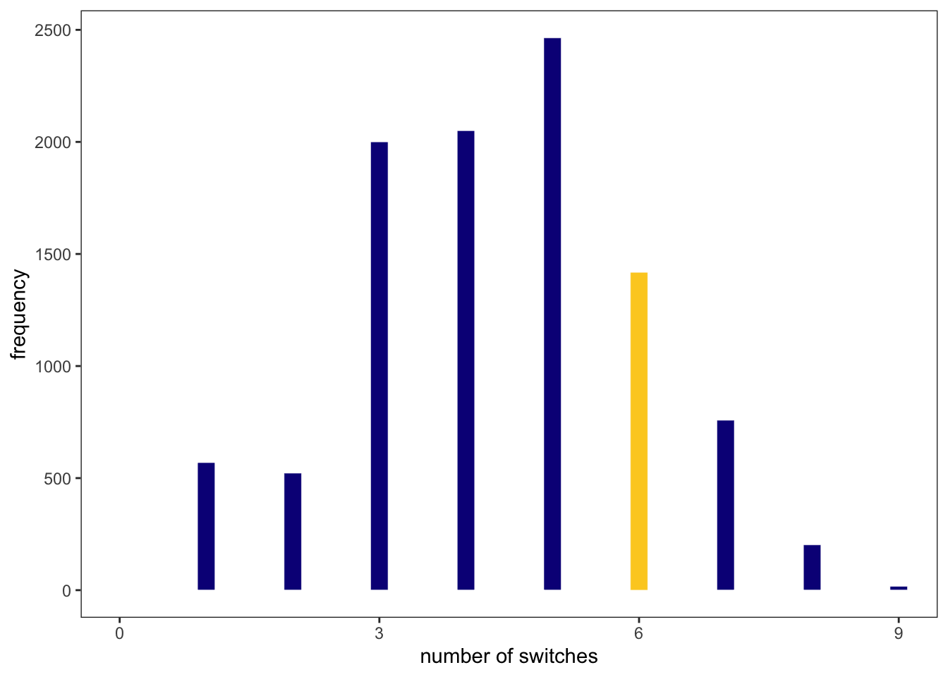
But Graph 3.20 just predicts the posterior distribution as our model sees the data. To evaluate the adequacy of the model for certain purposes it is important to investigate it under different point of views. McElreath proposes two look at the data in additional two ways:
Plot the distribution of the longest run of either water or land.
Plot the distribution of the number of switches from water to land and reverse.
The calculation and reproduction of Figure 3.7 is demonstrated in the next tidyverse section.
3.3.2 TIDYVERSE
3.3.2.1 Dummy data
R Code 3.53 b: Suppose \(N = 2\), two tosses of the globe with \(p = 0.7\)
#> # A tibble: 3 × 3
#>   draws     n proportion
#>   <int> <int>      <dbl>
#> 1     0  9000      0.09
#> 2     1 42051      0.421
#> 3     2 48949      0.489
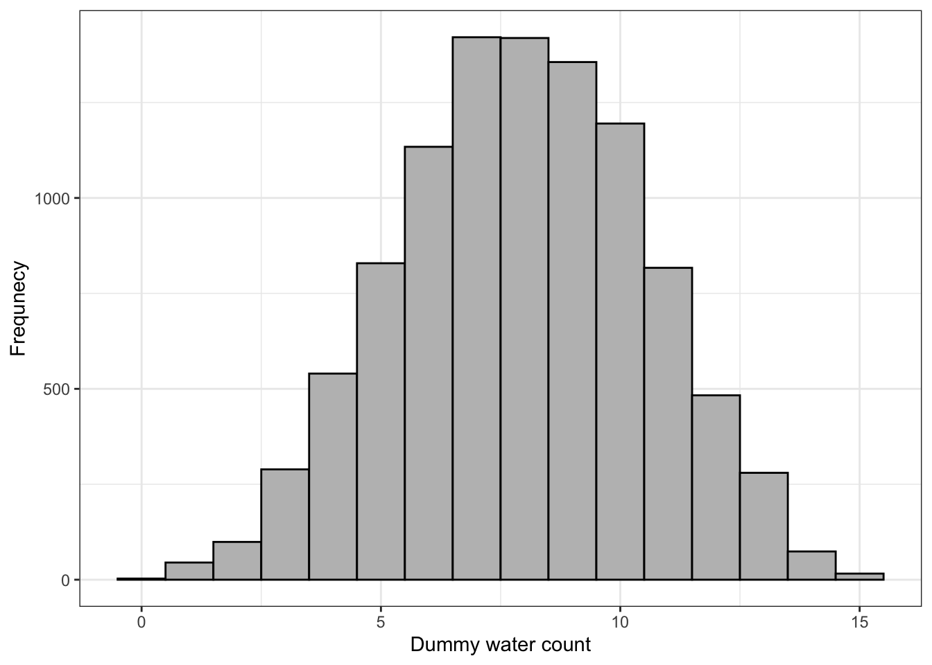
The simulation updated to \(n=9\) and plotting the tidyverse version of Figure 3.5.
R Code 3.54 b: Distribution of simulated sample observations from 9 tosses of the globe
Code
## R code 3.24b with ggplot2 #########################n_draws_b<-1e5base::set.seed(3)dummy_w2_b<-tibble::tibble(draws =stats::rbinom(n_draws_b, size =9, prob =.7))p1<-dummy_w2_b|>ggplot2::ggplot(ggplot2::aes(x =draws))+ggplot2::geom_histogram(binwidth =1, center =0, fill ="deepskyblue", color ="black", linewidth =1/10)+# breaks = 0:10 * 2 = equivalent in Kurz's versions: breaks = 0:4 * 2ggplot2::scale_x_continuous("dummy water count", breaks =0:10*2)+ggplot2::ylab("frequency")+ggplot2::coord_cartesian(xlim =c(0, 9))+ggplot2::theme(panel.grid =ggplot2::element_blank())+ggplot2::theme_bw()p2<-dummy_w2_b|>ggplot2::ggplot(ggplot2::aes(x =draws))+ggplot2::geom_histogram(binwidth =1, center =0, fill ="deepskyblue", color ="black", linewidth =1/10)+## breaks = 0:10 * 2 = equivalent in Kurz's versions: breaks = 0:4 * 2## I decided to set a break at each of the draws: breaks = 0:9 * 1ggplot2::scale_x_continuous("dummy water count", breaks =0:9*1)+ggplot2::ylab("frequency")+## I did not zoom into the graph because doesn't look so nice## for instance the last line in Kurz’ version is not visible# coord_cartesian(xlim = c(0, 9)) +ggplot2::theme(panel.grid =ggplot2::element_blank())+ggplot2::theme_bw()library(patchwork)p1+p2
Graph 3.21: Distribution of simulated sample observations from 9 tosses of the globe. These samples assume the proportion of water is 0.7. The plot uses the {ggplot2} functions. The left panel is Kurz’s original, the right one is my version slightly changed.
McElreath suggested to play around with different values of size and prob. But instead of reproducing all codes block introduced by Kurz, I will just replicate the first chunk, because it has some interesting and (for me) unfamiliar functions.
R Code 3.55 b: Simulated sample observations, using different sizes and probabilities
tidyr::unnest() expands a list-column containing data frames into row and columns. In the above case purrr::map2() returns a list and stores the data in draws9_b.
Instead of utils::head() I used dplyr::slice_sample() and ordered the result by the first column. I think this will get a better glimpse on the data as just the first 6 rows.
Code
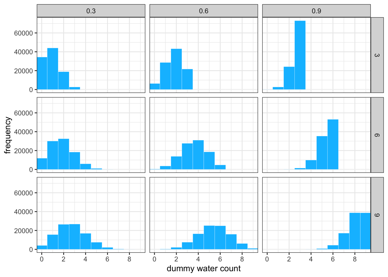
d9_b|>ggplot2::ggplot(ggplot2::aes(x =draws9_b))+ggplot2::geom_histogram(binwidth =1, center =0, fill ="deepskyblue", color ="white", linewidth =1/10)+ggplot2::scale_x_continuous("dummy water count", breaks =0:4*2)+ggplot2::ylab("frequency")+ggplot2::coord_cartesian(xlim =c(0, 9))+ggplot2::theme(panel.grid =ggplot2::element_blank())+ggplot2::theme_bw()+ggplot2::facet_grid(n9_b~probability9_b)
Graph 3.22: ?(caption)
3.3.2.2 Model checking
Checking if the software works correctly
On software checking Kurz refers to some material, that is too special at the moment for me. I will it include here, even if I had not read it. Maybe I will come later here again and pick up these resources when I have more experiences with Bayesian statistics and the necessary tools.
Vehtari, A., Gelman, A., Simpson, D., Carpenter, B., & Bürkner, P.-C. (2021). Rank-normalization, folding, and localization: An improved \(\widehat{R}\) for assessing convergence of MCMC. Bayesian Analysis, 16(2). https://doi.org/10.1214/20-BA1221
There are three computing steps to reproduce the three levels of Figure 3.6 copied here as Graph 3.18.
Posterior probability (top level)
Sampling distributions for nine values (0.1-0.9) (middle level)
## data wrangling ####################n2_b<-1001Ln_success<-6Ln_trials<-9Ld2_b<-tibble::tibble(p_grid2_b =base::seq(from =0, to =1, length.out =n2_b),# note we're still using a flat uniform prior prior2_b =1)|>dplyr::mutate(likelihood2_b =stats::dbinom(n_success, size =n_trials, prob =p_grid2_b))|>dplyr::mutate(posterior2_b =(likelihood2_b*prior2_b)/sum(likelihood2_b*prior2_b))head(d2_b)## plot ##############################d2_b|>ggplot2::ggplot(ggplot2::aes(x =p_grid2_b, y =posterior2_b))+ggplot2::geom_area(color ="deepskyblue", fill ="deepskyblue")+ggplot2::geom_segment(data =d2_b|>dplyr::filter(p_grid2_b%in%c(base::seq(from =.1, to =.9, by =.1), 3/10)),## Note how we Wweight the widths of the vertical lines ## by the posterior density `posterior2_b`ggplot2::aes(xend =p_grid2_b, yend =0, linewidth =posterior2_b), color ="black", show.legend =F)+ggplot2::geom_point(data =d2_b|>dplyr::filter(p_grid2_b%in%c(base::seq(from =.1, to =.9, by =.1), 3/10)))+ggplot2::annotate(geom ="text", x =.08, y =.0025, label ="Posterior probability")+ggplot2::scale_linewidth_continuous(range =c(0, 1))+ggplot2::scale_x_continuous("probability of water", breaks =0:10/10)+ggplot2::scale_y_continuous(NULL, breaks =NULL)+ggplot2::theme(panel.grid =ggplot2::element_blank())+ggplot2::theme()
Graph 3.23: Reproduction of the top part of figure 3.6
At first I thought I do not need to refresh the original grid approximation from R Code 3.10 as I have it stored it with the unique name d_b. But it turned out that the above code with n_grid_b = 1000L does not work, because it draws no vertical lines by the posterior density. Instead one has to sample 1001 times.
I noticed that with most sample numbers the plot does not work correctly. It worked with 1071. The sequence 1011, 1021, 1031, 1041, 1051, 1061 misses just one vertical line at \(p = 0.7\) An exception is 1041, which misses \(p = 0.6\). I do not know why this happens.
Code
## data wrangling #####################n_draws_b<-1e5simulate_binom<-function(probability){base::set.seed(3)stats::rbinom(n_draws_b, size =9, prob =probability)}d_small_b<-tibble::tibble(probability =base::seq(from =.1, to =.9, by =.1))|>dplyr::mutate(draws =purrr::map(probability, simulate_binom))|>tidyr::unnest(draws)|>dplyr::mutate(label =stringr::str_c("p = ", probability))utils::head(d_small_b)## plot ###############################d_small_b|>ggplot2::ggplot(ggplot2::aes(x =draws))+ggplot2::geom_histogram(binwidth =1, center =0, color ="black", fill ="deepskyblue", linewidth =1/10)+ggplot2::scale_x_continuous(NULL, breaks =0:3*3)+ggplot2::scale_y_continuous(NULL, breaks =NULL)+ggplot2::labs(subtitle ="Sampling distributions")+ggplot2::coord_cartesian(xlim =c(0, 9))+ggplot2::theme(panel.grid =ggplot2::element_blank())+ggplot2::theme_bw()+ggplot2::facet_wrap(~label, ncol =9)
#> # A tibble: 6 × 3
#>   probability draws label
#>         <dbl> <int> <chr>
#> 1         0.1     0 p = 0.1
#> 2         0.1     2 p = 0.1
#> 3         0.1     0 p = 0.1
#> 4         0.1     0 p = 0.1
#> 5         0.1     1 p = 0.1
#> 6         0.1     1 p = 0.1
Graph 3.24: Reproduction of the middle part of figure 3.6
Code
## data wrangling ######################################### how many samples would you like?n_samples_b<-1e4# make it reproduciblebase::set.seed(3)d2_samples_b<-d2_b|>dplyr::slice_sample(n =n_samples_b, weight_by =posterior2_b, replace =T)|>dplyr::mutate(w =purrr::map_dbl(p_grid2_b, stats::rbinom, n =1, size =9))dplyr::glimpse(d2_samples_b)## plot ###################################d2_samples_b|>ggplot2::ggplot(ggplot2::aes(x =w))+ggplot2::geom_histogram(binwidth =1, center =0, color ="black", fill ="deepskyblue", linewidth =1/10)+ggplot2::scale_x_continuous("number of water samples", breaks =0:3*3)+ggplot2::scale_y_continuous(NULL, breaks =NULL)+ggplot2::ggtitle("Posterior predictive distribution")+ggplot2::coord_cartesian(xlim =c(0, 9), ylim =c(0, 3000))+ggplot2::theme(panel.grid =ggplot2::element_blank())+ggplot2::theme_bw()
Graph 3.25: Reproduction of the bottom part of figure 3.6
In Figure 3.7, McElreath checked the adequacy of the model with
the longest sequence of the sample values and
number of switches between water and land.
But he didn’t show who to calculate and produce his Figure 3.7. To compute these alternative views and replicate the graph Kurz used the (for me until now unknown) base::rle() function in a brilliant manner. Before we replicate his computation let’s look more into the details of base::rle()
R Code 3.57 b: How the base::rle() function works for checking our model
Code
tosses<-c("w", "l", "w", "w", "w", "l", "w", "l", "w")base::rle(tosses)## In the left panel of Figure 3.7 we are interested in maximal lengthrle(tosses)$lengths|>max()## In the right panel of Figure 3.7 we are interested in maximal switchesrle(tosses)$lengths|>length()-1
The observed events in our globe tossing example are: w,l,w,w,w,l,w,l,w. The maximal length of consecutive water events is: rle(tosses)$lengths |> max() = 3.
Because rle() aggregated the consecutive length of water and land we can use this result as the maximum length of switches between water and land: rle(tosses)$lengths |> length() - 1 = 6
Different observations versus switches
I think there is a small miscalculation in Kurz’ text: The number of switches is the length of different observation minus one. There are 7 different observation but only 6 switches. This also conforms to the book.
Now we will follow Kurz’ procedure of calculating and plotting Figure 3.7.
Procedure 3.4 : How the base::rle() function works
He reasoned:
We’ve been using stats::rbinom() with the size parameter set to 9 for our simulations for a certain number of observation, e.g., 10 experiments á la 9 tosses each. This gives us the aggregated results of the number of water events: rbinom(10, size = 9, prob = .6) = 7, 5, 6, 8, 7, 5, 6, 3, 3, 4
But what we need is to simulate nine individual trials many times over: rbinom(9, size = 1, prob = .6) = 0, 1, 1, 1, 0, 0, 0, 0, 0
We simulate the result of individual trials many times and add their outcomes into a tibble d2_samples_b.
Code
set.seed(3)d2_samples_b<-d2_samples_b|>dplyr::mutate(iter =1:dplyr::n(), draws =purrr::map(p_grid2_b, rbinom, n =9, size =1))|>tidyr::unnest(draws)dplyr::glimpse(d2_samples_b)
R Code 3.58 b: Replication of left panel of Figure 3.7
Code
d2_samples_b|>dplyr::group_by(iter)|>dplyr::summarize(longest_run_length =base::rle(draws)$lengths|>base::max())|>ggplot2::ggplot(ggplot2::aes(x =longest_run_length))+ggplot2::geom_histogram(ggplot2::aes(fill =longest_run_length==3), binwidth =0.2, center =0, color ="white", linewidth =1/10)+ggplot2::scale_fill_viridis_d(option ="C", end =.9)+ggplot2::scale_x_continuous("longest run length", breaks =0:3*3)+ggplot2::ylab("frequency")+ggplot2::coord_cartesian(xlim =c(0, 9))+ggplot2::theme_bw()+ggplot2::theme(legend.position ="none", panel.grid =ggplot2::element_blank())
Graph 3.26: The length of the maximum run of water or land
b: Replication of right panel of Figure 3.7
Code
d2_samples_b|>dplyr::group_by(iter)|>dplyr::summarize(number_of_switches =base::rle(draws)$lengths|>base::length())|>ggplot2::ggplot(ggplot2::aes(x =number_of_switches))+ggplot2::geom_histogram(ggplot2::aes(fill =number_of_switches==6), binwidth =0.2, center =0, color ="white", linewidth =1/10)+ggplot2::scale_fill_viridis_d(option ="C", end =.9)+ggplot2::scale_x_continuous("number of switches", breaks =0:3*3)+ggplot2::ylab("frequency")+ggplot2::coord_cartesian(xlim =c(0, 9))+ggplot2::theme_bw()+ggplot2::theme(legend.position ="none", panel.grid =ggplot2::element_blank())
Graph 3.27: The number of switches between water and land samples
Check model adequacy with alternative views of the same posterior predictive distribution
For me there are two conclusion to draw from the section on model checking:
It is possible and also important to look at the data generated by the model from different angels.
“Instead of considering the data as the model saw it, as a sum of water samples, now we view the data as both the length of the maximum run of water or land (left) and the number of switches between water and land samples (right).” (McElreath, 2020, p. 67) (pdf)
To generate alternative views at the requires some ingenuity and an evaluation if the model is adequate. For instance: 6 switches in 9 tosses in not consistent with the distribution of the longest runs. There should be fewer switches.
3.3.2.3 Let’s practice with {brms}
The content of this section is more or less copied from Kurz without much knowledge of {brms}. The following code chunks are therefore my first acquaintance with the {brms} package and my reassurance that the package installation did work and to test if I get the same results as Kurz.
With {brms}, we’ll fit the primary model of \(w=6\) and \(n=9\) much like we did at the end of Chapter 2.
R Code 3.59 b: Fit model and compute posterior summary for b_Intercept, the probability of a “w”
Code
b3.1<-brms::brm(data =list(w =6), family =binomial(link ="identity"),w|trials(9)~0+Intercept,# this is a flat priorbrms::prior(beta(1, 1), class =b, lb =0, ub =1), iter =5000, warmup =1000, seed =3, file ="fits/b03.01")brms::posterior_summary(b3.1)["b_Intercept", ]|>round(digits =2)
But I will still have to learn about the syntax of the first three lines. The rest of the model description is more or less self-explanatory.
Much like the way we used the dplyr::slice_sample() function to simulate probability values, above, we can do so with the brms::fitted() function. But we will have to specify scale = "linear" in order to return results in the probability metric. By default, brms::fitted() will return summary information. Since we want actual simulation draws, we’ll specify summary = F.
R Code 3.61 b: Model b3.1: Density and posterior predictive distribution
Code
f|>ggplot2::ggplot(ggplot2::aes(x =p))+ggplot2::geom_density(fill ="deepskyblue", color ="deepskyblue")+ggplot2::annotate(geom ="text", x =.08, y =2.5, label ="Posterior probability")+ggplot2::scale_x_continuous("probability of water", breaks =c(0, .5, 1), limits =0:1)+ggplot2::scale_y_continuous(NULL, breaks =NULL)+ggplot2::theme(panel.grid =ggplot2::element_blank())+ggplot2::theme_bw()
Graph 3.28: Density plot of the fittet {brms} model
The graphic should look like the top part of Graph 3.18.
R Code 3.62 b: Posterior predictive distribution for model b3.1
Code
base::set.seed(3)f<-f|>dplyr::mutate(w2 =stats::rbinom(dplyr::n(), size =9, prob =p))# the plotf|>ggplot2::ggplot(ggplot2::aes(x =w2))+ggplot2::geom_histogram(binwidth =1, center =0, color ="black", fill ="deepskyblue", linewidth =1/10)+ggplot2::scale_x_continuous("number of water samples", breaks =0:3*3)+ggplot2::scale_y_continuous(NULL, breaks =NULL, limits =c(0, 5000))+ggplot2::ggtitle("Posterior predictive distribution")+# ggplot2::coord_cartesian(xlim = c(0, 9)) +ggplot2::theme(panel.grid =ggplot2::element_blank())+ggplot2::theme_bw()
Graph 3.29: Simulation to predict posterior distribution
Much like we did with samples, we can use this distribution of probabilities to predict histograms of \(w\) counts. With those in hand, we can make an analogue to the histogram in the bottom panel of Figure 3.6 (copied here into the text as Graph 3.18)
3.4 Practice
3.4.1 Easy
R Code 3.63 : Posterior distribution for the globe tossing example exercises
## R code 3.27a for exercises #######################p_grid_3ea<-seq(from =0, to =1, length.out =1000)prior_3ea<-rep(1, 1000)likelihood_3ea<-dbinom(6, size =9, prob =p_grid_3ea)posterior_3ea<-likelihood_3ea*prior_3eaposterior_3ea<-posterior_3ea/sum(posterior_3ea)set.seed(100)samples_3ea<-sample(p_grid_3ea, prob =posterior_3ea, size =1e4, replace =TRUE)hist(samples_3ea, xlab ="Probability", ylab ="Frequency", main ="Posterior distribution for the globe tossing example")
Code
## R code 3.27b for exercises #######################df_3eb<-tibble::tibble(p_grid_3eb =base::seq(from =0, to =1, length.out =1000), prior_3eb =base::rep(1, 1000), likelihood_3eb =stats::dbinom(6, size =9, prob =p_grid_3eb), posterior_3eb =likelihood_3eb*prior_3eb, posterior_std_3eb =posterior_3eb/sum(posterior_3eb))base::set.seed(100)samples_3eb<-df_3eb|>dplyr::slice_sample(n =1e4, weight_by =posterior_std_3eb, replace =TRUE)|>dplyr::rename(p_samples_3eb =p_grid_3eb)samples_3eb|>ggplot2::ggplot(ggplot2::aes(x =p_samples_3eb))+ggplot2::geom_histogram(bins =20, fill ="grey", color ="black")+ggplot2::theme_bw()+ggplot2::labs(x ="Propability", y ="Frequency", title ="Posterior distribution for the globe tossing example")
3E1. 0.04% of the posterior probability lies below \(p = 0.2\).
3E2. 11.16% of the posterior probability lies above \(p = 0.8\).
3E3. 88.8% posterior probability lies between \(p = 0.2\) and \(p = 0.8\).
3E4.\(20\%\) of the posterior probability lies below \(p =\) 0.519.
3E5.\(20\%\) of the posterior probability lies above \(p =\) 0.756.
3E6.\(66\%\) of the narrowest interval lies between 0.509 and 0.774.
3E7. The interval between 0.503 and 0.77 contains \(66\%\) of the posterior probability, assuming equal posterior probability both below and above the interval.
3E1. 0.04% of the posterior probability lies below \(p = 0.2\).
3E2. 11.16% of the posterior probability lies above \(p = 0.8\).
3E3. 88.8% posterior probability lies between \(p = 0.2\) and \(p = 0.8\).
3E4.\(20\%\) of the posterior probability lies below \(p =\) 0.519.
3E5.\(20\%\) of the posterior probability lies above \(p =\) 0.756.
3E6.\(66\%\) of the narrowest interval lies between 0.521 and 0.788.
3E7. The interval between 0.503 and 0.77 contains \(66\%\) of the posterior probability, assuming equal posterior probability both below and above the interval.
I learned from Jake Thompson that I could have used dplyr::between() for the exercise 3E3: mean(dplyr::between(p_samples_3eb$samples_3eb, 0.2, 0.8)) = 0.888
Exercise 3M1: Suppose the globe tossing data had turned out to be 8 water in 15 tosses. Construct the posterior distribution, using grid approximation. Use the same flat prior as before.
p_grid_3m1a<-seq(from =0, to =1, length.out =1000)prior_3m1a<-rep(1, 1000)likelihood_3m1a<-stats::dbinom(8, size =15, prob =p_grid_3m1a)posterior_3m1a<-likelihood_3m1a*prior_3m1aposterior_std_3m1a<-posterior_3m1a/sum(posterior_3m1a)plot(p_grid_3m1a, posterior_std_3m1a, type ="l", xlab ="Proportion of water (p)", ylab ="Posterior density")grid(lty =1)map_3m1a<-p_grid_3m1a[which.max(posterior_std_3m1a)]
Graph 3.30: Posterior distribution for 8 ‘W’ in 15 tosses (Original)
The modus (MAP) is at p = 0.534 with a posterior density of 0.00325.
R Code 3.67 : Exercise 3M1b (Tidyverse)
Code
df_3m1b<-tibble::tibble( p_grid_3m1b =base::seq(from =0, to =1, length.out =1000), prior_3m1b =base::rep(1, 1000), likelihood_3m1b =stats::dbinom(x =8, size =15, prob =p_grid_3m1b), posterior_3m1b =likelihood_3m1b*prior_3m1b, posterior_std_3m1b =posterior_3m1b/sum(posterior_3m1b))df_3m1b|>ggplot2::ggplot(ggplot2::aes(x =p_grid_3m1b, y =posterior_std_3m1b))+ggplot2::geom_line()+ggplot2::labs(x ="Proportion of water (p)", y ="Posterior density")+ggplot2::theme_bw()map_3m1b<-df_3m1b|>dplyr::arrange(dplyr::desc(posterior_std_3m1b))|>dplyr::summarize(dplyr::first(p_grid_3m1b))|>dplyr::pull(1)
Graph 3.31: Posterior distribution for 8 ‘W’ in 15 tosses (Tidyverse)
The modus (MAP) is at p = 0.5335335 with a posterior density of 0.0032519.
3.4.2.2 3M2
Exercise 3M2: Draw \(10,000\) samples from the grid approximation from above. Then use the samples to calculate the \(90\%\) and \(99\%\) HPDI for \(p\).
Graph 3.33: 10,000 samples from the grid approximation 8 water with 15 tosses (Tidyverse)
3.4.2.3 3M3
Exercise 3M3: Construct a posterior predictive check for this model and data. This means simulate the distribution of samples, averaging over the posterior uncertainty in \(p\). What is the probability of observing 8 water in 15 tosses?
In the following set of tabs “Original” is abbreviated with “O” and Tidyverse with “T”.
R Code 3.74 b: Exercise 3M3 – Histogram (Tidyverse)
Code
samples_3m2b|>ggplot2::ggplot(ggplot2::aes(x =dummy_3m3b))+ggplot2::geom_histogram(bins =16, fill ="grey", color ="black")+ggplot2::theme_bw()+ggplot2::labs(x ="Dummy water count", y ="Frequnecy")
Graph 3.34: Posterior predictive check for 8 water with 15 tosses
Exercise 3M5: Start over at Exercise 3M1 (Section 3.4.2.1), but now use a prior that is zero below \(p = 0.5\) and a constant above \(p = 0.5\). This corresponds to prior information that a majority of the Earth’s surface is water. Repeat each problem above and compare the inferences. What difference does the better prior make? If it helps, compare inferences (using both priors) to the true value \(p = 0.7\).
R Code 3.80 a: Exercise 3M5: Posterior Distribution (~ 3M1: Original)
Code
## repr 3M1a ###########p_grid_3m5a<-seq(from =0, to =1, length.out =1000)prior_3m5a<-ifelse(p_grid_3m5a<0.5, 0, 1)likelihood_3m5a<-stats::dbinom(8, size =15, prob =p_grid_3m5a)posterior_3m5a<-likelihood_3m5a*prior_3m5aposterior_std_3m5a<-posterior_3m5a/sum(posterior_3m5a)plot(p_grid_3m5a, posterior_std_3m5a, type ="l", lty ="dashed", xlab ="Proportion of water (p)", ylab ="Posterior density")lines(p_grid_3m1a, posterior_std_3m1a)abline(v =.7, col ="red")grid(lty =1)
Graph 3.35: Posterior distribution for 8 ‘W’ in 15 tosses with prior < 0.5 = 0 otherwise prior = 1 (Original)
Compared with the true value of \(0.7\) the new prior (\(0\) under \(p = 0.5\), otherwise \(p = 1\)) is better, but there is still a big difference between the true value and the mode of the probability density.
R Code 3.81 a: Exercise 3M5.2: HPDI of 90% from 1e4 samples (~3M2: Original)
The HPDI interval is smaller with the the new prior \(p < .5 = 0 \operatorname{and} p >= .5 = 1\) than with a constant prior of \(1\). The new prior is better as it gives more precise information.
The maximum posterior density of the new prior \(0/1\) is higher than the maximum with the prior of \(1\). Values of \(p < 0.5\) are no longer taking up posterior density because they are \(0\). This can also be seen in Graph 3.35.
The mean of the samples of 6 water observations with 9 tosses are higher than 8 water with 15 tosses. This represents the fact that the real value of 0.7 is nearer with 6/9 = 0.667 than with 8/15 = 0.533. Also note that a predictive check with the real value of \(0.7\) shows a very small mean value with 15/8 but a much higher mean with 9/6.
R Code 3.83 b: Exercise 3M5: Posterior Distribution (~ 3M1: Tidyverse)
Code
## repr 3M1b ##############df_3m5b<-tibble::tibble( p_grid_3m5b =base::seq(from =0, to =1, length.out =1000), prior_3m5b =base::ifelse(p_grid_3m5b<0.5, 0, 1), likelihood_3m5b =stats::dbinom(x =8, size =15, prob =p_grid_3m5b), posterior_3m5b =likelihood_3m5b*prior_3m5b, posterior_std_3m5b =posterior_3m5b/sum(posterior_3m5b))ggplot2::ggplot()+ggplot2::geom_line(data =df_3m5b, mapping =ggplot2::aes(x =p_grid_3m5b, y =posterior_std_3m5b, linetype ="ifelse(p < 0.5, 0, 1)"))+ggplot2::geom_line(data =df_3m1b, mapping =ggplot2::aes(x =p_grid_3m1b, y =posterior_std_3m1b, linetype ="1"))+ggplot2::scale_linetype_manual("Prior:", values =c("solid", "dashed"))+ggplot2::geom_vline(xintercept =.7, color ="red")+ggplot2::labs(x ="Proportion of water (p)", y ="Posterior density")+ggplot2::theme_bw()
Graph 3.36: Posterior distribution for 8 ‘W’ in 15 tosses with prior < 0.5 = 0 otherwise prior = 1 (Tidyverse)
Compared with the true value of \(0.7\) the new prior (\(0\) under \(p = 0.5\), otherwise \(p = 1\)) is better, but there is still a big difference between the true value and the mode of the probability density.
R Code 3.84 b: Exercise 3M5.2: HPDI of 90% from 1e4 samples (~3M2: Tidyverse)
The HPDI interval is smaller with the the new prior \(p < .5 = 0 \operatorname{and} p >= .5 = 1\) than with a constant prior of \(1\). The new prior is better as it gives more precise information.
The maximum posterior density of the new prior \(0/1\) is higher than the maximum with the prior of \(1\). Values of \(p < 0.5\) are no longer taking up posterior density because they are \(0\). This can also be seen in Graph 3.36.
The mean of the samples of 6 water observations with 9 tosses are higher than 8 water with 15 tosses. This represents the fact that the real value of 0.7 is nearer with 6/9 = 0.667 than with 8/15 = 0.533. Also note that a predictive check with the real value of \(0.7\) shows a very small mean value with 15/8 but a much higher mean with 9/6.
3.4.2.6 3M6
Exercise 3M6: Suppose you want to estimate the Earth’s proportion of water very precisely. Specifically, you want the 99% percentile interval of the posterior distribution of \(p\) to be only \(0.05\) wide. This means the distance between the upper and lower bound of the interval should be \(0.05\).
N tosses: How many times will you have to toss the globe to do this?
Width: How influences the sample size the difference between samples?
R Code 3.86 a: Exercise 3M6-1: How many times will you have to toss the globe to get a \(0.05\) wide interval with \(PI = .99\)? (Original)
Although McElreath states explicitly that he won’t require an exact answer but rather wants to see the chosen approach (Winter 2019 Homework) I was curious about the figure and how to program this process. It turned out that the chosen set.seed() number has effects how many times one has to toss the globe.
Code
pi99_3m6a<-function(N, seed){set.seed(seed)p_true<-0.7W<-rbinom(1, size =N, prob =p_true)p_grid_3m6a<-seq(from =0, to =1, length.out =1000)prior_3m6a<-rep(1, 1000)likelihood_3m6a<-dbinom(W, size =N, prob =p_grid_3m6a)posterior_3m6a<-likelihood_3m6a*prior_3m6aposterior_std_3m6a<-posterior_3m6a/sum(posterior_3m6a)samples_3m6a<-sample(p_grid_3m6a, prob =posterior_std_3m6a, size =1e4, replace =TRUE)rethinking::PI(samples_3m6a, 0.99)}tictoc::tic()N=1my_seed=c(3, 42, 100, 150)s=''for(iin1:length(my_seed)){PI99<-pi99_3m6a(N, my_seed[i])while(as.numeric(PI99[2]-PI99[1]>0.05)){N<-N+1PI99<-pi99_3m6a(N, my_seed[i])}s[i]<-glue::glue('With set.seed({my_seed[i]}) we need to toss the globe {N} times.\n')N=1}stictoc::toc()
#> [1] "With set.seed(3) we need to toss the globe 2102 times."
#> [2] "With set.seed(42) we need to toss the globe 2208 times."
#> [3] "With set.seed(100) we need to toss the globe 2304 times."
#> [4] "With set.seed(150) we need to toss the globe 2115 times."
#> 8.309 sec elapsed
R Code 3.87 a: Exercise 3M6-2: Demonstrate the variation of the interval width with different number of simulations (Original)
The difference between samples shrinks as the sample size increases.
What are we looking at in this plot? The horizontal is sample size. The points are individual interval widths, one for each simulation. The red line is drawn at a width of \(0.05\). Looks like we need more than \(2000\) tosses of the globe to get the interval to be that precise.
The above is a general feature of learning from data: The greatest returns on learning come early on. Each additional observation contributes less and less. So it takes very much effort to progressively reduce our uncertainty. So if your application requires a very precise estimate, be prepared to collect a lot of data. Or to change your approach. (Solution, Week-01, Winter 2019)
R Code 3.88 b: Exercise 3M6-1: How many times will you have to toss the globe to get a \(0.05\) wide interval with \(PI = .99\)? (Tidyverse)
Because of the slow performance of manipulating whole data frame, I am going to use here just one set.seed() function. This is only to show that we get the same result as in the first loop of R Code 3.86.
Code
pi99_3m6b<-function(N, seed){base::set.seed(seed)p_true<-0.7W<-stats::rbinom(1, size =N, prob =p_true)df_3m6b<-tibble::tibble(p_grid_3m6b =base::seq(from =0, to =1, length.out =1000))|>dplyr::mutate(prior_3m6b =base::rep(1, 1000), likelihood_3m6b =stats::dbinom(W, size =N, prob =p_grid_3m6b), posterior_3m6b =likelihood_3m6b*prior_3m6b, posterior_std_3m6b =posterior_3m6b/sum(posterior_3m6b))samples_3m6b<-df_3m6b|>dplyr::slice_sample(n =1e4, weight_by =posterior_std_3m6b, replace =TRUE)rethinking::PI(samples_3m6b$p_grid_3m6b, 0.99)}tictoc::tic()N=1my_seed=3## just one loop!s=''for(iin1:length(my_seed)){PI99_3m6b<-pi99_3m6b(N, my_seed[i])while(as.numeric(PI99_3m6b[2]-PI99_3m6b[1]>0.05)){N<-N+1PI99_3m6b<-pi99_3m6b(N, my_seed[i])}s[i]<-glue::glue('With set.seed({my_seed[i]}) we need to toss the globe {N} times.\n')N=1}stictoc::toc()
#> [1] "With set.seed(3) we need to toss the globe 2102 times."
#> 35.169 sec elapsed
Compare the execution time of just one set.seed() calculation with four in R Code 3.86. Using data frames turns out about 16(!) times slower the computation with vectors. (Already just one set.seed() computation with tibbles is 4 times slower than the processing time of 4 set.seed() loops with base R vectors.)
R Code 3.89 b: Exercise 3M6-2: Demonstrate the variation of the interval width with different number of simulations (Tidyverse)
Code
f_3m6b<-function(N){p_true<-0.7W<-stats::rbinom(1, size =N, prob =p_true)df_3m6b<-tibble::tibble(p_grid_3m6b =base::seq(from =0, to =1, length.out =1000))|>dplyr::mutate(prior_3m6b =base::rep(1, 1000), likelihood_3m6b =stats::dbinom(W, size =N, prob =p_grid_3m6b), posterior_3m6b =likelihood_3m6b*prior_3m6b, posterior_std_3m6b =posterior_3m6b/sum(posterior_3m6b))samples_3m6b<-df_3m6b|>dplyr::slice_sample(n =1e4, weight_by =posterior_std_3m6b, replace =TRUE)pi_99_3m6b<-rethinking::PI(samples_3m6b$p_grid_3m6b, 0.99)as.numeric(pi_99_3m6b[2]-pi_99_3m6b[1])}Nlist_3m6b<-c(20, 50, 100, 200, 500, 1000, 2000)df_3m6b_2<-tibble::tibble(Nlist_3m6b =base::rep(Nlist_3m6b, each =100))|>dplyr::mutate(width_3m6b =purrr::map_dbl(Nlist_3m6b, f_3m6b))df_3m6b_2|>ggplot2::ggplot(ggplot2::aes(x =Nlist_3m6b, y =width_3m6b))+ggplot2::geom_point(alpha =1/10)+ggplot2::labs(x ="Number of samples", y ="Width of PI = 0.99")+ggplot2::geom_hline(yintercept =.05, color ="red")+ggplot2::theme_bw()
The difference between samples shrinks as the sample size increases.
What are we looking at in this plot? The horizontal is sample size. The points are individual interval widths, one for each simulation. The red line is drawn at a width of \(0.05\). Looks like we need more than \(2000\) tosses of the globe to get the interval to be that precise.
The above is a general feature of learning from data: The greatest returns on learning come early on. Each additional observation contributes less and less. So it takes very much effort to progressively reduce our uncertainty. So if your application requires a very precise estimate, be prepared to collect a lot of data. Or to change your approach. (Solution, Week-01, Winter 2019)
3.4.3 Hard
R Code 3.90 : Reported first and second born children in 100 two-child families
Exercise 3H1: Using grid approximation, compute the posterior distribution for the probability of a birth being a boy. Assume a uniform prior probability. Which parameter value maximizes the posterior probability?
R Code 3.91 a: Posterior distribution for the probability of a birth being a boy (Original)
Code
p_grid_3h1a<-seq(from =0, to =1, length.out =1e3)prior_3h1a<-rep(0.5, 1e3)likelihood_3h1a<-dbinom(x =sum(birth1)+sum(birth2), size =200, prob =p_grid_3h1a)posterior_3h1a<-prior_3h1a*likelihood_3h1aposterior_std_3h1a<-posterior_3h1a/sum(posterior_3h1a)plot(p_grid_3h1a, posterior_std_3h1a, type ="l")map_3h1a<-p_grid_3h1a[which.max(posterior_std_3h1a)]
Graph 3.37: Posterior distribution of boys rate probability (Original)
The mode or MAP is at 0.555, e.g. the birth ratio for boys is 55.5%.
R Code 3.92 b: Posterior distribution for the probability of a birth being a boy (Tidyverse)
Code
df_3h1b<-tibble::tibble(p_grid_3h1b =base::seq( from =0, to =1, length.out =1e3))|>dplyr::mutate(prior_3h1b =base::rep(0.5, 1e3), likelihood_3h1b =stats::dbinom( x =base::sum(birth1)+base::sum(birth2), size =200, prob =p_grid_3h1b), posterior_3h1b =prior_3h1b*likelihood_3h1b, posterior_std_3h1b =posterior_3h1b/sum(posterior_3h1b))map_3h1b<-df_3h1b|>dplyr::arrange(dplyr::desc(posterior_std_3h1b))|>dplyr::summarize(dplyr::first(p_grid_3h1b))|>dplyr::pull(1)df_3h1b|>ggplot2::ggplot(ggplot2::aes(x =p_grid_3h1b, y =posterior_std_3h1b))+ggplot2::geom_line()+ggplot2::geom_vline(xintercept =map_3h1b, color ="red")+ggplot2::labs(x ="Ratio of boy births", y ="Posterior distribution")+ggplot2::theme_bw()
Graph 3.38: Posterior distribution of boys rate probability (Tidyverse)
The mode or MAP is at 0.555, e.g. the birth ratio for boys is 55.5%.
Note: {tidybayes} point intervals needs samples
I computed the mode by arranging the data frame with the highest value at the top. This is exactly the same value as in the book version. Another Base R solution would be df_3h1b$p_grid_3h1b[which.max(df_3h1b$posterior_std_3h1b)] = 55.4554555%.
I tried to calculate the mode also with the {tidybayes} package. But all mode values from this package (mode_qi(), mode_hdci(), mode_hdi() and Mode()) result in smaller values, for instance tidybayes::Mode(samples_3m2b$p_samples_3m2b) = 51.2%.
After many trials and exerpiments I came to the conclusion that above mentioned functions of the {tidybayes} package work only with generated samples. Therefore I do not have to address two columns as with the which.max() (one outside and one inside the square brackets) and I have to supply vectors with the above mentioned family of function form the {tidybayes} package.
Furthermore I noticed that all point_intervals without mode_, median_ and mean_ in front of the qi, ll, ul, hdi, hdci is not in {tidybayes} but in the accompanying package {ggdist} and need therefore as prefix ggdist::. Furthermore these functions needs numerical vectors and can’t therfore used with the pipe.
3.4.3.2 3H2
Exercise 3H2: Using the sample() function, draw \(10,000\) random parameter values from the posterior distribution you calculated above. Use these samples to estimate the \(50\%\), \(89\%\), and \(97\%\) highest posterior density intervals.
R Code 3.94 b: Draw \(10,000\) random parameter values from the posterior distribution you calculated above (Tidyverse)
Code
set.seed(100)samples_3h2b<-df_3h1b|>dplyr::slice_sample(n =1e4, replace =TRUE, weight_by =posterior_std_3h1b)(map_3h2b<-samples_3h2b|>tidybayes::mode_hdi(p_grid_3h1b, .width =c(.5, .89, .97)))samples_3h2b|>ggplot2::ggplot(ggplot2::aes(x =p_grid_3h1b))+ggplot2::geom_density()+ggplot2::geom_vline(xintercept =map_3h2b[[1, 1]], color ="red")+ggplot2::labs(x ="Ratio of boy births", y ="Samples from the posterior distribution")+ggplot2::theme_bw()
Graph 3.40: 10.000 samples from the posterior distribution of the birth data (Tidyverse)
The red line is the density mode (0.555) calculated with tidybayes::mode_hdi() and also displayed in the column p_grid_3h1b.
3.4.3.3 3H3
Exercise 3H3: Use rbinom() to simulate \(10,000\) replicates of \(200\) births. You should end up with \(10,000\) numbers, each one a count of boys out of \(200\) births. Compare the distribution of predicted numbers of boys to the actual count in the data (\(111\) boys out of \(200\) births). There are many good ways to visualize the simulations, but the dens() command (part of the {rethinking} package) is probably the easiest way in this case. Does it look like the model fits the data well? That is, does the distribution of predictions include the actual observation as a central, likely outcome?
Graph 3.41: Create posterior predictive distribution with 10,000 replicates of 200 births (Original)
The model appears to fit well, because the observed value of 111 boys is in the middle of the posterior predictive distribution which has a mean of 110.7847 and a median of 111.
R Code 3.96 b: Posterior predictive distribution with 10,000 replicates of 200 births (Tidyverse)
Code
set.seed(100)dummy_data_3h3b<-stats::rbinom(n =1e4, size =200, prob =samples_3h2b$p_grid_3h1b)utils::head(dummy_data_3h3b, 10)ggplot2::ggplot()+ggdist::stat_slabinterval(ggplot2::aes(x =dummy_data_3h3b), .width =c(0.66, 0.89), color ="red", slab_fill ="grey", slab_color ="black", density ="bounded")+ggplot2::geom_vline(ggplot2::aes(xintercept =n_boys), linetype ="dashed", color ="red")+ggplot2::labs(x ="Number of Boys", y ="Density")+ggplot2::theme_bw()
#> [1] 105 124 98 102 94 96 98 107 101 108
Graph 3.42: Create posterior predictive distribution with 10,000 replicates of 200 births (Tidyverse)
I have used the graphic function from the {ggdist} resp. {tidybayes} package. I learned about this familiy of functions from the solution by Jake Thompson.
The model appears to fit well, because the observed value of 111 boys is in the middle of the posterior predictive distribution which has a mean of 110.7847 and a median of 111.
3.4.3.4 3H4
Exercise 3H4: Now compare \(10,000\) counts of boys from \(100\) simulated first borns only to the number of boys in the first births, birth1. How does the model look in this light?
R Code 3.97 a: Compare \(10,000\) counts of boys from \(100\) simulated first borns (Original)
Code
set.seed(100)dummy_data_3h4a<-rbinom(n =1e4, size =100, prob =samples_3h2a)utils::head(dummy_data_3h4a, 10)map_3h4a<-rethinking::chainmode(dummy_data_3h4a, adj =1)rethinking::dens(dummy_data_3h4a, adj =0.7)abline(v =sum(birth1), col ="blue")abline(v =map_3h4a, col ="red")
#> [1] 51 60 59 48 56 49 50 52 46 62
Graph 3.43: Compare 10,000 counts of boys from 100 simulated first borns (Original)
Observed first born boys: 51
Simulation of first born boys:
Mean: 55.3639
Median: 55
Mode: 54.961
With the posterior predictive distribution for the first born boys the model does not appears to fit well, because the observed value of 51 boys (blue line) is not in the middle of the distribution.
R Code 3.98 b: Compare \(10,000\) counts of boys from \(100\) simulated first borns (Tidyverse)
Code
set.seed(100)dummy_data_3h4b<-stats::rbinom(n =1e4, size =100, prob =samples_3h2b$p_grid_3h1b)utils::head(dummy_data_3h4b, 10)map_3h4b<-tidybayes::Mode(dummy_data_3h4b)ggplot2::ggplot()+ggdist::stat_slabinterval(ggplot2::aes(x =dummy_data_3h4b), .width =c(0.66, 0.89), color ="red", slab_fill ="grey", slab_color ="black", density ="bounded")+ggplot2::geom_vline(ggplot2::aes(xintercept =sum(birth1)), linetype ="dashed", color ="blue")+ggplot2::geom_vline(ggplot2::aes(xintercept =map_3h4b), linetype ="dashed", color ="red")+ggplot2::labs(x ="Number of 1st born boys", y ="Density")+ggplot2::theme_bw()
#> [1] 51 60 59 48 56 49 50 52 46 62
Graph 3.44: Compare 10,000 counts of boys from 100 simulated first borns (Tidyverse)
Observed first born boys: 51
Simulation of first born boys:
Mean: 55.3639
Median: 55
Mode: 55
With the posterior predictive distribution for the first born boys the model does not appears so well as for all boys in R Code 3.96, because the observed value of 51 boys (blue line) is not in the middle of the distribution. However, it does not appear to be a large discrepancy, as the observed value is still within the middle 66% interval.
3.4.3.5 3H5
Exercise 3H5: The model assumes that sex of first and second births are independent. To check this assumption, focus now on second births that followed female first borns. Compare 10,000 simulated counts of boys to only those second births that followed girls. To do this correctly, you need to count the number of first borns who were girls and simulate that many births, 10,000 times. Compare the counts of boys in your simulations to the actual observed count of boys following girls. How does the model look in this light? Any guesses what is going on in these data?
df_birth_3h5a<-as.data.frame(cbind(birth1, birth2))df_birth_3h5a<-subset(df_birth_3h5a, birth1==0)n_1st_girls_3h5a<-100-sum(birth1)n_2nd_boys_3h5a<-sum(df_birth_3h5a$birth1)+sum(df_birth_3h5a$birth2)p_grid_3h5a<-seq(from =0, to =1, length.out =1e3)prior_3h5a<-rep(0.5, 1e3)likelihood_3h5a<-dbinom(x =n_2nd_boys_3h5a, size =n_1st_girls_3h5a, prob =p_grid_3h5a)posterior_3h5a<-prior_3h5a*likelihood_3h5aposterior_std_3h5a<-posterior_3h5a/sum(posterior_3h5a)set.seed(100)dummy_data_3h5a<-rbinom(n =1e4, size =n_1st_girls_3h5a, prob =samples_3h2a)rethinking::dens(dummy_data_3h5a, adj =1, xlab ="Number of 2nd born boys that follow a 1st born girl")abline(v =n_2nd_boys_3h5a, col ="blue")
Graph 3.45: Second births of boys that followed female first borns (Original)
The model predicts 27 2nd born boys that follow a 1st born girl. But we have observed 39 boys. Our model underestimates the number of 2nd born boys so that our assumption that births are independent must be challenged.
Code
n_1st_girls_3h5b<-100-sum(birth1)n_2nd_boys_3h5b<-sum(birth2[which(birth1==0)])set.seed(100)dummy_data_3h5b<-rbinom(1e4, size =n_1st_girls_3h5b, prob =samples_3h2b$p_grid_3h1b)map_3h5b<-tidybayes::Mode(dummy_data_3h5b)ggplot2::ggplot()+ggdist::stat_slabinterval(ggplot2::aes(x =dummy_data_3h5b), .width =c(0.66, 0.89), color ="red", slab_fill ="grey", slab_color ="black", density ="bounded")+ggplot2::geom_vline(ggplot2::aes(xintercept =n_2nd_boys_3h5b), linetype ="dashed", color ="blue")+ggplot2::geom_vline(ggplot2::aes(xintercept =map_3h5b), linetype ="dashed", color ="red")+ggplot2::labs(x ="Number of 2nd born boys that follow a 1st born girl", y ="Density")+ggplot2::theme_bw()
Graph 3.46: Second births of boys that followed female first borns (Tidyverse)
The model predicts 27 2nd born boys that follow a 1st born girl. But we have observed 39 boys. Our model underestimates the number of 2nd born boys so that our assumption that births are independent appears to be violated. We have generally more 2nd born boys (60% versus 51%) but especially more 2nd born boys when the first born was a girl (79.59%).
Kurt, Will. 2019. Bayesian Statistics the Fun Way: Understanding Statistics and Probability with Star Wars, LEGO, and Rubber Ducks. Illustrated Edition. San Francisco: No Starch Press.
Source Code
---format: htmlexecute: cache: true---# Sampling the Imaginary {#sec-chap03}::: my-objectives::: my-objectives-headerLearning Objectives::::::: my-objectives-containerThis chapter teaches the basic skills for working with samples from theposterior distribution. We'll begin to use samples to summarize andsimulate model output. The skills learned here will apply to everyproblem in the remainder of the book, even though the details of themodels and how the samples are produced will vary.The chapter exploits the fact that people are better in counts than inprobabilities. We will take the probability distributions from theprevious chapter and sampling from them to produce counts.::::::## Vampire Example {.unnumbered}### ORIGINAL {.unnumbered}::: my-definition::: my-definition-header::: {#def-chap-03-1}: Probability Notation::::::::: my-definition-containerAs a repetition and to get a better understanding of the followingformulae in this section I read a very [basic introduction intoprobabilitynotation]((https://www.mathsisfun.com/data/probability-events-conditional.html))$P(A)$ means "**Probability Of Event A**".::: my-example::: my-example-headerProbability of an Event:::::: my-example-containerWhat is the probability of $2$ after throwing a dice?$$P(A) = \frac{1}{6}$$::::::$P(B \mid A)$ means "**Probability of Event B given A**".This is a conditional probability. After event $A$ has happened, what isthe probability of $B$? If the events are independent from each otherthan the changes do not influence each other.::: my-example::: my-example-headerIndependent Conditional Events:::::: my-example-containerThe probability to throw $2$ in a second dice throw are still$P(B \mid A) = \frac{1}{6}$. If the events are dependent of each otherthen "Probability of event A and event B equals the probability of eventA times the probability of event B given event A."$$P(A \space and\space B) = P(A) \times P(B \mid A)$$::::::::: my-example::: my-example-headerDependent Conditional Events:::::: my-example-containerTypical example is removing marble from a bag without replacement. Let'stake a red marble from a bag of $5$ red and $5$ blue marbles withoutreplacement. Here the probability of a red marble (in the second draw)given the probability of a red marble (in the first draw) is$$\frac{5}{10} \times \frac{4}{9} = \frac{2}{9}$$::::::::::::#### a) Medical Test Scenario with Bayes theorem {.unnumbered}> "suppose there is a blood test that correctly detects vampirism 95% of> the time. In more precise and mathematical notation,> $Pr(\text{positive test result} \mid vampire) = 0.95$. It's a very> accurate test, nearly always catching real vampires. It also make> mistakes, though, in the form of false positives. One percent of the> time, it incorrectly diagnoses normal people as vampires,> $Pr(\text{positive test result}|mortal) = 0.01$. The final bit of> information we are told is that vampires are rather rare, being only> $0.1\%$ of the population, implying $Pr(vampire) = 0.001$. Suppose now> that someone tests positive for vampirism. What's the probability that> he or she is a bloodsucking immortal?" ([McElreath, 2020, p.> 49](zotero://select/groups/5243560/items/NFUEVASQ))> ([pdf](zotero://open-pdf/groups/5243560/items/CPFRPHX8?page=68&annotation=W9MU6VCZ))> "The correct approach is just to use Bayes' theorem to invert the> probability, to compute $Pr(vampire|positive)$. The calculation can be> presented as:$$\begin{align*}Pr(vampire\mid positive) = \frac{Pr(positive\mid vampire) Pr(vampire)}{Pr(positive)}\\\text{where Pr(positive) is the average probability of a positive test result, that is,}\\ Pr(positive) = Pr(positive \mid vampire) Pr(vampire) \\+ Pr(positive \mid mortal) 1 − Pr(vampire)\end{align*}$$ {#eq-vampire} " ([McElreath, 2020, p.49](zotero://select/groups/5243560/items/NFUEVASQ))([pdf](zotero://open-pdf/groups/5243560/items/CPFRPHX8?page=68&annotation=X4KD33AT))::: my-r-code::: my-r-code-header::: {#cnj-vampire-bayes-a}a: Performing vampire calculation with `r glossary("Bayes’ theorem")` inBase R::::::::: my-r-code-container```{r}#| label: vampire-bayes-a## R code 3.1a Vampire ##################pr_positive_vampire_a <-0.95pr_positive_mortal_a <-0.01pr_vampire_a <-0.001pr_positive_a <- pr_positive_vampire_a * pr_vampire_a + pr_positive_mortal_a * (1- pr_vampire_a)( pr_vampire_positive_a <- pr_positive_vampire_a * pr_vampire_a / pr_positive_a)```::::::There is only an `r pr_vampire_positive_a`% chance that the suspect isactually a vampire.> "Most people find this result counterintuitive. And it's a very> important result, because it mimics the structure of many realistic> testing contexts, such as HIV and DNA testing, criminal profiling, and> even statistical significance testing (see the Rethinking box at the> end of this section). Whenever the condition of interest is very rare,> having a test that finds all the true cases is still no guarantee that> a positive result carries much information at all. The reason is that> most positive results are false positives, even when all the true> positives are detected correctly" ([McElreath, 2020, p.> 49](zotero://select/groups/5243560/items/NFUEVASQ))> ([pdf](zotero://open-pdf/groups/5243560/items/CPFRPHX8?page=68&annotation=CMMR49PQ))#### b) Medical test scenario with natural frequencies {.unnumbered}> "There is a way to present the same problem that does make it more> intuitive" ([McElreath, 2020, p.> 50](zotero://select/groups/5243560/items/NFUEVASQ))> ([pdf](zotero://open-pdf/groups/5243560/items/CPFRPHX8?page=69&annotation=2DWF7729))``` (1) In a population of 100,000 people, 100 of them are vampires.(2) Of the 100 who are vampires, 95 of them will test positive for vampirism.(3) Of the 99,900 mortals, 999 of them will test positive for vampirism.```There are 999 + 95 = `r 999 + 95` people tested positive. But from thesepeople only 95 / (999 + 95) = `r (95 / (999 + 95)) * 100` % are actuallyvampires.Or with a slightly different wording it is still easier to understand:1. We can just count up the number of people who test positive: $95 + 999 = 1094$.2. Out of these $1094$ positive tests, $95$ of them are real vampires, so that implies:$$Pr(positive \mid vampire) = \frac{95}{1094}$$::: my-r-code::: my-r-code-header::: {#cnj-vampire-frequencies-a}a: Performing vampire calculation with frequencies in Base R::::::::: my-r-code-container```{r}#| label: vampire-frequencies-apr_vampire_a2 <-100/100000pr_positive_vampire_a2 <-95/100pr_positive_mortal_a2 <-999/99900pr_positive_a2 <-95+999( pr_vampire_positive_a2 <- pr_positive_vampire_a2 *100/ pr_positive_a2)```::::::> "The second presentation of the problem, using counts rather than> probabilities, is often called the frequency format or natural> frequencies. Why a frequency format helps people intuit the correct> approach remains contentious. Some people think that human psychology> naturally works better when it receives information in the form a> person in a natural environment would receive it. In the real world,> we encounter counts only. No one has ever seen a probability, the> thinking goes. But everyone sees counts ("frequencies") in their daily> lives." ([McElreath, 2020, p.> 50](zotero://select/groups/5243560/items/NFUEVASQ))> ([pdf](zotero://open-pdf/groups/5243560/items/CPFRPHX8?page=69&annotation=G26ZTDUZ))> "many scientists are uncomfortable with integral calculus, even though> they have strong and valid intuitions about how to summarize data.> Working with samples transforms a problem in calculus into a problem> in data summary, into a frequency format problem. An integral in a> typical Bayesian context is just the total probability in some> interval. That can be a challenging calculus problem. But once you> have samples from the probability distribution, it's just a matter of> counting values in the interval. An empirical attack on the posterior> allows the scientist to ask and answer more questions about the model,> without relying upon a captive mathematician. For this reason, it is> easier and more intuitive to work with samples from the posterior,> than to work with probabilities and integrals directly." ([McElreath,> 2020, p. 51](zotero://select/groups/5243560/items/NFUEVASQ))> ([pdf](zotero://open-pdf/groups/5243560/items/CPFRPHX8?page=70&annotation=M7I2DV3C))### TIDYVERSE {.unnumbered}#### a) Medical Test Scenario with Bayes theorem {.unnumbered}::: my-important::: my-important-headerVectors in Base R are tibble columns in tidyverse:::::: my-important-containerWhenever there is a calculation with vectors the pendant in tidyversemode is to generate columns in a tibble with `tibble::tibble()` or ifthere is already a data frame with `dplyr::mutate()` and to do theappropriate calculation with these columns.The following @cnj-vampire-bayes-a transformed the Base R calculation@cnj-vampire-bayes-b into a computation using the tidyverse approach.::::::::: my-r-code::: my-r-code-header::: {#cnj-vampire-bayes-b}b: Performing the calculation using Bayes' theorem with tidyverseapproach in R::::::::: my-r-code-container```{r}#| label: vampire-bayes-b## R code 3.1b Vampire ##########tibble::tibble(pr_positive_vampire_b = .95,pr_positive_mortal_b = .01,pr_vampire_b = .001) |> dplyr::mutate(pr_positive_b = pr_positive_vampire_b * pr_vampire_b+ pr_positive_mortal_b * (1- pr_vampire_b)) |> dplyr::mutate(pr_vampire_positive_b = pr_positive_vampire_b * pr_vampire_b / pr_positive_b) |> dplyr::glimpse()```::::::#### b) Medical test scenario with natural frequencies {.unnumbered}::: my-r-code::: my-r-code-header::: {#cnj-vampire-frequencies-b}b: Performing the calculation using frequencies with tidyverse approachin R::::::::: my-r-code-container```{r}#| label: vampire-frequencies-btibble::tibble(pr_vampire_b2 =100/100000,pr_positive_vampire_b2 =95/100,pr_positive_mortal_b2 =999/99900) |> dplyr::mutate(pr_positive_b2 =95+999) |> dplyr::mutate(pr_vampire_positive_b2 = pr_positive_vampire_b2 *100/ pr_positive_b2) |> dplyr::glimpse()```::::::## Sampling from a grid-approximate posterior {#sec-chap03-sampling-grid}### ORIGINALBefore we are going to draw samples from the posterior distribution weneed to compute the distribution similar as we had done in the globetossing example.> "Here's a reminder for how to compute the posterior for the globe> tossing model, using grid approximation. Remember, the posterior here> means the probability of p conditional on the data." ([McElreath,> 2020, p. 52](zotero://select/groups/5243560/items/NFUEVASQ))> ([pdf](zotero://open-pdf/groups/5243560/items/CPFRPHX8?page=71&annotation=KKQLR3FL))::: my-r-code::: my-r-code-header::: {#cnj-grid-globe-tossing-a}a: Generate the posterior distribution for the globe-tossing example(Original)::::::::: my-r-code-container```{r}#| label: grid-globe-tossing-a### R code 3.2a Grid Globe ########################### change prob_b to prior# change prob_data to likelihood# added variables: n_grid_a, n_success_a, n_trials_an_grid_a <-1000L # number of grid pointsn_success_a <-6L # observed watern_trials_a <-9L # number of trialsp_grid_a <-seq(from =0, to =1, length.out = n_grid_a)prior_a <-rep(1, n_grid_a) # = prior, = uniform distribution, 1000 times 1likelihood_a <-dbinom(n_success_a, size = n_trials_a, prob = p_grid_a) # = likelihoodposterior_a <- likelihood_a * prior_aposterior_a <- posterior_a /sum(posterior_a)```::::::> "Now we wish to draw 10,000 samples from this posterior. Imagine the> posterior is a bucket full of parameter values, numbers such as> $0.1, 0.7, 0.5, 1,$ etc. Within the bucket, each value exists in> proportion to its posterior probability, such that values near the> peak are much more common than those in the tails. We're going to> scoop out 10,000 values from the bucket. Provided the bucket is well> mixed, the resulting samples will have the same proportions as the> exact posterior density. Therefore the individual values of $p$ will> appear in our samples in proportion to the posterior plausibility of> each value." ([McElreath, 2020, p.> 52](zotero://select/groups/5243560/items/NFUEVASQ))> ([pdf](zotero://open-pdf/groups/5243560/items/CPFRPHX8?page=71&annotation=GS5GCASA))::: my-r-code::: my-r-code-header::: {#cnj-chap03-sample-posterior-globe-tossing}a: Draw 1000 samples from the posterior distribution (Original)::::::::: my-r-code-container```{r}#| label: sample-globe-tossing-an_samples_a <-1e4base::set.seed(3) # for reproducibility## R code 3.3a Sample Globe ##########################################samples_a <-sample(p_grid_a, prob = posterior_a, # from previous code chunksize = n_samples_a, replace =TRUE)```::::::The probability of each value is given by `posterior_a`, which wecomputed with @cnj-grid-globe-tossing-a.::: my-note::: my-note-header::: {#cor-excursion-a}: Details for a better understanding and comparison with the tidyverseversion::::::::: my-note-containerTo compare with the tidyverse version, I collected the three vectorswith `base::cbind()` into a matrix and displayed the first six lineswith `utils::head()`. Additionally I also displayed the first 10 valuesof `samples_a` vector.::: my-r-code::: my-r-code-header::: {#cnj-excursion-a}a: Excursion for better comparison (Base R)::::::::: my-r-code-container```{r}#| label: excursion_a# display grid results to compare with variant bd_a <-cbind(p_grid_a, prior_a, likelihood_a, posterior_a) head(d_a, 10)# display sample results to compare with variant bhead(samples_a, 10)```::::::::::::::: my-r-code::: my-r-code-header::: {#cnj-globe-glossing-scatterplot-a}a: Scatterplot of the drawn samples (Base R)::::::::: my-r-code-container```{r}#| label: fig-globe-tossing-scatterplot-a#| fig-cap: "Scatterplot of the drawn samples (Base R)"## R code 3.4a Globe Scatterplot #############plot(samples_a)```::::::> In fig-globe-glossing-plot-a "it's as if you are flying over the> posterior distribution, looking down on it. There are many more> samples from the dense region near 0.6 and very few samples below> 0.25. On the right, the plot shows the density estimate computed from> these samples." ([McElreath, 2020, p.> 53](zotero://select/groups/5243560/items/NFUEVASQ))> ([pdf](zotero://open-pdf/groups/5243560/items/CPFRPHX8?page=72&annotation=4WVLNZBT))::: my-r-code::: my-r-code-header::: {#cnj-globe-tossing-density-plot-a}a: Density estimate of the drawn samples (Rethinking)::::::::: my-r-code-container```{r}#| label: fig-globe-tossing-density-plot-a#| fig-cap: "Density estimate of the drawn samples (Rethinking)"## R code 3.5a Globe Density plot #############rethinking::dens(samples_a)```::::::### TIDYVERSE::: my-r-code::: my-r-code-header::: {#cnj-grid-globe-tossing-b}b: Generate the posterior distribution form the globe-tossing example(Tidyverse)::::::::: my-r-code-container```{r}#| label: grid-globe-tossing-b## R code 3.2b Grid Globe ###################### how many grid points would you like?n_grid_b <-1000Ln_success_b <-6Ln_trials_b <-9Ld_b <- tibble::tibble(p_grid_b =seq(from =0, to =1, length.out = n_grid_b),prior_b =1) |># flat uniform prior, vector 1L recycling dplyr::mutate(likelihood_b = stats::dbinom(n_success_b, size = n_trials_b, prob = p_grid_b)) |> dplyr::mutate(posterior_b = (likelihood_b * prior_b) /sum(likelihood_b * prior_b))head(d_b)```::::::::: my-watch-out::: my-watch-out-headerVariable names changed:::::: my-watch-out-containerI have changed McElreath's variable name `prob_p` and `prob_data` as`prior_x` and `likelihood_x`, where `x` stands for `a` (Base R) or `b`(Tidyverse).To see the difference between grid and samples I will add "\_sample" toall the other variable names.::::::::: my-r-code::: my-r-code-header::: {#cnj-sample-globe-tossing-b}b: Draw 1000 samples from the posterior distribution (Tidyverse)::::::::: my-r-code-container```{r}#| label: sample-globe-tossing-b## R code 3.3b Sample Globe ###################### how many samples would you like?n_samples_b <-1e4# make it reproduciblebase::set.seed(3)df_samples_b <- d_b |> dplyr::slice_sample(n = n_samples_b, weight_by = posterior_b, replace = T)df_samples_b <- df_samples_b |> dplyr::rename(samples_b = p_grid_b,likelihood_samples_b = likelihood_b,prior_samples_b = prior_b,posterior_samples_b = posterior_b)head(df_samples_b)```***`identical(samples_a, df_samples_b$samples_b)` = `r identical(samples_a, df_samples_b$samples_b)`.The column `samples_b` is identical with vector `samples_a`, because Ihave used in both sampling processes `base::set.seed(3)`, so that I (andyou) could reproduce the data.::::::There are different possibilities to display data frames respectivelytibbles:1. You can use the internal print facility of tibbles. It shows only the first ten rows and all columns that fit on the screen. You see an example in @cnj-sample-globe-tossing-b.2. With the `utils::str()` function you will get a result with shorter figures that is better adapted to a small screen.3. Another alternative is the tidyverse approach of `dplyr::glimpse()`.4. With `skimr::skim()` you will get a compact summary of all data.::: my-r-code::: my-r-code-header::: {#cnj-excursion-b}b: Excursion: Printing varieties for better comparison (Tidyverse)::::::::: my-r-code-container```{r}#| label: excursion-b#| results: holdglue::glue('USING THE str() FUNCTION:')utils::str(df_samples_b)glue::glue('#####################################################\n\n')glue::glue('USING THE dplyr::glimpse() FUNCTION:')dplyr::glimpse(df_samples_b)glue::glue('#####################################################\n\n')glue::glue('USING THE skimr::skim() FUNCTION:')skimr::skim(df_samples_b)```::::::We can plot the left panel of Figure 3.1 from the book with`ggplot2::geom_point()`. But before we do, we'll need to add a variablenumbering the samples. This is necessary as the x-parameter of the plot.::: my-r-code::: my-r-code-header::: {#cnj-globe-tossing-scatterplot-b}b: Scatterplot of the drawn samples (Tidyverse)::::::::: my-r-code-container```{r}#| label: fig-globe-tossing-scatterplot-b#| fig-cap: "Scatterplot of the drawn samples (Tidyverse)"## R code 3.4b Globe Scatterplot ########################df_samples_b |> dplyr::mutate(sample_number =1:dplyr::n()) |> ggplot2::ggplot(ggplot2::aes(x = sample_number, y = samples_b)) + ggplot2::geom_point(alpha =1/10) + ggplot2::scale_y_continuous("proportion of water (p)", limits =c(0, 1)) + ggplot2::xlab("sample number") + ggplot2::theme_bw()```::::::If you hover over this link from @fig-globe-tossing-scatterplot-a youcan compare the Base R version with the tidyverse result.Instead of the `rethinking::dens()` we'll plot the density in the rightpanel of the books Figure 3.1 with `ggplot2::geom_density()`.::: my-r-code::: my-r-code-header::: {#cnj-globe-tossing-densitiy-plot-b1}b: Density estimate of the drawn samples with 1e4 grid points(Tidyverse)::::::::: my-r-code-container```{r}#| label: fig-globe-tossing-density-plot-b1#| fig-cap: "Density estimate of the drawn samples with 1e4 grid points (Tidyverse)"## R code 3.5b(1) Globe Density ###########################df_samples_b |> ggplot2::ggplot(ggplot2::aes(x = samples_b)) + ggplot2::geom_density(fill ="grey") + ggplot2::scale_x_continuous("proportion of water (p)", limits =c(0, 1)) + ggplot2::theme_bw()```::::::Compare this somewhat smoother tidyverse plot with@fig-globe-tossing-density-plot-a.> "You can see that the estimated density is very similar to ideal> posterior you computed via grid approximation. If you draw even more> samples, maybe 1e5 or 1e6, the density estimate will get more and more> similar to the ideal." ([McElreath, 2020, p.> 53](zotero://select/groups/5243560/items/NFUEVASQ))> ([pdf](zotero://open-pdf/groups/5243560/items/CPFRPHX8?page=72&annotation=EXBQWX2M))Here's what it looks like with `1e6`.::: my-r-code::: my-r-code-header::: {#cnj-ID-text}b: Density estimate of the drawn samples with 1e6 grid points(Tidyverse)::::::::: my-r-code-container```{r}#| label: fig-globe-tossing-density-plot-b2#| fig-cap: "Density estimate of the drawn samples with 1e6 grid points (Tidyverse)"base::set.seed(3)## R code 3.5b(2) Globe Density ###########################d_b |> dplyr::slice_sample(n =1e6, weight_by = posterior_b, replace = T) |> ggplot2::ggplot(ggplot2::aes(x = p_grid_b)) + ggplot2::geom_density(fill ="grey") + ggplot2::scale_x_continuous("proportion of water (p)", limits =c(0, 1)) + ggplot2::theme_bw()```::::::## Sampling to Summarize {#sec-chap03-sampling-to-summarize}All we have done so far is crudely replicate the posterior density wehad already computed in the previous chapter. Now it is time to usethese samples to describe and understand the posterior.The description to understand the posterior can be divided into threeinquiries:1. Questions about intervals of *defined boundaries*. See @sec-chap-03-defined-boundaries.2. Questions about intervals of *defined probability mass*. See @sec-chap-03-probability-mass.3. Questions about *point estimates*. See: @sec-chap-03-point-estimates.### Intervals of Defined Boundaries {#sec-chap-03-defined-boundaries}#### ORIGINAL##### Grid-approximate PosteriorFor instance: What is the probability that the proportion of water isless than 0.5?> "Using the grid-approximate posterior, you can just add up all of the> probabilities, where the corresponding parameter value is less than> 0.5:" ([McElreath, 2020, p.> 53](zotero://select/groups/5243560/items/NFUEVASQ))> ([pdf](zotero://open-pdf/groups/5243560/items/CPFRPHX8?page=72&annotation=Z7XSZ6WT))::: my-r-code::: my-r-code-header::: {#cnj-grid-posterior-a}a: Define boundaries using the grid-approximate posterior (Base R)::::::::: my-r-code-container```{r}#| label: grid-posterior-a## R code 3.6a Grid Posterior Boundary ############################### add up posterior probability where p < 0.5sum(posterior_a[p_grid_a <0.5])```::::::About 17% of the posterior probability is below 0.5.##### Samples from the Posterior {#sec-chap03-samples-from-posterior}But this easy calculation based on grid approximation is often notpractical when there are more parameters. In this case you can drawsamples from the posterior. But this approach requires a differentcalculation:> "This approach does generalize to complex models with many parameters,> and so you can use it everywhere. All you have to do is similarly add> up all of the samples below 0.5, but also // divide the resulting> count by the total number of samples. In other words, find the> frequency of parameter values below 0.5" (McElreath, 2020, p. 53/54)"> ([McElreath, 2020, p.> 53](zotero://select/groups/5243560/items/NFUEVASQ))> ([pdf](zotero://open-pdf/groups/5243560/items/CPFRPHX8?page=72&annotation=SMQ6B78K))::: my-r-code::: my-r-code-header::: {#cnj-sample-boundary-a}a: Compute posterior probability below 0.5 using the sampling approach(Base R)::::::::: my-r-code-container```{r}#| label: sample-boundary-a## R code 3.7a Sample Boundary #############################(p_boundary_a <-sum(samples_a <0.5) /1e4)```::::::::: my-watch-out::: my-watch-out-headerDifferent values with samples from the posterior:::::: my-watch-out-containerIn comparison with the value of the posterior probability below 0.5 inthe book of 0.1726 the result in `r p_boundary_a` from@cnj-sample-boundary-a is quite different.The reason for the difference is that you can't get the same values in asampling processes. This is the nature of randomness. And McElreath didnot include the `base::set.seed()` function for (exact) reproducibility.::::::Using the same approach, you can ask how much posterior probability liesbetween 0.5 and 0.75:::: my-r-code::: my-r-code-header::: {#cnj-sample-interval-a}a: Compute posterior probability between 0.5 and 0.75 using the samplingapproach (Base R)::::::::: my-r-code-container```{r}#| label: sample-interval-a## R code 3.8a Sample Interval #############################(p_boundary_a8 <-sum(samples_a >0.5& samples_a <0.75) /1e4)```::::::#### TIDYVERSE##### Grid-approximate Posterior> To get the proportion of water less than some value of `p_grid_b`> within the {**tidyverse}**, you might first `filter()` by that value> and then take the `sum()` within `summarise()`.> ([Kurz](https://bookdown.org/content/4857/sampling-the-imaginary.html#intervals-of-defined-boundaries.))::: my-r-code::: my-r-code-header::: {#cnj-grid-boundary-b}b: Compute posterior probability below 0.5 using the grid approach(Tidyverse)::::::::: my-r-code-container```{r}#| label: grid-boundary-b## R code 3.6b Grid Boundary ####################### add up posterior probability where p < 0.5d_b |> dplyr::filter(p_grid_b <0.5) |> dplyr::summarize(sum = base::sum(posterior_b))```::::::##### Samples from the PosteriorKurz offers several methods to calculate the posterior probability below0.5:1. **Method**: `filter()` & `n()` within `summarize()`2. **Method**: `count()` followed by `mutate()`3. **Method**: Logical condition within `mean()`::: my-r-code::: my-r-code-header::: {#cnj-sample-boundary}b: Compute posterior probability below 0.5 using the sampling approachwith different methods (Tidyverse)::::::::: my-r-code-container```{r}#| label: sample-boundary-b#| results: hold# add up all posterior probabilities of samples under .5## R code 3.7b Sample Boundary ############################### Method (1) #######method_1 <- df_samples_b |> dplyr::filter(samples_b < .5) |> dplyr::summarize(sum = dplyr::n() / n_samples_b)glue::glue('Method 1:\n')method_1glue::glue('##################################################\n\n')###### Method (2) #######method_2 <- df_samples_b |> dplyr::count(samples_b < .5) |> dplyr::mutate(probability = n_samples_b / base::sum(n_samples_b))glue::glue('Method 2:\n')method_2glue::glue('##################################################\n\n')###### Method (3) #######method_3 <- df_samples_b |> dplyr::summarize(sum =mean(samples_b < .5))glue::glue('Method 3:\n')method_3```::::::To determine the posterior probability between 0.5 and 0.75, you can use`&` within `filter()`. Just multiply that result by 100 to get the valuein percent.::: my-r-code::: my-r-code-header::: {#cnj-sample-interval-b}b: Compute posterior probability between 0.5 and 0.75 using the samplingapproach (Tidyverse)::::::::: my-r-code-container```{r}#| label: sample-interval-b## R code 3.8b Sample Interval ##############df_samples_b |> dplyr::filter(samples_b > .5& samples_b < .75) |> dplyr::summarize(sum = dplyr::n() / n_samples_b)```::::::And, of course, you can do this calculation with the other methods aswell.To produce the top part of Figure 3.2 of the book we apply followingcode lines:::: my-r-code::: my-r-code-header::: {#cnj-fig-upper-part-3-2}b: Posterior distribution produced with {**tidyverse**} approach::::::::: my-r-code-container```{r}#| label: fig-upper-part-3.2-b#| fig-cap: "Upper part of SR2 Figure 3.2: Intervals of defined boundaries produced with {**tidyverse**} tools: Left: The blue area is the posterior probability below a parameter value of 0.5. Right: The posterior probability between 0.5 and 0.75."## R Code Fig 3.2 Upper Part ############## upper left panelp1 <- df_samples_b |> ggplot2::ggplot(ggplot2::aes(x = samples_b, y = posterior_samples_b)) + ggplot2::geom_line() + ggplot2::geom_area(data = df_samples_b |> dplyr::filter(samples_b < .5), fill ="deepskyblue") + ggplot2::labs(x ="proportion of water (p)", y ="density") + ggplot2::theme_bw()# upper right panelp2 <- df_samples_b |> ggplot2::ggplot(ggplot2::aes(x = samples_b, y = posterior_samples_b)) + ggplot2::geom_line() + ggplot2::geom_area(data = df_samples_b |> dplyr::filter(samples_b > .5& samples_b < .75), fill ="deepskyblue") + ggplot2::labs(x ="proportion of water (p)", y ="density") + ggplot2::theme_bw()library(patchwork)p1 + p2```::::::### Intervals of Defined Probability Mass {#sec-chap-03-probability-mass}#### ORIGINAL##### Quantiles::: my-definition::: my-definition-header::: {#def-probability-mass-intervals}: Several Terms for Intervals of Defined Probability Mass::::::::: my-definition-container- `r glossary("Confidence Interval")`: Term chiefly used in frequentist statistics.- `r glossary("Credible Interval")`: Term predominantly used in Bayesian statistics.- `r glossary("Compatibility Interval")`: Term preferably used by Richard McElreath.The abbreviation for all three versions of probability mass intervals is"CI".McElreath tries to avoid the semantic of "confidence" or "credibility"because> "What the interval indicates is a range of parameter values compatible> with the model and data. The model and data themselves may not inspire> confidence, in which case the interval will not either." ([McElreath,> 2020, p. 54](zotero://select/groups/5243560/items/NFUEVASQ))> ([pdf](zotero://open-pdf/groups/5243560/items/CPFRPHX8?page=73&annotation=BHMW5CJ4))::::::The values of these intervals can be found easier by using samplesfrom the posterior than by using a grid approximation.> "Suppose for example you want to know the boundaries of the lower> $80\%$ posterior probability. You know this interval starts at> $p = 0$. To find out where it stops, think of the samples as data and> ask where the $80th$ percentile lies:" ([McElreath, 2020, p.> 54](zotero://select/groups/5243560/items/NFUEVASQ))> ([pdf](zotero://open-pdf/groups/5243560/items/CPFRPHX8?page=73&annotation=3SA8YJWX))::: my-r-code::: my-r-code-header::: {#cnj-quantiles-a}a: Compute posterior probability intervals lower $80\%$ and from 10th to90th percentile::::::::: my-r-code-container```{r}#| label: quantiles-a## R code 3.9a Quantile 0.8 #######################q8 <-quantile(samples_a, 0.8)## R code 3.10a PI = Quantile 0.1-0.9 ###################q1_9 <-quantile(samples_a, c(0.1, 0.9))```- Lower $80\%$ = `r q8`- Between $10\%$ = `r q1_9[1]` and $90\%$ = `r q1_9[2]`::::::##### Percentile Interval (PI)The second calculation returns the middle 80% of the distribution> "Intervals of this sort, which assign equal probability mass to each> tail, are very common in the scientific literature. We'll call them> `r glossary("percentile", "percentile intervals")` (PI). These> intervals do a good job of communicating the shape of a distribution,> as long as the distribution isn't too asymmetrical. But in terms of> supporting inferences about which parameters are consistent with the> data, they are not perfect." ([McElreath, 2020, p.> 55](zotero://select/groups/5243560/items/NFUEVASQ))> ([pdf](zotero://open-pdf/groups/5243560/items/CPFRPHX8?page=74&annotation=5GPNVTUH))But they do not work well with highly skewed data. See@fig-skewed-dist-a where the posterior is consistent with observingthree waters in three tosses and a uniform (flat) prior.::: my-r-code::: my-r-code-header::: {#cnj-fig-skewed-dist-a}a: Skewed posterior distribution observing three waters in three tossesand a uniform (flat) prior (Base R)::::::::: my-r-code-container```{r}#| label: fig-skewed-dist-a#| fig-cap: "Skewed posterior distribution observing three waters in three tosses and a uniform (flat) prior. It is highly skewed, having its maximum value at the boundary where p equals 1."## R code 3.11a Skewed data #####################p_grid_skewed_a <-seq(from =0, to =1, length.out =1000)prior_skewed_a <-rep(1, 1000)likelihood_skewed_a <-dbinom(3, size =3, prob = p_grid_skewed_a)posterior_skewed_a <- likelihood_skewed_a * prior_skewed_aposterior_skewed_a <- posterior_skewed_a /sum(posterior_skewed_a)base::set.seed(3) # added to make sampling distribution reproducible (pb)samples_skewed_a <-sample(p_grid_skewed_a, size =1e4, replace =TRUE, prob = posterior_skewed_a)# added to show the skewed posterior distribution (pb)rethinking::dens(samples_skewed_a)```::::::> "\[The `r glossary("percentile", "percentile interval")`\] assigns 25%> of the probability mass above and below the interval. So it provides> the central 50% probability. But in this example, it ends up excluding> the most probable parameter values, near p = 1. So in terms of> describing the shape of the posterior distribution---which is really> all these intervals are asked to do---the percentile interval can be> misleading." ([McElreath, 2020, p.> 56](zotero://select/groups/5243560/items/NFUEVASQ))> ([pdf](zotero://open-pdf/groups/5243560/items/CPFRPHX8?page=75&annotation=96JZPRGW))`rethinking::PI()` is just a shorthand for the base R`stats::quantile()` function.::: my-r-code::: my-r-code-header::: {#cnj-pi-a1}a: Computing the Percentile Interval (PI)::::::::: my-r-code-container```{r}#| label: pi-a1## R code 3.12a(1) PI ############################rethinking::PI(samples_skewed_a, prob =0.5)```::::::::: my-procedure::: my-procedure-header::: {#prp-pi-a1}: Probability mass (PI) `prob = 0.6` equals the interval between$20-80\%$::::::::: my-procedure-container`rethinking::PI()` is just a shorthand for the base R`stats::quantile()` function. Instead of providing the intervalexplicitly (for instance $20-80\%$) we just say that we want the central$60\%$ = PI of `prob = 0.6`.`rethinking::PI()` simplifies the following three steps:1. We divide always the percentage assigned to the `prob` value by 2: 60% / 2 = 30\%$2. We subtract, respectively add this value to 50: 50% - 30% = 20% and 50% + 30% = 80%3. The result is the probability mass between 20-80%.::::::::: my-r-code::: my-r-code-header::: {#cnj-pi-a2}a: Compute PI between $20-80\%$ (Rethinking and Base R)::::::::: my-r-code-container```{r}#| label: pi-a2#| results: hold## R code 3.12a(2) PI ############################glue::glue('Central Propbability Mass calculated with rethinking::PI()\n')rethinking::PI(samples_skewed_a, prob =0.6)glue::glue('########################################################\n\n')glue::glue('Central Propbability Mass calculated with stats::quantile()\n')quantile(samples_skewed_a, prob =c(.20, .80))```::::::##### Highest Posterior Density Interval (HPDI)To include the most probable parameter value, the modus or`r glossary("MAP")` we should calculate the `r glossary("HPDI")`:> "The HPDI is the narrowest interval containing the specified> probability mass. If you think about it, there must be an infinite> number of posterior intervals // with the same mass. But if you want> an interval that best represents the parameter values most consistent> with the data, then you want the densest of these intervals. That's> what the HPDI is." (McElreath, 2020, p. 56/57)::: my-r-code::: my-r-code-header::: {#cnj-hpdi-a}a: Compute Highest Posterior Density Interval (HPDI) (Rethinking / BaseR)::::::::: my-r-code-container```{r}#| label: rethinking-HPDI-a## R code 3.13a HPDI ###############################rethinking::HPDI(samples_skewed_a, prob =0.5)```::::::::: my-note::: my-note-header::: {#cor-pi-hpdo}: HPDI versus PI::::::::: my-note-container**Advantages of HPDI**1. HPDI captures the parameters with highest posterior probability2. HPDI is noticeably narrower than PI. In our example`r round(rethinking::HPDI(samples_skewed_a, prob = 0.5)[[2]] - rethinking::HPDI(samples_skewed_a, prob = 0.5)[[1]], 3)` versus `r`round(rethinking::PI(samples_skewed_a, prob = 0.5)\[\[2\]\] - rethinking::PI(samples_skewed_a, prob = 0.5)\[\[1\]\], 3)\`.But this is only valid if we have a very skewed distribution.**Disadvantages of HPDI**1. HPDI is more computationally intensive than PI2. HPDI is sensitive of the number of samples drawn (= greater simulation variance)3. HPDI is more difficult to understand**Remember, the entire posterior distribution is the Bayesian estimate**> "Overall, if the choice of interval type makes a big difference, then> you shouldn't be using intervals to summarize the posterior. Remember,> the entire posterior distribution is the Bayesian 'estimate.' It> summarizes the relative plausibilities of each possible value of the> parameter. Intervals of the distribution are just helpful for> summarizing it. If choice of interval leads to different inferences,> then you'd be better off just plotting the entire posterior> distribution." ([McElreath, 2020, p.> 58](zotero://select/groups/5243560/items/NFUEVASQ))> ([pdf](zotero://open-pdf/groups/5243560/items/CPFRPHX8?page=77&annotation=XGHNSWCG))::::::"\[I\]n most cases, these two types of interval are very similar.58 Theyonly look so different in this case because the posterior distributionis highly skewed." ([McElreath, 2020, p.57](zotero://select/groups/5243560/items/NFUEVASQ))([pdf](zotero://open-pdf/groups/5243560/items/CPFRPHX8?page=76&annotation=FQPNEVHV))n::: my-r-code::: my-r-code-header::: {#cnj-pi-hpdi-symmetric-dist-a}a: Compare PI and HPDI of symmetric distributions: Six 'Water', 9 tosses::::::::: my-r-code-container```{r}#| label: pi-hpdi-symmetric-dist-api8a <- rethinking::PI(samples_a, prob =0.8)hpdi8a <- rethinking::HPDI(samples_a, prob =0.8)pi95a <- rethinking::PI(samples_a, prob =0.95)hpdi95a <- rethinking::HPDI(samples_a, prob =0.95)```- PI 80% = `r pi8a` versus HPDI 80% = `r hpdi8a`.- PI 95% = `r pi95a` versus HPDI 95% = `r hpdi95a`.::::::The 95% interval in frequentist statistics is just a convention, thereare no analytical reasons why you should choose exactly this interval.But convenience is not a serious criterion. So what to do instead?::: my-tip::: my-tip-headerInstead of 95% intervals use the widest interval that excludes the valueyou want to report or provide a series of nested intervals:::::: my-tip-container> "If you are trying to say that an interval doesn't include some value,> then you might use the widest interval that excludes the value. Often,> all compatibility intervals do is communicate the shape of a> distribution. In that case, a series of nested intervals may be more> useful than any one interval. For example, why not present 67%, 89%,> and 97% intervals, along with the median? Why these values? No reason.> They are prime numbers, which makes them easy to remember. But all> that matters is they be spaced enough to illustrate the shape of the> posterior. And these values avoid 95%, since conventional 95%> intervals encourage many readers to conduct unconscious hypothesis> tests." ([McElreath, 2020, p.> 56](zotero://select/groups/5243560/items/NFUEVASQ))> ([pdf](zotero://open-pdf/groups/5243560/items/CPFRPHX8?page=75&annotation=TG2LCZAG))::::::::: my-note::: my-note-headerBoundaries versus Probability Mass Intervals:::::: my-note-container**Boundaries**:- We ask for a **probability of frequencies**.- Result is a **percentage of probability**.- Boundaries are grounded on the **probability (`prob`) values (**$0-1$).**Probability Mass**:- We ask for a specified **amount of posterior probability**.- Result is the probability value of the **percentage of frequencies** we looked for.- Probability Mass is grounded on the **percentage of probabilities (**$0-100\%$).::::::#### TIDYVERSE##### QuantilesKurz offers again different methods --- this time to calculateprobability mass:1. **Method**: Since we saved our `samples_b` samples within the`df_samples_b` tibble, we'll have to index with `$` within`stats::quantile()`.2. **Method**: For an alternative approach, we could `dplyr::select()` the `samples_b` vector, extract it from the tibble with`dplyr::pull()`, and then pump it into `stats::quantile()`.> `pull()` is similar to `$`. It's mostly useful because it looks a> little nicer in pipes, it also works with remote data frames, and it> can optionally name the output. ([`dplyr::pull()` help file "Extract a> single column"](https://dplyr.tidyverse.org/reference/pull.html))3. **Method**: We might also use `stats::quantile()` within`dplyr::summarize()`.::: my-r-code::: my-r-code-header::: {#cnj-quantiles-b1}b: Compute posterior probability mass intervals of $80\%$ with differentmethods::::::::: my-r-code-container```{r}#| label: quantiles-b1#| results: hold## R code 3.9b Quantile 0.8 diff. approaches ############################# Method (1) #######method_1 <- q80 <-quantile(df_samples_b$samples_b, probs = .8)glue::glue('Method 1:\n')method_1glue::glue('##################################################\n\n')###### Method (2) #######method_2 <- df_samples_b |> dplyr::pull(samples_b) |>quantile(probs = .8)glue::glue('Method 2:\n')method_2glue::glue('##################################################\n\n')###### Method (3) #######method_3 <- df_samples_b |> dplyr::summarize(q80_2 =quantile(samples_b, probs = .8))glue::glue('Method 3:\n')method_3```::::::##### Percentile Interval (PI)Here's the `summarize()` approach with two probabilities returning the`r glossary("percentile", "percentile interval")` (PI).::: my-r-code::: my-r-code-header::: {#cnj-pi-b1}b: Compute probability mass of 80% with summarize method::::::::: my-r-code-container```{r}#| label: pi-b1## R code 3.10b(1) PI = Quantile 0.1-0.9 ###################df_samples_b |> dplyr::summarize(q10 =quantile(samples_b, probs = .1),q90 =quantile(samples_b, probs = .9))```::::::Kurz refers also to a now deprecated calculation using the vectorfeature of R to summarize different quantiles with one line.------------------------------------------------------------------------``` samples_b |> dplyr::summarize(q10_90 = quantile(samples_b, probs = c(.1, .9)))```------------------------------------------------------------------------This produces nowadays the following warning message:::: callout-warningWarning: Returning more (or less) than 1 row per `summarise()` group wasdeprecated in dplyr 1.1.0.Please use `reframe()` instead.When switching from `summarise()` to `reframe()`, remember that`reframe()` always returns an ungrouped data frame and adjustaccordingly.:::Therefore I am going to change `dplyr::summarize()` to`dplyr::reframe()`.::: my-r-code::: my-r-code-header::: {#cnj-reframe}b: Using `dplyr::reframe()` to compute probability mass intervals of 80%::::::::: my-r-code-container```{r}#| label: quantile-reframe## R code 3.10b(2) PI = Quantile 0.1-0.9 ###################df_samples_b |> dplyr::reframe(q10_90 =quantile(samples_b, probs =c(.1, .9)))```::: my-note::: my-note-header::: {#cor-reframe}: Excursion: Using `dplyr::reframe()` and friends::::::::: my-note-containerFrom the help file of `dplyr::reframe()`:> While `summarise()` requires that each argument returns a single> value, and `mutate()` requires that each argument returns the same> number of rows as the input, `reframe()` is a more general workhorse> with no requirements on the number of rows returned per group.>> `reframe()` creates a new data frame by applying functions to columns> of an existing data frame. It is most similar to `summarise()`, with> two big differences:>> - `reframe()` can return an arbitrary number of rows per group,> while `summarise()` reduces each group down to a single row.> - `reframe()` always returns an ungrouped data frame, while> `summarise()` might return a grouped or rowwise data frame,> depending on the scenario.>> We expect that you'll use `summarise()` much more often than> `reframe()`, but `reframe()` can be particularly helpful when you need> to apply a complex function that doesn't return a single summary> value.See also the appropriate [section in the blogpost](https://www.tidyverse.org/blog/2023/02/dplyr-1-1-0-pick-reframe-arrange/#reframe)about changes in {**dplyr**} 1.1.0. The name `reframe()` is inaccordance with `tibble::enframe()` and `tibble::deframe()`:- `enframe()`: Takes a vector, returns a data frame- `deframe()`: Takes a data frame, returns a vector- `reframe()`: Takes a data frame, returns a data frame::::::::::::> The functions of the tidyverse approach typically returns a data> frame. But sometimes you just want your values in a numeric vector for> the sake of quick indexing. In that case, base R `stats::quantile()`> shines: (Kurz in the section: [Intervals of defined> mass](https://bookdown.org/content/4857/sampling-the-imaginary.html#intervals-of-defined-mass.))::: my-r-code::: my-r-code-header::: {#cnj-pi-b2}b: Using `stats::quantile()` to get a vector of a probability masscalculation::::::::: my-r-code-container```{r}#| label: pi-b2## R code 3.12b(1) PI = Quantile 0.1-0.9#############################(q10_q90 =quantile(df_samples_b$samples_b, probs =c(.1, .9)))```This is the same method as in R base with the difference that we areworking with tibbles and need therefore to use the `$` operator.::::::To produce the bottom part of Figure 3.2 of the book we apply followingcode lines.::: my-r-code::: my-r-code-header::: {#cnj-fig-lower-part-3-2b}b: Plots of defined mass intervals lower of 80% and the middle 80%::::::::: my-r-code-container```{r}#| label: fig-lower-part-3-2b#| fig-cap: "Lower part of SR2 Figure 3.2: Intervals of defined mass produced with {**tidyverse**} tools: Left: Lower 80% posterior probability exists below a parameter value of about 0.75. Right: Middle 80% posterior probability lies between the 10% and 90% quantiles."## R Code Fig 3.2b Lower Part #############p1 <- df_samples_b |> ggplot2::ggplot(ggplot2::aes(x = samples_b, y = posterior_samples_b)) + ggplot2::geom_line() + ggplot2::geom_area(data = df_samples_b |> dplyr::filter(samples_b < q80), fill ="deepskyblue") + ggplot2::annotate(geom ="text",x = .25, y = .0025,label ="lower 80%") + ggplot2::labs(x ="proportion of water (p)",y ="density") + ggplot2::theme_bw()# upper right panelp2 <- df_samples_b |> ggplot2::ggplot(ggplot2::aes(x = samples_b, y = posterior_samples_b)) + ggplot2::geom_line() + ggplot2::geom_area(data = df_samples_b |> dplyr::filter(samples_b > q10_q90[[1]] & samples_b < q10_q90[[2]]), fill ="deepskyblue") + ggplot2::annotate(geom ="text",x = .25, y = .0025,label ="middle 80%") + ggplot2::labs(x ="proportion of water (p)",y ="density") + ggplot2::theme_bw()library(patchwork)p1 + p2```::::::Again we will demonstrate the misleading character of`r glossary("Percentile", "Percentile Intervals")` (PIs) with a veryskewed distribution.We've already defined `p_grid_b` and `prior_b` within `d_b`, above. Herewe'll reuse them and create a new tibble by updating all the columnswith the skewed parameters of three 'Water' in three tosses.To see the difference how the skewed distribution is different to theFigure 3.2 lower part, I will draw the appropriate figure here myself.::: my-r-code::: my-r-code-header::: {#cnj-fig-skewed-dist-b}b: Skewed posterior distribution observing three waters in three tossesand a uniform (flat) prior (Tidyverse)::::::::: my-r-code-container```{r}#| label: fig-skewed-dist-b#| fig-cap: "Skewed posterior distribution observing three waters in three tosses and a uniform (flat) prior. The distribution is highly skewed, having its maximum value where p equals 1."#| fig-width: 4#| figh-height: 5#| out-width: "50%"#| fig-align: "center"## R code 3.11b Skewed data ########################## here we update the `dbinom()` parameters # for values for a skewed distribution# assuming three trials results in 3 W (Water)n_samples_skewed_b <-1e4n_success_skewed_b <-3n_trials_skewed_b <-3# update `d_b` to d_skewed_bd_skewed_b <- d_b |> dplyr::mutate(likelihood_skewed_b = stats::dbinom(n_success_skewed_b,size = n_trials_skewed_b, prob = p_grid_b)) |> dplyr::mutate(posterior_skewed_b = (likelihood_skewed_b * prior_b) /sum(likelihood_skewed_b * prior_b))# make the next part reproduciblebase::set.seed(3)# here's our new samples tibblesamples_skewed_b <- d_skewed_b |> dplyr::slice_sample(n = n_samples_skewed_b, weight_by = posterior_skewed_b, replace = T) |> dplyr::rename(p_skewed_b = p_grid_b,prior_skewed_b = prior_b)# added to see the skewed distributionsamples_skewed_b |> ggplot2::ggplot( ggplot2::aes(x = p_skewed_b, y = posterior_skewed_b)) + ggplot2::geom_line() + ggplot2::theme_bw()```::::::To see how the skewed distribution is different to the book's Figure 3.2lower part, I will draw the appropriate figure here.::: my-r-code::: my-r-code-header::: {#cnj-fig-prob-mass-skewed-dist}b: Lower 80% and middle 80% of probability mass intervals in the skeweddistribution::::::::: my-r-code-container```{r}#| label: fig-prob-mass-skewed-dist#| fig-cap: "Probability mass intervals in a skewed distribution. Left: Lower 80%. right: Middle 80% = 80% Percentile Interval (PI)"## R code 3.12b(2) PI < 80 & middle 80% #############################p1 <- samples_skewed_b |> ggplot2::ggplot(ggplot2::aes(x = p_skewed_b, y = posterior_skewed_b)) + ggplot2::geom_line() + ggplot2::geom_area(data = samples_skewed_b |> dplyr::filter(p_skewed_b < q80), fill ="deepskyblue") + ggplot2::annotate(geom ="text",x = .25, y = .0025,label ="lower 80%") + ggplot2::labs(x ="proportion of water (p)",y ="density") + ggplot2::theme_bw()# upper right panelp2 <- samples_skewed_b |> ggplot2::ggplot(ggplot2::aes(x = p_skewed_b, y = posterior_skewed_b)) + ggplot2::geom_line() + ggplot2::geom_area(data = samples_skewed_b |> dplyr::filter(p_skewed_b > q10_q90[[1]] & p_skewed_b < q10_q90[[2]]), fill ="deepskyblue") + ggplot2::annotate(geom ="text",x = .25, y = .0025,label ="middle 80%") + ggplot2::labs(x ="proportion of water (p)",y ="density") + ggplot2::theme_bw()library(patchwork)p1 + p2```::::::##### Introducing tidybayes {.unnumbered}::: my-resource::: my-resource-headerIntroducing the {**tidybayes**} package by Matthew Kay:::::: my-resource-containerThe [{**tidybayes**}](https://mjskay.github.io/tidybayes/) package by[Matthew Kay](https://www.mjskay.com/) offers an array of conveniencefunctions for summarizing Bayesian models.> {**tidybayes**} is an R package that aims to make it easy to integrate> popular Bayesian modeling methods into a tidy data + ggplot workflow.> It builds on top of (and re-exports) several functions for visualizing> uncertainty from its sister package,> [{**ggdist**}](https://mjskay.github.io/ggdist/).- For an introduction using {**tidybayes**} with {**brms**} see [Extracting and visualizing tidy draws from {**brms**} models](https://mjskay.github.io/tidybayes/articles/tidy-brms.html).- For a general introduction (not confined to {**brms**}) see [Using tidy data with Bayesian models](https://mjskay.github.io/tidybayes/articles/tidybayes.html) but read also the start page [tidybayes: Bayesian analysis + tidy data + geoms](https://mjskay.github.io/tidybayes/) of the package documentation.- Besides supporting many types of models there is an additional {**tidybayes.rethinking**} package [available on GitHub](https://mjskay.github.io/tidybayes.rethinking/) that extends {**tidybayes**} to work with the {**rethinking**} package. I think this package is a new development because Kurz didn't mention it. (As far as I know, because at the moment I have read his [version 0.40](https://bookdown.org/content/4857/) only until chapter 4.)For the following parts the section on [Point Summaries andIntervals](https://mjskay.github.io/tidybayes/articles/tidy-brms.html#point-summaries-and-intervals)and the reference on [Point and interval summaries for tidy data framesof draws fromdistributions](https://mjskay.github.io/ggdist/reference/point_interval.html)are especially important.The mentioned vignettes above are long articles I haven't read yet. Iplan to do this in the next future but for now I am concentrating andtrusting on Kurz' text to apply and explain the most important functionparallel to McElreath book chapters.::::::::: my-watch-out::: my-watch-out-headerMany function names used by Kurz do not apply anymore:::::: my-watch-out-containerI had difficulties to use Kurz's functions because there was an[overhaul in the namingscheme](https://mjskay.github.io/tidybayes/reference/tidybayes-deprecated.html)of {**tidybayes**} version 1.0 and a deprecation of horizontal shortcutgeoms and stats in {**tidybayes**} 2.1. Because {**tidybayes**}integrates function of the sister package {**ggdist**} the [functiondescriptions and references of{**ggdist**}](https://mjskay.github.io/ggdist/reference/index.html) arealso important to consult. For instance all the function on [point andintervalsummaries](https://mjskay.github.io/ggdist/reference/point_interval.html)are now documented in {**ggdist**}.There is a systematic change of the function names: The `h` (for'horizontal') in parameter name of the point estimate was removed. Forinstance: Instead of `median_qih()`, `median_hdih()` and `median_hdcih()` it is now`tidybayes::median_qi()`, `tidybayes::median_hdi()` and`tidybayes::median_hdci()`. Similar with `point_inverhalh()`, `mean\_\*` and`mode\_\*`.------------------------------------------------------------------------There is another adaption compared to the Kurz' version: I can'treproduce the codes with his `samples` (my `samples_b`) data frame,because the data has changed values recently to the skewed samplingversion. To get the same results as Kurz I have to use in my namingscheme the `skewed` version.::::::> The {**tidybayes**} package contains a [family of> functions](https://mjskay.github.io/tidybayes/articles/tidy-brms.html#point-summaries-and-intervals)> that make it easy to summarize a distribution with a measure of> central tendency accompanied by intervals. With> `tidybayes::median_qi()`, we will ask for the median and> quantile-based intervals --- just like we've been doing with> `stats::quantile()`.> ([Kurz](https://bookdown.org/content/4857/sampling-the-imaginary.html#intervals-of-defined-mass.))::: my-r-code::: my-r-code-header::: {#cnj-median-qi}: Computing the median quantile interval with {**tidybayes**}::::::::: my-r-code-container```{r}#| label: median-quantile-intervaltidybayes::median_qi(samples_skewed_b$p_skewed_b, .width = .5)```> Note how the `.width` argument within `tidybayes::median_qi()` worked> the same way the `prob` argument did within `rethinking::PI()`. With> `.width = .5`, we indicated we wanted a quantile-based 50% interval,> which was returned in the `ymin` and `ymax` columns.::::::::: my-note::: my-note-header::: {#cor-point-interval-summaries}: Point and interval summaries for tidy data frames of draws fromdistributions::::::::: my-note-containerThe `qi` in `tidybayes::median_qi()` stands for "quantile interval". Theexplanation of this function family (`median_qi()`, `mean_qi()` and`mode_qi()`) is now documented in the {**ggdist**} package.> The `qi`-variants is the short form of the function family of> `tidybayes::point_interval(..., .point = median, .interval = qi)`.>> There are several point intervals that {**tidybayes**} respectively> {**ggdist**} computes:>> - **qi** yields the quantile interval (also known as the percentile> interval or equi-tailed interval) as a 1x2 matrix.> - **hdi** yields the highest-density interval(s) (also known as the> highest posterior density interval). Note: If the distribution is> multimodal, hdi may return multiple intervals for each probability> level (these will be spread over rows). You may wish to use hdci> (below) instead if you want a single highest-density interval,> with the caveat that when the distribution is multimodal hdci is> not a highest-density interval.> - **hdci** yields the highest-density continuous interval, also> known as the shortest probability interval. Note: If the> distribution is multimodal, this may not actually be the> highest-density interval (there may be a higher-density> discontinuous interval, which can be found using hdi).> - **ll and ul** yield lower limits and upper limits, respectively> (where the opposite limit is set to either Inf or -Inf). ([ggdist> reference](https://mjskay.github.io/ggdist/reference/point_interval.html))::::::> The {**tidybayes**} framework makes it easy to request multiple types> of intervals. In the following code chunk we'll request 50%, 80%, and> 99% intervals.::: my-r-code::: my-r-code-header::: {#cnj-multiple-intervals-b}b: Requesting multiple type of intervals with {**tidybayes**}::::::::: my-r-code-container```{r}#| label: multiple-intervals-b## R code 3.12b(3) different PIs ##############tidybayes::median_qi(samples_skewed_b$p_skewed_b, .width =c(.5, .8, .99))```> The .width column in the output indexed which line presented which> interval. The value in the y column remained constant across rows.> That's because that column listed the measure of central tendency, the> median in this case.::::::##### Highest Posterior Density Interval (HPDI)> Now let's use the `rethinking::HPDI()` function to return 50% highest> posterior density intervals (HPDIs).::: my-r-code::: my-r-code-header::: {#cnj-rethinking-hpdi-b}b: Compute Highest Posterior Density Interval (HPDI) (Rethinking /Tidyverse)::::::::: my-r-code-container```{r}#| label: rethinking-HPDI-b## R code 3.13b(1) HPDI ###############################rethinking::HPDI(samples_skewed_b$p_skewed_b, prob = .5)```::::::> The reason I introduce {**tidybayes**} now is that the functions of> the {**brms**} package only support percentile-based intervals of the> type we computed with `quantile()` and `median_qi()`. But> {**tidybayes**} also supports HPDIs.::: my-watch-out::: my-watch-out-header: Two Version for Highest Density Intervals:::::: my-watch-out-containerAs already mentioned in @cor-point-interval-summaries there is `hdi`and`hcdi`. Both functions produce the same result in unimodaldistributions.But in the case of an extreme skewed distribution like our data framewith the observation of 3 'Water' with 3 tosses the `tidybayes::hdi()`functions generates an error.> Error in quantile.default(dist_y, probs = 1 - .width) :\> missing values and NaN's not allowed if 'na.rm' is FALSEMy error message with `hdi` is in contrast to Kurz’ version where this function seems to work. BTW: I got the same error message providing the vector `samples_skewed_a`.from the Base R version.::::::::: my-r-code::: my-r-code-header::: {#cnj-tidyverse-HPDI-b}: High Density Intervals with {**tidybayes**}::::::::: my-r-code-container::: panel-tabset###### 6 W, n=9```{r}#| label: tidyverse-HPDI-b1#| results: hold## R code 3.13b(2a) HPDI 6 Water, 9 tosses #####################tidybayes::mode_hdi(df_samples_b$samples_b, .width = .5)tidybayes::mode_hdci(df_samples_b$samples_b, .width = .5)```###### 3 W, n=3```{r}#| label: tidyverse-HPDI-b2## R code 3.13b(2b) HPDI 3 Water, 3 tosses ###################### tidybayes::mode_hdi(samples_skewed_b$p_skewed_b, .width = .5) # generates errortidybayes::mode_hdci(samples_skewed_b$p_skewed_b, .width = .5)```:::::::::In contrast to @cnj-multiple-intervals-b and @cnj-rethinking-hpdi-b weused this time the mode as the measure of central tendency. With thisfamily of {**tidybayes**} functions, you specify the measure of centraltendency in the prefix (i.e., mean, median, or mode) and then the typeof interval you'd like (i.e., `qi()` or `hdci()`).If all you want are the intervals without the measure of centraltendency or all that other technical information, {**tidybayes**} alsooffers the handy `qi()` and `hdi()` functions.::: my-r-code::: my-r-code-header::: {#cnj-pi-4}: Numbered R Code Title::::::::: my-r-code-container```{r}#| label: pi-4## R code 3.12b4 PI 0.5 ##############################tidybayes::qi(samples_skewed_b$p_skewed_b, .width = .5)```::::::We have now all necessary skills to plot book's Figure 3.3:::: my-r-code::: my-r-code-header::: {#cnj-fig-pi-hpdi}b: Plot the difference between percentile interval (PI) and highestposterior density intervals (HPDI)::::::::: my-r-code-container```{r}#| label: fig-pi-hpdi#| fig-cap: "Reproduction of Figure 3.3 (p.57): The difference between percentile and highest posterior density compatibility intervals. The posterior density here corresponds to a flat prior and observing three water samples in three total tosses of the globe. Left: 50% percentile interval. This interval assigns equal mass (25%) to both the left and right tail. As a result, it omits the most probable parameter value, where p equals 1. Right: 50% highest posterior density interval, HPDI. This interval finds the narrowest region with 50% of the posterior probability. Such a region always includes the most probable parameter value."## R code Figure 3.3 ######################## left panelp1 <- samples_skewed_b |> ggplot2::ggplot(ggplot2::aes(x = p_skewed_b, y = posterior_skewed_b)) +# check out our sweet `qi()` indexing ggplot2::geom_area(data = samples_skewed_b |> dplyr::filter(p_skewed_b > tidybayes::qi(samples_skewed_b$p_skewed_b, .width = .5)[1] & p_skewed_b < tidybayes::qi(samples_skewed_b$p_skewed_b, .width = .5)[2]),fill ="deepskyblue") + ggplot2::geom_line() + ggplot2::labs(subtitle ="50% Percentile Interval",x ="proportion of water (p)",y ="density") + ggplot2::theme_bw()# right panelp2 <- samples_skewed_b |> ggplot2::ggplot(ggplot2::aes(x = p_skewed_b, y = posterior_skewed_b)) + ggplot2::geom_area(data = samples_skewed_b |> dplyr::filter(p_skewed_b > tidybayes::hdci(samples_skewed_b$p_skewed_b, .width = .5)[1] & p_skewed_b < tidybayes::hdci(samples_skewed_b$p_skewed_b, .width = .5)[2]),fill ="deepskyblue") + ggplot2::geom_line() + ggplot2::labs(subtitle ="50% HPDI",x ="proportion of water (p)",y ="density") + ggplot2::theme_bw()# combine!library(patchwork)p1 | p2```::::::Comparing the two panels of the plot you can see that in contrast to the50% HPDI the 50% of PI does not include the highest probability value.::: my-watch-out::: my-watch-out-header{**magrittr**} and native R pipe:::::: my-watch-out-containerKurz uses the {**magrittr**} paipe whereas I am using the native R pipe.These two pipes are not in every aspect equivalent. One difference isthe dot (`.`) syntax, "since the dot syntax is a feature of{**magrittr**} and not of base R." ([Understanding the native Rpipe](https://ivelasq.rbind.io/blog/understanding-the-r-pipe/#how-the-native-r-pipe-works)).The native pipe is available starting with R 4.1.0. It is constructedwith `|` followed by `>` resulting in the symbol `|>` to differentiateit from the {**magrittr**} pipe (`%>%`). To understand the details ofthe differences of `|>` and the native R pipe `|>` read this elaborated[blog article by IsabellaVelásquez](https://ivelasq.rbind.io/blog/understanding-the-r-pipe/index.html),an employee of [Posit](https://posit.co/) (formerly RStudio).So the following trick does not work with the native R pipe:> In the geom_area() line for the HPDI plot, did you notice how we> replaced `data = samples_skewed_b` with `data = .`? When using the> pipe (i.e., `%>%`), you can use the `.` as a placeholder for the> original data object. It's an odd and handy trick to know about.Therefore I had to replace the dot with the name of the data frame.Learn more of the [pipe function `%>%` of the {**magrittr**}package](https://magrittr.tidyverse.org/reference/pipe.html) and aboutthe [base R native forward pipeoperator](https://stat.ethz.ch/R-manual/R-devel/library/base/html/pipeOp.html).::::::PI and HPDI are only different if you have a very skewed distribution.This means that in unimodal somewhat normal distribution `hdi` and`hdci` are exactly the same and pretty similar to `qi` calculation. Inskewed distribution they differ. assertion:::: my-r-code::: my-r-code-header<div>b: High Density Intervals with {**tidybayes**}</div>:::::: my-r-code-container::: panel-tabset###### 6 W, n=9```{r}#| label: tidyverse-PI-HPDI-b1#| results: hold## R code 3.13b(2a) HPDI 6 Water, 9 tosses #####################tidybayes::mode_hdi(df_samples_b$samples_b, .width = .5)tidybayes::mode_hdci(df_samples_b$samples_b, .width = .5)tidybayes::mode_qi(df_samples_b$samples_b, .width = .5)```###### 3 W, n=3```{r}#| label: tidyverse-PI-HPDI-b2#| results: hold## R code 3.13b(2b) HPDI 3 Water, 3 tosses ###################### tidybayes::mode_hdi(samples_skewed_b$p_skewed_b, .width = .5) # generates errortidybayes::mode_hdci(samples_skewed_b$p_skewed_b, .width = .5)tidybayes::mode_qi(samples_skewed_b$p_skewed_b, .width = .5)```:::::::::Because of the disadvantages of `r glossary("HPDI")` (morecomputationally intensive, greater simulation variance and harder tounderstand) Kurz will primarily stick to the PI-based intervals. And hewill not use the 5.5% and 94.5% `r glossary("quantile", "quantiles")`that are `r glossary("percentile", "percentile intervals")` boundaries,corresponding to an 89% `r glossary("compatibility interval")` but stickto the 95% standard (frequentist) `r glossary("confidence interval")`.### Point Estimates {#sec-chap-03-point-estimates}#### ORIGINAL##### Measures of Central Tendency> "Given the entire posterior distribution, what value should you> report? This seems like an innocent question, but it is difficult to> answer. The Bayesian parameter estimate is precisely the entire> posterior distribution, which is not a single number, but instead a> function that maps each unique parameter value onto a plausibility> value. So really the most important thing to note is that you don't> have to choose a point estimate. It's hardly ever necessary and often> harmful. It discards information." ([McElreath, 2020, p.> 58](zotero://select/groups/5243560/items/NFUEVASQ))> ([pdf](zotero://open-pdf/groups/5243560/items/CPFRPHX8?page=77&annotation=EVCFUS3F))But whenever you have to do it, you must choose between mean, median andMAP (= the parameter value with highest posterior probability, a*maximum a posteriori*, essentially the "peak" or mode of the posteriordistribution.In the very skewed globe tossing example where we observed 3 waters outof 3 tosses they are all different.::: my-r-code::: my-r-code-header::: {#cnj-point-estimates-a}a: Compute MAP, median and mean::::::::: my-r-code-container```{r}#| label: point-estimates-a## R code 3.14a MAP (from grid) ###############map_skewed_a_1 <- p_grid_skewed_a[which.max(posterior_skewed_a)]## R code 3.15a MAP from posterior samples ################map_skewed_a_2 <- rethinking::chainmode(samples_skewed_a, adj =0.01)## R code 3.16a mean and median #############mean_skewed_a <-mean(samples_skewed_a)median_skewed_a <-median(samples_skewed_a)```**Results:**- MAP with `which.max()` = `r map_skewed_a_1`- MAP with `rethinking::chainmode()` = `r map_skewed_a_2`- Mean: `r mean_skewed_a`- Median: `r median_skewed_a`::::::::: my-watch-out::: my-watch-out-headerDifference between MAP and mode calculation?:::::: my-watch-out-containerI have observed small differences between the MAP calculation in@cnj-point-estimates-a and the mode calculation of other packages. Iwonder why all these other methods give 0.95/0.96 whereas the MAPcalculation results in 0.99/1.0.One explanation I could think is that the mode is defined by the*maximum frequency* of observations, whereas the MAP is calculated fromthe *maximum of the weighted probability frequency* .But I am not sure. One thing I can say with some certainty is that MAPseems [a complicated theoreticalconstruct](https://web.stanford.edu/class/archive/cs/cs109/cs109.1216/lectures/22_map.pdf)and a [difficult computationalprocedure](https://machinelearningmastery.com/maximum-a-posteriori-estimation/).::: my-r-code::: my-r-code-header::: {#cnj-map-mode}a: Compare MAP and mode calculation of different packages::::::::: my-r-code-container```{r}#| label: different-modes#| warning: falsem_skewed_1 <- modeest::mlv(samples_skewed_a, method ="mfv")m_skewed_2 <- DescTools::Mode(samples_skewed_a)m_skewed_3 <- bayestestR::map_estimate(samples_skewed_a)```Results of mode calculation with several packages:- `modeest::mlv()`: `r m_skewed_1`- `DescTools::Mode()`: `r m_skewed_2`- `bayestestR::map_estimate()`: `r m_skewed_3`::::::::::::The graphical representation as shown in Figure 3.4 will be calculatedin the tidyverse version of this section. See:@fig-left-panel-3-4-skewed-b for the left panel and @fig-prop-loss-b forthe right panel of Figure 3.4.##### Loss function to support particular decisions"One principled way to go beyond using the entire posterior as theestimate is to choose a `r glossary("loss function")`." ([McElreath,2020, p. 59](zotero://select/groups/5243560/items/NFUEVASQ))([pdf](zotero://open-pdf/groups/5243560/items/CPFRPHX8?page=78&annotation=42KE9FFZ))::: my-important::: my-important-headerDifferent loss functions imply different point estimates. ([McElreath,2020, p. 59](zotero://select/groups/5243560/items/NFUEVASQ))([pdf](zotero://open-pdf/groups/5243560/items/CPFRPHX8?page=78&annotation=3X2FI82B))::::::> "Here's an example to help us work through the procedure. Suppose I> offer you a bet. Tell me which value of p, the proportion of water on> the Earth, you think is correct. I will pay you $\$100$, if you get it> exactly right. But I will subtract money from your gain, proportional> to the distance of your decision from the correct value. Precisely,> your loss is proportional to the absolute value of $d − p$, where $d$> is your decision and $p$ is the correct answer. We could change the> precise dollar values involved, without changing the important aspects> of this // problem. What matters is that the loss is proportional to> the distance of your decision from the true value. Now once you have> the posterior distribution in hand, how should you use it to maximize> your expected winnings? It turns out that the parameter value that> maximizes expected winnings (minimizes expected loss) is the median of> the posterior distribution." ([McElreath, 2020, p.> 59/60](zotero://select/groups/5243560/items/NFUEVASQ))> ([pdf](zotero://open-pdf/groups/5243560/items/CPFRPHX8?page=79&annotation=59IS3PFL))> "Calculating expected loss for any given decision means using the> posterior to average over our uncertainty in the true value. Of course> we don't know the true value, in most cases. But if we are going to> use our model's information about the parameter, that means using the> entire posterior distribution. So suppose we decide $p = 0.5$ will be> our decision." ([McElreath, 2020, p.> 60](zotero://select/groups/5243560/items/NFUEVASQ))> ([pdf](zotero://open-pdf/groups/5243560/items/CPFRPHX8?page=79&annotation=UTEYE7VX)).::: my-r-code::: my-r-code-header::: {#cnj-expected-loss-a}a: Calculated expected loss for $p = 0.5$::::::::: my-r-code-container```{r}#| label: expected-loss-a## R code 3.17a weighted average loss ##################loss_avg_a <-sum(posterior_skewed_a *abs(0.5- p_grid_skewed_a))## R code 3.18a for every possible value #############################loss_a <-sapply(p_grid_skewed_a, function(d) sum(posterior_skewed_a *abs(d - p_grid_skewed_a)))## R code 3.19a minimized loss value #############################loss_min_a <- p_grid_skewed_a[which.min(loss_a)]```**Results:**- Weighted average loss value = `r loss_avg_a`.- Parameter value that minimizes the loss = `r loss_min_a`. This is the posterior median that we already have calculated in @cnj-point-estimates-a. Because of sampling variation it is not identical but pretty close (`r median_skewed_a` versus`r loss_min_a`).::::::::: my-important::: my-important-headerLearnings: Point estimates:::::: my-important-container> "In order to decide upon a *point estimate*, a single-value summary of> the posterior distribution, we need to pick a loss function. Different> loss functions nominate different point estimates. The two most common> examples are the absolute loss as above, which leads to the median as> the point estimate, and the quadratic loss $(d − p)^{2}$, which leads> to the posterior mean (`mean(samples_a)`) as the point estimate. When> the posterior distribution is symmetrical and normal-looking, then the> median and mean converge to the same point, which relaxes some anxiety> we might have about choosing a loss function. For the original globe> tossing data (6 waters in 9 tosses), for example, the mean and median> are barely different." ([McElreath, 2020, p.> 60](zotero://select/groups/5243560/items/NFUEVASQ))> ([pdf](zotero://open-pdf/groups/5243560/items/CPFRPHX8?page=79&annotation=JHGI3FVY))> "Usually, research scientists don't think about loss functions. And so> any point estimate like the mean or MAP that they may report isn't> intended to support any particular decision, but rather to describe> the shape of the posterior. You might argue that the decision to make> is whether or not to accept an hypothesis. But the challenge then is> to say what the relevant costs and benefits would be, in terms of the> knowledge gained or lost. Usually it's better to communicate as much> as you can about the posterior distribution, as well as the data and> the model itself, so that others can build upon your work. Premature> decisions to accept or reject hypotheses can cost lives." ([McElreath,> 2020, p. 61](zotero://select/groups/5243560/items/NFUEVASQ))> ([pdf](zotero://open-pdf/groups/5243560/items/CPFRPHX8?page=80&annotation=6GVPUF4Z))::::::#### TIDYVERSE##### Measures of Central TendencyIf we sort the posterior values of `d_skewed_b` (three tosses with three`W`) from highest to lowest values then the first row (= the maximumvalue of `posterior_skewed_b`) will give us the MAP as the corresponding`p_grid_b` value. Additionally the {**tidybayes**} has other options tocompute the MAP. To calculate mean and median we will use the Base Rfunctions. In the following code chunk I have collected all thesedifferent calculations.::: my-r-code::: my-r-code-header::: {#cnj-point-estimates-b}b: Compute MAP, median and mean::::::::: my-r-code-container```{r}#| label: point-estimates-b#| results: hold## R code 3.14b MAP (from grid) ###############################glue::glue('MAP computed with dplyr::arrange(dplyr::desc())\n')map_skewed_b <- d_skewed_b |> dplyr::arrange(dplyr::desc(posterior_skewed_b)) map_skewed_b[1, c(1,6)]glue::glue('#####################################################\n\n')## R code 3.15b MAP (from posterior sample) ###############################glue::glue('MAP computed with tidybayes::mode_qi()\n')samples_skewed_b |> tidybayes::mode_qi(p_skewed_b)glue::glue('#####################################################\n\n')glue::glue('MAP computed with tidybayes::mode_hdci()\n')samples_skewed_b |> tidybayes::mode_hdci(p_skewed_b)glue::glue('#####################################################\n\n')glue::glue('MAP computed with tidybayes::Mode()\n')tidybayes::Mode(samples_skewed_b$p_skewed_b)glue::glue('#####################################################\n\n')## R code 3.16b mean and median #############################glue::glue('Mean & Median computed with mean() & median()\n')samples_skewed_b |> dplyr::summarize(mean =mean(p_skewed_b),median =median(p_skewed_b))```::::::We can now plot a graph to reproduce the left panel of the books Figure3.4 where we will see the three different measures of central tendency.I will compare the skewed (three 'W', three tosses) with the somewhatnormal version (six 'W', nine tosses).::: my-r-code::: my-r-code-header::: {#cnj-fig-left-panel-3-4-b}: Posterior density for skewed and symmetric distribution::::::::: my-r-code-container::: panel-tabset###### 3W, n=3```{r}#| label: fig-left-panel-3-4-skewed-b#| fig-cap: "Posterior distribution after observing 3 'water' in 3 tosses of the globe. Vertical lines show the locations of the mode, median, and mean. All three measures of central tendency differ because of the skewness of the distribution. Therefore each point implies a different loss function. "## 1. bundle three types of estimates into a tibble. #######point_estimates_b1 <- dplyr::bind_rows(samples_skewed_b |> tidybayes::mean_qi(p_skewed_b), samples_skewed_b |> tidybayes::median_qi(p_skewed_b), samples_skewed_b |> tidybayes::mode_qi(p_skewed_b)) |> dplyr::select(p_skewed_b, .point) |>## 2. create two columns to annotate the plot ####### dplyr::mutate(x = p_skewed_b +c(-.03, .03, -.03),y =c(.0005, .0012, .002))## 3. plot #######samples_skewed_b |> ggplot2::ggplot(ggplot2::aes(x = p_skewed_b)) + ggplot2::geom_area(ggplot2::aes(y = posterior_skewed_b),fill ="deepskyblue") + ggplot2::geom_vline(xintercept = point_estimates_b1$p_skewed_b) + ggplot2::geom_text(data = point_estimates_b1, ggplot2::aes(x = x, y = y, label = .point),angle =90) + ggplot2::labs(x ="proportion of water (p)",y ="density") + ggplot2::theme(panel.grid = ggplot2::element_blank()) + ggplot2::theme_bw()```###### 6W, n=9```{r}#| label: fig-left-panel-3-4-sym-b#| fig-cap: "Point estimates in the almost symmetrical distribution of 6 'water' in 9 tosses. Vertical lines show the locations of the mode, median, and mean. All three points are in a similar locatioon and have approximately the same loss function."#| eval: false#| include: false## 0. compute mode with different methodmode2_b <- df_samples_b |> dplyr::arrange(dplyr::desc(posterior_samples_b)) |> dplyr::slice(1) |> dplyr::rename(.point = prior_samples_b) |> dplyr::select(samples_b, .point) |> dplyr::mutate(.point ="mode2")## 1. bundle three types of estimates into a tibble ######point_estimates_b2 <- dplyr::bind_rows(df_samples_b |> tidybayes::mean_qi(samples_b), df_samples_b |> tidybayes::median_qi(samples_b), df_samples_b |> tidybayes::mode_qi(samples_b)) |> dplyr::select(samples_b, .point) |> dplyr::bind_rows(mode2_b) |>## 2. create two columns to annotate the plot ####### dplyr::mutate(x =c(.55, .55, .75, .75),y =c(.0006, .0011, .0016, .0021),x_start =c(.4, .4, .85, .85),y_line =c(.0005, .0010, .0015, .0020),x_end = point_estimates_b2$samples_b)## 3. plot #########df_samples_b |> ggplot2::ggplot(ggplot2::aes(x = samples_b)) + ggplot2::geom_area(ggplot2::aes(y = posterior_samples_b),fill ="deepskyblue") + ggplot2::geom_vline(xintercept = point_estimates_b2$samples_b) + ggplot2::geom_text(data = point_estimates_b2, ggplot2::aes(x = x, y = y, label = .point)) + ggplot2::labs(x ="proportion of water (p)",y ="density") + ggplot2::theme(panel.grid = ggplot2::element_blank()) + ggplot2::theme_bw() + ggplot2::geom_segment( ggplot2::aes(\(x) x = point_estimates_b2$x_start[[1]],y = point_estimates_b2$y_line[[1]], xend = point_estimates_b2$samples_b[[1]], yend = point_estimates_b2$y_line[[1]]),arrow = grid::arrow(length = grid::unit(0.5, "cm")))``````{r}#| label: fig-left-panel-3-4-sym-b2#| fig-cap: "Point estimates in the almost symmetrical distribution of 6 'water' in 9 tosses. Vertical lines show the locations of the mode, median, and mean. All three points are in a similar locatioon and have approximately the same loss function."## 0. compute mode with different methodmode2_b <- df_samples_b |> dplyr::arrange(dplyr::desc(posterior_samples_b)) |> dplyr::slice(1) |> dplyr::rename(.point = prior_samples_b) |> dplyr::select(samples_b, .point) |> dplyr::mutate(.point ="mode2")## 1. bundle three types of estimates into a tibble ######point_estimates_b2 <- dplyr::bind_rows(df_samples_b |> tidybayes::mean_qi(samples_b), df_samples_b |> tidybayes::median_qi(samples_b), df_samples_b |> tidybayes::mode_qi(samples_b)) |> dplyr::select(samples_b, .point) |> dplyr::bind_rows(mode2_b) |>## 2. create two columns to annotate the plot ####### dplyr::mutate(x =c(.55, .55, .75, .75),y =c(.0006, .0011, .0016, .0021))## 3. plot ##########################################df_samples_b |> ggplot2::ggplot(ggplot2::aes(x = samples_b)) + ggplot2::geom_area(ggplot2::aes(y = posterior_samples_b),fill ="deepskyblue") + ggplot2::geom_vline(xintercept = point_estimates_b2$samples_b) + ggplot2::geom_text(data = point_estimates_b2, ggplot2::aes(x = x, y = y, label = .point)) + ggplot2::labs(x ="proportion of water (p)",y ="density") + ggplot2::theme(panel.grid = ggplot2::element_blank()) + ggplot2::theme_bw() +## 4. annotation (arrows & text) #################### ggplot2::geom_segment( ggplot2::aes(x =0.4, y = .0005, xend = point_estimates_b2$samples_b[[1]], yend = .0005),arrow = grid::arrow(length = grid::unit(0.5, "cm"))) + ggplot2::geom_segment( ggplot2::aes(x =0.4, y = .001, xend = point_estimates_b2$samples_b[[2]], yend = .001),arrow = grid::arrow(length = grid::unit(0.5, "cm"))) + ggplot2::geom_segment( ggplot2::aes(x =0.85, y = .0015, xend = point_estimates_b2$samples_b[[3]], yend = .0015),arrow = grid::arrow(length = grid::unit(0.5, "cm"))) + ggplot2::geom_segment( ggplot2::aes(x =0.85, y = .002, xend = point_estimates_b2$samples_b[[4]], yend = .002),arrow = grid::arrow(length = grid::unit(0.5, "cm")))```::: my-watch-out::: my-watch-out-headerMAP (mode) is not the highest point in the more symmetric version (6'W', n=9):::::: my-watch-out-containerI wounder if the calculation of the MAP of the somewhat symmetricalversion is correct, because the MAP or mode is not the highest value inthe distribution. In addition to calculate the mode with{**tidybayes**}, I have also used R code 3.14b from@cnj-point-estimates-b to compute MAP with`dplyr::arrange(dplyr::desc())`.It turns out that there is difference: In contrast to {**tidybayes**}arranging the data frame results in a MAP value (`mode2`) which isindeed the highest point of the distribution. I don't know how tointerpret this disparity.:::::::::::::::##### Loss function to support particular decisions::: my-r-code::: my-r-code-header::: {#cnj-expected-loss-b}b: Calculated expected loss for $p = 0.5$ with proportional andquadratic loss function::::::::: my-r-code-container::: panel-tabset###### $d-p$The absolute proportional loss $d-p$ for the decision $p = 0.5$ resultsinto the median.```{r}#| label: expected-prop-loss-b#| results: hold## R code 3.17b weighted average loss ##################loss_avg_b <- d_skewed_b |> dplyr::summarise(`expected loss`= base::sum(posterior_skewed_b * base::abs(0.5- p_grid_b)))## R code 3.18b for every possible value ############################### write functionmake_loss_b <-function(our_d) { d_skewed_b |> dplyr::mutate(loss_b = posterior_skewed_b * base::abs(our_d - p_grid_b)) |> dplyr::summarise(weighted_average_loss_b = base::sum(loss_b))}## calculate loss for all possible values glue::glue("Every possible loss values for decision 0.5 with proportional loss function\n")l_b <- d_skewed_b |> dplyr::select(p_grid_b) |> dplyr::rename(decision_b = p_grid_b) |> dplyr::mutate(weighted_average_loss_b = purrr::map(decision_b, make_loss_b)) |> tidyr::unnest(weighted_average_loss_b) head(l_b)## R code 3.19b minimized loss value ############################## this will help us find the x and y coordinates for the minimum valueloss_min_b <- l_b |> dplyr::filter(weighted_average_loss_b == base::min(weighted_average_loss_b)) |> base::as.numeric()```**Results:**- Weighted average loss value = `r loss_avg_b`.- Parameter value that minimizes the loss = `r loss_min_b[[1]]`. This is the posterior median that we already have calculated in @cnj-point-estimates-b. Because of sampling variation it is not identical but pretty close (`r median(samples_skewed_b$p_skewed_b)` versus `r loss_min_b[[1]]`).###### $(d−p)^{2}$The quadratic loss $(d−p)^{2}$ for the decision $p = 0.5$ suggests weshould use the mean.```{r}#| label: expected-quad-loss-b#| results: hold## R code 3.17b weighted average loss ##################loss_avg_b2 <- d_skewed_b |> dplyr::summarise(`expected loss`= base::sum(posterior_skewed_b * base::sqrt(abs(0.5- p_grid_b))))## R code 3.18b for every possible value ############################## amend our loss functionmake_loss2_b <-function(our_d2) { d_skewed_b |> dplyr::mutate(loss2_b = posterior_skewed_b * (our_d2 - p_grid_b)^2) |> dplyr::summarise(weighted_average_loss2_b = base::sum(loss2_b))}# remake our `l` dataglue::glue("Every possible loss values for decision 0.5 with quadratic loss function\n")l2_b <- d_skewed_b |> dplyr::select(p_grid_b) |> dplyr::rename(decision2_b = p_grid_b) |> dplyr::mutate(weighted_average_loss2_b = purrr::map(decision2_b, make_loss2_b)) |> tidyr::unnest(weighted_average_loss2_b)head(l2_b)## R code 3.19b minimized loss value ############################## update to the new minimum loss coordinatesloss_min_b2 <- l2_b |> dplyr::filter(weighted_average_loss2_b == base::min(weighted_average_loss2_b)) |> base::as.numeric()```**Results:**- Weighted average loss value = `r loss_avg_b2`.- Parameter value that minimizes the loss = `r loss_min_b2[[1]]`. This is the posterior mean that we already have calculated in @cnj-point-estimates-b. Because of sampling variation it is not identical but pretty close (`r mean(samples_skewed_b$p_skewed_b)` versus `r loss_min_b2[[1]]`).:::::::::Now we're ready to reproduce the right panel of Figure 3.4., e.g.,displaying the the loss function and computing the minimum loss value.Remember: Different loss functions imply different point estimates.::: my-r-code::: my-r-code-header::: {#cnj-fig-prop-loss-b}b: Plot expected loss for $p = 0.5$ with proportional and quadratic lossfunction::::::::: my-r-code-container::: panel-tabset###### $d-p$The absolute proportional loss $d-p$ for the decision $p = 0.5$ resultsinto the median.```{r}#| label: fig-prop-loss-b#| fig-cap: "Expected loss under the rule that loss is proportional to absolute distance of decision (horizontal axis) from the true value. The point marks the value of `p` that minimizes the expected loss, the posterior median."## right panel figure 3.4 ########################l_b |> ggplot2::ggplot(ggplot2::aes(x = decision_b, y = weighted_average_loss_b)) + ggplot2::geom_area(fill ="deepskyblue") + ggplot2::geom_vline(xintercept = loss_min_b[1], color ="black", linetype =3) + ggplot2::geom_hline(yintercept = loss_min_b[2], color ="black", linetype =3) + ggplot2::ylab("expected proportional loss") + ggplot2::theme(panel.grid = ggplot2::element_blank()) + ggplot2::theme_bw()```We saved the exact minimum value as `loss_min_b[1]`, which is`r loss_min_b[1]`. Within sampling error, this is the posterior medianas depicted by our samples (`r median(samples_skewed_b$p_skewed_b)`versus `r loss_min_b[[1]]`).###### $(d−p)^{2}$The quadratic loss $(d−p)^{2}$ for the decision $p = 0.5$ suggests weshould use the mean.```{r}#| label: fig-quad-loss-b#| fig-cap: "Expected loss under the rule that loss is quadratic to the distance of decision (horizontal axis) from the true value. The point marks the value of `p` that minimizes the expected loss, the posterior mean"#| results: hold# update the plotl2_b |> ggplot2::ggplot(ggplot2::aes(x = decision2_b, y = weighted_average_loss2_b)) + ggplot2::geom_area(fill ="deepskyblue") + ggplot2::geom_vline(xintercept = loss_min_b2[1], color ="black", linetype =3) + ggplot2::geom_hline(yintercept = loss_min_b2[2], color ="black", linetype =3) + ggplot2::ylab("expected proportional loss") + ggplot2::theme(panel.grid = ggplot2::element_blank()) + ggplot2::theme_bw()```Based on quadratic loss $(d−p)^{2}$, the exact minimum value is`r loss_min_b2[1]`. Within sampling error, this is the posterior mean ofour samples (`r mean(samples_skewed_b$p_skewed_b)` versus`r loss_min_b2[[1]]`).:::::::::## Sampling to simulate prediction### ORIGINAL::: my-procedure::: my-procedure-header::: {#prp-ease-sim}: 5 Reasons to simulate implied observations::::::::: my-procedure-container> "Another common job for samples is to ease **simulation** of the> model's implied observations. Generating implied observations from a> model is useful for at least ~~four~~ five reasons." ([McElreath,> 2020, p. 61](zotero://select/groups/5243560/items/NFUEVASQ))> ([pdf](zotero://open-pdf/groups/5243560/items/CPFRPHX8?page=80&annotation=N8SBHXFN))1. Model design2. Model checking3. Software validation4. Research design5. Forecasting> "We will call such simulated data **dummy data**, to indicate that it> is a stand-in for actual data." ([McElreath, 2020, p.> 62](zotero://select/groups/5243560/items/NFUEVASQ))> ([pdf](zotero://open-pdf/groups/5243560/items/CPFRPHX8?page=81&annotation=EG7YYPVK))::::::#### Dummy dataLikelihood functions work in both directions:- They help to infer the plausibility of each possible value of *p*. "With the globe tossing model, the `r glossary("dummy data")` arises from a binomial likelihood:" ([McElreath, 2020, p. 62](zotero://select/groups/5243560/items/NFUEVASQ)) ([pdf](zotero://open-pdf/groups/5243560/items/CPFRPHX8?page=81&annotation=5PLAWZ8J))- They can be used to simulate the observations that the model implies. "You could use `base::sample()` to do this, but R provides convenient sampling functions for all the ordinary probability distributions, like the binomial." ([McElreath, 2020, p. 62](zotero://select/groups/5243560/items/NFUEVASQ)) ([pdf](zotero://open-pdf/groups/5243560/items/CPFRPHX8?page=81&annotation=W69A2SQI))> "Given a realized observation, the likelihood function says how> plausible the observation is. And given only the parameters, the> likelihood defines a distribution of possible observations that we can> sample from, to simulate observation." ([McElreath, 2020, p.> 62](zotero://select/groups/5243560/items/NFUEVASQ))> ([pdf](zotero://open-pdf/groups/5243560/items/CPFRPHX8?page=81&annotation=PNGM8F8P))::: my-r-code::: my-r-code-header::: {#cnj-two-tosses-a}a: Suppose $N = 2$, two tosses of the globe with $p = 0.7$::::::::: my-r-code-container::: panel-tabset###### Probability```{r}#| label: two-tosses-prob-a## R code 3.20a #############################( two_tosses_prob_a <-dbinom(0:2, size =2, prob =0.7))```**Interpretation of the observed result of two tosses with a probabilityof** $p = 0.7$With $N = 2$ there are only three possibilities: 0, 1 or 2 water.- `r two_tosses_prob_a[[1]] * 100`% chance of observing 0 water.- `r two_tosses_prob_a[[2]] * 100`% chance of observing 1 water.- `r two_tosses_prob_a[[3]] * 100`% chance of observing 2 water.With different $p$ you will get a different result.###### Simulation```{r}#| label: two-tosses-sim-abase::set.seed(3) # for reproducibility## R code 3.21a #############################( two_tosses_sim_a <-rbinom(1, size =2, prob =0.7))```**Interpretation of the simulated result of two tosses with aprobability of** $p = 0.7$One simulation (trial) consists with $N = 2$ of two simulated tosses:- In our simulation (trial) of two simulated tosses $N = 2$ we got`r two_tosses_sim_a` water.Without the `base::set.seed()` function the result will change. Try it.:::::::::With `rbinom()` you can also generate more than one simulation (trial)at a time.::: my-r-code::: my-r-code-header::: {#cnj-several-sims}a: Using `rbinom()` to simulate two tosses to generate 10 and 100,000dummy observations::::::::: my-r-code-container::: panel-tabset###### 10 trials```{r}#| label: simulate-10-obs-abase::set.seed(3)## R code 3.22a #############################rbinom(10, size =2, prob =0.7)```###### 1e5 trials```{r}#| label: simulate-1e5-obs-abase::set.seed(3)## R code 3.23a #############################dummy_w_a <-rbinom(1e5, size =2, prob =0.7)table(dummy_w_a) /1e5```:::::::::Now let's simulate the same amount of tosses (sample size = 9) as wehave used previously. I will provide two kinds of R graphs: One for`rethinking::simplehist()` as in the book and one using base R with`graphics::hist()`.::: my-r-code::: my-r-code-header::: {#cnj-9-toss-fig-a}a: Distribution of simulated sample observations from 9 tosses of theglobe::::::::: my-r-code-container::: panel-tabset###### Base R```{r}#| label: fig-plot-hist-figure-3.5-a#| fig-cap: "Distribution of simulated sample observations from 9 tosses of the globe. These samples assume the proportion of water is 0.7. The plot uses the base R `hist()` function"base::set.seed(3)## R code 3.24a with hist() ##############dummy_w_a <-rbinom(1e5, size =9, prob =0.7)hist(dummy_w_a, xlab ="dummy water count")```###### Rethinking```{r}#| label: fig-plot-simplehist-figure-3.5-a#| fig-cap: "Distribution of simulated sample observations from 9 tosses of the globe. These samples assume the proportion of water is 0.7. the plot uses the `rethinking::simplehist()``` function"base::set.seed(3)## R code 3.24a with simplehist() #############################dummy_w_a <- stats::rbinom(1e5, size =9, prob =0.7)rethinking::simplehist(dummy_w_a, xlab ="dummy water count")```:::Note that in our example using `base::set.seed(3)` the simulation doesnot generate the water in its true proportion of $0.7$.> "That's the nature of observation: There is a one-to-many relationship> between data and data-generating processes. You should \[delete the> `base::set.seed()` line and\] experiment with sample size, the `size`> input in the code above, as well as the `prob`, to see how the> distribution of simulated samples changes shape and location."> ([McElreath, 2020, p.> 63](zotero://select/groups/5243560/items/NFUEVASQ))> ([pdf](zotero://open-pdf/groups/5243560/items/CPFRPHX8?page=82&annotation=2NRZ2EV9))::::::::: my-important::: my-important-headerSampling distributions versus Samples drawn from the posterior:::::: my-important-container> "Many readers will already have seen simulated observations.> `r glossary("Sampling distribution", "Sampling distributions")` are> the foundation of common non-Bayesian statistical traditions. In those> approaches, inference about parameters is made through the sampling> distribution. In this book, inference about parameters is never done> directly through a sampling distribution. The posterior distribution> is not sampled, but deduced logically. Then samples can be drawn from> the posterior, as earlier in this chapter, to aid in inference. In> neither case is 'sampling' a physical act. In both cases, it's just a> mathematical device and produces only *small world* (@sec-chap02)> numbers." ([McElreath, 2020, p.> 63](zotero://select/groups/5243560/items/NFUEVASQ))> ([pdf](zotero://open-pdf/groups/5243560/items/CPFRPHX8?page=82&annotation=C7QLRFPI))::::::#### Model checkingTwo main purposes:1. Checking if software is working correctly2. Evaluation the adequacy of the model> "All that is required is averaging over the posterior density for $p$,> while computing the predictions. For each possible value of the> parameter $p$, there is an implied distribution of outcomes. So if you> were to compute the sampling distribution of outcomes at each value of> $p$, then you could average all of these prediction distributions> together, using the posterior probabilities of each value of $p$, to> get a `r glossary("posterior predictive distribution")`." ([McElreath,> 2020, p. 65](zotero://select/groups/5243560/items/NFUEVASQ))> ([pdf](zotero://open-pdf/groups/5243560/items/CPFRPHX8?page=84&annotation=EZT523XH))::: my-procedure::: my-procedure-header::: {#prp-post-pred-sim-a}a: How to generate the `r glossary("posterior predictive distribution")`::::::::: my-procedure-container1. Use `rbinom()` to generate random binomial samples.2. Use as `prob` value not a single value but samples from the posteriorI will not reproduce Figure 3.6 in the upcoming section. The complexprocedure to plot the graph does not add much understanding in Bayesianstatistics. But the content of the picture itself is very important tounderstand how the posterior predictive distribution is generated.------------------------------------------------------------------------)([pdf](zotero://open-pdf/groups/5243560/items/CPFRPHX8?page=84&annotation=ZBMIA85F))](img/SR2-fig3_6.png){#fig-3-6fig-alt="Top panel shows the posterior probability, middle panel the sampling distribution and the bottom panel the posterior predictive distribution"fig-align="center" width="90%"}::::::We will generates 10,000 (1e4) simulated predictions of 9 globe tosses(size = 9)::: my-r-code::: my-r-code-header::: {#cnj-fig-post-pred-sim-a}a: Simulate predicted observations for a single value ($p = 0.6$) andwith samples of the posterior::::::::: my-r-code-containerGenerating 10,000 (1e4) simulated predictions of 9 globe tosses (size =9).::: panel-tabset###### p = single value of 0.6```{r}#| label: fig-post-pred-sim-a1#| fig-cap: "Simulate predicted observations for a single value p value of 0.6"base::set.seed(3)## R code 3.25a #############################w_a1 <-rbinom(1e4, size =9, prob =0.6)rethinking::simplehist(w_a1)```The predictions are stored as counts of water, so the theoreticalminimum is zero and the theoretical maximum is nine. Although our fix`prob` value = 0.6 the samples show 5 as the mode of the randomlygenerated distribution.###### p = posterior samples```{r}#| label: fig-post-pred-sim-a2#| fig-cap: "Simulate predicted observations with samples of the posterior"base::set.seed(3)## R code 3.26a #############################w_a2 <-rbinom(1e4, size =9, prob = samples_a)rethinking::simplehist(w_a2)```The code propagate parameter uncertainty into the predictions byreplacing a fixed `prob` value by the vector `samples_a`. The symbol`samples_a` is the same list of random samples from the posteriordistribution that we have calculated in @cnj-sample-globe-tossing andused in previous sections.:::::::::> "For each sampled value, a random binomial observation is generated.> Since the sampled values appear in proportion to their posterior> probabilities, the resulting simulated observations are averaged over> the posterior. You can manipulate these simulated observations just> like you manipulate samples from the posterior---you can compute> intervals and point statistics using the same procedures."> ([McElreath, 2020, p.> 66](zotero://select/groups/5243560/items/NFUEVASQ))> ([pdf](zotero://open-pdf/groups/5243560/items/CPFRPHX8?page=85&annotation=BVUDPY9U))But @fig-post-pred-sim-a2 just predicts the posterior distribution asour model sees the data. To evaluate the adequacy of the model forcertain purposes it is important to investigate it under different pointof views. McElreath proposes two look at the data in additional twoways:1. Plot the distribution of the longest run of either water or land.2. Plot the distribution of the number of switches from water to land and reverse.The calculation and reproduction of Figure 3.7 is demonstrated in thenext tidyverse section.### TIDYVERSE#### Dummy data::: my-r-code::: my-r-code-header::: {#cnj-two-tosses-b}b: Suppose $N = 2$, two tosses of the globe with $p = 0.7$::::::::: my-r-code-container::: panel-tabset###### Probability```{r}#| label: two-tosses-prob-b## R code 3.20b ######################tibble::tibble(n =2,`p(w)`= .7,w =0:n) |> dplyr::mutate(density = stats::dbinom(w, size = n, prob =`p(w)`))```###### Simulation```{r}#| label: two-tosses-sim-b## R code 3.21b = 3.21a ######################base::set.seed(3)stats::rbinom(1, size =2, prob = .7)```:::Compare the results with the calculation in @cnj-two-tosses-a.::::::::: my-r-code::: my-r-code-header<div>b: Using `stats::rbinom()` to simulate two tosses to generate 10 and100,000 dummy observations</div>:::::: my-r-code-container::: panel-tabset###### 10 trials```{r}#| label: simulate-10-obs-bbase::set.seed(3)## R code 3.22b = 3.22a #############################stats::rbinom(10, size =2, prob =0.7)```###### 1e5 trials```{r}#| label: simulate-1e5-obs-b## R code 3.23b ########################n_draws_b <-1e5base::set.seed(3)dummy_w_b <- tibble::tibble(draws = stats::rbinom(n_draws_b, size =2, prob = .7)) dummy_w_b |> dplyr::count(draws) |> dplyr::mutate(proportion = n / base::nrow(dummy_w_b))```:::::::::The simulation updated to $n=9$ and plotting the tidyverse version ofFigure 3.5.::: my-r-code::: my-r-code-header::: {#cnj-9-toss-fig-b}b: Distribution of simulated sample observations from 9 tosses of theglobe::::::::: my-r-code-container```{r}#| label: fig-plot-ggplot2-figure-3.5-b#| fig-cap: "Distribution of simulated sample observations from 9 tosses of the globe. These samples assume the proportion of water is 0.7. The plot uses the {**ggplot2**} functions. The left panel is Kurz's original, the right one is my version slightly changed."## R code 3.24b with ggplot2 #########################n_draws_b <-1e5base::set.seed(3)dummy_w2_b <- tibble::tibble(draws = stats::rbinom(n_draws_b, size =9, prob = .7))p1 <- dummy_w2_b |> ggplot2::ggplot(ggplot2::aes(x = draws)) + ggplot2::geom_histogram(binwidth =1, center =0,fill ="deepskyblue", color ="black", linewidth =1/10) +# breaks = 0:10 * 2 = equivalent in Kurz's versions: breaks = 0:4 * 2 ggplot2::scale_x_continuous("dummy water count", breaks =0:10*2) + ggplot2::ylab("frequency") + ggplot2::coord_cartesian(xlim =c(0, 9)) + ggplot2::theme(panel.grid = ggplot2::element_blank()) + ggplot2::theme_bw()p2 <- dummy_w2_b |> ggplot2::ggplot(ggplot2::aes(x = draws)) + ggplot2::geom_histogram(binwidth =1, center =0,fill ="deepskyblue", color ="black", linewidth =1/10) +## breaks = 0:10 * 2 = equivalent in Kurz's versions: breaks = 0:4 * 2## I decided to set a break at each of the draws: breaks = 0:9 * 1 ggplot2::scale_x_continuous("dummy water count", breaks =0:9*1) + ggplot2::ylab("frequency") +## I did not zoom into the graph because doesn't look so nice## for instance the last line in Kurz’ version is not visible# coord_cartesian(xlim = c(0, 9)) + ggplot2::theme(panel.grid = ggplot2::element_blank()) + ggplot2::theme_bw()library(patchwork)p1 + p2```::::::McElreath suggested to play around with different values of `size` and`prob`. But instead of reproducing all codes block introduced by Kurz, Iwill just replicate the first chunk, because it has some interesting and(for me) unfamiliar functions.::: my-r-code::: my-r-code-header::: {#cnj-sim-9-cond}b: Simulated sample observations, using different sizes andprobabilities::::::::: my-r-code-container::: panel-tabset###### Simulation```{r}#| label: simulate-9-conditions#| fig-cap: "Distribution of 9 simulated sample observations, using different size (number of tosses: 3, 6, 9) and different probabilities (prob: 0.3, 0.6, 0.9)."n_draws <-1e5simulate_binom <-function(n, probability) { base::set.seed(3) stats::rbinom(n_draws, size = n, prob = probability) }d9_b <- tidyr::crossing(n9_b =c(3, 6, 9),probability9_b =c(.3, .6, .9)) |> dplyr::mutate(draws9_b = purrr::map2(n9_b, probability9_b, simulate_binom)) |> dplyr::ungroup() |> dplyr::mutate(n = stringr::str_c("n = ", n9_b),probability = stringr::str_c("p = ", probability9_b)) |> tidyr::unnest(draws9_b)d9_b |> dplyr::slice_sample(n =10) |> dplyr::arrange(n9_b)```::: my-watch-out::: my-watch-out-headerUsing `tidyr::crossing()` and `tidyr::unnest()`:::::: my-watch-out-containerI am still not very experienced with `tidyr::crossing()` and`tidyr::unnest()`:- **`tidyr::crossing()`** is a wrapper around `tidyr::expand_grid()` (not to confuse with `base::expand.grid()`) and therefore creates a tibble from all combination of inputs. In addition to`tidyr::expand_grid()` it de-duplicates and sorts its input.- **`tidyr::unnest()`** expands a list-column containing data frames into row and columns. In the above case `purrr::map2()` returns a list and stores the data in `draws9_b`.Instead of `utils::head()` I used `dplyr::slice_sample()` and orderedthe result by the first column. I think this will get a better glimpseon the data as just the first 6 rows.::::::###### Plot```{r}#| label: fig-sim-plot-9-cond-bd9_b |> ggplot2::ggplot(ggplot2::aes(x = draws9_b)) + ggplot2::geom_histogram(binwidth =1, center =0,fill ="deepskyblue", color ="white", linewidth =1/10) + ggplot2::scale_x_continuous("dummy water count", breaks =0:4*2) + ggplot2::ylab("frequency") + ggplot2::coord_cartesian(xlim =c(0, 9)) + ggplot2::theme(panel.grid = ggplot2::element_blank()) + ggplot2::theme_bw() + ggplot2::facet_grid(n9_b ~ probability9_b)```:::::::::#### Model checking::: my-resource::: my-resource-headerChecking if the software works correctly:::::: my-resource-containerOn software checking Kurz refers to some material, that is too specialat the moment for me. I will it include here, even if I had not read it.Maybe I will come later here again and pick up these resources when Ihave more experiences with Bayesian statistics and the necessary tools.- [Esther Williams in the Harold Holt Memorial Swimming Pool](https://youtu.be/pKZLJPrZLhU?t=26285) by [Dan Simpson](https://twitter.com/dan_p_simpson)- [Visualisation in Bayesian workflow](https://www.youtube.com/watch?v=E8vdXoJId8M), YouTube video lecture at the Royal Statistics Society by Jonah Gabry & Daniel Simpson- [Maybe it's time to let the old ways die; or We broke R-hat so now we have to fix it](https://statmodeling.stat.columbia.edu/2019/03/19/maybe-its-time-to-let-the-old-ways-die-or-we-broke-r-hat-so-now-we-have-to-fix-it/), blog post by Daniel Simpson- Vehtari, A., Gelman, A., Simpson, D., Carpenter, B., & Bürkner, P.-C. (2021). Rank-normalization, folding, and localization: An improved $\widehat{R}$ for assessing convergence of MCMC. Bayesian Analysis, 16(2). https://doi.org/10.1214/20-BA1221::::::There are three computing steps to reproduce the three levels of Figure3.6 copied here as @fig-3-6.1. Posterior probability (top level)2. Sampling distributions for nine values (0.1-0.9) (middle level)3. Posterior predictive distribution (bottom level)::: my-r-code::: my-r-code-header::: {#cnj-fig-3-6-top}b: Posterior probability::::::::: my-r-code-container::: panel-tabset###### Top**Posterior probability**```{r}#| label: fig-repr-figure-3.6-top-b#| fig-cap: "Reproduction of the top part of figure 3.6"#| results: hold## data wrangling ####################n2_b <-1001Ln_success <-6Ln_trials <-9Ld2_b <- tibble::tibble(p_grid2_b = base::seq(from =0, to =1, length.out = n2_b),# note we're still using a flat uniform priorprior2_b =1) |> dplyr::mutate(likelihood2_b = stats::dbinom(n_success, size = n_trials, prob = p_grid2_b)) |> dplyr::mutate(posterior2_b = (likelihood2_b * prior2_b) /sum(likelihood2_b * prior2_b))head(d2_b)## plot ##############################d2_b |> ggplot2::ggplot(ggplot2::aes(x = p_grid2_b, y = posterior2_b)) + ggplot2::geom_area(color ="deepskyblue", fill ="deepskyblue") + ggplot2::geom_segment(data = d2_b |> dplyr::filter(p_grid2_b %in%c(base::seq(from = .1, to = .9, by = .1), 3/10)),## Note how we Wweight the widths of the vertical lines ## by the posterior density `posterior2_b` ggplot2::aes(xend = p_grid2_b, yend =0, linewidth = posterior2_b),color ="black", show.legend = F) + ggplot2::geom_point(data = d2_b |> dplyr::filter(p_grid2_b %in%c(base::seq(from = .1, to = .9, by = .1), 3/10))) + ggplot2::annotate(geom ="text", x = .08, y = .0025,label ="Posterior probability") + ggplot2::scale_linewidth_continuous(range =c(0, 1)) + ggplot2::scale_x_continuous("probability of water", breaks =0:10/10) + ggplot2::scale_y_continuous(NULL, breaks =NULL) + ggplot2::theme(panel.grid = ggplot2::element_blank()) + ggplot2::theme()```At first I thought I do not need to refresh the original gridapproximation from @cnj-grid-globe-tossing-b as I have it stored it withthe unique name `d_b`. But it turned out that the above code with`n_grid_b = 1000L` does not work, because it draws no vertical lines bythe posterior density. Instead one has to sample 1001 times.I noticed that with most sample numbers the plot does not workcorrectly. It worked with 1071. The sequence 1011, 1021, 1031, 1041,1051, 1061 misses just one vertical line at $p = 0.7$ An exception is1041, which misses $p = 0.6$. I do not know why this happens.###### Middle```{r}#| label: fig-repr-figure-3.6-middle-b#| fig-cap: "Reproduction of the middle part of figure 3.6"#| results: hold## data wrangling #####################n_draws_b <-1e5simulate_binom <-function(probability) { base::set.seed(3) stats::rbinom(n_draws_b, size =9, prob = probability) }d_small_b <- tibble::tibble(probability = base::seq(from = .1, to = .9, by = .1)) |> dplyr::mutate(draws = purrr::map(probability, simulate_binom)) |> tidyr::unnest(draws) |> dplyr::mutate(label = stringr::str_c("p = ", probability))utils::head(d_small_b)## plot ###############################d_small_b |> ggplot2::ggplot(ggplot2::aes(x = draws)) + ggplot2::geom_histogram(binwidth =1, center =0, color ="black",fill ="deepskyblue", linewidth =1/10) + ggplot2::scale_x_continuous(NULL, breaks =0:3*3) + ggplot2::scale_y_continuous(NULL, breaks =NULL) + ggplot2::labs(subtitle ="Sampling distributions") + ggplot2::coord_cartesian(xlim =c(0, 9)) + ggplot2::theme(panel.grid = ggplot2::element_blank()) + ggplot2::theme_bw() + ggplot2::facet_wrap(~ label, ncol =9)```###### Bottom```{r}#| label: fig-repr-figure-3.6-bottom-b#| fig-cap: "Reproduction of the bottom part of figure 3.6"#| results: hold## data wrangling ######################################### how many samples would you like?n_samples_b <-1e4# make it reproduciblebase::set.seed(3)d2_samples_b <- d2_b |> dplyr::slice_sample(n = n_samples_b, weight_by = posterior2_b, replace = T) |> dplyr::mutate(w = purrr::map_dbl(p_grid2_b, stats::rbinom, n =1, size =9))dplyr::glimpse(d2_samples_b)## plot ###################################d2_samples_b |> ggplot2::ggplot(ggplot2::aes(x = w)) + ggplot2::geom_histogram(binwidth =1, center =0, color ="black",fill ="deepskyblue", linewidth =1/10) + ggplot2::scale_x_continuous("number of water samples",breaks =0:3*3) + ggplot2::scale_y_continuous(NULL, breaks =NULL) + ggplot2::ggtitle("Posterior predictive distribution") + ggplot2::coord_cartesian(xlim =c(0, 9),ylim =c(0, 3000)) + ggplot2::theme(panel.grid = ggplot2::element_blank()) + ggplot2::theme_bw()```:::::::::In Figure 3.7, McElreath checked the adequacy of the model with(a) the longest sequence of the sample values and(b) number of switches between water and land.But he didn't show who to calculate and produce his Figure 3.7. Tocompute these alternative views and replicate the graph Kurz used the(for me until now unknown) `base::rle()` function in a brilliant manner.Before we replicate his computation let's look more into the details of`base::rle()`::: my-r-code::: my-r-code-header::: {#cnj-rle-function}b: How the `base::rle()` function works for checking our model::::::::: my-r-code-container```{r}#| label: rle-function#| results: holdtosses <-c("w", "l", "w", "w", "w", "l", "w", "l", "w")base::rle(tosses)## In the left panel of Figure 3.7 we are interested in maximal lengthrle(tosses)$lengths |>max()## In the right panel of Figure 3.7 we are interested in maximal switchesrle(tosses)$lengths |>length() -1```The observed events in our globe tossing example are:`w,l,w,w,w,l,w,l,w`. The maximal length of consecutive water events is:`rle(tosses)$lengths |> max()` = `r rle(tosses)$lengths |> max()`.Because `rle()` aggregated the consecutive length of water and land wecan use this result as the maximum length of switches between water andland: `rle(tosses)$lengths |> length() - 1` =`r rle(tosses)$lengths |> length() - 1`::: my-typo::: my-typo-headerDifferent observations versus switches:::::: my-typo-containerI think there is a small miscalculation in Kurz' text: The number ofswitches is the length of different observation minus one. There are 7different observation but only 6 switches. This also conforms to thebook.::::::::::::Now we will follow Kurz' procedure of calculating and plotting Figure3.7.::: my-procedure::: my-procedure-header::: {#prp-rle-function}: How the `base::rle()` function works::::::::: my-procedure-containerHe reasoned:1. We've been using `stats::rbinom()` with the size parameter set to 9 for our simulations for a certain number of observation, e.g., 10 experiments á la 9 tosses each. This gives us the aggregated results of the number of water events: `rbinom(10, size = 9, prob = .6)` =`r rbinom(10, size = 9, prob = .6)`2. But what we need is to simulate nine *individual* trials many times over: `rbinom(9, size = 1, prob = .6)` =`r rbinom(9, size = 1, prob = .6)`3. We simulate the result of individual trials many times and add their outcomes into a tibble `d2_samples_b`.```{r}#| label: sim-indiv-trialsset.seed(3)d2_samples_b <- d2_samples_b |> dplyr::mutate(iter =1:dplyr::n(),draws = purrr::map(p_grid2_b, rbinom, n =9, size =1)) |> tidyr::unnest(draws)dplyr::glimpse(d2_samples_b)```4. Now we can use the `base:rle()`function to compute consecutive length and number of switches:::: panel-tabset###### Length::: my-r-code::: my-r-code-header::: {#cnj-repl-fig-3.7-left}b: Replication of left panel of Figure 3.7::::::::: my-r-code-container```{r}#| label: fig-left-panel-3-7#| fig-cap: "The length of the maximum run of water or land"d2_samples_b |> dplyr::group_by(iter) |> dplyr::summarize(longest_run_length = base::rle(draws)$lengths |> base::max()) |> ggplot2::ggplot(ggplot2::aes(x = longest_run_length)) + ggplot2::geom_histogram(ggplot2::aes(fill = longest_run_length ==3),binwidth =0.2, center =0,color ="white", linewidth =1/10) + ggplot2::scale_fill_viridis_d(option ="C", end = .9) + ggplot2::scale_x_continuous("longest run length", breaks =0:3*3) + ggplot2::ylab("frequency") + ggplot2::coord_cartesian(xlim =c(0, 9)) + ggplot2::theme_bw() + ggplot2::theme(legend.position ="none",panel.grid = ggplot2::element_blank()) ```::::::###### Switches::: my-r-code::: my-r-code-header<div>b: Replication of right panel of Figure 3.7</div>:::::: my-r-code-container```{r}#| label: fig-right-panel-3-7#| fig-cap: "The number of switches between water and land samples"d2_samples_b |> dplyr::group_by(iter) |> dplyr::summarize(number_of_switches = base::rle(draws)$lengths |> base::length()) |> ggplot2::ggplot(ggplot2::aes(x = number_of_switches)) + ggplot2::geom_histogram(ggplot2::aes(fill = number_of_switches ==6),binwidth =0.2, center =0,color ="white", linewidth =1/10) + ggplot2::scale_fill_viridis_d(option ="C", end = .9) + ggplot2::scale_x_continuous("number of switches", breaks =0:3*3) + ggplot2::ylab("frequency") + ggplot2::coord_cartesian(xlim =c(0, 9)) + ggplot2::theme_bw() + ggplot2::theme(legend.position ="none",panel.grid = ggplot2::element_blank())```:::::::::::::::::: my-important::: my-important-headerCheck model adequacy with alternative views of the same posteriorpredictive distribution:::::: my-important-containerFor me there are two conclusion to draw from the section on modelchecking:1. It is possible and also important to look at the data generated by the model from different angels.> "Instead of considering the data as the model saw it, as a sum of> water samples, now we view the data as both the length of the maximum> run of water or land (left) and the number of switches between water> and land samples (right)." ([McElreath, 2020, p.> 67](zotero://select/groups/5243560/items/NFUEVASQ))> ([pdf](zotero://open-pdf/groups/5243560/items/CPFRPHX8?page=86&annotation=W7II5H76))2. To generate alternative views at the requires some ingenuity and an evaluation if the model is adequate. For instance: 6 switches in 9 tosses in not consistent with the distribution of the longest runs. There should be fewer switches.::::::#### Let's practice with {**brms**}The content of this section is more or less copied from Kurz withoutmuch knowledge of {**brms**}. The following code chunks are therefore myfirst acquaintance with the {**brms**} package and my reassurance thatthe package installation did work and to test if I get the same resultsas Kurz.::: my-resource::: my-resource-headerHow to use `r glossary("brms")`:::::: my-resource-containerI still have to read [How to use{**brms**}](https://github.com/paul-buerkner/brms#how-to-use-brms) andthe many [packages vignettes](https://paul-buerkner.github.io/brms/) inthe help file or at the website.::::::> With {**brms**}, we'll fit the primary model of $w=6$ and $n=9$ much> like we did at the end of @sec-chap02.::: my-r-code::: my-r-code-header::: {#cnj-b3.1}b: Fit model and compute posterior summary for `b_Intercept`, theprobability of a "w"::::::::: my-r-code-container```{r}#| label: brms-model-fit-bb3.1<- brms::brm(data =list(w =6), family =binomial(link ="identity"), w |trials(9) ~0+ Intercept,# this is a flat prior brms::prior(beta(1, 1), class = b, lb =0, ub =1),iter =5000, warmup =1000,seed =3,file ="fits/b03.01")brms::posterior_summary(b3.1)["b_Intercept", ] |>round(digits =2)```**Explication of the result**- `Estimate` is the posterior mean,- the two `Q` columns are the quantile-based 95% intervals,- the `Est.Error` is the posterior standard deviation.::::::::: callout-noteI have already some experience with the beta distribution from my studyof [Bayesian Statistics the Fun Way: Understanding Statistics andProbability With Star Wars, LEGO, and RubberDucks](https://nostarch.com/learnbayes) by Will Kurt [@kurt2019]. Seealso my [Quarto booknotes](https://bookdown.org/pbaumgartner/bayesian-fun/). There is moreabout the beta distribution in @sec-chap12.But I will still have to learn about the syntax of the first threelines. The rest of the model description is more or lessself-explanatory.:::> Much like the way we used the `dplyr::slice_sample()` function to> simulate probability values, above, we can do so with the> `brms::fitted()` function. But we will have to specify> `scale = "linear"` in order to return results in the probability> metric. By default, `brms::fitted()` will return summary information.> Since we want actual simulation draws, we'll specify `summary = F`.:::::{.my-r-code}:::{.my-r-code-header}:::::: {#cnj-brms-sim-b}b: Simulation of probability values :::::::::::::{.my-r-code-container}```{r}#| label: sim-prob-values-bf <- brms:::fitted.brmsfit(b3.1, summary = F,scale ="linear") |>data.frame() |> rlang::set_names("p")dplyr::glimpse(f)```:::::{.my-watch-out}:::{.my-watch-out-header}How to use [S3 methods](https://adv-r.hadley.nz/s3.html) withoutattached package?:::::::{.my-watch-out-container}I had problems with the following code chunk. See [my postings at Kurz'srepo](https://github.com/ASKurz/Statistical_Rethinking_with_brms_ggplot2_and_the_tidyverse_2_ed/issues/49).::::::::::::::::::Now we can display the density and the posterior predictive distribution::: {.panel-tabset}###### Density:::::{.my-r-code}:::{.my-r-code-header}:::::: {#cnj-fig-brms-3-6-top-b}b: Model b3.1: Density and posterior predictive distribution:::::::::::::{.my-r-code-container}```{r}#| label: fig-brms-3-6-top-b#| fig-cap: "Density plot of the fittet {brms} model"f |> ggplot2::ggplot(ggplot2::aes(x = p)) + ggplot2::geom_density(fill ="deepskyblue", color ="deepskyblue") + ggplot2::annotate(geom ="text", x = .08, y =2.5,label ="Posterior probability") + ggplot2::scale_x_continuous("probability of water",breaks =c(0, .5, 1),limits =0:1) + ggplot2::scale_y_continuous(NULL, breaks =NULL) + ggplot2::theme(panel.grid = ggplot2::element_blank()) + ggplot2::theme_bw()```The graphic should look like the top part of @fig-3-6.:::::::::###### Predictive:::::{.my-r-code}:::{.my-r-code-header}:::::: {#cnj-fig-brms-3-6-bottom-b}b: Posterior predictive distribution for model b3.1:::::::::::::{.my-r-code-container}```{r}#| label: fig-brms-3-6-bottom-b#| fig-cap: "Simulation to predict posterior distribution" base::set.seed(3)f <- f |> dplyr::mutate(w2 = stats::rbinom(dplyr::n(), size =9, prob = p))# the plotf |> ggplot2::ggplot(ggplot2::aes(x = w2)) + ggplot2::geom_histogram(binwidth =1, center =0, color ="black",fill ="deepskyblue", linewidth =1/10) + ggplot2::scale_x_continuous("number of water samples", breaks =0:3*3) + ggplot2::scale_y_continuous(NULL, breaks =NULL, limits =c(0, 5000)) + ggplot2::ggtitle("Posterior predictive distribution") +# ggplot2::coord_cartesian(xlim = c(0, 9)) + ggplot2::theme(panel.grid = ggplot2::element_blank()) + ggplot2::theme_bw()```> Much like we did with samples, we can use this distribution of> probabilities to predict histograms of $w$ counts. With those in hand,> we can make an analogue to the histogram in the bottom panel of Figure> 3.6 (copied here into the text as @fig-3-6)::::::::::::## Practice### Easy:::::{.my-r-code}:::{.my-r-code-header}:::::: {#cnj-exercise-data-3.27}: Posterior distribution for the globe tossing example exercises:::::::::::::{.my-r-code-container}::: {.panel-tabset}###### Original```{r}#| label: exercise-data-3.27a## R code 3.27a for exercises #######################p_grid_3ea <-seq(from =0, to =1, length.out =1000)prior_3ea <-rep(1, 1000)likelihood_3ea <-dbinom(6, size =9, prob = p_grid_3ea)posterior_3ea <- likelihood_3ea * prior_3eaposterior_3ea <- posterior_3ea /sum(posterior_3ea)set.seed(100)samples_3ea <-sample(p_grid_3ea, prob = posterior_3ea, size =1e4, replace =TRUE)hist(samples_3ea,xlab ="Probability",ylab ="Frequency",main ="Posterior distribution for the globe tossing example")```###### Tidyverse```{r}#| label: exercise-data-3.27b## R code 3.27b for exercises #######################df_3eb <- tibble::tibble(p_grid_3eb = base::seq(from =0, to =1, length.out =1000),prior_3eb = base::rep(1, 1000),likelihood_3eb = stats::dbinom(6, size =9, prob = p_grid_3eb),posterior_3eb = likelihood_3eb * prior_3eb,posterior_std_3eb = posterior_3eb /sum(posterior_3eb))base::set.seed(100)samples_3eb <- df_3eb |> dplyr::slice_sample(n =1e4, weight_by = posterior_std_3eb, replace =TRUE) |> dplyr::rename(p_samples_3eb = p_grid_3eb)samples_3eb |> ggplot2::ggplot(ggplot2::aes(x = p_samples_3eb)) + ggplot2::geom_histogram(bins =20, fill ="grey", color ="black") + ggplot2::theme_bw() + ggplot2::labs(x ="Propability",y ="Frequency",title ="Posterior distribution for the globe tossing example")```:::**Original**: `r head(samples_3ea, 5)`, …**Tidyerse**: `r head(samples_3eb$p_samples_3eb, 5)`, …:::::::::#### Exercises 3E1 - 3E7:::::{.my-exercise}:::{.my-exercise-header}Exercises 3E1 - 3E7- **3E1.** How much posterior probability lies below $p = 0.2$? - **3E2.** How much posterior probability lies above $p = 0.8$? - **3E3.** How much posterior probability lies between $p = 0.2$ and $p = 0.8$? - **3E4.** $20\%$ of the posterior probability lies below which value of $p$? - **3E5.** $20\%$ of the posterior probability lies above which value of $p$? - **3E6.** Which values of $p$ contain the narrowest interval equal to $66\%$ of the posterior probability? - **3E7.** Which values of $p$ contain $66\%$ of the posterior probability, assuming equal posterior probability both below and above the interval?:::::::{.my-exercise-container}::: {.panel-tabset}###### Original:::::{.my-r-code}:::{.my-r-code-header}:::::: {#cnj-easy-03a}a: Exercises 3E1 - 3E7 (Original):::::::::::::{.my-r-code-container}```{r}#| label: exercise-3ea#| results: hold## exercises 3E1a - 3E7a ####################sum(samples_3ea <0.2) /1e4## 3.7asum(samples_3ea >0.8) /1e4## 3.7asum(samples_3ea >0.2& samples_3ea <0.8) /1e4## 3.8aquantile(samples_3ea, 0.2) ## 3.9aquantile(samples_3ea, 0.8) ## 3.10arethinking::HPDI(samples_3ea, prob =0.66) ## 3.13arethinking::PI(samples_3ea, prob =0.66) ## 3.12a1## same as above## quantile(samples_3ea, prob = c(.1667, .8333)) ## 3.12a2```***- **3E1.** `r (sum(samples_3ea < 0.2) / 1e4) * 100`% of the posterior probability lies below $p = 0.2$. - **3E2.** `r (sum(samples_3ea > 0.8) / 1e4) * 100`% of the posterior probability lies above $p = 0.8$. - **3E3.** `r (sum(samples_3ea > 0.2 & samples_3ea < 0.8) / 1e4) * 100`% posterior probability lies between $p = 0.2$ and $p = 0.8$.- **3E4.** $20\%$ of the posterior probability lies below $p =$ `r round(quantile(samples_3ea, 0.2), 3)`. - **3E5.** $20\%$ of the posterior probability lies above $p =$ `r round(quantile(samples_3ea, 0.8), 3)`. - **3E6.** $66\%$ of the narrowest interval lies between `r round(rethinking::HPDI(samples_3ea, prob = 0.66)[1], 3)` and `r round(rethinking::HPDI(samples_3ea, prob = 0.66)[2], 3)`.- **3E7.** The interval between `r round(rethinking::PI(samples_3ea, prob = 0.66)[1], 3)` and `r round(rethinking::PI(samples_3ea, prob = 0.66)[2], 3)` contains $66\%$ of the posterior probability, assuming equal posterior probability both below and above the interval.:::::::::###### Tidyverse:::::{.my-r-code}:::{.my-r-code-header}:::::: {#cnj-easy-03b}b: Exercises 3E1 - 3E7 (Tidyverse):::::::::::::{.my-r-code-container}```{r}#| label: exercise-3eb#| results: hold## exercises 3E1b - 3E7b ####################(e3b1 <- samples_3eb |> dplyr::filter(p_samples_3eb <0.2) |> dplyr::summarize(sum = dplyr::n() /1e4) |> dplyr::pull()) ## 3.7b(e3b2 <- samples_3eb |> dplyr::filter(p_samples_3eb >0.8) |> dplyr::summarize(sum = dplyr::n() /1e4) |>## 3.7b dplyr::pull())(e3b3 <- samples_3eb |> dplyr::filter(p_samples_3eb >0.2& p_samples_3eb <0.8) |> dplyr::summarize(sum = dplyr::n() /1e4) |>## 3.8b dplyr::pull())(e3b4 <- stats::quantile(samples_3eb$p_samples_3eb, probs = .2))(e3b5 <- stats::quantile(samples_3eb$p_samples_3eb, probs = .8))(e3b6 <- tidybayes::mode_hdci(samples_3eb$p_samples_3eb, .width = .66))## tidybayes::mean_hdci(samples_3eb$p_samples_3eb, .width = .66)## same as above(e3b7 <- tidybayes::qi(samples_3eb$p_samples_3eb, .width = .66))### R Code 3.7b with alternative methods ##########base::sum(samples_3eb$p_samples_3eb < 0.2) / 1e4 ## 3.7b## samples_3eb |> # dplyr::summarize(sum = mean(p_samples_3eb > .8)) ## 3.7b# # samples_3eb |> # dplyr::count(p_samples_3eb > .8) |> # dplyr::mutate(probability = 1e4 / base::sum(1e4)) ## 3.7b```***- **3E1.** `r e3b1 * 100`% of the posterior probability lies below $p = 0.2$. - **3E2.** `r e3b2 * 100`% of the posterior probability lies above $p = 0.8$. - **3E3.** `r e3b3 * 100`% posterior probability lies between $p = 0.2$ and $p = 0.8$.- **3E4.** $20\%$ of the posterior probability lies below $p =$ `r round(e3b4, 3)`. - **3E5.** $20\%$ of the posterior probability lies above $p =$ `r round(e3b5, 3)`. - **3E6.** $66\%$ of the narrowest interval lies between `r round(e3b6$ymin, 3)` and `r round(e3b6$ymax, 3)`.- **3E7.** The interval between `r round(e3b7[1], 3)` and `r round(e3b7[2], 3)` contains $66\%$ of the posterior probability, assuming equal posterior probability both below and above the interval.:::::{.my-note}:::{.my-note-header}:::::: {#cor-3e3b}: Using `dplyr::between()`:::::::::::::{.my-note-container}I learned from Jake Thompson that I could have used `dplyr::between()` for the exercise 3E3: `mean(dplyr::between(p_samples_3eb$samples_3eb, 0.2, 0.8))` = `r mean(dplyr::between(samples_3eb$p_samples_3eb, 0.2, 0.8))`:::::::::::::::::::::::{.my-watch-out}:::{.my-watch-out-header}Difference between `rethinking::HPDI()` and `tidybayes::mode_hdci()`:::::::{.my-watch-out-container}There is a small difference between `rethinking::HPDI()` (`r rethinking::HPDI(samples_3ea, prob = 0.66)[1]` resp. `r rethinking::HPDI(samples_3ea, prob = 0.66)[2]`) and `tidybayes::mode_hdci()` (`r e3b6$ymin` and `r e3b6$ymax`). :::::::::::::::::::::### Middle#### 3M1 {#sec-e3m1}:::::{.my-exercise}:::{.my-exercise-header}Exercise 3M1: Suppose the globe tossing data had turned out to be 8 water in 15 tosses. Construct the posterior distribution, using grid approximation. Use the same flat prior as before.:::::::{.my-exercise-container}::: {.panel-tabset}###### Original:::::{.my-r-code}:::{.my-r-code-header}:::::: {#cnj-3m1a}: Exercise 3M1a (Original):::::::::::::{.my-r-code-container}```{r fig.height=7}#| label: fig-exercise-3m1a#| fig-height: 7#| fig-cap: "Posterior distribution for 8 'W' in 15 tosses (Original)"p_grid_3m1a <- seq(from = 0, to = 1, length.out = 1000)prior_3m1a <- rep(1, 1000)likelihood_3m1a <- stats::dbinom(8, size = 15, prob = p_grid_3m1a)posterior_3m1a <- likelihood_3m1a * prior_3m1aposterior_std_3m1a <- posterior_3m1a / sum(posterior_3m1a) plot(p_grid_3m1a, posterior_std_3m1a, type = "l", xlab = "Proportion of water (p)", ylab = "Posterior density")grid(lty = 1)map_3m1a <- p_grid_3m1a[which.max(posterior_std_3m1a)]```The modus (`r glossary("MAP")`) is at p = `r round(map_3m1a, 3)` with a posterior density of `r round(max(posterior_std_3m1a), 5)`.:::::::::###### Tidyverse:::::{.my-r-code}:::{.my-r-code-header}:::::: {#cnj-3m1a}: Exercise 3M1b (Tidyverse):::::::::::::{.my-r-code-container}```{r}#| label: fig-exercise-3m1b#| fig-cap: "Posterior distribution for 8 'W' in 15 tosses (Tidyverse)"df_3m1b <- tibble::tibble(p_grid_3m1b = base::seq(from =0, to =1, length.out =1000),prior_3m1b = base::rep(1, 1000),likelihood_3m1b = stats::dbinom(x =8, size =15, prob = p_grid_3m1b),posterior_3m1b = likelihood_3m1b * prior_3m1b,posterior_std_3m1b = posterior_3m1b /sum(posterior_3m1b) ) df_3m1b |> ggplot2::ggplot(ggplot2::aes(x = p_grid_3m1b, y = posterior_std_3m1b)) + ggplot2::geom_line() + ggplot2::labs(x ="Proportion of water (p)",y ="Posterior density") + ggplot2::theme_bw()map_3m1b <- df_3m1b |> dplyr::arrange(dplyr::desc(posterior_std_3m1b)) |> dplyr::summarize(dplyr::first(p_grid_3m1b)) |> dplyr::pull(1)```The modus (`r glossary("MAP")`) is at p = `r map_3m1b` with a posterior density of `r max(df_3m1b$posterior_std_3m1b)`.:::::::::::::::::::::***#### 3M2:::::{.my-exercise}:::{.my-exercise-header}Exercise 3M2: Draw $10,000$ samples from the grid approximation from above. Then use the samples to calculate the $90\%$ and $99\%$ HPDI for $p$.:::::::{.my-exercise-container}::: {.panel-tabset}###### Original:::::{.my-r-code}:::{.my-r-code-header}:::::: {#cnj-3m2a}a: Exercise 3M2 (Original):::::::::::::{.my-r-code-container}```{r}#| label: fig-exercise-3m2a#| fig-cap: "10,000 samples from the grid approximation 8 water with 15 tosses (Original)"#| results: hold## 1e4 samples #############set.seed(42)samples_3m2a <-sample(x = p_grid_3m1a,prob = posterior_std_3m1a, size =1e4,replace =TRUE)## Density with rethinking::dens() ########rethinking::dens(samples_3m2a, adj =1)## Parameters #########(pi_3m2a_1 <- rethinking::PI(samples_3m2a, prob = .9))(pi_3m2a_2 <- rethinking::PI(samples_3m2a, prob = .99))(hpdi_3m2a_1 <- rethinking::HPDI(samples_3m2a, prob = .9))(hpdi_3m2a_2 <- rethinking::HPDI(samples_3m2a, prob = .99))(mean_3m2a <-mean(samples_3m2a))(median_3m2a <-median(samples_3m2a))```- **Mean**: `r round(mean_3m2a, 3)`- **Median**: `r round(median_3m2a, 3)`| Prior = 1 | Low | High | Diff ||----------|----------------------|----------------------|-----------------------------------------|| PI .90 | `r pi_3m2a_1[[1]]` | `r pi_3m2a_1[[2]]` | `r pi_3m2a_1[[2]] - pi_3m2a_1[[1]]` || PI .99 | `r pi_3m2a_2[[1]]` | `r pi_3m2a_2[[2]]` | `r pi_3m2a_1[[2]] - pi_3m2a_1[[1]]` || HPDI .90 | `r hpdi_3m2a_1[[1]]` | `r hpdi_3m2a_1[[2]]` | `r hpdi_3m2a_1[[2]] - hpdi_3m2a_1[[1]]` || HPDI .99 | `r hpdi_3m2a_2[[1]]` | `r hpdi_3m2a_2[[2]]` | `r hpdi_3m2a_2[[2]] - hpdi_3m2a_2[[1]]` |:::::::::###### Tidyverse:::::{.my-r-code}:::{.my-r-code-header}:::::: {#cnj-3m2b}b: Exercise 3M2 (Tidyverse):::::::::::::{.my-r-code-container}```{r}#| label: fig-exercise-3m2b#| fig-cap: "10,000 samples from the grid approximation 8 water with 15 tosses (Tidyverse)"#| results: hold## 1e4 samples ##########base::set.seed(42)samples_3m2b <- df_3m1b |> dplyr::slice_sample(n =1e4, weight_by = posterior_std_3m1b, replace =TRUE) |> dplyr::rename(p_samples_3m2b = p_grid_3m1b) ## Density with ggplot2samples_3m2b |> ggplot2::ggplot(ggplot2::aes(x = p_samples_3m2b)) + ggplot2::geom_density(adjust =1.0) +# 1.0 = default value ggplot2::labs(x ="N = 10000, Bandwith = 1.0",y ="Density") + ggplot2::theme_bw()## Parameters ########( param_3m2b <- dplyr::bind_rows( ggdist::mean_qi(samples_3m2b$p_samples_3m2b, .width =c(0.9, 0.99)), ggdist::median_qi(samples_3m2b$p_samples_3m2b, .width =c(0.9, 0.99)), ggdist::mode_qi(samples_3m2b$p_samples_3m2b, .width =c(0.9, 0.99)), ggdist::mode_hdci(samples_3m2b$p_samples_3m2b, .width =c(0.9, 0.99)), ggdist::mode_hdi(samples_3m2b$p_samples_3m2b, .width =c(0.9, 0.99)) ))```:::::::::::::::::::::***#### 3M3:::::{.my-exercise}:::{.my-exercise-header}Exercise 3M3: Construct a posterior predictive check for this model and data. This means simulate the distribution of samples, averaging over the posterior uncertainty in $p$. What is the probability of observing 8 water in 15 tosses?:::::::{.my-exercise-container}In the following set of tabs "Original" is abbreviated with "O" and Tidyverse with "T".::: {.panel-tabset}###### Data (O):::::{.my-r-code}:::{.my-r-code-header}:::::: {#cnj-3m3a-data}a: Exercise 3M3 -- Data (Original):::::::::::::{.my-r-code-container}```{r}#| label: exercise-data-3m3abase::set.seed(42)## R code 3.23a #############################dummy_3m3a <- stats::rbinom(1e4, size =15, prob = samples_3m2a)as.data.frame(table(dummy_3m3a))```:::::::::###### Plot (O):::::{.my-r-code}:::{.my-r-code-header}:::::: {#cnj-3m3a-plot}a: Exercise 3M3 -- Histogram (Original):::::::::::::{.my-r-code-container}```{r}#| label: exercise-plot-3m3arethinking::simplehist(dummy_3m3a, xlab ="Dummy water count")```:::::::::###### Result (O):::::{.my-r-code}:::{.my-r-code-header}:::::: {#cnj-3m3a-result}a: Exercise 3M3 -- Result (Original):::::::::::::{.my-r-code-container}```{r}#| label: exercise-result-3m3a( mean_dummy_3m3a <-mean(dummy_3m3a ==8))```:::::::::The probability of observing 8 water in 15 tosses = `r mean_dummy_3m3a * 100`%.###### Data (T):::::{.my-r-code}:::{.my-r-code-header}:::::: {#cnj-3m3b-data}b: Exercise 3M3 -- Data (Tidyverse):::::::::::::{.my-r-code-container}```{r}#| label: exercise-data-3m3bbase::set.seed(42)## R code 3.23b #############################samples_3m2b <- samples_3m2b |> dplyr::mutate(dummy_3m3b = stats::rbinom(1e4, size =15, prob = p_samples_3m2b))samples_3m2b |> dplyr::group_by(dummy_3m3b) |> dplyr::summarize(dummy_cnt = dplyr::n())```:::::::::###### Plot (T):::::{.my-r-code}:::{.my-r-code-header}:::::: {#cnj-3m3b-plot}b: Exercise 3M3 -- Histogram (Tidyverse):::::::::::::{.my-r-code-container}```{r}#| label: fig-exercise-plot-3m3b#| fig-cap: "Posterior predictive check for 8 water with 15 tosses"samples_3m2b |> ggplot2::ggplot(ggplot2::aes(x = dummy_3m3b)) + ggplot2::geom_histogram(bins =16, fill ="grey", color ="black") + ggplot2::theme_bw() + ggplot2::labs(x ="Dummy water count",y ="Frequnecy")```:::::::::###### Result (T):::::{.my-r-code}:::{.my-r-code-header}:::::: {#cnj-3m3b-result}b: Exercise 3M3 -- Result (Tidyverse):::::::::::::{.my-r-code-container}```{r}#| label: exercise-result-3m3b( mean_dummy_3m3b <- samples_3m2b |> dplyr::summarize(mean(dummy_3m3b ==8)) |> dplyr::pull())```The probability of observing 8 water in 15 tosses = `r mean_dummy_3m3b * 100`%.:::::::::::::::::::::***#### 3M4:::::{.my-exercise}:::{.my-exercise-header}Exercise 3M4: Using the posterior distribution constructed from the new (8/15) data, now calculate the probability of observing 6 water in 9 tosses.:::::::{.my-exercise-container}There are two possible approaches for the solution:- **S1**: Random generation of the binomial distribution with the probability of the sampling distribution.- **S2**: Computing the density for 6/9 but with the posterior distribution from 8/15 as prior.::: {.panel-tabset}###### Original S1:::::{.my-r-code}:::{.my-r-code-header}:::::: {#cnj-3m4a1}a: Exercise 3M4 (Original: Method S1):::::::::::::{.my-r-code-container}```{r}#| label: exercise-3m4a1set.seed(100)samples_3m4a <-rbinom(1e4, size =9, prob = samples_3m2a)mean(samples_3m4a ==6)```:::::::::###### Original S2 :::::{.my-r-code}:::{.my-r-code-header}:::::: {#cnj-3m4a2}a: Exercise 3M4 (Original: Method S2):::::::::::::{.my-r-code-container}```{r}#|label: exercise-3m4a2likelihood_6of9_3m4a <- stats::dbinom(6, size =9, prob = p_grid_3m1a)prior_6of9_3m4a <- posterior_std_3m1a( posterior_6of9_3m4a <-sum(likelihood_6of9_3m4a * prior_6of9_3m4a))```:::::::::###### Tidyverse S1:::::{.my-r-code}:::{.my-r-code-header}:::::: {#cnj-3m4b}b: Exercise 3M4 (Tidyverse: Method S1):::::::::::::{.my-r-code-container}```{r}#| label: exercise-3m41bset.seed(100)samples_3m2b |> dplyr::mutate(p_6of9_3m4b = stats::rbinom(1e4, size =9, prob = p_samples_3m2b) ) |> dplyr::summarize(sum = base::mean(p_6of9_3m4b ==6)) |> dplyr::pull()```:::::::::###### Tidyverse M2:::::{.my-r-code}:::{.my-r-code-header}:::::: {#cnj-3m4b}b: Exercise 3M4 (Tidyverse Method S2):::::::::::::{.my-r-code-container}```{r}#| label: exercise-3m42bdf_3m1b |> dplyr::mutate(likelihood_6of9_3m4b = stats::dbinom(6, size =9, prob = p_grid_3m1b),prior_6of9_3m4b = posterior_std_3m1b) |> dplyr::summarize(sum = base::sum(likelihood_6of9_3m4b * prior_6of9_3m4b)) |> dplyr::pull()```:::::::::::::::::::::***#### 3M5:::::{.my-exercise}:::{.my-exercise-header}Exercise 3M5: Start over at Exercise 3M1 (@sec-e3m1), but now use a prior that is zero below $p = 0.5$ and a constant above $p = 0.5$. This corresponds to prior information that a majority of the Earth’s surface is water. Repeat each problem above and compare the inferences. What difference does the better prior make? If it helps, compare inferences (using both priors) to the true value $p = 0.7$.:::::::{.my-exercise-container}::: {.panel-tabset}###### 3M5.1a:::::{.my-r-code}:::{.my-r-code-header}:::::: {#cnj-3m5a-1}a: Exercise 3M5: Posterior Distribution (~ 3M1: Original):::::::::::::{.my-r-code-container}```{r}#| label: fig-exercise-3m5a-1#| fig-cap: "Posterior distribution for 8 'W' in 15 tosses with prior < 0.5 = 0 otherwise prior = 1 (Original)"## repr 3M1a ###########p_grid_3m5a <-seq(from =0, to =1, length.out =1000)prior_3m5a <-ifelse(p_grid_3m5a <0.5, 0, 1)likelihood_3m5a <- stats::dbinom(8, size =15, prob = p_grid_3m5a)posterior_3m5a <- likelihood_3m5a * prior_3m5aposterior_std_3m5a <- posterior_3m5a /sum(posterior_3m5a) plot(p_grid_3m5a, posterior_std_3m5a, type ="l", lty ="dashed",xlab ="Proportion of water (p)",ylab ="Posterior density")lines(p_grid_3m1a, posterior_std_3m1a)abline(v = .7, col ="red")grid(lty =1)```Compared with the true value of $0.7$ the new prior ($0$ under $p = 0.5$, otherwise $p = 1$) is better, but there is still a big difference between the true value and the mode of the probability density.:::::::::###### 3M5.2a:::::{.my-r-code}:::{.my-r-code-header}:::::: {#cnj-3m5a-2}a: Exercise 3M5.2: HPDI of 90% from 1e4 samples (~3M2: Original):::::::::::::{.my-r-code-container}```{r}#| label: exercise-3m5a-2## repr 3M2a #############set.seed(42)samples_3m5a <-sample(x = p_grid_3m5a, size =1e4, replace =TRUE, prob = posterior_std_3m5a )hpdi_3m5a <- rethinking::HPDI(samples_3m5a, .9)max_3m2a <-max(posterior_std_3m1a)max_3m5a <-max(posterior_std_3m5a)```| Prior | Low | High | Diff | Max Density ||-------|--------------------|--------------------|-------------------------------------|--------------|| 1 | `r hpdi_3m2a_1[[1]]` | `r hpdi_3m2a_1[[2]]` | `r hpdi_3m2a_1[[2]] - hpdi_3m2a_1[[1]]` | `r max_3m2a` || 0/1 | `r hpdi_3m5a[[1]]` | `r hpdi_3m5a[[2]]` | `r hpdi_3m5a[[2]] - hpdi_3m5a[[1]]` | `r max_3m5a` |The HPDI interval is smaller with the the new prior $p < .5 = 0 \operatorname{and} p >= .5 = 1$ than with a constant prior of $1$. The new prior is better as it gives more precise information.The maximum posterior density of the new prior $0/1$ is higher than the maximum with the prior of $1$. Values of $p < 0.5$ are no longer taking up posterior density because they are $0$. This can also be seen in @fig-exercise-3m5a-1.:::::::::###### 3M5.3a:::::{.my-r-code}:::{.my-r-code-header}:::::: {#cnj-3m5a-3}a: Exercise 3M5.3: Posterior predictive check (~3M3: Original):::::::::::::{.my-r-code-container}```{r}#| label: exercise-3m5a-3-4## repr 3M3a ##############set.seed(42)dummy_3m5a_1 <-rbinom(1e4, 15, samples_3m5a)mean_3m5a_1 <-mean(dummy_3m5a_1 ==8)## repr 3M4a ##############set.seed(42)dummy_3m5a_2 <-rbinom(1e4, 9, samples_3m5a)mean_3m5a_2 <-mean(dummy_3m5a_2 ==6)## compare with p = 0.7 ##############set.seed(42)dummy_3m5a_3 <-rbinom(1e4, 15, 0.7)mean_3m5a_3 <-mean(dummy_3m5a_3 ==8)set.seed(42)dummy_3m5a_4 <-rbinom(1e4, 9, 0.7)mean_3m5a_4 <-mean(dummy_3m5a_4 ==6)```| Name | Mean of 15/08 | Mean of 09/06 ||-----------|-----------------|-----------------|| Samples | `r mean_3m5a_1` | `r mean_3m5a_2` || Value 0.7 | `r mean_3m5a_3` | `r mean_3m5a_4` |The mean of the samples of 6 water observations with 9 tosses are higher than 8 water with 15 tosses. This represents the fact that the real value of 0.7 is nearer with 6/9 = `r round(6 / 9, 3)` than with 8/15 = `r round(8 / 15, 3)`. Also note that a predictive check with the real value of $0.7$ shows a very small mean value with 15/8 but a much higher mean with 9/6.:::::::::###### 3M5.1b:::::{.my-r-code}:::{.my-r-code-header}:::::: {#cnj-3m5b-1}b: Exercise 3M5: Posterior Distribution (~ 3M1: Tidyverse):::::::::::::{.my-r-code-container}```{r}#| label: fig-exercise-3m5b-1#| fig-cap: "Posterior distribution for 8 'W' in 15 tosses with prior < 0.5 = 0 otherwise prior = 1 (Tidyverse)"## repr 3M1b ##############df_3m5b <- tibble::tibble(p_grid_3m5b = base::seq(from =0, to =1, length.out =1000),prior_3m5b = base::ifelse(p_grid_3m5b <0.5, 0, 1),likelihood_3m5b = stats::dbinom(x =8, size =15, prob = p_grid_3m5b),posterior_3m5b = likelihood_3m5b * prior_3m5b,posterior_std_3m5b = posterior_3m5b /sum(posterior_3m5b) )ggplot2::ggplot() +ggplot2::geom_line(data = df_3m5b,mapping = ggplot2::aes(x = p_grid_3m5b, y = posterior_std_3m5b,linetype ="ifelse(p < 0.5, 0, 1)")) +ggplot2::geom_line(data = df_3m1b,mapping = ggplot2::aes(x = p_grid_3m1b, y = posterior_std_3m1b,linetype ="1")) +ggplot2::scale_linetype_manual("Prior:", values =c("solid", "dashed")) +ggplot2::geom_vline(xintercept = .7, color ="red") +ggplot2::labs(x ="Proportion of water (p)",y ="Posterior density") +ggplot2::theme_bw()```Compared with the true value of $0.7$ the new prior ($0$ under $p = 0.5$, otherwise $p = 1$) is better, but there is still a big difference between the true value and the mode of the probability density.:::::::::###### 3M5.2b:::::{.my-r-code}:::{.my-r-code-header}:::::: {#cnj-3m5b-2}b: Exercise 3M5.2: HPDI of 90% from 1e4 samples (~3M2: Tidyverse):::::::::::::{.my-r-code-container}```{r}#| label: exercise-3m5b-2## repr 3M2b ##############set.seed(42)samples_3m5b <- df_3m5b |> dplyr::slice_sample(n =1e4,weight_by = posterior_std_3m5b,replace =TRUE) |> dplyr::rename(p_samples_3m5b = p_grid_3m5b)hpdi_3m2b <- rethinking::HPDI(samples_3m2b$p_samples_3m2b, .9)hpdi_3m5b <- rethinking::HPDI(samples_3m5b$p_samples_3m5b, .9)max_3m2b <-max(df_3m1b$posterior_std_3m1b)max_3m5b <-max(df_3m5b$posterior_std_3m5b)```| Prior | Low | High | Diff | Max Density ||-------|--------------------|--------------------|-------------------------------------|--------------|| 1 | `r hpdi_3m2b[[1]]` | `r hpdi_3m2b[[2]]` | `r hpdi_3m2b[[2]] - hpdi_3m2b[[1]]` | `r max_3m2b` || 0/1 | `r hpdi_3m5b[[1]]` | `r hpdi_3m5b[[2]]` | `r hpdi_3m5b[[2]] - hpdi_3m5b[[1]]` | `r max_3m5b` |The HPDI interval is smaller with the the new prior $p < .5 = 0 \operatorname{and} p >= .5 = 1$ than with a constant prior of $1$. The new prior is better as it gives more precise information.The maximum posterior density of the new prior $0/1$ is higher than the maximum with the prior of $1$. Values of $p < 0.5$ are no longer taking up posterior density because they are $0$. This can also be seen in @fig-exercise-3m5b-1.:::::::::###### 3M5.3b:::::{.my-r-code}:::{.my-r-code-header}:::::: {#cnj-3m5b-3}b: Exercise 3M5.3: Posterior predictive check (~3M3: Tidyverse):::::::::::::{.my-r-code-container}```{r}#| label: exercise-3m5b-3-4## repr 3M3b ##############set.seed(42)dummy_3m5b_1 <-rbinom(1e4, 15, samples_3m5b$p_samples_3m5b)mean_3m5b_1 <-mean(dummy_3m5b_1 ==8)## repr 3M4b ##############set.seed(42)dummy_3m5b_2 <-rbinom(1e4, 9, samples_3m5b$p_samples_3m5b)mean_3m5b_2 <-mean(dummy_3m5b_2 ==6)## compare with p = 0.7 ##############set.seed(42)dummy_3m5b_3 <-rbinom(1e4, 15, 0.7)mean_3m5b_3 <-mean(dummy_3m5b_3 ==8)set.seed(42)dummy_3m5b_4 <-rbinom(1e4, 9, 0.7)mean_3m5b_4 <-mean(dummy_3m5b_4 ==6)```| Name | Mean of 15/08 | Mean of 09/06 ||-----------|-----------------|-----------------|| Samples | `r mean_3m5b_1` | `r mean_3m5b_2` || Value 0.7 | `r mean_3m5b_3` | `r mean_3m5b_4` |The mean of the samples of 6 water observations with 9 tosses are higher than 8 water with 15 tosses. This represents the fact that the real value of 0.7 is nearer with 6/9 = `r round(6 / 9, 3)` than with 8/15 = `r round(8 / 15, 3)`. Also note that a predictive check with the real value of $0.7$ shows a very small mean value with 15/8 but a much higher mean with 9/6.:::::::::::::::::::::***#### 3M6:::::{.my-exercise}:::{.my-exercise-header}Exercise 3M6: Suppose you want to estimate the Earth’s proportion of water very precisely. Specifically, you want the 99% percentile interval of the posterior distribution of $p$ to be only $0.05$ wide. This means the distance between the upper and lower bound of the interval should be $0.05$. - **N tosses**: How many times will you have to toss the globe to do this?- **Width**: How influences the sample size the difference between samples?:::::::{.my-exercise-container}::: {.panel-tabset}###### N tosses (O):::::{.my-r-code}:::{.my-r-code-header}:::::: {#cnj-3m6a-1}a: Exercise 3M6-1: How many times will you have to toss the globe to get a $0.05$ wide interval with $PI = .99$? (Original):::::::::::::{.my-r-code-container}Although McElreath states explicitly that he won't require an exact answer but rather wants to see the chosen approach ([Winter 2019 Homework](https://github.com/rmcelreath/statrethinking_winter2019/blob/master/homework/week01.pdf)) I was curious about the figure and how to program this process. It turned out that the chosen `set.seed()` number has effects how many times one has to toss the globe.```{r}#| label: exercise-3m6a-1#| results: hold#| cache: truepi99_3m6a <-function(N, seed) {set.seed(seed) p_true <-0.7 W <-rbinom(1, size = N, prob = p_true) p_grid_3m6a <-seq(from =0, to =1, length.out =1000) prior_3m6a <-rep(1, 1000) likelihood_3m6a <-dbinom(W, size = N, prob = p_grid_3m6a) posterior_3m6a <- likelihood_3m6a * prior_3m6a posterior_std_3m6a <- posterior_3m6a /sum(posterior_3m6a) samples_3m6a <-sample(p_grid_3m6a,prob = posterior_std_3m6a,size =1e4,replace =TRUE) rethinking::PI(samples_3m6a, 0.99)}tictoc::tic()N =1my_seed =c(3, 42, 100, 150)s =''for (i in1:length(my_seed)) { PI99 <-pi99_3m6a(N, my_seed[i])while (as.numeric(PI99[2] - PI99[1] >0.05)) { N <- N +1 PI99 <-pi99_3m6a(N, my_seed[i]) } s[i] <- glue::glue('With set.seed({my_seed[i]}) we need to toss the globe {N} times.\n') N =1}stictoc::toc()```:::::::::###### Width (O):::::{.my-r-code}:::{.my-r-code-header}:::::: {#cnj-3m6a-2}a: Exercise 3M6-2: Demonstrate the variation of the interval width with different number of simulations (Original):::::::::::::{.my-r-code-container}```{r}#| label: exercise-3m6a-2#| cache: truef_3m6a <-function(N) { p_true <-0.7 W <-rbinom(1, size = N, prob = p_true) p_grid_3m6a <-seq(from =0, to =1, length.out =1000) prior_3m6a <-rep(1, 1000) likelihood_3m6a <-dbinom(W, size = N, prob = p_grid_3m6a) posterior_3m6a <- likelihood_3m6a * prior_3m6a posterior_std_3m6a <- posterior_3m6a /sum(posterior_3m6a) samples_3m6a <-sample(p_grid_3m6a,prob = posterior_std_3m6a,size =1e4,replace =TRUE) pi_99_3m6a <- rethinking::PI(samples_3m6a, 0.99)as.numeric(pi_99_3m6a[2] - pi_99_3m6a[1])}Nlist <-c(20, 50, 100, 200, 500, 1000, 2000) Nlist <-rep(Nlist, each =100) width <-sapply(Nlist, f_3m6a) plot(Nlist, width) abline(h =0.05, col ="red")```The difference between samples shrinks as the sample size increases.> What are we looking at in this plot? The horizontal is sample size. The points are individual interval widths, one for each simulation. The red line is drawn at a width of $0.05$. Looks like we need more than $2000$ tosses of the globe to get the interval to be that precise.>> The above is a general feature of learning from data: The greatest returns on learning come early on. Each additional observation contributes less and less. So it takes very much effort to progressively reduce our uncertainty. So if your application requires a very precise estimate, be prepared to collect a lot of data. Or to change your approach. ([Solution, Week-01, Winter 2019](https://github.com/rmcelreath/statrethinking_winter2019/blob/master/homework/week01_solutions.pdf)):::::::::###### N tosses (T):::::{.my-r-code}:::{.my-r-code-header}:::::: {#cnj-3m6b-1}b: Exercise 3M6-1: How many times will you have to toss the globe to get a $0.05$ wide interval with $PI = .99$? (Tidyverse):::::::::::::{.my-r-code-container}Because of the slow performance of manipulating whole data frame, I am going to use here just one `set.seed()` function. This is only to show that we get the same result as in the first loop of @cnj-3m6a-1.```{r}#| label: exercise-3m6b-1#| results: hold#| cache: truepi99_3m6b <-function(N, seed) { base::set.seed(seed) p_true <-0.7 W <- stats::rbinom(1, size = N, prob = p_true) df_3m6b <- tibble::tibble(p_grid_3m6b = base::seq(from =0, to =1, length.out =1000)) |> dplyr::mutate(prior_3m6b = base::rep(1, 1000),likelihood_3m6b = stats::dbinom(W, size = N, prob = p_grid_3m6b),posterior_3m6b = likelihood_3m6b * prior_3m6b,posterior_std_3m6b = posterior_3m6b /sum(posterior_3m6b)) samples_3m6b <- df_3m6b |> dplyr::slice_sample(n =1e4,weight_by = posterior_std_3m6b,replace =TRUE) rethinking::PI(samples_3m6b$p_grid_3m6b, 0.99)}tictoc::tic()N =1my_seed =3## just one loop!s =''for (i in1:length(my_seed)) { PI99_3m6b <-pi99_3m6b(N, my_seed[i])while (as.numeric(PI99_3m6b[2] - PI99_3m6b[1] >0.05)) { N <- N +1 PI99_3m6b <-pi99_3m6b(N, my_seed[i]) } s[i] <- glue::glue('With set.seed({my_seed[i]}) we need to toss the globe {N} times.\n') N =1}stictoc::toc()```Compare the execution time of just one set.seed() calculation with four in @cnj-3m6a-1. Using data frames turns out about 16(!) times slower the computation with vectors. (Already just one set.seed() computation with tibbles is 4 times slower than the processing time of 4 set.seed() loops with base R vectors.):::::::::###### Width (T):::::{.my-r-code}:::{.my-r-code-header}:::::: {#cnj-3m6b-2}b: Exercise 3M6-2: Demonstrate the variation of the interval width with different number of simulations (Tidyverse):::::::::::::{.my-r-code-container}```{r}#| label: exercise-3m6b-2#| cache: truef_3m6b <-function(N) { p_true <-0.7 W <- stats::rbinom(1, size = N, prob = p_true) df_3m6b <- tibble::tibble(p_grid_3m6b = base::seq(from =0, to =1, length.out =1000)) |> dplyr::mutate(prior_3m6b = base::rep(1, 1000),likelihood_3m6b = stats::dbinom(W, size = N, prob = p_grid_3m6b),posterior_3m6b = likelihood_3m6b * prior_3m6b,posterior_std_3m6b = posterior_3m6b /sum(posterior_3m6b)) samples_3m6b <- df_3m6b |> dplyr::slice_sample(n =1e4,weight_by = posterior_std_3m6b,replace =TRUE) pi_99_3m6b <- rethinking::PI(samples_3m6b$p_grid_3m6b, 0.99)as.numeric(pi_99_3m6b[2] - pi_99_3m6b[1])}Nlist_3m6b <-c(20, 50, 100, 200, 500, 1000, 2000) df_3m6b_2 <- tibble::tibble(Nlist_3m6b = base::rep(Nlist_3m6b, each =100)) |> dplyr::mutate(width_3m6b = purrr::map_dbl(Nlist_3m6b, f_3m6b))df_3m6b_2 |> ggplot2::ggplot(ggplot2::aes(x = Nlist_3m6b,y = width_3m6b)) + ggplot2::geom_point(alpha =1/10) + ggplot2::labs(x ="Number of samples",y ="Width of PI = 0.99") + ggplot2::geom_hline(yintercept = .05, color ="red") + ggplot2::theme_bw()```The difference between samples shrinks as the sample size increases.> What are we looking at in this plot? The horizontal is sample size. The points are individual interval widths, one for each simulation. The red line is drawn at a width of $0.05$. Looks like we need more than $2000$ tosses of the globe to get the interval to be that precise.>> The above is a general feature of learning from data: The greatest returns on learning come early on. Each additional observation contributes less and less. So it takes very much effort to progressively reduce our uncertainty. So if your application requires a very precise estimate, be prepared to collect a lot of data. Or to change your approach. ([Solution, Week-01, Winter 2019](https://github.com/rmcelreath/statrethinking_winter2019/blob/master/homework/week01_solutions.pdf)):::::::::::::::::::::***### Hard:::::{.my-r-code}:::{.my-r-code-header}:::::: {#cnj-3h1-5}: Reported first and second born children in 100 two-child families:::::::::::::{.my-r-code-container}```{r}#| label: exercise-3h1-5 ## R code 3.28 ###############birth1 <-c(1, 0, 0, 0, 1, 1, 0, 1, 0, 1, 0, 0, 1, 1, 0, 1, 1, 0, 0, 0, 1, 0, 0, 0, 1, 0, 0, 0, 0, 1,1, 1, 0, 1, 0, 1, 1, 1, 0, 1, 0, 1, 1, 0, 1, 0, 0, 1, 1, 0, 1, 0, 0, 0, 0, 0, 0, 0, 1, 1,0, 1, 0, 0, 1, 0, 0, 0, 1, 0, 0, 1, 1, 1, 1, 0, 1, 0, 1, 1, 1, 1, 1, 0, 0, 1, 0, 1, 1, 0,1, 0, 1, 1, 1, 0, 1, 1, 1, 1)birth2 <-c(0, 1, 0, 1, 0, 1, 1, 1, 0, 0, 1, 1, 1, 1, 1, 0, 0, 1, 1, 1, 0, 0, 1, 1, 1, 0, 1, 1, 1, 0,1, 1, 1, 0, 1, 0, 0, 1, 1, 1, 1, 0, 0, 1, 0, 1, 1, 1, 1, 1, 1, 1, 1, 1, 1, 1, 1, 1, 1, 1,1, 0, 1, 1, 0, 1, 1, 0, 1, 1, 1, 0, 0, 0, 0, 0, 0, 1, 0, 0, 0, 1, 1, 0, 0, 1, 0, 0, 1, 1,0, 0, 0, 1, 1, 1, 0, 0, 0, 0)## R code 3.30 ###############n_boys <-sum(birth1) +sum(birth2)```200 Births of these are boys:- 1st born: `r sum(birth1)`- 2nd born: `r sum(birth2)`, - total: `r n_boys`:::::::::#### 3H1:::::{.my-exercise}:::{.my-exercise-header}Exercise 3H1: Using grid approximation, compute the posterior distribution for the probability of a birth being a boy. Assume a uniform prior probability. Which parameter value maximizes the posterior probability?:::::::{.my-exercise-container}::: {.panel-tabset}###### Boys (Original):::::{.my-r-code}:::{.my-r-code-header}:::::: {#cnj-3H1a}a: Posterior distribution for the probability of a birth being a boy (Original):::::::::::::{.my-r-code-container}```{r}#| label: fig-exercise-3h1a#| fig-cap: "Posterior distribution of boys rate probability (Original)"#| results: holdp_grid_3h1a <-seq(from =0,to =1,length.out =1e3)prior_3h1a <-rep(0.5, 1e3)likelihood_3h1a <-dbinom(x =sum(birth1) +sum(birth2),size =200,prob = p_grid_3h1a)posterior_3h1a <- prior_3h1a * likelihood_3h1aposterior_std_3h1a <- posterior_3h1a /sum(posterior_3h1a)plot(p_grid_3h1a, posterior_std_3h1a, type ="l")map_3h1a <- p_grid_3h1a[which.max(posterior_std_3h1a)]```The mode or `r glossary("MAP")` is at `r round(map_3h1a,3)`, e.g. the birth ratio for boys is `r round(map_3h1a,3) * 100`%.:::::::::###### Boys (Tidyverse):::::{.my-r-code}:::{.my-r-code-header}:::::: {#cnj-3h1b}b: Posterior distribution for the probability of a birth being a boy (Tidyverse):::::::::::::{.my-r-code-container}```{r}#| label: fig-exercise-3h1b#| fig-cap: "Posterior distribution of boys rate probability (Tidyverse)" #| results: holddf_3h1b <- tibble::tibble(p_grid_3h1b = base::seq(from =0,to =1,length.out =1e3)) |> dplyr::mutate(prior_3h1b = base::rep(0.5, 1e3),likelihood_3h1b = stats::dbinom(x = base::sum(birth1) + base::sum(birth2),size =200,prob = p_grid_3h1b),posterior_3h1b = prior_3h1b * likelihood_3h1b,posterior_std_3h1b = posterior_3h1b /sum(posterior_3h1b))map_3h1b <- df_3h1b |> dplyr::arrange(dplyr::desc(posterior_std_3h1b)) |> dplyr::summarize(dplyr::first(p_grid_3h1b)) |> dplyr::pull(1)df_3h1b |> ggplot2::ggplot(ggplot2::aes(x = p_grid_3h1b,y = posterior_std_3h1b)) + ggplot2::geom_line() + ggplot2::geom_vline(xintercept = map_3h1b, color ="red") + ggplot2::labs(x ="Ratio of boy births",y ="Posterior distribution") + ggplot2::theme_bw()```The mode or `r glossary("MAP")` is at `r round(map_3h1b,3)`, e.g. the birth ratio for boys is `r round(map_3h1b,3) * 100`%.:::::{.my-note}:::{.my-note-header}Note: {*tidybayes*} point intervals needs samples:::::::{.my-note-container}I computed the mode by arranging the data frame with the highest value at the top. This is exactly the same value as in the book version. Another Base R solution would be `df_3h1b$p_grid_3h1b[which.max(df_3h1b$posterior_std_3h1b)]` = `r df_3h1b$p_grid_3h1b[which.max(df_3h1b$posterior_std_3h1b)] * 100`%.I tried to calculate the mode also with the {**tidybayes**} package. But all mode values from this package (`mode_qi()`, `mode_hdci()`, `mode_hdi()` and `Mode())` result in smaller values, for instance `tidybayes::Mode(samples_3m2b$p_samples_3m2b)` = `r round(tidybayes::Mode(samples_3m2b$p_samples_3m2b), 3) * 100`%. After many trials and exerpiments I came to the conclusion that above mentioned functions of the {**tidybayes**} package work only with generated samples. Therefore I do not have to address two columns as with the `which.max()` (one outside and one inside the square brackets) and I have to supply vectors with the above mentioned family of function form the {**tidybayes**} package.Furthermore I noticed that all point_intervals without `mode_`, `median_` and `mean_` in front of the `qi`, `ll`, `ul`, `hdi`, `hdci` is not in {**tidybayes**} but in the accompanying package {**ggdist**} and need therefore as prefix `ggdist::`. Furthermore these functions needs numerical vectors and can't therfore used with the pipe.::::::::::::::::::::::::::::::***#### 3H2:::::{.my-exercise}:::{.my-exercise-header}Exercise 3H2: Using the `sample()` function, draw $10,000$ random parameter values from the posterior distribution you calculated above. Use these samples to estimate the $50\%$, $89\%$, and $97\%$ highest posterior density intervals.:::::::{.my-exercise-container}::: {.panel-tabset}###### Sample (Original):::::{.my-r-code}:::{.my-r-code-header}:::::: {#cnj-3h2a}a: Draw $10,000$ random parameter values from the posterior distribution you calculated above (Original):::::::::::::{.my-r-code-container}```{r}#| label: fig-exercise-3h2a#| fig-cap: "10.000 samples from the posterior distribution of the birth data (Original)"#| results: holdset.seed(100)samples_3h2a <-sample(x = p_grid_3h1a,size =1e4,replace =TRUE,prob = posterior_std_3h1a)rethinking::HPDI(samples_3h2a, c(.5, .89, .97))map_3h2a <- rethinking::chainmode(samples_3h2a, adj =1)rethinking::dens(samples_3h2a, adj =1)abline(v = map_3h2a, col ="red")```The red line is the density mode (`r round(map_3h2a, 3)`) calculated with `rethinking::chainmode()`.:::::::::###### Sample (Tidyverse):::::{.my-r-code}:::{.my-r-code-header}:::::: {#cnj-3h2b}b: Draw $10,000$ random parameter values from the posterior distribution you calculated above (Tidyverse):::::::::::::{.my-r-code-container}```{r}#| label: fig-exercise-3h2b#| fig-cap: "10.000 samples from the posterior distribution of the birth data (Tidyverse)"#| results: holdset.seed(100)samples_3h2b <- df_3h1b |> dplyr::slice_sample(n =1e4,replace =TRUE,weight_by = posterior_std_3h1b)( map_3h2b <- samples_3h2b |> tidybayes::mode_hdi(p_grid_3h1b, .width =c(.5, .89, .97)) )samples_3h2b |> ggplot2::ggplot(ggplot2::aes(x = p_grid_3h1b)) + ggplot2::geom_density() + ggplot2::geom_vline(xintercept = map_3h2b[[1, 1]], color ="red") + ggplot2::labs(x ="Ratio of boy births",y ="Samples from the posterior distribution") + ggplot2::theme_bw()```The red line is the density mode (`r round(map_3h2b[[1, 1]], 3)`) calculated with `tidybayes::mode_hdi()` and also displayed in the column `p_grid_3h1b`.:::::::::::::::::::::***#### 3H3:::::{.my-exercise}:::{.my-exercise-header}Exercise 3H3: Use `rbinom()` to simulate $10,000$ replicates of $200$ births. You should end up with $10,000$ numbers, each one a count of boys out of $200$ births. Compare the distribution of predicted numbers of boys to the actual count in the data ($111$ boys out of $200$ births). There are many good ways to visualize the simulations, but the `dens()` command (part of the {**rethinking**} package) is probably the easiest way in this case. Does it look like the model fits the data well? That is, does the distribution of predictions include the actual observation as a central, likely outcome?:::::::{.my-exercise-container}::: {.panel-tabset}###### 3H3a :::::{.my-r-code}:::{.my-r-code-header}:::::: {#cnj-3h3a}a: Posterior predictive distribution with 10,000 replicates of 200 births (Original):::::::::::::{.my-r-code-container}```{r}#| label: fig-exercise-3h3a#| fig-cap: "Create posterior predictive distribution with 10,000 replicates of 200 births (Original)"#| results: holdset.seed(100)dummy_data_3h3a <-rbinom(n =1e4,size =200,prob = samples_3h2a)head(dummy_data_3h3a, 10)rethinking::dens(dummy_data_3h3a, adj =1)abline(v =sum(birth1 + birth2), col ="red")```The model appears to fit well, because the observed value of 111 boys is in the middle of the `r glossary("posterior predictive distribution")` which has a mean of `r mean(dummy_data_3h3a)` and a median of `r median(dummy_data_3h3a)`.:::::::::###### 3H3b:::::{.my-r-code}:::{.my-r-code-header}:::::: {#cnj-3h3b}b: Posterior predictive distribution with 10,000 replicates of 200 births (Tidyverse):::::::::::::{.my-r-code-container}```{r}#| label: fig-exercise-3h3b#| fig-cap: "Create posterior predictive distribution with 10,000 replicates of 200 births (Tidyverse)"#| results: holdset.seed(100)dummy_data_3h3b <- stats::rbinom(n =1e4,size =200,prob = samples_3h2b$p_grid_3h1b )utils::head(dummy_data_3h3b, 10)ggplot2::ggplot() + ggdist::stat_slabinterval(ggplot2::aes(x = dummy_data_3h3b),.width =c(0.66, 0.89), color ="red",slab_fill ="grey", slab_color ="black",density ="bounded") + ggplot2::geom_vline( ggplot2::aes(xintercept = n_boys), linetype ="dashed", color ="red") + ggplot2::labs(x ="Number of Boys", y ="Density") + ggplot2::theme_bw()```I have used the graphic function from the {**ggdist**} resp. {**tidybayes**} package. I learned about this familiy of functions from the [solution by Jake Thompson](https://sr2-solutions.wjakethompson.com/bayesian-inference#chapter-3). The model appears to fit well, because the observed value of 111 boys is in the middle of the `r glossary("posterior predictive distribution")` which has a mean of `r mean(dummy_data_3h3b)` and a median of `r median(dummy_data_3h3b)`.:::::::::::::::::::::***#### 3H4:::::{.my-exercise}:::{.my-exercise-header}Exercise 3H4: Now compare $10,000$ counts of boys from $100$ simulated first borns only to the number of boys in the first births, `birth1`. How does the model look in this light?:::::::{.my-exercise-container}::: {.panel-tabset}###### 3H4a:::::{.my-r-code}:::{.my-r-code-header}:::::: {#cnj-3h4a}a: Compare $10,000$ counts of boys from $100$ simulated first borns (Original):::::::::::::{.my-r-code-container}```{r}#| label: fig-exercise-3h4a#| fig-cap: "Compare 10,000 counts of boys from 100 simulated first borns (Original)"#| results: holdset.seed(100)dummy_data_3h4a <-rbinom(n =1e4,size =100,prob = samples_3h2a)utils::head(dummy_data_3h4a, 10)map_3h4a <- rethinking::chainmode(dummy_data_3h4a, adj =1)rethinking::dens(dummy_data_3h4a, adj =0.7)abline(v =sum(birth1), col ="blue")abline(v = map_3h4a, col ="red")```Observed first born boys: `r sum(birth1)`Simulation of first born boys:- Mean: `r mean(dummy_data_3h4a)`- Median: `r median(dummy_data_3h4a)`- Mode: `r round(map_3h4a, 3)`With the `r glossary("posterior predictive distribution")` for the first born boys the model does not appears to fit well, because the observed value of `r sum(birth1)` boys (blue line) is not in the middle of the distribution.:::::::::###### 3H4b:::::{.my-r-code}:::{.my-r-code-header}:::::: {#cnj-3h4b}b: Compare $10,000$ counts of boys from $100$ simulated first borns (Tidyverse):::::::::::::{.my-r-code-container}```{r}#| label: fig-exercise-3h4b#| fig-cap: "Compare 10,000 counts of boys from 100 simulated first borns (Tidyverse)"#| results: holdset.seed(100)dummy_data_3h4b <- stats::rbinom(n =1e4,size =100,prob = samples_3h2b$p_grid_3h1b )utils::head(dummy_data_3h4b, 10)map_3h4b <- tidybayes::Mode(dummy_data_3h4b)ggplot2::ggplot() + ggdist::stat_slabinterval(ggplot2::aes(x = dummy_data_3h4b),.width =c(0.66, 0.89), color ="red",slab_fill ="grey", slab_color ="black",density ="bounded") + ggplot2::geom_vline( ggplot2::aes(xintercept =sum(birth1)), linetype ="dashed", color ="blue") + ggplot2::geom_vline( ggplot2::aes(xintercept = map_3h4b), linetype ="dashed", color ="red") + ggplot2::labs(x ="Number of 1st born boys", y ="Density") + ggplot2::theme_bw()```Observed first born boys: `r sum(birth1)`Simulation of first born boys:- Mean: `r mean(dummy_data_3h4b)`- Median: `r median(dummy_data_3h4b)`- Mode: `r round(map_3h4b, 3)`With the `r glossary("posterior predictive distribution")` for the first born boys the model does not appears so well as for all boys in @cnj-3h3b, because the observed value of `r sum(birth1)` boys (blue line) is not in the middle of the distribution. However, it does not appear to be a large discrepancy, as the observed value is still within the middle 66% interval.:::::::::::::::::::::***#### 3H5:::::{.my-exercise}:::{.my-exercise-header}Exercise 3H5: The model assumes that sex of first and second births are independent. To check this assumption, focus now on second births that followed female first borns. Compare 10,000 simulated counts of boys to only those second births that followed girls. To do this correctly, you need to count the number of first borns who were girls and simulate that many births, 10,000 times. Compare the counts of boys in your simulations to the actual observed count of boys following girls. How does the model look in this light? Any guesses what is going on in these data?:::::::{.my-exercise-container}::: {.panel-tabset}###### 3H5a```{r}#| label: fig-exercise-3h5a#| fig-cap: "Second births of boys that followed female first borns (Original)"#| results: holddf_birth_3h5a <-as.data.frame(cbind(birth1, birth2))df_birth_3h5a <-subset(df_birth_3h5a, birth1 ==0)n_1st_girls_3h5a <-100-sum(birth1)n_2nd_boys_3h5a <-sum(df_birth_3h5a$birth1) +sum(df_birth_3h5a$birth2)p_grid_3h5a <-seq(from =0,to =1,length.out =1e3)prior_3h5a <-rep(0.5, 1e3)likelihood_3h5a <-dbinom(x = n_2nd_boys_3h5a,size = n_1st_girls_3h5a,prob = p_grid_3h5a)posterior_3h5a <- prior_3h5a * likelihood_3h5aposterior_std_3h5a <- posterior_3h5a /sum(posterior_3h5a)set.seed(100)dummy_data_3h5a <-rbinom(n =1e4,size = n_1st_girls_3h5a,prob = samples_3h2a)rethinking::dens(dummy_data_3h5a, adj =1,xlab ="Number of 2nd born boys that follow a 1st born girl")abline(v = n_2nd_boys_3h5a, col ="blue")```The model predicts `r round(mean(dummy_data_3h5a), 0)` 2nd born boys that follow a 1st born girl. But we have observed `r n_2nd_boys_3h5a` boys. Our model underestimates the number of 2nd born boys so that our assumption that births are independent must be challenged.###### 3H5b```{r}#| label: fig-exercise-3h5b#| fig-cap: "Second births of boys that followed female first borns (Tidyverse)"#| results: holdn_1st_girls_3h5b <-100-sum(birth1)n_2nd_boys_3h5b <-sum(birth2[which(birth1 ==0)])set.seed(100)dummy_data_3h5b <-rbinom(1e4, size = n_1st_girls_3h5b, prob = samples_3h2b$p_grid_3h1b)map_3h5b <- tidybayes::Mode(dummy_data_3h5b)ggplot2::ggplot() + ggdist::stat_slabinterval(ggplot2::aes(x = dummy_data_3h5b),.width =c(0.66, 0.89), color ="red",slab_fill ="grey", slab_color ="black",density ="bounded") + ggplot2::geom_vline( ggplot2::aes(xintercept = n_2nd_boys_3h5b), linetype ="dashed", color ="blue") + ggplot2::geom_vline( ggplot2::aes(xintercept = map_3h5b), linetype ="dashed", color ="red") + ggplot2::labs(x ="Number of 2nd born boys that follow a 1st born girl", y ="Density") + ggplot2::theme_bw()```The model predicts `r round(mean(dummy_data_3h5b), 0)` 2nd born boys that follow a 1st born girl. But we have observed `r n_2nd_boys_3h5b` boys. Our model underestimates the number of 2nd born boys so that our assumption that births are independent appears to be violated. We have generally more 2nd born boys (`r sum(birth2)`% versus `r sum(birth1)`%) but especially more 2nd born boys when the first born was a girl (`r round((n_2nd_boys_3h5b / n_1st_girls_3h5b * 100), 2)`%).::::::::::::## Session info```{r}#| label: session-infoutils::sessionInfo()```