Chapter 2 Tidyverse and GGplot
R can be a bit weird 1, but many of it’s problems can be fixed with a library called the Tidyverse.
This week, we’re going to start using the Tidyverse, a software package for R that provides a systematic way of working with data. We’ll first use it to import some data into R, so that we have something to work with. We’ll then learn some basic techniques for cleaning it up and getting only the information that we need. Finally, we’ll use this data to make some visualizations.
Let’s get started!
2.1 Making a new file
Every time we write a program in R, we should put it in its own file. A good first step for today’s work is to make a new R script via:
File > New File > R Script
Give it a name you’ll remember later like tidyverse_intro.R 2
2.2 Loading the Tidyverse package
The Tidyverse can be loaded like any other R package:
## ── Attaching core tidyverse packages ───────────────────────────────────────── tidyverse 2.0.0 ──
## ✔ dplyr     1.1.3     ✔ readr     2.1.4
## ✔ forcats   1.0.0     ✔ stringr   1.5.0
## ✔ ggplot2   3.4.3     ✔ tibble    3.2.1
## ✔ lubridate 1.9.2     ✔ tidyr     1.3.0
## ✔ purrr     1.0.2
## ── Conflicts ─────────────────────────────────────────────────────────── tidyverse_conflicts() ──
## ✖ dplyr::filter() masks stats::filter()
## ✖ dplyr::lag()    masks stats::lag()
## ℹ Use the conflicted package (<http://conflicted.r-lib.org/>) to force all conflicts to become errors
These messages are nothing to worry about, they’re just telling you what things have changed because you loaded the Tidyverse package. 3
However, if you get the the following error:
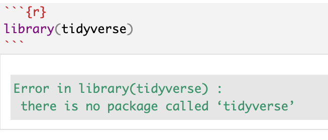
Then the package is not installed. You can download it with:
If you need a refresher on installing and loading packages, see loading libraries.
2.3 Gathering data
2.3.1 Finding data
For this lesson, we’re going to look at the names of horses in Switzerland, A very important topic that affects all of our lives. The data set can be found at:
https://tierstatistik.identitas.ch/en/equids-topNamesFemale.html
https://tierstatistik.identitas.ch/en/equids-topNamesMale.html
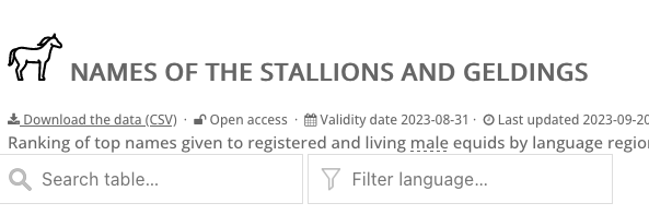
When we look at this data set, we can see that we have the option to “Download the data (CSV)” Do that, and put it in the same folder as your notebook. I usually keep my raw, untouched data in a sub-folder called “input_data”, but you can organize your files however you like.
2.3.2 Importing data
The first thing we should always do with any data we get is to just to open it up and take a look. You should see it in your file screen, and if you click on it, you’ll have the option to View File, which just opens it as a text file in RStudio.
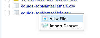
You can also do this in something like Notepad or VSCode if you prefer. It will look similar to this:
# Identitas AG. Validity: 2023-08-31. Evaluated: 2023-09-20
OwnerLanguage;Name;RankLanguage;CountLanguage;RankOverall;CountTotal
de;Luna;1;280;1;359
it;Luna;1;34;1;359
fr;Luna;2;45;1;359
it;Stella;2;26;2;159
de;Stella;4;104;2;159
fr;Stella;8;29;2;159
de;Fiona;2;114;3;153
it;Fiona;6;13;3;153
fr;Fiona;10;26;3;153
de;Cindy;2;114;4;131
Not very beautiful, but useful! Here are some things that we might notice:
- The first line is some meta-information that we don’t need. We don’t want to import that.
- This is in the form of a table. Each column of information is separated by a semicolon (;).
- The second row is the names of each column of information. We should treat this row as a header.
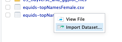
Fortunately, RStudio has all the tools we need to help you do this. We can get started by opening the “Import Dataset” dialog.
In the bottom left, you’ll see the import options. We’ll need to adjust some of them to make this work.
- We should set Skip: to 1, to skip that first line of metadata.
- The “Delimiter” is the thing that separates our data. For this dataset, we’ll use a semicolon.
- Make sure that “First Row as Names” is checked. This sets the column names.
- “equids_topNamesMale” will be an annoying name to type. Change the Name: to something more convenient.
Your option box should look like this:
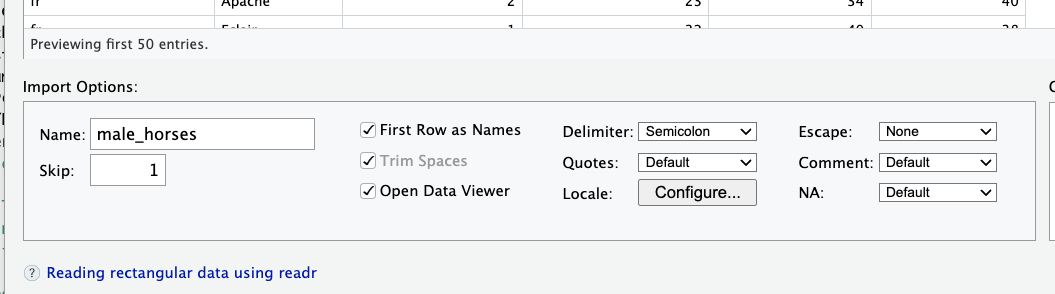
Figure 2.1: Every dataset is a little different, so you’ll have to learn to play around with different options.
If you’ve done everything correctly, you should see that the columns have been cleanly separated, and each column has a name.
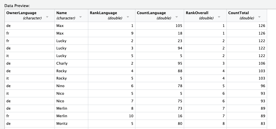
Figure 2.2: The data no longer looks like a mess, but a pretty readable table.
But don’t hit the import button! We want to focus on reproducibility, so we should make sure that our code runs without clicking these dialogues every time. Instead, copy the code from the code preview, and paste it into your source code.
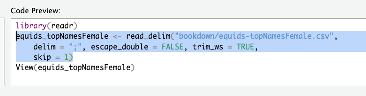
Figure 2.3: Copy this!
Do the same thing with the other horse data set. After this step, your code should look something like this:
2.4 Data pipelines
This symbol will be your new best friend:
All this does is take the results of your last step, and pass it to your next function. This allows us to do many small steps at once, and split up our data pipelines into small, readable steps.
We combine these with specially-made functions to arrange and organize our data.
You’ll be typing this a lot, and it’s really handy to use a keyboard shortcut for the pipe. By default, it is something like Ctrl-Shift-M, but may vary from keyboard to keyboard. You can check under:
Tools -> Global Options -> Code -> Editing -> Modify Keyboard Shortcuts -> Pipe
2.4.1 Head
The first of these special functions we’ll learn is head(), which just shows the first few lines of our data.

Figure 2.4: A head.
It’s useful for taking a look at really big datasets; let’s try it out with a pipe:
## # A tibble: 6 × 6
##   OwnerLanguage Name   RankLanguage CountLanguage RankOverall CountTotal
##   <chr>         <chr>         <dbl>         <dbl>       <dbl>      <dbl>
## 1 de            Luna              1           280           1        359
## 2 it            Luna              1            34           1        359
## 3 fr            Luna              2            45           1        359
## 4 it            Stella            2            26           2        159
## 5 de            Stella            4           104           2        159
## 6 fr            Stella            8            29           2        159
2.4.2 Count
Another useful function is count(), which gives the total number of rows, divided by the number of columns you select.
For example, if I wanted to know the total number of names in each language, I could pipe |> the OwnerLanguage into count.
THe output is always the input columns and n, which is the number of rows.
## # A tibble: 3 × 2
##   OwnerLanguage     n
##   <chr>         <int>
## 1 de               10
## 2 fr               10
## 3 it               11
2.4.3 Filter
This gives us a little preview of what we’re looking at, so new we can go ahead and search for the data that we want, by filtering out data that we don’t need.
One of the most important of these functions is filter(). Filtering only keeps the rows that we want, just like a coffee filter keeps only the liquid we want to drink, while getting rid of the gritty ground beans.
Figure 2.5: A filter.
Let’s say we wanted to find out the most common name for a horse with a German-speaking owner. Having looked at our data’s head, we can see that the column OwnerLanguage will tell us this information. To keep only the German data, we could use a filter like this:
## # A tibble: 10 × 6
## OwnerLanguage Name RankLanguage CountLanguage RankOverall CountTotal
## <chr> <chr> <dbl> <dbl> <dbl> <dbl>
## 1 de Luna 1 280 1 359
## 2 de Stella 4 104 2 159
## 3 de Fiona 2 114 3 153
## 4 de Cindy 2 114 4 131
## 5 de Fanny 9 86 6 118
## 6 de Lisa 6 92 7 114
## 7 de Nora 7 91 8 109
## 8 de Lara 10 85 9 105
## 9 de Sina 5 96 10 103
## 10 de Ronja 8 87 12 91That’s great, but what if we only wanted the top 3 names? We could use a second filter, with one piping into the next.
## # A tibble: 3 × 6
## OwnerLanguage Name RankLanguage CountLanguage RankOverall CountTotal
## <chr> <chr> <dbl> <dbl> <dbl> <dbl>
## 1 de Luna 1 280 1 359
## 2 de Fiona 2 114 3 153
## 3 de Cindy 2 114 4 131Even better, but those maybe we don’t need those other columns in our final analysis, so we can just select the ones that we need.
2.4.4 Select
Just like filter() filters out the rows that we want, select() can select only the columns that we want. We simply pass the names of the columns that we need, and only those will be taken.
In this example, we just want the top 3 horses, as well as the language count.
female_horses |>
filter(OwnerLanguage == "de") |>
filter(RankLanguage <= 3) |>
select(Name, CountLanguage)## # A tibble: 3 × 2
## Name CountLanguage
## <chr> <dbl>
## 1 Luna 280
## 2 Fiona 114
## 3 Cindy 114Great! But CountLanguage is kind of an awkward name. Can we rename it?
2.4.5 Rename
female_horses |>
  filter(OwnerLanguage == "de") |>
filter(RankLanguage <= 3) |>
select(Name, CountLanguage) |>
rename(Count = CountLanguage)## # A tibble: 3 × 2
## Name Count
## <chr> <dbl>
## 1 Luna 280
## 2 Fiona 114
## 3 Cindy 1142.4.6 Mutate
Much cleaner. However, sometimes we want to change something inside the cell. We can use mutate() to make new columns with slightly changed data, or replace a column that we have, using a function.
Maybe we want to make the names uppercase, like we are yelling at our horse. We already know that you can use toupper to change some text, like so:
## [1] "YELLING"To apply this to our data, we can use the mutate(), like so:
female_horses |>
  filter(OwnerLanguage == "de") |>
  filter(RankLanguage <= 3) |>
select(Name, CountLanguage) |>
rename(Count = CountLanguage) |>
mutate(loud_name = toupper(Name))## # A tibble: 3 × 3
## Name Count loud_name
## <chr> <dbl> <chr>
## 1 Luna 280 LUNA
## 2 Fiona 114 FIONA
## 3 Cindy 114 CINDYWe can even overwrite the original column with mutate, instead of making a new one:
female_horses |>
  filter(OwnerLanguage == "de") |>
  filter(RankLanguage <= 3) |>
  select(Name, CountLanguage) |>
rename(Count = CountLanguage) |>
mutate(Name = toupper(Name))## # A tibble: 3 × 2
## Name Count
## <chr> <dbl>
## 1 LUNA 280
## 2 FIONA 114
## 3 CINDY 114Soon, we will combine this with the male dataset, but we need to remember if each of these names is for a mare or a stallion. We can simply mutate a new column with the sex of the horse.
female_horses |>
  filter(OwnerLanguage == "de") |>
  filter(RankLanguage <= 3) |>
  select(Name, CountLanguage) |>
  rename(Count = CountLanguage) |>
mutate(Name = toupper(Name)) |>
mutate(Sex = "F")## # A tibble: 3 × 3
## Name Count Sex
## <chr> <dbl> <chr>
## 1 LUNA 280 F
## 2 FIONA 114 F
## 3 CINDY 114 FPretty clean, I’m happy with that! However, we never saved this data as a variable, it’s only getting displayed on the screen. Out last step is to use <- to create a variable. In this case, we call our new data frame german_mares.
german_mares <- female_horses |>
filter(OwnerLanguage == "de") |>
filter(RankLanguage <= 3) |>
select(Name, CountLanguage) |>
rename(Count = CountLanguage) |>
mutate(Name = toupper(Name)) |>
mutate(Sex = "F")Note that nothing shows up when you type this, because we haven’t told R to show it to us. If you’re feeling paranoid, just type the name of a variable and it will print.
## # A tibble: 3 × 3
##   Name  Count Sex
##   <chr> <dbl> <chr>
## 1 LUNA    280 F
## 2 FIONA   114 F
## 3 CINDY 114 F2.4.7 Rbind
The mares are ready, but what about the stallions? With a little copy-paste, we can simply re-do the same process for the males:
german_stallions <- male_horses |> # This line is different.
  filter(OwnerLanguage == "de") |>
  filter(RankLanguage <= 3) |>
  select(Name, CountLanguage) |>
  rename(Count = CountLanguage) |>
  mutate(Name = toupper(Name))  |>
  mutate(Sex = "M") # This line is different.

german_stallions
## # A tibble: 3 × 3
## Name Count Sex
## <chr> <dbl> <chr>
## 1 MAX 105 M
## 2 LUCKY 94 M
## 3 CHARLY 95 MOur next step is to combine the two datasets into one. We can do this with rbind(), which is short for row-bind. It adds one dataset to another, vertically. We pass the second dataset as an argument, and it plops them one on top of another.
## # A tibble: 6 × 3
##   Name   Count Sex
##   <chr>  <dbl> <chr>
## 1 LUNA     280 F
## 2 FIONA    114 F
## 3 CINDY    114 F
## 4 MAX      105 M
## 5 LUCKY     94 M
## 6 CHARLY    95 M
2.5 Classwork: Cleaning a dataset
The dataset for cattle is arranged differently. Can you figure out how to produce the same final table for German cows?
The raw data can be found here:
https://tierstatistik.identitas.ch/en/cattle-NamesFemaleCalves.html
https://tierstatistik.identitas.ch/en/cattle-NamesMaleCalves.html
Hint: we only need the current year here.
2.6 Graphics with GGplot.
Our second task for today will be to make a simple graph for this data, which we will also do with the tidyverse. For this, we’ll use ggplot()
G.G. stands for Grammar of Graphics, to plot just means to make a graph or chart.
To start, we’ll pipe our horses dataset into ggplot(). From here, we can start building our charts. As you can see, we currently have a plot, but there’s nothing there!

This is because every ggplot needs at least 3 things:
- Data (We have already piped this into GGplot)
- Aesthetics (What data should go with which visual properties)
- Geometry (What the visualization should look like)
We have our data, but let’s add the next two:
2.6.1 Aesthetics
Our first task is to define the aesthetics, what something should look like. We do this with the aes() function, which goes inside our ggplot function.
First, we can define what goes on the X axis, and what goes on the Y axis.
This is slightly better, but there’s still nothing there.
2.6.2 Geometry
The easiest way to solve this problem is to use different pre-made chart recipes. GGPlot comes with many different options, and can make any kind of visualization you could want.
If you’re looking for a way to chart something, you can always check the ggplot reference manual here:
https://ggplot2.tidyverse.org/reference/index.html
Or do a quick search for different types of visualization. This site looks good:
http://r-statistics.co/Top50-Ggplot2-Visualizations-MasterList-R-Code.html
Here are two easy options that we could use in our case:

2.6.3 Fill and color
X and Y aren’t the only thing we can define in our aes() function. It might be helpful here to make the mares and stallions different colors. We can do that with color=, which changes the line around each element, or fill==, which fills in the element with a color. For example:
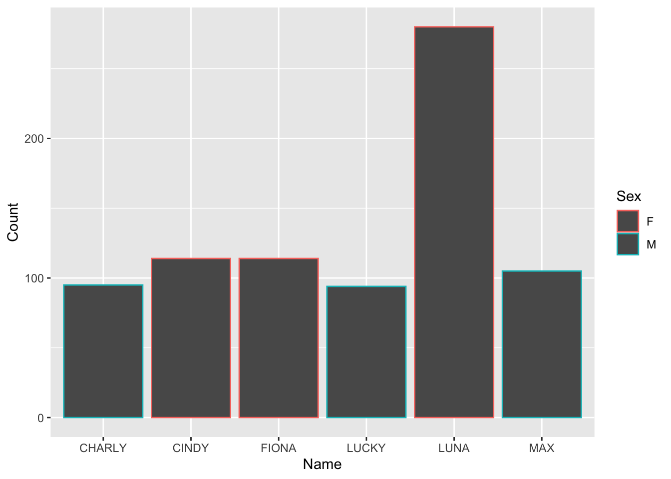
Color is not especially helpful here, only the border was changed.
Fill is much better, and more clearly shows the names of the cows.
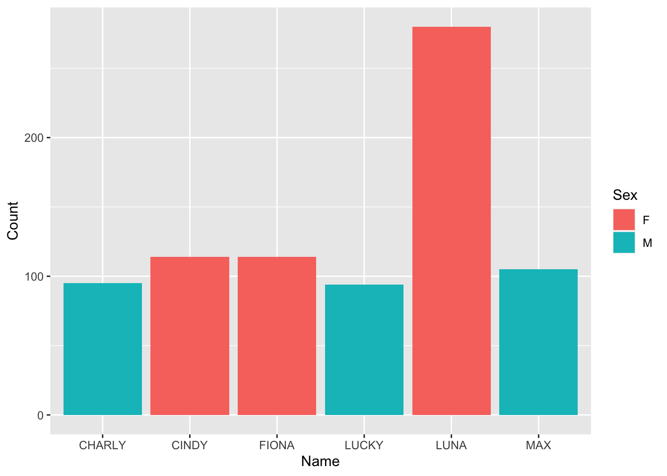
2.7 Labels
This is good, but your charts should always have some labels to tell you what is what. We can add this to our ggplot with the labs() option. Here, we give it a title, and new labels for the X and Y axes.
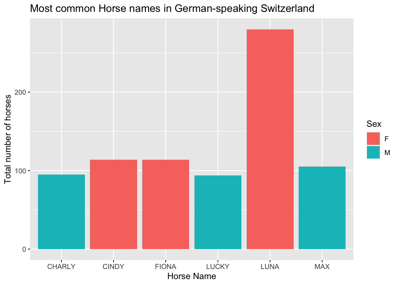
all_horses |>
  ggplot(aes(x = Name, y= Count, fill=Sex)) +
geom_col() +
labs(
x="Horse Name",
y="Total number of horses",
title = "Most common Horse names in German-speaking Switzerland"
)
2.8 Saving our plots
Once we’re happy with our plot, we can save it for use elsewhere. to do this, we just need to use the ggsave() option, and give it a file name.
For example:
all_horses |>
  ggplot(aes(x = Name, y= Count, fill=Sex)) +
  geom_col() +
  labs(
    x="Horse Name",
    y="Total number of horses",
    title = "Most common Horse names in German-speaking Switzerland"
    )
ggsave(filename="horse_plot.png")Now, horse_plot.png should be in your main folder!
Why do we need paste() and paste0()? Why do 10**4 and 10^4 do the same thing?↩︎
Both .r and .R are acceptable endings, but you’ll see .R more often↩︎
All it is telling you, for example, is that the stats package has a function called filter(), but we’ve replaced it with a different function, also called filter().↩︎