Chapter 9 Publication-Ready Graphics
## ── Attaching core tidyverse packages ──────────────────────── tidyverse 2.0.0 ──
## ✔ dplyr     1.1.3     ✔ readr     2.1.4
## ✔ forcats   1.0.0     ✔ stringr   1.5.0
## ✔ ggplot2   3.4.3     ✔ tibble    3.2.1
## ✔ lubridate 1.9.2     ✔ tidyr     1.3.0
## ✔ purrr     1.0.2
## ── Conflicts ────────────────────────────────────────── tidyverse_conflicts() ──
## ✖ dplyr::filter() masks stats::filter()
## ✖ dplyr::lag()    masks stats::lag()
## ℹ Use the conflicted package (<http://conflicted.r-lib.org/>) to force all conflicts to become errors##
## Attaching package: 'rvest'
##
## The following object is masked from 'package:readr':
##
## guess_encodingGGplot is a package for making graphics in R.
It’s based on the grammar of graphics, an idea that was first proposed by Leland Wilkinson in 1999. It states that there are a limited number of components that make up a graphic, and that these components can be combined in different ways to produce different graphics.
9.1 Review: GGplot
Thinking back to chapter 3, we can see that there are a number of components that make up a graphic:
- Data, the information that needs to be represented
- Geometry, the way that the data is represented as a shape
- Aesthetics, the way that the data is mapped to the geometry
For our first examples, we’ll use a dataset on Swiss energy production from different sources.
## Rows: 21033 Columns: 3
## ── Column specification ────────────────────────────────────────────────────────
## Delimiter: ","
## chr  (1): Energietraeger
## dbl  (1): Produktion_GWh
## date (1): Datum
##
## ℹ Use `spec()` to retrieve the full column specification for this data.
## ℹ Specify the column types or set `show_col_types = FALSE` to quiet this message.## # A tibble: 6 × 3
## Datum Energietraeger Produktion_GWh
## <date> <chr> <dbl>
## 1 2014-01-01 Flusskraft 26
## 2 2014-01-01 Kernkraft 80.1
## 3 2014-01-01 Speicherkraft 23.1
## 4 2014-01-01 Thermische 10.3
## 5 2014-01-02 Flusskraft 26
## 6 2014-01-02 Kernkraft 80.1plt <- strom |> ## Data
# This is the data that we want to represent
ggplot(aes(x = Energietraeger, y = Produktion_GWh)) + ## Aesthetics
# We here decide that the energy source will be represented on the x-axis,
# and the output per day will be represented on the y-axis.
geom_jitter(width = 0.2, size = 0.1) ## Geometry:
# This is the way that the data is visually represented
show(plt)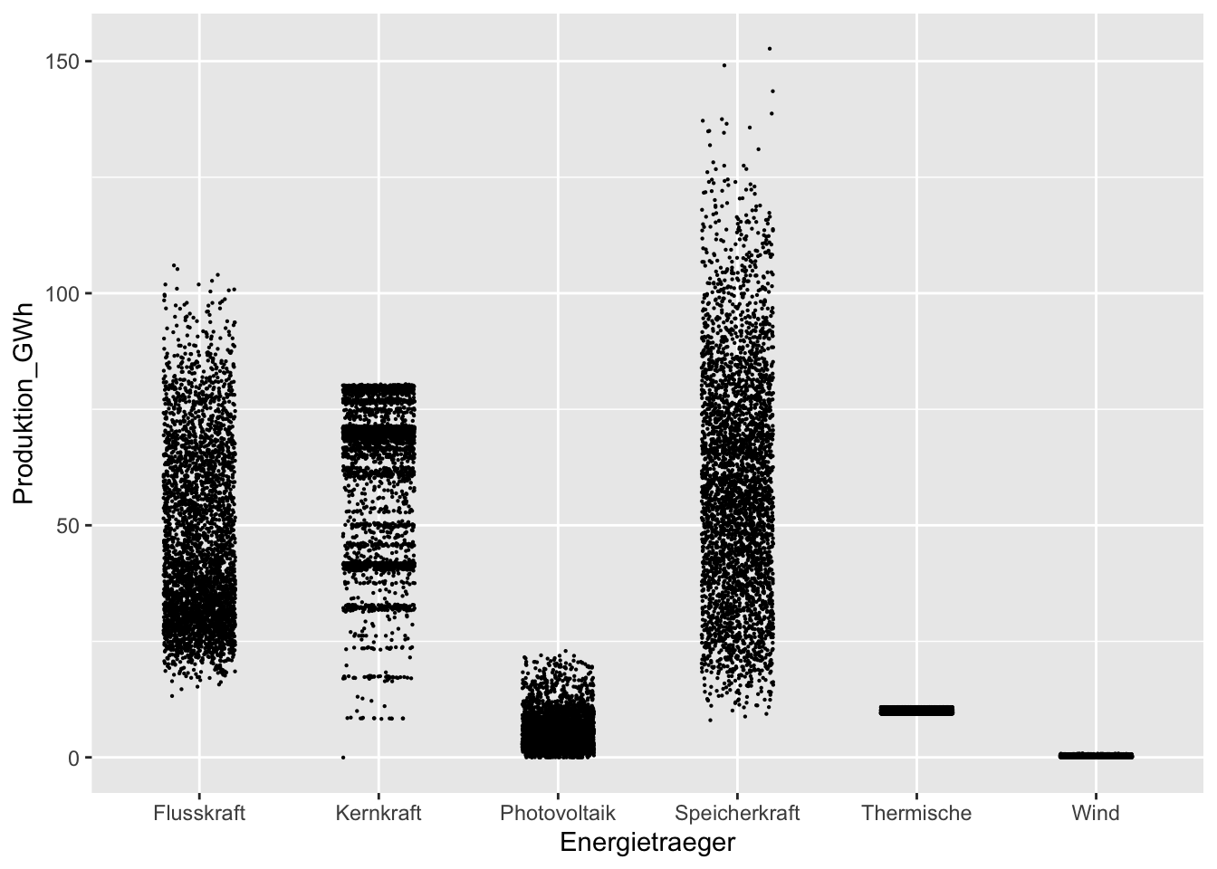
plt <- strom |>
ggplot(aes(x = Energietraeger, y = Produktion_GWh)) +
geom_boxplot() # Only this line changed.
show(plt)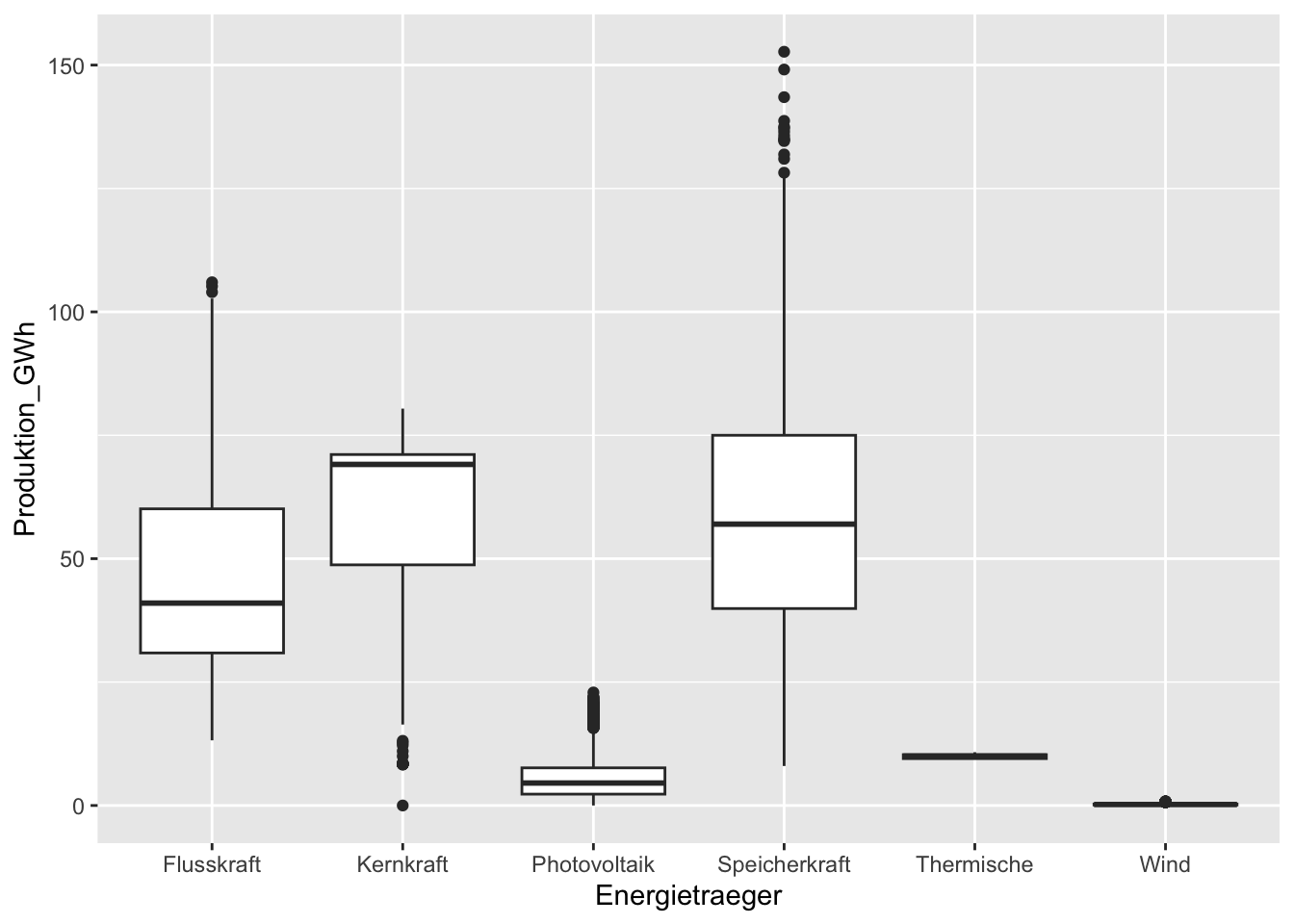 Simply be changing this geometry, we change the plot that is created.
Creating these geom_* objects is beyond the scope of this course, but there are so many
pre-made ones that you can use to create different graphics.
Simply be changing this geometry, we change the plot that is created.
Creating these geom_* objects is beyond the scope of this course, but there are so many
pre-made ones that you can use to create different graphics.
9.2 Grouping and combining data
We can use multiple data sets, aesthetics, and geometries on the same plot, as ggplot is very flexible in where you add different sections.
For example, I want both a smoothed line chart by day with geom_smooth(),
with a different color for each source of energy, but points for each data point,
but with no color info. We could apply separate aesthetics to each geometry.
strom |>
  ggplot() +
  geom_point(aes(x = Datum, y = Produktion_GWh), size = 0.1, color = "#00000033") +
  geom_smooth(aes(x = Datum, y = Produktion_GWh, color = Energietraeger))
## `geom_smooth()` using method = 'gam' and formula = 'y ~ s(x, bs = "cs")'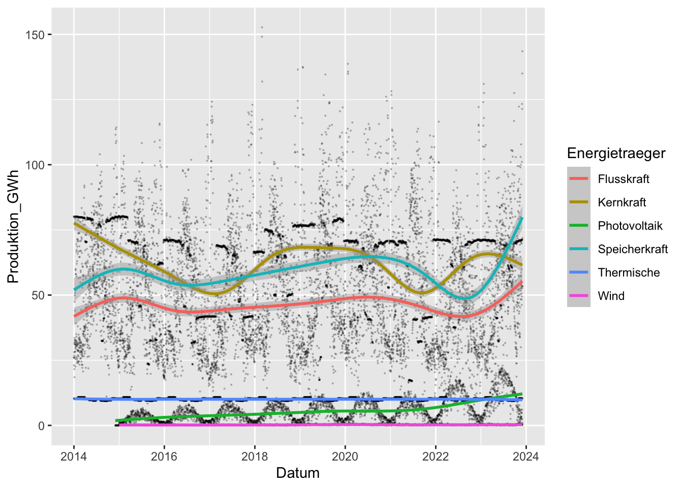 ## Faceting
This is a bit messy, so a handy way to clean it up is to use faceting. Faceting is a way to split up the data into different plots, based on some variable.
For example, we can split up the data by energy source, and plot each one separately.
We do this with facet_wrap(). The facets= argument is the variable that we want to split up by,
and the ncol= argument is the number of columns that we want to use. The facet argument
must be wrapped in vars(), which is a function that tells ggplot that it’s a variable name.
strom |>
  ggplot() +
  geom_point(aes(x = Datum, y = Produktion_GWh), size = 0.1, color = "#00000033") +
  geom_smooth(aes(x = Datum, y = Produktion_GWh, color = Energietraeger)) +
  facet_wrap(facets = vars(Energietraeger), ncol = 3)
## `geom_smooth()` using method = 'gam' and formula = 'y ~ s(x, bs = "cs")'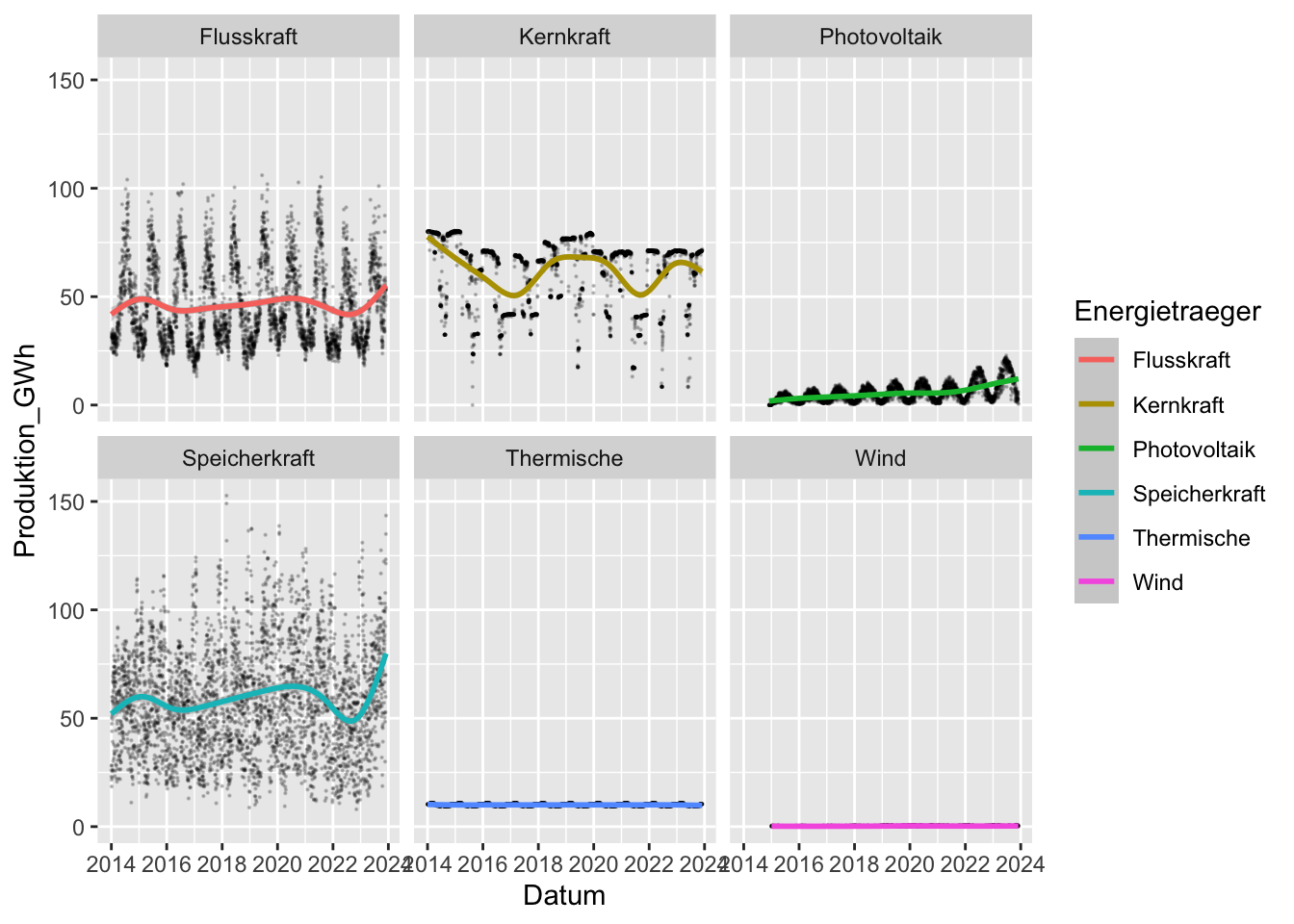
9.3 Classwork: Making whatever plot you want
I’ve downloaded a historical data set of Swiss newspapers according to political orientation in Switzerland over the past century, and cleaned the data for you (you’re welcome).
The original data comes from Historical Statistics of Switzerland, which has lots of interesting data sets in really hard-to-work-with formats.
Run this code, then make a plot of your choice. Make it look good.
If you prefer, you can also download and plot whatever else you like, but try not to take too much time.
library(readxl)

newspaper_ct <-
  read_excel("newspaper_ct.xlsx", range = "A4:AA56") |>
  mutate(political_orientation = case_when(str_detect(ZH, "[A-Z]") ~ ZH)) |>
  fill(political_orientation, .direction = "down") |>
  filter(!is.na(BE)) |>
  mutate(ZH = as.numeric(ZH)) |>
  mutate(political_orientation = str_extract(political_orientation, ".* /")) |>
  mutate(political_orientation = str_replace_all(political_orientation, " /", "")) |>
  select(!CH) |>
  pivot_longer(cols = ZH:GE, names_to = "canton", values_to = "newspaper_ct") |>
  mutate(newspaper_ct = replace_na(newspaper_ct, 0)) |>
  filter(political_orientation != "Gesamtzahl der Zeitungen") |>
  filter(political_orientation != "Gesamte Zeitungsauflage (in 1000)")

newspaper_ct |> sample_n(10)
## # A tibble: 10 × 4
## Jahr political_orientation canton newspaper_ct
## <chr> <chr> <chr> <dbl>
## 1 1896 Politisch neutrale Zeitungen BE 6
## 2 1930 Sozialdemokratische Zeitungen SH 1
## 3 1896 Freisinnig-demokratische Zeitungen SG 14
## 4 1896 Bürgerliche und bürgerlich-bäuerliche Zeitungen SG 1
## 5 1896 Liberal-konservative Zeitungen TI 1
## 6 1913 Politisch neutrale Zeitungen ZH 4
## 7 1913 Demokratische Zeitungen OW 0
## 8 1913 Bürgerliche und bürgerlich-bäuerliche Zeitungen UR 0
## 9 1913 Freisinnig-demokratische Zeitungen LU 6
## 10 1913 Politisch neutrale Zeitungen OW 09.4 Themes
Once you’ve used ggplot for a little while, you’ll start noticing the default theme everywhere in the wild. It’s a well-done, neutral look, but you should strive to do a little better than the default.
There are lots of themes that you can use, and you can also create your own. To demonstrate the different themes, we’ll use the same plot, but with different themes.
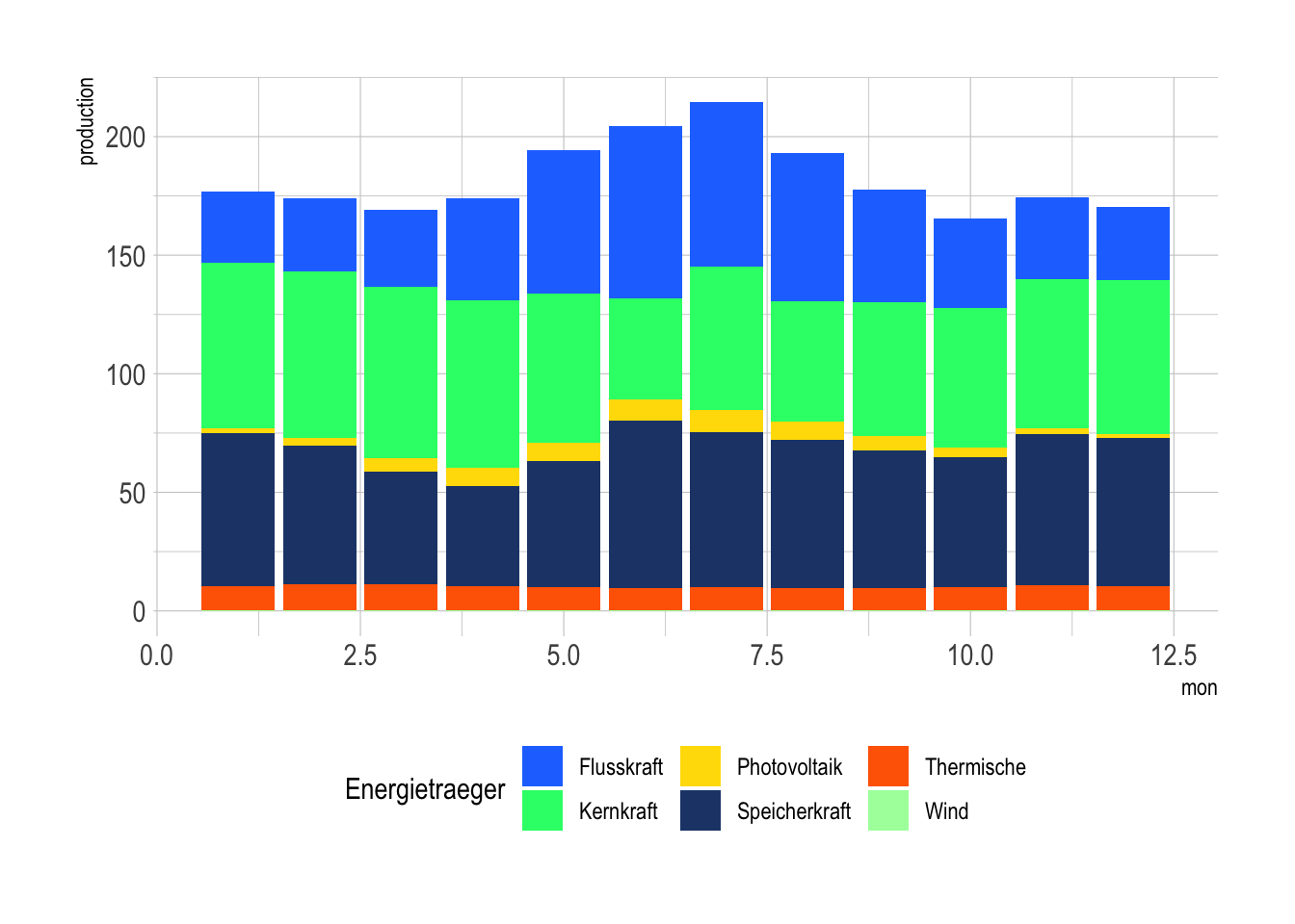
First, I’ll summarise the electricty production by month and energy source.
strom_by_year <- strom |>
  mutate(mon = month(Datum)) |>
  group_by(Energietraeger, mon) |>
  summarise(production = mean(Produktion_GWh))
## `summarise()` has grouped output by 'Energietraeger'. You can override using
## the `.groups` argument.Then, I’ll make a stacked bar chart, which shows the total production per month, averaged over the 10 years of our data set.
strom_by_year |>
ggplot(aes(x = mon, y = production, fill = Energietraeger)) +
geom_col(position = "stack")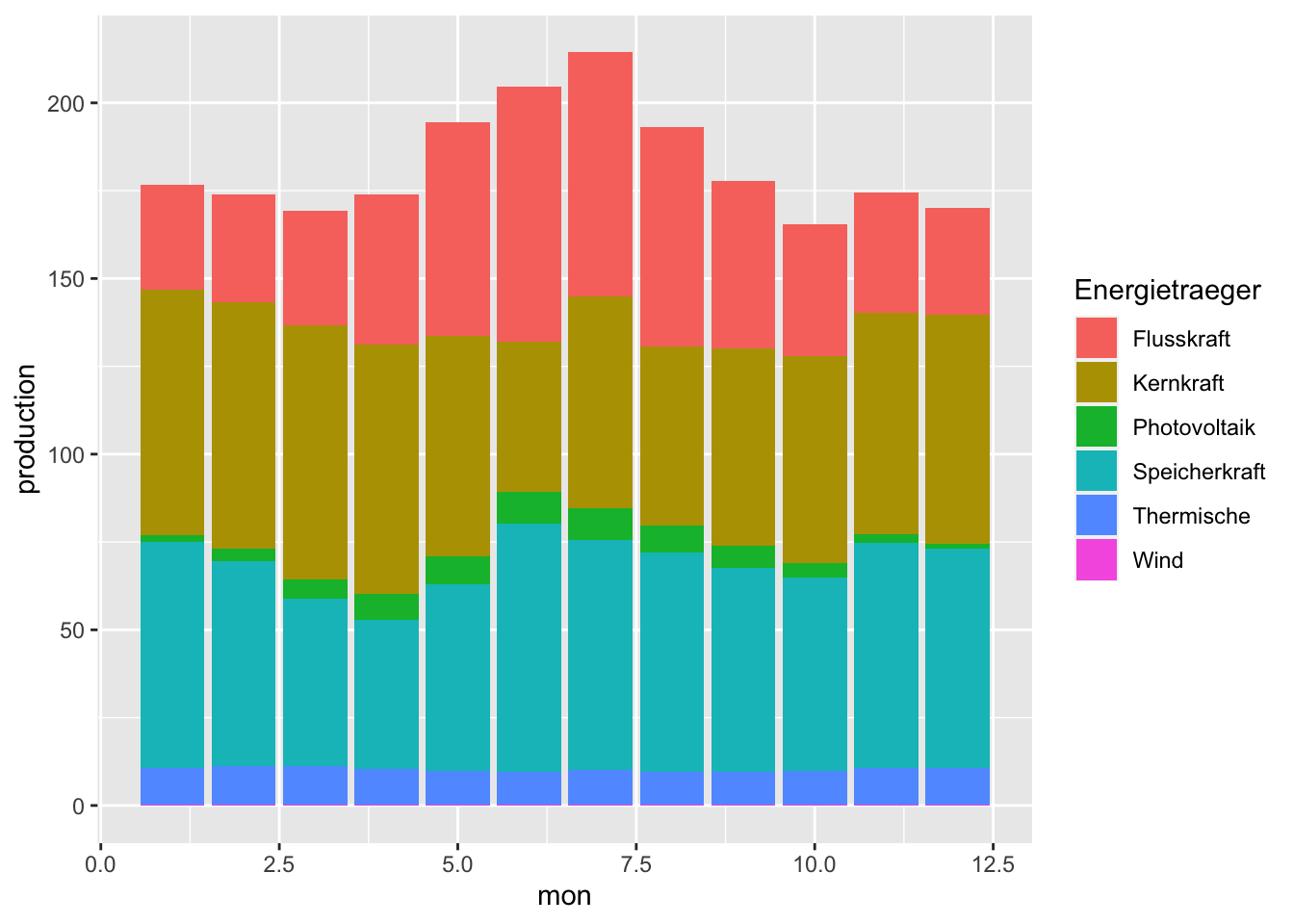 Not bad looking, but we can do better.
A simple upgrade might be theme_light(), which gets rid of the grey background,
always nice for print publications.
strom_by_year |>
  ggplot(aes(x = mon, y = production, fill = Energietraeger)) +
  geom_col(position = "stack") +
  theme_light()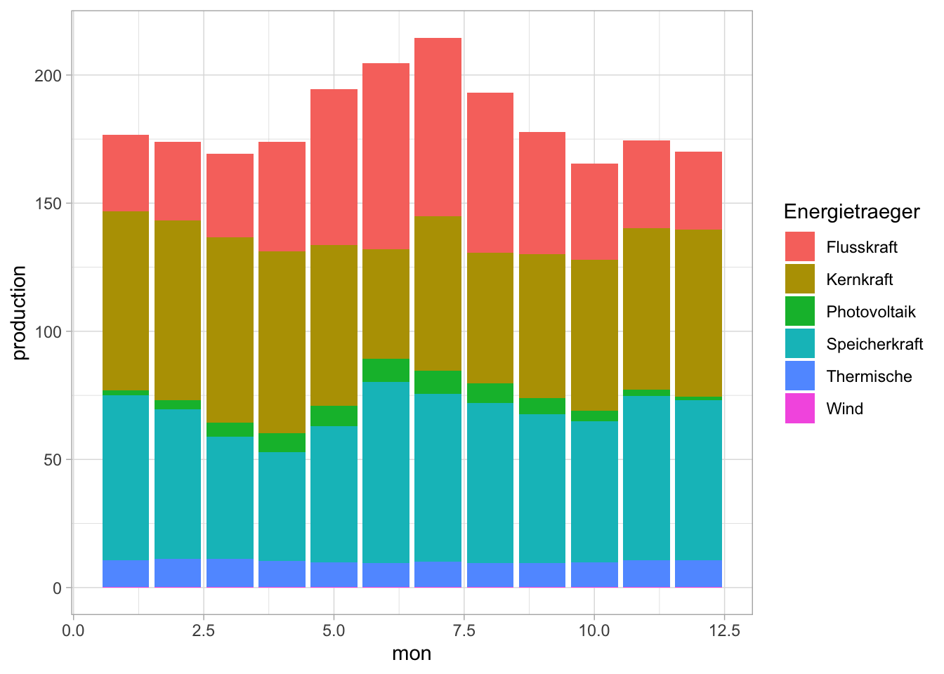
theme_void() is a nice one for when you want to eliminate as much as possible from the plot.
strom_by_year |>
  ggplot(aes(x = mon, y = production, fill = Energietraeger)) +
  geom_col(position = "stack") +
  theme_void()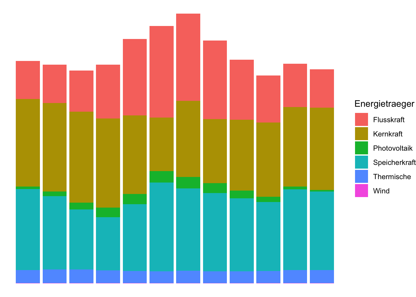
Some packages exist to supply nice themes for ggplot. For example, ggdark is a nice one for dark mode.
library(ggdark)

strom_by_year |>
  ggplot(aes(x = mon, y = production, fill = Energietraeger)) +
  geom_col(position = "stack") +
  dark_mode()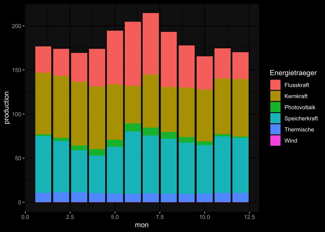
One that I use most often for publication-ready graphics is the package hrbrthemes
and the theme theme_ipsum(). It feels so clean and smooth,
and exports with a transparent background, great for putting into a publication.
library(hrbrthemes)

strom_by_year |>
  ggplot(aes(x = mon, y = production, fill = Energietraeger)) +
  geom_col(position = "stack") +
  theme_ipsum()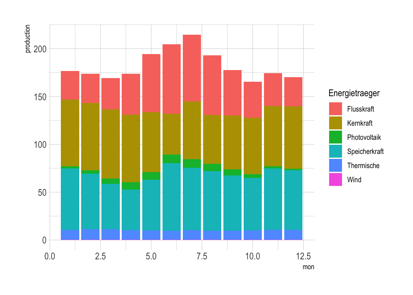
In addition to these pre-made themes, you can also use theme() to make your own
themes, or add to existing themes. For example, I like to add a legend to the bottom
of my plots, so I’ll add that to the theme_ipsum() theme.
In almost all cases, you’ll want to add the theme() call at the end of your plot,
strom_by_year |>
  ggplot(aes(x = mon, y = production, fill = Energietraeger)) +
  geom_col(position = "stack") +
  theme_ipsum() +
  theme(legend.position = "bottom")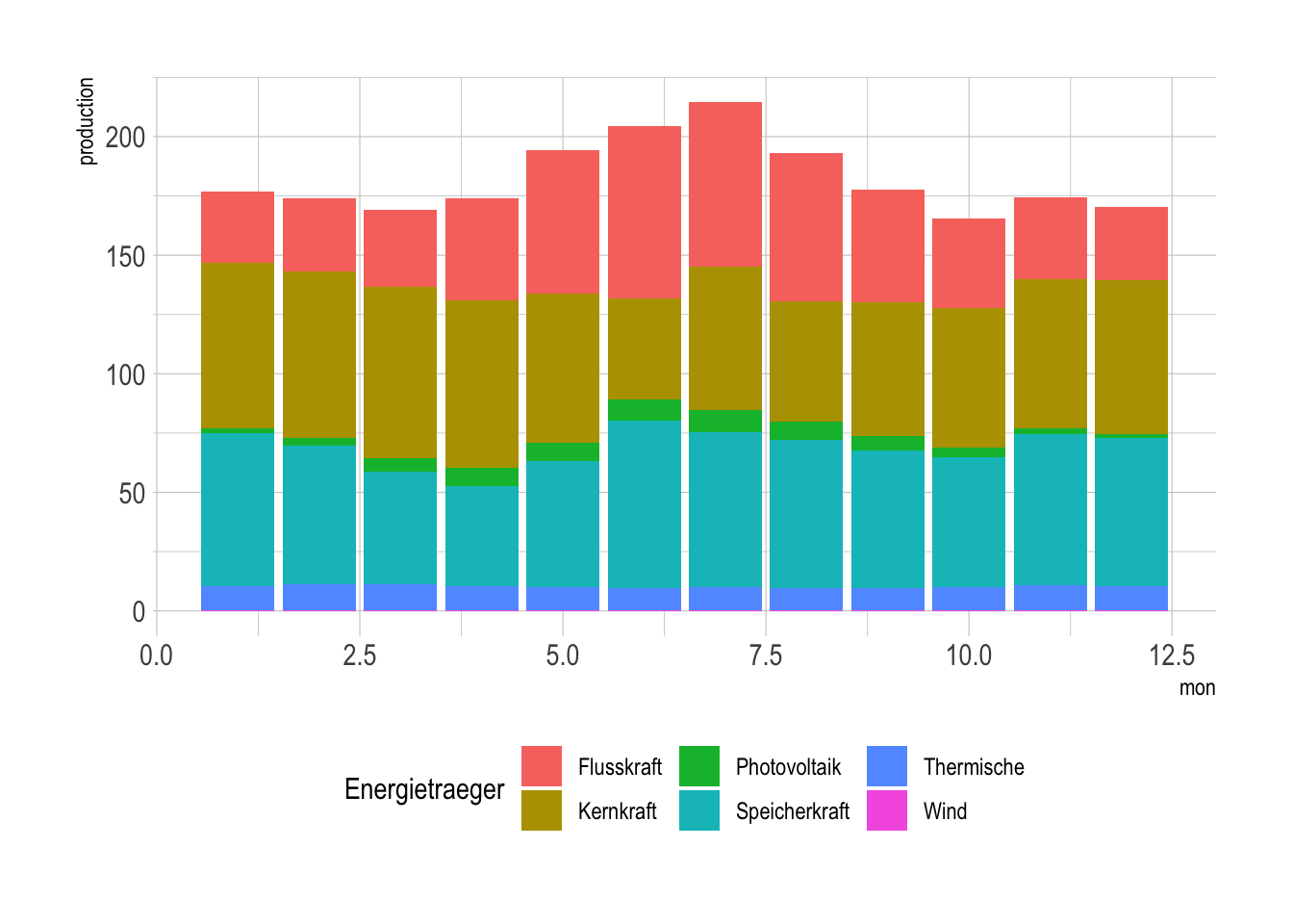
9.5 Color palettes
Another thing that you’ll want to change from the default is the color palette. The default palette is a rainbow, which is not great for a number of reasons. First, it’s not colorblind friendly, and second, it’s not great for printing in black and white.
There are a number of color palettes that you can use, and you can also create your own.
For example, the viridis package has a number of color palettes that are colorblind friendly,
and also look good in black and white.
## Loading required package: viridisLitestrom_by_year |>
ggplot(aes(x = mon, y = production, fill = Energietraeger)) +
geom_col(position = "stack") +
theme_ipsum() +
theme(legend.position = "bottom") +
scale_fill_viridis_d()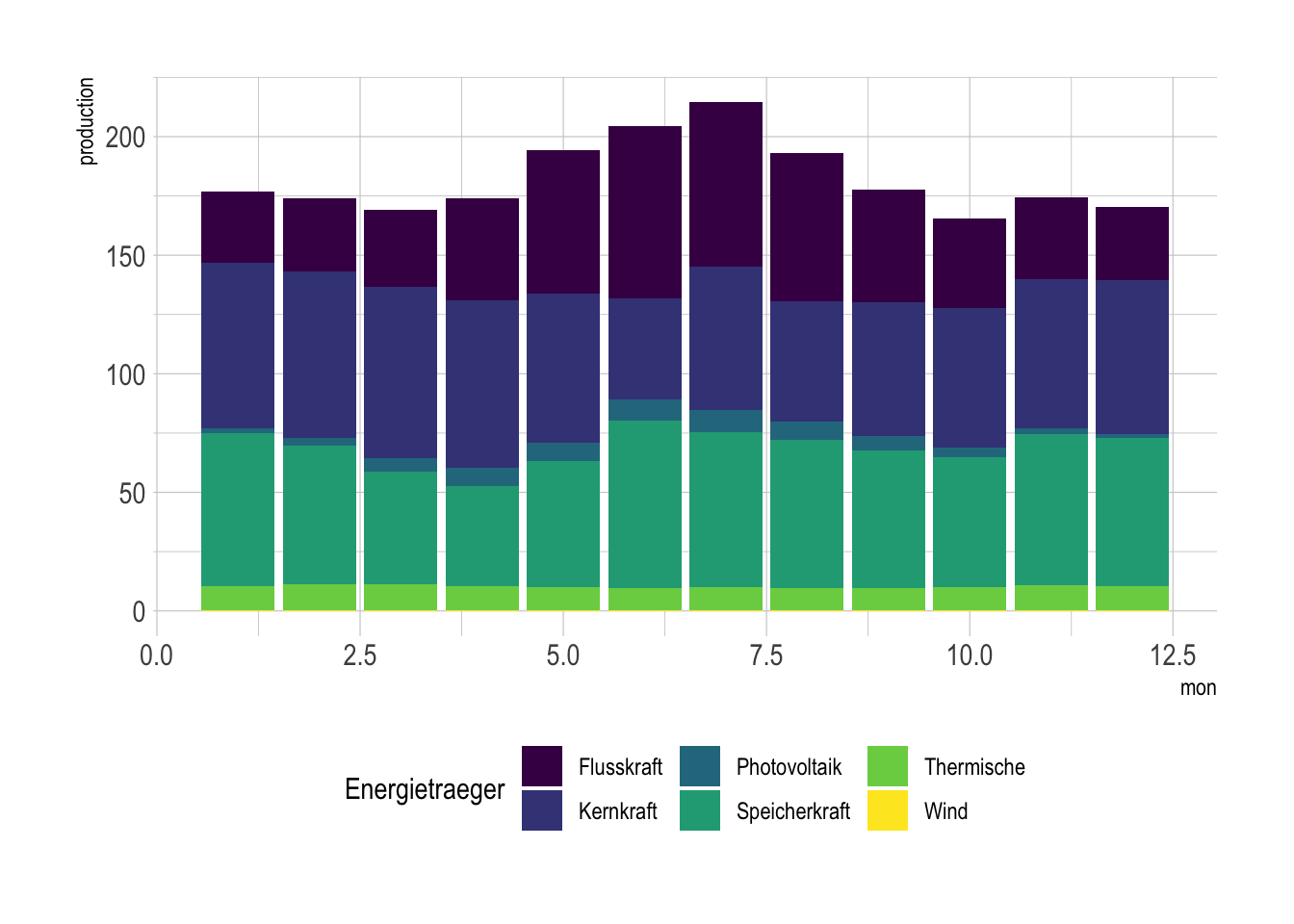
Also popular is the RColorBrewer package, which contains a lot of
nice color palettes that you can preview at colorbrewer2.org.
library(RColorBrewer)

strom_by_year |>
  ggplot(aes(x = mon, y = production, fill = Energietraeger)) +
  geom_col(position = "stack") +
  theme_ipsum() +
  theme(legend.position = "bottom") +
  scale_color_brewer(palette = "Set3", aesthetics = "fill")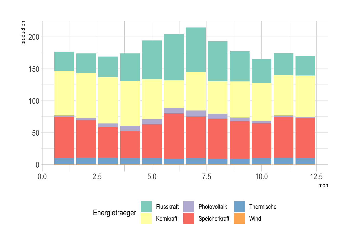
You can also create your own color palettes. using scale_fill_manual() to specify the fill values that you want to use.
You can use hex codes, or the names of colors. Eventually, you’ll get good enough with hex codes to just YOLO it, but you could also use a color picker to get the exact colors, such as this one from Adobe.
strom_by_year |>
  ggplot(aes(x = mon, y = production, fill = Energietraeger)) +
  geom_col(position = "stack") +
  theme_ipsum() +
  theme(legend.position = "bottom") +
  scale_fill_manual(
    values = c("#2277ff", "#22ff77", "#ffdd00", "#224477", "#ff6600", "#aaffaa")
  )
9.6 Maps!
Making maps is a whole art form, but R is surprisingly good at making simple ones.
We’ll use the sf package to make maps, along with ggspatial to plot them.
## Linking to GEOS 3.11.0, GDAL 3.5.3, PROJ 9.1.0; sf_use_s2() is TRUEThe most complicated part of this is actually getting the geographic data.
For our purposes, we’ll use the rnaturalearth package, but you might have to
download your own data for your own purposes.
A map is just another form of geometry, so we can use geom_sf() to plot it,
and use the same aesthetics as we would for any other geometry.
## Support for Spatial objects (`sp`) will be deprecated in {rnaturalearth} and will be removed in a future release of the package. Please use `sf` objects with {rnaturalearth}. For example: `ne_download(returnclass = 'sf')`africa <- ne_countries(scale = 10, continent = "africa", returnclass = "sf")
africa |>
ggplot(aes(fill = pop_est)) +
geom_sf()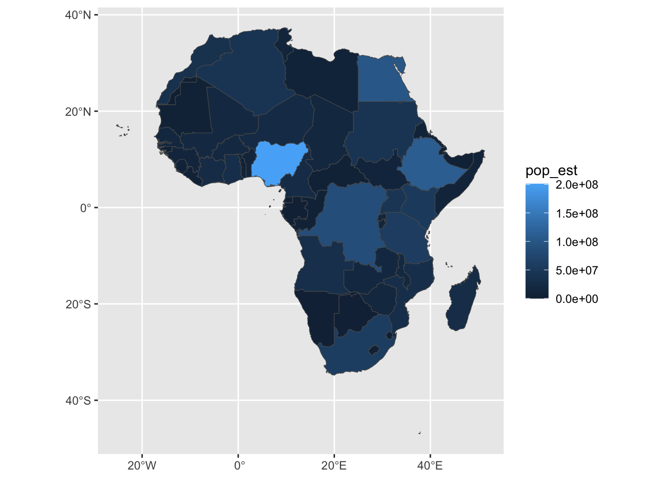
However, for this little demo, I want to crop the map a little more closely.
9.6.1 Map bounding boxes
The problem is that we’re using the default map projection, which is Mercator. This is a very common map projection, but it’s not great for our purposes.
The first thing we can do is set the extents of our map to some more
reasonable values. We can do this with coord_sf(). The numbers here come
from the geographic coordinates of the corners of Africa, eyeballed from the last map.
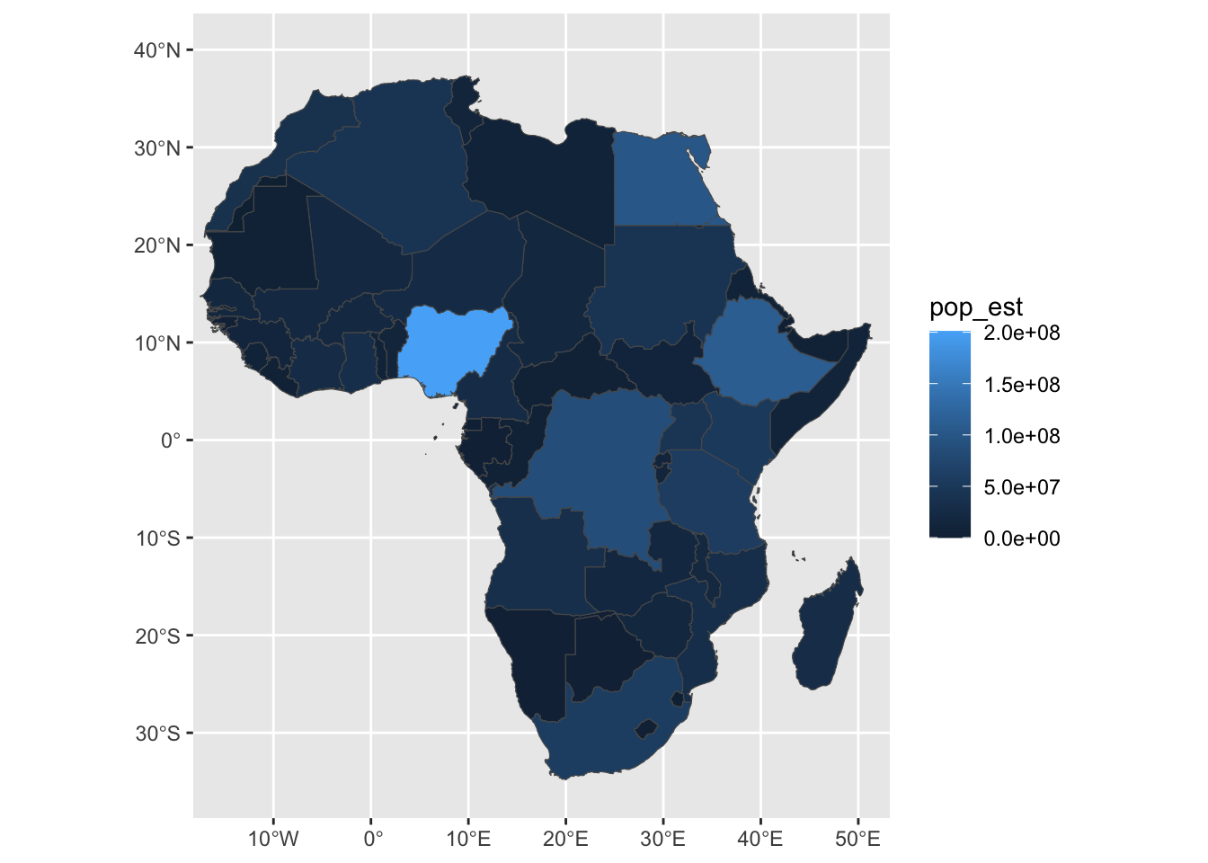
My African geography could use some work, so I’ll also add some labels to the map.
We do this by adding a geom_sf_label() layer to the plot,
as well as a label= aesthetic to the aes() call.
africa |>
  ggplot(aes(fill = pop_est, label = name_ciawf)) +
  geom_sf() +
  coord_sf(xlim = c(-15, 50), ylim = c(-35, 40)) +
  geom_sf_label()
## Warning in st_point_on_surface.sfc(sf::st_zm(x)): st_point_on_surface may not
## give correct results for longitude/latitude data## Warning: Removed 2 rows containing missing values (`geom_label()`).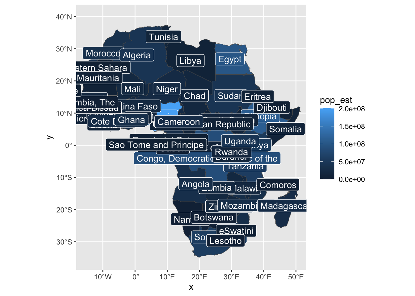
This is, however, a little crowded, so we can first make a new column to only
include the most populous countries, those over 30 million (3e7) inhabitants.
africa <- africa |> mutate(
  label_name = case_when(
    pop_est > 3e7 ~ name,
    .default = NA
  )
)

africa |>
  ggplot(aes(fill = pop_est, label = label_name)) +
  geom_sf() +
  coord_sf(xlim = c(-15, 50), ylim = c(-35, 40)) +
  geom_sf_label()
## Warning in st_point_on_surface.sfc(sf::st_zm(x)): st_point_on_surface may not
## give correct results for longitude/latitude data## Warning: Removed 41 rows containing missing values (`geom_label()`).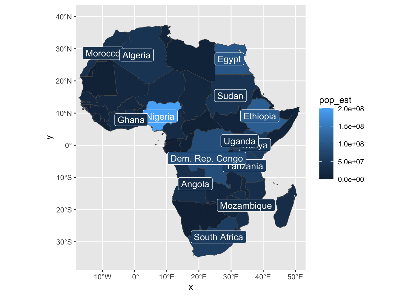
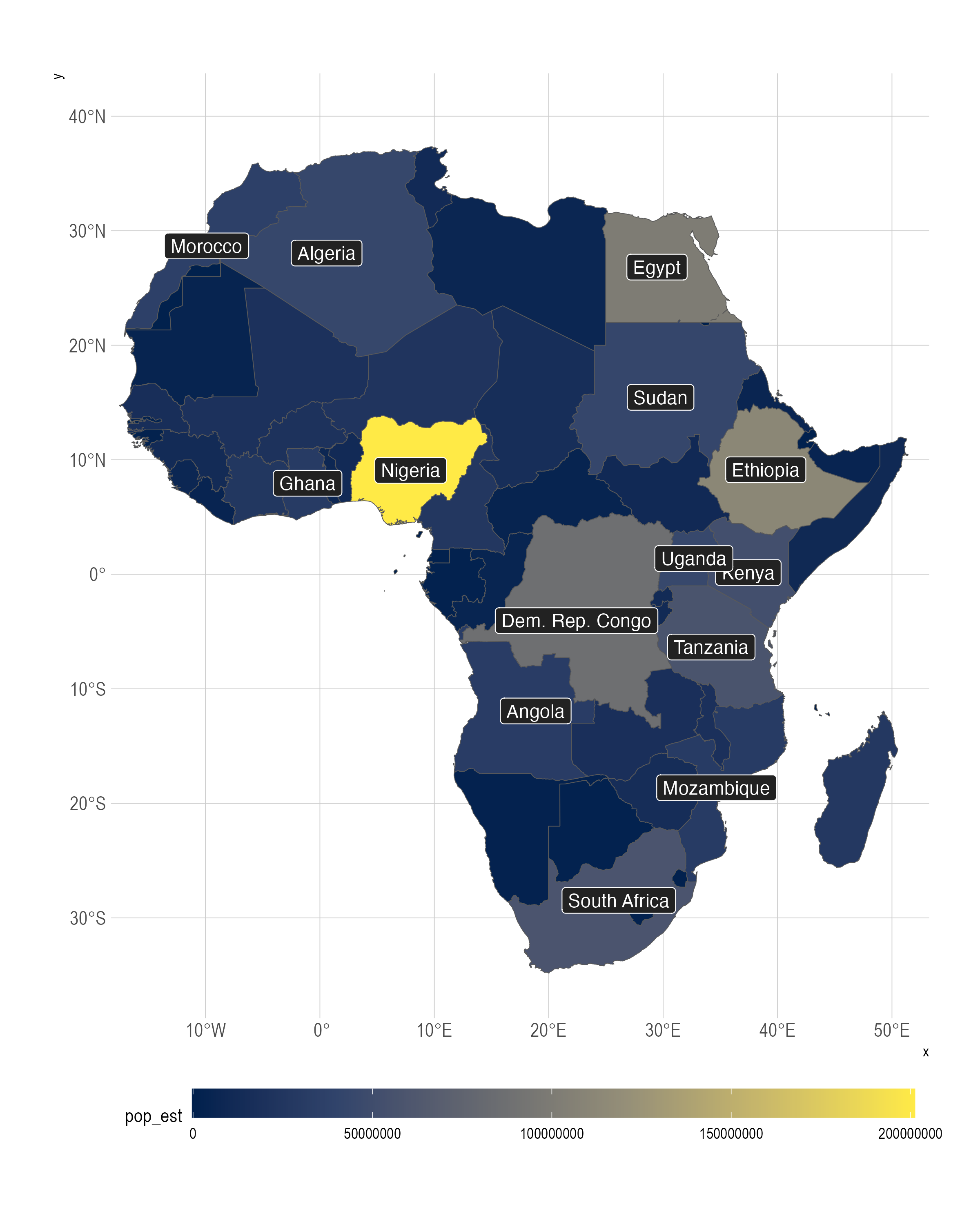
With a little messing around, we can get a decent looking map, without having to leave our little RStudio bubble.
Remember that for scale and stuff, you should look at the final output, not the little map preview in RStudio.
options(scipen = 999)

africa |>
  ggplot(aes(fill = pop_est, label = label_name)) +
  geom_sf() +
  coord_sf(xlim = c(-15, 50), ylim = c(-35, 40)) +
  geom_sf_label(fill = "#222222") +
  theme_ipsum() +
  theme(
    legend.position = "bottom",
    legend.key.width = unit(3, "cm")
  ) +
  scale_fill_viridis_c(option = "E")
## Warning in st_point_on_surface.sfc(sf::st_zm(x)): st_point_on_surface may not
## give correct results for longitude/latitude data## Warning: Removed 41 rows containing missing values (`geom_label()`).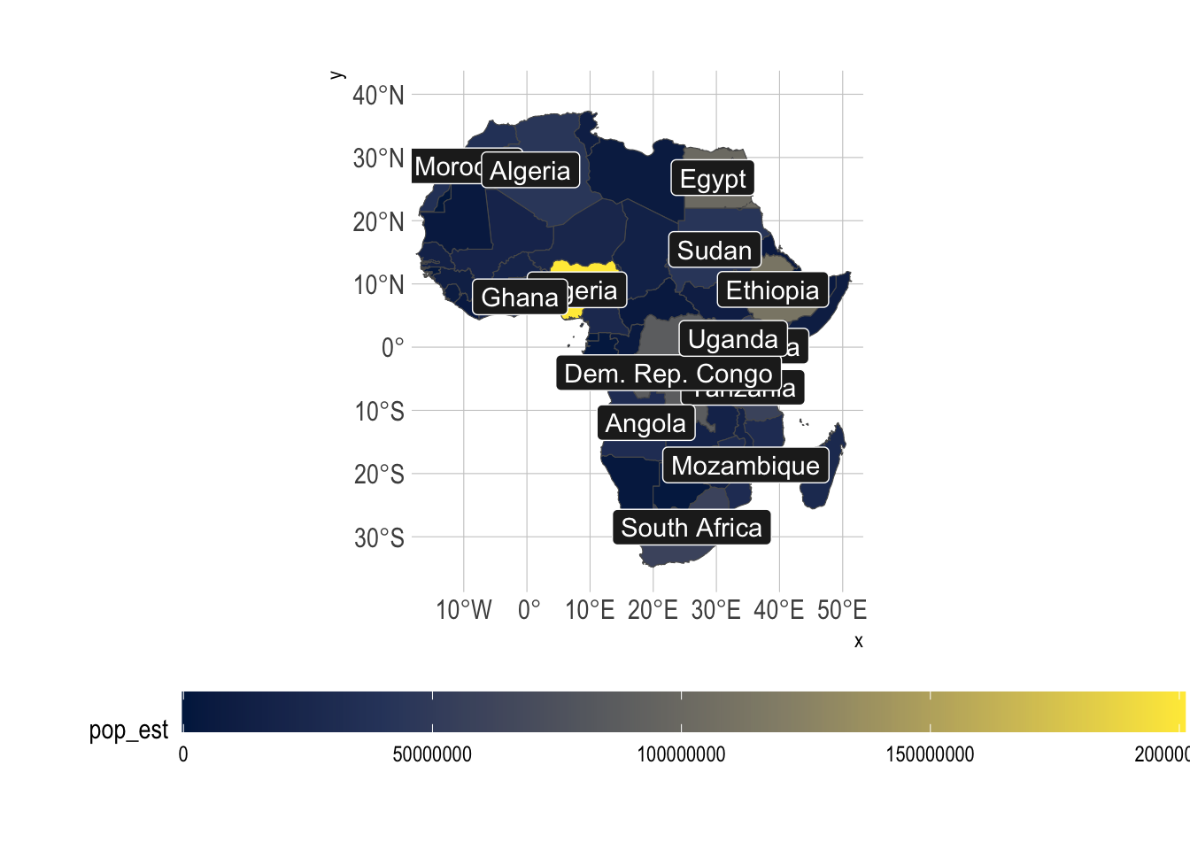
The final output, the one you’ll send to a publisher, looks alright.
9.8 Preparing graphics for publication
Once you’ve made a graphic that you’re happy with, you’ll want to export it for publication. If you want to go into academia or journalism, you’ll have to follow the style guide of the publication, and want to make sure that your graphic is as high quality as possible.
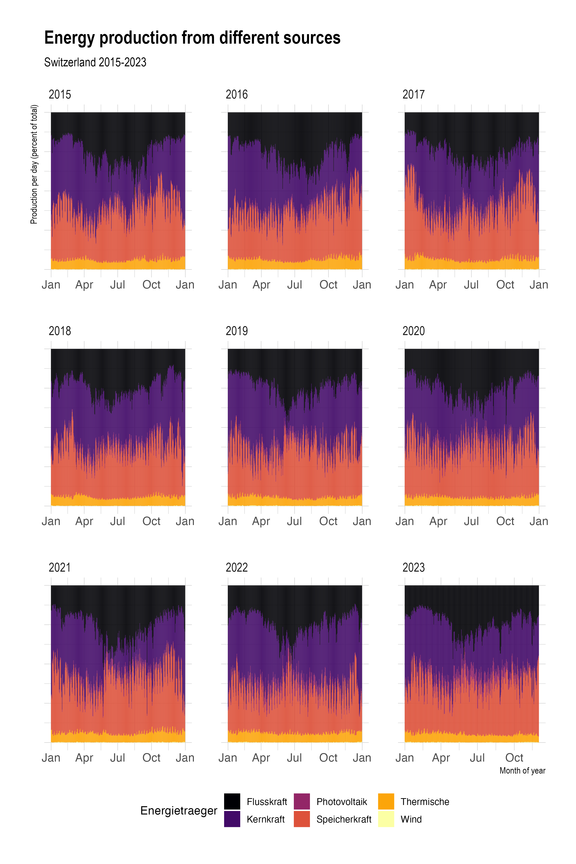
Here’s a basic graphic, let’s get it ready for publication. Be sure to look at the exported version, not the preview.
strom |>
  mutate(yr = year(Datum)) |>
  filter(yr > 2014) |>
  ggplot(aes(x = Datum, y = Produktion_GWh, fill = Energietraeger)) +
  geom_col(position = "fill", width = 1) +
  scale_fill_viridis_d(option = "B") +
  facet_wrap(facets = vars(yr), ncol = 3, scales = "free_x") +
  theme_ipsum() +
  theme(legend.position = "bottom")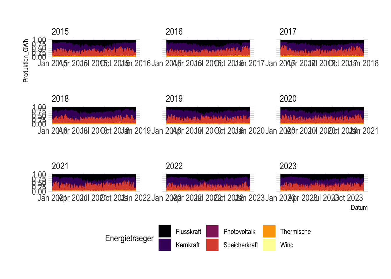
## Saving 7 x 5 in imageFirst, set the size of the graphic. This is done with the width and height arguments
to ggsave(). You can also set the units, which can be cm, in, or px.
If you’re saving a png, you’ll also want to set the dpi argument, which is the resolution
of the image. 300 is a good value for print, and 72 is a good value for web.
Second, set your font to whatever your publisher wants. You can do this with the
element_text(family = "Comic Sans") argument to theme().
strom_plt <- strom |>
  mutate(yr = year(Datum)) |>
  filter(yr > 2014) |>
  ggplot(aes(x = Datum, y = Produktion_GWh, fill = Energietraeger)) +
  geom_col(position = "fill", width = 1) +
  scale_fill_viridis_d(option = "B") +
  facet_wrap(facets = vars(yr), ncol = 3, scales = "free_x") +
  theme_ipsum() +
  theme(
    legend.position = "bottom",
    text = element_text(family = "Helvetica")
  )
Third, make sure everything is labeled properly, without any obvious_variable_names,
which just look amateur. The easiest way to do this is with labs().
strom_plt <- strom |>
  mutate(yr = year(Datum)) |>
  filter(yr > 2014) |>
  ggplot(aes(x = Datum, y = Produktion_GWh, fill = Energietraeger)) +
  geom_col(position = "fill", width = 1) +
  scale_fill_viridis_d(option = "B") +
  facet_wrap(facets = vars(yr), ncol = 3, scales = "free_x") +
  labs(
    title = "Energy production from different sources",
    subtitle = "Switzerland 2015-2023",
    x = "Month of year",
    y = "Production per day (percent of total)"
  ) +
  theme_ipsum() +
  theme(
    legend.position = "bottom",
    text = element_text(family = "Helvetica")
  )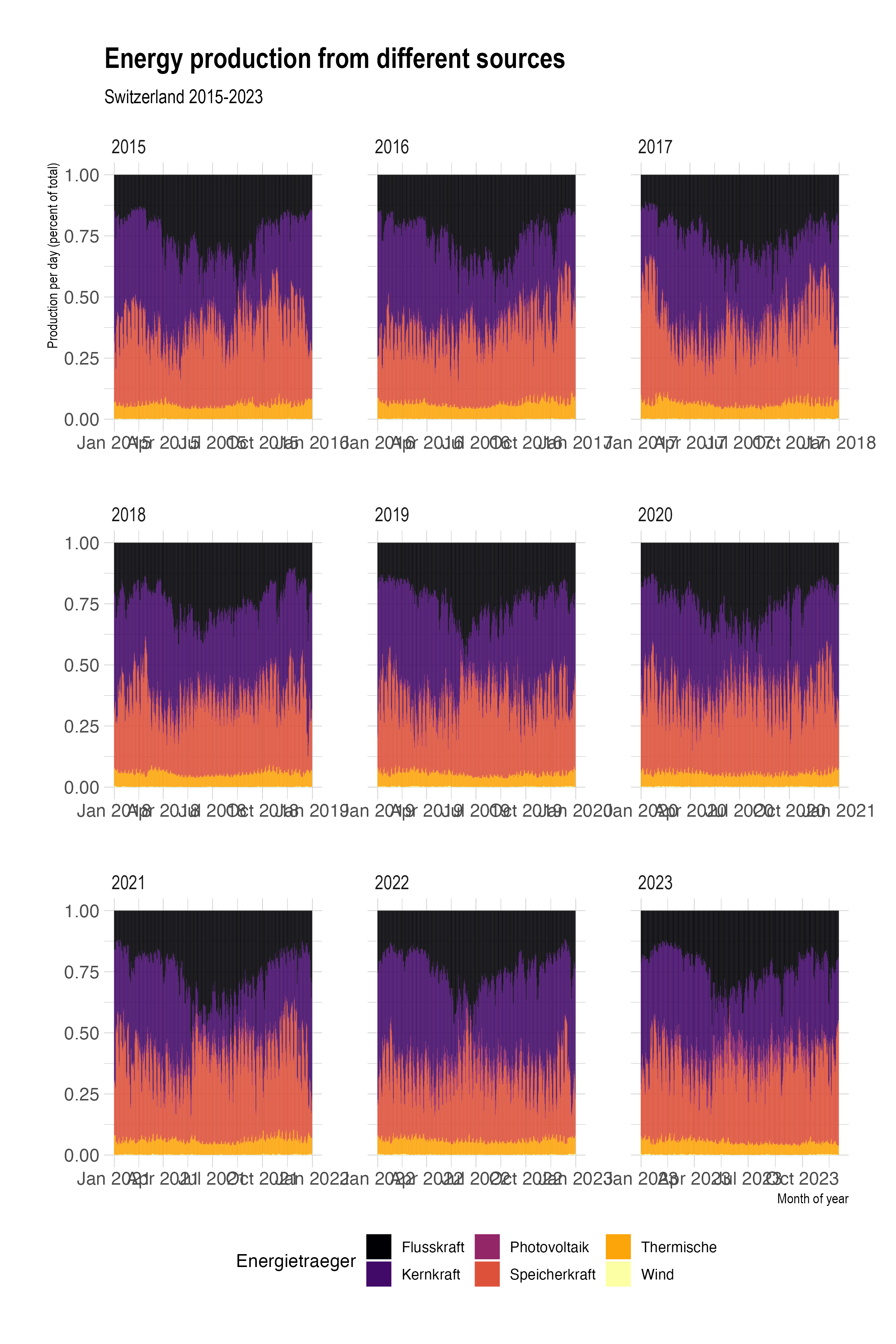
Fourth, make sure everything is readable. You might want to rotate some text, format some labels. Google is your friend here.
strom_plt <- strom |>
  mutate(yr = year(Datum)) |>
  filter(yr > 2014) |>
  ggplot(aes(x = Datum, y = Produktion_GWh, fill = Energietraeger)) +
  geom_col(position = "fill", width = 1) +
  scale_fill_viridis_d(option = "B") +
  facet_wrap(facets = vars(yr), ncol = 3, scales = "free_x") +
  scale_x_date(date_labels = "%b") +
  labs(
    title = "Energy production from different sources",
    subtitle = "Switzerland 2015-2023",
    x = "Month of year",
    y = "Production per day (percent of total)"
  ) +
  theme_ipsum() +
  theme(
    legend.position = "bottom",
    text = element_text(family = "Helvetica"),
    axis.ticks.x = element_blank(),
    axis.text.y = element_blank()
  )
Finally, make sure everything is in the target language of your publication. Kernkraft is a cool sounding word, but it won’t make you any friends with editors.
strom_plt <- strom |>
  mutate(yr = year(Datum)) |>
  filter(yr > 2014) |>
  ggplot(aes(x = Datum, y = Produktion_GWh, fill = Energietraeger)) +
  geom_col(position = "fill", width = 1) +
  scale_fill_viridis_d(option = "B", labels = c("River Hydro", "Nuclear", "Photovoltaic", "Dammed Hydro", "Geothermal", "Wind")) +
  facet_wrap(facets = vars(yr), ncol = 3, scales = "free_x") +
  scale_x_date(date_labels = "%b") +
  labs(
    title = "Energy production from different sources",
    subtitle = "Switzerland 2015-2023",
    x = "Month of year",
    y = "Production per day (percent of total)",
  ) +
  guides(fill = guide_legend(title = "Energy Source")) +
  theme_ipsum() +
  theme(
    legend.position = "bottom",
    text = element_text(family = "Helvetica"),
    axis.ticks.x = element_blank(),
    axis.text.y = element_blank()
  )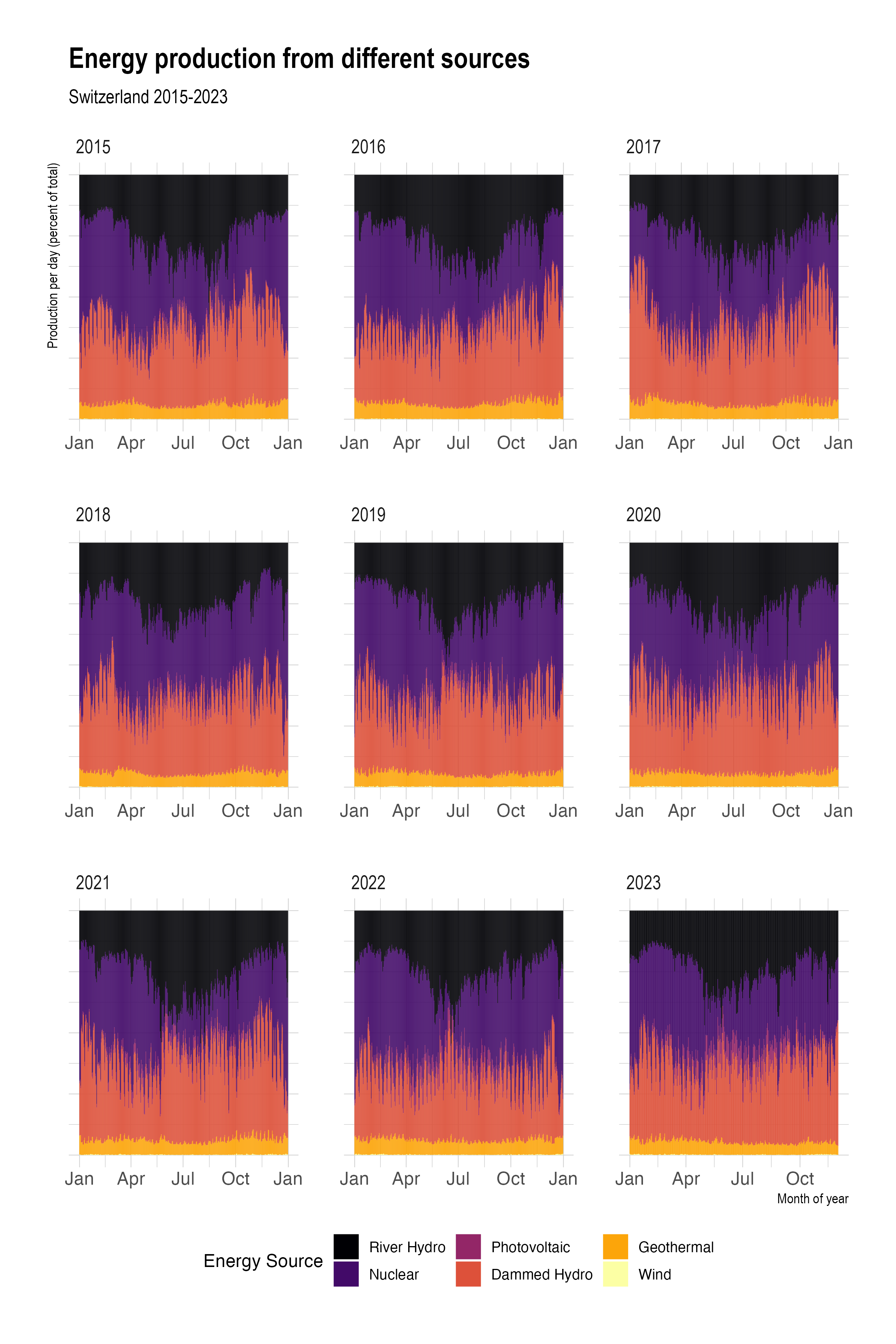
Your editors will love it! Now go get your research published!