Chapter 5 Lab 3 - 16/03/2022
In this lecture we will learn how to get frequency distribution using tidyverse and how to use the ggplot2 library (included inside the tidyverse collection) to produce very nice plots.
5.1 Frequency distribution
We will use the same financial data already introduced in Section 4.1. We import here the data and transform the categorical variables into factors (see Section 4.3:
library(tidyverse)
defdata <- read.csv("./files/Default_Fin.csv")defdata$Employed = factor(defdata$Employed,
levels = c(0,1),
labels = c("Not Employed", "Employed"))
defdata$Defaulted = factor(defdata$Defaulted,
levels = c(0,1),
labels = c("Not Defaulted", "Defaulted"))
str(defdata)## 'data.frame': 10000 obs. of 6 variables:
## $ Index : int 1 2 3 4 5 6 7 8 9 10 ...
## $ Employed : Factor w/ 2 levels "Not Employed",..: 2 1 2 2 2 1 2 1 2 2 ...
## $ Bank.Balance : num 8754 9806 12883 6351 9428 ...
## $ Annual.Salary: num 532340 145274 381206 428454 461562 ...
## $ Defaulted. : int 0 0 0 0 0 0 0 0 0 0 ...
## $ Defaulted : Factor w/ 2 levels "Not Defaulted",..: 1 1 1 1 1 1 1 1 1 1 ...To compute the absolute frequency for a single variable (for example Employed) we use the count function:
defdata %>%
  count(Employed)
## Employed n
## 1 Not Employed 2944
## 2 Employed 7056If we are interested in computing the percentages we have to divide the absolute frequencies (n) by the total number of observations (sum(n)) and then multiplying by 100. This can be included in a new column of the previously computed table; it can be created by using the mutate tidyverse verb:
defdata %>%
  count(Employed) %>%
  mutate(perc = n / sum(n) * 100)
## Employed n perc
## 1 Not Employed 2944 29.44
## 2 Employed 7056 70.56It is also possible to study two variables together and to compute the joint frequency distribution:
defdata %>%
  count(Employed, Defaulted) %>%
  mutate(perc = n / sum(n) * 100)
## Employed Defaulted n perc
## 1 Not Employed Not Defaulted 2817 28.17
## 2 Not Employed Defaulted 127 1.27
## 3 Employed Not Defaulted 6850 68.50
## 4 Employed Defaulted 206 2.06Note that in this case percentages are computed by dividing the absolute frequencies by the total number of observations (10000). It is also possible to obtain conditional percentage distribution by conditioning on the categories of a factor (that will be specified using the group_by option, see Section 4.6.3)
defdata %>%
  group_by(Employed) %>%
  count(Defaulted) %>%
  mutate(perc = n/sum(n)*100)
## # A tibble: 4 × 4
## # Groups: Employed [2]
## Employed Defaulted n perc
## <fct> <fct> <int> <dbl>
## 1 Not Employed Not Defaulted 2817 95.7
## 2 Not Employed Defaulted 127 4.31
## 3 Employed Not Defaulted 6850 97.1
## 4 Employed Defaulted 206 2.92In this case we are conditioning on the Employed variable (with two categories) and computing percentages with respect to the total number of observations in the two categories. For example, 95.7% is the percentage of Not Defaulted in the
Not Employed group. Moreover, 95.7+4.31=100% (this refers ot the Not Employed group).
5.2 The ggplot2 library
The ggplot2 is part of the tidyverse collection of packages. The grammar of graphics plot (ggplot) is an alternative to standard R functions for plotting; see here for the ggplot2 website. In Figure ?? we have some examples of plot (simple scatterplot, scatterplot with legend and boxplots) produced using standard R code (on the left) and the ggplot2 library (on the right).
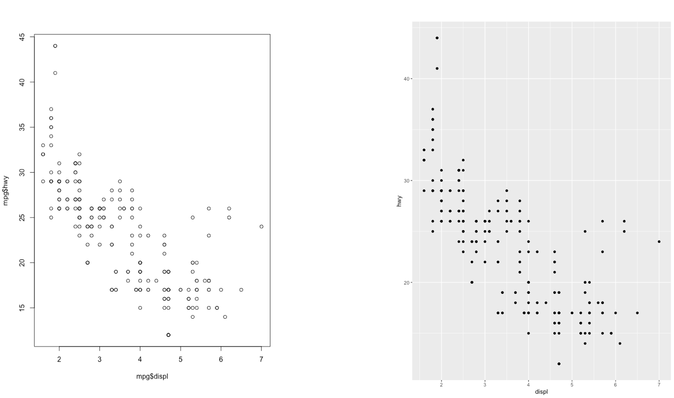
Figure 5.1: Comparison between standard (left) and ggplot2 plots (right)
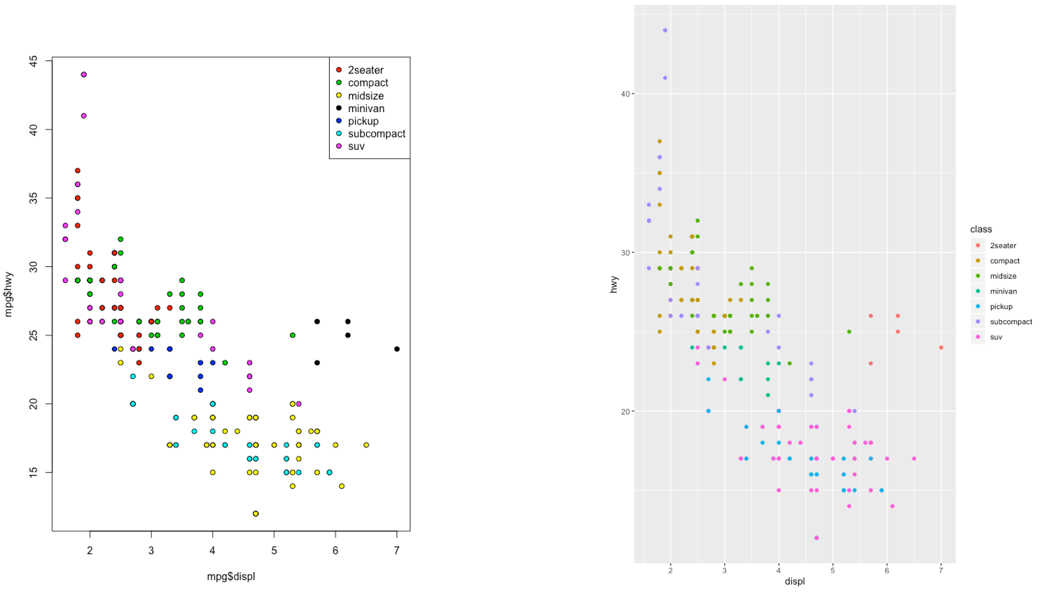
Figure 5.2: Comparison between standard (left) and ggplot2 plots (right)
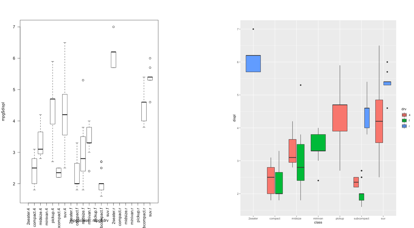
Figure 5.3: Comparison between standard (left) and ggplot2 plots (right)
With ggplot2 a plot is defined by several layers, as shown in Figure 5.4. The first layer specifies the coordinate system, then we can have several geometries each with an aesthetics specification.
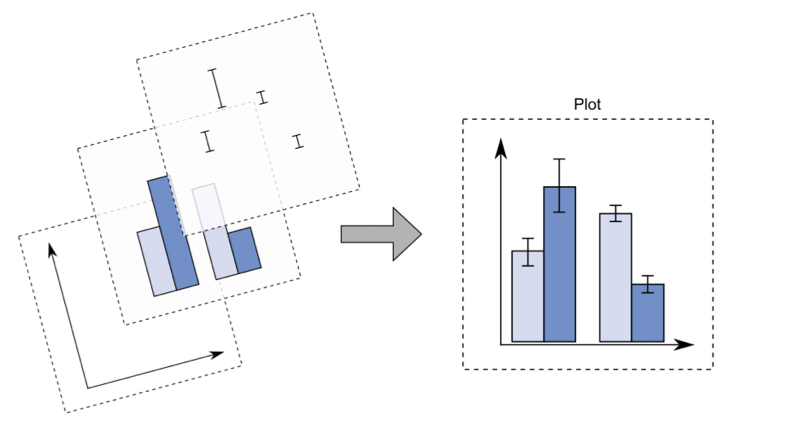
Figure 5.4: The layer structure of the ggplot2 plot
I suggest to download from here the ggplot2 cheat sheet.
5.3 Start working with the ggplot function
The most important function of the ggplot2 library is the ggplot function.
All ggplot plots begin with a call to ggplot supplying the data:
ggplot(data = …) +
  geom_function(mapping = aes(…))
where geom_function is a generic function for a geometry layer; see here for the list of all the available geometries.
For starting a new empty plot we can proceed by using one of the following codes:
ggplot(defdata)
defdata %>%
  ggplot()
Important: to add components and layers to the empty plot we will use the + symbol (and not the pipe!).
5.4 Scatterplot
We begin with a scatterplot displaying Bank.Balance on the y-axis and Annual.Salary on the x-axis; the necessary geometry is implemented with geom_point. Note that before plotting we first use the filter verb to select only the observations with Annual.Salary > 300000:
defdata %>%
filter(Annual.Salary > 300000) %>%
ggplot() +
geom_point(aes(Annual.Salary, Bank.Balance),
col = "red")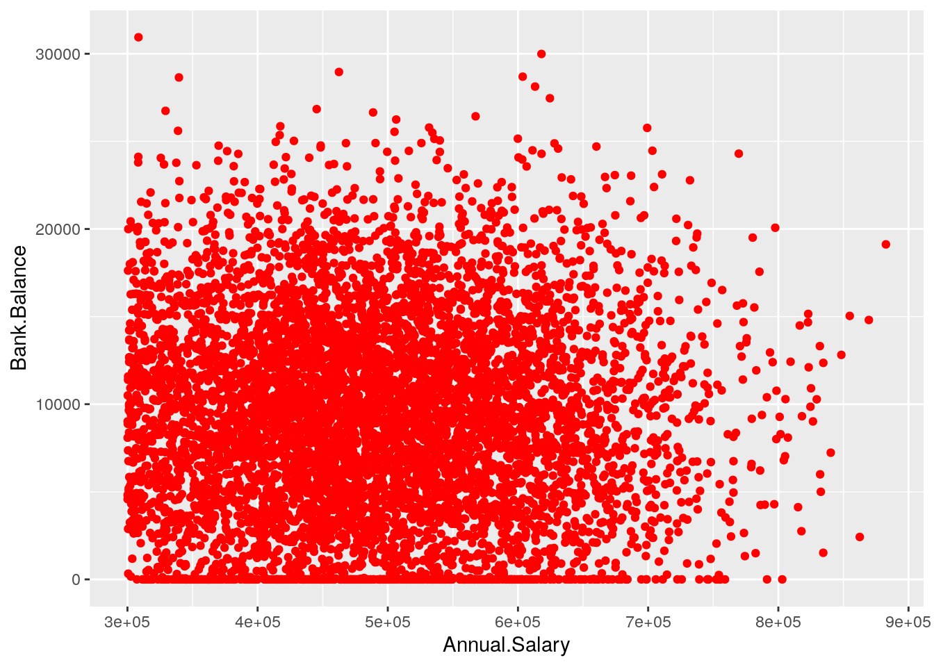 The aesthetic, created by
 aes, describes the visual characteristics that represent the data, e.g. position, size, color, shape, transparency, fill, etc. It is also possible to specify a color for all the points as for example red. Note that when the color is the same for all the points it is placed outside of aes() and is specified by quotes. A different case is when we have a different color for each point according, for example, to the corresponding category of the variable Defaulted. In this case the color specification is included inside aes():
defdata %>%
filter(Annual.Salary > 300000) %>%
ggplot() +
geom_point(aes(Annual.Salary,
Bank.Balance,
col = Defaulted))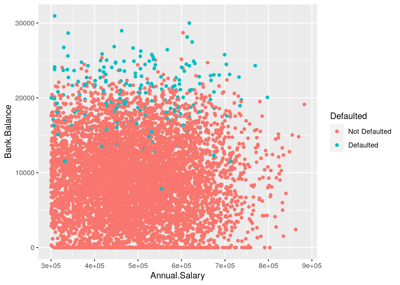 Note that automatically a legend is added that explains which level corresponds to each color.
It is also possible to set a different shape - instead of points - according to the categories of Employed:
defdata %>%
  filter(Annual.Salary > 300000) %>%
  ggplot() +
  geom_point(aes(Annual.Salary,
                 Bank.Balance,
                 col = Defaulted,
                 shape = Employed))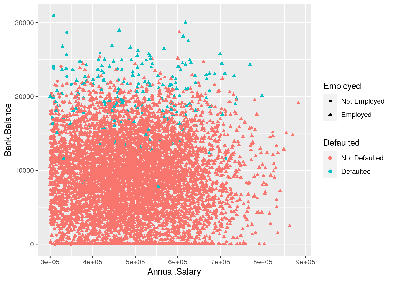
We now add a new geometry (a new layer) by means of geom_smooth, which adds in the plot a smooth line that can be ease the interpretation of the pattern in the plots. Note that we consider a smaller subset of data satisfying the following two conditions: Annual.Salary > 300000 & Bank.Balance > 20000:
defdata %>%
  filter(Annual.Salary > 300000 & Bank.Balance > 20000) %>%
  ggplot() +
  geom_point(aes(Annual.Salary,Bank.Balance,col=Defaulted)) +
  geom_smooth(aes(Annual.Salary,Bank.Balance,col=Defaulted)) +
  ggtitle("Scatterplot with 2 continuos variables and a factor")
## `geom_smooth()` using method = 'loess' and formula 'y ~ x'
Given that two layers share the same aes() specification it can be provided once in the main ggplot() function, as follows:
defdata %>%
  filter(Annual.Salary > 300000 &
           Bank.Balance > 20000) %>%
  ggplot(aes(Annual.Salary,
             Bank.Balance,
             col=Defaulted)) +
  #aes specified globally
  geom_point() +
  geom_smooth() +
  ggtitle("Scatterplot with 2 continuos variables and a factor")
## `geom_smooth()` using method = 'loess' and formula 'y ~ x'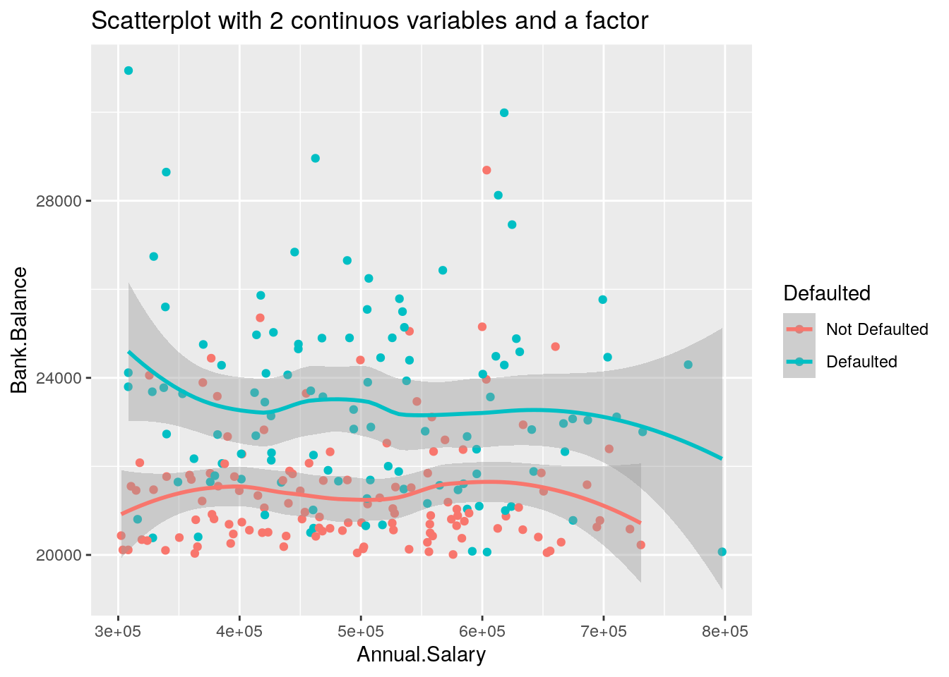
It is straightforward that the option ggtitle is used to include a title in the plot.
5.5 Histogram and density plot
When the aim is the analysis of the distribution of a continuos variable like Annual.Salary an histogram can be used. This is implemented by using the geom_histogram geometry:
defdata %>%
  ggplot() +
  geom_histogram(aes(Annual.Salary))
## `stat_bin()` using `bins = 30`. Pick better value with `binwidth`.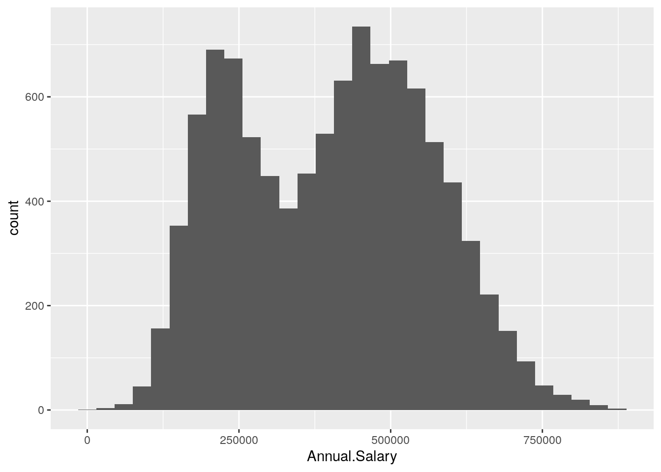 It is also possible to change the inner and outer colors and also the number of bins used for the histogram:
defdata %>%
  ggplot() +
  geom_histogram(aes(Annual.Salary),
                 col = "orange",
                 fill = "white",
                 bins = 50)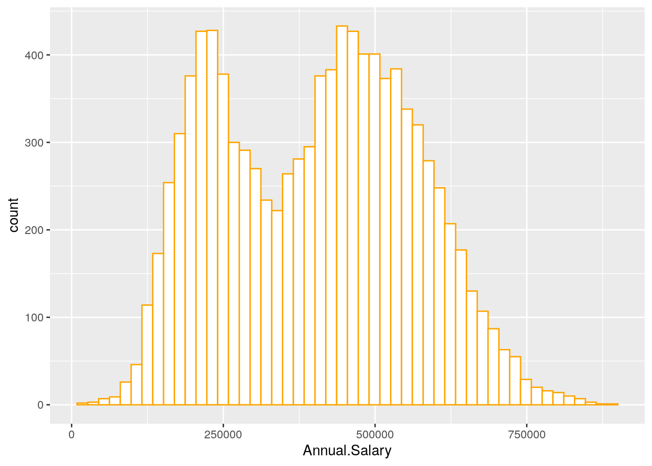
Note that in this case we need to specify only the x variable, while the y is computed automatically by ggplot and corresponds to the count variable (i.e. how many observations for each bin). This is given by the fact that every geometry has a default stat specification. For the histogram the default computation is stat_bin which uses 30 bins and computes the following variables:
count, the number of observations in each bin;density, the density of observations in each bin (percentage of total / bin width);x, the centre of the bin.
The histogram is a fairly crude estimator of the variable distribution. As an alternative it is possible to use the (non parametric) Kernel Density Estimation (see here) implemented in ggplot by geom_density (only x has to be specified):
defdata %>%
  ggplot() +
  geom_density(aes(Annual.Salary))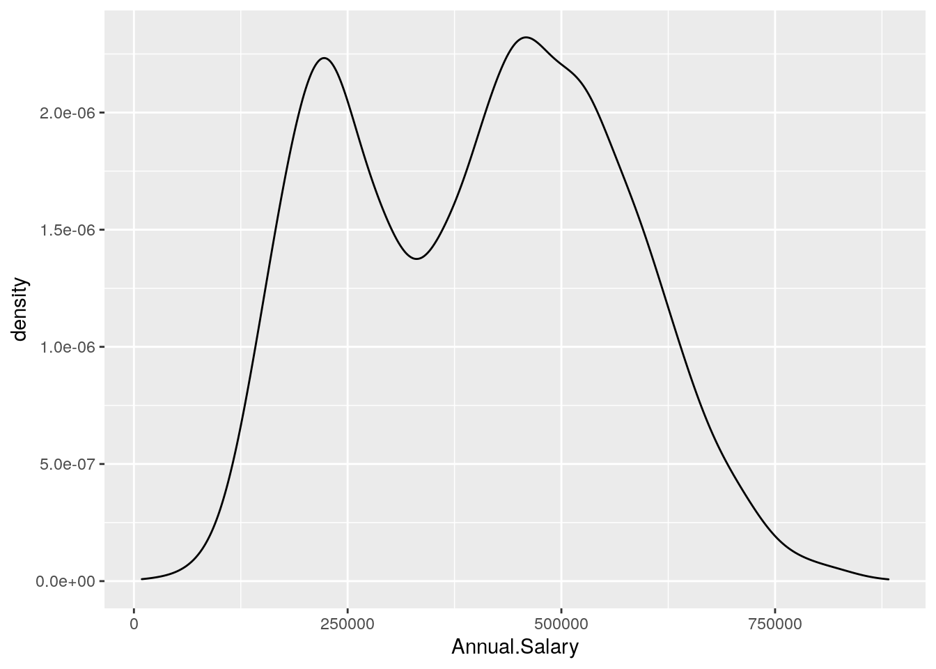
We can also display in the same plot several density estimates according to the categories of a factor like Defaulted:
defdata %>%
ggplot() +
geom_density(aes(Annual.Salary, fill = Defaulted),
alpha = 0.4)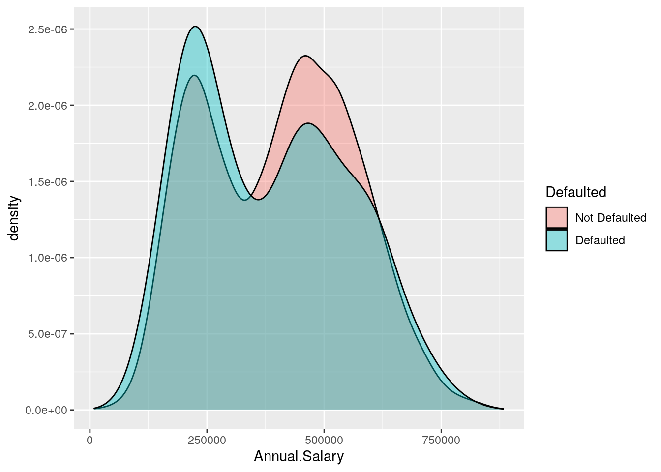 The option
 alpha which can take values between 0 and 1 specifies the level of transparency.
An alternative option for getting the two Annual.Salary distributions according to Defaulted is to use the option facet_wrap as follows:
defdata %>%
  ggplot() +
  geom_density(aes(Annual.Salary),
                 col = "orange",
                 fill = "white") +
  facet_wrap(~ Defaulted)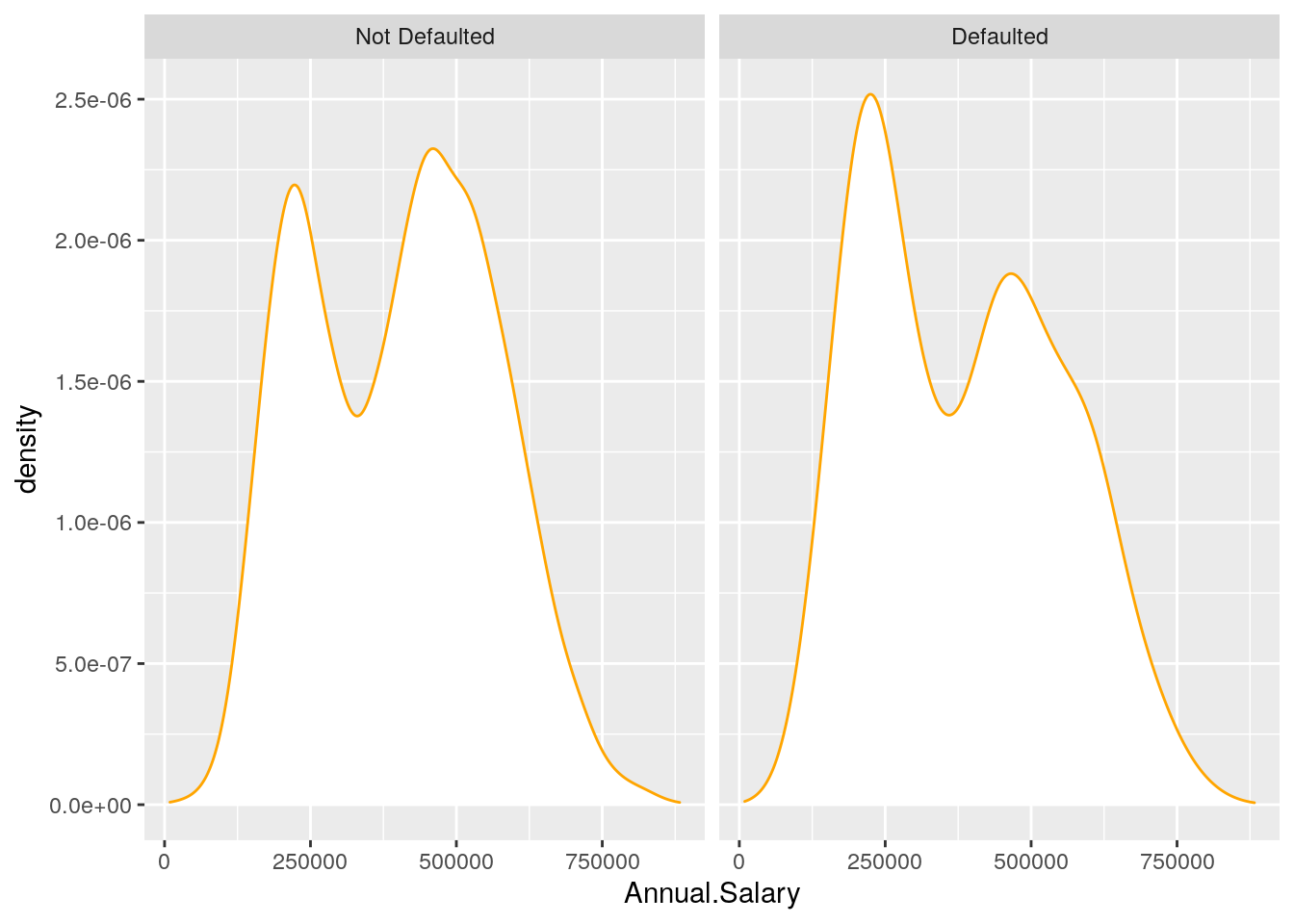
5.6 Boxplot
The boxplot can be used to study the distribution of a quantitative variable (e.g. Annual.Salary) conditioning on the categories of a factor (e.g. Defaulted). It can be obtained by using the geom_boxplot geometry, where x is given by the qualitative variable (factor):
defdata %>%
  ggplot() +
  geom_boxplot(aes(Defaulted, Annual.Salary),
               col = "orange",
               fill = "lightyellow")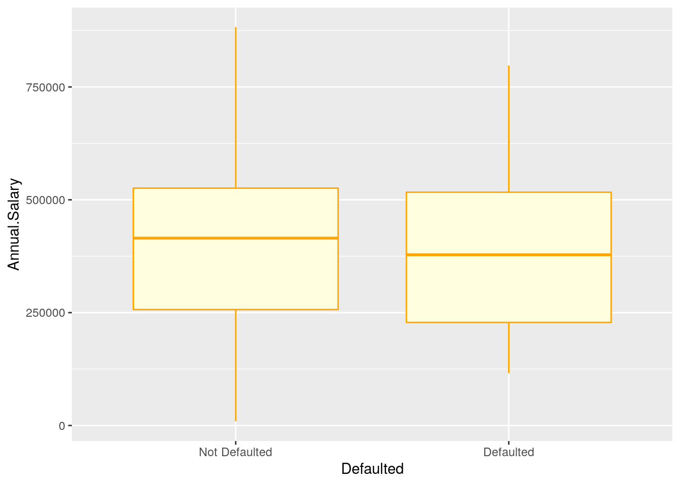
In the previous plot all the boxes are characterized by the same fill and contour color. If we instead interested in using different fill colors according to a variable (e.g.Employed) we have to specify the aesthetics with aes():
defdata %>%
  ggplot() +
  geom_boxplot(aes(Defaulted, Annual.Salary,
                   fill = Employed))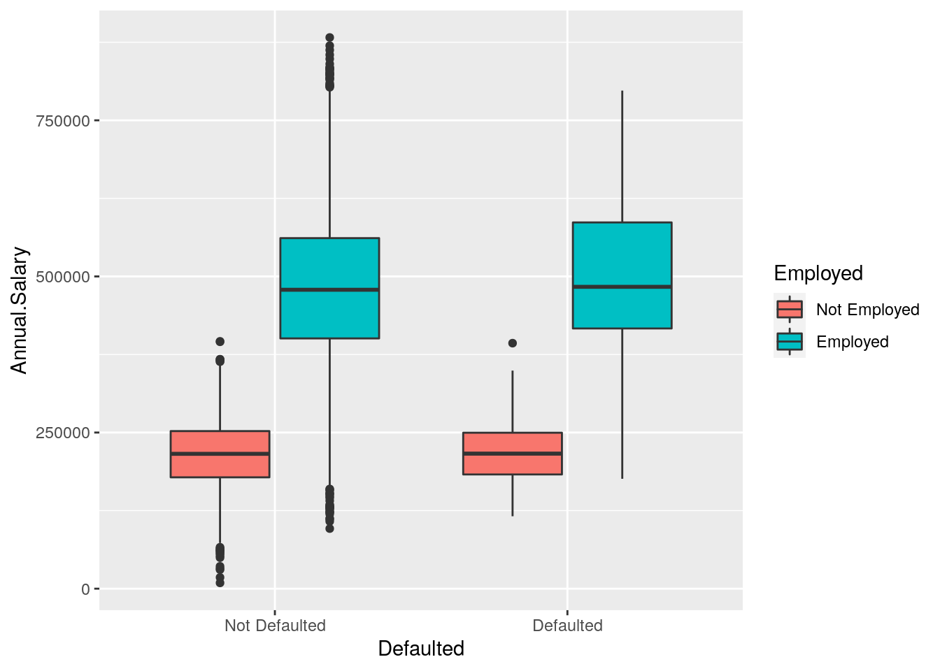
In this case for each Defaulted category we have several boxplots (for the Annual.Salary distribution) according to the Employed categories.
5.7 Barplot
The barplot can be used to represent the distribution of a categorical variable, such as for example Defaulted. It can be obtained by using the geom_bar geometry:
defdata %>%
ggplot() +
geom_bar(aes(Defaulted))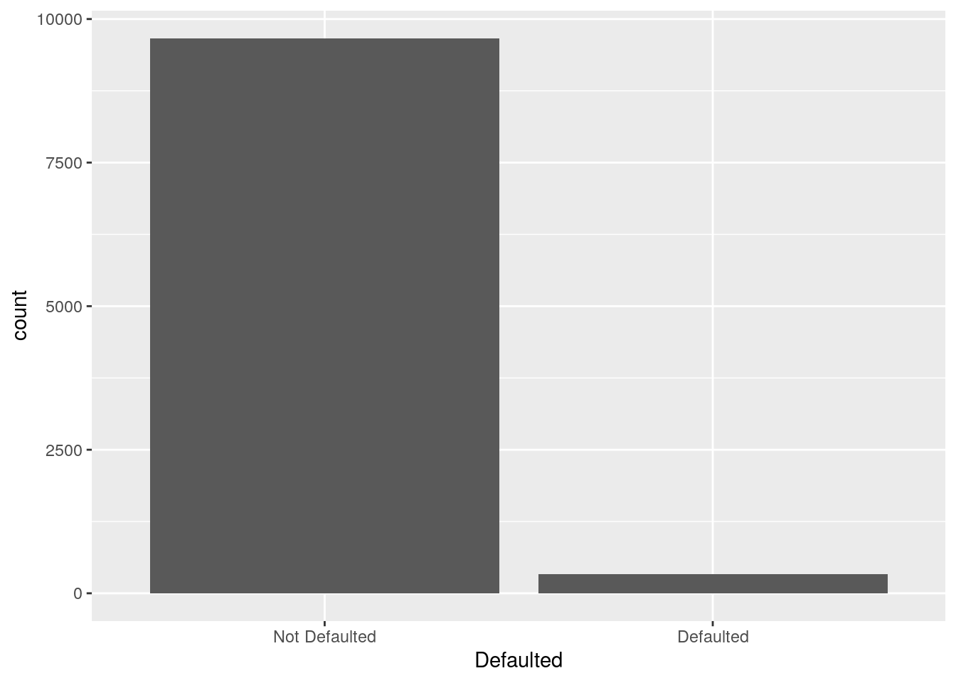 Similarly to the histogram, the y-axis is computed automatically and is given by counts (for
 geom_bar we have that stat="count"). If we are interested in percentages instead of absolute counts we can compute manually the percentage distribution (see Section 5.1) and then use the geom_col geometry:
defdata %>%
  count(Defaulted) %>%
  mutate(perc = n / sum(n) * 100) %>%
  ggplot() +
  geom_col(aes(Defaulted,perc))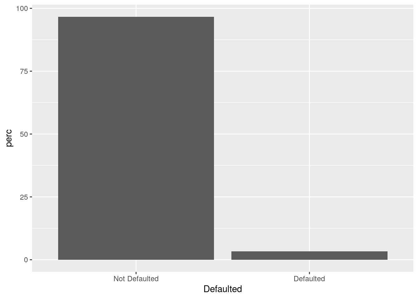
It is also possible to take into account in the barplot another qualitative variable such as for example Employed when interested in studying their joint distribution.
In particular Employed can be used to set the bar fill aesthetic:
defdata %>%
  ggplot() +
  geom_bar(aes(Defaulted, fill = Employed))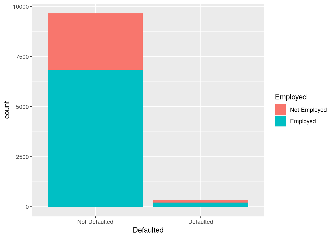
Note that the bars are automatically stacked and each colored rectangle represents a combination of Defaulted and Employed. The stacking is performed automatically by the position adjustment given by the position argument (by default it is set to position = "stack"). Other possibilities are "dodge" and "fill":
defdata %>%
  ggplot() +
  geom_bar(aes(Defaulted,
fill = Employed), position = "fill") 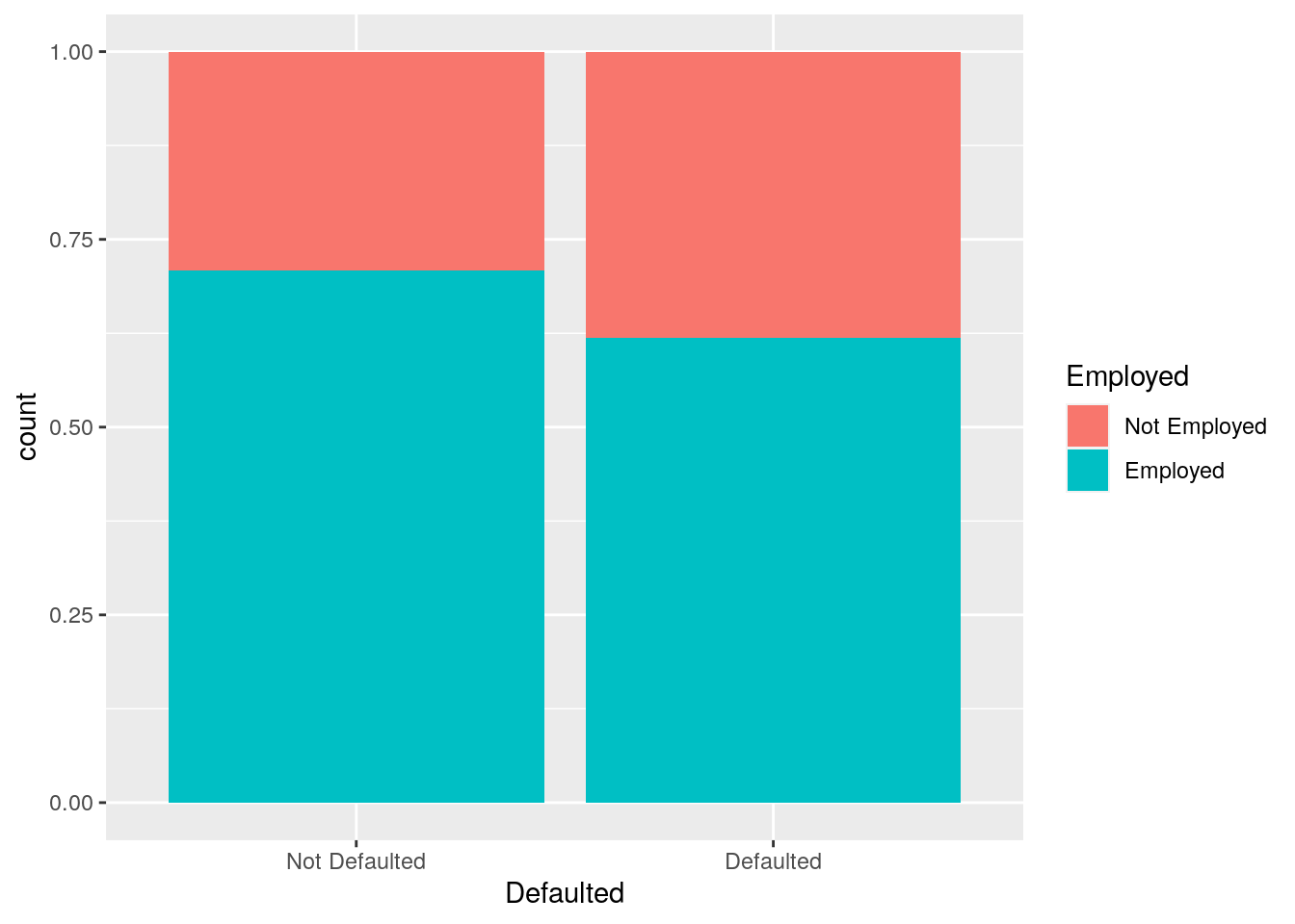
defdata %>%
  ggplot() +
  geom_bar(aes(Defaulted,
               fill = Employed), position = "dodge") +
  xlab("This is my x-axis with Defaulted") +
  ylab("Conditional proportions")+
  theme(axis.title.x=element_text(colour="red"))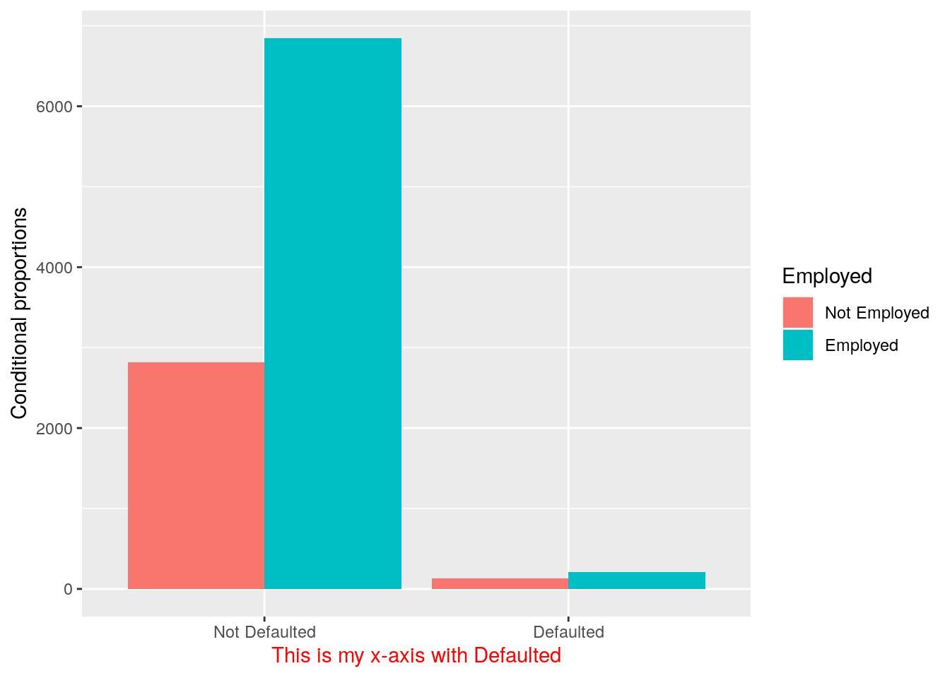
The option position = "fill" is similar to stacking but each set of stacked bars has the same height (corresponding to 100%); this makes the comparison between groups easier. The option position = "dodge" places the rectangles side by side. An alternative consists in the use of facet_wrap.
5.8 Exercises Lab 3
5.8.1 Exercise 1
Consider the data available in the fev.csv file (use fevdata as the name of the data frame). The dataset examines if respiratory function in children was influenced by exposure to smoking at home. The included variables are:
AgeFEV: forced expiratory volume in liters (lung capacity)Ht: height measured in inchesGender: 0=female, 1=maleSmoke: exposure to smoking (0=no, 1=yes)
Import the data in
Rand check the type of variables contained in the dataframe (use theread.csvfunction by means of theImportfeature of RStudio in the top-right panel). Check the structure of the data. TransformGenderandSmokeinto factors.Compute the univariate and bivariate frequency distribution (with percentage frequencies) for
GenderandSmoke.Represent graphically height, age and FEV by choosing the correct plot. Comment the plots.
Using boxplots study the distribution of
Ageand thenHtconditioned onGender. Comment the plots.Using a scatterplot represent
FEVas a function ofHt. Use different colors according to the smoke information. Comment.Produce different scatterplots representing
FEVas a function ofHtaccording to the gender categories. Include also in the plots a smooth line. Comment the plots.
5.8.2 Exercise 2
Consider the Titanic data contained in the file titanic_tr.csv. This is a subset (with 891 observations and 11 variables) of the original dataset. The included variables are the following:
pclass: passenger class (first, second or third)survived: survived (1) or died (0)name: passenger namesex: passenger sexage: passenger agesibSp: number of siblings/spouses aboardparch: number of parents/children aboardticket: ticket numberfare: fare (cost of the ticket)cabin: cabin idembarked: port of embarkation (S = Southampton, C = Cherbourg, Q = Queenstown)
- Import the data and explore them. Transform the variable
survived,pclassandsexinto factors using the following code (mydatais the name of the data frame). Try to understand the code and if necessary have a look to?factor:
mydata$pclass = factor(mydata$pclass)
mydata$survived = factor(mydata$survived, levels=c(0,1), labels=c("Died","Survived"))
mydata$sex = factor(mydata$sex)- Represent graphically the distribution of the variable
fare. Moreover, compute the average ticket price paid by passengers. Finally, compute the percentage of tickets paid more than 100$. - Represent graphically the distribution of the variable
age. Compute the average age. Pay attention to missing values. Consider the possibility of using thena.rmoption of the functionmean(see?mean). - Study the distribution of
sexby using a barplot. Derive also the corresponding frequency distribution. - By using a graphical representation study the distribution of age conditionally on gender. Moreover, compute the mean age by gender.
- Compute the (absolute and percentage) bivariate distribution of
sexandsurvived(percentages should be computed with respect to the total sample size). Moreover, produce the corresponding plot which represents the two factors. - Derive the percentage distribution of
survivedconditioned onsex. Produce also the corresponding plot. - Filter by sex and consider only males and compute the frequency distribution of the variable
embarked. Produce the corresponding plot. - Produce a scatterplot with
ageon the x-axis andfareon the y-axis. Use a different point color according to gender. - Study the relationship between
ageandfare, as you did in the previous sub-exercise, producing sub-plots according toembarked.