4.2 Patterns and variation
Staring at the numbers and character strings from a dataset is seldom useful. Consider the following data set USArrests which is built into Base R.
##             Murder Assault UrbanPop Rape
## Alabama       13.2     236       58 21.2
## Alaska        10.0     263       48 44.5
## Arizona        8.1     294       80 31.0
## Arkansas       8.8     190       50 19.5
## California     9.0     276       91 40.6
## Colorado       7.9     204       78 38.7
## Connecticut    3.3     110       77 11.1
## Delaware       5.9     238       72 15.8
## Florida       15.4     335       80 31.9
## Georgia       17.4     211       60 25.8
The head() function returns, in this case, the first 10 rows of the data frame USArrests. Even with this small fragment we get a limited picture. There are four variables (columns) and presumably at least 10 observations (or instances or rows). We can see the data type of the variables (note that str() which also reveals the exact number of observations.
## 'data.frame':	50 obs. of  4 variables:
##  $ Murder  : num  13.2 10 8.1 8.8 9 7.9 3.3 5.9 15.4 17.4 ...
##  $ Assault : int  236 263 294 190 276 204 110 238 335 211 ...
##  $ UrbanPop: int  58 48 80 50 91 78 77 72 80 60 ...
##  $ Rape    : num  21.2 44.5 31 19.5 40.6 38.7 11.1 15.8 31.9 25.8 ...
Without further information concerning the meaning or even the units for each variable our EDA is going to be limited. In this case, since the data set is built, we can use the help to discover more, e.g., help("USArrests").
The next step is to use summary or descriptive statistics to begin to answer questions such as what are typical values and how are the variables dispersed (vary). Extreme values, often referred to as outliers can be of particular interest so for this reason we have an entire Sub- Section on this topic.
##      Murder          Assault         UrbanPop          Rape
##  Min.   : 0.800   Min.   : 45.0   Min.   :32.00   Min.   : 7.30
##  1st Qu.: 4.075   1st Qu.:109.0   1st Qu.:54.50   1st Qu.:15.07
##  Median : 7.250   Median :159.0   Median :66.00   Median :20.10
##  Mean   : 7.788   Mean   :170.8   Mean   :65.54   Mean   :21.23
##  3rd Qu.:11.250   3rd Qu.:249.0   3rd Qu.:77.75   3rd Qu.:26.18
##  Max.   :17.400   Max.   :337.0   Max.   :91.00   Max.   :46.00
This is clearly an improvement over staring at tables of values and for example the mean and median give estimates of a typical value often referred to as central tendency. So for instance we can see that the mean number of arrests for assault is 170 per 100,000 population and the median is close at 159. This suggests a reasonably symmetric and only slightly skewed distribution. One way of thinking about dispersion is the range (i.e., Max - Min) or we can compute it directly using our own user-defined function
# Define our own range.finder function
range.finder <- function(x){max(x) - min(x)}

# Apply the function to the Assault variable
range.finder(USArrests$Assault)
## [1] 292Now we have a function we can efficiently apply to the entire data frame USArrests using one of the very useful apply() family of functions.
# Use sapply to apply our function to each vector with the data frame USArrests
sapply(USArrests, range.finder)
## Murder Assault UrbanPop Rape
## 16.6 292.0 59.0 38.7sapply()is actually a wrapper function for lapply(). It formats the output more elegantly (where possible). The apply family of functions are very useful for applying a function to multiple instances e.g., a vector or a data frame. They’re much faster than the equivalent for-loop and easier to code.
For more details on the extremely useful apply family of functions see Chapter 5 of (Kabacoff 2015) or the Week 4 seminar for this Modern Data module.
Nevertheless, there are clear limits to these simple descriptive statistics and it would still be nice to visualise the distributions.
4.2.1 How do the data vary?
This section is intended as a redress to the tendency of many analyses to focus on typicality or central tendency to the exclusion of almost all else. For instance, the most commonly reported summary statistics is the mean. Clearly this is important but without knowing how the sample varies comparing means can be highly misleading.
# Generate some synthetic data with same mean=0 but low (sd=1) or high (sd=10) variation
x.df <- data.frame(lo.sd=rnorm(n=1000,mean=0,sd=1), hi.sd=rnorm(n=1000,mean=0,sd=10))
data <- melt(x.df)
# Compare the distributions as density plots
ggplot(data,aes(x=value, fill=variable)) +
  geom_density(alpha=0.25) +
  labs(title="Comparing distributions with the same mean but different sd")
Don’t worry about the details of the above R code chunk. We will move onto producing graphical output with the incredibly powerful and versatile package {ggplot2} in the next section. In essence we are creating two normally distributed random variates
 lo.sd and hi.sd which have a common mean of zero, but standard deviations of 1 and 10 respectively. The plot superimposes the density distributions so we can see that although the modal points coincide the distributions are vastly different. If we were simply to report that the two variables have near identical means we are missing vital information.
4.2.2 Outliers
An outlier:is an observation that lies an abnormal [extreme] distance from other values in a random sample from a population. Two graphical techniques for identifying outliers are boxplots (univariate) and scatterplots (bivariate).
Frequently, a key part of EDA is answering the question: are there any outliers? This may also have an impact upon our data quality checking. However, it is very important not to assume all outliers are the result of a quality problem; some extreme values may naturally arise and can lead to important insights, e.g., why did this person generate the highest sales in the region?
One simple method to check for outliers within numeric data is the use of boxplots, first popularised by John Tukey. These are best understood via a simple example for which we use the breaking distances from the built-in cars data set.
# Produce a horizontal boxplot of car breaking distances
# using Base R for convenience
boxplot(cars$dist, horizontal = T, notch = T,
        xlab = "Distance in feet")
        title("Boxplot of car stopping distances")
# The equivalent in boxplot using ggplot is
# ggplot(cars, aes(y = dist)) +
#   geom_boxplot(notch=TRUE) +
#   coord_flip() +         # This rotates the plot to horizontal
#   ggtitle("Boxplot of car stopping distances") +
#   scale_y_continuous(name="Distance in feet")
In the plot we can see various features.
- The box is drawn from Q1 to Q3, i.e., the interquartile range (IQR)
- A vertical solid line within the box denotes the median
- The ‘notch’ around the median shows the 95% confidence limits
- The whiskers are by including the largest/smallest observed point from the dataset that falls within a distance of 1.5 times the IQR is measured out and a whisker is drawn up to
- All more extreme observed points are plotted as outliers as small circles
This plot is arranged horizontally (horizontal = T) since I personally think this is easier to read, however, it is something of a moot point. The default is vertical. We can see that there is a single extreme value of 120 feet which is shown as a circle to the right of the diagram and since it lies beyond the upper/positive whisker can be considered an outlier. As stated earlier this doesn’t necessarily make it an incorrect value, but it does merit further investigation. We also need to be aware that it may potentially be unduly influential (or a high influence point) if we use linear correlation or try to fit an ordinary least squares regression model. Minimally we might also wish to apply a robust analysis (Wilcox 2011).
For an accessible and short article on using boxplots, see (Williamson, Parker, and Kendrick 1989).
4.2.3 Co-variation
This is the pattern between variables. Sometimes an observation is not unusual in its own right but in the context of other variables it is anomalous. Sometimes this is referred to as multivariate outlier analysis. In some ways this is related to the ideas of referential integrity discussed in the previous chapter.
The point is when searching for outliers we need to consider the possibility that a value is not extreme in itself, but is an outlier when viewed in the context of a second or additional variables. A simple way to check for this is by means of a scatterplot.
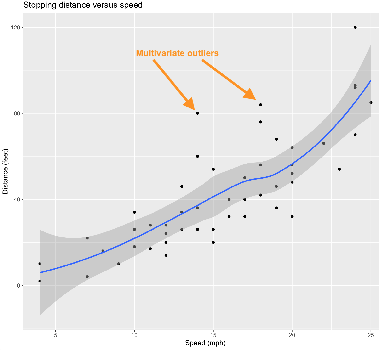
A scatterplot showing multi-variate outliers
In this scatterplot we show the relationship between Speed and Distance by a non-linear (and non-parametric) loess smoother. An alternative would be a linear regression line if we consider linearity to be a reasonable assumption. Data points that fall far from this line can be considered to be potential multivariate outliers despite the fact that for the individual variables their values are quite typical.
Note that this scatterplot was produced via the following R code (and then annotated by hand).
ggplot(cars, aes(x=speed, y=dist)) +
  geom_point() +
  geom_smooth(method="loess") +
  labs(title="Stopping distance versus speed",
       x="Speed (mph)", y = "Distance (feet)")
## `geom_smooth()` using formula 'y ~ x'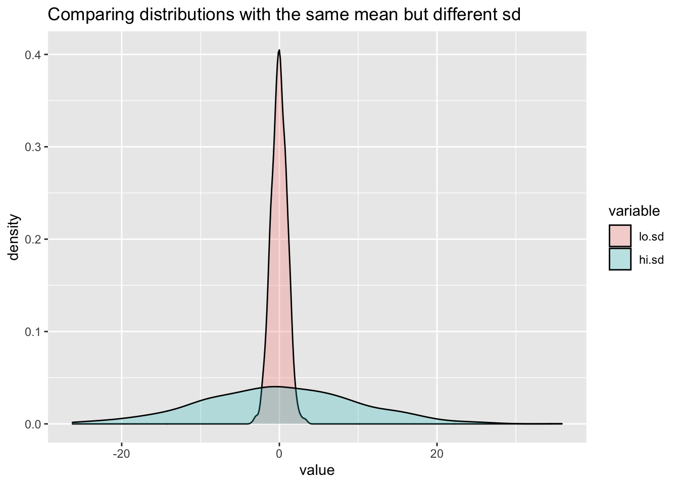
Although we have simply used visual inspection to identify potential outliers, more formal methods can be deployed. For instance, one can use Mahalanobis distance, which is the distance of a data point from the calculated centroid of all other cases, where the centroid is calculated as the intersection of the means of the variables being investigated.
References
Kabacoff, Robert. 2015. R in Action: Data Analysis and Graphics with R. 2nd ed. Manning.
Wilcox, Rand R. 2011. Introduction to Robust Estimation and Hypothesis Testing. 3rd ed. Academic press.
Williamson, David F, Robert A Parker, and Juliette S Kendrick. 1989. “The Box Plot: A Simple Visual Method to Interpret Data.” Annals of Internal Medicine 110 (11): 916–21.