Practice 14 How to create a scatterplot in R
14.1 Directions
In this practice exercise, you will conduct t-test for matched or paired samples in R.
14.2 A closer look at the code
We will use Anscombe’s Quartet to practice making scater plots using the plot() command. Anscombe’s Quartet is a data set that was constructed in 1973 by the statistician Francis Anscombe to demonstrate the importance of graphing data before analyzing.
data("anscombe")
attach(anscombe)
head(anscombe)
## x1 x2 x3 x4 y1 y2 y3 y4
## 1 10 10 10 8 8.04 9.14 7.46 6.58
## 2 8 8 8 8 6.95 8.14 6.77 5.76
## 3 13 13 13 8 7.58 8.74 12.74 7.71
## 4 9 9 9 8 8.81 8.77 7.11 8.84
## 5 11 11 11 8 8.33 9.26 7.81 8.47
## 6 14 14 14 8 9.96 8.10 8.84 7.04plot(x=x1,y=y1)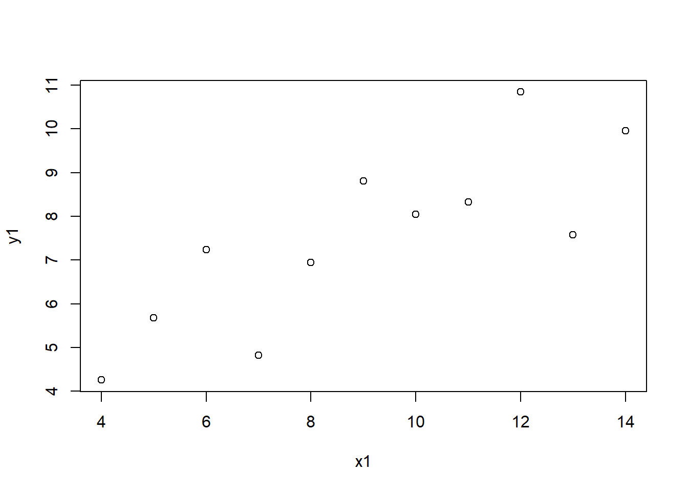
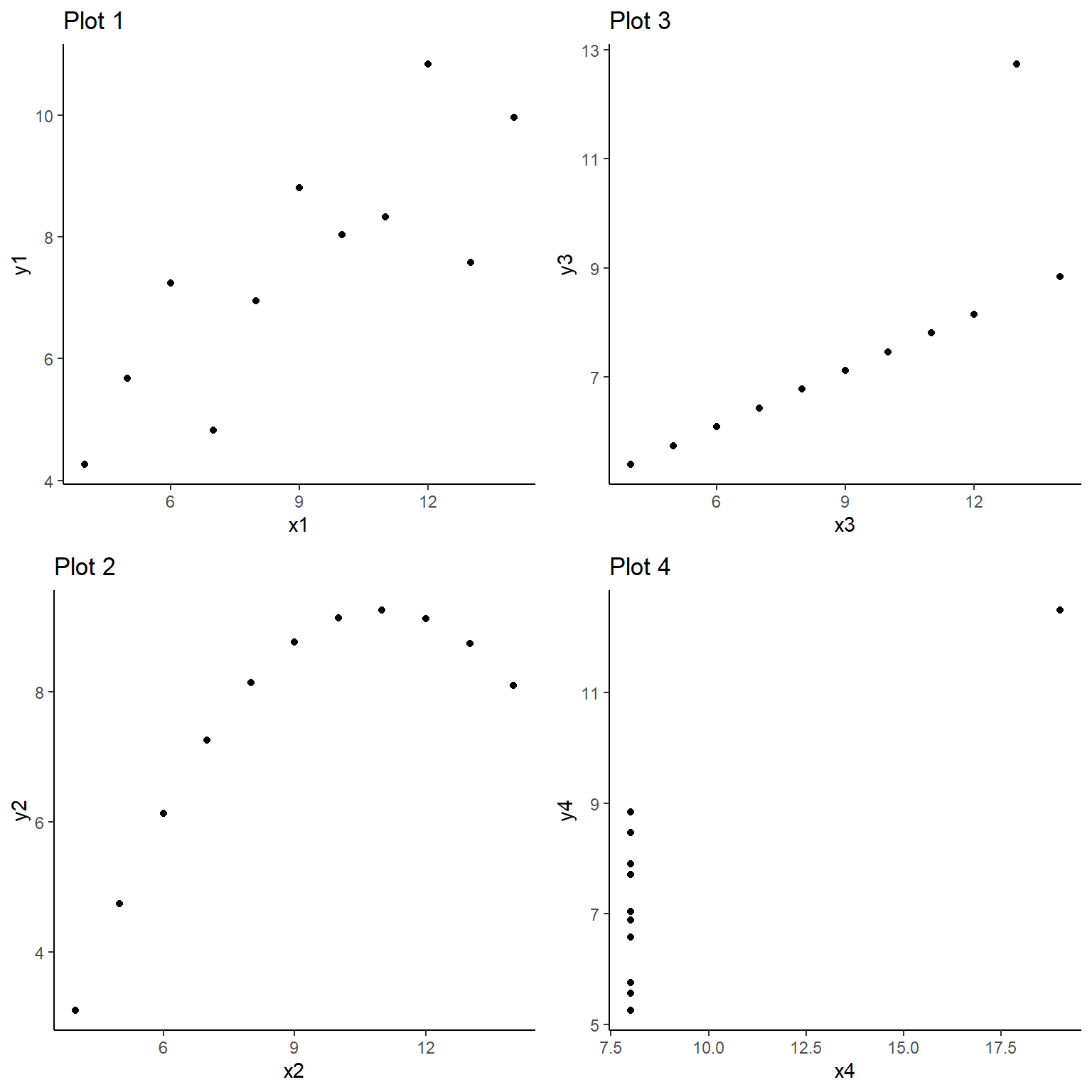
Here is a plot of all four pairs of data. What is cool about this is that the best fit line through each plot is identical.
Here is a short video on this very special data set.
14.3 Now you try
Use R to complete the following activities (this is just for practice you do not need to turn anything in).
Use the mtcars data set to plot mpg vs hp.