Practical 2 EDA with dplyr, ggplot2 and tmap
2.1 Overview
This practical is based on some of the content of Chapters 2, 3 and 5 in Comber and Brunsdon (2021). It covers the following topics:
- Manipulating data and spatial data (piping with
dplyr, single data tables, joining data tables) - Exploratory Data Analysis (EDA) with
ggplot2 - Some optional mapping with the
tmappackage
The exercises in this session use the Liverpool data again, but this time linked to other data. A number of different packages will be used in this session, some of which may need to be installed. The dplyr and ggplot2 packages are loaded with tidyverse.
The code below installs some packages. It does this by testing for the presence of each packages and installing the ones that are not present:
packages <- c("sf", "tidyverse", "tmap", "cols4all")
# check which packages are not installed
not_installed <- packages[!packages %in% installed.packages()[, "Package"]]
# install missing packages
if (length(not_installed) > 0) {
install.packages(not_installed, repos = "https://cran.rstudio.com/", dep = T)
}
# remove the 2 objects created
rm(list = c("packages", "not_installed"))When this is done, the packages can be loaded into your current R session:
# load the packages
library(sf) # for spatial data
library(tidyverse) # for data wrangling
library(cols4all) # for graphics
library(tmap) # for mappingOnce again, remember to:
- Create a separate folder for this Session
- Always run your code from an R script… always!
- Save the script to the folder
- Set the working directory to the folder location
As an initial step, you should load the data.
Recall it contains census Output Areas for Liverpool, with a number of attributes:
We will use this spatial data to illustrate ggplot and dplyr.
2.2 Part 1: Manipulating data and spatial data with dplyr
The first part of this session introduces methods for manipulating data using functions from the dplyr packages that is part of the tidyverse. Specifically it focuses on:
- operations for manipulating data tables
- joining data
The manipulations are undertaken using a piping syntax which essentially allows data manipulations and operations to be put into a chain or flow. This syntax can be used with spatial data and non-spatial data in the same way.
The dplyr packages supports a piping syntax and provides a suite of tools for manipulating and summarising data held in data tables.
2.2.1 Piping Syntax
The code below creates a map of the Liverpool OAs that are of OAC class Cosmopolitans with unemployment greater than the median OA values. It uses piping syntax, to undertake some dplyr manipulations, the results of which are passed to a ‘quick tmap’ (qtm()) to create the map in the figure below.
This is the first time you have seen piping syntax. The native pipe is denoted by a | with a > ( |> ) and it pushes the output of one operation into the input of another:
- the first line pushes oa_sf to the second line
- the second line filters the observations according to some logical criteria, and then pushes the result to qtm
- the third line takes the output of the pipe as its first argument. If you examine the help for qtm (i.e. by entering ?qtm) you will see that the first argument is shp taking an sf or sp class. So the pipe passes the filtered data to qtm.
Have a look at the outputs of specific parts of the pipe:
# set the tmap mode to interactive viewing
oa_sf |>
filter(OAC_class == "Cosmopolitans" & unmplyd > median(unmplyd)) Piping is efficient as no intermediate R objects are created, and only the final output (data, map, etc) is returned to the console, and therefore the computer memory. One final point is that when using the piping syntax, the idea is to read the functions from left to right, rather than nesting operations and reading from the inside (right) to the outside (left).
The equivalent un-piped code would require the creation of an intermediate object (tmp) as below:
tmap_mode("view")
tmp = filter(oa_sf, OAC_class == "Cosmopolitans" & unmplyd > median(unmplyd))
qtm(tmp, fill = "red", col = NA, basemaps = c('Esri.WorldTopoMap'))
ttm()The native pipe (|>) replaced the magrittr pipe (%>%) a few years ago, but it works in the same way. There is an excellent summary and explanation of piping, although with reference to the magrittr pipe (%>%) https://www.youtube.com/watch?v=ANMuuq502rE&t=288s and a very useful summary of the operator here: https://magrittr.tidyverse.org/reference/pipe.html
2.2.2 Single table manipulations in dplyr
The dplyr package contains a number of functions or verbs (the package developers call them verbs because they do something!) that can be used to manipulate single data tables. The important ones are summarised in the table below.
| Verb | Description |
|---|---|
| filter() | Selects a subset of rows in a data frame according to user defined conditional statements |
| slice() | Selects a subset of rows in a data frame by their position (row number) |
| arrange() | Reorders the row order according to the columns specified (by 1st, 2nd and then 3rd column etc) |
| desc() | Orders a column in descending order |
| select() | Selects the subset of specified columns and reorders them |
| distinct() | Finds unique values in a table |
| mutate() | Creates and adds new columns based on operations applied to existing columns e.g. NewCol = Col1 + Col2 |
| transmute() | As select but only retains the new variables |
| summarise() | Summarises values with functions that are passed to it |
| sample_n() | Takes a random sample of table rows |
| sample_frac() | Selects a fixed fraction of rows |
You will probably use them all at some point in your journey with R but the main ones you will use, at least initially, are:
filterfor selecting rows usually with some logical statementmutatefor creating new attributesselectfor selecting columnsgroup_bywithsummarisefor generating summaries over groups
We have already used filter used to select records that fulfil some kind of logical criteria.
The code below selects areas with an OAC class of Ethnicity Central and creates an index or ratio of the lack of green space to younger people (GSYouth) using mutate. Note that this index is meaningless - it is just used here to illustrate how new attributes or variables can be created in a data table using the mutate function. The select function returns the named variables (i.e. data columns) and passes them to the plot operation to visualise the variation of this new variable with the percentage of people who are under 45 (u45). Notice also how the final data table is passed to ggplot for visualisation. The results are shown in the figure below. Note that this variable, GSYouth, has no real meaning: it is just an example of how different dplyr verbs can be used, and the plot with u45 is just for illustration.
oa_sf |>
# drop the geometry from the spatial object
st_drop_geometry() |>
# use filter to select the rows / observations we are interested in
filter(OAC_class == "Ethnicity Central") |>
# use mutate to create a new index
mutate(GSYouth = (100-gs_area)/u16) |>
# use select to select variables / columns
select(GSYouth, u45) |>
# and plot
ggplot(aes(x = GSYouth, y = u45)) +
geom_point() +
geom_smooth(method = "lm", col = "red")## `geom_smooth()` using formula = 'y ~ x'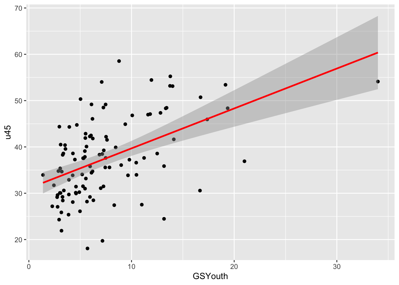
Figure 2.1: A ggplot scatterplot of GSYouth (a ratio of the lack of green space to young people) against under 45s, for one of the OAC classes.
You should unpick this: each line of code without the pipe sign (|>) can be run to see what it is doing. So for example, try examining the following sequence of code snippets. Notice the use of the st_drop_geometry() function to extract the data frame from the sf object and the use of head() to just show the first 6 records (rows) of the result:
Then…
oa_sf |>
st_drop_geometry() |>
filter(OAC_class == "Ethnicity Central") |>
mutate(GSYouth = (100-gs_area)/u16) |> head()And finally…
oa_sf |>
st_drop_geometry() |>
filter(OAC_class == "Ethnicity Central") |>
mutate(GSYouth = (100-gs_area)/u16) |>
select(GSYouth, u45) |> head()Note also, how the result of this final sequence of operations is piped directly into the ggplot code snippet. We will examine the ggplot2 package in more detail later in this session.
When working with sf spatial objects like oa_sf above, we often need to explicitly remove the geometry, as it is very sticky and remains with an sf object even when it is not selected!
It is also possible to use the summarise function along with group_by to generate group summaries. The code generates a mean of the unmplyd variable over OAC groups, generates an ordered table and assigns this to tmp. Notice how this is done at the end of the pipe and not the start:
oa_sf |>
st_drop_geometry() |>
group_by(OAC_class) |>
summarise(`Mean Unemployment` = mean(unmplyd)) |>
ungroup() |>
arrange(desc(`Mean Unemployment`)) -> tmp
tmpThe equivalent un-piped code would require the creation of many intermediate objects as below:
tmp1 = st_drop_geometry(oa_sf)
tmp2 = group_by(tmp1, OAC_class)
tmp3 = summarise(tmp2, `Mean Unemployment` = mean(unmplyd))
arrange(tmp3, desc(`Mean Unemployment`)) You will find that your use of the dplyr functions for manipulating data tables will grow in complexity the more you use them, and especially if used in conjunction with the piping syntax.
After the practical you should explore the introductory vignette to dplyr which describes the single table verbs in dplyr:
Tasks for single table dplyr verbs
Write some code that does the following:
- Summarises the median percentage of over 65 year olds (
o65) for different OAC classes, in descending order (hint: the function for calculating medians ismedianand look at the help forarrangeto work how how to do this in descending order). - Selects observations (records) with a very green space area (i.e. greater than 75%) and calculates the mean unemployment (
unmplyd) for different OAC classes and arranges them in descending order. - How does this change if the green space area in 2. above is not filtered for?
- Creates a variable of the ratio of unemployment (
unmplyd) to under 25s (u25), calculates the mean value of this ratio over different OAC classes and presents the results in descending order.
The answers to the tasks are at the end of this document.
2.2.3 Two table manipulations in dplyr
Data tables can be joined through an attribute that they have in common. To demonstrate this, load a second data table of census area attributes in Liverpool. The code below uses the read_csv function from the readr package that is part of the tidyverse. It reads data to a tibble - the data table format of the tidyverse, compared to read.csv which read data into a data.frame.
Here there is additional information about the Output Areas: the percentages of one person households (OnePH), one family household (OneFamH), people with a bachelors degree (Degree), and then the percentage of very broad ethnic groups (White, Mixed, Asian, Black and Other). You should also note that oa2 has an attribute called OAcode which is the same as code in oa_sf - this provides a key to how relational joins can be undertaken (i.e. using an attribute that 2 tables have in common to join them).
The code below uses inner_join to join the two data tables and prints out the fist 6 rows of the joined table.
This can be piped and the results can be written to a new object:
Which can be inspected in the same way:
Notice how, the join attributes common to each table (code and OAcode) have to be specified because in this case they did not have the same name. Run the code below that changes the names of the oa2 attribute before undertaking the join. Notice how the x and y required by inner_join are assumed (i.e. not named) by their position in the inputs to the inner_join function:
The join can be undertaken in such a way that the geometry of the spatial input (oa_sf) is retained in the output:
And in this case the result can be mapped:
joined_oa |>
ggplot() + geom_sf(aes(fill = Degree), colour = NA) +
scale_fill_continuous(name = "% Degree", type = "viridis")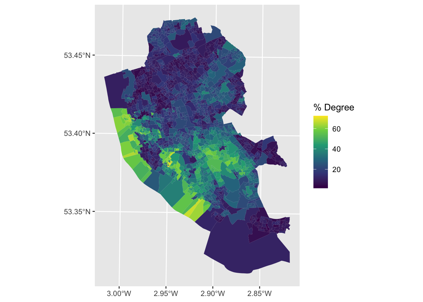
The direction of the join needs to be considered. Here we have 2 join data tables that have the same number of rows, representing the same census Output Areas. What about when we have data tables that do not match. The dplyr package defines a number of different types of joins that enforce cardinality (i.e. what get retained in the output) between any 2 tables in different ways. The different join types available in dplyr are summarised in the table below.
There are 6 join types included in the dplyr package - four of which are called mutating joins and two filtering joins. Mutating joins combine variables from both the x and y inputs and filtering joins only keep records from the x input. They have a similar syntax (do not run this code - it is showing the syntax):
| Join | Description | Type |
|---|---|---|
| inner_join() |
returns all of the records from x with matching values in y, and all fields from both x and y. If there are multiple matches between x and y, all combination of the matches are returned.
|
mutating |
| left_join() |
returns all of the records from x, and all of the fields from x and y. Any records in x with no match in y will be given NA values in the new fields. If there are multiple matches between x and y, all combination of the matches are returned.
|
mutating |
| right_join() |
returns all of the records in y, and all of the fields in x and y. Records in y with no match in x are given NA values in the new fields. If there are multiple matches between x and y, all combination of the matches are returned.
|
mutating |
| full_join() |
returns all records and fields from both x and y. NA is allocated to any non-matching values.
|
mutating |
| semi_join() |
returns all records from x where there are matching values in y, keeping just the fields from x. It never duplicates records as does an inner join.
|
filtering |
| anti_join() |
returns all the records from x where there are non-matching values in y, keeping just fields from x.
|
filtering |
To examine how the different join types work. The help section for dplyr joins has some other worked examples that you can copy and paste into your console and then run them:
After this practical you should explore the vignette for dplyr joins:
Tasks for dplyr table joins
You should write some code that joins oa_sf and oa2 that uses inner_join to return only the observations they have in common, and summarises mean percentage of the population with bachelor degrees (Degree) for different OAC classes.
The answers to the tasks are at the end of this document.
2.3 Part 2: Exploratory Data Analysis with ggplot
2.3.1 Introduction
Exploratory Data Analysis (EDA) is a critical part of any data analysis. It underpins the choice and development of methods and approaches of analysis, including which variables to retain and sometimes, which scale(s) to operate at.
The aim of EDA is to understand the properties or structure of the data. This includes distributions, data spread, central tendencies, etc for a single variable but also how different variables interact with each other. There are a number of visual and numeric tools to do this. Some of the numeric approaches have been illustrated.
# summary - with a nested st_drop_geometry() function
summary(st_drop_geometry(oa_sf))
# mean
mean(oa_sf$u16)
# standard deviation
sd(oa_sf$u16)Visual approaches are very useful for examining single variables and for examining the interactions of variables together. Common visualizations include histograms, frequency curves and bar charts, scatterplots, etc, some which have been already introduced in this and earlier sessions.
The ggplot2 package has many options as well as the type of visual summary. It allows multiple simultaneous visualizations, supports grouping by colour, shape and facets and the precise choice of the many options requires some careful thinking. Does the data need to be sorted or faceted? Should transparency and / or groups be used etc?
Earlier in this session some of the functions for plotting from the ggplot2 package were used to visualise data. The ggplot2 package is installed with the tidyverse package. R has several systems for making visual outputs such as graphs, but ggplot2 is one of the most elegant and most versatile. It implements the grammar of graphics (Wilkinson 2012), a coherent system for describing and building graphs. If you’d like to learn more about the theoretical underpinnings of ggplot2, “A Layered Grammar of Graphics” (Wickham 2010) is recommended.
This section provides some detail of ggplot2 but it is impossible to describe all of the different parameters and visualization options that are available. For this reason, the aims here are to establish some skills in visualisation.
The data we will use for this is defined below, combining the oa_sf and oa2 data tables to create df, re-ordered so that OAC_class is the last column:
oa_sf |>
st_drop_geometry() |>
select(-Easting, -Northing) |>
inner_join(oa2) |>
as_tibble() |>
select(code:unmplyd, OnePH:Other, OAC_class) -> dfWe can examine the numeric correlations, for example:
2.3.2 The ggplot Basics
The ggplot2 package provides a coherent system for describing and building graphs in which graphs are composed of different layers, each of which can be controlled.
The basic syntax is (do not run this code):
# specify ggplot with some mapping aesthetics
ggplot(data = <data>, mapping = <aes>)+
geom_<function>()In this syntax, first ggplot is called, a dataset is specified and some mapping aesthetics are defined. Together, these tell ggplot which variables are to be plotted (for example on the \(x\) and \(y\) axes), which variables are to be grouped and coloured. Finally, the plot type is specified such as geom_point(), geom_line() etc. ggplot2 has a defaults for plot and background colours, line types and sizes for points, line width, text etc, all of which can be overwritten.
These basics are probably best described through illustration.
2.3.3 Single variables
Starting with the simplest case, the distribution of a single continuous variable can be visualised using a histogram or a boxplot:
A probability density function can used as in the code below to create the figure below:
ggplot(df, aes(Black)) +
geom_histogram(aes(y=..density..),bins = 30, fill="indianred", col="white")+
geom_density(alpha=.5, fill="#FF6666")## Warning: The dot-dot notation (`..density..`) was deprecated in ggplot2 3.4.0.
## ℹ Please use `after_stat(density)` instead.
## This warning is displayed once every 8 hours.
## Call `lifecycle::last_lifecycle_warnings()` to see where this warning was
## generated.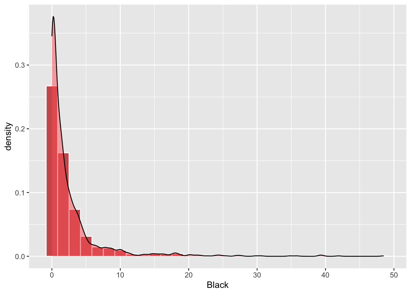
Figure 2.2: A density histogram with a probabaility density function.
NB I got the message
> Warning message:
The dot-dot notation (..density..) was deprecated in ggplot2 3.4.0.
ℹ Please use after_stat(density) instead.
This warning is displayed once every 8 hours.
Call lifecycle::last_lifecycle_warnings() to see where this warning was generated.
So I have updated the code:
ggplot(df, aes(Black)) +
geom_histogram(aes(y=after_stat(density)),bins = 30, fill="indianred", col="white")+
geom_density(alpha=.5, fill="#FF6666")The line geom_histogram(aes(y=after_stat(density)... rescales the histogram counts so that bar areas integrate to 1, but is otherwise the same as the standard ggplot2 histogram. The geom_density() function adds a density curve to the plot with a transparency term (alpha=.5). Try commenting out the middle line of the code above to see this on its own.
Recall that each use of ggplot requires a set of aesthetic mappings to be used and that these are specified using the aes argument. The variable Black is specified globally, and the density option within geom_histogram.
The code below generates the same histogram plot as the above, but this time with all of the mapping aesthetics specified for each plot layer individually:
ggplot() +
geom_histogram(data = df, aes(x = Black, y=..density..),
bins = 30, fill="indianred", col="white")+
geom_density(data = df, aes(x = Black), alpha=.5, fill="#FF6666")This layered approach to ggplot operations means that different variables can be passed to different layers. The code below shows unmplyd along with Black:
ggplot(data = df) +
geom_histogram(aes(x = unmplyd, y=..density..),
bins = 30, fill="indianred", col="white")+
geom_density(aes(x = Black), alpha=.5, fill="#FF6666")+
xlab("% Unemployed (bins) with % Black (curve)")Boxplots can also be used to explore distributions but I think are pretty rubbish for single variables:
Perhaps a more informative graph is to plot boxplots for each OAC class, ordered by their median value:
df |>
ggplot(aes(y=Degree, x = reorder(OAC_class, Degree, median), fill = OAC_class)) +
xlab("OAC class") +
coord_flip() +
geom_boxplot() +
theme(legend.position = "none") +
scale_fill_manual(name = "OAC class", values = c4a("brewer.spectral"))For categorical variables, bar plots can be used. The code below does this for OAC class counts.
# basic
ggplot(df, aes(x = OAC_class))+ geom_bar() + coord_flip()
# shaded
ggplot(df, aes(x = OAC_class, fill = OAC_class))+ geom_bar() + coord_flip()
# shaded with specified palette
ggplot(df, aes(x = OAC_class, fill = OAC_class))+ geom_bar() + coord_flip() +
scale_fill_manual(name = "OAC class", values =c4a("brewer.spectral"))2.3.4 Two variables
Scatterplots show how 2 continuous variables vary with each other - they allow the structure of the data to be examined and provide a visual summary of the pairwise correlations.
The code below generates a scatterplot of Degree against unmplyd from the oa_sf data, with a transparency term (alpha). The scatterplot of the percentage of people with a degree and unemployed is assigned to p:
Further graphical elements can be added as layers. The example below fits a trend line:
Layer specific parameters can be set such as colour, shape, transparency, size, thickness etc depending on the graphic, changing the default style. The ggplot2 package specifies a number of pre-defined styles, called by theme_X(), that can be added as a layer. The code below applies theme_bw() and sets the axis limits as in the figure below.
ggplot(data = df, aes(x = jitter(Degree), y = jitter(unmplyd)))+
# specify point characteristics
geom_point(size = 0.9, colour = "#FB6A4A", shape = 19)+
geom_smooth(method = "lm", colour = "#DE2D26")+
# specify a style
theme_bw() 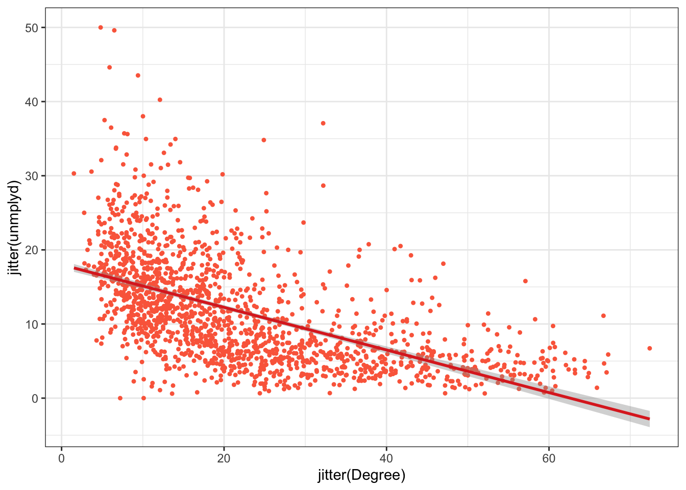
Figure 2.3: A scatterplot of the percentage of people with a degree and unemployed (unmplyd).
You should explore other ggplot themes which are listed if you enter ?theme_bw at the console.
Another approach for this is to use use hexbins. These are hexagonal tiles that are shaded to represent the number of data points at that location in a scatterplot. They provide a convenient way of summarising data. This is especially useful with very large data. Plot character size and transparency can be used as above to aid visualisation. Binning provides another route.
The bin shadings provide a convenient way of representing the density of data points with a similar value. Of course different elements of faceting, ordering, binning and grouping can be combined as in the figure below:
df |>
ggplot(mapping = aes(x = Degree, y = unmplyd)) +
geom_hex(bins=10) +
labs(fill='Count')+
scale_fill_gradient(low = "lemonchiffon", high = "darkblue") +
facet_wrap(~OAC_class)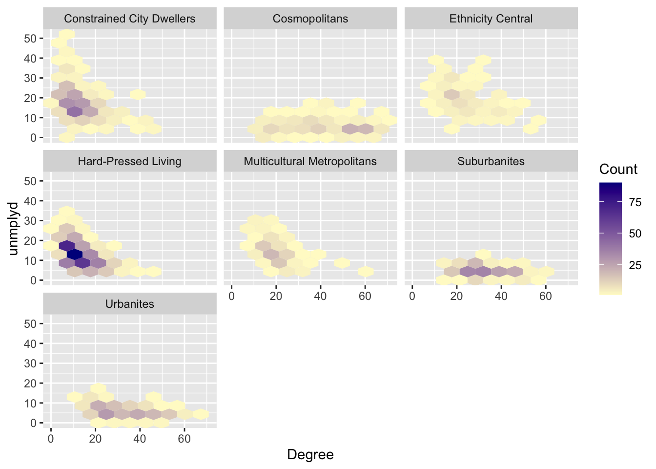
Figure 2.4: Hex bin plots of unmplyd and Degree variables by OAC class.
2.3.5 Facets and Groups
The last plot included faceting and grouping with the fill argument to group the data. These can be used with other plots to generate plots for different groups or categories.
In the simplest case, the colour parameter, specified in the aesthetics passed to ggplot, can be used to group:
More interestingly, the facet_wrap function can be used to generate multiple plots of a single variable. The variable that you pass to facet_wrap() should be discrete, i.e. categorical.
df |>
ggplot(aes(x=unmplyd)) +
geom_histogram(fill="firebrick3", bins = 30, col = "white") +
facet_wrap( ~ OAC_class, ncol = 4)This can be used for scatterplots as well. The code below generates separate scatterplots degree and unemployment percentages for each OAC class as in the figure below with some interesting differences across groups.
ggplot(data = df, aes(x = Degree, y = unmplyd)) +
# specify point characteristics
geom_point(alpha = 0.6, size = 0.7, colour = "#FB6A4A", shape = 1) +
geom_smooth(method = "lm", colour = "#DE2D26") +
facet_wrap(~OAC_class, nrow = 2) +
theme_bw() 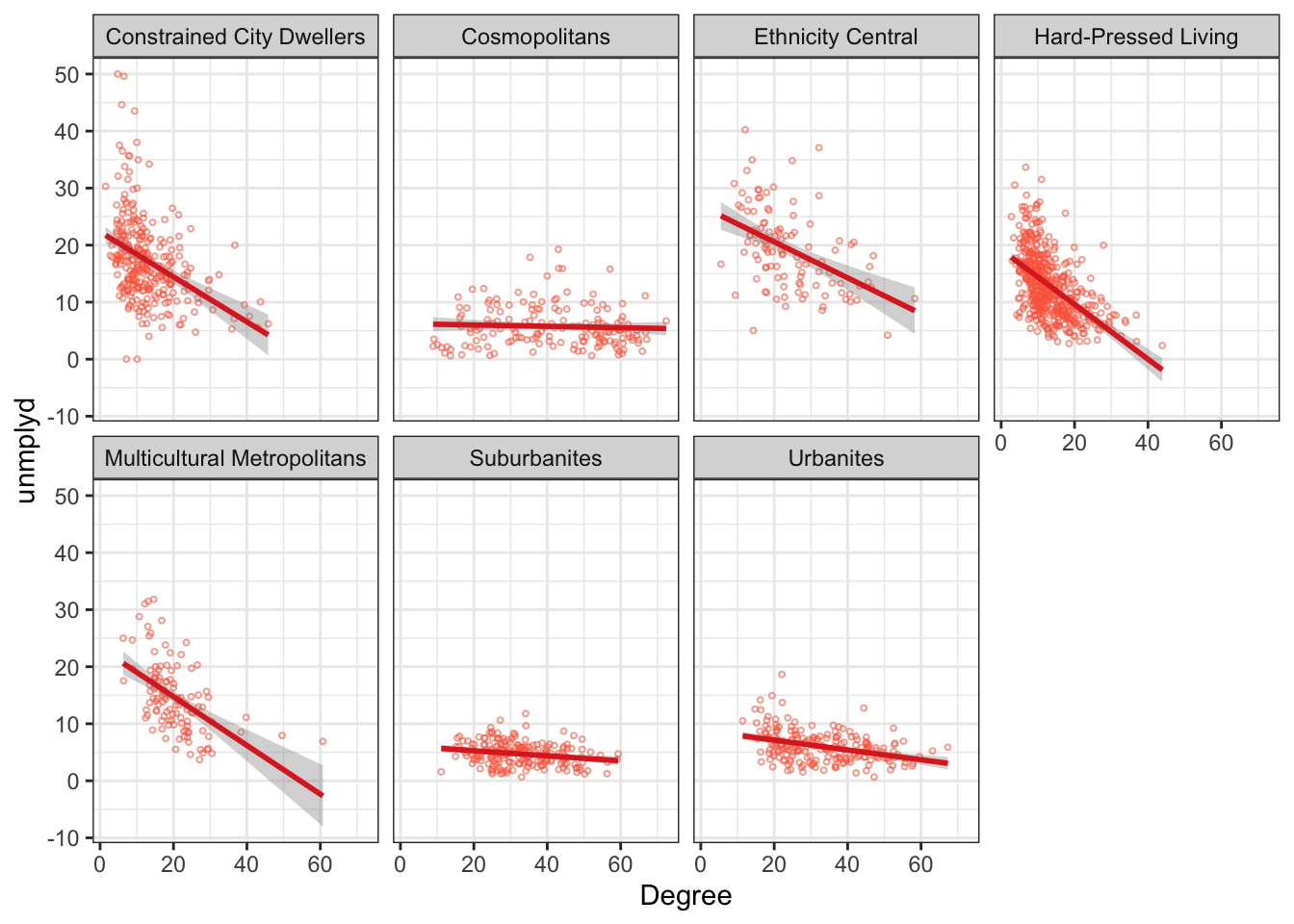
Figure 2.5: A faceted scatterplot of the percentage of people with a degree and unemployed (unmplyd)
Finally, histograms of all of the numeric data in df can be created. This requires the flat and wide data table to be converted to long format before being passed to facet_wrap - you should inspect the outputs of each stage!
df |>
# select the numeric variables
select_if(is.numeric) |>
# make a new variable to make the data longer
mutate(ID = 1:n()) |>
# make the data longer
pivot_longer(-ID) |>
# pass to ggplot
ggplot(aes(value)) +
geom_histogram(fill="firebrick3", bins = 30, col = "white") +
# face wrap
facet_wrap("name", scales = "free")2.3.6 Multiple variables
All the approaches until now have examined graphics showing univariate or bivariate (pair-wise) structure or relations. It it sometimes useful to examine multiple variables together. The code below examines differences in the properties of OAC classes. It constructs polar or radar plots showing the typical (mean) values of the different OAC classes for each of the numeric variables, as in the figure below. The code was modified from https://r-graph-gallery.com/web-circular-barplot-with-R-and-ggplot2.html and https://github.com/toebR/Tidy-Tuesday/blob/master/hiking/script.R.
df |>
# remove the code attribute
select(-code) |>
# rescale numeric variables
mutate_if(is.numeric, scale) |>
# get group means
group_by(OAC_class) |>
summarise_if(is.numeric, mean, na.rm = TRUE) |>
# convert to long format
pivot_longer(-OAC_class) |>
# arrange in variable order (specifying the language)
arrange(desc(name),.locale="en") |>
ggplot() +
# make custom panel grid with lines
geom_hline(
aes(yintercept = y),
data.frame(y = c(-2:2)),
color = "lightgrey"
) +
# add a dashed line for 0
geom_hline(
aes(yintercept = y),
data.frame(y = 0),
color = "black",
linetype = "dashed"
) +
# add bars to represent the values
geom_col(
aes(
x = factor(name),
y = value,
group= OAC_class, fill=OAC_class
),
) +
# adjust the shading
scale_fill_manual(values= c4a("brewer.set2")) +
# facet
facet_wrap(~OAC_class, ncol = 4)+
# make polar / radar
coord_polar() +
# tidy the plot
theme_light() +
theme(legend.position = "none",
axis.title = element_blank(),
axis.text = element_text(size = 8))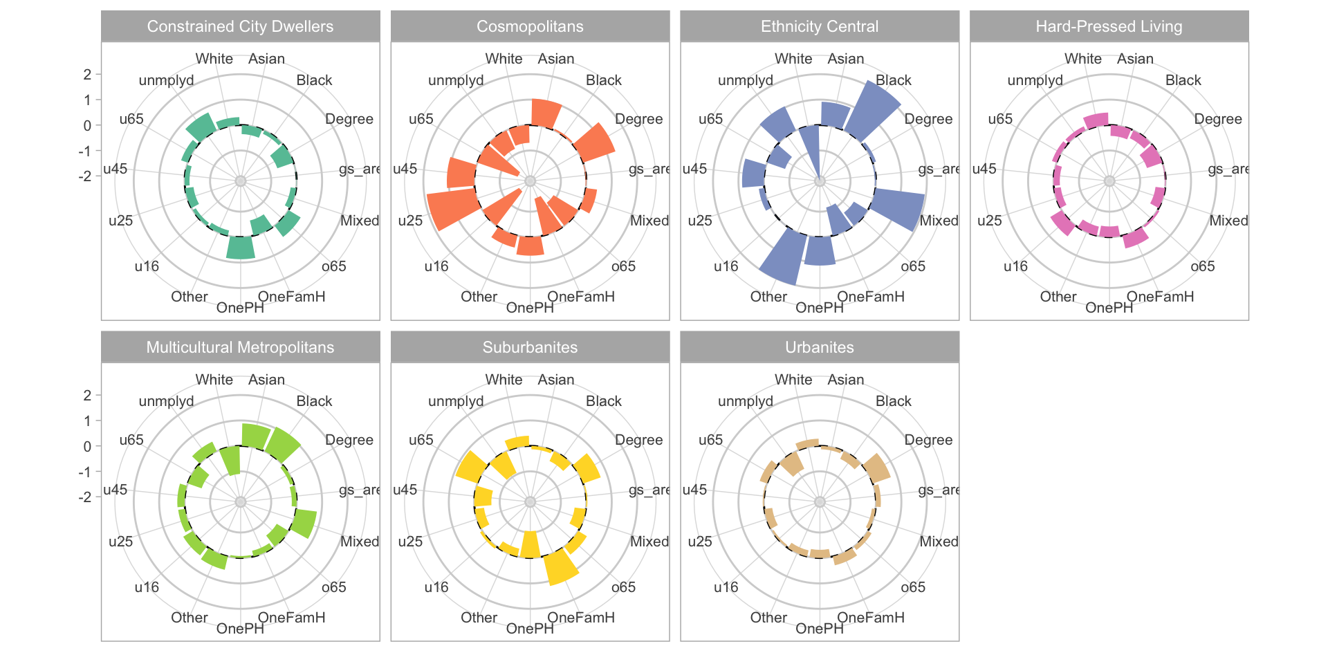
Figure 2.6: Radar plots of the standardised (rescaled) mean variable values for each OAC class.
In the above code the data were rescaled to show the variables on the same polar axis. Rescaling can be done in a number of ways and there are many functions to do it. Here the scale function applies a classic standardised approach around mean of 0 with a standard deviation of 1 - i.e. a z-score. The polar plots in the figure show that there are some large differences between OAC classes in most of the variables, although how evident this is will depend on the method of rescaling (trying changing rescale with scale in the code above and change mean to median).
2.3.7 Writing figures to file
A final consideration is that figures, plots, graphs, maps etc can be written out to a file for use in a document or report. There are a whole host of formats that graphics can be written out but usually we want PDFs, JPEGs, TIFFs or PNGs. This is very short sections that simply introduces 3 methods for writing graphics, figures and maps out to files.
There are a number of functions that do this:
Examine the help for these.
The key thing you need to know is that these functions all open a file. The open is then populated with the figure and the file is closed using dev.off() after the map or the figure has been written to it. So the basic syntax is (do not run this code - it is just showing syntax) :
You should try to write out a .png file of the map using the code below. This writes a .png file to the current working directory, which can always be changed:
2.3.8 Summary
EDA is a critical component of any data analysis and any spatial data analysis. Visualizing data is one of the easiest ways to do this and of course further refinement would be possible with some tests of significance (for example of the differences between groups).
The ggplot2 package is amazing. It is a bit of learning curve (i.e. difficult at first) especially with the piping syntax but it is quick and easily modifiable and can be wrapped into figure-making functions easily.
There are some excellent texts on data visualization more generally and specifically using R. It would be impossible to list them all and indeed many of them have some kind of on-line or bookdown version that are free to use. Various R specific texts provide insight into specific packages, such as Wickham (2016) as well as more general guidance about how to use different visualization techniques:
- ggplot2: Elegant Graphics for Data Analysis (Villanueva and Chen 2019)
- R Graphics Cookbook: Practical Recipes for Visualizing Data (Chang 2018)
- Data Visualization: a Practical Introduction (Healy 2018)
- Data Visualization with R https://rkabacoff.github.io/datavis/
It is impossible to capture the full dynamics of this information environment: new web-pages, blogs, tutorials etc appear constantly. In this context the aims of this session are not provide a comprehensive treatment of ggplot2 or all the different mapping options for spatial data. Rather, it briefly describes how to visualise the properties of data with the ggplot2 package as this is now the R default.
2.4 Part 3: Optional: Mapping and visualizing spatial properties
There are 2 packages that support mapping of spatial data: tmap and ggplot2. They are both introduced here. Note that tmap is in the process of being updated to tmap v4 (see https://github.com/r-tmap/tmap) which will change the syntax and structure used in calls to tmap functions. However
tmap v4has not been released yet so the code below usestmap v3syntax- the
tmap v4syntax is a real mess - illogical and confused. It is almost like someone has been whispering bad advice in Martijn Tennekes’ (the package owner) ear
So tmap v3 is presented but moving forward you are advised to undertake your mapping using ggplot2 approaches.
2.4.1 Mapping with tmap
The tmap package was used above in the calls to qtm or quick tmap. The tmap package supports the thematic visualization of spatial data, and mapping allows the spatial distributions of spatial data variables to be visualised.
It has a similar grammatical style to ggplot2 in that it handles each element of the map separately in a series of layers. In so doing it seeks to exercise control over each element. This is different to the basic R plot functions. tmap has a basic syntax (again, do not run this code - its is simply showing the syntax of tmap):
The tm_shape function initialises the map and then layer types and what gets mapped are specified using different flavours of tm_<function> as in the table below.
| Function | Description |
|---|---|
| tm_dots, tm_bubbles | for points either simple or sized according to a variable |
| tm_lines | for line features |
| tm_fill, tm_borders, tm_polygons | for polygons / areas, with and without attributes and polygon outlines |
| tm_text | for adding text to map features |
| tm_format, tm_facet, tm_layout | for adjusting cartographic appearance and map style, including legends |
| tm_view, tm_compass, tm_credits, tm_scale_bar | for including traditional cartography elements |
The easiest way to illustrate tmap is through some examples Lets start with a simple choropleth map. This shows the distribution of a continuous variable in different elements of the spatial data (typically polygons / areas or points). The code below maps `o65’ as in the figure below, and shows that there is a general trend running East-West,.
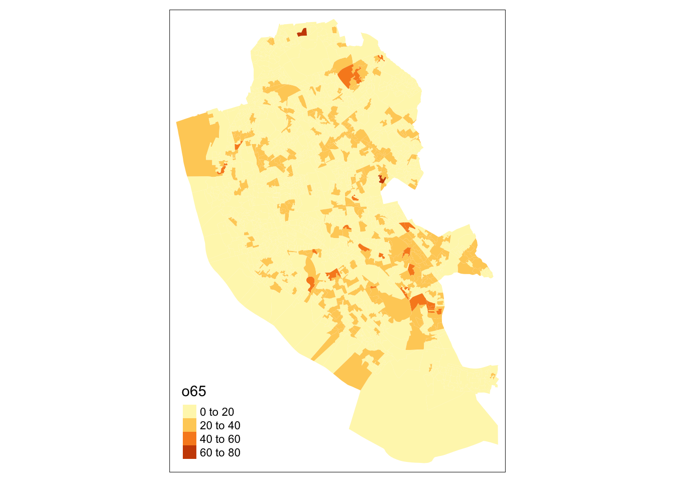
Figure 2.7: A choropleth map of o65.
By default tmap picks a shading scheme, the class breaks and places a legend somewhere. All of these can be changed. The code below allocates the tmap plot to p1 (plot 1) and then prints it:
p1 = tm_shape(oa_sf)+
tm_fill("o65", palette = "GnBu",
breaks = seq(0,100, 10), title = "% Over 65")+
tm_layout(legend.position = c("left", "top"), legend.outside = T)
p1And of course many other elements included either by running the code snippet defining p1 above with additional lines or by simply adding them as in the code below:
It is also possible to add or overlay other data such as the boundary, which because this is another spatial data layer needs to be added with tm_shape followed by the usual function:
The tmap package can be used to plot multiple attributes in the same plot in this case the u16 (% Under 16) and o65 (% Over 65) attributes, which perhaps unsurprisingly show an very different distributions as in the figure below:
tm_shape(oa_sf)+
tm_fill(c("u16", "o65"), palette = "GnBu",
title = c("% Under 16", "% Over 65"))+
tm_layout(legend.position = c("left", "bottom"))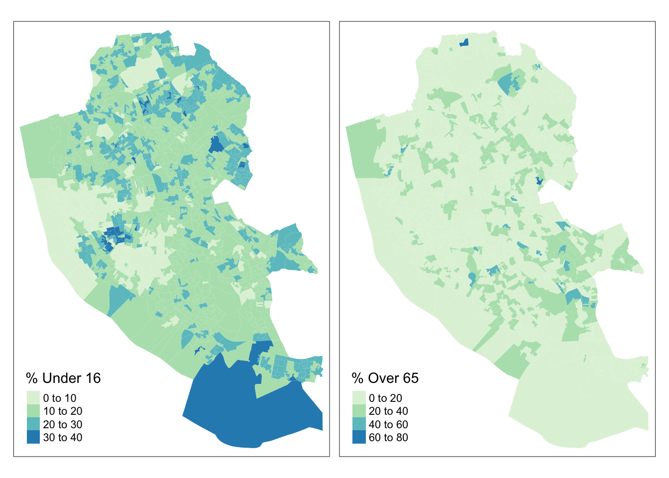
Figure 2.8: Choropleth maps of u16 and o65.
The code below applies further refinements to the choropleth map to generate the figure below. Notice the use of title and legend.hist, and then subsequent parameters passed to tm_layout to control the legend:
tm_shape(oa_sf)+
tm_fill("unmplyd", title = "% Unemployment", palette = "Reds",
style = "kmeans", legend.hist = T)+
tm_layout(title = "Liverpool",
frame = F, legend.outside = T,
legend.hist.width = 1,
legend.format = list(digits = 1),
legend.outside.position = c("left", "top"),
legend.text.size = 0.7,
legend.title.size = 1)+
tm_compass(position = c(0.13, 0.1))+
tm_scale_bar(position = c("left", "bottom")) +
tm_shape(boundary) + tm_borders(col = "black", lwd = 1)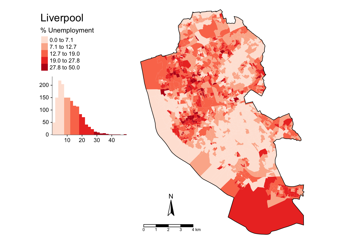
Figure 2.9: A refined choropleth map of unmplyd.
This is quite a lot of code to unpick. The first call to tm_shape determines which layer is to be mapped, then a specific mapping function is applied to that layer (in this case tm_polygons) and a variable is passed to it. Other parameters to specify are the palette, whether a histogram is to be displayed and the type of breaks to be imposed (here a \(k\)-means was applied). The help for tm_fill describes a number of different parameters that can be passed to tmap elements. Next, some adjustments were made to the defaults through the tm_layout function, which allows you to override the defaults that tmap automatically assigns (shading scheme, legend location etc). Finally the boundary layer was added.
There are literally 1000’s of options with tmap and many of them are controlled in the tm_layout function. You should inspect this:
The code below maps point data in different ways using oa_sf centroids. There are 2 basic options: change the size or change the shading of the points according to the attribute value. The code snippets and resultant figures below illustrate these approaches.
First by size using tm_bubbles:
# the boundary layer
tm_shape(boundary) +
tm_fill("olivedrab4") +
tm_borders("grey", lwd = 2) +
# the points layer
tm_shape(st_centroid(oa_sf)) +
tm_bubbles("unmplyd", title.size = "% Unemployed", scale = 0.8, col = "gold")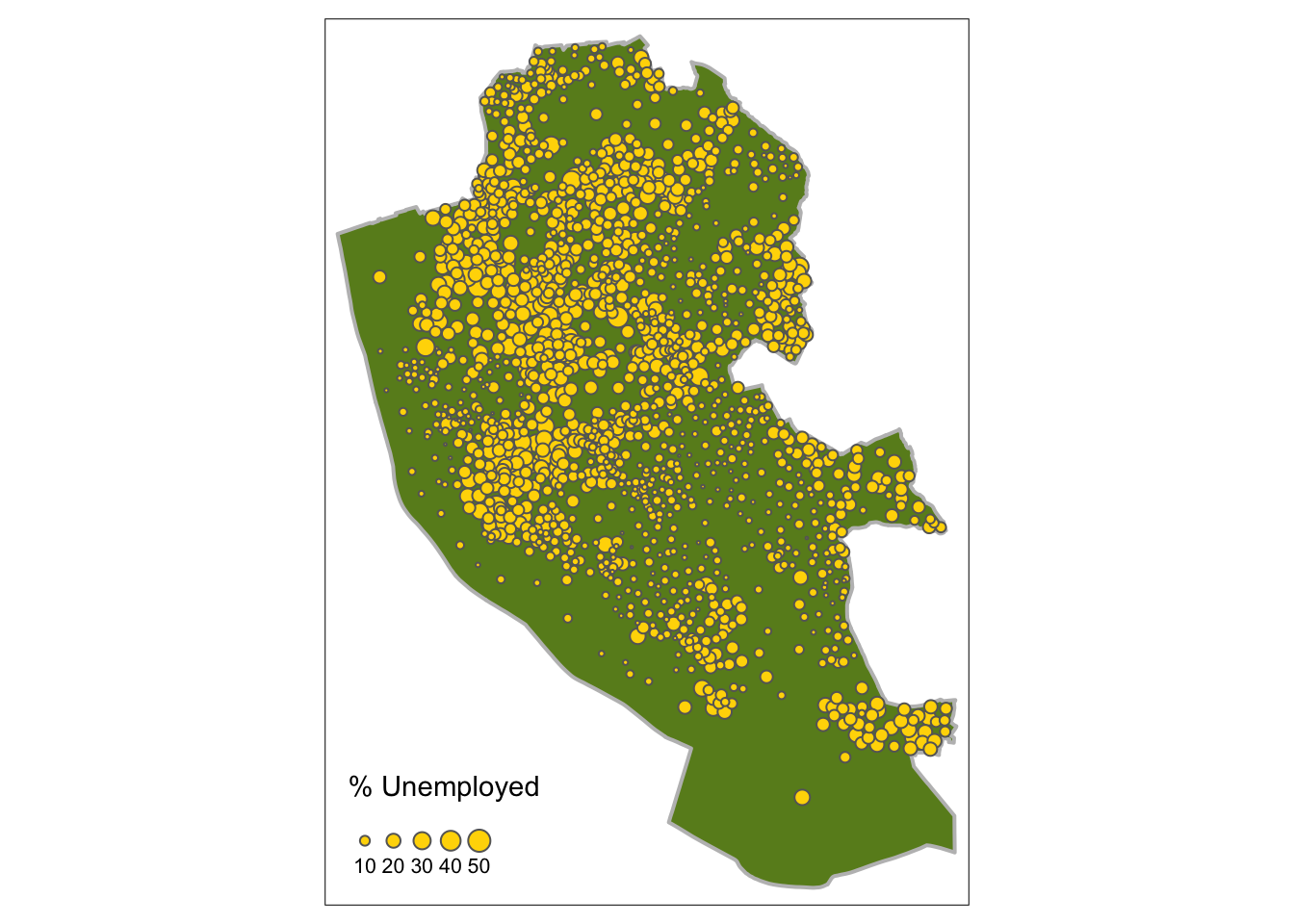
Figure 2.10: Point data values using size.
Second by shade using tm_dots:
# the 1st layer
tm_shape(boundary) +
tm_fill("grey70") +
tm_borders("gold", lwd = 2) +
# the points layer
tm_shape(st_centroid(oa_sf)) +
tm_dots("unmplyd", size = 0.2, title = "% Unemployed", shape = 19) 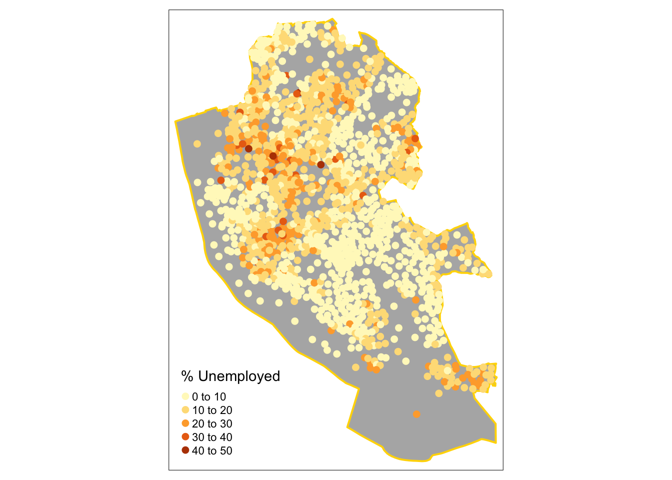
Figure 2.11: Point data values using choropleth mapping (colour).
It is possible to use an OpenStreetMap backdrop for some basic web-mapping with tmap by switching the view from the default mode from plot to view. You need to be online and connected to the internet. The code below generate zoomable web-map map with an OpenStreetMap backdrop in the figure below with a transparency term to aid the understanding of the local map context: