4 Static visualization of data
Installation/loading libraries/data used
if (!require(wordcloud)) install.packages('wordcloud')
library(wordcloud)
if (!require(RColorBrewer)) install.packages('RColorBrewer')
library(RColorBrewer)
if (!require(GGally)) install.packages('GGally')
library(GGally)
if (!require(openxlsx)) install.packages('openxlsx')
library(openxlsx)
if (!require(pxR)) install.packages('pxR')
library(pxR)
if (!require(patchwork)) install.packages('patchwork')
library(patchwork)
if (!require(ggplot2)) install.packages('ggplot2')
library(ggplot2)
if (!require(tidyverse)) install.packages('tidyverse')
library(tidyverse)In this course we attach great importance to data visualization. In this first chapter dedicated to this topic we are going to present the static visualization that corresponds to the usual visualization where the user does not interact with the graph. We will see that with very few lines of code, very attractive and complex graphics can be created using a common structure, independent of the content of the graphic, this is possible with the so-called grammar of graphics that we will present below.
4.1 The grammar of graphics
Visualizing a varied collection of related data requires good organization of the different elements that graphs can include. To facilitate this organizational task, a grammar is defined (see [Wi10]), where a graph is the result of the combination of the following elements that are organized by layers:
The data table and a declaration of the table elements involved in the graph.
The layers with the geometric attributes to be used such as histograms, box plots, line graphs, data statistics, positioning adjustments, etc.
One scale for each geometric object included.
A coordinate system
Specifications on whether to include multiple graphs (
facets) combining table dataSpecifications on formatting and layout issues related to chart output
This organization represents an abstraction of the process of creating a graph and, as we will see, it is very powerful for creating, with very compact code, all types of complex graphs.
To generate graphs using this grammar we will use the ggplot2 library and its ggplot function, which, as we will see, is a very powerful visualization tool. As a summary of this section it may be useful to look at the following summary sheet.
4.2 Bar charts
We are going to draw, using ggplot, a bar plot with the world population organized by
continents. In this case the graph is generated by calling ggplot, and adding
a single layer generated by geom_bar. To add new layers to the graph,
uses the + symbol.
owid_country %>%
   group_by(continent) %>%
   summarise(population=sum(population)) %>%
   ggplot(aes(x=continent,y=population,fill=continent)) +
     geom_bar(stat = "identity")
Figure 4.1: Bar diagram using geom_bar
the fill=continent statement is used to automatically assign colors
to the bars. These design issues will be discussed in detail at the end of the chapter.
4.3 Grouped bar diagrams
Let’s draw a stacked bar chart using the average, by continent, of the percentage of male smokers and female smokers.
owid_country %>%
   group_by(continent) %>%
   summarise(
     male=mean(na.omit(male_smokers)),
     female=mean(na.omit(female_smokers))) %>%
   pivot_longer(male:female, names_to = "sex", values_to = "smokers") %>%
   ggplot(aes(x=continent,y=smokers,fill=sex)) +
     geom_bar(stat = "identity")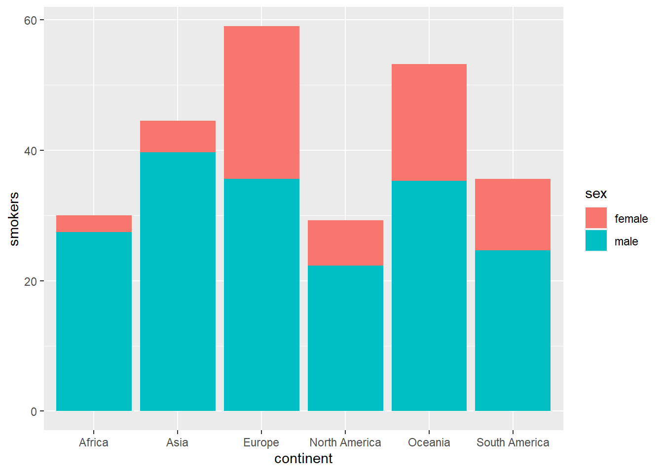
Figure 4.2: Stacked bar diagram using geom_bar
Next we will do the same but aligning the bars with the position="dodge" option
owid_country %>%
   group_by(continent) %>%
   summarise(
     male=mean(na.omit(male_smokers)),
     female=mean(na.omit(female_smokers))) %>%
   pivot_longer(male:female, names_to = "sex", values_to = "smokers") %>%
   ggplot(aes(x=continent,y=smokers,fill=sex)) +
     geom_bar(position="dodge",stat = "identity")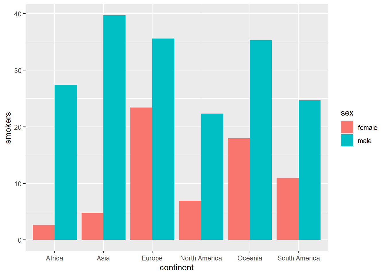
Figure 4.3: Aligned bar diagram using geom_bar
Next we are going to represent the same graph with horizontal and “mirror” bars, that is, the central vertical line represents the zero level and one variable moves to the right and another to the left. To do this we have to use the trick of assigning a negative value to the variable that we want to appear on the left. So that the axis values do not come out negative, they are set to an absolute value with the instruction scale_y_continuous(labels= abs).
owid_country %>%
   group_by(continent) %>%
   summarise(
     male=mean(na.omit(male_smokers)),
     female=-mean(na.omit(female_smokers))) %>% # change the sign of this variable
   pivot_longer(male:female, names_to = "sex", values_to = "smokers") %>%
   ggplot(aes(x=continent,y=smokers,fill=sex)) +
     geom_col() +
     coord_flip() + # rotate the graph 90 degrees
     scale_y_continuous(labels= abs) # axis values in absolute value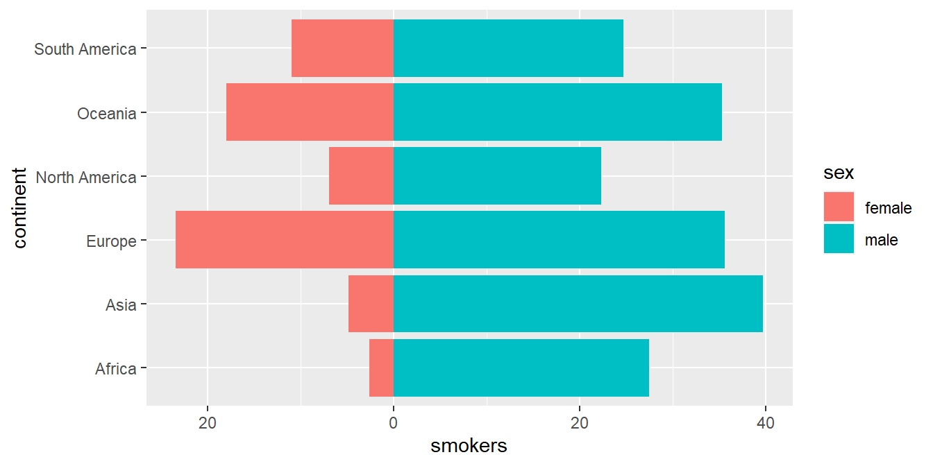
Figure 4.4: Horizontal bar chart to compare 2 variables using geom_col
4.4 Pie Charts
When the number of data is small, an effective way to visualize the relationship between the data is to use the well-known pie charts (pie charts). In it The following example shows how to build one using the pooled world population by continents:
owid_country %>%
   group_by(continent) %>%
   summarise(population=sum(population)) %>%
   mutate(labels = scales::percent(population/sum(population))) %>%
   ggplot(aes(x="",y=population,fill=continent)) +
     geom_col() +
     geom_text(aes(x=1.6,label = labels),position = position_stack(vjust = 0.5)) +
     coord_polar(theta = "y")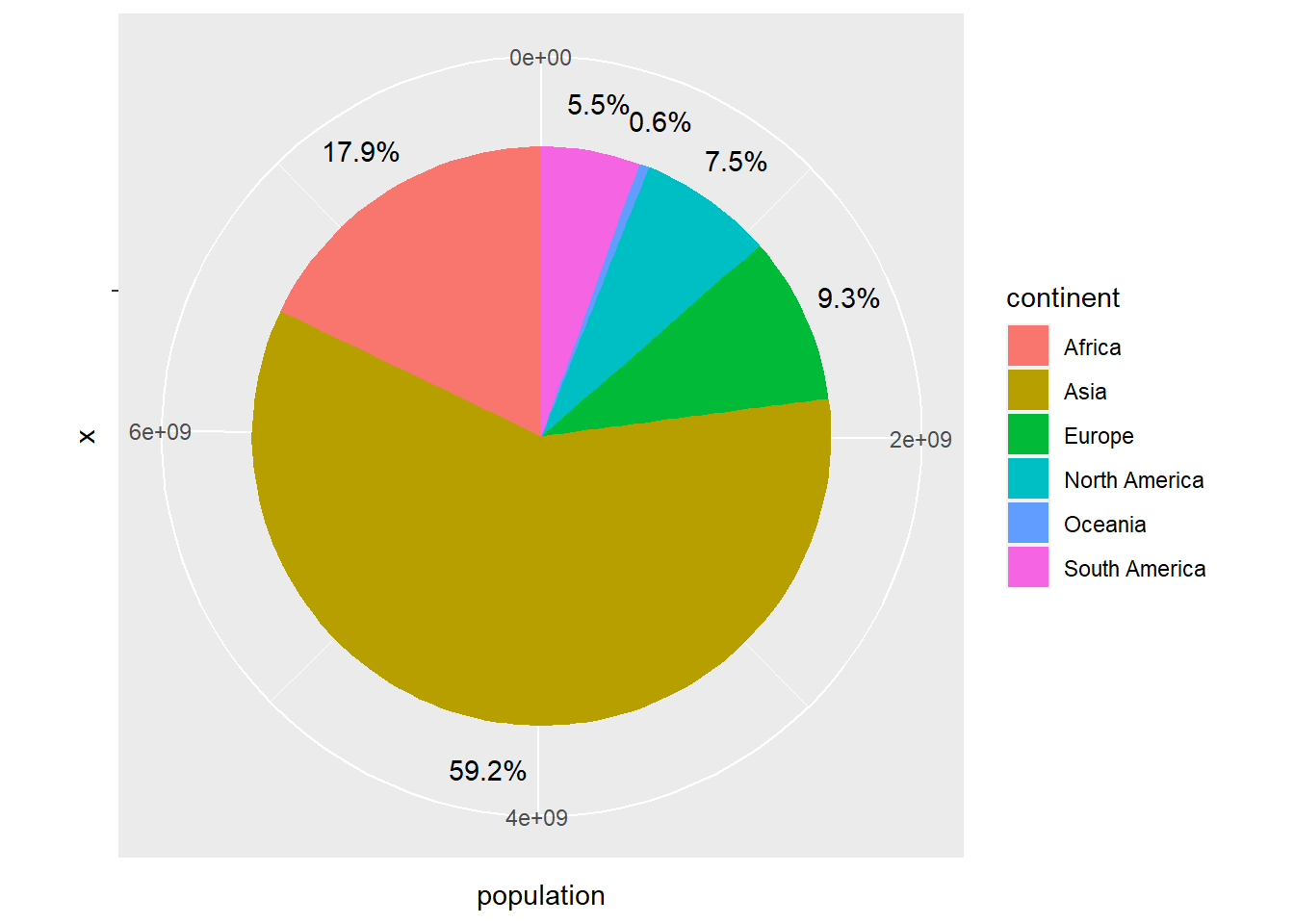
Figure 4.5: Pie chart using geom_col
The coord_polar function can be used to transform a bar chart into a pie chart. Let’s see what the stacked bar chart from the previous section looks like when transformed into a pie chart.
owid_country %>%
   group_by(continent) %>%
   summarise(
     male=mean(na.omit(male_smokers)),
     female=mean(na.omit(female_smokers))) %>%
   pivot_longer(male:female, names_to = "sex", values_to = "smokers") %>%
   ggplot(aes(x=continent,y=smokers,fill=sex)) +
     geom_bar(stat = "identity",width = 1) +
     coord_polar(theta = "x")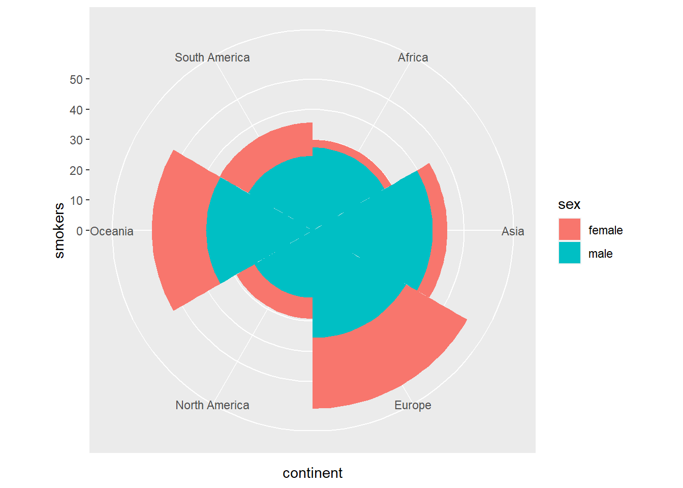
Figure 4.6: Stacked bar diagram transformed into circular sectors using coord_polar
4.5 Donut graphics
Donut charts are very similar to pie charts, leaving a circular gap inside the chart. We will use the hsize variable to set the size of the hole.
hsize <- 2
owid_country %>%
   group_by(continent) %>%
   summarise(population=sum(population)) %>%
   mutate(labels = scales::percent(population/sum(population))) %>%
   ggplot(aes(x=hsize,y=population,fill=continent)) +
     geom_col() +
     geom_text(aes(x=hsize + 0.1,label = labels),position = position_stack(vjust = 0.5)) +
     coord_polar(theta = "y") +
     xlim(c(0.2, hsize + 0.5))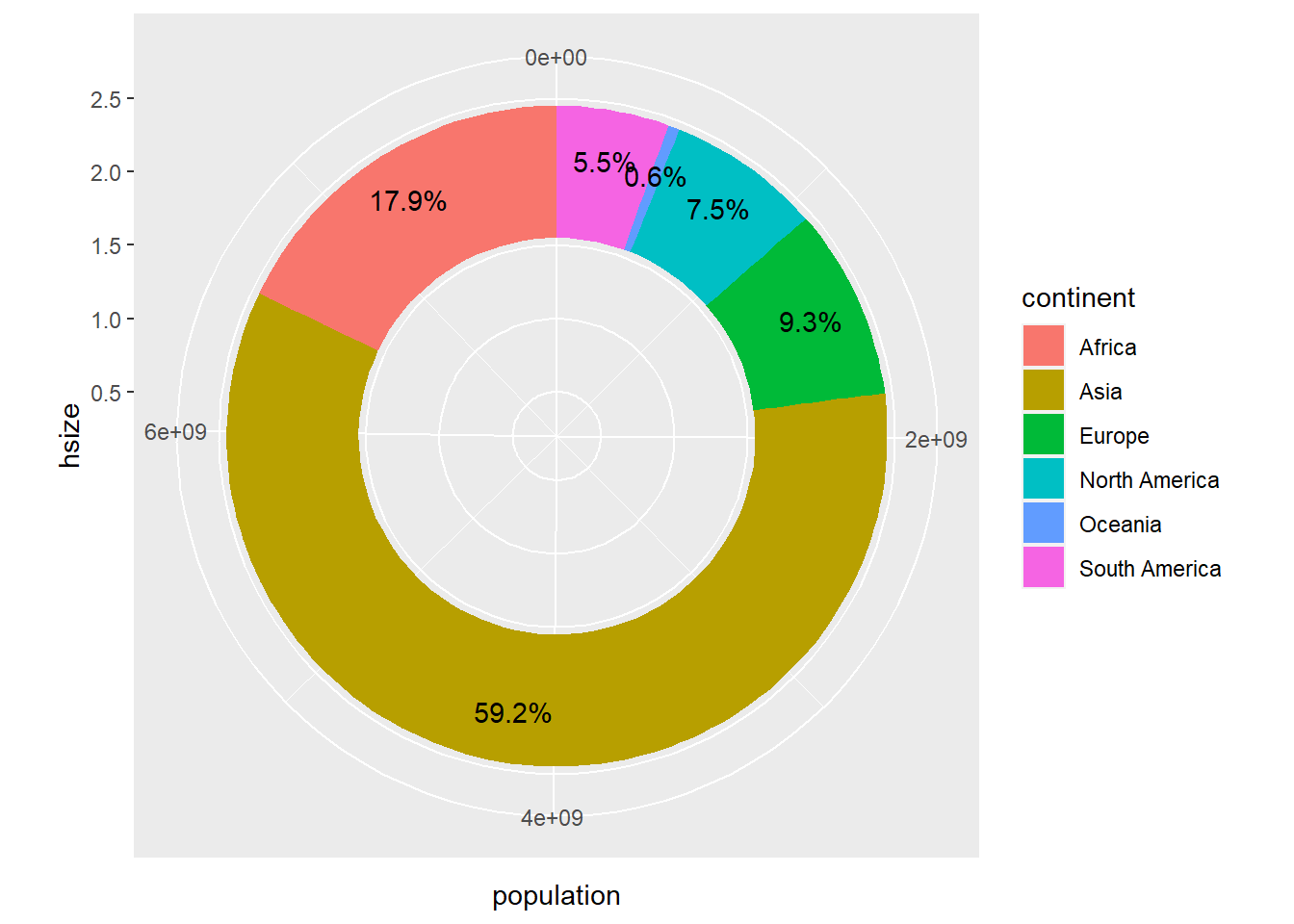
Figure 4.7: Donut chart using geom_col
4.6 Histograms
Next, we are going to draw a histogram of the GDP per capita in the different countries of the world using ggplot.
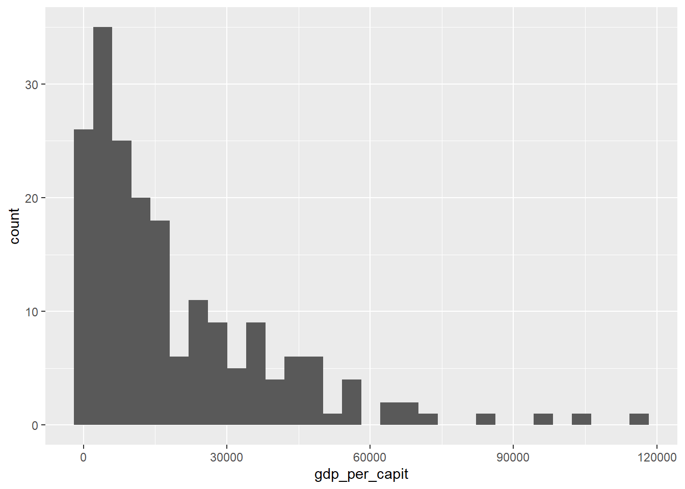
Figure 4.8: Histogram plot using geom_histogram()
Next we will do the same but adjusting the histogram to a probability density function.
owid_country %>%
   ggplot(aes(x=gdp_per_capit)) +
     geom_histogram(aes(y=after_stat(density))) +
     geom_density(alpha=0.6)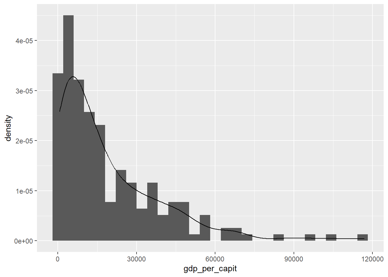
Figure 4.9: Histogram and density function with geom_histogram and geom_density
Below we present the histogram organized by continents.
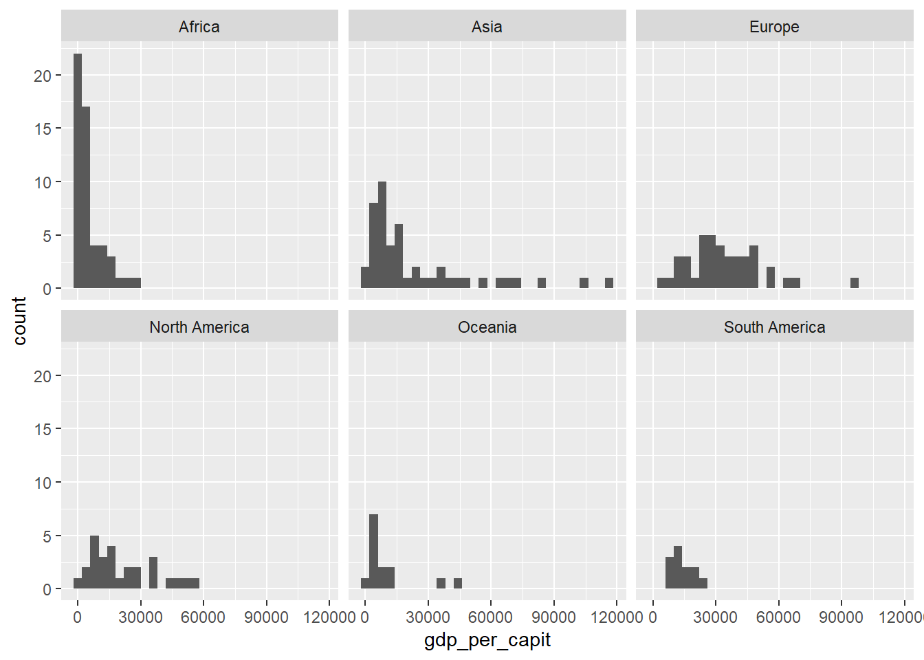
Figure 4.10: Drawing a grid with gdp_per_capit histograms organized by continents using facet_wrap
Finally we draw the histogram of the population by country. Since this variable varies greatly between countries we use a logarithmic scale on the axes. We also add some vertical lines with the position of the mean and the percentiles 0.25, 0.5 (the median) and 0.75.
owid_country %>%
   ggplot(aes(x=population)) +
     geom_histogram() +
     scale_y_continuous(trans = 'log2') +
     scale_x_continuous(trans = 'log2') +
     geom_vline(aes(xintercept=mean(population)),linetype="dashed") +
     geom_vline(aes(xintercept=quantile(population,0.25)),linetype="solid") +
     geom_vline(aes(xintercept=quantile(population,0.5)),linetype="solid") +
     geom_vline(aes(xintercept=quantile(population,0.75)),linetype="solid")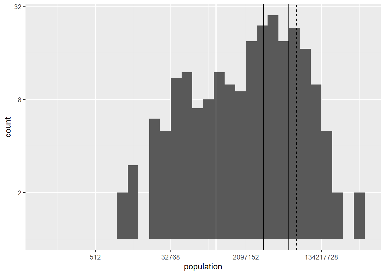
Figure 4.11: Histogram using a logarithmic scale for the axes including vertical lines at the position of the mean and leading percentiles using geom_vline
4.7 Boxplots
Boxplots are a very powerful tool for illustrating the difference between different distributions. Vertical box plots contain the following information
\(Q_1\) : the base of the rectangle corresponds to quartile 1 (25% percentile).
\(Q_2\) : the center line of the rectangle corresponds to the 2nd quartile (50% percentile, the median).
\(Q_3\) : the height of the rectangle corresponds to the 3rd quartile (75% percentile).
To draw the lines above and below, the value \(IQR=Q_3-Q_1\) is used.
The bottom line corresponds to the maximum between \(Q_1 - 1.5IQR\) and the minimum of the data values.
The top line corresponds to the minimum between \(Q_3 + 1.5IQR\) and the maximum of the data values.
In addition, the data values below and above the box-plot are drawn in the form of points. These values are considered “outliers” (values outside the expected range).
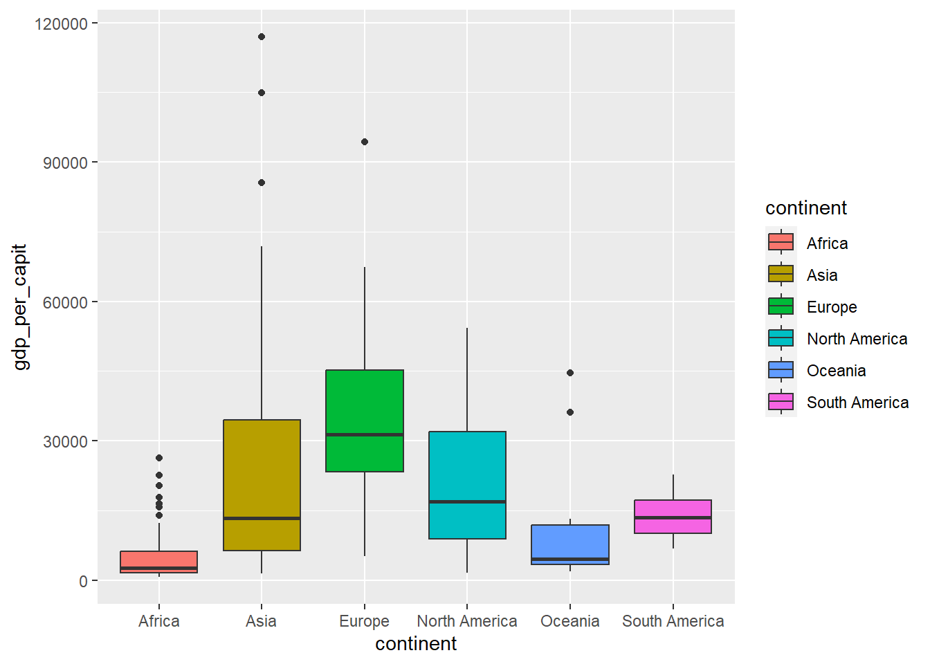
Figure 4.12: Boxplot using geom_boxplot
When the set of values is not very large, the values are usually drawn in the form of points to better illustrate the distribution.
owid_country %>%
   ggplot(aes(x=continent,y=gdp_per_capit,fill=continent)) +
     geom_boxplot(outlier.shape = NA) +
     geom_jitter(shape=16, position=position_jitter(0.2))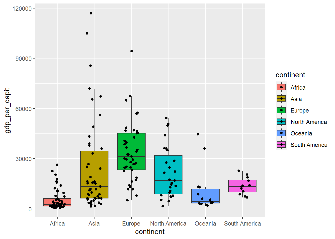
Figure 4.13: Boxplot including all values as points, using geom_jitter
When the set of values is very large, box-plots are usually drawn in the shape of a violin, where the lateral curve (side of the violin) represents the density function of the distribution.
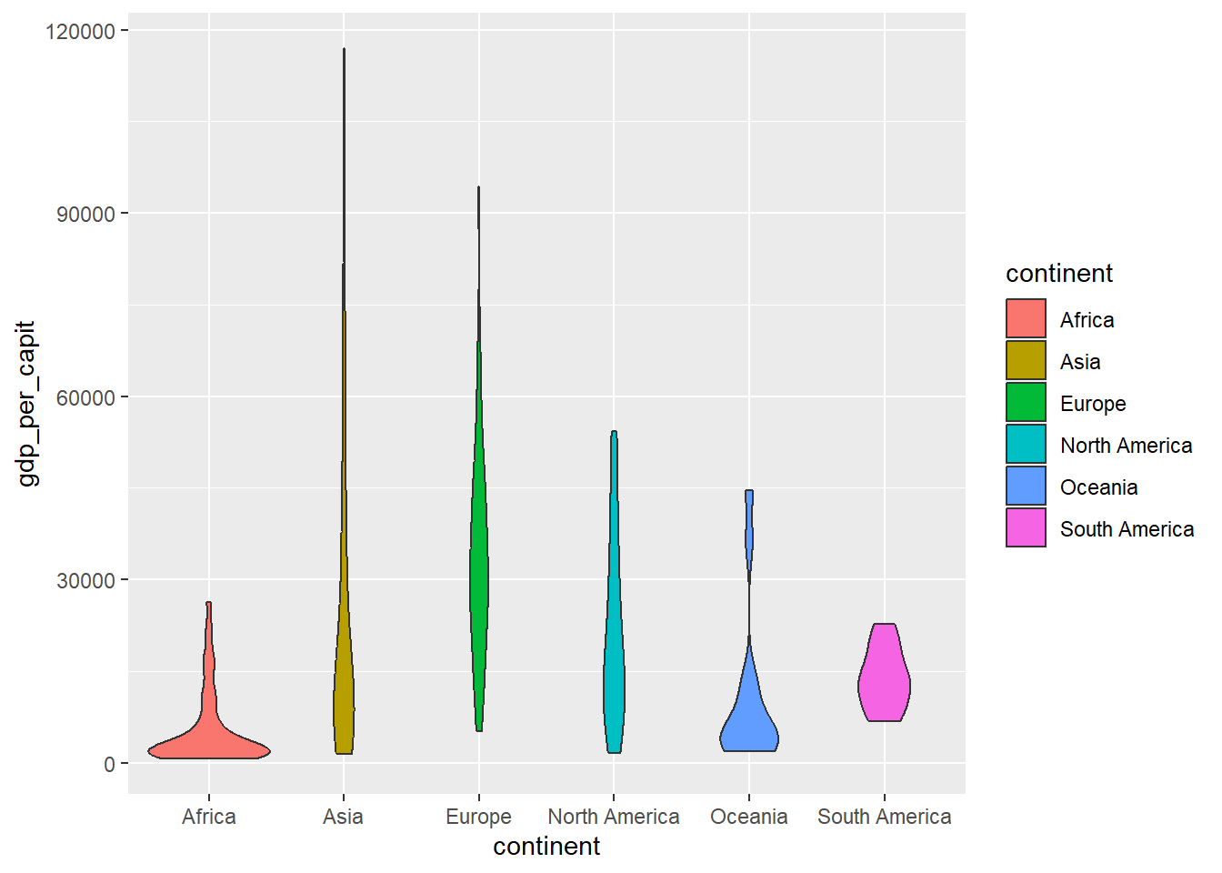
Figure 4.14: Violin-shaped diagram using geom_violin
4.8 Scatterplots
To compare variables, it is very useful to visualize, in the form of points, the values of one variable against another. The following figure compares GDP per inhabitant and life expectancy.
owid_country %>%
   ggplot(aes(x=gdp_per_capit,y=life_expectancy)) +
     geom_point() + # point plot
     scale_x_continuous(trans = 'log2') + # transform the variable x with log
     geom_smooth(method = lm, se = FALSE) # draw regression line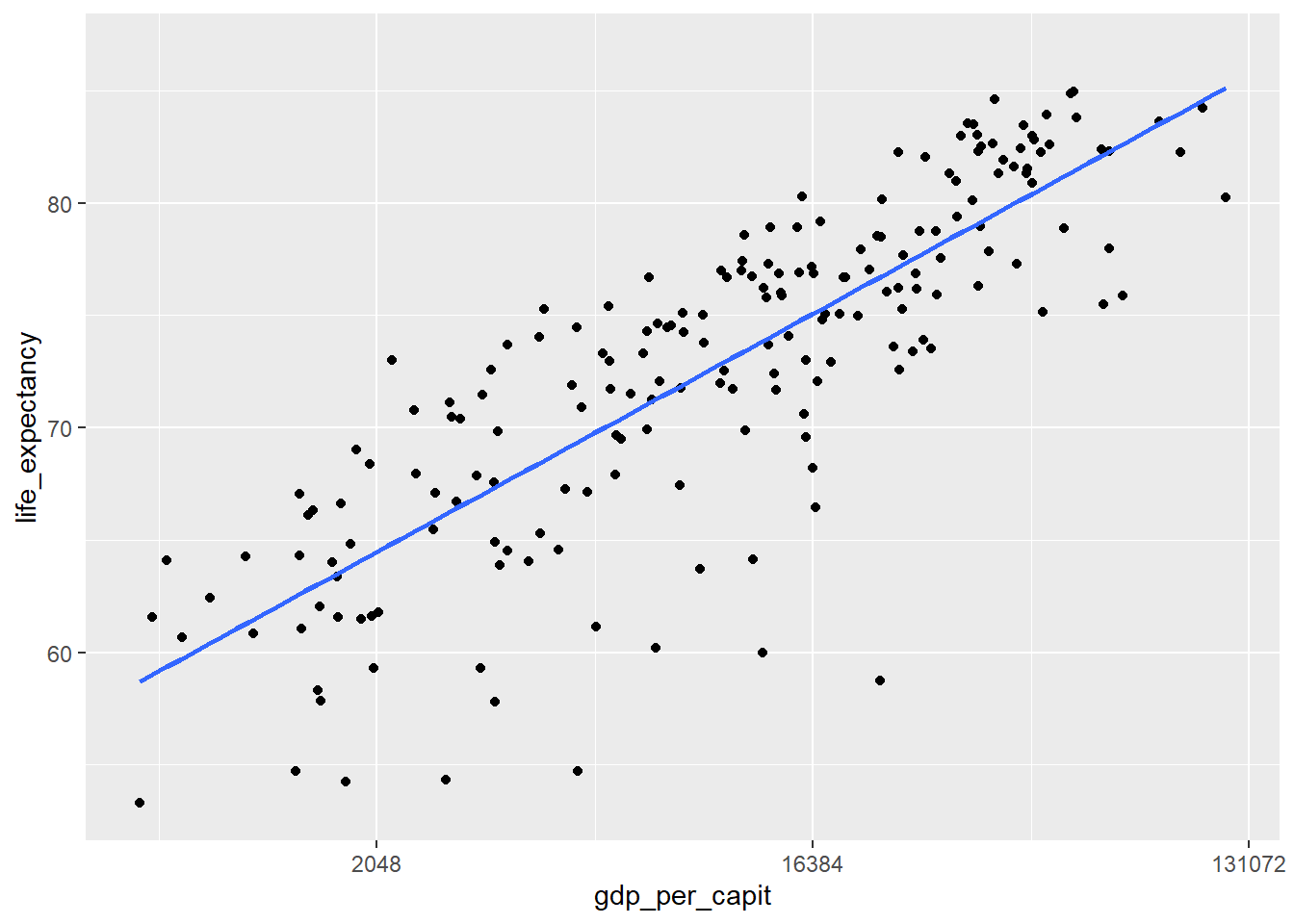
Figure 4.15: Scatter plot using geom_point and with the x-axis in logarithmic scale
In the following graph we group by continents
owid_country %>%
   ggplot(aes(x=gdp_per_capit,y=life_expectancy,color=continent)) +
     geom_point() +
     scale_x_continuous(trans = 'log2') +
     geom_smooth(method = lm, se = FALSE)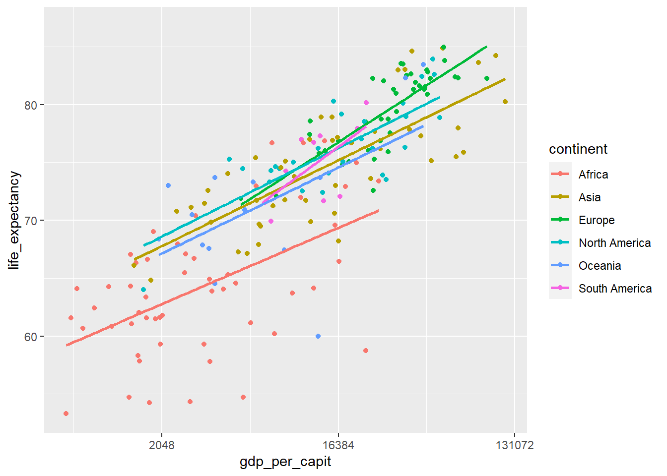
Figure 4.16: Scatterplot using geom_point and with the x-axis in logarithmic scale
4.9 Line graphs
When there is a sorted variable in our table (for example dates) we can draw curves showing the evolution of other variables with respect to the sorted variable that is placed on the horizontal axis. Let’s see an example with the evolution of daily deaths in the United Kingdom due to COVID-19 using data provided by OWID.
# we read the data
owid_covid <- read.xlsx("https://ctim.es/AEDV/data/owid_covid.xlsx",sheet=1) %>%
   as_tibble()
# we draw the line graph
owid_covid %>%
   filter(iso_code=="GBR") %>% # select UK data
   mutate(date=as.Date(date)) %>% # convert the date variable to dates
   select(date=date,deceased=new_deaths_restored_EpiInvert) %>% # select the date and the deceased
   ggplot(aes(x=date,y=deceased))+ # we draw
   geom_line()+ # generate line graph
   theme_bw() # set the background to white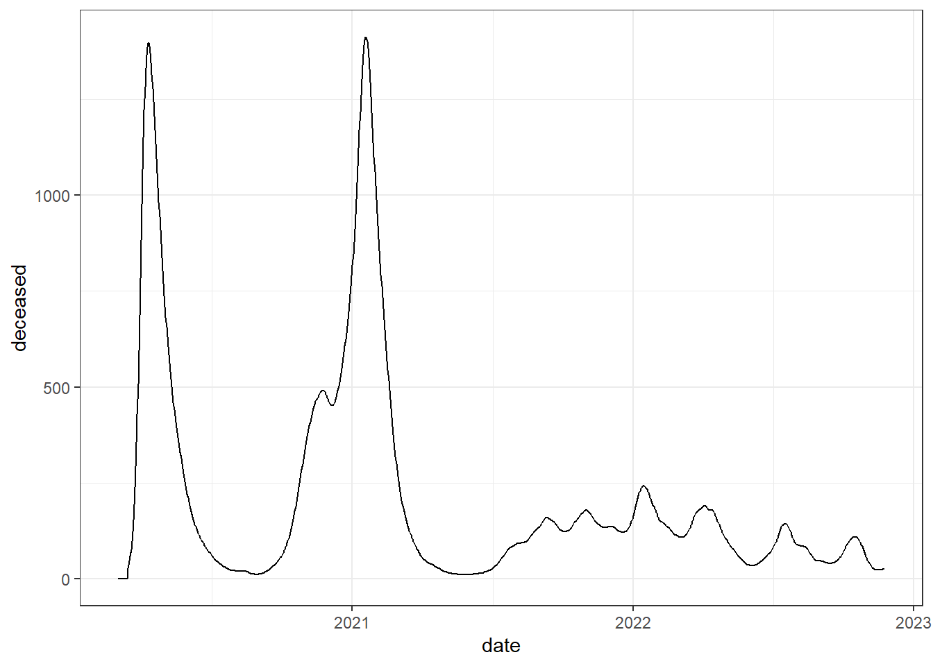
Figure 4.17: Line chart using geom_line
Next we are going to add some colored areas to this line graph to identify the different epidemic waves
# we create a table with the beginning and end dates of each epidemic wave with the name of the virus variant.
data_breaks <- tibble(
     start = as.Date(c("2020-03-23","2020-09-07","2021-05-28","2021-12-15","2022-06-24")),
     end = as.Date(c("2020-05-30","2021-04-21","2021-12-14","2022-04-29","2022-08-03")),
     variants =c("1. wild-type","2. Alpha","3. Delta","4. Omicron","5. Omicron")
)
# we draw the line graph
owid_covid %>%
   filter(iso_code=="GBR") %>%
   mutate(date=as.Date(date)) %>%
   select(date=date,deceased=new_deaths_restored_EpiInvert) %>%
   ggplot(aes(x=date,y=deceased))+
   # we add the colored areas
   geom_rect(data = data_breaks,aes(xmin = start,xmax = end,ymin = - Inf,ymax = Inf,fill = variants),inherit.aes = FALSE,alpha = 0.2) +
   geom_line()+
   theme_bw()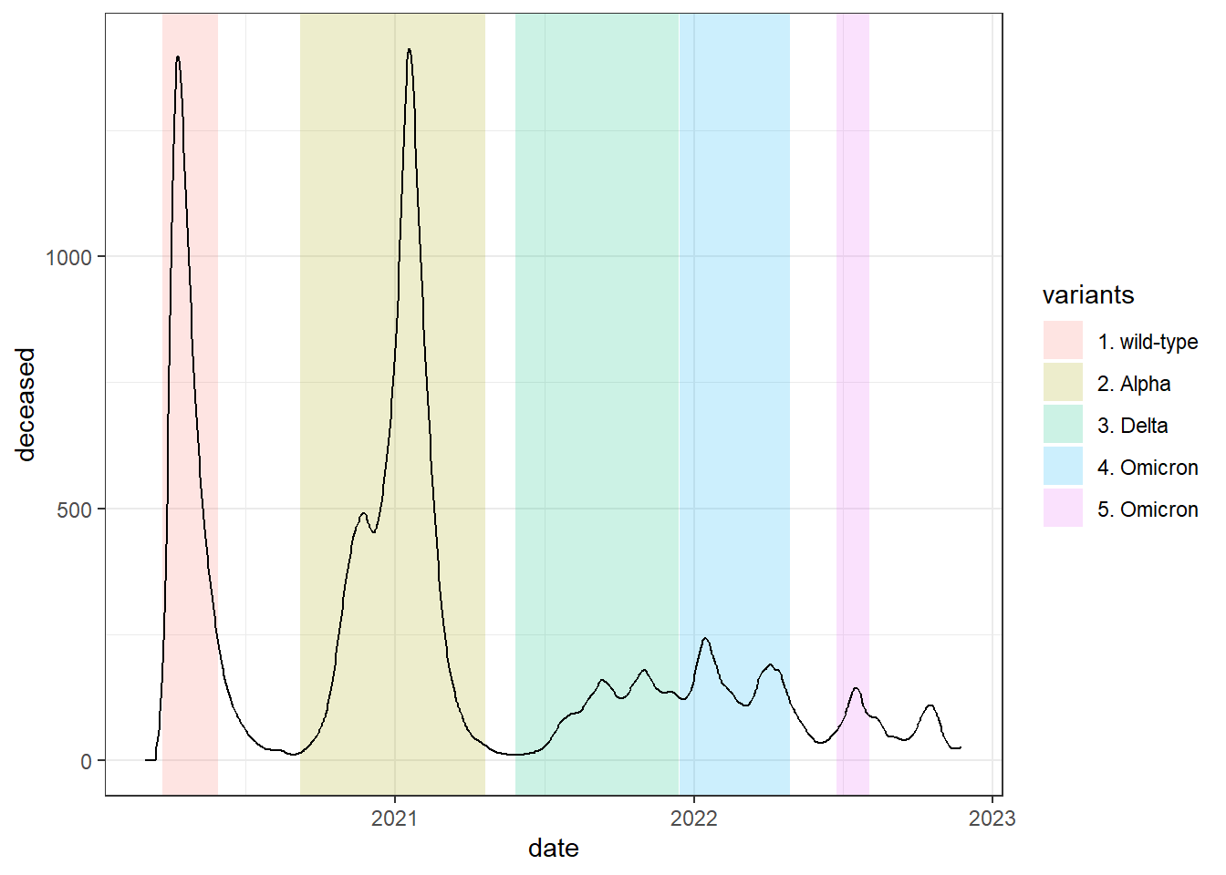
Figure 4.18: Colored areas are added to the previous graph with the geom_rect function
Sometimes, we want to compare two variables of very different magnitudes in the same line graph, for this we use a double vertical axis, one on the left and one on the right. Let’s look at an example comparing the daily incidence of cases (number of registered infections) and deaths from COVID-19 in France. To present the two variables together, when drawing, the second variable must be scaled so that it moves in the same range as the first. You must also add the data of the vertical axis on the right, according to the magnitude of the second variable.
data <- owid_covid %>%
  filter(iso_code=="FRA") %>%
  mutate(date=as.Date(date))  %>%
  select(fecha=date,fallecidos=new_deaths_restored_EpiInvert,incidencia=new_cases_restored_EpiInvert)

  # calculation of values necessary to adjust the range of the variables
  y1<-min(data$incidencia)
  x1<-min(data$fallecidos)
  m1<-(max(data$incidencia)-y1)/(max(data$fallecidos)-x1)

  data %>% ggplot(aes(x=fecha)) +
  geom_line(aes(y = incidencia), color = "red") + # draw the first variable
  geom_line(aes(y = y1+(fallecidos-x1)*m1), color="blue") + # we draw the second scaled variable
  #we assign titles to the axes and create the values of the vertical axis on the right
  scale_y_continuous(name = "daily incidence",sec.axis = sec_axis(~ (. - y1)/m1+x1, name="daily deaths")) +
  theme_bw()+
  theme(
    axis.title.y = element_text(color = "red"),
    axis.title.y.right = element_text(color = "blue")
  )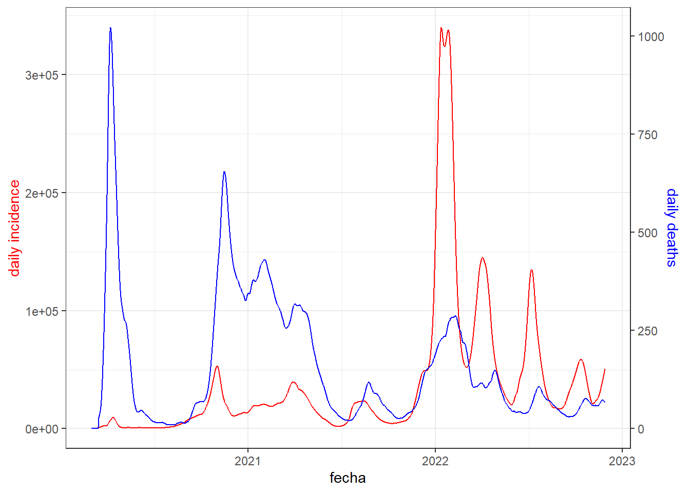
Figure 4.19: Line chart with double vertical axis
Let’s now see how to add text to the death graph in France to indicate when the daily maximum of deaths occurs:
tb <- owid_covid %>%
   filter(iso_code=="FRA" & date<"2021-12-30") %>%
   mutate(date=as.Date(date)) %>%
   select(date=date,deceased=new_deaths_restored_EpiInvert)

# we calculate the maximum number of daily deaths and when it is reached
yl <- max(tb$deceased)
xl <- tb$date[which(tb$deceased==yl)]

tb %>%
   ggplot(aes(x=date,y=deceased))+
   geom_line()+
   theme_bw()+
   # we write the annotation slightly offset from the position of the maximum
   annotate(geom="label",x=xl+40,y=yl-20,hjust="left",
            label=paste(yl," was the maximum number of daily deaths\n",
                        "and it was reached " ,xl))+
   # we draw a vector from the annotation to the position of the maximum
   annotate(
     geom="segment",x=xl+40,y=yl-20,xend=xl,yend=yl,size=0.5,
     arrow=arrow(length=unit(2,"mm"),angle=25,type="closed")
   )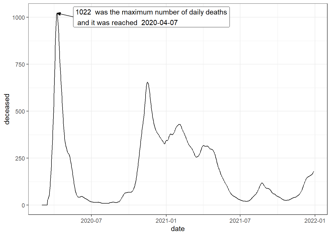
Figure 4.20: Annotated line chart
These data that we have just shown about COVID-19 are particular cases of time series where we have data that varies over time. In the next topic we will study time series in more detail.
4.10 Combining graphics
Each graph generated by ggplot can be handled as an object that is later
can be combined with other graphics. To combine graphics we will use the library
patchwork. Let’s see an example combining graphs that compare different variables
from the owid_country tibble
p1 <- owid_country %>%
   ggplot(aes(x=gdp_per_capit,y=life_expectancy)) +
     geom_point() +
     scale_x_continuous(trans = 'log2')

p2 <- owid_country %>%
   ggplot(aes(x=gdp_per_capit,y=handwashing_facilities)) +
     geom_point() +
     scale_x_continuous(trans = 'log2')

p3 <- owid_country %>%
   ggplot(aes(x=gdp_per_capit,y=hospital_beds_per_thousand)) +
     geom_point() +
     scale_x_continuous(trans = 'log2')

p4 <- owid_country %>%
   ggplot(aes(x=gdp_per_capit,y=human_development_index)) +
     geom_point() +
     scale_x_continuous(trans = 'log2')

wrap_plots(p1, p2, p3, p4, ncol = 2, nrow = 2)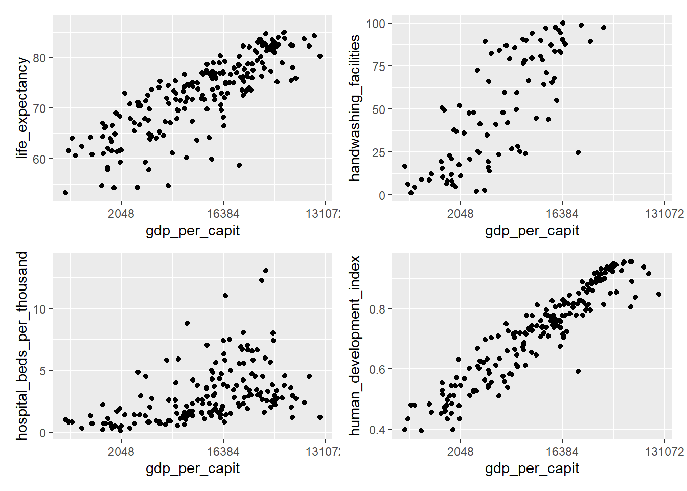
Figure 4.21: Combining plots using wrap_plots
4.11 ggpairs to compare variables
The ggpairs function of the GGally library offers an advanced way to compare
variables. The following figure shows an example of its use to compare
3 indicators from the owid_country table making a comparison with all the
data and another comparison grouping by continents. ggpairs generates a grid
where the density functions of the distributions are located on the diagonal of the resulting matrix. scatter diagrams to compare each pair of variables are drawn at the bottom of the matrix, and on top of
The matrix we show the correlation value between each pair of variables,
The closer this value is to 1, the closer the point cloud of the scatter diagram is to a line.
owid_country %>%
   select(continent,
          cardiovasc_death_rat,
          life_expectancy,
          human_development_index) %>%
   ggpairs(columns = 2:4, # tibble columns to compare
           aes(color = continent,alpha=0.5)) # color by continent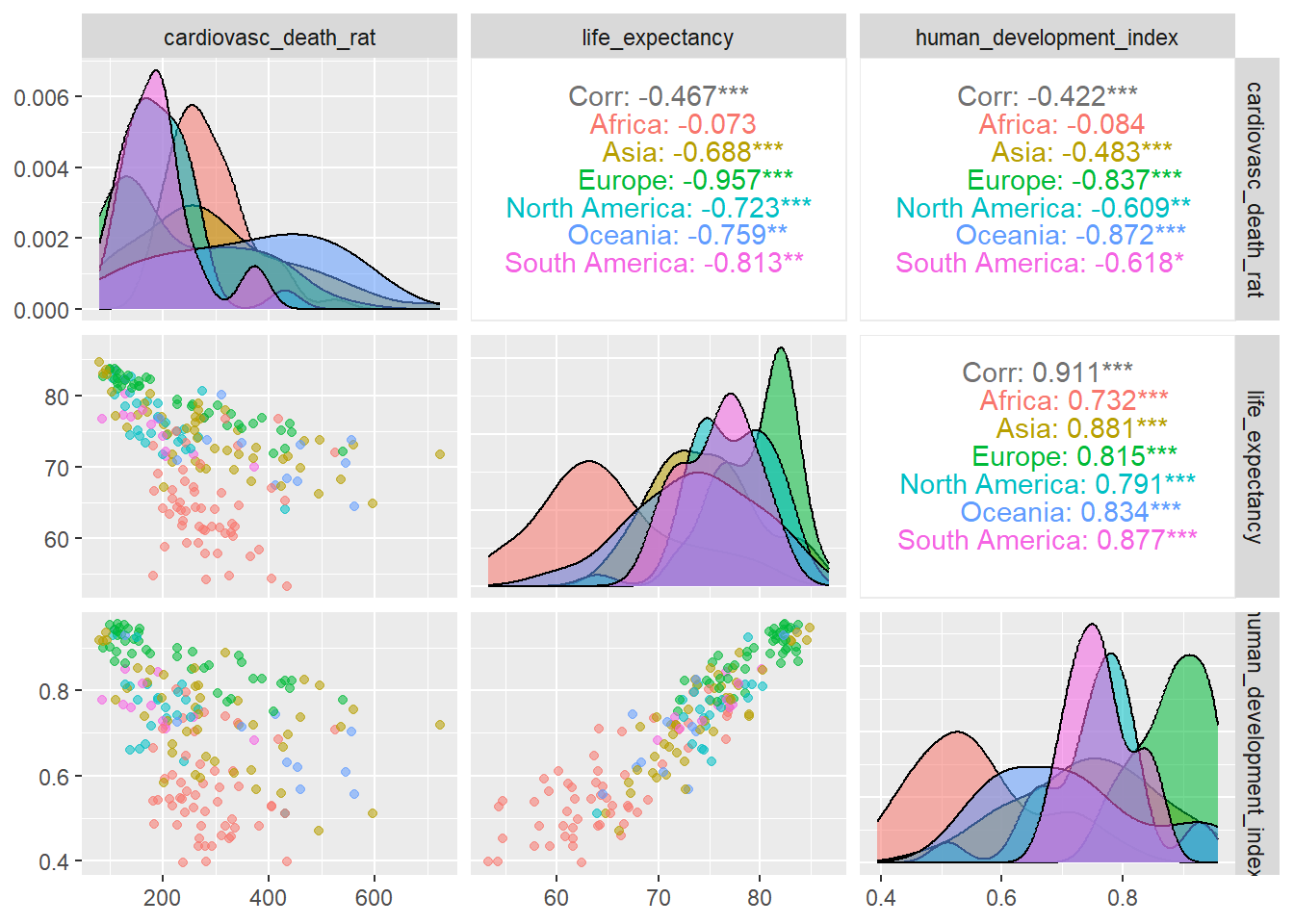
Figure 4.22: Comparison of variables using ggpairs
4.12 Colors
When it comes to presenting our data analysis efficiently and attractively, it is very It is important to pay attention to aesthetic design elements. The next sections are devoted to this topic starting with color management. In the vast majority of example charts shown in this book these aesthetic elements are not included, not because they are not considered important, but to simplify the presentation and put emphasis on the technical issues of the geometric elements. We highlight that all these graphics can be aesthetically improved using the tools shown in the sections that follow.
Colors are a very important design element in graphics.
There are several different ways to define a color. For example,
we can define a color using its name or its HEX code. In
r-charts.com a detailed list can be found
of colors with their name and HEX code. Below is shown
a selection of colors with their associated names.
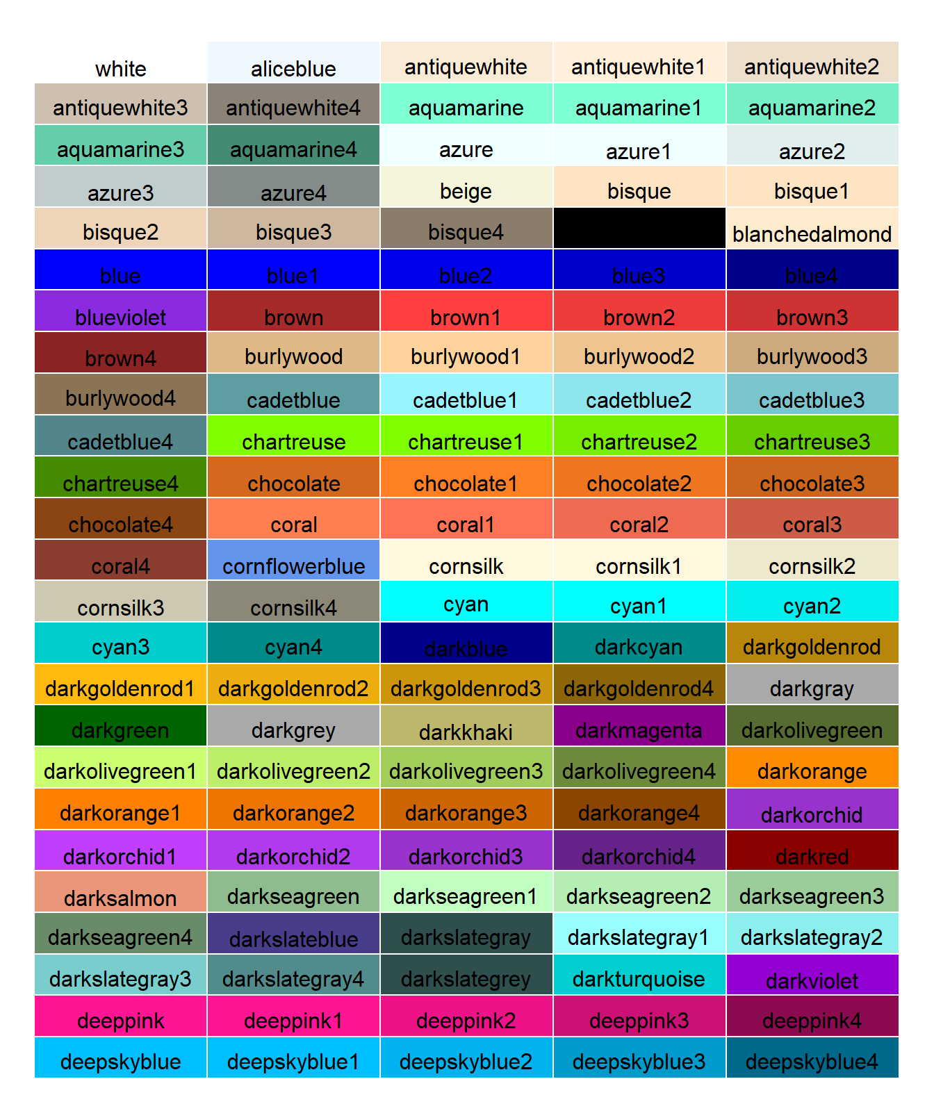
Figure 4.23: Table with a selection of colors with their associated names
Another way to define colors is through their level of red (R), green (G),
and blue (B), as well as an alpha value (optional) that indicates its transparency when overlaid on other
already painted figures. Each component moves between values 0 and 1. For example rgb(1.,0.,0.) would be the color red and rgb(0.,0.,1.,0.9) would be the color blue with a slight transparency.
We can assign colors to each drawable geometric element of ggplot
using the color (color of the geometric object) and fill (interior fill color of the shape) attributes. Furthermore, the assignment can be automatic or manual. Let’s look at some examples with a diagram
of bars
owid_country %>%
   group_by(continent) %>%
   summarise(population=sum(population)) %>%
   ggplot(aes(x=continent,y=population)) +
     geom_bar(stat = "identity",fill="lightblue",color="black")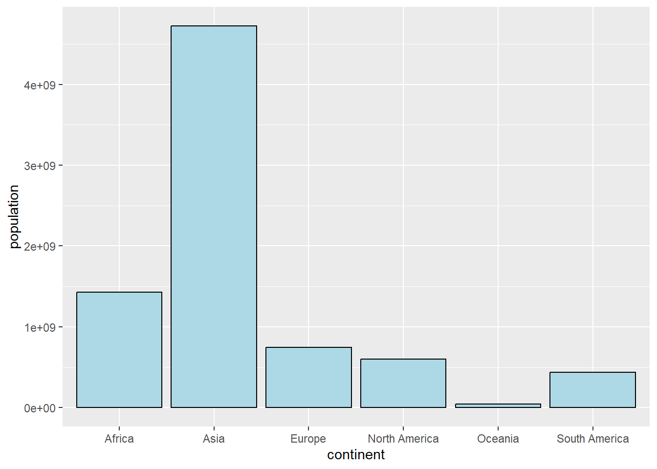
Figure 4.24: Bar chart defining a single color in geom_bar
owid_country %>%
   group_by(continent) %>%
   summarise(population=sum(population)) %>%
   ggplot(aes(x=continent,y=population,fill=continent)) +
     geom_bar(stat = "identity")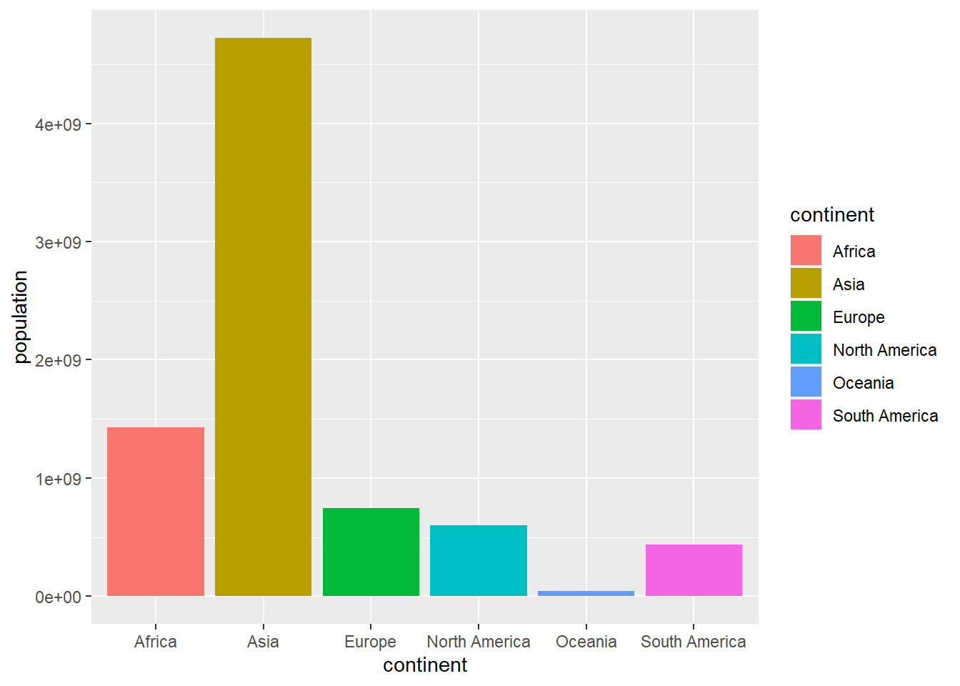
Figure 4.25: Bar plot with automatically generated colors in the aes of ggplot
owid_country %>%
   group_by(continent) %>%
   summarise(population=sum(population)) %>%
   ggplot(aes(x=continent,y=population,fill=continent)) +
     geom_bar(stat = "identity") +
     scale_fill_manual(values = c("white","black","blue","red","green","yellow"))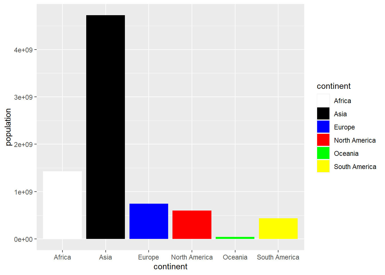
Figure 4.26: Bar chart with colors assigned manually using scale_fill_manual
Another way to define colors is using palettes. The RColorBrewer library supplies the following color palettes:
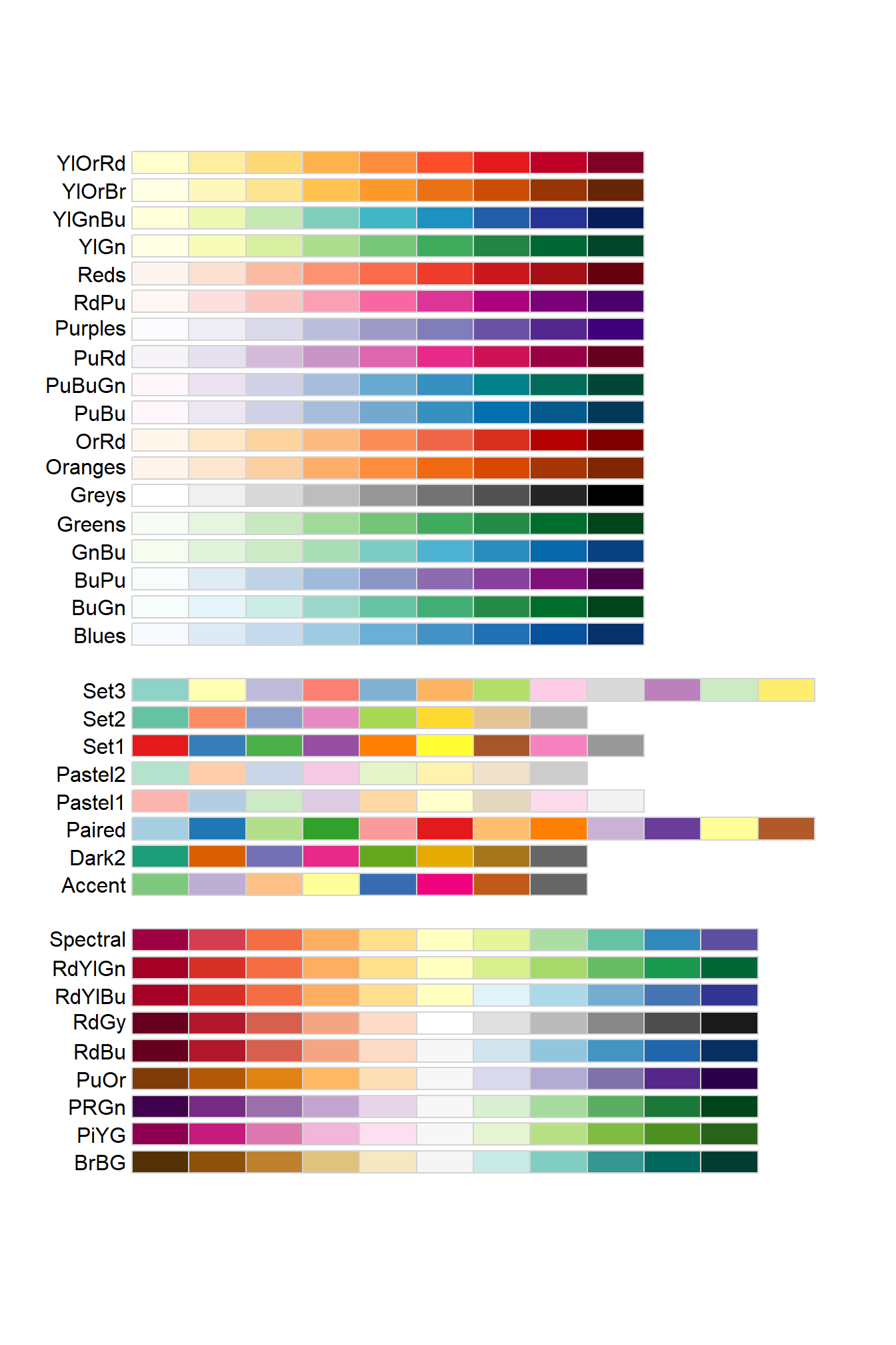
Figure 4.27: Color palettes from the RColorBrewer library
We can distinguish 3 types of palettes:
Single color palettes with decreasing luminosity: the color is maintained but its luminosity decreases throughout the palette.
Divergent palettes: luminosity and color do not follow a progressive pattern.
Palettes with various colors: the palette starts with a dark color that gets lighter until it reaches the middle of the table, then changes color and gets progressively darker.
Palettes with progressive colors are especially suitable when we associate a color with a numerical value, in such a way that we want the color to change progressively based on the numerical value. We will see an application of this in the next section where the heatmaps will be explained.
owid_country %>%
   group_by(continent) %>%
   summarise(population=sum(population)) %>%
   ggplot(aes(x=continent,y=population,fill=continent)) +
     geom_bar(stat = "identity") +
     scale_fill_brewer(palette = "Paired")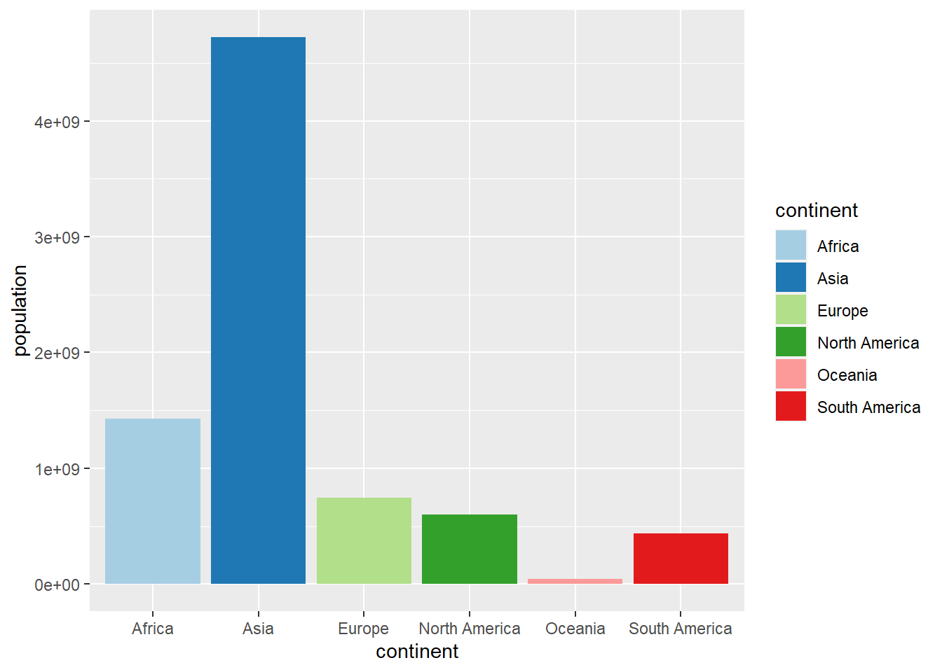
Figure 4.28: Bar chart with colors using scale_fill_brewer
4.13 Heatmaps
A heatmap (Heatmap) is a table of numerical values where the cells have a varying color
according to the numerical value of the cell. To illustrate this tool we are going to do
a heat map with the values of some indicators of the countries of Europe stored in
the owid_country tibble. As in this case the values of the indicators move
in very different ranges we are going to normalize them by dividing them by their maximum. In this way,
the value 1 corresponds to the country with the maximum value and in the rest of the countries the value indicates
the ratio of the country’s value to such maximum value.
In the following instructions, the owid_country tibble is filtered, selected
the fields involved in the heat map and are normalized
sel_owid_country <- owid_country %>%
   filter(continent=="Europe" & is.na(aged_65_older)==FALSE ) %>%
   select(location,population:gdp_per_capit,hospital_beds_per_thousand,human_development_index)
   for( i in 2:ncol(sel_owid_country)){
     sel_owid_country[i] <- round(sel_owid_country[i]/max(na.omit(sel_owid_country[i])),digits = 2)
   }
Next we create the heatmap using the YlOrRd color palette. Previously
we have to modify, using pivot_longer, the organization of the tibble to convert it to the tidy data format that
requires ggplot
sel_owid_country %>%
  pivot_longer(population:human_development_index, names_to = "indicator", values_to = "value") %>%
  ggplot(aes(indicator,location,fill=value)) +
    geom_tile(color = "lightblue",
            lwd = 0.5,
            linetype = 1) +
    scale_fill_gradientn(colors = brewer.pal(9, 'YlOrRd'))+
    geom_text(aes(label = value), color = "blue") +
    theme(axis.text.x = element_text(angle = 45,hjust=1))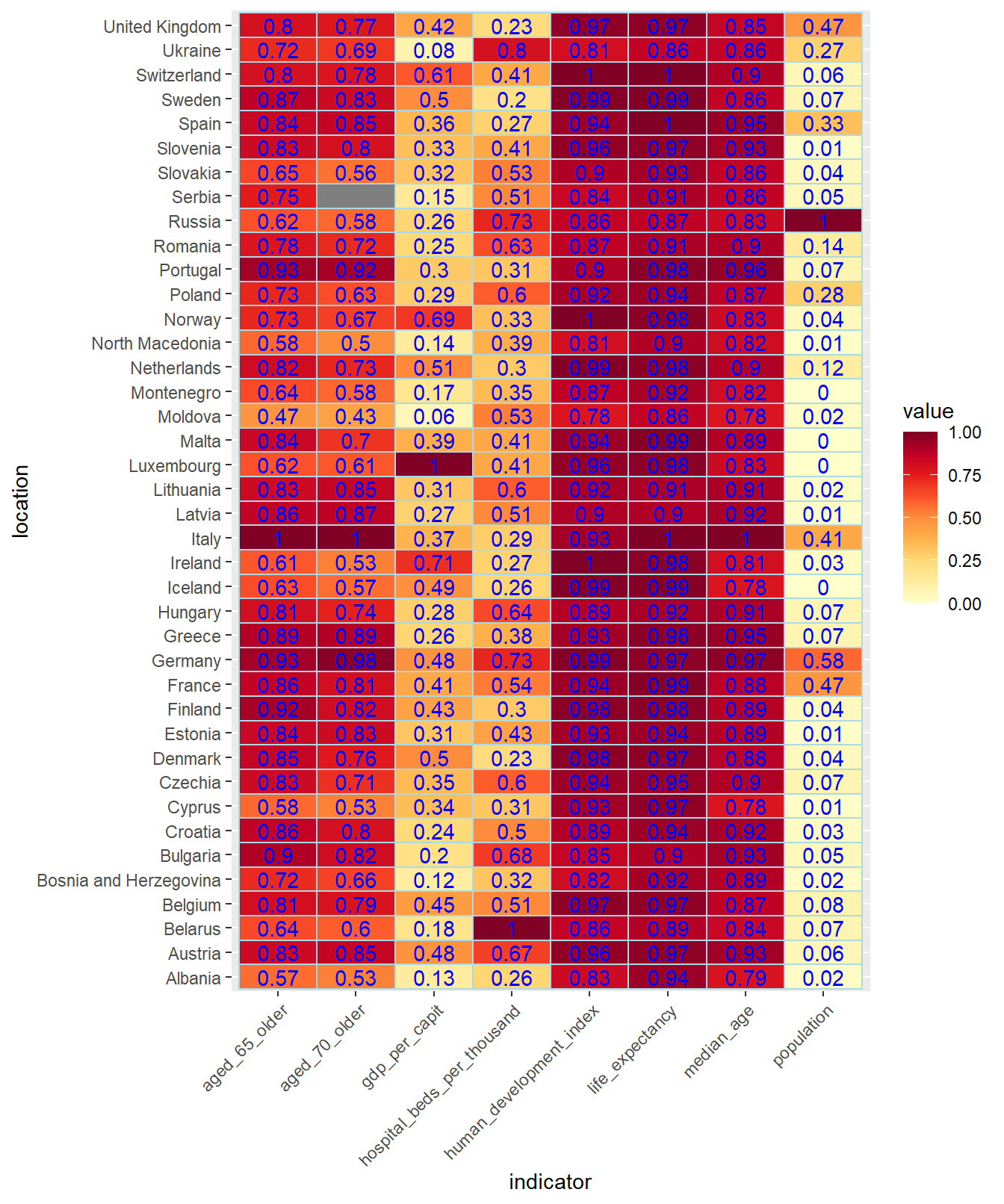
Figure 4.29: Heat map, using the YlOrRd palette, of some normalized European indicators dividing by their maximum
4.14 Wordcloud
wordcloud is a library that allows you to create attractive graphics by combining strings whose size depends on a numerical variable. Let’s look at an example where the size of the names of European countries depends on their GDP per inhabitant.
  wordcloud(words = sel_owid_country$location, freq = sel_owid_country$gdp_per_capit, min.freq = 0,
          max.words=200, random.order=FALSE, colors=brewer.pal(8, "Dark2"))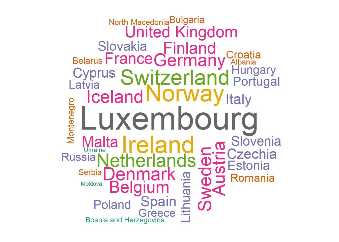
Figure 4.30: Worcloud of European countries using their GDP per capita with the Dark2 brewer palette
4.15 Themes
The overall layout of the output of a ggplot plot is controlled through the theme layer. We can modify the attributes using different themes. In fact there are packages in R dedicated exclusively
to the design of themes. To illustrate this with an example, we will use the theme theme_bw in
a graph:
owid_country %>%
   ggplot(aes(x=gdp_per_capit,y=life_expectancy,color=continent)) +
     geom_point() +
     theme_bw() +
     scale_x_continuous(trans = 'log2') +
     labs(title="Distribution, by continent, of GDP per inhabitant ",x="gdp_per_capit", y = "life_expectancy")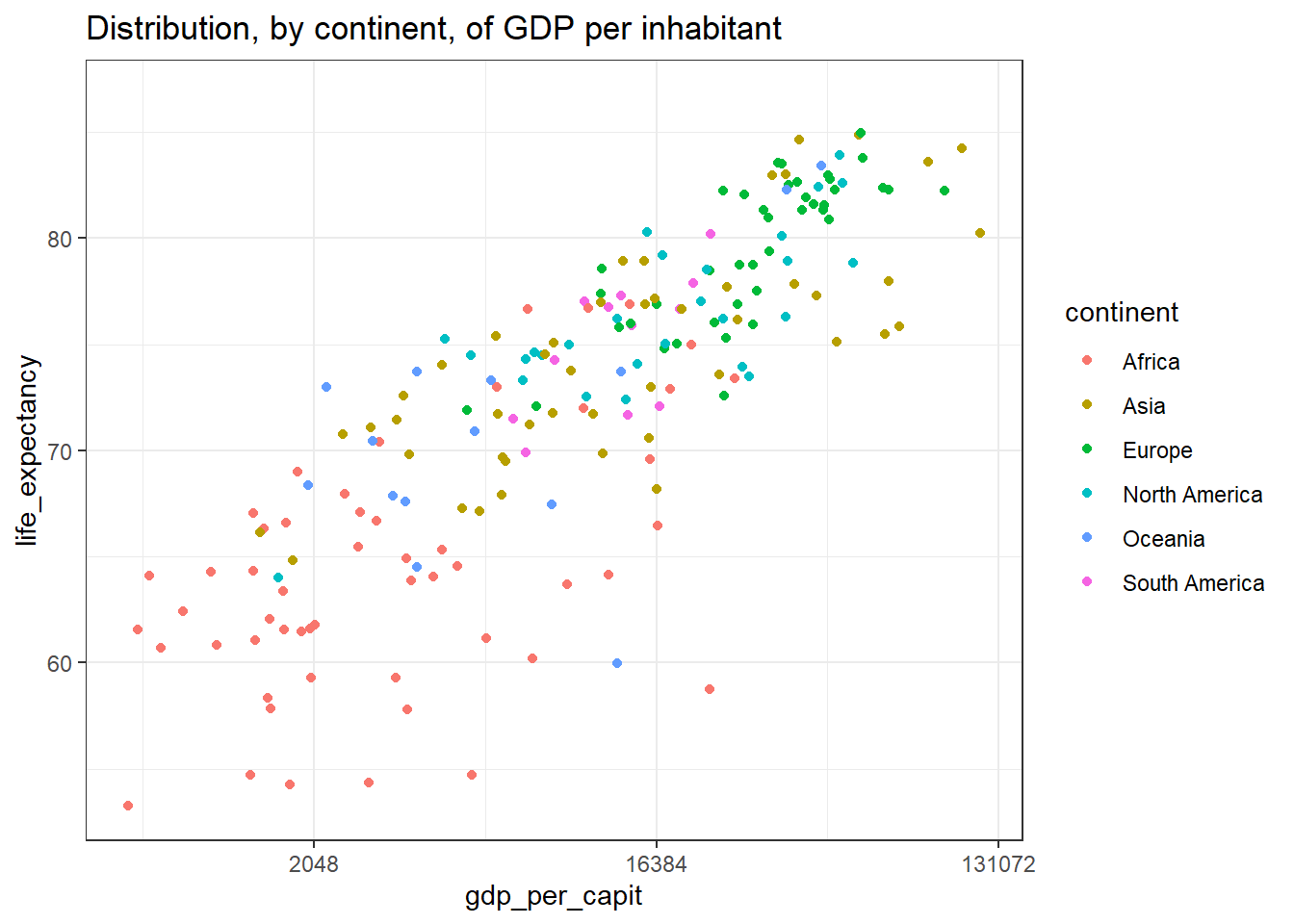
Figure 4.31: Using the theme theme_bw
In addition to defining a general theme for the chart, we can control
the individual attributes of the theme, adding an additional theme layer to the graph.
Below are some attributes that can be set with the layer
theme
owid_country %>%
   ggplot(aes(x=gdp_per_capit,y=life_expectancy,color=continent)) +
     geom_point() +
     scale_x_continuous(trans = 'log2') +
     theme(
       panel.background = element_rect( fill = "ivory", #backgroundcolor
                                       color = "black", # border color
                                       linewidth = 2), # border thickness
       panel.grid = element_line( color = "blue", #grid color
                                  linewidth = 0.5, # grid thickness
                                  linetype = 2), # linetype
       axis.title.y = element_blank(), # remove y-axis title
       axis.text.x = element_text(angle = 45,hjust=1), # tilt text x axis
       legend.position="none", # remove legend on the right
       text = element_text(size = 20) # modify the font size
     )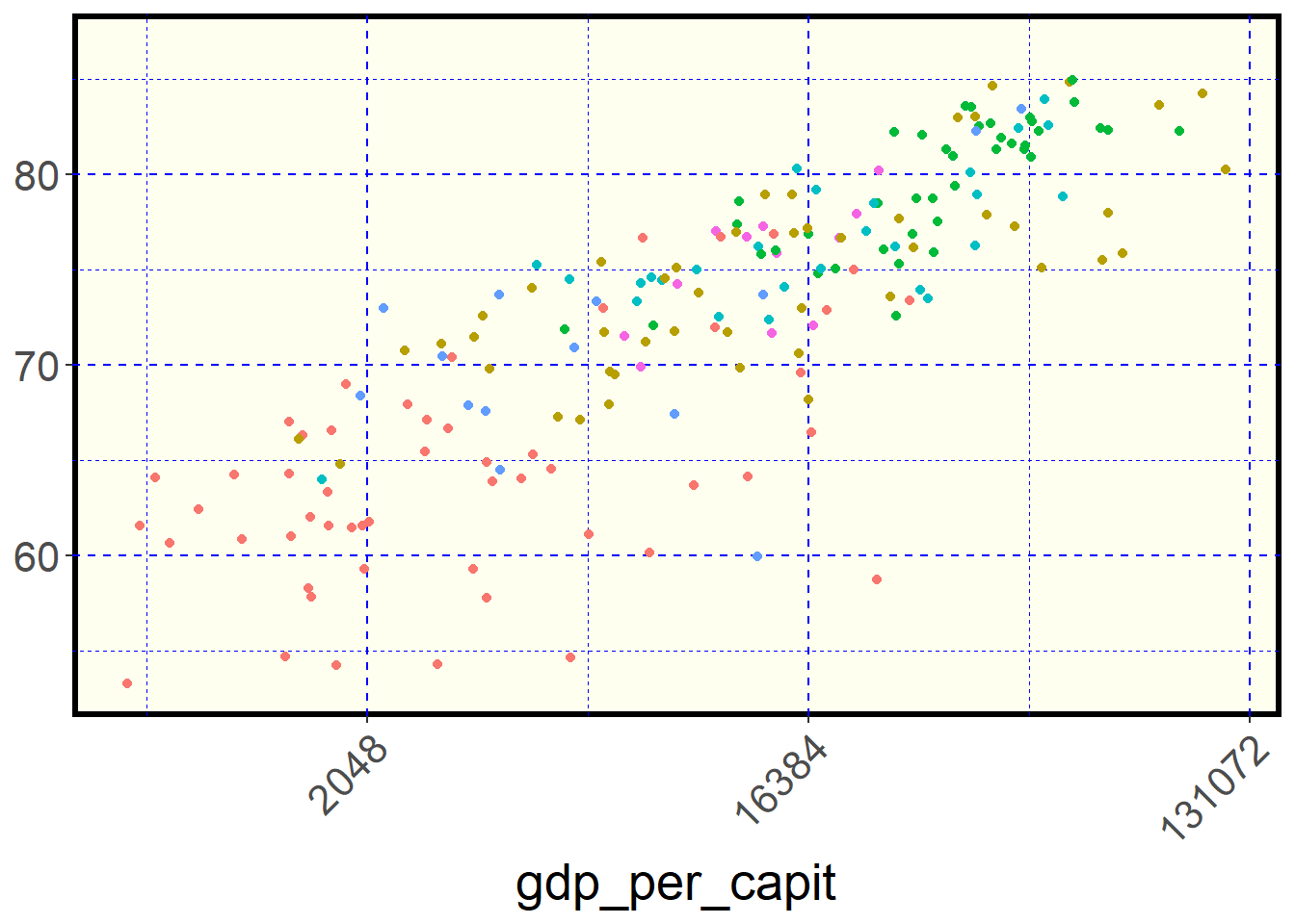
Figure 4.32: Some theme options
If we want to modify the default theme throughout the document we can put the following instruction at the beginning of the document
4.16 Design of titles and axes
owid_country %>%
   ggplot(aes(x=gdp_per_capit,y=life_expectancy,color=continent)) +
     geom_point() +
     labs( title = "My Title",
           subtitle = "My Subtitle",
           x= "X axis title",
           y= "Y axis title"
     ) +
     scale_x_continuous(trans = 'log2', # x-axis transformation function
                        n.break = 10, # number of x-axis cuts
                        ) +
     scale_y_continuous(n.break = 10) # number of y-axis cuts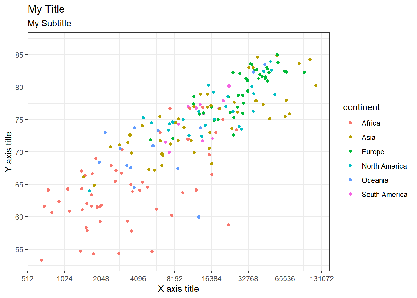
References
[Ka20] Rob Kabacoff. Data Visualization with R, 2020.
[Rc] R CODER. R CHARTS.
[He19] Kieran Healy. Data Visualization, Princeton University Press, 2019.
[Ho] Yan Holtz. The R Graph Gallery.
[Wi10] Wickham, Hadley. A Layered Grammar of Graphics, Journal of Computational and Graphical Statistics, 3–28, 2010.
[WiÇeGa23] Wickham, Hadley, Mine Çetinkaya-Rundel and Garrett Grolemund. R for Data Science (2e), O’Reilly Media, 2023.
[Wi19] Claus O. Wilke. Fundamentals of Data Visualization, O’Reilly, 2019.