7 Dashboards
Installation/loading libraries/data used
if (!require(shiny)) install.packages('shiny')
library(shiny)
if (!require(flexdashboard)) install.packages('flexdashboard')
library(flexdashboard)
Dashboards are web applications that present a set of graphics in an organized way. They can be static, where the graphs always present the same data or dynamic, where the user, through menus, can choose what data present in the graphs. In this course we are going to use the shiny library to create dynamic dashboards. Additionally we will use the flexdashboard library as an interface to create Shiny applications.
Once the libraries are installed, the skeleton of a dashboard can be created using the instructions detailed in flexdashboard. You can also use any of the dashboard example Rmd files provided in this course.
7.1 Dashboard with hchart
To illustrate the concept of a dynamic dashboard we will use the example found in Dashboard1.Rmd, whose execution is displayed below (in order to interact with the graph you have to run the Rmd file from Rstudio) :
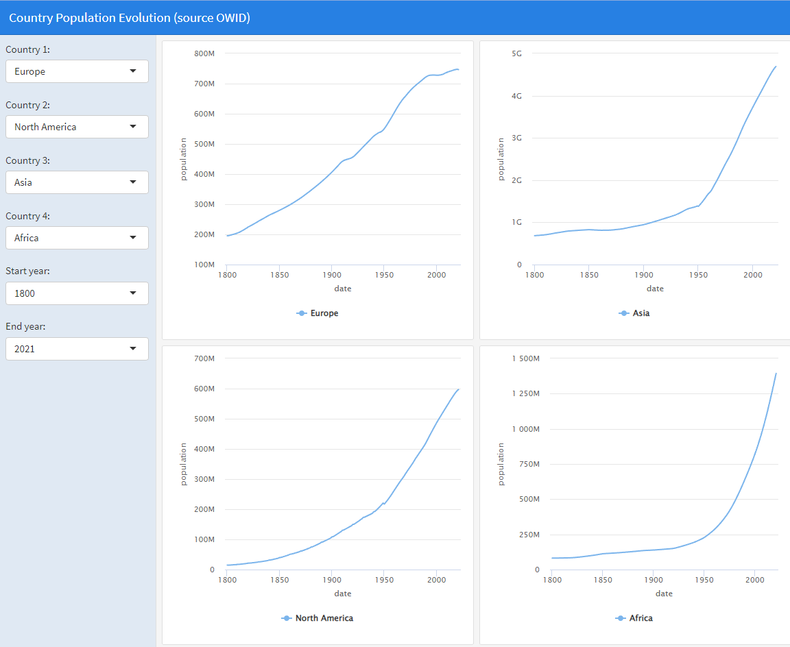
This dashboard presents 4 comparative graphs, made with ‘hchart’, of the evolution of the population in 4 countries or regions of the world. On the left are drop-down menus to choose the country/region of each graph and the start and end years to generate the graph. To generate this dashboard locally, you must load the file Dashboard1.Rmd in Rstudio and execute run document (option that replaces knit in this type of Rmd files). We observe that this dashboard is organized in 3 columns: in the first column the drop-down menus appear, in the second column two graphs generated with hchart appear and in the third column 2 other similar graphs appear. Using flexdashboard this dashboard is organized as follows:
Reading the data used by the dashboard and creating the labels that the drop-down menus will use
Creation of a first column to put the drop-down menus. The column is created using the code:
each dropdown is created using the selectInput function. This function associates a name to the field of this drop-down menu, for example country1, inside the functions that draw, the value of this field is accessed through input$country1.
- Creation of a second column to put 2 stacked graphs of the population of two countries/regions. We create the column again using the statement
We created each graph with the renderHighchart function. That is, for the two graphs to appear, the code would follow the following style
###

renderHighchart({
   .....
   hchart creation code with input$country1 data
   ....
})

###

renderHighchart({
   .....
   hchart creation code with input$country2 data
   ....
})- Creation of a third column identical to the second, but using the data from
input$country3andinput$country4
The renderHighchart function is used because it is a graph generated with hchart. If it were a graph generated with plotly you would have to use the renderPlotly function, and if it were a Leaflet geographic data graph you would have to use the renderLeaflet function. That is, each type of chart has a different function associated with it in flexdashboard. For a standard plot the renderPlot function is used.
7.2 Dashboard with Leaflet
The second dashboard that we are going to study is found in the file Dashboard2.Rmd, whose execution is displayed below:
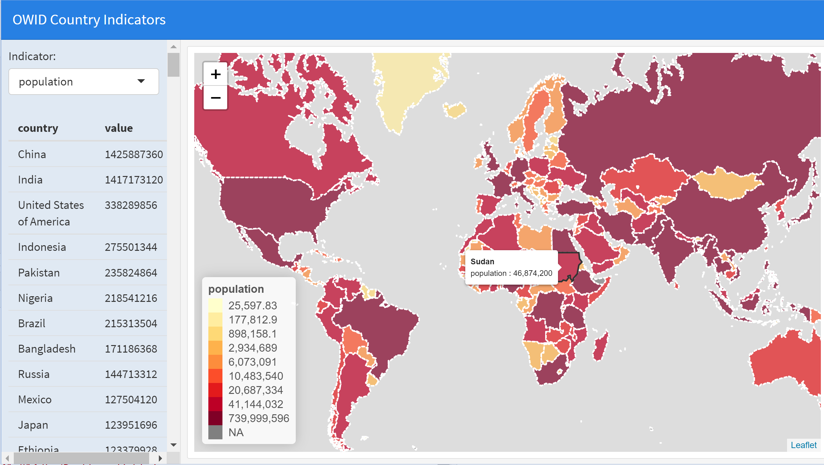
In this case, the dashboard has two columns. In the first column, a drop-down menu appears to choose the indicator of the countries that we are going to use and a table also appears with the indicator data in descending order. The tables in flexdashboard are generated using the renderTable function. To the right appears a column with a choropleth map with the indicator values (to interact with the graph you must run the Rmd file from Rstudio)
7.3 Dashboard with Plotly
The third dashboard that we are going to study is found in the file
Dashboard3.Rmd, whose execution is displayed below:
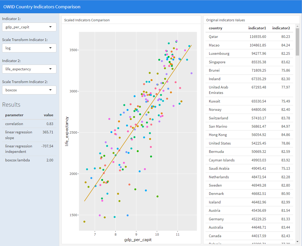
This dashboard is within the scope of attribute analysis that will be seen in more detail in the following topic. The dashboard is organized into 3 columns. In the first column some drop-down menus and a table of results are shown, in the second column a dot plot using plotly and in the third column a table with data.
The objective of this dashboard is to study the relationship between any pair of country indicators published by OWID. We will call the first indicator \(x\) and the second \(y\). For example, the previous image shows the comparison between \(x=\)GDP/inhabitant and \(y=\)life expectancy. The model we will use is the well-known linear regression, that is, we look for a linear relationship between \(x\), \(y\), given by
\[y=ax+b\]
where \(a\) is the slope and \(b\) is the independent term. We will use the correlation factor as a quality criterion of the fit, the closer this value is to 1, the better the fit. Additionally, before calculating the linear regression we give the user the option to scale \(x\) or \(y\). Scaling \(x\) means that we replace \(x\) with \(s_x(x)\), where \(s_x()\) is the transform used, which in our case, we give as options \(s_x(x)=log(x)\), or \(s_x(x)=sqrt(x)\). We have already used this type of scaling in ggplot for visualization purposes. In the same way, we optionally scale \(y\) with \(s_y(y)\), allowing us to choose \(s_y(y)=log(y)\) or \(s_y(y)\) given by the Box-Cox transform, which for \(y>0\) is defined as:
\[ s_y(y)=\left\{ \begin{array} [c]{ccc}% \frac{y^{\lambda}-1}{\lambda} & si & \lambda\neq0\\ \log(y) & si & \lambda=0 \end{array} \right. \] This transformation is continuous with respect to \(\lambda\) because it can be easily shown that if \(y>0\), then
\[Lim_{\lambda\rightarrow0}\frac{y^{\lambda}-1}{\lambda}=\log(y)\] In practice, the value of \(\lambda\) is automatically calculated to optimize the linear regression between \(s_x(x)\) and \(s_y(y)\). Since linear regression is applied after scaling, in the end the relationship between the variables is as
\[ s_y(y)=a\cdot s_x(x)+b \] For each pair of indicators chosen, we will consider that the best choice of scaling is the one that maximizes the correlation. In the example displayed in the image above, we observe a maximum correlation of \(0.83\) with \(s_x(x)=log(x)\) and \(s_y(y)\) the Box-Cox transformation with \(\lambda=2\) . That is, the relationship between \(x\) and \(y\) would be
\[ \frac{y^2-1}{2}=365.71 \cdot log(x)-707.54 \] Visually, in the dashboard dot plot, the better the point cloud fits the regression line, the better the model will explain the relationship between the two indicators.
7.4 Publish a dashboard
There are several ways to publish a dashboard made by flexdashboard (see shiny.rstudio.com). The easiest thing is to use the shinyapps.io server. To do this, you must register on the aforementioned website and follow the following
instructions. The free version of the server allows 5 applications and 25 hours of execution per month. Another more complex option, but also free, is to host the complete software on your own LINUX server.
References
[BoCo64] Box, G. E., and D. R. Cox.. An analysis of transformations, Journal of the Royal Statistical Society. Series B (Methodological), 211–52, 1964.
[Shinyapps] Shinyapps
[SIAB23] Sievert, Carson, Richard Iannone, JJ Allaire, and Barbara Borges. 2023. flexdashboard: R Markdown Format for Flexible Dashboards, 2023.