Chapter 10 Shuffling labels to generate a null
Motivating scenarios: You want to make the ideas of a null sampling distribution and a p-value more concrete and learn a very robust way to test null hypotheses while you’re at it.
Learning goals: By the end of this chapter you should be able to
- Explain what a permutation is.
- Explain why permuting many times generates a sampling distribution under the null.
- Use
Rto permute data to see if two sample means come from the different (statistical) populations.
- Identify that we use permutation (shuffling) to generate null distributions, and bootstrapping (resampling with replacement) to estimate uncertainty.
- Generalize the idea of permutation as a way to test most null models.
10.1 One simple trick to generate a null distribution
a permutation test is like low key the most useful method in all of statistics
— Killian Campbell (@kdc509) January 25, 2021
In Chapter 9, we discussed the idea behind null hypothesis significance testing. Specifically, the challenge in null hypothesis significance testing is to figure out how often we would see what we saw if some boring null hypothesis was true. A key step in this process is comparing our observed “test statistic” to its sampling distribution when the null hypothesis is true.
Later in the course we will deal with special cases for which mathematicians have estimated a sampling distribution under some set of assumptions. But A really clean way to generate a null distribution is to shuffle your data randomly, as if nothing where happening. Unlike the math tricks we cover later, this shuffling approach, known as permutation, makes very few assumptions. The most critical assumption of the permutation test is that samples are random, independent, and collected without bias, and that the null is no association.
.](https://i.imgur.com/TD6Hc06.gif)
Figure 10.1: Listen to the permutation anthem here.
10.1.1 Motivation:
One of the most common statistical hypotheses we ask are “Do these two samples differ.” For example,
- Do people who get a vaccine have worse side effects than people getting a placebo?
- Does planting a native garden attract pollinators?
So how do we go about asking these questions from data?
In this chapter we focus in permuting to test for differences between two groups, but permutation is super flexible and can be used for most problems, where the null is “no association”!
10.2 Case study: Mate choice & fitness in frogs
There are plenty of reasons to choose your partner carefully. In much of the biological world a key reason is “evolutionary fitness” – presumably organisms evolve to choose mates that will help them make more (or healthier) children. This could, for example explain Kermit’s resistance in one of the more complex love stories of our time, as frogs and pigs are unlikely to make healthy children.
To evaluate this this idea Swierk and Langkilde (2019), identified a males top choice out of two female wood frogs and then had them mate with the preferred or unpreferred female and counted the number of hatched eggs.
Concept check
- Is this an experimental or observational study?
- Are there any opportunities for bias? Explain!
- What is the biological hypothesis?
- What is the statistical null?
Here are the raw data (download here if you like)
10.3 What to do with data?
So we have this data set that informs a biological quetsion! What do we do, now?
10.3.1 Visualize patterns
One of the first things we do with a new data set is visualize it!
A quick exploratory plot (Chapters ??, 6), helps us understand the shape of our data, and devise an appropriate analysis plan!
library(ggforce)
ggplot(frogs, aes(x = treatment, y =  hatched.eggs, color = treatment, shape = treatment  ))+
  geom_sina(show.legend = FALSE)+ # if you don't have ggforce you can use geom_jitter
  stat_summary(color = "black",show.legend = FALSE)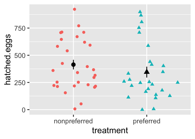
10.3.2 Estimate parameters
Now that we understand the shape of our data we can devise meaningful summaries by estimating appropriate parameters (Chapter 3).
For the frog mating let’s first quantify the mean and standard deviation in the number of hatched eggs in the preferred and non-preferred mating groups.
frog_summary <- frogs                           %>%
  group_by(treatment)                           %>%
  summarise(mean_hatched = mean(hatched.eggs),
              sd_hatched =   sd(hatched.eggs))

frog_summary
## # A tibble: 2 × 3
## treatment mean_hatched sd_hatched
## <chr> <dbl> <dbl>
## 1 nonpreferred 414. 237.
## 2 preferred 345. 260.One high-level summary here could be the difference in mean eggs hatched in preferred vs. nonpreferred matings
mean_diff <- summarise(frog_summary,  nonpref_minus_pref = diff(mean_hatched))

pull(mean_diff) %>% round(digits = 2)
## [1] -68.82… So visual and numeric summaries suggest that contrary to our expectation, we get more eggs from pairs of frogs when males don’t get their preferred mate. But, we know that sample estimates will differ from population parameters by chance (aka. sampling error). So we …
10.3.3 Quantify uncertainty
So the estimated means are not identical, but we also know that there is substantial variability within each group (standard deviations of 260 and 237 for preferred and nonpreferred matings, respectively).
So we quantify uncertainty with the ‘bootstrap’ described in Chapter 5. Specifically, we resample within each treatment with replacement, and
- Calculate groups means in this resampled data set, and
- Calculate the distribution of differences in the mean for each permutation.
n_reps <- 10000
# number nonpreferred
n_nonpref <- frogs                            %>%
  summarise(sum(treatment == "nonpreferred")) %>%
  pull()
# bootstrap nonpreferred
frogs.boot.nonpreferred <- frogs            %>%
  filter(treatment == "nonpreferred")  %>%
  rep_sample_n(size = n_nonpref, replace = TRUE, reps = n_reps) %>%
  summarise(mean_nonpreferred = mean(hatched.eggs))

# number preferred
n_pref <- frogs                            %>%
  summarise(sum(treatment == "preferred")) %>%
  pull()
# bootstrap preferred
frogs.boot.preferred <- frogs            %>%
  filter(treatment == "preferred")  %>%
  rep_sample_n(size = n_pref, replace = TRUE, reps = n_reps) %>%
  summarise(mean_preferred = mean(hatched.eggs))

# let's shove our bootstraps together!
frogs.boot <- full_join(frogs.boot.nonpreferred,
                        frogs.boot.preferred,
                        by = "replicate") %>%
  mutate(nonpref_minus_pref = mean_nonpreferred - mean_preferred)
Here are the bootstrap results:
Let’s summarize uncertainty. To do so, we
- Tidy the bootstrapped data.
- Find the standard error as the standard deviation of the bootstrapped distribution.
- Find the upper and lower (95%) Confidence Intervals as the extreme 2.5 percentiles of the bootstrapped distribution.
frog_uncertainty <- pivot_longer(frogs.boot, cols = -1, names_to = "treatment", values_to = "eggs_hatched") %>%
    group_by(treatment) %>%
    summarise(se = sd(eggs_hatched),
              lower_95_ci = quantile(eggs_hatched, prob = 0.025),
upper_95_ci = quantile(eggs_hatched, prob = 0.975))| treatment | se | lower_95_ci | upper_95_ci |
|---|---|---|---|
| mean_nonpreferred | 43.46 | 329.03 | 498.21 |
| mean_preferred | 48.83 | 253.85 | 445.67 |
| nonpref_minus_pref | 65.30 | -61.36 | 195.75 |
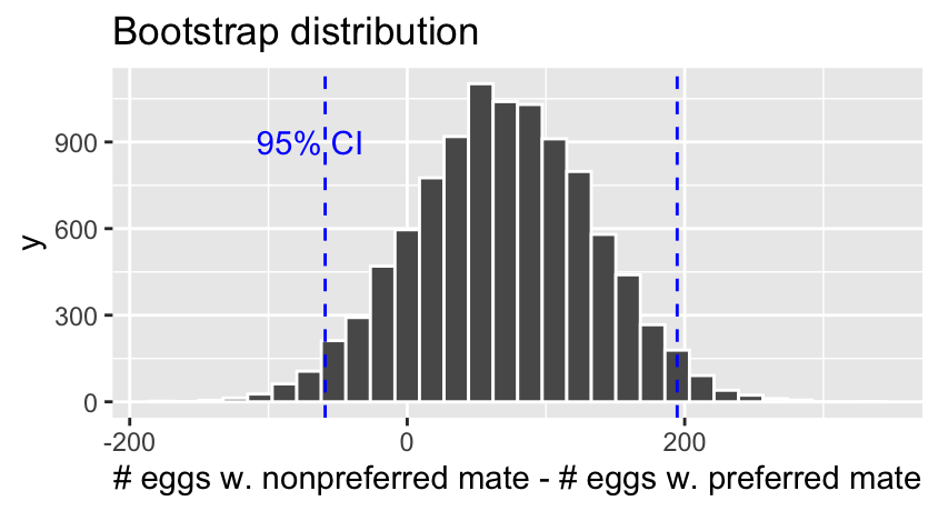
There is considerable uncertainty in our estimates – our bootstrapped 95% confidence interval includes some cases in which preferred matings yield more hatched eggs than nonpreferred matings, in addition to cases in which nonpreferred matings yield more hatched eggs.
How do we test the null model that mate preference does not matter to egg hatching? Let’s generate a sampling distribution under the null!
10.4 Permute to generate a null distribution!
IT’S TIME TO…

PERMUTE THE FROG
In a permutation test, we generate a null distribution by shuffling the association between explanatory and response variables. We then calculate a P-value by comparing the test statistic of the actual data to this null distribution we found by shuffling.
Steps in a Permutation Test
- State the null (\(H_0\)) and alternative (\(H_A\)) hypotheses.
- Decide on a test statistic.
- Calculate the test statistic for the actual data.
- Permute the data by shuffling values of explanatory variables across observations.
- Calculate the test statistic on this permuted data set.
- Repeat step 3 and 4 many times to generate the sampling distribution under the null (a thousand is standard… the more permutations, the more precise the p-value).
- Calculate a p-value as the proportion of permuted values that are as or more extreme than observed in the actual data.
- Interpret the p-value.
- Write up results.
10.4.1 Permutation: State \(H_0\) and \(H_A\)
- \(H_0\): The number of hatched eggs does not differ in preferred vs. non-preferred matings.
- \(H_A\): The number of hatched eggs differs in preferred vs. non-preferred matings.
10.4.2 Permutation: Decide on a test statistic.
The test statistic for a permutation can be whatever we think best captures our biological hypothesis. For this case, let’s say the test statistic is the difference in mean number of eggs hatched in nonpreferred and preferred matings.
10.4.3 Permutation: Calculate the test statistic for the actual data.
In section 10.3.2 we found the mean number of eggs hatched
- Was 345.11 in preferred matings,
- And 413.93 in nonpreferred matings.
Yielding a difference of -68.82 between the means.
10.4.4 Permutation: Permute the data.
So now we permute the data by randomly shuffling “treatment” onto our observed response variable, hatched.eggs, by using the sample() function. Let’s make one permutation below.
one.perm <- dplyr::select(frogs,treatment, hatched.eggs)     %>%
  mutate(perm_treatment = sample(treatment, size = n(), replace = FALSE))
So we see that after randomly shuffling treatment onto values, some observations stay with the original treatment and some swap. This generates a null as if there is no association because we randomly shuffled, removing a biological explanation for an association.
10.4.5 Permutation: Calculate the test statistic on permuted data.
Let’s take the difference in means in this permuted data set. As in section 10.3.2, to do so we
group_by()(permuted) treatment
summarise()(permuted) treatment means
- find the
diff()erence between group means
perm.diff <- one.perm %>%
  group_by(perm_treatment) %>%
  summarise(mean_hatched = mean(hatched.eggs))%>%
  summarise(diff_hatched = diff(mean_hatched))
## # A tibble: 1 × 1
## diff_hatched
## <dbl>
## 1 52.0So we see that our single permutation (i.e. one sample from the null distribution) revealed a difference of 51.98 eggs on average between the non-preferred and preferred matings. REMEMBER we know there is no actual association in the permutation because we randomly shuffled. We now do this many times to find the sampling distribution under the null.
This permuted difference of 51.98 is LESS extreme than the actual difference of -68.82 between treatments.
10.4.6 Permutation: Permute a bunch to build the null sampling distribution
But, this is just one sample from the null distribution. Now we do this many times to generate the sampling distribution.
PERMUTE MANY TIMES
sample_size <- nrow(frogs)
perm_reps   <- 100000

many.perm <- dplyr::select(frogs,treatment, hatched.eggs)     %>%
  rep_sample_n(size = sample_size, replace = FALSE, reps = perm_reps ) %>%
  mutate(perm_treatment = sample(treatment, size = n(), replace = FALSE))  %>%
  group_by(replicate, perm_treatment)

many.perm
## # A tibble: 5,600,000 × 4
## # Groups: replicate, perm_treatment [200,000]
## replicate treatment hatched.eggs perm_treatment
## <int> <chr> <int> <chr>
## 1 1 preferred 249 preferred
## 2 1 nonpreferred 646 nonpreferred
## 3 1 nonpreferred 218 nonpreferred
## 4 1 preferred 247 preferred
## 5 1 nonpreferred 582 preferred
## 6 1 preferred 753 nonpreferred
## 7 1 nonpreferred 923 preferred
## 8 1 preferred 165 preferred
## 9 1 preferred 255 nonpreferred
## 10 1 nonpreferred 296 preferred
## # … with 5,599,990 more rowsSUMMARIZE PERMUTED GROUPS FOR EACH REPLICATE
many.perm.means <- many.perm %>%
  summarise(mean_hatched = mean(hatched.eggs), .groups = "drop")%>%
  group_by(replicate)

many.perm.means
## # A tibble: 200,000 × 3
## # Groups: replicate [100,000]
## replicate perm_treatment mean_hatched
## <int> <chr> <dbl>
## 1 1 nonpreferred 392.
## 2 1 preferred 368.
## 3 2 nonpreferred 310.
## 4 2 preferred 457.
## 5 3 nonpreferred 382.
## 6 3 preferred 380.
## 7 4 nonpreferred 450.
## 8 4 preferred 306.
## 9 5 nonpreferred 439.
## 10 5 preferred 319.
## # … with 199,990 more rowsCALCULATE THE TEST STATISTIC (DIFFERENCE IN PERMUTED GROUP MEANS) FOR EACH REPLICATE
many.perm.diffs <- many.perm.means %>%
  summarise(diff_hatched = diff(mean_hatched))

ggplot(many.perm.diffs, aes(x = diff_hatched)) +
  geom_histogram(bins = 32, color = "white")+
  labs(title = "Permuted sampling distribution")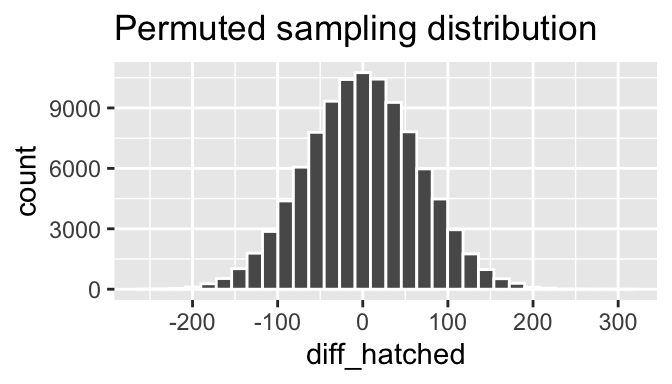
10.4.7 Permutation: Calculate a p-value.
Now that we have our observed test statistic and its sampling distribution under the null, we can calculate a p-value – the probability that we would observe a test statistic as or more extreme than what we actually saw if the null were true.
We do this by finding the proportion of permuted replicates that are as or more extreme than the actual data. To look at both tails (i.e. a two-tailed test) we work with absolute values - allowing us to work with one tail while incorporating both extremes.
many.perm.diffs <- many.perm.diffs %>%
  mutate(abs_obs_dif = abs(pull(mean_diff)),
         abs_perm_dif = abs(diff_hatched),
         as_or_more_extreme = abs_perm_dif >= abs_obs_dif)

# Plot the permuted distribution
ggplot(many.perm.diffs, aes(x = diff_hatched, fill = as_or_more_extreme )) +
  geom_histogram(bins = 35, color = "white")    +
  scale_fill_manual(values = c("grey","black")) +
  theme_light()                                 +
  theme(legend.position = "bottom")             +
  labs(title = "Permuted distribution")         +
  geom_vline(xintercept = c(-1,1)*pull(mean_diff), color = "lightblue") +
  annotate(x = -200, y = 7900, geom = "text", color = "lightblue", label = "Observed")+
  scale_y_continuous(limits = c(0,12000))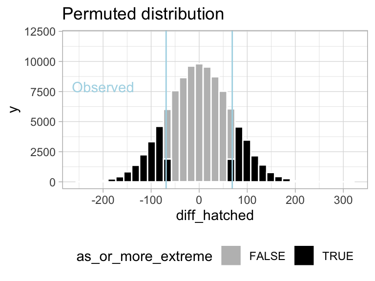
Figure 10.2: Sampling distribution for the difference in mean eggs hatched by treatment under the null hypothesis (light blue lines show the observed value).
CALCULATE A P-VALUE
Find the proportion of permutations that are as or more extreme than the real data (i.e. the proportion of the histogram in Figure 10.2) by taking the mean of as_or_more_extreme (FALSE = 0, TRUE = 1).
## # A tibble: 1 × 1
##   p_value
##     <dbl>
## 1   0.302
10.4.8 Permutation: Interpret the p-value.
So, we found a p-value of 0.3, meaning that in a world with no true association between mating treatment and eggs hatched, 30% of samples would be as or more extreme than what we observed in our actual sample.
As such we fail to reject the null hypothesis as we don’t have enough evidence to support the alternative hypothesis that number of eggs hatched differs based on mating with preferred or nonpreferred frogs.
10.5 Example write up.
So let’s take this opportunity to practice writing up a scientific result.
To test the idea that mating with preferred partners increased reproductive output, we analyzed data from wood frogs (Rana sylvatica). In this experiment, Swierk and Langkilde (2019), identified frogs’ preferred partners, randomly assigned some frogs preferred and other non-preferred partners, and counted the number of hatched eggs in each group. These data, presented in Figure 10.3, show that slightly fewer eggs hatched from preferred (mean = 345, bootstrapped 95% CI = {254, 446}) than non nonpreferred couples (mean = 414, bootstrapped 95% CI = {329, 498}), but there was large variability within each couple (\(sd_\text{preferred} = 260\), \(sd_\text{nonpreferred} = 237\)). This small difference in means was not significant (two-tailed permutation-based p-value = 0.30) – as such we cannot reject the null hypothesis and conclude that there is no evidence to suggest that preferred and nonpreferred woodfrog couples hatch different numbers of eggs.
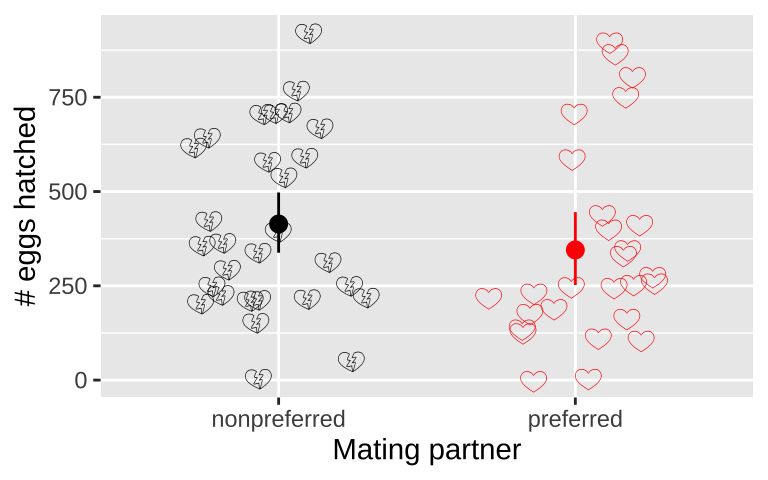
Figure 10.3: No evidence that the number of hatched eggs differed in nonpreferred vs preferred matings (two-tailed permutation based p-value = 0.30). Emojis show raw data, points show groups means, and lines display bootstrapped 95% confidence intervals.
10.6 How to deal with nonindependence by permutation
Permutation can solve so many stats problems. But if data are complex (e.g. more than one explanatory variable), we need to think about how to shuffle data to test these hypotheses we’re interested in, and not some confounding factor.
For example, our frog experiment was actually conducted over two years, and the design was slightly unbalanced – there were more non-preferred than preferred couples in 2013. So our p-value above is a bit wrong - as the difference in years could confound our answer.
frogs %>%
  group_by(year, treatment) %>%
  summarise(n = n())
## # A tibble: 4 × 3
## # Groups: year [2]
## year treatment n
## <int> <chr> <int>
## 1 2010 nonpreferred 15
## 2 2010 preferred 15
## 3 2013 nonpreferred 14
## 4 2013 preferred 12In fact, the mean number of hatched eggs differs substantially across years
frogs %>%
  ggplot(aes(x= factor(year), y = hatched.eggs, color = treatment)) +
  geom_jitter(height = 0, width = .1, size= 3, alpha = .3)          +
  stat_summary(position = position_nudge(x= c(.15,.2)))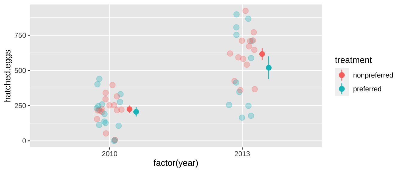
So we have to deal with such non-independence to ensure that, we can shuffle treatments within a year as follows. Things can get even more complicated with more complex non-independence.
year_perm <- frogs %>%
  rep_sample_n(size = nrow(frogs), reps = 10000) %>%
  group_by(replicate, year)                   %>%
  mutate(treatment = sample(treatment))       %>%
  ungroup()
Let’s be sure we permuted within years correctly by making sure that means for 210 and 2013 do not differ over replicates
year_perm %>%
  group_by(year, replicate) %>%
  summarise(mean = mean(hatched.eggs)) %>%
  summarise(means = unique(mean))
## # A tibble: 2 × 2
## year means
## <int> <dbl>
## 1 2010 215.
## 2 2013 572.Woohooo!
OK so now let’s calculate summary stats and find a p-value!!! Note that we don’t have to worry about year anymore because we permuted within year!
abs_observed_mean <- frog_summary %>% summarise(abs(diff(mean_hatched))) %>%pull()

year_perm %>%
  group_by(replicate, treatment) %>%
  summarise(mean_hatched = mean(hatched.eggs), .groups = "drop_last") %>%
  summarise(perm_diff_hatched = diff(mean_hatched),
            abs_perm_diff_hatched  = abs(perm_diff_hatched )) %>%
  ungroup() %>%
  mutate(as_or_more_extreme = abs_perm_diff_hatched >= abs_observed_mean) %>%
  summarise(p_value = mean(as_or_more_extreme))
## # A tibble: 1 × 1
## p_value
## <dbl>
## 1 0.160This more appropriate p-value still exceeds our traditional \(\alpha\) threshold of 0.05, but is way closer to it, and so while we would still formally “fail to reject the null hypothesis”, we might be somewhat more willing to entertain the idea that frogs lay more eggs with nonpreferred mates from this correct p-value than from the one calculated without considering the effect of year.
10.8 Advanced / Optional
10.8.1 The infer package can permute for us!
I prefer doing more of the coding myself because it’s more flexible and I know what’s happening (for example, from my quick skim of the infer vignette, I couldn’t quickly figure out how to permute conditional on year), but see the code below and the infer package website if you want to use their functions.
frogs_diff_hatch  <- frogs          %>%
  specify(hatched.eggs ~ treatment) %>%
  calculate(stat = "diff in means")

null_distn <- frogs %>%
   specify(hatched.eggs ~ treatment)  %>%
   hypothesize(null = "independence") %>%
   generate(reps = 10000, type = "permute") %>%
   calculate(stat = "diff in means")

null_distn %>%
  get_p_value(obs_stat = frogs_diff_hatch, direction = "two-sided")
## # A tibble: 1 × 1
## p_value
## <dbl>
## 1 0.29910.8.2 Large data sets
As in the bootstrap example, copying a large dataset 10000 times and then permuting can challenge R. If your data set is too big, you’ll need to permute one observation at a time. As in the bootstrap example, we do this by writing a function to permute once, and then use the replicate() function to permute many times. For example
conditionalPermute <- function(dataset, response, explanatory, condition){
  dataset                                                      %>%
    group_by({{condition}})                                    %>%
    mutate(perm_explanatory = sample({{explanatory}}))         %>%
    ungroup()                                                  %>%
    group_by(perm_explanatory )                                %>%
    summarise(mean_perm = mean({{response}}), .groups = "drop") %>%
    summarise(diff(mean_perm)) %>%
    pull()
}

perm_vals <- replicate(1000 ,conditionalPermute(dataset = frogs,
                                                 response    = hatched.eggs,
                                                 explanatory = treatment,
                                                 condition   = year))

p.value <- mean(abs(perm_vals)  >= abs_observed_mean )
p.value
## [1] 0.16710.9 Code for figure
library(emojifont)
frogs %>%
  mutate(label = case_when(treatment == "preferred" ~ emoji("heart"),
                           treatment == "nonpreferred" ~ emoji("broken_heart"))) %>%
  ggplot(aes(x = treatment, y = hatched.eggs, label = label, color = treatment)) +
  geom_text(family="EmojiOne", size=4, vjust = .3, position = position_jitter(seed = 1, width = .3,height=0))+
  stat_summary(fun.data = 'mean_cl_boot') +
  scale_color_manual(values = c("black","red"))+
  theme(legend.position = "none")+
  labs(x = "Mating partner",  y = "# eggs hatched")