Chapter 12 Shuffling two categorical variables
Motivating scenarios: We are interested to estimate an association between two categorical variables, and test if there is a non-random association.
Learning goals: By the end of this chapter you should be able to
- Summarize the association between to categorical variables as
- A relative risk OR
- A (log) odds ratio
- Test the null hypothesis of no association by
- Permutation / Fishers exact test OR
- \(\chi^2\) test
12.1 Associations between categorical variables.
One of the most common statistical questions we come across is “are the two variables associated?”
For instance, we might want to know if people who have and have not gotten a vaccine for some virus have a different probabilities of contracting or spreading that virus, or expressing any negative side effects of the vaccine.
Such an association would be quite interesting, and if it arises in a randomized controlled experiment, it would suggest that vaccination caused this outcome.
.](Applied-Biostats_files/figure-html/modernadat-1.png)
Figure 12.1: Participants receiving a placebo had a much higher incidence of covid than those receiving the Moderna vaccine. Data from the Moderna press release.
12.2 Summarizing associations between two categorical variables
When we are looking into the association between two categorical variables, we usually display data in a contingency table. For example, the contingency table below shows the outcomes of the Moderna COVID vaccine trial. Note that a contingency table is not ‘tidy’ but is useful for communicating result with readers.
covid_counts <- tibble( outcome = c("Covid" ,"No COVID"),
        Moderna    =    c(   11, 14989),
        No_vaccine =    c(  185, 14815))

kable(covid_counts)| outcome | Moderna | No_vaccine |
|---|---|---|
| Covid | 11 | 185 |
| No COVID | 14989 | 14815 |
12.2.1 Relative Risk
The best summary of an association between two categorical variables is the relative risk, \(\widehat{RR}\). The relative risk is the probability of a bad outcome conditional on being in scenario one divided by the probability of that bad outcome conditional on being in the other scenario. For example if 10 of 100 smokers die of lung cancer and 1 of 100 non-smokers die of lung cancer, the relative risk of dying of lung cancer given that you’re a smoker is \(\frac{10/100}{1/100} = 10\) times great than that given that you’re a non-smoker. Note that hats \(\hat{ }\) over p and RR indicate that these are estimates, not parameters.
\[\widehat{RR} = \frac{\widehat{p_1}}{\widehat{p_2}} \text{ , where } \widehat{p_1} = \frac{n_\text{bad outcomes in scenario one}}{n_\text{individuals in scenario one}}\]
For example, the relative risk of getting sick if vaccinated is the probability of getting sick if vaccinated (\(\widehat{p}(\text{sick| vaccine})\)) divided by the probability of getting sick if unvaccinated (\(\widehat{p}(\text{sick| no vaccine})\)). In the Moderna COVID vaccine trial
- 11 of 15,000 individuals in the vaccine group caught coronavirus (\(\hat{p} = \frac{11}{15000} = \frac{0.11}{150}= \frac{0.07\overline{33}}{100}\)).
- 185 of 15,000 individuals in the placebo group caught coronavirus (\(\hat{p} = \frac{185}{15000} = \frac{1.85}{150}= \frac{1.2\overline{333}}{100}\)).
So the relative risk of covid infection in the vaccinated was \(\frac{11 / 15000}{185 / 15000} = \frac{185}{11} = 0.0595\) – in other words, receiving the Moderna vaccine was associated with about a roughly 16.8-fold (i.e. 1/0.0595) decrease in the risk of getting covid. The relative risk can take any value between zero and infinity, with
- A relative risk below one indicating that option one (the one in the numerator) is safer, and
- A relative risk above one indicating that option two (the one in the denominator) is safer.
The relative risk is a fantastic summary statistic because it is straightforward, matches how we think, and is easy to communicate. Therefore, the relative risk should be reported whenever probabilities can be estimated without bias,
12.2.2 The (log) Odds-Ratio
While the relative risk is a simple summary to communicate it suffers from two challenges
- We often cannot study rare outcomes without some selection bias.
- It has some non-desirable properties for statistical modeling.
For these reasons, we often deal with the less intuitive (log) Odds Ratio, rather than the simpler relative risk😭. Jason Kerwin argues that odds ratios are so confusing that they are basically useless, do you agree?
The odds of an outcome is the estimated probability of that outcome, \(\widehat{p}\), divided by the estimated probability of not that outcome, \(1 - \widehat{p}\). That is \(\text{Odds} = \frac{\widehat{p}}{1-\widehat{p}}\).
The odds ratio is the odds of an outcome in scenario one divided by the odds of an outcome in the other scenario.
For example if 10 of 100 smokers die of lung cancer and 1 of 100 non-smokers die of lung cancer, the odds ratio of dying of lung cancer for smokers relative to non-smokers is \(\frac{(10/100)/(90/100)}{(1/100)/(99/100)} = \frac{1/9}{1/99} = 99/11 = 9\). This shows
- The odds ratio does not equal the relative risk.
- The denominator drops out of the top and bottom – meaning this will work even if we don’t have true absolute probabilities. This will be the case in studies of rare outcomes in which it makes sense to increase the number of these rare outcomes we see (as we do in case-control studies).
12.3 Quantifying uncertainty in associations between two catergorical variables
There is an equation for the uncertainty in the log odds ratio, but it isn’t illuminating, and is a pain. I include it at the end of this chapter but I can’t come up with a good reason to teach it to you. Instead, let’s bootstrap!!! In the real world, you will simply use the default standard error that R gives you, but that doesn’t do much to help us understand anything.
So let’s approximate the sampling distribution by resampling outcomes with replacement and summarizing variability in this resampling to describe uncertainty.
library(tidyverse)
library(infer)
boot_risk_Moderna <-  tibble(covid = rep(c(1,0), times = c(11,14989)))    %>%
  rep_sample_n(size = 15000, reps = 10000, replace = TRUE)           %>%
  summarise(risk_vax = mean(covid))


boot_risk_novaccine <-  tibble(covid = rep(c(1,0), times = c(185,14815))) %>%
  rep_sample_n(size = 15000, reps = 10000, replace = TRUE)           %>%
  summarise(risk_novax = mean(covid))
Let’s visualize this uncertainty by plotting this approximation of the sampling distribution.
tidy_boot_risk <-
  bind_rows(boot_risk_Moderna %>%rename(risk = risk_vax) %>% mutate(treatment = "vax"),
            boot_risk_novaccine %>%rename(risk = risk_novax) %>% mutate(treatment = "no_vax"))


ggplot(tidy_boot_risk, aes(x = risk, fill = treatment))+
  geom_density(alpha = .8, color = NA)+
  theme_tufte()+
  scale_y_continuous(expand = c(0,0))+
  scale_x_continuous(breaks = seq(0,0.02,.002))+
  annotate(geom = "text", x =  c(0.0015, .0115), y = 575, label = c("vax","no vax"), hjust = 0)+
  theme(axis.line = element_line(color = "black"),
        legend.position = "none")+
  labs(title = "Bootstrapped distribution of covid risk",
       x = "risk of covid (from Moderna Study)")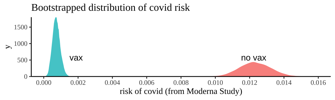
Figure 12.2: Bootstrapping participants in Moderna trials by treatment to consider uncertainty in our estimate of risk.
We can summarize this uncertainty for each treatment with the bootstrap standard error and the bootstrap confidence intervals of the risk
tidy_boot_risk %>%
  group_by(treatment) %>%
  summarise(se_risk     = sd(risk),
            lower_95_CI = quantile(risk, prob = 0.025),
            upper_95_CI = quantile(risk, prob = 0.975))
## # A tibble: 2 × 4
## treatment se_risk lower_95_CI upper_95_CI
## <chr> <dbl> <dbl> <dbl>
## 1 no_vax 0.000911 0.0106 0.0141
## 2 vax 0.000221 0.000333 0.0012So a reasonable bound is that we think the risk of getting COVID over the course of the Moderna Vaccine trial was between 0.0333% and 0.113% for people who got the vaccine and between 1.05% and 1.4% for people who did not.
To quantify uncertainty in the relative risk and odds ratio we pair replicates together and use our summaries of risk among the vaccinated and unvaccinated in each replicate, and then calculate eg confidence intervals and standard errors.
tidy_boot_risk %>%
  pivot_wider(id_cols = replicate,names_from = treatment, values_from = risk) %>%
  mutate(relative_risk = vax / no_vax,
         odds_ratio    = (vax)*(1-vax) / ((no_vax)*(1 - no_vax))) %>%
  summarise_at(.vars = c("relative_risk", "odds_ratio"), quantile, probs = c(0.025,0.975)) %>%
  mutate(CI = c("lower_95", "upper_95") )
## # A tibble: 2 × 3
## relative_risk odds_ratio CI
## <dbl> <dbl> <chr>
## 1 0.0266 0.0269 lower_95
## 2 0.100 0.101 upper_9512.4 Testing the null hypothesis of no association
- State the null hypothesis and its alternative.
- Null hypotheses: There is NO association between our two categories. e.g. The proportion of people with covid does not differ between the vaccinated and unvaccinated people.
- Alternate hypotheses: There is an association between our two categories. e.g. The proportion of people with covid differs between vaccinated and unvaccinated people.
- Null hypotheses: There is NO association between our two categories. e.g. The proportion of people with covid does not differ between the vaccinated and unvaccinated people.
- Calculate a test statistic to summarize our data.
- Compare the observed test statistic to the sampling distribution of this statistic from the null model.
- Interpret these results. If the test statistic is in an extreme tail of this sampling distribution, we reject the null hypothesis, otherwise we do not.
12.4.1 By permutation
First let’s test this null by permutation. Remember in permutation we generate a sampling distribution under the null by shuffling explanatory and response variables. We need a test statistic – so let’s take the odds ratio. (p-values and conclusions will be the exact same if we chose the relative risk).
First load the data
# Make the data
moderna_data <- bind_rows(
  tibble(treatment = "vaccine", covid = rep(c("+", "-"), times = c( 11, 14989))),
  tibble(treatment = "novax",   covid = rep(c("+", "-"), times = c(185, 14815))))
12.4.1.1 Then shuffle labels for many replicates
- Use the
rep_sample_n()function withreplace = FALSEto make a bunch of identical copies of our data (the orders will be shuffled, but all data will be there and associations will be maintained).
- So we the shuffle treatments across outcomes for each replicate to generate data from the null.
# shuffle the relationship between explanatory and response variable
n_perms <- 10000
moderna_perm <- moderna_data                                                %>%
  rep_sample_n(size = nrow(moderna_data), replace = FALSE, reps = n_perms ) %>%
  mutate(treatment = sample(treatment, replace = FALSE, size = nrow(moderna_data) ))
and count outcomes
# Summarize sampling distribution of permutation
moderna_perm_counts <- moderna_perm                                         %>%
  group_by( treatment, covid, replicate, .drop = FALSE)                     %>%
  summarise(count = n())
12.4.1.2 And summarize permuted data
Note this is a bunch of somewhat uninspired R code – it could be fun for you to work through (and you might have a better way), but no need to pay too much attention — the main thing is we calculated our summaries.
moderna_perm_summaries <-  moderna_perm_counts                              %>%
  group_by(treatment, replicate)                                            %>%
  mutate(n = sum(count))                                                    %>%
  ungroup()                                                                 %>%
  filter(covid == "+")                                                      %>%
  group_by(replicate)                                                       %>%
  mutate(risk          = count / n,
         odds          = risk / (1- risk),
         relative_risk = risk  / (sum(risk) - risk),
         odds_ratio    = odds  / (sum(odds) - odds))                        %>%
  filter(treatment == "vaccine")                                            %>%
  ungroup()
12.4.1.3 Plot the data
actual_odds_ratio    <-   ((11 /15000) / (1 - (11 /15000) )) /  ((185 /15000) / (1- (185/15000)))

odds_ratio_plot <- ggplot(moderna_perm_summaries, aes(x = odds_ratio)) +
  geom_histogram(color = "white", binwidth = .04, size = .005) +
  geom_vline(xintercept = c( actual_odds_ratio, 1 /actual_odds_ratio), color = "firebrick", lty = 2) +
  annotate(x = -2, y =1500, label =  "Actual\nodds\nratio", geom = "text", hjust = 0, vjust = 1, color = "firebrick")+
    labs(title = "Null Sampling distribution: Moderna trial", subtitle = "odds ratio")

log_odds_ratio_plot <- ggplot(moderna_perm_summaries, aes(x = log(odds_ratio))) +
  geom_histogram(color = "white", bins = 270, size = .03) +
  geom_vline(xintercept = log(c( actual_odds_ratio, 1 / actual_odds_ratio)), color = "firebrick", lty = 2) +
  annotate(x = log(actual_odds_ratio), y =500, label =  "   Actual\n   log odds\n   ratio", geom = "text", hjust = 0, vjust = 1, color = "firebrick")+
  labs(title = "Null Sampling distribution: Moderna trial", subtitle = "log odds ratio")

plot_grid(odds_ratio_plot, log_odds_ratio_plot, labels = "AUTO")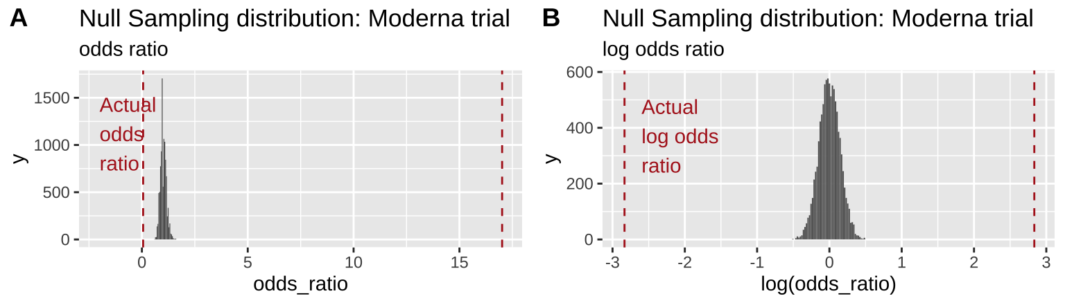
Figure 12.3: Comparing the efficacy of the Moderna COVID vaccine (red dashed line) to its sampling distribution under the null (bars). Each group consisted of 15,000 participants. The odds ratio and log odds ratio are presented in A and B, respectively
From Figure 12.3 it is pretty clear that it would be quite strange to see a result as extreme as we did if the null were true.
Figure 12.3B highlights the practical utility of using log odds ratios as opposed to odds ratios – as it shows that both tails of the distribution are equidistant from the null, in contrast to the misleading impression from 12.3A.
12.4.1.4 Find a p-value
Remember the p-value is the probability that we would observe our test statistic, or something more extreme if the null were true. While it is clear from Figure 12.3 that it would be quite strange to see a result as extreme as we did if the null were true, we want to quantify this weirdness with a p-value.
We can approximate this by looking at the proportion of values from our permutation that are as or more extreme than our actual observation.
Because the odds ratio is a ratio, we take values that are as small as ours (or smaller) or as large as the reciprocal of ours (or larger) as being as or more extreme. The code below is written so it works whether our observed odds ratio was very small or very big.
observed_both_tails <- c(actual_odds_ratio, 1 / actual_odds_ratio)
moderna_perm_summaries %>%
  mutate(as_or_more_extreme = odds_ratio <= min(observed_both_tails) |
                              odds_ratio >= max(observed_both_tails) ) %>%
  summarise(p_val = mean(as_or_more_extreme ))                         %>%
  pull()
## [1] 0We find that none of ten-thousand permutations were as or more extreme than our data, so we conclude that our p-value is less than 0.0001, and reject the null hypothesis that (Moderna) vaccination status is not associated with COVID risk.
12.4.2 With math
The permutation above did the job. We came to a solid conclusion. But there are a few downsides
- It can be a bit slow – it takes my computer like five minutes to permute a data set this large 10,000 times. While five minutes isn’t a lot of time it would add up if for example we wanted to do this for every mutation in a genome.
- It is influenced by chance. Every permutation will have a slightly different p-value due to the chance outcomes of random shuffling. While this shouldn’t impact our conclusions it’s a bit unsatisfying.
- We couldn’t calculate an exact answer when p is really low. Again if p is really low, we don’t really need to know it precisely, because we’re going to reject the null, but again, we’d like a more satisfactory answer.
For these reasons, we usually only apply a permutation to cases without mathematically solved null sampling distributions. For the case of associations between categorial variables there is a relevant null sampling distribution – the \(\chi^2\) distribution!
12.4.2.1 \(\chi^2\) (aka chi squared)
\(\chi^2\) is a test statistic that quantifies the difference between observed and expected counts. That is, \(\chi^2\) summarizes the fit of categorical data to expectations.We calculate \(\chi^2\) as
\[\begin{equation} \chi^2 = \sum \frac{(\text{Observed}_i - \text{Expected}_i)^2}{\text{Expected}_i} \tag{12.1} \end{equation}\]
Where each \(i\) is a different potential outcome (in our example: COVID without vaccine, COVID with vaccine, NO COVID without vaccine, NO COVID with vaccine), and observations and expectations are counts not proportions.
We use the multiplication rule \(P_{A \text{ AND } B} = P_{A} \times P_B\) to find null expectations (i.e. assuming independence) for proportions. We then convert these expected proportions to counts by multiplying by sample size. In our case
moderna_chi2_calcs <- moderna_data %>%
  group_by(treatment, covid)    %>%
  summarise(count = n())        %>%
  ungroup()                     %>%
  mutate(total_n = sum(count))  %>%
  group_by(covid)     %>% mutate(p_covid = sum(count) / total_n) %>% ungroup() %>%
  group_by(treatment) %>% mutate(p_treat = sum(count) / total_n) %>% ungroup() %>%
  mutate(expected_count  = p_covid * p_treat * total_n,
         chi2 =  (expected_count - count)^2/ expected_count)

moderna_chi2_calcs
## # A tibble: 4 × 8
## treatment covid count total_n p_covid p_treat expected_count chi2
## <chr> <chr> <int> <int> <dbl> <dbl> <dbl> <dbl>
## 1 novax - 14815 30000 0.993 0.5 14902 0.508
## 2 novax + 185 30000 0.00653 0.5 98 77.2
## 3 vaccine - 14989 30000 0.993 0.5 14902 0.508
## 4 vaccine + 11 30000 0.00653 0.5 98 77.2The code above finds the contribution of each category to \(\chi^2\) in column chi2, as \(\frac{(\text{Observed}_i - \text{Expected}_i)^2}{\text{Expected}_i}\) (Eq. (12.1)). Note that because treatments where equally spread out, we just get the same values twice, this won’t happen with unequal treatment proportions.
Adding these all up, we have a \(\chi^2\) value of \(\frac{(14815 - 14902)^2}{14902} + \frac{(185 - 98)^2}{98} + \frac{(14989 - 14902)^2}{14902} + \frac{(11 - 98)^2}{98}\) = 0.51 + 77.23 + 0.51 + 77.23 = 155.49.
The \(\chi^2\) distribution
So, is our \(\chi^2\) value of 155.49 low or high? We can compare this to the null sampling distribution of \(\chi^2\) to find out. To do so, let us first look at the distribution of \(\chi^2\) values in our permutations under the null model, above.
# Boring formating stuff...
moderna_perm_for_chi2 <- bind_rows(dplyr::select( moderna_perm_summaries, treatment, covid, replicate, count) ,
          dplyr::select( moderna_perm_summaries, treatment, covid, replicate, count) %>%
            mutate(treatment = "-", count = 196 - count))

moderna_perm_for_chi2 <- bind_rows(moderna_perm_for_chi2,
          mutate(moderna_perm_for_chi2, covid = "-", count = 15000 - count))%>%
  mutate(expected_count = case_when(covid == "+" ~    98,
                                    covid == "-" ~ 14902),
         chi2 =  (expected_count - count)^2/ expected_count)                  %>%
  group_by(replicate) %>%
  summarise(chi2 = sum(chi2))

moderna_chi2_plot <- ggplot(moderna_perm_for_chi2 , aes(x = chi2))+
  geom_histogram(aes(y = ..density.. ),color = "white", bins = 20, size = .1)+
  scale_y_continuous(limits = c(0,1.1)) +
  labs(x = expression(chi^2,
                      title = "Null Sampling distribution: Moderna trial",
                      subtitle = expression(paste("Permutation-based ", chi^2))))

moderna_chi2_plot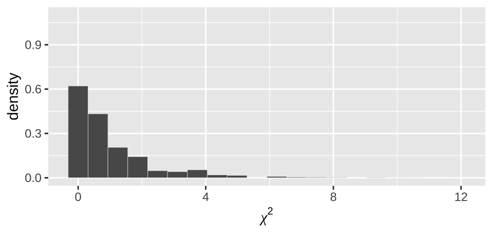
Figure 12.4: Distribution of chi2 values from our null permutation.
As above (e.g. Figure 12.3), we see from Figure 12.4 that the observed \(\chi^2\) value of 155.49 is way outside of what we would expect from the null.
But remember, the whole reason we calculate \(\chi^2\) is because there is a nice mathematical function that captures this null sampling distribution without permutation!
12.4.2.1.1 Degrees of freedom
It turns out that the distribution of \(\chi^2\) values under the null depends on something called the degrees of freedom. The degrees of freedom specify the additional number of values we need to know all the outcomes in our study.
In the case of the Moderna trial, we know the number of participants, and need to calculate \(p_\text{vaccinated}\) and \(p_\text{covid +}\) from our data to calculate \(\chi^2\). This means that if you gave me this information, plus the counts for one box in our table (e.g. the number of vaccinated people who got COVID) I could use basic algebra to learn all the other boxes. So we say there is one degree of freedom. In general, the degrees of freedom for associations between count data equals:
\[df = (\text{# potential values for explanatory var} -1) \times (\text{# potential values for response var} -1)\].
In our case, this is \((2-1)\times(2-1)=1 \text{ degree of freedom}\). We see that the actual \(\chi^2\) distribution with one degree of freedom
moderna_chi2_plot +
  geom_density()+
  stat_function(fun = dchisq, args = list(df = 1),  color = "red", lwd = 2, alpha = .4)+
  annotate(x = 4, y =.9,  color = "red",  geom = "text", label= expression(paste(chi^2,"distribution. df =1")) , hjust = 0)+
  annotate(x = 4, y =.7, geom = "text", label= "Fitting a density curve to permutations" , hjust = 0)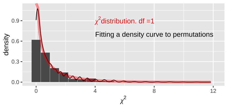
Figure 12.5: Comparing the distribution of chi2 values from our null permutation (histogram in bars, density curve as black line) to the chi2 distribution with one degree of freedom (red)
Effect size vs surprise It’s worth noting a major difference between the relative risk and log odds ratio as compared to the \(\chi^2\) value:
- The relative risk and log odds ratio quantify the association between categorical variables.
- \(\chi^2\) quantifies the evidence for a deviation from expectations.
An identical estimated relative risk of 2:1 would have a way bigger \(chi^2\) value if it came from two-thousand observations than if it came from twenty observations. As such \(\chi^2\) does not capture the effect size in the same way as the relative risk or log odds ratio.
12.4.2.2 A p-value
We can use the \(\chi^2\) distribution to find a p-value! Specificaly we can ask R to find the area under the \(\chi^2\) distribution that is as or more extreme than our \(\chi^2\) value with the pchisq function.
observed_chi2 <-moderna_chi2_calcs %>% pull(chi2) %>% sum()
pchisq(observed_chi2, df = 1, lower.tail = FALSE)
## [1] 1.096878e-35This is an exceptionally small p-value. If we did 10,000,000,000,000,000,000,000,000,000,000,000 such experiments for which th null were true, only one would be as extreme as what we saw. So we (still) reject the null hypothesis.
Note that we told R that we
- Had one degree of freedom (argument
df = 1).
- We were only interested in the upper tail (argument
lower.tail = FALSE).
So, why do we only look at one tail here? It’s because both extreme associations (either an association between vaccine and COVID, or association with no vaccine and COVID (both tails in Figure 12.3, result in large \(\chi^2\) values) – an exceptionally small \(\chi^2\) value does not correspond to either tail we care about.
12.4.2.3 \(\chi^2\) contingency test with the chisq.test() function
We can avoid all of this tedious calculation by using thechisq.test() function in R. Recall our initial data structure covid_counts
## # A tibble: 2 × 3
##   outcome  Moderna No_vaccine
##   <chr>      <dbl>      <dbl>
## 1 Covid         11        185
## 2 No COVID   14989      14815
We can type
covid_chisq_test <- covid_counts      %>%
  dplyr::select(- outcome)                 %>%  # to ignore labels
  chisq.test(x = ., correct = FALSE)

covid_chisq_test
##
## Pearson's Chi-squared test
##
## data: .
## X-squared = 155.49, df = 1, p-value < 2.2e-16Note three things:
- We typed
correct = FALSE, this tellsRwe want the basic \(\chi^2\) test and not to use a fancy correction. Seehelp(chisq.test)for more info.
- The p-value was reported as
< 2.2e-16. By default, this is what R tells us when the p-value is very small.
- This is easy to look at and read, but not easy to work with because it isn’t tidy.
We can solve issues 2 and 3, above, with the tidy function in the broom package, which tidies output from R’s hypothesis testing output.
library(broom)
tidy(covid_chisq_test)
## # A tibble: 1 × 4
## statistic p.value parameter method
## <dbl> <dbl> <int> <chr>
## 1 155. 1.10e-35 1 Pearson's Chi-squared testReassuringly, R’s answers match ours!!!
12.5 More on the \(\chi^2\) test.
12.5.1 Uses of the \(\chi^2\) test
The \(\chi^2\) test tests the null hypothesis that counts follow expectations of some null model.
- We introduced a specific and common use of the \(\chi^2\) test — the \(\chi^2\) contingency test, which is used to test for associations between two categorical outcomes.
- However, we can use the same framework to test the null hypothesis that babies have an equal probability of being born on any da of the week (e.g. a probability of 1/7 for each day), or if data fit a common distribution for counts such as the Poisson (if events are independent over time or space) or binomial (if counts are independent within groups). Much of this is covered in Chapter 8 of Whitlock and Schluter (2020) , which we are skipping here (I have never used any of that chapter outside of teaching). Feel free to look there for more information if you care.
12.5.2 Assumptions of the \(\chi^2\) test.
The \(\chi^2\) test assumes
- Random sampling (without bias) in each group.
- Independent observations in each group.
- All categories have an expected count greater than one.
- No more than 20% of categories have an expected count of less than five.
When these assumptions are not met, we can be sure that the null \(\chi^2\) distribution will match the mathematical approximation represented by the \(\chi^2\) distribution.
The Moderna trial met all of these assumptions, but sometimes studies don’t. When data do not meet test assumptions, we have a few options.
- Ignore violations of assumptions if they are super minor.
- Permute or simulate to generate a null that does not depend on mathematical assumptions (I did this a bunch in this paper (Pickup et al. 2019)).
- Collapse observations into smaller sensible categories e.g.
| Initial Groups | Collapsed Groups 1 | Collapsed Groups 2 |
|---|---|---|
| no COVID | no COVID | no or asymptomatic COVID |
| asymptomatic COVID | COVID | no orasymptomatic COVID |
| mild COVID | COVID | mild COVID |
| severe COVID | COVID | severe COVID or DEATH |
| COVID death | COVID | severe COVID or DEATH |
Noote: it would not make sense to have categories like No COVID and COVID death vs. asymptomatic COVID, mild COVID and severe COVID.
- Use a more appropriate test.
12.5.2.1 Fisher’s exact test as an alternative to the \(\chi^2\) test.
Fisher’s exact test is a common solution to the issue of having expected counts too small for a \(\chi^2\) contingency test. Fisher’s exact test is basically a permutation test, but instead of randomly shuffling, we use fancy math to lay out all possible permutations in their expected counts. This works well for cases with few observations because the math is doable, but gets to be impractical when there are many observations.
EXAMPLE: Fisher’s exact test
Could vampire bats preferentially prey in cows in estrus? For some reason ¯\__(ツ)_/¯, Turner (1975) looked into this and found:
cows <- tibble(bitten     = c("bit","not bit"),
               estrus     = c(15,   7),
               not_estrus = c( 6, 322))

kable(cows)| bitten | estrus | not_estrus |
|---|---|---|
| bit | 15 | 6 |
| not bit | 7 | 322 |
A quick calculation (Relative Risk = \(\frac{15 / (15+7)}{6/(6+322)}= \frac{15 \times 328}{22 \times 6} = \frac{5\times164}{22} = \frac{5\times82}{11} = \frac{410}{11} = 37.3\)) shows that the risk of being bitten is about 37 times greater for cows in estrus, than those not in estrus. (Odds Ratio = \(\frac{ (15/22)/(7/22)}{(6/328)/(322/328)} = \frac{ 15/7}{6/322} = \frac{15 \times 322}{6 \times 7} = \frac{15 \times 46}{6} = 5 \times 23 = 115\)).
The visualization below (Fig. 12.6) makes this point clearly.
par(mar =c(1,1,1,1))
mosaicplot(column_to_rownames(cows, var = "bitten"), color = c("firebrick","cornsilk"),main="")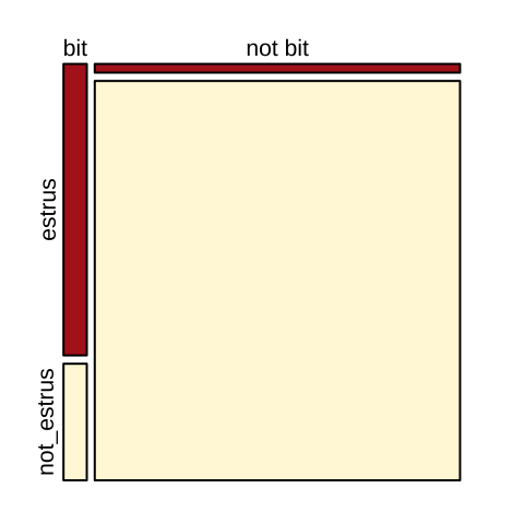
Figure 12.6: Visualizng cows being bitten by vampire bats.
Calculating expectations
As above, we calculate expected counts as \(P_A \times P_B \times n\)
pivot_longer(cows, cols = contains("estrus"),
             names_to   = c("condition"),
             values_to  = c("count"))         %>%
  mutate(tot = sum(count))                    %>%
  group_by(condition) %>% mutate(prop_condition = sum(count) / tot) %>% ungroup() %>%
  group_by(bitten)    %>% mutate(prop_bite      = sum(count) / tot) %>% ungroup() %>%
mutate(expected_count = prop_condition * prop_bite * tot) %>% kable(digits = 3)| bitten | condition | count | tot | prop_condition | prop_bite | expected_count |
|---|---|---|---|---|---|---|
| bit | estrus | 15 | 350 | 0.063 | 0.06 | 1.32 |
| bit | not_estrus | 6 | 350 | 0.937 | 0.06 | 19.68 |
| not bit | estrus | 7 | 350 | 0.063 | 0.94 | 20.68 |
| not bit | not_estrus | 322 | 350 | 0.937 | 0.94 | 308.32 |
Because we expect fewer than a count of five in more than 20% of our cells, we violate the assumptions of a \(\chi^2\) test. So, we will use the Fisher’s exact test.
cows_exact_test <- cows   %>%
  dplyr::select(- bitten)         %>%  # to ignore labels
  fisher.test()

cows_exact_test
##
## Fisher's Exact Test for Count Data
##
## data: .
## p-value < 2.2e-16
## alternative hypothesis: true odds ratio is not equal to 1
## 95 percent confidence interval:
## 29.94742 457.26860
## sample estimates:
## odds ratio
## 108.3894tidy(cows_exact_test)## # A tibble: 1 × 6
## estimate p.value conf.low conf.high method alternative
## <dbl> <dbl> <dbl> <dbl> <chr> <chr>
## 1 108. 1.00e-16 29.9 457. Fisher's Exact Test for Coun… two.sidedAgain the extremely small p-value means that such an extreme association would be produced in about one in every 1,000,000,000,000,000 universes in which the null model is true.
We therefore reject the null hypothesis and conclude that the probability of being bitten by a vampire bat is larger for cows in estrus than cows not in estrus.
12.6 Silly equations
Take the contingency table like the one below. The odds ratio is \(\widehat{OR}=\frac{a\times d}{b \times c}\), and we estimate the standard error of the log odds ratio as \(\sqrt{\frac{1}{a}+\frac{1}{b}+\frac{1}{c}+\frac{1}{d}}\). Th 95% CI for the log odds ratio is
\[log(\widehat{OR}) \pm 1.96 \times \sqrt{\frac{1}{a}+\frac{1}{b}+\frac{1}{c}+\frac{1}{d}}\] And we can exponentiate this to estimate the 95% CI for the odds ratio.
| Treatment | Control | |
|---|---|---|
| Focal outcome | a | b |
| Alternate outcome | c | d |