Chapter 6 Week 6 Lab
Homework for Next Week
- Fill in your strain’s labwork details on the google sheet.
- Submit the single ppt/pptx slide (and audio file, if desired) for use in Tuesday’s lecture (due on Canvas by Monday, May 11th at 10:59pm).
- Complete your initial proposal and submit on Canvas (due on Canvas by Wednesday, May 13th at 10:59pm).
- Make a post on the Week 6 Piazza discussion.
Learning Objectives
- Code a sliding window analysis to look for regions in a contig with unusually high or low GC content.
- Explore the RAST browser to look at particular gene subsystems and compare with related microbes.
- Have a specific plan for turning your project idea into a proposal for next week.
6.0.0.1 For local (non RStudio Cloud) users
If you are using RStudio locally, you only need to make sure that the “strain1926.fasta” file stored in the “data” folder where your Lab 6 Rmd is stored. After that, the next line of code should run successfully.
6.0.1 Overview
Today we’ll get more concrete about the final project, doing some example evaluation of potential ideas and trying to form groups of students working on similar themes.
But before we do that, we’ll show an example of a sliding window analysis, and do a quick exploration of RAST. In our case, we’ll use a sliding window approach to see how small scale variation in GC content along a contig might reveal interesting regions to investigate more. These might indicate genes that have arisen from horizontal gene transfer, or genes that have unique selection pressures due to the role they serve in the environment.
6.0.2 Week 5 Discussion – Figure of the Week details
Dr. Furrow will reveal a version of the Figure of the Week with more detailed axes and legend.
6.0.3 Themes and tools
We will overview a list of some of the key themes of the projects and some tools you might use to ask your questions.
6.0.4 Finding weird genomic regions using sliding window analyses
6.0.4.1 Reading overview
We will review the figure and discuss what they did, before jumping into it ourselves.
6.0.4.2 Live-coding the analysis as a class
Let’s use the example strain (1926), and perform a sliding window analysis on a single contig to figure out the mechanics of it. We’ll begin by loading the data.
# we are back to our old friend the DNAStringSet

# let's focus just on the second contig (for arbitrary reasons)
# we can select it with the double brackets
s26_2 <- s26[[2]]

# now s26_1 is in our environment as a single DNAString
# let's use our gc_content_single() function to get the overall GC content
gc26_2 <- gc_content_single(s26_2)

# it's 0.39

# as a quick example, let's get the GC content for just the first 500 bp
# all we have to do is use square brackets to select the base pairs from
# position 1 up to 500.
gc_content_single(s26_2[1:500])
## [1] 0.416Okay, we have a single contig of interest, and we know how to get GC content from any given stretch. We will write a loop now to repeatedly find and store the GC content at different windows along the contig.
After we’ve completed that, we should have identified a low GC region from about 70,000 bp until 72,500 bp. What can we do with it? Quick brainstorm in chat.
Pause here for check-in and 10-minute break
6.0.5 Exploring with RAST
About 2 weeks ago, you all uploaded a genome to RAST. At its core, RAST is a tool to build an annotation of an assembled genome, trying to identify as many potential genes as possible within the assembly. The typical output is a genbank file that you can download and analyze with tools in R or other software. But RAST also has online tools to let you view some summaries of the annotation, and make some comparisons with other species.
6.0.5.1 An example gene-based analysis – counting osmotic stress genes
We will walk through this together.
Navigate to the RAST site. https://rast.nmpdr.org/rast.cgi
(Make sure that you are logged in.)
Scroll down, and click view details for the genome “Unknown sp 1926”. Then click “Browse annotated genome in SEED Viewer”.
You are now in the SEED Viewer, which is an interactive browser of the genome annotation for our strain 1926. Near the top of the screen you should see an overview, and down below you should see a pie chart with colors for many different subsystems (subsystems are categories of genes related to particular biological processes). Okay, you have something to work with.
To begin, let’s get our first sense of what species our strains might be. Click on the “View closest neighbors” link. This is not a comprehensive list – it only searches among the genomes that are in RAST’s database. But it should get us to the right genus, or at least the right family. For strain 1926, we see that the top 6 best matches are all Staphylococcus, and the top 2 are Staphylococcus aureus. Let’s note that in the google spreadsheet with our strain data. https://docs.google.com/spreadsheets/d/1tZaAMtWj2uMCXAHMZY8-8d4xz_j9hQByU4tL_bw2ESA/edit#gid=0
6.0.5.2 Brief aside: zooming into a region of interest
Before we start exploring subsystems, let’s loop back around to the region we found before. To browse the whole genome, we can click on “>>Organism”, and then “Genome Browser”). From here we select NODE_2_… from the “contig” dropdown menu, select start base of 70000, and select “4,000 bp” for our window size. Click “draw”.
Froom this we can see two (or maybe three) genes right in that low GC region we identified before. Unfortunately, they are hypothetical proteins (predicted to be proteins, but without a definitive known function yet). However, we could click on one, click “details page”, then click the “sequence” link (in “internal links”) to see the actual nucleotide or amino acid sequence, which you could then paste into BLAST to look for matches. If you are investigating regions of interest, you might want to play around with these tools.
6.0.5.3 Back to subsystem exploration
Okay, let’s look for some genes now. The pie chart indicates the relative number of genes mapped to each of these subsystem categories, and you can use the expandable list on the right to see in more detail. If we hover over the “Subsystem Coverage” bar at the left side, we can see that 1463 genes were categorized to subsystems (35% of the total number of genes that were found by this annotation).
Let’s dig in a bit. In the “Subsystem Feature Counts” list, click the + next to “Stress Response” (near the bottom), then “Osmotic Stress”, and see many are predicted to be involved in “Choline and Betaine Uptake and Betaine Biosynthesis”. This system is known to be involved in osmoregulation in response to salt stress across a large range of organisms. Click on the subsystem name “Choline and Betaine Uptake and Betaine Biosynthesis”.
RAST even has a nice explanation when you click on the subsystem, including references to several experimental papers that helped scientists get to the current level of understanding about the subsystem.
When you’re on this subsystem page, you also have other useful information. There is a (tiny) diagram, but more importantly you can click on the “Subsystem Spreadsheet” tab and make some comparisons with other species.
First, let’s note that it initially looks like there are 27 genes in our assembly involved in the subsystem “Choline and Betaine Uptake and Betaine Biosynthesis”. The spreadsheet shows a breakdown of the best matches for those genes. Colors indicate a cluster of nearby genes (usually an operon). Interestingly, it looks like some genes are multiple copies of a single gene, for example OpuD. Each number corresponds to a unique gene. We note that there is one weird thing about RAST – some genes are listed twice (here 3294 and 530, both in the OpuA protein family). This is because they are annotated as having two potential functions. So we actually only have 25 unique genes in the genome here.
Okay, now we need context in the form of a comparison with other reference species. Let’s pull another Staphylococcus genome to compare by entering “Staphylococcus” in the “Organism” box at the upper left of the spreadsheet. The first few examples (all Staph. aureus) all look pretty similar. Eyeball, and estimate the average number of genes in this subsystem for these Staph species. One common pattern seems to be BetA, BetB, BetT, two OpuD genes, one OpuA gene, and an operon with four genes OpuC family. So, 10 genes total.
This seems like a lot fewer. But how can we formalize this? Are the genome assemblies of similar quality? Can we turn this into a proportion in some way, or otherwise control for genome quality/size/number of genes?
Take 5 minutes with your groups and brainstorm some ideas. We can put some thoughts up on the whiteboards.
Okay, we only have so many tools/data to work with. I will outline one standard approach below.
# Suppose we want to just use the total number of genes in the
# assembly that were successfully mapped to a subsystem by RAST

# We'll compare our Strain 1926 (Staph. aureus) to another
# Staph. aureus (RAST # 196620.1)

# We found 25 genes in the subsystem, out of 1463 total mapped genes
# Our comparison has 10 out of 1523

25/1463
## [1] 0.01708817## [1] 0.006565988# These proportions are quite different, but how can we formalize this?
# A classic approach to analyzing comparisons of counts is to use a
# contingency table. Let's make one.
betaine_table <- matrix(c(25,1463-25,10,1523-10),nrow = 2, byrow = TRUE)
betaine_table## [,1] [,2]
## [1,] 25 1438
## [2,] 10 1513# This matrix summarizes the counts as a 2x2 table. Each row sums up
# to the total number of genes for that genome, and the two
# columns are (gene in this system, gene not in this system).
# We can plot the difference as a mosaic plot, which helps to
# visualize differences in proportion
mosaicplot(betaine_table)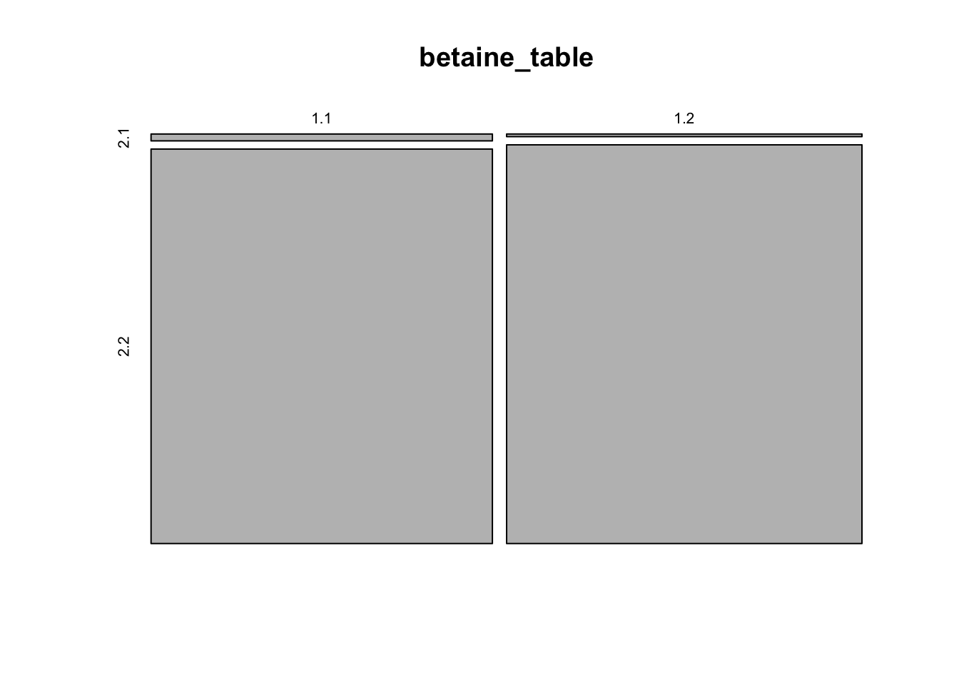
Figure 6.1: figure
# With proportions so small, it's hard to see much.

# The classic statistical approach here is to compare the odds
# of a gene being in the system or not for the two species.

# Fisher's exact test is the gold standard.  It takes a 2x2 table and returns
# a p-value, an odds ratio, and a confidence interval for that odds ratio.

fisher.test(betaine_table)
##
## Fisher's Exact Test for Count Data
##
## data: betaine_table
## p-value = 0.00983
## alternative hypothesis: true odds ratio is not equal to 1
## 95 percent confidence interval:
## 1.214531 6.157731
## sample estimates:
## odds ratio
## 2.629594Okay, we have a “result”. Some of you may know what a p-value is, but everyone could likely use a refresher. Think of it as a coincidence meter. Higher values indicate a higher chance that this kind of result could just be a random coincidence. Lower values indicated a lower chance that the result is just to chance. So low values indicate a stronger result – one that is unlikely to have occurred simply due to random chance because of things like assembly quality, variation among individuals of the species, errors in annotation, etc.
Usually, we consider a p-value of 0.05 or lower to be a strong enough indication that this result reflects a meaningful pattern. In this case, our p-value is very low, 0.0098 (very low chance that this difference is just a coincidence). So we believe that the higher number of genes in our strain may reflect a real biological difference from the Staph. aureus reference sample. The odds ratio suggests that a gene has odds 2.63 times higher of being involved in this subsystem for our sample than for the reference. That makes this subsystem an interesting candidate for further investigation.
NOTE: remember that manhattan plot of p-values along the chromosomes that we saw as our mystery figure for last week’s homework? Those p-values essentially come from this exact kind of analysis (a 2x2 contingency table), except there the rows and columns are gene variant A vs. B and two different phenotypes (e.g. patient has gout, patient does not have gout). But it’s just a table with four numbers. So the manhattan plots combine both of the approaches that we’ve seen today: using counting to quantify an unexpectedly high or low value for some feature, combined with sliding along a genome to identify regions that consistently have this anomaly.
Now let’s get back to our data.
6.0.5.4 Doing this with your primary strain (and secondary, time permitting)
Follow similar steps for your strain(s). Starting from the home page https://rast.nmpdr.org/rast.cgi, go to:
- “Jobs Overview” in “Your Jobs”,
- click on “view details” for your strain.
- Then click “Browse annotated genome in SEED Viewer”.
- From here, click “View closest neighbors” and record the top 2 species names and scores on the google sheet.
- Click back on the browser, or click “>>Organism” then “General Information”, to get back to the browser’s start page.
- Looking down at the Subsystem Statistics at the bottom, hover over the “Subsystem Coverage” barchart to see how many genes were successfully categorized into subsystems. Record that number.
- From the “Subsystem Feature Counts” in the lower right, click the “+” on “Stress Response”, then click the “+” for “Osmotic stress”.
- Click the link “Choline and Betaine Uptake and Betaine Biosynthesis”.
- Count how many unique genes there are (there may be a few duplicate listings with the same number), and enter that on the google sheet.
Populate the spreadsheet with your result, following the examples that are already there.
https://docs.google.com/spreadsheets/d/1tZaAMtWj2uMCXAHMZY8-8d4xz_j9hQByU4tL_bw2ESA/edit?usp=sharing
10-minute break
6.0.6 Rest of class, working on your projects.
We will start with a quick poll to see which themes people are leaning towards the most. This week’s Piazza post will be used to start organizing working groups for next week.
Instructors will guide a short activity, then give you time to do background research and start creating your slide for Tuesday (more details below).
6.1 Homework
6.1.1 Finish up labwork (10 points)
Make sure that the google doc is filled in with your strain’s details. This is the only task required to get full homework credit for this week. https://docs.google.com/spreadsheets/d/1tZaAMtWj2uMCXAHMZY8-8d4xz_j9hQByU4tL_bw2ESA/edit#gid=0
6.1.2 Powerpoint slide for Tuesday “lab meeting” lecture, due Mon. May 11 at 10:59pm on Canvas.
We are going to transition away from having background material during lecture, and instead focus on using the time to help you improve your project ideas and let you ask questions. For Tuesday, we want everyone to share a single slide and give a 1-minute explanation to the class (voice only, no need for video). The slides need to be uploaded as a ppt/pptx file to Canvas by 10:59pm on Monday, May 11th. Dr. Nord will download and organize them. The explanation can be given live during lecture (but practice to make sure it’s absolutely no longer than 1.5 minutes). However, if you have connection/microphone issues, you can choose to record your one-minute audio explanation ahead of time and also upload that file to Canvas. One free and easy tool to do this from a browser is speakpipe: https://www.speakpipe.com/voice-recorder.
The slide only needs three elements, each of which is only 1 sentence:
- A descriptive title,
- an outline of the data/data processing you will need to do,
- a potential result you might find.
Similarly, the one-minute explanation should simply explain these three sentences, providing a little more context on the data and what the potential result might mean.
For an example on unrelated research, my slide might have these three sentences.
Title: Finding genomic regions under selection in humans.
Data: Diploid genomic sequences for 100 individuals from around the world
Result: Several regions on a few chromosomes with unexpectedly low variation that are candidates to have recently undergone natural selection.
6.1.3 Written proposal, due Weds. May 13 at 10:59pm on Canvas.
Details for the proposal are in the project prompt online. It should be 400-500 words, and include all of the components listed in the prompt. This does not need to be written as an Rmd – you can use Word or whatever text editor you desire, as long as you submit a pdf, doc, or docx file.
By completing this before Lab 7, you will be ready to get our feedback and do more focused work, with the goal of finalizing the approach to your analysis during Lab 7, then generating a result to bring in to Lab 8.