Chapter 5 Week 5 Lab
Homework for Next Week
- Fill in all of the answer blocks and coding tasks in this lab notebook.
- Complete all tasks in the Homework section (bottom of the Rmd).
Learning Objectives
- Outline the logical steps for a hierarchical clustering algorithm.
- Apply hierarchical clustering to real data on amino acid usage for a set of halophile strains.
- Build a phylogenetic tree using a distance matrix.
- Relate a phylogenetic tree to a potential history of the evolutionary relatedness of species in the tree.
- Refine your potential project ideas.
5.0.1 Loading some 2019 data
We will use last year’s genomes to explore some potential analyses related to amino acid usage. If you are using RStudio Cloud, the RData file is already in our Files, we just need to load it with the code below.
5.0.2 Overview
Today we will learn some clustering techniques for comparing amino acid usage among species, and generate plots of last year’s real data. Prior research suggests that halophiles should have distinctive patterns of amino acid usage, due to the effect of their highly saline environments on protein stability. We will examine some 2019 BIS 23B data to see if there are clear patterns among those strains.
The second half of lab will apply these clustering approaches to the creation of phylogenetic trees, then shift to discussing initial ideas and providing feedback for potential research projects. It’s still early in the quarter, but the more you brainstorm, plan, and get feedback now, the better your final project will be.
5.0.3 Week 4 Discussion – Figure of the Week details
Dr. Furrow will reveal a version of the Figure of the Week with more detailed axes and legend.
5.0.4 Halophile protein composition – Reading review
Exactly what was their question for the data they showed in Figure 1? Was their analysis (and the Figure 1 plot) convincing?
5.0.5 The genes in our data
In lecture this week we talked about genes and how they are often the key objects of interest that we are looking for in our genome assemblies. Up to this point we have just been working with raw FASTA files. They are just sequences of nucleotides, and it’s not obvious exactly how we can find the potential genes in these data. The process of finding genes in a genome assembly (e.g. in a FASTA file) is called genome annotation. There are two main methods to find genes when looking at a sequence.
Using purely computational/statistical predictions. We heard about looking for certain promoter sequences, ribosomal binding sites, or start codons. Here’s a more detailed example to show how this works, focusing on start codons. We know that ATG is the typical start codon for a microbial gene, while stop codons are typically TAA, TAG, and TGA. One can start looking for genes by finding every start codon, then following along the sequence (in triplets) until they reach a stop codon. This defines a potential open reading frame (ORF). However, some of these won’t be real genes. They will just be random places that had …ATG… in the genome. To narrow down this long potential list of ORFs, the easiest approach is to filter by length. A random codon has a 3/64 chance of being a stop codon – we’ll skip the math on this for today, but it turns out that a random, not-real ORF is quite likely to be 300 base pairs or shorter. This is shorter than you would expect from any prokaryotic gene. The exact details are a little more complicated, but we can do a good job of finding potential genes by just finding ORFs, then removing all of the ORFs shorter than some certain length.
Using comparisons with known genes. Thinking back to lecture 2, algorithms such as BLAST (and its many variations) do something called sequence alignment. They take a sequence, and find its best match in some database. If you use a database of known genes, you can find sequences in your genome that match up to particular genes. If they match well, you can be fairly confident that you’ve found a gene in your strain that has a similar function. We will talk about this more during Lab 5.
Most tools for genome annotation use both of these approaches. We have not begun the process of genome annotation yet, but we will have the data from RAST for next week.
5.0.6 The amino acid profiles of our coding regions
The analysis we read about (Paul et al. 2008) didn’t work with nucleotide data – which is pretty much the only data we’ve looked at so far for our halophiles. Instead, they used amino acids. As we discussed in Tuesday’s lecture, there is a direct correspondence between the the amino acid sequence of a protein and the DNA sequence of the gene that codes for that protein. Each triplet of DNA codes for a particular amino acid (and the code is redundant; in many cases several triplets code for the same amino acid). We won’t have these data to work with until next week when we get our annotations back from RAST.
We will now focus on last year’s BIS 23B data. Following the analysis in Paul et al., we have data on the relative frequency of each amino acid in each genome from last year’s halophiles. When you loaded the RData file at the start of the Rmd, you added the data df_aa_long and df_aa_wide to your environment. These data are data frames – our preferred format for analyzing and plotting data in R. Note that we have 17 halophile strains, as well as E. coli, 2 other Bacteria, and 2 other Archaea. We’ve enriched the data a bit as well – we have the genus of each strain (based on BLASTing against a 16S database), domain of life, genomic gc content, a measure of salt-specific growth rate, and two principal components. Don’t worry about exactly what those mean yet. Let’s take a few looks at our data.
Let’s pause for 1 minute. Why are the proportions for the E. coli strain all equal to 1? And what is the final row? Those numbers look way smaller! Think back to the methods in the Paul et al. paper.
5.0.7 Heatmap as an initial view
Okay, let’s make a pretty plot. We’ll use the long version of the data, which lets us more easily use plotting tools like ggplot().
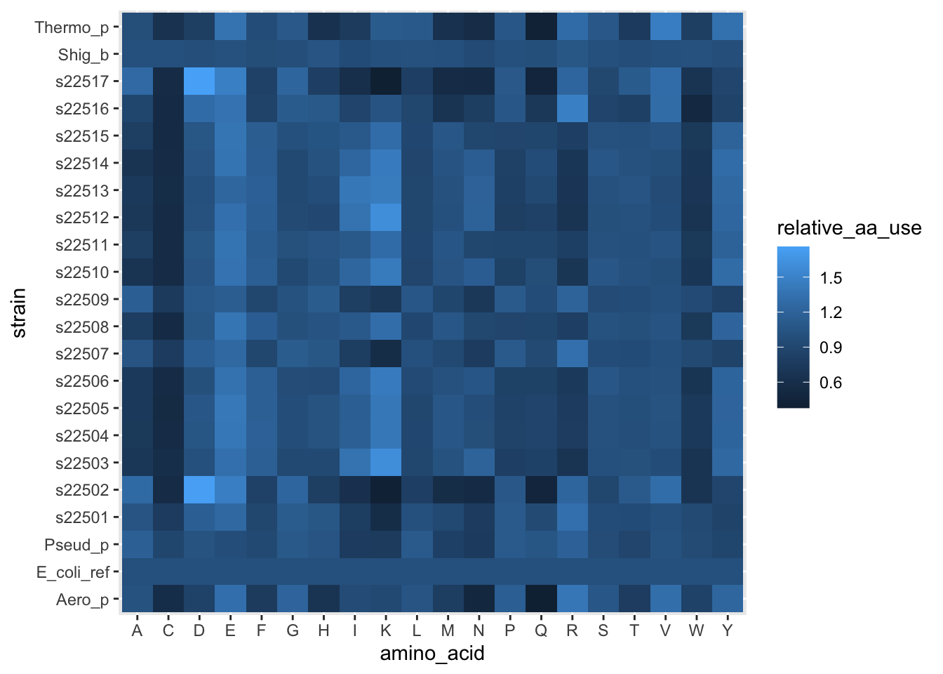
Figure 5.1: figure
Cool, we have a heatmap. These allow us to choose a discrete (categorical) variable on the x-axis and y-axis, then plot some continuous value (like the relative use of each amino acid) as a color. You’ll notice a new aesthetic. x and y make intuitive sense, they are how what we’ll use as x- and y-positions on the plot. fill on the other hand, tells us to use a data column to fill in a color for each row in the data. This is mainly useful when one or both axes are categorical/discrete.
But these colors really aren’t that helpful. Let’s try to replicate the plot in the paper.
ggplot(df_aa_long,aes(x = amino_acid, y = strain)) +
geom_tile(aes(fill = relative_aa_use)) +
scale_fill_gradient2(low = "red", mid = "yellow", high = "green", midpoint = 1)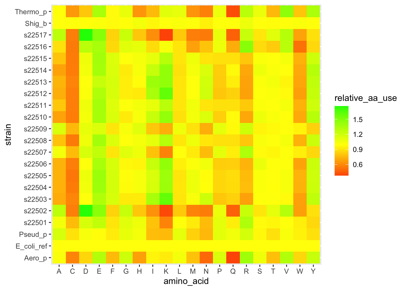
Figure 5.2: figure
The layer scale_fill_gradient2() let us set different colors for low values, a midpoint, and high values. And we set the midpoint to 1, which is equivalent to the E. coli profile.
Hopefully you’re starting to see how powerful ggplot can be. You can have a lot of control over exactly what you plot and how it looks. Let’s explore another approach to making varied figures from a data set. This will feel very confusing at first, but stick with it, it’s a powerful tool.
5.0.8 Computational thinking – hierarchical clustering
We can think of our amino acid data as 20 measurements for each of the strains. Mathematically, we have a 20-dimensional vector to represent each strain. How can we make sense of which strains are similar?
In your teams, outline an algorithm for grouping together similar species. Try to be as specific as possible. To start, think about how you would first find the most similar pair of strains, out of all possible pairs to compare. Then think about how you would build from there. It might help to imagine you’re only working with one or two measurements (e.g. just Asp and Lys proportions) to build the intuition for how to decide what defines similarity.
Again, this work will be done in groups. As you chat, use the shared google doc to jot down lots of ideas, then have one person share their screen as you discuss and refine your list. Select one person to be the reporter, they will give a 2 minute overview of your method when we come back together as a class.
5.0.8.1 Answer block – your clustering steps
Fill in the bullet points below with your steps.
- …
Each group will share out
5.0.9 Performing clustering in R
It turns out that the clustering from the Paul et al. paper is extremely easy to do in R.
# This is easier to perform with the wide data (unlike most tasks in R)
# Make sure you don't use the un-normalized E. coli data (row 23)
# We first calculate the pairwise distances between strains -- this is called
# a distance matrix.
aa_dist <- dist(x = df_aa_wide[-23,1:20],method = "euclidean")
# the function hclust() performs the stepwise process we discussed above
# if we use the mean pairwise distance
clusters <- hclust(aa_dist,method = "average")
# a plot by strain
plot(clusters, labels = df_aa_wide$strain[1:22])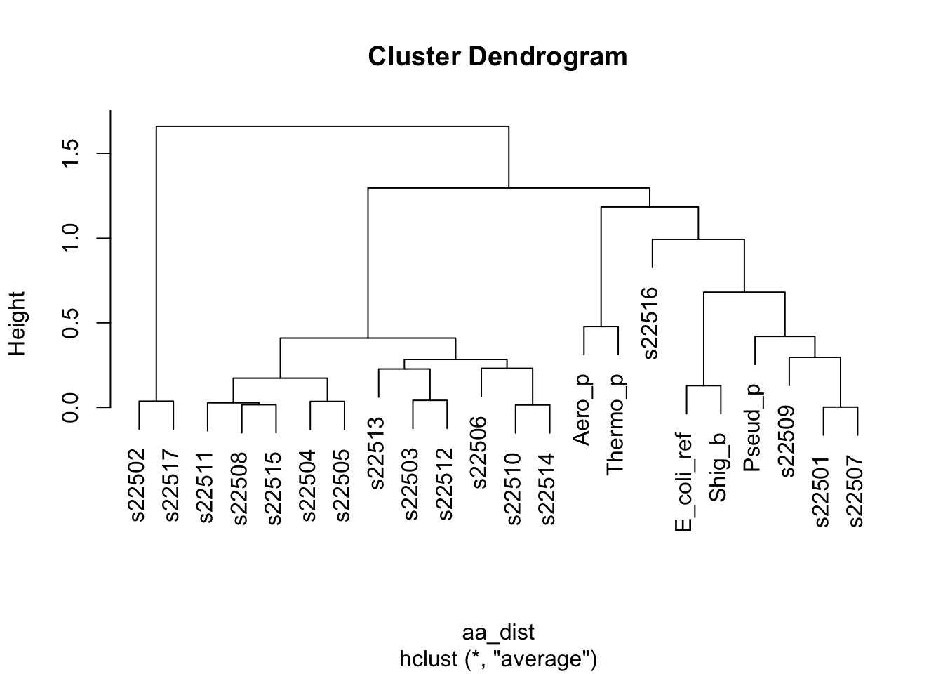
Figure 5.3: figure
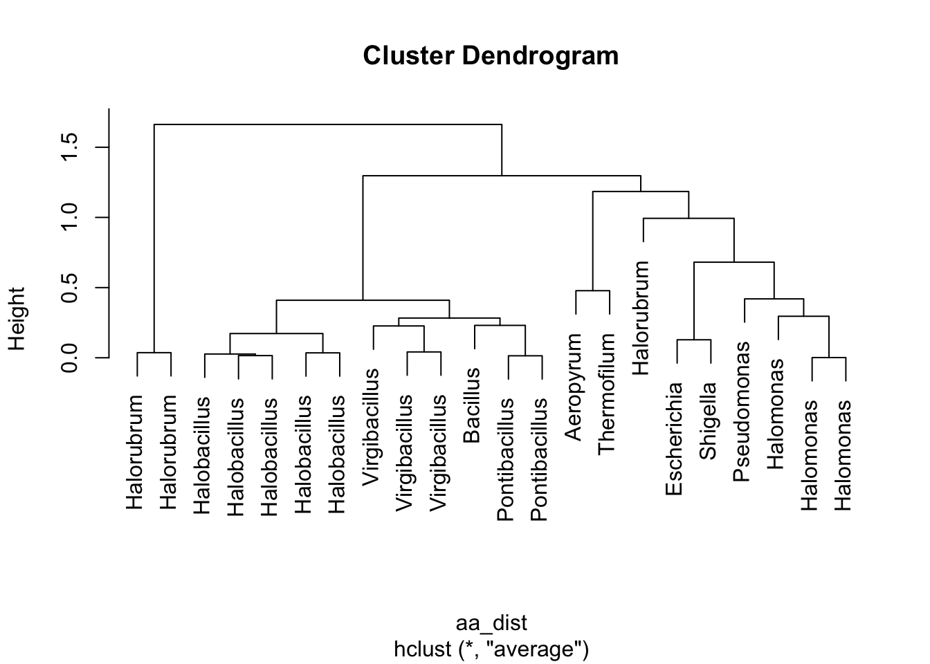
Figure 5.4: figure
Take 1 minute to think. What is this telling us? How do these results relate to what we saw in the Paul et al. paper?
We are now about to hit one of the most common uses of clustering when working with heatmap-type data. Let’s use these clusters to re-organize our data and look for patterns. Inside of our clusters object (which is a list), there is a vector that has a re-ordering of our data based on which strains are similar to each other. We can use this to reorder the y-axis on our heatmap so that similar strains are visually close together. This can help reveal patterns of how different clusters have consistently different amino acid patterns.
# storing this vector of the reordered positions/indices
clust_order <- clusters$order
# getting the names of each strain from our data in the original order
strain_names <- df_aa_wide$strain
# making a reordered version of the names in clustered order
strain_ordered <- strain_names[clust_order]
# this plot is similar, but we've specified the "limits" in our
# y-axis scale so that they will be ordered by cluster
ggplot(df_aa_long,aes(x = amino_acid, y = strain)) +
    geom_tile(aes(fill = relative_aa_use)) +
scale_fill_gradient2(low = "red", mid = "yellow", high = "green", midpoint = 1) +
scale_y_discrete(limits = strain_ordered)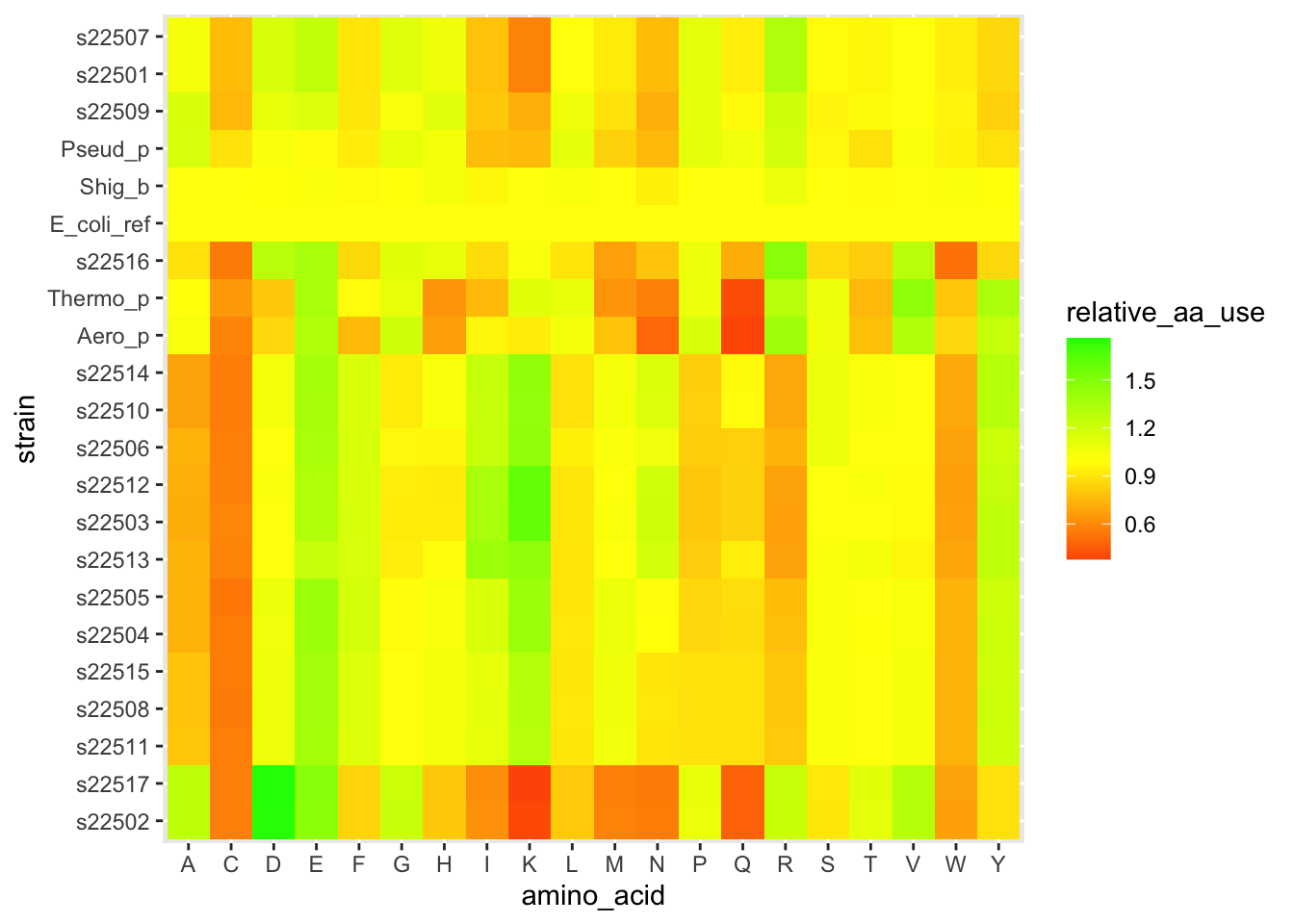
Figure 5.5: figure
# we also have a genus column
# we can order that in cluster order
genus_ordered <- df_aa_wide$genus[clust_order]

# and use it to add a different y-axis label (the "labels" argument in
# the bottom line below)
ggplot(df_aa_long,aes(x = amino_acid, y = strain)) +
  geom_tile(aes(fill = relative_aa_use)) +
  scale_fill_gradient2(low = "red", mid = "yellow", high = "green", midpoint = 1) +
  scale_y_discrete(limits = strain_ordered, labels = genus_ordered)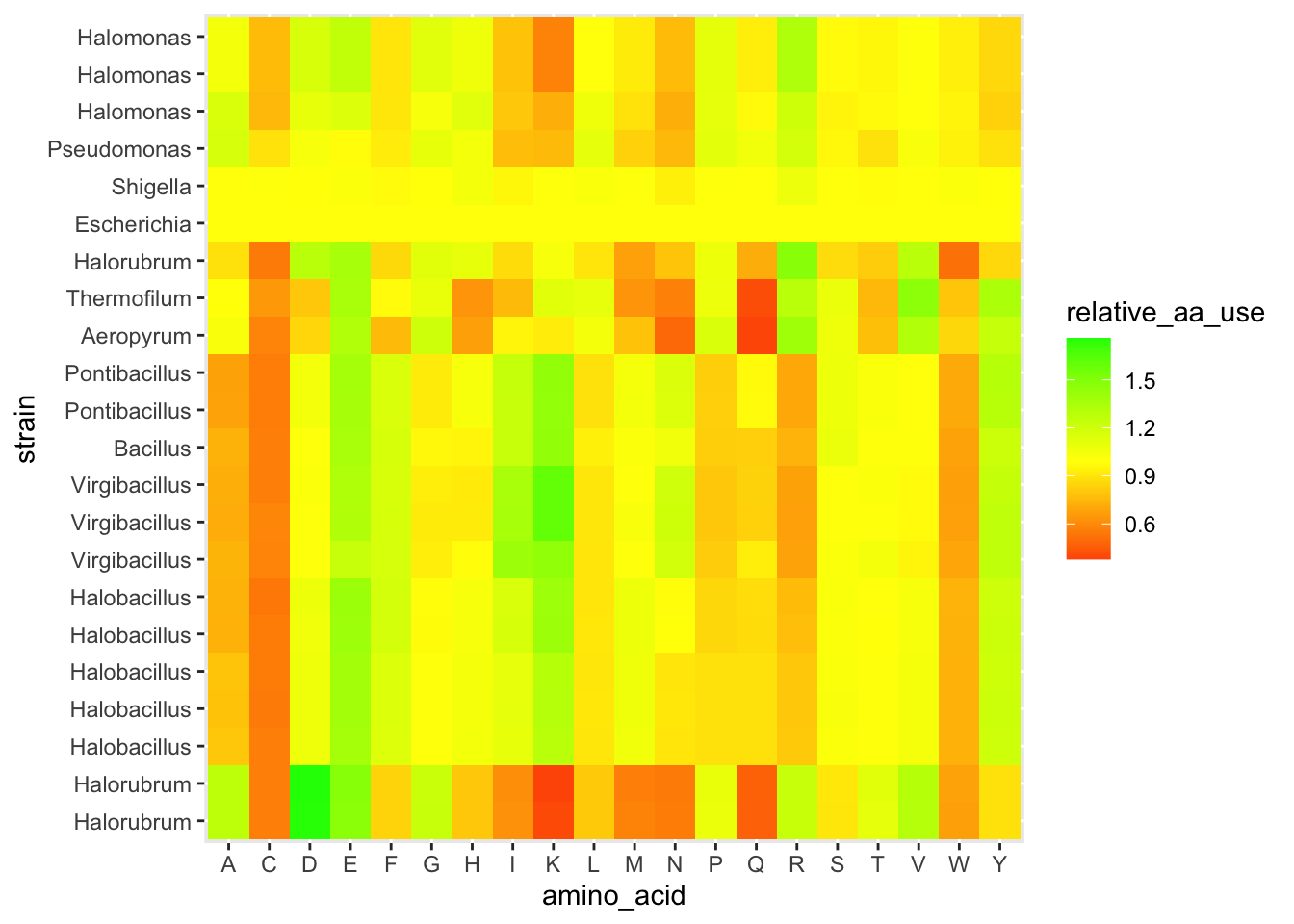
Figure 5.6: figure
Pause here for a brief discussion
5.0.10 Phylogeny review
After a short review, instructors will share a set of words. Your task is to build a phylogeny for these words, deciding which are most closely related to each other. After your work, we will think together about formalizing this into “distances” between the words.
Pause here for discussion
5.0.10.1 Finding the “distance” between sequences with stringDist()
In the homework, we saw that Phylo didn’t give equal weight to gaps and mismatches. It assigned a bigger penalty to a new gap opening and smaller penalties to gap extensions (the size of an insertion/deletion) and mismatches. This is actually easy to handle with stringDist(). We can specify a substitution matrix that gives the exact scores. (And we could get even more complicated and make different mismatches worth different amounts – it turns out that mutations from A<->G or C<->T are signficantly more common than any others.)
Let’s create a set of rules, then apply them to last year’s real data. We can build a tree using the 16s sequences. First, a look at our data.
We have our 17 samples, and two extra species. One is an Archaeon, Haloarcula marismortui, that is fairly closely related to Halorubrum. The other is a Bacterium, Mycobacterium tuberculosis. This is the species that causes the disease tuberculosis. For phylogeny-building, it can help to have a closely related outside species to better infer the relationships between species. This allows a better chance at figuring out what the original DNA sequence of the ancestor was. However, none of this matters that much when we’re building a tree across both Bacteria and Archaea – these are different Domains of life and only share an ancestor incredibly deeply back in time.
# we'll make a matrix that assigns a -1 for each mismatch
sub_mat <- nucleotideSubstitutionMatrix(match = 0, mismatch = -1, baseOnly = TRUE)

# and we can now specify that gap opening is has a penalty of 3
dist_16s <- stringDist(phylogeny_genes$seq_16s, method = "substitutionMatrix",
                        substitutionMatrix = sub_mat,
                        gapOpening = 3, gapExtension = 1)

# You might want to check out the distance matrix
# Uncomment the next line to view the matrix in the console
# dist_16s

clust_16s <- hclust(dist_16s, method = "average")


plot(clust_16s, labels = phylogeny_genes$strain)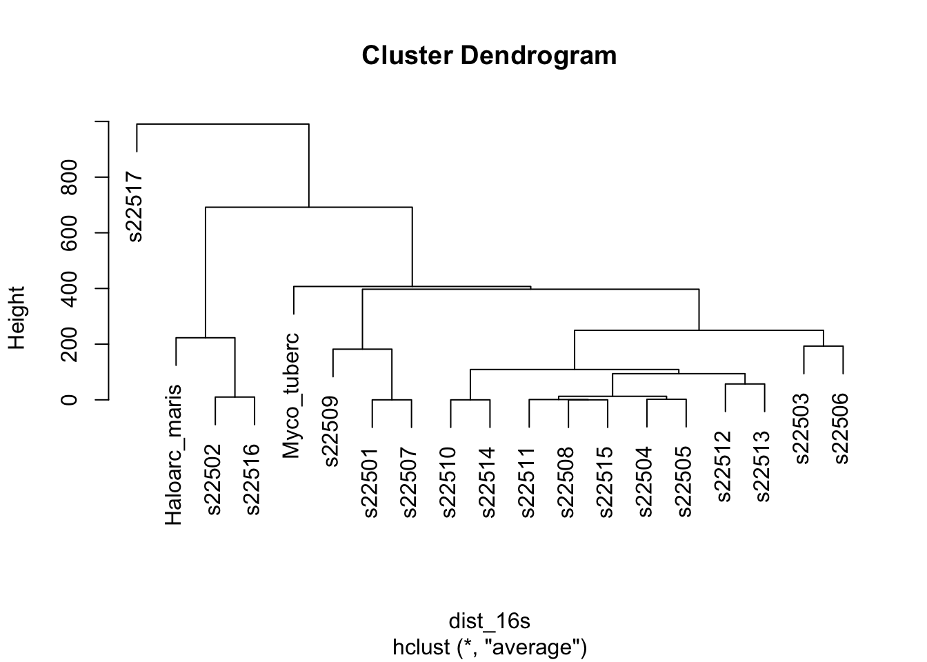
Figure 5.7: figure
# To get more descriptive, let's view the plot with some different labels
plot(clust_16s, labels = phylogeny_genes$genus)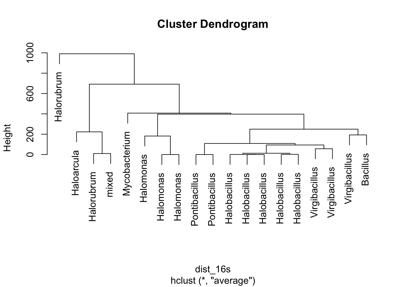
Figure 5.8: figure
# plot(clust_16s, labels = phylogeny_genes$phylum)

# plot(clust_16s, labels = phylogeny_genes$source)

plot(clust_16s, labels = paste0(phylogeny_genes$genus,": ",phylogeny_genes$source))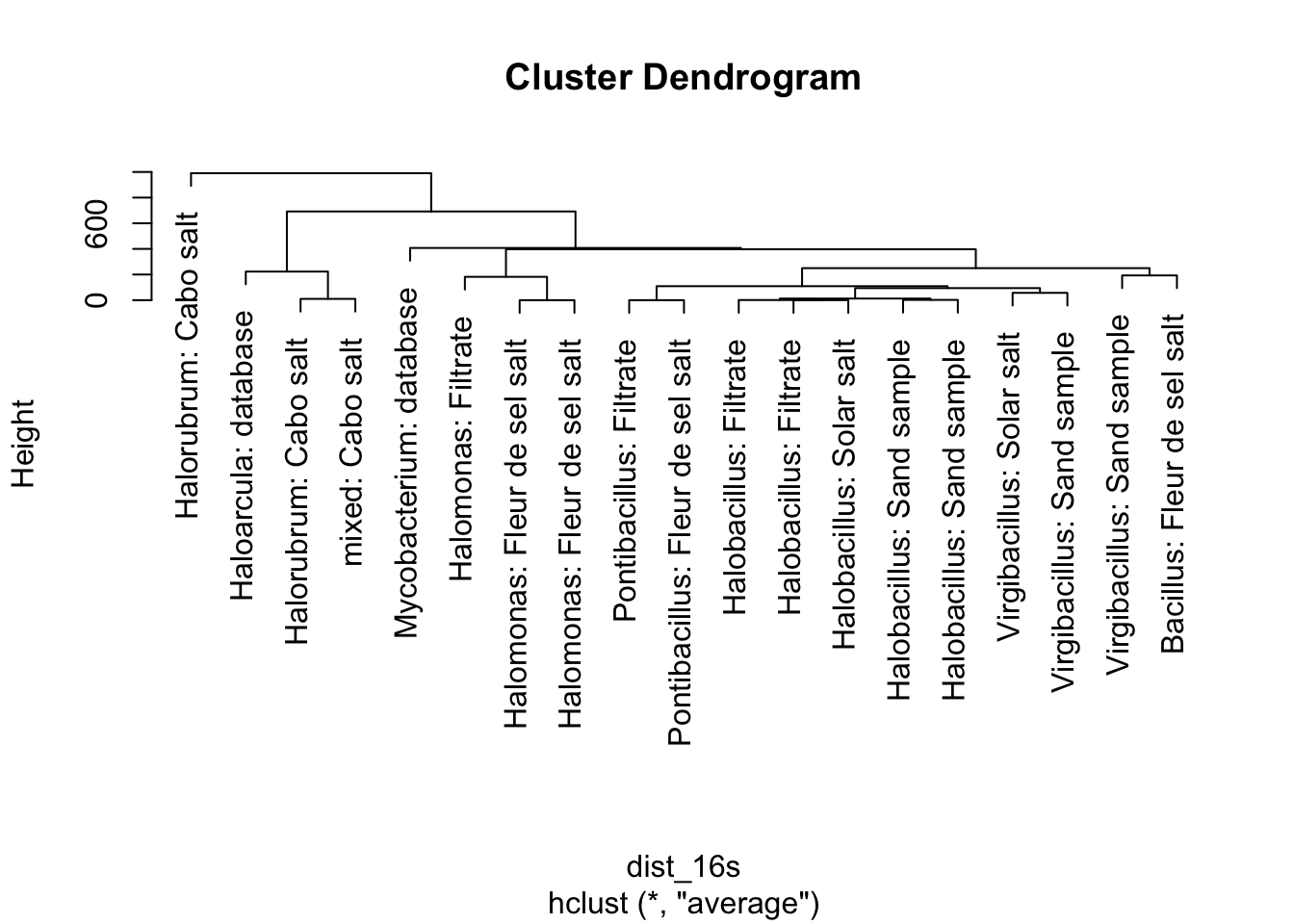
Figure 5.9: figure
Does everything about this tree make sense? Remember that species in the same genus should all be clustered together on the tree.
Pause here for a quick discussion.
Your instructors also found a different conserved gene that was present and complete in all the samples. That gene is infB, and it codes for a translation initiation factor. Basically, the cell cannot make any proteins without some copies of the infB protein. So this is a critical gene that will have changed in sequence only very slowly through time.
Your task now is to build a phylogeny using the same approach, but with the infB gene instead. Then for homework you’ll build a tree using both genes at once.
# Your task, build the same tree using the infB gene.
# then build a tree combining data from both genes.

##################################
###  Your code below           ###
##################################

# building a tree from infB
# first create a distance matrix. You should
# only need to make a small change to the code above.


# then, use that distance matrix with hclust()


# finally, plot the results


##################################
##################################
Some questions to think about:
You do not get the same tree. What are some differences?
Is one tree better than the other? Why or why not?
With these phylogenies in mind, what are some questions you have? Are there any unexpected patterns? How does this relate to the source from which the sample came?
Pause here for discussion and then a 10-minute break.
5.0.11 Final project overview
We will distribute a more detailed project prompt on Tuesday. But here’s an outline.
Final product: A new analysis of our genomic data as both a written report and a presentation (exact details of the presentation may depend on logistics and what technology works best for all of you).
Timeline:
Week 5 – Pitching session with peers to brainstorm and refine ideas
Week 6 – Small group check-in and mentored open work time for second half of lab
Week 7 – Submit initial written proposal (5%)
Week 8 – Present an outline of an analysis for peer review session (5%)
Week 9 – Submit initial draft (5%) for peer review session
Week 10 – Submit finalized written draft (15%) and prep for presentation
Final Exam period – give/submit presentation and participate in course wrap-up (10%)
5.0.12 Idea pitching
Take 5 minutes to get your thoughts together. Then we’ll get into groups and have everyone give a 2-minute pitch for your top idea. Be sure to mention the main question, why it’s interesting, and what tools/data you might need to do the analysis. You will be in breakout rooms, and you will have a shared google doc for notes.
5.0.12.1 Answer block – Project ideas
Reflecting on the pitching sessions, use this space for some notes about what you need to do next to refine your idea(s). Keep the following questions in mind, and take notes on each one as needed.
What is my question? Do I have a good sense of what I might expect to find?
Do I have all the data I need? Will I need to download any other genomes or other useful comparative information?
What kind of analyses am I doing? Are there pre-existing tools available online or to download? Is it easy to understand the conceptual idea of what they’re doing?
What data processing and other coding will I need to do in R? What might I need to learn?
What kinds of results will I present? Figures? Tables? Conceptual illustrations?
5.0.13 End of class – 10 minutes for mid-quarter feedback.
Please take this anonymous, online survey to help us make changes to maximize your learning in the second half of the quarter. Thanks! https://forms.gle/XEWZo3mgUNKzLAg27
5.1 Homework (due on Wednesday, 6 May at 10:59pm)
5.1.1 Finish up labwork (2 pts)
Make sure that any short responses or coding snippets above have been filled in with your work.
5.1.2 Online discussion (part of Week 5 participation points)
Write a follow-up or reply to another student’s follow-up on the Week 5 discussion post on Piazza.
5.1.3 Reading and response (6 pts)
A team led by UC Davis Professor Marc Facciotti recently published a rich analysis of a large set of Halophile genomes. The paper is here: https://journals.plos.org/plosgenetics/article?id=10.1371/journal.pgen.1004784, and is on Canvas as a PDF.
If you tried to read this paper from start to finish, you would be exhausted and confused (and angry that we had set you on such a cruel task). But it lays out many potential analyses that we could do on our data. We may loop back to this paper a few times to refine our understanding. This week we’ll start by:
- Reading the Abstract, Author Summary, and Introduction,
- Reading the section Local variation in genomic G+C as a proxy for horizontal gene transfer events as well as Figure 7 and its caption,
- Skimming the titles of all the sections to see the breadth of analyses they performed.
This text will be full of jargon and will feel overwhelming. It’s okay that you don’t understand every word. Focus on the bigger picture, and use the reading questions below to help guide you.
With this reading in mind, answer the following questions:
In this analysis the authors looked in each species for places where the local GC content of the DNA sequence was different from that of the majority of the genome. To do this, they used a sliding window analysis. Briefly explain what they did for this sliding window analysis – what was the window, what did they calculate, what insights did this offer?
Through this analysis several regions were identified with very different GC content. What were some of the types of functions that genes in these regions had?
After skimming the titles of different sections, did you find any that related to one of your potential research questions? If so, skim one section while keeping in mind how you might use our data in a similar way. If not, pick a section and coarsely read for the big picture of what they did. In either case, write the name of the section you’ve chosen, and write out a brief (3+ sentences) outline of the steps you might take to analyze our data in a similar way.
5.1.3.1 Answer block – HW reading questions.
Q1 (2-3 sentences).
Q2 (3-4 sentences).
Q3 (3+ sentences).
5.1.4 Coding (2 pts)
First, an aside. Your TA Joel has put together a useful resource. https://bookdown.org/joelrome88/bis23/ This website has the lab files for each week, as well as an appendix that overviews data visualization with example code. We hope that this will be useful as you begin on your final projects, so that it’s easy to look back at code from previous weeks without having to shuffle through a half-dozen Rmd files. There is also a link to this site on Canvas.
Okay, back to the coding homework. During class you built a tree using the 16S gene, then built a different tree using the infB gene. For homework, your task is to combine these two pieces of data to build a more refined tree that incorporates information from both genes. It might sound complicated, but it turns out that one easy way to do this is to simply add the distance matrices together, and use that for your clustering. In the code chunk below,
- create a new distance matrix by adding the two previous matrices you’ve defined,
- use that as an input to the function
hclust()to get a new clustering, - take those data and plot them, using each strain’s genus as its label (following the example from class).
##################################
###    Your work below         ###
##################################


##################################
##################################
5.2 Code Appendix
This includes all of the inline code you wrote in the coding sections while you were exploring in this week’s lab. You don’t need to run anything – it will automatically fill itself in.
##################################
###  Your code below
##################################

# create a vector named dog, consisting of the values 5, 7, 9, and 126.3
# remember to wrap the values in the c() function


# use the function mean() to calculate the mean of the vector dog


# use the command ?mean to see R's documentation of the function.
# ? before a function name pulls a useful help file.
# mean() has some extra arguments that you can use.
# what can you do by setting a trim argument?


# below is a string stored as the object bird
# use strsplit() and table() to count the number of occurrences of the letter r
bird <- "chirp_chirp_i_am_a_bird_chirp"


###
# extra things to play with, time permitting
# check out the help file for strsplit()


# we used the argument split="" to split every character apart.
# try using strsplit() with split="_" on the variable bird.


# what is your output?  (use the # symbol at the start of the line
# to write your response as a comment, otherwise
# R will get confused when you create your final document)


# Can you imagine any scenarios where this might be useful?


##################################
##################################
# Following the approach above, find the percent identity
# for these two sequences
seq1 <- "CCTAACGTCAGCAGATCAAACGCCGATTC"
seq2 <- "CCGAAGGACTAGCTAGCTAGCGCGGATTG"

##################################
###  Your code below
##################################


# After calculating it, what do you think? Are these sequences similar?
# We'll gradually get more and more context for this as the course goes on.

##################################
##################################
lab1_hw_reads <- c("GTTATCTAAGACCCATCTTCTCACTGGTCACTCACTCCACTGGCATATTC",
                   "CGAATCTTTTTGTTGTTCGAGAGGCCTGTGACACCCCTGGGTTATCTAAG",
                   "TGGCATATTCGTCAAACAGTTCTGATGCCTGATACAACTGACAAATCTCA")

##################################
###  Your code below
##################################

# Make sure you include lots of comments!
# Before each of line code where you're doing someting new,
# use # to add a comment to explain what you're doing.

# Remember to create the string named genome and also to
# calculate GC content.


##################################
##################################

# Use this space to write the code for assembling the mystery sequences
# Assemble mystery2, 3, 4, 5, 6, and 7, and store them as
# a2, a3, a4, a5, a6, a7

##################################
###  Your code below
##################################

# example for mystery2
a2 <- assemble(mystery2, min_overlap = 5)


##################################
##################################

# Here you have a pre-written function to calculate GC content.
# But, the lines of code ARE IN THE WRONG ORDER!
# Read it over, move the code into the right order,
# and add comments to explain each step.

##################################
###  Your code below
##################################

count_gc <- function(assembly)
{
    GC <- C_total + G_total

    C_total <- sum(assembly_vec == "C")

    assembly_vec <- unlist(strsplit(assembly, split = ""))

    G_total <- sum(assembly_vec == "G")

    return(GC)
}


# When that's complete, use the code from count_gc,
# but add a few lines so that you return the fraction
# of all nucleotides that are GC, not the total count
# I.e. it should be a number between 0 and 1.

fraction_gc <- function(assembly)
{

}

# VALIDATION
# your answer for fraction_gc(a1) should be 0.47 (rounded)
# your answer for fraction_gc(a2) should be 0.59 (rounded)


##################################
##################################
##################################
###  Your code below
##################################
# use this space to load your FASTA file and get the data requested above.

# template for loading your data as a DNAStringSet
# you'll need to edit the filename to match the FASTA file for
# your strain
my_strain <- readDNAStringSet("data/ENTER_YOUR_STRAIN.fasta")

# for the example (strain 1926), we used the command
# strain_1926 <- readDNAStringSet("data/strain1926.fasta")
# we commented the line above so it won't automatically run


##################################
##################################
# storing our contig lengths as a vector
c_lengths <- width(strain_1926)

total <- sum(c_lengths)

# creating a cumulative sum
c_sum <- cumsum(c_lengths)
plot(c_sum) + abline(a = total/2, b = 0)

# here we have a function to calculate L50, but
# the lines are out of order!  Let's fix it.

L_50 <- function(contig_lengths)
{
  contig_ind <- which(contig_sum > sum(contig_lengths)*0.5)
  return(L)
  L <- min(contig_ind)
  contig_sum <- cumsum(contig_lengths)
}


##################################
###       Your code below
##################################
N_50 <- function(contig_lengths)
{
  # enter your code here
  # hint: you can use other functions inside this
  # function. For example, L_50() might be useful
}


# also, load your own strain into the environment right now as well
# uncomment the next line and replace with the correct numbers for your strain

# strain_XXXX <- readDNAStringSet("data/strainXXXX.fasta")

##################################
##################################

##################################
###  Your code below
##################################

gc_content <- function(string_set)
{
  # add your code for the function here.
  # the R example just above this should be useful.

  # your input, which we named "string_set", will be a DNAStringSet
}


## below are some extra challenges if you have spare time
## you do not need to complete this as part of the HW/labwork.

# 1) Although it's rare, there will sometimes be a non-zero value
# in the "other" column from alphabetFrequency(). That means that
# adding up the G and C columns isn't quite right. Revisit
# your gc_content() function and adjust it to only calculate GC
# based on the known A, T, C, and G nucleotides and ignore "others".

# 2) In the Piazza discussion for Week 2, it has come up that
# it's harder to amplify high GC content DNA segments. So one part
# of Illumina sequencing, the bridge amplification step, might not work as
# well for species or genomic regions with high GC. What are some potential
# consequences of this? For a sample with multiple species, how might
# this influence the number of contigs you get for each species?


##################################
##################################
#### Make the same plot for your strain
# You will first need to create a data frame by creating a
# vector for GC and a vector for contig length

##################################
###  Your code below
##################################

# create a new vector that holds the contig lengths for your strain

# create a new vector with the GC of each contig

# Optional: use data.frame() to create a data frame with a column for each of those
# two vectors (make sure you store this as a new object in your environment)


# create your plot, either from the data frame columns, or
# directly from the vectors
# Make sure you have a title with your strain number


##################################
##################################

##############################
###    Your code below
##############################

# enter the code for your plotting (and loading your data) here


##############################
##############################

##################################
###  Your code below           ###
##################################

# These tasks are all working with strain 1926

# 1) create a new DNAStringSet called strain_1926_f5000
# that has only contigs of length >= 5000


# 2) create a new data frame called strain_1926_gc_narrow
# that has only contigs of length >= 2000 and gc content < 0.5


##################################
##################################
# Our comments below are reminders of the key steps

##########################
### Your work below    ###
##########################

# Load your data and create a data frame with contig length and gc content
# e.g. strain_XXXX <- readDNAStringSet("data/strainXXXX.fasta")
# df_XXXX <- data.frame(contig_lengths = width(strain_XXXX),gc = gc_content(strain_XXXX))


# Plot the data and look for quality issues
# e.g. ggplot(data = df_xxxx, aes(x = contig_lengths, y = gc)) +
#  geom_point() +
#  scale_x_log10()


# Use logical comparisons like >,<,>=, etc. combined with &
# to get a TRUE/FALSE vector of the entries you want to keep


# Use that vector to select only certain entries from your
# DNAStringSet


# Save your new DNAStringSet as a fasta file with the following naming
# convention: strainXXXX_clean.fasta (replace XXXX with your strain number)


##########################
##########################
# Your task, build the same tree using the infB gene.
# then build a tree combining data from both genes.

##################################
###  Your code below           ###
##################################

# building a tree from infB
# first create a distance matrix. You should
# only need to make a small change to the code above.


# then, use that distance matrix with hclust()


# finally, plot the results


##################################
##################################

##################################
###    Your work below         ###
##################################


##################################
##################################
# we are back to our old friend the DNAStringSet

# let's focus just on the second contig (for arbitrary reasons)
# we can select it with the double brackets
s26_2 <- s26[[2]]

# now s26_1 is in our environment as a single DNAString
# let's use our gc_content_single() function to get the overall GC content
gc26_2 <- gc_content_single(s26_2)

# it's 0.39

# as a quick example, let's get the GC content for just the first 500 bp
# all we have to do is use square brackets to select the base pairs from
# position 1 up to 500.
gc_content_single(s26_2[1:500])

## live-coding will be written in this chunk