Chapter 4 Week 4 Lab
Homework for Next Week
- Fill in all of the answer blocks and coding tasks in this lab notebook.
- Complete all tasks in the Homework section (bottom of the Rmd). There are several small HW tasks this week, though the one to focus on most is the brainstorming of three potential research ideas.
Learning Objectives
- Calculate amino acid patterns using example halophile genomes and compare with E. coli and other prokaryotes.
- Be able to explain what a hierarchical clustering algorithm does, and use R to apply clustering techniques to real data.
4.0.1 Loading some 2019 data
Because we are waiting on our genome annotations for this year, we will use last year’s genomes to explore some potential analyses. If you are using RStudio Cloud, the RData file is already in our Files, we just need to load it with the code below.
4.0.2 Overview
Today we have two goals. First, we will tidy up our assemblies using filtering tools in R, then submit them to an annotation pipeline called RAST. Second, we will begin to dive into comparative genomics. We will learn some contemporary techniques for comparing amino acid usage among species, and generate plots of our real data. Prior research suggests that halophiles should have distinctive patterns of amino acid usage, due to the effect of their highly saline environments on protein stability. We will examine some 2019 BIS 23B data to see if that’s the case.
4.0.3 Week 3 Discussion – Figure of the Week details
Dr. Furrow will reveal a version of the Figure of the Week with more detailed axes and legend.
4.0.4 Creating cleaner data
If you recall from the Week 2 Figure of the Week (and Lab 3), some of the smaller contigs in our assemblies seem to be potential contamination. We want to get genome annotations, but that data will be more useful if we’ve tidied up our data first. A quick and dirty way to handle this is by selectively removing some of our contigs. You have probably seen that the GC content of your small contigs might vary widely, or be quite different from the GC content of your largest contigs. Those large contigs are the most useful ones when looking for genes – they are large, continuous chunks of the bacterial genomes of interest. How can we selectively choose only certain contigs? Easy, peasy, with our old friends the logical comparisons.
4.0.4.1 Logical comparisons
A few times this quarter we’ve used logical comparisons, for example using == to find all instances of a particular nucleotide, like “G”, in a vector version of a contig. Let’s refresh our memory and load some data.
Here we will do a quick Zoom poll to warm up our brains.
Now, let’s look at our data again to refresh our memory about potential quality concerns with the assembly for strain 1926.
df_1926 <- data.frame(contig_lengths = width(strain_1926),
                      gc = gc_content(strain_1926))

# plotting the gc X contig length, but also using a logarithmic x-axis (see final
# line in plotting code below)
ggplot(data = df_1926, aes(x = contig_lengths, y = gc)) +
  geom_point() +
  scale_x_log10()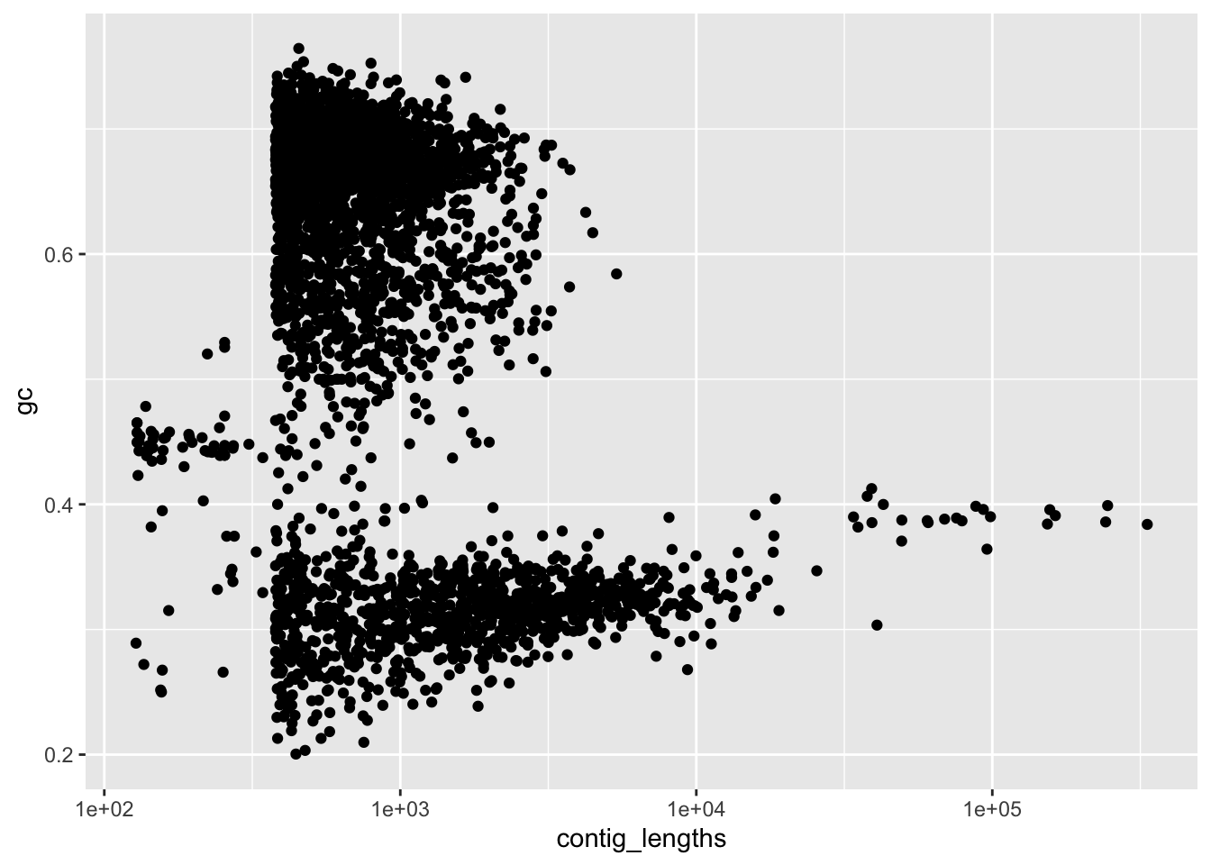
Figure 4.1: figure
Hmm, our long contigs are the one we really care about. That spike is around a GC content betwen 0.37 and 0.42. How can we selectively keep only the long contigs (and selectively discard only the short ones)? We can start by finding the longer contigs.
# cont_2000 will store which contigs have more than 2000 bp as a vector of
# TRUE/FALSE values
cont_2000 <-  df_1926$contig_lengths >= 2000

# R is quite flexible about how to use these. We have a few options.

# 1) use this TRUE/FALSE vector to pull from the original data.

# e.g. to filter the data.frame
df_1926_f2000 <- df_1926[cont_2000,]
# e.g. to filter the DNAStringSet
strain_1926_f2000 <- strain_1926[cont_2000]


# 2) use a tidyverse function called filter()
# BUT THIS ONLY WORKS FOR DATA FRAMES, NOT DNASTRINGSETS

df_1926_f2000_v2 <- filter(df_1926, contig_lengths >= 2000)


# lets quickly plot our new data. We can use the exact same code, but replace
# our data with one of the filtered versions.

ggplot(data = df_1926_f2000, aes(x = contig_lengths, y = gc)) +
  geom_point() +
  scale_x_log10()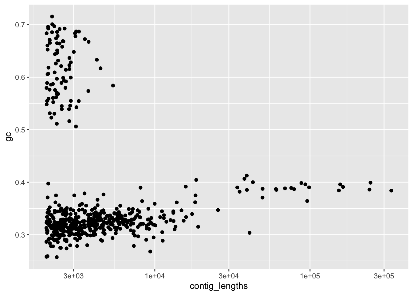
Figure 4.2: figure
Look in the environment to compare the two version of our filtered data. Does it look like there is anything different about them?
Okay, that’s a filtering based on contig length. But this data still looks a little junky. What’s up with that cluster of high GC contigs? We don’t want those when we submit our data for annotation. We could have instead (or additionally) filtered based on GC content. The logic should look similar. Let’s focus on practicing with the basic approach… the filter() function is great, but it only works with data frames. We’ll want to do this filtering for our DNAStringSet to make new FASTA files, and filter() won’t work there.
cont_gc <- (df_1926$gc > 0.37) & (df_1926$gc < 0.42)
# filtering the data.frame
df_1926_gc <- df_1926[cont_gc,]
# filtering the DNAStringSet
strain_1926_gc <- strain_1926[cont_gc]
There’s something new to unpack here: the & symbol. For those of you who have taken computer science or logic, this & is the same as the one we use in logic. It’s a way to combine two different questions (two different TRUE/FALSE values). Each of the two terms on the right side of the <- above are asking a TRUE/FALSE question. The first asks is the gc content greater than 0.37. The second asks is the gc content less than 0.42. When you use an & symbol, you are asking to get a TRUE response only if both questions are true. So the resulting vector, cont_f_gc, will have TRUE values where the GC content is greater than 0.37 AND less than 0.42, and have FALSE values everywhere else. Let’s practice.
##################################
###  Your code below           ###
##################################

# These tasks are all working with strain 1926

# 1) create a new DNAStringSet called strain_1926_f5000
# that has only contigs of length >= 5000


# 2) create a new data frame called strain_1926_gc_narrow
# that has only contigs of length >= 2000 and gc content < 0.5


##################################
##################################
4.0.5 Finalizing the filtering of strain 1926
Let’s finalize the filtering for strain_1926. Let’s begin by plotting our assembly with the gc filter of 0.37 < gc < 0.42.
ggplot(data = df_1926_gc, aes(x = contig_lengths, y = gc)) +
  geom_point() +
  ylim(c(0,1)) +
  scale_x_log10()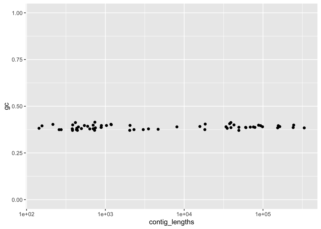
Figure 4.3: figure
Hmm, that seems awfully strict. We expect a wider range of GC for small contigs (since they might be single genes such as rRNA genes that have different kinds of GC patterns). Let’s combine the two approaches and filter by length, as well as filtering by GC.
cont_final <-  df_1926$contig_lengths >= 2000 &
  df_1926$gc > 0.3 &
  df_1926$gc <0.5

df_1926_final <- df_1926[cont_final,]

ggplot(data = df_1926_final, aes(x = contig_lengths, y = gc)) +
  geom_point() +
  ylim(c(0,1))+ scale_x_log10()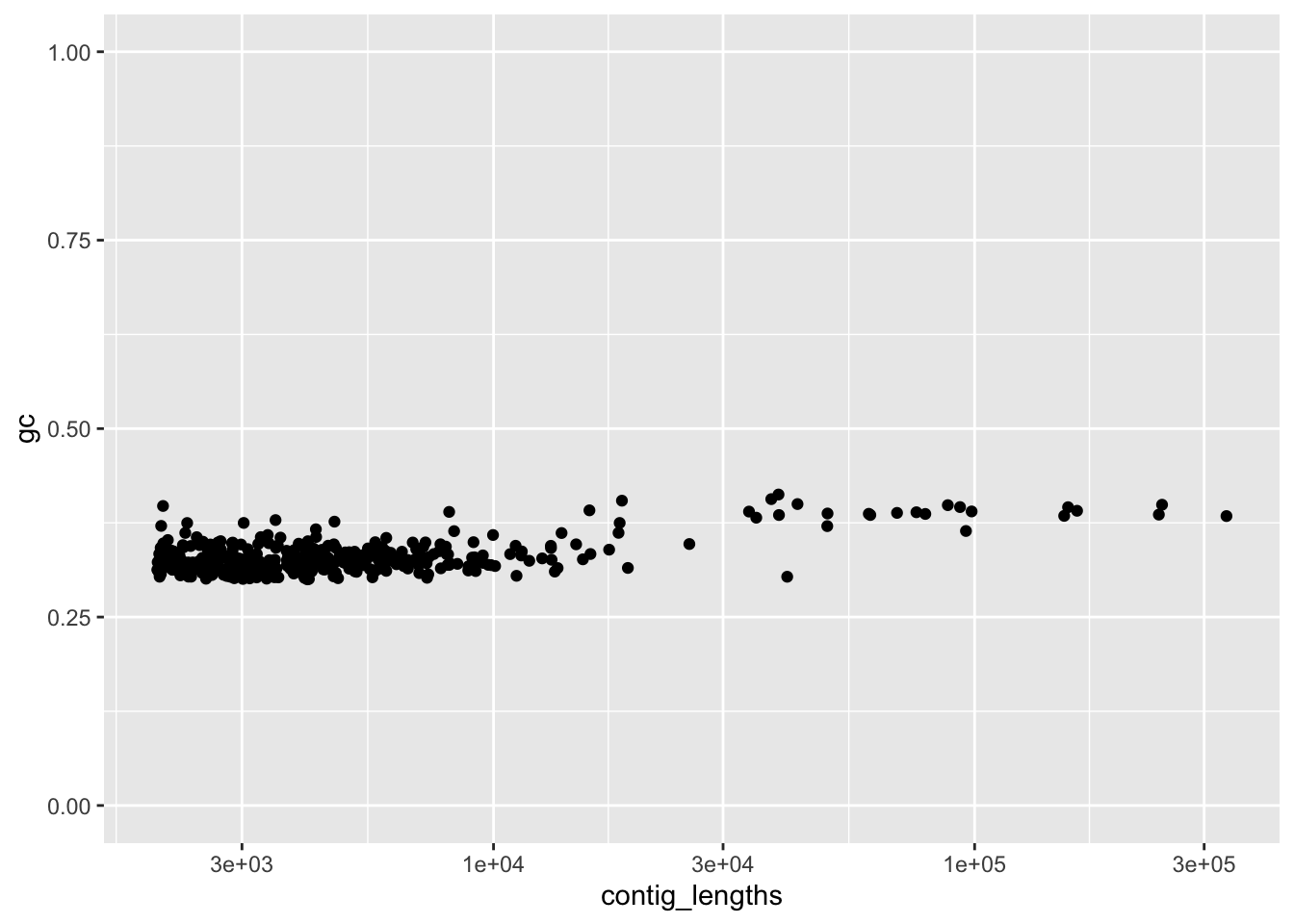
Figure 4.4: figure
I’m fairly happy with that. Now we have to apply the filtering to our DNAStringSet. Then we can save it as a new, cleaned version of the FASTA file. Luckily, the Biostrings has a pre-made function to write DNAStringSets to FASTA files.
# The logic for filtering with the DNAStringSet is exactly the same
# we'll use the same indices from cont_final
strain_1926_final <- strain_1926[cont_final]
Sanity check – do we have the same number of elements (contigs) in strain_1926_final as we have rows in df_1926_final?
The last step. We’ll use a function called writeXStringSet to save the data as a new FASTA file.
4.0.5.1 Team work: filtering your files
Your task is to plot your strain, decide on filters for gc content and contig length, then filter and create a new FASTA file. Do this first for your individual strains, then collaborate to decide on the filtering for your shared strain (you are in the groups based on your shared strains). Some suggestions for how to work together most effectively:
- Use the google sheet tab for your breakout room to enter your plans,
- Write your code in the code chunk below,
- Check in with peers and share your screen if you want to show your plots,
- When working on the shared (secondary) strain, have one person share the screen with the plot/code while you discuss,
- Check with your instructors if you want to use a contig length filter higher than 2000 bp.
# Our comments below are reminders of the key steps

##########################
### Your work below    ###
##########################

# Load your data and create a data frame with contig length and gc content
# e.g. strain_XXXX <- readDNAStringSet("data/strainXXXX.fasta")
# df_XXXX <- data.frame(contig_lengths = width(strain_XXXX),gc = gc_content(strain_XXXX))


# Plot the data and look for quality issues
# e.g. ggplot(data = df_xxxx, aes(x = contig_lengths, y = gc)) +
#  geom_point() +
#  scale_x_log10()


# Use logical comparisons like >,<,>=, etc. combined with &
# to get a TRUE/FALSE vector of the entries you want to keep


# Use that vector to select only certain entries from your
# DNAStringSet


# Save your new DNAStringSet as a fasta file with the following naming
# convention: strainXXXX_clean.fasta (replace XXXX with your strain number)


##########################
##########################
4.0.5.2 Upload your file here
Please upload your cleaned FASTA file to this folder. You just need to open the link and drag your file into that browser window. Please following the naming convention: strainXXXX_clean.fasta (replace XXXX with your strain number).
4.0.5.3 Submit your file for annotation on RAST
- Sign in to RAST. Hover over “Your Jobs”, and select “Upload New Job”.
- Click on “Choose File” as the bottom, then navigate to your new, cleaned FASTA file.
- Click “Use this data and go to step 2”.
- You are on a new page. We don’t yet know our taxonomy, so leave everything as is, except:
- Select “Bacteria” for the “Domain:”
- Write your strain number (e.g. “Strain 1926”) in the box for “Strain:”
- Select “11” for the “Genetic Code:”.
- Click the button at the bottom: “Use this data and go to step 3”
- Click the button at the bottom: “Finish the upload”.
4.0.5.4 10 minute break
4.0.6 Halophile protein composition – Reading review
Exactly what was their question for the data they showed in Figure 1? Was their analysis (and the Figure 1 plot) convincing?
4.0.7 The genes in our data
In lecture this week we talked about genes and how they are often the key objects of interest that we are looking for in our genome assemblies. Up to this point we have just been working with raw FASTA files. They are just sequences of nucleotides, and it’s not obvious exactly how we can find the potential genes in these data. The process of finding genes in a genome assembly (e.g. in a FASTA file) is called genome annotation. There are two main methods to find genes when looking at a sequence.
Using purely computational/statistical predictions. We heard about looking for certain promoter sequences, ribosomal binding sites, or start codons. Here’s a more detailed example to show how this works, focusing on start codons. We know that ATG is the typical start codon for a microbial gene, while stop codons are typically TAA, TAG, and TGA. One can start looking for genes by finding every start codon, then following along the sequence (in triplets) until they reach a stop codon. This defines a potential open reading frame (ORF). However, some of these won’t be real genes. They will just be random places that had …ATG… in the genome. To narrow down this long potential list of ORFs, the easiest approach is to filter by length. A random codon has a 3/64 chance of being a stop codon – we’ll skip the math on this for today, but it turns out that a random, not-real ORF is quite likely to be 300 base pairs or shorter. This is shorter than you would expect from any prokaryotic gene. The exact details are a little more complicated, but we can do a good job of finding potential genes by just finding ORFs, then removing all of the ORFs shorter than some certain length.
Using comparisons with known genes. Thinking back to lecture 2, algorithms such as BLAST (and its many variations) do something called sequence alignment. They take a sequence, and find its best match in some database. If you use a database of known genes, you can find sequences in your genome that match up to particular genes. If they match well, you can be fairly confident that you’ve found a gene in your strain that has a similar function. We will talk about this more during Lab 5.
Most tools for genome annotation use both of these approaches. We have not begun the process of genome annotation yet, but we will have the data from RAST for next week.
4.0.8 The amino acid profiles of our coding regions
The analysis we read about (Paul et al. 2008) didn’t work with nucleotide data – which is pretty much the only data we’ve looked at so far for our halophiles. Instead, they used amino acids. As we discussed in Tuesday’s lecture, there is a direct correspondence between the the amino acid sequence of a protein and the DNA sequence of the gene that codes for that protein. Each triplet of DNA codes for a particular amino acid (and the code is redundant; in many cases several triplets code for the same amino acid). We won’t have these data to work with until next week when we get our annotations back from RAST.
We will now focus on last year’s BIS 23B data. Following the analysis in Paul et al., we have data on the relative frequency of each amino acid in each genome from last year’s halophiles. When you loaded the RData file at the start of the Rmd, you added the data df_aa_long and df_aa_wide to your environment. These data are data frames – our preferred format for analyzing and plotting data in R. Note that we have 17 halophile strains, as well as E. coli, 2 other Bacteria, and 2 other Archaea. We’ve enriched the data a bit as well – we have the genus of each strain (based on BLASTing against a 16S database), domain of life, genomic gc content, a measure of salt-specific growth rate, and two principal components. Don’t worry about exactly what those mean yet. Let’s take a few looks at our data.
Let’s pause for 1 minute. Why are the proportions for the E. coli strain all equal to 1? And what is the final row? Those numbers look way smaller! Think back to the methods in the Paul et al. paper.
4.0.9 Heatmap as an initial view
Okay, let’s make a pretty plot. We’ll use the long version of the data, which lets us more easily use plotting tools like ggplot().
Cool, we have a heatmap. These allow us to choose a discrete (categorical) variable on the x-axis and y-axis, then plot some continuous value (like the relative use of each amino acid) as a color. You’ll notice a new aesthetic. x and y make intuitive sense, they are how what we’ll use as x- and y-positions on the plot. fill on the other hand, tells us to use a data column to fill in a color for each row in the data. This is mainly useful when one or both axes are categorical/discrete.
But these colors really aren’t that helpful. Let’s try to replicate the plot in the paper.
ggplot(df_aa_long,aes(x = amino_acid, y = strain)) +
geom_tile(aes(fill = relative_aa_use)) +
scale_fill_gradient2(low = "red", mid = "yellow", high = "green", midpoint = 1)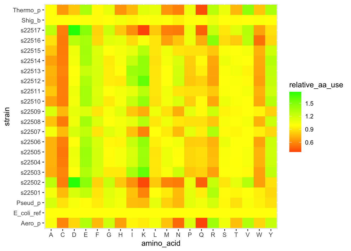
Figure 4.5: figure
The layer scale_fill_gradient2() let us set different colors for low values, a midpoint, and high values. And we set the midpoint to 1, which is equivalent to the E. coli profile.
Hopefully you’re starting to see how powerful ggplot can be. You can have a lot of control over exactly what you plot and how it looks. Let’s explore another approach to making varied figures from a data set. This will feel very confusing at first, but stick with it, it’s a powerful tool.
4.0.10 Computational thinking – hierarchical clustering
We can think of our amino acid data as 20 measurements for each of the strains. Mathematically, we have a 20-dimensional vector to represent each strain. How can we make sense of which strains are similar?
In your teams, outline an algorithm for grouping together similar species. Try to be as specific as possible. To start, think about how you would first find the most similar pair of strains, out of all possible pairs to compare. Then think about how you would build from there. It might help to imagine you’re only working with one or two measurements (e.g. just Asp and Lys proportions) to build the intuition for how to decide what defines similarity.
Again, this work will be done in groups. As you chat, use the shared google doc to jot down lots of ideas, then have one person share their screen as you discuss and refine your list. Select one person to be the reporter, they will give a 2 minute overview of your method when we come back together as a class.
4.0.10.1 Answer block – your clustering steps
Fill in the bullet points below with your steps.
- …
Each group will share out
4.0.11 Performing clustering in R
It turns out that the clustering from the Paul et al. paper is extremely easy to do in R.
# This is easier to perform with the wide data (unlike most tasks in R)
# Make sure you don't use the un-normalized E. coli data (row 23)
# We first calculate the pairwise distances between strains -- this is called
# a distance matrix.
aa_dist <- dist(x = df_aa_wide[-23,1:20],method = "euclidean")
# the function hclust() performs the stepwise process we discussed above
# if we use the mean pairwise distance
clusters <- hclust(aa_dist,method = "average")
# a plot by strain
plot(clusters, labels = df_aa_wide$strain[1:22])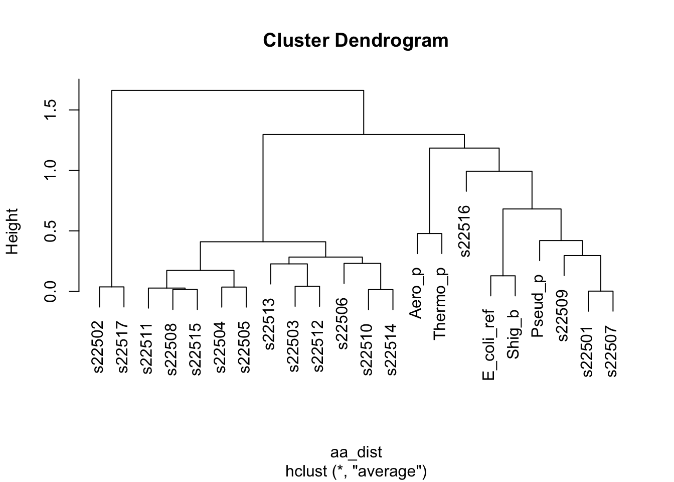
Figure 4.6: figure
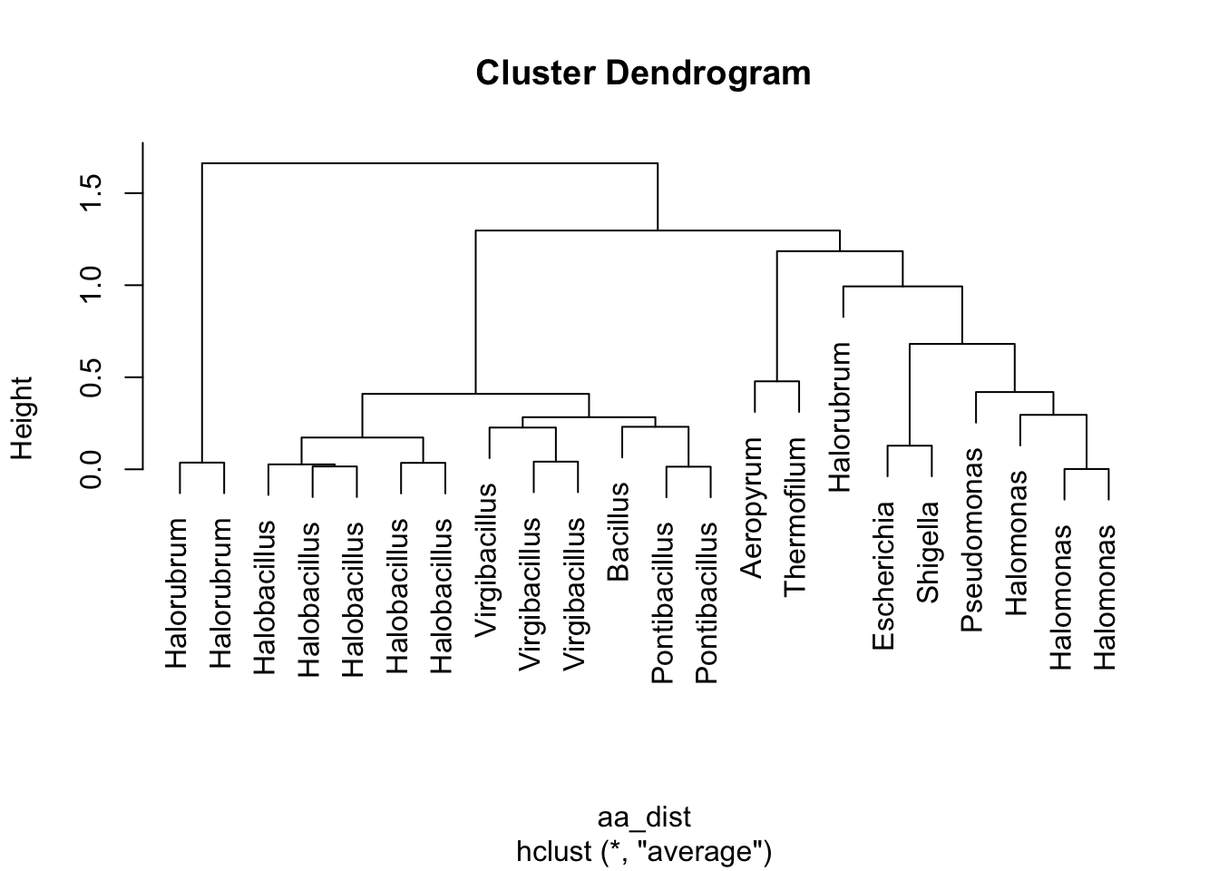
Figure 4.7: figure
Take 1 minute to think. What is this telling us? How do these results relate to what we saw in the Paul et al. paper?
We are now about to hit one of the most common uses of clustering when working with heatmap-type data. Let’s use these clusters to re-organize our data and look for patterns. Inside of our clusters object (which is a list), there is a vector that has a re-ordering of our data based on which strains are similar to each other. We can use this to reorder the y-axis on our heatmap so that similar strains are visually close together. This can help reveal patterns of how different clusters have consistently different amino acid patterns.
# storing this vector of the reordered positions/indices
clust_order <- clusters$order
# getting the names of each strain from our data in the original order
strain_names <- df_aa_wide$strain
# making a reordered version of the names in clustered order
strain_ordered <- strain_names[clust_order]
# this plot is similar, but we've specified the "limits" in our
# y-axis scale so that they will be ordered by cluster
ggplot(df_aa_long,aes(x = amino_acid, y = strain)) +
    geom_tile(aes(fill = relative_aa_use)) +
scale_fill_gradient2(low = "red", mid = "yellow", high = "green", midpoint = 1) +
scale_y_discrete(limits = strain_ordered)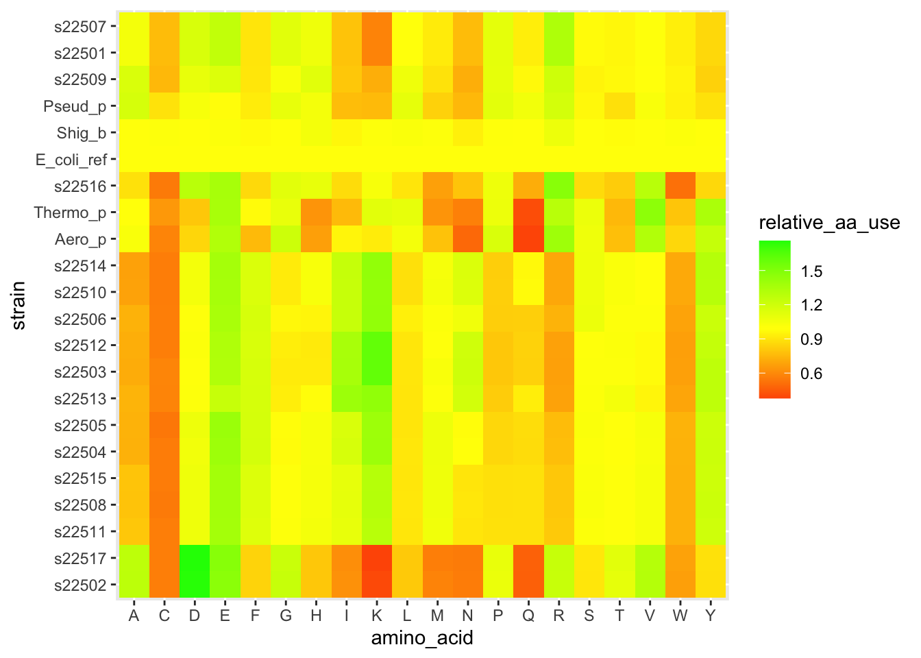
Figure 4.8: figure
# we also has a genus column
# we can order that in cluster order
genus_ordered <- df_aa_wide$genus[clust_order]

# and use it to add a different y-axis label (the "labels" argument in
# the bottom line below)
ggplot(df_aa_long,aes(x = amino_acid, y = strain)) +
  geom_tile(aes(fill = relative_aa_use)) +
  scale_fill_gradient2(low = "red", mid = "yellow", high = "green", midpoint = 1) +
  scale_y_discrete(limits = strain_ordered, labels = genus_ordered)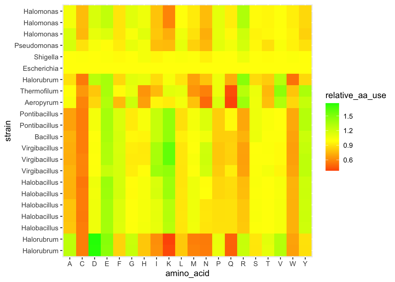
Figure 4.9: figure
Pause here for a brief discussion
4.0.12 Exit ticket (time permitting) – google form
Thinking back to the Paul et al. paper, what’s a follow-up to perform a more refined version of this amino acid analysis. You could think about adding more samples (what kinds of additional samples would you want?), changing how you normalize (does normalizing by E. coli make sense?), using other methods for clustering, or anything else you can think of.
4.1 Homework
4.1.1 Finish up labwork (2 pts)
Make sure that any short responses or coding snippets above have been filled in with your work.
4.1.2 Reading and response (8 pts)
4.1.2.1 Part 1. Playing a game (2 out of 8 pts)
Navigate to the phylo online alignment game. https://phylo.cs.mcgill.ca/play.php
Spend 30 minutes playing Phylo, performing some alignments of genes (to help improve genomic data). If you choose the story mode, try to play up to stage 8, when it starts to get quite hard. Choose any category for your playing around.
Respond to the following questions:
How is the quality/score of an alignment calculated for this game? Why might gaps have a bigger penalty than mismatches?
We can think of an alignment score as the measure of similarity between two DNA sequences. With this in mind, explain how you might perform hierarchical clustering on a set of DNA sequences. (This is a common way to build an evolutionary tree of relatedness, comparing samples using a gene that evolves slowly like the 16S rRNA gene. We’ll take this on in more detail in Lab 5.)
4.1.2.2 Part 1: PHYLO (2-3 sentences each)
Respond to the two prompts in the space below.
Question 1.
Question 2.
4.1.2.3 Part 2. Coming up with potential final project questions
We will go over the final project in more detail next week. But it’s never too early to start generating potential ideas. To kick things off, we put together some example questions that might lead to an interesting project.
https://docs.google.com/document/d/1rjcClT2NqQ1sNhuykrQ_DwWl-MAMDrV_OezCke9cNvs/edit?usp=sharing
There are a few things to keep in mind:
- The degree of quantitative-ness of the projects might vary quite a bit. That’s okay, but you’re expected (with our help) to perform some kind of quantitative analysis on your resulting data. You’ll be surprised how many good questions can be answered with statistical methods that are really just careful counting and comparing.
- This is not restricted to your sample – you can use all the class data, last year’s data, and pull in comparison samples from databases.
- If you end up using a pre-existing tool (e.g. for predicting protein function), you should be able to clearly explain the computational logic of the algorithm.
- This is our first round of brainstorming, so don’t worry about an idea being silly or naive. But do make sure you’ve thought out the logic of the idea. We’ll spend the next 3 weeks helping you refine your ideas, and we’ll put together groups working with similar methods so that you also have peer support.
Be ready to share these ideas with your classmates next week. We will do a speed-pitching session for rapid-fire feedback and cross-pollination of ideas in Lab 5
4.1.2.4 Part 2: your three potential questions/hypotheses (3 sentences each. 6 out of the 8 pts)
Write your three potential questions below. For each one, include the question, a sentence explaining the types of data you would need to use to answer it, and a potential result that you might find.
Question 1.
Question 2.
Question 3.
4.2 Code Appendix
This includes all of the inline code you wrote in the coding sections while you were exploring in this week’s lab. You don’t need to run anything – it will automatically fill itself in.
##################################
###  Your code below
##################################

# create a vector named dog, consisting of the values 5, 7, 9, and 126.3
# remember to wrap the values in the c() function


# use the function mean() to calculate the mean of the vector dog


# use the command ?mean to see R's documentation of the function.
# ? before a function name pulls a useful help file.
# mean() has some extra arguments that you can use.
# what can you do by setting a trim argument?


# below is a string stored as the object bird
# use strsplit() and table() to count the number of occurrences of the letter r
bird <- "chirp_chirp_i_am_a_bird_chirp"


###
# extra things to play with, time permitting
# check out the help file for strsplit()


# we used the argument split="" to split every character apart.
# try using strsplit() with split="_" on the variable bird.


# what is your output?  (use the # symbol at the start of the line
# to write your response as a comment, otherwise
# R will get confused when you create your final document)


# Can you imagine any scenarios where this might be useful?


##################################
##################################
# Following the approach above, find the percent identity
# for these two sequences
seq1 <- "CCTAACGTCAGCAGATCAAACGCCGATTC"
seq2 <- "CCGAAGGACTAGCTAGCTAGCGCGGATTG"

##################################
###  Your code below
##################################


# After calculating it, what do you think? Are these sequences similar?
# We'll gradually get more and more context for this as the course goes on.

##################################
##################################
lab1_hw_reads <- c("GTTATCTAAGACCCATCTTCTCACTGGTCACTCACTCCACTGGCATATTC",
                   "CGAATCTTTTTGTTGTTCGAGAGGCCTGTGACACCCCTGGGTTATCTAAG",
                   "TGGCATATTCGTCAAACAGTTCTGATGCCTGATACAACTGACAAATCTCA")

##################################
###  Your code below
##################################

# Make sure you include lots of comments!
# Before each of line code where you're doing someting new,
# use # to add a comment to explain what you're doing.

# Remember to create the string named genome and also to
# calculate GC content.


##################################
##################################

# Use this space to write the code for assembling the mystery sequences
# Assemble mystery2, 3, 4, 5, 6, and 7, and store them as
# a2, a3, a4, a5, a6, a7

##################################
###  Your code below
##################################

# example for mystery2
a2 <- assemble(mystery2, min_overlap = 5)


##################################
##################################

# Here you have a pre-written function to calculate GC content.
# But, the lines of code ARE IN THE WRONG ORDER!
# Read it over, move the code into the right order,
# and add comments to explain each step.

##################################
###  Your code below
##################################

count_gc <- function(assembly)
{
    GC <- C_total + G_total

    C_total <- sum(assembly_vec == "C")

    assembly_vec <- unlist(strsplit(assembly, split = ""))

    G_total <- sum(assembly_vec == "G")

    return(GC)
}


# When that's complete, use the code from count_gc,
# but add a few lines so that you return the fraction
# of all nucleotides that are GC, not the total count
# I.e. it should be a number between 0 and 1.

fraction_gc <- function(assembly)
{

}

# VALIDATION
# your answer for fraction_gc(a1) should be 0.47 (rounded)
# your answer for fraction_gc(a2) should be 0.59 (rounded)


##################################
##################################
##################################
###  Your code below
##################################
# use this space to load your FASTA file and get the data requested above.

# template for loading your data as a DNAStringSet
# you'll need to edit the filename to match the FASTA file for
# your strain
my_strain <- readDNAStringSet("data/ENTER_YOUR_STRAIN.fasta")

# for the example (strain 1926), we used the command
# strain_1926 <- readDNAStringSet("data/strain1926.fasta")
# we commented the line above so it won't automatically run


##################################
##################################
# storing our contig lengths as a vector
c_lengths <- width(strain_1926)

total <- sum(c_lengths)

# creating a cumulative sum
c_sum <- cumsum(c_lengths)
plot(c_sum) + abline(a = total/2, b = 0)

# here we have a function to calculate L50, but
# the lines are out of order!  Let's fix it.

L_50 <- function(contig_lengths)
{
  contig_ind <- which(contig_sum > sum(contig_lengths)*0.5)
  return(L)
  L <- min(contig_ind)
  contig_sum <- cumsum(contig_lengths)
}


##################################
###       Your code below
##################################
N_50 <- function(contig_lengths)
{
  # enter your code here
  # hint: you can use other functions inside this
  # function. For example, L_50() might be useful
}


# also, load your own strain into the environment right now as well
# uncomment the next line and replace with the correct numbers for your strain

# strain_XXXX <- readDNAStringSet("data/strainXXXX.fasta")

##################################
##################################

##################################
###  Your code below
##################################

gc_content <- function(string_set)
{
  # add your code for the function here.
  # the R example just above this should be useful.

  # your input, which we named "string_set", will be a DNAStringSet
}


## below are some extra challenges if you have spare time
## you do not need to complete this as part of the HW/labwork.

# 1) Although it's rare, there will sometimes be a non-zero value
# in the "other" column from alphabetFrequency(). That means that
# adding up the G and C columns isn't quite right. Revisit
# your gc_content() function and adjust it to only calculate GC
# based on the known A, T, C, and G nucleotides and ignore "others".

# 2) In the Piazza discussion for Week 2, it has come up that
# it's harder to amplify high GC content DNA segments. So one part
# of Illumina sequencing, the bridge amplification step, might not work as
# well for species or genomic regions with high GC. What are some potential
# consequences of this? For a sample with multiple species, how might
# this influence the number of contigs you get for each species?


##################################
##################################
#### Make the same plot for your strain
# You will first need to create a data frame by creating a
# vector for GC and a vector for contig length

##################################
###  Your code below
##################################

# create a new vector that holds the contig lengths for your strain

# create a new vector with the GC of each contig

# Optional: use data.frame() to create a data frame with a column for each of those
# two vectors (make sure you store this as a new object in your environment)


# create your plot, either from the data frame columns, or
# directly from the vectors
# Make sure you have a title with your strain number


##################################
##################################

##############################
###    Your code below
##############################

# enter the code for your plotting (and loading your data) here


##############################
##############################

##################################
###  Your code below           ###
##################################

# These tasks are all working with strain 1926

# 1) create a new DNAStringSet called strain_1926_f5000
# that has only contigs of length >= 5000


# 2) create a new data frame called strain_1926_gc_narrow
# that has only contigs of length >= 2000 and gc content < 0.5


##################################
##################################
# Our comments below are reminders of the key steps

##########################
### Your work below    ###
##########################

# Load your data and create a data frame with contig length and gc content
# e.g. strain_XXXX <- readDNAStringSet("data/strainXXXX.fasta")
# df_XXXX <- data.frame(contig_lengths = width(strain_XXXX),gc = gc_content(strain_XXXX))


# Plot the data and look for quality issues
# e.g. ggplot(data = df_xxxx, aes(x = contig_lengths, y = gc)) +
#  geom_point() +
#  scale_x_log10()


# Use logical comparisons like >,<,>=, etc. combined with &
# to get a TRUE/FALSE vector of the entries you want to keep


# Use that vector to select only certain entries from your
# DNAStringSet


# Save your new DNAStringSet as a fasta file with the following naming
# convention: strainXXXX_clean.fasta (replace XXXX with your strain number)


##########################
##########################
# Your task, build the same tree using the infB gene.
# then build a tree combining data from both genes.

##################################
###  Your code below           ###
##################################

# building a tree from infB
# first create a distance matrix. You should
# only need to make a small change to the code above.


# then, use that distance matrix with hclust()


# finally, plot the results


##################################
##################################

##################################
###    Your work below         ###
##################################


##################################
##################################
# we are back to our old friend the DNAStringSet

# let's focus just on the second contig (for arbitrary reasons)
# we can select it with the double brackets
s26_2 <- s26[[2]]

# now s26_1 is in our environment as a single DNAString
# let's use our gc_content_single() function to get the overall GC content
gc26_2 <- gc_content_single(s26_2)

# it's 0.39

# as a quick example, let's get the GC content for just the first 500 bp
# all we have to do is use square brackets to select the base pairs from
# position 1 up to 500.
gc_content_single(s26_2[1:500])

## live-coding will be written in this chunk