Chapter 7 Annex: Data Vizualization
7.1 Principles of data visualization
“The world is complex, dynamic, multidimensional; the paper is static, flat. How are we to represent the rich visual world of experience and measurement on mere flatland?” — Edward R. Tufte (Envisioning Information)
Visualization of data is an important device to help summarize key findings or show patterns that are not obvious by looking at a numbers on a table. However, choosing the correct visualization is also important. In a systematic review of 703 published papers (10.1371/journal.pbio.1002128) data was often presented in an incorrect form. This not only leads a loss of information, but can be misleading, and in the authors’ words: "transform the reader from an active participant into a passive consumer of statistical information".
Using the right tool for the job, or plot for the data, can help the reader interpret the findings more easily and promote critical thinking.
A motivating example
Imagine you are reading the results of a recently published study about the relationship between the amount of free time and the number of cat videos watched for different people.
The authors only present summary statistics and claim a significant (p < 0.05) and strong linear relationship (r=0.81) between free time (X) and number of cat videos watched (Y). You might even see a table like this:
| Estimate | StdErr | t value | p value | p < 0.05 | |
|---|---|---|---|---|---|
| Intercept | 3.0017 | 1.1239 | 2.2671 | .0255 | * |
| Free Time | 0.4999 | 0.1178 | 4.243 | .00216 | ** |
By themselves, these results might suggest that there is a positive and linear relationship between these two variables: the more free time someone has, the more cat videos they watch.
BUT…
There is one problem with this: there are several combinations of data that can produce this result. Each of this plots result can be described with the table above:
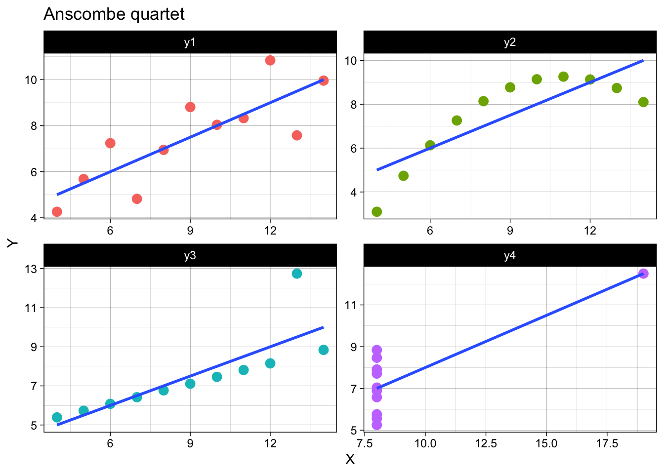
All of these plots have the same summary statistics: the mean for all values of X and Y are the same. The line of best fit is the same for each set of data. *Note, the data comes from a set called the Anscombe’s quartet.
##    mean StdDev
## x1  9.0   3.32
## x2  9.0   3.32
## x3  9.0   3.32
## x4  9.0   3.32
## y1  7.5   2.03
## y2  7.5   2.03
## y3  7.5   2.03
## y4  7.5   2.03
This is not to say that summary statistics should not be used, or that are misleading. It means that they should accompany visualizations to get the message across.
A few pointers that help inform the choose of visualization:
- What you want to communicate?
- Consider the reader. Each one might have their own context and biases.
- The data. What does it have to say and how it informs the truth?
Throughout this course we’ll think about ways to visualize different types of data and present key findings.
7.2 Getting Started
“The simple graph has brought more information to the data analyst’s mind than any other device.” — John Tukey
The process of visualization involves taking raw data (like numbers and labels) and converting them into images for the purpose of communication. The goal is that the idea you want to convey travels faster than it would from looking at a table or reading a summary.
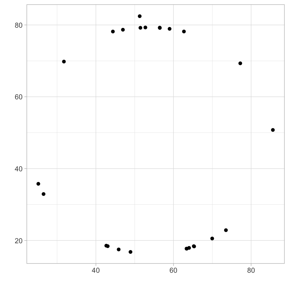
Take a quick look at the number in the following table. What conclusions can you get from it?
| x | y |
|---|---|
| 42.68104 | 18.54254 |
| 46.96246 | 78.66656 |
| 56.47538 | 79.16784 |
| 48.91462 | 16.79864 |
| 51.46710 | 79.20184 |
| 63.39471 | 17.70054 |
| 26.51355 | 32.91875 |
| 56.45143 | 79.24711 |
| 52.75122 | 79.29366 |
| 73.50745 | 22.85699 |
| 77.20459 | 69.31215 |
| 65.31504 | 18.33375 |
| 31.76067 | 69.79766 |
| 43.04618 | 18.40256 |
| 64.01024 | 17.92448 |
| 51.28846 | 82.43594 |
| 25.16587 | 35.76661 |
| 69.96773 | 20.53899 |
| 58.98825 | 78.91726 |
| 45.87037 | 17.48939 |
| 63.35649 | 17.72407 |
| 85.60450 | 50.76234 |
| 65.22303 | 18.39720 |
| 44.37791 | 78.16463 |
| 62.68567 | 78.17474 |
The plots below represent different ways to take a look at the data
The simplest way to look at the relationship between two variables is using a scatterplot. From the previous table and plots, it is not evident that these data points actually form a pattern:
We’ll take a look at when to use other plots for other types of data, but a scatterplot is generally a good starting point in data visualization, when you know there are two related variables.
Who knows what the data might reveal?
- Note: The data here comes from the datasaurus dozen. Similar to the Anscombe’s Quartet, this is a dataset that represents 13 datasets with the same summary statistics that when plotted reval different shapes.
“Never trust summary statistics alone; always visualize your data” Alberto Cairo (creator of the original datasaurus set)
7.3 Making plots with ggplot
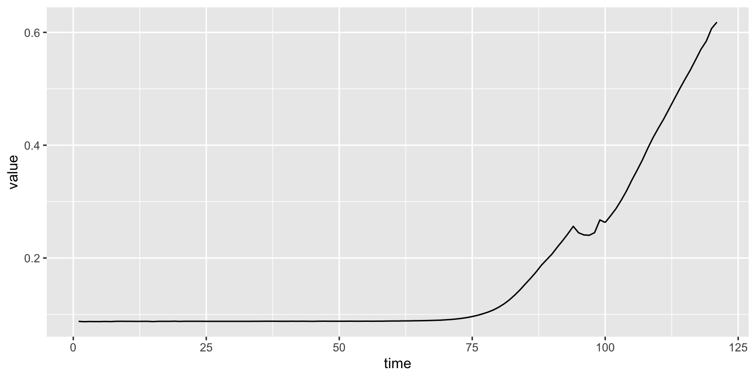
Imagine you do an experiment with a sample isolated from a salty environment. After isolating different colonies you want to select those that can grow in high salt concentrations. You set up an experiment where different colonies compete in a high-salt media and measure their growth over time.
Line plots are an excellent way to visualize with data that was collected sequentially (like our experiment of measuring bacterial growth over time). We’ll look at how to draw lineplots using ggplot with data collected from BIS23A.
Using the plot() function and passing the values for the x and y values we can generate plots very easily in R:
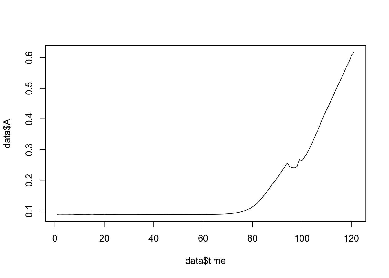
Figure 7.1: Here we are plotting time in minutes on the x-axis and the measurements for growth on the y-axis.
Using plot() is useful when we only have two variables (for example, time and growth for a single colony). But what happens when we have more data?
##    time      A      B      C      D      E
## 1     1 0.0877 0.1191 0.0868 0.1297 0.0877
## 2     2 0.0871 0.1180 0.0876 0.1311 0.0878
## 3     3 0.0874 0.1176 0.0878 0.1322 0.0882
## 4     4 0.0873 0.1184 0.0877 0.1343 0.0880
## 5     5 0.0873 0.1197 0.0878 0.1380 0.0881
## 6     6 0.0875 0.1222 0.0879 0.1441 0.0883
## 7     7 0.0873 0.1247 0.0878 0.1514 0.0881
## 8     8 0.0877 0.1286 0.0883 0.1629 0.0886
## 9     9 0.0878 0.1332 0.0881 0.1771 0.0886
## 10   10 0.0877 0.1388 0.0881 0.1937 0.0886
This is where ggplot comes in handy. To make plots using this library we use a special format of the table (called long format) instead of wide (like the example above). In the long format each row is a unique observation: the colony’s growth value for a sample at a specific time.
## # A tibble: 10 x 3
##     time samples  value
##    <int> <chr>    <dbl>
##  1     1 A       0.0877
##  2     2 A       0.0871
##  3     3 A       0.0874
##  4     4 A       0.0873
##  5     5 A       0.0873
##  6     6 A       0.0875
##  7     7 A       0.0873
##  8     8 A       0.0877
##  9     9 A       0.0878
## 10    10 A       0.0877
7.3.1 Plots
ggplot is build around the idea of a grammar of graphics, which you can think of as an image is worth a thousand words. Using code you can fine tune different elements of the plot.
You first need a canvas that is called using the ggplot() function. On top of this canvas you can layer different types of figures (called geometries or geoms) such as points or lines. At each layer you can control many features like the color, shape and size. You can also have a finer control over specific features (called aesthetics or aes) , like changing the colors for different samples to enhance the visualization of the data.
Calling ggplot() alone generates the canvas:

We then tell which data to use. The aesthetics (aes()) of the plot are used to indicate which variables will be plotted in the x and y axis. We want to plot the growth of the colonies over time:
Running the line above still gives us a mostly empty plot. This is because we haven’t told the function which type (or geometry to use). Let’s make a line plot like the one before:
Now, what if we want to make something more complex? Here the table in long format really shines. So far we have been plotting two variables: time and growth.
## # A tibble: 10 x 3
## time samples value
## <int> <chr> <dbl>
## 1 1 A 0.0877
## 2 1 B 0.119
## 3 1 C 0.0868
## 4 1 D 0.130
## 5 1 E 0.0877
## 6 2 A 0.0871
## 7 2 B 0.118
## 8 2 C 0.0876
## 9 2 D 0.131
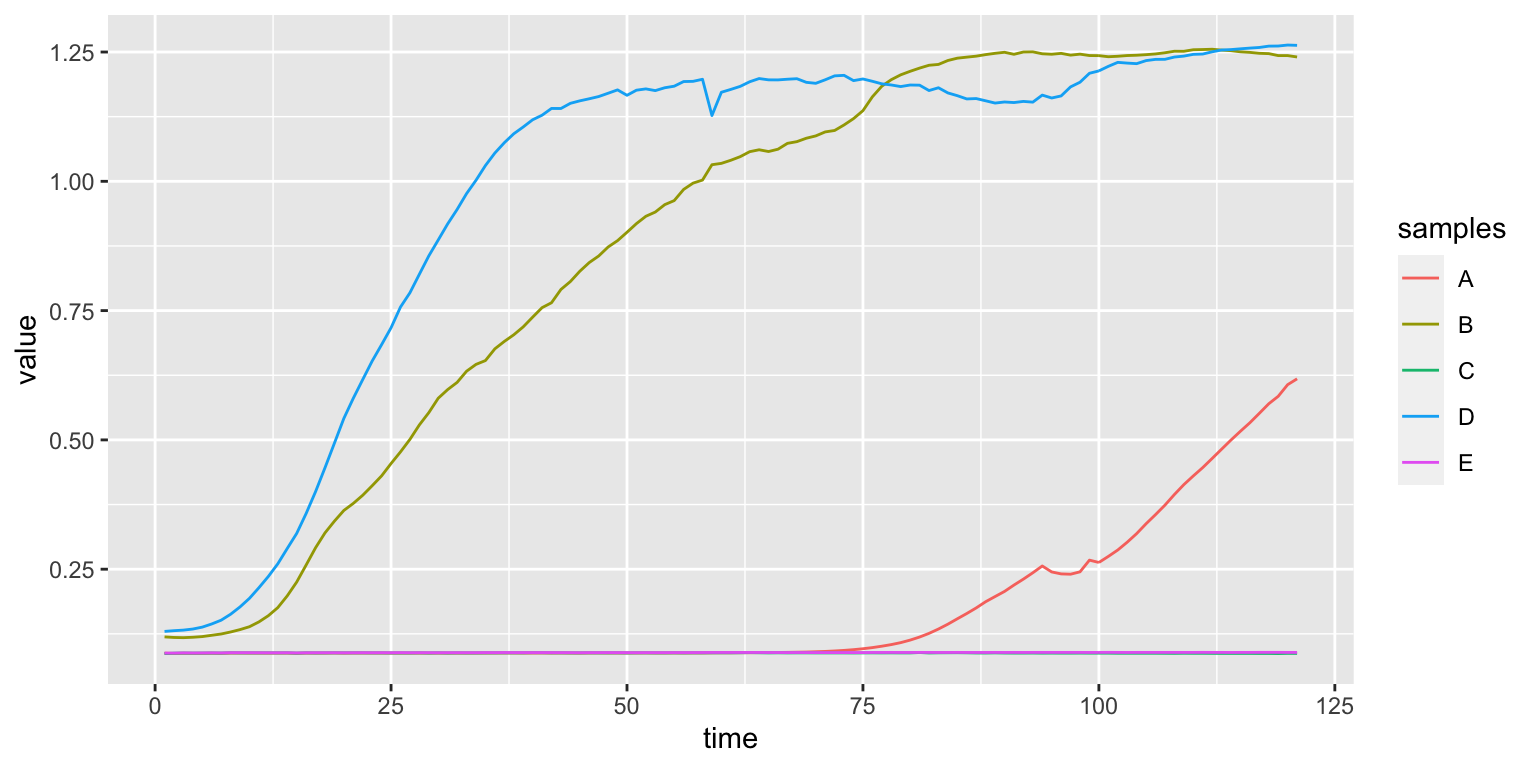
## 10 2 E 0.0878Using the aesthetics we can introduce a third variable and select a different color for each of the samples with aes(color=samples)
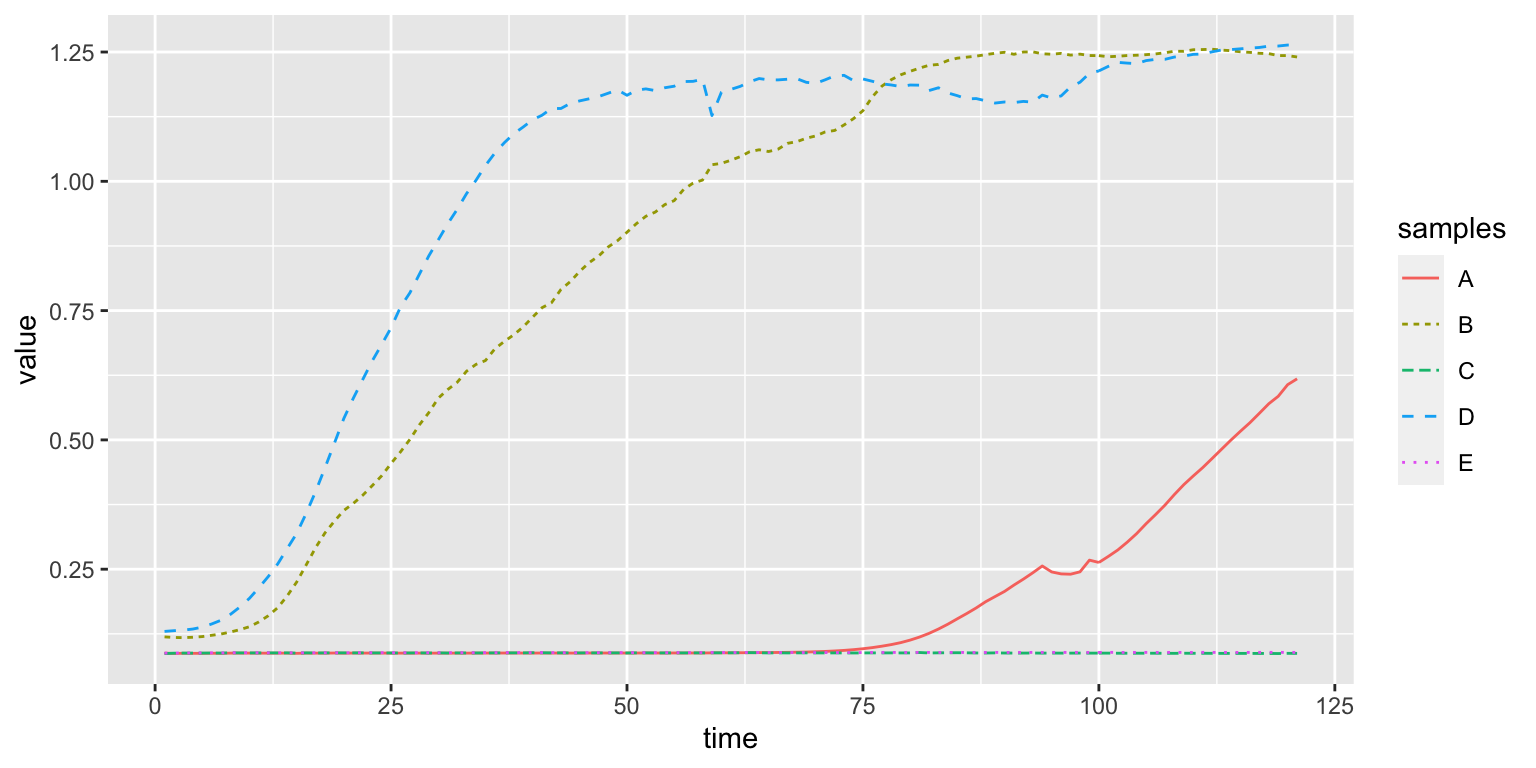
We can also select a different type of line with aes(lty=samples)
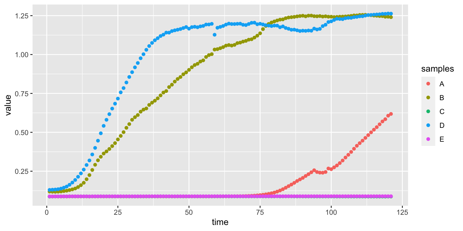
We can add more types of plots changing the geom:
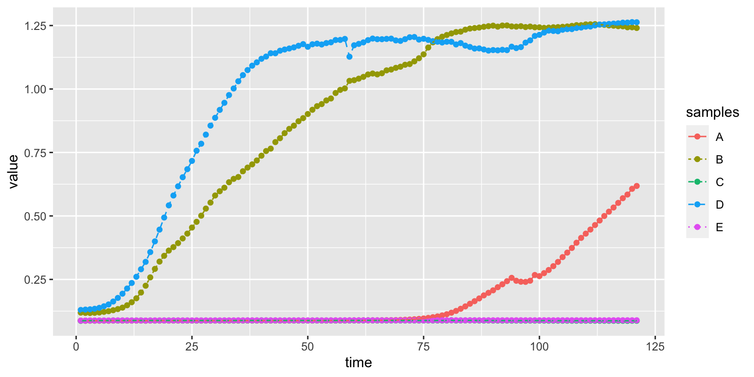
We can also combine two geoms:
There are many other type of options we can modify, like the size of the dots or the background of the canvas. Over the next lessons we’ll see how to create new types of plots and how to map different aesthetics to variables.