Chapter 5 Research and Development
5.1 Sentiment Analysis
5.2 Six Sigma
library("SixSigma")
# Create vector of Input , Output and Steps
inputs <-c ("Ingredients", "Cook", "Oven")
outputs <- c("temperature", "taste", "tenderness","weight", "radius", "time")
steps <- c("DOUGH", "TOPPINGS", "BAKE", "DELIVER")

#Save the names of the outputs of each step in lists
io <- list()
io[[1]] <- list("X's")
io[[2]] <- list("Dough", "ingredients", "Cooker")
io[[3]] <- list("Raw Pizza", "Cooker", "Oven Plate")
io[[4]] <- list("Baked Pizza", "Plate")

#Save the names, parameter types, and features:
param <- list()
param[[1]] <- list(c("Cook", "C"),c("flour brand", "C"),c("prop Water", "P"))
param[[2]] <- list(c("Cook", "C"),c("Ing.Brand", "Cr"),c("amount", "P"),c("prep.Time", "Cr"))
param[[3]] <- list(c("Cook","C"),c("queue", "N"),c("BakeTime", "Cr"))
param[[4]] <- list(c("Waiter","C"),c("queue", "N"))

feat <- list()
feat[[1]] <- list("Density", "toughness", "thickness")
feat[[2]] <- list("Diameter", "Weight", "thickness")
feat[[3]] <- list("temperature", "tenderness", "taste")
feat[[4]] <- list("temperature", "taste", "tenderness","weight", "time")
# Create process map
ss.pMap(steps, inputs, outputs,io, param, feat,sub = "Pizza Process Example")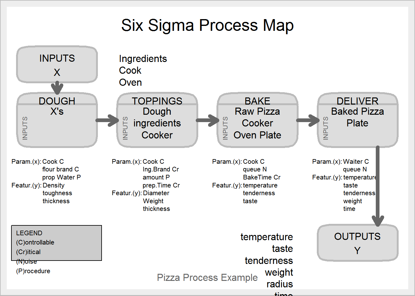
# Cause and Effect Diagram
##Create effect as string
effect <- "Low Quality product"
##Create vector of causes
causes.gr <- c("Measurement", "Material", "Methods", "Environment",
"Manpower", "Machines")
# Create indiviual cause as vector of list
causes <- vector(mode = "list", length = length(causes.gr))
causes[1] <- list(c("Lab error", "Contamination"))
causes[2] <- list(c("Raw Material", "Additive"))
causes[3] <- list(c("Sampling", "Analytical Procedure"))
causes[4] <- list(c("Rust near sample point"))
causes[5] <- list(c("Poor analyst","No guidance"))
causes[6] <- list(c("Leakage", "breakdown"))
# Create Cause and Effect Diagram
ss.ceDiag(effect, causes.gr, causes, sub = "Fish Bone Diagram Example")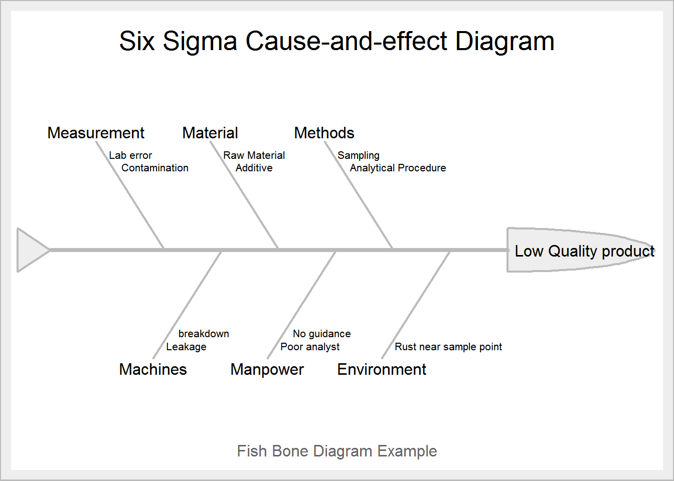
#Pareto Chart
library(qcc)
defect <- c(60,20,16,14,8,9)
names(defect) <- c("A", "B", "C", "D","E","F")
pareto.chart(defect, ylab = "Defect frequency", col=heat.colors(length(defect)))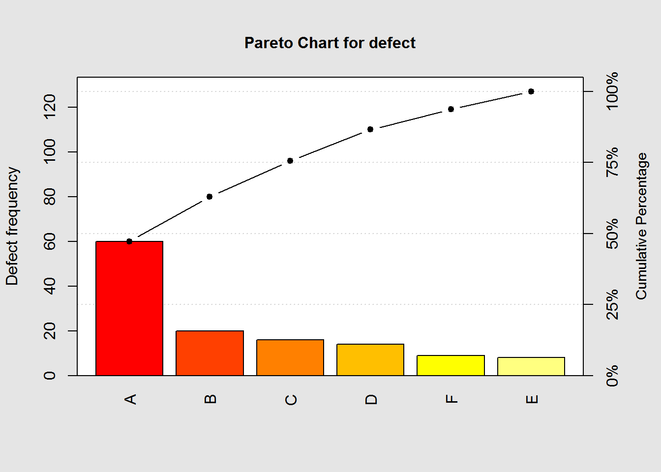
Pareto chart analysis for defect Frequency Cum.Freq. Percentage Cum.Percent. A 60.000000 60.000000 47.244094 47.244094 B 20.000000 80.000000 15.748031 62.992126 C 16.000000 96.000000 12.598425 75.590551 D 14.000000 110.000000 11.023622 86.614173 F 9.000000 119.000000 7.086614 93.700787 E 8.000000 127.000000 6.299213 100.000000
curve(0.002 * (x - 10)^2, 9, 11,
lty = 1,
lwd = 2,
ylab = "Cost of Poor Quality",
xlab = "Observed value of the characteristic",
main = expression(L(Y) == 0.002 ~ (Y - 10)^2))
abline(v = 9.5, lty = 2)
abline(v = 10.5, lty = 2)
abline(v = 10, lty = 2)
abline(h = 0)
text(10, 0.002, "T", adj = 2)
text(9.5, 0.002, "LSL", adj = 1)
text(10.5, 0.002, "USL", adj = -0.1)
# Create loss function with Tolerance=0.5 ,target=10,Cost of poor quality=0.001,batch size=100000)
ss.lfa(ss.data.bolts, "diameter", 0.5, 10, 0.001,lfa.sub = "Bolts example loss function",
lfa.size = 100000, lfa.output = "both")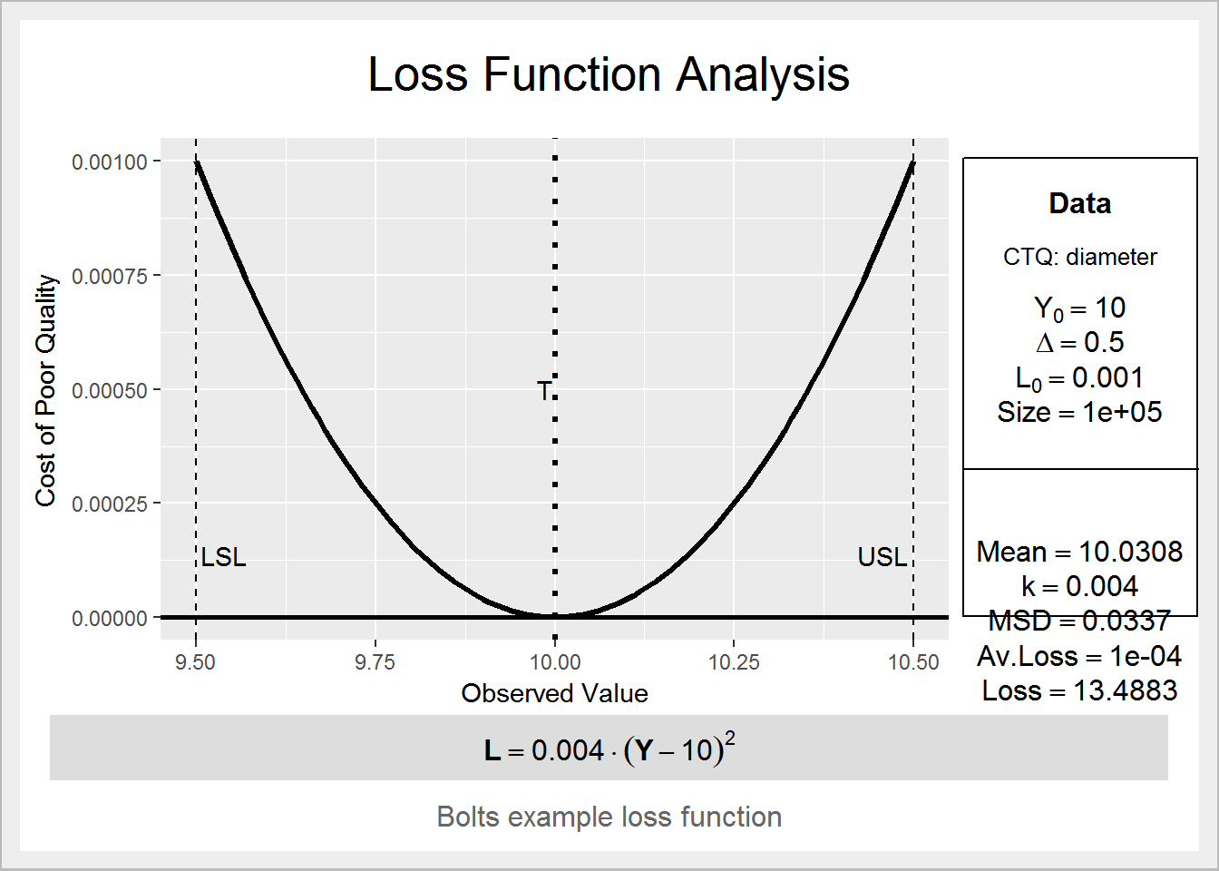 $lfa.k [1] 0.004
$lfa.lf expression(bold(L == 0.004 %.% (Y - 10)^2))
$lfa.MSD [1] 0.03372065
$lfa.avLoss [1] 0.0001348826
$lfa.Loss [1] 13.48826