Chapter 3 Data Science
The Data Science approach may be summarized as:
- Get
- Clean
- Organize
- Model
- Visualize
In this section, we will focus on each topic in order, before diving deeper into case studies in the next section, Business Analysis.
3.1 Overview
‘Wikipedia’
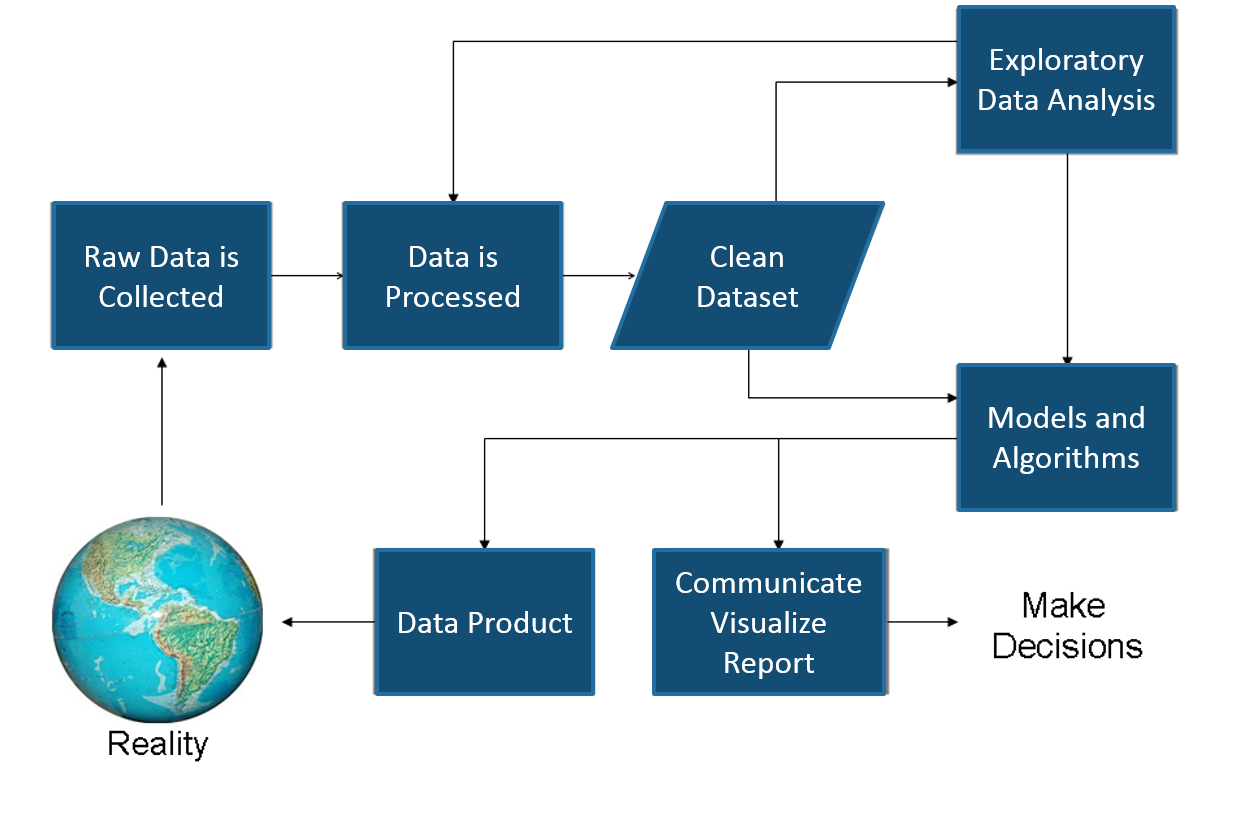
Included in this process it is important to remember Reality. Too often an Analyst suffers Paralysis of Analysis, forgetting the business is depending on the insights the analyst provides to make critical decisions. This is where the feedback loop provides the necessary check against reality to make sure the Analyst stays on track and schedule.
The Feedback Loop 
3.2 Get
Points to remember:
- Importing data into R is fairly simple.
- For Stata and Systat, use the foreign package.
- For SPSS and SAS the Hmisc package is recommended for ease and functionality.
Example of importing data follows.
mydata <- read.csv("mydata.csv")  # read csv file
mydata <- read.table("mydata.txt")

library(openxlsx)
mydata <- read.xlsx("mydata.xlsx ", sheet = 'sheet1', startRow = 1, colNames = TRUE, skipEmptyRows = TRUE)
Let’s read the first lines of Acme’s sales data.
df <- read.csv('https://raw.githubusercontent.com/jmonroe252/RforBusiness/master/sales.csv', stringsAsFactors = FALSE)

head(df)| Date | Customer_ID | Customer | Product | Value | Units |
|---|---|---|---|---|---|
| 12/1/2017 | 68 | Yosemite Sam | Iron Bird Seed | 304217.0 | 283 |
| 12/1/2017 | 68 | Yosemite Sam | Earthquake Pills | 270966.0 | 299 |
| 12/1/2017 | 68 | Yosemite Sam | Hi-Speed Tonic | 688150.0 | 609 |
| 12/1/2017 | 68 | Yosemite Sam | Dehydrated Boulder | 334638.7 | 235 |
| 12/1/2017 | 68 | Yosemite Sam | Invisible Paint | 292643.3 | 254 |
| 12/1/2017 | 68 | Yosemite Sam | Anvil | 729439.0 | 579 |
From a comma delimited text file
- First row contains variable names, comma is separator
- Assign the variable id to row names
- Note the / instead of on mswindows systems
mydata <- read.table("c:/mydata.csv", header=TRUE, sep=",", row.names="id")From Excel
To read and write data to Excel, we will use the openxlsx package. An example of extracting using the RODBC package is also provided, but openxlsx is preferred.
Openxlsx is described by the authors as:
“Simplifies the creation of Excel .xlsx files by providing a high level interface to writing, styling and editing worksheets. Through the use of ‘Rcpp’, read/write times are comparable to the ‘xlsx’ and ‘XLConnect’ packages with the added benefit of removing the dependency on Java.”
Read from an Excel file or Workbook object
Description
Read data from an Excel file or Workbook object into a data.frame
Usage
read.xlsx(xlsxFile, sheet = 1, startRow = 1, colNames = TRUE, rowNames = FALSE, detectDates = FALSE, skipEmptyRows = TRUE, skipEmptyCols = TRUE, rows = NULL, cols = NULL, check.names = FALSE, namedRegion = NULL, na.strings = “NA”, fillMergedCells = FALSE)
Arguments
xlsxFile = An xlsx file, Workbook object or URL to xlsx file.
sheet = The name or index of the sheet to read data from.
startRow = first row to begin looking for data. Empty rows at the top of a file are always skipped, regardless of the value of startRow.
colNames = If TRUE, the first row of data will be used as column names.
rowNames = If TRUE, first column of data will be used as row names.
detectDates = If TRUE, attempt to recognise dates and perform conversion.
skipEmptyRows = If TRUE, empty rows are skipped else empty rows after the first row containing data will return a row of NAs.
skipEmptyCols = If TRUE, empty columns are skipped.
rows = A numeric vector specifying which rows in the Excel file to read. If NULL, all rows are read.
cols = A numeric vector specifying which columns in the Excel file to read. If NULL, all columns are read.
check.names logical. = If TRUE then the names of the variables in the data frame are checked to ensure that they are syntactically valid variable names.
namedRegion = A named region in the Workbook. If not NULL startRow, rows and cols parameters are ignored.
na.strings = A character vector of strings which are to be interpreted as NA. Blank cells will be returned as NA.
fillMergedCells = If TRUE, the value in a merged cell is given to all cells within the merge.
Details
Formula written using writeFormula to a Workbook object will not get picked up by read.xlsx(). This is because only the formula is written and left to be evaluated when the file is opened in Excel. Opening, saving and closing the file with Excel will resolve this.
Examples
xlsxFile <- system.file("readTest.xlsx", package = "openxlsx")

df1 <- read.xlsx(xlsxFile = xlsxFile, sheet = 1, skipEmptyRows = FALSE)
sapply(df1, class)

df2 <- read.xlsx(xlsxFile = xlsxFile, sheet = 3, skipEmptyRows = TRUE)

df2$Date <- convertToDate(df2$Date)
sapply(df2, class)
head(df2)

df2 <- read.xlsx(xlsxFile = xlsxFile, sheet = 3, skipEmptyRows = TRUE, detectDates = TRUE)
sapply(df2, class)
head(df2)

wb <- loadWorkbook(system.file("readTest.xlsx", package = "openxlsx"))
df3 <- read.xlsx(wb, sheet = 2, skipEmptyRows = FALSE, colNames = TRUE)
df4 <- read.xlsx(xlsxFile, sheet = 2, skipEmptyRows = FALSE, colNames = TRUE)
all.equal(df3, df4)

wb <- loadWorkbook(system.file("readTest.xlsx", package = "openxlsx"))
df3 <- read.xlsx(wb, sheet = 2, skipEmptyRows = FALSE,
cols = c(1, 4), rows = c(1, 3, 4))
Read an Excel file using the RODBC package
library(RODBC)
channel <- odbcConnectExcel("c:/myexcel.xls")
mydata <- sqlFetch(channel, "mysheet")
odbcClose(channel)
Keyboard Input Usually you will obtain a dataframe by importing it from SAS, SPSS, Excel, Stata, a database, or an ASCII file. To create it interactively, you can do something like the following.
Creating a dataframe from scratch
age <- c(25, 30, 56)
gender <- c("male", "female", "male")
weight <- c(160, 110, 220)
mydata <- data.frame(age,gender,weight)
You can also use R’s built in spreadsheet to enter the data interactively, as in the following example.
Enter data using editor
mydata <- data.frame(age=numeric(0),gender=character(0), weight=numeric(0))
mydata <- edit(mydata)- Note that without the assignment in the line above, the edits are not saved!
Exporting Data
There are numerous methods for exporting R objects into other formats . For SPSS, SAS and Stata. you will need to load the foreign packages. For Excel, you will need the xlsReadWrite, Openxlsx, or RODBC package.
To A Tab Delimited Text File
write.table(mydata, "c:/mydata.txt", sep="\t") To an Excel Spreadsheet
library(xlsReadWrite)
write.xls(mydata, "c:/mydata.xls")
To SAS
library(foreign)
write.foreign(mydata, "c:/mydata.txt", "c:/mydata.sas", package="SAS")
Viewing Data
There are a number of functions for listing the contents of an object or dataset.
####list objects in the working environment
ls()

####list the variables in mydata
names(mydata)

####list the structure of mydata
str(mydata)

####list levels of factor v1 in mydata
levels(mydata$v1)

####dimensions of an object
dim(object)
There are a number of functions for listing the contents of an object or dataset.
####class of an object (numeric, matrix, dataframe, etc)
class(object)

####display mydata
mydata
####or
print(mydata)

####display first 10 rows of mydata
head(mydata,10)

####display last 5 rows of mydata
tail(mydata,5)
Variable Labels
R’s ability to handle variable labels is somewhat unsatisfying. If you use the Hmisc package, you can take advantage of some labeling features.
library(Hmisc)
label(mydata$myvar) <- "Variable label for variable myvar"
describe(mydata)
Unfortunately the label is only in effect for functions provided by the Hmisc package, such as describe(). Your other option is to use the variable label as the variable name and then refer to the variable by position index.
names(mydata)[3] <- "This is the label for variable 3"
mydata[3] # list the variable
To understand value labels in R, you need to understand the data structure factor. You can use the factor function to create your own value labels. Variable v1 is coded 1, 2 or 3 and we want to attach value labels 1=red, 2=blue,3=green
mydata$v1 <- factor(mydata$v1,levels = c(1,2,3),labels = c("red", "blue", "green")) Variable y is coded 1, 3 or 5 and we want to attach value labels 1=Low, 3=Medium, 5=High
mydata$v1 <- ordered(mydata$y,levels = c(1,3, 5),labels = c("Low", "Medium", "High")) Use the factor() function for nominal data and the ordered() function for ordinal data. R statistical and graphic functions will then treat the data appropriately.
Note: Factor and ordered are used the same way, with the same arguments. The former creates factors and the later creates ordered factors.
Web Scraping
Wikipedia
library(XML)
library(rvest)
html = read_html("http://en.wikipedia.org/wiki/List_of_U.S._states_and_territories_by_population")
population = html_table(html_nodes(html, "table")[1], fill=TRUE)
str(population)
Exchange Rates
####Retrieving Exchange Rates
library(Quandl)
eu_fx = head(Quandl("FRED/EXUSEU"),5)
mx_fx = head(Quandl("FRED/DEXMXUS"),5)

eu_fx
Diesel Prices
library(RJSONIO)
library(plyr)
library(rjson)
library(RCurl)

bls.content <- getURL("https://api.bls.gov/publicAPI/v1/timeseries/data/WPU05730302")
bls.json <- fromJSON(bls.content)
tmp <-bls.json$Results[[1]][[1]]
diesel <- data.frame(year=sapply(tmp$data,"[[","year"),
                     period=sapply(tmp$data,"[[","period"),
                     periodName=sapply(tmp$data,"[[","periodName"),
                     value=as.numeric(sapply(tmp$data,"[[","value")),
                     stringsAsFactors=FALSE)
diesel <- head(diesel,5)
Global Trade Data from UN Comtrade
library(rjson)
library(plyr)

string <- "http://comtrade.un.org/data/cache/partnerAreas.json"
reporters <- fromJSON(file=string)
reporters <- as.data.frame(t(sapply(reporters$results,rbind)))

function
get.Comtrade <- function(url="http://comtrade.un.org/api/get?"
                         ,maxrec=50000
                         ,type="C"
                         ,freq="A"
                         ,px="HS"
                         ,ps="now"
                         ,r
                         ,p
                         ,rg="all"
                         ,cc="TOTAL"
                         ,fmt="json"
                         ,token=""
)
{
  string<- paste(url
                 ,"max=",maxrec,"&" #maximum no. of records returned
                 ,"type=",type,"&" #type of trade (c=commodities)
                 ,"freq=",freq,"&" #frequency
                 ,"px=",px,"&" #classification
                 ,"ps=",ps,"&" #time period
                 ,"r=",r,"&" #reporting area
                 ,"p=",p,"&" #partner country
                 ,"rg=",rg,"&" #trade flow
                 ,"cc=",cc,"&" #classification code
                 ,"fmt=",fmt        #Format
                 ,sep = ""
  )

  if(fmt == "csv") {
    raw.data<- read.csv(string,header=TRUE)
    return(list(validation=NULL, data=raw.data))
  } else {
    if(fmt == "json" ) {
      raw.data<- fromJSON(file=string)
      data<- raw.data$dataset
      validation<- unlist(raw.data$validation, recursive=TRUE)
      ndata<- NULL
      if(length(data)> 0) {
        var.names<- names(data[[1]])
        data<- as.data.frame(t( sapply(data,rbind)))
        ndata<- NULL
        for(i in 1:ncol(data)){
          data[sapply(data[,i],is.null),i]<- NA
          ndata<- cbind(ndata, unlist(data[,i]))
        }
        ndata<- as.data.frame(ndata)
        colnames(ndata)<- var.names
      }
      return(list(validation=validation,data =ndata))
    }
  }
}

part 2: download specific data
information:


start downloading:

q8 <- get.Comtrade(r='8',p='all',ps='2015',fmt='csv',cc='480255')
3.3 Clean
Missing Data
In R, missing values are represented by the symbol NA (not available) . Impossible values (e.g., dividing by zero) are represented by the symbol NaN (not a number).
Unlike SAS, R uses the same symbol for character and numeric data.
Test for Missing Values:
is.na(x) # returns TRUE of x is missing
y <- c(1,2,3,NA)
y <- is.na(y) # returns a vector (F F F T)

y
Lets recode missing values as 99.
y[is.na(y)] <- 99| x |
|---|
| 1 |
| 2 |
| 3 |
| 99 |
We already did this in a previous example, but a little review never hurts, so lets exclude missing values from our analyses and perform a function on data with missing values.
x <- c(1,2,NA,3)
mean(x) # returns NA
mean(x, na.rm=TRUE) # returns 2
The function complete.cases() returns a logical vector indicating which cases are complete. Here, we combine x and y into a dataframe and list rows of data that have missing values.
The function na.omit() returns the object with listwise deletion of missing values. Here we create new dataset without missing data
df <- data.frame(x = c(1, 2, 3), y = c(0, 10, NA))
na.omit(df)
x y 1 1 0 2 2 10
| x | y |
|---|---|
| 1 | 0 |
| 2 | 10 |
Advanced Handling of Missing Data
Most modeling functions in R offer options for dealing with missing values. You can go beyond pairwise of listwise deletion of missing values through methods such as multiple imputation. Good implementations that can be accessed through R include Amelia II, Mice, and mitools.
Date Values
Dates are represented as the number of days since 1970-01-01, with negative values for earlier dates. Use as.Date( ) to convert strings to dates
mydates <- as.Date(c("2007-06-22", "2004-02-13"))
mydates
Number of days between 6/22/07 and 2/13/04
days <- mydates[1] - mydates[2]
Sys.Date() ####returns today's date.
Date() ####returns the current date and time. | Symbol | Description | Example |
|---|---|---|
| %d | day as a number | 01-31 |
| %a | abbreviated weekday | Mon |
| %A | unabbreviated weeekday | Monday |
| %m | month | 00-12 |
| %b | abbreviated month | Jan |
| %B | unabbreviated month | January |
| y | 2-digit year | 07 |
| Y | 4-digit year | 2007 |
Print today’s date:
today <- Sys.Date()
format(today, format="%B%d%Y")
3.4 Organize
Once you have access to your data, you will want to massage it into useful form. This includes creating new variables (including recoding and renaming existing variables), sorting and merging datasets, aggregating data, reshaping data, and subsetting datasets (including selecting observations that meet criteria, randomly sampling observation, and dropping or keeping variables).
Each of these activities usually involve the use of R’s built-in operators (arithmetic and logical) and functions (numeric, character, and statistical). Additionally, you may need to use control structures (if-then, for, while, switch) in your programs and/or create your own functions. Finally you may need to convert variables or datasets from one type to another (e.g. numeric to character or matrix to dataframe).
Use the assignment operator <- to create new variables. A wide array of operators and functions are available here.
Three examples for doing the same computations
####Example 1:
mydata$sum <- mydata$x1 + mydata$x2
mydata$mean <- (mydata$x1 + mydata$x2)/2

####Example 2:
mydata$sum <- x1 + x2
mydata$mean <- (x1 + x2)/2

####Example 3:
mydata <- transform( mydata,sum = x1 + x2,mean = (x1 + x2)/2)
In order to recode data, you will probably use one or more of R’s control structures.
Create 2 age categories
mydata$agecat <- ifelse(mydata$age > 70, c("older"), c("younger"))Another example: Create 3 age categories
mydata$agecat[age > 75] <- "Elder"
mydata$agecat[age > 45 & age <= 75] <- "Middle Aged"
mydata$agecat[age <= 45] <- "Young"
Renaming
You can rename variables programmatically or interactively.
#####Rename interactively
fix(mydata) # results are saved on close

####Rename programmatically
library(reshape)
mydata <- rename(mydata, c(oldname="newname"))
You can re-enter all the variable names in order Changing the ones you need to change. The limitation is that you need to enter all of them!
names(mydata) <- c("x1","age","y", "ses") Sorting
To sort a dataframe in R, use the order( ) function. By default, sorting is ASCENDING. Prepend the sorting variable by a minus sign to indicate DESCENDING order.
Here are some examples using the sales_data dataset.
####Retrieve the sales_data data set
sdata <- read.csv('https://raw.githubusercontent.com/jmonroe252/RforBusiness/master/sales_data.csv')

####Sort by Net_Sales_Unit
newdata <- sdata[order(sdata$Net_Sales_Unit),] | Customer | Net_Sales_Unit |
|---|---|
| Penelope Pussycat | 705 |
| Piggy | 736 |
| Inki | 760 |
| Playboy Penguin | 779 |
| Ralph Wolf | 783 |
| Quick Brown Fox and Rapid Rabbit | 798 |
Sort by Net_Sales_Unit and Distribution_Unit
newdata <- sdata[order(sdata$Net_Sales_Unit, sdata$Distribution_Unit),]| Customer | Net_Sales_Unit | Distribution_Unit |
|---|---|---|
| Penelope Pussycat | 705 | 62 |
| Piggy | 736 | 61 |
| Inki | 760 | 78 |
| Playboy Penguin | 779 | 188 |
| Ralph Wolf | 783 | 85 |
| Quick Brown Fox and Rapid Rabbit | 798 | 56 |
Sort by Net_Sales_Unit (descending) and Distribution_Unit (ascending)
newdata <- sdata[order(-sdata$Net_Sales_Unit, sdata$Distribution_Unit),]| Customer | Net_Sales_Unit | Distribution_Unit |
|---|---|---|
| Buddy | 1463 | 54 |
| Beaky Buzzard | 1459 | 57 |
| Hubie and Bertie | 1303 | 72 |
| Marc Antony and Pussyfoot | 1279 | 89 |
| Colonel Shuffle | 1263 | 171 |
| Charlie Dog | 1253 | 49 |
Merging
To merge two dataframes (datasets) horizontally, use the merge function. In most cases, you join two dataframes by one or more common key variables (i.e., an inner join).
####Merge two dataframes by ID
total <- merge(dataframeA,dataframeB,by="ID")

####Merge two dataframes by ID and Country
total <- merge(dataframeA,dataframeB,by=c("ID","Country"))
Adding Rows To join two dataframes (datasets) vertically, use the rbind function. The two dataframes must have the same variables, but they do not have to be in the same order. total <- rbind(dataframeA, dataframeB)
If dataframeA has variables that dataframeB does not, then either: - Delete the extra variables in dataframeA or - Create the additional variables in dataframeB and set them to NA (missing) before joining them with rbind.
Aggregating
It is relatively easy to collapse data in R using one or more BY variables and a defined function. Using the sdata data set, let’s aggregate Units_Billed by Customer.
aggdata <- aggregate(sdata["Units_Billed"],by=sdata[c("Customer")], FUN=sum)When using the aggregate() function, the by variables must be in a list (even if there is only one). The function can be built-in or user provided.
See also:
- summarize() in the Hmisc package
- summaryBy() in the doBy package
Type conversions in R work as you would expect. For example, adding a character string to a numeric vector converts all the elements in the vector to character.
- Use is.foo to test for data type foo. Returns TRUE or FALSE
- Use as.foo to explicitly convert it.
- is.numeric(), is.character(), is.vector(), is.matrix(), is.data.frame(), as.numeric(), as.character(), as.vector(), as.matrix(), as.data.frame)
As a conglomerate that seems to produce everything imaginable, Acme is involved in significant trade globally. As Acme’s Business Analyst, you have been asked to analyze Acme’s Global Trade flows for Glue and Smoke Screen Bombs at the regional level. Unfortuntately, the data set provided is at the country level and a bit disorganized, so this will require some work on our part first.
####Import Data
trade <- read.csv('https://raw.githubusercontent.com/jmonroe252/RforBusiness/master/trade.csv', stringsAsFactors = FALSE)

str(trade)| Variable | Class | First_Values |
|---|---|---|
| ID | integer | 1, 2, 3, 4, 5, 6 |
| Partner.Country | character | Algeria, Algeria, Algeria, Angola, Angola, Angola |
| Reporting.Country | character | South Africa, Egypt, Egypt, South Africa, South Africa, South Africa |
| Product | character | Glue, Smoke Screen Bomb, Glue, Smoke Screen Bomb, Giant Rubber Band, Glue |
| X2002 | double | 0, 0, 0, 4.8, 0, 3.4 |
| X2003 | double | 0, 0, 0, 75.6, 0, 0 |
| … | … | … |
| X2014 | double | 0, 0, 0, 409.6, 3.2, 3.6 |
| X2015 | double | 0, 0, 0, 108, 0, 0.8 |
That is one messy data set. As mentioned, the data only shows countries, but we need to aggregate to the regional level and the years are in columns with a X attached. Let’s begin cleaning this up by bringing in a region reference table.
####Import Data
region <- read.csv('https://raw.githubusercontent.com/jmonroe252/RforBusiness/master/region.csv', stringsAsFactors = FALSE)

str(trade)| Variable | Class | First_Values |
|---|---|---|
| X | integer | 1, 2, 3, 4, 5, 6 |
| Region | character | ASIA, CEB, MIDDLE EAST & NORTH AFRICA, WESTERN EUROPE, SUB-SAHARAN AFRICA, LATIN AMERICA |
| Country | character | Afghanistan, Albania, Algeria, Andorra, Angola, Antigua and Barbuda |
| A_Country | character | Other.Far.East, Other.Eastern.Europe, Middle.East, Other.Western.Europe, Other.Africa, Other.Latin.America |
| A_Region | character | Far.East, Eastern.Europe, Middle.East, Western.Europe, Africa, Latin.America |
| B_Country | character | Afghanistan*, Albania, Algeria, Andorra, Angola, Antigua & Barbuda |
The region table has many more fields than we require. We are going to merge the “Country” field in the region table with the “Partner.Country” and “Reporting.Country” fields in the trade data set, to return the “Region”. After that, we will deal with the years being in columns and the attached X.
####Rename Partner.Country in Trade dataset
names(trade)[names(trade)=="Partner.Country"] <- "Country"

####Merge
trade1 <- (merge(region, trade, by = 'Country'))
names(trade1)[names(trade1)=="Region"] <- "Partner.Region"
names(trade1)[names(trade1)=="Country"] <- "Partner.Country"

####Repeat the preceding steps for Reporter.Country
names(trade1)[names(trade1)=="Reporting.Country"] <- "Country
Now, let’s remove columns not needed and use the gsub() function to remove the “X” from year.
####Remove columns not needed
vars <- names(trade1) %in% c("X", "A_Country.x", "A_Region.x", "B_Country.x", "X.x",
                               "A_Country.y", "A_Region.y", "B_Country.y", "X.y", "Segment")
trade1 <- trade1[!vars]

#####Aggregate the data, adding a year column
library(reshape)
trade2 <- melt(trade1, id=c("Reporting.Country","Reporting.Region", "Partner.Country", "Partner.Region"))
names(trade2)[names(trade2)=="variable"] <- "Year"

####Convert Year to numeric
trade2$Year <- gsub("X", "", paste(trade2$Year))
trade2$Year <- as.numeric(trade2$Year)
trade2$value <- as.numeric(trade2$value)

####Sum by Reporting.Region, Partner.Region and Year
trade.agg <- aggregate(trade2["value"], by=trade2[c("Reporting.Region","Partner.Region", "Year")], FUN=sum, na.rm=TRUE)

head(trade.agg)| Reporting.Region | Partner.Region | Year | value |
|---|---|---|---|
| ASIA | ASIA | 2002 | 95252.8 |
| CEB | ASIA | 2002 | 427.6 |
| CIS | ASIA | 2002 | 3151.4 |
| LATIN AMERICA | ASIA | 2002 | 4796.8 |
| MEXICO | ASIA | 2002 | 0.0 |
| NORTH AMERICA | ASIA | 2002 | 3337.4 |
3.5 Model
Linear Regression
Linear regression is used to predict the value of an outcome variable Y based on one or more input predictor variables X. The aim is to establish a linear relationship between the predictor variable(s) and the response variable, so that, we can use this formula to estimate the value of the response Y, when only the predictors (Xs) values are known.
Introduction
The aim of linear regression is to model a continuous variable Y as a mathematical function of one or more X variable(s), so that we can use this regression model to predict the Y when only the X is known. This mathematical equation can be generalized as follows:
\[\begin{equation} Y_i = \beta_0 + \beta_1 X_i + \epsilon_i \end{equation}\]
where the slope is:
\[\begin{equation} \hat{\beta}_1 = \frac{\sum(X_i - \bar{X}) (Y_i - \bar{Y})} {\sum(X_i - \bar{X})^2} \end{equation}\]
and the intercept is:
\[\begin{equation} \hat{\beta}_0 = \bar{Y} - \hat{\beta}_1 \bar{X} \end{equation}\]
Collectively, they are called regression coefficients. \(\epsilon_i\) is the error term, the part of Y the regression model is unable to explain.
Example Problem For this analysis, we will use the sales_data dataset that is posted on Github RforBusiness. sales_data is a sample data from Acme. You will find that it consists of 68 observations(rows) and 12 variables (columns), which we will limit to 2 in our example, Units_Billed, and Cont_Margin_Unit. Lets view the first six observations here.
| Net_Sales_Unit | Cont_Margin_Unit |
|---|---|
| 1237.1175 | 688.0386 |
| 937.0911 | 501.6672 |
| 1459.1544 | 940.9065 |
| 1054.7908 | 632.4303 |
| 1053.0315 | 623.4967 |
| 890.7143 | 411.4174 |
Correlation
Correlation is a statistical measure that suggests the level of linear dependence between two variables, that occur in pair just like what we have here in Net_Sales_Unit and Cont_Margin_Unit. Correlation can take values between -1 to +1. If we observe for every instance where Net_sales_Unit increases, the Cont_Margin_Unit increases along with it, then there is a high positive correlation between them and therefore the correlation between them will be closer to 1. The opposite is true for an inverse relationship, in which case, the correlation between the variables will be close to -1.
A value closer to 0 suggests a weak relationship between the variables. A low correlation (-0.2 < x < 0.2) probably suggests that much of variation of the response variable (Y) is unexplained by the predictor (X), in which case, we should probably look for better explanatory variables.
cor(sdata_full$Net_Sales_Unit, sdata_full$Cont_Margin_Unit) # calculate correlation between Net_Sales_Unit and Cont_Margin_Unit [1] 0.8755682
scatter.smooth(x=sdata_full$Net_Sales_Unit, y=sdata_full$Cont_Margin_Unit, main="Cont_Margin ~ Net Sales") 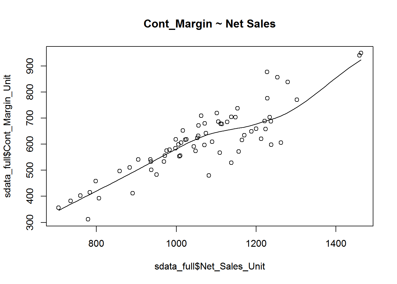
Build Linear Model
Now that we have seen the linear relationship pictorially in the scatter plot and by computing the correlation, lets see the syntax for building the linear model. The function used for building linear models is lm(). The lm() function takes in two main arguments, namely: 1. Formula 2. Data. The data is typically a data.frame and the formula is a object of class formula. But the most common convention is to write out the formula directly in place of the argument as written below.
linearMod <- lm(Cont_Margin_Unit ~ Net_Sales_Unit, data=sdata_full)  # build linear regression model on full data

print(linearMod)
Call: lm(formula = Cont_Margin_Unit ~ Net_Sales_Unit, data = sdata_full)
Coefficients: (Intercept) Net_Sales_Unit
-134.8339 0.7017
Now that we have built the linear model, we also have established the relationship between the predictor and response in the form of a mathematical formula for Cont_Margin_Unit as a function for Net_Sales_Unit. For the above output, you can notice the Coefficients part having two components: Intercept: -134.8339, Net_Sales_Unit: 0.7017 These are also called the beta coefficients. In other words,
\[Cont_Margin_Unit=Intercept+(\beta*Net_Sales_Unit)\]
\[=> Cont_Margin_Unit = -134.8339 + 0.7017*Net_Sales_Unit\]
Linear Regression Diagnostics
Now the linear model is built and we have a formula that we can use to predict the dist value if a corresponding speed is known. Is this enough to actually use this model? NO! Before using a regression model, you have to ensure that it is statistically significant. How do you ensure this? Lets begin by printing the summary statistics for linearMod.
summary(linearMod)Call: lm(formula = Cont_Margin_Unit ~ Net_Sales_Unit, data = sdata_full)
Residuals: Min 1Q Median 3Q Max -144.79 -34.27 14.96 34.02 150.39
Coefficients: Estimate Std. Error t value Pr(>|t|)
(Intercept) -134.83395 51.24853 -2.631 0.0106 *
Net_Sales_Unit 0.70168 0.04765 14.724 <2e-16 *** — Signif. codes: 0 ‘’ 0.001 ’’ 0.01 ’’ 0.05 ‘.’ 0.1 ‘’ 1
Residual standard error: 61.99 on 66 degrees of freedom Multiple R-squared: 0.7666, Adjusted R-squared: 0.7631 F-statistic: 216.8 on 1 and 66 DF, p-value: < 2.2e-16
The p Value: Checking for statistical significance
The summary statistics above tells us a number of things. One of them is the model p-Value (bottom last line) and the p-Value of individual predictor variables (extreme right column underCoefficients). The p-Values are very important because, We can consider a linear model to be statistically significant only when both these p-Values are less that the pre-determined statistical significance level, which is ideally 0.05. This is visually interpreted by the significance stars at the end of the row. The more the stars beside the variable p-Value, the more significant the variable.
Null and alternate hypothesis
When there is a p-value, there is a hull and alternative hypothesis associated with it. In Linear Regression, the Null Hypothesis is that the coefficients associated with the variables is equal to zero. The alternate hypothesis is that the coefficients are not equal to zero (i.e. there exists a relationship between the independent variable in question and the dependent variable).
t-value
We can interpret the t-value something like this. A larger t-value indicates that it is less likely that the coefficient is not equal to zero purely by chance. So, higher the t-value, the better.
Pr(>|t|) or p-value is the probability that you get a t-value as high or higher than the observed value when the Null Hypothesis (the β coefficient is equal to zero or that there is no relationship) is true. So if the Pr(>|t|) is low, the coefficients are significant (significantly different from zero). If the Pr(>|t|) is high, the coefficients are not significant.
What this means to us? when p Value is less than significance level (< 0.05), we can safely reject the null hypothesis that the co-efficient \(\beta\) of the predictor is zero. In our case, linearMod, both these p-Values are well below the 0.05 threshold, so we can conclude our model is indeed statistically significant.
It is absolutely important for the model to be statistically significant before we can go ahead and use it to predict (or estimate) the dependent variable, otherwise, the confidence in predicted values from that model reduces and may be construed as an event of chance.
How to calculate the t Statistic and p-Values? When the model co-efficients and standard error are known, the formula for calculating t Statistic and p-Value is as follows:
\[t-Statistic=\frac{\beta-coefficient}{Std. Error}\]
modelSummary <- summary(linearMod)  # capture model summary as an object
modelCoeffs <- modelSummary$coefficients  # model coefficients
beta.estimate <- modelCoeffs["Net_Sales_Unit", "Estimate"]  # get beta estimate for Net_Sales_Unit
std.error <- modelCoeffs["Net_Sales_Unit", "Std. Error"]  # get std.error for Net_Sales_Unit
t_value <- beta.estimate/std.error  # calc t statistic
p_value <- 2*pt(-abs(t_value), df=nrow(cars)-ncol(sdata_full))  # calc p Value
f_statistic <- linearMod$fstatistic[1]  # fstatistic
f <- summary(linearMod)$fstatistic  # parameters for model p-value calc
model_p <- pf(f[1], f[2], f[3], lower=FALSE)
R-Squared and Adj R-Squared
The actual information in a data is the total variation it contains, remember?. What R-Squared tells us is the proportion of variation in the dependent (response) variable that has been explained by this model.
\[R^2=1-\frac{SSE}{SST}\]
where, SSE is the sum of squared errors given by \(\sum_{i}^n (y_i-\hat{y}_i)^2\) and \(SST=\sum_{i}^n (y_i-\bar{y}_i)^2\) is the sum of squared total. Here, yi^ is the fitted value for observation i and \(\hat{y}_i\) is the mean of Y.
We don’t necessarily discard a model based on a low R-Squared value. Its a better practice to look at the AIC and prediction accuracy on validation sample when deciding on the efficacy of a model.
Now thats about R-Squared. What about adjusted R-Squared? As you add more X variables to your model, the R-Squared value of the new bigger model will always be greater than that of the smaller subset. This is because, since all the variables in the original model is also present, their contribution to explain the dependent variable will be present in the super-set as well, therefore, whatever new variable we add can only add (if not significantly) to the variation that was already explained. It is here, the adjusted R-Squared value comes to help. Adj R-Squared penalizes total value for the number of terms (read predictors) in your model. Therefore when comparing nested models, it is a good practice to look at adj-R-squared value over R-squared.
\[R^2adj=1-\frac{MSE}{MST}\]
where, MSE is the mean squared error given by \(MSE=\frac{SSE}{(n-q)}\) and \(MST=\frac{SST}{(n-1)}\) is the mean squared total, where n is the number of observations and q is the number of coefficients in the model.
Therefore, by moving around the numerators and denominators, the relationship between \(R^2\) and \(R^2adj\) becomes:
\[R^2adj=1-\Bigg(\frac{(1-R^2)(n-1)}{n-q}\Bigg)\]
Standard Error and F-Statistic
Both standard errors and F-statistic are measures of goodness of fit.
\[Std.Error=\sqrt{MSE}=\sqrt{\frac{SSE}{n-q}}\]
\[F-statistic=\frac{MSR}{MSE}\]
where, n is the number of observations, q is the number of coefficients and MSR is the mean square regression, calculated as,
\[MSR=\frac{\sum_{i}^n (\hat{y_{i}} - \bar{y})}{q-1}=\frac{SST-SSE}{q-1}\] AIC and BIC
The Akaike’s information criterion - AIC (Akaike, 1974) and the Bayesian information criterion - BIC (Schwarz, 1978) are measures of the goodness of fit of an estimated statistical model and can also be used for model selection. Both criteria depend on the maximized value of the likelihood function L for the estimated model.
The AIC is defined as:
\[AIC=(-2)*ln(L+2k)\]
where, k is the number of model parameters and the BIC is defined as:
\[BIC=(-2)*ln(L)+k*ln(n)\]
where, n is the sample size.
For model comparison, the model with the lowest AIC and BIC score is preferred.
AIC(linearMod) # AIC => 758.2119 BIC(linearMod) # BIC => 764.8704
How to know if the model is best fit for your data?
The most common metrics to look at while selecting the model are:| Statistic | Criterion |
|---|---|
| R-Squared | Higher the better (>0.70) |
| Adj. R-Squared | Higher the better |
| F-Statistic | Higher the better |
| Std. Error | Closer to zero the better |
| t-statistic | Should be greater than 1.96 for p-value to be less than 0.05 |
| AIC | Lower the better |
| BIC | Lower the better |
| Mallows cp | Should be close to the number of predictions in model |
| MAPE (Mean Absolute Percent Error | Lower the better |
| MSE (Mean Squared Error | Lower the better |
| Min_Max Accuracy => mean(min(actual, predicted)/max(actual,predicted)) | Higher the better |
Predicting Linear Models
So far we have seen how to build a linear regression model using the whole dataset. If we build it that way, there is no way to tell how the model will perform with new data. So the preferred practice is to split your dataset into a 80:20 sample (training:test), then, build the model on the 80% sample and then use the model thus built to predict the dependent variable on test data.
Doing it this way, we will have the model predicted values for the 20% data (test) as well as the actuals (from the original dataset). By calculating accuracy measures (like min_max accuracy) and error rates (MAPE or MSE), we can find out the prediction accuracy of the model. Now, lets see how to actually do this..
*Step 1: Create the training (development) and test (validation) data samples from original data.
*Step 2: Develop the model on the training data and use it to predict the distance on test data.
*Step 3: Review diagnostic measures.
Call: lm(formula = Cont_Margin_Unit ~ Net_Sales_Unit, data = trainingData)
Residuals: Min 1Q Median 3Q Max -138.910 -39.611 7.582 39.901 161.087
Coefficients: Estimate Std. Error t value Pr(>|t|)
(Intercept) -103.72031 62.78696 -1.652 0.105
Net_Sales_Unit 0.66761 0.05916 11.285 1.36e-15 *** — Signif. codes: 0 ‘’ 0.001 ’’ 0.01 ’’ 0.05 ‘.’ 0.1 ‘’ 1
Residual standard error: 64.41 on 52 degrees of freedom Multiple R-squared: 0.7101, Adjusted R-squared: 0.7045 F-statistic: 127.4 on 1 and 52 DF, p-value: 1.358e-15
AIC (lmMod) # Calculate akaike information criterionAIC = 607.0629
From the model summary, the model p value and predictor’s p value are less than the significance level, so we know we have a statistically significant model. Also, the R-Sq and Adj R-Sq are comparative to the original model built on full data.
*Step 4: Calculate prediction accuracy and error rates
A simple correlation between the actuals and predicted values can be used as a form of accuracy measure. A higher correlation accuracy implies that the actuals and predicted values have similar directional movement, i.e. when the actuals values increase the predicteds also increase and vice-versa.
actuals_preds <- data.frame(cbind(actuals=testData$Cont_Margin_Unit, predicteds=contPred))  # make actuals_predicteds dataframe.

correlation_accuracy <- cor(actuals_preds)  # 94.9%

head(actuals_preds)

actuals    predicteds
688.0386   722.1935
501.6672   521.8924
940.9065   870.4278
949.2637   872.9064
596.3764   611.2421
856.9224   732.9666
Now lets calculate the Min Max accuracy and MAPE: \[MinMaxAccuracy=mean\Bigg(\frac{min(actuals,predicteds)}{max(actuals,predicteds)}\Bigg)\] \[MeanAbsolutePercentageError (MAPE)=mean\Bigg(\frac{abs(predicteds-actuals)}{actuals}\Bigg)\]
k- Fold Cross validation
Suppose, the model predicts satisfactorily on the 20% split (test data), is that enough to believe that your model will perform equally well all the time? It is important to rigorously test the model’s performance as much as possible. One way is to ensure that the model equation you have will perform well, when it is built on a different subset of training data and predicted on the remaining data.
How to do this is? Split your data into k mutually exclusive random sample portions. Keeping each portion as test data, we build the model on the remaining (k-1 portion) data and calculate the mean squared error of the predictions. This is done for each of the k random sample portions. Then finally, the average of these mean squared errors (for k portions) is computed. We can use this metric to compare different linear models.
By doing this, we need to check two things:
- If the models prediction accuracy isn’t varying too much for any one particular sample, and if the lines of best fit don’t vary too much with respect the the slope and level.
- In other words, they should be parallel and as close to each other as possible. You can find a more detailed explanation for interpreting the cross validation charts when you learn about advanced linear model building.
library(DAAG)

cvResults <- suppressWarnings(CVlm(data=sdata_full, form.lm=Cont_Margin_Unit ~ Net_Sales_Unit, m=5, dots=FALSE, seed=10, legend.pos="topleft",  printit=FALSE, main="Small symbols are predicted values while bigger ones are actuals."));  # performs the CV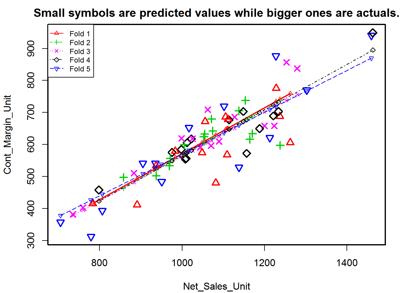
attr(cvResults, 'ms') # => 3961.37 mean squared error[1] 3961.37
3.6 Visualize
For visualizions, we will rely heavily on the ggplot2 package created by Hadley Wickham. The ggplot2 package offers a powerful graphics language for creating elegant and complex plots. Its popularity in the R community has exploded in recent years. Origianlly based on Leland Wilkinson’s The Grammar of Graphics, ggplot2 allows you to create graphs that represent both univariate and multivariate numerical and categorical data in a straightforward manner. Grouping can be represented by color, symbol, size, and transparency. The creation of trellis plots (i.e., conditioning) is relatively simple.
Mastering the ggplot2 language can be challenging (see the Going Further section below for helpful resources). There is a helper function called qplot() (for quick plot) that can hide much of this complexity when creating standard graphs.
qplot() The qplot() function can be used to create the most common graph types. While it does not expose ggplot’s full power, it can create a very wide range of useful plots. The format is:
qplot(x, y, data=, color=, shape=, size=, alpha=, geom=, method=, formula=, facets=, xlim=, ylim= xlab=, ylab=, main=, sub=)where the options are:
Option <- c('')

Description <- c('')

plot_opts <- cbind(Option, Description)

knitr::kable(plot_opts, caption = 'ggplot Options')
ggplot2 cannot be used to create 3D graphs or mosaic plots. Use I(value) to indicate a specific value. For example size=z makes the size of the plotted points or lines proporational to the values of a variable z. In contrast, size=I(3) sets each point or line to three times the default size. Here are some examples using sales data (Net_Sales_Unit, Distribution_Unit, DVC_Unit, PKG_Loss_Unit, etc.) contained in the sdata data frame.
sdata <- read.csv('https://raw.githubusercontent.com/jmonroe252/RforBusiness/master/sales_data.csv')

library(ggplot2)

####Plot Net Sales Per Unit vs. Units Billed
qplot(Units_Billed, Net_Sales_Unit, data=sdata, main="Net Sales Per Unit vs. Units_Billed")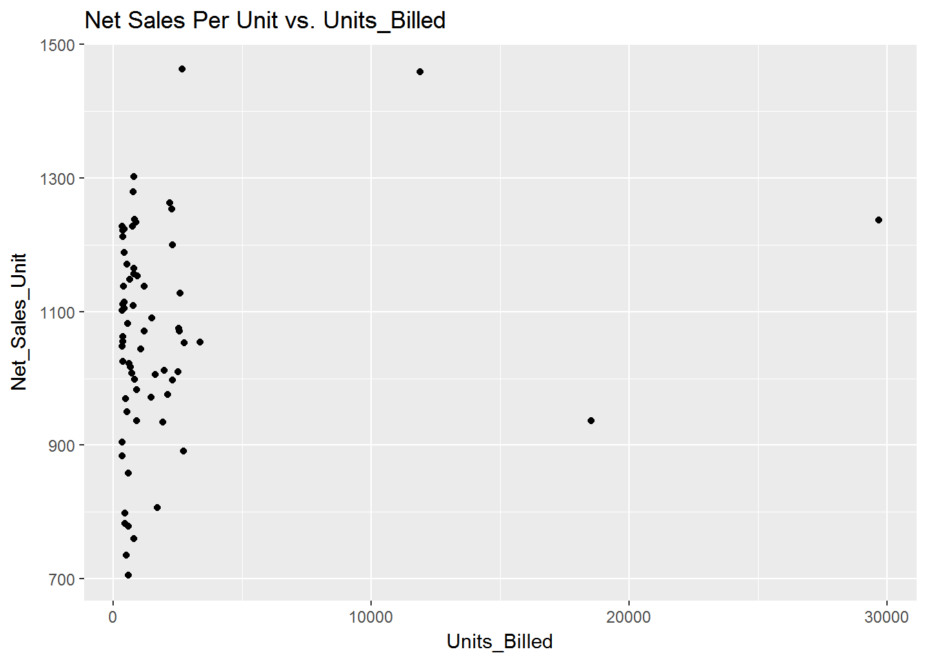
####PSelect Top 10 Customers based on Net_Sales_Unit and Plot Customer vs. Net_Sales_Unit
top_10 <- tail(sdata[order(-sdata$Net_Sales_Unit),],10)
top_10$Net_Sales_Unit <- round(top_10$Net_Sales_Unit,0)

####POrder Net_Sales_Unit for plot
top_10$Customer <- factor(top_10$Customer, levels = top_10$Customer[order(top_10$Net_Sales_Unit)])

qplot(Net_Sales_Unit, Customer, data=top_10, main="Top 10 Customers by Net_Sales_Unit")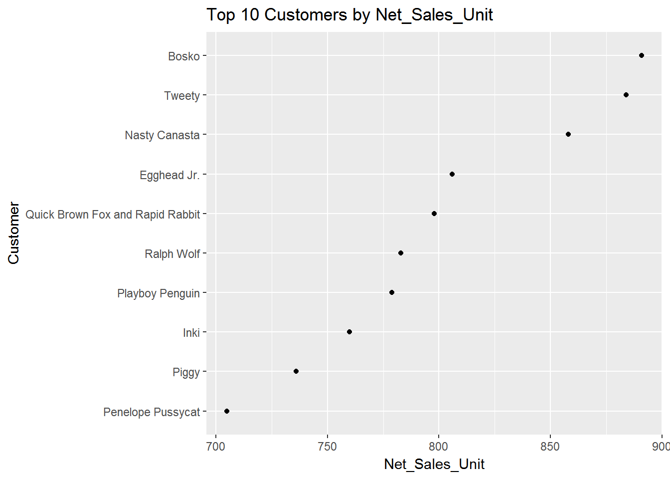
####PGrouped by Variance per Unit, where Variance < 4 and Units < 5000
sdata1 <- sdata[ which(sdata$Variance_Unit < 4
                       & sdata$Units_Billed < 5000), ]

####Pcreate factors with value labels
sdata1$Variance_Unit <- factor(sdata1$Variance_Unit,levels=c(1,2,3,4,5,6,7,8,9,10),
    labels=c("1","2","3", "4","5","6","7","8","9","10"))

qplot(Units_Billed, data=sdata1, geom="density", fill=Variance_Unit, alpha=I(.5), main="Distribution of Variance", xlab="Units Billed",
   ylab="Density")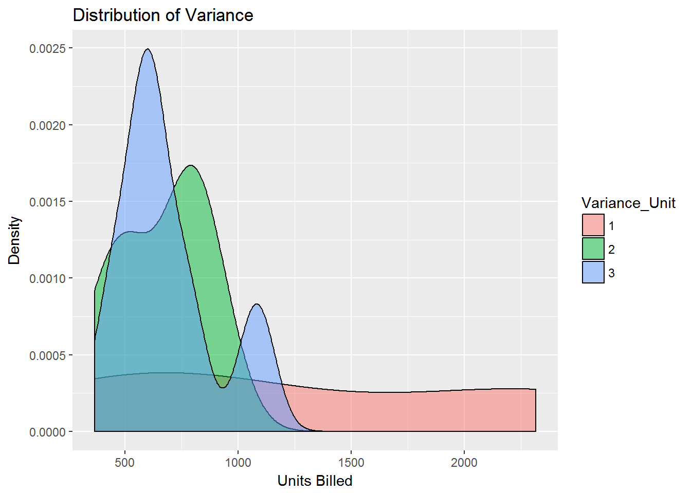
####PSeparate regressions of Units_Billed on Net_Sales_Unit where Variance < 4 and Units < 5000
qplot(Units_Billed, Net_Sales_Unit, data=sdata1, geom=c("point", "smooth"),
   method="lm", formula=y~x, color=Variance_Unit,
   main="Regression of Units and Net Sales Per unit",
   xlab="Units", ylab="Net Sales")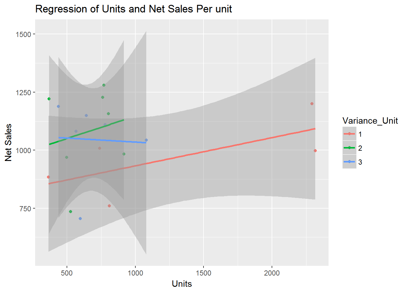
Customizing ggplot2 Graphs
Unlike base R graphs, the ggplot2 graphs are not effected by many of the options set in the par( ) function. They can be modified using the theme() function, and by adding graphic parameters within the qplot() function. For greater control, use ggplot() and other functions provided by the package. Note that ggplot2 functions can be chained with “+” signs to generate the final plot.
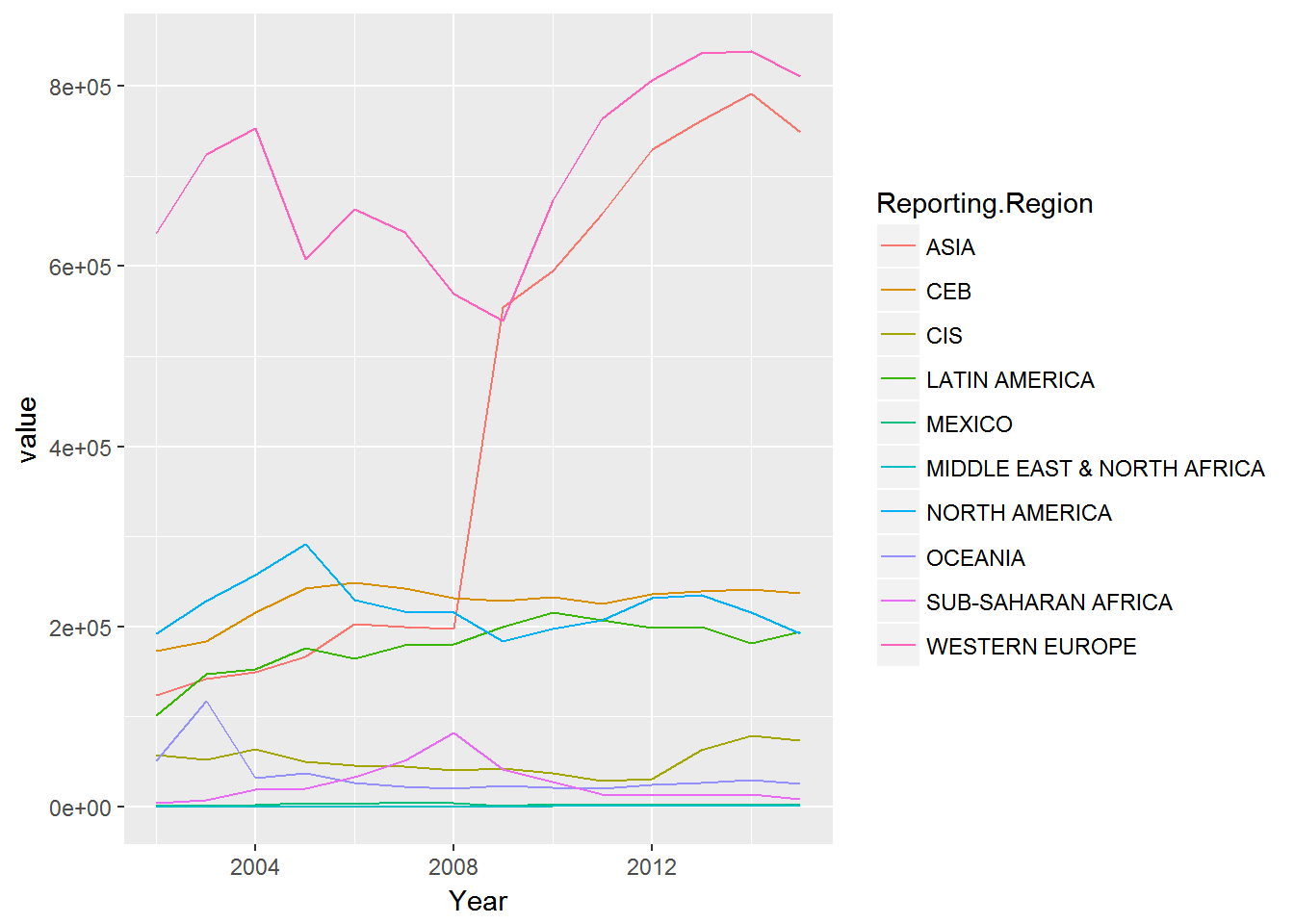
Let’s use the trade data set reviewed previously and plot the values by year for the reporting regions.
p1_data <- aggregate(trade2["value"], by=trade2[c("Reporting.Region","Year")], FUN=sum, na.rm=TRUE)

ggplot(p1_data) + geom_line(aes(x=Year, y=value, colour=Reporting.Region))