Chapter 7 Causal inference & directed acyclic diagrams (DAGs)
7.0.1 R packages required for this chapter
library(knitr)
library(tidyverse)
library(dagitty)
library(ggdag)
library(patchwork)
library(lavaan)
library(broom)
7.1 Introduction
Felix, qui potuit rerum cognoscere causa - Vigil (29BC)
“Fortunate is he, who is able to know the causes of things”
The ubiquitous aphorism “Association (correlation) does not imply causation” is well known and even appears in comic strips. 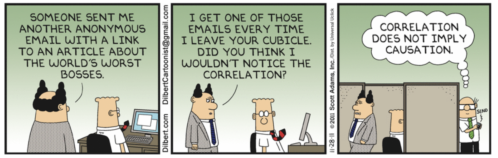
Many in the health field make several extrapolations from this common mantra;
1. Randomized clinical trials always provide causal inferences
2. Observational studies can never provide causal inferences
3. Therefore we should never even think about, or aspire to, causal inference with observational designs
Of course, a modicum of reflection shows these statements to all be false. For example, a RCT with significant lost to follow-up can lead to bias and an inability to draw true causal inferences from the final results. On the other hand, being explicit about the causal objective of an observational study may reduce ambiguity in the scientific question, errors in study design and data analysis, and excesses in data interpretations thereby favoring a pathway towards potential causality.
Moreover as discussed in a Chapter 6, an examination of the top published articles in JAMA Internal Medicine  reveals a predominance of association studies leading one to wonder if, despite the widespread nature of the “association is not causation” mantra, there is not a strong latent tendency for busy clinicians to be subconsciously interpreting these association studies in a causal manner. It is hard to imagine the intense interest in these studies if not for for the lure of the forbidden fruit of causality.
Causality is often best appreciated through either a potential outcomes or counterfactual approach. Before providing a formal definition of causal inference, we need to define some terminology. Let Y, a random variable, represent the outcome of interest and A, another random variable, be the treatment of interest where individual i if exposed is represented as a\(_i\) = 1 and if unexposed as a\(_i\) = 0. The individual causal effect of treatment A on outcome Y is therefore defined as the difference Y\({_i}^{a=1}\) - Y\({_i}^{a=0}\). The variables Y\({_i}^{a=1}\) and Y\({_i}^{a=0}\) are referred to as potential outcomes or as counterfactual outcomes. As not more than one of these two outcomes is potentially observed, causal inference is often seen as a problem of missing data.
While the calculation of individual causal effects is generally impossible, the average causal effect (across all individuals) expressed as E(Y\(^{a=1}\) - Y\(^{a=0}\)) where E( ) is the expectation or average, can be calculated provided the control or unexposed group is identical to the exposed group in every way, except obviously for the exposure, as for example in a randomized clinical trial.
Since expectations are linear,
\[\begin{equation}
E(Y^{a=1} - Y^{a=0}) = E(Y^{a=1}) - E(Y^{a=0})
\tag{7.1}
\end{equation}\]
If then, as is reasonable to assume, the average potential outcome for the exposed is the same as what we actually observe for the exposed group then
\[\begin{equation}
E(Y^{a=1} | A=1) = E(Y | A=1)
\tag{7.2}
\end{equation}\]
Next if the potential outcome of exposure for everyone is equal to the potential outcome of exposure for those exposed
\[\begin{equation}
E(Y^{a=1}) = E(Y^{a=1} | A=1)
\tag{7.3}
\end{equation}\]
and therefore
\[\begin{equation}
E(Y^{a=1}) = E(Y | A=1)
\tag{7.4}
\end{equation}\]
or in other words, the potential outcome with exposure for everyone is the same as the observed outcome for the exposed
In a similar manner, it can be shown that the potential outcome with no exposure for everyone is the same as the observed outcome for the non exposed or
\[\begin{equation}
E(Y^{a=0}) = E(Y | A=0)
\tag{7.5}
\end{equation}\]
Combining the above, it can be shown that the average causal effect, E(Y\(^{a=1}\) - Y\(^{a=0}\)), can be estimated by the observed data E(Y | A=1) - E(Y | A=0)
PROVIDED \[\begin{equation} E(Y^{a=1}) = E(Y | A=1) \tag{7.6} \end{equation}\] and \[\begin{equation} E(Y^{a=0}) = E(Y | A=0) \tag{7.7} \end{equation}\]
in other words, provided there is no confounding, as in a large randomized clinical trial, the observed association, E(Y | A=1) - E(Y | A=0), equals the causal association as expressed by potential outcomes, \(E(Y^{a=1})\) - \(E(Y^{a=0})\).
The question then becomes what, if any, condition must hold for an unbiased and consistent average causal effect (ACE) to be determined from an observational study.
The answer: “Ignorability” which means the the potential outcomes must be jointly independent of treatment assignment.
In observational studies, ignorability seldom holds on its own (i.e., without any adjustments). But it may hold within groups defined by some other variables, C which is known as “conditional ignorability.” If (conditional) ignorability holds, then can get an unbiased and consistent estimate of the ACE.
How to know if (conditional) ignorability holds? Often clinical researchers incorrectly believe statistical inference is the solution.
The object of statistical inference is the reduction of data to a parsimonious mathematical description of the joint distribution of observed variables. Good statistical processes provide a useful description of the data but don’t say anything about the data generating process. Causal inference aims to upset this paradigm as it doesn’t limit itself to the description of data but seeks to understand the processes that are generating the data and thereby answer interesting causal questions. Several canons of causal inference are listed in the Table.
| Statistical significance alone can’t imply causation |
|---|
| Every causal inference task must rely on judgmental, extra-data assumptions (or experiments) |
| Assumption - free causal inference doesn’t exist - it’s not the existence but the quality of the assumptions that are the issue |
| Ways of encoding those assumptions mathematically and test their implications exist |
| A mathematical machinery exists to take those assumptions, combine them with data and derive answers to questions of interest |
7.2 The inadequacy of statistical inference to determine causality.
Consider the following example from Pearl (Pearl, Glymour, and Jewell 2016) where where 350 people were exposed to a drug and 350 were not exposed (controls). A simple question; does the drug work?
| Drug (exposed) | Control (not exposed) | |
|---|---|---|
| Men | 81 of 87 recovered (93%) | 234 of 270 recovered (87%) |
| Women | 192 of 262 recovered (73%) | 55 of 80 recovered (69%) |
| Combined | 273 of 350 recovered (78%) | 289 of 350 recovered (83%) |
Should you consider the results from the overall population or the results of the subgroups by gender? This apparent contradiction between the overall and subgroup results is known as Simpson’s paradox. To study Simpson’s paradox in more detail try the interactive “Simpson Machine” simulator. Can you resolve it?
While the combined results suggest the drug does not work, this makes no sense if the drug works both for men and women. Is this a general rule that subgroup results take precedence over the combined results?
Consider next a different experiment that gives the results below where the drug is known to work by lowering BP but it also has some toxic side effects. Do you still recommend the drug?
| Control (not exposed) | Drug (exposed) | |
|---|---|---|
| Low BP | 81 of 87 recovered (93%) | 234 of 270 recovered (87%) |
| High BP | 192 of 262 recovered (73%) | 55 of 80 recovered (69%) |
| Combined | 273 of 350 recovered (78%) | 289 of 350 recovered (83%) |
In this case, we still believe the drug should be recommended based on the combined data. But why use the combined data here, rather than the subgroup data as above? Before answering this questions, notice the 2X2 tables are identical so it is apparent that statistical considerations alone express no causal information. Causal interpretations can only be made by the sensible inclusion of external judgment or evidence.
If statistical associations are not the solution, perhaps directed acyclic graphs (DAGs) may help.
7.3 Directed acyclic graphs (DAGs)
Directed acyclic graphs (DAGs) are a graphical means of representing our external judgment or evidence and may resolve the apparent paradox in the above example. DAGs (AKA causal diagrams) (can characterize the causal structures compatible with the observations & assist in drawing logical conclusions about the statistical relations. They can thereby help to understand confounding, selection bias, covariate selection, over adjustment, and avoid making analytical errors when evaluating these situations.
DAGs are visual representations of the joint distribution of a set of variables. In a DAG all the variables are depicted as nodes and connected by arrows or directed paths, sequences of arrows in which every arrow points to some direction. DAGs are acyclic because no directed path can form a closed loop. In other words, the future can’t predict the past. Missing lines between nodes of the causal model are very important and indicate the strongest possible assumption, variable independence. DAGs should include all common causes of any 2 variables in the DAG. DAGs should also include all variables that play a role in data generation whether they are observed or unobserved. DAGS contain both causal and non-causal pathways. A causal pathway has an arrow pointing away from the treatment (exposure) going towads the outcome. Non causal pathways connect expsoure and outcome via a pathway with at least one arrow directed against the flow of time.
DAGs help appreciate the different ways statistical association may exist between two variables X and Y:
1. Random fluctuation
2. X caused Y
3. Y caused X
4. X and Y share a common cause
5. The statistical association was induced by conditioning on a common effect of X and Y (one formal definition of selection bias)
While the first 4 associations are obvious, the 5th may be unknown to some readers. When there are multiple independent causes for an effect (i.e. a common effect), conditioning on this common effect, in other words choosing only a subset of this common effect, leads to a spurious association between those causes. The following Figure can help explain this phenomenon.
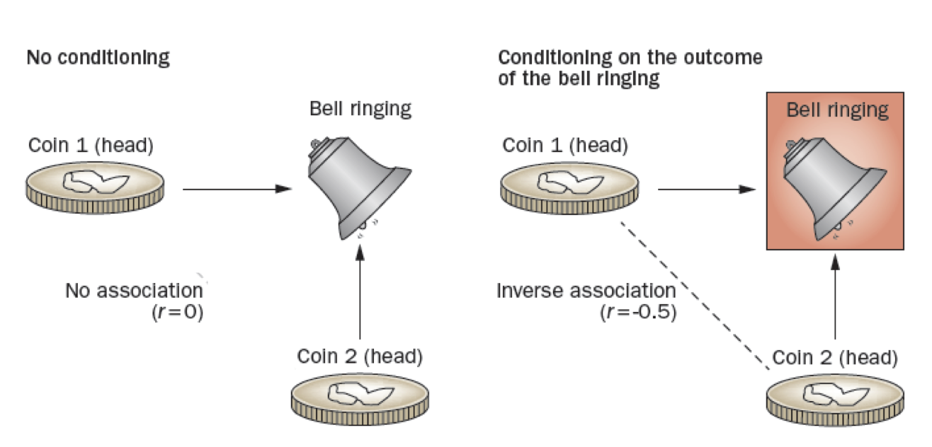
Figure 2.1: Collider stratification bias
Consider a simple example such as the Figure on the left where 2 coins are independently tossed (no conditioning), if either or both are heads then the bell will ring. Thus, the bell ringing is a common effect of heads appearing on the toss of either coin with the coin tosses being independent a correlation coefficient between them of 0. In the DAG, this is shown as colliding causal arrows into a given common effect variable (hence the name ‘collider’). However, if we condition on the bell ringing, Figure on the right, the appearances of heads on the two coins is no longer independent, but rather there is a -0.5 correlation between the coins. This occurs because if the first coin is tails, then we know that the second coin B must be heads, given that the bell rang. In the DAG world, conditioning is indicated by a box around the variable name, and the spurious association by a dotted line between variables. This conditioning on a common cause is responsible for index event bias, also known as collider stratification bias, that occurs in many published studies.
Let us consider a slightly more realistic example. Suppose both higher income (greater accessibiity) and blood pressure (greater medical need) lead to more doctor visits. Suppose further that there is no relationship between income and blood pressure. What happens if we analyze a subpopulation of those who visit the doctor?
First, represent the scenario with a DAG.
dag <- dagitty("dag {
  X -> Y
  C ->  Y
               }")

coordinates( dag ) <-  list(
  x=c(X=1, C=3, Y=5),
  y=c(X=1, C=3, Y=1) )

dag <- tidy_dagitty(dag)
ggdag(dag, layout = "circle") + theme_dag_blank(plot.caption = element_text(hjust = 1)) + geom_dag_node(color="pink") + geom_dag_text(color="white") +
  ggtitle("Income and BP -> medical visits but are not unconditionally associated") +
  labs(caption = "X = BP\nY = medical visit\nC = income ")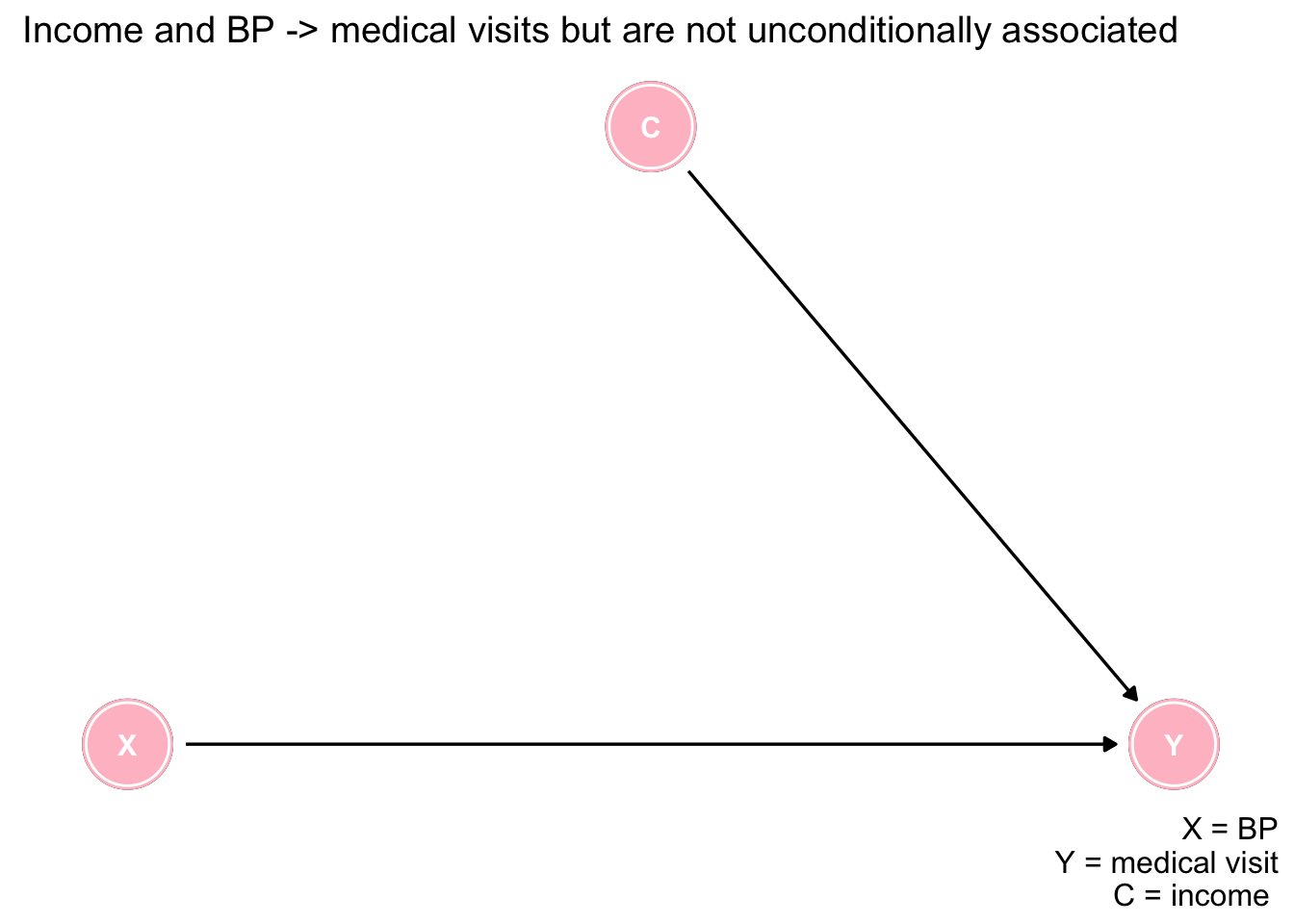
Next let’s simulate and plot some data. Notice income and BP are selected as random variables with no association between them as shown in the plot.
n = 5000
set.seed(123)

income <- rnorm(n)
bp <- rnorm(n)

ggplot(data.frame(income,bp), aes(income, bp)) +
  geom_point() +
  geom_smooth(method='lm', formula= y~x) +
  labs(title = "No association of bp and income in population", subtitle = "Blue line is linear regression line") +
  theme_bw()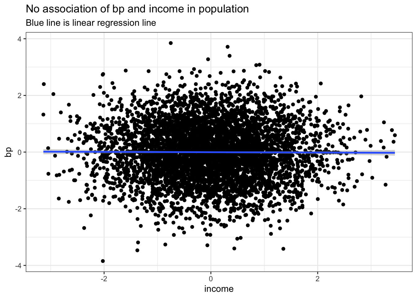
logitSelect <- -2 + 2*income + 2*bp
pSelect <- 1/(1+exp(-logitSelect)) # easier to use inverse function expit locfit::expit(logitSelect)
select <- rbinom(n, 1, pSelect)

dPop <- data.table::data.table(income, bp, select)
Now let us consider the DAG where both BP and income lead to increase visits and we wish to examine their association among the subgroup who had a doctors appointment. We now see an inverse association between BP and income due to the conditioning on the common effect of a medical visit. This again is not surprising as if the patient did not have high blood pressure then they likely had high income to explain the medical visit and the reverse of low income individuals likely having higher chance of elevated blood pressure.
logitSelect <- -2 + 2*income + 2*bp
pSelect <- 1/(1+exp(-logitSelect)) # easier to use inverse function expit locfit::expit(logitSelect)
select <- rbinom(n, 1, pSelect)

dPop <- data.table::data.table(income, bp, select)
dSample <- dPop[select == 1]

ggplot(dPop, aes(income, bp, color=as.factor(select))) +
    geom_point() +
    geom_smooth(data=subset(dPop,select==1), method = "lm", se = FALSE) +
    labs(title = "Selection bias", subtitle = "association of bp and income in selected subset") +
    theme_bw()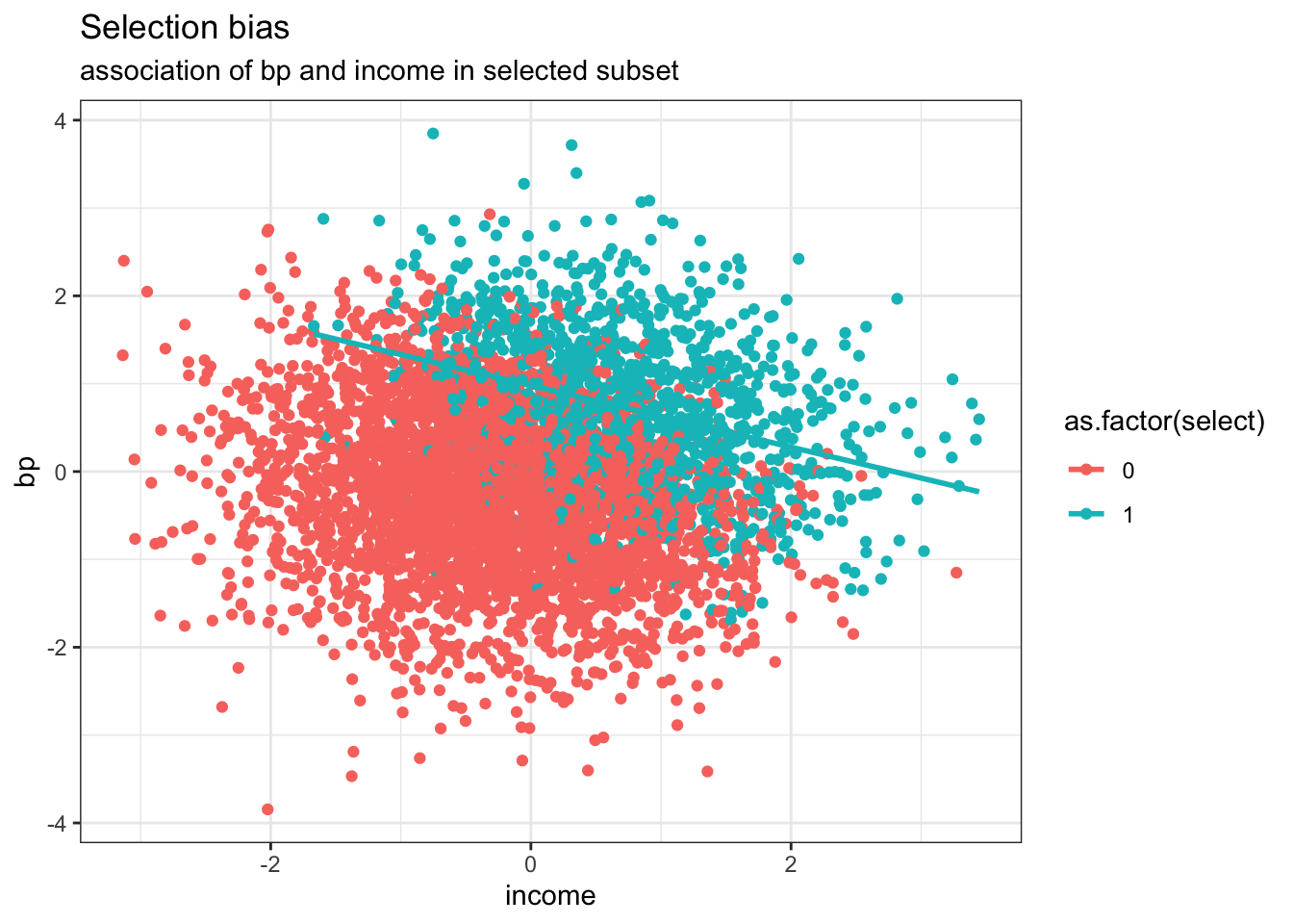
Published studies often report paradoxical findings for incident risk factors in populations of patients with established disease. These associations generally represent examples of this collider bias, where conditioning has taken place on surviving the initial diagnosis. Typical examples, are the ludicrous reported protective effects of obesity or smoking in survivors of a heart attacks, the so-called obesity or smoking paradoxes.
Remember if you see the word paradox in this setting, always first think collider stratification bias.
Returning now to our drug example, let us plot the causal diagram (DAG) for each of the 2 studies.
# example 1
dag <- dagitty("dag {
  X -> Y
  C -> X
  C ->  Y
               }")

coordinates( dag ) <-  list(
  x=c(X=1, C=3, Y=5),
  y=c(X=1, C=3, Y=1) )

dag <- tidy_dagitty(dag)
ex1 <- ggdag(dag, layout = "circle") + theme_dag_blank(plot.caption = element_text(hjust = 1)) + geom_dag_node(color="pink") + geom_dag_text(color="white") +
  ggtitle("a) Gender (C) as a confounder") +
  labs(caption = "X = drug exposure\nY = outcome\nC = gender (confounder)")

# example 2
dag <- dagitty("dag {
  X -> Y
  X -> C
  C ->  Y
               }")

coordinates( dag ) <-  list(
  x=c(X=1, C=3, Y=5),
  y=c(X=-.5, C=1, Y=-.5) )

ex2 <- ggdag(dag, layout = "circle") + theme_dag_blank(plot.caption = element_text(hjust = 1)) + geom_dag_node(color="pink") + geom_dag_text(color="white") +
  ggtitle("b) BP (C) in the causal pathway") +
  labs(caption = "X = drug exposure\nY = outcome\nC = BP response (mediator)")

ex1 + ex2 +
  plot_annotation(title = 'Causal diagrams - understanding the difference between \na confounder and a mediator')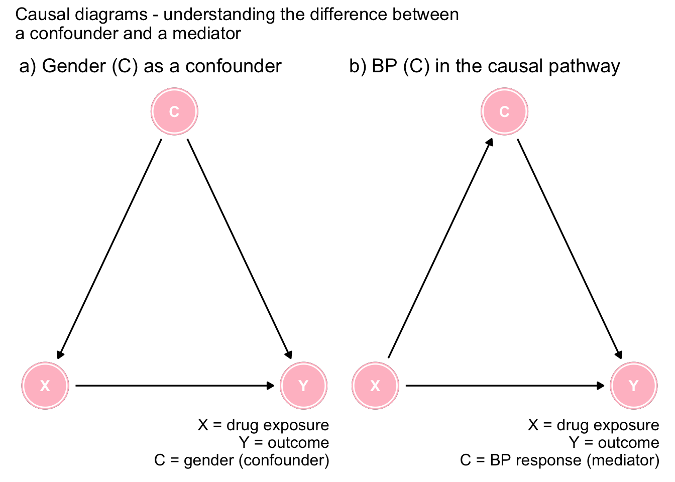
Figure 7.1: The importance of DAGs
Figure 7.1a shows gender as a confounder since it is a common cause of both the exposure and the outcome. This opens a backdoor, or spurious pathway between the exposure and the outcome that must be controlled to obtain an unbiased effect estimate. Clearly the arrows must go in the direction indicated as neither drug exposure or outcome can cause gender. In this scenario, the marginal effect is biased and it is necessary to consider the adjusted effect sizes.
On the other hand, Figure 7.1b shows that low BP is on the causal pathway between the drug exposure and the outcome (there may also be another direct causal pathway as shown in the Figure). In this case, controlling for BP is not indicated as the variable is on the causal pathway and the unbiased effect comes from the marginal and not the conditional associations. This underlines that the proper causal interpretation can not be arrived at by an isolated examination of statistical associations.
To further explore and test our understanding of DAGs, next consider the following simple DAG. Can you list all the causal and statisitical assumptions implied by this simple DAG? The identified assumptions implied by the model can then be verified with the avaialble data and the model updated as required.
dag <- dagitty("dag {
  X -> Y
  U ->  Y
  Y -> Z
               }")

coordinates( dag ) <-  list(
  x=c(X=1, U=1, Y=5, Z=7),
  y=c(X=1.5, U=0.5, Y=1,Z=1) )

dag <- tidy_dagitty(dag)
ggdag(dag, layout = "circle") + theme_dag_blank(plot.caption = element_text(hjust = 1)) + geom_dag_node(color="pink") + geom_dag_text(color="white") +
  ggtitle("Simple DAG") +
  labs(caption = "")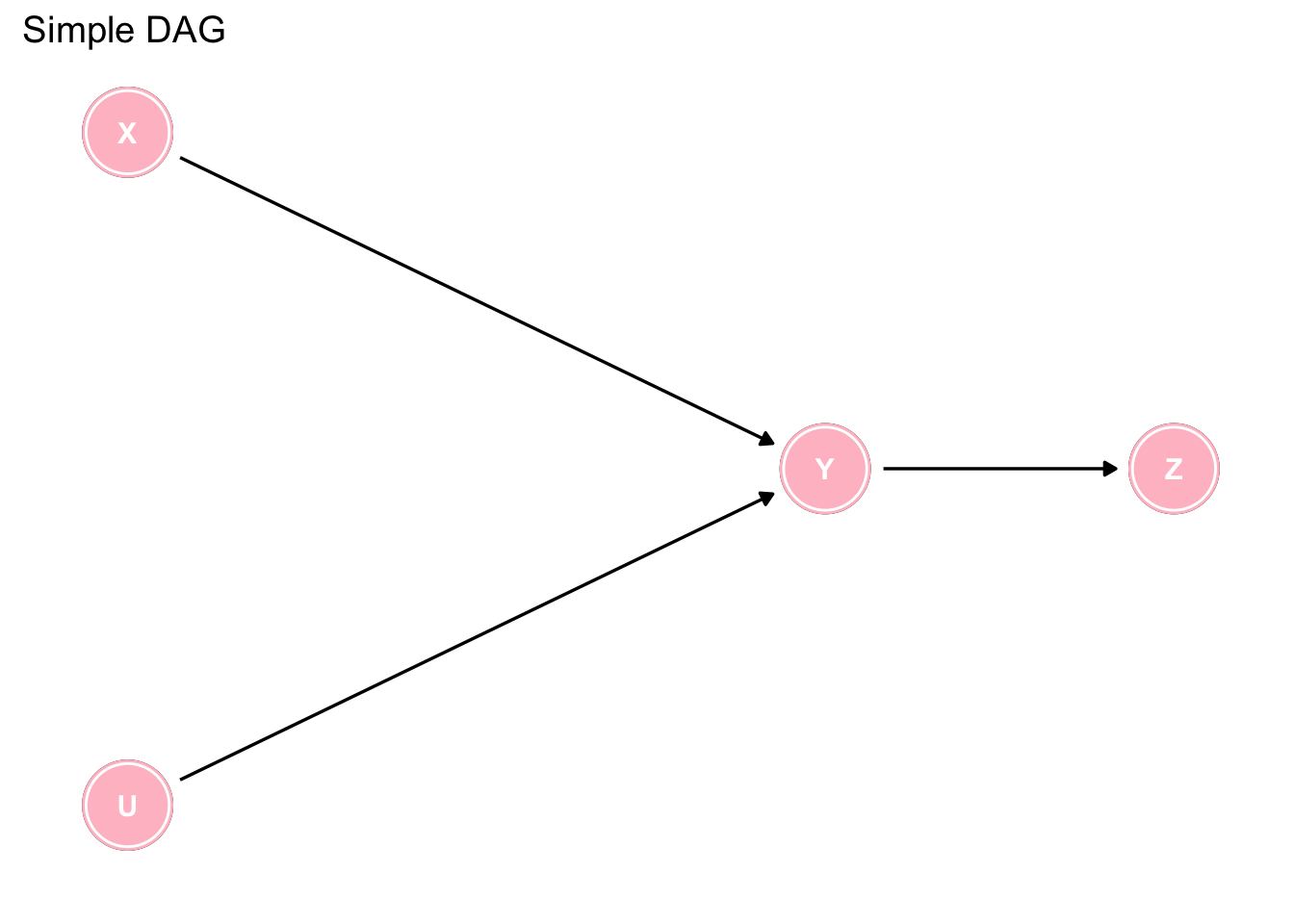
Figure 7.2: Interpreting a simple DAG
Are you sure you have identified them all? There are more than 15 which can be found by clicking on the code tab.
# Causal implications
1. X & U are direct causes of Y
2. Y is a direct cause of Z
3. X is an indirect cause of Z via Y
4. X is not a cause of U and U is not a cause of X
5. U is an indirect cause of Z via Y
6. No variable causes both X and Y OR U and Y

# Statistical implications
1. X and Y are statistically dependent
2. U and Y are statistically dependent
3. Y and Z are statistically dependent
4. X and Z are statistically dependent
5. U and Z are statistically dependent
6. X and U are statistically independent
7. X and U are statistically dependent, conditional on Y
8. X and U are statistically dependent, conditional on Z
9. X and Z are statistically independent, conditional on Y
10. U and Z are statistically independent, conditional on Y
While this is a somewhat trivial example, where some simple intuition enables the reader to determine which analysis to accept, the situation can rapidly become complex, as in the following example, where the use of DAGs is almost mandatory to arrive at the appropriate analyses.
dag <- dagify(Y1 ~ X + Z1 + Z0 + U + P,
              Y0 ~ Z0 + U,
              X ~ Y0 + Z1 + Z0 + P,
              Z1 ~ Z0,
              P ~ Y0 + Z1 + Z0,
              exposure = "X",
              outcome = "Y1")


dag %>%
  tidy_dagitty(layout = "auto", seed = 12345) %>%
  arrange(name) %>%
  ggplot(aes(x = x, y = y, xend = xend, yend = yend)) +
  geom_dag_point() +
  geom_dag_edges() +
  geom_dag_text(parse = TRUE, label = c("P", "U", "X", expression(Y[0]), expression(Y[1]), expression(Z[0]), expression(Z[1]))) +
  theme_dag() +
geom_dag_node(color="pink") + geom_dag_text(color="white") 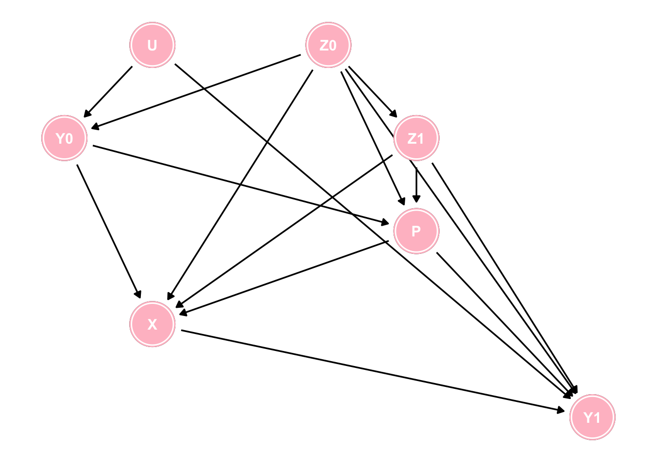
Figure 7.3: A more complex DAG
Questions arising from this DAG.
1. How many paths are there from X to Y1?
2. How many of those paths are spurious (backdoor) paths?
3. How many of those backdoor paths are open?
4. What is the minimal set of variables to block these spurious pathways?
While these questions can be theoretically answered by careful attention to the DAG the daggity package can automatically provide these answers using paths, and adjustmentSets functions.
g <- paths(dag, "X", "Y1")
paste0("There are ", length(g$paths), " pathways from X to Y1 and all are backdoor except for 1")
## [1] "There are 43 pathways from X to Y1 and all are backdoor except for 1"paste0("Of these backdoor pathways ", sum(g$open=="TRUE"), " are open") ## [1] "Of these backdoor pathways 25 are open"paste0("The minimum adjustment sets are ")## [1] "The minimum adjustment sets are "adjustmentSets(dag, "X", "Y1", type = "minimal")## { P, U, Z0, Z1 }
## { P, Y0, Z0, Z1 }7.4 Inadequacy of simply putting everything into a multivaraible model
There is a tendency amongmany clinical researchers to assume that no harm comes from including all variables in a multivariable model and letting the model decide which ones to retain. Imagine a study where X = exposure, Y = outcome, C = covariates, U1, U2 = unmeasured covariates andsuppose you are entertaining 3 potential causal models as shown below. Since you have measurements on X, Y and C, what happens if you include C in your statistical model?
## ex1
dag <- dagitty("dag {
  X -> Y
  Y -> C
  U1 -> X
  U1 -> C
               }")

coordinates( dag ) <-  list(
  x=c(X=1, U1=1, Y=3, C=5),
  y=c(X=1, U1= 1.5, Y=1, C=1) )

dag <- tidy_dagitty(dag)
ex1 <- ggdag(dag, layout = "circle") + theme_dag_blank(plot.caption = element_text(hjust = 1)) + geom_dag_node(color="pink") + geom_dag_text(color="white") +
  ggtitle("Ex 1") +
  labs(caption = "")

## ex2
dag <- dagitty("dag {
  X -> Y
  X -> C
  U2 -> Y
  U2 -> C
               }")

coordinates( dag ) <-  list(
  x=c(X=1, U2=1, Y=3, C=5),
  y=c(X=1, U2= -1.5, Y=1, C=1) )

dag <- tidy_dagitty(dag)
ex2 <- ggdag(dag, layout = "circle") + theme_dag_blank(plot.caption = element_text(hjust = 1)) + geom_dag_node(color="pink") + geom_dag_text(color="white") +
  ggtitle("Ex 2") +
  labs(caption = "")


## ex3
dag <- dagitty("dag {
  X -> Y
  X -> C
  U2 -> Y
  U2 -> C
  U1 -> C
  U1 -> X
               }")

coordinates( dag ) <-  list(
  x=c(X=1, U1=1, U2=1, Y=3, C=5),
  y=c(X=1, U1=2, U2= -0, Y=1, C=1) )

dag <- tidy_dagitty(dag)
ex3 <- ggdag(dag, layout = "circle") + theme_dag_blank(plot.caption = element_text(hjust = 1)) + geom_dag_node(color="pink") + geom_dag_text(color="white") +
  ggtitle("Ex 3") +
  labs(caption = "")

ex1 + ex2 + ex3 +
  plot_annotation(title = 'Causal diagrams without confounding (unconditionally)')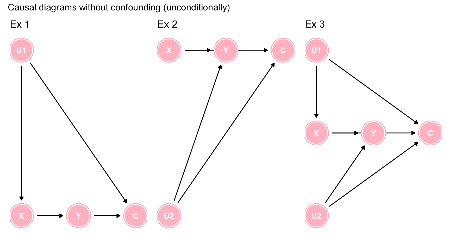
Figure 7.4: Causal diagrams without confounding (unconditionally)
In each of the 3 scenarios, C is not a confounder, since it is not a common cause of X and Y. However by including C in the model, you are creating a spurious conditional association between X and Y via collider stratification. Hence the inclusion of a non-confounder but common effect, will create a bias.
Let’s simulate some data to correspond to the data generating model of Figure ??c and investigate our ability to evaluate the causal effect of X on Y which we will set to 0.8.
First we evaluate the simulated data using a structural equation model (SEM) approach, which reflects the underlying causal beliefs which consist in “weak assumptions” (the effects) and “strong assumptions” (belief about non-effects). We will contrast this result with that obtained by standard regression model which ignores the underlying causal model.
lavaan_model <- "X ~ 1*U1
                 Y ~ .8*X + 1*U2
                 C ~ 1*U1 + .5*U2"

set.seed(12345)
g_tbl <- simulateData(lavaan_model, sample.nobs=1000)

# fit with traditional SEM
lavaan_fit <- sem(lavaan_model, data = g_tbl)
parameterEstimates(lavaan_fit)
## lhs op rhs est se z pvalue ci.lower ci.upper
## 1 X ~ U1 1.000 0.000 NA NA 1.000 1.000
## 2 Y ~ X 0.800 0.000 NA NA 0.800 0.800
## 3 Y ~ U2 1.000 0.000 NA NA 1.000 1.000
## 4 C ~ U1 1.000 0.000 NA NA 1.000 1.000
## 5 C ~ U2 0.500 0.000 NA NA 0.500 0.500
## 6 X ~~ X 1.021 0.046 22.361 0.00 0.932 1.111
## 7 Y ~~ Y 0.929 0.042 22.361 0.00 0.848 1.010
## 8 C ~~ C 0.935 0.042 22.361 0.00 0.853 1.017
## 9 Y ~~ C 0.007 0.029 0.227 0.82 -0.051 0.064
## 10 U1 ~~ U1 1.069 0.000 NA NA 1.069 1.069
## 11 U1 ~~ U2 -0.033 0.000 NA NA -0.033 -0.033
## 12 U2 ~~ U2 0.929 0.000 NA NA 0.929 0.929The traditional SEM produces the expected causal effect of X1, 0.8. The unadjusted X1 effect from a traditional regression model gives essentially the same unbiased result, 0.79, as there is no confounding in this model.
lm(Y ~ X, data = g_tbl) %>%
  tidy()
## # A tibble: 2 x 5
## term estimate std.error statistic p.value
## <chr> <dbl> <dbl> <dbl> <dbl>
## 1 (Intercept) -0.0549 0.0442 -1.24 2.15e- 1
## 2 X 0.787 0.0311 25.3 1.88e-109However, what happens if follow a common approach of putting all variables into the model and therefore we include C in our model.
lm(Y ~ X + C, data = g_tbl) %>%
  tidy()
## # A tibble: 3 x 5
## term estimate std.error statistic p.value
## <chr> <dbl> <dbl> <dbl> <dbl>
## 1 (Intercept) -0.0594 0.0426 -1.39 1.64e- 1
## 2 X 0.633 0.0348 18.2 4.08e-64
## 3 C 0.294 0.0334 8.81 5.68e-18The variable C is highly statistically significant and most standard analyses would therefore retain this more complex model. But look what has happened to our estimate of X, it has become biased with an alomost 25% difference from the true causl effect. This has arisen since we have conditioned on C which is not a confounder but rather a collider and therefore have opended the backdoor spurious pathway X <- U1 -> U2 -> Y.
This is another example where attempting to “control for everything” and a passive reliance on statistical regression algorithms will lead you astray.
To sum up;
1. Confounding is not based on the statistical associations found in our data but rather on qualitative background knowledge about the causal structure encoded in DAG
2. No generally applicable statistical approaches will substitute for using a priori causal knowledge to characterize such structure.
3. DAG approach contrasts with the causally blind strategies which use only statistical associations to decide whether C should be adjusted for
4. The distinction between confounders and colliders is shown in the following Table
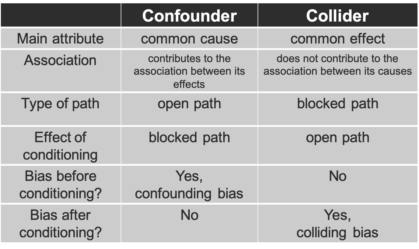
Figure 3.7: Confounder versus Collider