1.6 Presenting data with tables and charts
Data are usually ungrouped as they are given for each observation
Grouped data are presented by frequency table, which can be one-dimensional or two-dimensional, depending on the number of characteristics (variables) used for counting the observations
If data are quantitative (discrete or continuous) values of the variable \(X\) are noted as \(x_i\) and frequencies are noted as \(f_i\) (the subscript \(i\) denotes the \(i^{th}\) row of the table)
Considering Example 1.1 the frequency table is given:
| \(x_i\) | \(f_i\) |
|---|---|
| 1 | 1 |
| 2 | 1 |
| 3 | 2 |
| 4 | 1 |
| Total | 5 |
In Table 1.3 \(x_i\) represents the number of books, and \(f_i\) represents the number of students, e.g. the frequency in a third row \(f_3=2\) indicates that 2 students carry 3 books
The total number of students corresponds to the sample size \(\displaystyle n= \sum_{i=1}^4 f_i=5\)
If data are continuous it is likely that all values are different and makes sense to group these values within a few intervals
Example 1.11 Sample data of \(50\) companies in Excel file are available at this link. Group the companies with respect to the annual revenue into \(5\) intervals of the same size by \(40\) thousands EUR, starting with \(0\) and ending with \(200\). Insert frequencies in the second column of the table 1.4
| Annual revenue | Number of companies |
|---|---|
| 0-40 | |
| 40-80 | |
| 80-120 | |
| 120-160 | |
| 160-200 | |
| Total | 50 |
Excel instructions: select the column of interest including the variable name (cells range E1:E51) or entire data set. On the Insert tab click PivotTable. In the next step just click OK (default location for a new pivot table is New Worksheet). Drag the Annual revenue to both Rows and Values area of the PivotTable Fields pane. In the Values area change the Field Settings to Count and click OK. Finally, right-click any single cell inside the Annual revenue and select Group from drop down options. In the grouping box edit the values Starting at: 0, Ending at: 200 and By: 40.
- Quantitative data from frequency table are often presented by histogram

FIGURE 1.1: Histogram of the companies with respect to the annual revenue
Visual representation of a data, helps us to see patterns and other details. Deciding which type of graph to use depends on the type of data.
The most useful types of graphs in business statistics are:
- Histogram is commonly used to visualize the distribution of data among different intervals as a series of vertical bars
- Line graph is commonly used to visualize how variable changes over time (time-series data)
- Scatter diagram is commonly used to visualize the relationship between two quantitative variables as a series of points
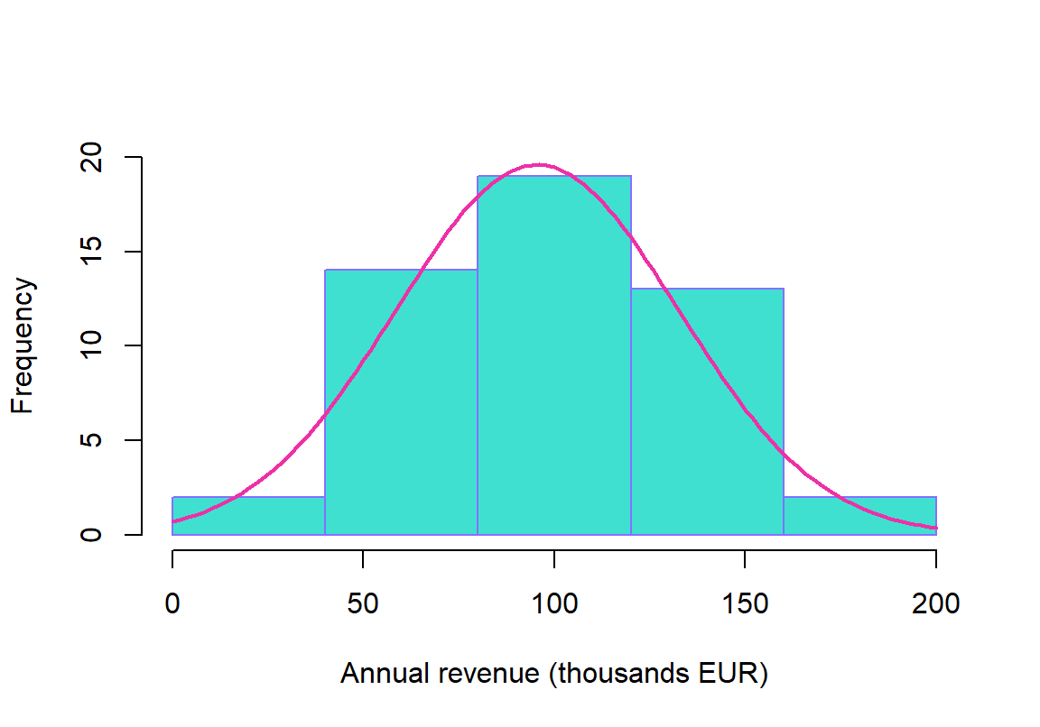
FIGURE 1.2: Histogram with normal curve
Histogram, in particular, may indicate the presence of extreme values above the mean (distribution has a long right tail) which means that data are positively skewed
Histogram may also indicate the presence of extreme values bellow the mean (distribution has a long left tail) which means that data are negatively skewed
Histogram 1.2 indicates that companies with respect to the annual revenue are symetrically distributed and for the same reason a distribution can be well approximated with a nice bell-shaped curve such as normal distribution
Normal distribution is the most important distribution in business statistics as it has a very nice features