Chapter 2 Descriptive Statistics
Descriptive statistics is used to present the characteristics of a data set or a sample in a clear and structured way → It describes the data.
For that purpose, we use:
frequency tables
graphs (diagrams)
measures of central tendency
measures of dispersion
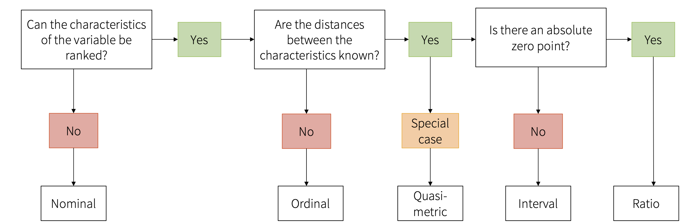
2.1 Levels of measurement (scales)
The scale level determines which operations are possible and which statistical test should be selected. 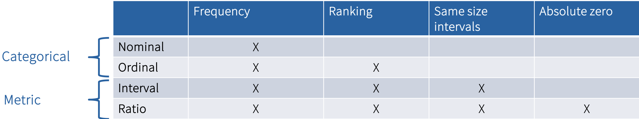
2.1.1 Nominal scale
Nominal scale means that the characteristics (=values) of a variable can be categorized but there is no clear order between the categories. We can do frequency comparison but there’s no hierarchy.
Examples:
gender
occupation
study field
marital status
2.1.2 Ordinal scale
Ordinal scale is similar to nominal, but the measured values can be brought into a logical order. While the ranking is possible, the distances between values are not equal.
Examples:
newspaper consumption
frequency of social media use
→ e.g., often, sometimes, rarely, never
2.1.3 Quasi-metric ordinal scale
Quasi-metric ordinal scale is a special type of a case, where we know (assume) equal distances between values and that helps us to calculate specific statistics. Typical example is a Likert scale (“On a scale from 1 to 7 indicate how much you agree with the following statements”).
2.1.4 Interval
With intervals, the differences between two values are equal and meaningful. We can not only make statements about the ranking of the objects, but also about the size of their distances, i.e., the difference between the two values (the interval).
Examples:
standardized IQ points
birth year
2.1.5 Ratio
In contrast to the interval scale, a ratio scale has an absolute zero point. Absolute zero point means total lack of quantity. For example, length is a ratio because 0 cm means absence of length. There can also be no negative measures (you cannot have length of -X cm).
Examples:
length
weight
age
2.2 Frequency tables
Table used to describe the dataset. Example of frequency table for a variable education. 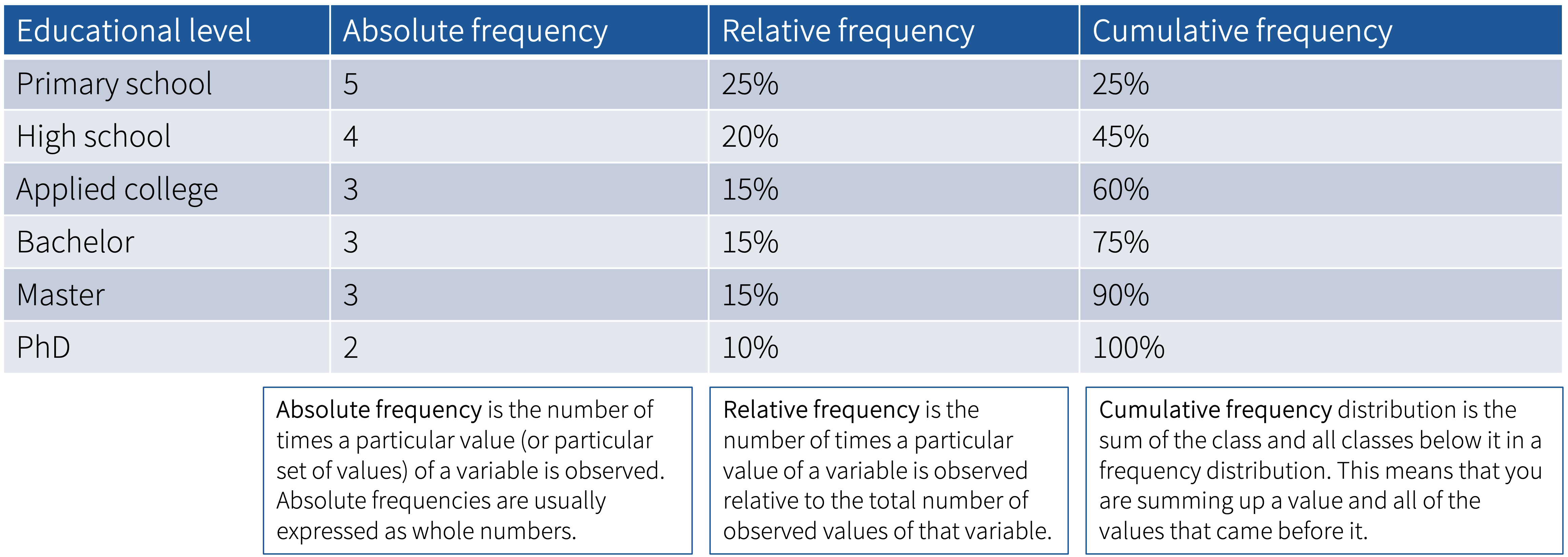
Absolute frequency = how many times a value is observed
Relative frequency = how many times a value is observed relative to the total number of observed values (i.e., percentages of total)
Cumulative frequency = sum of the class and all the classes below it
There are many ways to create frequency tables in R. The following examples use the dataset Mobile_phone_use.sav, which you can find on Moodle. To be able to work with this data set, we first need to load it to R. It is a .sav file, which can be loaded using the haven package:
2.2.1 Option 1: using tab1() function from the epiDisplay package
install.packages("epiDisplay")
library(epiDisplay)
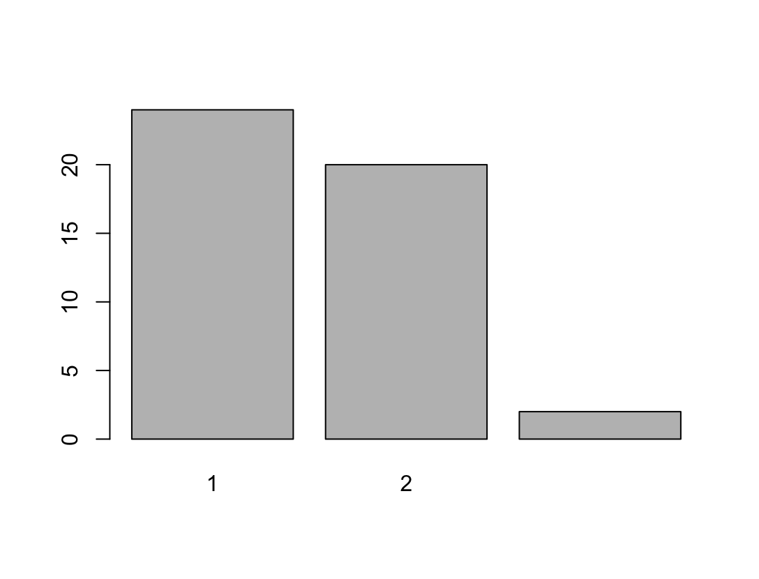
tab1(Mobile_phone_use$gender, graph = FALSE)
#If you remove the graph = FALSE argument, the function will also generate a bar chart This function will give us the absolute frequency as well as the relative frequency (%) for the variable including (NA+) as well as excluding (NA-) the N/A values (not available), i.e., missing values:
2.2.2 Option 2: using group by() and summarise() functions from the dplyr package
install.packages("dplyr")
library (dplyr)

gender_freq_perc <- Mobile_phone_use %>%
  group_by(gender) %>%
  summarise(Frequency = n(), .groups = "drop") %>%
  mutate(Percent = Frequency / sum(Frequency) * 100)
gender_freq_perc
# A tibble: 3 × 3
gender Frequency Percent
<dbl+lbl> <int> <dbl>
1 1 [female] 24 52.2
2 2 [male] 20 43.5
3 NA 2 4.35There are therefore slightly more women in our sample (note the coding in the questionnaire!!!) than men. Two people did not specify their gender.
2.3 Graphs and charts
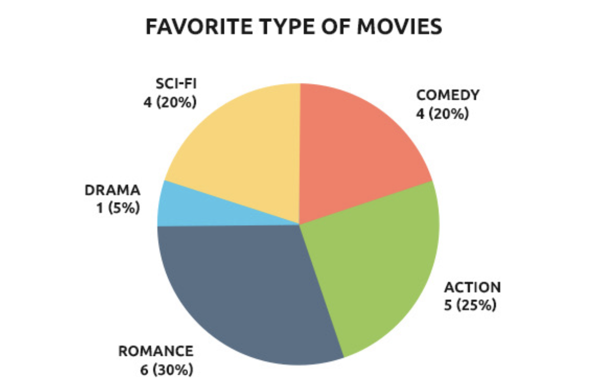
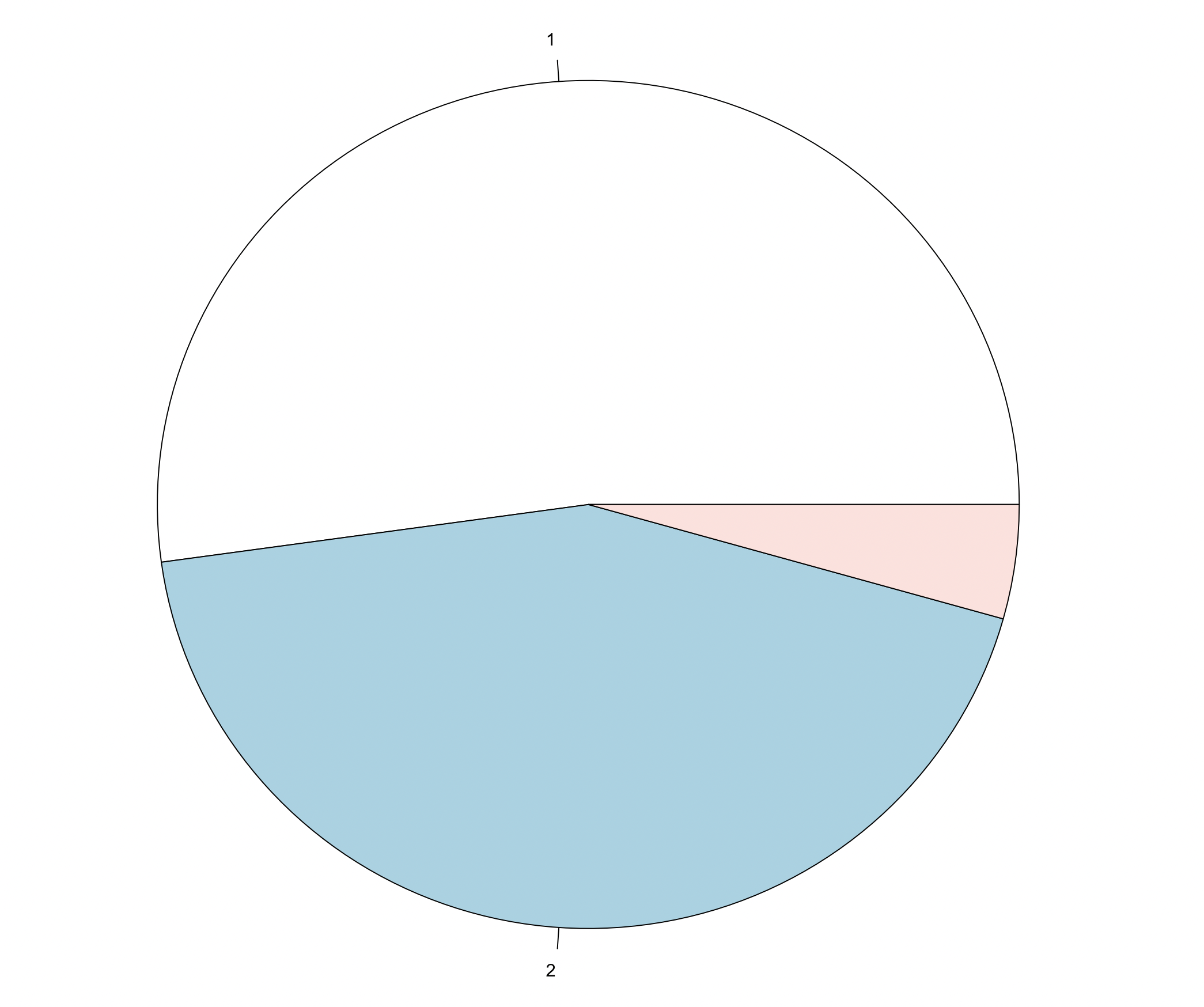
2.3.1 Pie Chart
Pie charts can be used for nominal and ordinal data. However, generally, it is not recommended to use the pie chart for displaying data.
Again, there are many ways to generate a pie chart in R.
2.3.1.1 Option 1: Using the pie() function
We will use the table() function within the pie() function. These functions are part of base R and thus no packages are needed. By specifying useNA = "ifany", we tell R to also diplay NAs, if there are any:
2.3.1.2 Option 2: Using the ggplot() function from the ggplot2 package
install.packages("ggplot2")
library(ggplot2)

ggplot(gender_freq_perc, aes(x="", y=Frequency, fill=as.factor(gender))) +
  geom_bar(width = 1, stat = "identity") +
  coord_polar("y", start=0)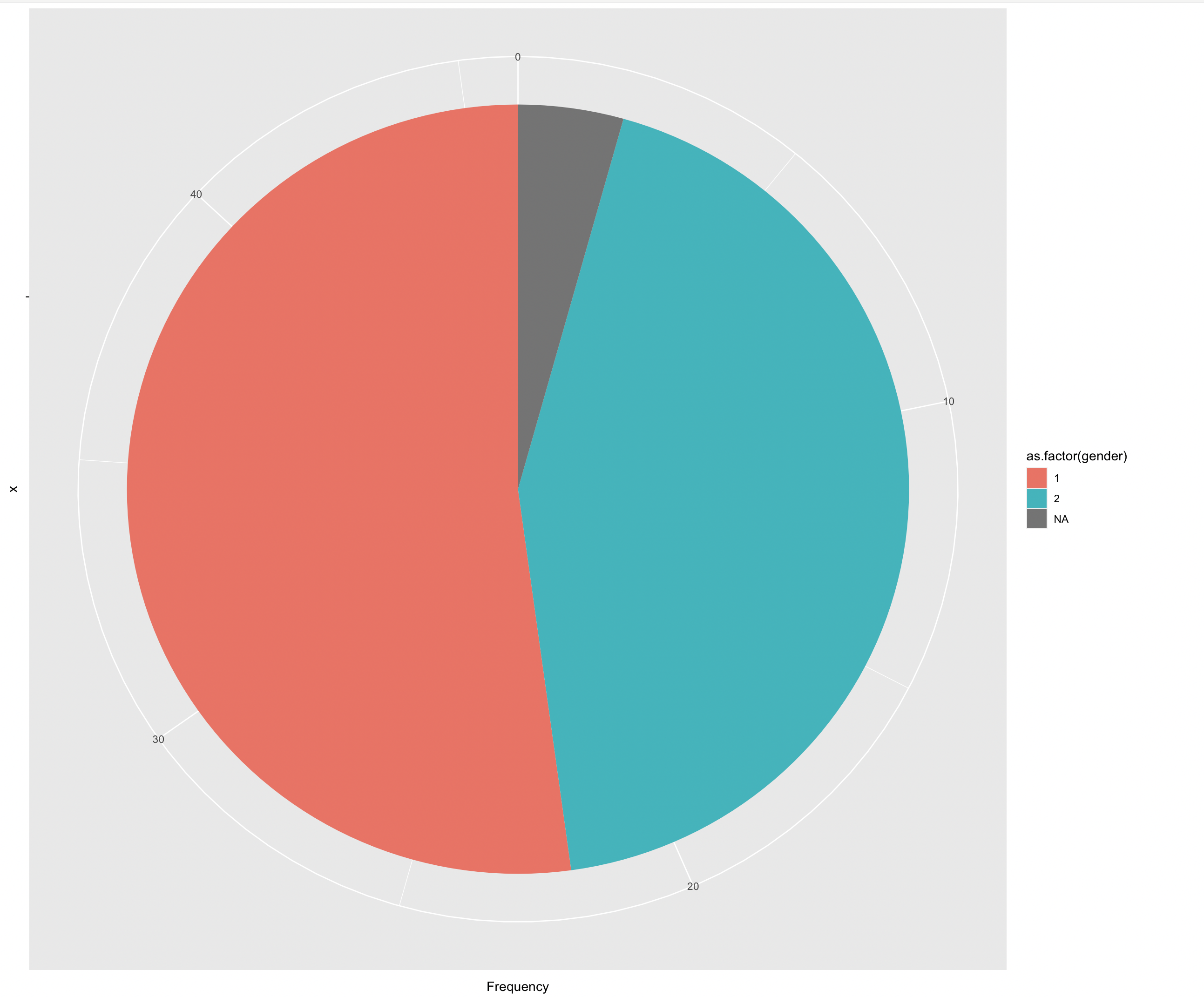
We could also include percentages instead of absolute frequencies:
ggplot(gender_freq_perc, aes(x="", y=Percent, fill=as.factor(gender))) +
  geom_bar(width = 1, stat = "identity") +
  coord_polar("y", start=0)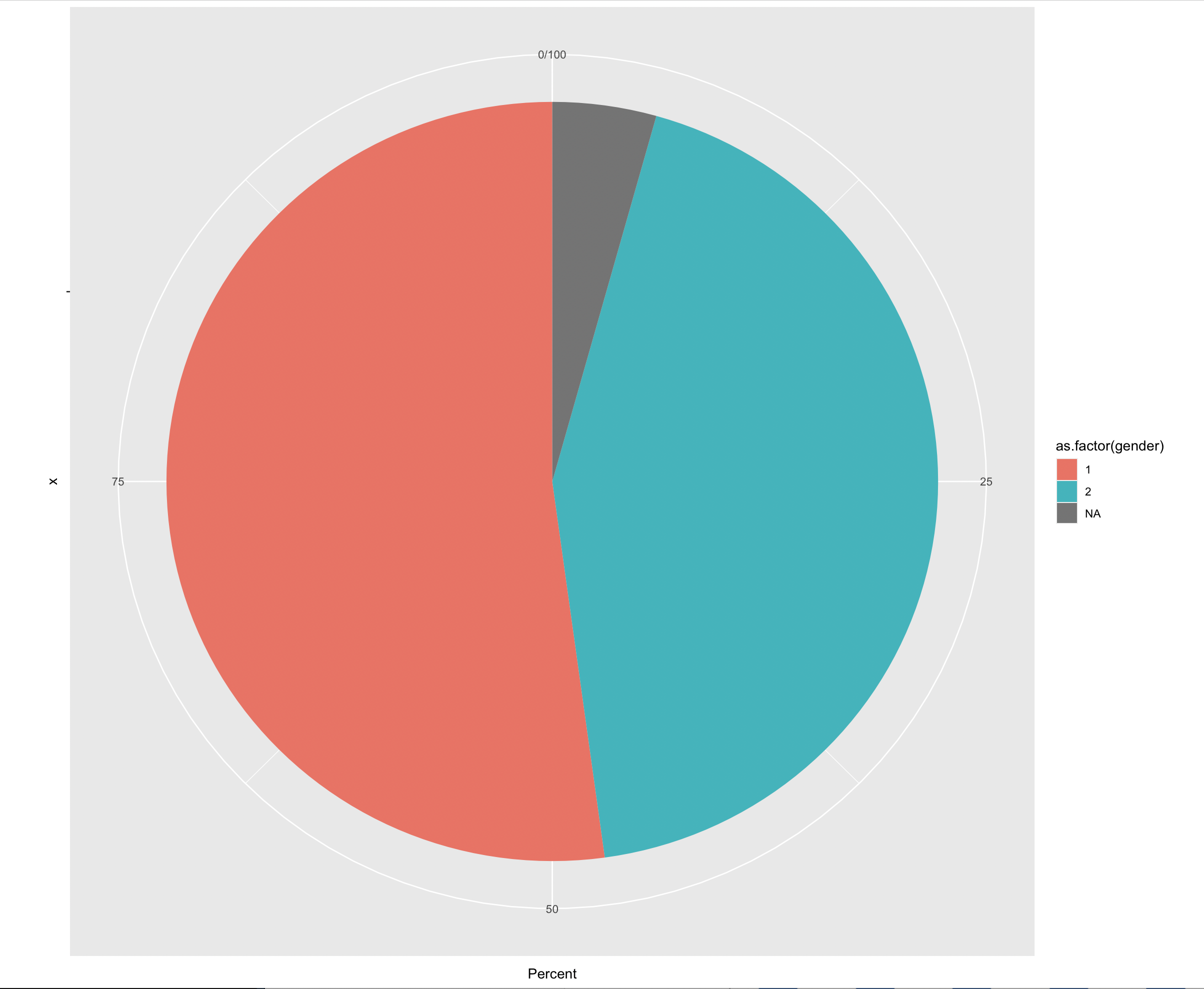
There are many ways to customize your charts and graphs in R.
gplotis the most common solution, with which you can create countless different types of diagrams and customize them in every conceivable way. There is a lot of helpful information on the Internet, e.g., https://r-graph-gallery.com/index.html and https://r-charts.com/ggplot2/.
2.3.2 Bar Chart
Bar charts can be used for nominal and ordinal data. The height of the columns illustrates frequencies and the width has no meaning. 
2.3.2.1 Option 1: Using the barplot() function
We will use the table() function within the barplot() function. These functions are part of base R and thus no packages are needed. By specifying useNA = "ifany", we tell R to also display NAs, if there are any:
 #### Option 2: Using the
 ggplot()
ggplot(Mobile_phone_use, aes(x = as.factor(gender))) +
  geom_bar() +
  labs(title = "Frequency of Gender", x = "Gender", y = "Frequency") + #we can customize the axis labels and the chart title
  scale_x_discrete(labels = c("female", "male", "no answer")) + #we can also change the naming of the categories - ATTENTION note the coding in the questionnaire!
  theme_minimal()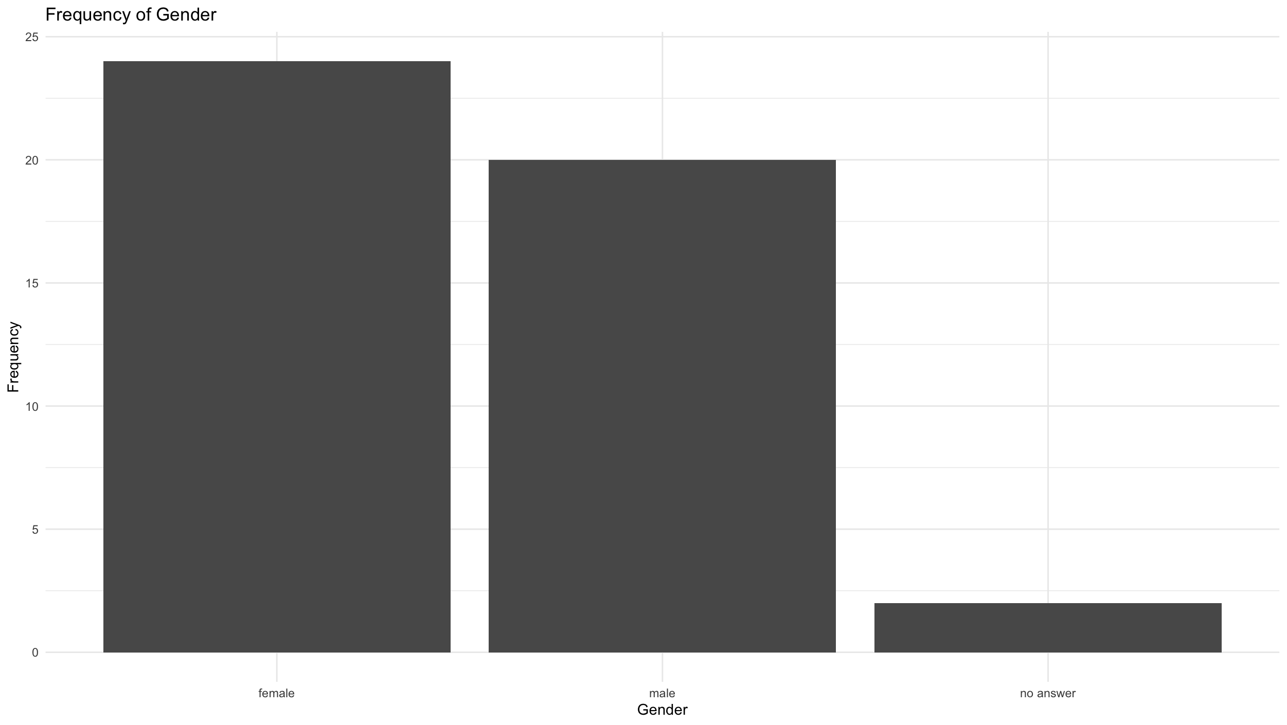
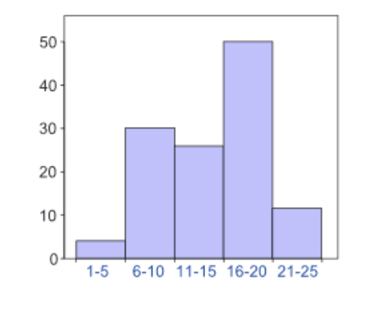
2.3.3 Histogram
Histograms can be used for metric and quasi-metric variables. The area of the columns (height x width) illustrates the frequencies, meaning the width has meaning.
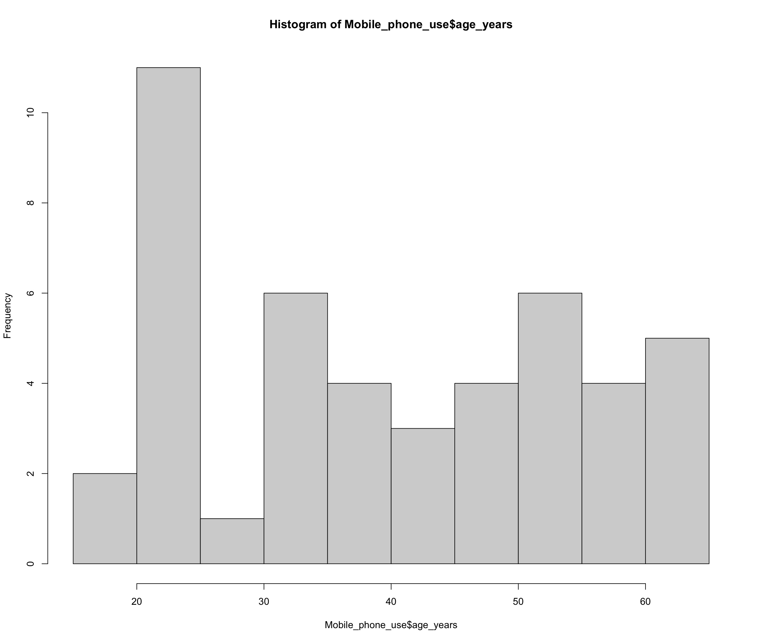
2.3.3.2 Option 2: many possibilities with ggplot
ggplot(Mobile_phone_use, aes(x = age_years)) +
  geom_histogram(binwidth = 8, fill="#69b3a2", color="#e9ecef") + #With binwidth we can set the width of the "groups", i.e. the accuracy of the diagram
  labs(title = "Distribution of age", x = "Age in years", y = "Frequency") +
  scale_x_continuous(breaks = seq(10,70,by=2)) #with breaks we can set how many points we want to have on the axis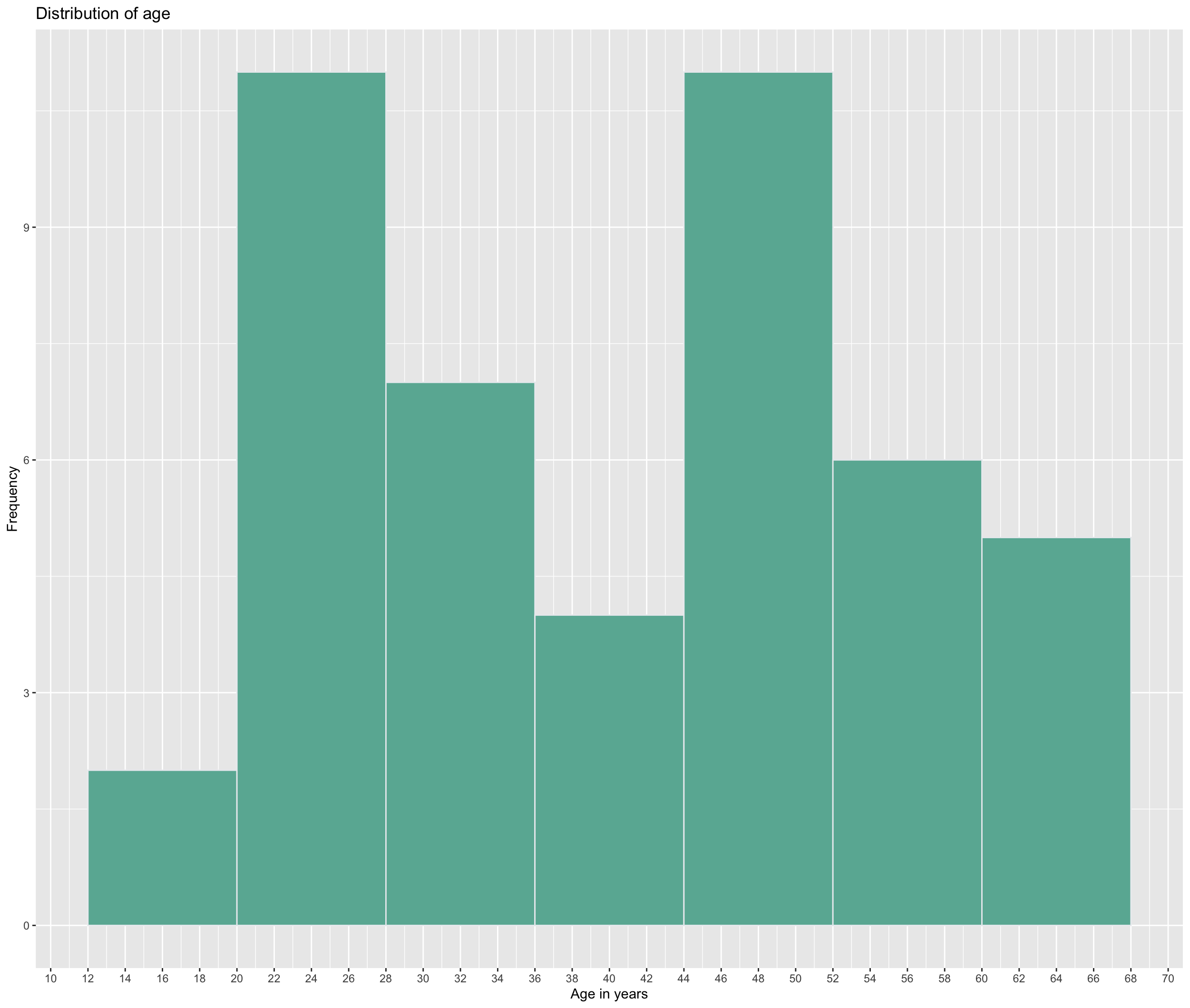
2.3.4 Boxplot
Boxplots can be used for metric and quasi-metric variables. They also show the median, quartiles and outliers. 
Outliers are single unusually large/small measurements. They can be caused by measurement or survey input errors. Outliers should always be closely examined and possibly removed from the dataset for further analysis.
2.3.4.2 Option 2: many possibilities with ggplot
It becomes more interesting when we look not just at one metric variable, but how it relates to different groups, e.g. how age is distributed according to gender.
ggplot(Mobile_phone_use, aes(x = as.factor(gender), y = age_years)) +
  geom_boxplot() +
  ggtitle("Age in years by gender") +
  labs(x = "Gender", y = "Age") +
  scale_x_discrete(labels = c("female", "male", "no answer"))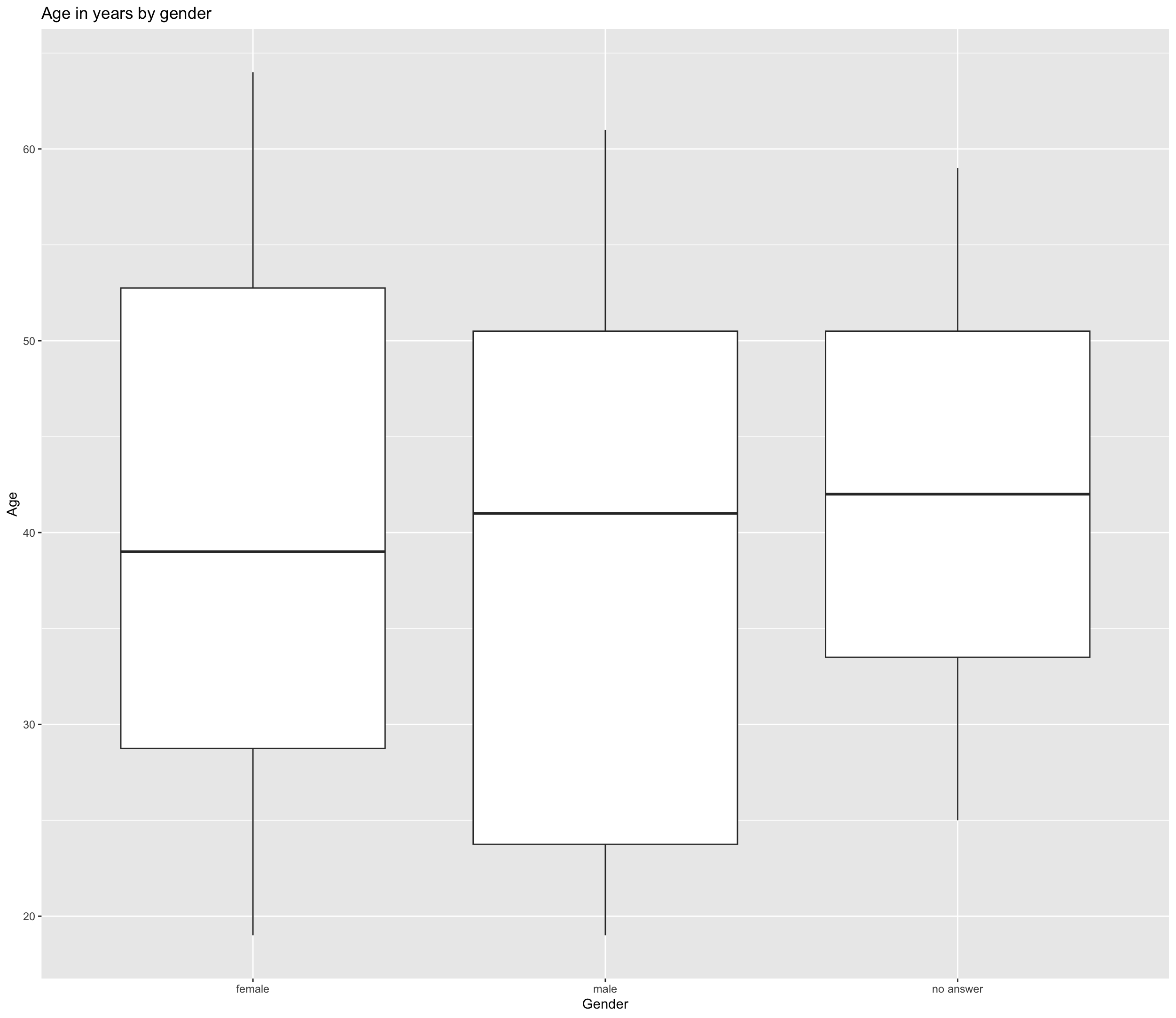
The men in our sample are on average slightly older than the women, but the distribution is different.
2.4 Measures of central tendency
We use three measures of central tendency: mode, median and mean. 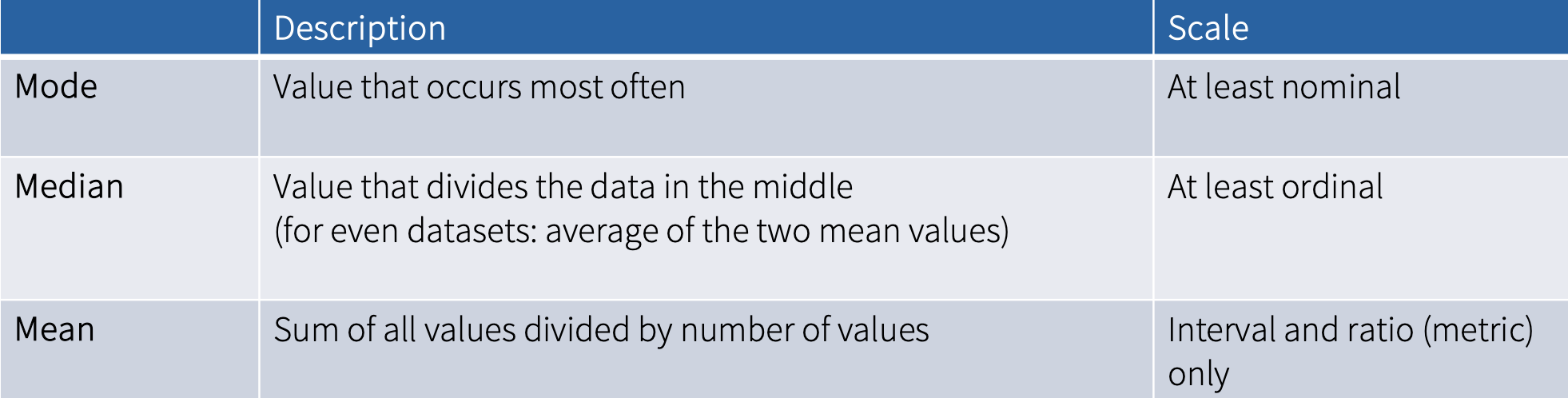
2.4.1 Mode
Mode is the most frequent score, i.e., the value that appears the most often within a variable. Usually, it does not have to be calculated because it can be easily read in a frequency table or graphs.
2.4.2 Median
Median is the middle score, meaning that it divides the data right in the middle, so that 50% of the values are above the median and 50% below it. To determine the median, all values are sorted by size (variable needs to be at least ordinal). 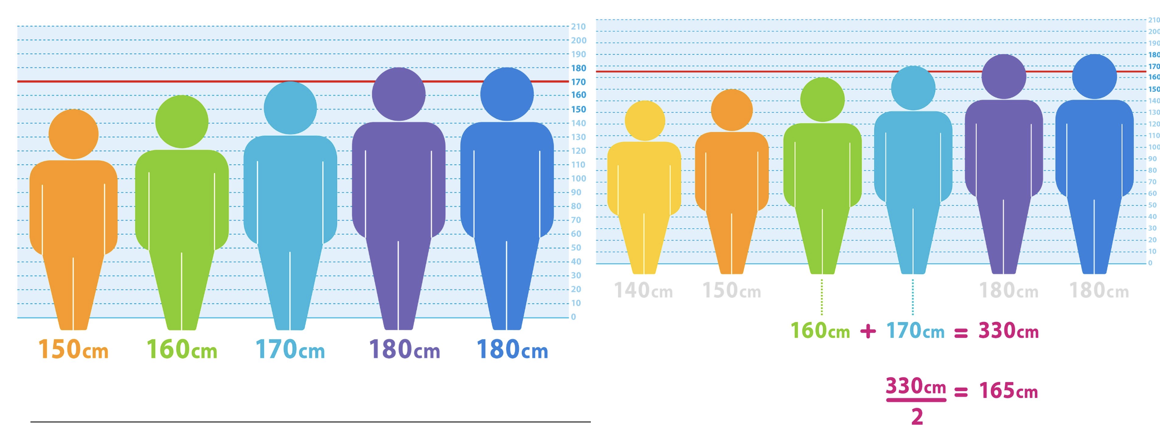 In the first example, the middle score is 170. To determine the median for the second example, we need to take the two middle values and divide them by 2, the resulting value is then the median.
We can use the function median() to calculate median in R.
2.4.3 Mean
Mean is the average value. We calculate it by summing up all the values and then dividing this sum by the number of values. Therefore, mean is quite vulnerable to outliers.
We can use the function mean() to calculate mean in R.
We can also use the function summary() to see the minimum, maximum, quartiles, median and the mean value of a variable:
2.5 Measures of dispersion
We use four measures of dispersion: range, interquartile distance, variance, and standard deviation. 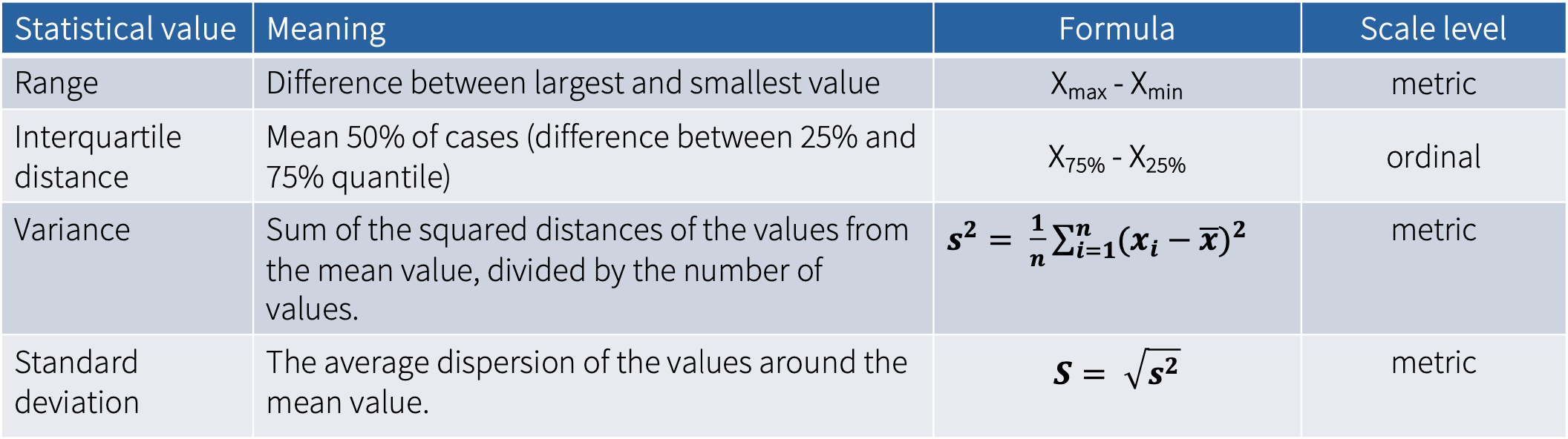
2.5.1 Range
Range is the difference between largest and smallest value. Therefore, it provides information about the two values of a distribution between which all values lie. This measure is thus vulnerable to outliers.
The formula for calculating the range of a set of values is given by: \[ R = x_{\text{max}} - x_{\text{min}} \] where \(x_{\text{max}}\) is the maximum value in the data set, and \(x_{\text{min}}\) is the minimum value. The range (\(R\)) is the difference between the maximum and minimum values.
2.5.2 Interquartile distance
Interquartile range (IQR) is the range of the middle 50% of the values. It is relatively resistant to outliers. To calculate it, we use quartiles, which divide the data into four parts:
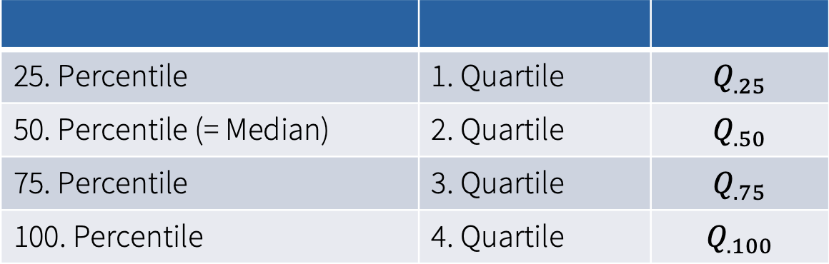

We calculate the interquartile range by: The formula for calculating the interquartile range of a set of values is given by: \[ IQR = Q._{\text{75}} - Q._{\text{25}} \] where \(Q._{\text{75}}\) is the value of the 3. quartile (75th percentile), and \(Q._{\text{25}}\) is the value of the 1. quartile (25th percentile).
2.5.3 Variance and standard deviation
Variance and standard deviation are both measures used to determine the spread of data around the mean.
Variance is a statistical measurement that gauges the dispersion between values in a variable, essentially measuring how far each value is from the mean (that is, an average error between the mean and the observations made). Variance uses squared values and is thus vulnerable to outliers.
We can use the var() function to calculate variance of a variable.
Standard deviation (SD) describes the average dispersion of the measured values of a variable around the mean value of a distribution (=tells us how much the data varies from the average).
If the SD is small, it means most of the numbers are close to the average. If SD is large, the numbers are more spread out, far from the average. The closer the numbers are to the average, the more accurately the average represents the the objects (data) as a whole, or the better the value can be generalized.
We can use the sd() function to calculate variance of a variable.
We can also use the describe() from the psych package to see the standard deviation (SD), range, standard error (SE) and other statistics of a variable. If we include the IQR=TRUE argument, we can also see the IQR.
2.6 Participation Exercise 2
In this exercise, you need to:
create a frequency table
calculate measures of central tendency and dispersion
create a chart to visualize the descriptives
2.6.1 Step-by-step instructions
Create a new RScript in your STADA project File -> New File -> R Script
First, you need to download all the packages that you will need in this exercise. The following code will install the packages you do not have yet.
if (!require("haven")) install.packages("haven")
if (!require("psych")) install.packages("psych")
if (!require("epiDisplay")) install.packages("epiDisplay")
if (!require("summarytools")) install.packages("summarytools")
if (!require("dplyr")) install.packages("dplyr")
if (!require("ggplot2")) install.packages("ggplot2")- Next, you also need to load the packages:
library("haven")
library("psych")
library("epiDisplay")
library("summarytools")
library("dplyr")
library("ggplot2")
If needed, you can of course add install and load more packages later on.
Now you need to load the the data set to R. We will be working with the Media_use.sav file. Use the function
read_sav().Inspect the data set using the
head()function.Create a frequency table for the variable newspaper_use.
Calculate the mean age of the participants (variable age).
For the variable newspaper_use calculate the following measures. Copy paste the following code (comments), add it to your script and fill in the resulting values.
- Lastly, create a meaningful graphic for the variables gender and newspaper_use.
Tip: take a closer look at the variables and their level of measurement first.
- Save the RScript as YourName_PE2.R and upload it on Moodle.