Part 10 Week 5
Data Visualization in R with ggplot2 > Week 2
10.1 Bar Plots Part 1, 2
library(tidyverse)

cel <-
  read_csv(
    url(
      "https://www.dropbox.com/s/4ebgnkdhhxo5rac/cel_volden_wiseman%20_coursera.csv?raw=1"
    )
  )
#>
#> ── Column specification ─────────────────────────────────────────────
#> cols(
#> .default = col_double(),
#> thomas_name = col_character(),
#> st_name = col_character()
#> )
#> ℹ Use `spec()` for the full column specifications.####bar plot for dems variable in the 115th Congress. 0=Republican, 1=Democrat
cel %>%
filter(congress == 115) %>%
ggplot(aes(x = dem)) +
geom_bar()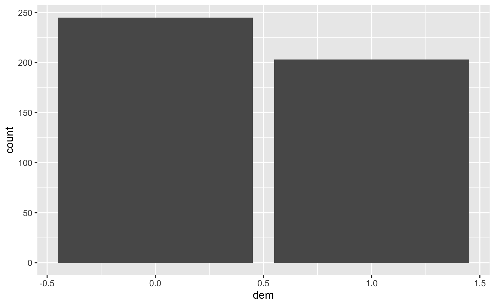
###prove to yourself your bar plot is right by comparing with a frequency table:
table(filter(cel, congress == 115)$dem)
#>
#> 0 1
#> 245 203###use st_name instead, so how counts of how many members of Congress from each state:
cel %>% filter(congress == 115) %>% ggplot(aes(x = st_name)) + geom_bar()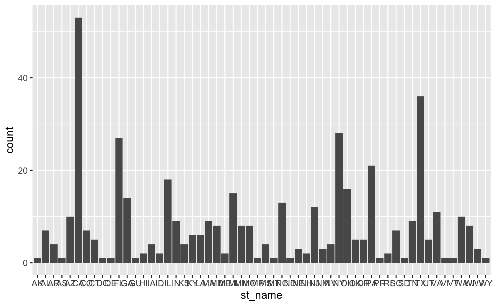
###flip the figure by setting y aesthetic rather than the x

cel %>% filter(congress == 115) %>% ggplot(aes(y = st_name)) + geom_bar()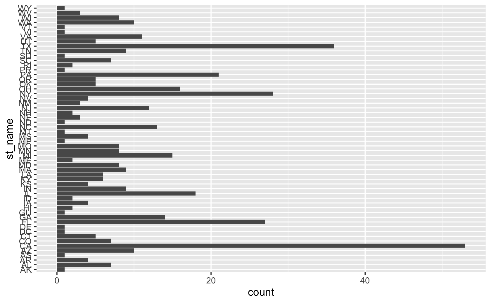
###let's go back and recode the dem variable to be a categorical variable

party <- recode(cel$dem, `1` = "Democrat", `0` = "Republican")

cel <- add_column(cel, party)

cel %>% filter(congress == 115) %>% ggplot(aes(x = party)) +
  geom_bar()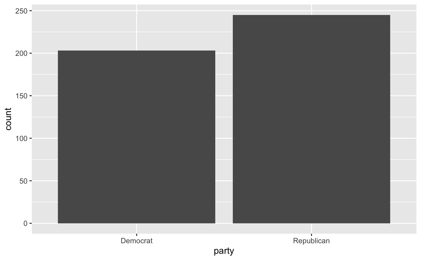
####now add some visual touches

###add axis labels
cel %>% filter(congress == 115) %>% ggplot(aes(x = party)) +
  geom_bar() +
  labs(x = "Party", y = "Number of Members")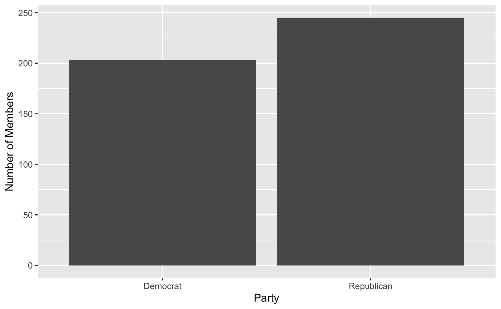
###add colors for the two different bars
cel %>% filter(congress == 115) %>% ggplot(aes(x = party, fill = party)) +
  geom_bar() +
  labs(x = "Party", y = "Number of Members")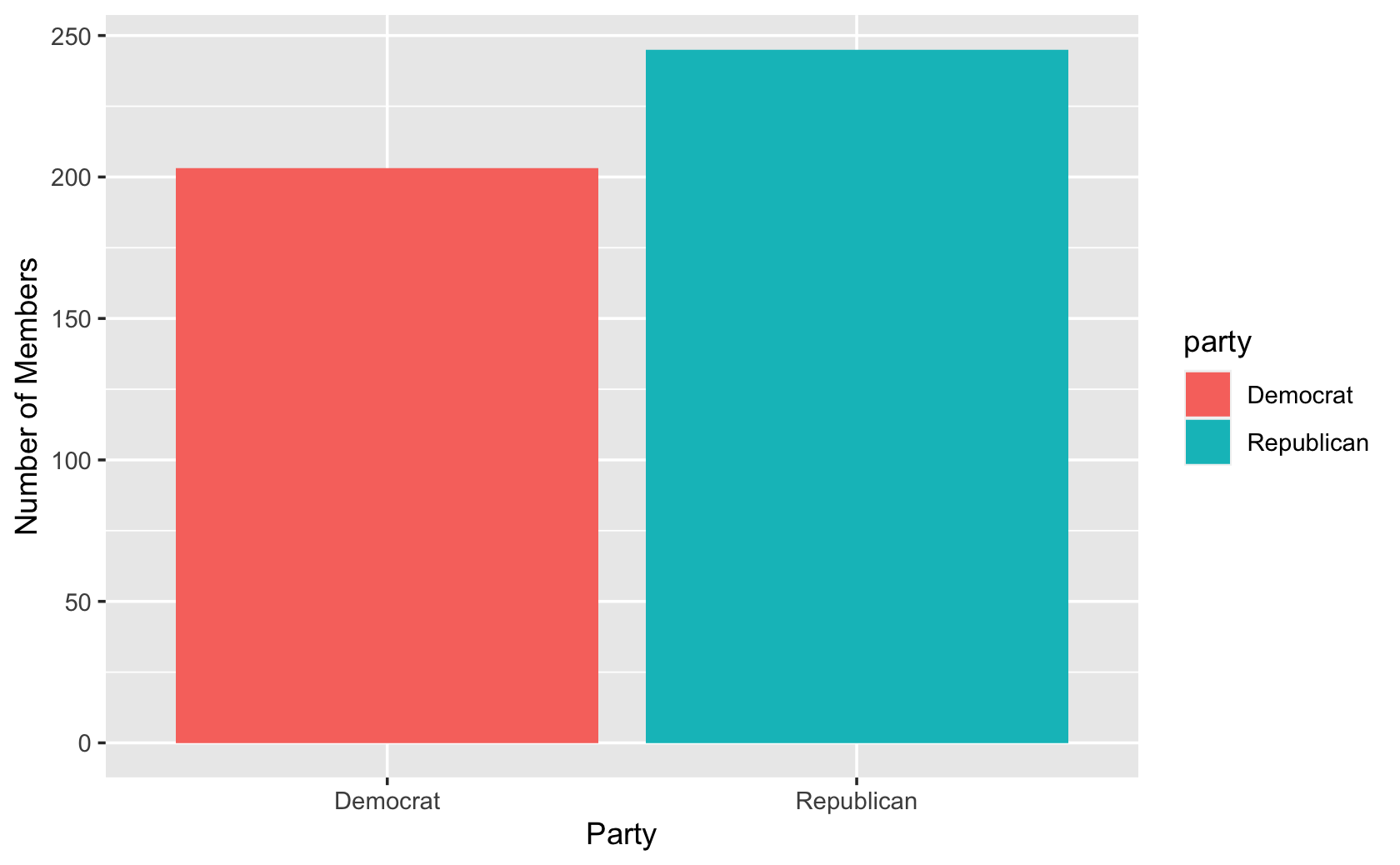
###manually change the colors of the bars
cel %>% filter(congress == 115) %>% ggplot(aes(x = party, fill = party)) +
  geom_bar() +
  labs(x = "Party", y = "Number of Members") +
  scale_fill_manual(values = c("blue", "red"))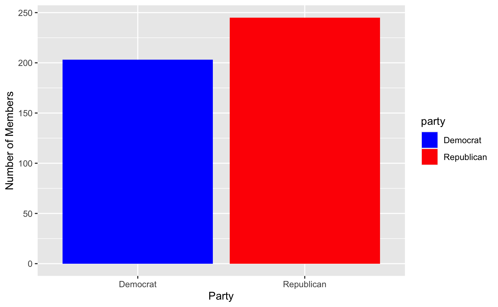
###drop the legend with the "guides" command
cel %>% filter(congress == 115) %>% ggplot(aes(x = party, fill = party)) +
  geom_bar() +
  labs(x = "Party", y = "Number of Members") +
  scale_fill_manual(values = c("blue", "red")) +
  guides(fill = FALSE)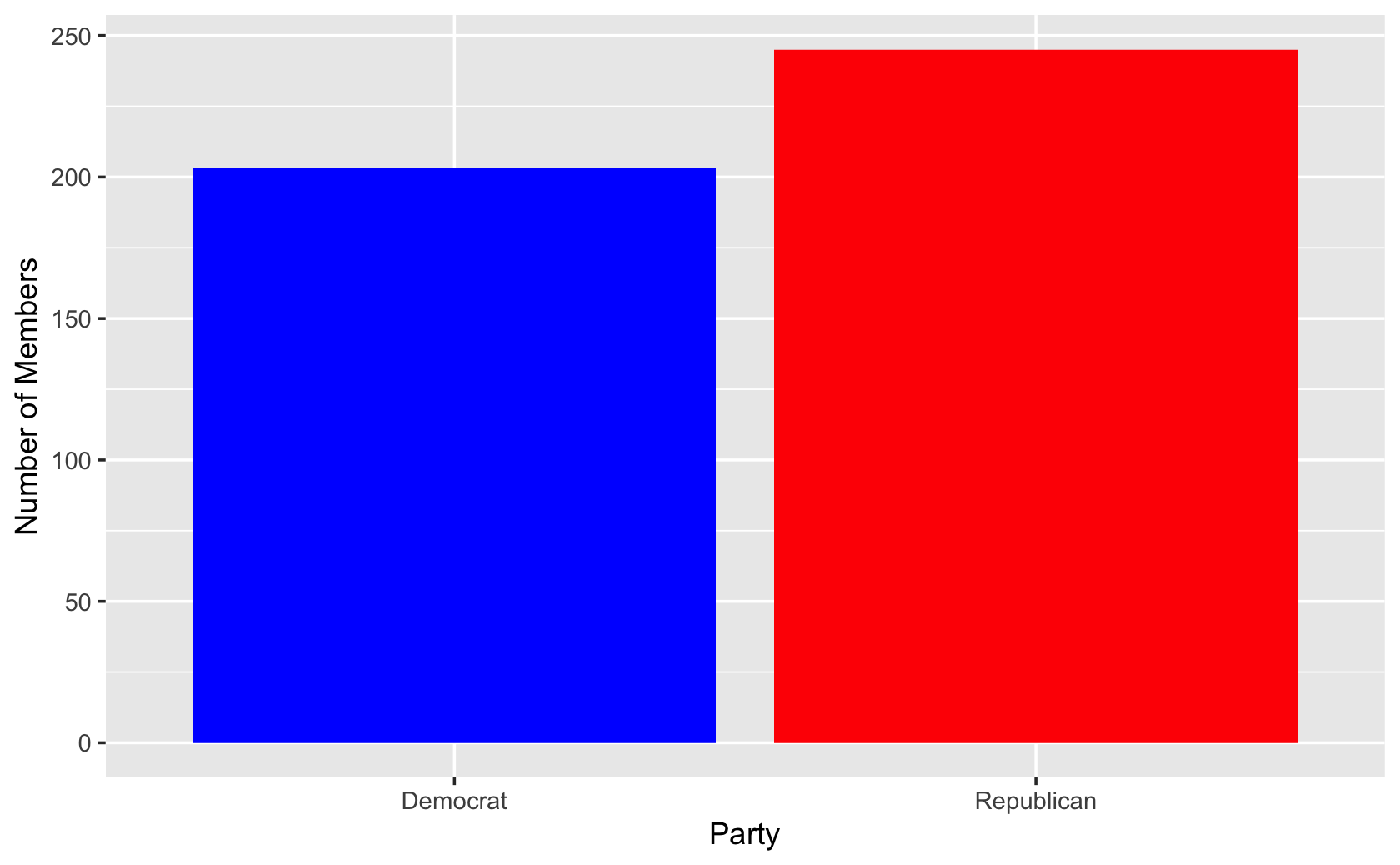
#####Making more barplots and manipulating more data in R

####Making a barplot of proportions

#####a toy demonstration
#####a bowl of fruit
apple <- rep("apple", 6)
orange <- rep("orange", 3)
banana <- rep("banana", 1)

###put together the fruits in a dataframe
###creates a single columns with fruits
fruit_bowl <- tibble("fruits" = c(apple, orange, banana))

########Let's calculate proportions instead

#####create a table that counts fruits in a second column
fruit_bowl_summary <- fruit_bowl %>%
  group_by(fruits) %>%
  summarize("count" = n())

fruit_bowl_summary
#> # A tibble: 3 x 2
#> fruits count
#> <chr> <int>
#> 1 apple 6
#> 2 banana 1
#> 3 orange 3####calculate proportions
fruit_bowl_summary$proportion <-
fruit_bowl_summary$count / sum(fruit_bowl_summary$count)
fruit_bowl_summary#> # A tibble: 3 x 3
#> fruits count proportion
#> <chr> <int> <dbl>
#> 1 apple 6 0.6
#> 2 banana 1 0.1
#> 3 orange 3 0.3####add the geom_bar, using "stat" to tell command to plot the exact value for proportion
ggplot(fruit_bowl_summary, aes(x = fruits, y = proportion)) +
geom_bar(stat = "identity")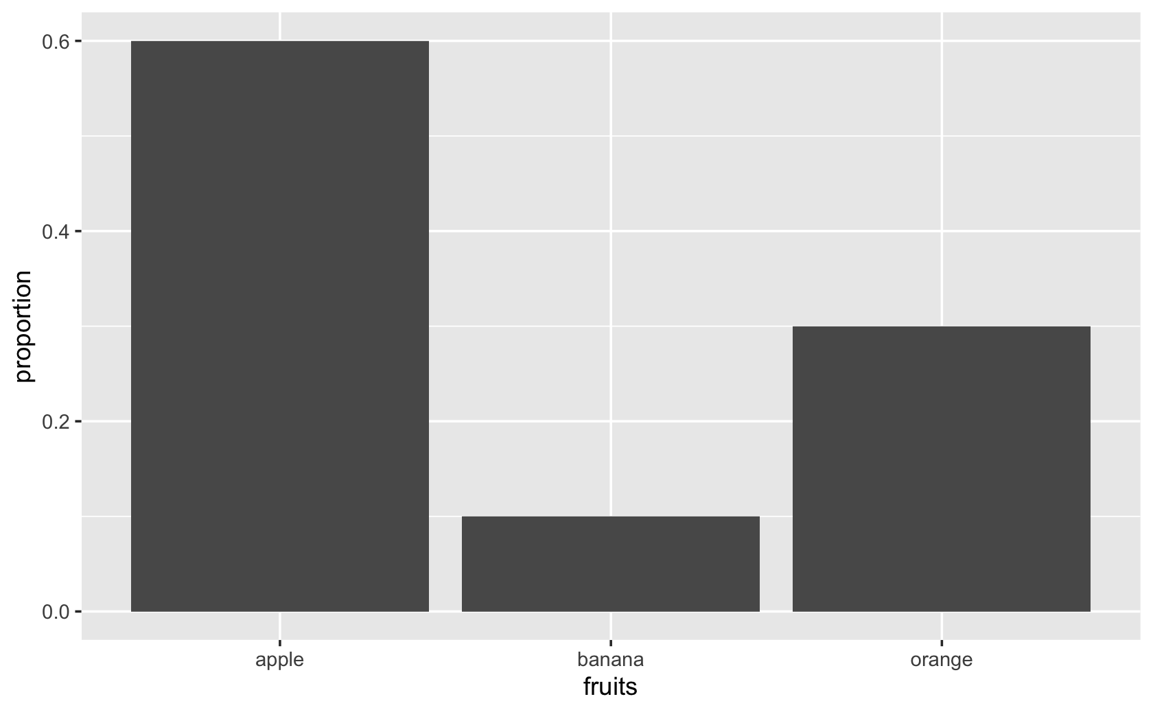
ggplot(fruit_bowl_summary, aes(x = fruits, y = proportion, fill = fruits)) +
  geom_bar(stat = "identity") +
  scale_fill_manual(values = c("red", "yellow", "orange")) +
  guides(fill = FALSE) +
  labs(x = "Fruits", y = "Proportion of Fruits")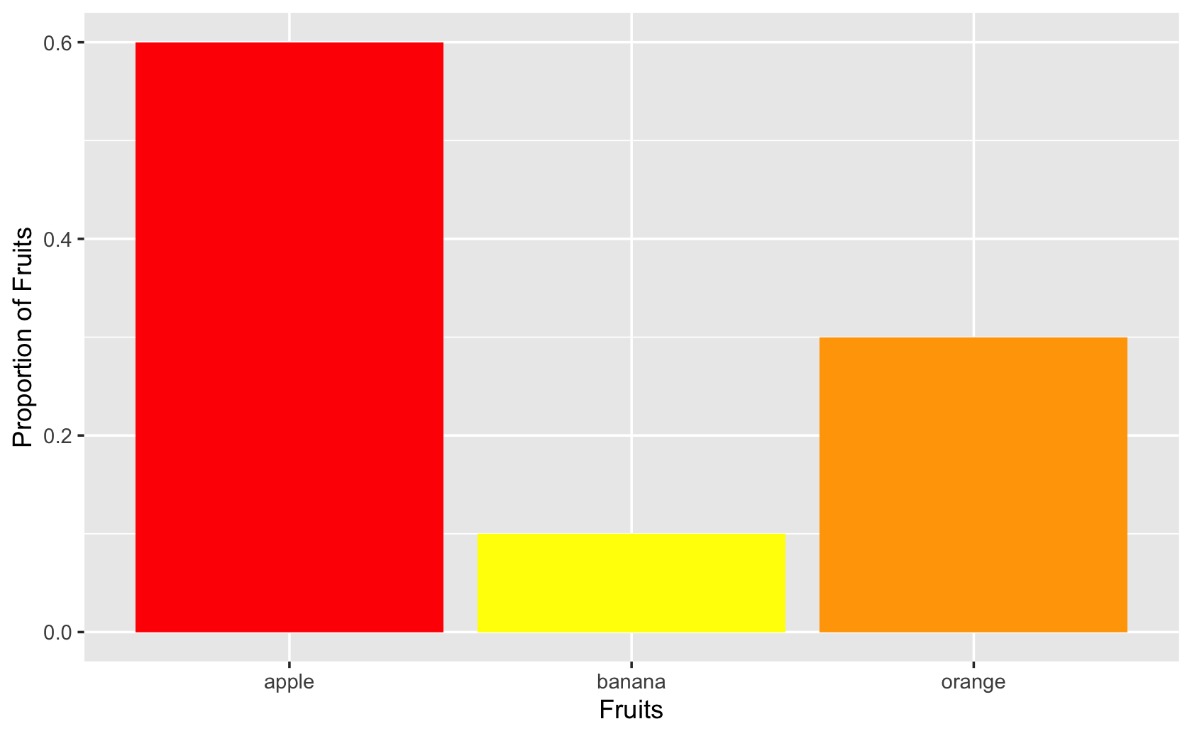
####More practice with barplots!

#####
cces <-
  read_csv(
    url(
      "https://www.dropbox.com/s/ahmt12y39unicd2/cces_sample_coursera.csv?raw=1"
    )
  )
#>
#> ── Column specification ─────────────────────────────────────────────
#> cols(
#> .default = col_double()
#> )
#> ℹ Use `spec()` for the full column specifications.####create counts of Ds, Rs, and Is by region
dem_rep <-
recode(
cces$pid7,
`1` = "Democrat",
`2` = "Democrat",
`3` = "Democrat",
`4` = "Independent",
`5` = "Republican",
`6` = "Republican",
`7` = "Republican"
)
table(dem_rep)#> dem_rep
#> Democrat Independent Republican
#> 516 119 365cces <- add_column(cces, dem_rep)
###stacked bars
ggplot(cces, aes(x = region, fill = dem_rep)) +
geom_bar()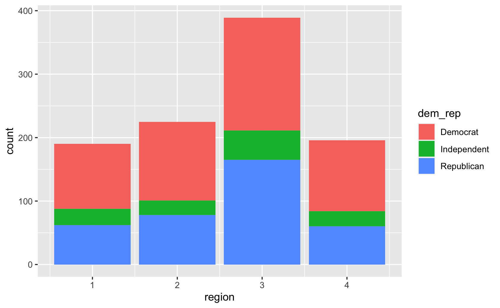
###grouped bars
ggplot(cces, aes(x = region, fill = dem_rep)) +
  geom_bar(position = "dodge")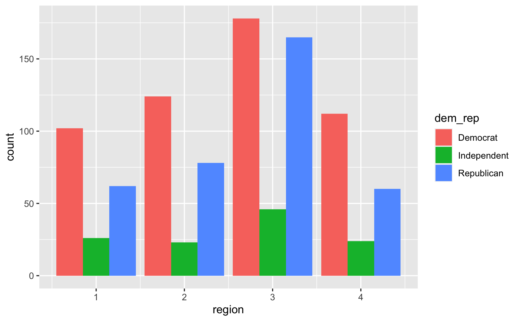
##visual touches like relabeling the axes
ggplot(cces, aes(x = region, fill = dem_rep)) +
  geom_bar(position = "dodge") +
  labs(x = "Region", y = "Count")
10.2 Line Plots Part 1
library(tidyverse)

####create a sequence of years

years <- seq(from = 2001, to = 2020, by = 1)

####create "fake" data for price (note, your values will be different)

price <- rnorm(20, mean = 15, sd = 5)

####put years and price together

fig_data <- tibble("year" = years, "stock_price" = price)

ggplot(fig_data, (aes(x = years, y = price))) +
  geom_line()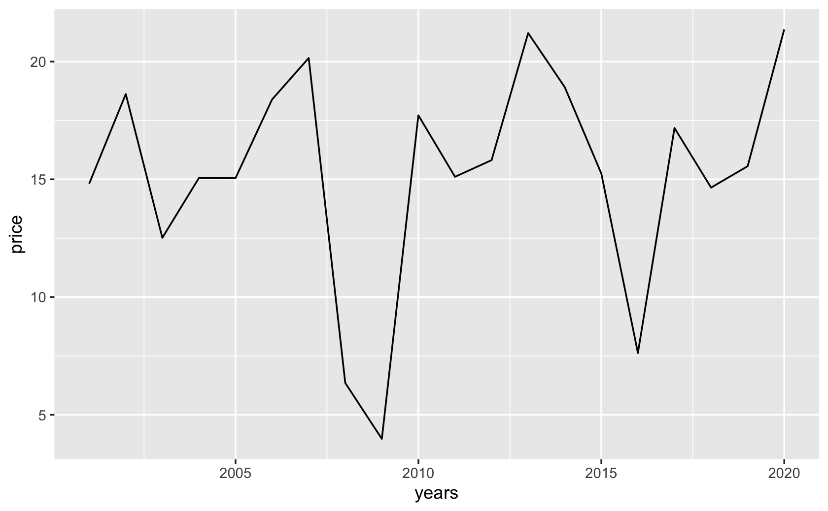
####make data for the first of two stocks

fig_data$stock_id = rep("Stock_1", 20)

stock_1_time_series <- fig_data

#####create data for the second company
########same approach as with the last company
stock_id <- rep("Stock_2", 20)

years <- seq(from = 2001, to = 2020, by = 1)

price <- rnorm(20, mean = 10, sd = 3)

stock_2_time_series <-
  tibble("stock_id" = stock_id,
         "year" = years,
         "stock_price" = price)

####combine with bind_rows()

all_stocks_time_series <-
  bind_rows(stock_1_time_series, stock_2_time_series)

# View(all_stocks_time_series)

####make the plot, setting group to stock_id

ggplot(all_stocks_time_series, (aes(
  x = year, y = stock_price, group = stock_id
))) +
  geom_line()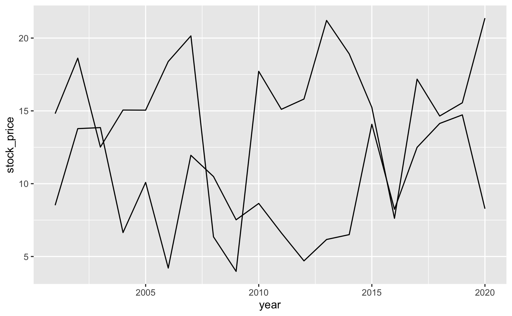
####modify group, linetype, color, and add facet_wrap()

ggplot(all_stocks_time_series, (
  aes(
    x = year,
    y = stock_price,
    group = stock_id,
    linetype = stock_id,
    color = stock_id
  )
)) +
  geom_line() +
  facet_wrap( ~ stock_id)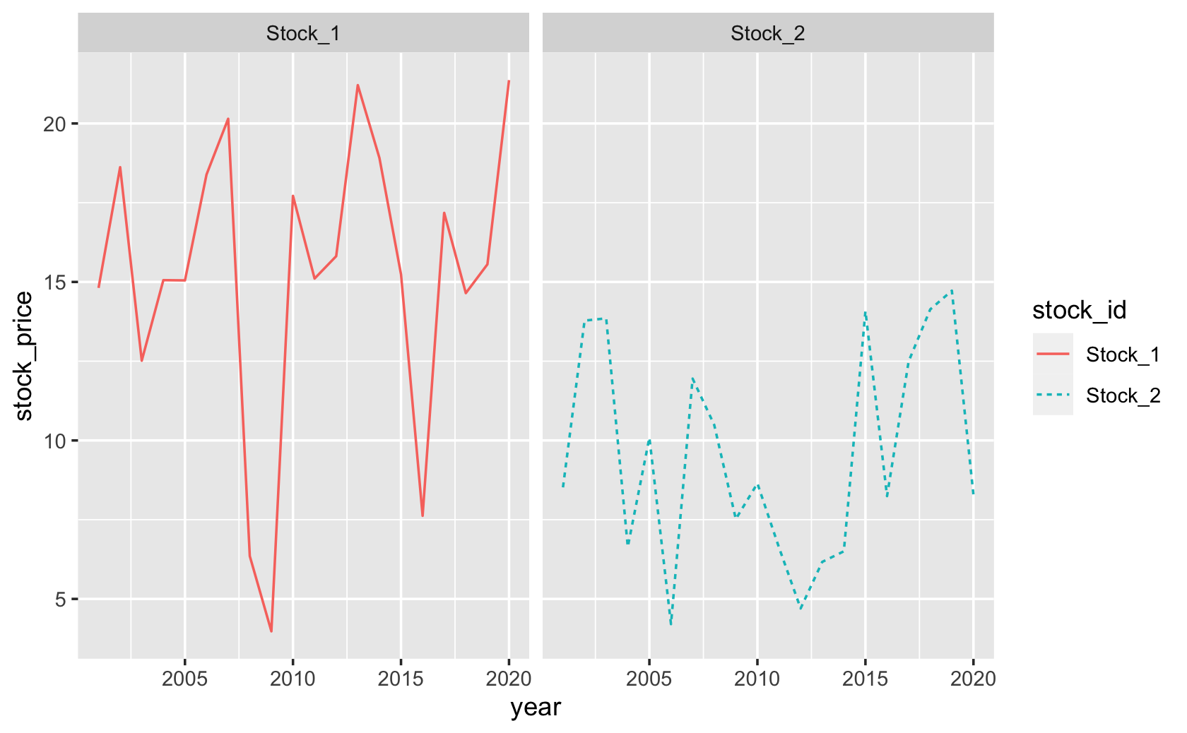
#####Practice with another data set

cel <-
  read_csv(
    url(
      "https://www.dropbox.com/s/4ebgnkdhhxo5rac/cel_volden_wiseman%20_coursera.csv?raw=1"
    )
  )
#>
#> ── Column specification ─────────────────────────────────────────────
#> cols(
#> .default = col_double(),
#> thomas_name = col_character(),
#> st_name = col_character()
#> )
#> ℹ Use `spec()` for the full column specifications.cel$Party <- recode(cel$dem, `1` = "Democrat", `0` = "Republican")
fig_data <- cel %>%
group_by(Party, year) %>%
summarize("Ideology" = mean(dwnom1, na.rm = T))#> `summarise()` has grouped output by 'Party'. You can override using the `.groups` argument.# View(fig_data)
ggplot(fig_data, (aes(
x = year,
y = Ideology,
group = Party,
color = Party
))) +
geom_line() +
scale_color_manual(values = c("blue", "red"))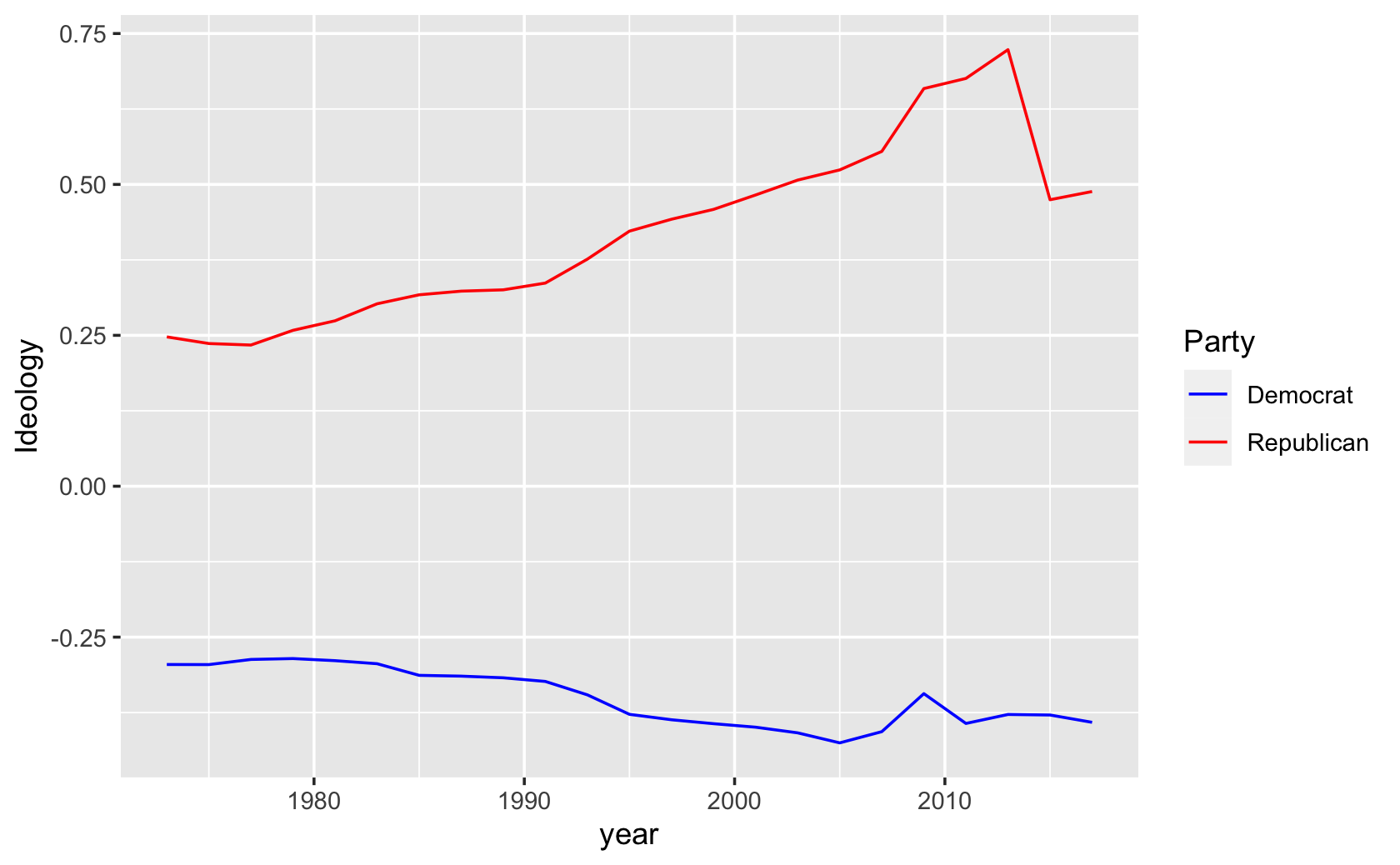
10.3 Learning New Figures Part 1
# Library
library(tidyverse)

# Dummy data
x <- LETTERS[1:20]
y <- paste0("var", seq(1, 20))

# ? expand.grid
dat <- expand.grid(X = x, Y = y)

# ? runif
dat$Z <- runif(400, 0, 5)

# Heatmap
ggplot(dat, aes(x = X, y = Y, fill = Z)) +
  geom_tile()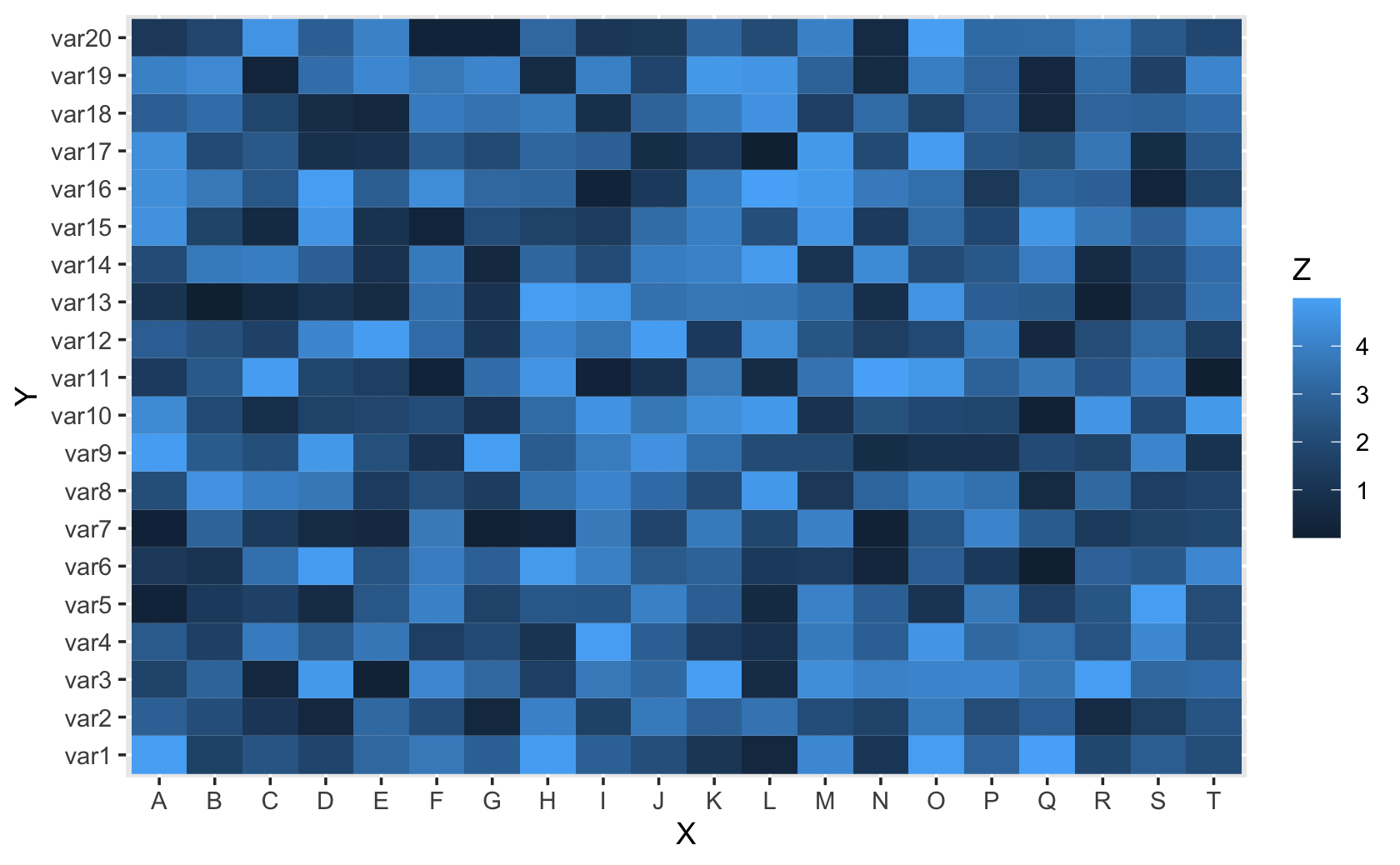
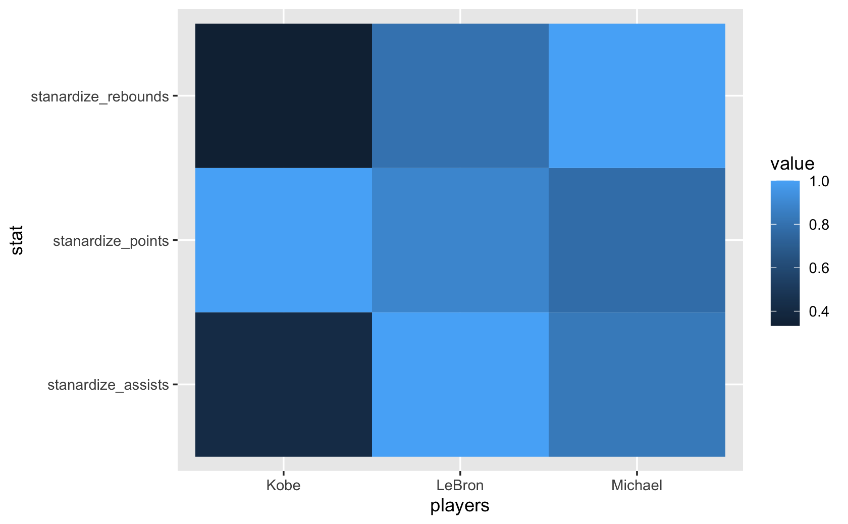
#####practice again using a more substantive example

players <- c("Michael", "LeBron", "Kobe")
points <- c(35, 40, 45)
assists <- c(10, 12, 5)
rebounds <- c(15, 12, 5)

basketball <- tibble(players, points, assists, rebounds)

#####standardize the values

basketball$stanardize_points <-
  basketball$points / max(basketball$points)
basketball$stanardize_assists <-
  basketball$assists / max(basketball$assists)
basketball$stanardize_rebounds <-
  basketball$rebounds / max(basketball$rebounds)

basketball_stanardize <-
  select(
    basketball,
    "players",
    "stanardize_points",
    "stanardize_assists",
    "stanardize_rebounds"
  )

basketball_stanardize
#> # A tibble: 3 x 4
#> players stanardize_points stanardize_assists stanardize_rebounds
#> <chr> <dbl> <dbl> <dbl>
#> 1 Michael 0.778 0.833 1
#> 2 LeBron 0.889 1 0.8
#> 3 Kobe 1 0.417 0.333long_basketball_scaled <-
pivot_longer(
basketball_stanardize,
c(
"stanardize_points",
"stanardize_assists",
"stanardize_rebounds"
),
names_to = "stat",
values_to = "value"
)
long_basketball_scaled#> # A tibble: 9 x 3
#> players stat value
#> <chr> <chr> <dbl>
#> 1 Michael stanardize_points 0.778
#> 2 Michael stanardize_assists 0.833
#> 3 Michael stanardize_rebounds 1
#> 4 LeBron stanardize_points 0.889
#> 5 LeBron stanardize_assists 1
#> 6 LeBron stanardize_rebounds 0.8
#> # … with 3 more rowsggplot(long_basketball_scaled, aes(x = players, y = stat, fill = value)) +
geom_tile()