Chapter 6 Visualizing RNA-seq results
During this lesson, we will get you started with some basic and more advanced plots commonly used when exploring differential gene expression data.
Let’s start by loading a few libraries (if not already loaded):
# load libraries
library(tidyverse)
library(ggplot2)
library(ggrepel)
library(RColorBrewer)
library(DESeq2)
library(pheatmap)
library(dplyr)
NOTE: Since we are using the
tidyversesuite of packages, we may run into conflicts with functions that have the same name but are part of different packages (i.efilter). If you run the code and run into an error try re-running the code using syntax where you specify package explicitly (i.edplyr::filter).
We will be working with three different data objects we have already created in earlier lessons:
- Metadata for our samples (a dataframe):
meta - Normalized expression data for every gene in each of our samples (a matrix):
normalized_counts - Tibble versions of the DESeq2 results we generated in the last lesson:
res_tableOE_tbandres_tableKD_tb
Let’s create tibble objects from the meta and normalized_counts data frames before we start plotting. This will enable us to use the tidyverse functionality more easily.
Check to make sure the column names of the normalized_counts matrix are the same as the row names of the meta data frame. If they are not, you will need to reorder the columns of normalized_counts to match the row names of meta.
# Create a tibble for meta data
mov10_meta <- meta %>%
    rownames_to_column(var = "samplename") %>%
    as_tibble()

# you might need to read in normalized_counts if it is not in your current
# session:
normalized_counts <- read.delim("data/normalized_counts.txt", row.names = 1)

all(mov10_meta$samplename == colnames(normalized_counts))
## [1] TRUE# Create a tibble for normalized_counts
normalized_counts <- normalized_counts %>%
data.frame() %>%
rownames_to_column(var = "gene") %>%
as_tibble()6.0.1 Plotting signicant DE genes
One way to visualize results would be to simply plot the expression data for a handful of genes. We could do that by picking out specific genes of interest or selecting a range of genes.
6.0.1.1 Using DESeq2 plotCounts() to plot expression of a single gene
To pick out a specific gene of interest to plot, for example Mov10, we can use the plotCounts() from DESeq2. plotCounts() is a function that allows us to plot the normalized counts for a single gene across all samples.
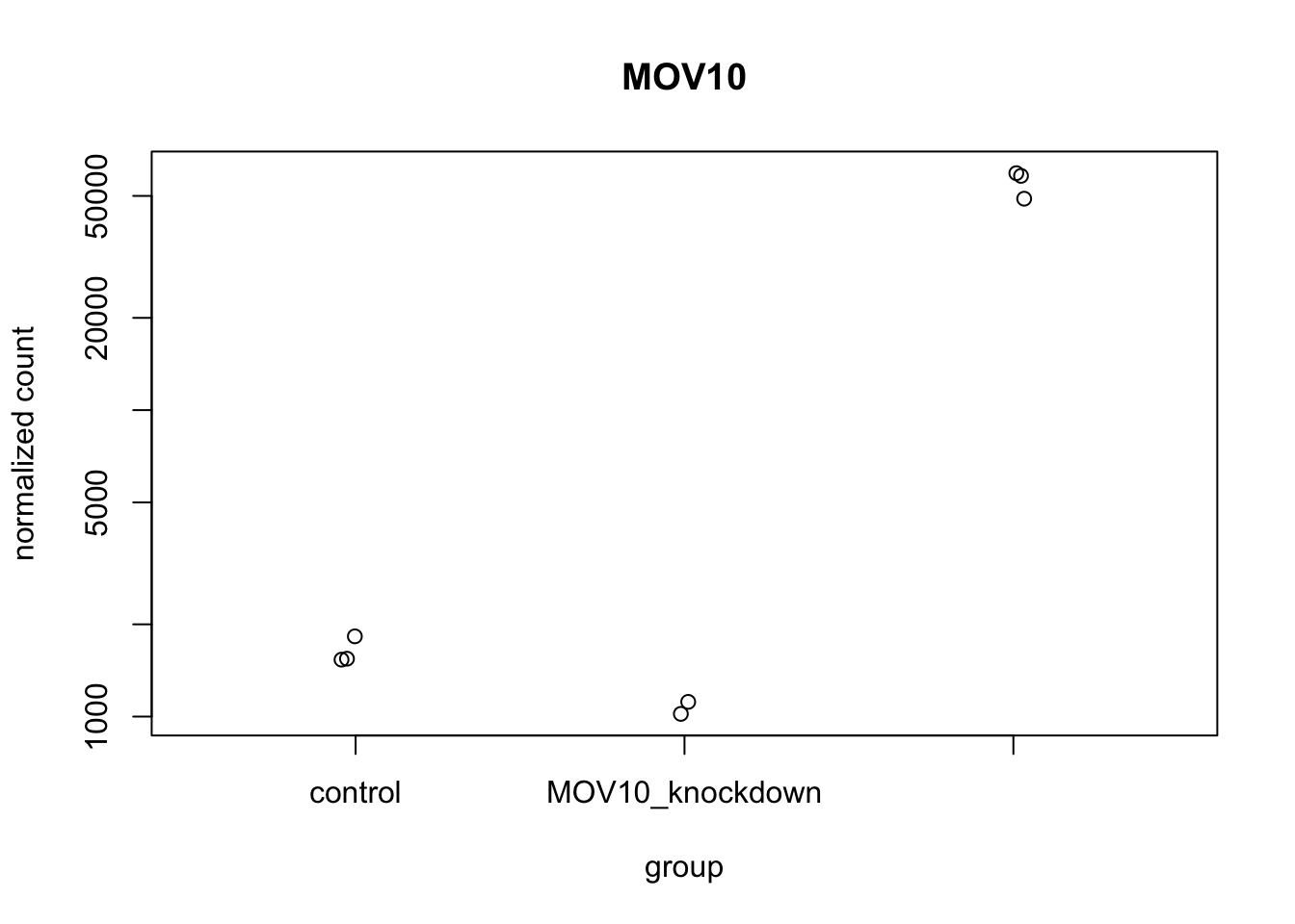
# we can give it some color and filled points:

sampletype = as.factor(mov10_meta$sampletype)

library(RColorBrewer)

display.brewer.all()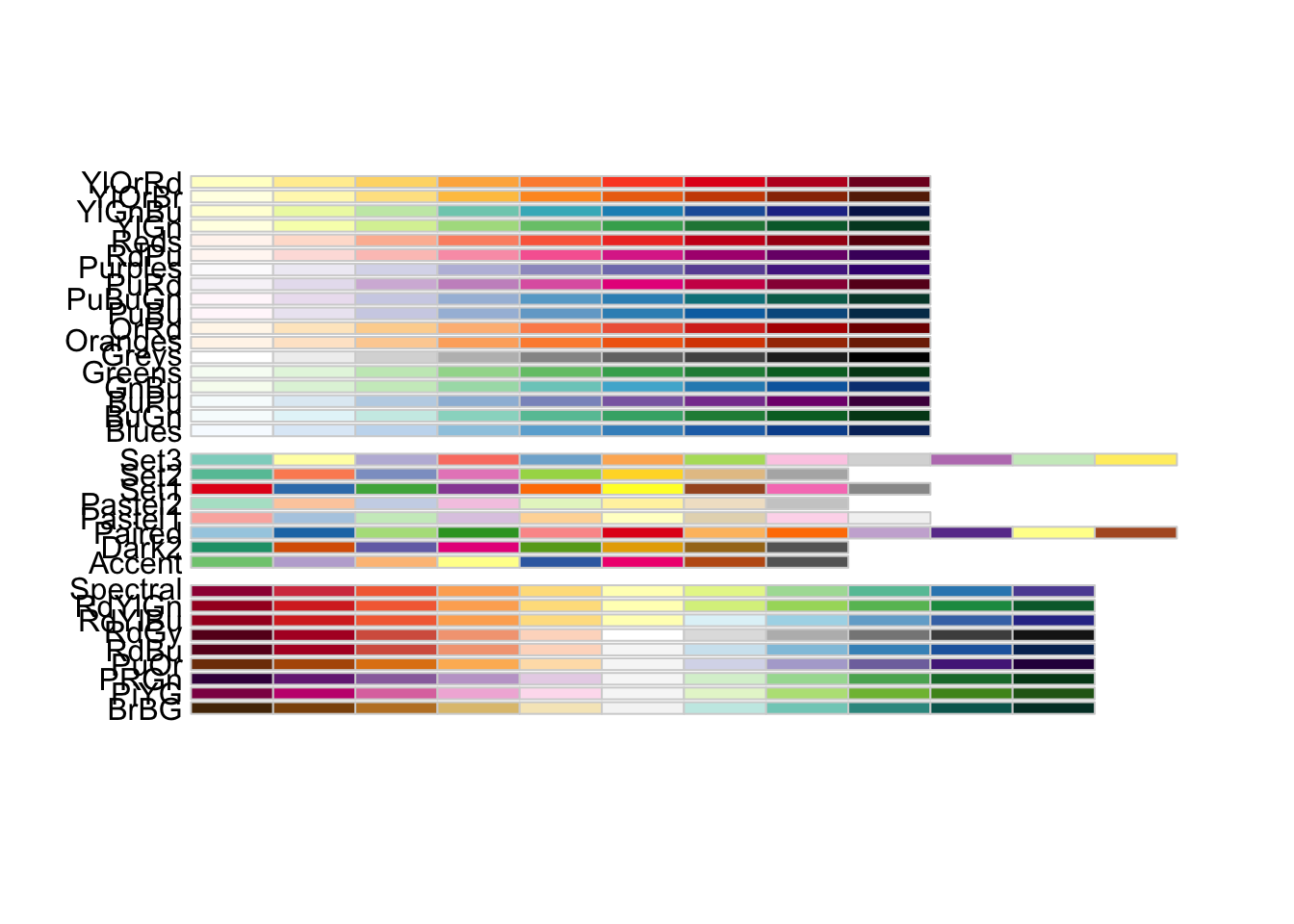
col = brewer.pal(8, "Dark2")
palette(col)

plotCounts(dds, gene = "MOV10", intgroup = "sampletype", col = as.numeric(sampletype),
    pch = 19)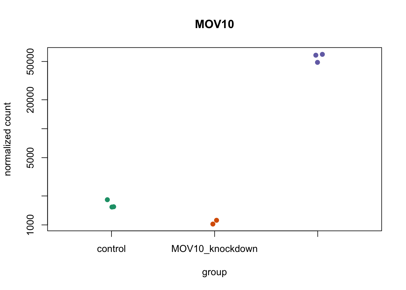
This function only allows for plotting the counts of a single gene at a time.
6.0.1.2 Using ggplot2 to plot expression of a single gene
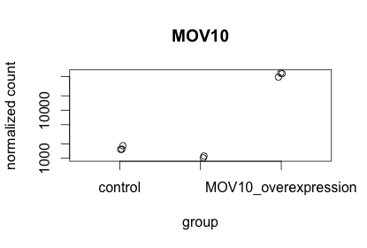
We can also use ggplot2 to plot the MOV10 counts. We can save the output of plotCounts() to a variable specifying the returnData=TRUE argument, then use ggplot():
# Save `plotCounts()` to a data frame object
d <- plotCounts(dds, gene = "MOV10", intgroup = "sampletype", returnData = TRUE)

# Plot the MOV10 normalized counts, using the samplenames (rownames of d as
# labels)
ggplot(d, aes(x = sampletype, y = count, color = sampletype)) + geom_point(position = position_jitter(w = 0.1,
    h = 0)) + geom_text_repel(aes(label = rownames(d))) + theme_bw() + ggtitle("MOV10") +
    theme(plot.title = element_text(hjust = 0.5))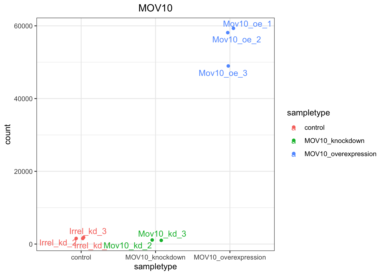
Note that in the plot below (code above), we are using
geom_text_repel()from theggrepelpackage to label our individual points on the plot.
6.0.1.3 Using ggplot2 to plot multiple genes (e.g. top 20)
Often it is helpful to check the expression of multiple genes of interest at the same time. This often first requires some data wrangling.
We are going to plot the normalized count values for the top 20 differentially expressed genes (by padj values).
To do this, we first need to determine the gene names of our top 20 genes by ordering our results and extracting the top 20 genes (by padj values):
res_tableOE <- readRDS("data/res_tableOE.RDS")

res_tableOE_tb <- res_tableOE %>%
    data.frame() %>%
    rownames_to_column(var = "gene") %>%
    as_tibble()

## Order results by padj values
top20_sigOE_genes <- res_tableOE_tb %>%
    arrange(padj) %>%
    # Arrange rows by padj values
pull(gene) %>%
    # Extract character vector of ordered genes
head(n = 20)
# Extract the first 20 genes
Then, we can extract the normalized count values for these top 20 genes:
## normalized counts for top 20 significant genes
top20_sigOE_norm <- normalized_counts %>%
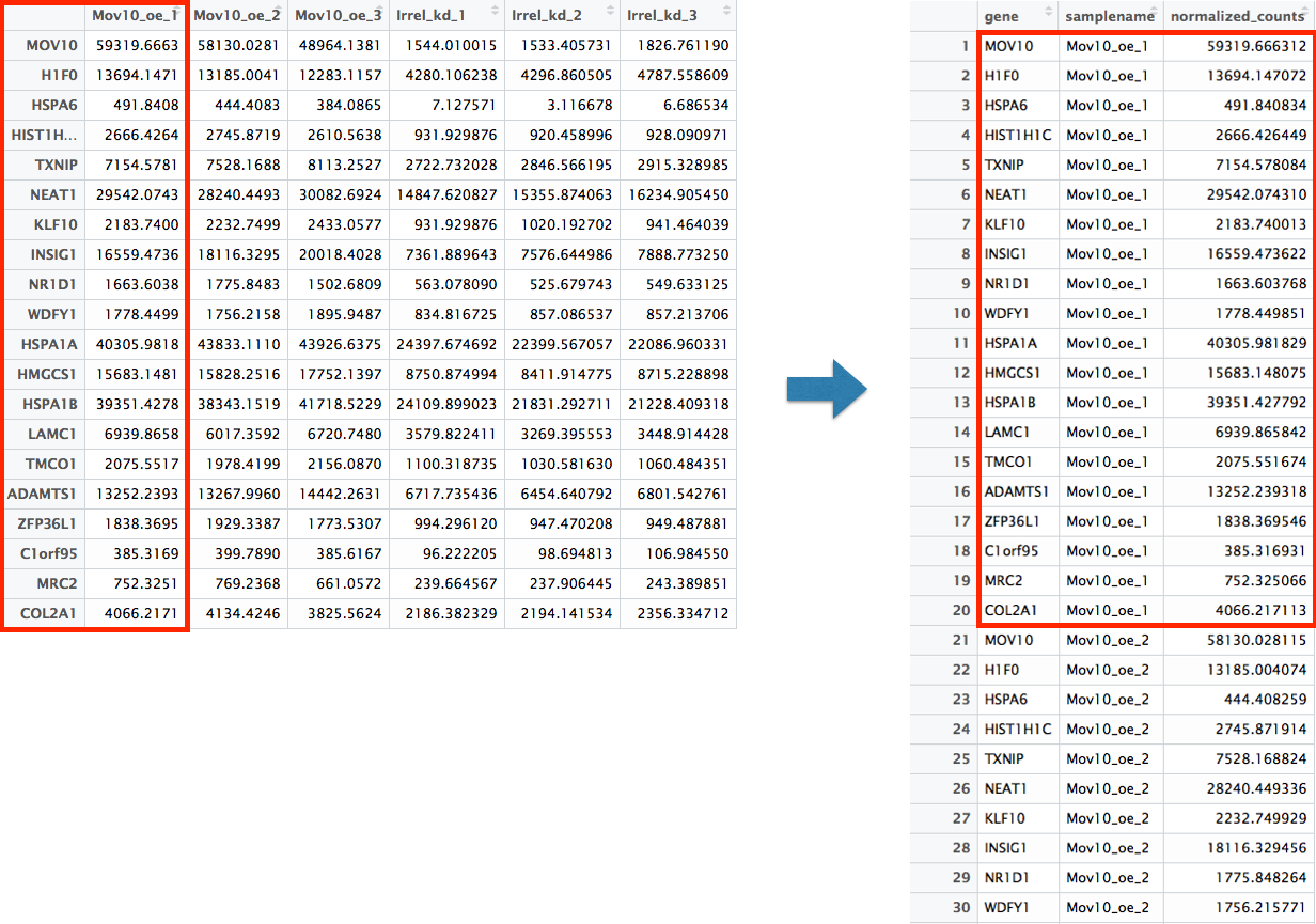
filter(gene %in% top20_sigOE_genes)Now that we have the normalized counts for each of the top 20 genes for all 8 samples, to plot using ggplot(), we need to pivot_longer top20_sigOE_norm from a wide format to a long format so the counts for all samples will be in a single column to allow us to give ggplot the one column with the values we want it to plot.
The pivot_longer() function in the tidyr package will perform this operation and will output the normalized counts for all genes for Mov10_oe_1 listed in the first 20 rows, followed by the normalized counts for Mov10_oe_2 in the next 20 rows, so on and so forth.
# Pivoting the columns to have normalized counts to a single column
pivoted_top20_sigOE <- top20_sigOE_norm %>%
    pivot_longer(colnames(top20_sigOE_norm)[2:9], names_to = "samplename", values_to = "normalized_counts")

## Check the column header in the 'pivoted' data frame
head(pivoted_top20_sigOE)| gene | samplename | normalized_counts |
|---|---|---|
| ADAMTS1 | Irrel_kd_1 | 6717.735 |
| ADAMTS1 | Irrel_kd_2 | 6454.641 |
| ADAMTS1 | Irrel_kd_3 | 6801.543 |
| ADAMTS1 | Mov10_kd_2 | 6869.168 |
| ADAMTS1 | Mov10_kd_3 | 8730.977 |
| ADAMTS1 | Mov10_oe_1 | 13252.239 |
Now, if we want our counts colored by sample group, then we need to combine the metadata information with the melted normalized counts data into the same data frame for input to ggplot():
inner_join(x,y) will merge 2 data frames by the colname in x that matches a column name in y.
## Joining with `by = join_by(samplename)`Now that we have a data frame in a format that can be utilised by ggplot easily, let’s plot!
## plot using ggplot2
ggplot(pivoted_top20_sigOE) + geom_point(aes(x = gene, y = normalized_counts, color = sampletype)) +
    scale_y_log10() + xlab("Genes") + ylab("log10 Normalized Counts") + ggtitle("Top 20 Significant DE Genes") +
    theme_bw() + theme(axis.text.x = element_text(angle = 45, hjust = 1)) + theme(plot.title = element_text(hjust = 0.5))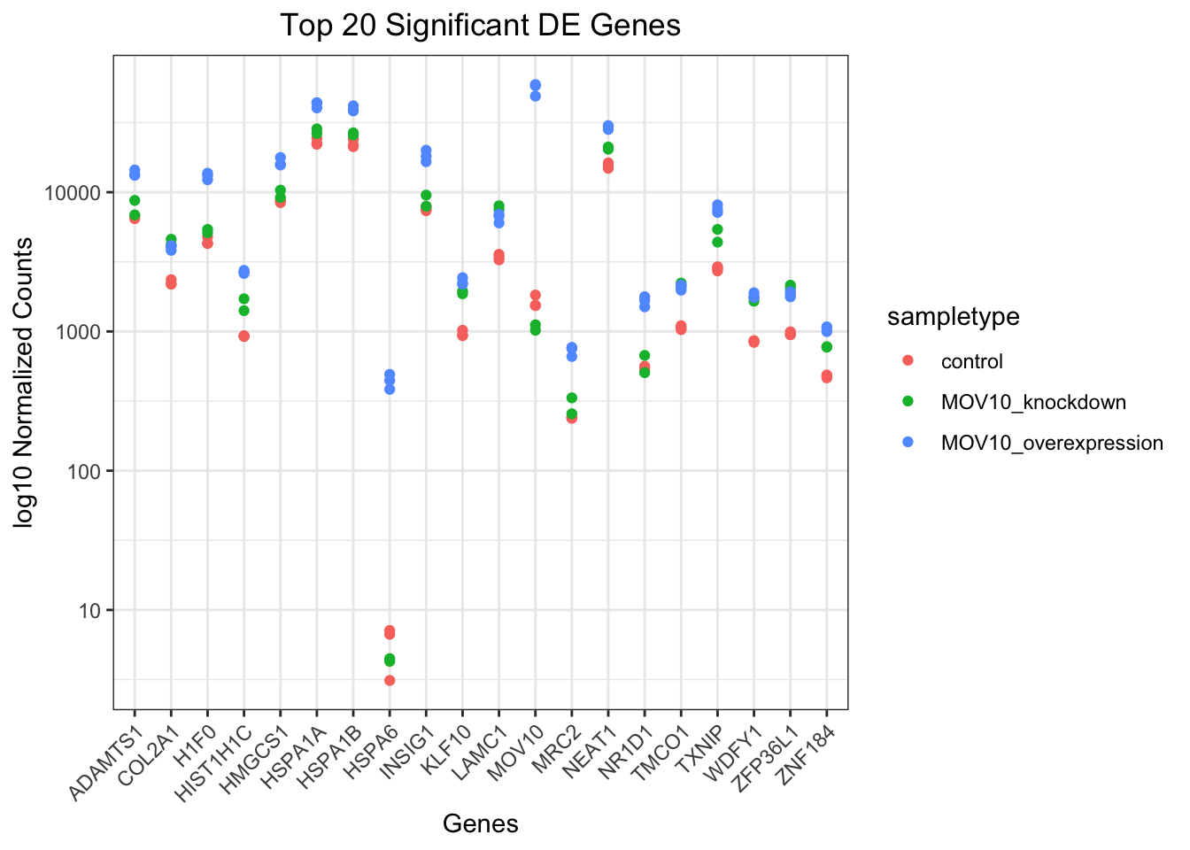
6.0.2 Heatmap
In addition to plotting subsets, we could also extract the normalized values of all the significant genes from Control vs. Mov10 overexpression (control and overexpression) and plot a heatmap of their expression using pheatmap().
sigOE = readRDS("data/sigOE.RDS")

norm_OEsig <- normalized_counts[, c(1, 2:4, 7:9)] %>%
    filter(gene %in% sigOE$gene) %>%
    data.frame() %>%
    column_to_rownames(var = "gene")
Now let’s draw the heatmap using pheatmap:
### Annotate our heatmap (optional)
annotation <- mov10_meta %>%
    dplyr::select(samplename, sampletype) %>%
    data.frame(row.names = "samplename")

### Set a color palette
heat_colors <- brewer.pal(6, "YlOrRd")

### Run pheatmap
pheatmap(norm_OEsig, color = heat_colors, cluster_rows = T, show_rownames = F, annotation = annotation,
    border_color = NA, fontsize = 10, scale = "row", fontsize_row = 10, height = 20)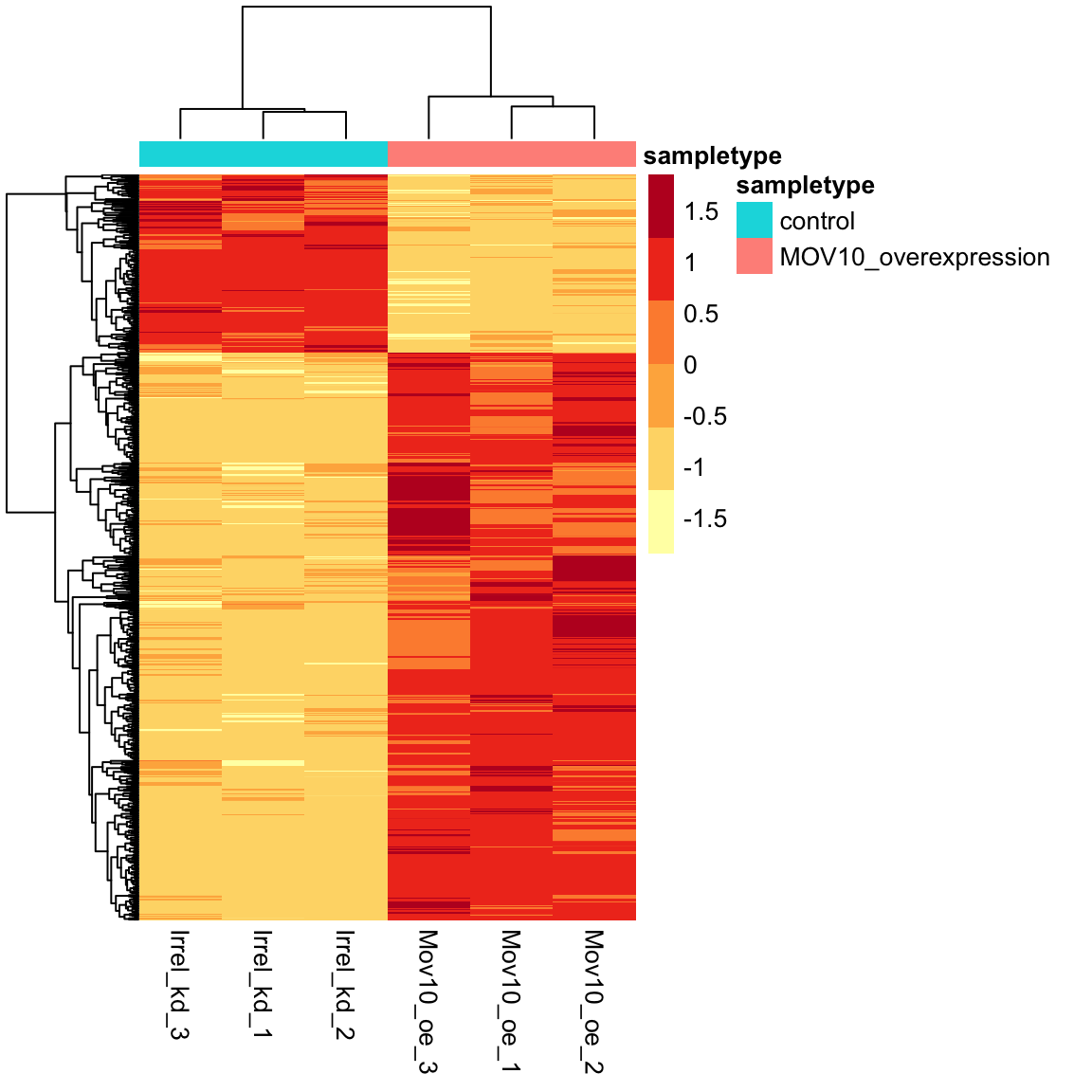
NOTE: There are several additional arguments we have included in the function for aesthetics. One important one is
scale="row", in which Z-scores are plotted, rather than the actual normalized count value.Z-scores are computed on a gene-by-gene basis by subtracting the mean and then dividing by the standard deviation. The Z-scores are computed after the clustering, so that it only affects the graphical aesthetics and the color visualization is improved.
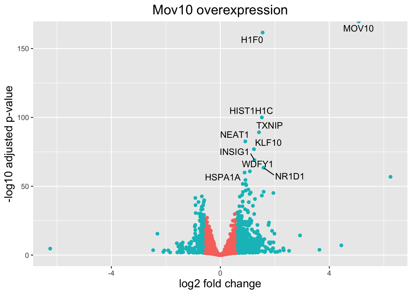
6.0.3 Volcano plot
The above plot would be great to look at the expression levels of a good number of genes, but for more of a global view there are other plots we can draw. A commonly used one is a volcano plot; in which you have the log transformed adjusted p-values plotted on the y-axis and log2 fold change values on the x-axis.
To generate a volcano plot, we first need to have a column in our results data indicating whether or not the gene is considered differentially expressed based on p-adjusted values.
## Obtain logical vector where TRUE values denote padj values < 0.05 and fold
## change > 1.5 in either direction

res_tableOE_tb <- res_tableOE_tb %>%
    mutate(threshold_OE = padj < 0.05 & abs(log2FoldChange) >= 0.58)
Now we can start plotting. The geom_point object is most applicable, as this is essentially a scatter plot:
## Volcano plot

ggplot(res_tableOE_tb) + geom_point(aes(x = log2FoldChange, y = -log10(padj), colour = threshold_OE)) +
    ggtitle("Mov10 overexpression") + xlab("log2 fold change") + ylab("-log10 adjusted p-value") +
    # scale_y_continuous(limits = c(0,50)) +
theme(legend.position = "none", plot.title = element_text(size = rel(1.5), hjust = 0.5),
    axis.title = element_text(size = rel(1.25)))
## Warning: Removed 7791 rows containing missing values or values outside the scale range
## (`geom_point()`).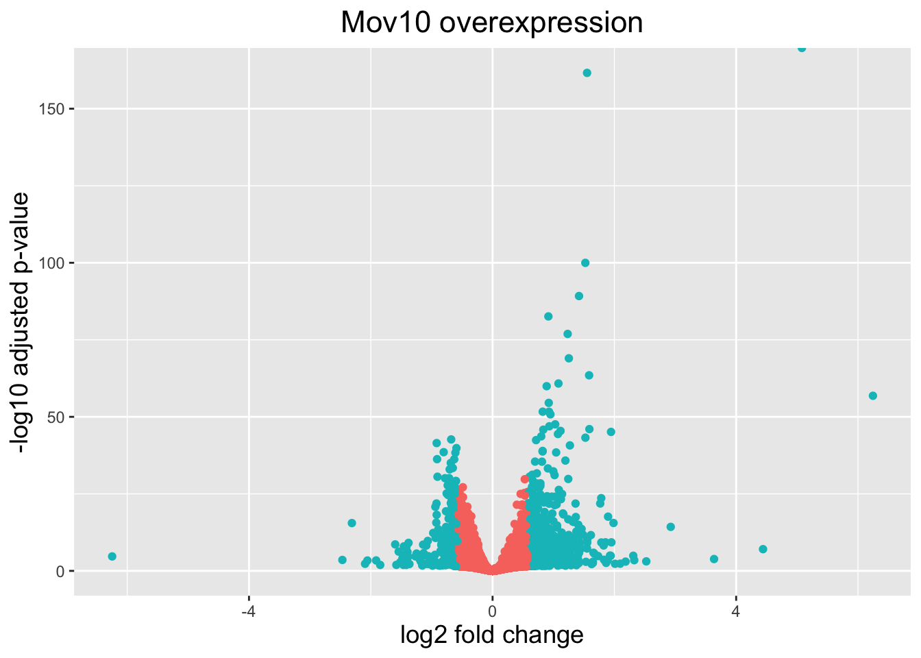
This is a great way to get an overall picture of what is going on, but what if we also wanted to know where the top 10 genes (lowest padj) in our DE list are located on this plot? We could label those dots with the gene name on the Volcano plot using geom_text_repel().
First, we need to order the res_tableOE tibble by padj, and add an additional column to it, to include on those gene names we want to use to label the plot.
## Create a column to indicate which genes to label

res_tableOE_tb <- res_tableOE_tb %>%
    arrange(padj) %>%
    mutate(genelabels = "")

res_tableOE_tb$genelabels[1:10] <- res_tableOE_tb$gene[1:10]

head(res_tableOE_tb)| gene | baseMean | log2FoldChange | lfcSE | pvalue | padj | threshold_OE | genelabels |
|---|---|---|---|---|---|---|---|
| MOV10 | 21681.800 | 5.0796303 | 0.1101145 | 0 | 0 | TRUE | MOV10 |
| H1F0 | 7881.081 | 1.5517867 | 0.0565777 | 0 | 0 | TRUE | H1F0 |
| HIST1H1C | 1741.383 | 1.5233152 | 0.0706090 | 0 | 0 | TRUE | HIST1H1C |
| TXNIP | 5133.749 | 1.4193814 | 0.0696576 | 0 | 0 | TRUE | TXNIP |
| NEAT1 | 21973.706 | 0.9162823 | 0.0466942 | 0 | 0 | TRUE | NEAT1 |
| KLF10 | 1694.211 | 1.2332114 | 0.0651896 | 0 | 0 | TRUE | KLF10 |
Next, we plot it as before with an additiona layer for geom_text_repel() wherein we can specify the column of gene labels we just created.
ggplot(res_tableOE_tb, aes(x = log2FoldChange, y = -log10(padj))) + geom_point(aes(colour = threshold_OE)) +
    geom_text_repel(aes(label = genelabels)) + ggtitle("Mov10 overexpression") +
    xlab("log2 fold change") + ylab("-log10 adjusted p-value") + theme(legend.position = "none",
    plot.title = element_text(size = rel(1.5), hjust = 0.5), axis.title = element_text(size = rel(1.25)))
## Warning: Removed 7791 rows containing missing values or values outside the scale range
## (`geom_point()`).## Warning: Removed 7791 rows containing missing values or values outside the scale range
## (`geom_text_repel()`).