Chapter 8 Functional analysis of RNAseq data
GO Terms, Ontology, and GO Enrichment:
- GO Terms (Gene Ontology Terms):
- GO terms are labels or keywords that describe the function of genes. These terms are organized into three main categories:
- Biological Process: Describes what a gene product does in the larger context of cellular or organismal processes (e.g., “cell division,” “response to stress”).
- Molecular Function: Describes the specific activity of a gene product at the molecular level (e.g., “enzyme activity,” “DNA binding”).
- Cellular Component: Describes where a gene product is located in the cell (e.g., “nucleus,” “mitochondrion”).
- Ontology:
Ontology refers to a structured system that organizes knowledge into a hierarchical network. In the case of Gene Ontology (GO), it organizes GO terms into a network that shows relationships between terms, from more general terms (like “cellular process”) to more specific ones (like “mitosis”).
This hierarchical structure helps researchers understand how genes are connected to different biological processes, molecular functions, or cellular components.
- GO Enrichment:
GO enrichment is a technique used to identify whether certain GO terms are overrepresented in a list of genes. For example, if you’re analyzing genes that are highly expressed in a disease condition, GO enrichment can help determine whether specific biological processes, functions, or cellular locations are more common among those genes than you would expect by chance.
This process helps to identify biological themes or pathways that are important in the condition you’re studying.
Functional Analysis Tools:
GO functional analysis tools are useful in interpreting resulting DGE gene lists from RNAseq, and fall into three main types:
Overrepresentation Analysis, Hypergeometric Test, and GSEA
- Overrepresentation Analysis (ORA):
Overrepresentation analysis is used to find biological themes that are more common in a list of genes than expected by chance. The goal is to identify which GO terms (or other functional categories) are overrepresented in your list of genes compared to the entire background of genes (e.g., all genes in the genome or all genes in your experiment).
You start with a list of genes (e.g., differentially expressed genes), and ORA helps determine if specific biological processes, molecular functions, or cellular components are significantly enriched in that list.
- Hypergeometric Test:
The hypergeometric test is a statistical method used in overrepresentation analysis to determine whether a GO term (or other category) is overrepresented in a list of genes compared to what you’d expect by chance.
The test answers the question: Given a certain number of genes in your list associated with a GO term, how likely is it to observe this many (or more) genes by random chance?
Example: If 10 out of 100 genes in your dataset are involved in “cell division,” but only 5 out of 1000 genes in the genome are involved in “cell division,” the hypergeometric test will tell you if this difference is statistically significant.
- Gene Set Enrichment Analysis (GSEA):
GSEA is a more advanced method that looks at all genes in your dataset rather than just a selected list (like in ORA).
Instead of only considering genes above a certain threshold (e.g., differentially expressed genes), GSEA looks at the entire ranked list of genes (e.g., ranked by their expression levels) and checks whether genes associated with a certain GO term are concentrated toward the top or bottom of the ranked list.
This method is helpful when there are subtle but coordinated changes in gene expression that may not meet a strict threshold but are still biologically significant.
-Example: GSEA would analyze whether genes related to “immune response” tend to cluster near the top or bottom of your ranked gene list, indicating coordinated up- or down-regulation in response to a treatment.
We will be using clusterProfiler first for overrepresentation analysis
8.0.1 clusterProfiler
# you may have to install some of these libraries; use
# BiocManager::install(c('org.Hs.eg.db','clusterProfiler','enrichplot','fgsea'))

library(org.Hs.eg.db)
library(clusterProfiler)
library(tidyverse)
library(enrichplot)
library(fgsea)
8.0.1.1 Running clusterProfiler
res_tableOE = readRDS("data/res_tableOE.RDS")

res_tableOE_tb <- res_tableOE %>%
    data.frame() %>%
    rownames_to_column(var = "gene") %>%
    dplyr::filter(!is.na(log2FoldChange)) %>%
    as_tibble()
To perform the over-representation analysis, we need a list of background genes and a list of significant genes. For our background dataset we will use all genes tested for differential expression (all genes in our results table). For our significant gene list we will use genes with p-adjusted values less than 0.05 (we could include a fold change threshold too if we have many DE genes).
## background set of ensgenes
allOE_genes <- res_tableOE_tb$gene

sigOE = dplyr::filter(res_tableOE_tb, padj < 0.05)

sigOE_genes = sigOE$gene
Now we can perform the GO enrichment analysis and save the results:
## Run GO enrichment analysis
ego <- enrichGO(gene = sigOE_genes, universe = allOE_genes, keyType = "SYMBOL", OrgDb = org.Hs.eg.db,
    minGSSize = 20, maxGSSize = 300, ont = "BP", pAdjustMethod = "BH", qvalueCutoff = 0.05,
    readable = TRUE)

## Output results from GO analysis to a table
cluster_summary <- data.frame(ego)

## make sure you have a results directory
write.csv(cluster_summary, "results/clusterProfiler_Mov10oe.csv")
8.0.1.2 Visualizing clusterProfiler results
dotplot
The dotplot shows the number of genes associated with the first 50 terms (size) and the p-adjusted values for these terms (color). This plot displays the top 50 genes by gene ratio (# genes related to GO term / total number of sig genes), not p-adjusted value.
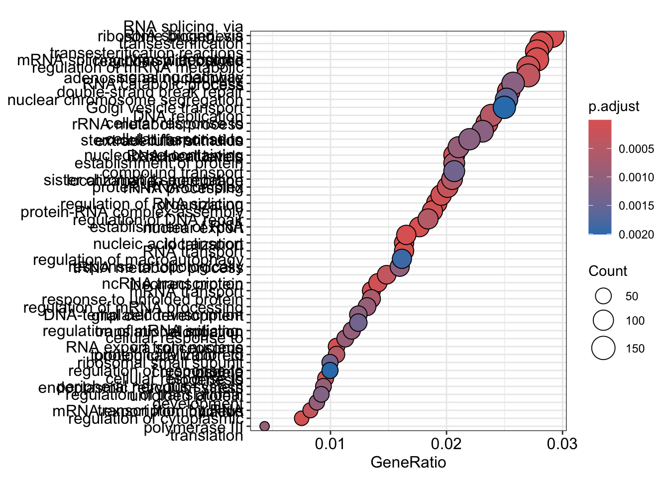 To save the figure, click on the Export button in the RStudio Plots tab and Save as PDF….set PDF size to 8 x 14 to give a figure of appropriate size for the text labels
enrichment GO plot
The next plot is the enrichment GO plot, which shows the relationship between the top 50 most significantly enriched GO terms (padj.), by grouping similar terms together. The color represents the p-values relative to the other displayed terms (brighter red is more significant) and the size of the terms represents the number of genes that are significant from our list.
This plot is useful because it serves to collapse the GO terms into functional categories by showing the overlap between GO terms.
## Enrichmap clusters the 50 most significant (by padj) GO terms to visualize
## relationships between terms

pwt <- pairwise_termsim(ego, method = "JC", semData = NULL, showCategory = 50)

emapplot(pwt, showCategory = 50)
## Warning: ggrepel: 9 unlabeled data points (too many overlaps). Consider
## increasing max.overlaps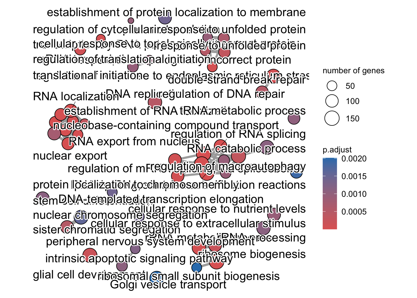
To save the figure, click on the Export button in the RStudio Plots tab and Save as PDF…. In the pop-up window, change the PDF size to 24 x 32 to give a figure of appropriate size for the text labels.
Finally, the category netplot shows the relationships between the genes associated with the top five most significant GO terms and the fold changes of the significant genes associated with these terms (color). The size of the GO terms reflects the pvalues of the terms, with the more significant terms being larger. This plot is particularly useful for hypothesis generation in identifying genes that may be important to several of the most affected processes.
netplot
## To color genes by log2 fold changes, we need to extract the log2 fold
## changes from our results table creating a named vector
OE_foldchanges <- sigOE$log2FoldChange

names(OE_foldchanges) <- sigOE$gene


## Cnetplot details the genes associated with one or more terms - by default
## gives the top 5 significant terms (by padj)
cnetplot(ego, categorySize = "pvalue", showCategory = 5, foldChange = OE_foldchanges,
    vertex.label.font = 6)
## Warning in cnetplot.enrichResult(x, ...): Use 'color.params = list(foldChange = your_value)' instead of 'foldChange'.
## The foldChange parameter will be removed in the next version.## Warning: ggrepel: 436 unlabeled data points (too many overlaps). Consider
## increasing max.overlaps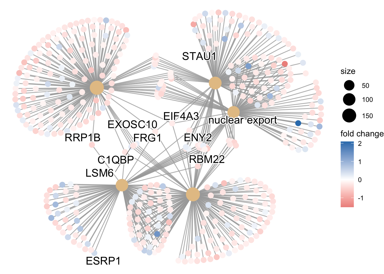
Again, to save the figure, click on the Export button in the RStudio Plots tab and Save as PDF…. Change the PDF size to 24 x 32 to give a figure of appropriate size for the text labels.
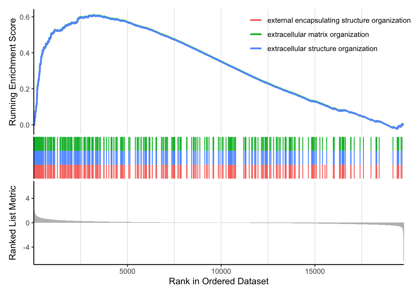
8.0.2 Gene set enrichment analysis (GSEA)
8.0.2.1 GSEA using clusterProfiler
GSEA uses the entire list of log2 fold changes from all genes. It is based on looking for enrichment of genesets among the large positive or negative fold changes. Thus, rather than setting an arbitrary threshold to identify ‘significant genes’, all genes are considered in the analysis. The gene-level statistics from the dataset are aggregated to generate a single pathway-level statistic and statistical significance of each pathway is reported.
Extract and name the fold changes:
## Extract the foldchanges
foldchanges <- res_tableOE_tb$log2FoldChange

## Name each fold change with the corresponding Entrez ID
names(foldchanges) <- res_tableOE_tb$gene
Next we need to order the fold changes in decreasing order. To do this we’ll use the sort() function, which takes a vector as input. This is in contrast to Tidyverse’s arrange(), which requires a data frame.
## Sort fold changes in decreasing order
foldchanges <- sort(foldchanges, decreasing = TRUE)

head(foldchanges)
## HSPA6 MOV10 ASCL1 HSPA7 SCRT1 SIGLEC14
## 6.246267 5.079630 4.441203 3.637040 2.925440 2.615129We can explore the enrichment of BP Gene Ontology terms using gene set enrichment analysis:
# GSEA using gene sets associated with BP Gene Ontology terms

gseaGO <- clusterProfiler::gseGO(geneList = foldchanges, ont = "BP", keyType = "SYMBOL",
    eps = 0, minGSSize = 20, maxGSSize = 300, pAdjustMethod = "BH", pvalueCutoff = 0.05,
    verbose = TRUE, OrgDb = "org.Hs.eg.db", by = "fgsea")
## using 'fgsea' for GSEA analysis, please cite Korotkevich et al (2019).## preparing geneSet collections...## GSEA analysis...## Warning in preparePathwaysAndStats(pathways, stats, minSize, maxSize, gseaParam, : There are ties in the preranked stats (8.07% of the list).
## The order of those tied genes will be arbitrary, which may produce unexpected results.## leading edge analysis...## done...## Warning: ggrepel: 84 unlabeled data points (too many overlaps). Consider
## increasing max.overlaps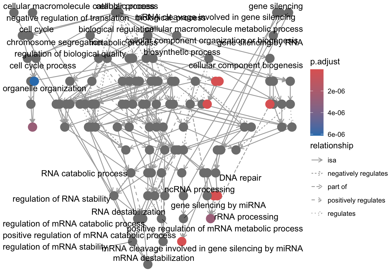
We can also use our homemade GO enrichment analysis. To do this we need to load the library GOenrichment:
# Uncomment the following if you haven't yet installed GOenrichment.

# devtools::install_github('gurinina/GOenrichment')

library(GOenrichment)

ls("package:GOenrichment")
## [1] "compSCORE" "dfGOBP" "hGOBP.gmt" "hyperG"
## [5] "runGORESP" "runNetwork" "sampleFitdata" "visSetup"
## [9] "yGOBP.gmt"One of the problems with GO enrichment analysis is that the GO annotations are in constant flux.
Here we can use the GO annotations in hGOBP.gmt (downloaded recently) to run GSEA using the fgsea package to run GSEA:
fgseaRes <- fgsea::fgseaSimple(pathways = hGOBP.gmt, stats = foldchanges, nperm = 1000,
    maxSize = 300, minSize = 20)
## Warning in preparePathwaysAndStats(pathways, stats, minSize, maxSize, gseaParam, : There are ties in the preranked stats (8.07% of the list).
## The order of those tied genes will be arbitrary, which may produce unexpected results.fgsea <- data.frame(fgseaRes, stringsAsFactors = F)
w = which(fgsea$ES > 0)
fposgsea <- fgsea[w, ]
fposgsea <- fposgsea %>%
arrange(padj)We are going to compare these results to runing the GO enrichment function runGORESP. runGORESP uses over-representation analysis to identify enriched GO terms, so we need to define a significance cutoff for the querySet.
## function (mat, coln, curr_exp = colnames(mat)[coln], sig = 1,
##     fdrThresh = 0.2, bp_path = NULL, bp_input = NULL, go_path = NULL,
##     go_input = NULL, minSetSize = 5, maxSetSize = 300)
## NULL`?`(runGORESP)
# we'll define our significance cutoff as 0.58, corresponding to 1.5x change.
# `runGORESP` requires a matrix, so we can turn foldchanges into a matrix using
# `cbind`:
matx <- cbind(foldchanges, foldchanges)
hresp = GOenrichment::runGORESP(fdrThresh = 0.2, mat = matx, coln = 1, curr_exp = colnames(matx)[1],
sig = 0.58, bp_input = hGOBP.gmt, go_input = NULL, minSetSize = 20, maxSetSize = 300)
names(hresp$edgeMat)## [1] "source" "target" "overlapCoeff" "width" "label"## [1] "filename" "term" "nGenes"
## [4] "nQuery" "nOverlap" "querySetFraction"
## [7] "geneSetFraction" "foldEnrichment" "P"
## [10] "FDR" "overlapGenes" "maxOverlapGeneScore"
## [13] "cluster" "id" "size"
## [16] "formattedLabel"Let’s check the overlap between the enriched terms found using runGORESP and those found using fgseaSimple as they used the same GO term libraries:
w = which(fposgsea$padj <= 0.2)

lens <- length(intersect(fposgsea$pathway[w], hresp$enrichInfo$term))

length(w)
## [1] 590## [1] 238 16## [1] 81.5126180%, that’s very good, especially because we are using two different GO enrichment methods, over-representation analysis and GSEA. The overlap between these enrichment and the ones using the other GO enrichment tools will be very small because of the differences in the GO annotation libraries.
Now to set up the results for viewing in a network, we use the function visSetup, which creates a set of nodes and edges in the network, where nodes are GO terms (node size proportional to FDR score) and edges represent the overlap between GO terms (proportional to edge width). This network analysis is based on Cytoscape, an open source bioinformatics software platform for visualizing molecular interaction networks.
## [1] "nodes" "edges"Now we use runNetwork to view the map:
This is one of the best visualizations available out of all the GO packages.
There are other gene sets available for GSEA analysis in clusterProfiler (Disease Ontology, Reactome pathways, etc.). In addition, it is possible to supply your own gene set GMT file, such as a GMT for MSigDB called c2.
** The C2 subcollection CGP: Chemical and genetic perturbations. Gene sets that represent expression signatures of genetic and chemical perturbations.**
8.0.3 Other tools and resources
GeneMANIA. GeneMANIA finds other genes that are related to a set of input genes, using a very large set of functional association data curated from the literature. Association data include protein and genetic interactions, pathways, co-expression, co-localization and protein domain similarity.
ReviGO. Revigo is an online GO enrichment tool that allows you to copy-paste your significant gene list and your background gene list. The output is a visualization of enriched GO terms in a hierarchical tree.
AmiGO. AmiGO is the current official web-based set of tools for searching and browsing the Gene Ontology database.
DAVID. The fold enrichment is defined as the ratio of the two proportions; one is the proportion of genes in your list belong to certain pathway, and the other is the proportion of genes in the background information (i.e., universe genes) that belong to that pathway.
etc.