6 Mapping Segregation
With Assignment #5, we are once again we are interested in tracking spatial patterns and distributions in and around our neighborhood. Instead of focusing on events/incidents like crime and public order like we did last week, we are now interested in how people of different racial/ethnic backgrounds are distributed across our chosen neighborhood and in the city and region that encompass our neighborhood.
The assignment asks you to think about the prevalence and consistency of segregation in and around your neighborhood. To be able to make claims about the segregation, we will need to create a couple of maps and graphs. These visuals will help us understand which racial groups have resided in the neighborhood, the city, and the region, and how the distribution of the racial groups in the neighborhood compares to the distribution in the city and to the distribution across places within the region. On top of that, we are going to enable time functionality on our maps and graphs, so that we can track change over time in the composition and distribution of racial groups in the three different geographies. You’re probably noticing that in the process of mapping segregation, we are dealing with multiple dimensions. The dimensions that we want to pay careful attention to are:
- Racial groups - Non-Hispanic Black, Non-Hispanic White, Asian, Native, Hispanic, Nonwhite (aggregate of all non-white groups)
- Geographic units - Neighborhood, City/Place, Region
- Time - Each decade from 1970 to 2020. Some of you may find that the first decade in your data is 1980. This is because data were not collected for your city at the census tract level.
That may seem like a lot of dimensions to consider, but you will find that there are visual techniques in GIS, especially web-based GIS, that make expressing all of these dimensions in a map straightforward and digestible. In the following sections, we will walk through three mapping styles that are useful for understanding segregation: dot density, predominance, and choropleth mapping. The data you need to make your maps is provided on our AGOL class group page. Each section will direct you to the appropriate data layers.
6.1 Racial Composition
Before we get to point of quantifying racial residential segregation in and around our neighborhood, we need to be able to see the racial composition of our neighborhood and other neighborhoods in the city in which it is located. A map of racial composition will tell us which racial groups are present and how much of the overall population each group represents. In your readings for the week, the Massey & Denton and Schafran provided a sense of racial composition when they pointed to tables with the breakdown of race by percentages and in maps that were shaded by the percent of a single race group, e.g., % African American population. In the next few sections, we are going to go a step further with some mapping techniques that can show multiple racial groups at once and which racial groups are predominant in the neighborhood population.
6.1.1 Predominance Map
Let’s start with a predominance map. The sub-units (smaller geography) that we will map are census tracts and our super-unit (larger geography) is the city. The predominance map will show two attributes for each census tract in the city:
- The most common racial group in the census tract,
- How predominant the most common group is (i.e., the clear majority or just barely the majority).
Start by opening up a new map in the Map Viewer. Navigate to the Add Layers button and search within our group page for the layer of census tracts in your neighborhood’s city [Naming Style: CITY_NAME_Tracts_Race]. Add the layer to the map. You should see a time slider at the bottom of your Map viewer now like the one shown in the image below. If you do not see the time slider, email Francine so she can fix the configuration of your layer.
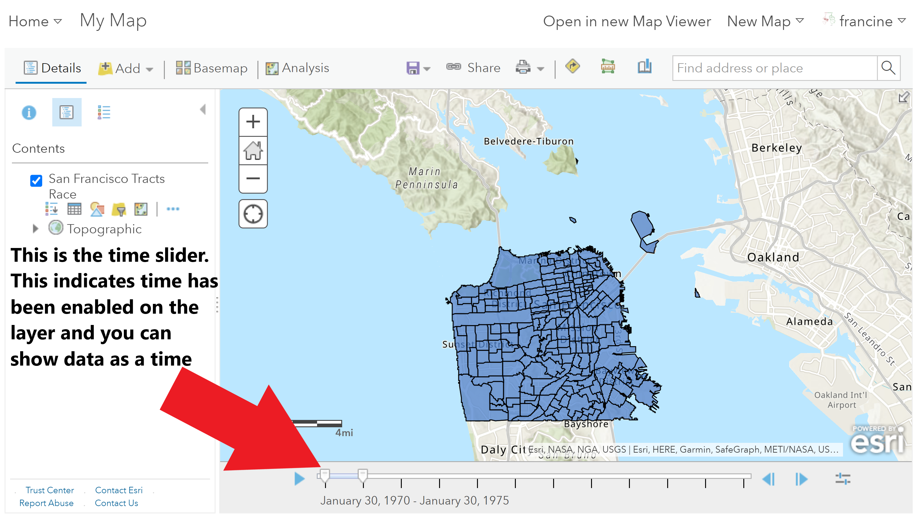
Add the time-series census tract layer
Style the Predominance Layer
Add the time-series census tract layer
- Once you have added the layer to the map, go into the layer and Change the Style. You will need to specify the racial groups as attributes. The GIF above shows how to add each group successively. Select race groups from the list below. You do not need to select all of them.
- Non-Hispanic White (NHWHITE)
- Non-Hispanic Black (NHBLACK)
- Asian & Pacific Islander (ASIAN)
- Native American (NATIVE)
- Hispanic/Latinx (HISPANIC)
- Alternatively, if you are just interested in the binary white/non-white group distribution, use only Non-Hispanic White and Nonwhite (NONWHITE) as your attributes. Nonwhite aggregates the Non-Hispanic Black, AAPI, Native American, and Hispanic/Latinx groups.
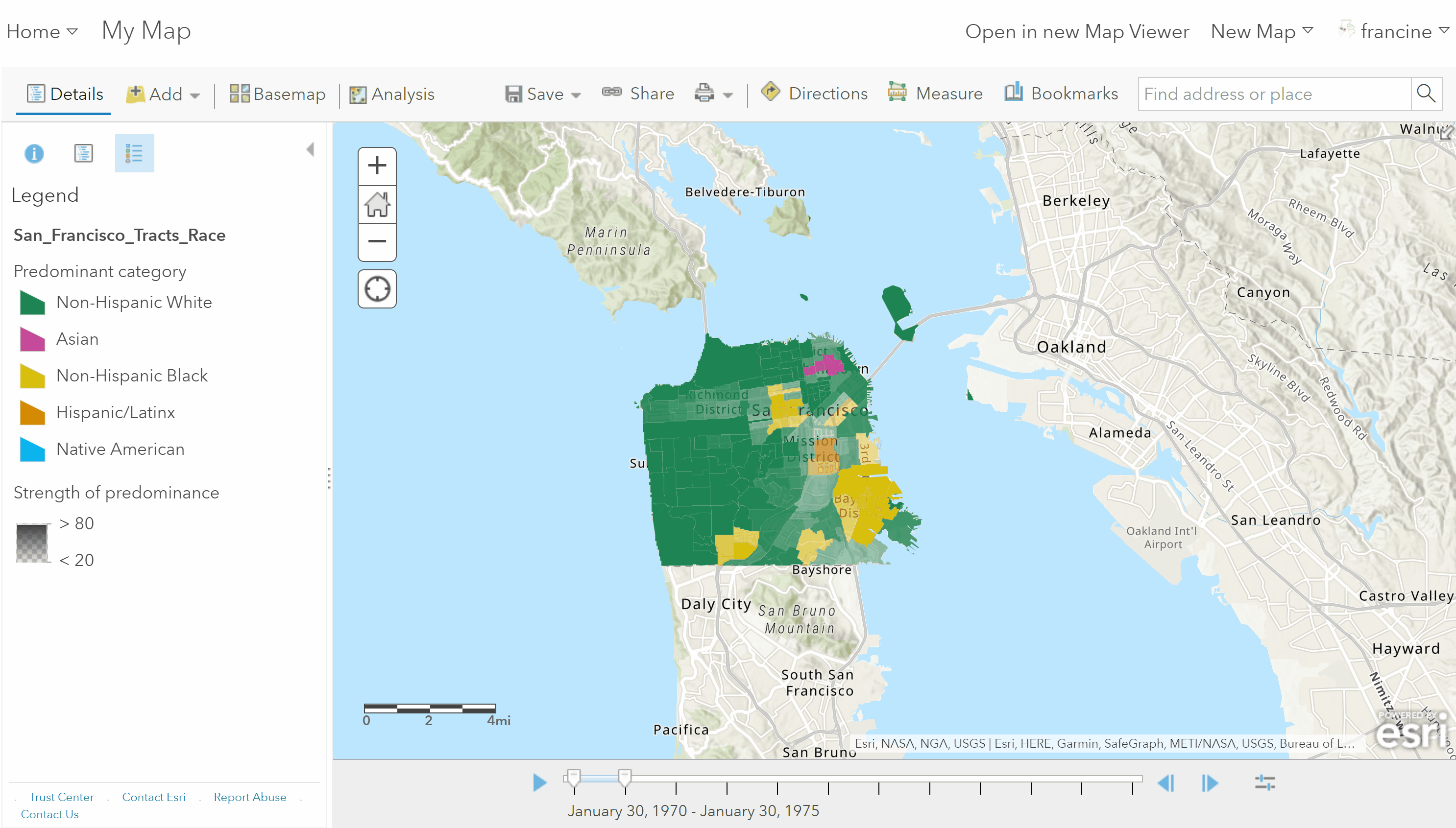
- Select Predominant Category as the drawing style, and click on the options.
- In the options, change the label names from the abbreviated variable names to the actual racial group names.
- Select a color scheme that you would like. You can manually select colors or pick a palette that you would prefer.
- Do not change the transparency settings.
- Select Okay and Done and view the predominant racial groups in each of the census tracts in your city.
Notice in the legend that the strength of predominance is represented based on the intensity of the color shading. Darker colors indicate more predominance, while lighter/more transparent coloring represents more of a plurality of groups being present in the tract. However, right now this visual is deceptive because each decade is stacked on one another in this layer. We need to turn on the time-slider to see the predominant groups in each decade.
Adjust the time intervals
To set the time slider intervals to show decade-steps, navigate to the Configure button on the time slider. It is the button all the way to the right of the slider.
Adjust the time slider to show all decades
- Select advanced options.
- Change the interval to Decade and the count to 1.
- You can adjust the play-back speed by moving the slider at the top.
Before you watch your animated map, I recommend making a couple of aesthetic decisions:
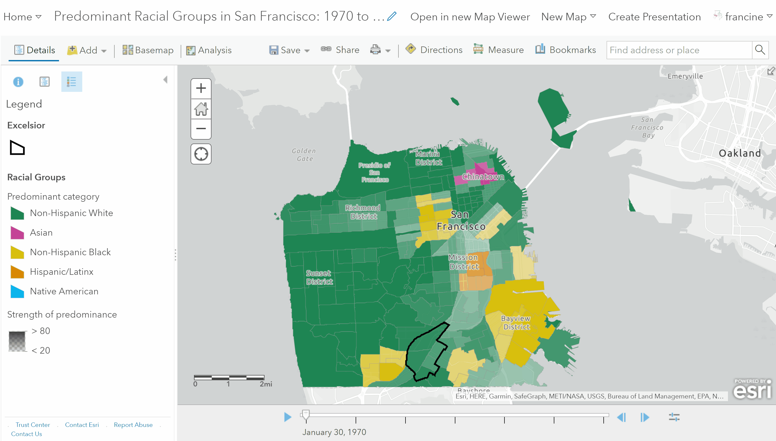
- Add the layer with your neighborhood boundaries, style it so that the polygon area is transparent and you only have an outline of the neighborhood boundaries. This will draw attention to your neighborhood.
- Because the series of maps we will be making are thematic maps with lots of colors, it is a good idea to opt for a basemap with a neutral background style and minimal colors, labels, and features. I would recommend changing the background style to the Light or Dark Gray Canvas.
When you are happy with your basemap, hit play on the time slider and watch where the predominant groups change and stay the same. Note what is happening within the census tracts in and around your neighborhood. Save your map with the Save As button. Be sure to give it an informative title.
Watch your animated racial group predominance map
This map gives us a good sense of the predominant groups, but does not show all groups residing in the census tract at once. For this, we need to turn to the quintessential composition map - the dot density map!
6.1.2 Dot Density Map
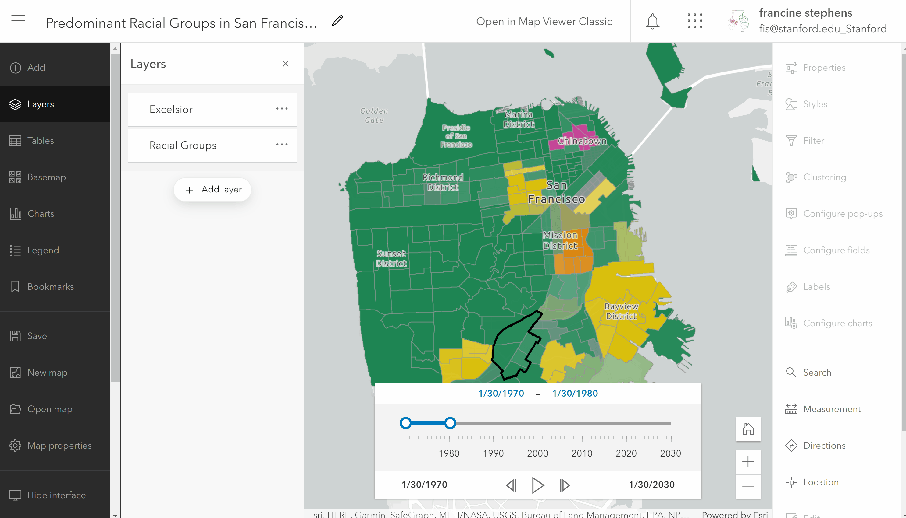
The Map Viewer we have been using up to this point does not have the ability to render a dot density map. However, the new Map Viewer does, so we are going to switch into its interface for the dot density map. With your predominance map open in the (classic) Map Viewer, navigate to the button in the top bar that says: Open in New Map Viewer.
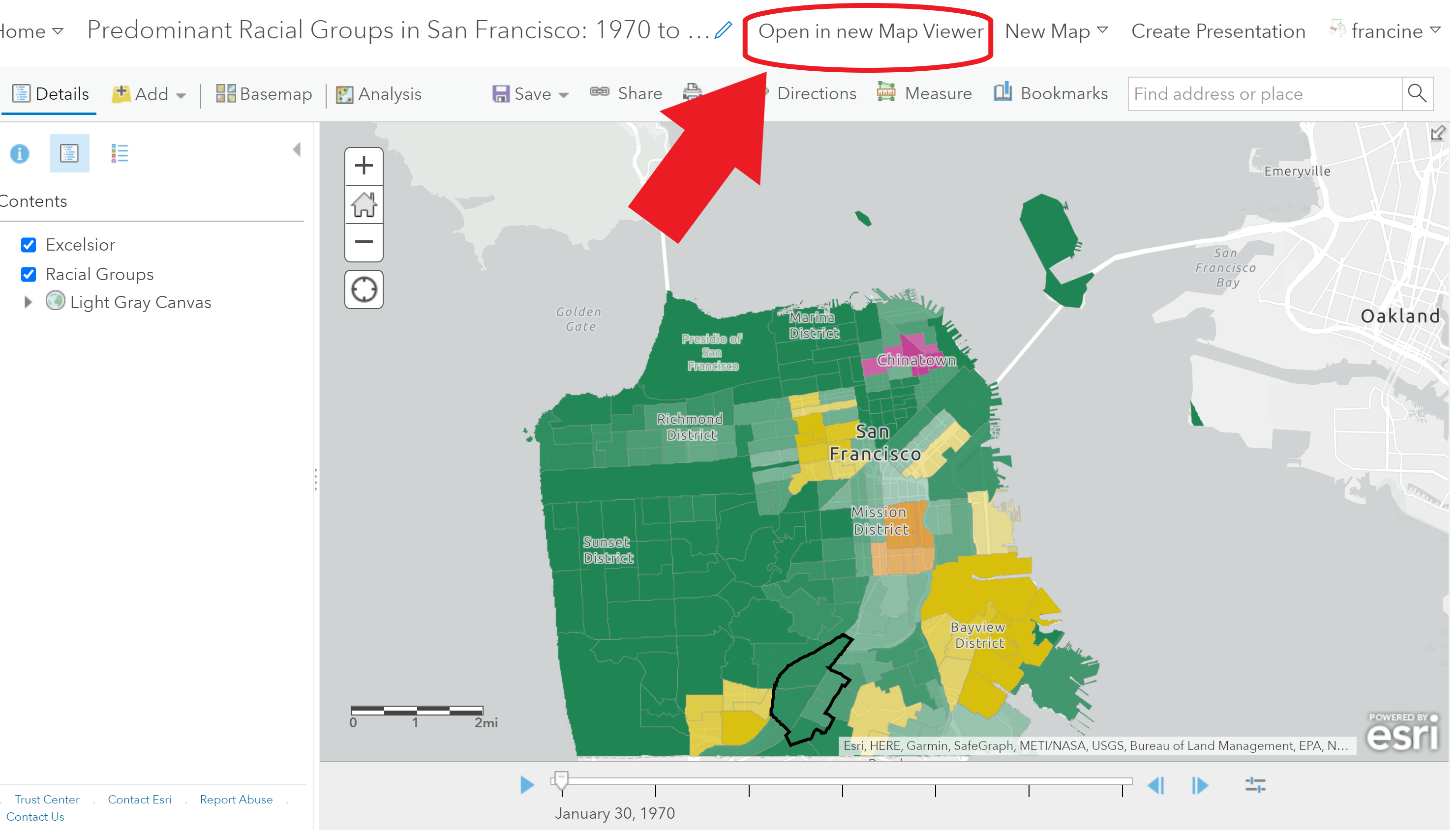
Open the map in the New Map Viewer
Follow the steps in the GIF and written below to style the dot density map:
Style your dot density map
- Navigate over to the Layers Pane and click on the three dots on the census tract layer with your racial groups.
- Select Show Properties. The properties pane will appear on the right-hand side of your screen for you to change the drawing style.
- Select Edit layer style to change the drawing style.
- Then, select Dot Density from the Drawing Styles.
- Select the Style Options to change some of the properties. Set style options similar to the way you did in the Predominance map.
- Rename the race group categories with their real names instead of the abbreviated variable names.
- Change the color scheme. I replicated the color scheme of the predominance map.
- Test out different dot value representations. I found bumping down the value to work better and capture density in more dense neighborhoods. However, the ideal value is going to vary based on how urbanized/dense your city is, so test out different sizes.
Go ahead and play the time animation and watch what happens.
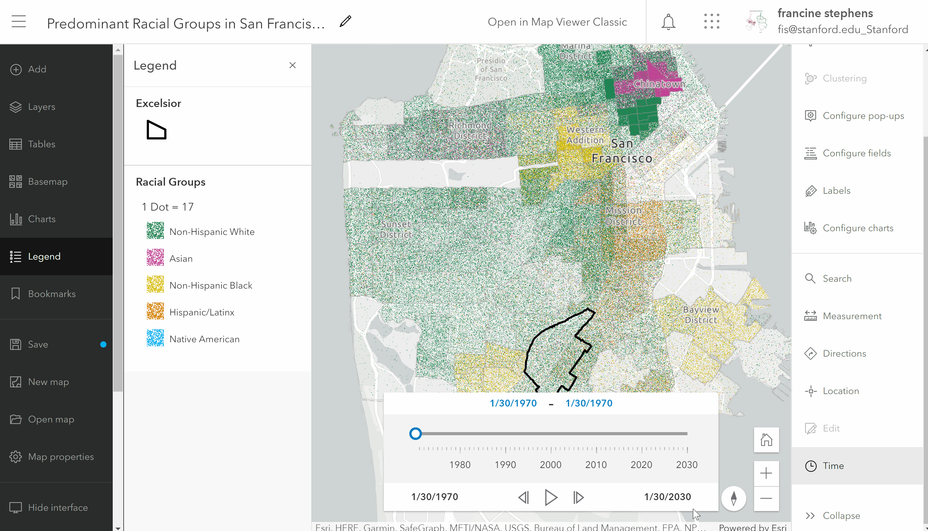
Animated dot density map
Zoom and pan around your map. Notice that the dots move and re-size. The dots are not representing specific locations of residents within the tract; they are randomly distributed across the tract. The resizing changes as you zoom in and out. To change that, go into the layer options and turn off the rescaling option. You may have to try several different drawing sizes before you find one that works best for your neighborhood/city.
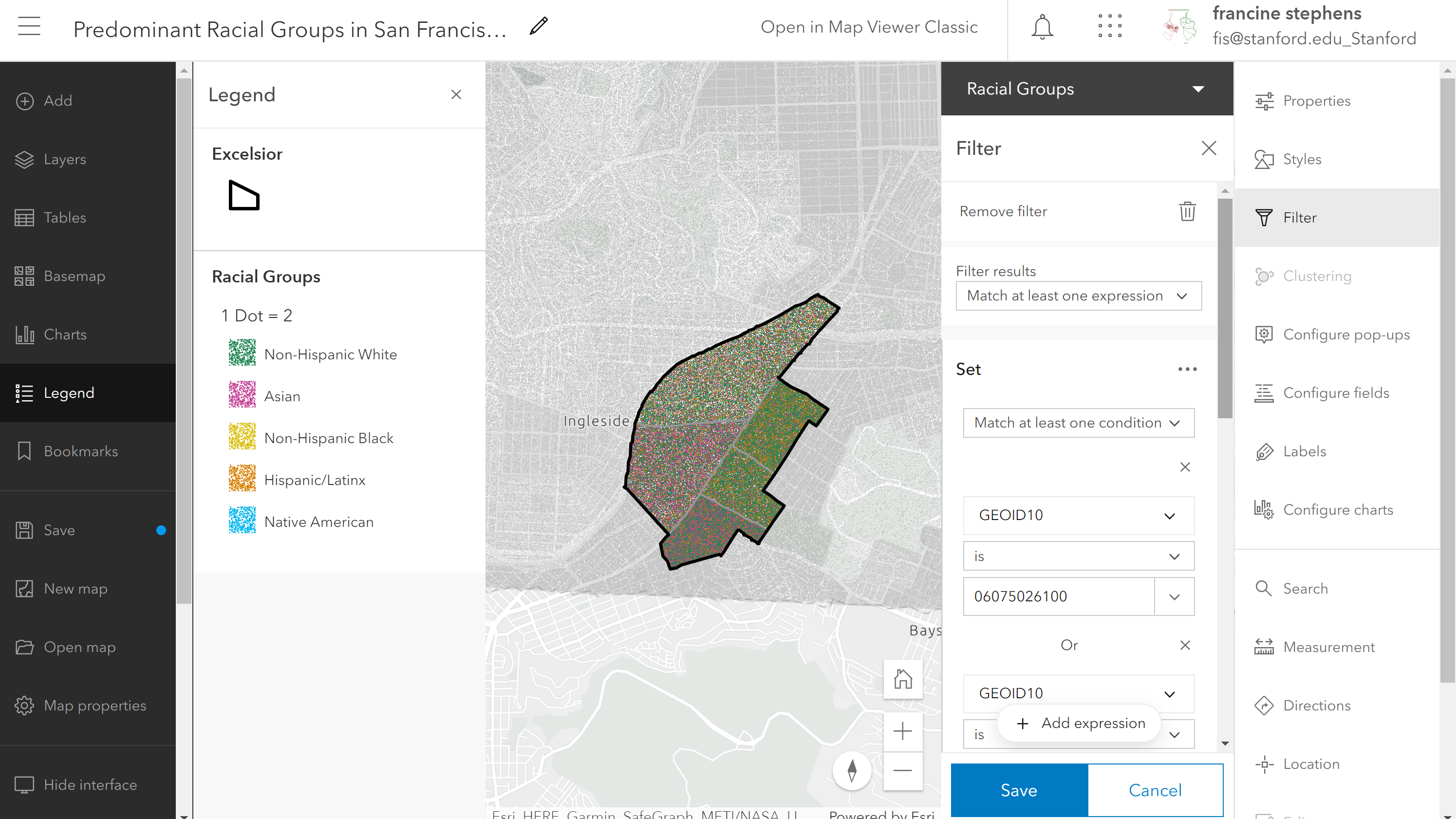
If you have multiple tracts in your neighborhood, it might be worth filtering down to the extent of your neighborhood as I have done in the image below. Go to the filter tab on the side bar and filter based on the tract GEOIDs in your neighborhood. You can find your tract GEOIDs by clicking on the tracts and viewing the pop-up information.
Filter down dot density map down to your neighborhood
Before you close your map be sure to save your map with a new name.
For your assignment, you do not need to present both the predominance map and the dot-density map. Pick the visual that helps to convey your message. If presenting all groups or the denseness/sparseness of the population is important, then the dot density map would be ideal. If you are more focused on closely tracking one or two groups in the neighborhood/city, then the predominance map would probably be effective. You cannot save a time series map as a PDF, so you will need to Share the link to the web-map with us. If you create the dot density map, set the share settings to the AGOL class group. We will access the map from the group when grading.
6.2 Visualizing Segregation Indices
Now, that we have mapped racial composition, we want to quantify the level of segregation between neighborhoods within the city and examine how the level of segregation has changed over time. Some measures of segregation are more clearly visualized in a graph rather than a map. This is the case for the dissimilarity index. Other segregation measures like the divergence index can be clearly captured in a choropleth map. We will walk through what each index means and how to visualize it.
6.2.1 Dissimilarity Index Graph
The dissimilarity index is the most commonly used measure of segregation. It is the simplest to calculate and interpret. The dissimilarity index indicates how unevenly two racial groups are distributed across tracts within a city. The dissimilarity score can be interpreted as the percent of one racial group (in the pair being considered) that would need to move to other neighborhoods in order to have an even distribution of the two racial groups across the city.
Because the dissimilarity score applies to the whole city, it would not be informative to color the map for just our city. Instead, we can more effectively track the dissimilarity scores for a city over time by using a graph. A spreadsheet software like Excel or Google sheets will allow us to view and chart the dissimilarity index over time. If you know how to make graphs using a statistical software like R, Stata, SPSS, or Python, you are welcome to use one of those statistical tools. The dissimilarity measures are stored as CSV files on our class group page. Navigate to the Content page for our class group and filter by categories for the Segregation Data to find your city’s data. The screenshot below shows you where to look on the content page.
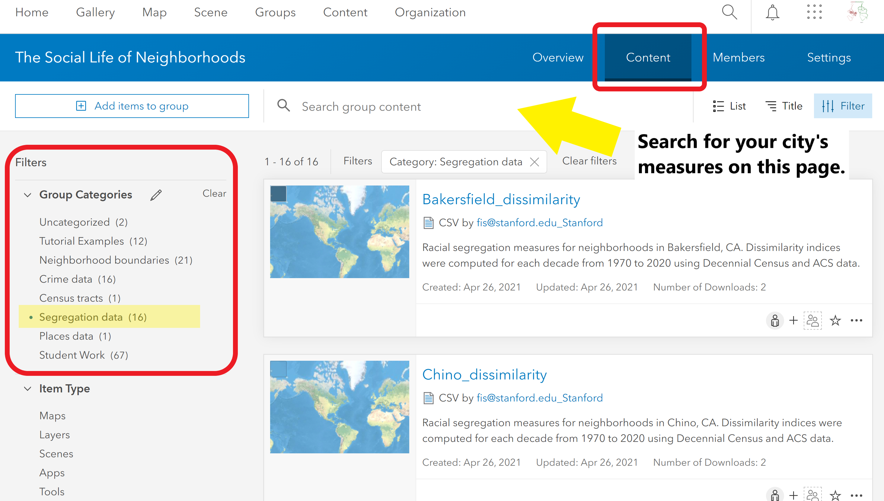
Find your city’s dissimilarity scores
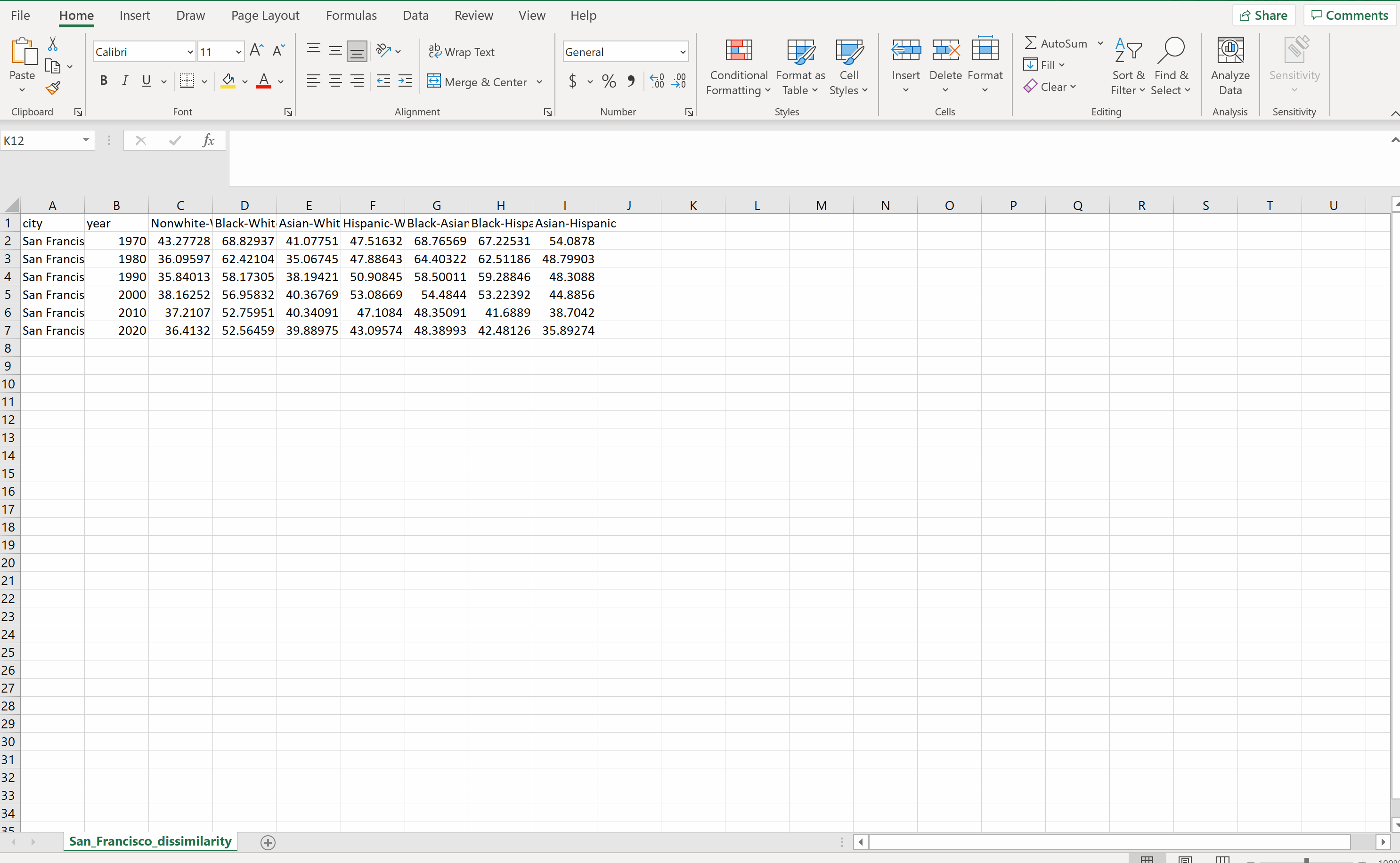
- Download the CSV and open it in your spreadsheet software of choice.
- The spreadsheet has columns for the: city name, year, and the dissimilarity scores based on the two group-pairs.
- Make a line chart in Excel using the year and the dissimilarity score columns. The GIF below walks you through the process.
- Remove the “year” label to get the graph to render as a line graph. Excel is picky about the x-axis not having a column label.
Graph the dissimilarity scores over time
This GIF is just to give you a sense of how to quickly pull together a line graph from your data in Excel. You do not need to replicate this graph exactly. It is up to you as to which dissimilarity scores you present and how you style the chart. Base your decisions on which patterns jump out to you and what points you are making in your write-up.
Once you are happy with your graph, save it as an image so that you can include it in your assignment write-up and the Story Map that you create at the end of the quarter.
How do you interpret the scores? For the 1970 Asian-Hispanic score in this example, we would say that 54.1 dissimilarity score as indicating that about 54% of Asians (or Hispanics) would need to move neighborhoods in the city in order to achieve an even distribution of these racial groups across the city.
What is considered a low or high segregation level?
The dissimilarity index is minimized (i.e., equals 0), when the proportion of each group in the census tract matches the proportions of the group in the city. By contrast, a score of 100 would signal that the tract is home to only one racial/ethnic group. Generally, the breakdown for low-moderate-high levels of segregation looks like:
- Low = (0, 30]
- Moderate = (30, 60]
- High = (60, 100]
What are the limitations of the Dissimilarity index?
At this point, you might notice that there are a couple of constraints of the dissimilarity index. First, we can only consider segregation between two racial groups at a time. Areas with more overall racial diversity tend to show lower overall Black-white dissimilarity scores, for example. This is not necessarily because Blacks and whites are more integrated, but because there are fewer all-white or all-Black neighborhoods.
Second, the dissimilarity score is produced for the super-unit (the city) and we cannot decompose the dissimilarity index to show how much each tract contributes to the dissimilarity score of the city. Let’s turn to a measure that allows us to get around those two limitations - the divergence index.
N.b: 2020 race data: The 2020 data are based on estimates from the ACS, NOT counts from the Decennial Census. For urbanized areas, the estimates will be reasonable, but the same cannot be said for small urban areas and suburban areas. The ACS coverage in these areas was not as robust. If your neighborhood’s city is not highly urbanized area, you will probably notice that the dissimilarity values tick upward or downward substantially from 2010 to 2020. This is probably a product of using an estimate with some coverage issues, especially for minority groups. If these conditions apply to your city’s data, then take the 2020 values with a grain of salt in your write-up.
6.2.2 Divergence Index Choropleth Map
With the divergence index, we are representing the departure of the tract’s racial make-up from the super-unit of interest, which in this case is the city. Although this measure takes into account all of the racial groups present in a census tract and the city at the same time, there is not a particularly straightforward way of interpreting the divergence index score. Unlike the dissimilarity index, the score does not represent the share of people from one racial group that would need to be redistributed across the city/larger sub-unit. Instead, the divergence score is generally interpreted based on which categorical level the score falls into:
- Low Segregation = [0, 0.1]
- Moderate Segregation = (0.1, 0.25]
- High Segregation = (0.25, 1.0]
In the steps below, we will first walk through mapping the raw divergence index scores in a choropleth map. Then, we will reclassify the choropleth map into the three levels of segregation categories presented above.
Choropleth Map of Divergence Index
In a new map viewer window, navigate to the Add Layer button and find the layer of census tracts in your city with the divergence index scores [Naming style: “City_Name_tracts_divergence”]. Once you have added the layer, check that time is enabled and set the interval to decades in the configure options. Next, add the neighborhood boundaries layer and once again style it with a transparent area and outlined borders. Let’s now build the choropleth map by navigating to the Change style button on the layer.
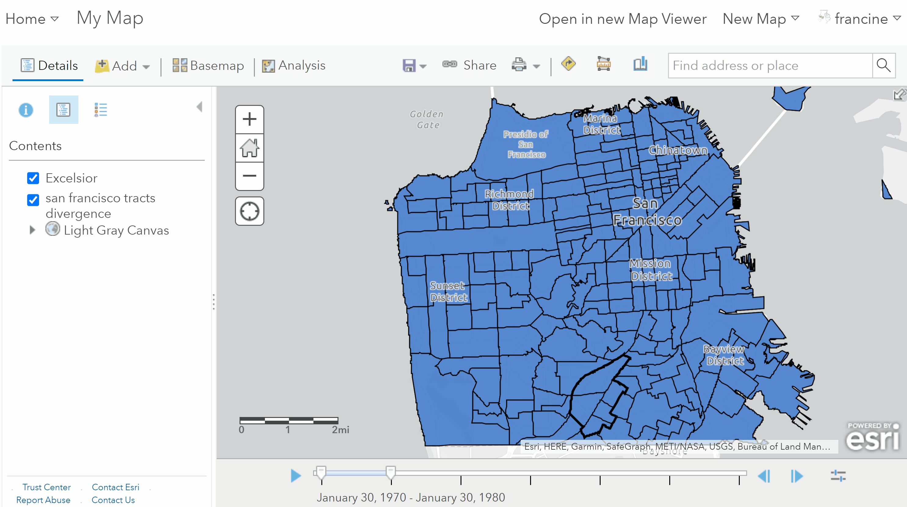
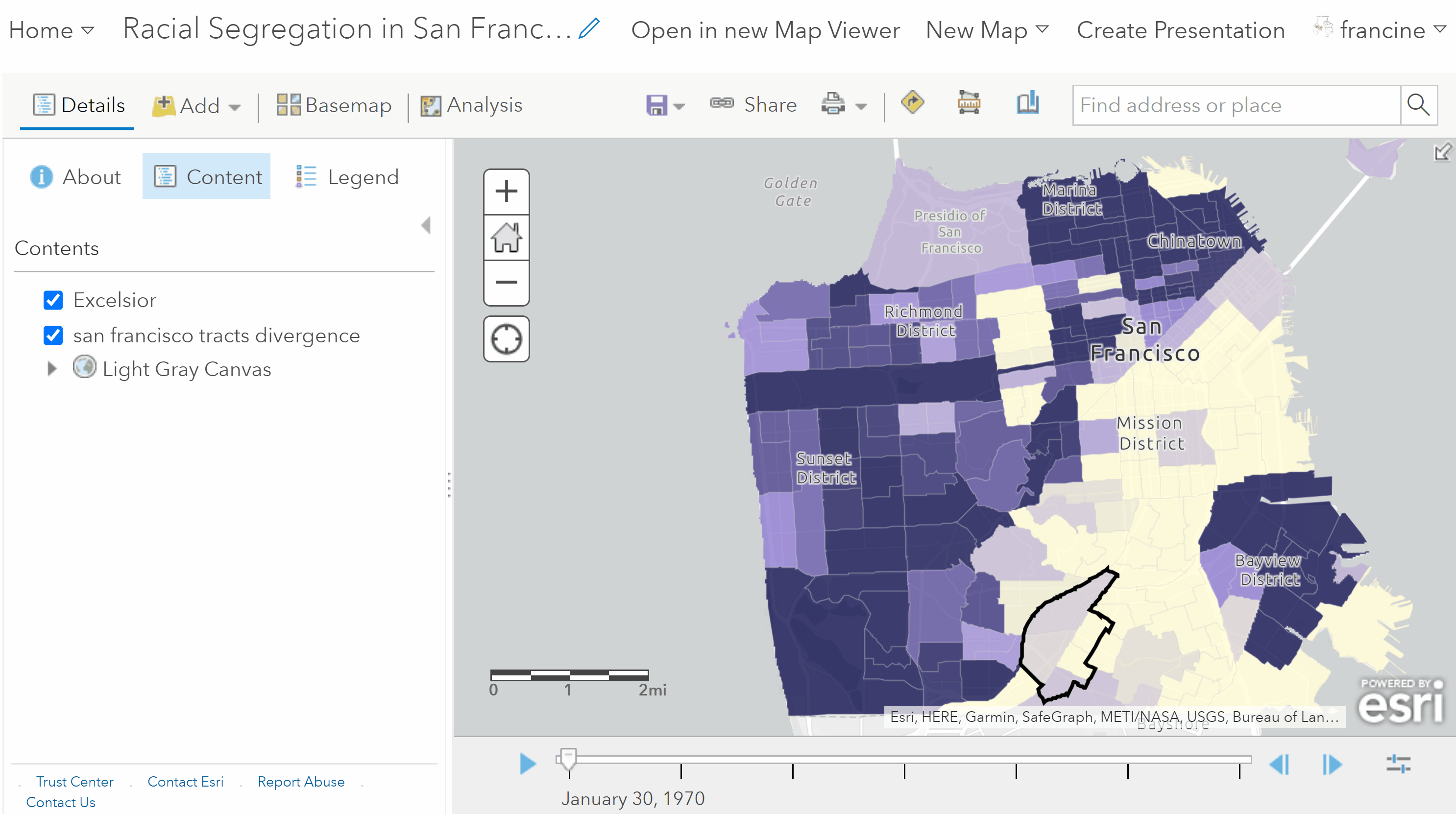
Create a choropleth map of the divergence index
- In the change style page, set the attribute to divergence (abbreviated divrgnc) in the drop-down menu.
- Select the Counts and Amounts (Color) drawing style, and go into the Options.
- You should notice that the color-scheme for low to high values is automatically populated as is the scaling of the shading in the legend. You can change the color scheme if you would prefer. More importantly, set the scale on the legend based on the low/moderate and moderate/high thresholds listed in above.
Push play on the time slider and notice how the shading of the tracts in and around your neighborhood changes over time. Darkening of colors over time indicates that the tract’s population is becoming increasingly segregated. Tracts that trend toward lighter shades over time are experiencing decreases in segregation.
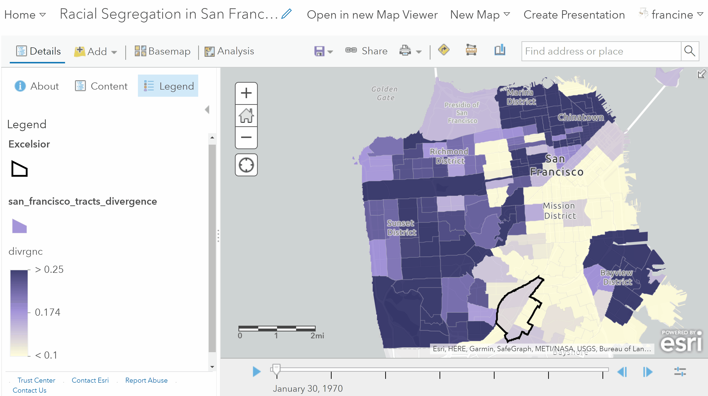
View changes in segregation in and around your neighborhood over time
Categorical Thematic Map of Segregation Levels
With an index measure like the divergence index, the changes in the score over time are not clearly communicated using a choropleth map with the full numeric scale. One of the limitations of the divergence index is that the values tend to be quite small, so it can be tricky to discern what is a low segregation and what is a moderate level. We can help out someone who is reading our map by grouping the index scores into categories. It also can be easier to spot the neighborhoods (i.e., census tracts) experiencing changes in segregation by reclassifying them into categories of low, moderate, and high, like the ones listed above for segregation levels. Let’s do this with our map! Return to the Change Styles page for the layer and again select the Options button again on the color drawing style.
Transform your choropleth to a categorical thematic map
- Check the Reclassify data radio button.
- Select the Manual Breaks Classification as the Using option from the drop down menu, and enter 3 for the number of classes.
- We want to match the 3 levels to match those in the series of bullets above, so go to the legend and change the values for the breaks to match the ones in the table.
- Then, change the labels on the legend to high, moderate, and low.
- Confirm your changes by clicking Okay/Done, and watch your time animated map again.
When you play the time animated map, this reclassified version with segregation level categories draws more attention to the tracts that experience substantial changes in segregation levels (e.g., from low to medium or medium to high or vice-versa). As with the racial composition maps, you do not need to include both styles in your submission, select the one that does the best job conveying the trends in segregation occurring in and around your neighborhood.
Don’t forget to save your map with the Save As option and give it an informative title!
6.3 Segregation between Places
Now, let’s turn to a larger scale - the region. The Schafran chapter made an argument about segregation becoming more prominent between places across a region instead of just between neighborhoods in the same city over time. To get a sense of segregation between places in a region, we need to change our units. In our maps and graphs, our sub-unit needs to change from census tracts/neighborhoods to places - cities, suburbs, and exurbs - in a region. The super-unit is now the region, instead of the city.
The approach we are taking in measuring and visualizing regional segregation parallels Schafran’s, but there are a few departures that we are going to take that are worth mentioning briefly here.
Places
Schafran uses a geographic unit called places that have been designated by the U.S. Census Bureau. Census places are a good approximation of cities and suburbs, but this geographic unit does not actually cover all of the land area in the region. Moreover, this geographic unit leaves out some of the population in the region.
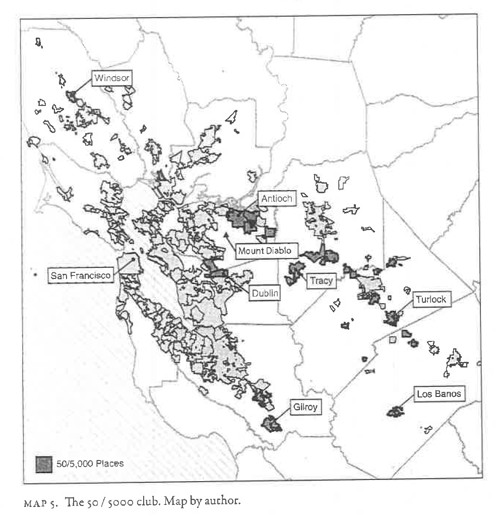
Map 5 in The Road to Resegregation: The 50/5,000 club Places
The Census Bureau lets states’ OMB identify what constitutes a “place”, so there is actually a lot of variation across the U.S. in terms of what gets designated as a place or not. Some states specify a certain population threshold, and others, like Hawaii, make sure that they draw boundaries in such a way that accounts for the entirety of the land area/population.
Why does this shortcoming of Census places matter for racial residential segregation? Some of the areas that are not emplaced by the Census are these exurban places that are experiencing population and housing growth in the last decade. This is especially true in the South and American sunbelt region. At this point, there is not much research on these types of areas, so we do not really know if these exurban areas are becoming home to homogeneous or racially diverse populations. In the attribute table of your places map layer, you will see both the census designated places, which have names that end in city, town, or CDP as well as the non-emplaced areas, which have been labeled an unincorporated place in the county in which they are located (e.g., San Mateo County unincorporated place).
Region
Schafran also takes issue with using the Census Bureau’s Metropolitan Statistical Area (MSA) as a region. The geographic extent of MSAs varies across the U.S. because they are drawn according to population size thresholds. Schafran thinks that commuting patterns and the employment landscape are also important dimensions of a region. He relies on these dimensions to establish his 12 county definition of the Bay Area region. It is tricky to apply his approach to defining a region to other parts of the country, so regions are going to be defined differently based on where your neighborhood is located. If your neighborhood is in the Bay Area, your region extent will be the same as Schafran’s. If your neighborhood is located somewhere else, we will just use the combined-statistical area geography from the U.S. Census Bureau. Check-out the table below to see how your region has been defined.
| City | CBSA Census Region |
|---|---|
| Pittsburgh | Pittsburgh, PA |
| Yakima | Yakima, WA |
| Los Angeles; Westminster | Los Angeles-Long Beach-Santa Ana, CA |
| Bakersfield | Bakersfield-Delano, CA |
| Chino | Riverside-San Bernardino-Ontario, CA |
| Denver | Denver-Aurora-Broomfield, CO |
| Kansas City | Kansas City, MO-KS |
| Detroit | Detroit-Warren-Livonia, MI |
N.b. Changes in places from 1970 to 1990: There are some regions in this table that contained places and entire counties that were not assigned census tracts prior to 1990. You may see that your region grows in size around 1990. This is not an error in the data layer or an AGOL rendering problem. This reflects a change in tracting practices by the Census Bureau. For the places that do not appear on your map until 1990, your ability to make temporal comparisons will be slightly constrained.
6.3.1 Racial Composition Map
Now that you are familiar with these larger geographic units, navigate to the Add layers button and search for the places layer in your region that has racial composition data [Naming style: “Region_Name_places_race”]. Add the places layer and change your basemap to the same minimalist style one that you used when you mapped racial composition of your neighborhood and the tracts in the city.
At this point, you will want to apply the mapping techniques covered above on mapping racial composition to this new layer of places in the region. Do not forget to configure the time settings to the one decade intervals. Also, remember that you can interact with the features in your map layers. As shown in the image below, clicking on any of the places opens up a pop-up with the data in the attribute table for that place (e.g., Name, Total population).
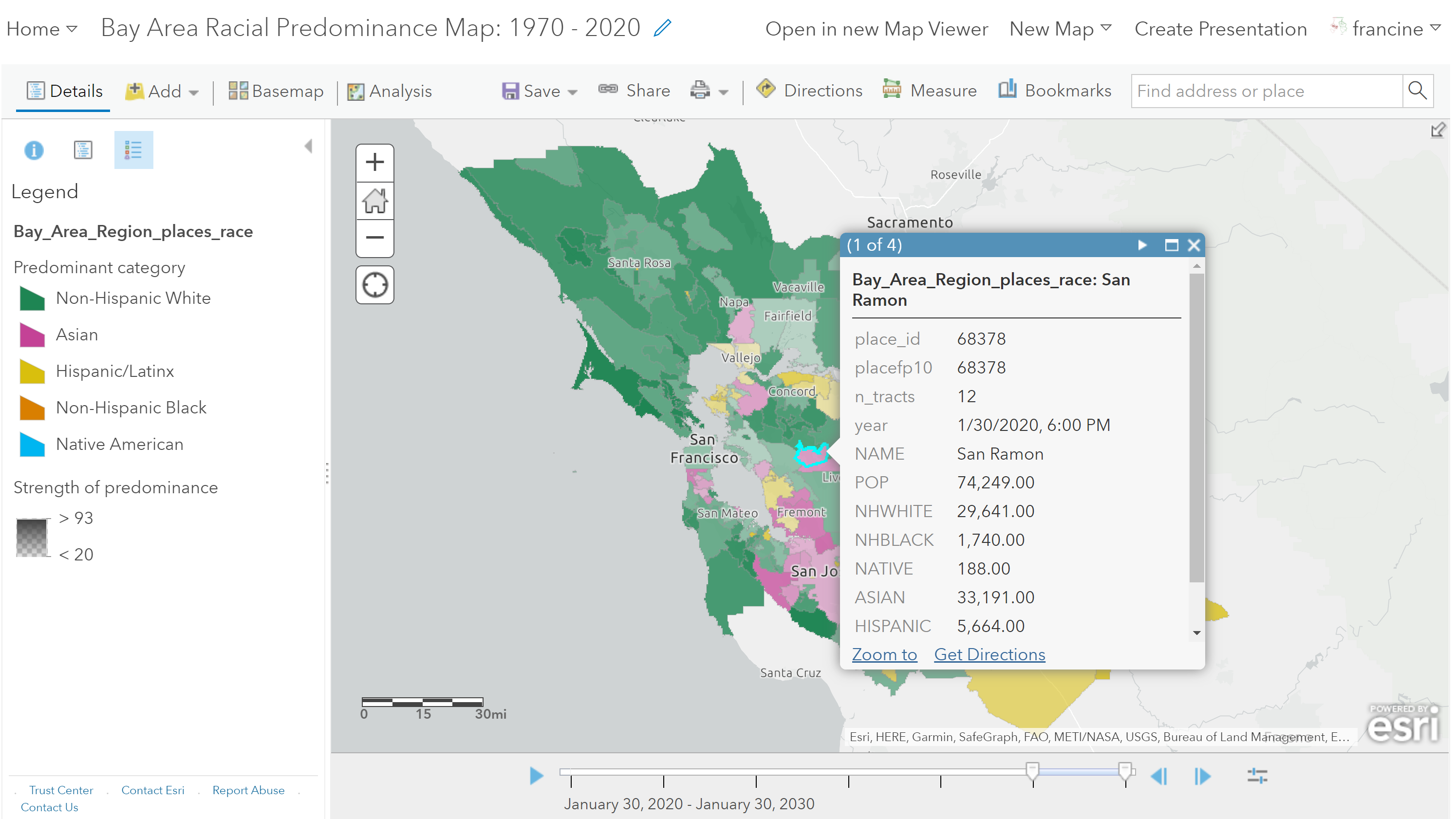
Interact with your map to find the name of the places and other information
There is a lot of variation across the class in terms of the size of the region and number of places, so a dot density map may not be the most effective approach for all students. Regardless of the type of map you choose for racial composition in your region, be sure to pay attention to the racial composition in your city and how it compares to other places - cities, suburbs, and exurbs - in your region across time. Consider how the composition changes you are seeing across places compare to the changes you saw in racial composition of neighborhoods in your city.
If you are interested in tracking a particular racial/ethnic group like Schafran did with the Black population in the Bay Area, you may also want to make a choropleth map that just shows the proportion of the racial group in each place. Navigate to the Counts and Amounts (Colors) and in the options page, set the Divide by drop down box to POP. This will allow you to map the proportion of the population that the racial group represents. The image below provides an example of how to map the proportion of Black residents for places in the region.
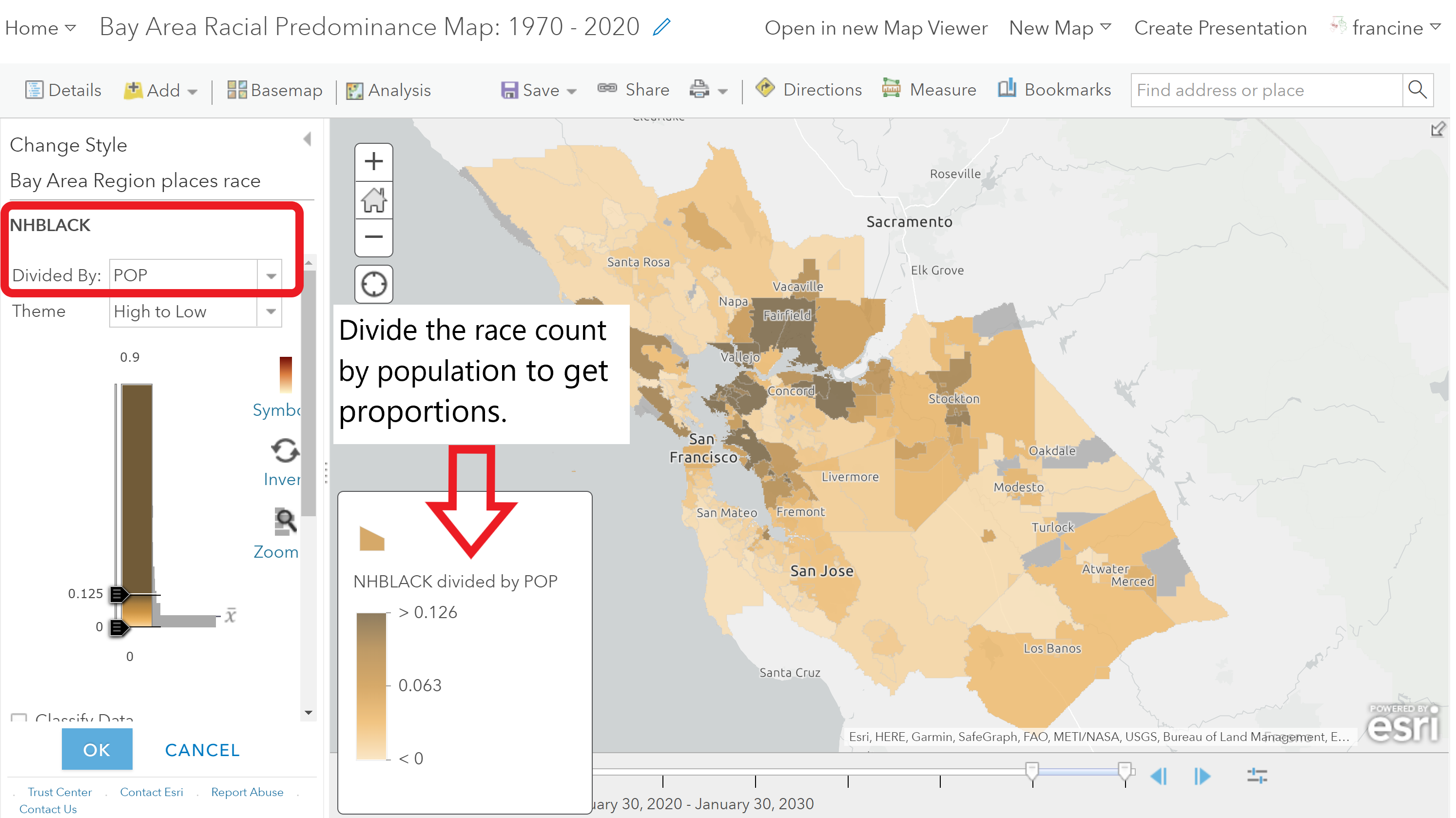
You can make a choropleth map for proportions of a particular racial group like Map 3 in Chapter 1 of The Road to Resegregation
As you map the places in the region, especially if your region is large like the Bay Area, you might find that the time animator struggles to render the map. It might lag for some places or not show them. You can see this in the GIF below. You have two options to work around this problem. One is to just pause at each decade and make note of your observations; we can do that too when you submit your maps as a link. The other option is to turn off the time option and use a filter like you did with the crime data and to create separate layers for each decade in our time span. You can turn on and off the layers manually and make note of your patterns. If you choose to share the region-wide map of place-based racial composition with the filtered layers, you need to put each layer on the same map and share the web-link in your write-up. When Professor Stuart and I are grading your assignments, we can turn on and off the layers to see the time trends.
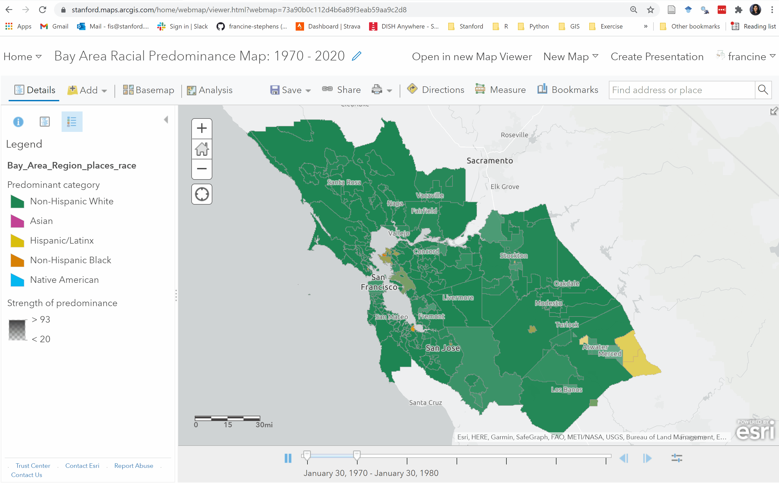
Predominance map of Bay Area region
When you are happy with your map, Save it as a new map with an informative title. Don’t forget to set the sharing options to our class group before you move onto mapping segregation in the region.
6.3.2 Segregation Maps
Finally, we will visualize the segregation measures for the places in our region. At this scale, we can map all of our segregation measures. No graphing is necessary here.
Open up a new Map Viewer window and set-up your basemap with the style you prefer. Then, navigate to the Add Layers button and search for the places layers in your region with segregation data. The naming format for the segregation files is: “Region_Name_places_seg_decade”. Add the layer to the map. The layer contains the dissimilarity index scores and divergence index score for all places in the region for the decade. Notice that unlike the region-wide racial composition data, the segregation data are already broken up into separate layers by decade. We decided to divide up the segregation measures by decade because the time animator was not able to read all of these measures across all six decades. This means there will be some repetition in your work-flow because you will be creating the same mapping style on five or six separate layers, depending on how many decades of data are available to you. If you are submitting this map with your assignment, just submit the weblink of the map with each decades included as separate layers in your contents pane. Professor Stuart and I can turn on and off the layers to see the time trend.
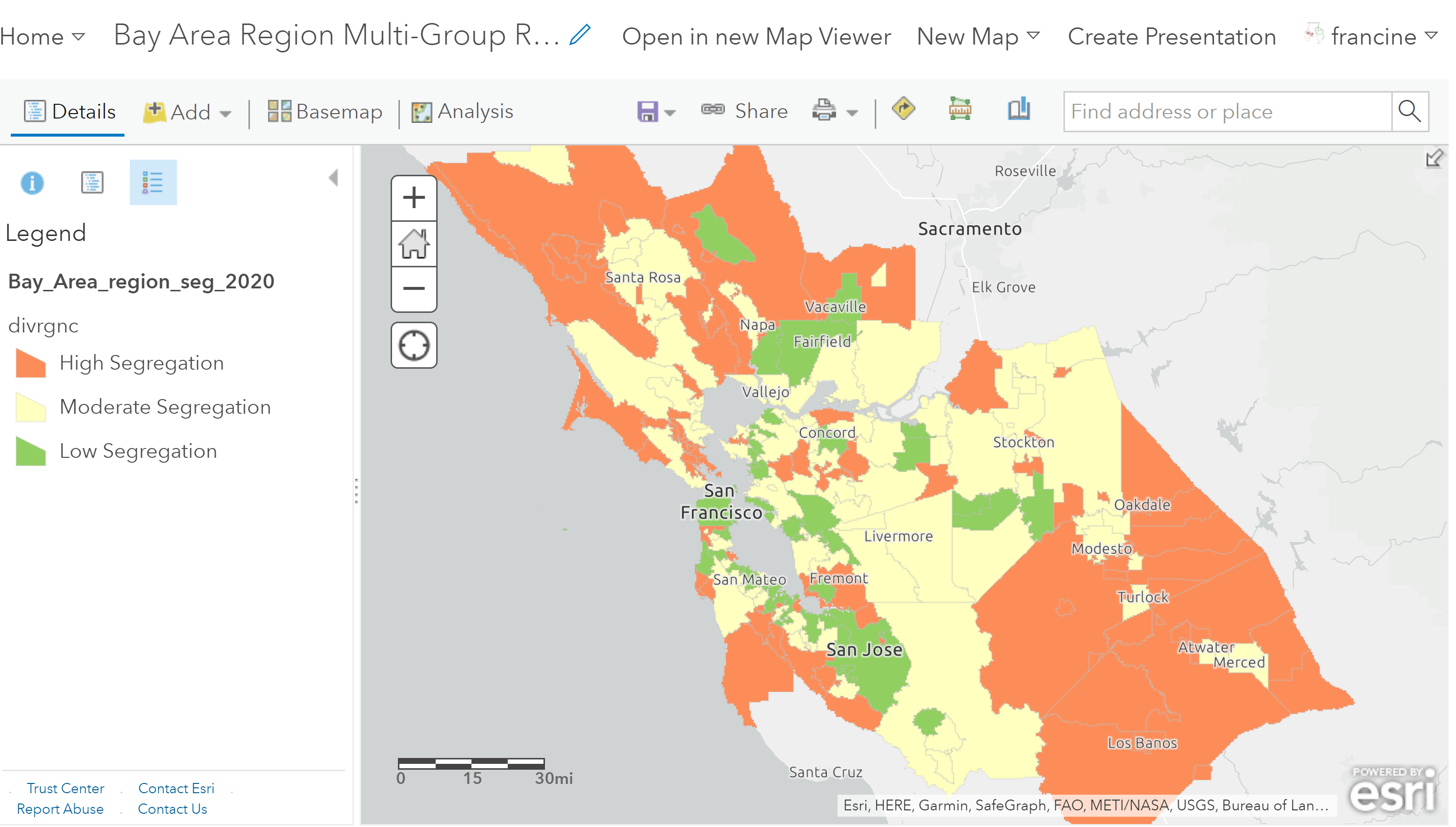
Map of multi-group racial residential segregation in the Bay Area in 2020
You can visualize both types of indices using the same choropleth and categorical mapping techniques demonstrated in the section above where we mapped the Divergence index. If you are mapping the dissimilarity index, be mindful of the fact that you cannot show the dissimilarity index for all race pairs (e.g., Black-white, Asian-white, Hispanic-white, etc.) at the same time on a single map. You will need to pick the group pairs that you want to speak to in your write-up and map them as separate choropleth/categorical layers. The abbreviated variable names for the segregation measures are listed in the table below with the group-pairs that they represent.
| Variable Name | Group-Pair Measure Name |
|---|---|
| Dis_NWW | Non White - Non-Hispanic White Dissimilarity |
| Dis_BW | Non-Hispanic Black - Non-Hispanic White Dissimilarity |
| Dis_AW | Asian - Non-Hispanic White Dissimilarity |
| Dis_BH | Non-Hispanic Black - Hispanic Dissimilarity |
| Dis_BA | Non-Hispanic Black - Asian Dissimilarity |
| Dis_AH | Asian - Hispanic Dissimilarity |
| Divrgnc | Multi-group racial divergence index |
In the end, we do not need to see every single dissimilarity index and the divergence index mapped in your write-up. Just feature the racial composition and segregation maps that allow you to tease out some spatio-temporal patterns and engage with the theories of segregation you read about this past week.
Interpreting Segregation at the Region and Place Scale
The dissimilarity indices still represent segregation between neighborhoods (i.e., census tracts - sub-units) within the place (super-unit). In your interpretations of the dissimilarity scores, you can compare places based on the level of residential segregation that exists within the places boundaries.
The divergence score, on the other hand, was computed with the place as the sub-unit and the region as the super-unit. The score for each place represents how much the composition of the place departs from the composition of the region as a whole. Therefore, your interpretations of segregation based on the divergence score should be oriented toward between-place comparisons in the region.
Taking Stock & Looking Ahead
In just a few assignments, you have acquired several mapping techniques in your tool-kit. Take a minute to appreciate how quickly you have picked up on web-mapping and visualizing spatial data. The plus-side of picking up all of these mapping techniques in just a few weeks time is that when we return to mapping in a few weeks for Assignments #7 and #9, we will end up re-using a lot of these techniques to map gentrification in the neighborhood and across the city. If you have made it this far in the mapping exercises, it should be smooth sailing from here on out.