8 ESRI Story Maps
Now, it is time to put together a digital visual story of your neighborhood using some of the content you have created throughout the course assignments. We will be making a story map about the social life of your neighborhood. The assignment instructions posted on Canvas detail the expectations for the content in your story map. This tutorial provides a little bit of background on ESRI’s Story Map platform and points you to the templates and resources that you will use to compile your maps, text, and other types of media into a digital narrative.
8.1 Creating Story Maps
What is a story map?
ESRI Story Maps are web applications that let you, the author, combine web-maps with narrative text, images, and multimedia, including video and audio. The applications are designed to be attractive and usable by anyone, which makes them great for education and outreach to the general public or to a particular audience. Story maps can be made for many different topics. Basically, anything that you can show on a map can be the topic of a story map!
There are two versions of Story Maps available online - the classic and new version. We are going to use the Classic version. The classic version’s biggest asset is that it has a set of templates that are made-to-fill-in. The templates make it easier on you as an author to figure out how to add content to your story. Unfortunately, Stanford’s AGOL landing page does not directly link to the Classic version of ESRI Story Maps. Instead, you can navigate to the Classic Story Maps splash page from here. Feel free to add this link to your bookmarks. Before navigating to the Classic Story Maps splash page, be sure that you are logged into your AGOL account. Classic Story Maps still verifies that you are part of Stanford’s institutional AGOL account.
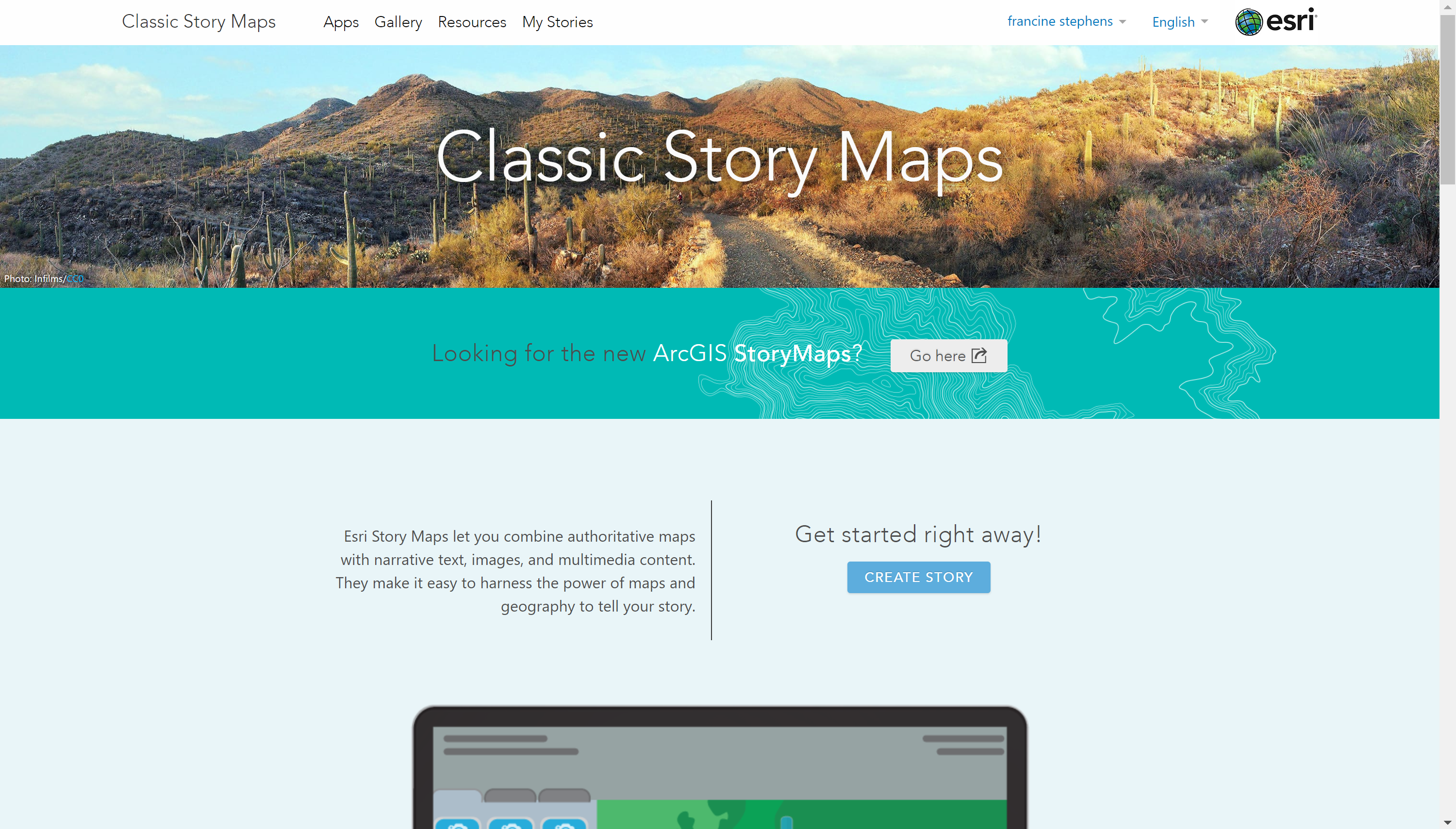
The splash page for Classic Story Maps.
What are the template options?
ESRI’s Story Maps application offers six different templates. Each template lets you deliver a specific viewing experience to your audience. Below is a list of the available templates and a brief summary of the viewing experience they offer. Click on the template name in the list to be redirected to the template’s home page, which includes a more detailed description, examples, and a tutorial for using the template.
- Tour - A sequence of place-enabled photos or videos that are linked to an interactive map that your audience can sequentially take a tour through.
- Shortlist - Present a large number of places/points of interest organized into tabs based on themes. Your audience can interact with the places as they navigate around the map.
- Journal - A scrolling multimedia narrative organized into side-by-side sections on each page. Text and images can be displayed in a static side-panel alongside your “main stage content” or on top of your “main stage” content in a floating side-panel.
- Cascade - A scrolling multimedia narrative that fills the page. Similar to the journal template, but instead allows you to put other multimedia content, like images and text, in immersive sections that fill the entire page.
- Series - Present a series of related maps that your audience can easily browse and switch between using tabs, bullets, or an expandable side-panel. The side-panel allows you to embed text and other types of media alongside your maps.
- Swipe & Spyglass - Compare two maps by swiping back and forth, or by peering through one map to see another.
It is possible to use multiple story map templates in your story. For example, you may find that the swipe/spyglass would be good for one capturing one key issue in your neighborhood and the journal template would be ideal for other key course themes that are salient in your neighborhood. There are a few different ways of combining multiple ESRI story map templates. Selecting the best method to combine or embed is going to depend on the templates you are using and the viewing experience you intend to create for the audience. You are not required to use multiple templates, but if you feel that the features of multiple templates are essential for telling your story, meet with Francine during her office hours or book an appointment with her, so that the two of you can brainstorm the best method and discuss the steps you will need to take to combine.
8.1.1 Before you Begin Building your Story Map
View existing story maps to get ideas. Visit the Story Maps Gallery to see some wonderful examples of story maps. Filter and search the gallery using the options on the left-hand side-bar to see how authors like you have created stories that may well be similar to the one you want to tell. Filter based on the type of template, story topic, or both. Explore. Get a sense of what the viewing experience looks like in the different templates and what makes a good story. Feel free to borrow approaches that you think work well, or come up with your own.
Select a template that works well for the story that you want to tell. From exploring the Story Maps Gallery, you may already have a good idea of which template will work best for you. Using the links for the templates listed above, spend some time comparing the templates, the layout options they offer, and the different components they let you incorporate in your story. If you feel uncertain about selecting a template, there is a wizard on the Apps page with an “Ask the Pros” feature in the Create Story function that can guide you to the best template for your story.
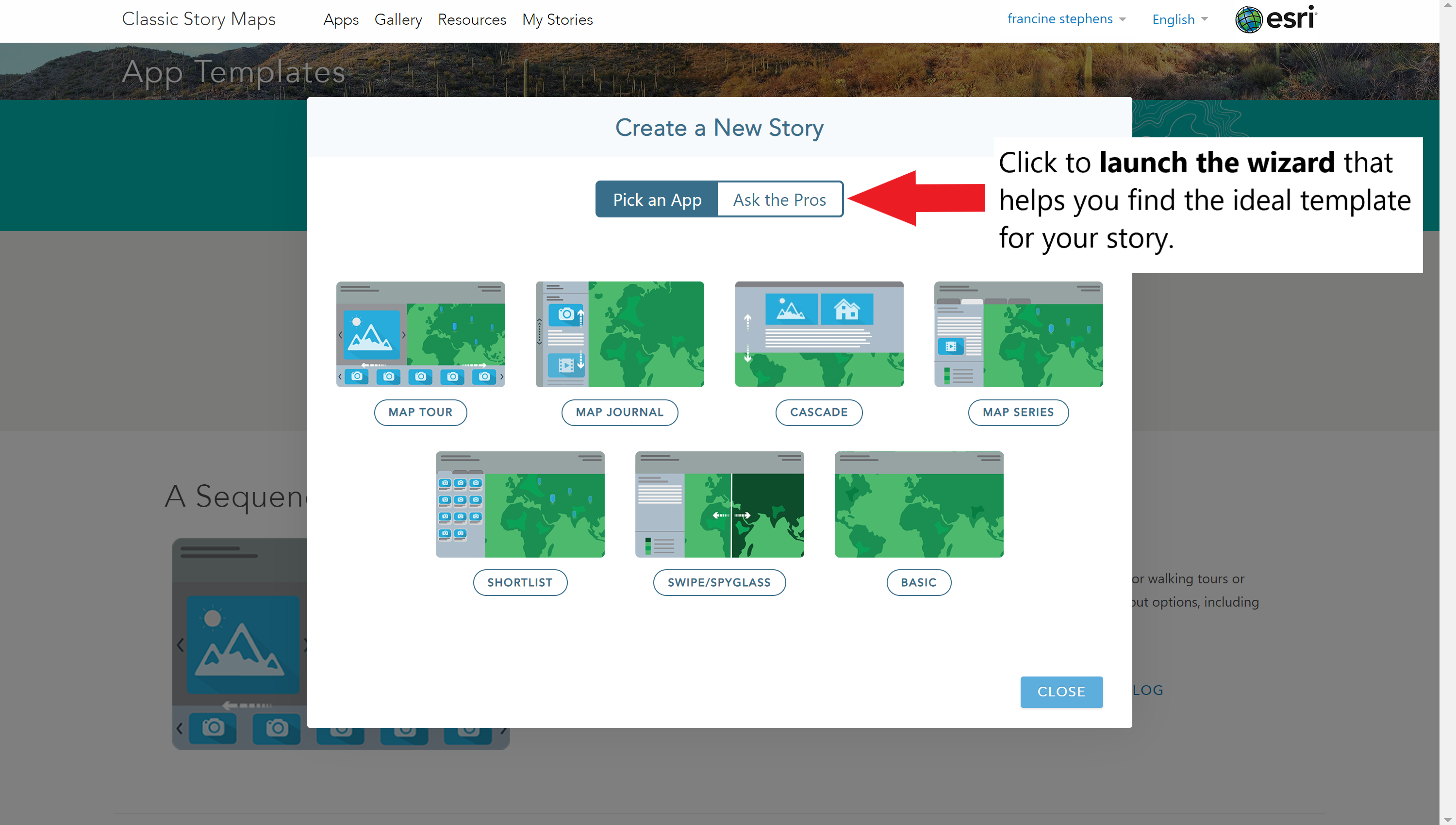
If you are unsure about the template to use, Ask the Pros
Plan and organize your story. Before you start putting your story map together online, you should first sketch it out offline. Outline what each story map “slide” will present. Figure out which visuals make the most sense. Sketch out which features of your template work best with your story’s narrative and flow. Below is a list of resources that you can use to plan your story map.
- Create a storyboard & content inventory - Use the linked template or sketch an outline on your own.
- Francine’s storyboard - View an example of a completed storyboard template.
- Review ESRI’s planning document - The blog contains an illustrated guide for planning your story.
- Review the nine tips for effective digital storytelling - The tips are displayed in an ESRI Story Map.
If you have any questions or just want to bounce ideas off of someone, please do not hesitate to drop by Professor Stuart’s or Francine’s office hours. We are both happy to help you brainstorm and lay out some plans for your story map.
8.1.2 Building your Story Map
Prepare the content for your story map. If you used the storyboard/content inventory template above or sketched your own outline, you are aware of the existing content that you need refine and content that you need to create or obtain for your story. Make the refinements and assemble any additional content you need for your story before building your story. This way you will not have to jump back and forth between making content and sequencing your story map. Below is a list of potential tasks you might complete to prepare content for your story map.
- Make refinements to your existing maps.
- Change basemaps.
- Change color schemes/icon styles.
- Resize elements/Change viewing extent.
- Add locations to your geocoded points.
- Disaggregate some layers, e.g., decades in the racial composition maps.
- Configure pop-ups.
- Find new data or webmaps.
- Extract & revise text from your neighborhood assignments to use as text in your story map.
- Identify memorable quotes/passages from your interview to use in your story map.
- Create graphs/charts.
- Compile images and other multimedia (e.g., video, audio).
- Make a list of weblinks, if you plan on linking to other websites in your story map.
- Keep a running list of sources of your content, so that you can feed them into the credits at the end of your story map.
If you decide that you want to make additional maps, but are not sure about where to find the data or how to import the data into AGOL, email or meet with Francine to figure out the appropriate steps to take.
Build your story map. With all of your content now on hand, it is time to dive into building the story map. On the Apps page, click on the Build button for the template that you have chosen to launch an interactive story builder. The story builder will guide you through the each of the steps for building your story. The story builder will indicate when you can bring in a map, text, or other types of media. If you are having trouble with the story builder’s instructions, remember that the links posted above for each of the template types contained a tutorial section that you can review.
As you build your story map, be sure to save your work often. The Save button is in the upper-right corner of your screen. You should also experiment with the story map template Settings, which you can find in the tool-bar at the top of the page. The settings options allow you to manipulate the layout, map features, color scheme, and the header material. Preview your story at any point in the building process by navigating to the View button on the tool-bar. The view button will allow you to see what the viewing experience is like for your audience.
8.1.3 Publish & Share your Story Map
Publish your story map. When you feel good about the look and feel of your story map, publish it. There is not a publish button on the Story Maps page. Instead, you will need to close your story map and return to the Classic Story Maps splash page.
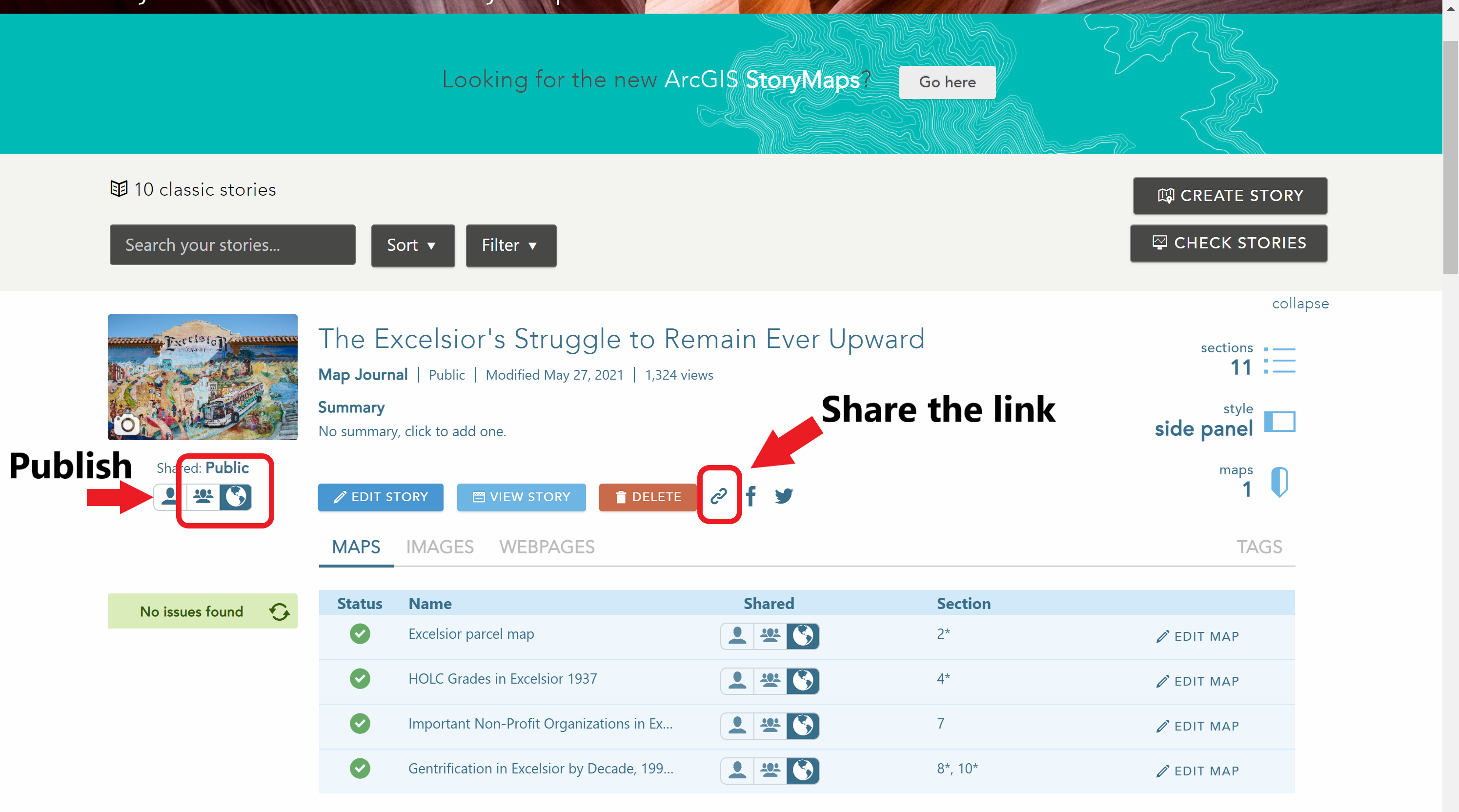
Publish and share your story map!
- Navigate to the My Stories page by clicking on the My Stories button on the toolbar.
- Find your story map and click on the title.
- If you see a message beside the maps list that says, “No issues found.” Go ahead and change the Shared settings option on your story map (i.e., the set of buttons below your story map’s thumbnail) to either Organization or Public.
- If your maps had some issues, try to troubleshoot a bit. Usually, the problem is that a layer in your map was not shared with the organization or publicly. The share settings on your map layers need to be the same as your share settings on your story map.
- If you are unsure about how to resolve the issues, come to office hours so that we can trouble-shoot the problem.
Your story map is now published. You can still continue to edit your story map and the map contents in it even though it is published. Just be sure to save any changes you make so that they will show up when someone views the map.
Share your story map. At last, it is time to share your map. Click on the Link icon next to the delete button, to get the web-link for the story map. This is the link that you should submit on Canvas for us to evaluate your story map.
You will also notice that there is an iframe embedding option in the share window. If you have a website, you can embed your story map in your website using the iframe code chunk.
8.2 Examples of Story Maps
- Cool examples of story maps from Dr. Willow Lung-Amam’s class
- The City of Los Angeles has some neat story maps, too.
- ESRI’s favorite StoryMaps in 2018
- ESRI’s favorite StoryMaps in 2019
- ESRI’s favorite StoryMaps in 2020
- Francine’s example story map for San Francisco’s Excelsior neighborhood. Click on the expand option in the bottom right hand corner of the iframe below to view the story in full-screen mode.
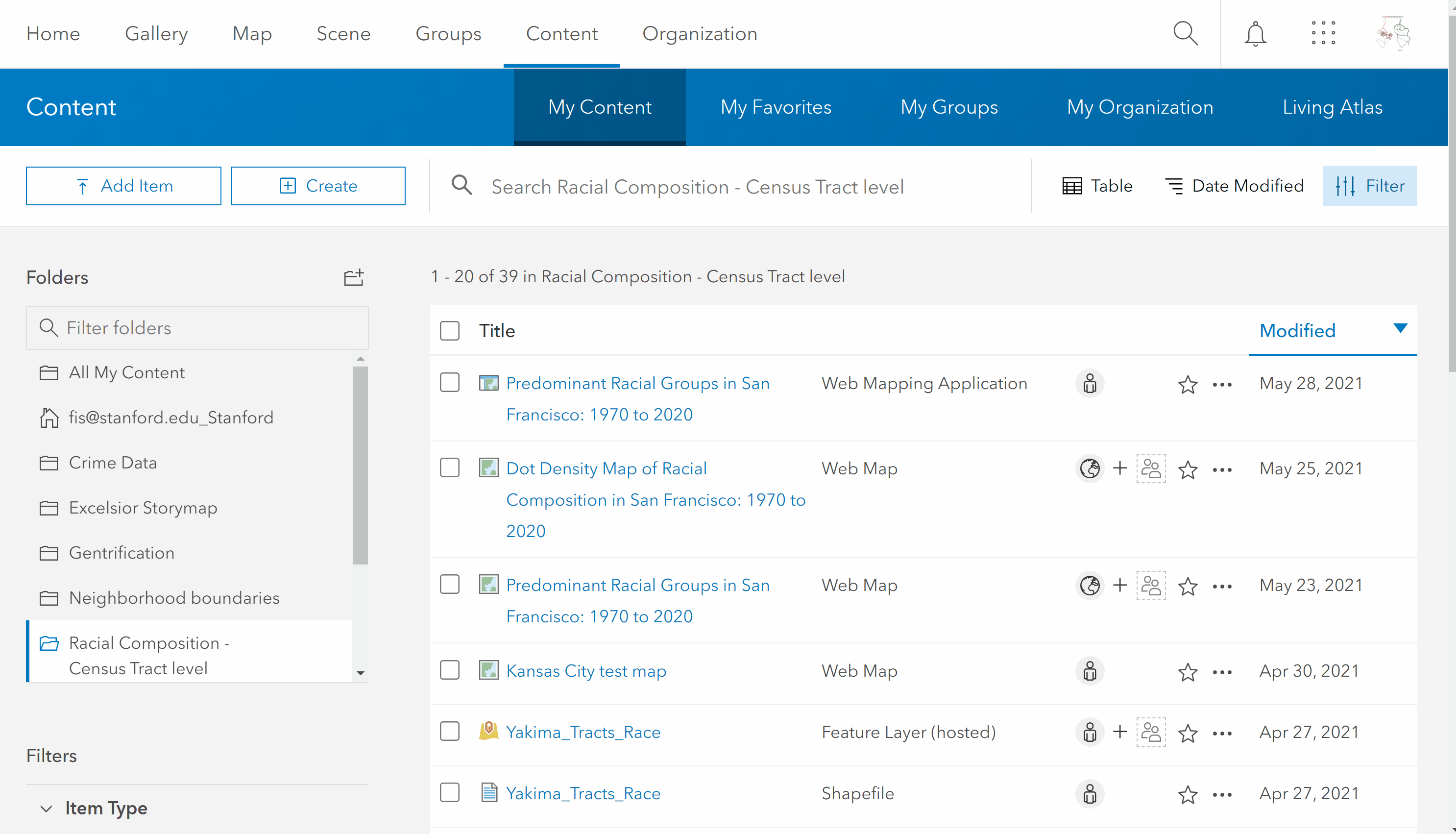
8.3 Using Time-Series Maps in StoryMaps
You may want to use one of the time series maps that you created for racial composition or segregation in your story map. When you created those maps, we used the time animator to sequentially show each decade as a layer on the map. Unfortunately, you cannot just load these web-maps directly into the story map template. Instead, you need to make a choice about whether you want to display time in an animated fashion or in manual scroll/clicking actions initiated by your reader.
8.3.1 Time animator for Predominance & Segregation Maps
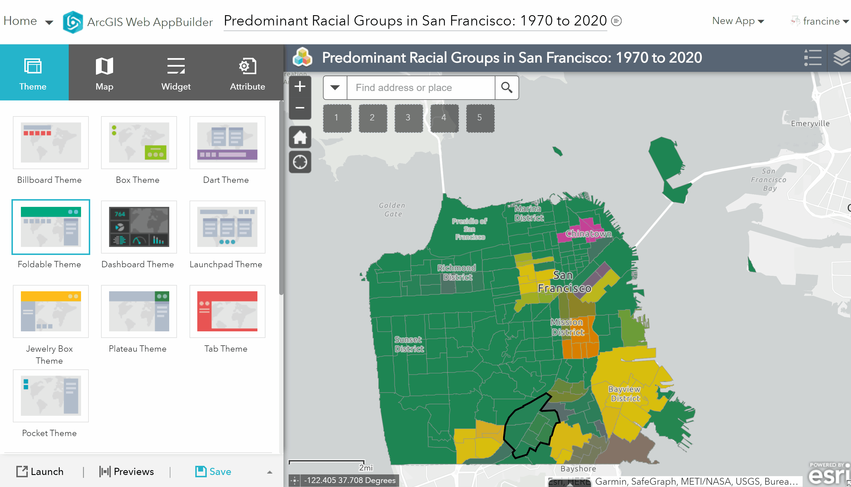
If you want the time animator in your story map, you will need to convert your time-series map into a web-app. Use the web-app builder function in the share settings. The steps are listed below. GIFs and images for selected steps are included below the list of steps.
- Title and add tags to the web-app. (Recommendation: Include “App” in the title so that you know it is different from the web-map you created and can find it later if you need to trouble-shoot issues.)
- Navigate to the widgets tab in your web-abb builder.
- Click on one of the empty widgets at the bottom of the widgets pane. This should open up a search bar and list of all widgets. Search for the time slider and select it.
- Once you have selected the time slider, a window will open with configuration options for the time slider. Change the time interval step to 10 (years). You can decide how you would like to set the other configuration preferences.
- A time slider widget should appear in the upper-left side of the screen. If you click on it the time slider will render. 6. When you are happy with the look of your app, save the app.
- Then, navigate your AGOL content page, from your list of contents, select the web-app that you just created.
- Change the share settings to either organization/public (based on your story map share settings).
- Copy the link at the bottom of the app page and paste it into the web-page media content in your story map.
Find the time-slider widget in the app-builder
Share the web-app and copy the link to paste into your story map.
If you are having trouble with this, email/book an appointment with Francine.
8.3.2 Separate Time Layers for Predominance & Segregation Maps
If you are using these maps and would rather have the reader click/scroll through certain decades, filter by the year attribute on the layer using the filter tab. Earlier in the quarter, we applied filters to disaggregate the crime data by attributes like time and type of crime. You would repeat the exact same steps, but use the year attribute and choose the expression that enable you to filter down to the decade that you are interested in.
If you are having trouble with this, email/book an appointment with Francine.
8.3.3 Steps for Dot-Density Maps
For the dot density maps, it is not possible to create apps with a time-slider. You have two options for importing these dot density maps into your story map. (1) If you are using all or most of the time points in the dot density map, then you should consider “printing” each decade layer separately and stringing them together into a .mpeg or .gif. (2) If you are using one or two of these maps, you could create an app for the selected layers. The steps for each of these two options are listed below.
Create your own animated video
You will need to print each decade layer separately to create your own animated video. This is the equivalent of exporting the map as a static image file. This means that your reader will not be able to interact with these maps.
- Navigate to the Print button in the left-hand toolbar.
- Select your print option - layout or map only.
- Layout gives you the legend and the scale distance bar like the PDF maps you created at the beginning of the quarter.
- Map Only lets you just export the map in your map viewer screen, not other features.
- Specify the type of image file you want (e.g., JPEG, PNG) and any other image features that are relevant (i.e., height and width settings).
- Once you have exported all of your images, you need to bring them into a software that allows you to string them together into a video. Francine did this really quickly with Microsoft Photos in her story map, but you could use other software too, like Apple iMovie.
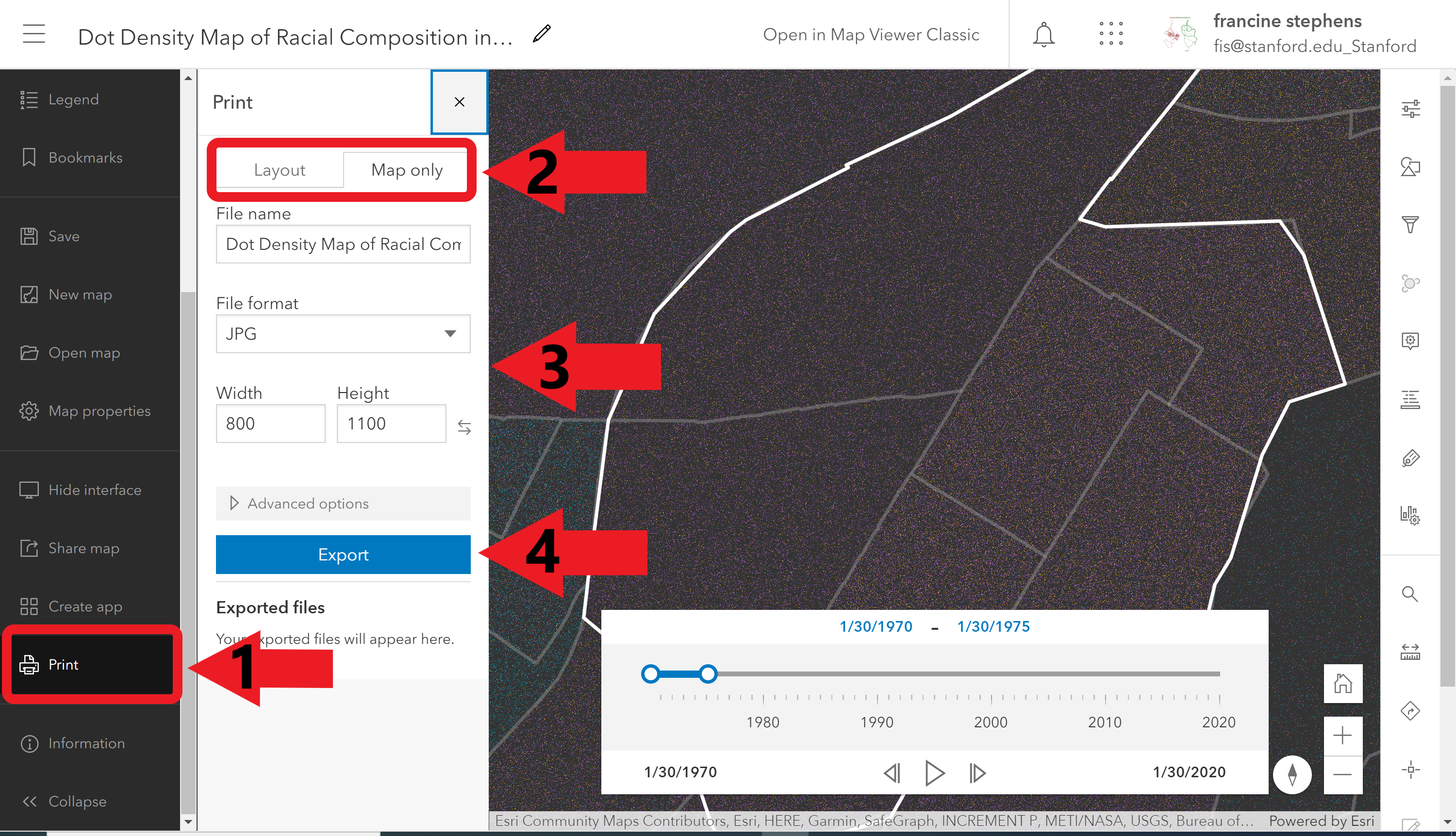
Print Dot Density Map.
Create Separate Layers in a web-app
If you want to keep the interactive-feature of the web-map, then you will need to create separate layers for each decade that viewers scroll or click through. Apply filters based on the year attribute of the race layer to create separate layers. Make sure that the race layer loaded and selected (i.e., click on the layer in the layers pane) in the new map-viewer and follow the steps below. An example of a filter applied for 1970 is also included below.
- Navigate to the filter button on the right-hand side panel of the interface.
- Select year as the attribute.
- Set the expression appropriately based on the decade you are trying to select.
- Then, in the histogram at the bottom of the filter panel, drag the slider to reflect the decade that you are trying to isolate.
- Click Save to apply the filter.
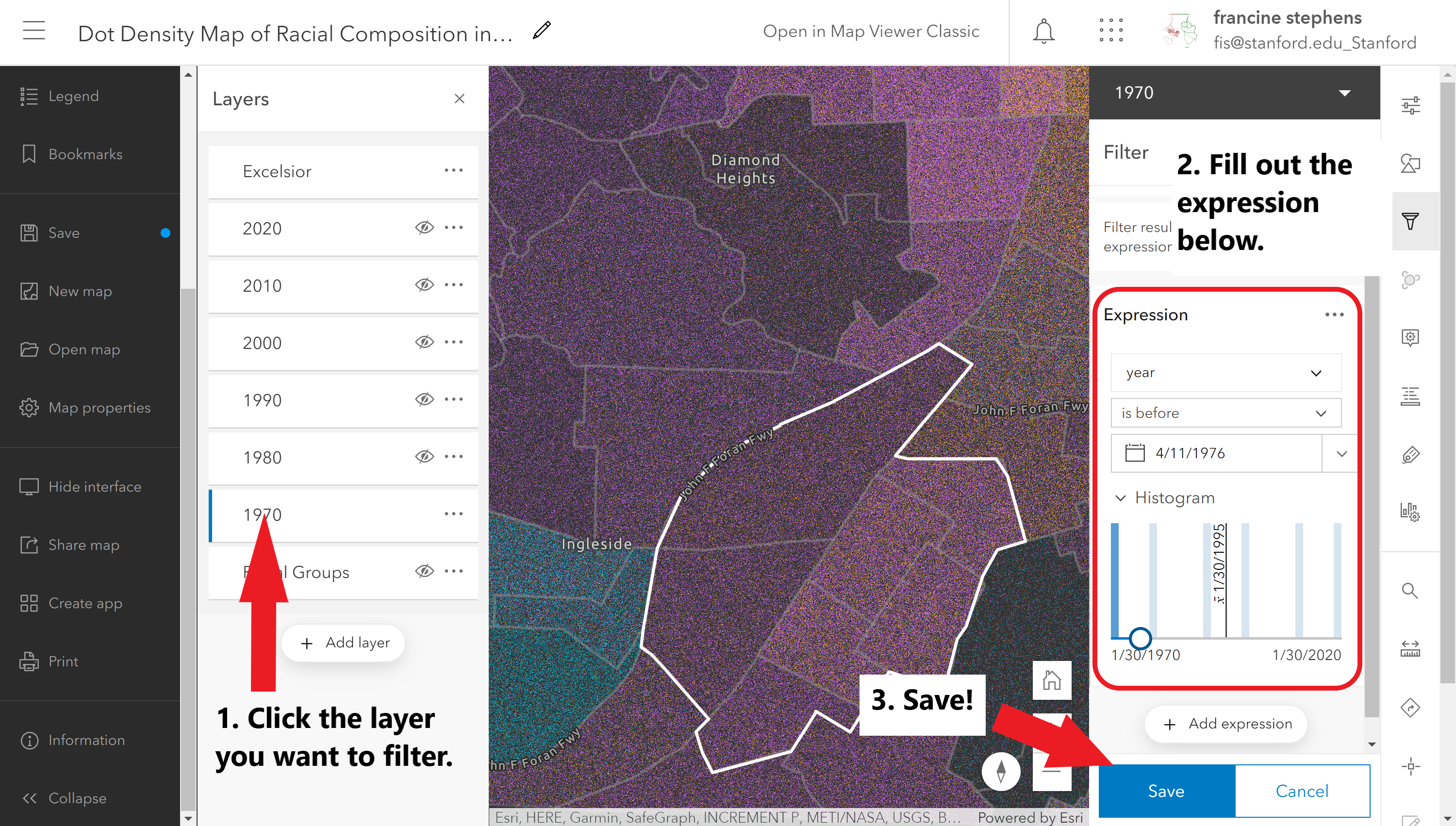
Filter a dot density map layer by year.
When you are happy with the look of your map, be sure to Save and Share it publicly or with the organization. Now, you are ready to create the app. Follow the steps below. A GIF of where to find the web-apps function is included below the steps.
- Scroll down to the bottom of the left-hand tool bar to the *Create app and select the Instant App** option.
- Pick an app template. The Minimalist app option works well.
- Give your app a title. (Recommendation: Include “App” in the title so that you know it is different from the web-map you created and can find it later if you need to trouble-shoot issues.)
- Then, click on configure. A new window will launch to set the configurations.
- A new window will launch to set the configurations with a set of steps. Follow the steps in this configuration window.
- When you publish the app (the final step), copy the link for your app. This is the link that you will paste into your story map as a web-page.
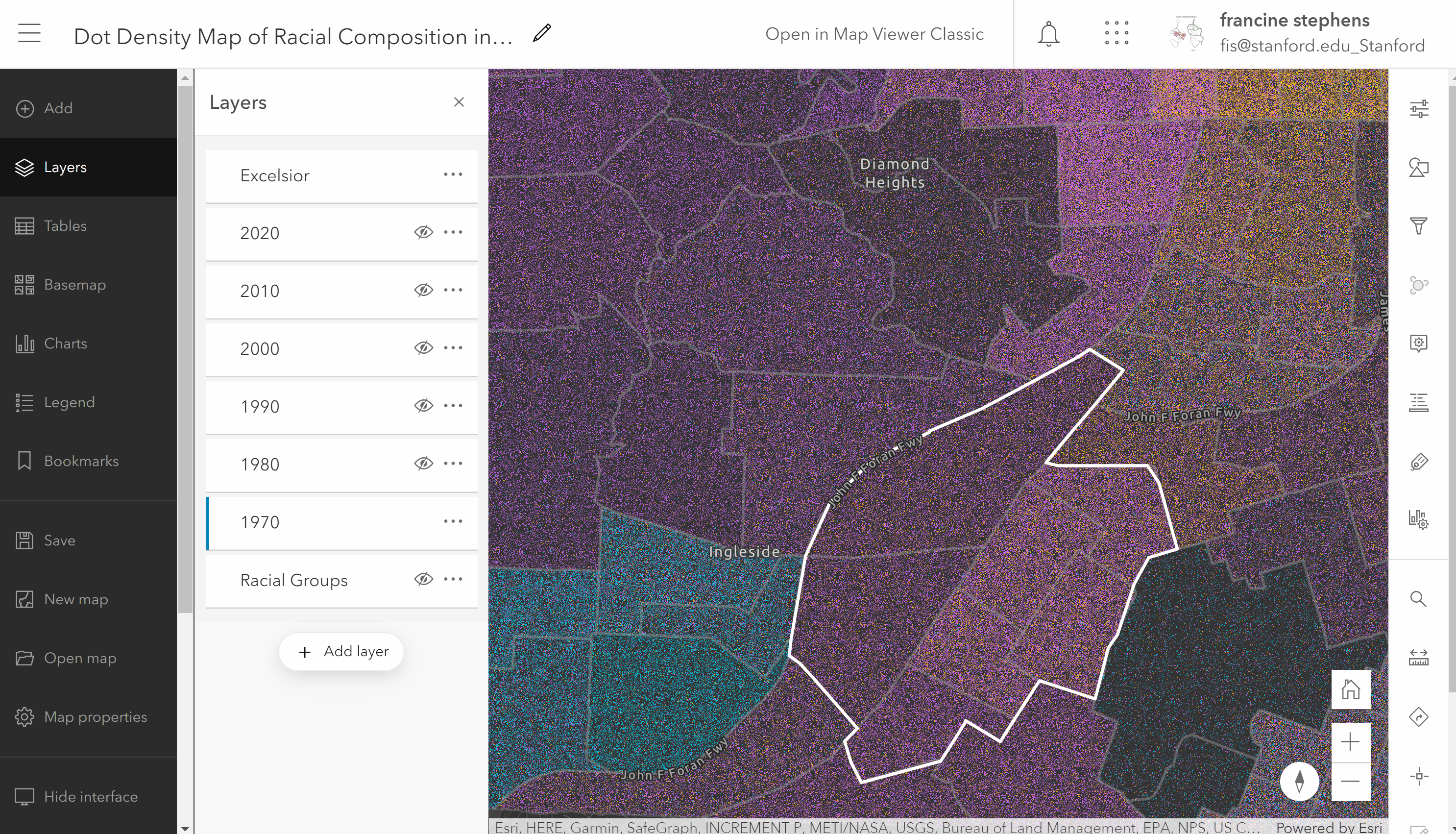
Create a web-app of the map.
For each decade you will need to repeat the steps for filtering and building the app. If you are having trouble with this, email/book an appointment with Francine.
8.4 Coloring In-Line Text
There might be some instances where you want to customize the color of some of your text to look like the colors used in your maps. Coloring your text to match attributes in your map is one way to get around using legends for your thematic maps. The process for coloring in-line text to match your maps is really simple. It involves (1) obtaining the hex-code(s) for the color(s) in your map and (2) copying the hex code into the font-color editor in the story map. Follow the steps and graphics below.
Find the hex-code associated with features in your map
- Open up the style tab and click on the icons for the colors of interest. In the color tab, you will find the hex code listed. The hex code starts with a hashtag/pound sign and is followed by a series of alphanumeric characters. Examples are pictured below:
- Copy the hex-code.
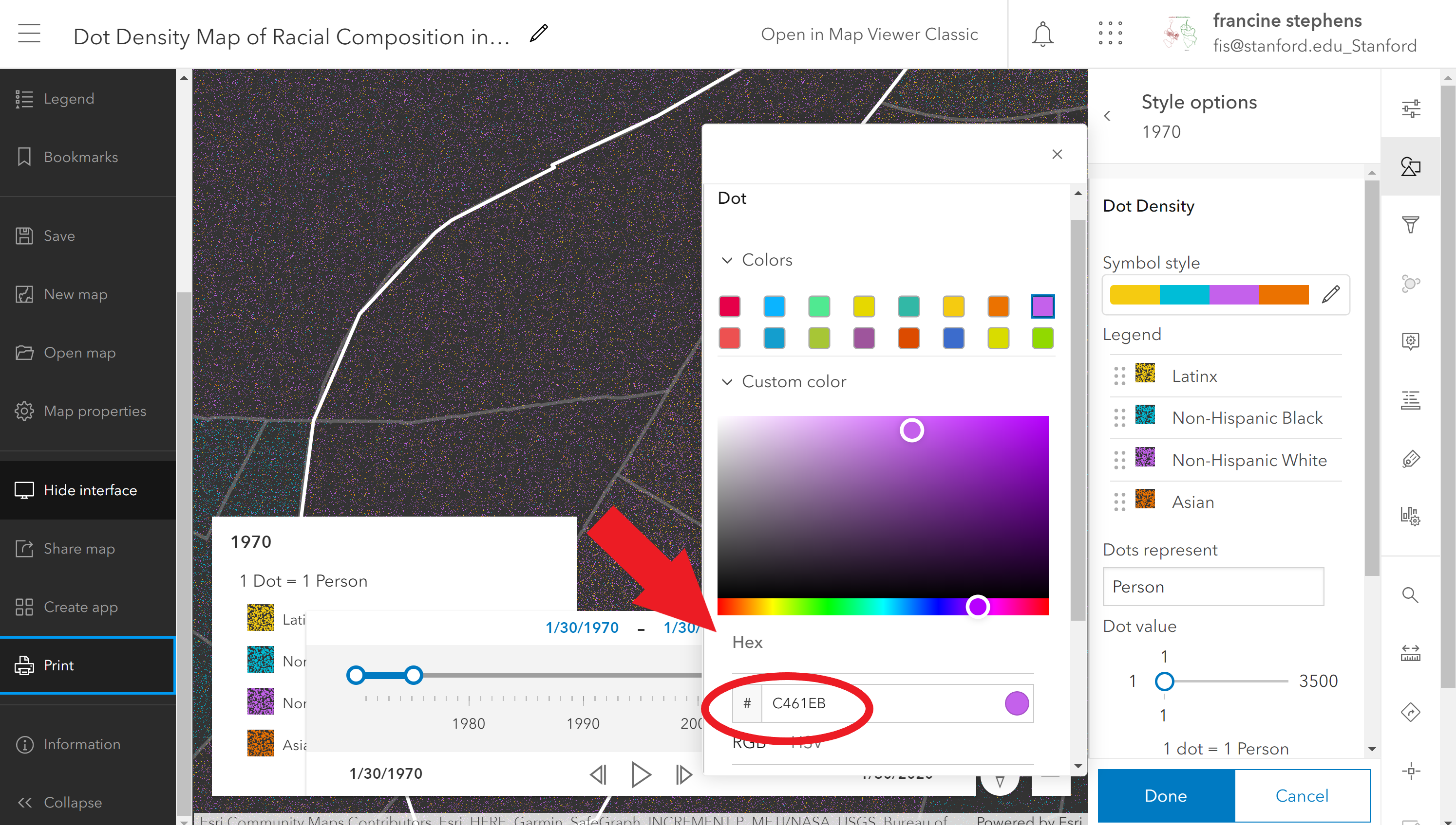
Find the hex-codes in the New Map Viewer.
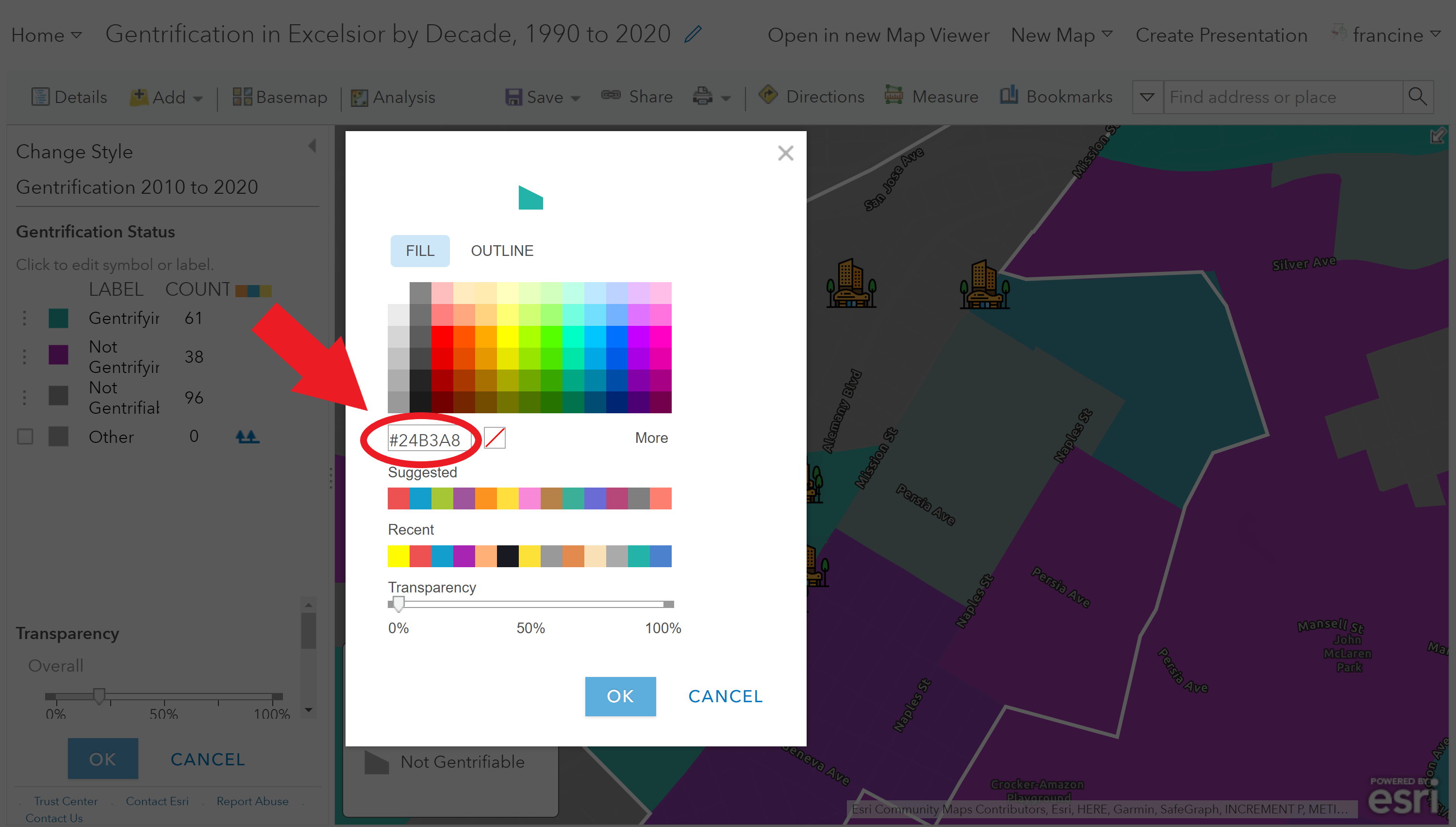
Find the hex-codes in the Classic Map Viewer.
Apply the hex-code to text in your story map
- Highlight the text that you want to color in your story map.
- Navigate to the font-color option in the text editor bar.
- In the font-color editor, navigate to the text-box and paste the hex-code in the empty box. Be sure to add the hash-tag/pound sign to the start of the hex code. When you click outside of the text-box, the color associated with the hex-code should appear. The GIF below shows these steps.
- Do not forget to Save your changes.
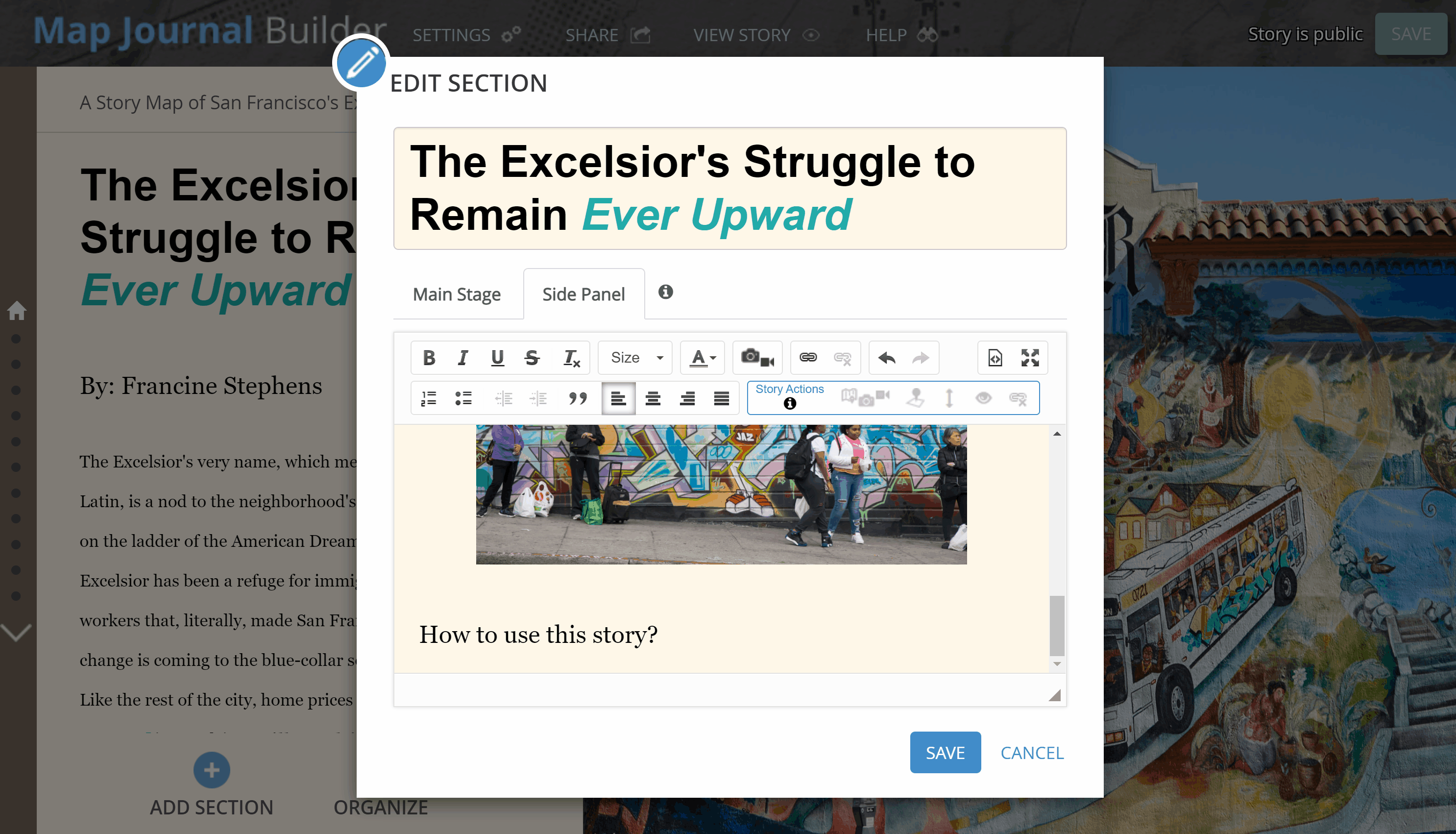
Color text using the hex-code.
8.5 Additional Resources
Story Maps
- ESRI ArcGIS Online Learning Tutorial - Guided tutorial from ESRI for selected Story Map templates.
- Story Maps FAQs
- The Myriad Uses of StoryMaps
- Styling buttons and links using HTML & CSS in a StoryMap Journal
- Style/Move the Back button in a StoryMap Journal
AGOL Web-map Design
- Intro to ArcGIS Online from Stanford Geospatial Center StoryMap
- Importing Custom Symbols - To use custom symbols instead of AGOL’s icons.
- Configure Pop-ups
- Add color to pop-up text
- How to georeference historical maps online
- How Not to Use Web Maps - A story map lesson with examples of poorly designed web-maps from the StoryMaps Curriculum Team at the University of Minnesota.
Design & Visualization Tools & Tips
- Canva - If you want to create your own graphics and bring them into your story map as images, consider using the free-level of Canva. You can make images and graphs/charts with this software. It is a good, user-friendly alternative to Adobe Photoshop and Illustrator.
- RawGraphs - Great alternative to Excel’s charts. An open source graph and chart generator. All you need to do is copy-paste or upload your tabular data, choose a chart type, select the variables you want to show, and customize the color and sizing.
- Infogram - If you want to make interactive charts and graphics but are not familiar with a statistical packages like R or Python, use the free level of Infogram. There are over 37 chart types available and animation options.
- Storytelling with Maps on Paper and Screen - A story map that explains key story telling considerations for paper-based maps and digital web-maps.