5 Mapping Crime Data
In Assignment #4, we will be adding more points to our map! We will map elements of social order/disorder in the neighborhood. By the end of the tutorial you will have produced a map or series of maps that include a new layer containing locations exemplifying the theory of public order that you have chosen as well as new layers for the crime incidents in your neighborhood. Go ahead and pull up your map from Assignment #3 in AGOL, so we can step through the process of creating the new layers.
5.1 Map observations of public order theory
The guidelines for Assignment #4 ask you to record locations from your observations that exemplify one of the theories of public order that you read about in the weekly readings. Record those locations in a spreadsheet and geocode them following the steps for geocoding.
You can style the symbols of the point locations as we did for the organizations in Assignment #3. If you want to be a little fancy and use symbols that better represent the elements that you observed in your neighborhood, then follow the instructions/GIF below for importing custom symbols. Otherwise, go ahead and proceed to the Import Crime Data & Spatially Reduce section.
5.1.1 Importing Custom Symbols (Optional)
Before opening up the change style option, go ahead and find or create an image that you would like to use as an icon for your geocoded locations. The image needs to meet two criteria:
- Be in png format (AGOL says that it will read JPEGs, but I have not had any luck successfully reading in this type of image file).
- The pixel size needs to be at most 120px x 120px.
When you have located your image, copy the URL of the image. Here is the link to the URL for the image of eyes on the street that I used on my map. Once you have that URL ready, follow the steps in the GIF/written out below.
Note for creating your own image: If you have used graphics software to create and save the image locally on your computer. You will need to host it on the web. The easiest way to do this is to save the image to your Google drive and setting the sharing privileges to public, so that AGOL can read the link.
Adding Custom Symbols
- In the change symbols menu, find and select the Custom Images option in the drop-down box.
- Select the underlined text that says, “Use an Image”, which prompts a text entry box to appear.
- Paste your image’s URL in the box and click the blue plus sign next to the text box. Your image will appear as a tiny icon at the top of the symbols menu and below the drop-down box.
- Resize your icon with the slider/pixel box, and when you are happy with how it looks, select Okay twice. At that point, you should see the icon on your map and in the legend.
5.2 Import Crime Data & Spatially Reduce
We are now ready to add the crime data as a layer to our map. You do not need to go fetch the crime data for your city because it is stored in the Crime data folder of our Class’ AGOL page. These data have been formatted in a way that will make your experience filtering by crime attributes much easier.
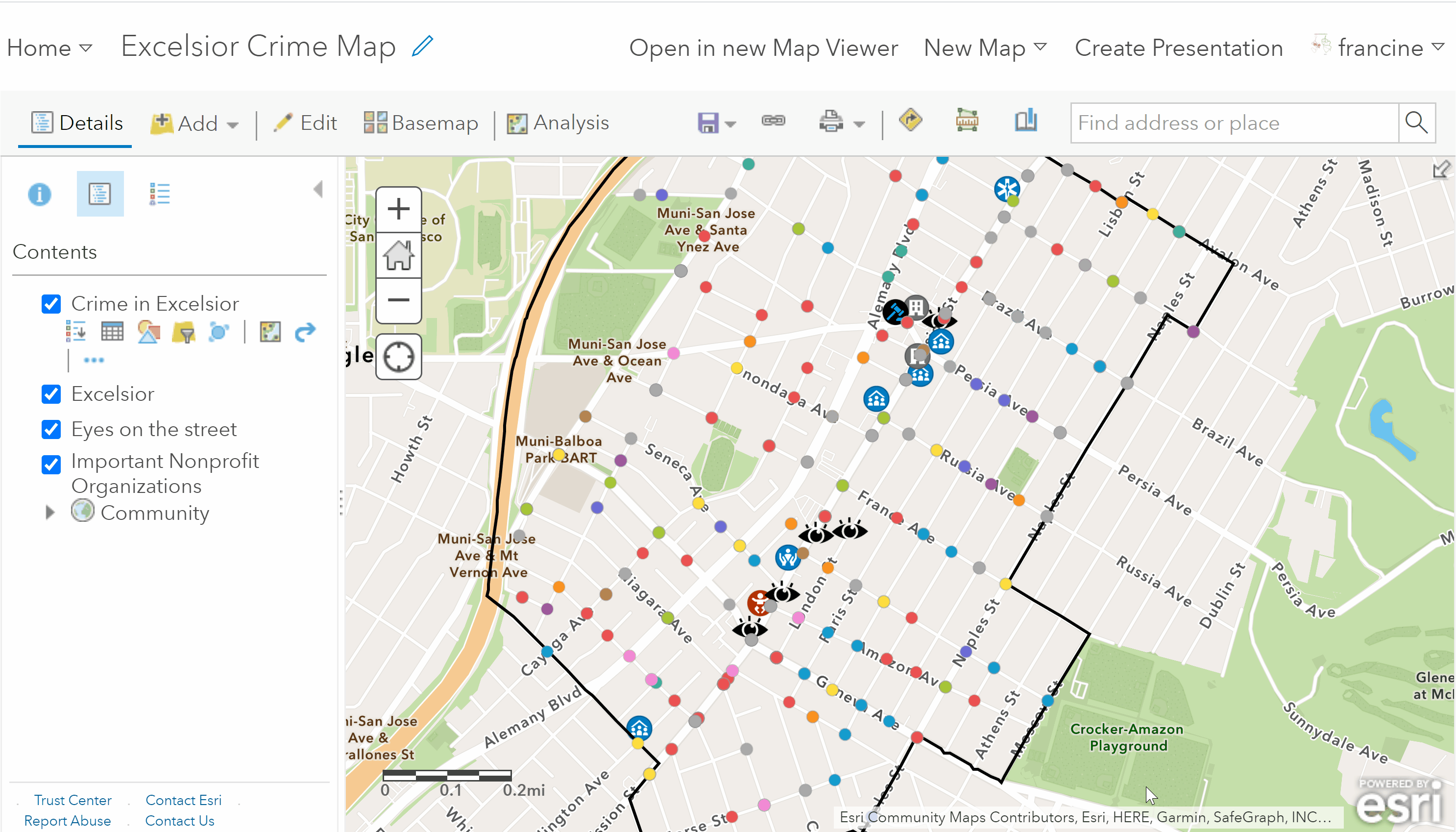
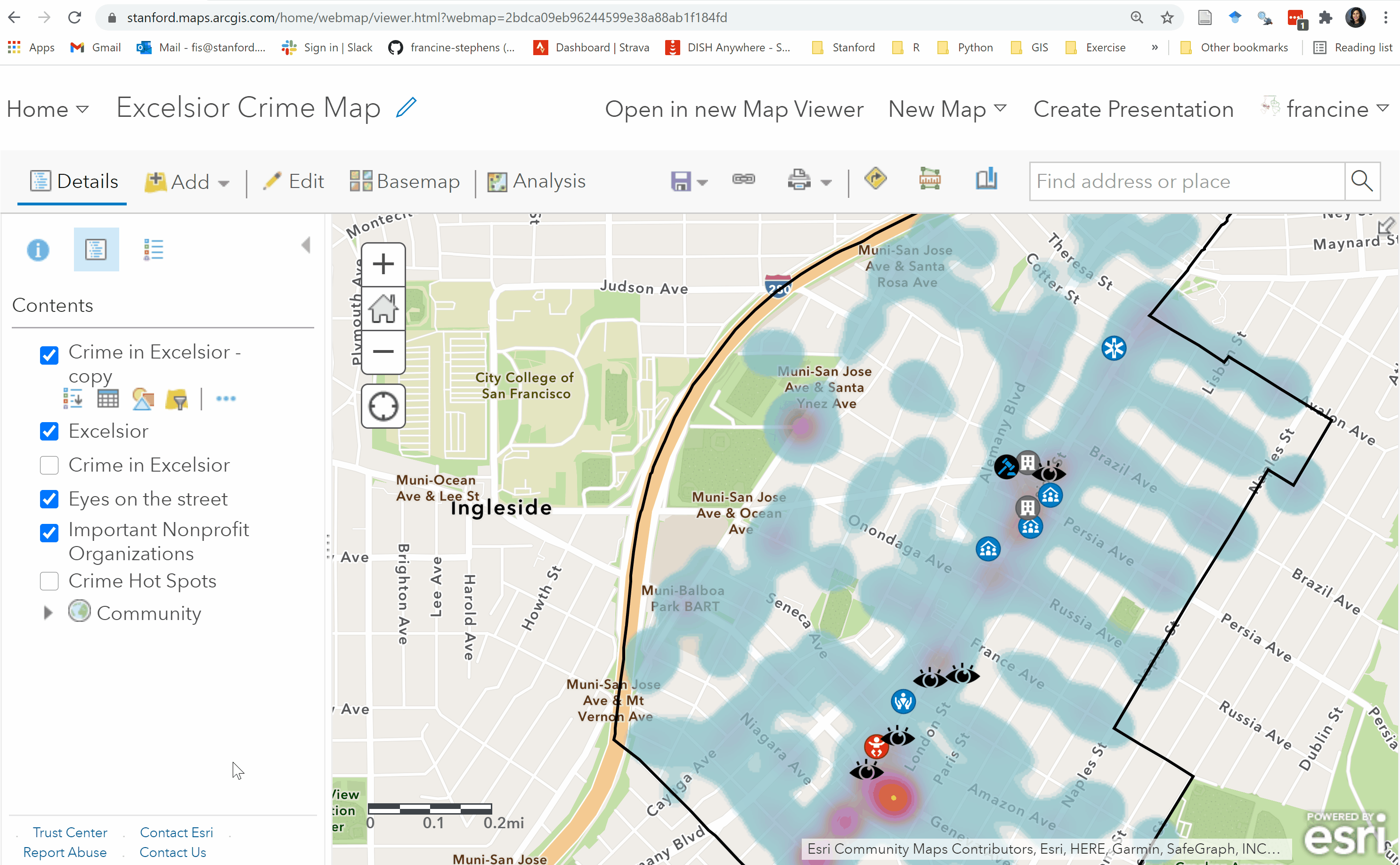
Navigate to the Add Layer tab, and select Search for Layers. Make sure that you are searching for the layer from My Groups. In the search bar, type in the name of your city and crime, (e.g., San Francisco Crime) and the layer of crime incidents should populate. Add that layer to the map. You should see points representing the crime incidents in your city. Below is a screenshot of what the layer looks like for San Francisco. The number of points you see will vary based on the city and how the data were collected.
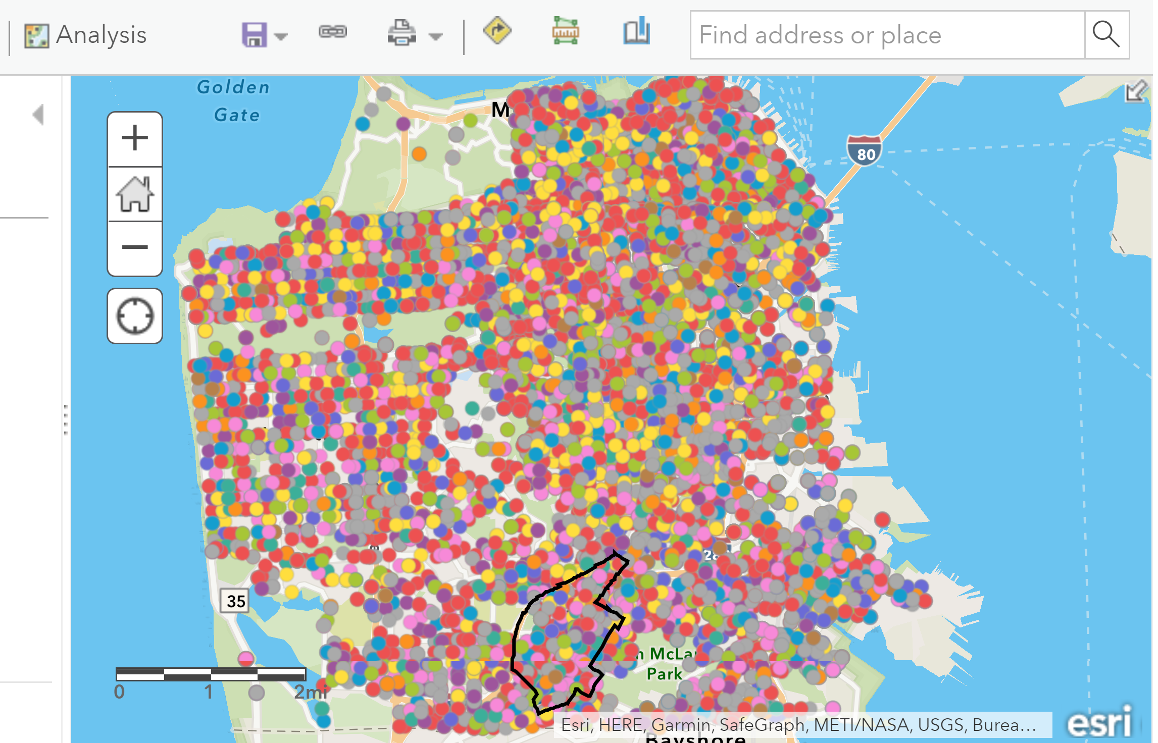
City-level crime incidents
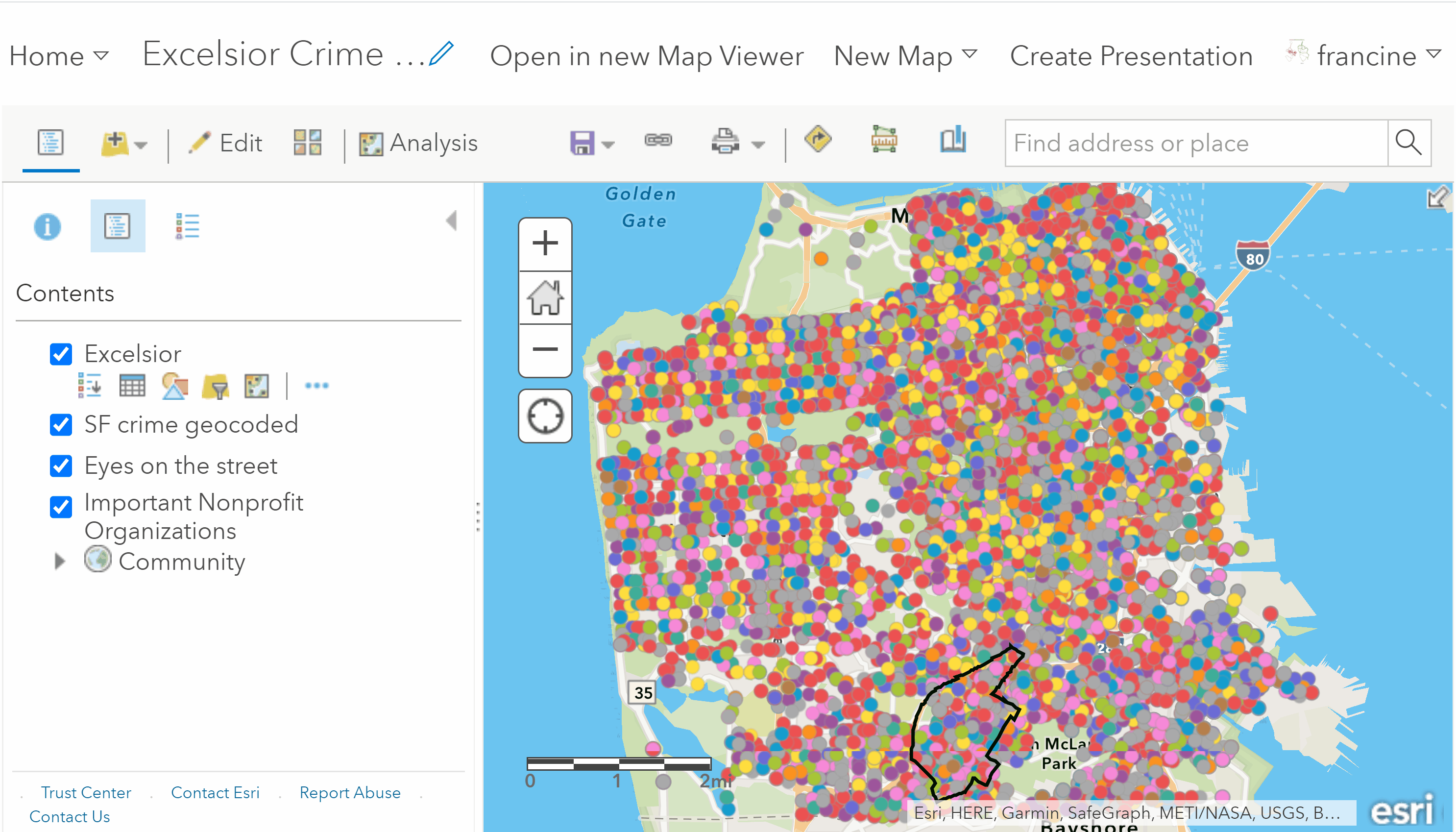
You will see crime incidents both in and outside of your neighborhood boundaries. Because we are interested in spatial patterns of crime within the neighborhood, we need to spatially reduce the crimes to the extent of the neighborhood boundaries. We will do this by using a technique called a spatial join.
Click on the Analysis Tab on the toolbar to open up the analysis operations in your content panel. Next, select the Summarize Data category, and then click on the Join Features operation. To perform the spatial join, follow GIF/steps written below:
Spatial reduction of crimes to the neighborhood
- Set the Target layer to be the crime incident points. The target layer is the layer that we are trying to reduce.
- Next, set the Join layer to be the neighborhood boundaries layer. This is the extent of our area of interest for our crime incidents.
- Specify the Join Type as Choose a spatial relationship and select Completely Within from the drop-down box. This tells AGOL that we want to select only the crime incidents that lie completely within the neighborhood boundaries.
- Specify the Join Operation as One to One. This defines the spatial join in binary terms: Crime incidents are either assigned to the neighborhood if they fall within its boundaries or they are assigned to outside the boundary if they fall outside of it. Leave the other fields in #4 as they are.
- Give the new layer that you are about to create an informative name. Keep the radio box for Use Current Map Extent checked.
- Run the analysis.
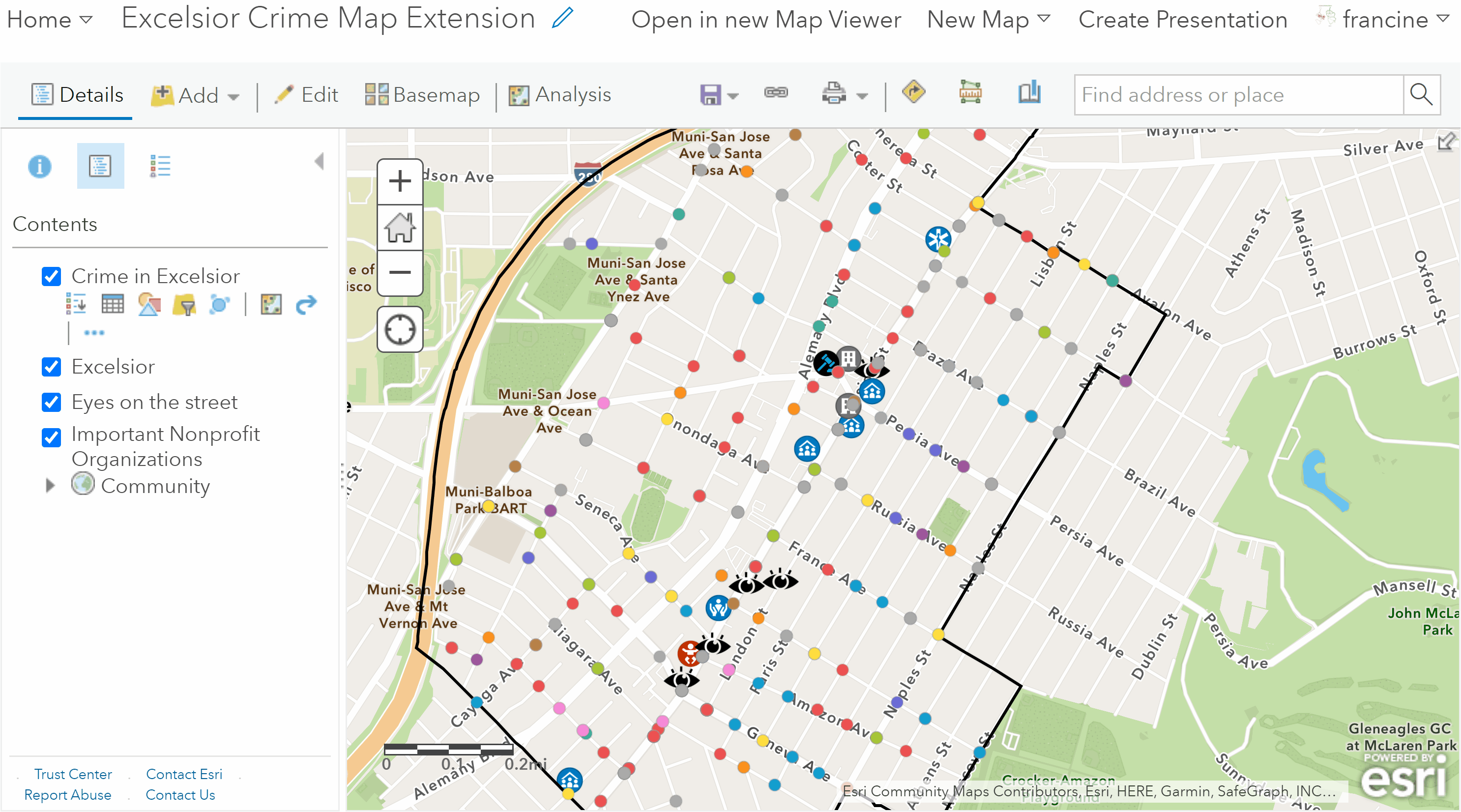
If your neighborhood is in a major city, you will have hundreds of thousands of points, so the analysis tool will take a while to perform the reduction and add the layer to your map. Just be patient. Once the layer is added, you will see the crime incidents that are within your neighborhood as shown in the image below.
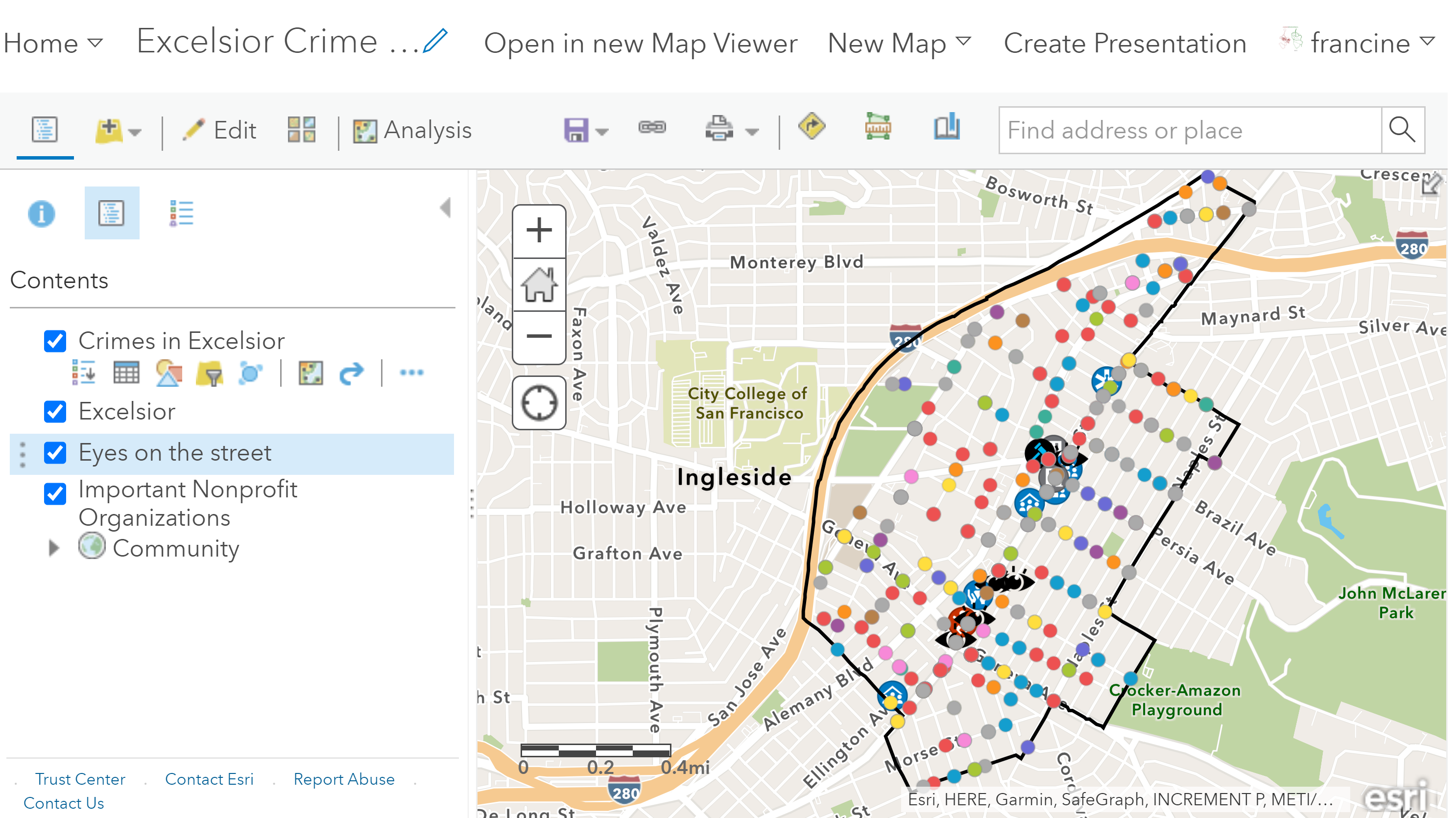
City-level crime incidents
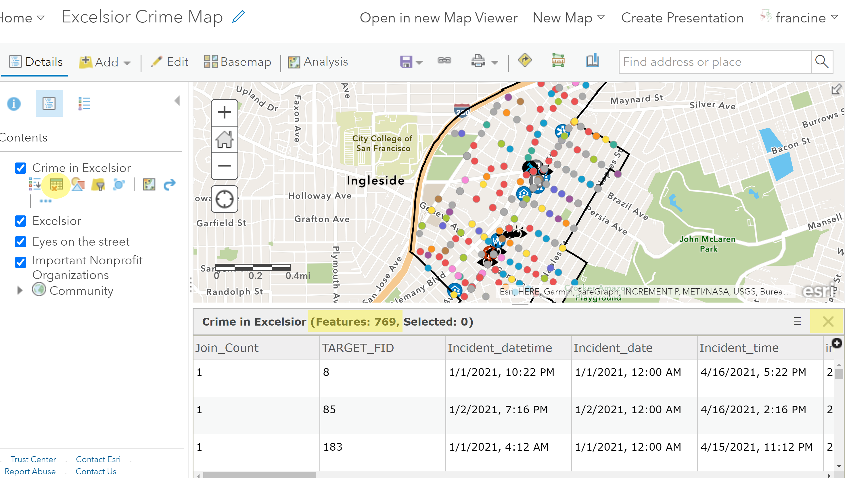
To see the number of crime incidents in your neighborhood, click on the Table button in the contents pane underneath your crime layer’s-name. You will see a table appear at the bottom of your screen like in the screen shot below. At the top of the table, in parentheses, the number of features tells you how many crime incidents are in your neighborhood. There are 769 crime incidents in Excelsior. The number of rows in the table match the number of features, which tells you that each row in the table represents a crime incident and the columns in this table contain descriptive information about each crime. We will return to this table and the descriptive attributes when we walk through the steps for filtering by attribute. To hide the table and just see your map in the map viewer, click on the ‘X’ in the upper-right corner of the table or click on the table button in the contents pane again.
Crime incident attribute table preview
Be sure to check out the information about your crime data layer. This can be found by navigating to the layer in the content page in our Group. You will find important information like the time span of your crime data and the attribute (i.e., variable) definitions.
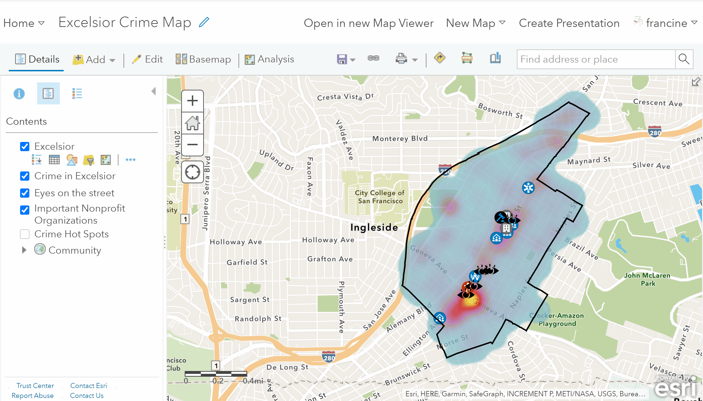
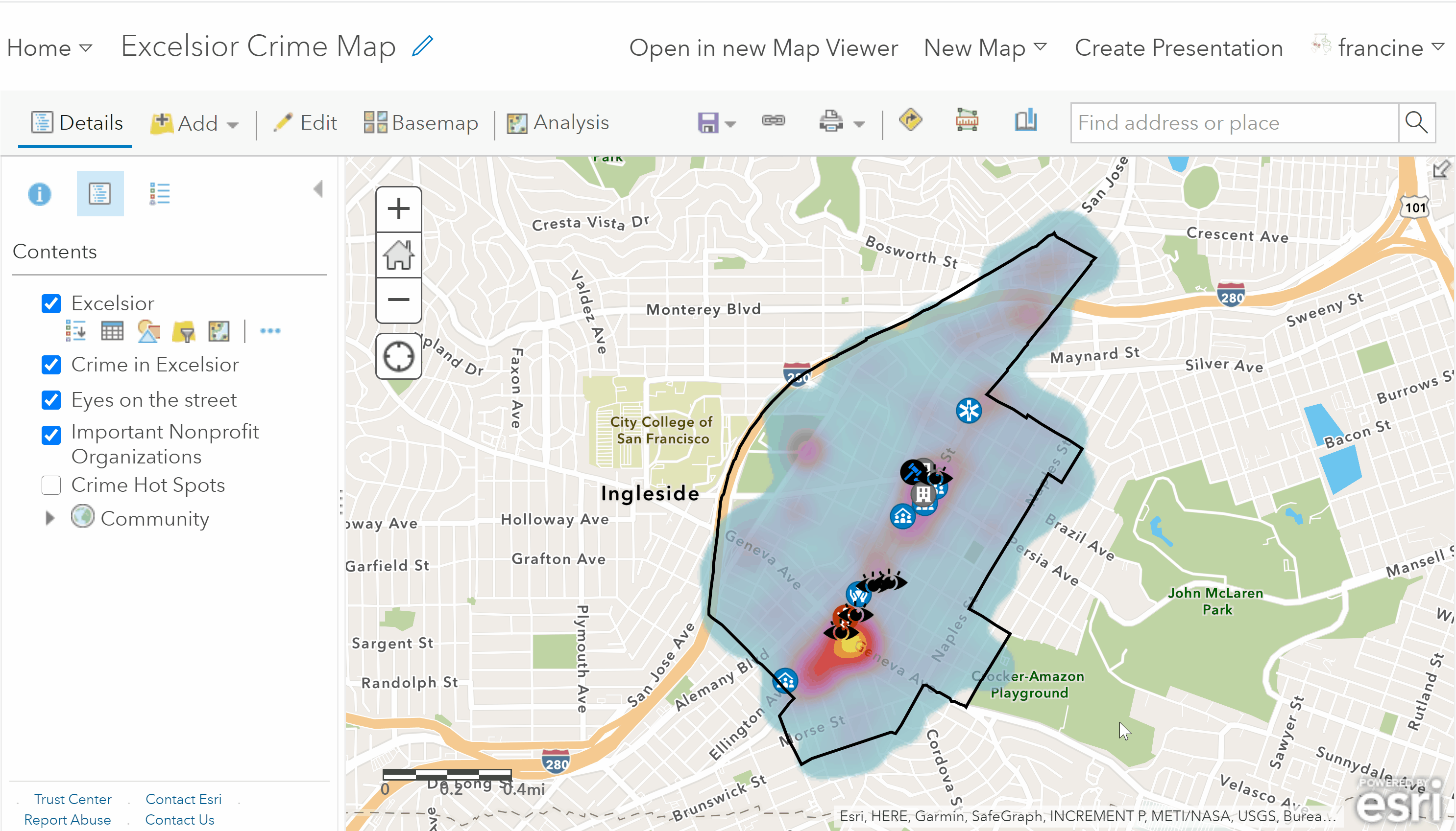
At this point, it is a good idea to save a new map with your work. Go ahead and remove the geocoded city-level crime incidents layers using by clicking on the three blue dots icon below the layer and selecting the remove layer option. Then, go to the Save icon in the toolbar and select Save As. Save this new map with an informative title, summary, and some tags. You can continue working off of this map for the next few steps of this assignment.
5.3 Visualizing Crime Distribution & Concentration
We have the points on the map representing crime incidents, but these points are not really indicative of point patterns when they are symbolized in this manner. There are two things to take note of when looking at the points as they currently plotted.
First, the points tend to show up at very particular points on the road network: street intersections or at the mid-point of a street segment. Why is this? Police departments provide the spatial locations for the crime incidents with “blurred addresses” or “blurred coordinates.” Blurring means that give you an approximate location. The department uses the nearest street intersection or midpoint to the actual address of the crime incident or the midpoint of the street segment. Alternatively, if they do not provide the address, but the geographic coordinates, they blur the coordinates by truncating the number of decimal places in the longitude and latitude. Blurring is done as a privacy control to minimize the risk of identifying individuals or establishments involved in the incident. The type and degree of blurring differs across cities. San Francisco’s blurring is pretty high. Some of you may find your city’s blurring practice is a little looser.
The second thing you should notice is that the map does not clearly represent multiple incidents that may have occurred in a single location with this type of symbology. At the moment, the only way you can tell whether multiple incidents occurred at a given location is by clicking on a crime point and reading the pop-up box content. As shown in the GIF below, when you look at the pop-up box, you can see the number of records listed and flip through them. This interactive pop-up box tells us a little bit about the number “crime incidents” occurred in the location (or, really nearby this intersection/mid-point of the street), but we want this information about the concentration and distribution of crime incidents to be seen discerned with the symbology. Let’s walk through two approaches for doing aggregating and visualizing points.
Pop-up boxes show the number of crimes at a location
5.3.1 Clustered Point Map
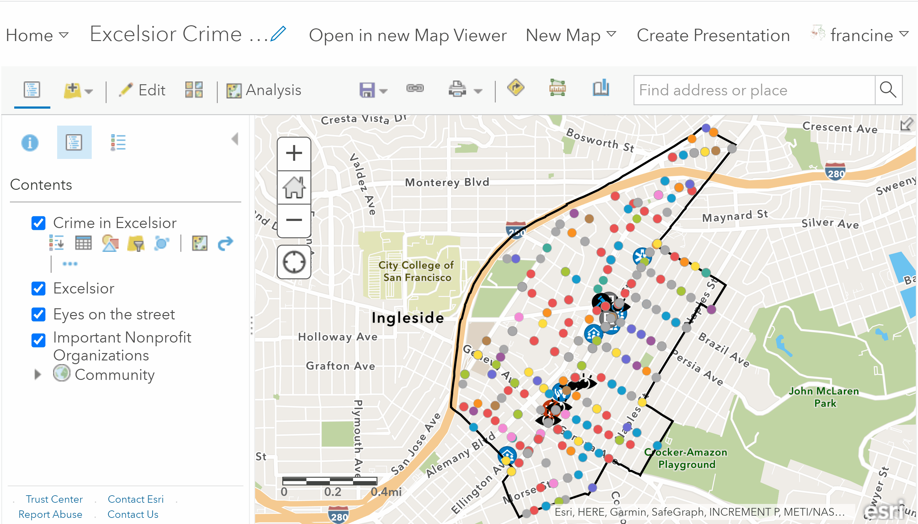
If your neighborhood has very few crime incidents and there are not locations where of multiple crimes have occurred, then simply adding the points to the map and cleaning up the symbology to a manner that looks pleasing is fine. You do not need to worry about creating a clustered point map or the two maps covered in the next two sub-sections. Just experiment with the **location only symbology to find a color/shape style that you like to find and then skip down to the section on disaggregating the crime data by attribute. But, if you have many incidents in your neighborhood and there are locations where multiple crime incidents have occurred, then a clustered point map would be a useful visual. Let’s walk through the steps to cluster the points.
Start by navigating to the Change style button underneath your neighborhood crime layer.
Cluster crime point locations
- Select Show location Only as the attribute that you want to show on your map. If your crime incidents are already styled as location only and not types, then skip this step and go to step 2i
- Select Location (Single symbol) as the drawing style.
- If you would like to change the symbology, go into the options and select the icon/add a custom icon that you would like to represent crime locations on your map.
- Select done, and then look at the options on your neighborhood crime incident point layer. You should see a blue dot - this is the cluster option.
- Click on the Cluster option. Your points will automatically be resized because the clustering tool is pulling together point locations that are nearby and aggregating them.
- The automatic re-size setting will likely over-aggregate and leave you with very few points on your map that are quite large. Move the cluster size option to the left on the slider to re-size the clusters and have more showing. You should play around with this a little bit until you are happy with the way the clusters reflect the distribution of point locations in your crime dataset.
- Then, go to the drop-down box for Pop-up Contents Display and select the option *a list of field attributes.**
- Click the attribute Number of features clustered. And select okay. Now, when you click on any of the clustered points, the pop-up will tell you the number of crime incidents that occurred at that cluster location. Click okay and interact with your clustered points.
You may notice that these clustered points cover or overlap with some of the other layers in our map, especially if the clusters are large. If this is the case, Try rearranging the drawing order of the layers in your contents pane by moving the clustered crime points below the point layers that you geocoded. If that does not help, you can also keep the clustered points as the top layer and just increase the transparency of the symbols in the change style options window, so that you can “see through the crime cluster points.”
Check out the legend on your map now that you have created the clustered points.
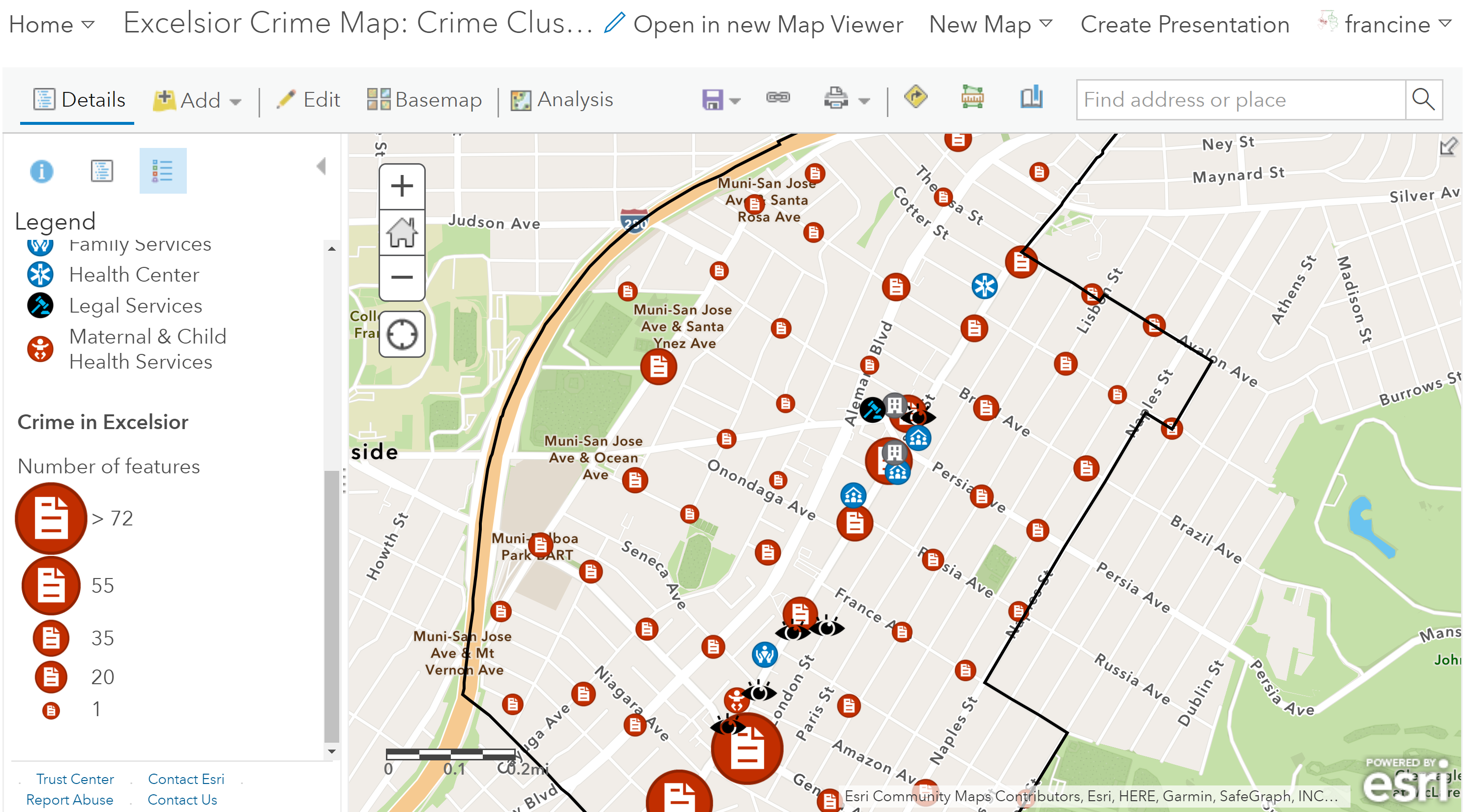
Legend for the clustered crime points
The crime clusters have been drawn as graduated symbols on the legend. You can see how the symbol sizes correspond with the frequency of crimes - larger the symbol the more crimes that occurred in that area. This type of clustering and aggregating visualization technique is helpful given that the crime incident data that we have are blurred to approximate locations.
5.3.2 Heat Map
The cluster map provides a very general sense of the distribution of crime incidents, however you might be looking for a visual that can convey the concentration of incidents in space. This is where a density or heat map can be useful! This map is good for drawing attention to where points are concentrated the most. Where the color is “hot”, the incidents are concentrated the most, and where the color is “cold” there are fewer or no incidents occurring.
In other GIS software, we would have to compute a density map to get a heat map, but AGOL has a heat map symbology style built into its drawing styles. Navigate to the Change style button on the crime layer. Then, view the steps in the GIF and written out below.
Create a Heat map
- Set Show location only in the first drop-down box as the attribute to show.
- Select the Heat map drawing style.
If you want to adjust the transparency, color-scheme, or the scale of the high-low legend, click on the Options button and adjust those settings as you see fit. If not, click Okay and notice how the crime incidents have been represented now.
The visual is no longer a set of points, but a smoothed raster with colors ranging from light blue, which represents low frequency of incidents,to yellow representing areas with high frequencies. Zoom in and out of your neighborhood and you will notice that the visualization change. When the layer is zoomed out, the entire area is very “hot” and pointless to view. But, as you zoom in on the layer, the heat map becomes less developed as some of the raster cells disappear. When you zoom in even more, the layer starts to look more like points along the intersections. The redrawing makes heat maps a source only for reference, but not for in-depth analyzing.
Before you move on to creating additional layers, be sure to Save all of these new layers to your map. Now, we can move from aggregation to mapping some disaggregated characteristics of crime incidents in your neighborhood.
5.3.3 Hot Spots (Optional)
If you want to know whether the concentration of crime incidents in certain parts of the neighborhood is distributed in a non-random fashion, then we need to use a spatial statistics tool. Performing spatial statistics is not required for this assignment. IThis is included just in case it is of interest. If you have fewer than 60 crime incidents in your neighborhood or are not interested in including spatial statistics at this time, jump down to the disaggregating the crime data by attribute section.
What makes a hot spot map different from a heat map? The short answer is statistics! A heat map maps how concentrated points are across the space in your viewing frame, but a hot spot map compares how concentrated points are in sub-regions of the area of interest (e.g., neighborhood) to how concentrated points would be if the points were distributed in a completely random manner across the area of interest. From the map, you can see which regions have more or less incidents than we would expect if the “crime generating process” was completely random. The hot spots indicate regions where the frequency of crimes is higher than we would expect if crime was randomly distributed across the neighborhood. Cold spots would represent regions with frequencies that are lower than expected if crime was randomly distributed across the neighborhood. The darker the shading indicates higher levels of statistical confidence in the hot spot estimates.
As you might guess, the tool we need is the Hot Spot Analysis. This tool will aggregate to a series of small polygons that cover the area of our neighborhood. Aggregating to small polygons makes sense given that the points were blurred by the police department and represent the approximate locations of crimes. Thus, the polygons can represent the potential area where the incidents may have occurred. The hot spot analysis will output a map of hot spots and cold spots, if there are any in your dataset.
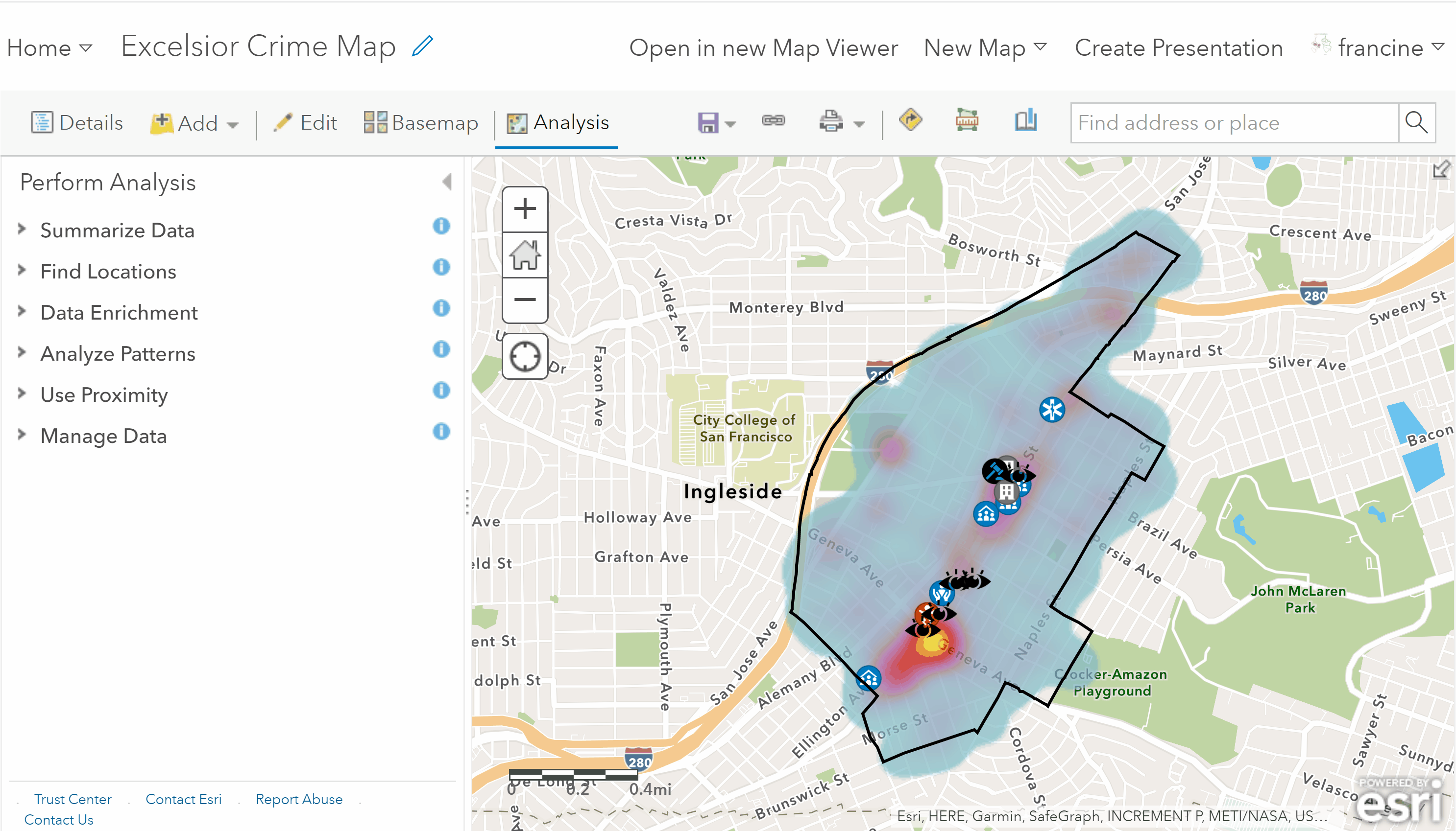
Use the hot spot analysis tool
Return to the Analysis tab on the toolbar, and then select the Analyze Patterns category. Open up the Find Hot Spots tool and fill in the tool parameters as follows:
- The layer you will use to calculate hot spots is the neighborhood crime incidents layers.
- Set the clusters of high and low values to Point counts. This tells AGOL to just calculate the points per area, not any of the numeric attributes of the crime points.
- You need to specify to count points within either Fishnet grid or a Hexagon grid. The grid is going to include the units for aggregating - either rectangles or hexagons. Hexagons are good if you have a curvature in your neighborhood boundaries or roadway networks like in this example. If your neighborhood is more square/rectangular in shape, then the fishnet grid would be more ideal. If you have an irregularly shaped neighborhood and are unsure which type of grid to use, the hexagon would probably be a better option for you. However, feel free to run it one way and then repeat the analysis with the other grid and compare. More likely than not, you will not see substantial differences, which means you can opt for whichever one you prefer. If the outputs differ noticeably, reach out to Francine to discuss this.
- In the field labeled: Define where points are possible, select the neighborhood boundaries.
- You can leave the Divide by field as None. If you want to set it to population, feel free, but AGOL’s population normalization tends to work better at higher levels of geography like zipcodes, cities, and counties.
- You do not need to set any of the options. AGOL tends to do a decent job at guessing an appropriate cell size.
- Give the new layer that you are about to create an informative name. Leave the radio box for Use current map extent checked. Finally, click Run Analysis.
AGOL will output two items for you. You will see the hot spot layer with the grid you selected and shaded based on statistically significant hot and cold spots populate on your map. You will also get a report with specific details about the hot spot analysis, including the dimensions of the grid cells, the scale, and the number of hot spots.
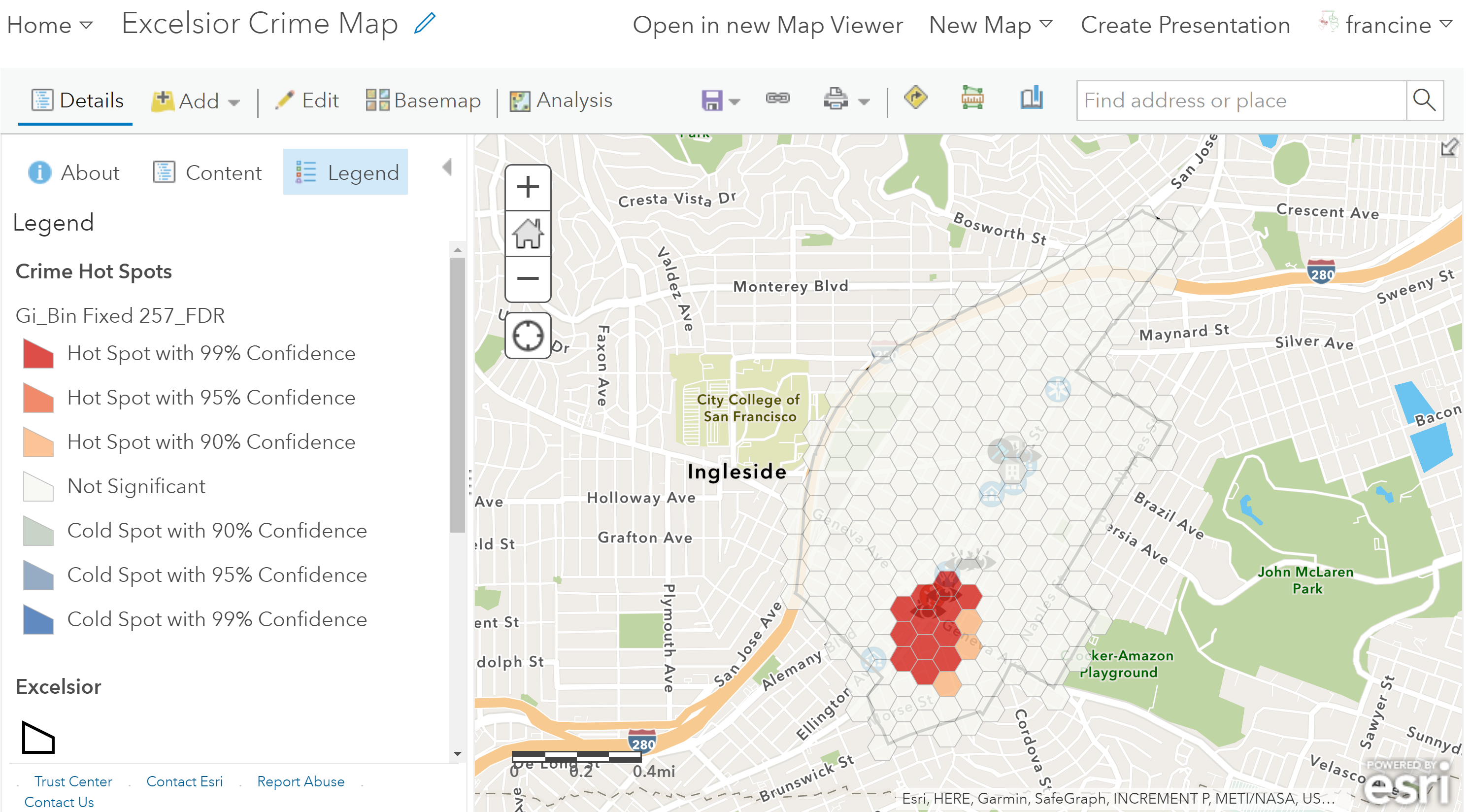
Crime hot-spots map layer
I am not including any information about how to clean up the styling of the hot spot map because my guess is that the clustered points or the heat map are sufficient evidence to lean on in your write-up. If you find that the hot spots are helpful for conveying the points you are trying to make in your assignment write-up, and want help with the styling contact Francine or come to office hours.
Be sure to Save all of these new layers to your map. Now we can move from aggregation to mapping some disaggregated characteristics of crime incidents in your neighborhood.
5.4 Filter Crime Data by Attributes
In addition to mapping all of the crime incidents in your neighborhood, Assignment #4 asks you to dive a little deeper into at least one characteristic of the crime data. Whenever you start to analyze particular attributes or subcategories of a dataset this is referred to as disaggregation. We are going to do this in AGOL using the filtering options in the attribute table.
Before you head over to the attribute table of the crime incident data in your neighborhood, you need to take a look at your data to see what characteristics you have available. Police departments do not have a standardized way of releasing their data to the public. Looking over your dataset will give you a sense of your attribute options. There are two ways to “take a look” at your data. The first way is more cursory, and the second way is a little more detailed and will make the filtering process a bit easier. The second option is recommended.
Go to the content page for your crime layer to see the list of attributes and the variable names they are given. Some data layers also have links to the metadata from the police department. These metadata offer more detailed definitions of the attributes. If you have questions about your attributes and what they mean, send your questions to Francine.
To take a closer, more hands-on look at your data, you will want to export the neighborhood crime incident layer data as a CSV that you can open up in Excel or Google Sheets on your computer. The plus side of this approach is that you can practice filtering different attributes in the spreadsheet on your computer. When you go to the filtering tool in AGOL you will know what text to type into the filters to reduce the data points down to the attributes that you care about. Navigate to the Analysis tab and follow the steps below to extract your neighborhood-level crime data to a CSV:
Export your neighborhood crime data to a CSV
Note: In the GIF, you might notice that I have switched back to the heat map layer and moved it to be above the other layers (i.e., eyes on the street, organizations, and hot spot). I did this just for ease. Moving it up in the contents pane brings it toward the top of the drop-down box options. Also, turning this layer on and the hot spots off was just a way to remind myself that this is the layer with the full layer of crime incident points that I want to pull down in the CSV.
- Select the Manage Data category and the Extract Data tool.
- Specify the Neighborhood-level Crime Data layer (i.e., the layer drawn as a heat map) as the layer to extract.
- Set the Study Area as Same as your neighborhood boundaries Keep the radio button for Select features checked.
- Leave the Output format as CSV.
- Give the Output file an informative name. Keep the radio box for Current extent checked, and click on Run Analysis
You should now be able to open up the CSV in a spreadsheet software and examine the attributes. The next two sections will demonstrate filtering for two different attributes - day and type of crime.
5.4.1 By Day of the Week
The day of the week that the incident occurred is one attribute in all of your crime datasets. We can use an attribute filter to reduce the crimes to that occurred on a particular day. Let’s say that I conducted my observations in Excelsior. I could set the day of the week filter to Friday to only have crimes that took place on a Friday. Find the column name for the day of the week attribute (e.g., incident_day_of_week), and then follow the steps shown in the GIF and written out below:
Example of filtering by the day of the week.
- Before applying the filter, copy the heat-map layer with your neighborhood’s crime incidents. You can do this by clicking on the three blue dots below your layer and selecting the copy-option.
- Click on the *attribute table** button below this copied layer.
- Select Filter in the drop-down menu options in the top right corner of the attribute table preview.
- In the first drop-down menu, find and select the name of the day of the week field (i.e., variable) in your dataset.
- Keep the middle drop-down menu set to is. (Think of is as signifying day of the week “is equal to”)
- In the third drop-down menu, type in the name of the value you are interested in mapping. In this case, that is crimes that occurred on a “Friday”.
- Click on Apply Filter. Notice that the number of features in the attribute table preview has decreased.
- Close out the attribute table preview.
Notice that your map has changed. The high heat areas may reduce in intensity or disappear all together. You should inspect your map for patterns, and try visualizing using the clustered points and heat map like we did with the full dataset in the previous sections. Pay attention to how this particular set of crimes compared to the full set of crimes and how it compares to the elements of public order/disorder that you observed during your walk through the neighborhood or on Google Street View.
It is possible to go another step in disaggregating your data. For example, some of you will also have time-stamps on your crime incident data. You could add another expression in the filter window and set the drop-down menus in that second filter to the specific time period when you conducted your observations (e.g., between 7pm and 8pm). The next example will show the process for setting multiple expressions in a filter, but with type of crime attributes.
5.4.2 By Type of Crime
Another type of characteristic you might be interested in is the type of crime. In my observations, I identified some public spaces where I found many eyes on the street. These tended to be in public spaces that the Excelsior community has spent a lot of time beautifying and renovating, so I’m interested in whether crimes labeled as “vandalism” are distant from the eyes on the street or if they are co-located.
Most datasets only classify crimes with a single variable (e.g., crime_type, crime_description, crime_category). However, some datasets have classify crime types with multiple variables. This is the case for San Francisco, so I need to use two crime-type variables - the crime category and crime subcategory to pull the vandalism crimes that I am interested in. Specifically, I need to filter for the incident_category value: “Malicious Mischief” and the sub-category value: “Vandalism”.
The date filter from the previous section was cleared, so the GIF starts from the heat map of the full set of incidents. Also, notice how the raster of the heat map became much sparser. This because the filter left us with 40 incidents. The other thing to note is that I renamed the filtered layer at the end with a new, more informative label. This is important for the legend label.
Example of filtering by type of crime with two filter expressions
As mentioned in the previous section, you would want to explore which visualization technique is sensible your filtered points - Location only, Clustered points, or heat-mapping.
Once you have chosen the characteristic you want to focus on - day, time, or some attribute of the crime - and created your filtered view and visualization, do not forget to Save your map. If you would like, go ahead and use the Save As option and give the new map an informative title/summary based on the filtering option you used. This will come in handy for the map products you turn in and later on when we make the Story Map.
5.5 Final Map Products
This tutorial walked you through creating multiple layers. For both aesthetic and readability reasons, it is not necessarily ideal to show all of the layers that you created on the same map at once. Assignment #4 does not require that you use all of these map layers in your write-up. Instead, you might consider using a couple of maps to reveal the patterns (or lack thereof) that you find compelling or surprising and want to discuss in your write-up. I could see one map for showing the general/aggregated distribution of crime incidents with layers for your social order/disorder elements and key organizations. The second map would feature the disaggregated crime characteristics that you chose to focus on (e.g., type of crime) alongside layers for your social order/disorder elements and key institutions. This is where the comment above about Saving As after making the filtered map comes in handy.
For the map with the generalized/aggregated crime data, you do not need to have both the clustered points layer and the heat map layer layer visible. Even if you have all of these layers turned on, it may be hard to view them together. Determine which visualization style better supports the patterns you are discussing in your write-up. The clustered point map may be good if you have many points that co-occur (either in the spot or near one another) and your neighborhood has a small areal extent. The heat map is good for conveying generalized/high-level patterns. For example, if you are focused on broad regional differences within your neighborhood (e.g., the difference in crime prevalence between areas east and west of Main Street), then the heat map may be a good choice. On the other hand, if you want to quantify differences in crime incidents at a finer-grained spatial level, then the clustered/graduated symbol map would be the better option.
The hot spot map DOES NOT need to be included in your write-up. If you have a lot of crime incidents in your neighborhood and want to make a statement about statistically significant patterns of crime in your neighborhood, you can use the map layer or just reference it in your write-up. Just know that even if an area does not have a statistically significant hot or cold spot, it does not mean there are not meaningful or substantively interesting patterns occurring there. There are plenty of patterns in the real world that are not statistically significant, but still compelling/interesting/surprising.
To conclude, the map products you choose to submit should be the ones that most effectively convey the argument you are trying to make about how crime patterns in your neighborhood compare to the theoretical ideas about public order/disorder that you read about this week. But, don’t delete or forget to save the map layers that you do not submit! It is possible that those layers may work better for the Story Map that you will create later this quarter.
A note on sharing your maps: You have two options for sharing your maps when you submit your assignment. You can print the maps as a “PDF” with the web-app as was demonstrated in the section about PDF exports. Alternatively, you have the option to share the web-map. This will be an interactive map for your viewer to engage with. In my opinion, this sharing option is a lot simpler:
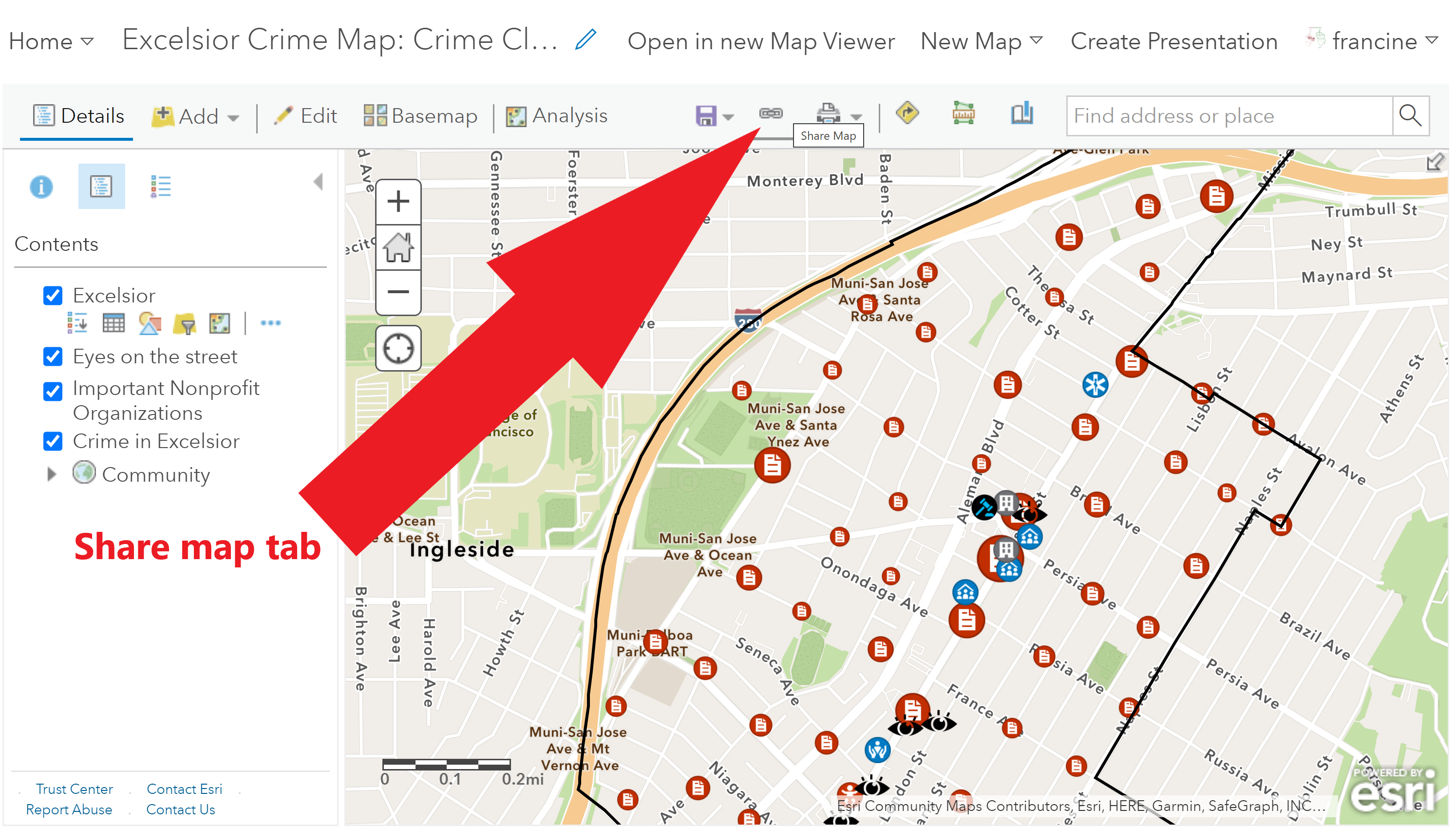
Navigate to the Share Link tab
- Go to the share tab in the tool bar shown in the picture above.
- In the sharing settings dialogue box be sure to check the box for our class group. Your sharing settings should look like the ones outlined in red in the image below.
- Copy the weblink at the bottom of the dialogue and paste or link it to the write-up you are turning in.
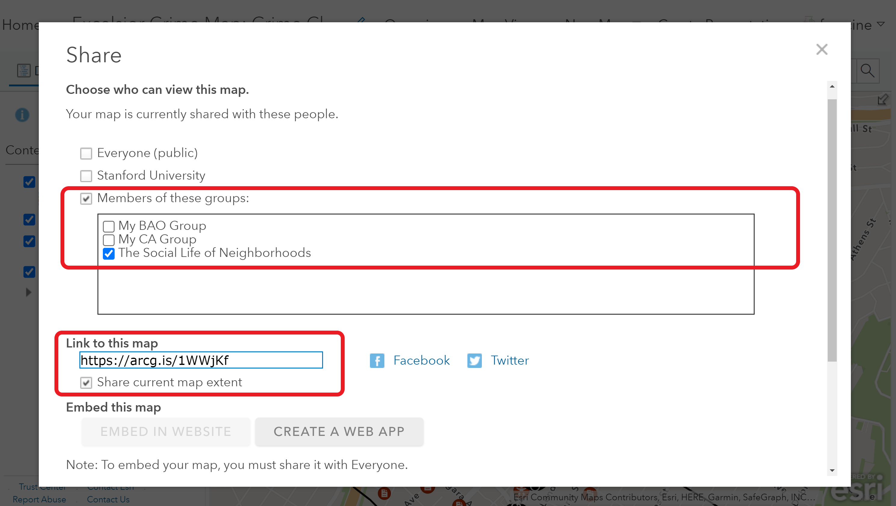
Set your sharing settings
Hopefully you enjoyed getting to try out different visualization approaches this week. Next week we will have another opportunity to play with visualization strategies when we map changes in racial composition and segregation trends.