| After this module you should be able to… |
| Determine and defend appropriate disease mapping strategies consistent with basic epidemiologic concepts (e.g. study design, sampling strategy, measurement error, and systematic bias) |
| Create statistically smoothed, age-adjusted disease maps of epidemiologic parameters including SMR, disease risk or rate, and measures of estimate precision/stability |
| Describe the modifiable areal unit problem and discuss strategies for evaluating bias arising from MAUP |
Module 2: Disease Mapping: Aspatial Empirical Bayes
Learning objectives
Additional Resources
- Arianna Planey blog on spatial thinking and MAUP
- Waller L, Gotway C. Applied Spatial Statistics for Public Health Data. Hoboken, NJ: John Wiley & Sons, Inc; 2004.
- Clayton D, Kaldor J. Empirical Bayes estimates of age-standardized relative risks for use in disease mapping. Biometrics. 1987 Sep;43(3):671–81.
Objectives in Disease Mapping
Disease mapping: is located at the intersection of statistics, geography, and epidemiology.
Typically involves the use of Geographic Information Systems (GIS) to collect, analyze, and display spatial data. Researchers extend to use statistical models to account for confounding factors and to enhance the accuracy of the maps.
Driven by core epidemiological questions and concerned about fundamental epidemiological and statistical issues
Why do we need disease mapping?
Provided novel insight into the geographic patterns of health and disease.
Characterizes the distribution and determinants of health in populations.
To spatially describe the distribution of disease, epidemiologists are primarily interested in two over-arching question:
Is the intensity of disease or health spatially heterogeneous or spatially homogeneous?
Is there spatial structure or spatial correlation in the location of disease intensity?
Allows for methodological and systematic ways to deal with:
- Parameter estimate instability due to sparse data/rare events;
- Spurious heterogeneity arising from ‘confounding’ by nuisance covariates;
- Biased description of spatial heterogeneity arising from the modifiable areal unit problem (MAUP), a form of the ecologic fallacy
Note
Spatial heterogeneity means there are differences in the intensity of disease in some sub-regions as compared to others.
Another way of saying it, is that the local parameter (e.g. the rate, risk, prevalence, etc) in at least some sub-regions of a study area is different from the global parameter (e.g. the overall rate, risk, prevalence, etc) for the entire study area.
In contrast, spatial homogeneity means that if you know the overall, global parameter, you basically know every local parameter, plus or minus random variation.
Looking for heterogeneity is the whole reason for mapping! If the occurrence of disease were the same everywhere, a map would not tell us much!
The problem and approach to data sparsity
When either a disease is quite rare – resulting in a small numerator – or the population at risk is quite sparse – resulting in a small denominator – the estimate of disease burden is inherently unstable or imprecise.
That means that adding just one or two more events or persons at risk has a notable impact on the estimate.
Example: Imagine a county that has 10 people at risk of death in each of three consecutive years (e.g. if some die, others are born or move into the county). In one year, perhaps none die, in the next year one dies, and in the third year three die. The mortality rate is estimated at 0%, 10% and 30%.
In other words each of these estimates are both mathematically true for the given year, but statistically unstable, and frankly implausible as an indicator of the true underlying risk of the population.
The problem is the estimate of mortality rate is derived from too little data.
Solutions
- Aggregate!
- counts of disease events and population at risk over multiple years or time intervals to increase the opportunity for events, or extend the amount of person-time
- counts of disease events and population at risk over geographic units to pool together larger populations.
- \(\textcolor{red}{\text{Spatial Smoothing:}}\) Sharing information across small areas to smooth extreme high or extreme low rates. Also referred to as disease rate stabilization.
The problem and approach to confounding or nuisance sources of heterogeneity
Confounding refers to a specific causal structure, wherein the association between an exposure and a target disease outcome is spuriously associated because of a backdoor path through one or more confounders, creating false association.
Covariates that are simply a nuisance means they explain some amount of spatial heterogeneity, but you as the epidemiologist are not particularly interested in their role as an explanation.
Instead you wish to know if there is still spatial heterogeneity above and beyond those covariates. For example consider comparison of mortality rates by state:
| State | Crude mortality rate (per 100,000) | Age-adjusted mortality rate (per 100,000) |
|---|---|---|
| Florida | 957.3 | 666.6 |
| Alaska | 605.7 | 745.6 |
Using the crude mortality rate, it is clear that Florida has a mortality rate perhaps 30% higher than Alaska, suggesting something really awful is going on in Florida as compared to Alaska! However once we adjust or standardize by age, it is actually Alaska that has a slightly higher (age-adjusted) mortality rate.
Solutions
Age standardization of disease rates: adjust rates (such as mortality or disease incidence rates) for age differences in populations
Stratification across socio-demographic groups: dividing a population or dataset into distinct subgroups (or strata) that share specific characteristics.
Regression control: regression analysis to account for the effects of confounding variables or predictors when estimating the relationship between the primary independent variable(s) and the dependent variable.
Using statistics and probability models to improve disease mapping
In epidemiology, we spend a lot of time trying to disentangle ‘noise’ from ‘signal’ in collections of data and their relationships.
Two broad buckets of error:
random error that comes from chance and is related to sample size
systematic error that comes from structural bias (e.g. confounding, selection, misclassification/measurement error) that is not driven by sample size and is therefore not fixed or corrected by increasing sample size).
To make inference (make meaning or decisions) from data that take account of random error we adopt statistical probability models that describe the role of chance alone in generating values.
How are statistics different in space?
- Health events happen at the individual level.
Individuals can be linked to their location in space.
For example, imagine a study region represented by a blue square.
The population is spread across the region, with each person occupying a specific \(x,y\) location.
We could observe all (or a subset) of individuals and their corresponding point locations at a point in time.
This observation represents a specific realization of a spatial point process
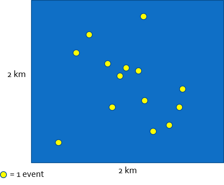
Spatial disease intensity of the event is a spatially continuous surface. For every location, the intensity is the amount of disease per unit-area (e.g. cases per square kilometer). To calculate a single, global, measure of spatial intensity for the figure above we divide events by area:
\(\frac{events}{Area}=\frac{14}{4km^{2}}=\frac{3.5}{km^{2}}\)
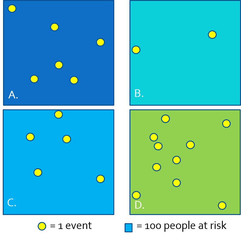
- Because we often do not have the exact \(x,y\) location of every person at risk and every health event, we cannot observe the full spatial point process and thus cannot estimate the continuous spatial intensity surface.
- We approximate the spatial intensity by aggregating health events and population and summarizing the ratio (e.g. as risk, rate, prevalence) per areal unit.
- In the figure above, each rectangle contains \(n=100\) person-years at risk, producing the following disease rates estimating the spatial intensity of disease:
| Region | \(\frac{events}{population}\) | Estimate |
|---|---|---|
| A | \(\frac{6}{100}\) | 6% |
| B | \(\frac{2}{100}\) | 2% |
| C | \(\frac{5}{100}\) | 5% |
| D | \(\frac{10}{100}\) | 10% |
When we have data in this form (e.g. counts of events and counts of population), we can use one of several parametric statistical probability distributions common in epidemiology including Poisson, binomial, and negative binomial.
Why are probability distributions useful?
A probability distribution is a mathematical expression of what we might expect to happen simply due to random chance
Describes our expectations under a null hypothesis.
We choose different probability distributions to suit different types of data such as continuous, binary, or count.
Relating the count of disease events to a probability distribution permits the calculation of standard errors or confidence intervals expressing the precision or certainty in an estimate.
- \(Y_i\) is the count of health events in the \(i_{th}\) areal unit
- \(N_i\) is the count of population at risk in the \(i_{th}\) areal unit
- \(r_i\) is the risk in the \(i_{th}\) areal unit (e.g. estimated by \(Y_i / N_i\))
- \(E_i\) is the expected count, which is calculated as \(N_i\times r\), where \(r\) is an overall reference level of risk (note there is no subscript \(_i\); that means it is global risk rather than risk local to region \(_i\). So expected simply means the burden of disease in the \(i_{th}\) areal unit if they experienced the reference risk.
- \(\theta_i\) is the relative risk in the \(i_{th}\) areal unit; this is essentially the relative deviation of this region from the expected.
Probability distributions model the observed counts\(Y_i\) as a function of the expected count \(E_i\), the population at risk \(N_i\), and the unknown risk parameter \(\theta_i\).
- Poisson distribution is a classic distribution to use for evaluating counts of events possibly offsetting by the time-at-risk or person-years. This latter point about the “offset” is how we use Poisson distribution to model disease rates.
- Poisson assumes that the mean of the distribution is the same as the variance of the distribution.
- Poisson distribution only approximates the disease intensity rate well for rare disease processes. Therefore Poisson is not a good choice if the outcome is not rare.
- Binomial distribution is useful for characterizing disease occurrence for non-rare or common disease processes.
If you want to learn more about Poisson point processes or probability distributions for spatial epidemiology, I highly recommend Lance Waller’s text, Applied Spatial Statistics for Public Health Data (Waller & Gotway, 2004).
Spatial Analysis in Epidemiology
As an example dataset, we will aim to estimate the spatial heterogeneity at the county level of the occurrence of opioid-related deaths across 159 counties in Georgia. These data were made available from the Georgia Department of Health.
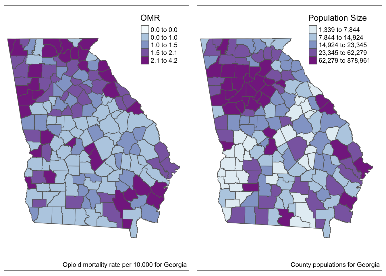
- In the maps above we visualize the observed opioid mortality rate (OMR) as well as county population sizes for 159 counties in GA.
- For smaller counties, we should be thinking about issues of imprecision or instability in the estimates (and therefore in the map overall) because so many counties have such sparse data.
There are four disease mapping objectives we wish to accomplish to more fully describe these data:
- Test whether there is statistical evidence for spatial heterogeneity versus homogeneity
- Describe the precision of OMR estimates in each county
- Account for possibly spurious or nuisance differences between counties due to a confounding covariate such as age structure
- Produce overall and covariate-adjusted smoothed or stabilized rate estimates using global Empirical Bayes.
Disease mapping: Is there spatial heterogeneity?
Calculating expected counts and the SMR
Does disease intensity (risk, rate, prevalence) deviate from the \(\textcolor{red}{\text{expected value}}\) for a given geographic area.
Standardized Morbidity/Mortality Ratio (SMRs):
The SMR is a measure of relative excess risk.
It quantifies the deviation of a population prevalence/rate from a reference value (i.e., the risk for the whole state of GA)
The SMR is calculated as the Observed count of events, \(Y_i\), divided by the Expected count, \(E_i\), of events.
\[ SMR_i = Y_i/E_i \]
Calculating expected counts: first calculate the overall risk for the entire study region, \(r\), and then multiply that by the population at risk in each county, \(N_i\), to get the events expected if there were homogeneity in risk, or if the \(SMR=1.0\) for all counties.
# the overall (statewide) ratio of events to population is the global risk
risk <- sum(data$death_count) / sum(data$pop_count)


# Now add a variable to the dataset representing expected count and SMR
data <- data%>%
  mutate(expect = risk * pop_count,  # calculate the EXPECTED count for each county
         SMR = death_count / expect)  # calculate the SMR as observed/expected
As you can see in the maps below, the SMR represents the same underlying pattern, but simply does so on a different scale, that of relative excess risk rather than absolute risk.
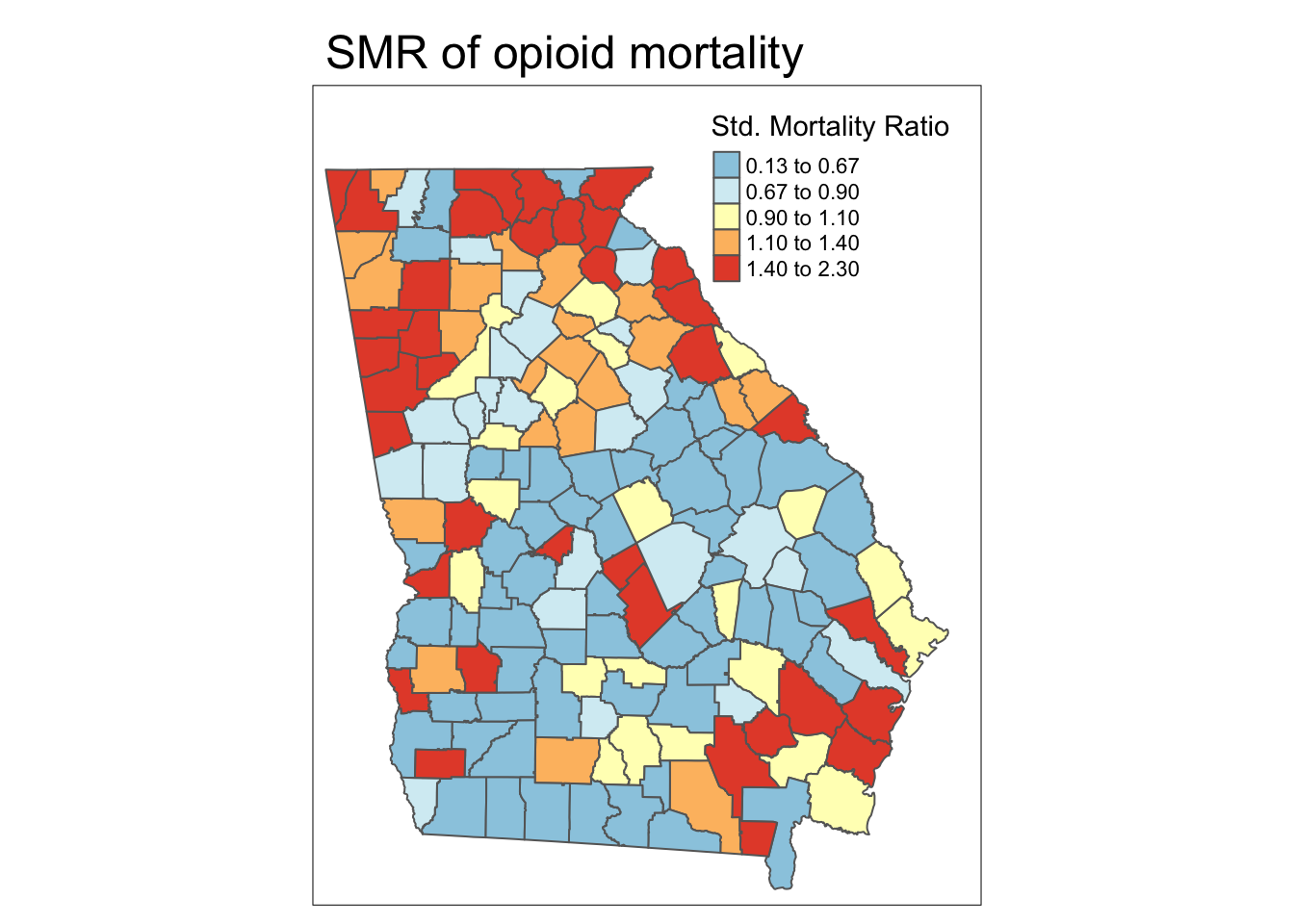
Spatial heterogeneity
Both maps above illustrate (qualitatively at least) that there is spatial heterogeneity or variation in OMR estimates. The relative scale of the SMR specifically highlights counties as one of three types:
- Better than average which means they have lower risk than the average, statewide population. These have SMR < 1.0.
- Worse than average which means they have higher risk than the average, statewide population. These have SMR > 1.0.
- About average meaning they have risk about as would be expected given the statewide prevalence. These have SMR approximately equal to 1.0.
Disease mapping: How precise are county estimates?
We may ask the question if there is global spatial heterogeneity? (e.g. at least some counties have \(SMR\neq 1.0\))
How precise are the estimates themselves?
Which counties are statistically significantly different from the null expectation?
A function to estimate the continuous p-value associated with the SMR is the
probmapfunction from the packagespdep.This function calculates the probabilities of observing an event count more extreme than what was actually observed, given the expected count (e.g. we might expect every county had the overall risk).
The test is a one-tailed test, and by default the alternative hypothesis is that observed are less than expected, or that SMR <1.0 (to test for extremes greater than 1.0, set the argument
alternative = 'greater').
The function returns the expected count of deaths, as well as the SMR (in this case it is named relRisk, and somewhat oddly the function multiplies the SMR by 100 so the numbers appear different!), and the Poisson probability that the observed count was more ‘extreme’ than actually observed.
library(spdep)
x <- probmap(n = data$death_count, x = data$pop_count,
              row.names = data$GEOID,
             alternative = 'greater')
head(x) # look at what is returned| raw | expCount | relRisk | pmap |
| 0.000137 | 2.15 | 92.9 | 0.634 |
| 0.000154 | 0.955 | 105 | 0.615 |
| 0.000114 | 1.29 | 77.4 | 0.725 |
| 0 | 0.355 | 0 | 1 |
| 5.39e-05 | 5.46 | 36.6 | 0.972 |
| 0.000337 | 2.18 | 229 | 0.0706 |
As you can see, the function calculates:
- Raw rate, which is simply \(\frac{Y_i}{N_i}\)
- Expected count, which is simply \(r\times N_i\), where \(r\) is the overall expected rate based on all deaths in the Georgia dataset
- Relative risk, which is the SMR and is the ratio of the observed to expected. Note that the function multiplies the SMR by 100. So the value 103 actually refers to an SMR of 1.03
- p-value, which again is the probability that the SMR in this county was significantly greater than 1.0
For mapping, we will grab the SMR (e.g. relRisk but divided by 100 to make it more conventional) and the p-value term, pmap, which we can easily add to our sf object:
data$pmap <- x$pmap
data$SMR <- x$relRisk / 100
Mapping the p-value for the SMR
To produce a p-value map depicting the continuous probability that we would observe an SMR that is more extreme than observed (and specifically in this case, greater than observed), assuming the null described by the expected count is true.
While this is interesting, perhaps what is more useful would be to quantify these probabilities into familiar thresholds. For example we could use the output of the probmap() function to calculate custom p-value categories.
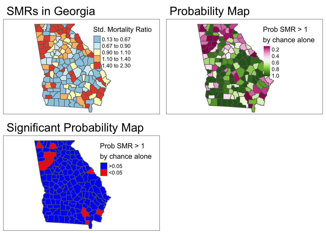
- To align this with 95% confidence interval results (which identified counties with extreme values in either direction,, effectively two-sided): We could look for counties with p > 0.975.
- Thus a new variable is equal to 1 when the county has both an SMR>1 and a
p-valuevalue less than 0.05. Otherwisenewvarwill be equal to zero.
Disease mapping: Rate stabilization with global Empirical Bayes
In the case of small area estimation, we want to extract the signal or underlying spatial trend in the data, net of the random noise induced by small event counts and widely varying population sizes.
This process is sometimes referred to as small area estimation because it goes beyond just showing the observed values, instead trying to estimate some underlying true trend.
Empirical Bayes (EB) estimation is one technique for producing more robust small area parameter estimates.
EB estimation is an approach to parameter shrinkage, wherein extreme estimates (e.g. of SMR) are judged to be reliable or not-reliable based on their variance, which itself is a function of the number of events.
In other words if a county has both an extreme SMR, and a small event count, that SMR parameter is less reliable.
How does shrinkage work:
MORE: In the absence of other information, we might guess that it is extreme because of the small event count and try to adjust, or shrink, it back into the range of reasonable values.
LESS: If a county had a relatively extreme SMR, but had many events, that extreme value might be deemed more reliable.
EB uses the overall average rate or SMR as the global reference and shrinks each SMR toward the global mean. Aim: true pattern persists with less noise.
DISCLAIMER: You do not need to understand Bayesian statistical theory to work effectively with these EB estimators in this class. However I provide superficial discussion of what is happening below for those who want it. If you are less interested, focus on the code for producing the estimates and the credible intervals. If you are really interested, likely my superficial intro will be unsatisfying. I can point you to more resources if desired!
A bit about Bayes…
You may have learned Bayes Theorem in statistics, but may not have gone much further than that.
Bayesian statistics take a slightly different perspective to analysis and inference as compared to the frequentist statistics underlying most of what we conventionally use.
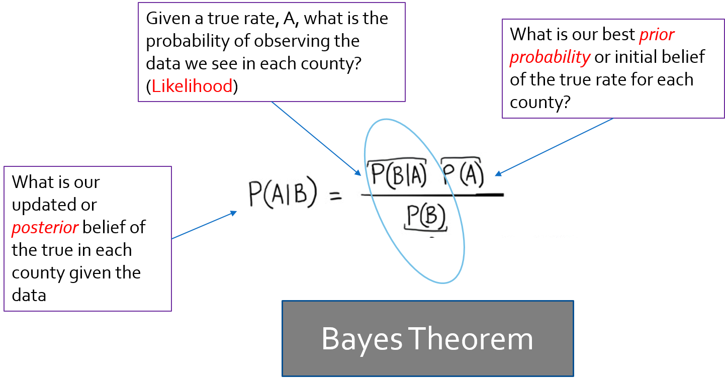
Bayes theorem posits that there is some prior belief /information that when combined with the likelihood (data model) provides a new and updated posterior belief.
In EB, we use the observed data to derive our prior information.
In the package
SpatialEpi, there is a function calledeBayes()which estimates Empirical Bayes smoothed estimates of disease burden (or more specifically of relative excess risk or SMR), based on the Poisson-Gamma mixture.
First, let’s estimate the EB-smoothed relative risk. This function expects an argument, Y, which is the vector of event counts, and an argument, E, the expected count. Note that there is also an option to include a covariate matrix, if you wanted to estimate covariate-adjusted EB-smoothed rates.
library(SpatialEpi)
global_eb1 <- eBayes(data$death_count, data$expect)
names(global_eb1)
[1] "RR" "RRmed" "beta" "alpha" "SMR" Notice that the object
global_eb1that was returned by the functioneBayes()is actually a list with 5 elements.SMR(which is based on observed data, not smoothed!)RR(mean estimate for the smoothed relative risk)RRmed(the median estimate for the smoothed relative risk, which in our case is nearly identical to mean).Estimates of the \(\beta\) (
beta) and \(\alpha\) (alpha) parameters of the Gamma prior that were estimated from the data.
We can now add the smoothed or stabilized estimates to our dataset and map the raw or unsmoothed SMR compared to the Empirical Bayes smoothed SMR…
# this adds the smoothed relative risk (same as SMR) to the vlbw dataset
data$ebSMR <- global_eb1$RR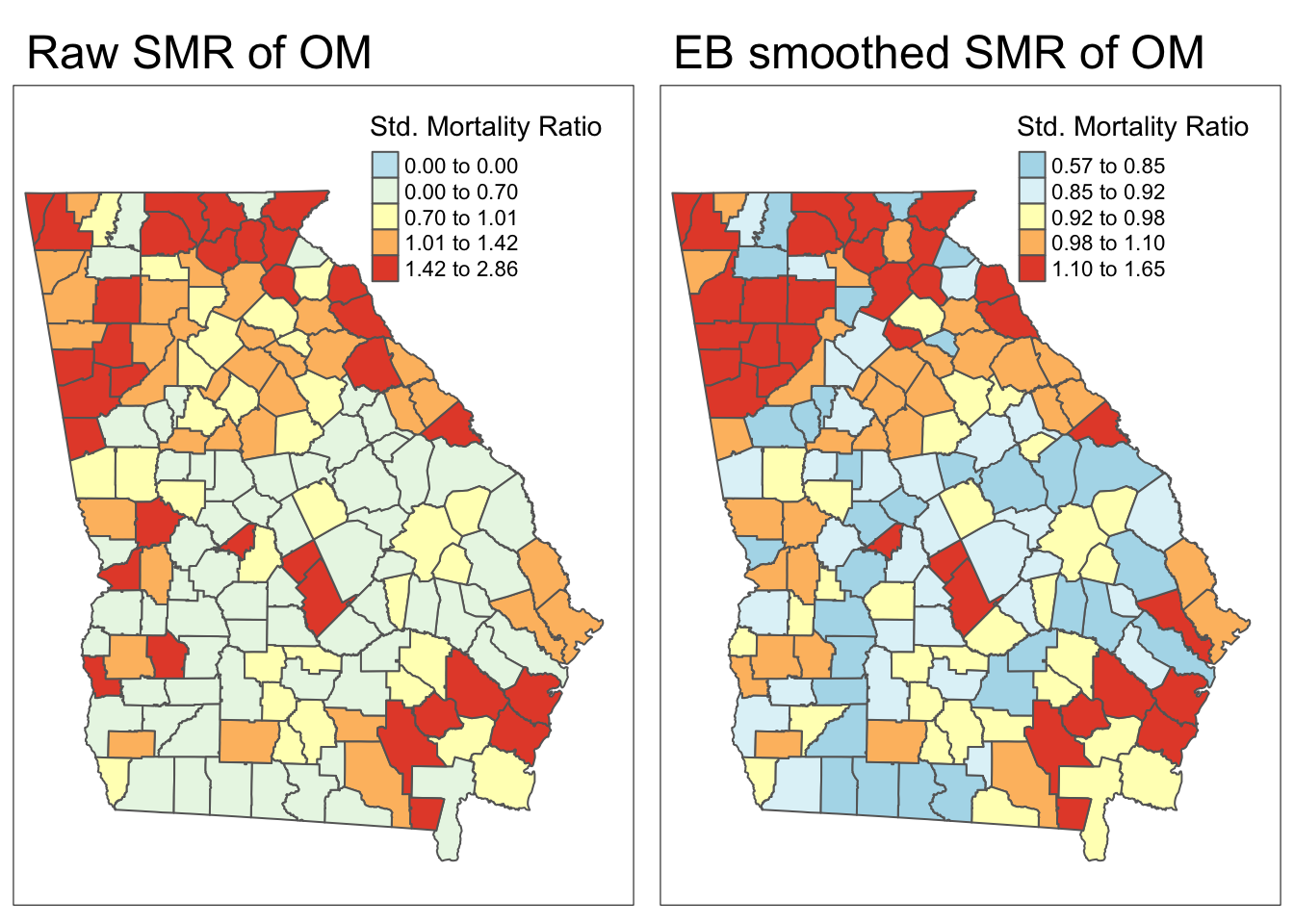
Each map is symbolized using an independent quantile categorization. As a result, notice two things about the map comparison above:
- The general patterns of highs and lows is quite similar, although not identical
- The cutpoints in the legend are relatively different.
Estimating Bayesian exceedance probabilities
Credible intervals in Empirical Bayes (EB) reflect the range within which the true value of a parameter, like the SMR, is likely to lie, based on the posterior distribution.
Unlike confidence intervals, credible intervals directly represent the degree of belief in a range, given the data and prior.
These intervals show both the estimate’s size and the precision or uncertainty, with narrower intervals indicating greater certainty in the estimate for each area.
Below we show the posterior distribution for DeKalb County.
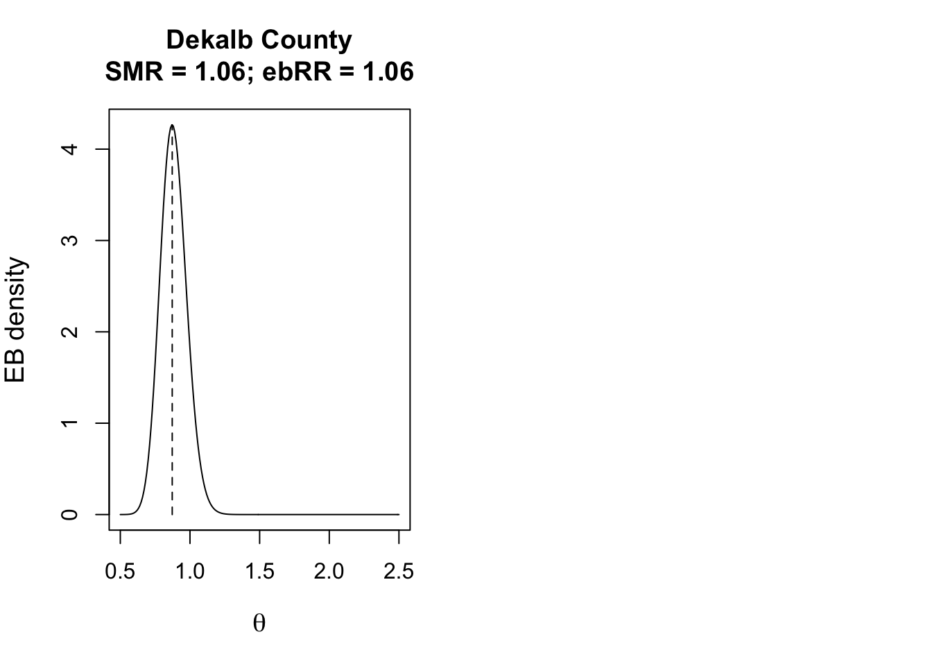
To describe how likely or unlikely the EB-smoothed relative risk for a given county is different from the null value of 1, we can use Bayesian exceedance probabilities.
\(\textcolor{red}{\text{Bayesian exceedance probabilities}}\): the probability that the true parameter,* \(\theta\) is greater than 1.0, given the prior and observed data”.
(e.g. “what is the probability that the RR is greater than 1?”), that is an option.
data$eb2_prob <- EBpostthresh(Y = data$death_count,
                              E = data$expect,
                              alpha = global_eb1$alpha,
                              beta = global_eb1$beta,
rrthresh = 1)- Finally, here is a map of the smoothed estimates and the indication for those with high probability of being different from the Georgia average rate (e.g. probability of exceeding SMR of 1.0 is 95%).
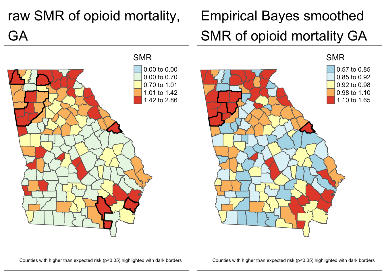
Comparing these two maps you will see that there are fewer significant counties using the Empirical Bayes approach. This is not surprising, and consistent with our goal of trying to separate the signal from the random noise. This would suggest that at least some of the counties appearing to be significantly different from the global rate, were in fact plausibly outliers with small amounts of information that cannot be stably and precisely estimated.