4 Central Tendency
As discussed in the Data Overview section, understanding data types is crucial before applying measures of Central Tendency (CT). For example, the mean is suitable for interval or ratio data, while the median can be applied to both ordinal and continuous data. The mode, however, can be used for all data types, including nominal categories. Choosing the right measure ensures that the “center” of the data is represented accurately, avoiding misleading interpretations.
By mastering central tendency (Figure 4.1), readers will be able to describe datasets more effectively, compare groups of data, and prepare for deeper statistical analysis, such as measures of dispersion and hypothesis testing. Graphical tools—such as histograms, boxplots, and frequency distributions—can further enhance understanding by visually confirming how the data’s center aligns with its overall shape and spread [1].
As illustrated in the Figure 4.1, the discussion now turns to measures of central tendency—mean, median, and mode—together with guidance on selecting the most suitable measure for a given dataset. These statistical tools offer concise summaries of complex information, making it easier to detect patterns, describe distributions, and lay the groundwork for deeper analysis. Gaining proficiency with these measures equips us to interpret data more reliably and to support conclusions with stronger evidence [2], [3].
4.1 Definition of CT
Central Tendency is a statistical measure that represents the typical or central value of a dataset. It aims to provide a single value that best represents the entire data, allowing us to understand where most data values are concentrated. The three most common measures of central tendency are: Mean, Median, and Mode [4].
4.1.1 Mean
The mean is obtained by dividing the sum of all data values by the total number of observations. It is suitable for interval and ratio data types.
\[ \bar{X} = \frac{\sum X_i}{n} \]
Where:
- \(\bar{X}\): mean (average)
- \(X_i\): each data value
- \(n\): number of observations
Data: 10, 20, 30, 40, 50
\[ \bar{X} = \frac{10 + 20 + 30 + 40 + 50}{5} = 30 \]
The average value of the data is 30.
4.1.2 Median
The median is the middle value of an ordered dataset. It is suitable for ordinal, interval, and ratio data [5]. Steps to Find the Median:
- Arrange the data in ascending order.
- If the number of data points \(n\) is odd, the median is at position \(\frac{n+1}{2}\).
- If \(n\) is even, the median is the average of the two middle values.
Data: 5, 7, 8, 12, 15, 18, 20
\[ n = 7 \Rightarrow \text{Median} = X_{(4)} = 12 \]
Because there are 7 data points (odd number), the median is located at the (n + 1) / 2 = 4th position when the data are arranged in ascending order. Hence, the 4th value, which is 12, becomes the median — the central value that divides the dataset into two equal parts:
- Lower half: 5, 7, 8
- Upper half: 15, 18, 20
4.1.3 Mode
The mode is the most frequently occurring value in a dataset. It can be used for nominal, ordinal, interval, or ratio data [5].
Data: 3, 4, 4, 5, 6, 6, 6, 7
\[Mode = 6 \space \text{(because it appears most often)}\] The most common value in the dataset is 6.
4.2 Appropriate Measure
When analyzing data, selecting the correct measure of central tendency is crucial. The appropriate measure (mean, median, or mode) depends on the type of data whether it is categorical, ordered, or numeric. Using the right measure ensures that your analysis accurately reflects the nature and distribution of the data [6].
| Type of Data | Suitable Measure | Explanation |
|---|---|---|
| Nominal | Mode | Data in categories (e.g., color, gender) |
| Ordinal | Median or Mode | Ordered data without equal spacing (e.g., rank, satisfaction level) |
| Interval / Ratio | Mean | Numeric data with meaningful intervals (e.g., income, weight) |
If the dataset contains extreme outliers, use the median since it is less affected by extreme values compared to the mean.
4.3 Conditional Rule
The choice of which measure of central tendency to use also depends on the condition or pattern of the data. Different data shapes and distributions can influence which statistic best represents the center of the dataset [7].
| Data Condition | Recommended Measure |
|---|---|
| Data without outliers and symmetrical | Mean |
| Data with outliers or skewed distribution | Median |
| Categorical data | Mode |
| Multimodal data (more than one peak) | Mode (can be multi-mode) |
- When the data is symmetrical and clean (no outliers), the mean gives a good overall representation.
- If the data contains extreme values or is skewed, the median is more reliable because it is not affected by those extremes.
- For categorical variables, the mode identifies the most frequent category.
- In some datasets with multiple peaks, there can be more than one mode, indicating several dominant values or groups.
4.4 Visualization for CT
Understanding measures of central tendency—mean, median, and mode—is more intuitive when supported by visualizations. Graphical representations such as histograms and boxplots help reveal the underlying shape, spread, and balance of a dataset. Through these visual tools, we can identify whether the data are symmetrical, skewed, categorical, or multimodal [8].
Each visualization provides unique insights:
- Histograms show the frequency distribution and how central measures align with data concentration.
- Boxplots highlight the median, quartiles, and presence of outliers in a concise format.
In the following subsections, we will explore how central tendency behaves under different conditions using both histogram and boxplot visualizations:
- Symmetrical and No Outliers – when data are evenly distributed around the center.
- Extreme Values (Skewed) – when outliers pull the mean in one direction.
- Categorical Variables – when data represent distinct groups or classes.
- More Than One Mode – when data have multiple peaks or centers of concentration.
4.4.1 Symmetrical and No outliers
A symmetrical distribution occurs when data values are evenly spread around the center, creating a balanced and bell-shaped pattern. In this case, the mean, median, and mode all fall at or near the same central point. This indicates that there are no significant outliers or skewness pulling the data to one side.
In the Figure 4.2, the smooth density curve highlights the normal distribution of values, while the vertical lines represent the positions of the mean, median, and mode — all nearly overlapping at the center. Such a distribution is typical for naturally occurring phenomena like height, weight, or measurement errors.
library(ggplot2)
# --- Symmetrical data: Perfect bell-shaped (Normal Distribution, no outliers) ---
set.seed(123)
data_sym <- data.frame(value = rnorm(50000, mean = 50, sd = 10))
# --- Compute Mean, Median, Mode ---
mean_val <- mean(data_sym$value)
median_val <- median(data_sym$value)
mode_val <- as.numeric(names(sort(table(round(data_sym$value, 0)),
                                  decreasing = TRUE)[1]))
# --- Visualization (Histogram + Density) ---
ggplot(data_sym, aes(x = value)) +
  geom_histogram(aes(y = after_stat(density)),
                 binwidth = 2,
                 fill = "#5ab4ac",
                 color = "white",
                 alpha = 0.8) +
  geom_density(color = "#2b8cbe", linewidth = 1.3, alpha = 0.9) +
  geom_vline(aes(xintercept = mean_val, color = "Mean"), linewidth = 1.2) +
  geom_vline(aes(xintercept = median_val, color = "Median"),
             linewidth = 1.2, linetype = "dashed") +
  geom_vline(aes(xintercept = mode_val, color = "Mode"),
             linewidth = 1.2, linetype = "dotdash") +
  labs(
    title = "Symmetrical Distribution (No Outliers)",
    subtitle = "Mean, Median, and Mode coincide at the center of the bell curve",
    x = "Value",
    y = "Density",
    color = "Measure"
  ) +
  theme_minimal(base_size = 13) +
  theme(
    plot.title = element_text(face = "bold", hjust = 0.5),
    plot.subtitle = element_text(hjust = 0.5),
    legend.position = "bottom"
  )
A symmetrical distribution represents a balanced dataset where values are evenly distributed around the central point. This pattern forms the classic bell-shaped curve, also known as a normal distribution. In such cases, the mean, median, and mode are equal or nearly identical, reflecting perfect equilibrium in the data.
Key Interpretations
- Balance Around the Center: Data are distributed evenly on both sides of the center, showing no bias toward higher or lower values.
- Equality of Central Measures: The mean, median, and mode overlap or align closely, indicating that the dataset is centered without distortion from extreme values.
- **Absence of Skewness and Outliers:* There are no outliers pulling the data to one side, and the distribution is neither left- nor right-skewed. This results in a stable and predictable shape.
- Predictable Shape — Bell Curve: The histogram and smooth density curve form a bell shape, where most values cluster near the center, and frequencies gradually taper off toward both tails.
Statistical Implication
Such a symmetrical pattern satisfies many classical statistical assumptions, making it foundational for various parametric analyses such as:
- t-tests
- ANOVA
- Linear regression
Because the data follow a normal distribution, inferential analyses become more valid, reliable, and stable, as deviations and sampling errors are minimized.
Real-World Examples
Symmetrical, bell-shaped distributions commonly appear in:
- Human characteristics (e.g., height, weight, IQ)
- Natural phenomena (e.g., measurement errors, biological variation)
- Academic performance (e.g., exam scores from large populations)
4.4.2 Extreme Values (Skewed)
A skewed distribution occurs when data values are not symmetrically distributed around the center — meaning one tail of the distribution is longer or more stretched than the other. This skewness is often caused by extreme values (outliers) that pull the mean toward one direction, while the median and mode remain closer to the peak of the data.
When a dataset contains extreme high or low values, the distribution becomes positively skewed (right-skewed) or negatively skewed (left-skewed). These distortions affect the position of central tendency measures and provide valuable insight into the underlying data behavior. In the Figure 4.3 plot below, we can observe how a few extreme values shift the mean away from the main cluster of data, creating an asymmetrical shape.
library(ggplot2)
# --- Right-skewed data (with extreme values) ---
set.seed(123)
data_skew <- data.frame(value = c(rgamma(4800, shape = 2, scale = 10),
                                  rnorm(200, mean = 200, sd = 5)))
# --- Compute Mean, Median, Mode ---
mean_val <- mean(data_skew$value)
median_val <- median(data_skew$value)
mode_val <- as.numeric(names(sort(table(round(data_skew$value, 0)),
                                  decreasing = TRUE)[1]))
# --- Visualization (Histogram + Density) ---
ggplot(data_skew, aes(x = value)) +
geom_histogram(aes(y = after_stat(density)),
binwidth = 5,
fill = "#5ab4ac",
color = "white",
alpha = 0.8) +
geom_density(color = "#2b8cbe", linewidth = 1.3, alpha = 0.9) +
geom_vline(aes(xintercept = mean_val, color = "Mean"), linewidth = 1.2) +
geom_vline(aes(xintercept = median_val, color = "Median"), linewidth = 1.2,
           linetype = "dashed") +
geom_vline(aes(xintercept = mode_val, color = "Mode"), linewidth = 1.2,
           linetype = "dotdash") +
labs(
title = "Right-Skewed Distribution (With Extreme Values)",
subtitle = "Mean is pulled toward the extreme high values due to skewness",
x = "Value",
y = "Density",
color = "Measure"
) +
theme_minimal(base_size = 13) +
theme(
plot.title = element_text(face = "bold", hjust = 0.5),
plot.subtitle = element_text(hjust = 0.5),
legend.position = "bottom"
)
A skewed distribution indicates that the dataset is asymmetrical, meaning the data do not fall evenly around the central point. The presence of extreme values (outliers) causes this imbalance, pulling one side of the distribution’s tail farther than the other.
Types of Skewness
- Positively Skewed (Right-Skewed): The tail extends to the right, showing that a small number of large values are stretching the mean upward (Order: Mode < Median < Mean).
- Negatively Skewed (Left-Skewed): The tail extends to the left, indicating that very small values pull the mean downward (Order: Mean < Median < Mode).
Key Interpretations
- Effect of Extreme Values: Outliers on one end distort the balance of the distribution, shifting the mean away from the center.
- Separation of Central Measures: The mean, median, and mode no longer align; their spacing reveals the degree of skewness.
- Asymmetrical Shape: The histogram shows one side tapering more gradually, confirming the directional bias in the data.
- Impact on Statistical Assumptions: Skewed data violate normality assumptions required in many parametric tests.
Statistical Implication
Skewness can influence data interpretation and analysis validity, especially when using parametric methods such as t-tests, ANOVA, or linear regression, which assume normality. In such cases, analysts often:
- Apply data transformation (e.g., log, square root)
- Use non-parametric tests (e.g., Mann–Whitney U, Kruskal–Wallis)
- Identify and handle outliers explicitly
Real-World Examples
Right- or left-skewed distributions commonly appear in:
- Income and wealth data: A few individuals earn far more than most (right-skewed).
- Time-to-failure or lifespan data: Many items fail early, with fewer lasting very long (left-skewed).
- Sales and transaction data: A small number of customers may account for extremely high purchase amounts.
- Environmental data: Some readings, like pollution concentration, exhibit right-skew due to rare spikes.
4.4.3 Categorical Variables
Categorical variables divide data into distinct groups or categories. When combined with a numerical variable, we can analyze how the distribution of numerical values differs across categories. A boxplot is an excellent visualization for this purpose — it shows the median, quartiles, range, and outliers within each group.
For example, in the chart below (Figure 4.4), each box represents a product category, while the vertical axis shows the distribution of sales values within that category.
# ==========================================================
# Categorical Variables — Boxplot Visualization (Fixed & Varied Distributions)
# ==========================================================
library(ggplot2)
library(dplyr)

set.seed(123)

# --- Create category structure ---
categories <- c("Electronics", "Clothing", "Home", "Beauty", "Sports")
sales_data <- data.frame(
  ProductCategory = sample(
    categories, 500, replace = TRUE,
    prob = c(0.25, 0.30, 0.20, 0.15, 0.10)
  )
)

# --- Generate different distributions per category correctly ---
sales_data <- sales_data %>%
  group_by(ProductCategory) %>%
  mutate(
    TotalSales = case_when(
      ProductCategory == "Electronics" ~ rnorm(n(), mean = 120, sd = 20),         # normal, symmetric
      ProductCategory == "Clothing"    ~ rlnorm(n(), meanlog = 4.5, sdlog = 0.4), # right-skewed
      ProductCategory == "Home"        ~ runif(n(), min = 60, max = 150),         # uniform
      ProductCategory == "Beauty"      ~ rexp(n(), rate = 1/70),                  # exponential, skewed
      ProductCategory == "Sports"      ~ rnorm(n(), mean = 90, sd = 35)           # wide spread
    )
  ) %>%
  ungroup()

# --- Visualization: Boxplot by Category ---
ggplot(sales_data, aes(x = ProductCategory, y = TotalSales, fill = ProductCategory)) +
  geom_boxplot(
    alpha = 0.8, color = "gray30",
    outlier.colour = "red", outlier.shape = 16, outlier.size = 2
  ) +
  labs(
    title = "Boxplot of Sales Distribution by Product Category",
    subtitle = "Each category displays a unique distribution pattern of total sales",
    x = "Product Category",
    y = "Total Sales (in units)",
    fill = "Category"
  ) +
  theme_minimal(base_size = 13) +
  theme(
    plot.title = element_text(face = "bold", hjust = 0.5),
    plot.subtitle = element_text(hjust = 0.5),
    legend.position = "none"
  )
# ==========================================================
# Boxplot of Sales by Product Category — with Global Mean & Mode Lines
# ==========================================================
library(ggplot2)
library(dplyr)

set.seed(123)

# --- Create category structure ---
categories <- c("Electronics", "Clothing", "Home", "Beauty", "Sports")
sales_data <- data.frame(
  ProductCategory = sample(
    categories, 500, replace = TRUE,
    prob = c(0.25, 0.30, 0.20, 0.15, 0.10)
  )
)

# --- Generate different distributions per category ---
sales_data <- sales_data %>%
  group_by(ProductCategory) %>%
  mutate(
    TotalSales = case_when(
      ProductCategory == "Electronics" ~ rnorm(n(), mean = 120, sd = 20),
      ProductCategory == "Clothing"    ~ rlnorm(n(), meanlog = 4.5, sdlog = 0.4),
      ProductCategory == "Home"        ~ runif(n(), min = 60, max = 150),
      ProductCategory == "Beauty"      ~ rexp(n(), rate = 1/70),
      ProductCategory == "Sports"      ~ rnorm(n(), mean = 90, sd = 35)
    )
  ) %>%
  ungroup()

# --- Compute global mean and mode ---
mean_val <- mean(sales_data$TotalSales, na.rm = TRUE)

# Estimate mode using kernel density (works for continuous data)
dens <- density(sales_data$TotalSales, na.rm = TRUE)
mode_val <- dens$x[which.max(dens$y)]

# --- Visualization ---
ggplot(sales_data, aes(x = ProductCategory, y = TotalSales, fill = ProductCategory)) +
  geom_boxplot(
    alpha = 0.8, color = "gray30",
    outlier.colour = "red", outlier.shape = 16, outlier.size = 2
  ) +
  # Add mean line
  geom_hline(
    yintercept = mean_val, color = "#1b9e77", linewidth = 1.2
  ) +
  # Add mode line
  geom_hline(
    yintercept = mode_val, color = "#d95f02", linewidth = 1.2, linetype = "dashed"
  ) +
  # Annotate lines
  annotate(
    "text", x = 5.4, y = mean_val, label = sprintf("Mean = %.1f", mean_val),
    color = "#1b9e77", hjust = 0, vjust = -0.5, fontface = "bold", size = 3.8
  ) +
  annotate(
    "text", x = 5.4, y = mode_val, label = sprintf("Mode = %.1f", mode_val),
    color = "#d95f02", hjust = 0, vjust = -0.5, fontface = "bold", size = 3.8
  ) +
  labs(
    title = "Boxplot of Sales Distribution by Product Category",
    subtitle = "Global mean (green solid) and mode (orange dashed) lines for comparison across all categories",
    x = "Product Category",
    y = "Total Sales (in units)"
  ) +
  theme_minimal(base_size = 13) +
  theme(
    plot.title = element_text(face = "bold", hjust = 0.5),
    plot.subtitle = element_text(hjust = 0.5),
    legend.position = "none"
  )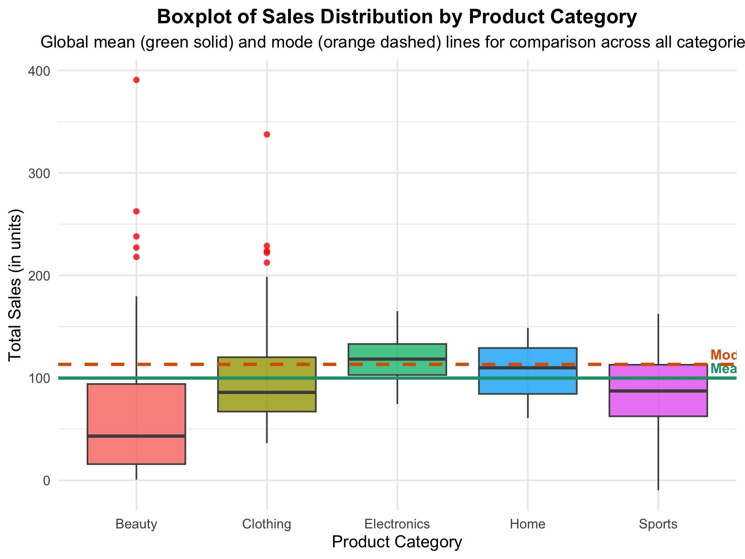
A categorical variable divides data into distinct groups or categories — for example, product types, departments, or regions — while a numerical variable measures quantitative outcomes such as sales, profit, or ratings. When visualized using a boxplot, the relationship between these two types of variables becomes clear, showing how the numerical data are distributed within each category.
Key Interpretations
- Median (Center Line): Represents the central value of sales within each category, showing which category tends to sell more or less.
- Interquartile Range (IQR): The height of each box shows the middle 50% of the data — wider boxes indicate greater variability in sales.
- Whiskers and Outliers: The vertical lines (whiskers) represent typical sales ranges, while the red dots highlight outliers (unusually high or low values).
- Comparison Across Categories: Different box heights and positions indicate variation in both central tendency and spread among product categories.
Statistical Implications
Boxplots of categorical variables are valuable for:
- Detecting differences in distribution among groups.
- Identifying skewness and outliers within each category.
- Assessing variability and central tendency visually without relying on complex statistical summaries.
Real-World Applications
This approach is essential in:
- Business analytics: Comparing sales or profits across product lines.
- Healthcare: Comparing recovery times or satisfaction scores across hospitals.
- Education: Comparing test scores across schools or departments.
By visualizing categorical variables with boxplots, analysts can quickly detect differences between groups, guide deeper statistical testing, and support data-driven decisions.
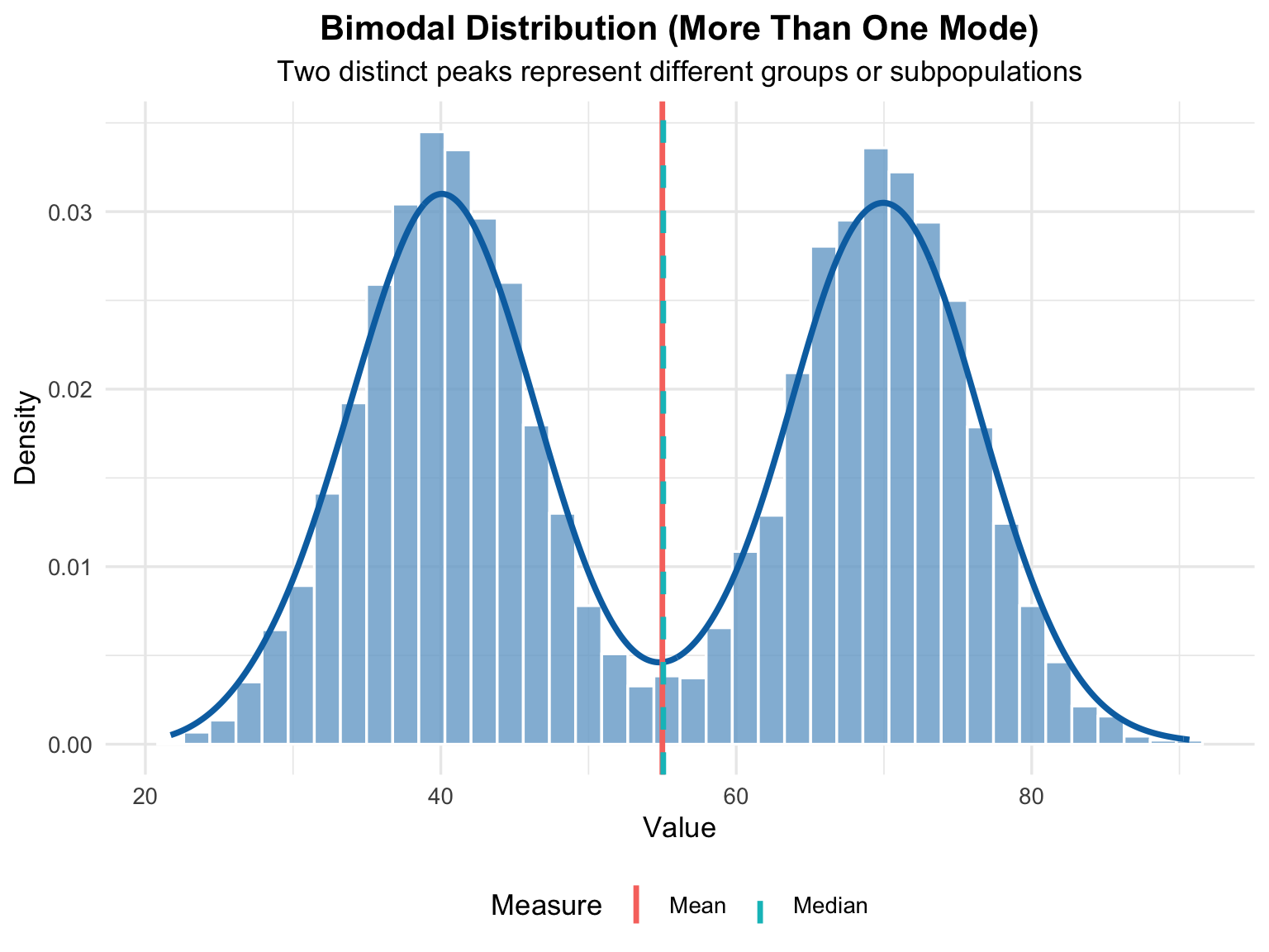
4.4.4 More Than One Mode
In many real-world datasets, the distribution of values does not always form a single, smooth peak. Instead, some datasets exhibit two or more distinct peaks, known as multiple modes. Each mode represents a cluster where values tend to concentrate — meaning that the data have several regions of high frequency rather than one central location.
In the following histogram (see, Figure 4.5), we will observe a bimodal distribution where two separate peaks appear clearly. This illustrates how the histogram can reveal hidden structure in the data that simple summary statistics, like the mean or median, might overlook.
# ==========================================================
# More Than One Mode — Bimodal Distribution Visualization
# ==========================================================
library(ggplot2)
library(dplyr)
set.seed(123)

# --- Generate Bimodal Data (two peaks) ---
# Combine two normal distributions with different means
data_bimodal <- data.frame(
  value = c(
    rnorm(2500, mean = 40, sd = 6),   # first cluster
    rnorm(2500, mean = 70, sd = 6)    # second cluster
  )
)
# --- Compute Summary Statistics ---
mean_val   <- mean(data_bimodal$value)
median_val <- median(data_bimodal$value)
# --- Visualization: Histogram + Density Curve ---
ggplot(data_bimodal, aes(x = value)) +
  geom_histogram(
    aes(y = after_stat(density)),
    bins = 40, fill = "#74a9cf",
    color = "white", alpha = 0.8
  ) +
  geom_density(color = "#0570b0", linewidth = 1.3, alpha = 0.9) +
  geom_vline(aes(xintercept = mean_val, color = "Mean"), linewidth = 1.2) +
  geom_vline(aes(xintercept = median_val, color = "Median"),
             linewidth = 1.2, linetype = "dashed") +
  labs(
    title = "Bimodal Distribution (More Than One Mode)",
    subtitle = "Two distinct peaks represent different groups or subpopulations",
    x = "Value",
    y = "Density",
    color = "Measure"
  ) +
  theme_minimal(base_size = 13) +
  theme(
    plot.title = element_text(face = "bold", hjust = 0.5),
    plot.subtitle = element_text(hjust = 0.5),
    legend.position = "bottom"
  )
Unlike histograms, boxplots do not display the exact number of peaks, but they clearly show that the data are not symmetrically distributed — for example, the median line may be off-center, and the whiskers might extend unevenly to one side. Together, the histogram and boxplot provide complementary insights:
- the histogram reveals the overall shape (and multiple modes),
- while the boxplot emphasizes the spread and skewness of the data.
In the following visualization (see, Figure 4.6), the boxplot helps us interpret how a bimodal dataset behaves in terms of variation, central value, and outliers, reinforcing the insights gained from the histogram.
# ==========================================================
# Boxplot Representation — Bimodal Distribution
# ==========================================================
library(ggplot2)
library(dplyr)
set.seed(123)
# --- Generate Bimodal Data (same as histogram) ---
data_bimodal <- data.frame(
value = c(
rnorm(2500, mean = 40, sd = 6),   # first cluster
rnorm(2500, mean = 70, sd = 6)    # second cluster
)
)
# --- Compute Summary Statistics ---
mean_val   <- mean(data_bimodal$value)
median_val <- median(data_bimodal$value)
# --- Visualization: Boxplot ---
ggplot(data_bimodal, aes(x = "", y = value)) +
geom_boxplot(
fill = "#74a9cf",
color = "gray30",
outlier.colour = "#fb6a4a",
outlier.shape = 16,
outlier.size = 2,
width = 0.3
) +
geom_hline(aes(yintercept = mean_val, color = "Mean"), linewidth = 1.2) +
geom_hline(aes(yintercept = median_val, color = "Median"), linewidth = 1.2,
           linetype = "dashed") +
labs(
title = "Boxplot of Bimodal Distribution (More Than One Mode)",
subtitle = "Wider spread indicates data concentration around two regions",
x = NULL,
y = "Value",
color = "Measure"
) +
scale_color_manual(values = c("Mean" = "#0570b0", "Median" = "#ff7f00")) +
theme_minimal(base_size = 13) +
theme(
plot.title = element_text(face = "bold", hjust = 0.5),
plot.subtitle = element_text(hjust = 0.5),
axis.text.x = element_blank(),
legend.position = "bottom"
)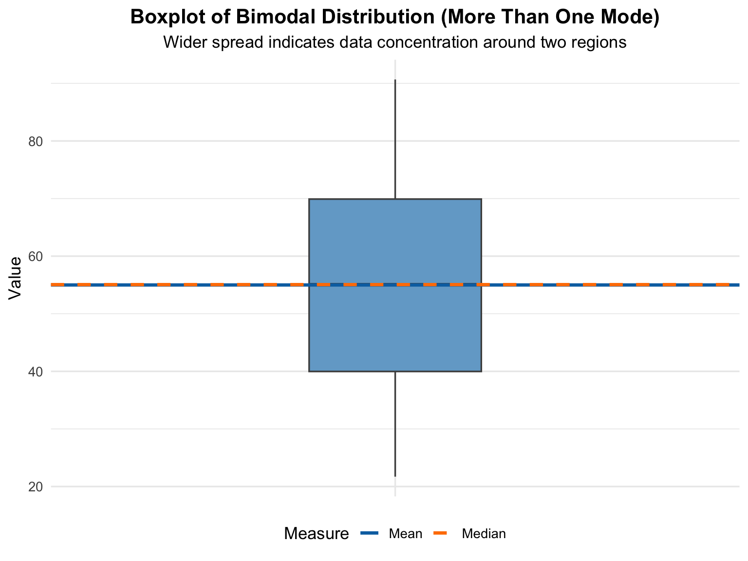
A boxplot cannot explicitly display two peaks (bimodal pattern), because:
- The boxplot only summarizes data statistically (using the five-number summary: minimum, first quartile, median, third quartile, and maximum).
- It does not represent the shape of the distribution (e.g., how many peaks or modes exist).
# ==========================================================
# Enhanced Violin + Boxplot — Bimodal Distribution
# ==========================================================
library(ggplot2)
library(ggtext)
set.seed(123)

data_bimodal <- data.frame(
  value = c(
    rnorm(2500, mean = 40, sd = 6),
    rnorm(2500, mean = 70, sd = 6)
  )
)
# --- Create the plot ---
ggplot(data_bimodal, aes(x = "", y = value)) +
  # Gradient violin to show smooth density
  geom_violin(
    aes(fill = stat(y)),
    color = "gray30",
    alpha = 0.8,
    width = 1.1,
    linewidth = 0.6
  ) +
  scale_fill_gradient(
    low = "#c6dbef", high = "#08306b", name = "Density"
  ) +
  # Overlay boxplot
  geom_boxplot(
    width = 0.12,
    fill = "#fdd0a2",
    color = "gray25",
    outlier.colour = "#fb6a4a",
    outlier.shape = 16,
    outlier.size = 2
  ) +
  # Annotate the two modes
  annotate(
    "text", x = 1.15, y = 40, label = "First Mode $\\approx$ 40",
    color = "#045a8d", size = 4, fontface = "bold", hjust = 0
  ) +
  annotate(
    "text", x = 1.15, y = 70, label = "Second Mode $\\approx$ 70",
    color = "#d94801", size = 4, fontface = "bold", hjust = 0
  ) +
  annotate(
    "curve",
    x = 1.05, xend = 1.0, y = 42, yend = 45,
    curvature = 0.3, color = "#045a8d", arrow = arrow(length = unit(0.15, "cm"))
  ) +
  annotate(
    "curve",
    x = 1.05, xend = 1.0, y = 68, yend = 65,
    curvature = -0.3, color = "#d94801", arrow = arrow(length = unit(0.15, "cm"))
  ) +
  labs(
    title = "Violin + Boxplot of Bimodal Distribution",
    subtitle = "The violin shape reveals two clear concentration regions around
    <b style='color:#045a8d;'>40</b> and <b style='color:#d94801;'>70</b>",
    x = NULL,
    y = "Value",
    fill = "Density"
  ) +
  theme_minimal(base_size = 14) +
  theme(
    plot.title = element_text(face = "bold", size = 16, hjust = 0.5),
    plot.subtitle = element_markdown(hjust = 0.5, size = 12),
    axis.text.x = element_blank(),
    legend.position = "none",
    panel.grid.minor = element_blank(),
    panel.grid.major.x = element_blank(),
    plot.background = element_rect(fill = "#f9fbfd", color = NA)
  )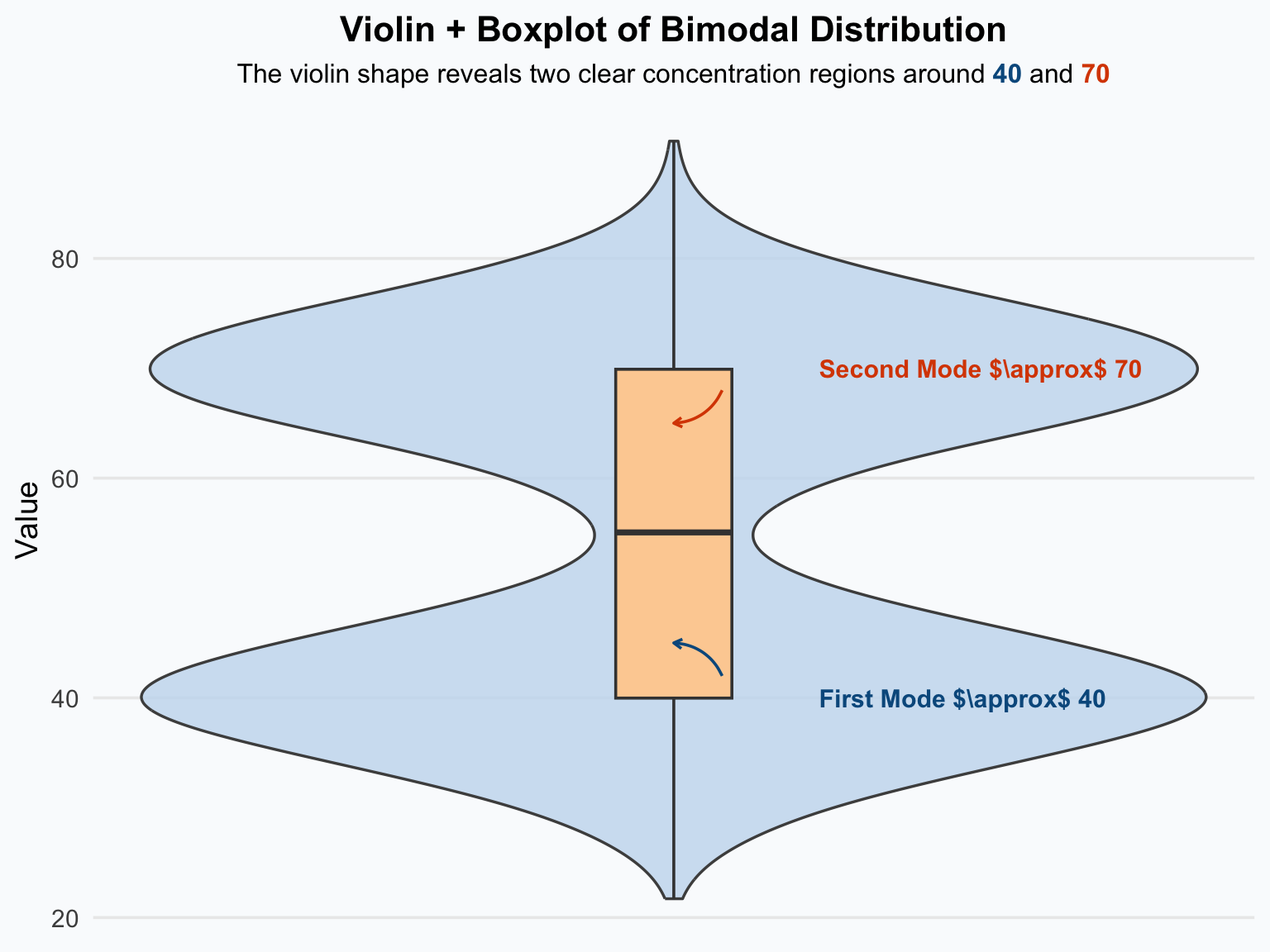
A bimodal distribution occurs when a dataset has two distinct peaks (modes), meaning there are two dominant groups of values around different centers. Unlike a normal distribution that has one central peak, a bimodal shape suggests that the data may come from two different populations or underlying processes combined into one dataset.
Key Interpretations
- Two Peaks (Modes): Each peak represents a cluster of frequently occurring values — often caused by two subgroups with different characteristics.
- Mean and Median: These measures may fall between the two modes, failing to represent either group accurately.
- Spread and Overlap: The distance between peaks and the overlap between them indicate how distinct or similar the two groups are.
- Potential Mixture of Populations: Bimodality is a strong clue that the dataset may not be homogeneous.
Statistical Implications
- Classical measures like mean and standard deviation can be misleading, since they ignore multimodal structure.
- Analysts should consider segmenting the data (e.g., clustering or grouping) before running inferential tests.
- Identifying multiple modes often leads to insightful segmentation — discovering hidden subgroups within the data.