3 Basic Data Visualizations
Data visualization is a crucial process in transforming raw data into clear, meaningful, and actionable insights. Before creating effective charts or graphs, it is essential to develop a comprehensive understanding of the data’s characteristics, including its type, structure, and key attributes. This foundational understanding ensures that visualizations accurately represent the data and effectively communicate the intended message, thereby minimizing the risk of misinterpretation [1].
This section focuses on Basic Data Visualizations (Figure 3.1), explaining how data can be categorized into numeric (quantitative) and categorical (qualitative) forms, along with subtypes like discrete, continuous, nominal, and ordinal. It also discusses common data sources and the fundamental elements of a dataset, such as variables and observations, which are essential for selecting appropriate visualization methods.
As discussed in the section of Data Exploration, understanding data types and structure is essential before creating visualizations. By considering the structure of datasets including variables, observations, and data sources readers can select appropriate visual representations, such as histograms for continuous data, bar charts for categorical data, or scatter plots for examining relationships. This thoughtful selection of visualization methods helps reveal patterns, trends, and actionable insights within the dataset [2]; [3].
According to the mindmap, the following section will explore several fundamental data visualizations by emphasizing their types, purposes, applications, users, and tools. Starting with these essential visualizations is crucial before progressing to more advanced analytical techniques. These visuals not only help us understand distributions, comparisons, and relationships between variables in a simple yet informative way but also provide the foundation for deeper analysis. By mastering these basics, we can communicate insights more effectively, spot hidden patterns, and make data-driven decisions with greater confidence [4]–[6]. Before moving forward to next sections, please consider to watching this video.
3.1 Dataset
This dataset represents 200 simulated sales transactions from various cities across Indonesia during the year 2024. It is designed to illustrate different types of data commonly found in business and analytics contexts — including nominal, ordinal, discrete, and continuous variables.
Each row in the dataset corresponds to a single customer transaction, recording essential details such as date, product type, city, customer tier, quantity sold, price, and payment method. The dataset is intentionally structured to be used for teaching and practicing data exploration, visualization, and analysis in tools like R, Python, Excel, or Power BI.
3.1.1 Purpose of the Dataset
The dataset can be used to:
- Demonstrate how to identify and classify different data types (nominal, ordinal, discrete, continuous).
- Practice generating and interpreting common visualizations such as line chart, bar charts, histograms, pie charts, boxplots, and scatter plots.
- Perform exploratory data analysis (EDA) on sales trends, customer segments, and pricing patterns.
- Explore relationships between variables, such as how quantity and price affect total sales or how customer tiers differ across payment methods.
3.1.2 Dataset Overview
| Column | Example | Data Type | Description |
|---|---|---|---|
TransactionID |
T0045 | Nominal | Unique identifier for each transaction |
TransactionDate |
2024-05-14 | Date | Date of transaction |
ProductCategory |
Electronics | Nominal | Category of the purchased product |
City |
Jakarta | Nominal | City where the transaction occurred |
CustomerTier |
Gold | Ordinal | Customer level (Bronze < Silver < Gold < Platinum) |
Quantity |
3 | Discrete | Number of items sold |
UnitPrice |
1,200,000 | Continuous | Price per unit of the product |
TotalPrice |
3,600,000 | Continuous | Total transaction value |
Advertising |
500,000 | Continuous | Advertising spend associated with the transaction |
PaymentMethod |
Credit Card | Nominal | Payment method used by the customer |
library(DT)
# Generate Sales Transaction Dataset in R
# ==============================

set.seed(123)  # reproducible

# --- 1. Define base variables ---
TransactionID <- sprintf("T%04d", 1:200)

TransactionDate <- sample(seq(as.Date("2025-01-01"), as.Date("2025-12-31"),
                              by = "day"), 200, replace = TRUE)

ProductCategory <- sample(c("Electronics", "Groceries", "Fashion",
                            "Furniture", "Beauty"), 200, replace = TRUE)

City <- sample(c(
  "Jakarta", "Surabaya", "Bandung", "Medan", "Semarang", "Palembang",
  "Makassar", "Bekasi", "Tangerang", "Depok", "Batam", "Pekanbaru",
  "Bandar Lampung", "Denpasar", "Padang", "Malang", "Banjarmasin",
  "Pontianak", "Manado", "Balikpapan"
), 200, replace = TRUE)

CustomerTier <- sample(c("Bronze", "Silver", "Gold", "Platinum"), 200,
                       replace = TRUE, prob = c(0.3, 0.4, 0.2, 0.1))

Quantity <- sample(1:10, 200, replace = TRUE)

UnitPrice <- round(runif(200, 20000, 3000000), 0)

# --- Advertising spend (continuous) ---
Advertising <- round(runif(200, 50000, 1000000), 0)

# --- TotalPrice: positive linear relationship with Advertising ---
# Formula: TotalPrice = base + slope * Advertising + random noise
TotalPrice <- round(50000 + 2 * Advertising +
                      rnorm(200, mean = 0, sd = 50000), 0)

PaymentMethod <- sample(c("Cash", "Credit Card", "Debit Card", "E-Wallet"),
                        200, replace = TRUE)

# --- Combine into a data frame ---
sales_data <- data.frame(
  TransactionID,
  TransactionDate,
  ProductCategory,
  City,
  CustomerTier,
  Quantity,
  UnitPrice,
  TotalPrice,
  Advertising,
  PaymentMethod
)

# Display the data frame
library(DT)
datatable(sales_data,
          caption = "Dataset with Positive Linear TotalPrice vs Advertising",
          rownames = FALSE)
3.2 Line-chart
A Line Chart is a data visualization tool that illustrates how values change over a sequence, typically over time. It connects data points with a continuous line, making it ideal for displaying trends and patterns in time-series data [7]. Line charts are particularly useful for:
- Identifying Seasonal Patterns: Recognizing recurring fluctuations at regular intervals, such as increased sales during holidays [8].
- Detecting Growth or Decline Trends: Observing upward or downward movements in data over time [9].
- Spotting Peaks or Dips: Highlighting significant increases or decreases in activity, such as sales spikes during promotions [10].
In this Dataset, we can use a line chart to show how total sales or the number of transactions change across dates during the year 2024.
3.2.1 Basic Line-chart
The following line chart using Base R functions (see Figure 3.2) shows the monthly sales trend derived from sales_data. This visualization helps identify growth patterns, seasonal fluctuations, and overall performance across time periods.
# Step 1: Ensure TransactionDate is in Date format
sales_data$TransactionDate <- as.Date(sales_data$TransactionDate,
                                      format = "%Y-%m-%d")
# Step 2: Calculate total sales per month
sales_trend <- aggregate(TotalPrice ~ format(sales_data$TransactionDate,
                                             "%Y-%m"),
                         data = sales_data, sum)
# Step 3: Rename columns for better clarity
names(sales_trend) <- c("MonthStr", "TotalSales")
# Step 4: Add "-01" to create a complete date format
sales_trend$Month <- as.Date(paste0(sales_trend$MonthStr, "-01"),
                             format = "%Y-%m-%d")
# Step 5: Plot the line chart
plot(
  sales_trend$Month,
  sales_trend$TotalSales,
  type = "o",
  col = "steelblue",
  pch = 16,
  lwd = 2,
  main = "Monthly Sales Trend in 2024",
  xlab = "Month",
  ylab = "Total Sales (IDR)"
)
grid(col = "gray80", lty = "dotted")
3.2.2 Line-chart using ggplot2
The following visualization (Figure 3.3) displays the trend of monthly total sales throughout the year. It helps identify periods of high or low sales performance, supporting time-based decision-making. We use the ggplot2 library for cleaner visualization and dplyr + lubridate for data wrangling.
# Load required packages
library(ggplot2)
library(dplyr)
library(lubridate)

# Summarize total sales by month
sales_trend <- sales_data %>%
  mutate(Month = floor_date(TransactionDate, "month")) %>%
  group_by(Month) %>%
  summarise(TotalSales = sum(TotalPrice))

# Create line chart
ggplot(sales_trend, aes(x = Month, y = TotalSales)) +
  geom_line(color = "steelblue", linewidth = 1.2) +  # updated aesthetic
  geom_point(color = "darkorange", size = 2) +
  labs(
    title = "Monthly Sales Trend in 2024",
    x = "Month",
    y = "Total Sales (IDR)"
  ) +
  theme_minimal()
3.3 Bar-chart
A Bar Chart is a type of data visualization used to represent categorical data with rectangular bars. Each bar’s height (or length) corresponds to the value or frequency of a category, making it easy to compare quantities across different groups [11].
Bar charts are especially suitable for:
- Discrete numeric data – numbers that can only take specific values (e.g., number of items purchased) [12].
- Ordinal categorical data – categories with a natural order (e.g., customer satisfaction levels: Low, Medium, High) [13].
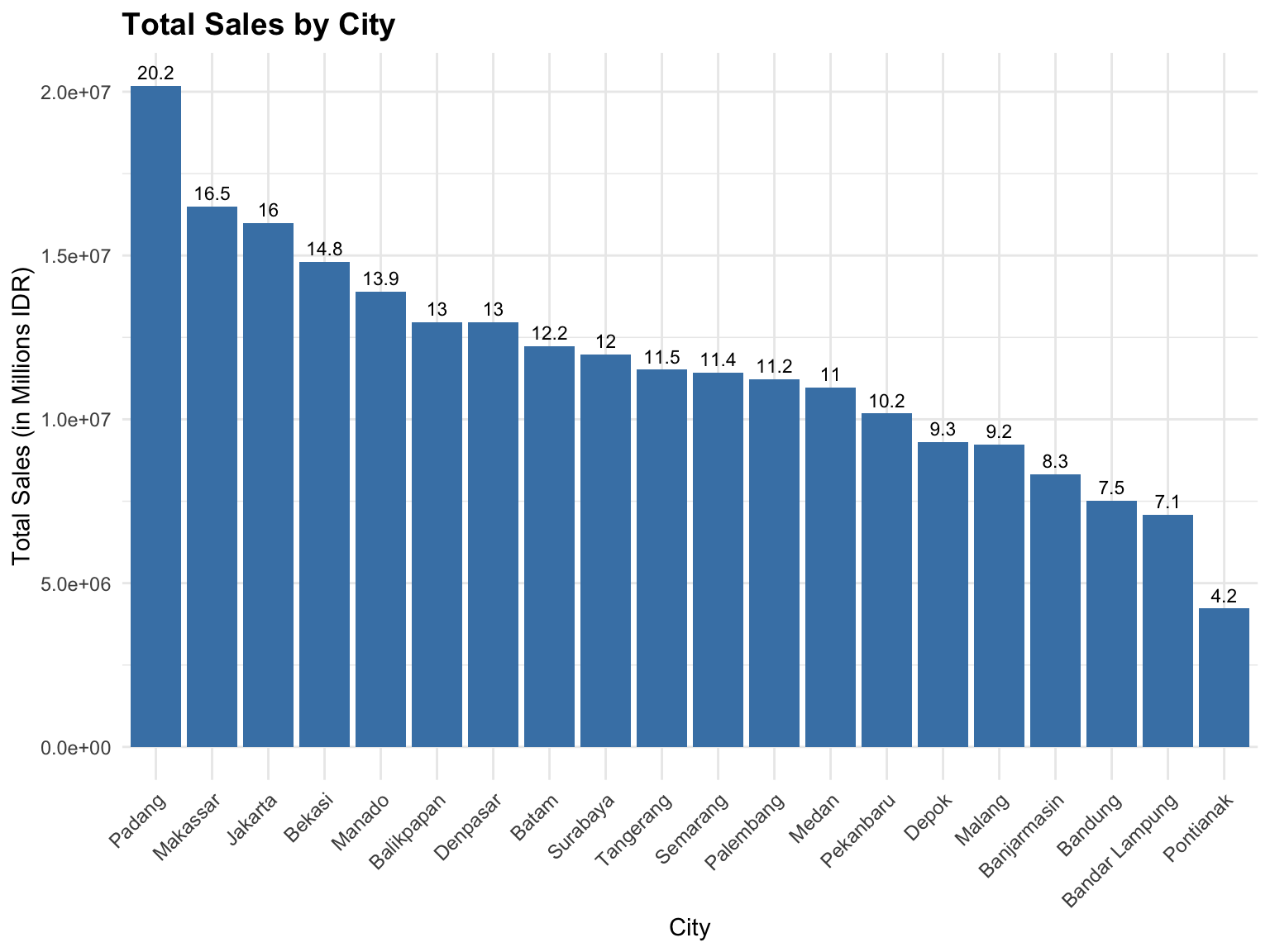
In this Dataset, the Bar Chart is used to show the Total Sales by City. This allows us to quickly identify which cities contribute the most to total sales performance [14].
Insights:
- Taller bars indicate higher total sales.
- The chart helps compare city-level sales performance visually.
- It is ideal for categorical variables such as
Cityand discrete numeric values likeTotalPrice. - For ordinal data, bar charts make it easy to observe trends or patterns across ordered categories.
3.3.1 Basic Bar-chart
In this section, we create a bar chart (see, Figure 3.4) using Base R functions instead of ggplot2. The base plotting system in R provides a simple and direct way to visualize data without requiring additional packages. Here, we visualize total sales by city to compare which locations contribute most to overall revenue.
# Step 1: Aggregate total sales per city
sales_city <- aggregate(TotalPrice ~ City, data = sales_data, sum)

# Step 2: Sort data by total sales (descending)
sales_city <- sales_city[order(sales_city$TotalPrice, decreasing = TRUE), ]

# Step 3: Set margins
par(mar = c(8, 5, 4, 2))  # c(bottom, left, top, right)

# Step 4: Create bar chart
barplot(
  height = sales_city$TotalPrice,
  names.arg = sales_city$City,
  col = "steelblue",
  las = 2,                     # rotate city labels vertically
  cex.names = 0.8,             # reduce font size of city names
  main = "Total Sales by City",
  xlab = "",
  ylab = ""
)

# Optional: Add grid lines
grid(nx = NA, ny = NULL, col = "gray80", lty = "dotted")
3.3.2 Bar-chart using ggplot2
In this section, we create the same bar chart (see, Figure 3.5) using the ggplot2 package, which provides a more modern and flexible approach to visualization in R. Compared to the Base R plotting system, ggplot2 allows easier customization, better control over aesthetics, and integration with themes and color palettes. We visualize total sales by city to compare sales performance across locations.
# Load ggplot2
library(ggplot2)

# Summarize total sales per city
sales_city <- aggregate(TotalPrice ~ City, data = sales_data, sum)

# Sort city by total sales (descending)
sales_city <- sales_city[order(sales_city$TotalPrice, decreasing = TRUE), ]

# Create bar chart
ggplot(sales_city, aes(x = reorder(City, -TotalPrice), y = TotalPrice)) +
  geom_bar(stat = "identity", fill = "steelblue") +
  geom_text(aes(label = round(TotalPrice/1e6, 1)),
            vjust = -0.5, size = 3, color = "black") +
  labs(
    title = "Total Sales by City",
    x = "City",
    y = "Total Sales (in Millions IDR)"
  ) +
  theme_minimal() +
  theme(
    axis.text.x = element_text(angle = 45, hjust = 1, size = 9),
    plot.title = element_text(size = 14, face = "bold")
  )
3.4 Histogram-chart
A Histogram is a graphical representation of the distribution of numerical data. It divides the data into intervals, known as bins, and displays the frequency of data points within each bin. This visualization helps identify patterns such as the central tendency, spread, skewness, and the presence of multiple modes in the data [7].
Histograms are particularly effective for:
- Visualizing the Distribution: They provide a clear picture of how data is distributed across different ranges, helping to identify the shape of the distribution (e.g., normal, skewed, bimodal) [14].
- Identifying Central Tendency and Spread: By observing the peak of the histogram, one can infer the central value of the data. The width of the histogram indicates the variability or spread of the data [15].
- Detecting Skewness: The asymmetry of the histogram can reveal whether the data is skewed to the left or right, indicating potential biases in the data collection process [16].
- Recognizing Multiple Modes: A histogram can show if the data has multiple peaks (modes), suggesting the presence of different subgroups within the dataset [17].
In this Dataset, we can use histograms to explore the distribution of variables such as:
Quantity(number of items purchased)UnitPrice(price per item)TotalPrice(total transaction value)
3.4.1 Basic Histogram-chart
In this example, we use Base R plotting functions to create a histogram (Figure 3.6) showing how many transactions occurred for each quantity of items purchased. A histogram helps us understand the distribution of data — in this case, which purchase quantities are most common. Peaks (tall bars) represent quantities that occur more frequently, while shorter bars indicate rarer purchase sizes.
hist(sales_data$Quantity,
     main = "Histogram of Quantity",
     xlab = "Number of Items Purchased",
     ylab = "Frequency",
     col = "skyblue",
     border = "white",
breaks = 5) 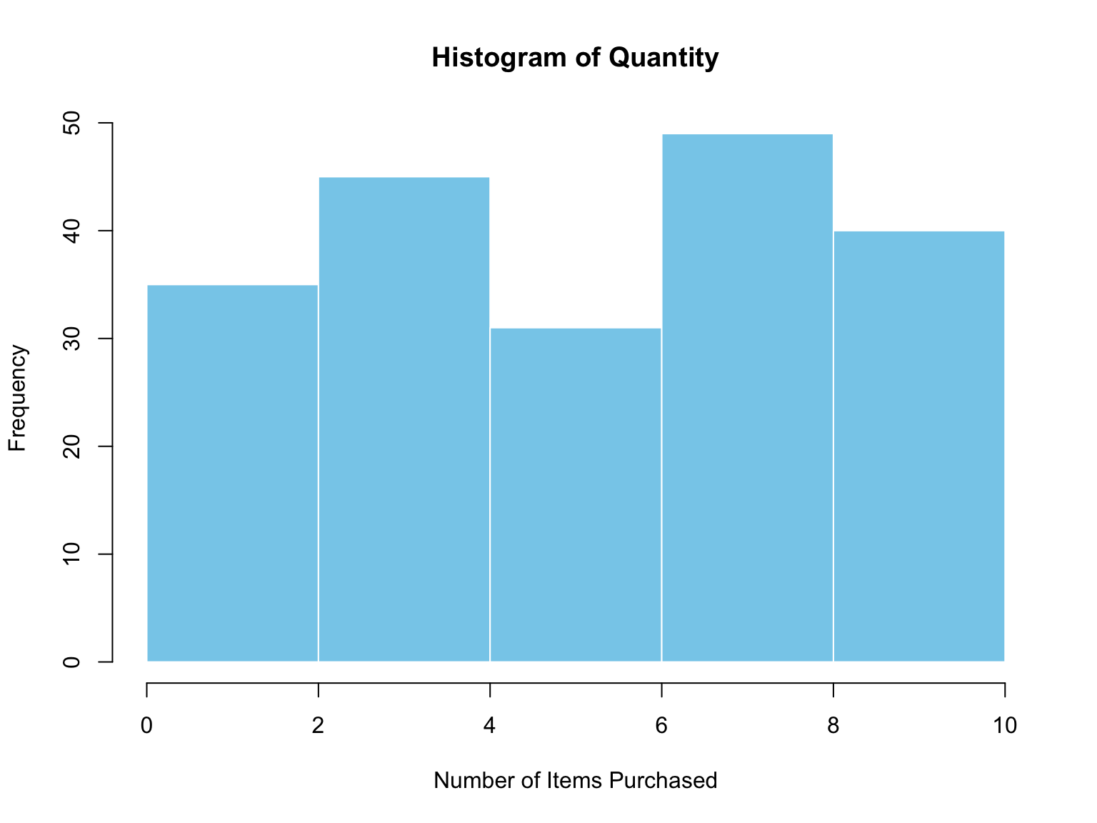
3.4.2 Histogram-chart using ggplot2
In this case, we use the ggplot2 library to display how many transactions fall within each range of item quantities purchased. Each bar represents a range of purchase quantities, while the height indicates the frequency of transactions within that range. This Figure 3.7 helps us quickly identify whether customers tend to buy in small, medium, or large quantities.
library(ggplot2)

ggplot(sales_data, aes(x = Quantity)) +
  geom_histogram(
    bins = 5,                 # number of bins (adjust as needed)
    fill = "skyblue",         # fill color for the bars
    color = "white",          # border color for the bars
    alpha = 0.8               # transparency level
  ) +
  labs(
    title = "Histogram of Quantity",
    x = "Number of Items Purchased",
    y = "Frequency"
  ) +
  theme_minimal()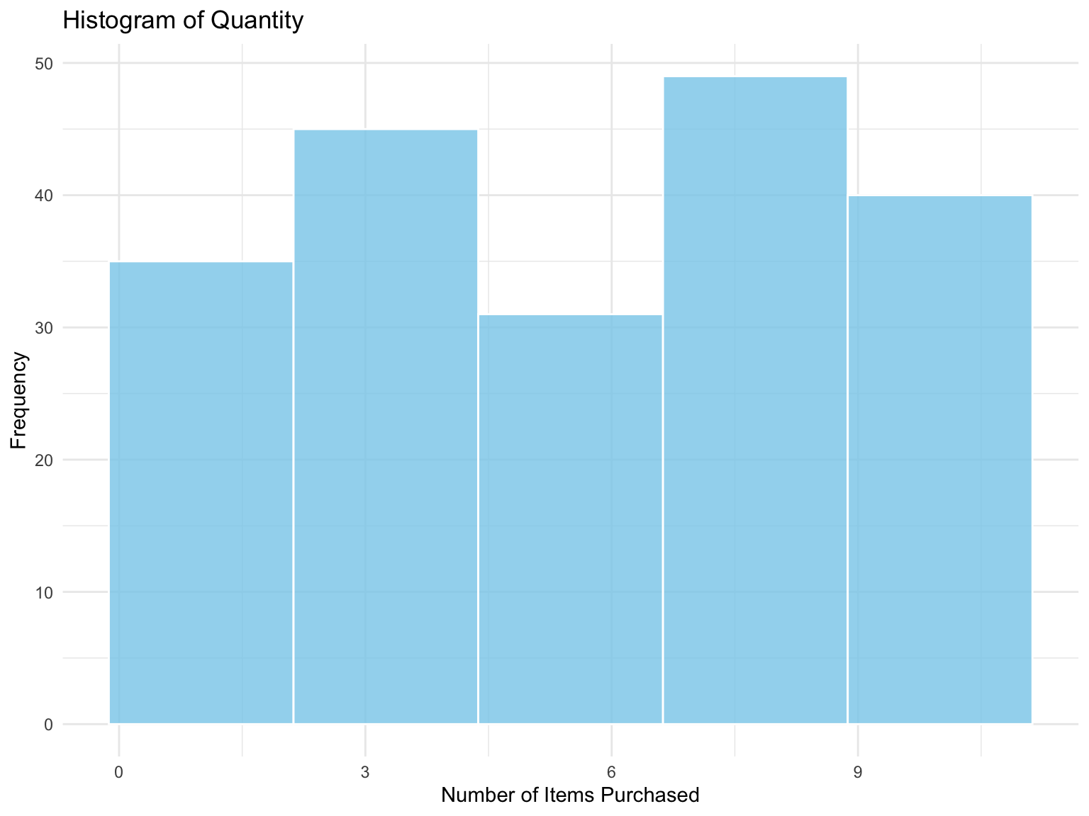
3.5 Pie-chart
A Pie Chart is a circular statistical graphic divided into slices to illustrate numerical proportions within a dataset. Each slice of the pie represents a category’s contribution to the whole, making it ideal for showing part-to-whole relationships.
Pie charts are best used when:
- The dataset contains a small number of categories.
- You want to emphasize relative proportions or percentages.
- The total adds up to 100% of the dataset.
However, pie charts are less effective when there are too many categories or when the differences between slices are small — in such cases, a bar chart is often more suitable [18]; [19].
3.5.1 Basic Pie-chart
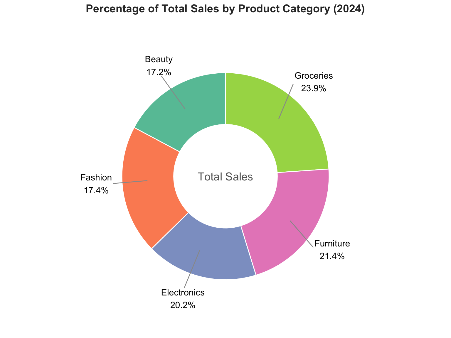
In this dataset, we can use a Pie Chart (see, Figure 3.8) to visualize the percentage contribution of total sales by product category. This helps to quickly understand which product categories dominate total sales performance.
# --- Summarize total sales by product category (base R only) ---
total_sales <- tapply(sales_data$TotalPrice, sales_data$ProductCategory, sum)

# Calculate percentage for each category
percentage <- round(100 * total_sales / sum(total_sales), 1)

# Create labels with category names and percentage
labels <- paste(names(total_sales), " - ", percentage, "%", sep = "")

# --- Create Donut Chart (Base R) ---
par(mar = c(2, 2, 2, 2))  # Adjust margins for clean layout

# Draw pie chart
pie(
  total_sales,
  labels = labels,
  main = "Percentage of Total Sales by Product Category (2024)",
  col = rainbow(length(total_sales)),
  clockwise = TRUE,
  border = "white",
  radius = 1,
  cex = 0.9     # control label size
)

# Add a white circle in the center to make it a donut
symbols(
  0, 0,
  circles = 0.4,
  inches = FALSE,
  add = TRUE,
  bg = "white",  # center color (donut hole)
  fg = NA        # remove border
)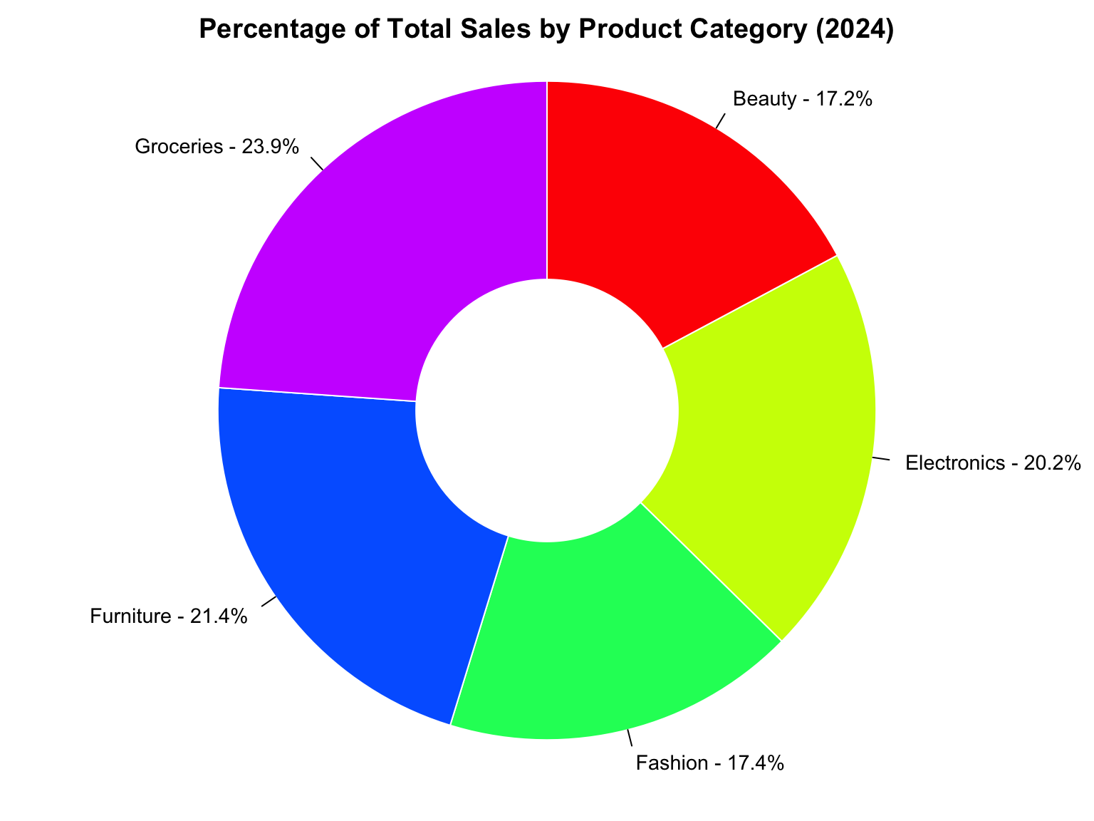
Insights:
- Larger slices indicate higher total sales share.
- Useful for summarizing categorical variables such as
ProductCategory.
- Supports decision-making by highlighting the dominant categories in the market.
3.5.2 Pie-chart using ggplot2
In this example, we use the ggplot2 package to visualize the percentage of total sales by city (see, Figure 3.9). Each slice of the pie represents one city’s contribution, making it easy to compare which cities generate the most or least revenue.
library(ggplot2)
library(dplyr)
library(ggrepel)

# --- Summarize total sales by product category ---
sales_summary <- sales_data %>%
  group_by(ProductCategory) %>%
  summarise(TotalSales = sum(TotalPrice, na.rm = TRUE)) %>%
  mutate(Percentage = round(100 * TotalSales / sum(TotalSales), 1)) %>%
  arrange(desc(TotalSales)) %>%
  mutate(
    ypos = cumsum(TotalSales) - 0.5 * TotalSales,
    Label = paste0(ProductCategory, "\n", Percentage, "%")
  )

# --- Donut Chart (Polished Version) ---
ggplot(sales_summary, aes(x = 2, y = TotalSales, fill = ProductCategory)) +
  geom_col(width = 1, color = "white") +
  coord_polar(theta = "y", start = 0) +
  xlim(0.5, 3) +   # add extra space around the donut
  theme_void() +
  geom_text_repel(
    aes(y = ypos, label = Label),
    color = "black",
    size = 4,
    nudge_x = 1,                # push labels away from the donut
    force = 8,                  # increase label repulsion strength
    segment.size = 0.5,
    segment.color = "gray60",
    min.segment.length = 0.5,
    max.overlaps = Inf,
    show.legend = FALSE
  ) +
  scale_fill_brewer(palette = "Set2") +
  annotate("text", x = 0.5, y = 0, label = "Total Sales",
           size = 5, color = "gray40") +
  labs(
    title = "Percentage of Total Sales by Product Category (2024)",
    fill = "Product Category"
  ) +
  theme(
    plot.title = element_text(
      hjust = 0.5,
      face = "bold",
      size = 14,
      color = "#333333"
    ),
    legend.position = "none",
    plot.background = element_rect(fill = "white", color = NA)
  )
3.6 Box-plot
A Boxplot is a data visualization technique that displays the distribution, spread, and potential outliers of a continuous variable through its summary statistics — minimum, first quartile (Q1), median, third quartile (Q3), and maximum [7]. It provides a compact view of how data values are dispersed and where they concentrate.
Boxplots are particularly useful for: - Comparing Distributions Across Groups: Revealing differences in data spread and central tendency across categories (e.g., product types or customer tiers) [8]. - Detecting Outliers: Identifying unusually high or low data points that may indicate data errors or special cases [9]. - Assessing Data Symmetry and Skewness: Observing whether the data are evenly distributed or skewed toward higher or lower values [10].
In this Dataset, a boxplot can be used to compare the distribution of total sales (TotalPrice) across different customer tiers (CustomerTier) or product categories (ProductCategory). This helps identify which segments tend to have higher transaction values and whether there are significant outliers in purchasing behavior.
3.6.1 Basic Box-plot
In this example, we use Base R plotting to display how total sales (TotalPrice) vary across different product categories (see,Figure 3.10). The box represents the interquartile range (IQR), the line inside shows the median, and dots beyond the whiskers may indicate outliers.
# ============================================
# Boxplot of TotalPrice with arrows & stats
# Base R version (no ggplot2)
# ============================================

# Compute summary statistics
summary_stats <- data.frame(
  Stat  = c("Min", "Q1", "Median", "Q3", "Max", "Mean"),
  Value = c(
    min(sales_data$TotalPrice, na.rm = TRUE),
    quantile(sales_data$TotalPrice, 0.25, na.rm = TRUE),
    median(sales_data$TotalPrice, na.rm = TRUE),
    quantile(sales_data$TotalPrice, 0.75, na.rm = TRUE),
    max(sales_data$TotalPrice, na.rm = TRUE),
    mean(sales_data$TotalPrice, na.rm = TRUE)
  )
)

# --- Adjust small offset to avoid overlap between Median and Mean ---
median_idx <- which(summary_stats$Stat == "Median")
mean_idx   <- which(summary_stats$Stat == "Mean")

# If values are close, add vertical offset
if (abs(summary_stats$Value[median_idx] - summary_stats$Value[mean_idx]) <
    0.05 * diff(range(summary_stats$Value))) {
  summary_stats$Value[median_idx] <-
    summary_stats$Value[median_idx] * 1.02  # move slightly upward
  summary_stats$Value[mean_idx]   <-
    summary_stats$Value[mean_idx]   * 0.95  # move slightly downward
}

# Adjust plot margins (more space on the right)
par(mar = c(5, 4, 5, 6))

# Create basic boxplot
boxplot(
  sales_data$TotalPrice,
  main = "Distribution of Total Sales Value with Summary Statistics",
  ylab = "Total Price (IDR)",
  col = "#69b3a2",
  border = "gray40",
  boxwex = 0.3,
  notch = FALSE,
  outline = TRUE
)

# X position of the boxplot
x_box <- 1

# Add arrows pointing from left to right
arrows(
  x0 = x_box + 0.15, x1 = x_box + 0.25,
  y0 = summary_stats$Value, y1 = summary_stats$Value,
  length = 0.08, angle = 20, col = "gray40", lwd = 1
)

# Add text labels to the right of the arrows
text(
  x = x_box + 0.28, y = summary_stats$Value,
  labels = paste0(summary_stats$Stat, ": ",
                  format(round(summary_stats$Value, 0), big.mark = ",")),
  pos = 4,  # left-aligned text
  cex = 0.8, col = "#222222"
)

# Add caption below the plot
mtext("Source: @dsciencelabs",
      side = 1,
      line = 4,
      adj = 1,
      cex = 0.8,
      col = "gray50")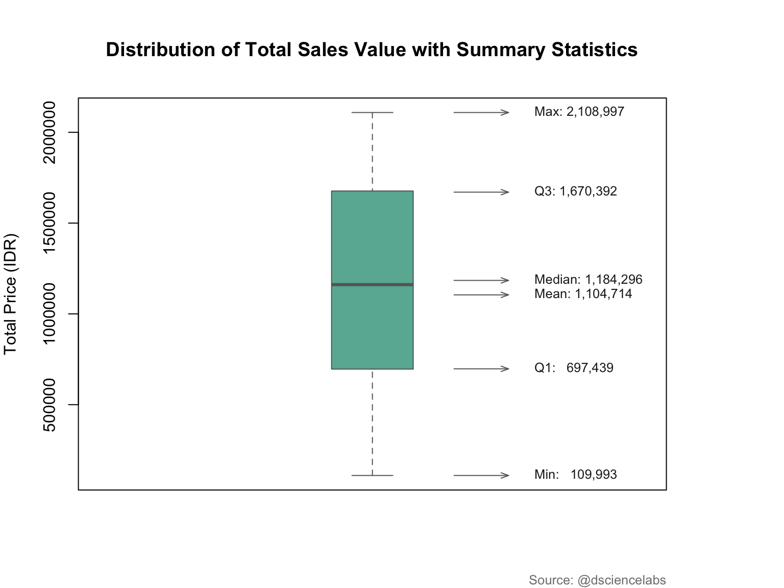
Explanation:
| Statistic | Description |
|---|---|
| Min | The smallest value in the dataset. |
| Q1 (First Quartile) | The value below which 25% of the data fall. |
| Median | The middle value dividing the data into two equal halves. |
| Q3 (Third Quartile) | The value below which 75% of the data fall. |
| Max | The largest value in the dataset. |
| Mean | The arithmetic average of all data points. |
3.6.2 Box-plot using ggplot2
The ggplot2 package allows a more elegant and customizable approach to creating box plots (see, Figure 3.11). This visualization shows the distribution of total sales (TotalPrice) across product categories, highlighting the median, variability, and potential outliers. Compared to the Base R version, ggplot2 provides smoother visuals and easier styling through themes and color mapping.
library(ggplot2)
library(dplyr)
library(grid)

# =======================================================
# Compute summary statistics for TotalPrice
# =======================================================
summary_stats <- data.frame(
  Stat  = c("Min", "Q1", "Median", "Q3", "Max", "Mean"),
  Value = c(
    min(sales_data$TotalPrice, na.rm = TRUE),
    quantile(sales_data$TotalPrice, 0.25, na.rm = TRUE),
    median(sales_data$TotalPrice, na.rm = TRUE),
    quantile(sales_data$TotalPrice, 0.75, na.rm = TRUE),
    max(sales_data$TotalPrice, na.rm = TRUE),
    mean(sales_data$TotalPrice, na.rm = TRUE)
  )
)

# =======================================================
# Adjust small offset to avoid overlap between Median & Mean
# =======================================================
median_idx <- which(summary_stats$Stat == "Median")
mean_idx   <- which(summary_stats$Stat == "Mean")

if (abs(summary_stats$Value[median_idx] - summary_stats$Value[mean_idx]) <
    0.05 * diff(range(summary_stats$Value))) {
  summary_stats$Value[median_idx]<-summary_stats$Value[median_idx] * 1.02 # up
  summary_stats$Value[mean_idx] <- summary_stats$Value[mean_idx]   * 0.98 # down
}

# =======================================================
# Create ggplot boxplot with larger width and arrows
# =======================================================
ggplot(sales_data, aes(x = "Total", y = TotalPrice)) +
  geom_boxplot(
    width = 0.6,
    fill = "#69b3a2",
    color = "gray40",
    outlier.color = "gray40"
  ) +

  # Horizontal arrows shifted right to avoid overlapping the boxplot
  geom_segment(
    data = summary_stats,
    aes(x = 1.65, xend = 1.8, y = Value, yend = Value),
    arrow = arrow(length = unit(0.15, "cm"), angle = 20),
    color = "gray40"
  ) +

  # Text labels at the right of arrows
  geom_text(
    data = summary_stats,
    aes(
      x = 1.85,
      y = Value,
      label = paste0(Stat, ": ", format(round(Value, 0), big.mark = ","))
    ),
    hjust = 0,
    size = 3.5,
    color = "#222222"
  ) +

  # Scale and margins to keep everything centered
  scale_x_discrete(expand = expansion(add = c(3, 3))) +
  labs(
    title = "Distribution of Total Sales Value with Summary Statistics",
    y = "Total Price (IDR)",
    x = NULL,
    caption = "Source: @dsciencelabs"
  ) +
  theme_minimal(base_size = 12) +
  theme(
    plot.title = element_text(face = "bold", hjust = 0.5, size = 14),
    plot.caption = element_text(hjust = 0.5, color = "gray50", size = 10),
    axis.text.x = element_blank(),
    axis.ticks.x = element_blank(),
    panel.grid.major.x = element_blank(),
    panel.grid.minor.x = element_blank(),
    plot.margin = margin(20, 120, 20, 120)
  ) +
  coord_cartesian(clip = "off")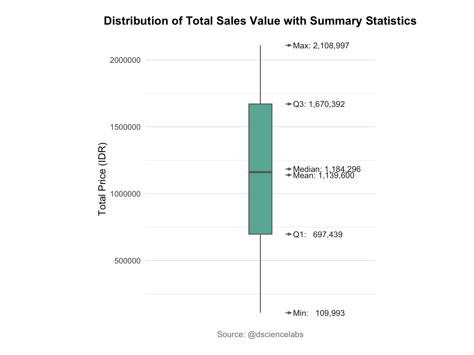
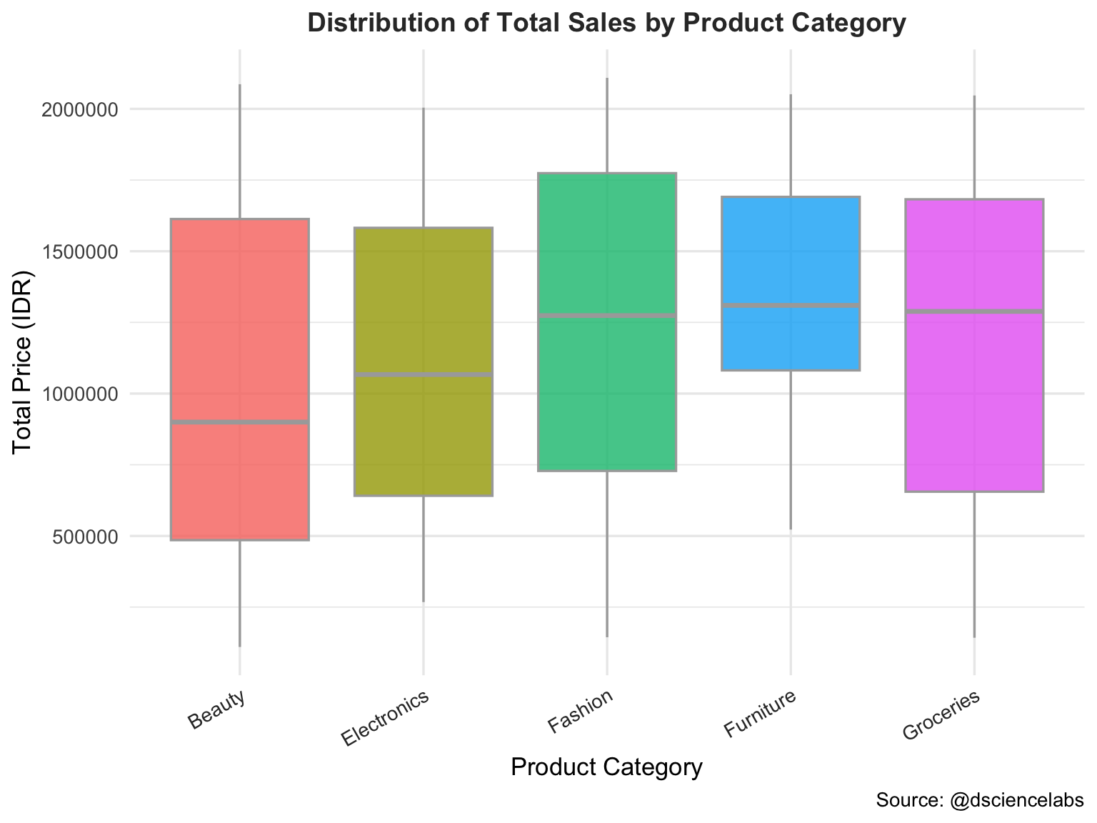
The Figure 3.12 provides a visual summary of the spread and central tendency of sales data by Product Category. Each box represents the interquartile range (IQR), the line inside the box marks the median, and points outside the whiskers indicate outliers — unusually high or low sales values that may deserve further investigation.
library(ggplot2)

# --- Boxplot of Total Price by Product Category ---

ggplot(sales_data, aes(x = ProductCategory, y = TotalPrice, fill = ProductCategory)) +
geom_boxplot(
color = "darkgray",
outlier.colour = "red",
outlier.shape = 16,
outlier.size = 2,
alpha = 0.8
) +
labs(
title = "Distribution of Total Sales by Product Category",
x = "Product Category",
y = "Total Price (IDR)",
caption = "Source: @dsciencelabs"
) +
theme_minimal(base_size = 13) +
theme(
plot.title = element_text(
face = "bold",
size = 14,
color = "#333333",
hjust = 0.5
),
axis.text.x = element_text(
angle = 30,
hjust = 1,
color = "#333333"
),
legend.position = "none",
plot.background = element_rect(fill = "white", color = NA)
)
3.7 Scatter-plot
A Scatter Plot is a data visualization technique that displays the relationship between two continuous variables by plotting individual data points on a two-dimensional plane. Each point represents one observation, with its position determined by the values of the two variables. Scatter plots are useful for identifying patterns, trends, correlations, clusters, and potential outliers in the data [7].
Scatter plots are particularly useful for:
- Identifying Relationships Between Variables: Revealing positive, negative, or no correlation between variables (e.g., advertising spend vs. sales performance) [8].
- Detecting Clusters or Groups: Highlighting natural groupings in data that may correspond to categories, regions, or segments [9].
- Spotting Outliers: Identifying unusual data points that deviate from the general trend, which could indicate errors or special cases [10].
In this Dataset, a scatter plot can be used to explore the relationship between total sales (TotalPrice) and advertising spend (Advertising), or between TotalPrice and CustomerSatisfaction. This helps identify whether higher spending leads to increased sales, whether specific groups form distinct clusters, and whether there are extreme observations in the dataset that require further investigation.
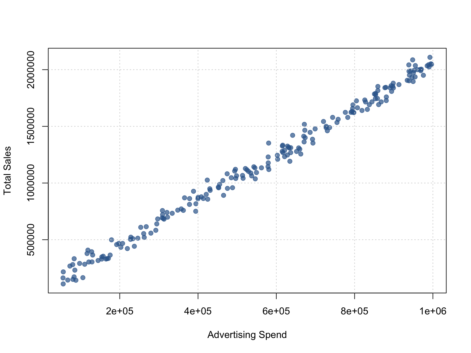
3.7.1 Basic Scatter-plot
The basic scatter plot shown in Figure 3.13 illustrates the relationship between Advertising Spend and Total Sales (TotalPrice) using base R plotting. Each point represents a sales observation, allowing us to visually identify patterns or potential outliers. This basic visualization provides a clear starting point before enhancing the design using ggplot2.
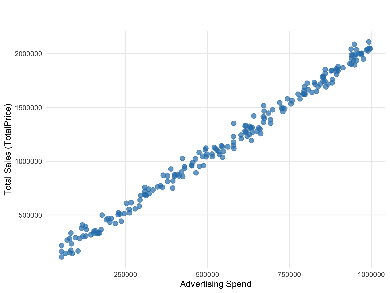
3.7.2 Scatter-plot using ggplot2
The Figure 3.14 illustrates the relationship between Advertising Spend and Total Sales (TotalPrice). This visualization helps identify patterns, trends, or potential outliers between these two numerical variables.
3.8 Summary
The Table 3.1 provides an overview of the most common chart types used in data visualization, highlighting their advantages, disadvantages, suitable data types, and typical use cases. It serves as a quick reference to help select the most appropriate chart based on the dataset and analytical objectives.
| Type_Data | Advantages | Disadvantages | Use_Case | |
|---|---|---|---|---|
| Line Chart | Continuous, Time-series | Shows trends over time; easy to read | Not effective for discrete categories; too many lines can be confusing | Sales trends, stock prices, daily temperature |
| Bar Chart | Categorical, Discrete | Easy comparison between categories; clear visualization | Not suitable for continuous data; crowded if many categories | Compare sales by product category, revenue by region |
| Histogram | Continuous | Shows data distribution; easy to see frequency | Does not show relationship between variables; binning affects interpretation | Analyze distribution of age, income, TotalPrice |
| Pie Chart | Categorical | Simple view of proportions or percentages | Hard to compare categories if many; inaccurate for similar values | Market share, sales proportion per category |
| Boxplot | Continuous | Shows distribution, outliers, median, and quartiles | Does not show trend; individual data points are not visible | Compare TotalPrice distribution across groups/categories |
| Scatter Plot | Continuous, Numeric | Shows relationship/correlation between two variables; detects outliers | Hard to read if too dense; does not show overall distribution | Analyze TotalPrice vs Advertising, TotalPrice vs CustomerSatisfaction |