Chapter 15 Graphing Maps
library(tidyverse) # loading ggplot2 and dplyr
library(sf) # Simple Features for GIS
library(rnaturalearth) # package with detailed information about country &
library(rnaturalearthdata) # state/province borders, and geographical features
# devtools::install_github('ropensci/rnaturalearthhires')
library(rnaturalearthhires) # Hi-Resolution Natural Earth
# devtools::install_github("UrbanInstitute/urbnthemes")
# devtools::install_github("UrbanInstitute/urbnmapr")
library(urbnmapr)
#library(urbnthemes)
library(leaflet)Introduction
We often have data that is associated with some sort of geographic information.
For example, we might have information based on US state counties. It would be
nice to be able to produce a graph where we fill in the county with a color shade
associated with our data (This is called a chloropleth).
Or perhaps put dots at the center of each county and the dots might be color
coded or size coded to our data.
But the critical aspect is that we already have some data, but we need some
additional data relating to the shape of the county or state of interest.
There are several tutorials that I’ve found useful while preparing this introduction:
There is a simple blog style series of posts that is a quick read.
The
sfpackage vignettes are a really great resource.Finally there is a great on-line book by Edzer Pebesma and Roger Bivand about mapping in R.
Coordinate Reference Systems (CRS)
There are many ways to represent a geo-location.
WGS84 aka Latitude/Longitude One of the oldest systems, and most well known, is the latitude/longitude grid. The latitude measures north/south where zero is the equator and +90 and -90 are the north and south poles. Longitude is the east/west measurement and the zero is the Prime Meridian (which is close to the Greenwich Meridian) and +180 and -180 are the anti-meridian near the Alaska/Russia border. The United States is in the negative longitudes. The problem with latitude/longitude is that small differences in lat/long coordinates near the equator are large distance, but near the poles it would be much much smaller. Another weirdness is that lat/long coordinates are often given in a base 60 system of degrees/minutes/seconds.
To get the decimal version we use the formula \[\textrm{Decimal Value} = \textrm{Degree} + \frac{\textrm{Minutes}}{60} + \frac{\textrm{Seconds}}{3600}\] For example, Flagstaff AZ has lat/long 35°11′57″N 111°37′52″W. Notice that the longitude is 111 degrees W which should actually be negative. This gives a lat/long pair of:35 + 11/60 + 57/3600## [1] 35.19917-1 * (111 + 37/60 + 52/3600)## [1] -111.6311Reference Point Systems A better idea is to establish a grid of reference points along the grid of the planet and then use offsets from those reference points. One of the most common projection system is the Universal Transverse Mercator (UTM) which uses a grid of 60 reference points. From these reference points, we will denote a location using a northing/easting offsets. The critical concept is that if you are given a set of northing/easting coordinates, we also need the reference point and projection system information. For simplicity we’ll refer to both the lat/long or northing/easting as the coordinates.
15.0.1 Projections
No matter how the geographic information is stored, we need to decide how to display the. For small geographic areas, this choice isn’t too important, but for large areas it is. The fundamental reason is because the earth is approximately a sphere and any 2-dimensional map must distort the size and/or shape of the areas being represented.
To tell R which projection to use, we’ll modify the CRC to include information about what project we want. Inside a geographic object, all the information about the CRC and projection is encoded in a single text string and we just need to update that.
world_map <-
ne_countries(returnclass = 'sf') %>% # tibble containing country shapes
ggplot() +
geom_sf(fill='grey')
world_map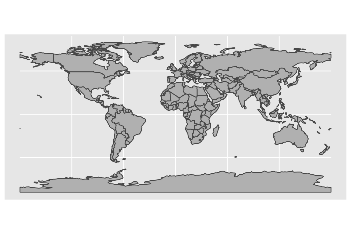
The default projection is the ‘Patterson’ projection and gives far to much pixel area to areas in the arctic when looking at the entire planet. Alternatives include the Robinson and Mollweide.
P1 <- world_map +
coord_sf(crs = '+proj=moll') + # change the projection to Mollweide
labs(title='Mollweide Projection')
P2 <- world_map +
coord_sf(crs = '+proj=robin') + # change the projection to Robinson
labs(title='Robinson Projection')
cowplot::plot_grid(P1, P2)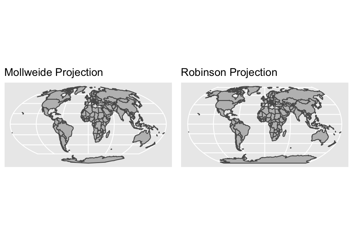
When graphing smaller regions, the default projection doesn’t quite work because Alaska spans across the international date line.
USA_map <- ne_states(country = 'united states of america', returnclass = 'sf') %>%
ggplot() +
geom_sf(fill='grey')
USA_map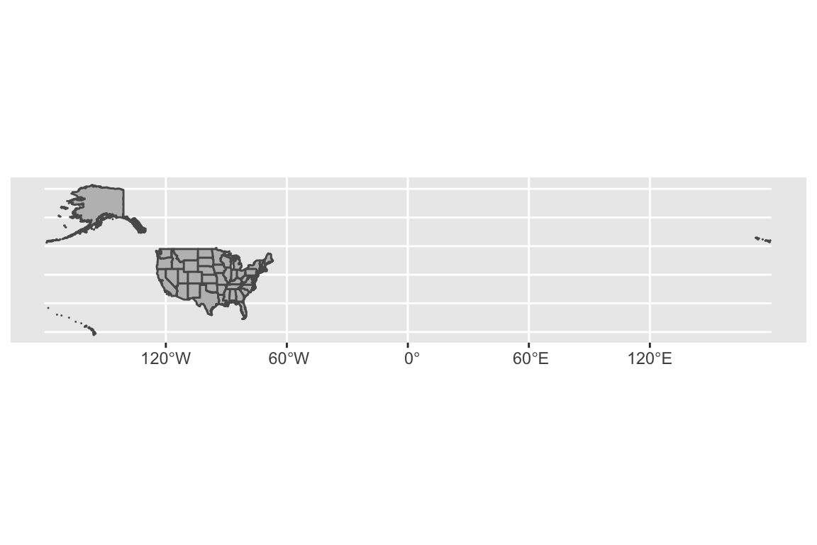
A somewhat better alternative when showing just the contiguous United States is
to use the UTM projection which includes a zone
option
and center the map on the center zone.
USA_map +
coord_sf(crs = '+proj=utm +zone=12') # change the projection to UTM zone 12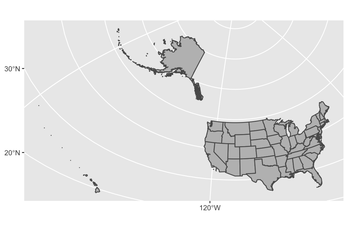
But Alaska and Hawaii are making this map a bit ugly and we often see them just
moved and re-sized. The urbnmapr package has data sets of the US states and
counties that already has a good projection that already does this.
# pull the CRS information from Urban Institutes maps.
get_urbn_map(map='states', sf=TRUE) %>%
ggplot() +
geom_sf(fill='grey') +
theme_void() # get rid of latitude and longitude now I've moved things around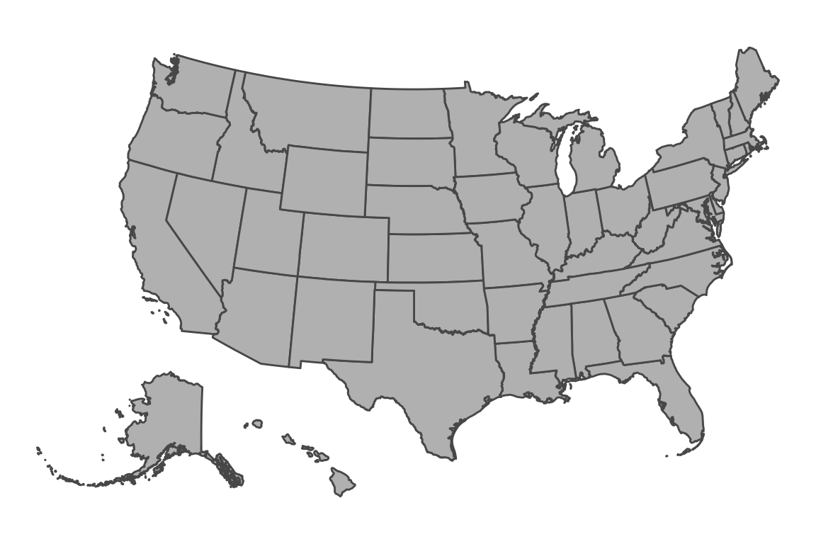
Spatial Objects
Regardless of the coordinate reference system (CRS) used, there are three major types of data that we might want to store.
Points The simplest type of data object to store is a single location. Storing them simply requires knowing the coordinates and the reference system. It is simple to keep track of a number of points as you just have a data frame of coordinates and then the reference system.
LineString This maps out a one-dimensional line across the surface of the globe. An obvious example is to define a road. To do this, we just need to define a sequence of points (where the order matters) and the object implicitly assumes the points are connected with straight lines. To represent an arbitrary curve, we simply need to connect points that are quite close together. As always, this object also needs to keep track of the CRS.
Polygons These are similar to a LineString in that they are a sequential vector of points, but now we interpret them as forming an enclosed area so the line starts and ends at the same place. As always, we need to keep the CRS information for the points. We also will allow “holes” in the area by having one or more interior polygons cut out of it. To do this, we need to keep a list of removed polygons.
Each of the above type of spatial objects can be grouped together, much as we naturally made a group of points. For example, the object that defines the borders of the United States of America needs to have multiple polygons because each contiguous land mass needs its own polygon. For example the state of Hawaii has 8 main islands and 129 minor islands. Each of those needs to be its own polygon for our “connect the dots” representation to make sense.
Until recently, the spatial data structures in R (e.g. the sp package) required
users to keep track of the data object type as well as the reference system. This
resulted in code that contained many mysterious input strings that were almost
always poorly understood by the user. Fortunately there is now a formal ISO standard
that describes how spatial objects should be represented digitally and the types of
manipulations that users should be able to do. The R package sf, which stands for
“Simple Features” implements this standard and is quickly becoming the preferred R
library for handling spatial data.
Tiles
Instead of building a map layer by layer, you might want to start with some base level information, perhaps some topological map with country and state names along with major metropolitan areas. Tiles provide a way to get all the background map information for you to then add your data on top.
Tiles come in two flavors. Rasters are similar to a pictures in that every pixel is stored. These have the downside that when zooming in, the pixelation becomes obvious. Vector based tiles actually only store the underlying spatial information and handle zooming in without pixelation.
Obtaining Spatial Data
Often I already have some information associated with some geo-political unit such as state or country level rates of something (e.g. country’s average life span, or literacy rate). Given the country name, we want to produce a map with the data we have encoded with colored dots centered on the country or perhaps fill in the country with shading associated with the statistic of interest. To do this, we need data about the shape of each country!
In general it is a bad idea to rely on spatial data that is static on a user’s machine. First, large scale geo-political borders, coastal boundaries can potentially change. Second, fine scale details like roads and building locations are constantly changing. Third, the level of detail needed is quite broad for world maps, but quite small for neighborhood maps. It would be a bad idea to download neighborhood level data for the entire world in the chance the a use might want fine scale detail for a particular neighborhood. However, it is also a bad idea to query a web-service every time I knit a document together. Therefore we will consider ways to obtain the information needed for a particular scale and save it locally but our work flow will always include a data refresh option.
Natural Earth Database
Natural Earth is a public domain map database
and is free for any use, both commercial and non-commercial. There is a nice R
package, rnaturalearth that provides convenient interface. There is also
information about urban areas and roads as well as geographical details such
as rivers and lakes. There is a mechanism to download data at different
resolutions as well as matching functions for reading in the data from a local
copy of it.
There are a number of data sets that are automatically downloaded with the
rnaturalearth package including country and state/province boarders.
ne_countries(continent='Africa', returnclass = 'sf') %>% # grab country borders in Africa
ggplot() + geom_sf() +
labs(title='Africa')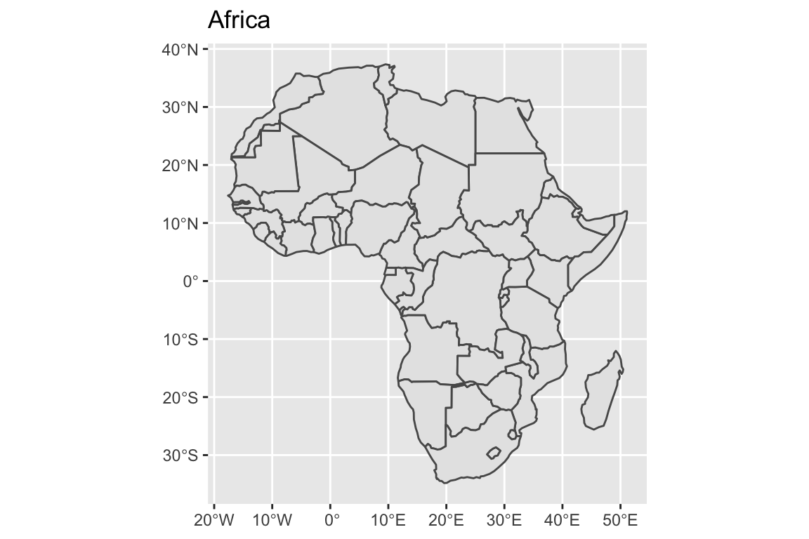
ne_states(country='Ghana', returnclass = 'sf') %>% # grab provinces within Ghana
ggplot() +
geom_sf( ) +
labs(title='Ghana')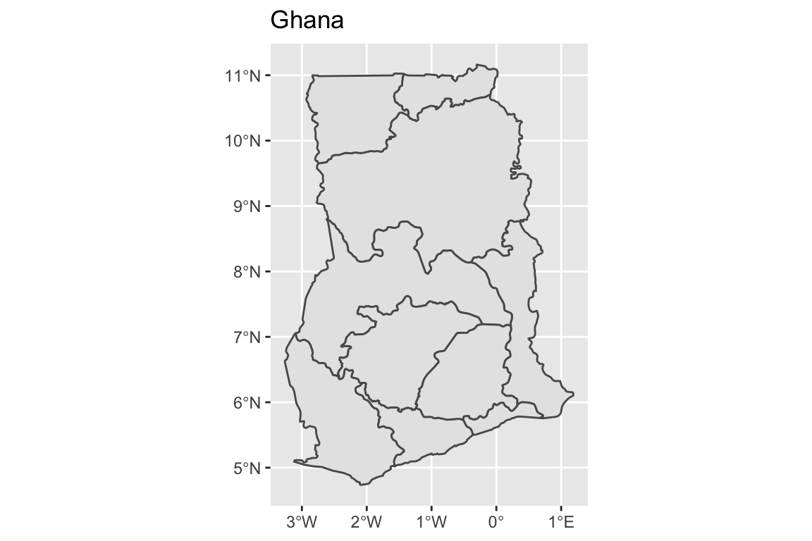
# The st_centroid function takes the sf object and returns the center of
# the polygon, again as a sf object.
Ghana <- ne_states(country='Ghana', returnclass = 'sf') # grab provinces within Ghana
Ghana %>% ggplot() +
geom_sf( ) +
geom_text( data=st_centroid(Ghana), size=2,
aes(x=longitude, y=latitude, label=woe_name)) +
labs(title='Ghana Administrative Regions')## Warning in st_centroid.sf(Ghana): st_centroid assumes attributes are constant
## over geometries of x## Warning in st_centroid.sfc(st_geometry(x), of_largest_polygon =
## of_largest_polygon): st_centroid does not give correct centroids for longitude/
## latitude data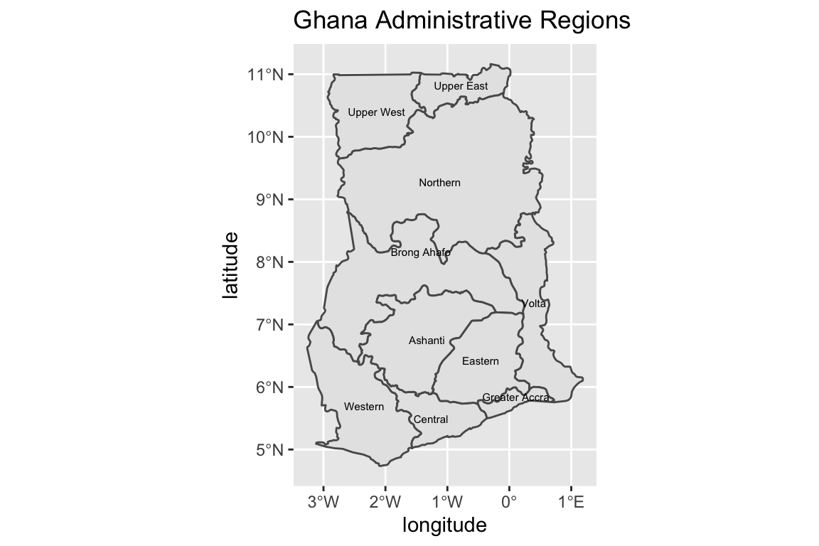
There is plenty of other geographic information that you can download from Natural Earth. In the table below, scale refers to how large the file is and so scale might more correctly be interpreted as the data resolution.
| category | type | scale small |
scale medium |
scale large |
|---|---|---|---|---|
physical |
coastline |
Yes | Yes | Yes |
physical |
land |
Yes | Yes | Yes |
physical |
ocean |
Yes | Yes | Yes |
physical |
lakes |
Yes | Yes | Yes |
physical |
geographic_lines |
Yes | Yes | Yes |
physical |
minor_islands |
No | No | Yes |
physical |
reefs |
No | No | Yes |
cultural |
populated_places |
Yes | Yes | Yes |
cultural |
urban_areas |
No | Yes | Yes |
cultural |
roads |
No | No | Yes |
15.0.2 Urban Institute
15.0.2.1 Package urbnmapr
This is a package developed by the Urban Institute and has two convenient data sets for US states and counties. This is quite US-centric, but it works for me.
AZ_map_df <- get_urbn_map(map='counties', sf=TRUE) %>%
filter(state_name == 'Arizona')
str(AZ_map_df)## Classes 'sf' and 'data.frame': 15 obs. of 7 variables:
## $ county_fips: chr "04015" "04023" "04012" "04007" ...
## $ state_abbv : chr "AZ" "AZ" "AZ" "AZ" ...
## $ state_fips : chr "04" "04" "04" "04" ...
## $ county_name: chr "Mohave County" "Santa Cruz County" "La Paz County" "Gila County" ...
## $ fips_class : chr "H1" "H1" "H1" "H1" ...
## $ state_name : chr "Arizona" "Arizona" "Arizona" "Arizona" ...
## $ geometry :sfc_MULTIPOLYGON of length 15; first list element: List of 1
## ..$ :List of 1
## .. ..$ : num [1:1023, 1:2] -1321573 -1321334 -1320642 -1319546 -1317819 ...
## ..- attr(*, "class")= chr [1:3] "XY" "MULTIPOLYGON" "sfg"
## - attr(*, "sf_column")= chr "geometry"
## - attr(*, "agr")= Factor w/ 3 levels "constant","aggregate",..: NA NA NA NA NA NA
## ..- attr(*, "names")= chr [1:6] "county_fips" "state_abbv" "state_fips" "county_name" ...Notice that there is a FIPS code, which is the Federal Information Processing Standards which includes a standard code for identifying geographic information. These are slowly being phased out in favor of GNIS Feature ID, and INCITS standards but FIPS is still widespread.
# I downloaded some information about Education levels from the American Community Survey
# website https://www.census.gov/acs/www/data/data-tables-and-tools/
# by selecting the Education topic and then used the filter option to select the state
# and counties that I was interested in. Both the 1 year and 5 year estimates
# didn't include the smaller counties (too much uncertainty).
# I then had reshape the data a bit to the following
# format. I ignored the margin-of-error columns and didn't worry about the
# the Race, Hispanic, or Gender differences.
AZ_Education <-
read_csv('data-raw/AZ_Population_25+_BS_or_Higher.csv') %>%
arrange(County) %>%
rename(Percent_BS = 'Percent_BS+') %>%
mutate(County = str_to_title(County),
County = str_c(County , ' County'))
# Show the County percent of 25 or older population with BS or higher
AZ_Education## # A tibble: 10 x 2
## County Percent_BS
## <chr> <dbl>
## 1 Apache County 11.6
## 2 Cochise County 21.8
## 3 Coconino County 36
## 4 Maricopa County 33.2
## 5 Mohave County 14.3
## 6 Navajo County 14.3
## 7 Pima County 31.5
## 8 Pinal County 19.7
## 9 Yavapai County 26.4
## 10 Yuma County 16.8Finally we can joint the geographic data set and the Education data and plot it
AZ_map_df %>%
left_join(AZ_Education, by=c('county_name' = 'County')) %>%
ggplot() +
geom_sf(aes(fill=Percent_BS)) +
coord_sf(crs = '+proj=utm +zone=12 +ellps=WGS84 +towgs84=0,0,0')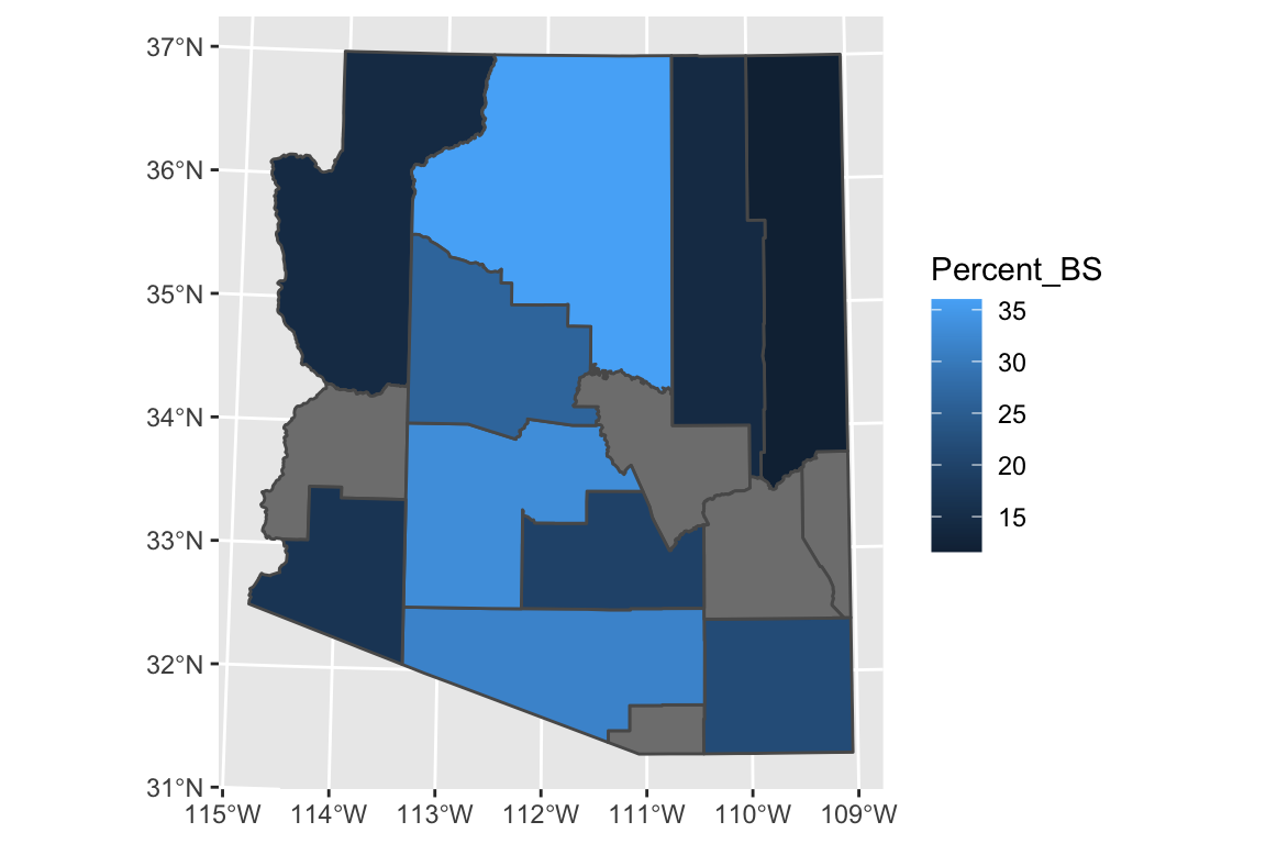
#coord_sf( crs = '+proj=natearth +lon_0=0 +datum=WGS84 +units=m +no_defs')15.0.3 Other non-sf packages
15.0.3.1 Package maps
The R package maps is one of the easiest way to draw a country or state maps
because it is built into the ggplot package. This is one of the easiest ways
I know of to get US county information. Unfortunately it is fairly US specific.
Once we have the data.frame of regions that we are interested in selected,
all we need to do is draw polygons in ggplot2.
# ggplot2 function to create a data.frame with world level information
geo.data <- ggplot2::map_data('world') # Using maps::world database.
# group: which set of points are contiguous and should be connected
# order: what order should the dots be connected
# region: The name of the region of interest
# subregion: If there are sub-regions with greater region
head(geo.data)## long lat group order region subregion
## 1 -69.89912 12.45200 1 1 Aruba <NA>
## 2 -69.89571 12.42300 1 2 Aruba <NA>
## 3 -69.94219 12.43853 1 3 Aruba <NA>
## 4 -70.00415 12.50049 1 4 Aruba <NA>
## 5 -70.06612 12.54697 1 5 Aruba <NA>
## 6 -70.05088 12.59707 1 6 Aruba <NA># Now draw a nice world map, not using Simple Features,
# but just playing connect the dots.
ggplot(geo.data, aes(x = long, y = lat, group = group)) +
geom_polygon( colour = "white", fill='grey50') 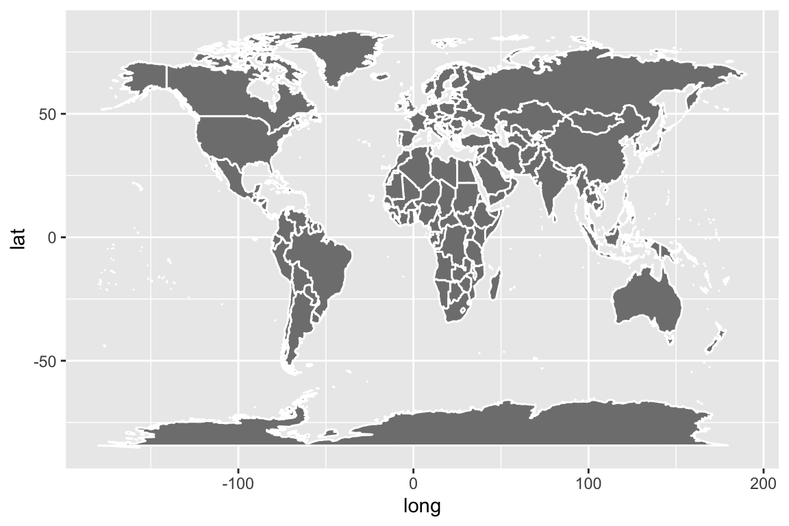
The maps package has several data bases of geographical regions.
| Database | Description |
|---|---|
world |
Country borders across the globe |
usa |
The country boundary of the United States |
state |
The state boundaries of the United States |
county |
The county boundaries within states of the United States |
lakes |
Large fresh water lakes across the world |
italy |
Provinces in Italy |
france |
Provinces in France |
nz |
North and South Islands of New Zealand |
The maps package also has a data.frame of major US cities. This is a
nice place to get city locations, though I often want to turn this into
a sf data set with the following:
Cities <- maps::us.cities %>%
mutate(city = str_sub(name, 1, -3), # remove the state Abbreviation
city = str_trim(city)) %>%
rename(state = 'country.etc') %>%
select(city, state, lat, long) %>%
st_as_sf(coords=c('long','lat'), # Which columns have longitute/latitude
crs="+proj=longlat +datum=WGS84") # I'm using long/lat coordinatesAZ_Cities <- Cities %>% filter(state == 'AZ')
AZ_map_df %>%
ggplot() +
geom_sf(fill='grey') +
geom_sf(data=AZ_Cities) +
coord_sf(crs = '+proj=utm +zone=12 +ellps=WGS84 +towgs84=0,0,0')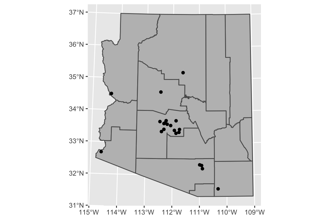
Adding labels to the cities is fairly easy as well. We’ll use the ggrepel
package to push the labels away from their data points but we need to specify to
use the sf geometry to get the x and y locations.
AZ_Cities <- Cities %>% filter(state == 'AZ')
AZ_Cities_ToLabel <- AZ_Cities %>%
filter(city %in% c('Phoenix','Tempe','Scottsdale',
'Flagstaff','Prescott','Lake Havasu City',
'Yuma','Tucson','Sierra Vista'))
AZ_map_df %>%
ggplot() +
geom_sf(fill='grey') +
geom_sf(data=AZ_Cities) +
ggrepel::geom_text_repel(
data = AZ_Cities_ToLabel,
aes(label = city, geometry = geometry),
stat = "sf_coordinates") +
coord_sf(crs = '+proj=utm +zone=12 +ellps=WGS84 +towgs84=0,0,0')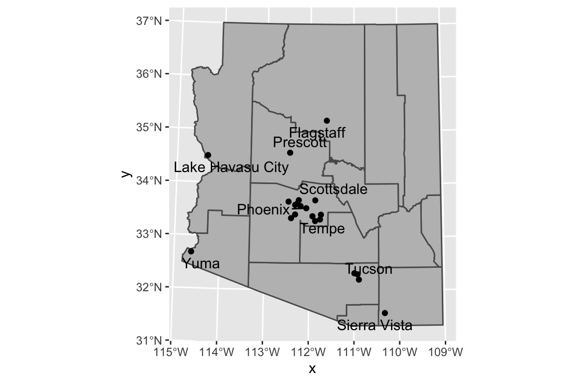
15.0.4 Package leaflet
Leaflet is a popular open-source JavaScript library for interactive maps. The
package leaflet provides a nice interface to this package. The
tutorial
for this package is quite good.
The basic work flow is:
- Create a map widget by calling leaflet().
- Create and add layers (i.e., features) to the map by using layer functions
addTiles- These are the background of the map that we will put stuff on top of.addMarkersaddPolygons
- Repeat step 2 as desired.
- Print the map widget to display it.
map <- leaflet() %>% # Build a base map
addTiles() %>% # Add the default tiles
addMarkers(lng=-1*(111+37/60+52/3600),
lat=35+11/60+57/3600,
popup="Flagstaff, AZ")
map %>% print()Because we have added only one marker, then leaflet has decided to zoom in as much as possible. If we had multiple markers, it would have scaled the map to include all of them.
As an example of an alternative, I’ve downloaded a GIS shape file of forest service administrative area boundaries.
# The shape file that I downloaded had the CRS format messed up. I need to
# indicate the projection so that leaflet doesn't complain.
Forest_Service <-
sf::st_read('data-raw/Forest_Service_Boundaries/S_USA.AdministrativeRegion.shp') %>%
sf::st_transform('+proj=longlat +datum=WGS84')## Reading layer `S_USA.AdministrativeRegion' from data source `/Users/dls354/GitHub/444/data-raw/Forest_Service_Boundaries/S_USA.AdministrativeRegion.shp' using driver `ESRI Shapefile'
## Simple feature collection with 9 features and 7 fields
## Geometry type: MULTIPOLYGON
## Dimension: XY
## Bounding box: xmin: -179.2311 ymin: 17.92523 xmax: 179.8597 ymax: 71.44106
## Geodetic CRS: NAD83leaflet() %>%
addTiles() %>%
addPolygons(data = Forest_Service) %>%
setView(-93, 42, zoom=3)