STA 141 - Exploratory Data Analysis and Visualization
May 27, 2021
Preface
The history of advertisement is full of examples of false advertisement. In the United States, the Federal Trade Commission regulates advertisement and can level fines for deceptive or misleading ads. As a result, the ads typically say true, but misleading facts.
The shift to people getting information from social media sources has exacerbated the problem. With hundreds of automated accounts on a media site, a disinformation campaign can continually present their information without suffering any penalty.
In order to be compelling, the disinformation has to be compelling and look like reasonable data.
The goal for this textbook is to inoculate people against disinformation provided they ask the questions taught. The reader needs to be willing to question what is being said and always ask appropriate follow on questions.
Unfortunately, to convince somebody that already believes something, is much harder convince a person otherwise. “You can reason somebody out of a position they didn’t reason themselves into.”
These are the lecture notes for STA 141 - Exploratory Visual Data Analysis. This course is intended to teach students how to think critically about problems, examine data that can provide answers, and create graphs that are insightful, and ask follow-up questions to the visual analysis. Also, because disinformation can be disguised to seem credible, students will also be exposed to various data visualization tricks and statistical malarkey that propagandists.
The source code for my notes, homework assignments, and other information is
available on my on GitHub. In particular,
there is a directory data-raw that contains many of the data sets that we’ll use
in these notes and homeworks.
0.1 Pedigogical Plan
Data exploration and visualization requires both a source of data and mechanism to manipulate the data and wrangle the data into a format that is usable by our graphing software. The first section addresses these two issues. Then we consider examples where the choice of variable standardization matters.
Introduce foundations about Elementary Perceptual Task order and grouping ideas. These will provide the basis to discuss why a visualization is good or bad. Next we introduce a slew of graphic types and examples of where and how they are commonly used.
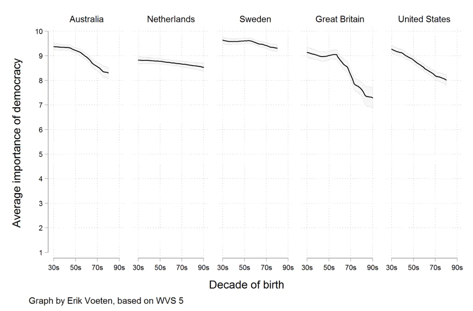
Important relationships between two variables might exist for one group of individuals but not another group. Exploring relationships between variables across a variety of scales and groups is crucial for understanding nuanced relationships. Interactive graphics allow for a convenient way to allow the user to move between scales.
Unfortunately data visualizations can be used to mislead the audience. This section outlines common malicious techniques for lying with data and how to provide transparency that such shenanigans aren’t present.
This course draws information from several websites and books.
Alberto Cairo’s book The Truthful Art. Alberto Cairo is the Knight Chair in Visual Journalism at the School of Communication of the University of Miami (UM), where he heads specializations in infographics and data visualization. You can find more about him at thefunctionalart.com. Also at his website, his blog highlights data visualizations in the news. Many of the graphs I will shown in this class are featured here.
Claus O. Wilke has a book Fundamentals of Data Visualization. There is an online pre-print version of the book available here as well as GitHub repositories for the book source and data used in the book.
He also has a nice R package called cowplot that aids in making publication ready graphs using R’sggplot2.Calling Bullshit This is a 3-credit course taught at University of Washington. Their goal is to teach students to recognize bullshit provide another scientist a reason why a claim is bullshit.
Amelia McNamara’s SDS 136 course. Amelia is an Assistant Professor at University of St Thomas and I’ve been influenced by her presentations at national conferences. These are her notes from a data visualization course that she teaches. She is also pretty fun to follow on twitter.
0.3 Data Sources
The website Our World in Data has tried to bring together huge amounts of information about a variety of topics and presents the data in context. It typically addresses socioeconomic issues.
The website Kaggle started out as a repository for data sets in which data scientists would have host informal competitions. It has grown to host thousands of data sets covering a wide variety of issues.
The Gapminder website has health and socioeconomic data for counties going back in time.
Access data from the US Government from Data.gov
The Centers for Disease Control Vital Stats allows for direct download of commonly used downloads. The CDC’s Wonder on-line access allows you to format data requests for a wide variety of scenarios.
0.4 Introduction
Why visualize data?
- See relationships that raw data obscure.
- Cognitive work to translate raw numbers into context between other data points are already done for you.
- Good graphics translate particular numerical relationships into physical relationships which our brains are really good at processing.
UK Drug Poison These are the data from the UK related to drug overdose and misuse. Farther down the page gives a similar graph on suicide.
While the New York Times is generally really quite good, this graph is quite misleading. Another view of the data is more fair, although the still depressing.
I feel compelled to show a bad 3-d Excel graphic as well.
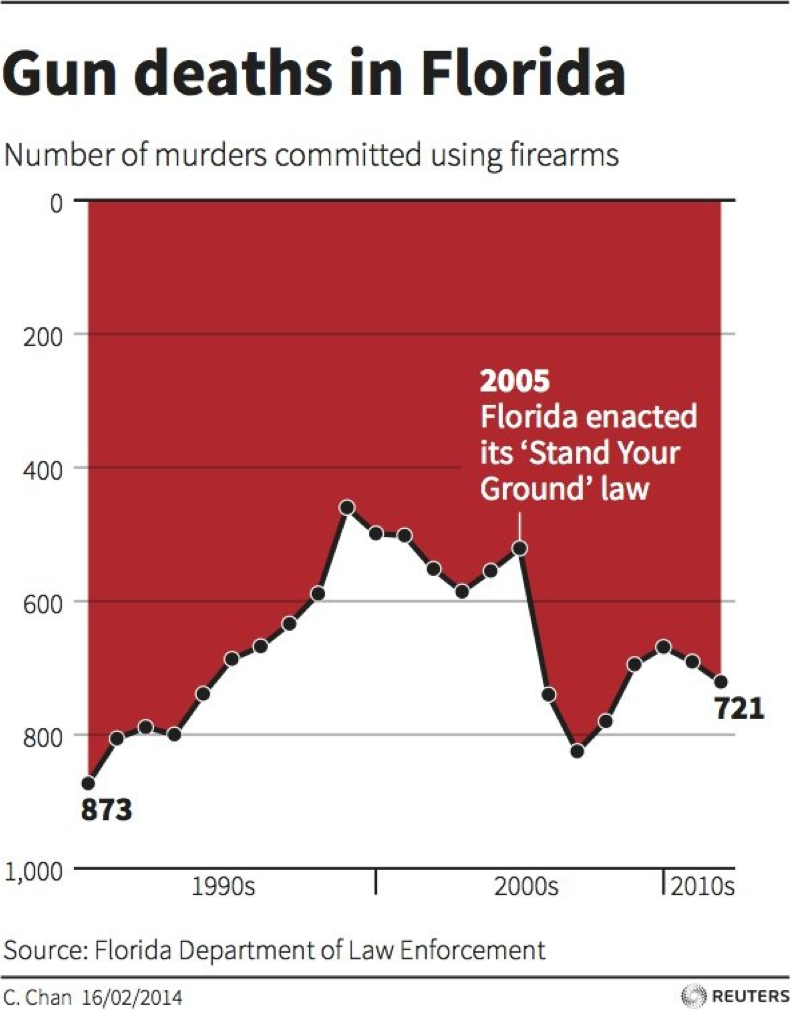
Reuter’s infamous gun deaths in Florida chart.
- Preface - Why use graphs and what relevance to do they have.
- Data organization
- Long vs wide
- pivots
- Unions
- Joins
- Do this in Tableau Prep
- Data Sources
- Aggregations
- Sums and Means tables.
- Calculation Percentages or Proportions
- Within Tableau, do proportions across rows or columns or cell.
- Basic bar charts in Tableau
- Sums and Means in Bar Charts
- Calculation of percentages or proportions
- Within Tableau, do proportions across rows or columns or cell
- Graphing Theory
- Additional graphs
- Scatter plots
- Pie Charts
- Sankey Diagrams
- Mosaic/Tree plots
- Radar plots
- Chloropleths
- Solving Problems
- over-plotting with transparency and heat maps and contour plots
- Excessive clumping and white-space - Log transformation
- Showing variability
- Histograms, Density plots, and boxplots
- Showing CIs - Regression Ribbons
- Cairo’s chapter on not showing variability
- exampel of most searched for phrase by State
- Showing high variability time series with small trend where adding the trend line shows the relationship.
- Maliciousness
- Cherry Picking
- Innappropriate y-variables or encoding - Trumps Red Map.
0.2 Social Media Sources for Graphics