Chapter 2 Data Variablity
In the previous chapter, we emphasized that compelling data should be representative of the population that of interest. We continue that thought process in this chapter but present some pitfalls relating to only focusing on particular observations and ignoring the overall trend of the data.
2.1 Individual Chain Reasoning
This type of reasoning is appropriate for understanding issues associated with particular individuals or situations. The key idea is that if any of the reasoning steps is false, then the entire premise is dis-proven.
For example, in the handling of evidence a forensics lab for analyzing data in a police investigation, the chain of possession of the evidence is carefully documented so as to argue that evidence tampering is impossible. If the documented chain of possession is broken in ANY place, then the evidence is no longer considered reliable.
There are many situations where a single point of failure is a reasonable concern. When protecting building against intrusion, any single point of weakness will be exploited.
Lawsuits around legal contracts often demonstrate this line of reasoning. For example in a housing rental agreement, if one party violates any part of the contract, then they are in “Breach of Contract.” Television shows would have us believe the entire contract is thrown out, but it turns out that it depends on the severity of the breach.
In all of these cases, we are interested in a SINGLE individual or contract and not interested in understanding the general relationship between two (or more) variables and that any single failure invalidates the premise.
2.2 Population Trends Reasoning
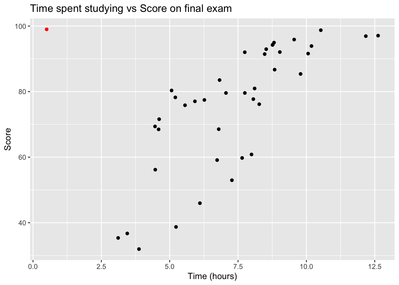
As we try to understand the relationship between variables, we often don’t care about individual data points so much as the overall general relationship. For example, in the following example we have the amount of time spent studying for a final exam vs the students score.

In general, it is clear that there is a positive relationship between the amount of time spent studying and the student score on the final exam. There is some variability among students, but students that study more tend to perform better.
However, there is one student that is extremely unusual (highlighted in red). This student had actually taken some upper division courses but realized she needed to take the introductory course in order to graduate. Nobody would reasonably claim that this student’s performance reasonably invalidates the trend. There are always data points that are unusual and might even be counter to the general trend.
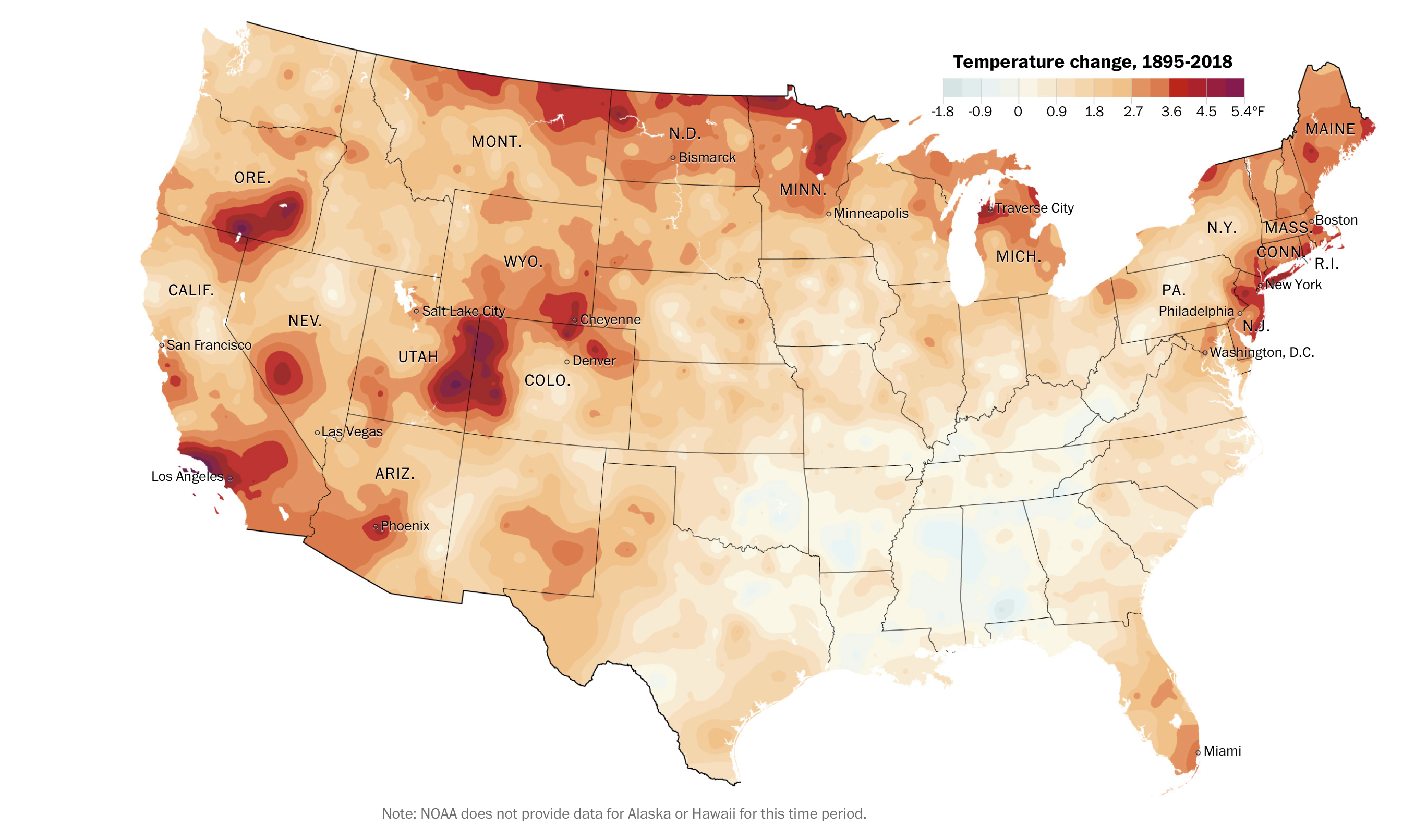
Another example of data variability comes from a US map of change in yearly average temperature from 1895-2018. The data are from the US National Oceanic and Atmospheric Administration (NOAA).

NOAA
The Washington Post has a good article about these data and it allows you to select states and counties that you personally might be interested in.
In general, there has been a strong warming across the United States, with much of the country warming by 1-2 \(^\circ\)F. There are many locations that have warmed by a much larger amount, particularly along the Canadian boarder, Southern California, and the Southern Rocky Mountains. Interestingly, there has been relatively little warming the southern states of Mississippi and Alabama.
If we were using a “Individual Chain Reasoning,” we might argue that for global warming to be true, then EVERY place on the globe would be warming. Following this, we would argue that because Alabama isn’t warming, then global warming is a hoax.
However, climate scientists are well aware that trapping heat in the atmosphere and oceans will change predominate wind patterns, and certain areas could actually cool. Some scientists recognized this as confusing among a lay audience and suggested global weirding as a way to describe that climate change will lead some places to be hotter while others might experience colder cold spells or more violent storms, flooding, and wildfire.
It would be disingenuous to argue that because locations in Alabama are not warming then the entire phenomena of global climate change must be false. Instead, the totality of the evidence should be considered. For example, notice that the scale is not centered at 0 and the “warming” side of the scale has to be A LOT larger than the cooling side of the scale.
2.3 Exercises
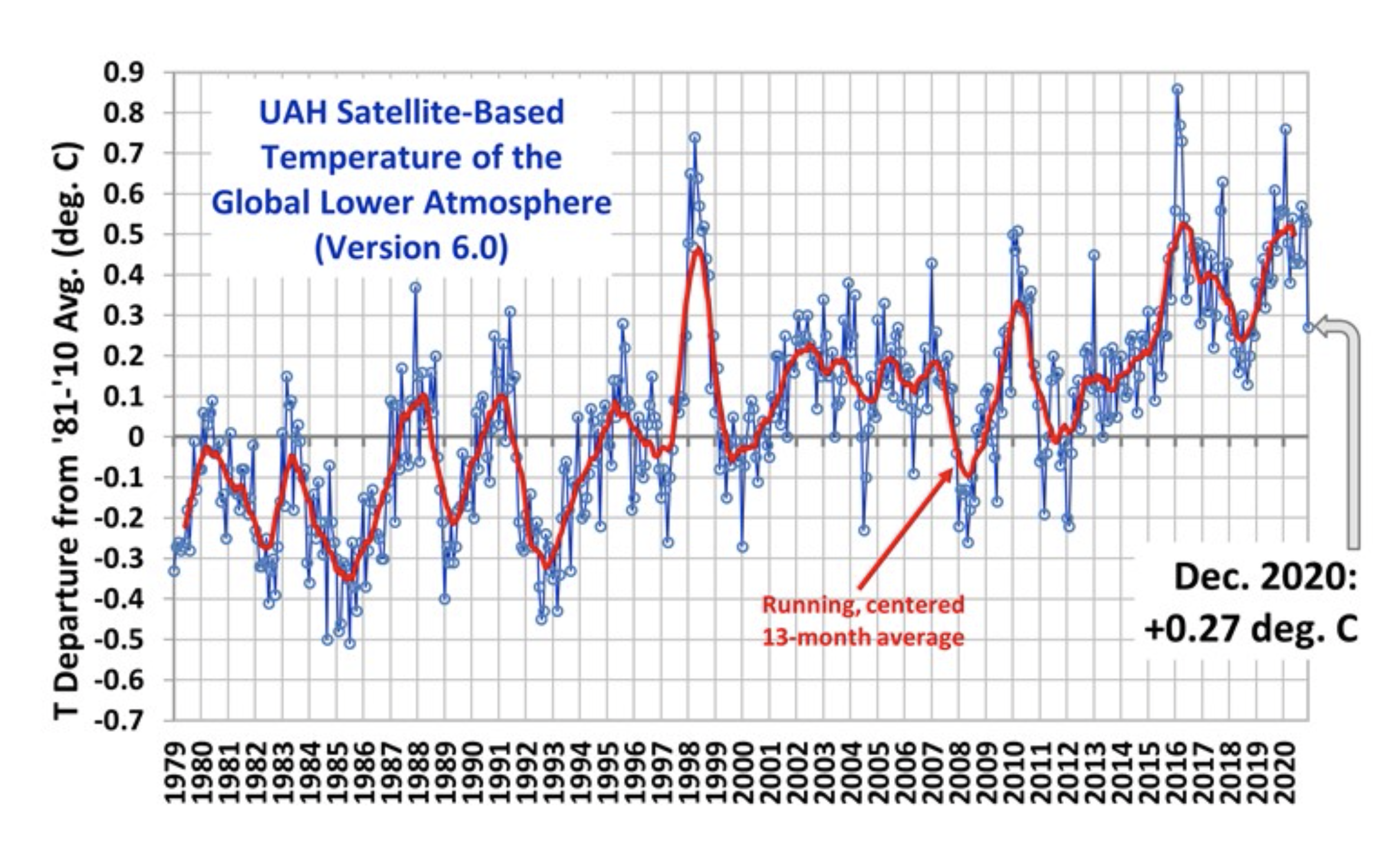
In 2015, Senator Ted Cruz claimed that issues regarding Global Warming were overblown because, for the last 17 years, global temperatures had not risen. That is, the average global temperature in 1998 was higher than the average global temperature in 2015. This reason is quite dubious because it hinges on the year 1998, which was an extraordinarily warm year. Looking at a more expanded time series,

it is clear that his choice to look at the last 17 years (1998 - 2015) was chosen for a reason. What conclusion would he have had if he had considered the previous 15 years or previous 20 years? What period of osscilation (the time between subsequent peaks) in global temperatures is apparent in this graph? Has there been a change in the ossilation?
As of January 12, 2021, eight US Senators (all Republican) have contracted Covid-19. Furthermore, only 17 Democratic compared to 33 Republican House of Representative members have tested positive (3 of the Democrats tested positive after sheltering in-place with Republicans during the Jan 6, 2021 insurrection). Explain why in is not inconsistent to say that there is a clear trend that Republican congress members are more likely to contract Covid-19 (presumable due to behavior rather than unknown biological differences between Democrats and Republicans), as well as there is no guarantees that mask wearing will perfectly prevent transmission. That is to say, refute the anecdotal evidence “My sister Connie always wore a mask and she still got Covid so I’m not going to bother.”
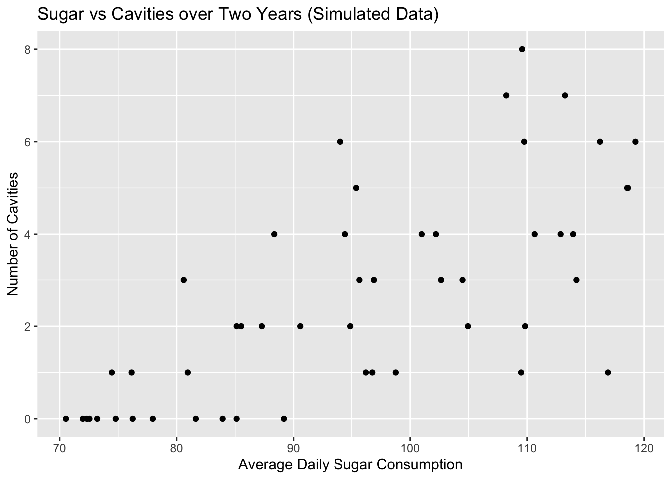
Below is a scatter plot of simulated data that represents the average amount of sugar consumed by a teenager per day compared to the number of cavities the individual had over a two year period.
 Read the Introduction section of the class textbook “How Charts Lie” and compare the
above graph to a similar graph on page 14. Explain the differences in what a single
dot represents and why the above chart has integer values on the vertical axis while
the book’s does not.
Read the Introduction section of the class textbook “How Charts Lie” and compare the
above graph to a similar graph on page 14. Explain the differences in what a single
dot represents and why the above chart has integer values on the vertical axis while
the book’s does not.Of the graphs in the Introduction section of the class textbook “How Charts Lie”, select one graph that you found interesting or surprising. Describe what is being conveyed by the graph and why you found it interesting or insightful.