Chapter 12 Critiques
12.1 Dual Y-Axes
In general, dual y-axes are hard to do correctly, and can be easily used maliciously. Anytime I see a graph with dual y-axes I’m imediately suspicious.
Lisa Charlotte Rost has a great example of how the arbitrary scaling of each axis results can result in unintentionally confusing graphs.
In particular, the relative percent change or the rate of change is now messed up because the slopes on the two axes are not equivalent. Malicious tweaking of the scales would allow us to show whatever we want.
Example. Market share of a particular cookie manufacturer.
12.2 Critique Workflow
- Identify the primary and secondary insights that the graphic is trying to convey.
- Identify the EPTs used and what is confusing or difficult to do.
- Identify how to use more effective EPTs for the primary and secondary insights.
- Identify points of confusion and decide those could be addressed (e.g. an introduction graph or just better annotation)
12.3 General Examples to Critique
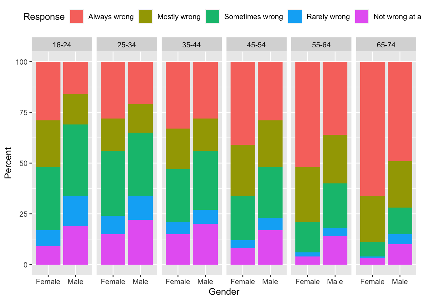
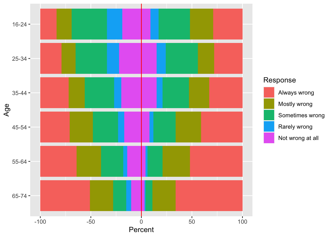
- Attitudes to one night strands compared by gender and age group.
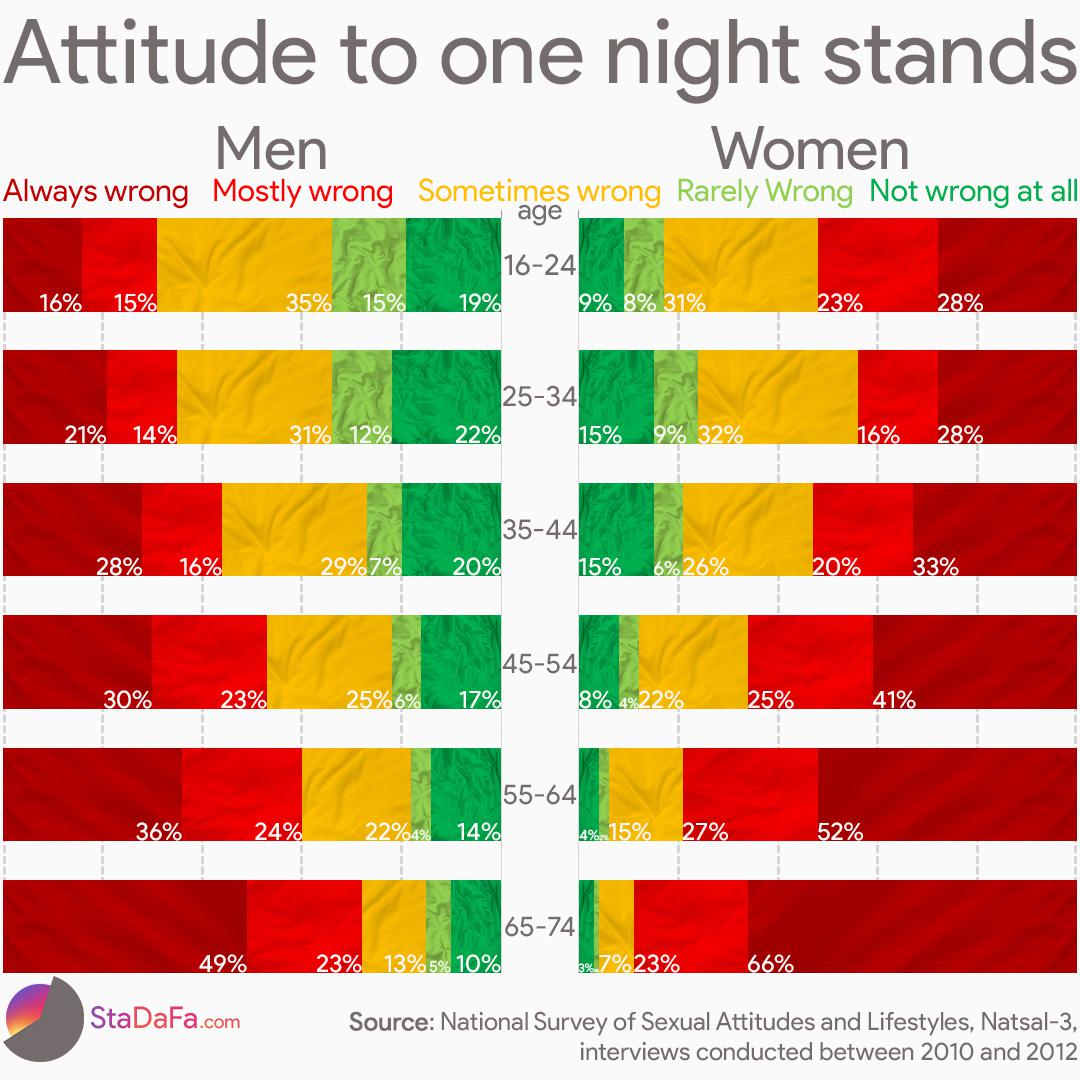
- What are the primary comparisons intended? The secondary? Is this the order you would think?
- What do you think about the texture?
- What about this?
- The following graph received an extradinary amount of conversation.
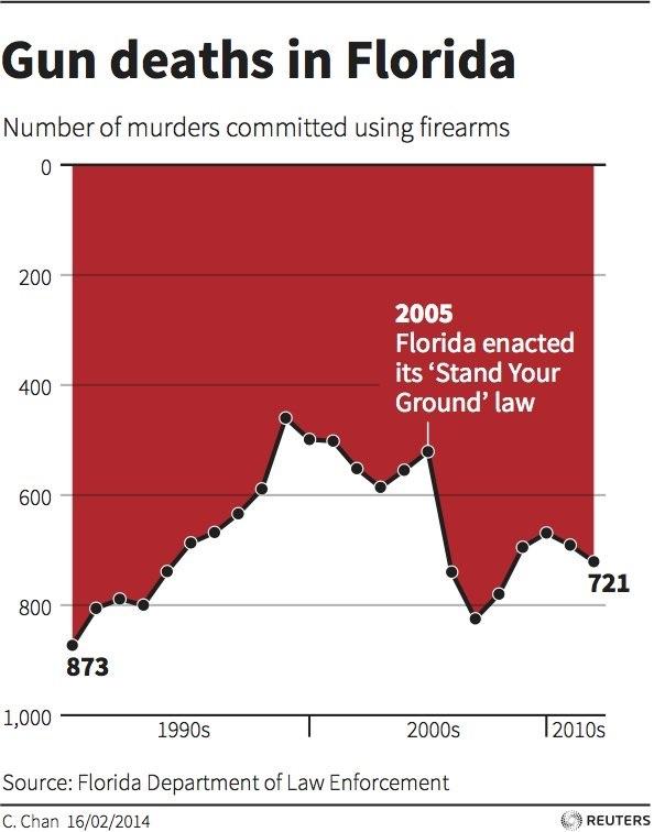
The reason is because the graph designer opted to use a negative y-axis because
murders are a negative thing and the visual impression of dripping blood is
very distinct. However on first glance, a reader would assume that Florida
gun deaths decreased after the Stand Your Ground law was enacted.
Alberto Cairo and
Robert Kosara
both have nice discussions about this graph and a similar one about
deaths in Iraqi.
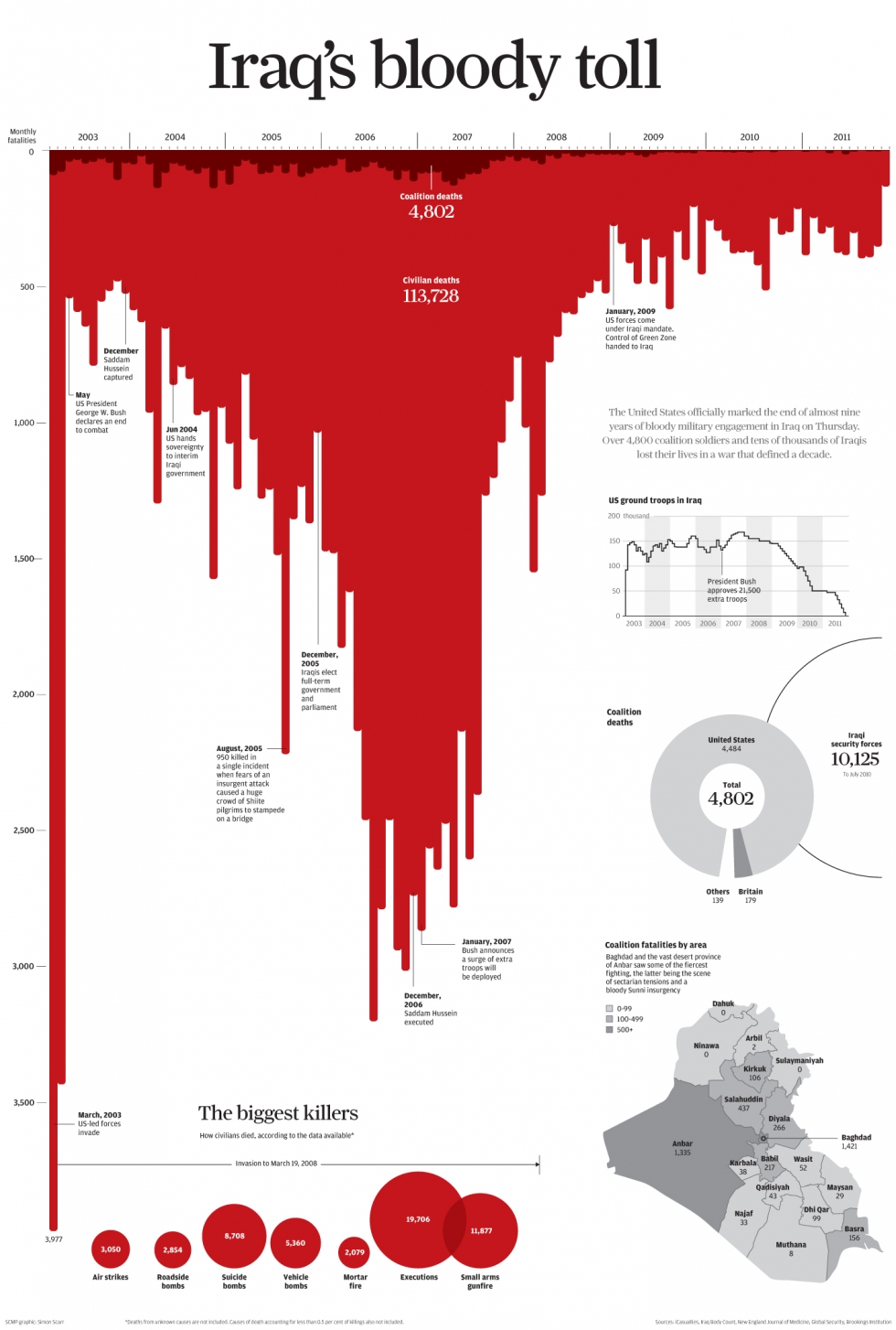 There are two aspects that make this second chart work and the first to be
misleading.
a) The location of the x-axis.
b) Sub-graphics and annotations taking up the background space which clearly
differentiate the foreground and background.
There are two aspects that make this second chart work and the first to be
misleading.
a) The location of the x-axis.
b) Sub-graphics and annotations taking up the background space which clearly
differentiate the foreground and background.
90 Years of Gender Inequality in Canadian Politics (1930-2019).
- Deputies are elected members of the House of Commons.
- Ministers are similar to the US Cabinet members. These are senior members of the ruling party and each Minister is also a House of Commons Deputy.
- What do the dots represent?
- A person, a seat?
- Why do the dots turn black and then fall out? Why do new dots show up?
- What could help this video?
- Are dots the right choice?
- What about a pie chart over time?
This New York Times article on the discrepancy in Covid-19 vaccination rates between the rich and poor countries makes a subtle use of a log10 transformation on both the x and the y axes.
Color gradients - Many different states use color coding to indicate a level of risk. For Covid-19 those color scales have varied quite a lot from state to state.
- Green for low risk and Red for high risk is fairly common.
- How many risk levels should there be? 3-4 is probably all we can handle.
- Green -> Yellow -> Red is intuitive for this scale simply because of traffic lights.
- But a number of states do other things:
- Oklahoma: Green -> Yellow -> Orange
- Alabama : Green -> Yellow -> Orange -> Red
- Colorado : Green -> Blue -> Yellow -> Orange -> Red -> Purple
- North Dakota : Blue -> Green -> Orange -> Red -> Dark Red
- Utah : Different Shades of Blue!
- New Mexico: Tuquoise -> Green -> Yellow -> Red
More Scrollytelling! Again we are zooming out to a wider and wider perspective.
- https://www.nytimes.com/interactive/2019/11/06/us/politics/elizabeth-warren-policies-taxes.html
- The adding of dots is pretty cool and visually striking.
- But comparison among the plans is challenging. By looking at area covered by the dots, we get a sense of this, but area is really far down on the EPT scale.
- The graphs omit critical information that is in the text. For example Warren’s plan for Medicare For All raises most of its funding by subverting corporation payroll that previously went to insurance payments. So much of yellow dots isn’t new costs on employees or employers.
Scrollytelling! The Gates Foundations 2019 Report.
- https://www.gatesfoundation.org/goalkeepers/report/2019-report/#ExaminingInequality
- Initial graphic sets the stage, and indirectly the order of discussion. Font sets the tone that this is not data, but rather an idealized visualization.
- Scrollytelling is the zooming.
- Annotation on demand!
Fonts indicating uncertainty (This is a pretty new idea!)
- Washington Post article
- Races that are considered competitive are circled in a handwriting font to indicate that the notion of “competitive” is subjective.
- A journal article about “sketchiness” as a visual attribute of a graph mark.
- Do you think a gradient scale of sketchiness would work? Or is it a binary on/off stylistic choice?
- Not widely available in graphing packages.
Other Methods for indicating variability
- Background distribution.
- Error Bars / Error Ribbons
- Predictive hurricane tracks are a classic issue of needing to display uncertainty.
12.4 Historically Significant Graphs
12.4.1 John Snow’s Map of Cholera Outbreak
The Germ Theory of Disease did not become the commonly accepted scientific consensus about disease until the mid 1880’s. Prior to that, Miasma Theory that held that diseases—such as cholera, chlamydia, or the Black Death—were caused by a miasma (μίασμα, Ancient Greek for “pollution”), a noxious fomr of “bad air,” also known as night air. The theory held that epidemics were caused by miasma, emanating from rotting organic matter. In London 1854, a cholera outbreak in SoHo neighborhood the physician John Snow stopped a cholera) outbreak by keeping careful records of deaths by cholera and mapped them. The striking observation to be made from the map is that some houses had many cases of cholera and others had very few (notice the near-by brewery). If cholera was being spread by noxious air, then we should expect that people would be equally likely to be infected. A break-through came in the form of a female cholera patient who had sent her servant to fetch water from the water well in the SoHo neighborhood because she preferred the taste. With the only common thread being the well, John Snow removed the pump handle and the epidemic ground to a halt. It would later be shown that this well was It would eventually turn out that the well was contaminated by a old cesspit, only 3 feet away.
12.4.2 Florence Nightingale’s Rose Plot
Florence Nightingale kept detailed records about deaths in a military hospital during the Crimean War (1854) and believed that the conditions of the hospital were partly to blame for the death of 4077 soldiers (10 times more died from disease than from their wounds). Her coxcomb graph helped show the change in mortality after a sanitation commission flushed out the sewers and improved ventilation. Also in that same time, Nightingale implemented hand washing and other hygiene practices to the hospital.
She combined these and other graphics into a report to the UK Royal Commission Mortality of the British Army (1858) clearly showing how many more soldiers die due to lack of sanitary conditions.
12.4.3 Space Shuttle Challenger
The space shuttle Challenger exploded due to o-rings not sealing the rocket boosters. Engineers working on the launch warned that due to the cold weather predicted on launch day, there could be an issue.
As NPR reported
The night before the launch, Bob Ebeling and four other engineers at NASA contractor Morton Thiokol had tried to stop the launch. Their managers and NASA overruled them. That night, he told his wife, Darlene, “It’s going to blow up.”
It isn’t clear exactly what got presented at that meeting, but subsequent investigations revealed temperature information presented in a non-optimal format.
The graph below gives information about each pair of rocket that had flown and
if they had experienced O-ring failure as well as the temperature at which the
rocket pair had flown in.
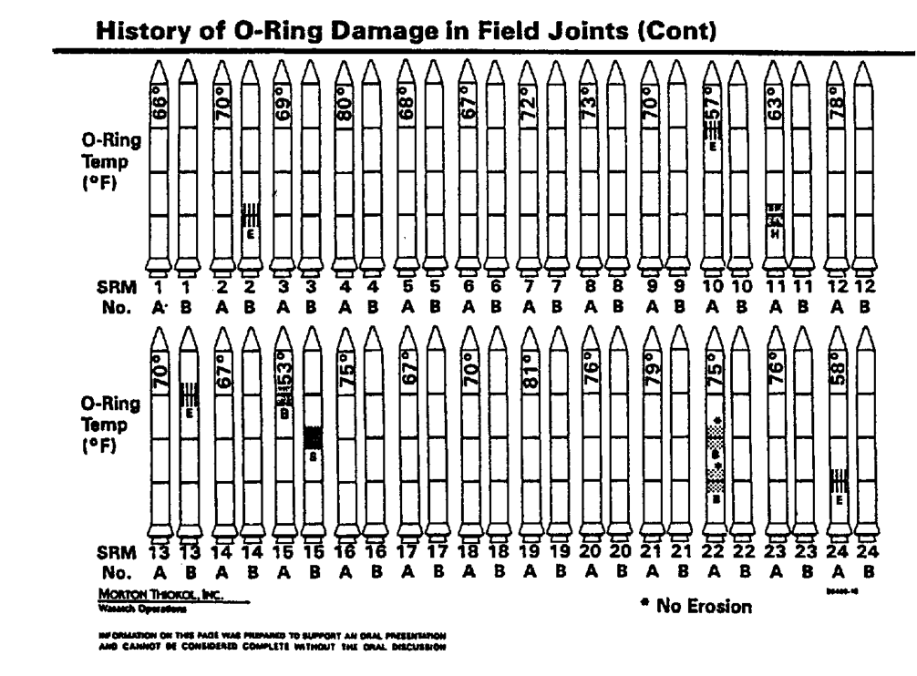
This second graph gives the relationship between temperature and number of O-ring
failures but inextricably neglects to include the flights with zero failures.
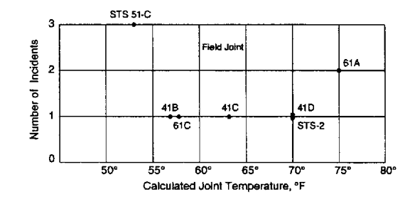
The alternative visualization given below is much clearer and perhaps would have resulted in a different decision.
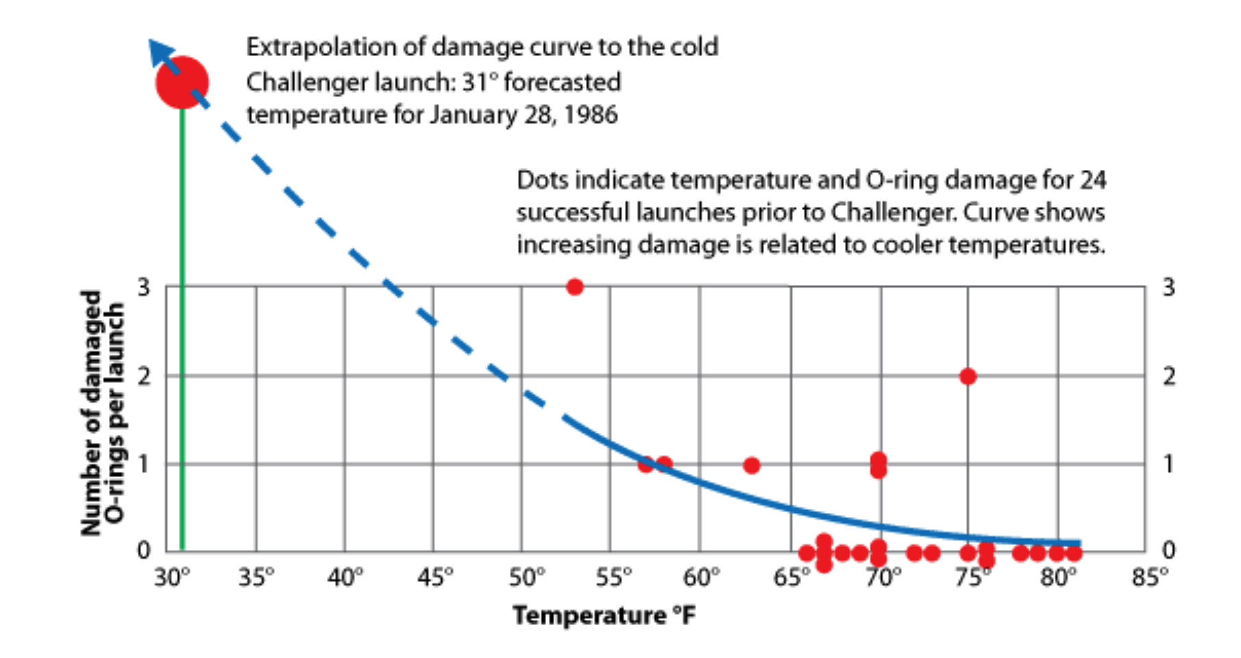
A slightly longer description of these is available here and a full novel-length investigation here.
12.5 Awesome xkcd graphs
12.6 Examples of bad graphs
- Example Here we examine another case where the same quantity is show using two different EPT scales and they do not agree.
- Example This is an Obama administration graphic where the graphic design considerations were put before the data visualization considerations.
- Example This is an example of trying to take data and make it “look” like a chart.
- Example Another example of taking raw percentages and pasting them onto a pie chart without making the area of the slices correspond.
- Example This is talking about cricket scores for various teams and to indicate the team city, they added the most iconic building from the city. Does the area/height/color of the building indicate anything?
- Example Here an analyst compares the stock prices of Tesla and Netflix, but cherry picks certain time points to try to conflate the recovery of Netflix with his prediction of the future of Tesla.
12.7 Cherry Picking Issues
Gish Gallop: A debating technique that attempts to overwhelm the listener with as many arguments as possible without any regard for accuracy or coherency.
Alberto Brandolini’s Law of Bullshit Asymmetry: The amount of energy necessary to refute bullshit is an order of magnitude larger than to produce it.
Cherry Picking: Selectively looking at data that supports your position while ignoring evidence that is counter to it.
Example This simplistic graph shows the change in the number of abortions vs cancer screenings done at Planned Parenthood disregards the increases in other services
For another example of all of these, check out this opinion article published by the Washington Examiner. Notice you can click on the highlights to see the commentary by climate scientists that took the time to discuss what the best scientific consensus is on each point. It is exhausting.
- Climate change can’t be true because:
- In 2019, Ted Cruz claims there hasn’t
been any global warming since 1998
- This claim is based on Satellite data from 1997-2012. Those years are chosen very carefully. He further considers only satellite data, which is widely considered less accurate than ground station data. Broadly, scientists use satellite data only when there isn’t reliable ground measurements.
- After the satellite data has been aligned with the more accurate ground measurements, the “pause” he refers to disappears even with the highly optimized start/stop points of his pause interval.
- On the wider time scale, there is a clear upward trend.
- In 2019, Ted Cruz claims there hasn’t
been any global warming since 1998
- Climate change can’t be true because:
- Regions in Georgia have cooled since the early parts of the 1900s!
- Yes but the rest of the country has warmed.
- Also, 1934 was the 2nd hottest year in the US, so comparing present day to the hottest part of the country in that particularly hot year results in seeing no increase.
Be careful to recognize specific intervals or specific measurements. Ask questions like:
- Does the time interval presented represent all the data, could the author have expanded/contracted the time window?
- Are there other relevant sources of data we aren’t talking about?
- Is the effect consistent across sources of data?
12.8 Final Projects
- Pick a social data visualization challenge from any of the following:
(the list order is in order of ease of finding visualization submissions and
ease of data wrangling needed.)
- Reddit’s /r/dataisbeautiful page had a monthly Data Viz competition for about two years before the momentum died. For each monthly challenge, submissions were posted on the monthy thread.
- On Twitter, there is a #TidyTuesday project that has been running for 4 years. The original datasets can be found in a GitHub repository. The difficulty in using this is that to find submissions you have to search through Twitter posts. For example to find submissions on the Traumatic Brain Injury data set, I search Twitter for “#TidyTuesday Traumatic Brain Injury TBI” and found several submissions. The #TidyTuesday datasets might involve more data wrangling as the projects are intended to help people learn to do both data wrangling and visualization.
- The website Kaggle has a huge number of public data sets and individuals are free to submit an analysis. Often these take the form of data wrangling and a machine learning algorithm, but there is often some very insightful visualizations.
- Pick several submissions and do a critique of them. Pick at least one bad submission, two mediocre submissions that you can say both good and bad things about, at least one very good submission.
- Create a comprehensive story, creating at least 3 graphics, that a reader would be able to follow. This info-graphic should be for mass consumption among adults, so pay attention to good annotation and labeling.
- Create a report in the same format as the first project that includes your critiques and that describes your thinking in how you decided on the graphs you produced and the revision process you used to simplify and polish your final graphs.