Chapter 6 A Survey of Graph Types
6.1 Introduction
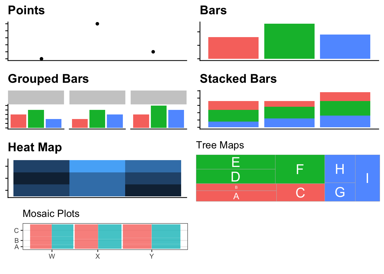
This chapter focuses on displaying a single numerical variable versus one or more
categorical variables. To display the quantitative variable, we’ll try to stay at
the top of the EPT tasks and the quantitative variable will be quantified with
either the x or y axis or using length. The exception to this is the heatmap,
where the quantitative variable is encoded by the color of the tile.
6.2 Example 1
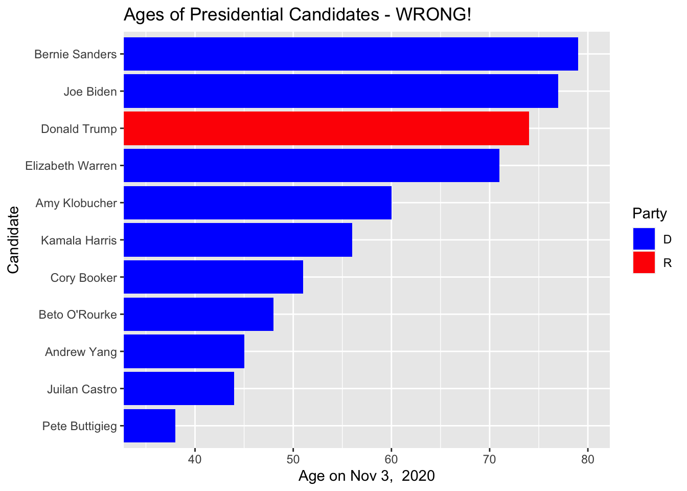
The 2020 presidential candidate field has a wide range of ages. The New York Times has a nice article showing the candidate ages. I grabbed a few of the most prominent candidates and pulled their birthdays from Wikipedia and then calculated their age on election day. As usual the data is available on the Github pages for this book.
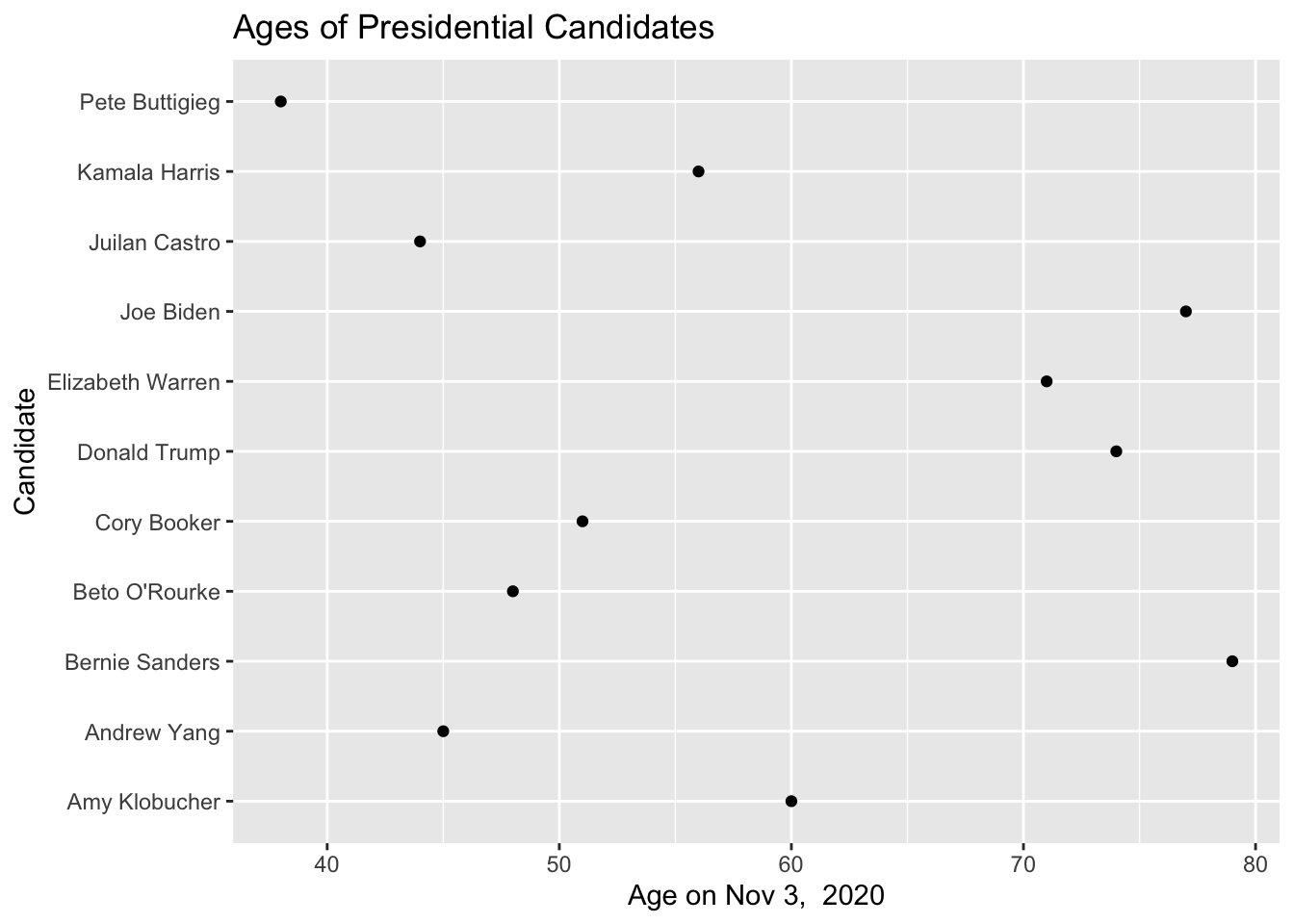
The order of the candidates is useless. Here we have ordered them alphabetically when we should try to think about an ordering that improves clarity. Lets switch to sorting the candidates by age.
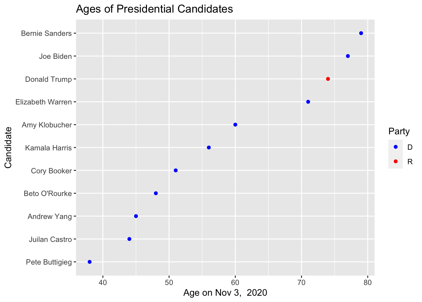
This isn’t too bad, but it fails to visually impress the differences. A bar chart should visually impress the ages based on the length of the bar so that we don’t have to keep looking at the Age axis.
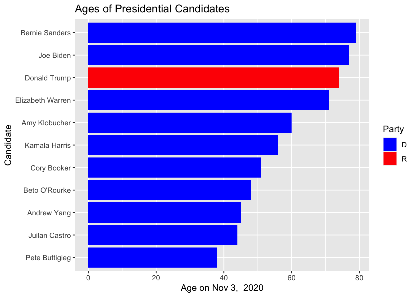
What would be dishonest is if we were to chop off the bars at 35 or 40 to make the age difference between Buttigieg and Warren, Trump, Biden and Sanders seem huge.
6.3 Example 2
In this section we’ll consider two categories. We have the results from a survey administered to students in an introductory statistics class at a New York university. We’ll compare the number of student responses broken down by year in school and gender.
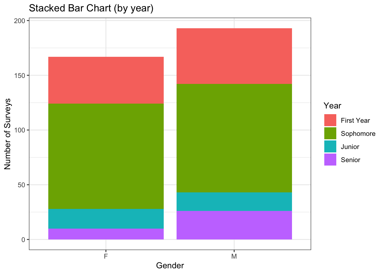
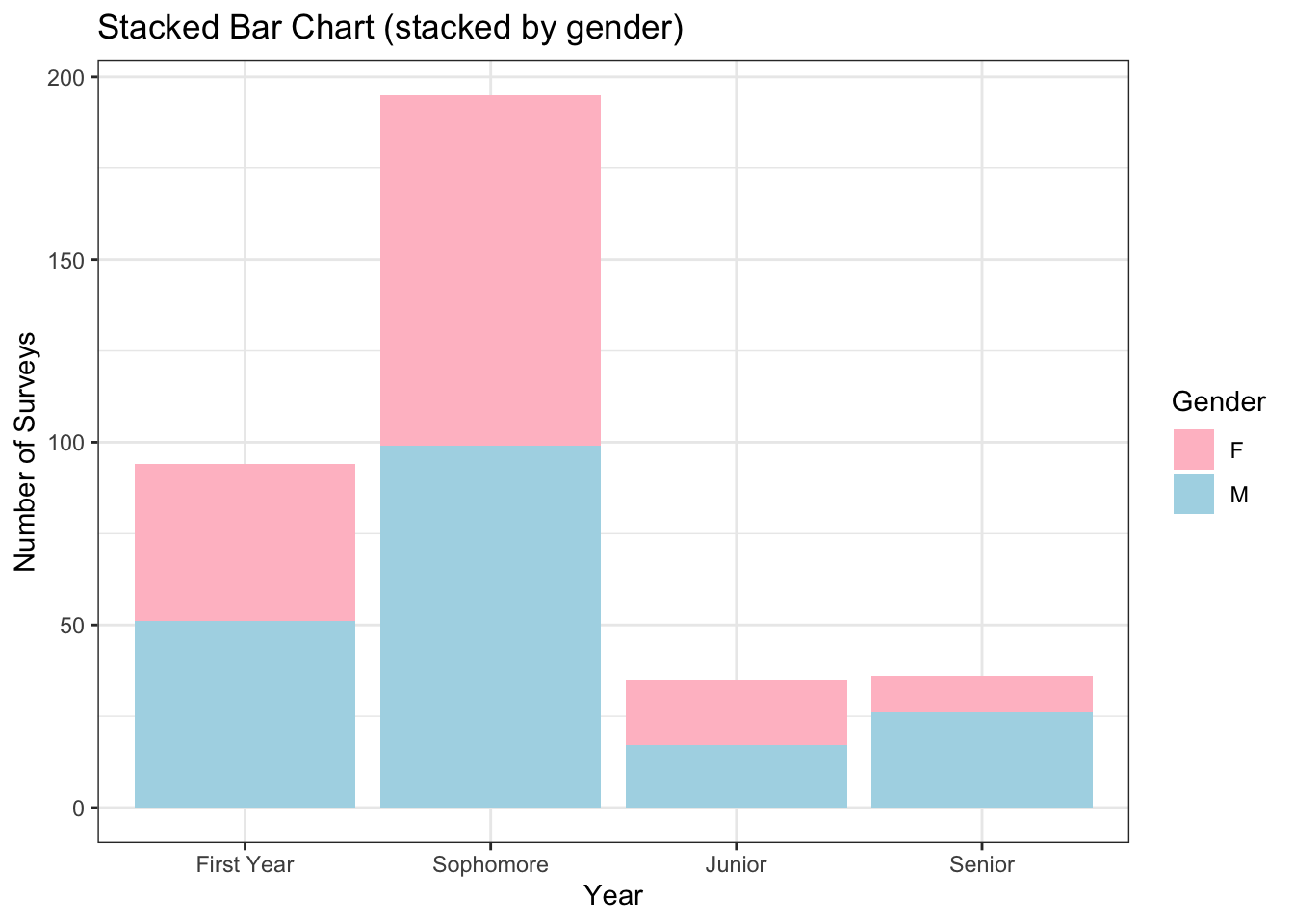
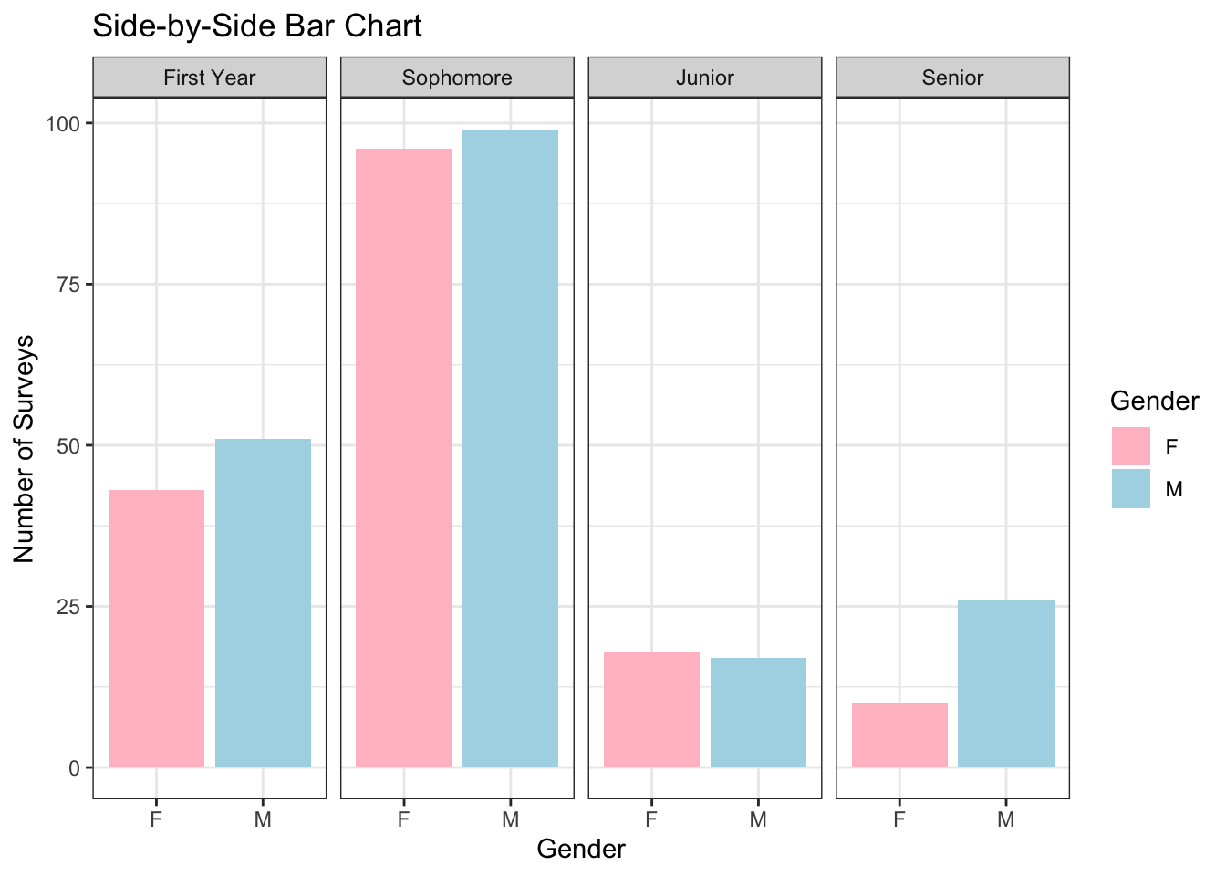
The first thing I notice is that there is approximate gender equality, but there are a few more males in class. After a more detailed look, I see that the most abundant class is sophomores, followed by first years, and juniors and seniors are approximately equally abundant. If we switch the grouping order and use color to denote gender and columns to denote the classes, the abundance of sophomores is the first insight to be noticed.
6.4 Example 3
Often we need to graph some value and want to know how it varies among two different categories. In these cases, we have to employ some sort of grouping strategy.
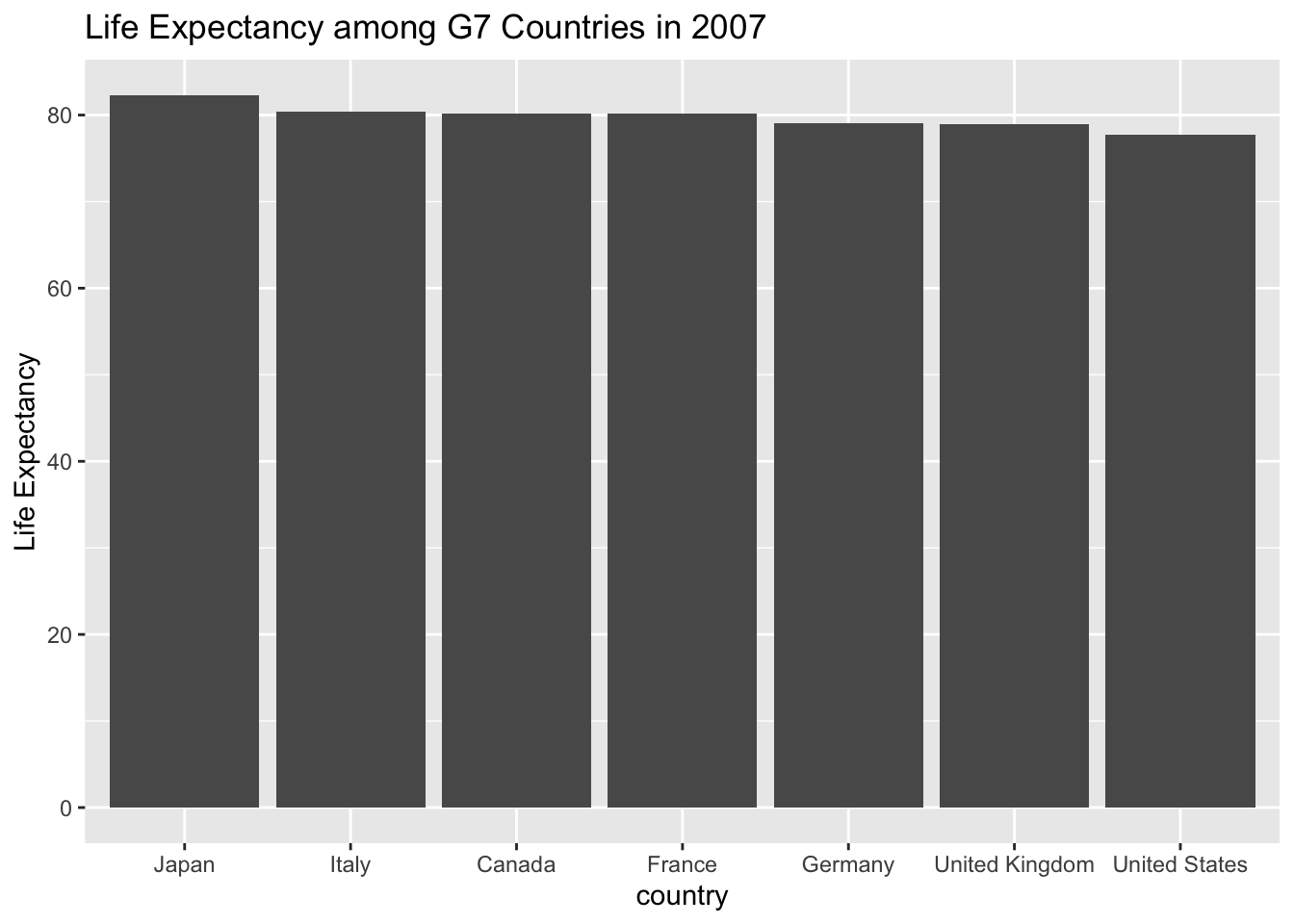
The bar chart here is obscuring the differences in life expectancies because the numbers are so close. In this case, I think points make more sense. Also I want to see how life expectancy has changed since World War II.
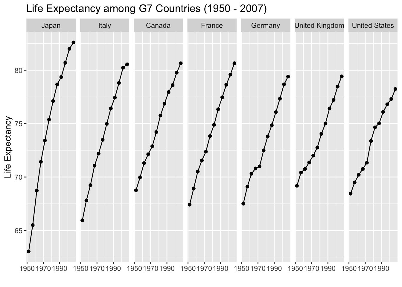
In the above graph, I am grouping countries both by enclosure and with a physical path connection. The reader tends to see the line as a whole object and compare the line max/min and slope among the seven countries.
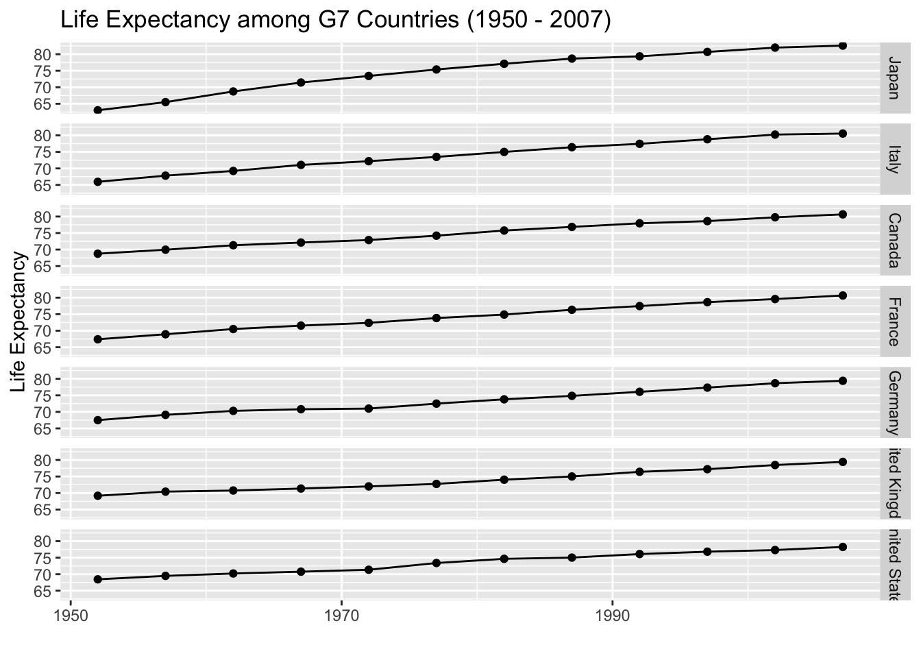
We might consider changing the faceting to stack the countries, but this makes
it much harder to compare countries to see which has a higher life expectancy.
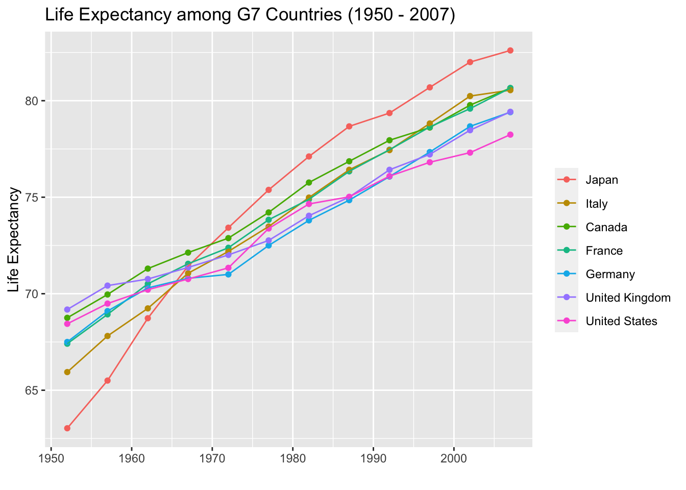
We could have also used color to indicate which country is which, but this produces a bit of a spaghetti plot and is difficult to interpret. However, it is easier to identify when Japan’s life expectancy surpassed the rest of the G7 countries.
A heat map makes it easier to see which country has the highest life expectancy,
but we lose precision in the actual values.
6.5 Proportions
Conceptually graphing proportions is the same as graph raw values, but sum to 100%. This seemingly small difference means that our graphic can imply that our categories contain ALL possible categories.
6.6 Single Set
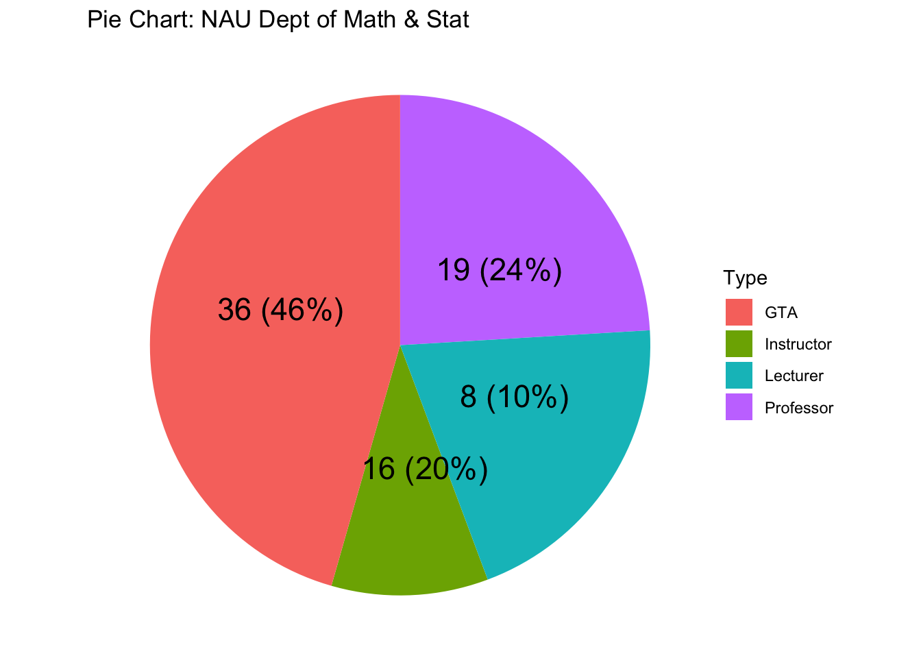
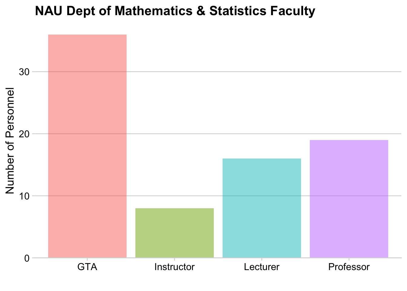
6.6.1 Pie Charts
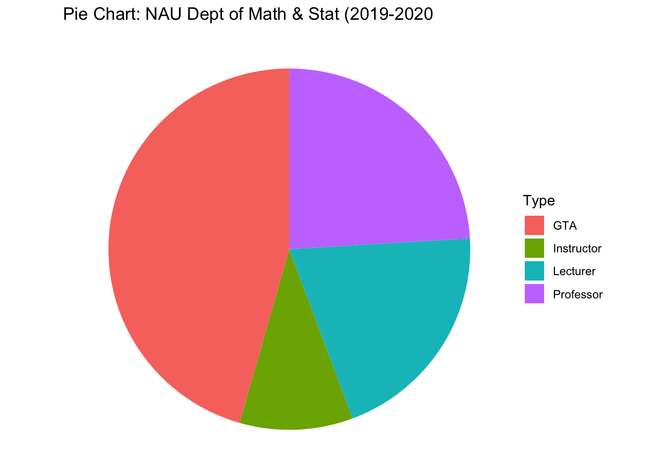
As typical, with a just a few categories, we should move the labels onto the graph and just annotate the graph. Also, we’ll order the categories from the most temporary employees (Graduate Teaching Assistants) to most permanent (Professors).

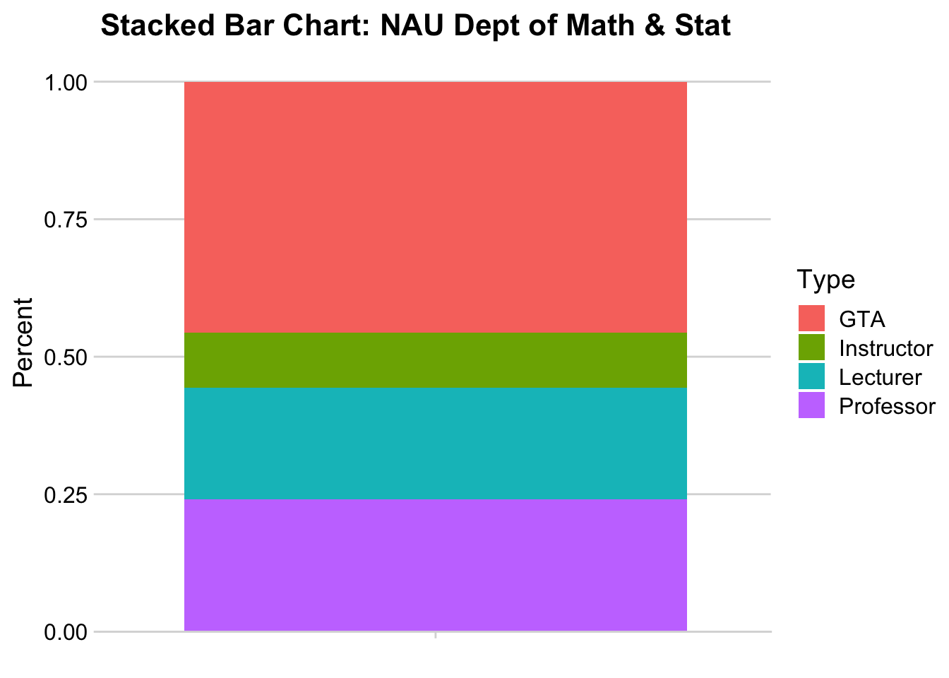
6.6.2 Stacked Bar
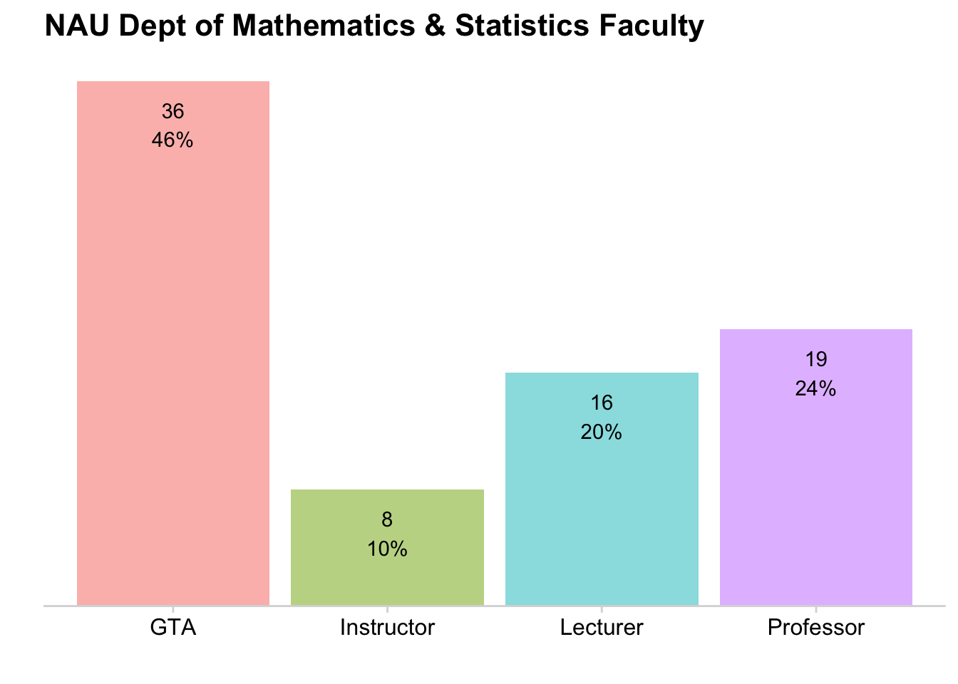
6.6.3 Side-by-side Barchart
| Pie chart | Stacked bars | Side-by-side bars | |
|---|---|---|---|
| Clear that data is proportions of a whole | Yes | Yes | no |
| Precise visual comparison of values | no | no | Yes |
| Visually appealing even in simple comparisons | Yes | no | Yes |
| Extendable to nested or multiple distributions or time series | no | Yes | no |
6.7 Multiple Sets of Proportions
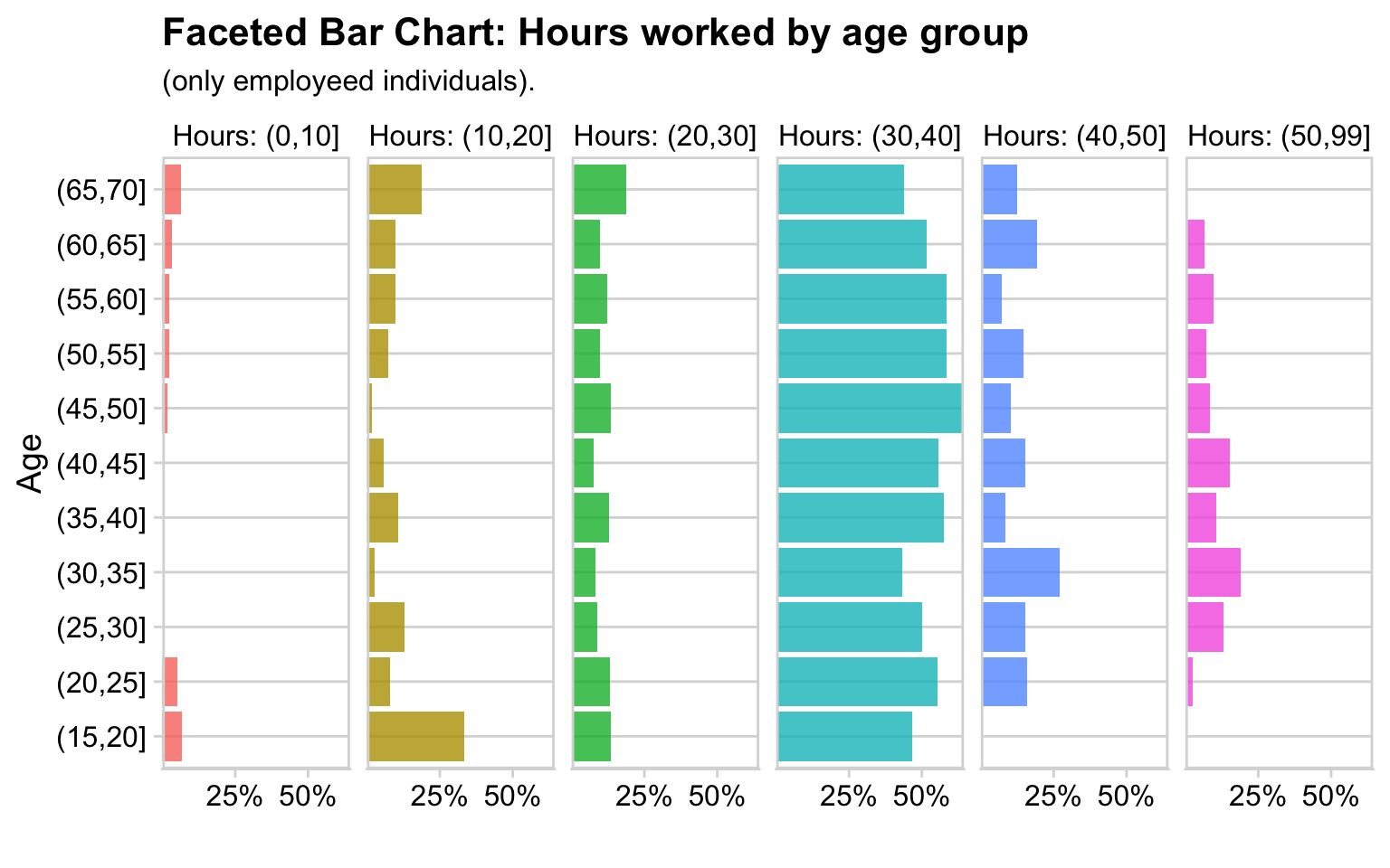
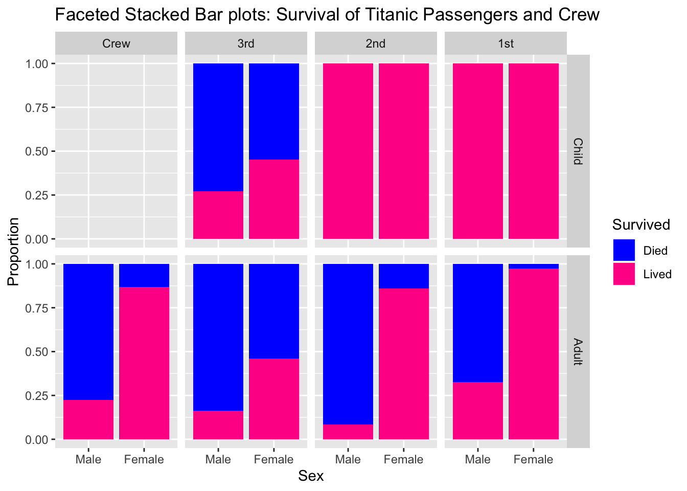
6.7.1 Faceted Bar charts
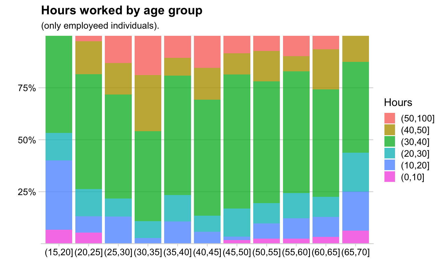
6.7.2 Side-by-Side Stacked Barcharts
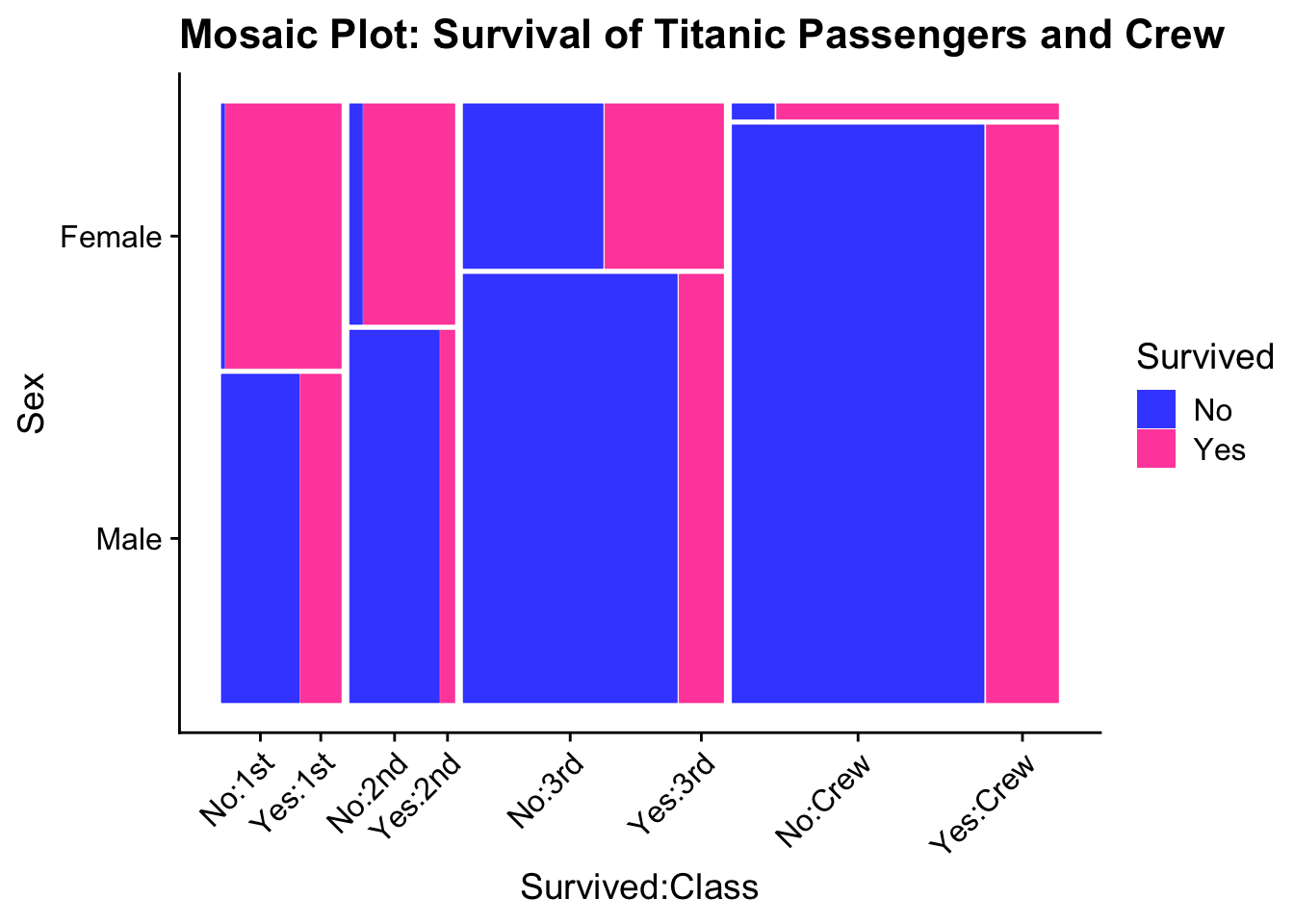
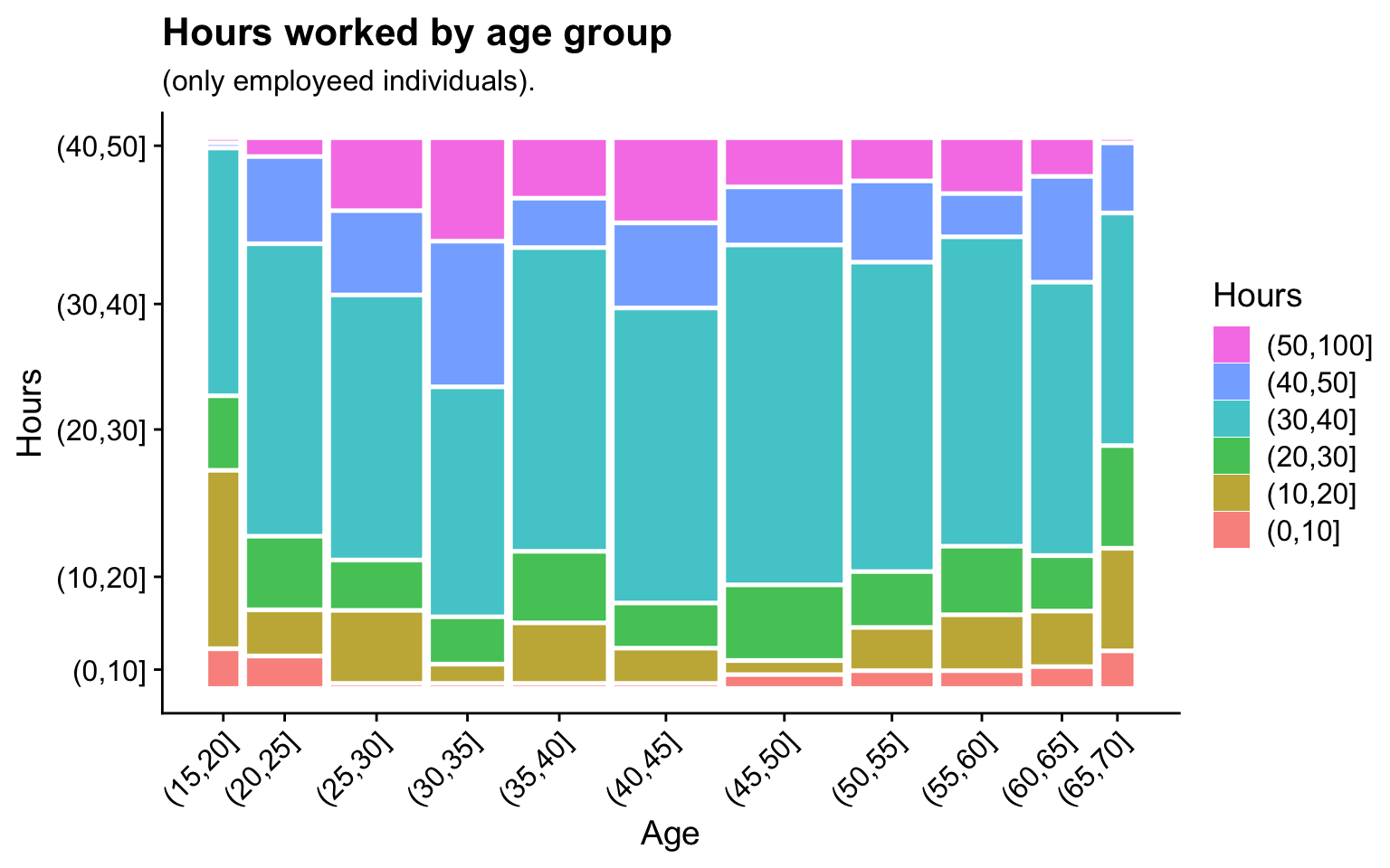
6.7.3 Mosiac plots
Sort like side-by-side stacked bar charts, but now we allow the column width to
vary as well. The area is proportional the groups representation in the whole data.
This reduces the number of really thin bands because we can make the column
narrower as well.
6.7.4 Alluvial Plots
If we want to compare multiple categorical variables, another option is alluvial plots.
I find that alluvial plots work better for events that have a definite chronological order and there is less stream overlaps. Here is an example from a Washington Post story about people graphing their online dating interactions.
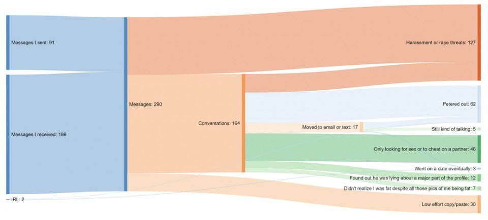
These are the results of 6.5 weeks of online dating by a 37 year old woman.
6.7.5 Tree graphs
In mosaic plots, we had crossed variables where every category level of one factor could show up with all levels of another factor.
| Factor.1 | Factor.2 | value |
|---|---|---|
| A | w | 4 |
| A | x | 6 |
| B | w | 15 |
| B | x | 25 |
Another possibility is that the variables are nested such that a category level of the second factor only ever occurs within a single level of the first factor.
| Factor.1 | Factor.2 | value |
|---|---|---|
| A | w | 4 |
| A | x | 6 |
| B | y | 15 |
| B | z | 25 |
When we have a hierarchical structure of categories, then mosaic plots aren’t
quite right. Instead we’ll hierarchically subdivide the graph area up.
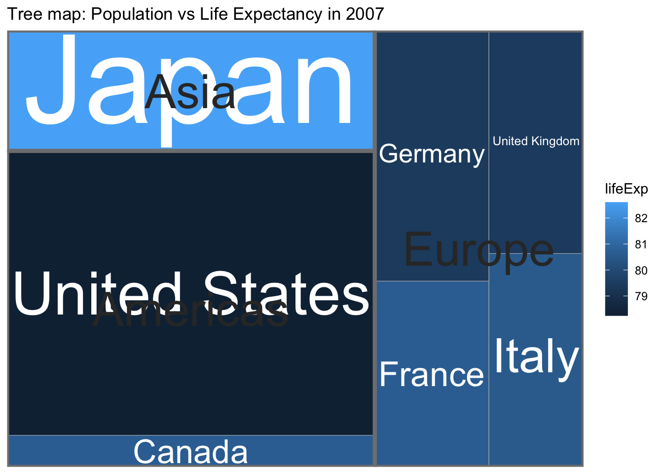
The graph first separates the graph into continents and scales the area of each continent by the population of the continent. Then each continent is split into the countries that compose the continent, again with area representing population. Finally the countries are color-coded by their 2007 life expectancy.
This differs from a mosaic plot in that a country only occurs withing one continent whereas in a mosaic plot, a category level will occur in multiple “containers”.
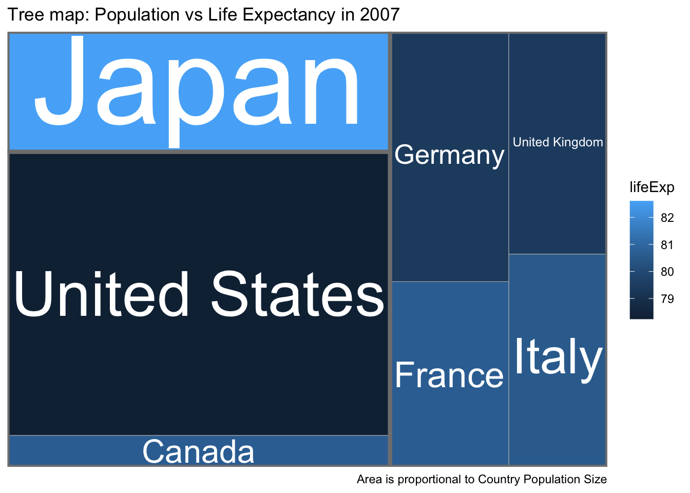
The previous graph is pretty ugly because we are trying to code two quantitative variables (population size and life expectancy). We’ll concentrate on population size. Instead of using text to indicate both the continent and country, lets use text for the country and color for continent and size for the population size.
6.8 Exercises
Alluvial plots are a particular type of Sankey graphs which show flow rates and amounts and have been around for quite some time. In 1869, Charles Minard created a graphic that details the size of Napoleon’s army as they marched on Russia and subsequently returned. You can find the original or the modern English translation on Wikipedia.
- How many men did the army start marching with?
- How many men arrived in Moscow?
- How many men died crossing the Berezina River on the return trip? (approximately from the map information provided)
- How cold was it when they cross the Berezina River on the return trip?
Read Chapter 10 and 11 in Claus Wilke’s Fundamentals of Data Visualization book. In chapter 11 he presents several different graphics that visualize the bridge construction era, bridge material, and which river they cross for bridges near Pittsburgh, Pennsylvania. Discuss three of them and explain which graph you prefer and why.
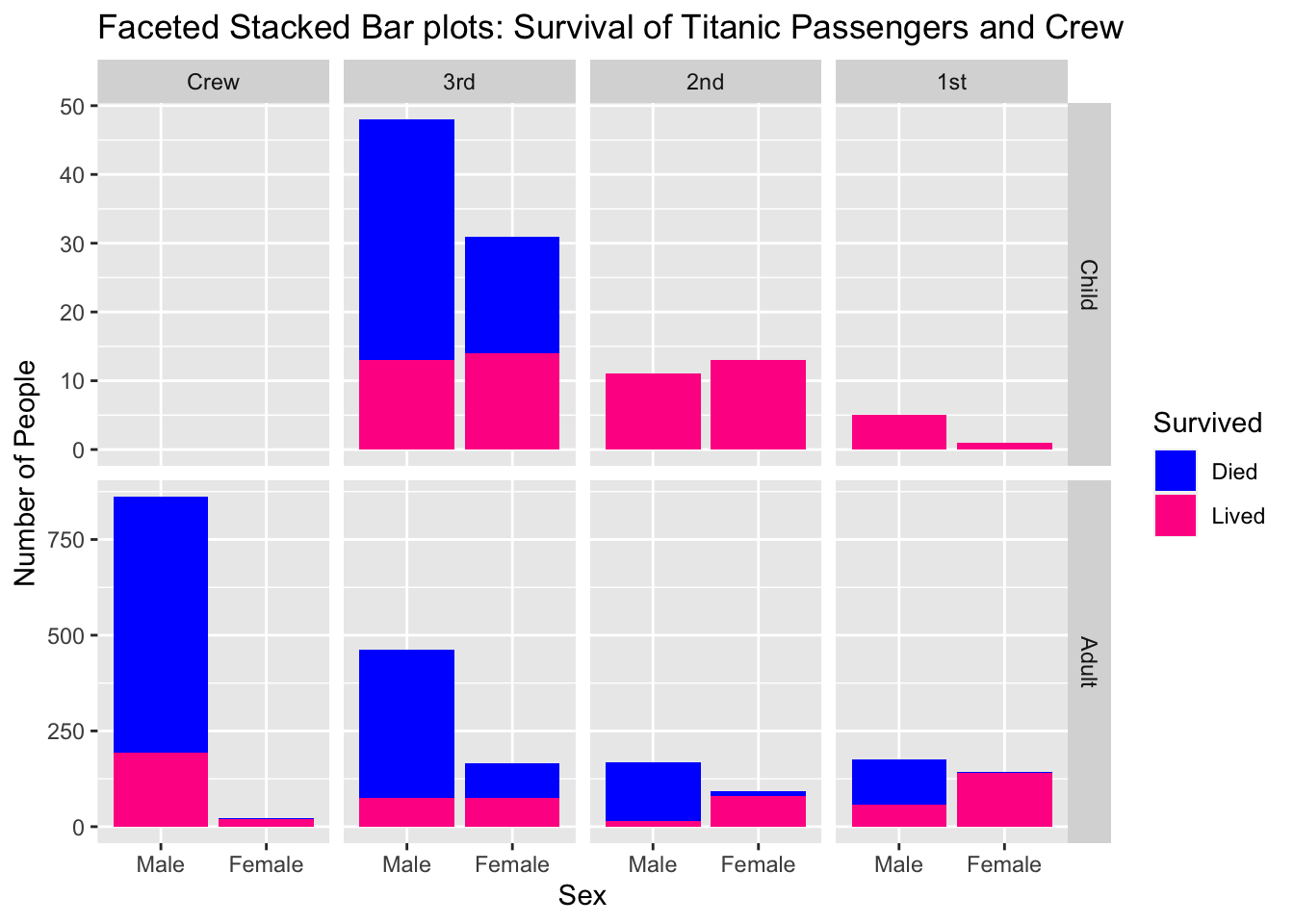
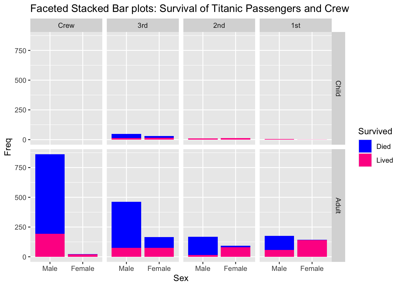
Download data about the Titanic disaster at the GitHub site for this class. Save the file as a
Titanic.csvand open it in Tableau.- In Tableau, create a faceted stacked bar chart just as we did in these notes.
- In a new worksheet, copy your faceted stacked bar chart and then turn it into faceted pie charts.
- Comment on which you prefer and why.
- Finally create a mosaic plot of the Titanic data set.