Chapter 5 Graphing Principles
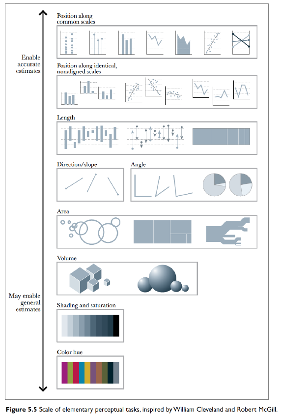
Some visual tasks are easier than others because our visual processing evolved to do certain tasks. Our visual cortex is well developed to compare heights and spatial relationships. We do well comparing 3 or 4 colors, but are terrible distinguishing 8 or more colors. We are also bad at comparing areas and volumes as well as comparing heights when there isn’t a common reference point.
5.1 Elementary Perception Tasks
We can break basic graph reading tasks into a hierarchy of tasks that range between very quick and precise to extremely difficult.
From Alberto Cairo’s “The Truthful Art”
Ideally we will create a graph that utilizes tasks that are easier compared to tasks that are harder.
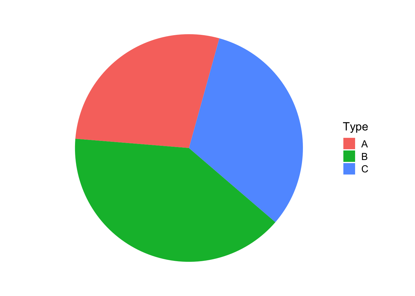 Which graph is Type is larger? Is it Type B perhaps? Between the other two, which
is larger? This is not easy to tell, but in the following graph, the answer is
obvious because we can compare the heights of the bars relative to a common axis.
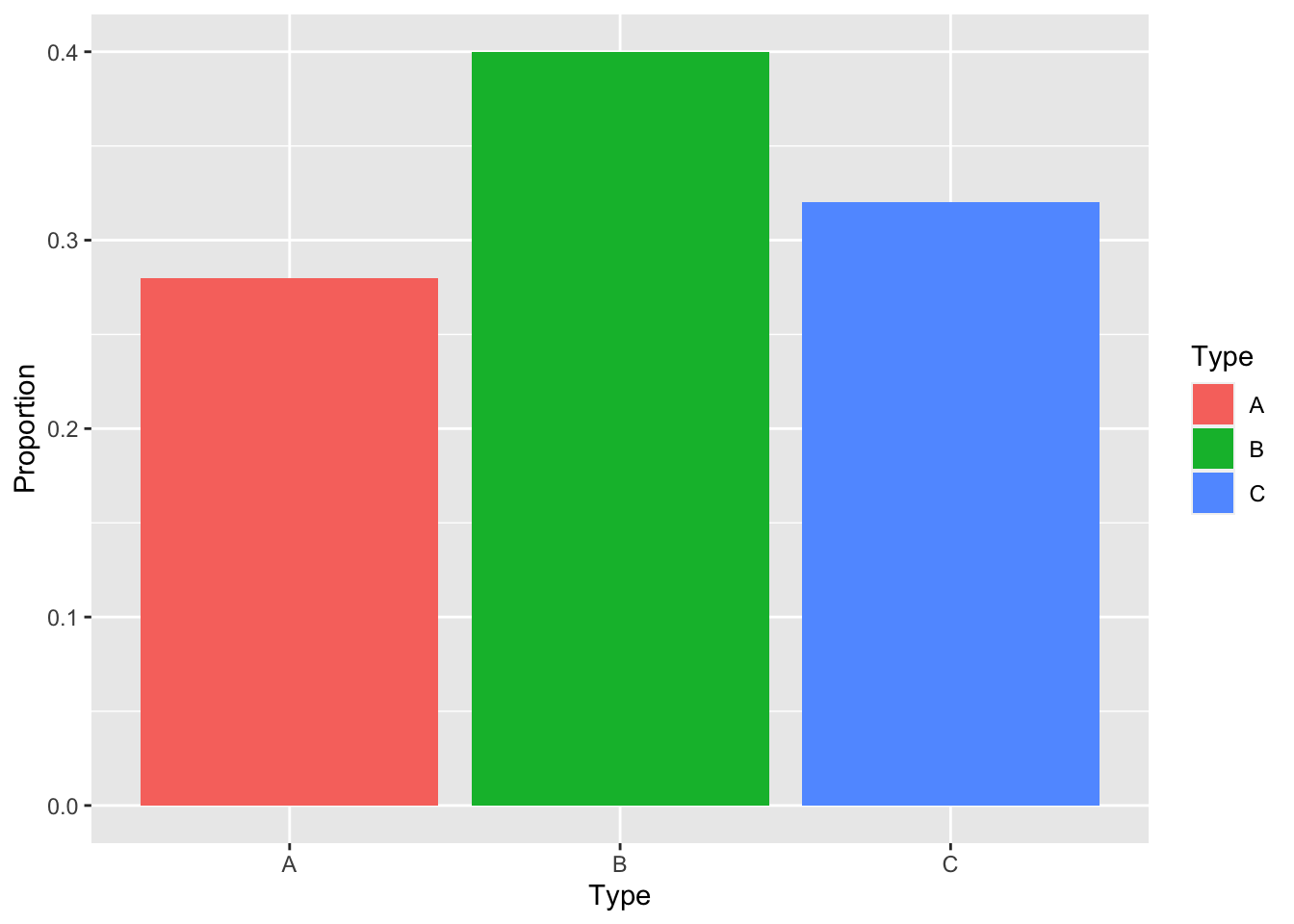
Which graph is Type is larger? Is it Type B perhaps? Between the other two, which
is larger? This is not easy to tell, but in the following graph, the answer is
obvious because we can compare the heights of the bars relative to a common axis.
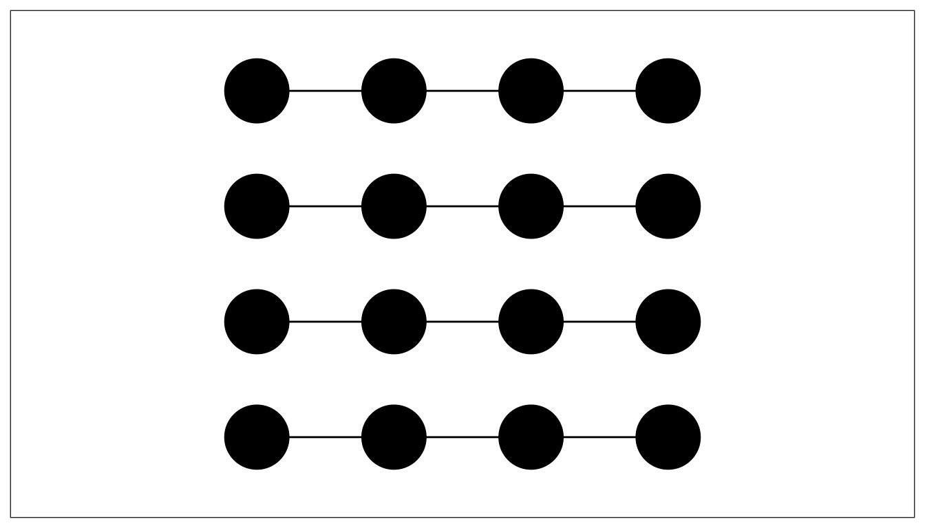
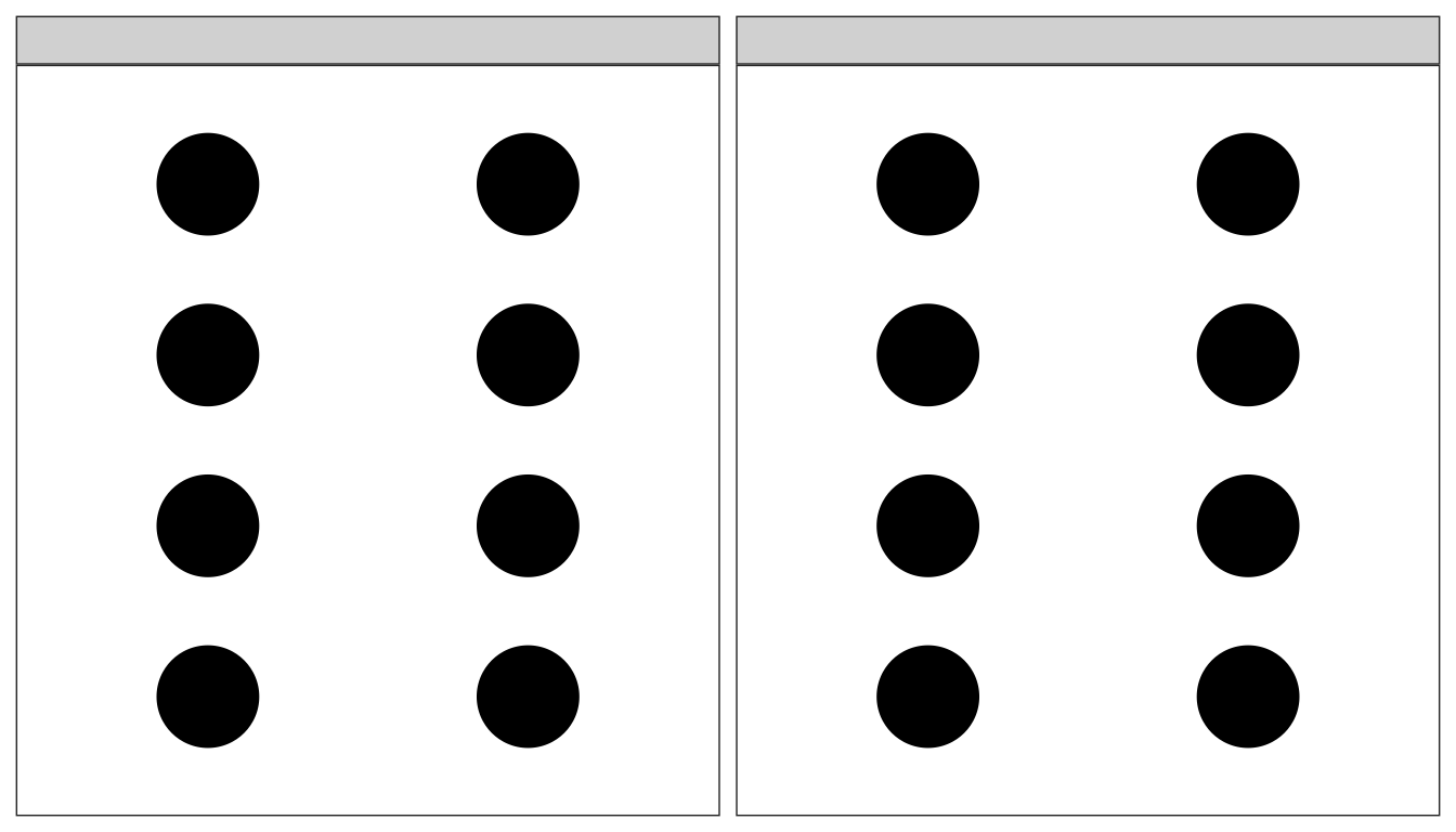
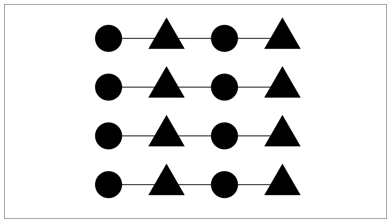
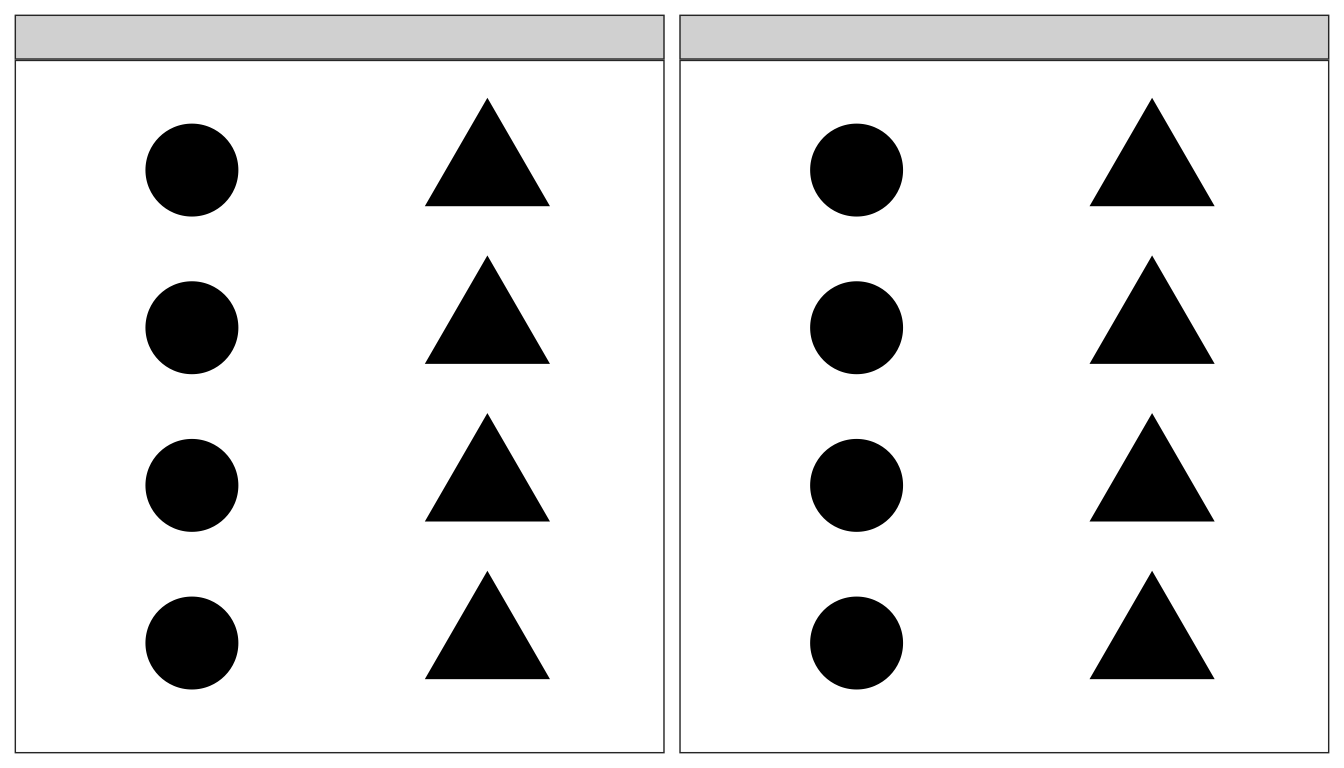
5.2 Groupings / Gestalt
The way we organize our graphics can lead a viewer to create mental groups of marks.
The way we form groupings can be in one of the following ways, (where higher grouping methods produce a stronger grouping effect.
- Enclosures
- Connections
- Proximity
- Similarity (color is better than shape)
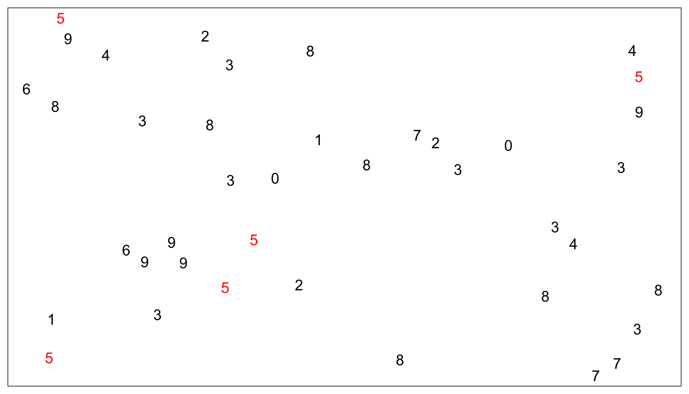
In the following example, find all the fives:
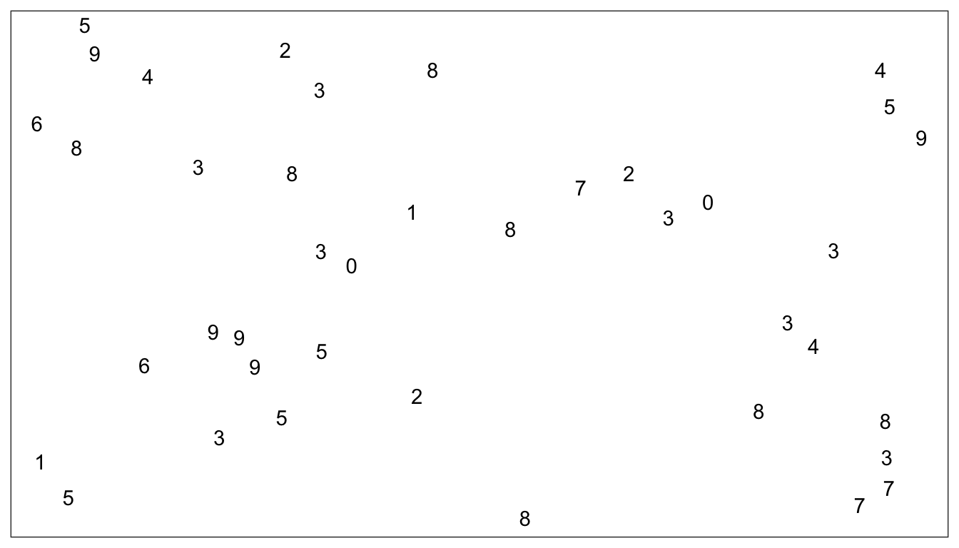
If instead, we form a grouping by adding color, then the group of fives stands
out prominently.
 This example was inspired by an example by Alberto Cairo.
5.2.1 Grouping Examples
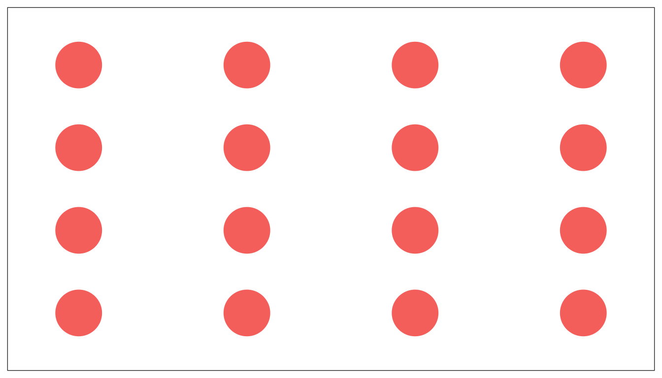
In the following examples, ask yourself what the visual grouping the graph is encouraging? Are the rows or columns grouped? These are taken from a presentation by Todd Iverson and Silas Bergen.
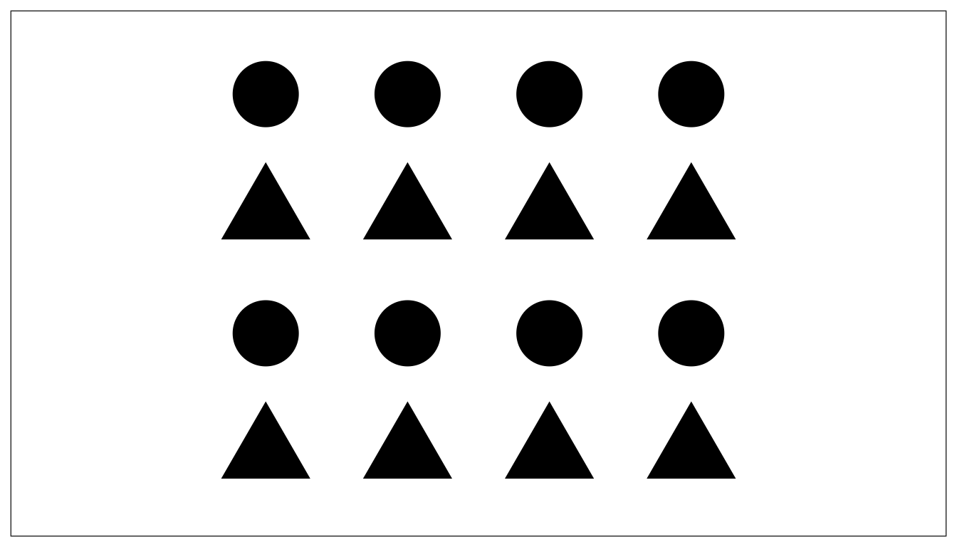
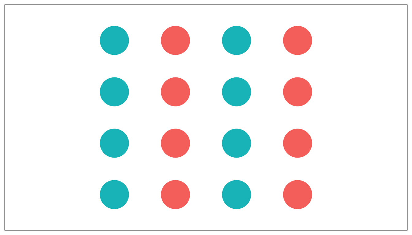
Notice in this example, we have two levels of grouping.
Some grouping is stronger than others
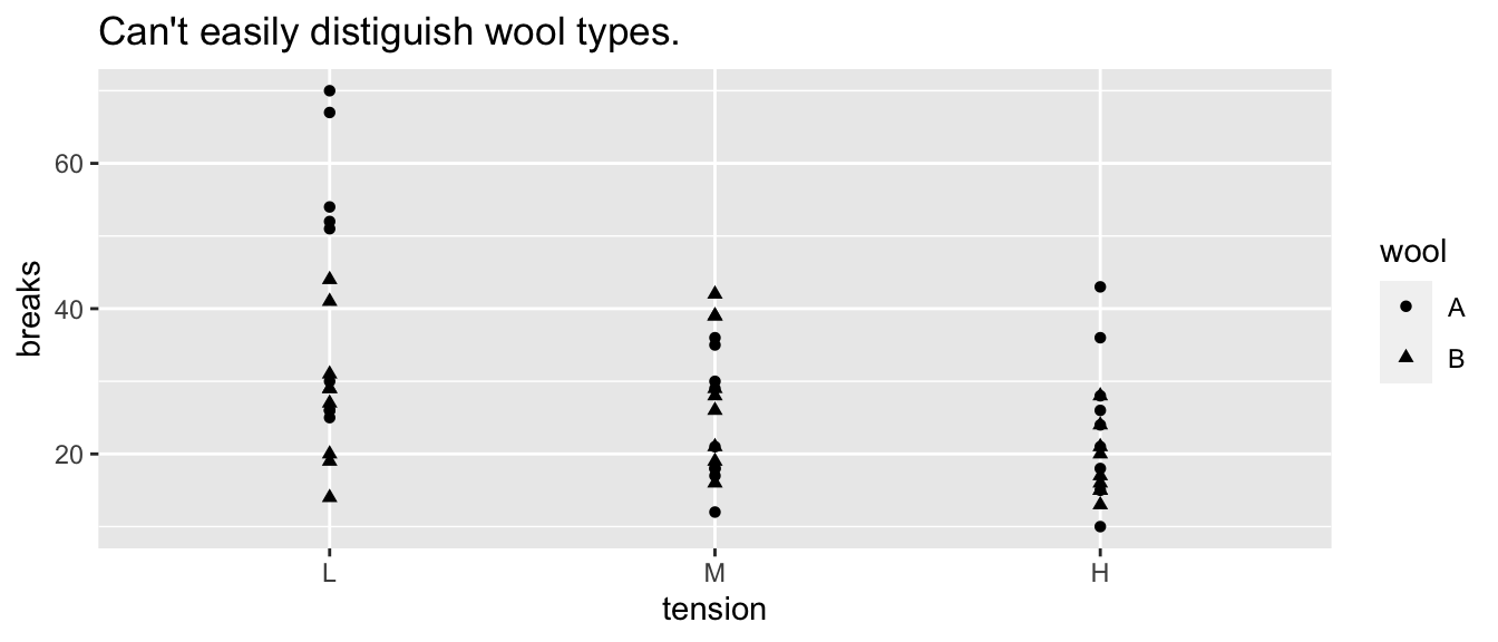
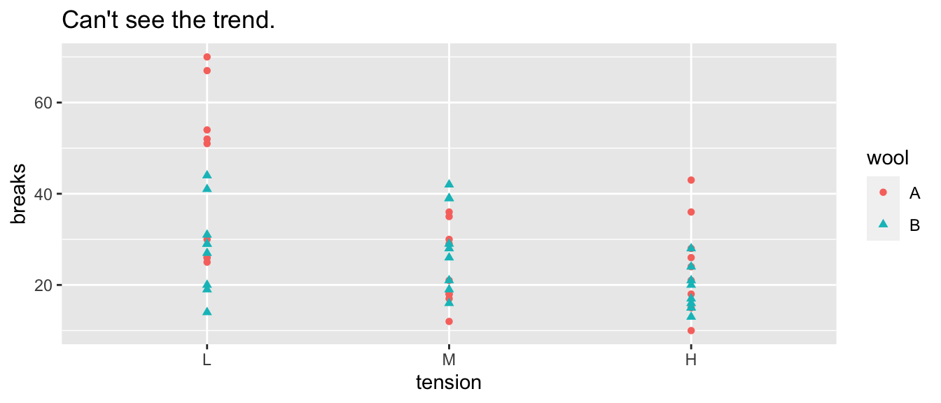
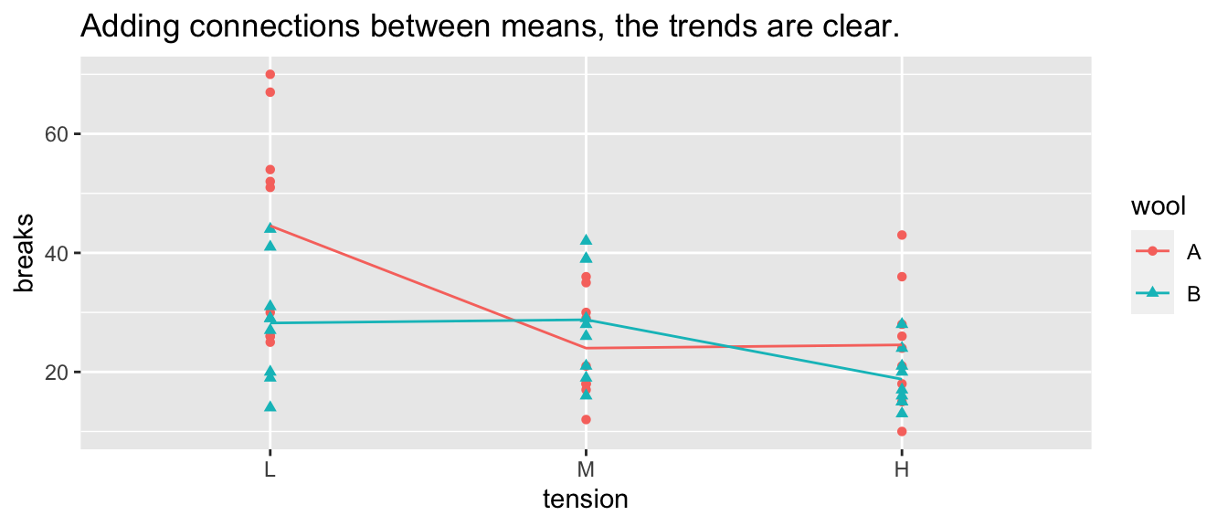
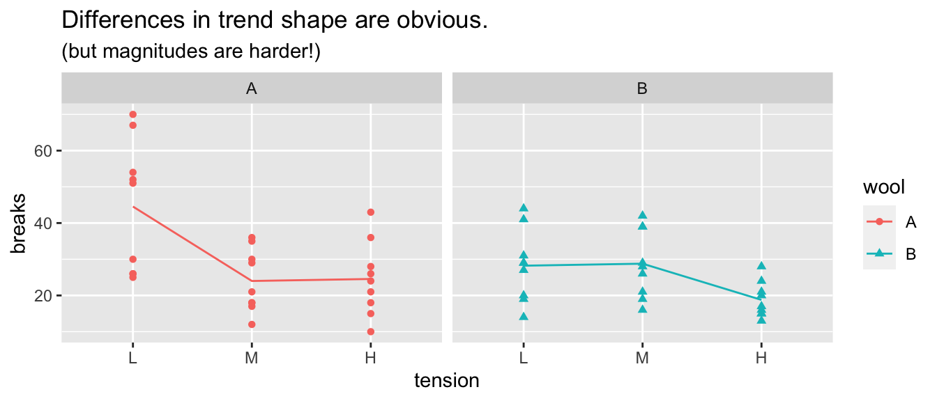
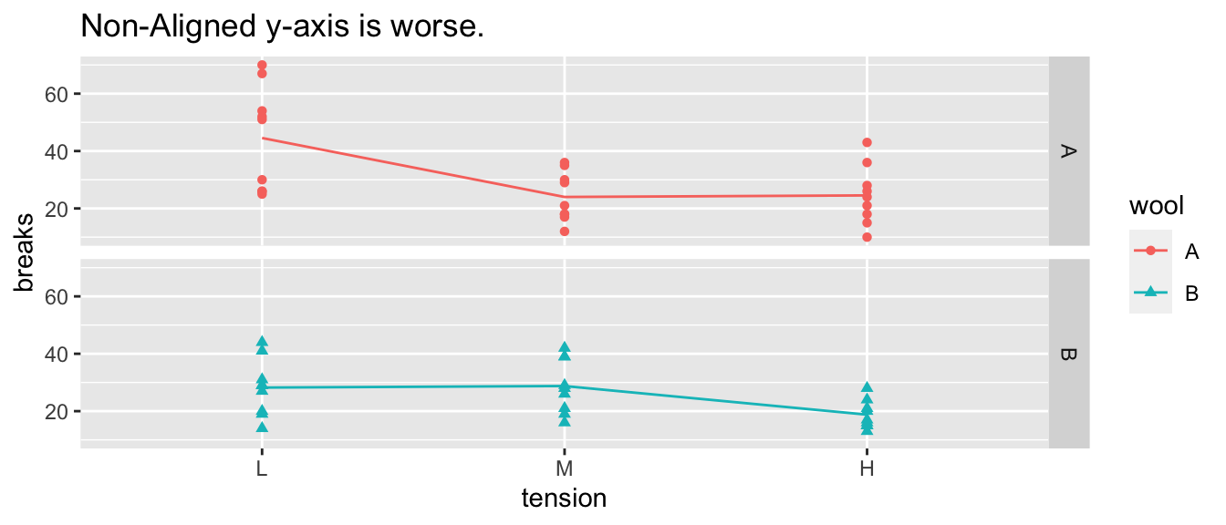
5.2.2 Example: Warpbreaks
While spinning wool into thread, if the tension on the wool isn’t correctly set, the thread can break. Here we compare two different types of wool at three different tensions.
5.3 “Color” Scales
Defining Color really has three different attributes (From Wikipedia).
5.3.0.1 HSV Scale
- Hue: The attribute of a visual sensation according to which an area appears to be similar to one of the perceived colors: red, yellow, green, and blue, or to a combination of two of them.
- Saturation: The “colorfulness of a stimulus relative to its own brightness”
- Value: The “brightness relative to the brightness of a similarly illuminated white”
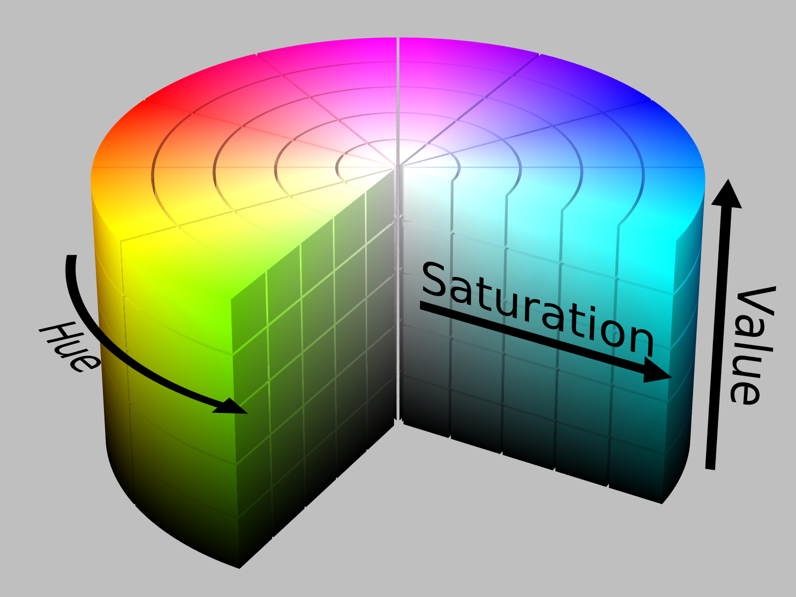
HSV Cylinder from Wikipedia
- Hue is appropriate for categorical variables.
- Saturation and/or Value is appropriate for a quantitative variable scale.
Neither R nor Tableau make it particularly easy to map these aspects, so we won’t get too deep into it.
5.4 Exercises
In soccer, Kylian Mbappé is being referred to as the next world dominating player. The graphic below compares Mbappé to soccer greats Cristiano Ronaldo and Lionel Messi. Below is a graph showing the number of goals scored during various parts of their career (first 100 professional games, second 100, etc).
Mbappé vs Messi and Ronaldo
- Identify the EPT the reader is required to perform and the grouping structures used. Notice the grouping structure is nested. This forces the user first look at the trends within a top level group and then ask if the trend remains the same across the different groups.
- Comment on how the grouping was effective or if you think some change might be better.
In NBA basketball, shot accuracy and distance from the net is important. In the following graph, we can investigate how often shots are taken from different distances. In the first graph, the y-axis is the cumulative percentage of all shots taken. So a steep slope means that lots of shots are taken at that distance and a shallow slope means very few shots are taken.
Shot distribution in the NBA
- Identify the EPT the reader is required to perform in the top and bottom graph. Comment on which graph you understood more easily and why.
- Comment on how the grouping of distance and which was more effective and informative.
The following graphic calculates difference between a month’s temperature compared to the monthly average temperature across the years since 1850. For example, this graph compares the average January 2014 temperature to the average January temperature across the last 170 Januaries.)
Average World Temperature Since 1850
- Identify the EPT the reader is required to perform and the grouping structures used.
- Comment on how the grouping was effective or if you think some change might be better.
Find a graphic “in the wild” that you think is interesting. Turn in both the original graphic as well as your answers to the following:
- Identify the EPT the reader is required to perform and the grouping structures used.
- Comment on how the graph was effective or if you think some change might improve the graph.