6 (Correlation and) Causation
You have almost certainly heard the phrase “correlation does not imply causation”, or its equivalent “association does not imply causation”. This phrase is stating that, just because the values of two variables “move together”, doesn’t mean that changing the value of one variable will induce changes in another variable.
For example, I may observe that people who use TikTok are on average younger than people who use Facebook, but I cannot make myself younger by closing my Facebook account and opening a TikTok account.
In these notes, we will start with examples showing why causation cannot be inferred from correlation. We will then take a step back and look at why causation is still a very important concept when drawing inferences from data, and how not taking causation seriously can bias our inferences.
6.1 “Correlation doesn’t imply causation”
Easy to say, hard to internalize!
See powerpoint slides on Canvas for examples
6.2 Simpson’s Paradox
A particular form of confounding is “Simpson’s Paradox”. This occurs when we see an overall association going in one direction, (A > B), but when we break data into subgroups we see the association going in the opposite direction (B > A) for every subgroup!
Example: suppose there are two major law firms in town who specialize in criminal defense; call them the Sanders law firm and the Smith law firm. Someone who has been charged with a crime is deciding which firm to go to for representation. Two relevant facts:
The Smith law firm advertises that the defendants they represent get lower prison sentences, on average, than defendants represented by any other firm in town.
The Sanders law firm advertises that misdemeanor defendants they represent get lower prison sentences than misdemeanor defendants represented by any other firm in town, and that felony defendants they represent get lower prison sentences than felony defendants represented by any other firm in town.
How can this be? All crimes that carry the possibility of prison are classified as either misdemeanors or felonies. So how can the Sanders firm get the lowest sentences for its misdemeanor defendants as well as the lowest sentences for its felony defendants, while the Smith firm gets the lowest sentences overall?
Well, suppose that the Smith firm takes mostly misdemeanor cases, while the Sanders firm takes mostly felony cases. It could be that the Sanders firm provides more effective legal defense than the Smith firm for both misdemeanor and felony defendants, but because most of their clients are charged with felonies and felonies carry longer prison sentences, their clients get longer sentences on average than those of the Smith firm, who mostly represent people charged with misdemeanors.
In this case, category of criminal charge (misdemeanor vs. felony) is a confounding variable: it affects the length of a prison sentence, and it affects the chances that the case will be taken on by the Smith firm rather than the Sanders law firm.
(There are other examples of Simpson’s paradox that we’ll look at later in this module.)
6.3 How can we establish or investigate causality?
There is a common piece of “textbook” wisdom that says we have to perform experiments in order to establish causality. The logic is this:
Non-experimental studies cannot establish causation, because there could be unaccounted for outside variables influencing the observed associations.
Example: suppose we wish to assess the effect of taking fish oil supplements on cholesterol levels. We collect data from a primary care physician’s office, in which patients have their cholesterol levels measured and are asked whether or not they take fish oil supplements. Should we decide that whatever difference in average cholesterol we see between those who do and do not take fish oil supplements is a good estimate for the effect of fish oil supplements on cholesterol?
Well, maybe people who take fish oil supplements tend to also have diet and exercise habits that lead to lower cholesterol, in which case we’d see lower cholesterol among those taking the supplements even if the supplements did nothing.
Or, maybe people who take fish oil supplements are doing so because they have high cholesterol levels and their physician told them fish oil could help. In this case, we’d see higher cholesterol among those taking supplements even if the supplements did nothing.
Either way, the study is observational, and so we can not infer causality.
In experimental settings, subjects are randomly assigned to treatment groups. This breaks the confounding: any potentially confounding variables will no longer be associated with the treatment of interest.
For instance, suppose existing diet and exercise habits affect both cholesterol level and the probability that someone takes fish oil supplements. In a randomized controlled trial, participants would be randomly assigned to either take fish oil supplements or not take them. Thus, the distributions of diet and exercise habits should be similar among those assigned to take the supplements and those assigned to not take the supplements, and so this can no longer be a confounding variable.
If all possible sources of confounding are eliminated, any systematic differences observed between the treatment groups must be due to the treatments themselves.
This is the case for why we perform experiments when we want to establish causality. And as a general principle, experiments are our best tool for establishing causality. But, we have methods for investigating causal relationships with non-experimental data. After all, we believe smoking causes lung cancer even though we’ve never done that experiment!
Here are some approaches for doing causal inference using observational data:
If we have data on all confounding variables20, we can statistically “control” or “adjust” for them and then estimate a causal relationship. This can be done using regression methods, or done using matching methods, where pairs of outcomes to be compared are matched on the values of potential confounders.
If we have a “natural experiment”, we can assume this is as good as genuine random assignment, which suggests we may infer causality.
Example: assessing the “effect” of students attending charter schools rather than public schools on standardized test scores. We might worry that there are confounding variables affecting both the probability a child attends a charter school and that child’s test scores. But, some charter schools have lotteries for admission. If we assume that any confounders that lead to a child attending a charter will also lead to them signing up for the lottery to begin with, we can then infer that these potential confounders are randomly distributed among the students who got in via the lottery and those who were in the lottery but didn’t get in. The lottery acts here as a “random assignment”, breaking confounding.
This sounds great, but we’ve made a substantial assumption that might be questioned. What about students who are accepted via the lottery but elect not to go to the charter school? Are there confounding variables that affect the decision to accept admittance and also affect test scores? If so, we still have a potential problem.
More simply, we can assume a causal model, and interpret observed associations causally, conditional upon the assumed model. Others may argue that the assumptions are implausible, and if the causal assumptions are rejected, the conclusions are too. But, this approach is at least transparent, as opposed to the more common approach of sneaking in causal statements without making clear the assumptions upon which they rely.
Causal inference is an entire field! Look up Rubin’s “potential outcomes” framework or Pearl’s “do-calculus” if you’re interested in learning more.
6.4 Confounding isn’t the only problem!
Why is it that correlation doesn’t imply causation? The usual answer is that there could always be confounding variables that induce an observed correlation between our actual variables of interest, thus fooling us into interpreting a statistical association as though it quantified causation.
But let’s generalize the question:
Q: why is it that observed effect sizes do not necessarily quantify causal effects?
A: because our model fails to account for all relevant causal relationships
It turns out that not including confounding variables is just one way our model might fail to account for “real world” causation and thus produce observed associations that misrepresent causality. Here is a longer list, starting with confounding:
Confounding variables (C affects X; C affects Y; X and Y do not affect each other. Failing to control for C creates a non-causal observed association between X and Y)
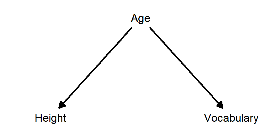
Example: taller children have larger vocabularies. The confounding variable is age: as children grow older, they get taller and they learn more words.
Collider variables (X affects C; Y affects C; X and Y do not affect each other. Controlling for C creates a non-causal observed association between X and Y)
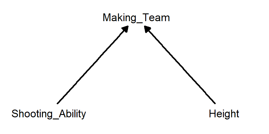
Example: players on a basketball team who are shorter tend to have higher shooting percentages for mid-range and long-range shots. The collider variable is making the basketball team. Better shooters are more likely to make the team, and taller players are more likely to make the team. Therefore, if someone who made the team isn’t a very good shooter, they are more likely to be tall, and if someone who made the team isn’t very tall, they are more likely to be a good shooter.
Mediator variables (X affects C; C affects Y; X affects Y. Controlling for C biases the observed association between X and Y)
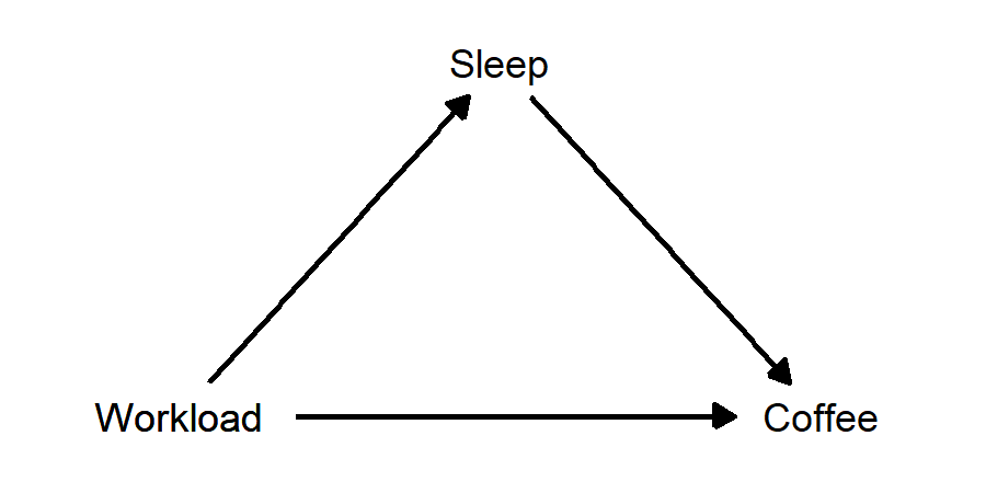
Example: Suppose Neb likes to drink coffee. Neb drinks more coffee on days after he’s has less sleep, and also on days when he has more work to do. Suppose also that having more work leads to Neb getting less sleep. In this case, “amount of sleep” is a mediator variable, lying between amount of work and amount of coffee. When Neb has more work to do, he gets less sleep. When Neb gets less sleep, he drinks more coffee the next day. But, Neb also will drink more coffee when he has more work, regardless of how much sleep he got. In this case, there is a “direct effect” of amount of work on amount of coffee, and there is also an “indirect effect”, in which amount of work affects amount of sleep, which in turn affects amount of coffee.
Post-treatment variables (X affects Y; X affects C. Controlling for C biases the observed association between X and Y)
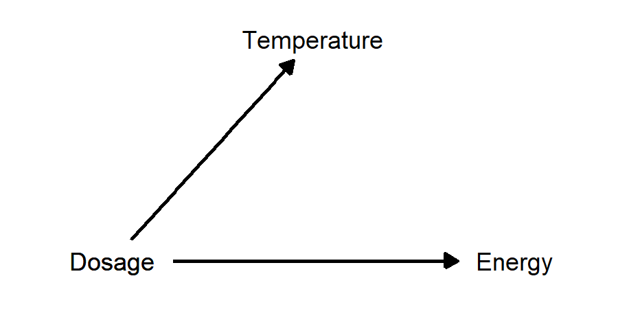
Example: suppose there is a drug that reduces body temperature for people with influenza, and higher doses give a greater reduction. We perform a study in which patients with the flu get different doses of the drug, and we measure body temperature 6 hours later. In addition, we ask patients to rate how energetic they feel on a scale from 1 to 10. In this case, subjective energy level is a post-treatment variable, because it was caused by the treatment of interest (drug dosage), but it has no effect on the outcome of interest (body temperature).
6.5 Directed Acylic Graphs (DAGs)
Thinking about causality is a lot easier if we can visualize how our variables are related. A directed acylic graph (DAG) is a popular tool for doing this21. DAGs are “directed” in that they use arrows that show the direction of causation from one variable to another. They are “acylic” in that they don’t allow causation to go in both directions between two variables. And they are “graphs” because they’re graphs.
6.5.1 Plotting the previous examples
- Taller children have larger vocabularies; age is a confounding variable:
- Shorter basketball players make more shots from distance; making the team is a collider variable:
- Neb drinks more coffee when he’s had less sleep, and when he has more work to do. He also gets less sleep when he has more work to do. Sleep is a mediator variable:
- Higher dosage of a flu drug reduces body temperature and also increases energy level. Energy level is a post-treatment variable:
6.5.2 Example: Score on an exam
What affects someone’s score on an exam? The answer is: a whole bunch of things! Let’s pick two and make a causal diagram in the form of a DAG:
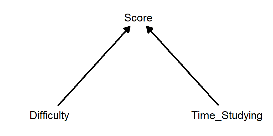
This diagram just shows that amount of time studying and difficulty of exam both affect score. But… doesn’t difficulty also affect how much time is spent studying? Maybe this would be a better diagram:
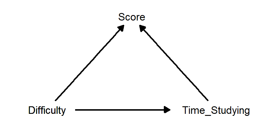
How can we describe these relationships?
If we are interested in the causal effect of time studying on score, then difficulty is a confounder, because it affects both these other variables. Visually, there are arrows going from difficulty into both other variables.
If we are interested in the causal effect of difficulty on score, then time studying is a mediator, because it is affected by difficulty and it affects score. Visually, there are arrows going from difficulty into time studying, and from time studying into score.
If we are interested in the causal effect of difficulty on time studying, then score is a collider, because it is affected by both difficulty and time studying. Visually, there are arrows going from both these variables into score.
To make things a little more interesting, let’s add in a variable that has no direct causal relationship with score, but that is affected by time studying: time spent watching TV22:
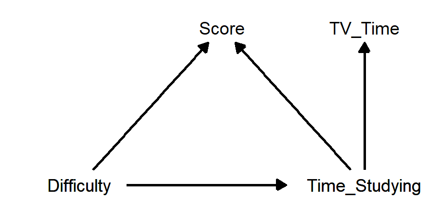
- If we are interested in the causal affect of either difficulty or time studying on score, TV time is a post-treatment variable, because it is affected by our causal variable(s). It is not a mediator, because it does not have a direct causal effect on the outcome variable score.
So, what does all of this imply regarding potential statistical analyses?
If we are interested in the causal effect of time studying on score, we should probably control for difficulty. This way, we will estimate how much a change in time studying affects score, assuming the difficulty of the exam does not change.
If we are interested in the causal effect of difficulty on score, we have a choice to make. Suppose that more difficult tests result in people spending more time studying, and spending more time studying results in higher scores. In this case, controlling for time studying will make it appear that difficulty lowers scores by more than it does in reality, because we’d be answering the question “what happens to score when difficulty increases but people do not study more in response?”
But, maybe this is what we want to estimate. Maybe we are interested in the effect of difficulty on score, for people who study the same amount of time. In this case, we should control for time studying. Or, maybe we are interested in the “real world” effect of difficulty on score, in which case we should not control for time studying.
If we are interested in the causal effect of difficulty on time studying, we should not control for score. If we control for score, then we are asking “what is the effect of increased test difficulty on time studying, for people whose scores were the same?”
But, since greater difficulty lowers scores and greater time studying increases scores, if we increase difficulty and hold score constant, then time studying must increase to balance out the effect of difficulty! And so, our estimated effect of difficulty on time studying would be biased upward. We expect already that increasing difficulty increases time studying; holding score constant will make it look like the effect of difficulty on time studying is bigger than it really is.
No matter what, we should not control for TV time. For instance, suppose we are interested in the causal effect of time studying on score, and suppose also that people who study more before an exam also watch less TV than they otherwise would have before that exam. If we hold TV time constant, then we are answering the question “what is the effect of time studying on score, for people who watch the same amount of TV before the exam?”
Besides being the answer to an uninteresting question, this could have all kinds of biasing effects. First off, for any given amount of TV time, there will simply be less variability in time studying than there would be if we didn’t control for TV time. And so it will be more difficult to estimate the statistical association, and standard error for the estimated effect of time studying will increase. Second, someone who spends more time studying but the same amount of time watching TV as normal will need to make up for this lost time somewhere. If they make up for it by sleeping less, this this could lower their exam score.
6.6 To control or not to control?
We can statistically “control” for a variable by including it in a regression model. So, how do we decide what variable(s) to include beyond our primary predictor of interest?
It is sometimes suggested (implicitly or explicitly) that we should control for anything and everything that improves certain statistical outcomes. Examples:
Variables that are statistically significant should always be included in a model.
Variables that improve \(R^2\) by a substantial amount should always be included in a a model.
Models with lower AIC or BIC values should be preferred to models with higher values.
Models chosen using a variable selection algorithm (step-wise variable selection, Mallow’s CP, LASSO, ridge regression…) should be used.
If we care about causality and inference, the advice above could end up being very bad. As we have just seen, controlling for a collider variable, mediator variable, or post-treatment variable can induce bias. We should not control for a collider or post-treatment variable, even if it has a small p-value and improves \(R^2\) and gets chosen by a variable selection algorithm. We may or may not want to control for a mediator; whether we do depends on the precise question we want answered.
Here are some more examples.
6.6.1 Baseball example: Derek Jeter vs. David Justice
Here is a classic “Simpson’s Paradox” example: Derek Jeter and David Justice played Major League Baseball in the 1990s. In the 1995 season, Jeter’s batting average was 0.250 and Justice’s was 0.253. In 1996, Jeter batted 0.314 and Justice batted 0.321. But, between 1995 and 1996 combined, Jeter’s batting average was 0.310 and Justice’s was 0.270.
This seems paradoxical: how can Justice have a better average in both 1995 and 1996, while Jeter has a better average when combining 1995 and 1996? The explanation is that Justice had far more at-bats in 1995 (411 vs. 48), while Jeter had far more at-bats in 1996 (582 vs. 140). Both batters had much better averages in 1996 than in 1995. Jeter was at bat far more often in 1996 than in 1995, while Justice was at bat far more often in 1995 than in 1996.
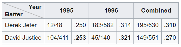
(From the Wikipedia page on Simpson’s Paradox)
The “confounding” variable here is year (1995 vs 1996). But it seems strange to call this a confounder - did the difference in year cause both batters to improve their averages? Did it cause Jeter to have more at-bats than Justice? Do we buy this causal diagram?

This “Simpson’s Paradox” outcome looks like a chance occurrence, and if year is not a real confounder, then why should we control for it? It seems most appropriate to conclude that Jeter’s batting average was superior to Justice’s across 1995 to 1996, rather than performing the analysis separately for each year and concluding Justice had the better average.
6.6.2 Berkeley admissions example
This appears to be the most popular “Simpson’s Paradox” example in statistics textbooks and websites; it is the first example on the Wikipedia page for Simpson’s Paradox.
In 1973, administrators at UC Berkeley noticed that the university was admitting a larger number of men than women. Fearing a potential lawsuit, they looked into their admissions numbers in greater detail. They found that most women were applying to programs that admitted fewer students (and were thus more difficult to get into), while most men were applying to programs that admitted more students (and were thus easier to get into). But, within most programs, women were being accepted at a higher rate than men. And so they concluded that the apparent gender bias was really just due to confounding.
What was the “confounding” variable? It was “program applied to”. If this is a confounding variable, then our causal diagram looks like this:
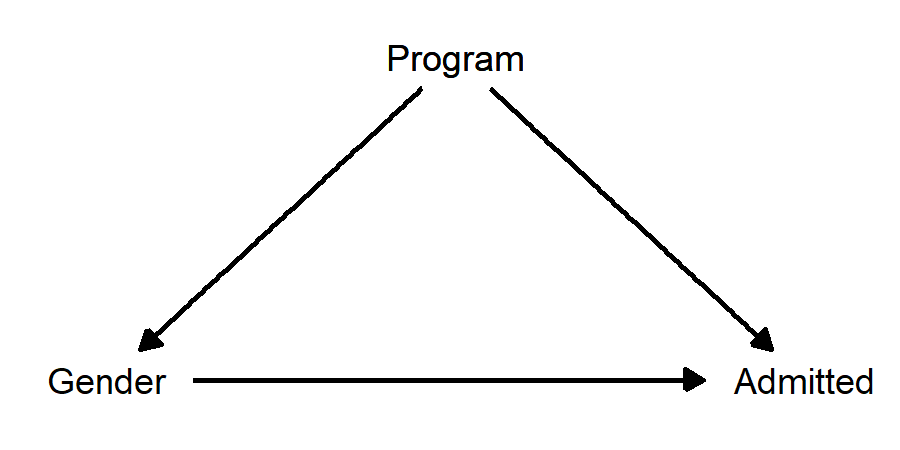
Because Program is affecting both Gender and Admitted, we should obviously control for it, which would then allow us to estimate the direct effect of Gender on Admitted without the bias introduced by Program.
There is a problem though… this diagram doesn’t make sense. “Program applied to” certainly has a causal effect on chance of being admitted, because some programs accept more students than others. But how can “program applied to” have a causal effect on gender? This is backwards! In this classic “Simpson’s Paradox” story, gender has a causal effect on program applied to, insofar as some programs have more men applying and some have more women applying. This diagram makes much more sense:
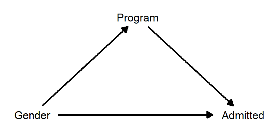 When we draw the diagram, we see that “program applied to” is not a confounder; it’s a mediator! Now the question of whether we should control for program looks more like a judgement call, because controlling for program will remove whatever “indirect” effect there is of gender on admission. Do we want to do this? There are arguments to be made both ways:
Argument for: The mediating effect of “program applied to” occurs because some programs accept more students and some accept fewer students. This is not the kind of “gender bias” that Berkeley was worried about getting sued over. They were worried about the people who make admissions decisions within a program choosing to admit more men than women. Controlling for program is a way of adjusting for the overall selectivity of the programs, and when we do this we see that women are actually admitted at a slightly higher rate than men.
Argument against: Why, exactly, is it that the programs with more female applicants admit fewer students, while the programs with more male applicants admit more students? We see that this situation results in higher admissions rates for male students than for female students overall. It seems reasonable to treat UC Berkeley’s decision to accept more applicants to the programs more men apply to and to accept fewer applicants to the programs women apply to is itself an act of gender bias. If so, then “controlling” for the different admittance rates across programs amounts to intentionally choosing to ignore the very source of the bias.
A lot rests, then, on if we are willing to treat the differences in admission rates across programs as gender neutral for the purpose of assessing a potential claim of discrimination.
It turns out that, in 1973, UC Berkeley decided how many students to accept into the various programs on account of how much grant money went into those programs, and more men applied to programs that had historically higher levels of funding. Maybe Berkeley administrators would have been willing to concede there was gender bias, but that the bias was due to societal level inequalities between women and men, not due to decisions that UC Berkeley admissions staff were making.
At this point, the questions we’re asking don’t sound so much like statistics questions. The point of this example is that drawing a causal diagram can be very helpful when making analysis decisions. What sounded like “confounding” was actually mediation, and this makes the decision of whether or not to control for the 3rd variable much more complicated.
6.7 Simulating data from causal models
In this last section, we’ll simulate data from causal models and then perform regression analyses on our simulated data. The first example demonstrates what happens when we control for a collider variable. The second example demonstrates how our ability to remove the effect of a confounding variable using regression may be limited by data quality.
6.7.1 Innovativeness vs. rigor example (from Rohrer)
Julia Rohrer’s “Thinking Clearly About Correlation and Causation” contains an example on the relationship between innovativeness and rigor in scientific research. Here is the DAG:
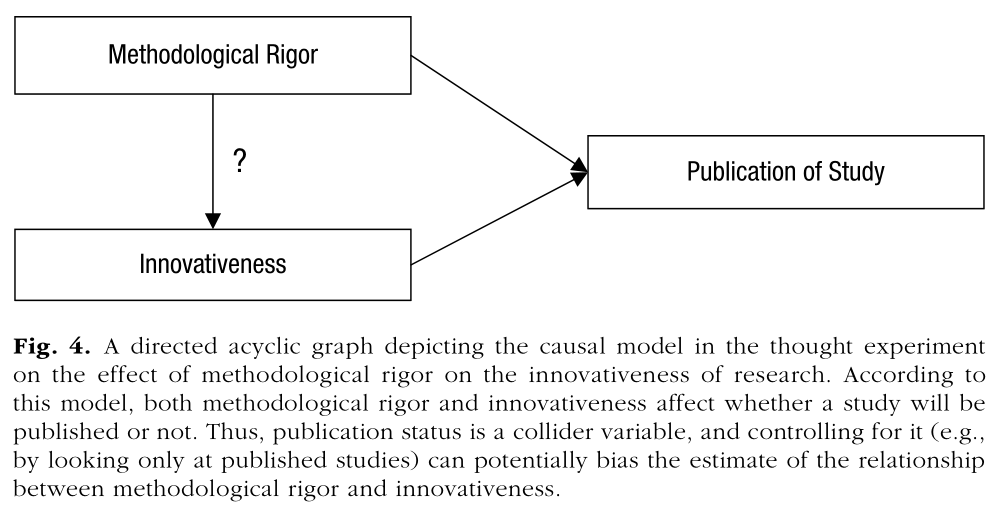
In this example, publication status is a collider variable between rigor and innovativeness.
Here is some code to simulate data from this causal model. First, we treat rigor and innovativeness as variables that go from 0 to 1, and are not correlated with each other. We’ll use a Beta distribution that is bi-modal near 0 and 1, reflecting the assumption that innovativeness and rigor are often very high or very low, and not as often in between.
library(ggplot2)
set.seed(335)
N <- 500
Rigor <- rbeta(n=N,shape1=0.6,shape2=0.6)
hist(Rigor)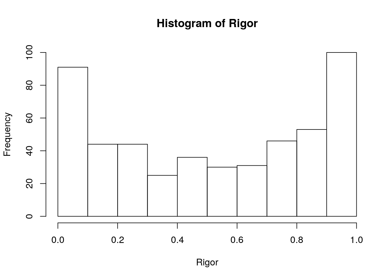
Innovativeness <- rbeta(n=N,shape1=0.6,shape2=0.6)
hist(Innovativeness)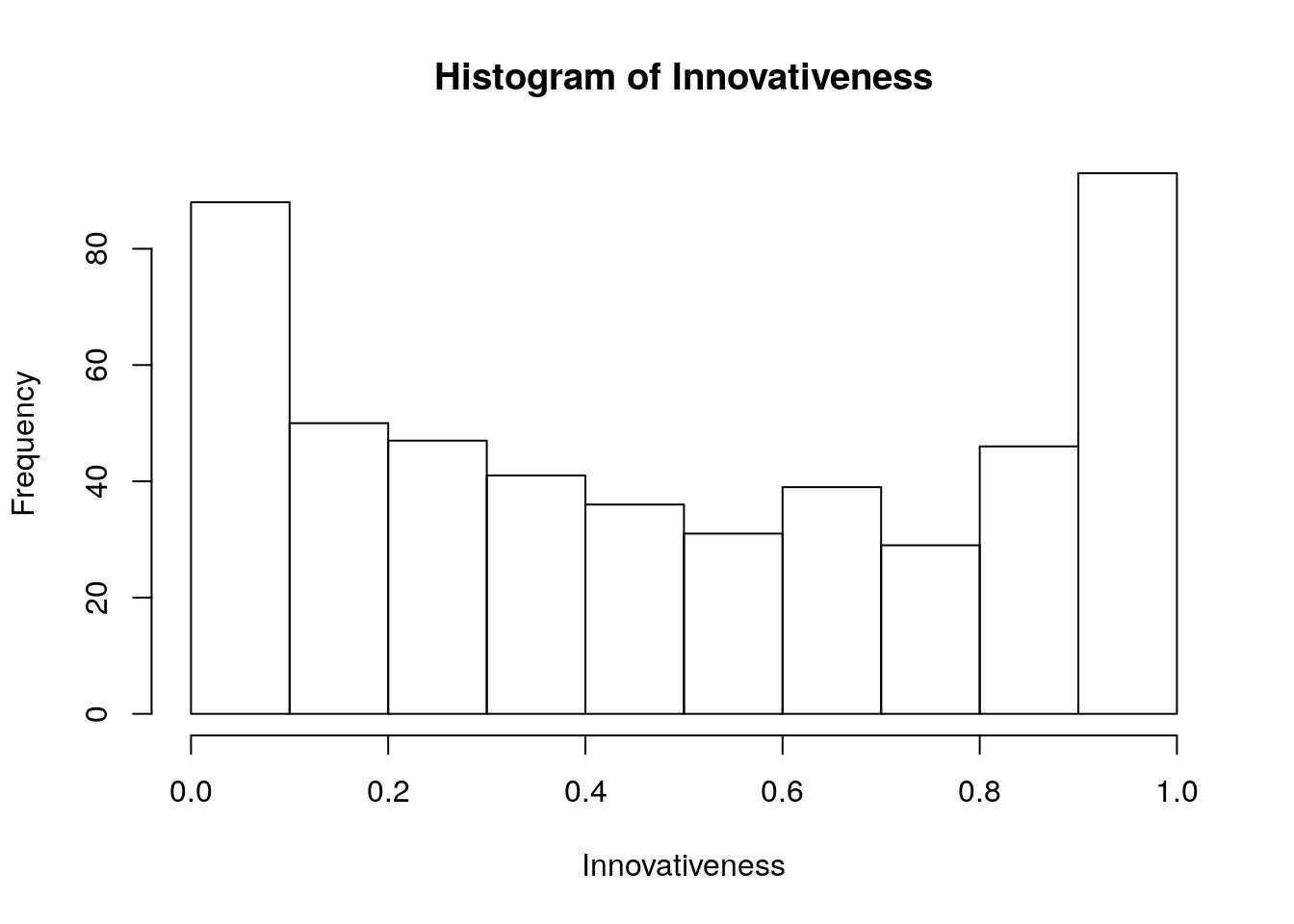
RvI_data <- data.frame(Rigor,Innovativeness)
ggplot(RvI_data,aes(x=Innovativeness,y=Rigor)) +
  geom_point()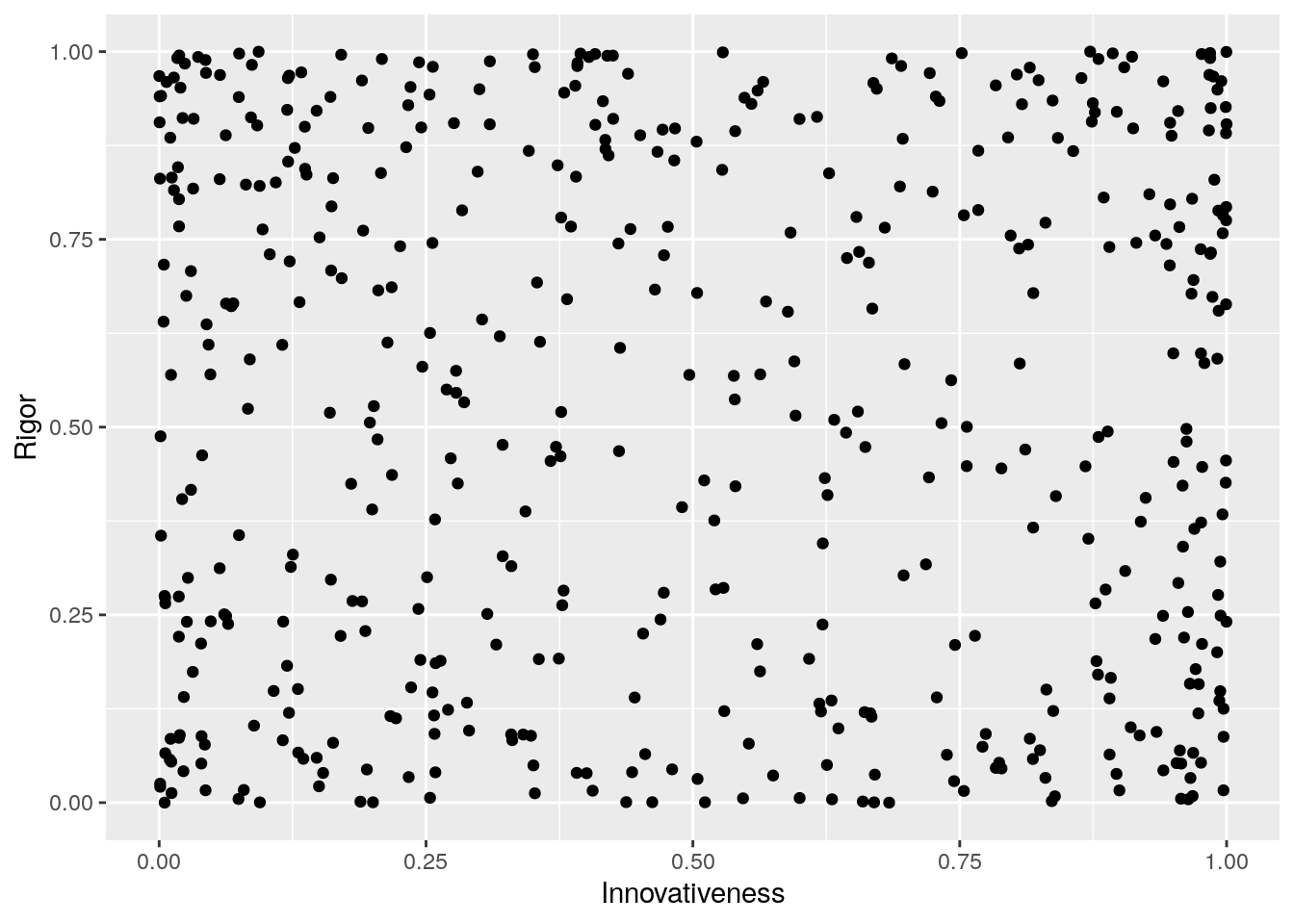
Now, we’ll determine which of our pretend scientific papers get published in a journal. Both rigor and innovativeness increase the probability of publication.
We define \(P(Published=1|Rigor, Innovativess) = mean(Rigor,Innovativeness)\). In other words, the probability of getting research published is simply the mean of the previously simulated values for rigor and innovativeness (both of which must be between 0 and 1). Is this a dramatic oversimplification? Yep! Onward we go…
Prob_published <- rep(0,N)
Published <- rep(0,N)
for (i in 1:N) {
Prob_published[i] <- mean(c(Rigor[i],Innovativeness[i]))
Published[i] <- rbinom(n=1,size=1,prob=Prob_published[i])
}
RvIvP_data <- data.frame(Rigor,Innovativeness,Published)
ggplot(RvIvP_data,aes(x=Innovativeness,y=Rigor,col=Published)) +
  geom_point(show.legend = F)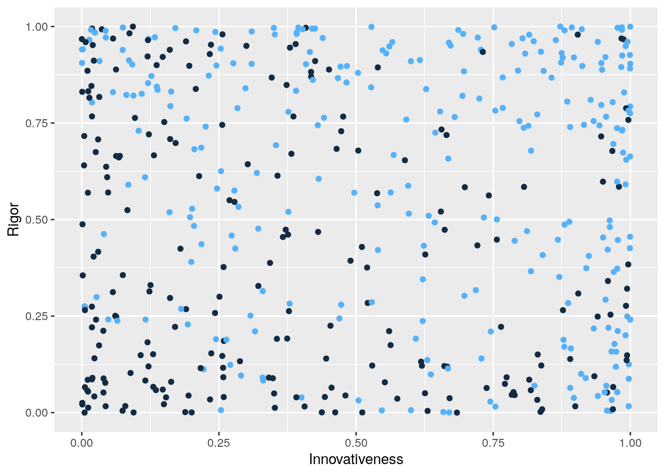
Notice that we have induced a negative association between rigor and innovativeness among those papers that were published. To see this, notice that when innovativeness is low, published papers tend to be higher in rigor. And, when rigor is low, published papers tend to be higher in innovativeness.
Now let’s fit a model to predict innovativeness using rigor:
RvI_model <- lm(Innovativeness~Rigor,data=RvIvP_data)
summary(RvI_model)
##
## Call:
## lm(formula = Innovativeness ~ Rigor, data = RvIvP_data)
##
## Residuals:
## Min 1Q Median 3Q Max
## -0.50193 -0.31983 -0.03192 0.33202 0.51630
##
## Coefficients:
## Estimate Std. Error t value Pr(>|t|)
## (Intercept) 0.50334 0.02762 18.225 <2e-16 ***
## Rigor -0.01986 0.04434 -0.448 0.654
## ---
## Signif. codes: 0 '***' 0.001 '**' 0.01 '*' 0.05 '.' 0.1 ' ' 1
##
## Residual standard error: 0.3424 on 498 degrees of freedom
## Multiple R-squared: 0.0004028, Adjusted R-squared: -0.001604
## F-statistic: 0.2007 on 1 and 498 DF, p-value: 0.6544The estimated slope for Rigor is tiny both in raw terms and relative to its standard error. The p-value is large, and \(R^2=0.0004\). This is what we expected, because we generated the values for Rigor and Innovativeness independently. Any association we see is due to pure chance.
Now, let’s suppose we only have data on papers that were published, and fit the model again.
RvIvP_published <- subset(RvIvP_data,Published==1)
RvI_model_published <- lm(Innovativeness~Rigor,data=RvIvP_published)
summary(RvI_model_published)
##
## Call:
## lm(formula = Innovativeness ~ Rigor, data = RvIvP_published)
##
## Residuals:
## Min 1Q Median 3Q Max
## -0.64833 -0.30424 0.05095 0.29491 0.45698
##
## Coefficients:
## Estimate Std. Error t value Pr(>|t|)
## (Intercept) 0.69538 0.04196 16.571 <2e-16 ***
## Rigor -0.15264 0.06030 -2.531 0.0119 *
## ---
## Signif. codes: 0 '***' 0.001 '**' 0.01 '*' 0.05 '.' 0.1 ' ' 1
##
## Residual standard error: 0.3212 on 270 degrees of freedom
## Multiple R-squared: 0.02318, Adjusted R-squared: 0.01956
## F-statistic: 6.407 on 1 and 270 DF, p-value: 0.01194Oh no, what have we done??? Now the slope estimate for Rigor is much larger, in raw terms and relative to its standard error. The p-value is below the magic line, and \(R^2=0.023\). This isn’t a very impressive \(R^2\) on its own, but it is much larger than the \(R^2=0.0004\) from the first model.
Now let’s suppose we were able to collect both published and unpublished research projects (perhaps we solicited them from researchers, or found them online as non-peer reviewed “pre-prints”). If we had a representative sample of published and unpublished research, we’d be back to our first model that showed no association between innovativeness and rigor. But, what if we noticed that publication status was correlated with both, and decided to control for it on the grounds that it must be a “confounder”?
RvIvP_model <- lm(Innovativeness~Rigor+Published,data=RvIvP_data)
summary(RvIvP_model)
##
## Call:
## lm(formula = Innovativeness ~ Rigor + Published, data = RvIvP_data)
##
## Residuals:
## Min 1Q Median 3Q Max
## -0.64386 -0.28224 -0.01745 0.27826 0.70261
##
## Coefficients:
## Estimate Std. Error t value Pr(>|t|)
## (Intercept) 0.41989 0.02734 15.359 < 2e-16 ***
## Rigor -0.13955 0.04337 -3.218 0.00138 **
## Published 0.26742 0.03007 8.893 < 2e-16 ***
## ---
## Signif. codes: 0 '***' 0.001 '**' 0.01 '*' 0.05 '.' 0.1 ' ' 1
##
## Residual standard error: 0.3184 on 497 degrees of freedom
## Multiple R-squared: 0.1376, Adjusted R-squared: 0.1341
## F-statistic: 39.66 on 2 and 497 DF, p-value: < 2.2e-16Now we have \(R^2=0.138\), and small p-values on both of our predictors. But, we know that rigor and innovativeness are actually uncorrelated at the population level, at least in this simulation.
If you had data like these and your question of interest was “what is the relationship between rigor and innovativeness in scientific research?”, would you be willing to leave out the “Published” variable on principled grounds? Would you choose to report the model with \(R^2=0.0004\) rather than the one with \(R^2=0.138\)?
6.7.2 Measurement error hinders statistical control
Recall the vocabulary vs. height example:
Here’s some code to simulate data from this model. First, we’ll generate ages of children, in months. Minimum age here is two and a half years; maximum is eight years:
set.seed(335)
ages <- round(runif(min=30,max=96,n=200),0)
hist(ages)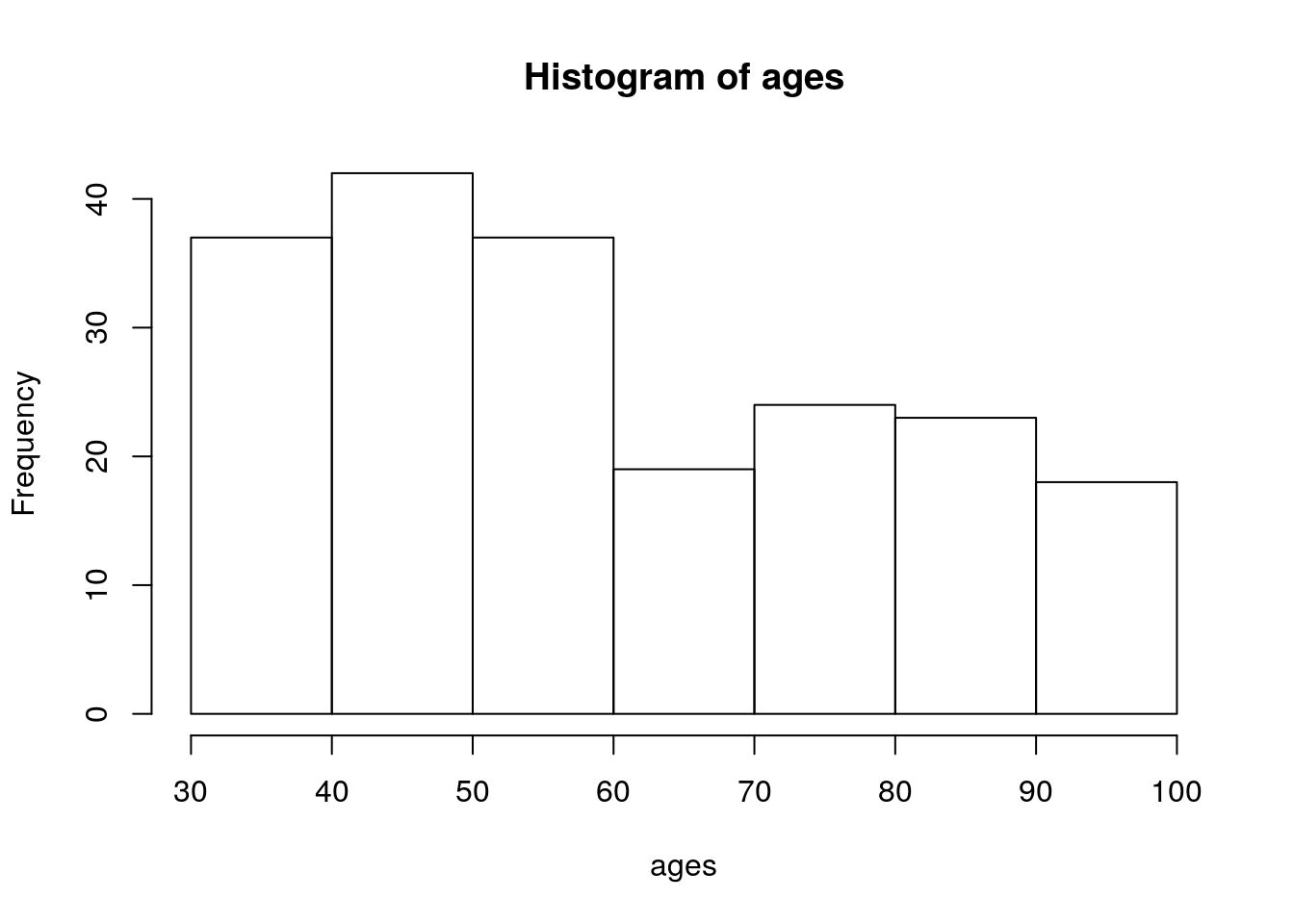
Now we’ll generate heights, in inches. The ages2 term is \(age^2\); the sd_ages term creates standard deviations for generating random values of height, so that the standard deviation of height increases with age. This is a violation of the equal variance assumption in regression. It is also realistic, so we’re doing it: heights for older children are more varied than heights for younger children!
ages2 <- ages^2
sd_ages <- ages*0.0015+0.00035*ages2
heights <- round(30+0.22*ages+rnorm(n=100,mean=0,sd=sd_ages),1)
plot(heights~ages)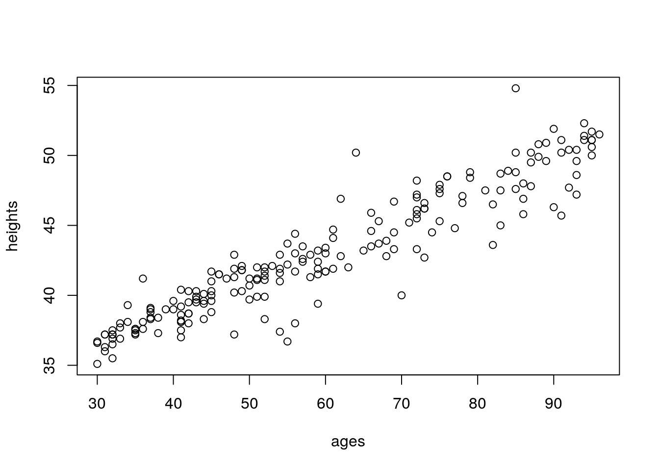
This is pretty close to correct; average height for 3 year-olds is around 37 inches; average height for 8 year-olds is around 50 inches.
Now we’ll generate vocabulary sizes. Importantly, we will not use height to generate these values; only age. Again, we’ll do a trick to make variance in vocabulary size increase with age, which is realistic.
sdvocabs <- -11.5*ages+0.8*ages^2
vocabs <- round(-7000+300*ages+rnorm(n=100,sd=sdvocabs),0)
plot(vocabs~ages,ylim=c(0,28000))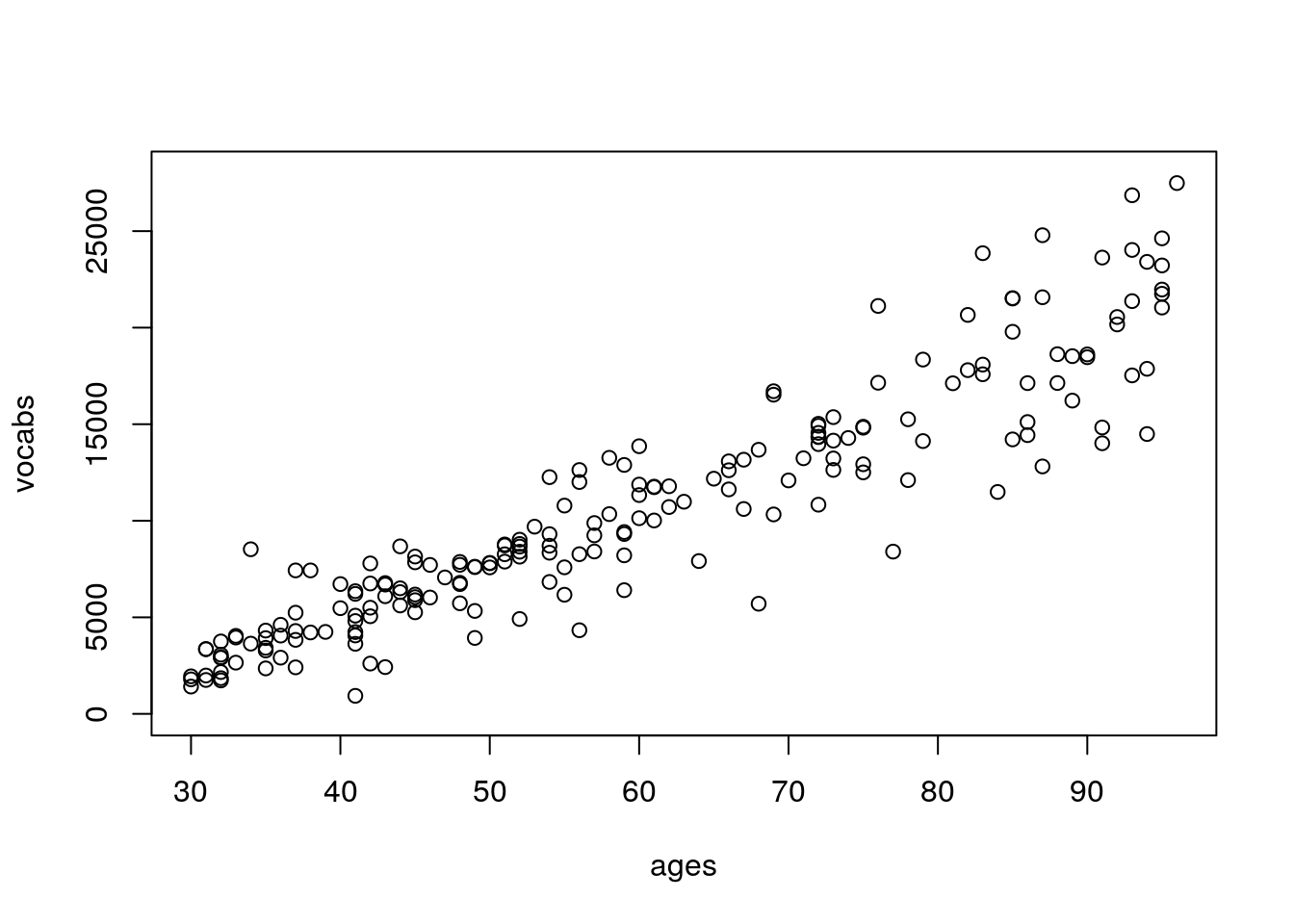
Information on vocabulary size by age is a little harder to come by compared to information on height by age, but these numbers are in the ballpark for number of words a child recognizes as they age (the real relationship is non-linear; for the sake of simplicity we’re keeping this linear).
Now, let’s see what we get when we regress vocabulary size onto height:
summary(lm(vocabs~heights))##
## Call:
## lm(formula = vocabs ~ heights)
##
## Residuals:
## Min 1Q Median 3Q Max
## -11198.0 -1361.7 -178.7 1254.4 11290.4
##
## Coefficients:
## Estimate Std. Error t value Pr(>|t|)
## (Intercept) -40215.87 2054.68 -19.57 <2e-16 ***
## heights 1181.81 47.64 24.81 <2e-16 ***
## ---
## Signif. codes: 0 '***' 0.001 '**' 0.01 '*' 0.05 '.' 0.1 ' ' 1
##
## Residual standard error: 3028 on 198 degrees of freedom
## Multiple R-squared: 0.7566, Adjusted R-squared: 0.7554
## F-statistic: 615.5 on 1 and 198 DF, p-value: < 2.2e-16Height is, unsurprisingly, highly significant, and \(R^2=0.757\).
Now, let’s control for age, the confounding variable:
summary(lm(vocabs~heights+ages))##
## Call:
## lm(formula = vocabs ~ heights + ages)
##
## Residuals:
## Min 1Q Median 3Q Max
## -7181.7 -904.2 57.0 961.1 6814.8
##
## Coefficients:
## Estimate Std. Error t value Pr(>|t|)
## (Intercept) -7713.05 3182.49 -2.424 0.0163 *
## heights 36.72 104.01 0.353 0.7244
## ages 279.80 23.79 11.762 <2e-16 ***
## ---
## Signif. codes: 0 '***' 0.001 '**' 0.01 '*' 0.05 '.' 0.1 ' ' 1
##
## Residual standard error: 2327 on 197 degrees of freedom
## Multiple R-squared: 0.857, Adjusted R-squared: 0.8556
## F-statistic: 590.4 on 2 and 197 DF, p-value: < 2.2e-16Just as we expected! Now age is highly significant, and height is non-significant. Controlling for the confounder removed the apparent association between vocabulary size and height. Note also that \(R^2=0.857\), about ten percentage points larger than when height was the only predictor.
BUT - isn’t age usually reported in years, not months? We only typically report age in months when talking about very young children. So, let’s be “realistic” and suppose we had recorded age in years. To do this, we’ll divide age by 12, and then truncate.
It is important that we truncate rather than round here. For example, a child who is 6 years and 10 months old is considered a 6 year-old, not a 7 year-old.
ages_years <- trunc(ages/12)
plot(ages_years~ages)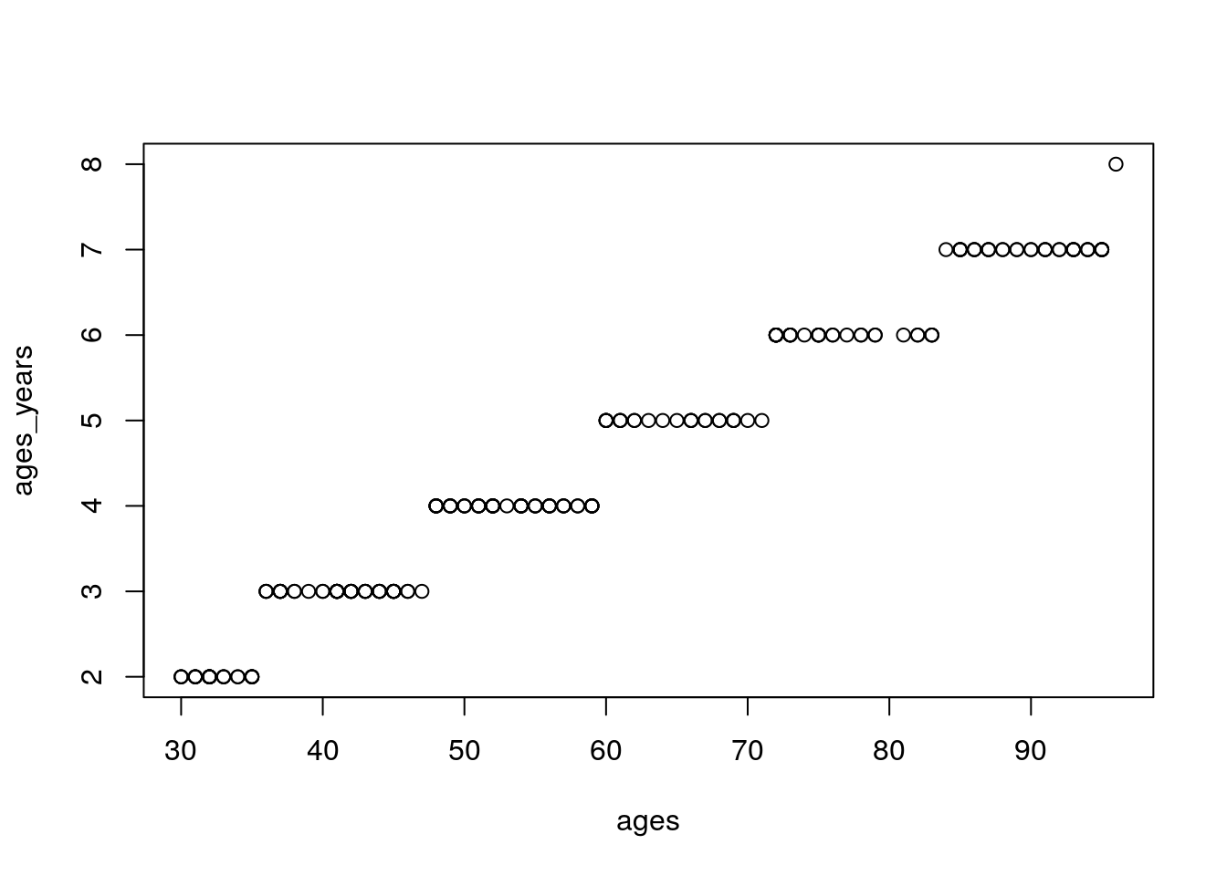
And now, let’s re-run that multiple regression model in which we “controlled” for age, this time using age in years:
summary(lm(vocabs~heights+ages_years))##
## Call:
## lm(formula = vocabs ~ heights + ages_years)
##
## Residuals:
## Min 1Q Median 3Q Max
## -7268.3 -1223.2 -130.9 1165.9 8793.8
##
## Coefficients:
## Estimate Std. Error t value Pr(>|t|)
## (Intercept) -12914.4 3529.9 -3.659 0.000326 ***
## heights 268.2 110.4 2.429 0.016021 *
## ages_years 2651.1 298.2 8.890 3.91e-16 ***
## ---
## Signif. codes: 0 '***' 0.001 '**' 0.01 '*' 0.05 '.' 0.1 ' ' 1
##
## Residual standard error: 2565 on 197 degrees of freedom
## Multiple R-squared: 0.8263, Adjusted R-squared: 0.8245
## F-statistic: 468.5 on 2 and 197 DF, p-value: < 2.2e-16Oh no! Now height is statistically signficant! Also, \(R^2=0.826\), which is smaller than in the last model. So, our model’s predictions are a little bit worse, and controlling for the confounding variable didn’t actually fix the confounding.
This is an illustration of a more general principle: our ability to “control” or “adjust” for confounding variables using regression is limited by the quality of our measurements. If we have imperfect measurements, we will have imperfect statistical control.