5 Principal component analysis for perceptual maps (office dataset)
In this chapter, you will learn how to carry out a principal component analysis and visualize the results in a perceptual map.
Say we have a set of observations that differ from each other on a number of dimensions, for example, we have a number of whiskey brands (observations) that are rated on a number of attributes such as body, sweetness, fruitiness, etc (dimensions). If some of those dimensions are strongly correlated then it should be possible to describe the observations by a smaller (than original) number of dimensions without losing too much information. For example, sweetness and fruitness could be highly correlated and could therefore be replaced by one variable. Such dimensionality reduction is the goal of principal component analysis.
5.1 Data
5.1.1 Import
We will analyze data from a survey in which respondents were asked to rate four brands of office equipment on six dimensions. Download the data here and import them into R:
library(tidyverse)
library(readxl)

office <- read_excel("perceptual_map_office.xlsx","attributes") # don't forget to load the readxl package
5.1.2 Manipulate
office # Check out the dataThe data set consists of one identifier, the brand of office equipment, and the average (across respondents) rating of each brand on six attributes: large_choice, low_prices, service_quality, product_quality, convenience, and preference_score. Let’s factorize the identifier:
office <- office %>%
mutate(brand = factor(brand))5.2 How many factors should we retain?
The goal of principal component analysis is to reduce the number of dimensions that describe our data, without losing too much information. The first step in principal component analysis is to decide upon the number of principal components or factors we want to retain. To help us decide, we’ll use the PCA function from the FactoMineR package:
install.packages("FactoMineR")
library(FactoMineR)
To be able to use the PCA function, we need to transform the data frame first:
office.df <- office %>%
  select(- brand) %>% # The input for the principal components analysis should be only the dimensions, not the identifier(s), so let's remove the identifiers.
  as.data.frame() # then change the type of the object to 'data.frame'. This is necessary for the PCA function

rownames(office.df) <- office$brand # Set the row names of the data.frame to the brands (this is important later on when making a biplot)
We can now proceed with the principal component analysis:
office.pca <- PCA(office.df, graph=FALSE) # Carry out the principal component analysis

office.pca$eig # and look at the table with information on explained variance
## eigenvalue percentage of variance cumulative percentage of variance
## comp 1 4.2656310 71.093850 71.09385
## comp 2 1.6197932 26.996554 98.09040
## comp 3 0.1145758 1.909596 100.00000If we look at this table, then we see that two components explain 98.1 percent of the variance in the ratings. This is quite a lot already and it suggests we can safely do with two dimensions to describe our data. A rule of thumb here is that the cumulative variance explained by the components should be at least 70%.
5.3 Principal components analysis:
Let’s retain only two components or factors:
office.pca.two <- PCA(office.df, ncp = 2, graph=FALSE) # Ask for two factors by filling in the ncp argument.5.3.1 Factor loadings
We can now inspect the table with the factor loadings:
office.pca.two$var$cor # table with factor loadings## Dim.1 Dim.2
## large_choice 0.8851204 -0.4527205
## low_prices -0.8448204 -0.5161931
## service_quality 0.9913907 0.1283554
## product_quality 0.8406022 0.4730741
## convenience -0.3639026 0.9247757
## preference_score 0.9729227 -0.2299953These loadings are the correlations between the original dimensions (large_choice, low_prices, etc.) and the two factors that are retained (Dim.1 and Dim.2). We see that low_prices, service_quality, and product_quality score highly on the first factor, whereas large_choice, convenience, and preference_score score highly on the second factor. We could therefore say that the first factor describes the price and quality of the brand and that the second factor describes the convenience of the brand’s stores.
We also want to know how much each of the six dimensions are explained by the extracted factors. For this we need to calculate the communality and/or its complement, the uniqueness of the dimensions:
loadings <- as_tibble(office.pca.two$var$cor) %>% # We need to capture the loadings as a data frame into a new object. Use as_tibble(), otherwise we cannot access the different factors
  mutate(variable = rownames(office.pca.two$var$cor), # keep track of the row names (these are removed when converting to tibble)
         communality = Dim.1^2 + Dim.2^2,
         uniqueness = 1 - communality) # The ^ operator elevates a value to a certain power. To calculate the communality, we need to sum the squares of the loadings on each factor.
loadings
## # A tibble: 6 × 5
## Dim.1 Dim.2 variable communality uniqueness
## <dbl> <dbl> <chr> <dbl> <dbl>
## 1 0.885 -0.453 large_choice 0.988 0.0116
## 2 -0.845 -0.516 low_prices 0.980 0.0198
## 3 0.991 0.128 service_quality 0.999 0.000669
## 4 0.841 0.473 product_quality 0.930 0.0696
## 5 -0.364 0.925 convenience 0.988 0.0124
## 6 0.973 -0.230 preference_score 0.999 0.000524The communality of a variable is the percentage of that variable’s variance that is explained by the factors. Its complement is called uniqueness. Uniqueness could be pure measurement error, or it could represent something that is measured reliably by that particular variable, but not by any of the other variables. The greater the uniqueness, the more likely that it is more than just measurement error. A uniqueness of more than 0.6 is usually considered high. If the uniqueness is high, then the variable is not well explained by the factors. We see that for all dimensions, communality is high and therefore uniqueness is low, so all dimensions are captured well by the extracted factors.
5.3.2 Loading plot and biplot
We can also plot the loadings. For this, we need another package called factoextra:
install.packages("factoextra")
library(factoextra)fviz_pca_var(office.pca.two, repel = TRUE) # the repel = TRUE argument makes sure the text is displayed nicely on the graph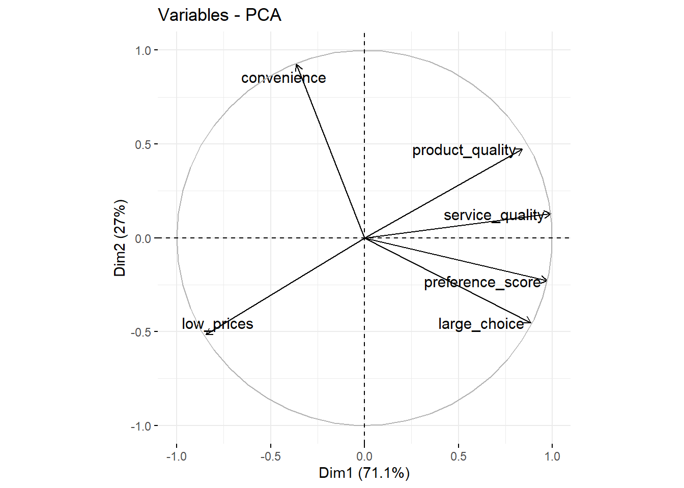
We see that large_choice, service_quality, product_quality, and preference_score have high scores on the first factor (the X-axis Dim1) and that convenience has a high score on the second factor (the Y-axis Dim2). We can also add the observations (the different brands) to this plot:
fviz_pca_biplot(office.pca.two, repel = TRUE) # plot the loadings and the brands together on one plot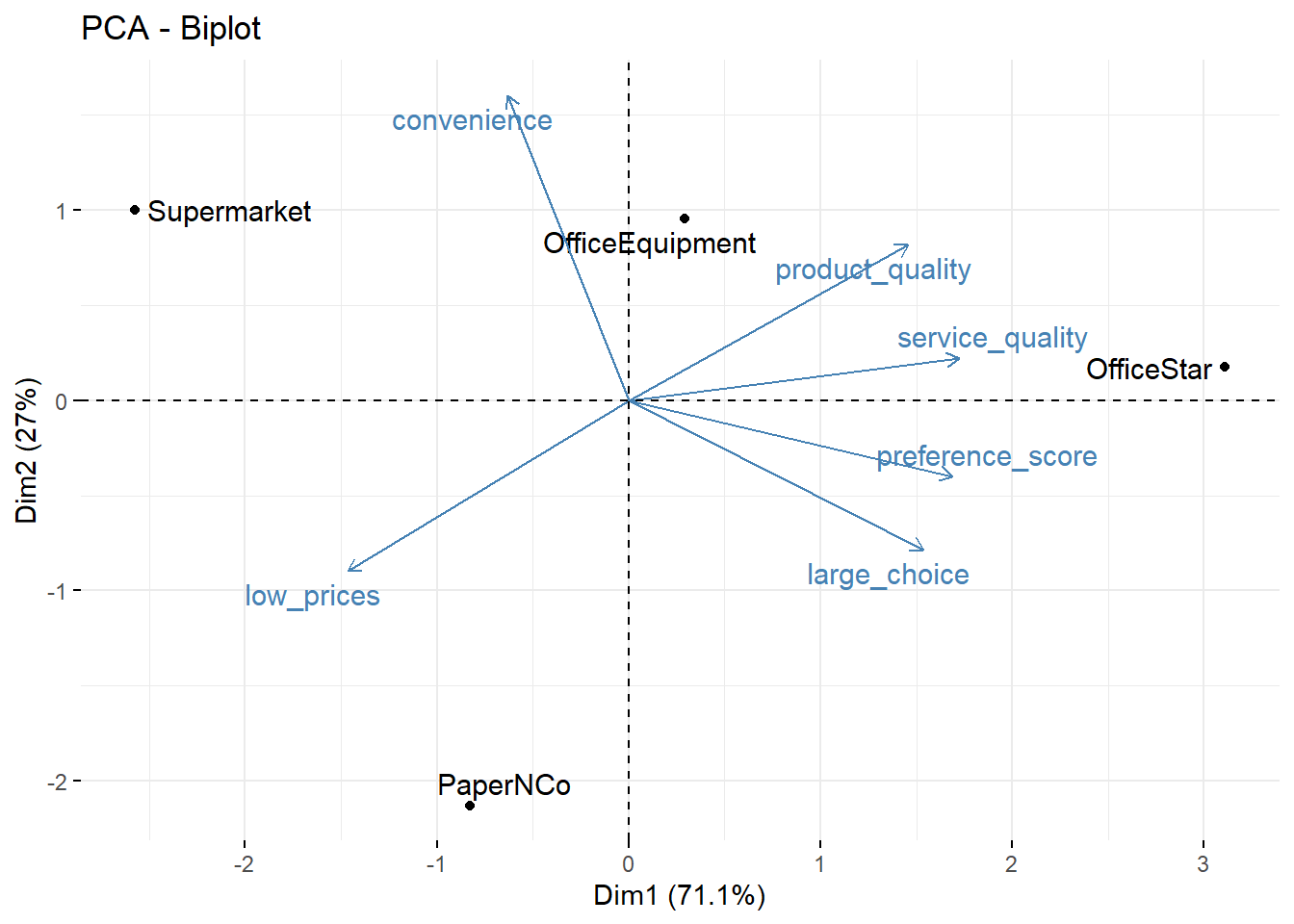
This is also called a biplot. We can see, for example, that OfficeStar scores highly on the first factor.