Chapter 6 Visualizations with Simple Features
Now that we have an idea of the content of our dataset, we can focus on its geospatial aspect.
6.1 Merge the data (again)
We first merge our DT.max.speed.per.way.hour table with the OSM shapefile :
df.Uber <- as.data.frame(DT.max.speed.per.way.hour[,name:=NULL])
OSM_sf.with.Uber <-  merge(OSM_sf,df.Uber,by.x='osm_id',by.y='osm_id',all.y=T)
Note that in order to merge both, we must convert our data.table DT.max.speed.per.way.hour to a data.frame.
Can we resist to look at the Uber data for the streets (ways) that are defined as ‘pedestrian’ ?
No.
## Simple feature collection with 0 features and 16 fields
## bbox:           xmin: NA ymin: NA xmax: NA ymax: NA
## epsg (SRID):    4326
## proj4string:    +proj=longlat +datum=WGS84 +no_defs
##  [1] osm_id          code            fclass          name
##  [5] ref             oneway          maxspeed.x      layer
##  [9] bridge          tunnel          hour            total_rows
## [13] ratio.over      speed_kph_mean  maxspeed.y      speed_minus_max
## [17] geometry
## <0 rows> (or 0-length row.names)
A very clean dataset indeed, not a single row for ways defined by OSM as pedestrian.
How about the other types of ways ? We aggregate the data per class and compute the mean of the speed limit infrigment ratio :
DT.OSM.max.speed <-  as.data.table(OSM_sf.with.Uber)
DT.OSM.max.speed[,.(total_fclass=.N, mean_ratio.over =round(mean(ratio.over),2)),by=.(fclass)][order(-mean_ratio.over)]
## fclass total_fclass mean_ratio.over
## 1: unclassified 592 54.69
## 2: trunk 711 54.00
## 3: motorway 7807 53.81
## 4: trunk_link 10 40.00
## 5: residential 8940 29.58
## 6: motorway_link 890 24.58
## 7: primary 33527 21.55
## 8: secondary 52036 18.18
## 9: tertiary 15670 17.44
## 10: secondary_link 271 8.13
## 11: primary_link 132 2.27
## 12: tertiary_link 11 0.00In term of occurence, motorways are the most likely to witness speed limit infrigments.
6.2 Create an animation with the magick package :
With the shapefile enriched with our aggregated Uber data, we have a glance into it:
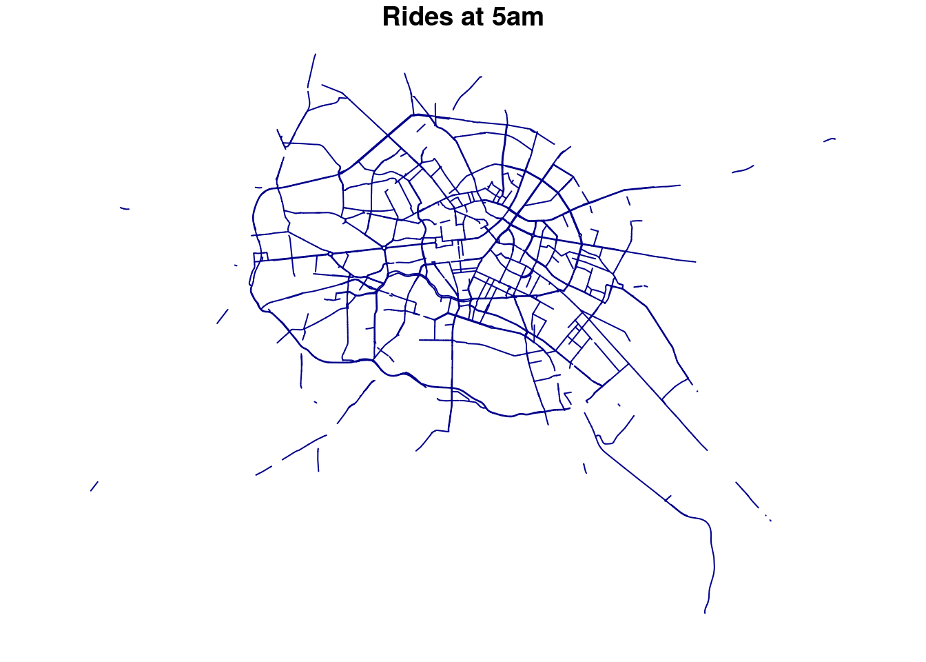 Nice, but we also want to represent the frequency of those rides per way.
For this, we set a new variable
Nice, but we also want to represent the frequency of those rides per way.
For this, we set a new variable col that use the quantiles of the total_rows to set the color :
col <- findColours(classIntervals(
            OSM_sf.with.Uber$total_rows, 4, style="quantile"),
            smoothColors("tomato",98,"white"))
Now try again with this col variable :
## Warning in plot.sf(subset(OSM_sf.with.Uber, hour == 5)["total_rows"], col =
## col, : col is not of length 1 or nrow(x): colors will be recycled; use pal
## to specify a color palette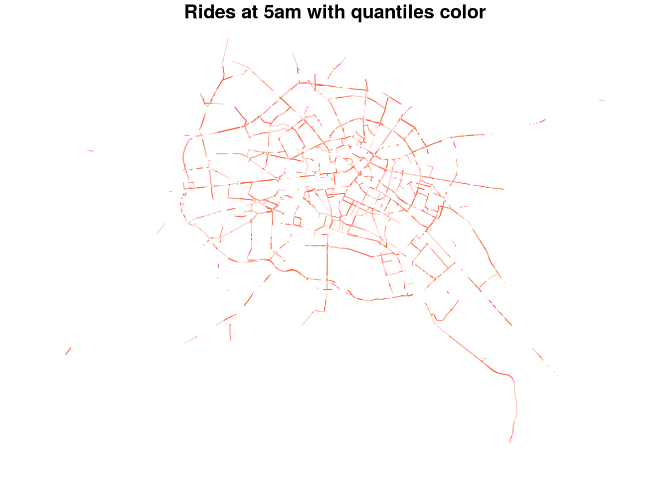 How about adding a black background ?
## Warning in plot.sf(subset(OSM_sf.with.Uber, hour == 5)["total_rows"], col =
## col, : col is not of length 1 or nrow(x): colors will be recycled; use pal
## to specify a color palette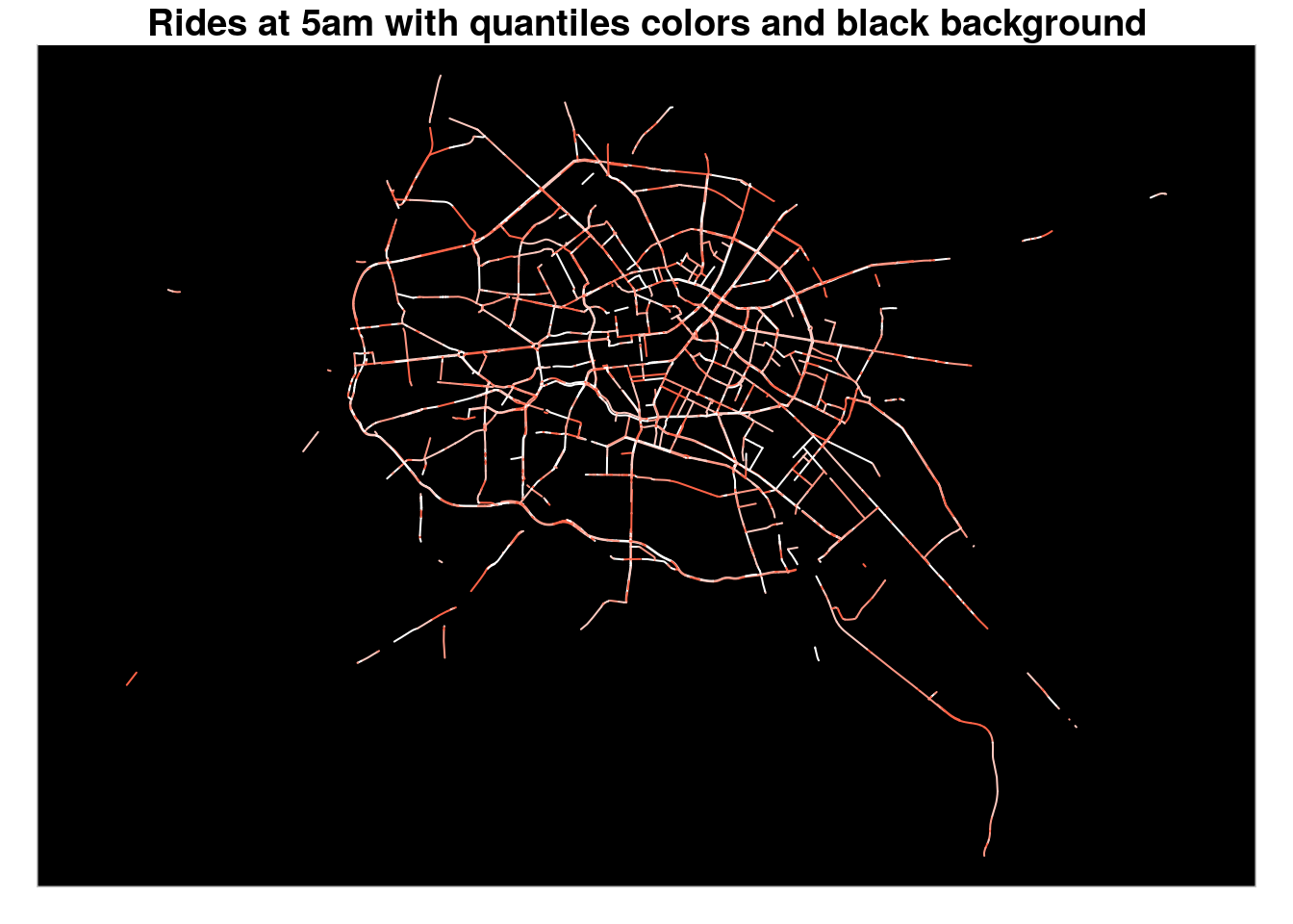
Ok, now we can write a methode to loop on each hour of the day, plot the map, and save it into a file :
Before that, we must adjust the geographical boundaries of each plot so that, when combined, they fit on the same rectangle :
# we create a new sf object to freeze the boundaries while looping on the hour :
bb <- st_bbox(OSM_sf.with.Uber)
print(bb)
## xmin ymin xmax ymax
## 13.17176 52.39320 13.59680 52.61206And now our looping method : uncomment the code to make it run
#
# for (i in unique(OSM_sf.with.Uber$hour)){
#   png(paste0('plot/',as.character(i),"_rplot.png") )
#   plot(a,axes=F,col='black',reset=F,bgc='black',main=paste0('Average Uber rides at ',stringr::str_pad(i,2,'left','0'),'H'))
#   plot(subset(OSM_sf.with.Uber,hour==i)["total_rows"],add=T,axes=F,col=col)
#   dev.off()
# }
Once we have our 24 plots saved into files in the plot folder (make sure it exists before), we call the method to load those images, combine them and generate an animated gif :
createAnimation <- function() {
  listfiles <-
    paste0('plot/', sort(unique(OSM_sf.with.Uber$hour)), "_rplot.png")
  images <- lapply(listfiles , image_read)
  frames <- image_morph(image_join(images) , frames = 10)
  animation <- image_animate(frames, fps = 2)
  image_write(animation, "plot/Uber_total_rows.gif")
}
The call to this method is commented as it is relatively long to process:
And here is the final result :
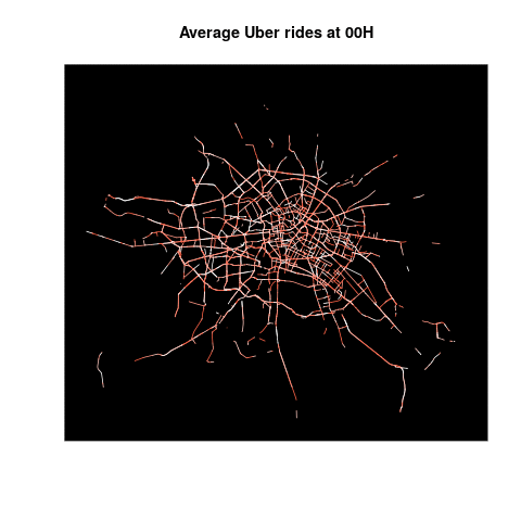
Uber