Statistics for Data Science Notes
2021-11-08
Chapter 1 Exploratory Data Analysis
1.1 Exploring Diamond Prices
We consider a dataset with prices (in $ US) and other information on 53,940 round cut diamonds. The first 6 rows are shown below.
library(tidyverse)
data(diamonds)
head(diamonds)
## carat cut color clarity depth table price x y z
## 1 0.23 Ideal E SI2 61.5 55 326 3.95 3.98 2.43
## 2 0.21 Premium E SI1 59.8 61 326 3.89 3.84 2.31
## 3 0.23 Good E VS1 56.9 65 327 4.05 4.07 2.31
## 4 0.29 Premium I VS2 62.4 58 334 4.20 4.23 2.63
## 5 0.31 Good J SI2 63.3 58 335 4.34 4.35 2.75
## 6 0.24 Very Good J VVS2 62.8 57 336 3.94 3.96 2.48The dataset incudes both:
- categorical (or factor) variables cut, color, clarity, and
- quantitative (or numeric) variables, depth, table, price, x, y, z
1.1.1 Boxplot of Diamond Prices
ggplot(data=diamonds, aes(x=price, y=cut, fill=cut)) +
  geom_boxplot(outlier.size=0.01, outlier.alpha = 0.1) +
    stat_summary(fun=mean, geom="point", shape=4, color="red", size=3)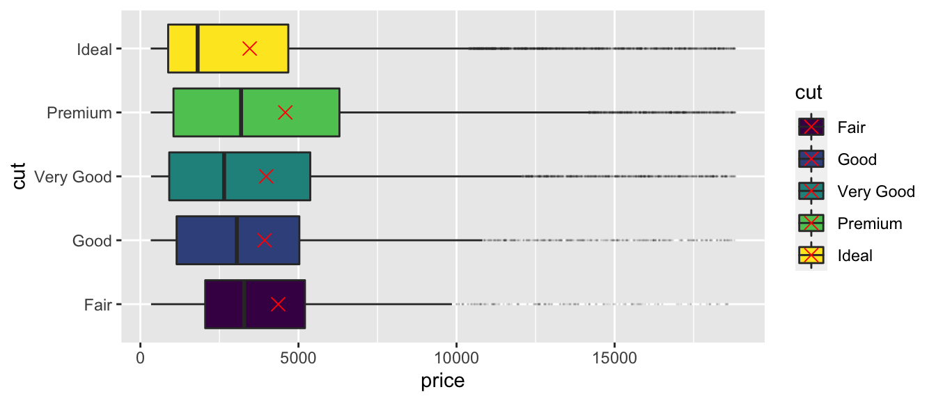
What do we notice about the relationship between price and cut? Is this surprising?
1.1.2 Histogram of carat size and quality of cut
Next, we examine a histogram, displaying price, cut, and carat size.
ggplot(data=diamonds, aes(x=carat, fill=cut)) + geom_histogram()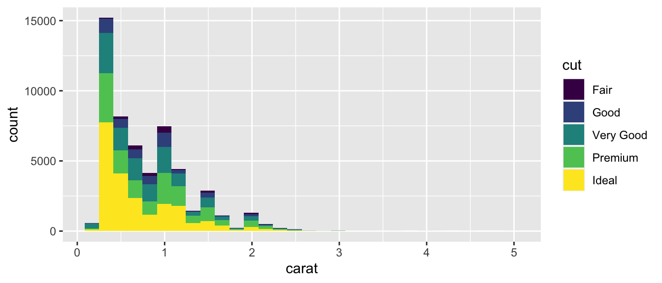
How does the information in this plot help explain the surprising result we saw in the boxplot?
1.1.3 Table 1: Average carat size and price by quality of cut
diamonds %>% group_by(cut) %>% summarize(N=n(),
                                         Avg_carat=mean(carat),
                                         Avg_price=mean(price) )
## # A tibble: 5 x 4
## cut N Avg_carat Avg_price
## <ord> <int> <dbl> <dbl>
## 1 Fair 1610 1.05 4359.
## 2 Good 4906 0.849 3929.
## 3 Very Good 12082 0.806 3982.
## 4 Premium 13791 0.892 4584.
## 5 Ideal 21551 0.703 3458.1.1.4 Scatterplot of carat size and quality of cut
Next, we use a scatterplot to visualize cut, price, and carat size.
ggplot(data=diamonds, aes(x=carat, y=price, color=cut)) + geom_point()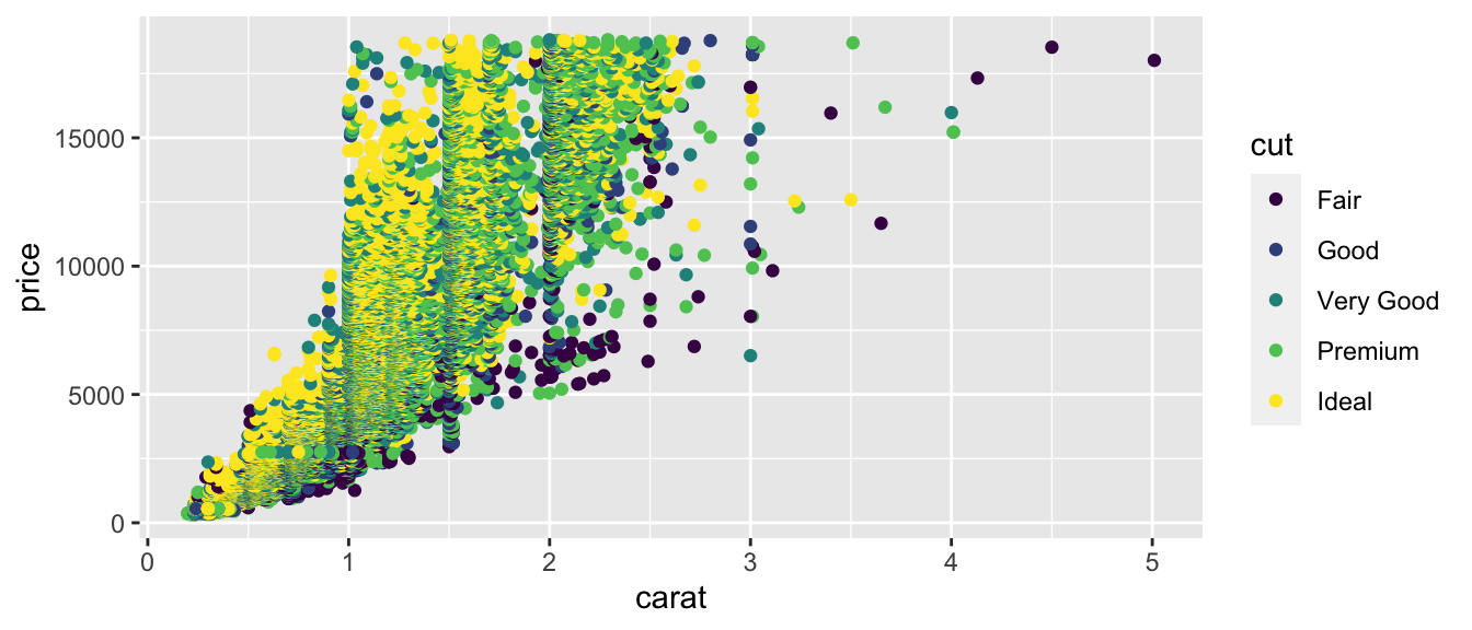
What should we conclude about the relationship between price and quality of cut? Are better cuts generally more expensive? less expensive? about the same? Does the relationship between price and cut seem to depend on carat size?
1.1.5 Terminology
The diamonds dataset is an example of two statistical concepts:
Simpson’s Paradox refers to a situation when an apparent relationship between two variables changes or reverses when additional variable(s) are considered.
Example: diamonds with higher quality of cut appear less expensive than lower quality cuts, until we account for carat size
An interaction between two variables X and Y occurs when the relationship between X and a third variable Z depends on Y.
Example: the relationship between cut and price depends on carat size, so there is an interaction between cut and carat size.
1.2 Tidy Data
1.2.1 Representations of Data
Data can be displayed in many different tabular forms. We’ll discuss one useful form, called tidy data.
Learning Outcomes:
Define tidy data.
Recognize when data are tidy form.
Consider the following representations of the same dataset, which dispays the number of tuberculosis cases in different countries, relative to population. This example comes from R for Data Science by Wickham and Grolemund
1.2.2 Representation 1
| country | year | cases | population |
|---|---|---|---|
| Afghanistan | 1999 | 745 | 19987071 |
| Afghanistan | 2000 | 2666 | 20595360 |
| Brazil | 1999 | 37737 | 172006362 |
| Brazil | 2000 | 80488 | 174504898 |
| China | 1999 | 212258 | 1272915272 |
| China | 2000 | 213766 | 1280428583 |
1.2.3 Representation 2
| country | year | type | count |
|---|---|---|---|
| Afghanistan | 1999 | cases | 745 |
| Afghanistan | 1999 | population | 19987071 |
| Afghanistan | 2000 | cases | 2666 |
| Afghanistan | 2000 | population | 20595360 |
| Brazil | 1999 | cases | 37737 |
| Brazil | 1999 | population | 172006362 |
| Brazil | 2000 | cases | 80488 |
| Brazil | 2000 | population | 174504898 |
| China | 1999 | cases | 212258 |
| China | 1999 | population | 1272915272 |
| China | 2000 | cases | 213766 |
| China | 2000 | population | 1280428583 |
1.2.4 Representation 3
| country | year | rate |
|---|---|---|
| Afghanistan | 1999 | 745/19987071 |
| Afghanistan | 2000 | 2666/20595360 |
| Brazil | 1999 | 37737/172006362 |
| Brazil | 2000 | 80488/174504898 |
| China | 1999 | 212258/1272915272 |
| China | 2000 | 213766/1280428583 |
1.2.5 Representation 4
Table A:
| country | 1999 | 2000 |
|---|---|---|
| Afghanistan | 745 | 2666 |
| Brazil | 37737 | 80488 |
| China | 212258 | 213766 |
Table B:
kable(table4b)| country | 1999 | 2000 |
|---|---|---|
| Afghanistan | 19987071 | 20595360 |
| Brazil | 172006362 | 174504898 |
| China | 1272915272 | 1280428583 |
1.2.6 Variables and Observations
In this example, we have observed data on various countries at different points in time. The record for a single country, in a given year is called an observation.
For each observation, we record the country, year, number of cases, and population. These are called variables.
1.2.7 Tidy Data
A dataset is said to be tidy when it satisfies the following conditions:
- Each variable has its own column.
- Each observation has its own row.
- Each value must has own cell.
In fact, any two of these imply the third.
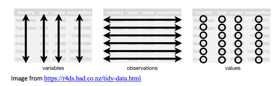
Image from R for Data Science by Wickham and Grolemund
1.2.8 Representation 1 Tidy
Representation 1 is in tidy form.
| country | year | cases | population |
|---|---|---|---|
| Afghanistan | 1999 | 745 | 19987071 |
| Afghanistan | 2000 | 2666 | 20595360 |
| Brazil | 1999 | 37737 | 172006362 |
| Brazil | 2000 | 80488 | 174504898 |
| China | 1999 | 212258 | 1272915272 |
| China | 2000 | 213766 | 1280428583 |
1.2.9 Representation 2 not Tidy
Representation 2 is not in tidy form.
- Observations are spread over multiple rows.
- The variables
casesandpopulationdo not have thir own column.
- The column
typecontains variable names, not values.
| country | year | type | count |
|---|---|---|---|
| Afghanistan | 1999 | cases | 745 |
| Afghanistan | 1999 | population | 19987071 |
| Afghanistan | 2000 | cases | 2666 |
| Afghanistan | 2000 | population | 20595360 |
| Brazil | 1999 | cases | 37737 |
| Brazil | 1999 | population | 172006362 |
| Brazil | 2000 | cases | 80488 |
| Brazil | 2000 | population | 174504898 |
| China | 1999 | cases | 212258 |
| China | 1999 | population | 1272915272 |
| China | 2000 | cases | 213766 |
| China | 2000 | population | 1280428583 |
1.2.10 Representation 3 not Tidy
Representation 3 is not in tidy form.
The variables cases and population do not have their own columns, but are combined in a single column called rate.
| country | year | rate |
|---|---|---|
| Afghanistan | 1999 | 745/19987071 |
| Afghanistan | 2000 | 2666/20595360 |
| Brazil | 1999 | 37737/172006362 |
| Brazil | 2000 | 80488/174504898 |
| China | 1999 | 212258/1272915272 |
| China | 2000 | 213766/1280428583 |
1.2.11 Representation 4 is not Tidy
Representation 4 is not in tidy form.
- The variable
yearis spread across multiple columns.
- The variables
casesandpopulationare spread over multiple tables.
| country | 1999 | 2000 |
|---|---|---|
| Afghanistan | 745 | 2666 |
| Brazil | 37737 | 80488 |
| China | 212258 | 213766 |
| country | 1999 | 2000 |
|---|---|---|
| Afghanistan | 19987071 | 20595360 |
| Brazil | 172006362 | 174504898 |
| China | 1272915272 | 1280428583 |
1.2.12 Why Use Tidy Data
Data are often easiest to work with when they are in tidy form
The
tidyverse()R package is useful for creating graphs, and calculating summary statistics when data are in tidy form.Sometimes there is good reason for data to not be in tidy form. This is ok, but it makes it harder to work with.
In this class, we will focus on data that are already in tidy form. However, if you come across data on your own, you should check that it is tidy before attempting to use the techniques we’ll see in this class.
In CMSC/STAT 205: Data-Scientific Programming, we study how to convert data into tidy form if it is not already. More information can be found in R For Data Science by Wickham and Grolemund.