7 靜態視覺化入門:ggplot2
除了內建的 Base Plotting System 可以繪製圖形,有很高比例的 R 語言使用者更依賴使用 ggplot2 這個繪圖套件,它簡潔、彈性高以及美觀的輸出,是吸引這些使用者的原因。gg 意指 grammer of graphics,核心理念是利用正規而有結構的文法來探索資料,它的作者是 Hadley Wickham 與 Winston Chang。
7.1 安裝與載入
使用之前,必須要安裝和載入 ggplot2 這個套件:
# 安裝 ggplot2 套件 ---------
install.packages("ggplot2")
# 安裝 dplyr 套件 ---------
library(ggplot2)
7.2 常用的基本圖形
| 圖形種類 | 繪圖函數 |
|---|---|
| 散佈圖 | geom_point() |
| 線圖 | geom_line() |
| 直方圖 | geom_histogram() |
| 盒鬚圖 | geom_boxplot() |
| 長條圖 | geom_bar() |
7.3 散佈圖
使用 geom_point() 繪製散佈圖來探索兩個數值的關係。
library(ggplot2)
library(gapminder)

gapminder_2007 <- gapminder %>%
  filter(year == 2007)
scatter_plot <- ggplot(gapminder_2007, aes(x = gdpPercap, y = lifeExp)) +
  geom_point()
scatter_plot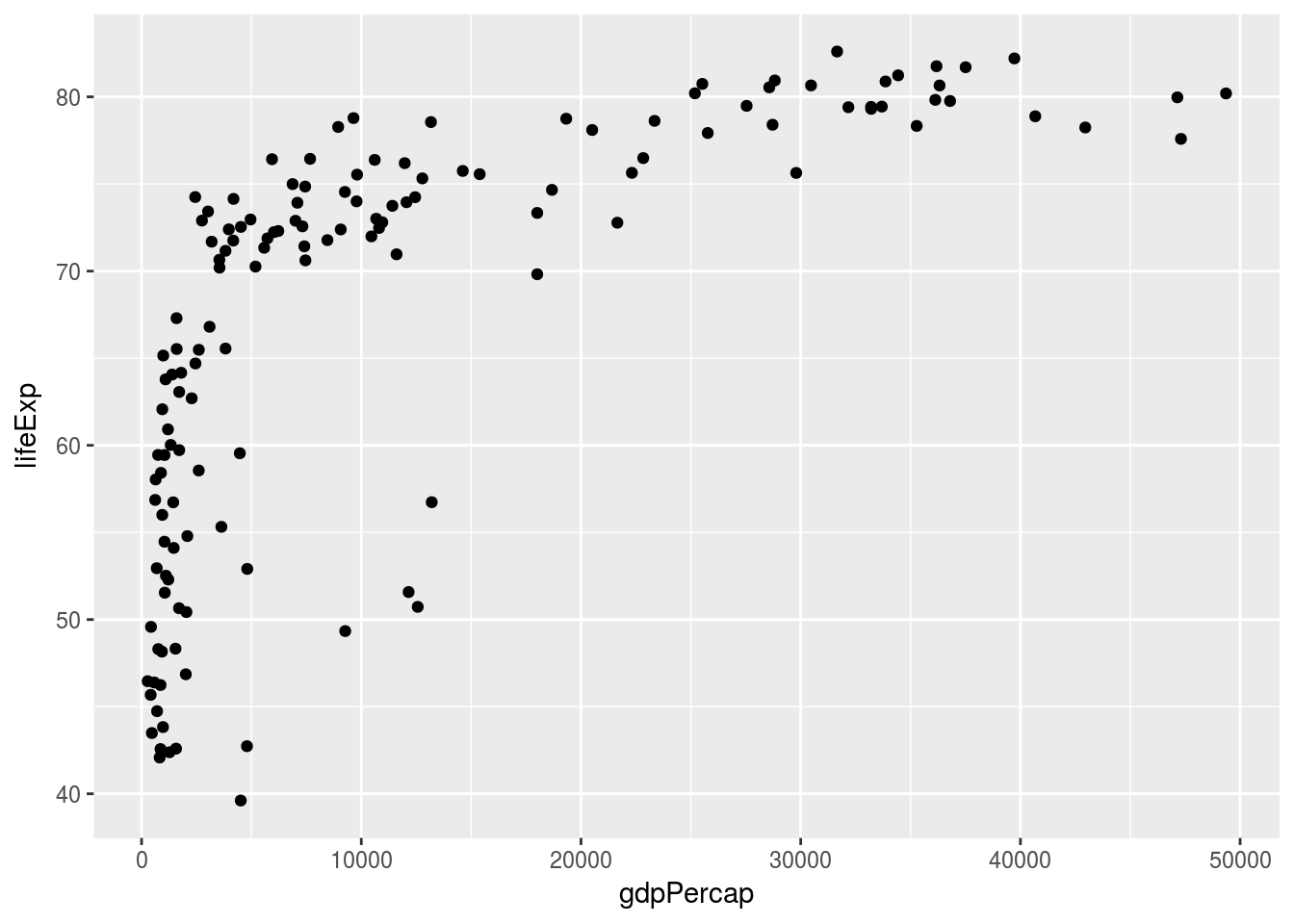
7.4 線圖
使用 geom_line() 繪製線圖來探索數值與日期(時間)的關係。
north_asia <- gapminder %>%
  filter(country %in% c("China", "Japan", "Taiwan", "Korea, Rep."))
line_plot <- ggplot(north_asia, aes(x = year, y = gdpPercap, colour = country)) +
  geom_line()
line_plot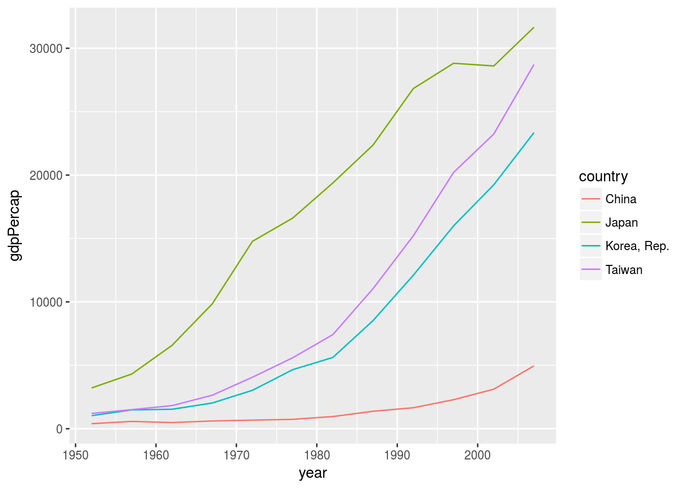
7.5 直方圖
使用 geom_histogram() 繪製直方圖來探索數值的分佈。
hist_plot <- ggplot(gapminder_2007, aes(x = gdpPercap)) +
  geom_histogram()
hist_plot
## `stat_bin()` using `bins = 30`. Pick better value with `binwidth`.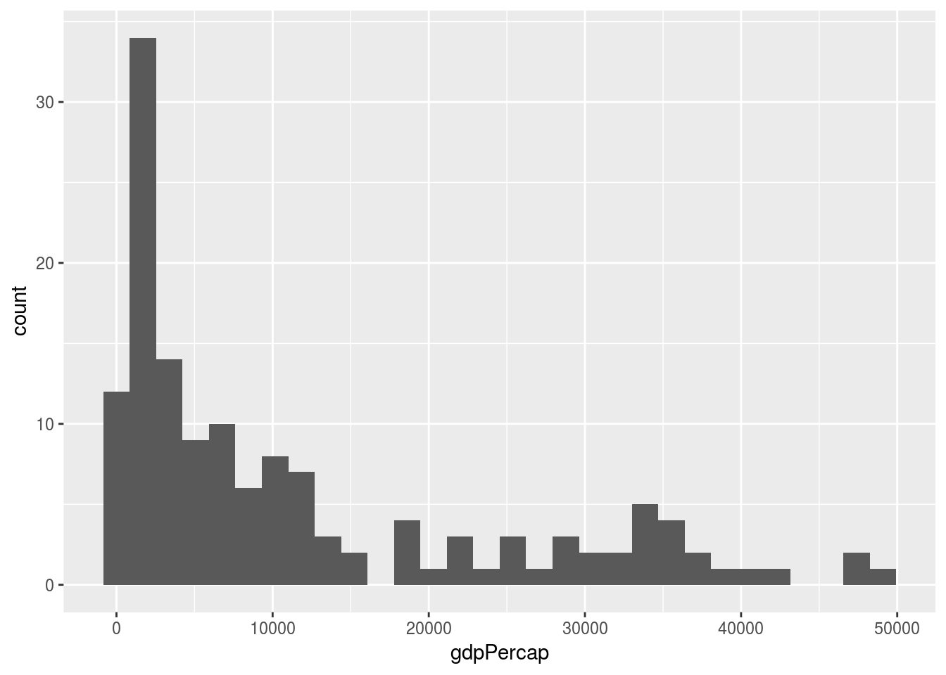
訊息的出現是由於直方圖的分箱數(bins)使用了 30 個分箱預設值,透過調整 bins 或 binwidth 就不會有訊息提示。
hist_plot <- ggplot(gapminder_2007, aes(x = gdpPercap)) +
  geom_histogram(bins = 20)
hist_plot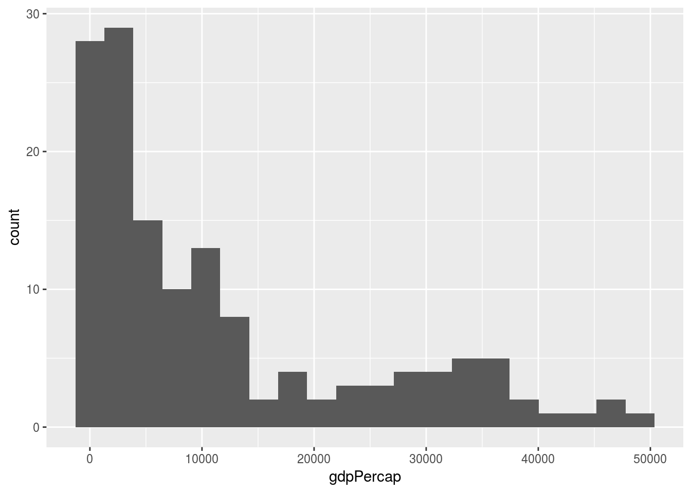
7.6 盒鬚圖
使用 geom_boxplot() 繪製盒鬚圖來探索不同類別與數值分佈的關係。
box_plot <- ggplot(gapminder_2007, aes(x = continent, y = gdpPercap)) +
  geom_boxplot()
box_plot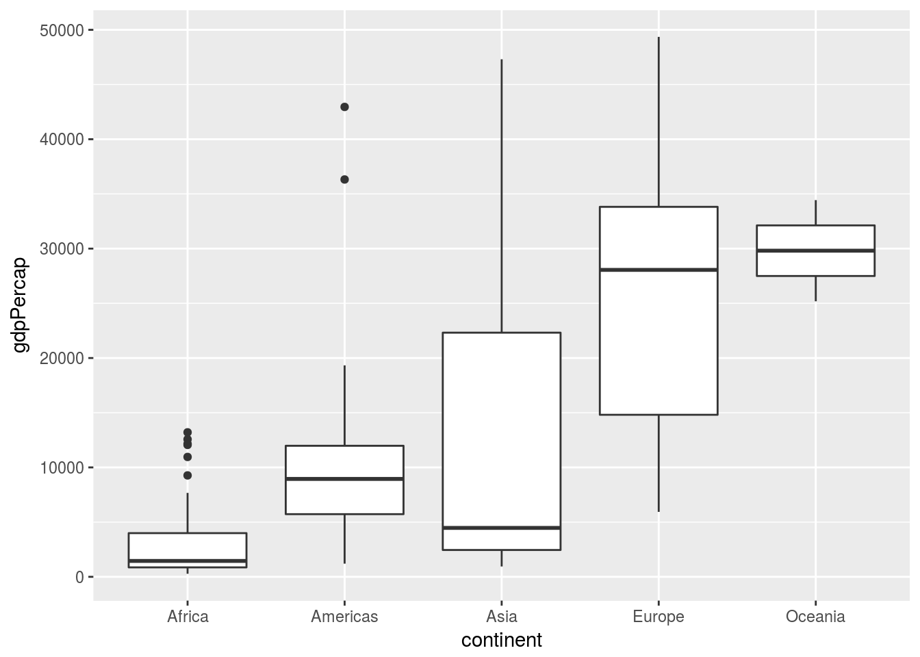
7.7 長條圖
使用 geom_bar() 繪製長條圖來探索類別的排名。
gdpPercap_2007_na <- gapminder %>%
  filter(year == 2007 & country %in% c("China", "Japan", "Taiwan", "Korea, Rep."))
bar_plot <- ggplot(gdpPercap_2007_na, aes(x = country, y = gdpPercap)) +
  geom_bar(stat = "identity")
bar_plot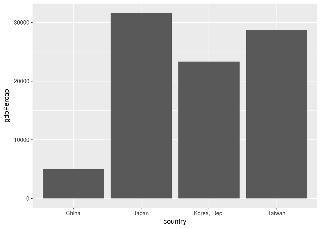
7.8 mac 顯示中文
指定一個電腦中有的字型給 ggplot2。
ggplot(...) +
  geom_XXX(...) +
  theme(text = element_text(family = "Heiti TC Light")) # 指定繁體中文黑體