Part 3 Survey data
One of the most common types of data that MSSE students use and interpret are Likert-style data. Respondents are asked to rank their responses to a question by their level of agreement, e.g.,
1 = Strongly disagree 2 = Disagree 3 = Neutral 4 = Agree 5 = Strongly agree
It might seem obvious to you at this point, but these data need to be treated carefully.
3.1 Vocabulary
You should be able to define and use the following words:
- categorical
- continuous
- nominal
- ordinal
- mode
3.2 Illustration of basic concepts
In contrast to test scores, which are continuous data (data that can take any real value in an interval, e.g., test scores can take any value between 0 and 100), Likert data are categorical data. Categorical data are those that take discrete values. For example, types of bicycles (e.g., road, mountain bike, cyclocross) are a categorical variable; furthermore, it is a nominal categorical variable in that the categories do not have any intrinsic order. Likert data are ordinal categorical variables in that the discrete values have a meaningful order (get it, “order” = ordinal).
However, there is something really important about ordinal data in general, and Likert data in particular. The differences between the responses are not on a uniform scale! Although going from a “Strongly agree” to an “Agree” has a change from a 5 to a 4 (a difference of 1), and going from an “Agree” to a “Neutral” has the same apparent difference, these differences are unlikely to actually mean the same thing. Put yourself in your students’ position: how much effort does it take to get someone from a “Strongly agree” to an “Agree,” compared to the effort to get someone from an “Agree” to a “Neutral?” Are you prepared to say those changes actuallly mean the same things?
This is not just a theoretical conversation. It strongly implies that you should not be using means and standard deviations to describe Likert data. Why? Because a 1 to a 2 does not always mean the same things as a 3 to a 4. If the scale is not uniform, then a mean value is not informative at all, and a standard deviation describes the spread in a data set where you don’t know what the values mean. Weird, right?
This is not a universal feature of categorical data, by the way. Interval data are a type of categorical data in which the differences between each category always mean the same thing, e.g., the number of respondents on a poll are always discrete (number of people is an integer), but the difference between 2 and 3 people means the same thing as the difference between 3900 people and 3901 people.
So, what are you supposed to do? Simple lesson here, and that is that you should just use better metrics and descriptions of Likert data. Rather than using means and standard deviations, consider using quartiles, modes and really sweet figures.
Let’s generate some Likert data. We will randomly generate Likert responses for a class of 30 students to the statement prior to a course with MSSE:
“I really, truly, absolutely love dealing with data and statistics”,
where the responses run from a 1 = Strongly disagree to a 5 = Strongly agree.
pre_responses <- sample(c(1, 2, 3, 4, 5), 30, replace = TRUE, prob = c(4, 3, 2, 1, 1))

barplot(table(pre_responses), names = c("Strongly disagree", "Disagree", "Neutral", "Agree", "Strongly agree"), main = "Pre:  I really, truly, absolutely love statistics")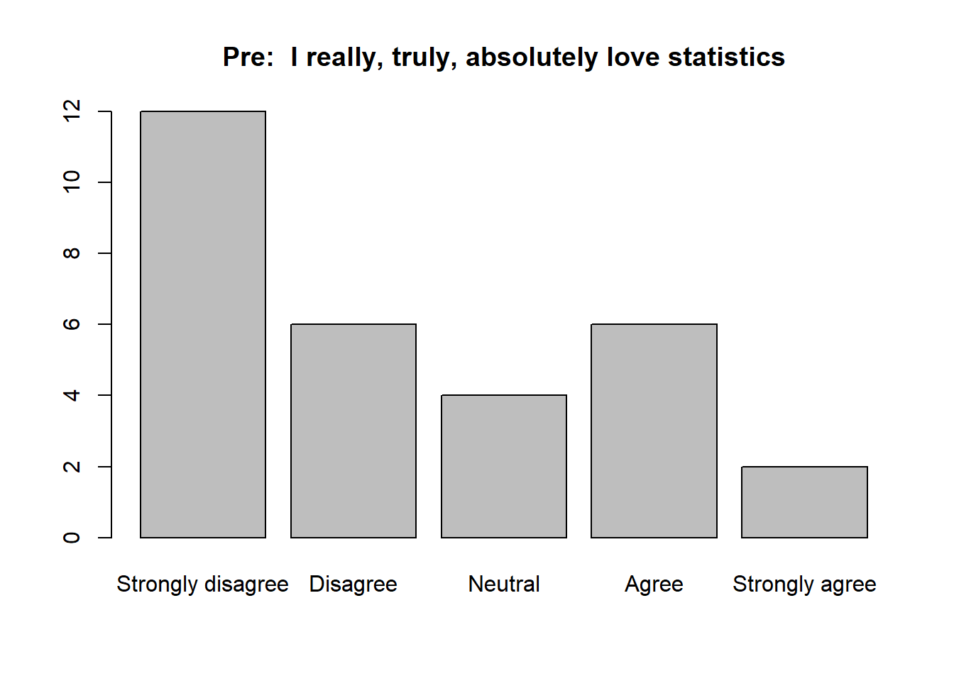
Wow, data and statistics are not popular with this crowd. Here are some simulated data from the same group to the same prompt at the end of a MSSE course:
post_responses <- sample(c(1, 2, 3, 4, 5), 30, replace = TRUE, prob = c(1, 1, 1, 3, 3))

barplot(table(post_responses), names = c("Strongly disagree", "Disagree", "Neutral", "Agree", "Strongly agree"), main = "Post:  I really, truly, absolutely love statistics")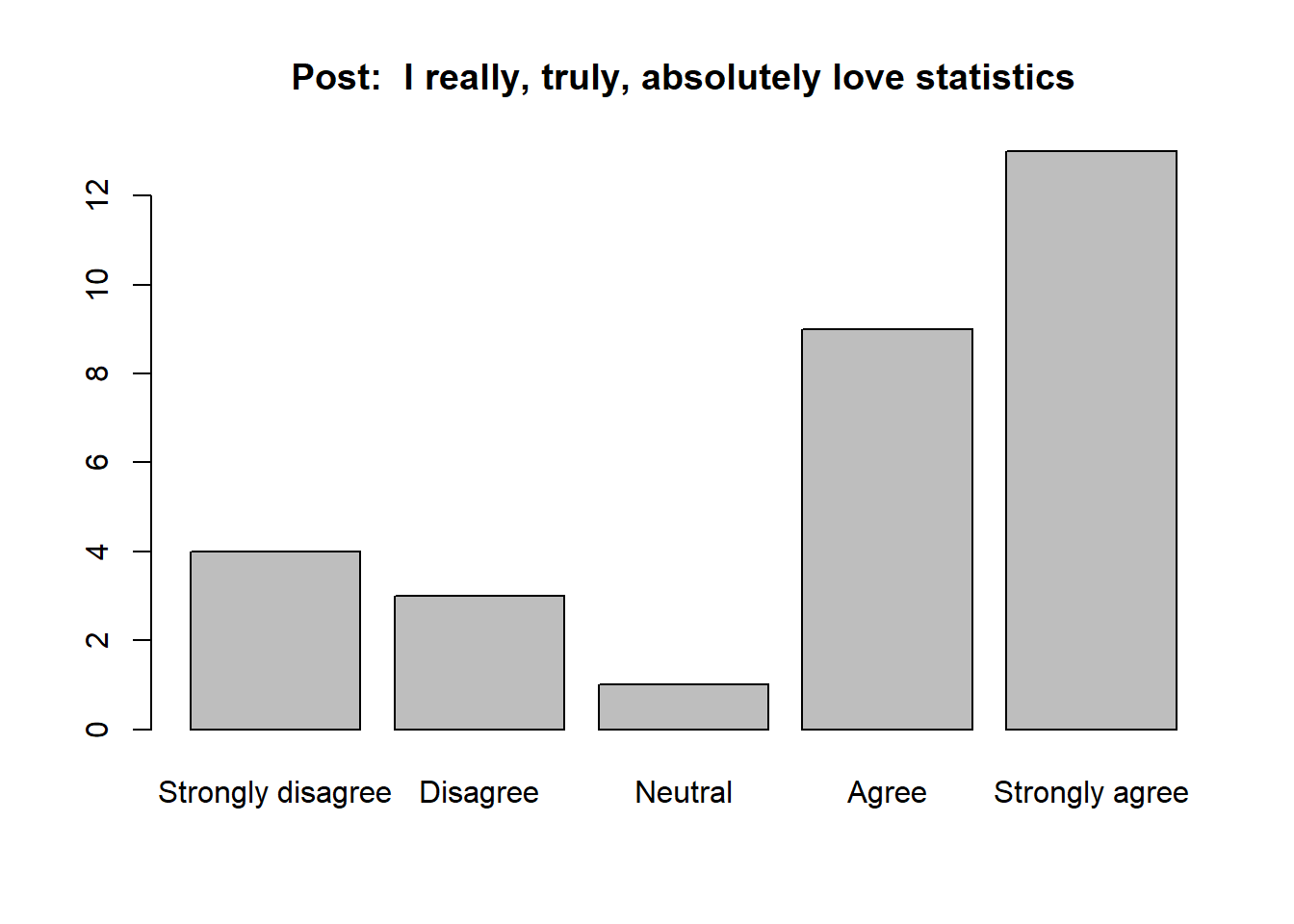
It appears that we did our job in the course, but what are some good ways to talk about these data?
3.3 How to mess up
Here is a good example of how to profoundly mess this up:
The mean response of the group prior to the course was 2.6, compared the to mean response after we spent a week helping people overcome their fears (3.2). I conclude the unit was an incredible success.
What went wrong? Well, the means are really hard to interpret. 3.2 seems higher than 2.6, but what does that difference actually mean? Moreover, this doesn’t tell us anything about the variability in the responses.
A marginally better description:
The mean response of the group prior to the course was 2.6 (standard deviation = 1.52), compared the to mean response after we spent a week helping people overcome their fears (3.2, standard deviation = 1.45). I conclude the unit was an incredible success.
I am being a little trite, but the point here is that just referencing the standard deviation did not improve your description at all.
A much better description:
The most common response on the pre-course survey was 1, and fully 60 percent of students responded either “Strongly disagree” or “Disagree,” indicating devastatingly poor views of data and statistics. In contrast, the most common response of the same group to the same question after a week-long short course was 4. Furthermore, 50 percent of respondents either “Agreed” or “Strongly Agreed,” suggesting that shift in attitudes indicated by the response mode is a consistent effect across students. Finally, I note that 67 percent of respondents that answered “Strongly disagree” at the beginning had improved to at least “Neutral” by the end.
The lessons to learn here:
- do not use the mean and standard deviation for Likert data
- instead, use descriptive statistics like the mode and percentiles of improvement
- make good figures; there was nothing in the above text description that would not have been obvious in a good figure
Look here for a short video on how to make a good graph for these data in Google Sheets.
3.4 Case study 3
Here is a short assignment you can use to show me how well you understand these ideas. Here is the set-up:
Let’s use the same teacher from the last case study. Recall that this teacher had two sections of students (section 1 and section 2), and investigated the impact of a particular teaching modality on content mastery over two unrelated units (unit A, the comparison unit, and unit B, the treatment unit). For both units, the teacher administered a Likert survey before and after the unit. The statement was:
“I feel confident in my ability to read primary literature on this topic.”
The data are here.
Using one figure and a short, concise (1/2 page single spaced, no more) summary, please describe what these data tell you about the teaching method.
Please do be careful again. Not only do you have to at least mention that these units cover different topics, you also need to mention the possibility that students are simply getting better over time and that the new teaching modality is nonsense.