Part 1 How to talk about data
The single biggest change that I would like to facilitate in you folks is to simply abandon the idea that the best way to talk about data, compare data, or use data to support arguments is by the use of a naked mean (or, an average with no other context). If this is the only tweak we make in your analysis toolset, then we should consider this course a success for you.
1.1 Vocabulary
You should already be able to define and use the following words:
- mean
- mode
- quartiles
- median
- range
- variance
- standard deviation
If you need a little boost on these vocabulary terms, they are linked to short explanations at the end of this part. If this is still past the limits of your way back machine, there are good external resources here and here.
1.2 Illustration of basic concepts
Below, you are going to see some vaguely computer-code looking stuff and then some pretty plots. I am using a freely available program (called R) to both generate the code and make the plots. You are in no way expected to understand this code, replicate it, or use it. I just don’t want to hide anything from you. Ignore it at your leisure.
I am going to generate some random data for two groups (we’ll call them classes just to be comfortable to you), and then use those data to illustrate our above vocabulary and the key concept for this part. To set the stage, we’ll say that these are the pre-assessment scores given before you started a unit on dimensional analysis in Chemistry.
classA <- rtruncnorm(100, 70, 100, 80, 5)
classB <- rtruncnorm(100, 0, 100, 80, 15)

par(mfrow = c(2, 1))

hist(classA,
     main = "Histogram of scores from class A",
     xlim = c(0, 100),
     xlab = "",
     breaks = seq(0, 100, 5))

hist(classB,
     main = "Histogram of scores from class B",
     xlim = c(0, 100),
     xlab = "Exam score",
     breaks = seq(0, 100, 5))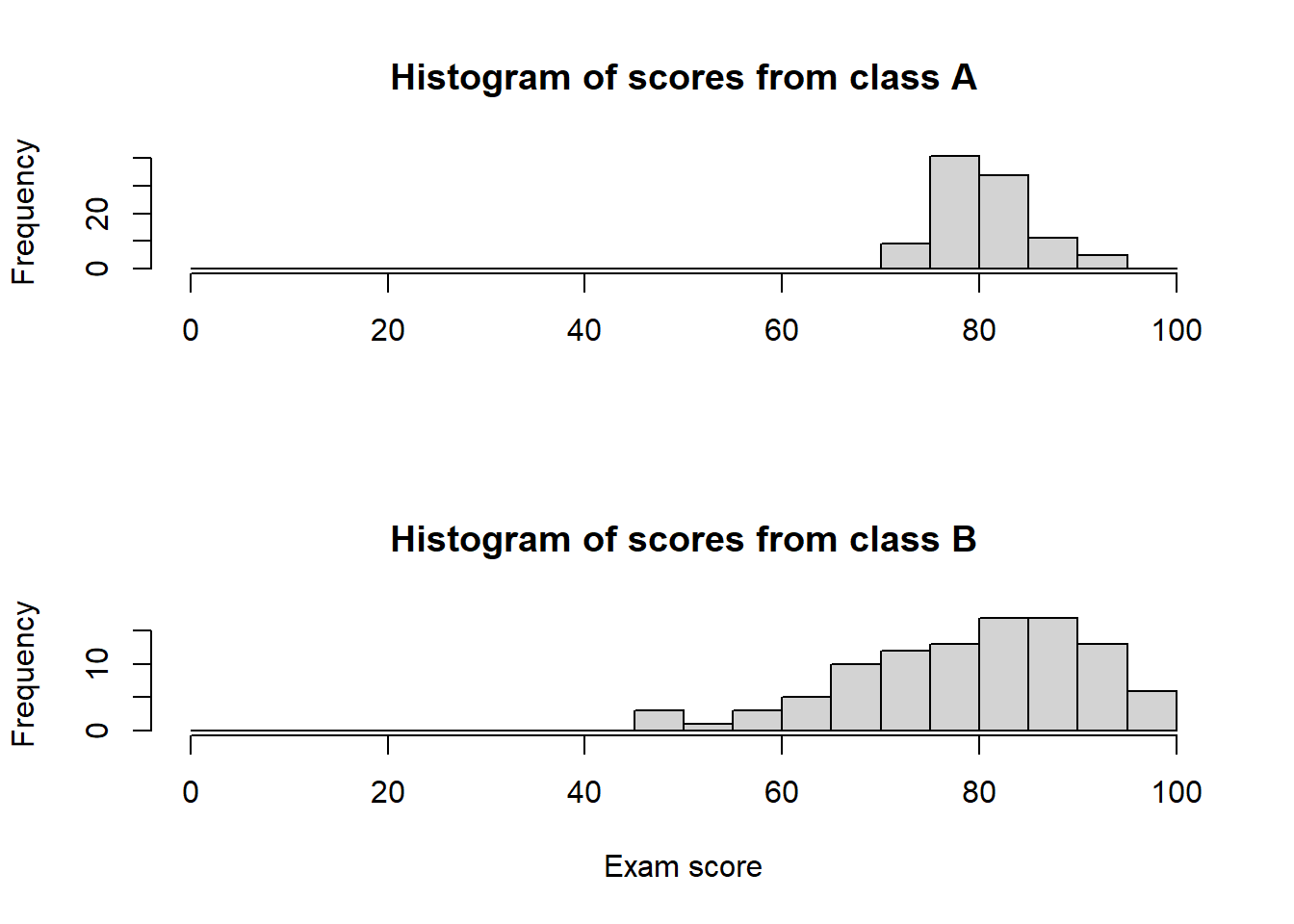
The above figure shows you two histograms of the scores from the two classes. Histograms are amazing: they show you the number of students (y-axis, or “Frequency”) with scores that fall into “buckets” or “bins” (x-axis, or “Exam score”). Here, the bins are 5-units wide, e.g., 71 to 75, 76 to 80, etc.
Another really, really good way of showing data is by using a boxplot (or candlestick plot in Google Sheets). I use these way more often as they are compact and elegant.
df <- data.frame(score = c(classA, classB), grp = rep(c("class A", "class B"), each = 100))

par(mfrow = c(1, 1))

boxplot(score ~ grp, main = "Comparison of class A and class B", data = df, xlab = "", ylab = "Exam score")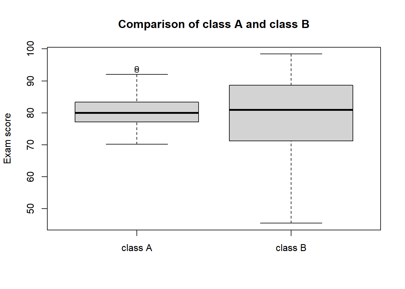
What are you looking at? For each group (class A, class B), the heavy bold line is the median, the lower edge of the gray box is the first quartile, the upper edge of the gray box is the third quartile, the upper “whisker” is 1.5 times the interquartile range away from the third quartile, the lower “whisker” is 1.5 times the interquartile range away from the third quartile, and any dots are “outliers” or points outside the whiskers. That was an ugly sentence!!
So, what can we say about these scores? Both figures are trying to tell you the same thing, and a few things come to mind:
- holy smokes, class B has a much, much higher spread of data
- class A has a very tight distribution of data in comparison
Why? This is the good storytelling part, but one that I have seen frequently from Capstone-style data is that you don’t have random samples of students. Maybe class A are a group of higher-achieving students that got lumped into that section due to scheduling shenanigans. Tragically, maybe class B includes a host of English-language learners that are not receiving the support they need (and are legally entitled to).
Here is a resource to help you learn to make these figures in Google Sheets. This is a Techsmith-hosted video; if you are having troubles, please visit the following page.
How can we butcher the description of these data?
1.3 How to mess up
Here is an example of how to mess these data up:
Prior to the dimensional analysis unit, I found that the there was no real difference in the average score between class B (76.51) and class A (80.18). Therefore, I conclude that these two classes are really similar headed into this challenging unit.
That is pretty awful, even if it is really common. Why? All we used was the mean (or average, technically the arithmetic mean).
It does nothing to convey the context and real structure of the data. We just talked about how these data look really different to our eye after we took the trouble to make a pretty figure out of them.
Here is a very slight improvement:
Prior to the dimensional analysis unit, I found that the there was no real difference in the average score between class B (76.51, standard deviation = 13.41) and class A (80.18, standard deviation = 4.15), even if the spread of the data suggest these groups may be different. I conclude that, overall, these two classes are really similar headed into this challenging unit.
That is really only marginally better. Here, the author used a standard deviation as a totem against criticism. How does that single number help you understand the context of the data any better? It does not (see below in section 1.5)!
This is better:
Prior to the dimensional analysis unit, I found that the there was no real difference in the average score between class B (76.51) and class A (80.18). However, the range (class B = 43.54 to 99.21; class A = 71.69 to 89.39) and quartiles of these two group (class B: 1st = 68.35, median = 77.85, 3rd = 86.57; class A: 1st = 77.34, median = 79.73, 3rd = 83.6) suggest that there are some profound differences in achievement between the two groups heading into this unit. class B has a significant portion of underperforming students, and I urge caution in interpreting any comparison of scores across these two groups.
Why is this so much better? It is honest, thorough and sets your reader up for what you should talk about: how scores within class A improved over a unit, and how scores within class B improved over a unit, and how you should really not compare the two.
The lessons to learn here:
- always include a metric of how spread out your data are, the mean and median alone are really misleading
- pay attention to your quartiles, lots of MSSE projects show improvements among the lowest-achieving students and not among your (already) high-achieving students
- pay attention to the spread of your data; if your treatment doesn’t really change the median/median but tightens the spread that is a worthwhile result
- consider that a single Figure is worth a page of words; use them liberally
1.4 Case study 1
Here is our first (and arguably most important) idea in how to talk about Capstone data.
A MSSE student is investigating the effect of peer-review on the grades for laboratory reports in his middle school science class. He was given permission to use one section as a ‘control’ group (and we should stop calling it that, it is really just a comparison group), wherein the students did traditional lab reports. He used another section as his ‘treatment’ group. For each section, he then compared the final summative grades to the initial pre-assessment, and then compared that difference between the sections. Make sense? What is his hopeful expectation? He hopes that the treatment section shows more improvement and a higher overall score. Here are the raw data (please make a copy of the Google Sheet).
When he did the comparison of means he despaired. Sadness, melancholy, doubt resulted. However, he screwed up by making bad comparisons. Help him by re-analyzing the data doing a better job looking at legitimate comparisons, and the spread of data.
Using one figure and a short, concise (1/2 page single spaced, no more) summary, please explain to this young man why he need not despair. What do the data actually tell you?
1.5 Vocabulary help
Let’s make some fake data and look at a histogram of it.
nonsense <- 100 * rbeta(100, 3, 1)

hist(nonsense)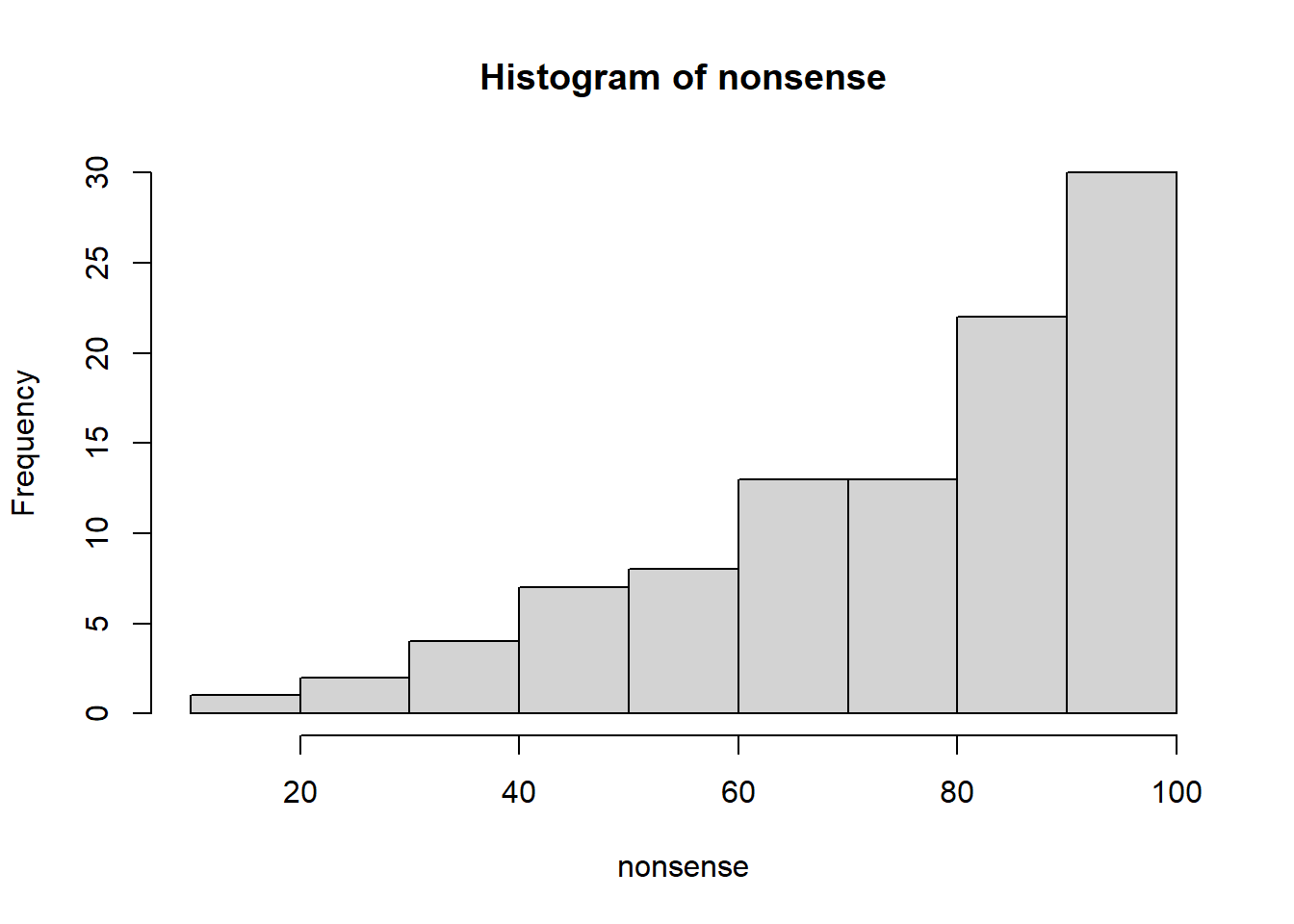
- mean
Not much to say here. The mean (or the average) is just the plain old “add them all up and divide by the number of numbers.” Just as a point of elegance, there are actually many different kinds of means. We nearly exclusively use the arithmetic mean, and in this case the mean is 74.45.
Good point to make here is that the mean is really sensitive to outliers. I am going to replace the maximum value of our data by a crazy high value of (1 * 10^4) and re-calculate it: the new mean is 173.46.
- mode
Quite uncommon for test-score type data. At its most accessible, the mode is the most common number in a data set. For test-score data you may never have a mode if a number is not repeated. There are more complicated versions, but let’s leave it here for now.
- quartiles
Super-useful for us. Quartiles are just ways of pulling apart data into four pieces (“quart” prefix is from the Latin, meaning “four” or “fourth”). Put all of your data into order and start splitting it into quartiles: lower quartile = 25% of your data is at or lower than this value, second quartile (or median) = 50% of your data is at or lower than this value, etc… Here you see a graph of values with red lines at each of the quartiles.
hist(nonsense)

abline(v = quantile(nonsense, probs = c(0.25, 0.5, 0.75)), col = "red")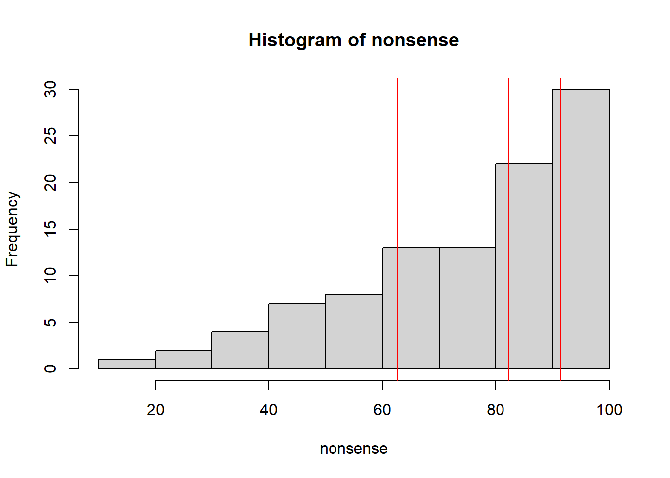
first quartile = 63.983
second quartile = 75.614
third quartile = 90.6125
This does a really good job telling us how spread out the data are.
- median
Easy. Just a new name for the second quartile. The nice part is that it is way more resistant to outliers than the mean. I’ll play the same game as above and replace the maximum value of the data by a value of 1 * 10 ^ 4: the new median is 75.61. Much more resistant to outliers.
- range
Easier. The range refers to either the difference between the maximum and minimum values in a data set (e.g., 80.95), or writing out the minimium to the maximum (e.g., the range of values was from 18 to 98.95).
- variance
Harder. The variance is a metric describing how spread out data are, and it takes a little bit to understand what you are doing here. Let us do it in steps.
- Find the mean of your data
mean_of_nonsense <- mean(nonsense)Our mean is 74.4478.
- Find out how far every point is from the mean you just calculated.
distance <- nonsense - mean_of_nonsense

hist(distance)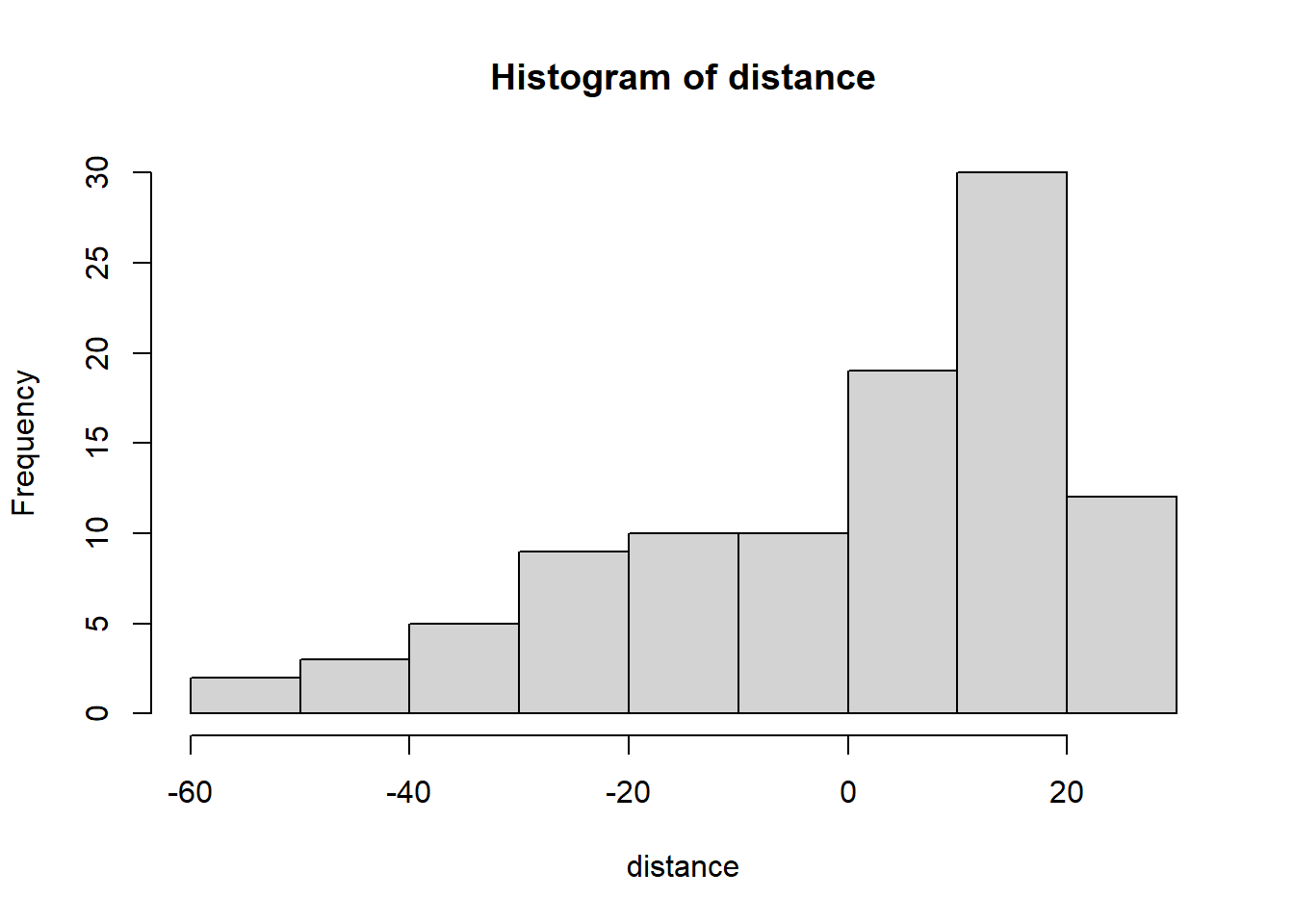
The above figure shows you a histogram of the distances of each datum from the mean.
- Square all of those distances.
squared_distance <- distance ^ 2

hist(squared_distance)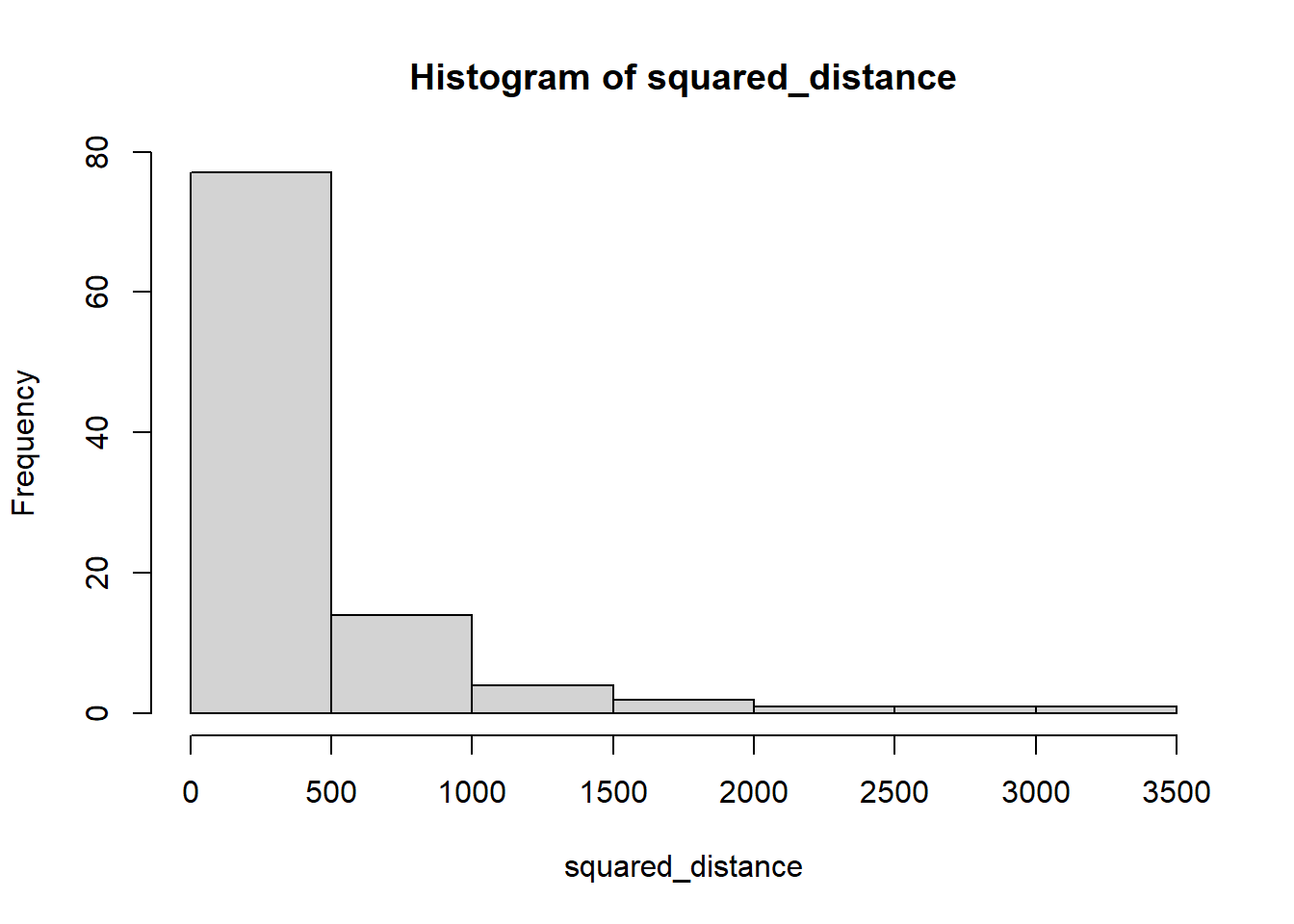
Why do we square them? (wait for it, we’ll explain in a minute)
- Find a strange average of those numbers by adding them all up and dividing by the number of numbers minus 1.
variance <- sum(squared_distance)/(length(squared_distance) - 1)

variance
## [1] 401.4659Why the minus 1? Watch this.
There is your variance. How do we interpret it? It is a representation of the average squared distance of every point from the mean value in a data set.
- standard deviation
This is a funny one. If you are cool with dimensional analysis, then you will note that in the above series of steps you square a distance. If you keep track of your units, that means that you just squared your units. The standard deviation is just the square root of the variance; that puts you back on the original scale of your units. Super disappointing.
Now that we are here, it also helps explain why we square them. If you don’t, when you go to add them all up you tend to get an answer close to zero, i.e., some stuff is above, some stuff is below, and when you add those all up you tend to get zero. Not really your intent. There are other ways to do it (like the absolute value), this is just one.
sqrt(variance)## [1] 20.03661Gets you the same thing as the fancy command:
sd(nonsense)## [1] 20.03661And, now that we are here, it is a good time to put in a plug for why the standard deviation is not that awesome. It is based on as average (as weird as it is), and an average is crippled by outliers. A ton of outliers in your data set and your standard deviation can get real messed up.