Chapter 5 Data Visualization II
5.1 The Review of Key Concepts in ggplot2
The
ggplot2package is an R package for data visualization.The
ggplot2package was developed to create a graphic by combining few graphical components (e.g., data, coordinate systems, geometric objects, aesthetics, facets, themes) based on the grammar of graphics (gg inggplot2stands for grammar of graphics).
| Graphical components | Description |
|---|---|
| Data | Data are what we want to visualize and consist of variables. |
| Coordinate systems | Coordinate systems are the space on which the geometric object are organized. For example, we typically use the cartesian coordinate system with x and y axis. |
| Geoms | Geoms are the geometric objects that are drawn to represent the data. For examples, the points, lines, and bars on a plot are geoms. Each geom function (e.g., geom_points()) returns a layer representing a geometric object. |
| Aesthetics | Aesthetics are the visual properties of geoms. For example, the positions of x and y axis, color of points, shape of points, color of lines are the aesthetics. The variable in the data is mapped to the aesthetic of a geometric object. For example, color = country is a specification that maps the variable country in the data to the color aesthetic. The specific function that maps a variable to an aesthetic is called scales. |
| Scales | The scale function (e.g., scale_fill_brewer()) maps data values to the visual values of an aesthetic. For example, using the scale_fill_brewer() function, we can change the mapping from data values to the colors. That is, we can change the colors of geoms. In this sense, the scales control the aesthetic mapping. |
| Stats | A statistical transformation (stats for short) creates new variables to plots (e.g., counts, prop). A stat function (e.g., stat_count for a bar plot) is an alternative way to build a layer. A stat takes a dataset as input, and returns a dataset as output. |
| Facets | Facets divide a plot into multiple subplots based on the values of one or more discrete variables. |
| Themes | Theme elements are the non-data elements of a graph, such as titles, fonts, ticks, and labels. |
- In the
ggplot2package, a graph is the layers of graphical components.
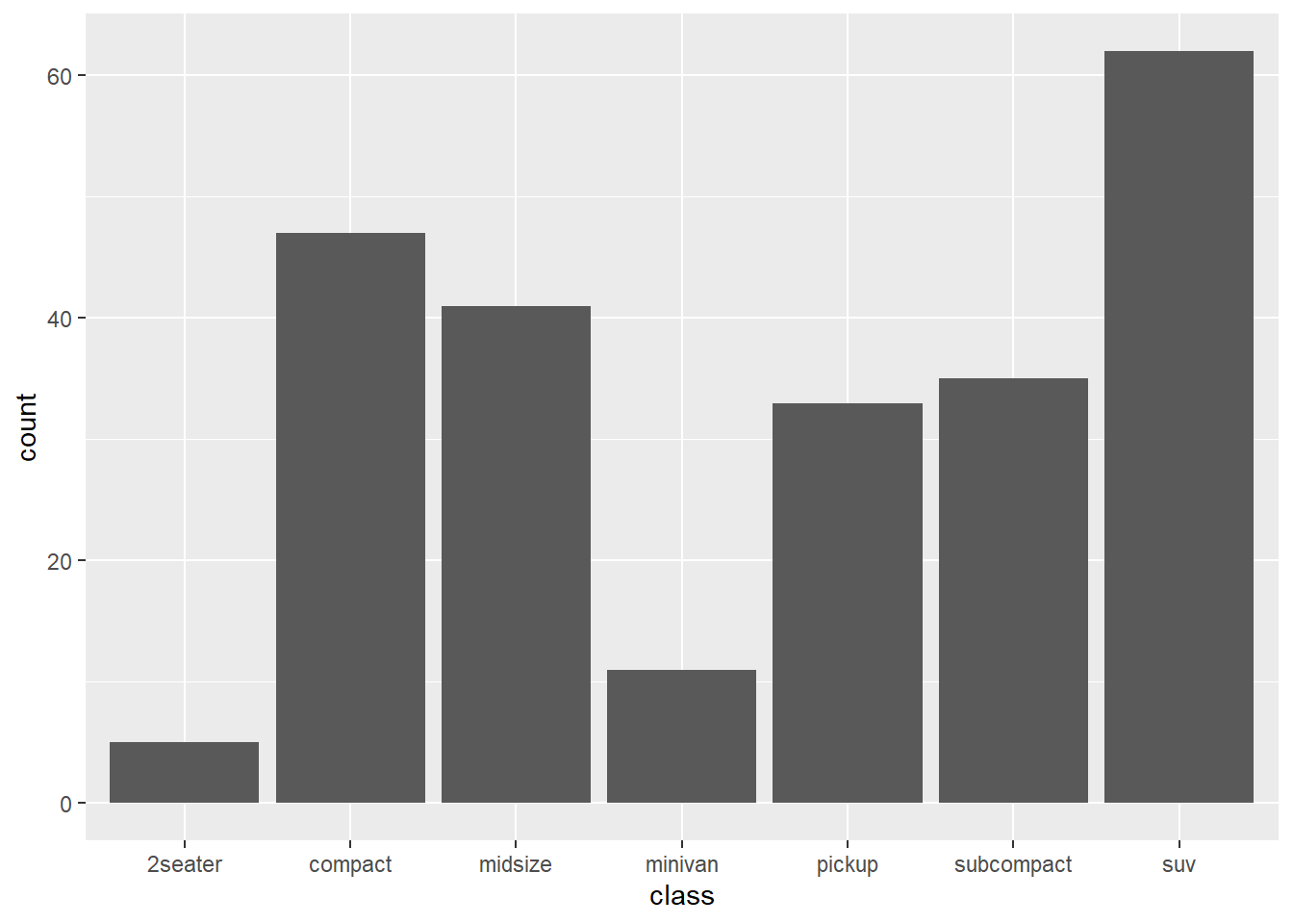
5.2 An example of a graph in the ggplot2
- (Data) We will use the
mpgdataset in theggplot2package. For more details about thempgdata, type?mpgin the console.
## # A tibble: 234 x 11
##    manufacturer model    displ  year   cyl trans   drv     cty   hwy fl    class
##    <chr>        <chr>    <dbl> <int> <int> <chr>   <chr> <int> <int> <chr> <chr>
##  1 audi         a4         1.8  1999     4 auto(l~ f        18    29 p     comp~
##  2 audi         a4         1.8  1999     4 manual~ f        21    29 p     comp~
##  3 audi         a4         2    2008     4 manual~ f        20    31 p     comp~
##  4 audi         a4         2    2008     4 auto(a~ f        21    30 p     comp~
##  5 audi         a4         2.8  1999     6 auto(l~ f        16    26 p     comp~
##  6 audi         a4         2.8  1999     6 manual~ f        18    26 p     comp~
##  7 audi         a4         3.1  2008     6 auto(a~ f        18    27 p     comp~
##  8 audi         a4 quat~   1.8  1999     4 manual~ 4        18    26 p     comp~
##  9 audi         a4 quat~   1.8  1999     4 auto(l~ 4        16    25 p     comp~
## 10 audi         a4 quat~   2    2008     4 manual~ 4        20    28 p     comp~
## # ... with 224 more rows- The
ggplot()function initialize the ggplot object.

- (Aesthetic) The
aes()function is used for the aesthetic mapping between variables and aesthetic. In this example, we mapped theclassvariable to thexposition aesthetic of thexaxis.
- (Geoms) The
geom_bar()add a layer representing the bars.
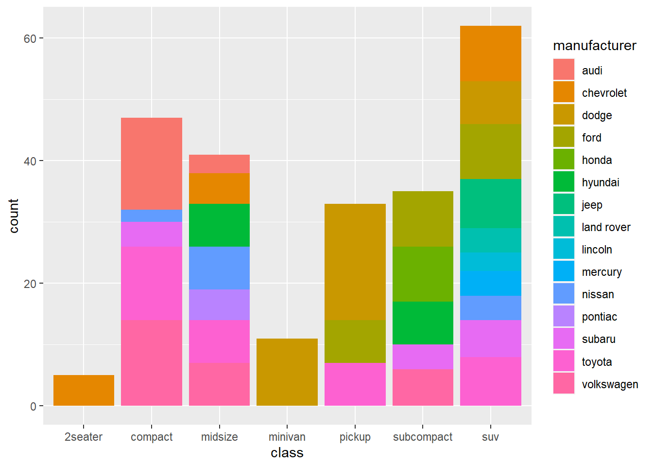
- (Aesthetic) The
fill = manufacturermaps themanufacturervariable in thempgto thefillaesthetic (i.e., color inside bars)

- (Stats) The
geom_bar()makes the height of the bar proportional to the number of cases in each group. That is, thegeom_bar()needs to calculate a new variable, the number of cases in each group, to create a bar plot. By default, thegeom_bar()usesstat_count()which counts the number of cases at each x position. Sostat_count()creates the same graph.
- (facets) There are two types of faceting provided by
ggplot2:facet_grid()andfacet_wrap().facet_grid()produces a 2d grid of panels defined by variables which form the rows and columns, whilefacet_wrap()produces a 1d ribbon of panels that is wrapped into 2d. In this example,facet_wrap()is used to creates multiple subplots based on the values of themanufacturervariable.
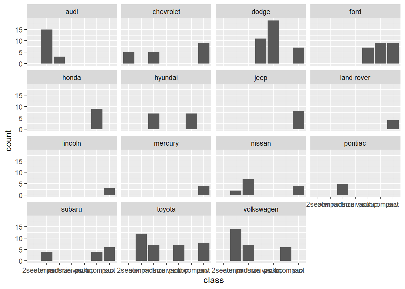
# x = class has been changed to y = class for the horizontal bar plot
ggplot(data = mpg, aes(y = class)) +
geom_bar() +
facet_wrap(vars(manufacturer)) 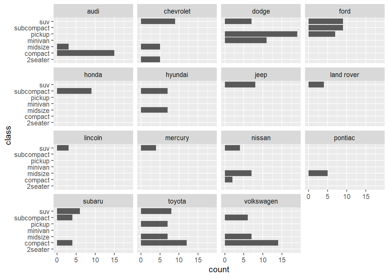
5.3 Themes
- You can create a graph by combining graphical components of the
ggplot2package based on your data. Now, it’s time to make your graph more pretty and informative.
“Theme elements specify the non-data elements that you can control. For example, the
plot.titleelement controls the appearance of the plot title;axis.ticks.x, the ticks on the x axis;legend.key.height, the height of the keys in the legend.”
“Each element is associated with an element function, which describes the visual properties of the element. For example,
element_text()sets the font size, colour and face of text elements likeplot.title.”
“The
theme()function which allows you to override the default theme elements by calling element functions, liketheme(plot.title = element_text(colour = "red")).”
“Complete themes, like
theme_grey()set all of the theme elements to values designed to work together harmoniously”
- Here is the theme elements of a graph in the
ggplot2package.
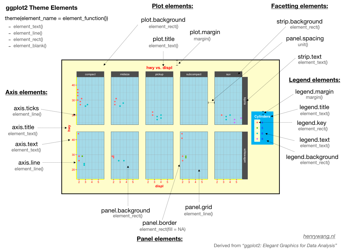
from henrywang.nl
- When you make your graph more pretty and informative, it is almost impossible to memorize all the functions and options for each of specific modifications of your graph. Again, Goolgling is the best way to achieve your goal of making your graph pretty and informative. In order to find the solutions to your problems quickly, you need to know the terminologies for the elements of a graph. Then, you can google using the right keywords (e.g., “increase the size of font on axis label”, “change the position of legend”).
5.4 Modify axis, legend, and plot labels
labs()is used to modify axis, legend, and plot labels. Please compare the graph below with the one above to check which labels have been changed bylabs(). Check here for more details aboutlabs().
ggplot(data = mpg, aes(x = class, fill = manufacturer)) +
geom_bar() +
labs(title = "Counts of Car Class",
subtitle = "By manufacturer",
caption = "source: mpg data from ggplot2",
fill = "Car Company",
x = "Class of Cars",
y = "Count")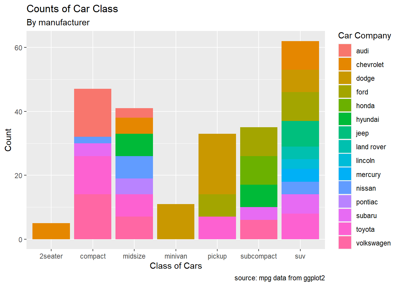
5.5 Axes
- ggplot will display the axes with defaults that look good in most cases, but you might want to control, for example, the axis labels, the number and placement of tick marks, the tick mark labels, and so on.
5.5.1 Setting the Position of Tick Marks
- Often, we want to set the tick marks on the axis
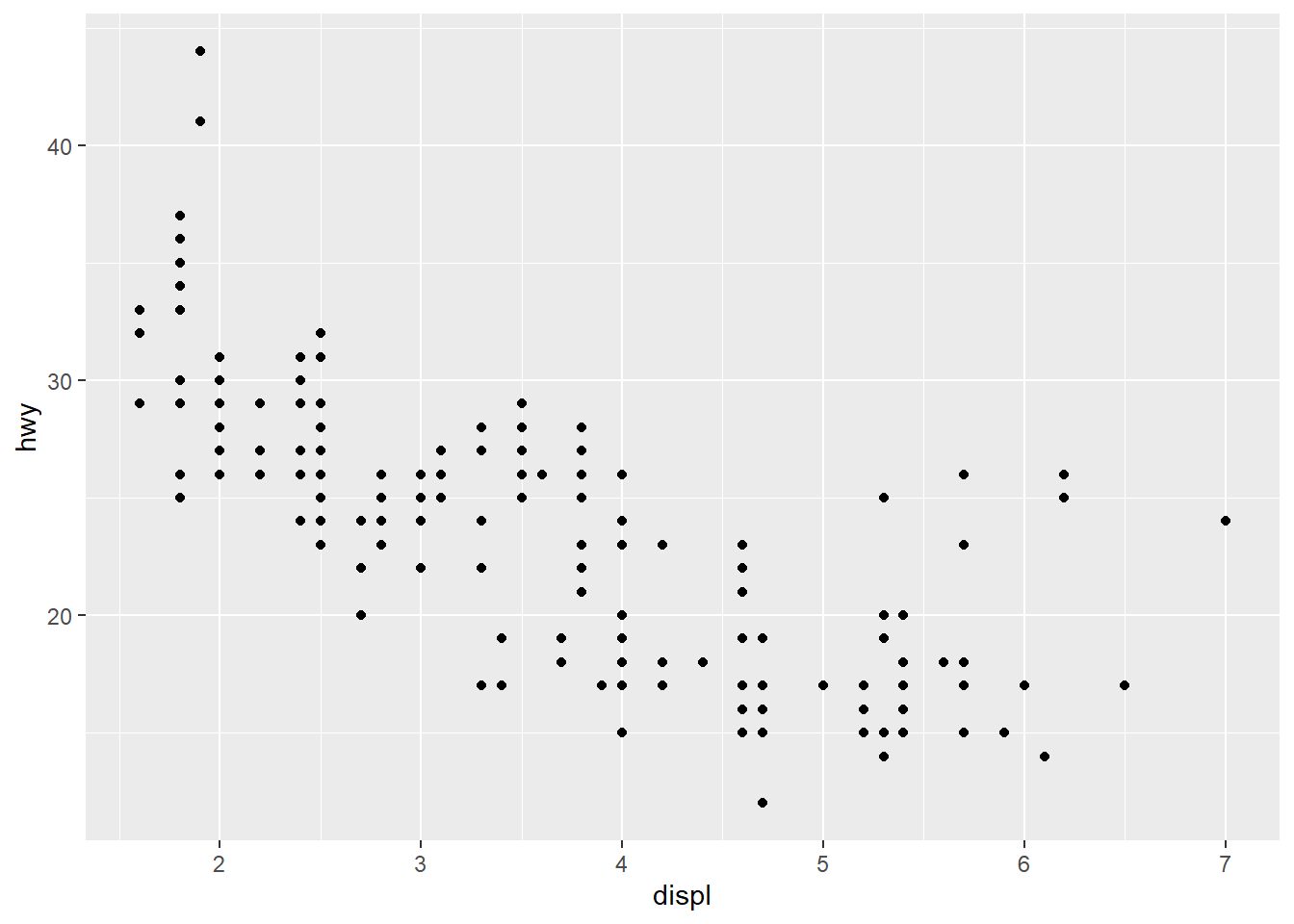
breakssets the tick marks.
ggplot(mpg, aes(x = displ, y = hwy)) +
geom_point() +
scale_x_continuous(breaks = c(2,4,6)) +
scale_y_continuous(breaks = c(15, 25, 35, 45))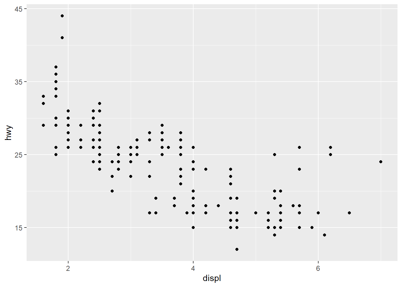
5.5.2 Changing the Text of Tick Labels
labelssets the tick labels.
ggplot(mpg, aes(x = displ, y = hwy)) +
geom_point() +
scale_x_continuous(breaks = c(2,4,6), labels = c("2 cylinders", "4 cylinders", "6 cylinders")) +
scale_y_continuous(breaks = c(15, 25, 35, 45))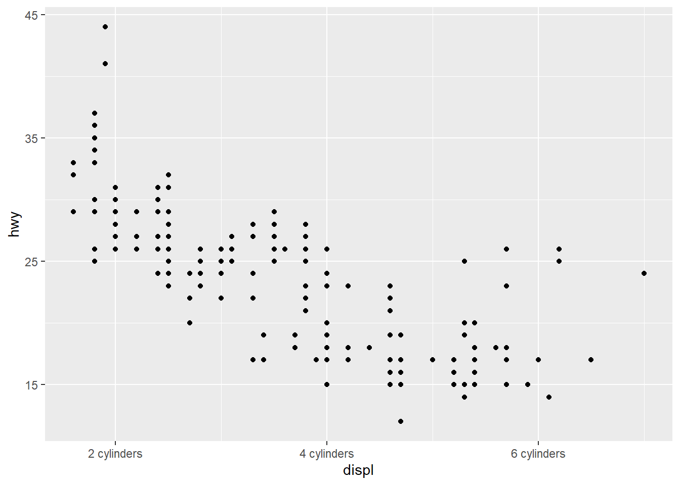


5.6 Legends
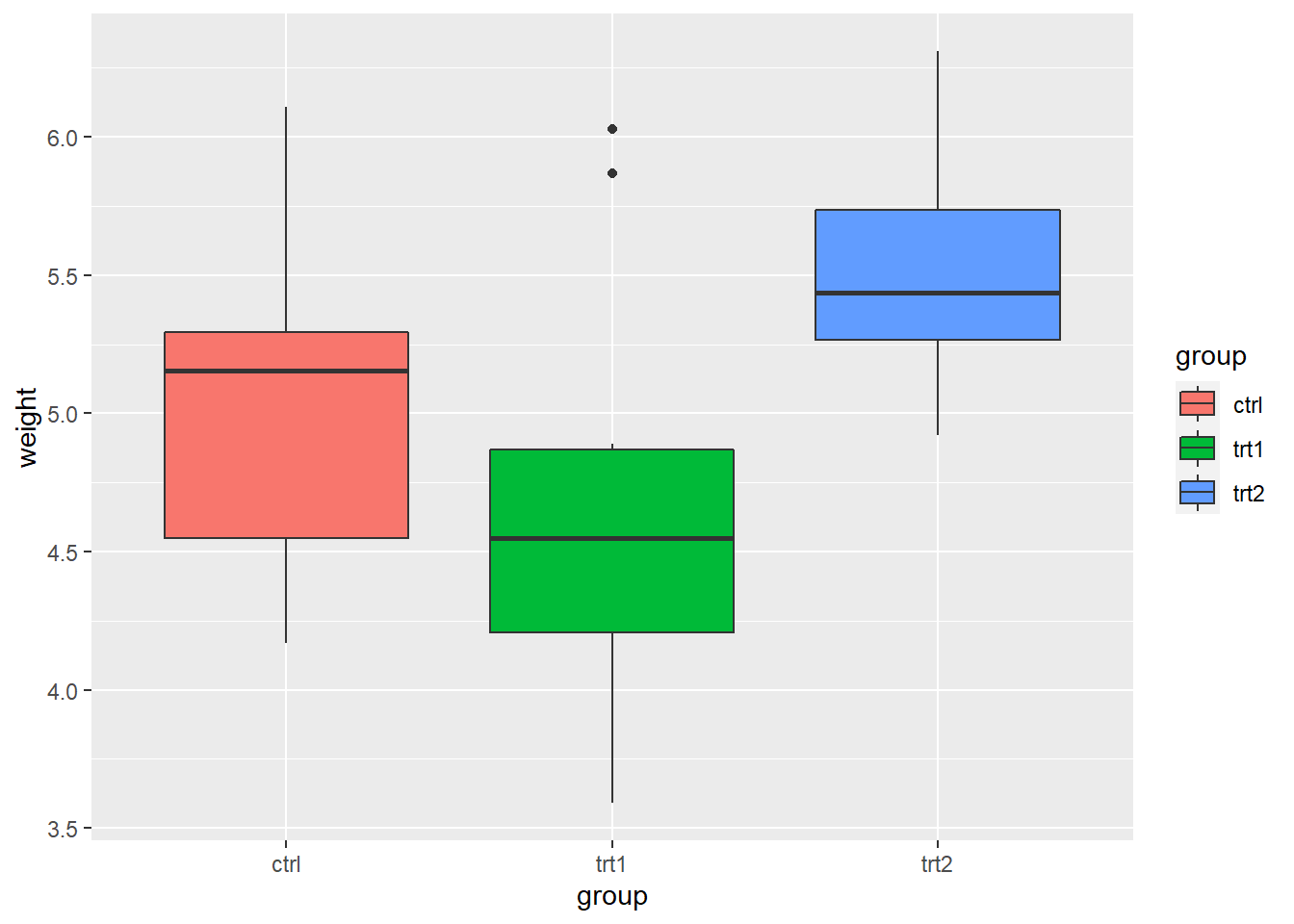
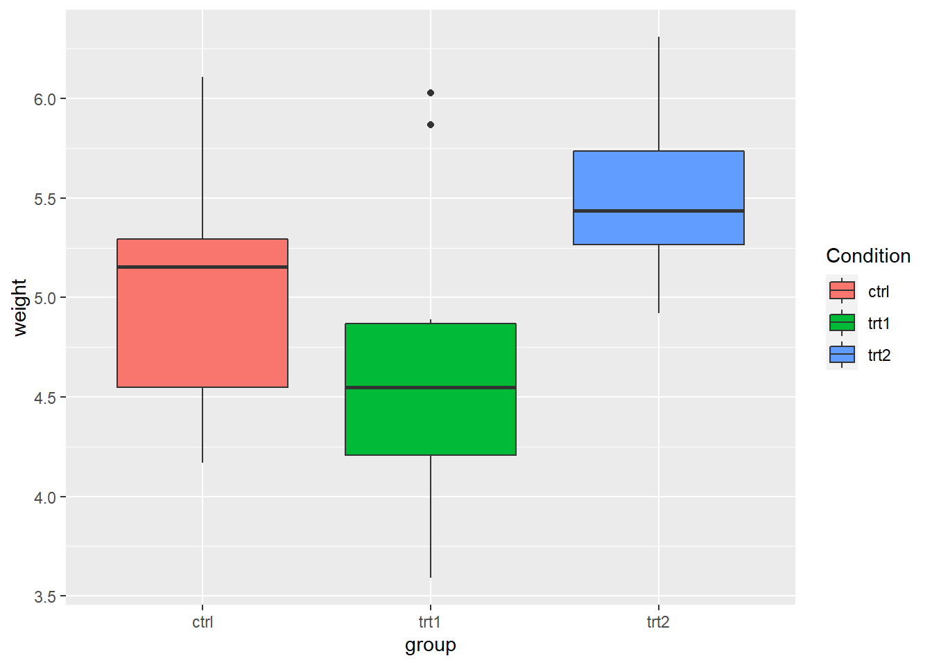
- The
PlantGrowthdata are the results from an experiment to compare yields (as measured by dried weight of plants) obtained under a control and two different treatment conditions.
- Use
labs()and set the value offill,colour,shape, or whatever aesthetic is appropriate for the legend
- In fact,
labs()sets the title, subtitle, caption, x-axis label, y-axis label, and the title of the legend.
pg_plot +
labs(title = "Weight of Plants",
subtitle = "By Experimental Conditions",
caption = "source: PlantGrowth",
x = "Experimental Conditions",
y = "Weight (pounds)",
fill = "Condition")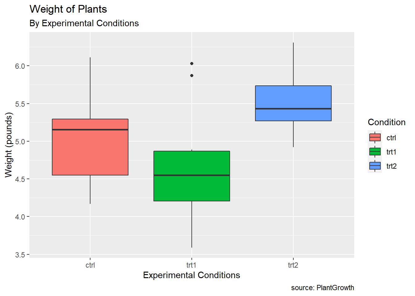
- Changing the position of the legend
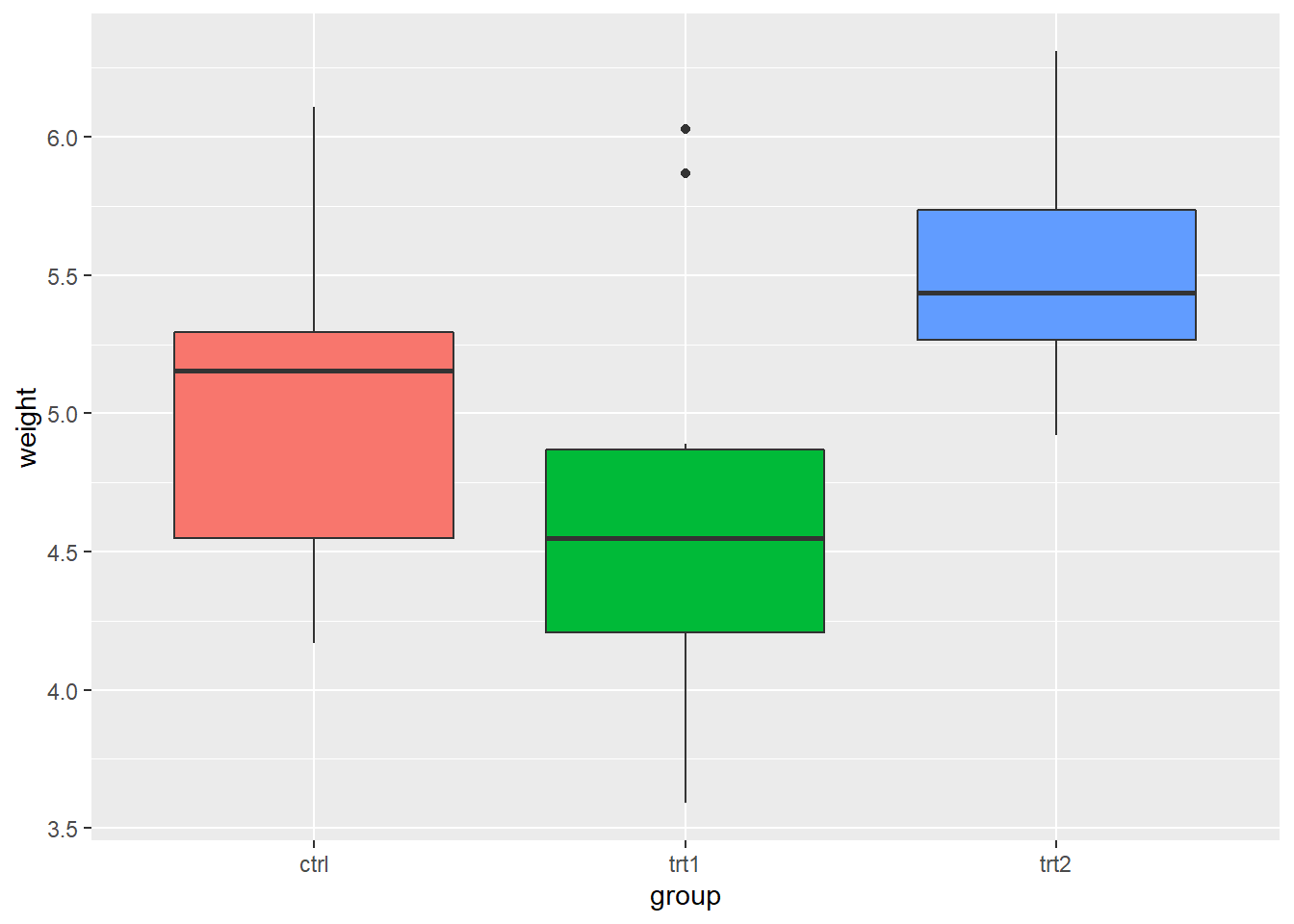
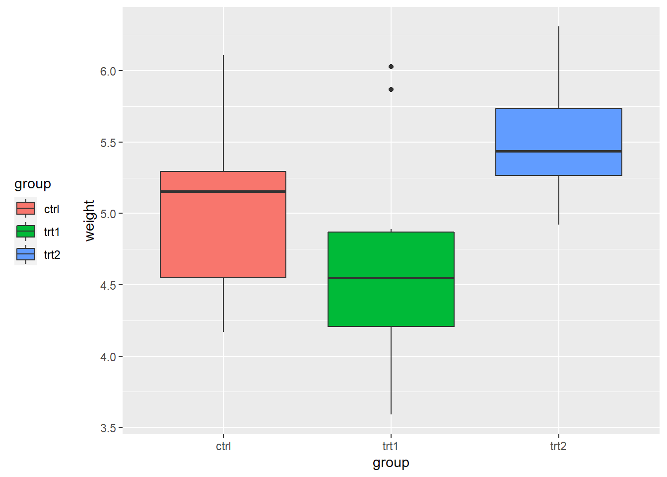
# place the legend inside the plot
# The coordinate space starts at (0, 0) in the bottom left and goes to (1, 1) in the top right.
pg_plot +
theme(legend.position = c(.8, .3))
5.7 Annotations
- Once you create your plot using data, you can add extra contextual information (e.g., text, lines).
5.7.1 Adding Text Annotations
- faithful data
# faithful is a built-in data in R
# ?faithful in your console will display the help documentation for the data
# faithful contains waiting time between eruptions and the duration of the eruption for the Old Faithful geyser in Yellowstone National Park, Wyoming, USA.
# head() will display the first six observations in your screen
head(faithful)## eruptions waiting
## 1 3.600 79
## 2 1.800 54
## 3 3.333 74
## 4 2.283 62
## 5 4.533 85
## 6 2.883 55- Let’s create the scatter plot between
eruptions(x-axis) andwaiting(y-axis)
# A variable name `p` points to (or binds or references) the ggplot object
# Simply, we just give a name `p` to the ggplot object
# <- is an assignment operator in R
# e.g., a <- 10 # a variable name `a` points to the value `10`
p <- ggplot(faithful, aes(x = eruptions, y = waiting)) +
geom_point()
p 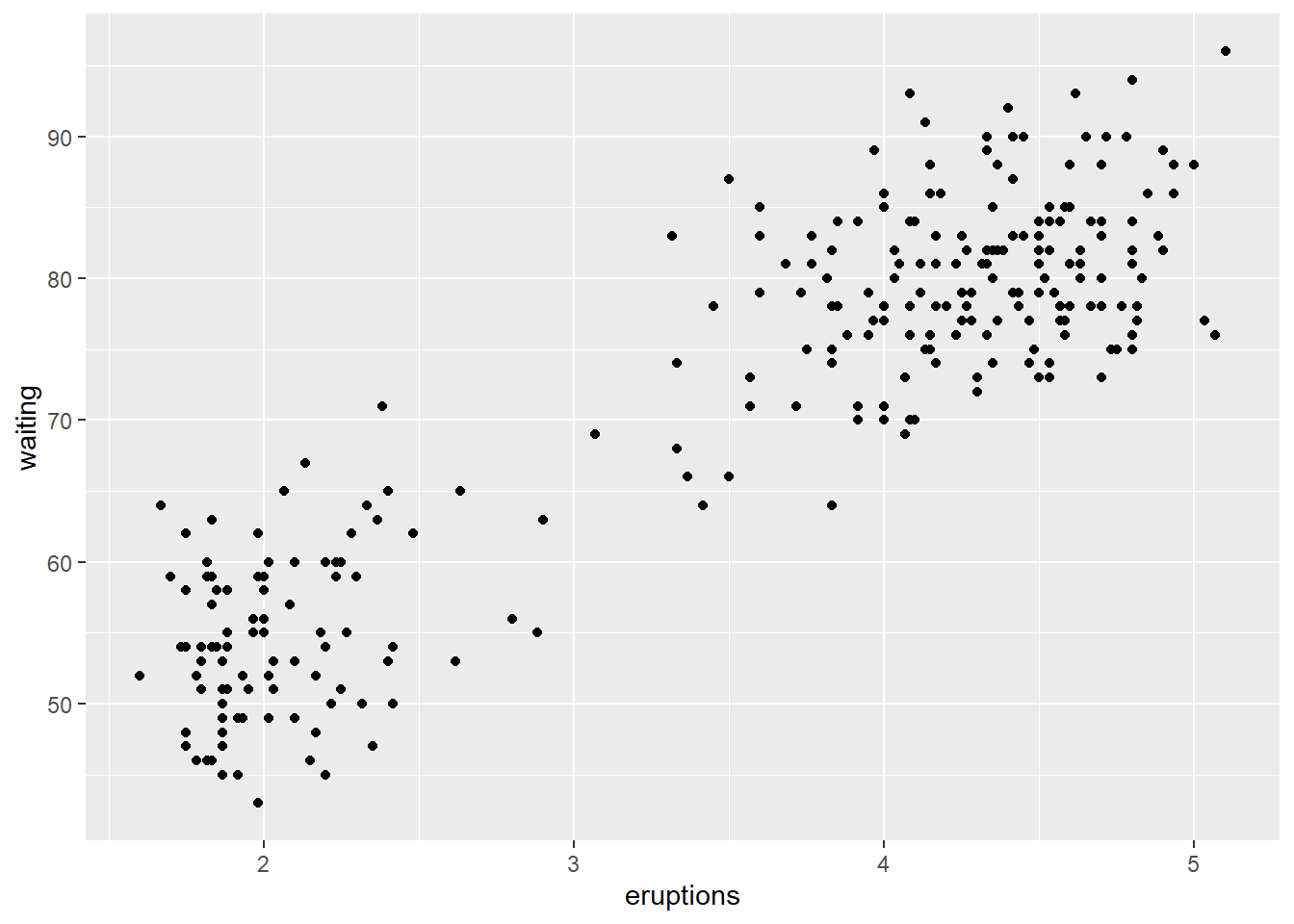
- The
annotate()function can be used to add any type of geometric object. In the example below, we addtextto a plot.
# we are adding another layers to the `p` object
# Where do the values 3, 48, 4.5, and 66 come from?
p +
annotate("text", x = 3, y = 48, label = "Group 1") +
annotate("text", x = 4.5, y = 66, label = "Group 2")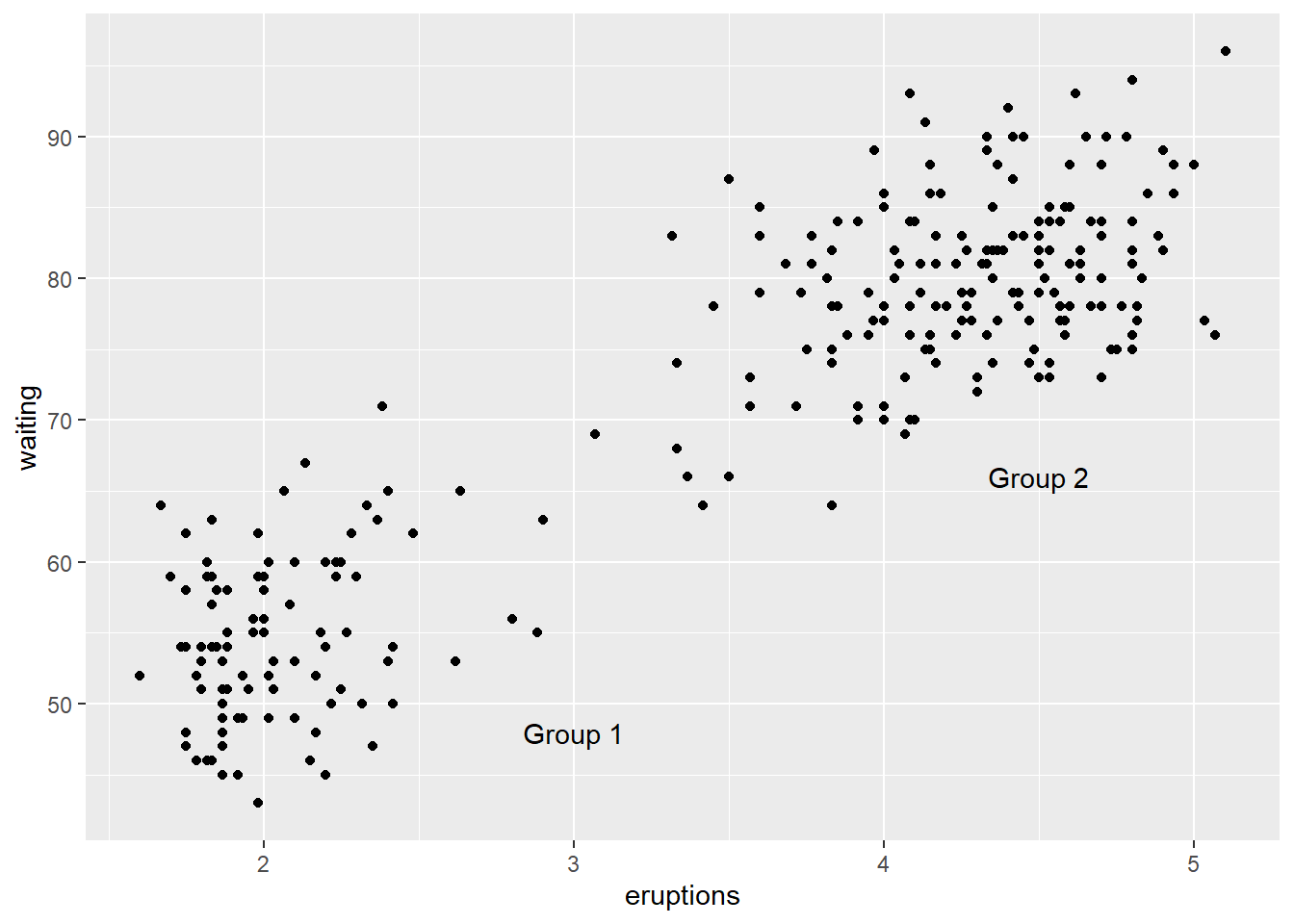
5.7.2 Adding Lines
## Warning: package 'gcookbook' was built under R version 4.0.3- heightweight data
## sex ageYear ageMonth heightIn weightLb
## 1 f 11.92 143 56.3 85.0
## 2 f 12.92 155 62.3 105.0
## 3 f 12.75 153 63.3 108.0
## 4 f 13.42 161 59.0 92.0
## 5 f 15.92 191 62.5 112.5
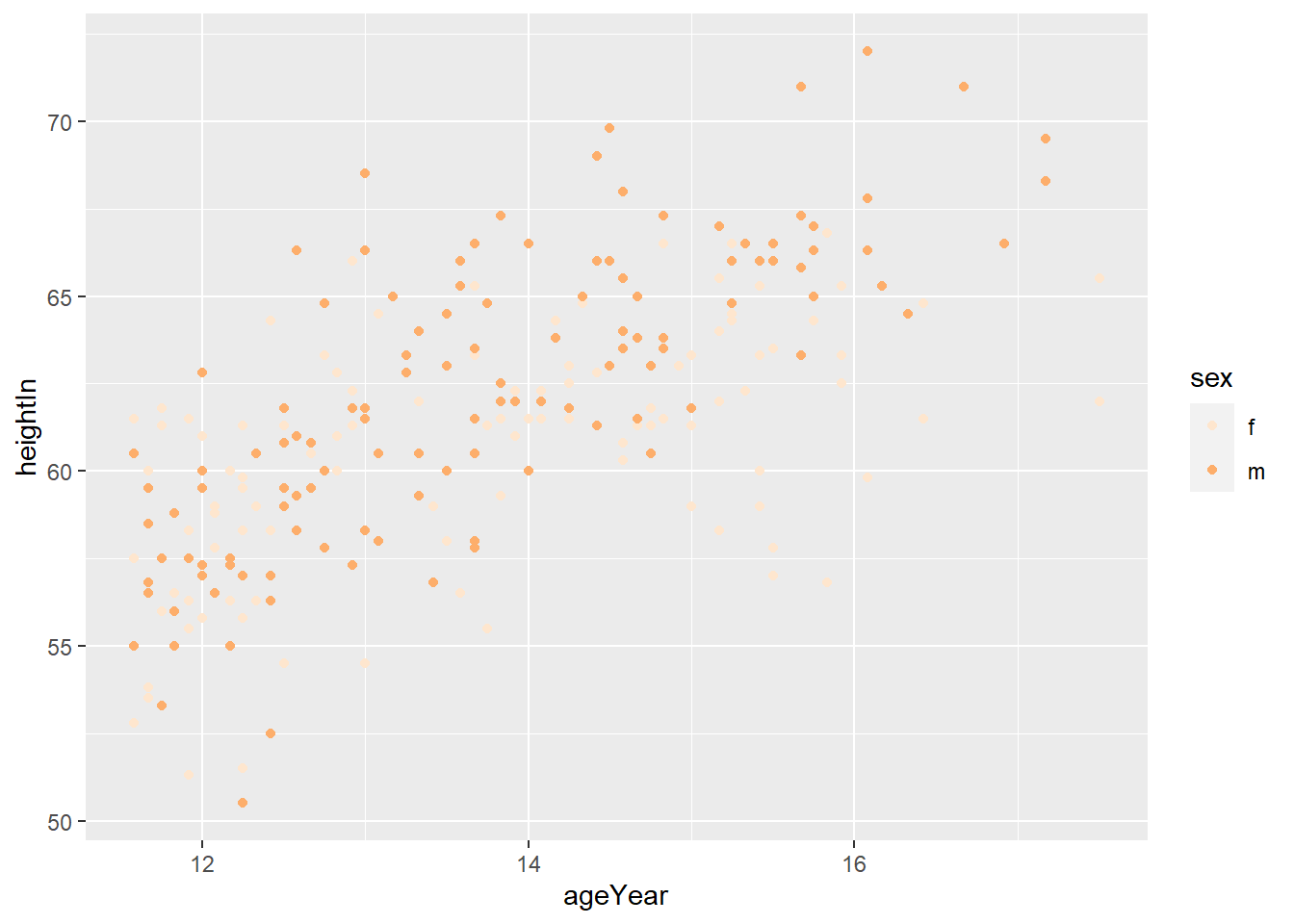
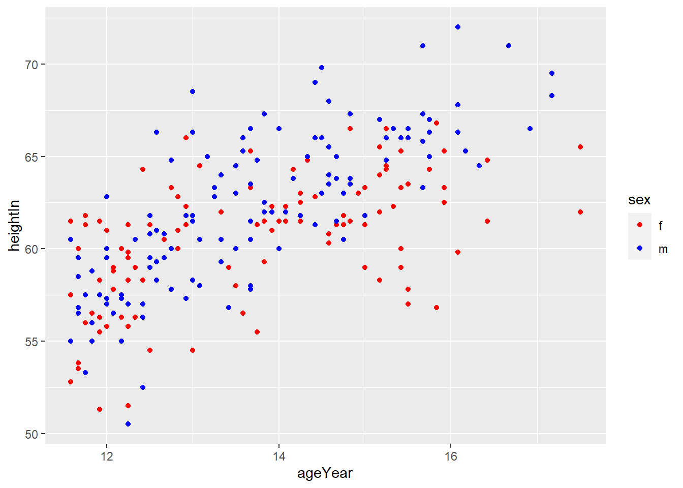
## 6 f 14.25 171 62.5 112.0# How do you read `colour = sex` in the code below?
# Explain the role of `colour = sex`
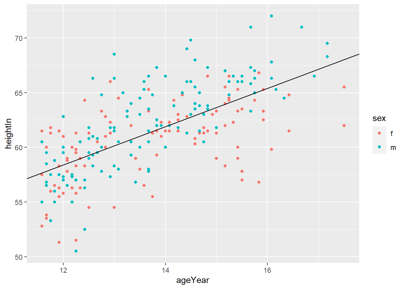
hw_plot <- ggplot(heightweight, aes(x = ageYear, y = heightIn, colour = sex)) +
geom_point()
hw_plot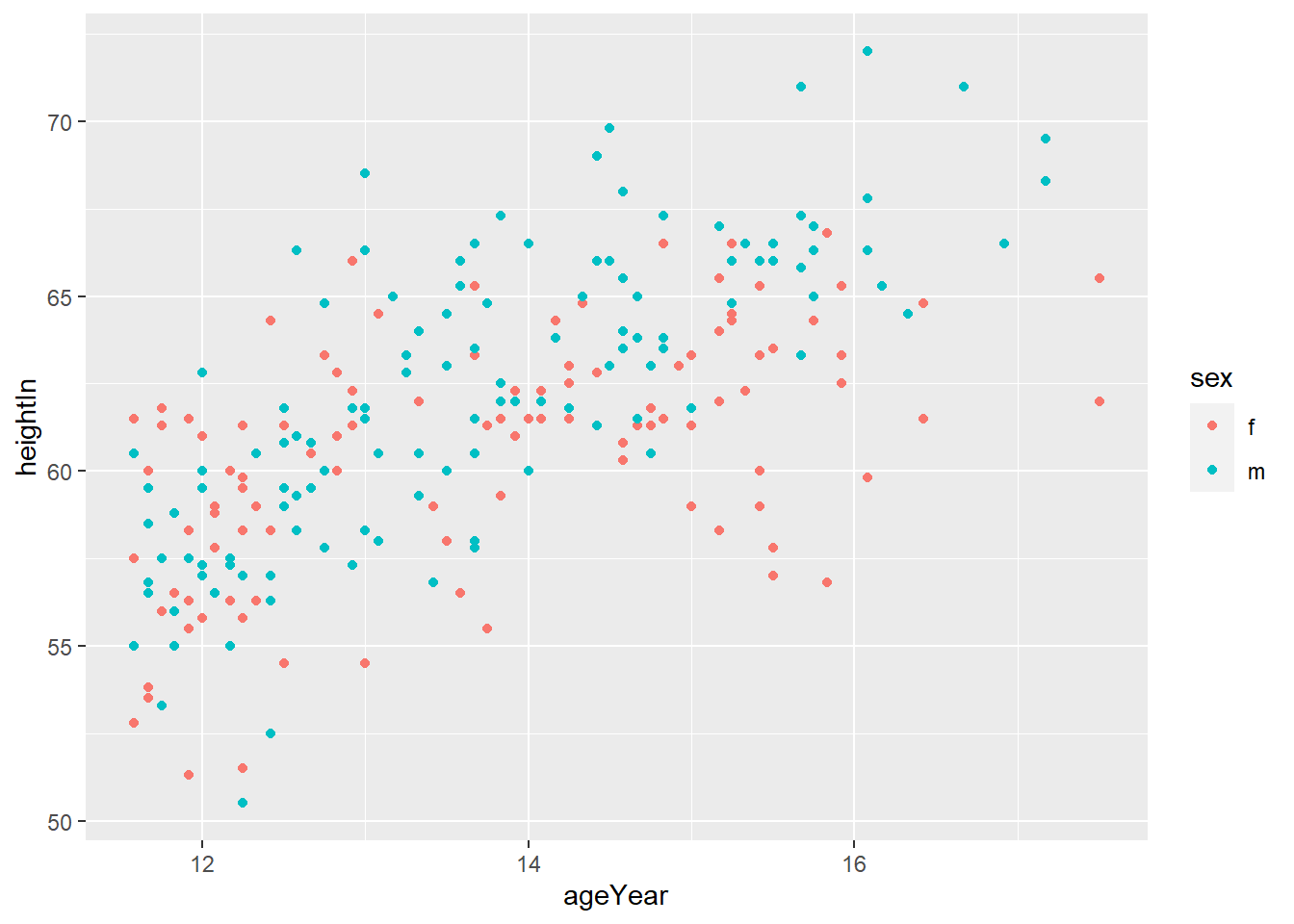
geom_hline(yintercept = y)adds horizontal line at y
# Add horizontal lines
# how do you get more detailed information about the geom_hline() function?
hw_plot +
geom_hline(yintercept = 60)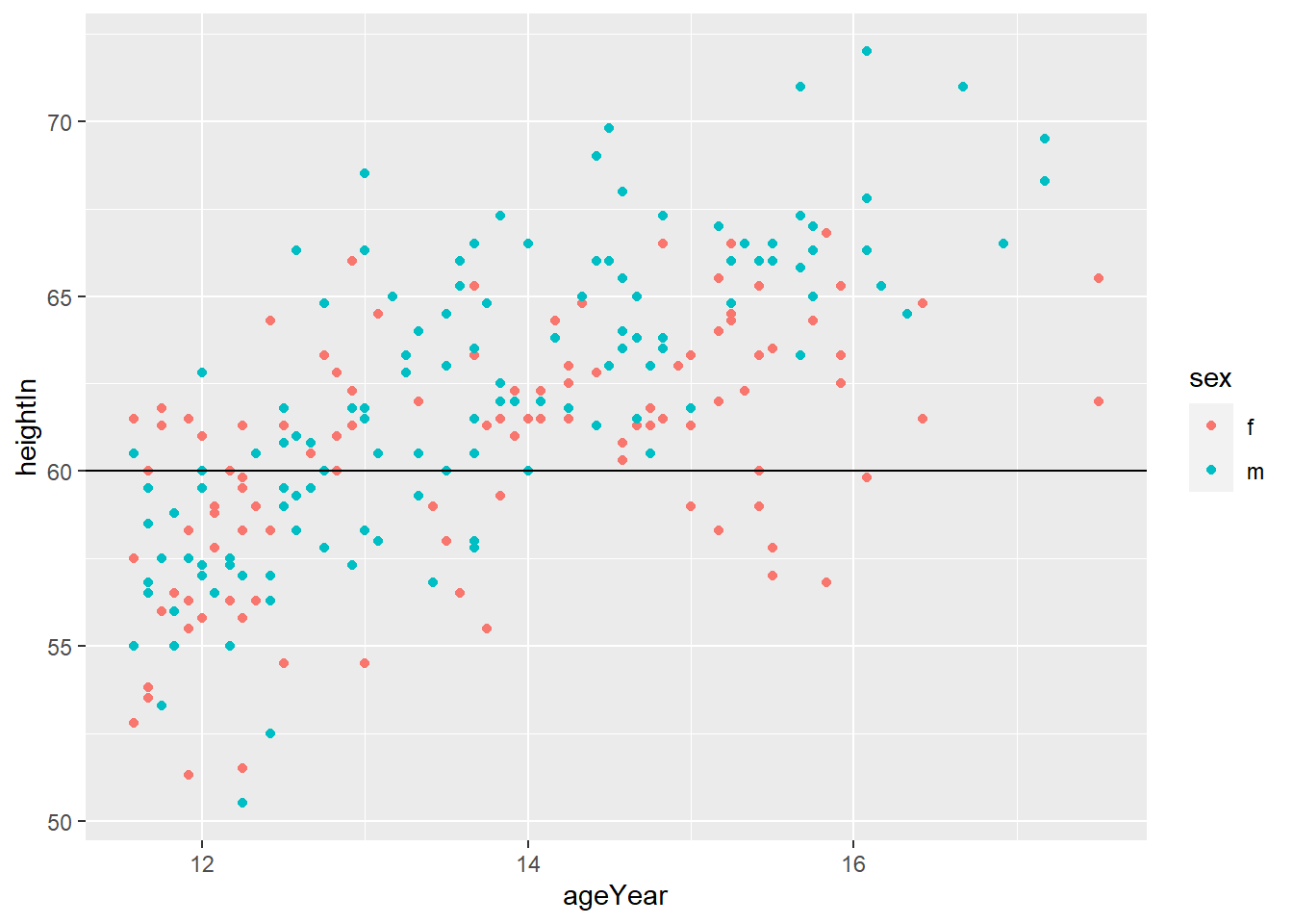
geom_vline(xintercept = x)adds horizontal line at x

- You can do both
# Add horizontal and vertical lines
hw_plot +
geom_hline(yintercept = 60) +
geom_vline(xintercept = 14)
geom_abline(intercept = i, slope = s)adds horizontal line with y = i + s*x
5.8 Using Colors in Plots
5.8.1 Setting and Mapping the Colors of Objects
- It is important to distinguish
- setting aesthetics to a constant
- mapping aesthetics to a variable
- Setting aesthetics to a constant means you fix the value of aesthetics to a constant value.
# set the value of the color aesthetics to "blue"
ggplot(mpg, aes(x = displ, y = hwy)) +
geom_point(color = "blue") 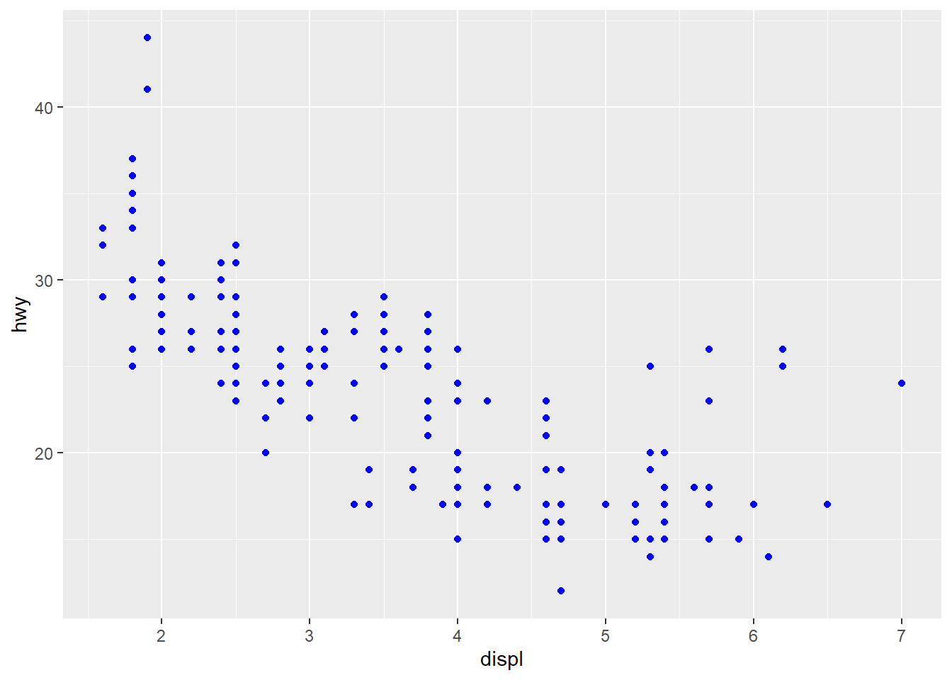
# set the value of the color aesthetics to "red"
ggplot(mpg, aes(x = displ, y = hwy)) +
geom_point(color = "red") 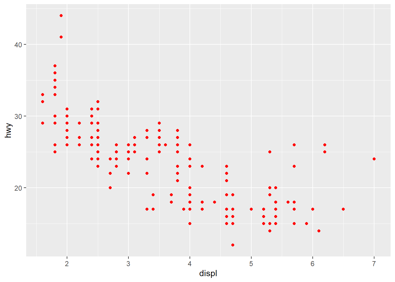
You can find many resources on the name of the color in R by typing “R color” in Google. Here is an example.
Mapping aesthetics to a variable means you want to use different colors depending on the value of the variable.
# map the value of the color aesthetics to the variable `drv`
# This is called an aesthetic mapping, and you need aes()
ggplot(mpg, aes(x = displ, y = hwy)) +
geom_point(aes(color = drv)) 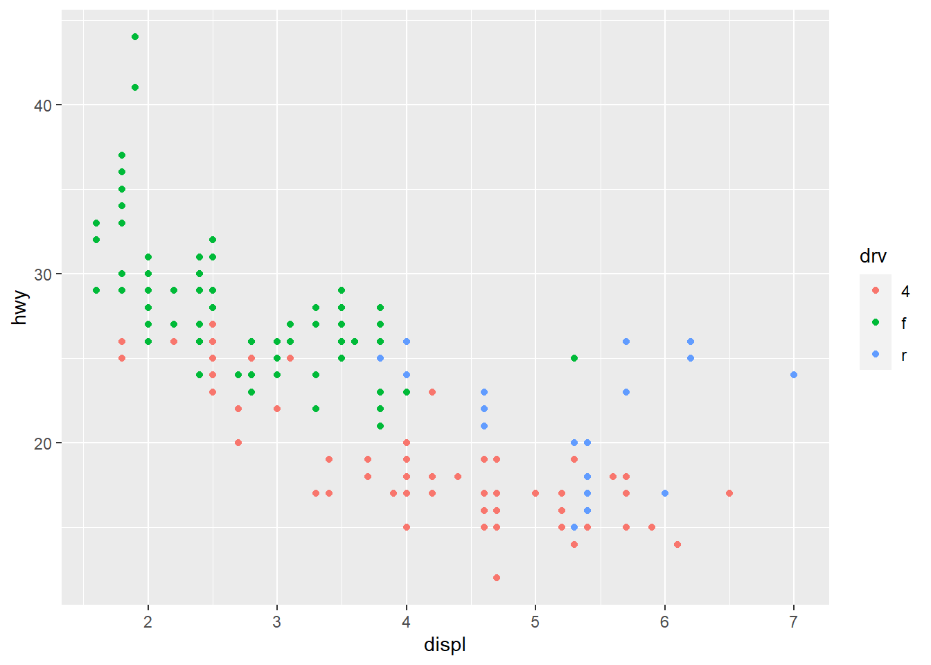
5.8.2 Using a Different Palette for a Discrete Variable
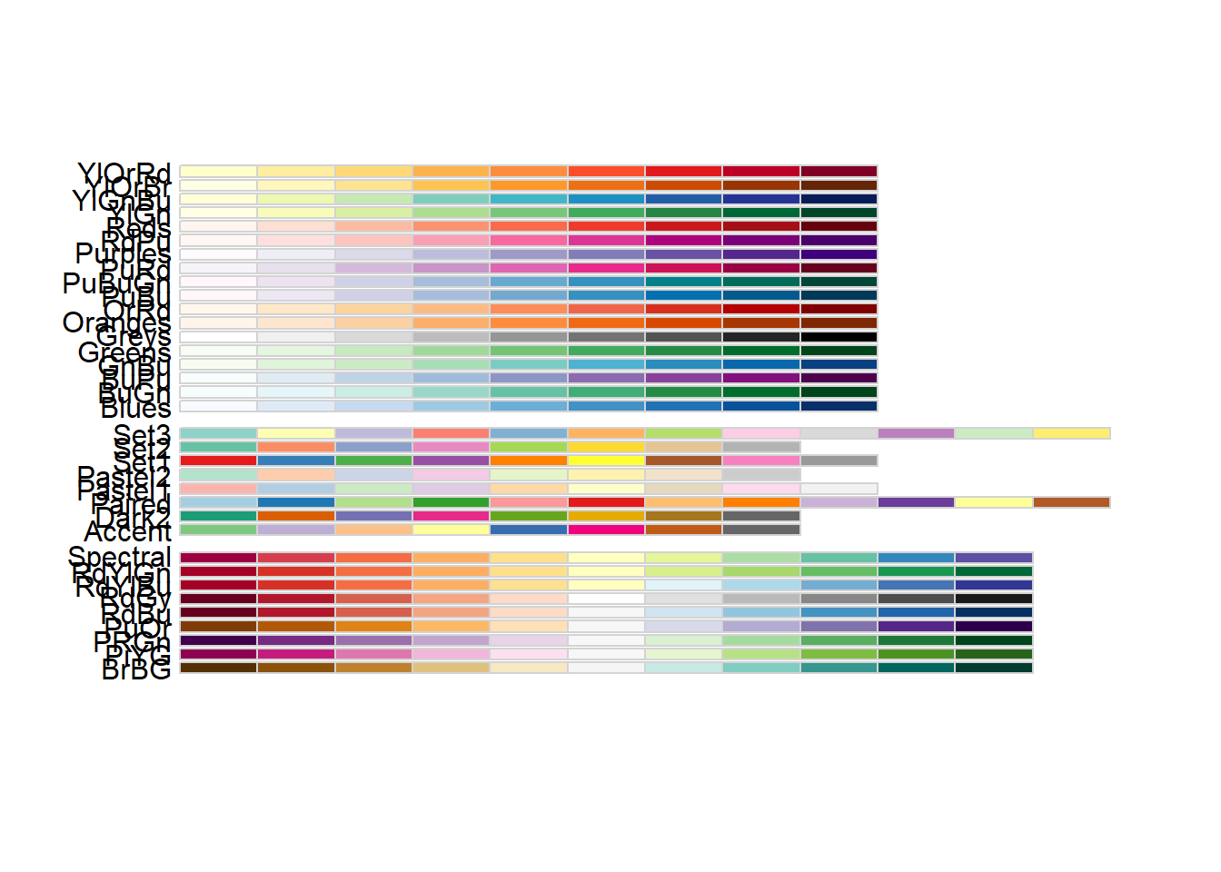
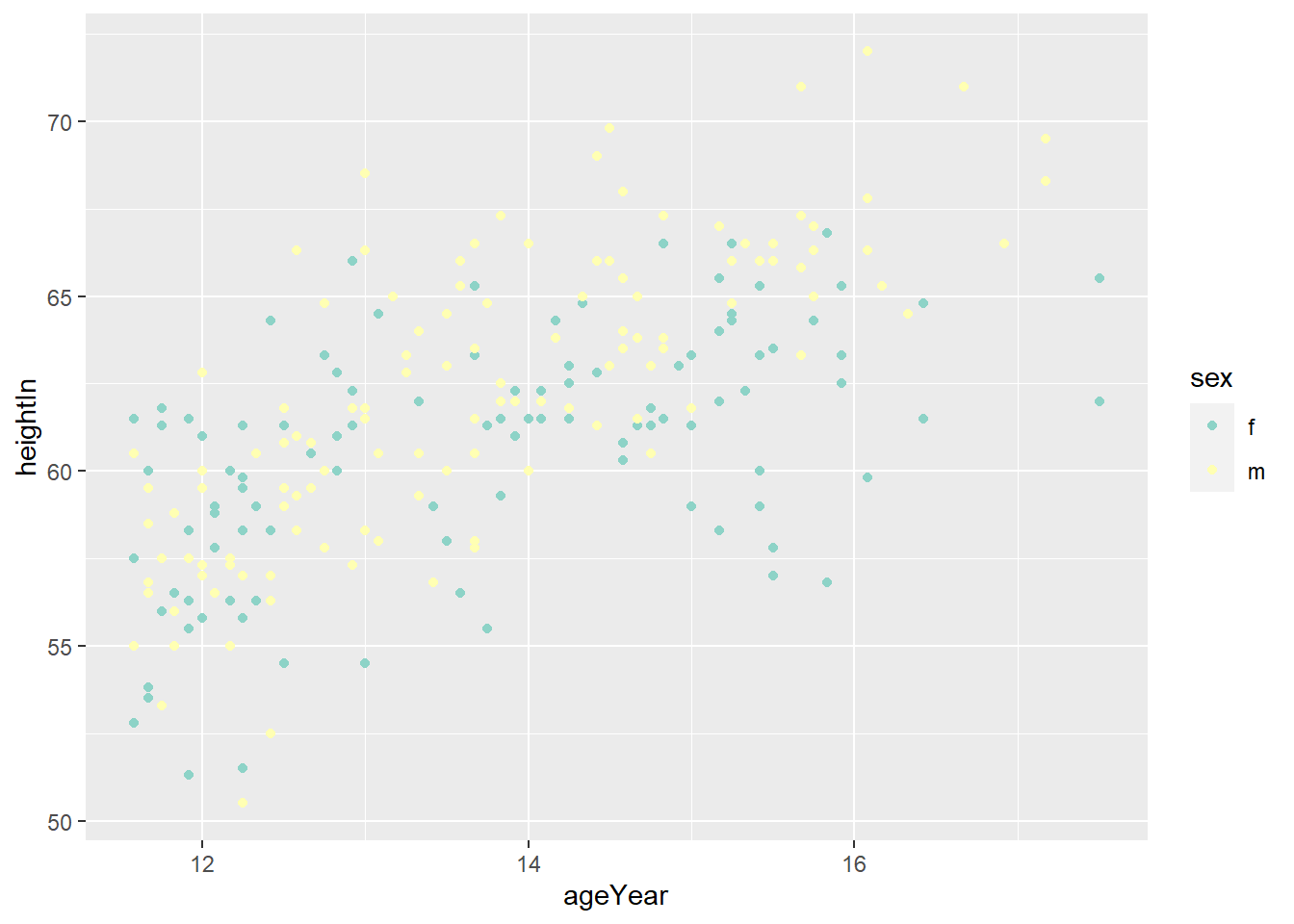
- To use different color scheme, color palettes are available from the
RColorBrewerpackage.
library(gcookbook)
hw_splot <- ggplot(heightweight, aes(x = ageYear, y = heightIn, colour = sex)) +
geom_point()
hw_splot
5.8.3 Using a Manually Defined Palette for a Discrete Variable
scale_colour_manual()sets the values of color
5.9 Complete themes
- There are complete themes which control all non-data display at once.
ggplot(data = mpg, aes(x = class, fill = manufacturer)) +
  geom_bar() +
  labs(title = "Counts of Car Class",
       subtitle = "By manufacturer",
       caption = "source: mpg data from ggplot2",
       fill = "Car Company",
       x = "Class of Cars",
y = "Count") 
# theme_grey() is the defualt theme
ggplot(data = mpg, aes(x = class, fill = manufacturer)) +
geom_bar() +
labs(title = "Counts of Car Class",
subtitle = "By manufacturer",
caption = "source: mpg data from ggplot2",
fill = "Car Company",
x = "Class of Cars",
y = "Count") +
theme_grey()
# theme_grey() is the defualt theme
ggplot(data = mpg, aes(x = class, fill = manufacturer)) +
  geom_bar() +
  labs(title = "Counts of Car Class",
       subtitle = "By manufacturer",
       caption = "source: mpg data from ggplot2",
       fill = "Car Company",
       x = "Class of Cars",
y = "Count") +
theme_classic()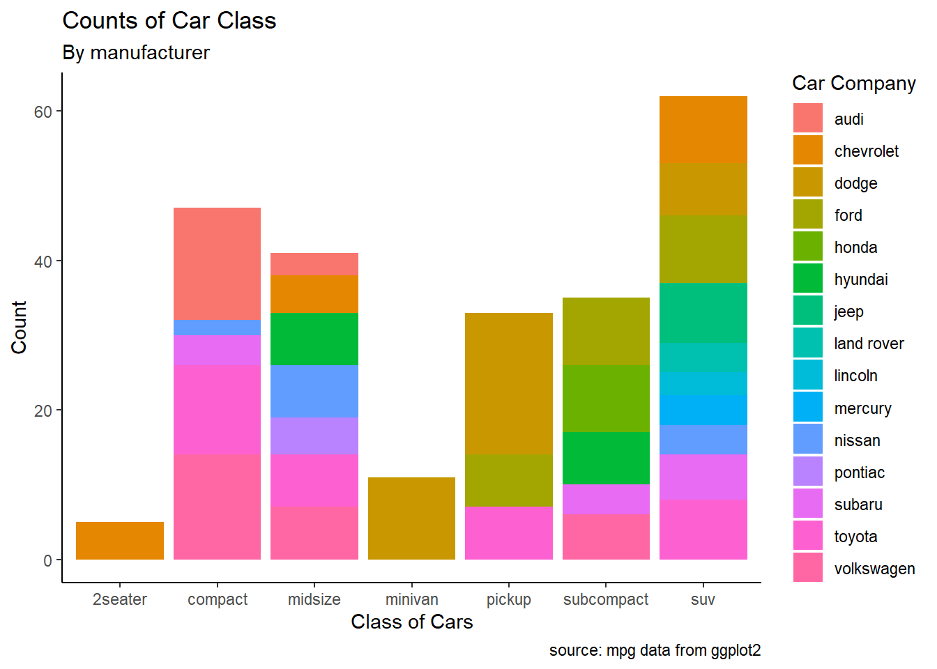
# theme_grey() is the defualt theme
ggplot(data = mpg, aes(x = class, fill = manufacturer)) +
  geom_bar() +
  labs(title = "Counts of Car Class",
       subtitle = "By manufacturer",
       caption = "source: mpg data from ggplot2",
       fill = "Car Company",
       x = "Class of Cars",
       y = "Count") +
  theme_light()
- Check here for more details about the complete themes.
5.10 Exercise
5.10.1 Exercise 1 (with answers)
- Using the
heightweightdataset in thegcookbookpackage, replicate the following plots
# Height and weight of school children
# head() displays the first six observations
head(heightweight)
## sex ageYear ageMonth heightIn weightLb
## 1 f 11.92 143 56.3 85.0
## 2 f 12.92 155 62.3 105.0
## 3 f 12.75 153 63.3 108.0
## 4 f 13.42 161 59.0 92.0
## 5 f 15.92 191 62.5 112.5
## 6 f 14.25 171 62.5 112.0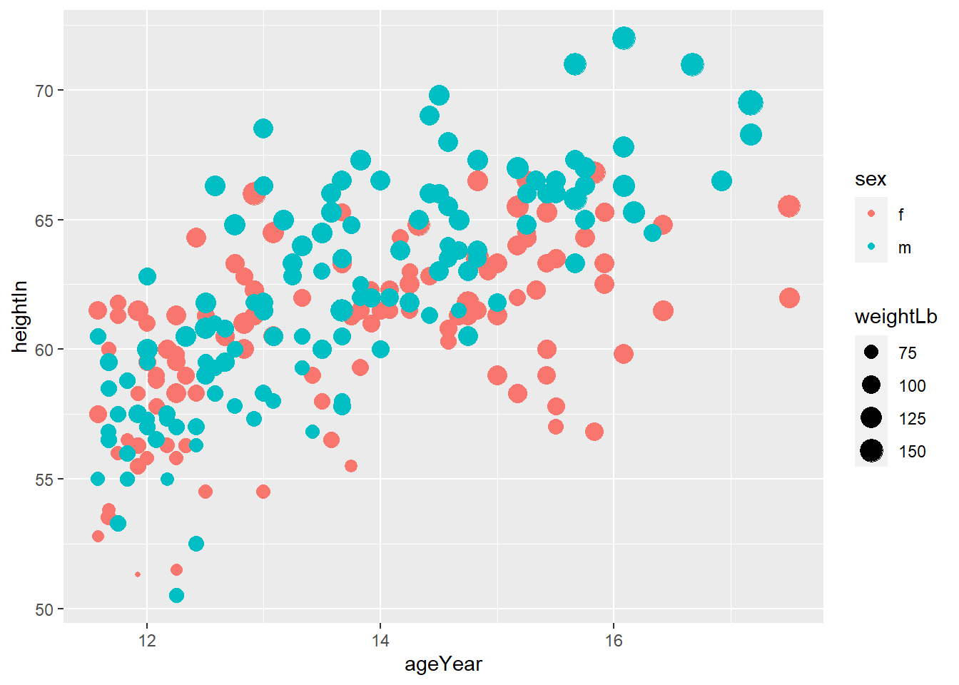
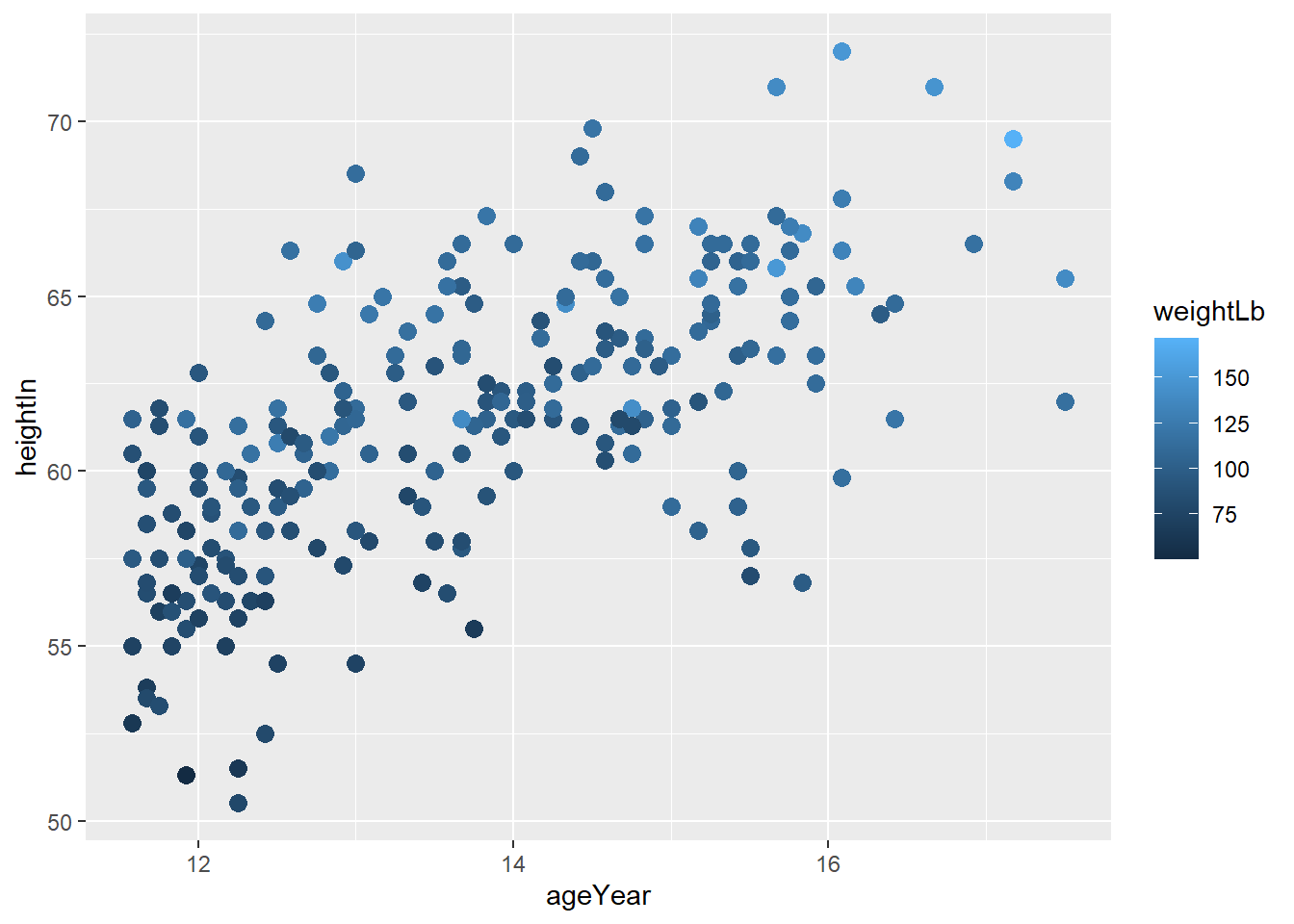
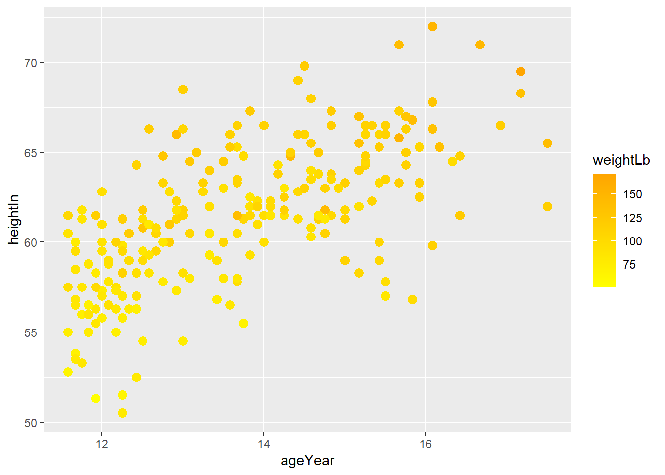
- Often we want to set (or map) the transparency of points, especially when points overlaps. In that case,
alphacontrols the transparency of points. In this exercise, usealpha = 0.3.
ggplot(heightweight, aes(x = ageYear, y = heightIn, size = weightLb, color = sex)) +
  geom_point(alpha = 0.3)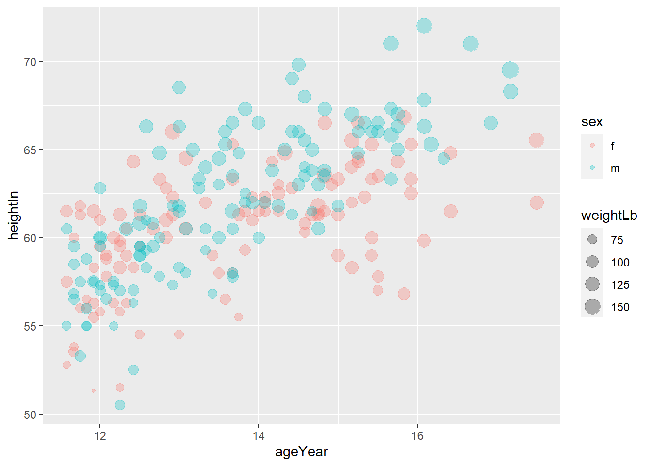
- you can set the title, subtitle, x-axis label, y-axis label, and legend title using
labs()
ggplot(heightweight, aes(x = ageYear, y = heightIn, size = weightLb, color = sex)) +
  geom_point(alpha = 0.3) +
  labs(title = "Height and weight of school children",
       subtitle = "Height vs Weight",
       caption = "Source: heightweight",
       x = "Age (year)",
       y = "Height (inches)",
       size = "Weight (Lb)",
       color = "Gender"
  )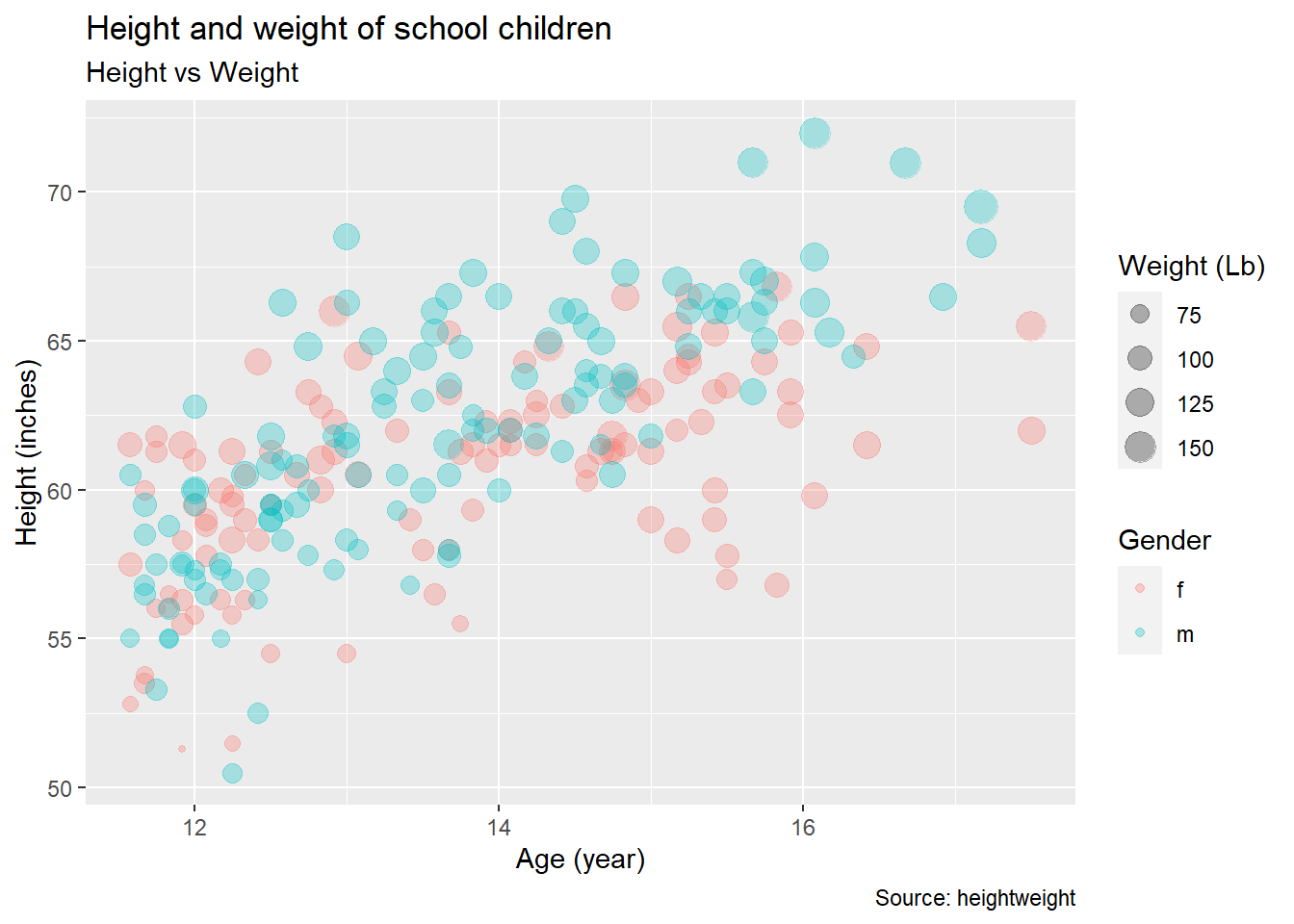
- You may want to use themes. Use
theme_classic().
ggplot(heightweight, aes(x = ageYear, y = heightIn, size = weightLb, color = sex)) +
  geom_point(alpha = 0.3) +
  labs(title = "Height and weight of school children",
       subtitle = "Height vs Weight",
       x = "Age (year)",
       y = "Height (inches)",
       size = "Weight (Lb)",
       color = "Gender"
  ) +
  theme_classic()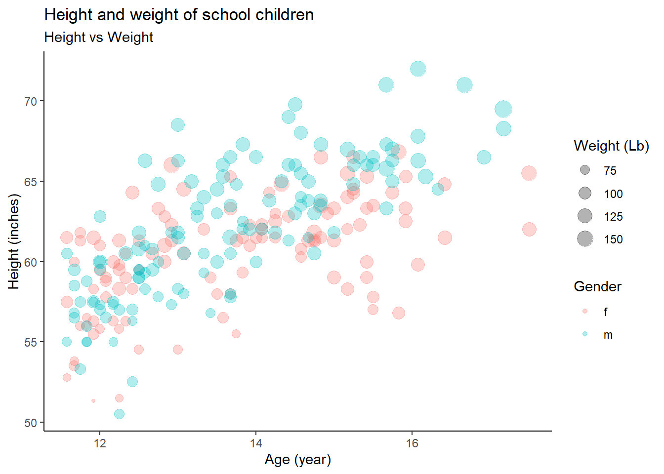
5.10.2 Exercise 2 (with answers)
- Using the
heightweightdataset in thegcookbookpackage, replicate the following plots
# Height and weight of school children
# head() displays the first six observations
head(heightweight)
## sex ageYear ageMonth heightIn weightLb
## 1 f 11.92 143 56.3 85.0
## 2 f 12.92 155 62.3 105.0
## 3 f 12.75 153 63.3 108.0
## 4 f 13.42 161 59.0 92.0
## 5 f 15.92 191 62.5 112.5
## 6 f 14.25 171 62.5 112.0geom_histogram()displays a histogram to display the distribution of a variable.
## `stat_bin()` using `bins = 30`. Pick better value with `binwidth`.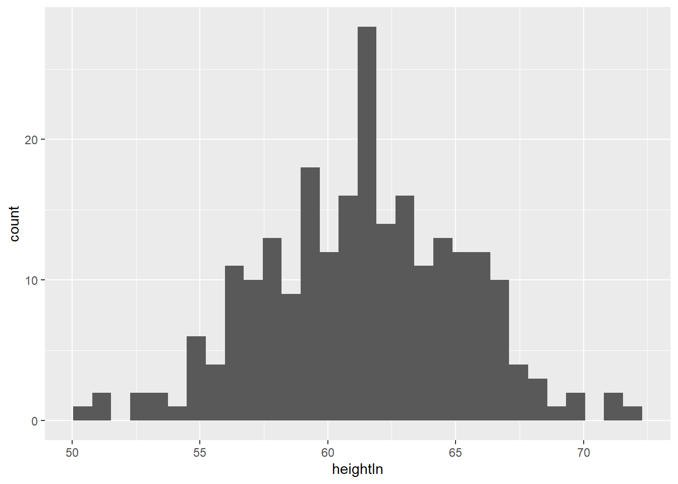
- The
fillaesthetics control the inside color of a geometric object.
## `stat_bin()` using `bins = 30`. Pick better value with `binwidth`.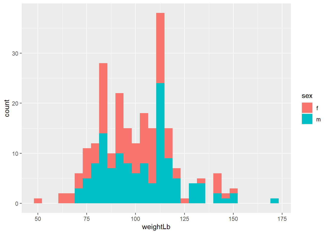
- If you use
colorandfillaesthetics, you needscale_color_manual()andscale_fill_manual()to manually control the color and fill aesthetics. Depending on the aesthetic you used in 3-2-a, manually change the color of the female to orange and male to yellow.
ggplot(heightweight, aes(x = weightLb, fill = sex)) +
  geom_histogram(alpha = 0.4) +
  scale_fill_manual(values = c("orange", "yellow"))
## `stat_bin()` using `bins = 30`. Pick better value with `binwidth`.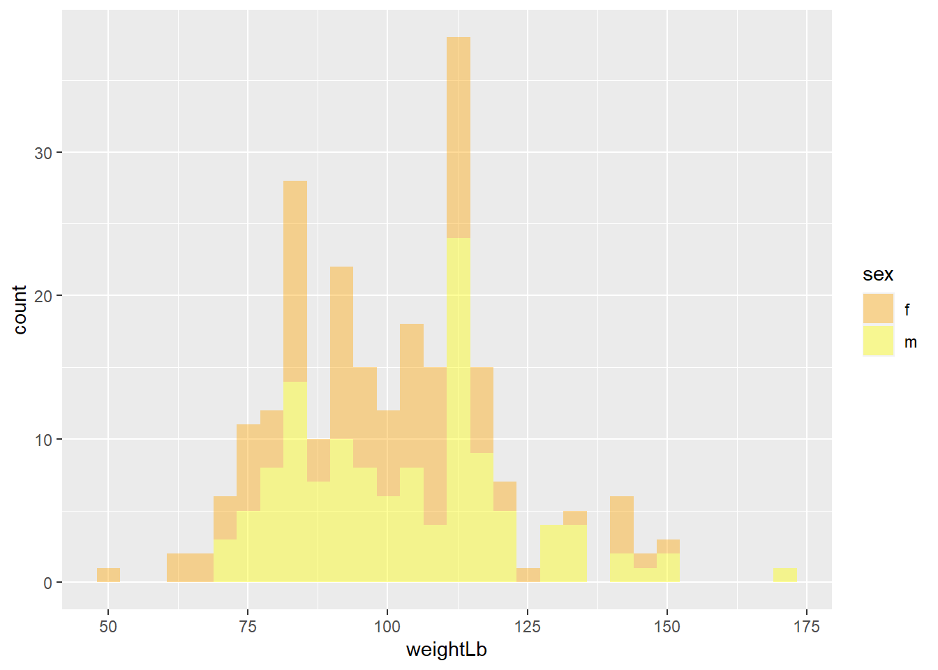
- Again, add titles and apply
theme_minimal()
ggplot(heightweight, aes(x = weightLb, fill = sex)) +
  geom_histogram(alpha = 0.4) +
  scale_fill_manual(values = c("orange", "yellow")) +
  labs(title = "A histogram of the weight of school children",
       subtitle = "By gender",
       x = "Weight (Lb)",
       y = "Count",
       fill = "Gender"
  ) +
  theme_minimal()
## `stat_bin()` using `bins = 30`. Pick better value with `binwidth`.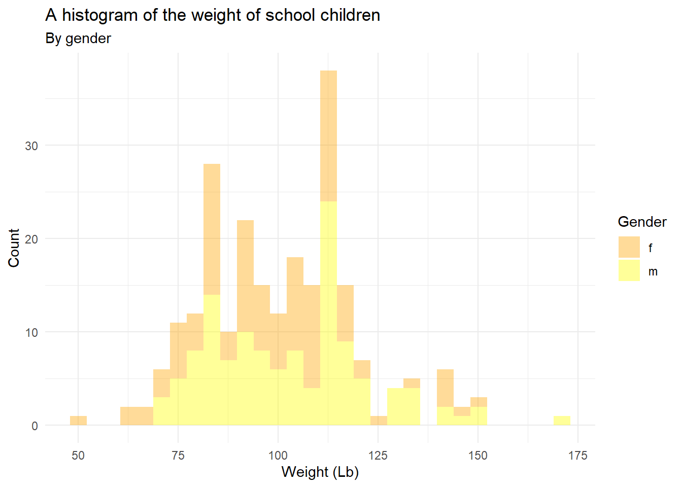
5.10.3 Exercise 3 (without answers, I will post the answer next week, you don’t need to submit any of exercises. We don’t have any Quiz this week.)
Using the mpg dataset in the ggplot2 package, replicate the plot below using the following settings:
- Set
alpha = 0.5for the width of bars in histogram - Use
facet_grid() - Use
theme_minimal()
ggplot(mpg, aes(hwy)) +
  geom_histogram(aes(fill=drv), alpha = 0.5) +
  facet_grid(rows = vars(drv)) +
  theme_minimal() +
  labs(title = "Histogram using facet_grid()",
       subtitle="Histogram of Highway Mile Per Gallon",
       caption = "Source: mpg")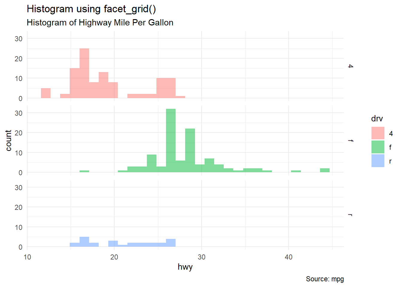
5.10.4 Exercise 4 (without answers, I will post the answer next week, you don’t need to submit any of exercises. We don’t have any Quiz this week.)
Using the midwest dataset in the ggplot2 package, replicate the plot below using the following settings:
- Map
x=areaandy=poptotal - Set
alpha = 0.4 - Set the limit of x-axis is
c(0, 0.1) - Set the limit of y-axis is
c(0, 500000) - Use
se=FALSEoption withingeom_smooth()to remove confidence bands - Use theme_classic()
library(ggplot2) # you need `ggplot2` to use `midwest` data
options(scipen=999) # turn-off scientific notation like 1e+48ggplot(midwest, aes(x=area, y=poptotal)) +
geom_point(aes(col=state, size=popdensity), alpha = 0.4) +
geom_smooth(se=FALSE) +
xlim(c(0, 0.1)) +
ylim(c(0, 500000)) +
labs(subtitle="Area Vs Population",
y="Population",
x="Area",
title="Scatterplot",
caption = "Source: midwest") +
theme_classic()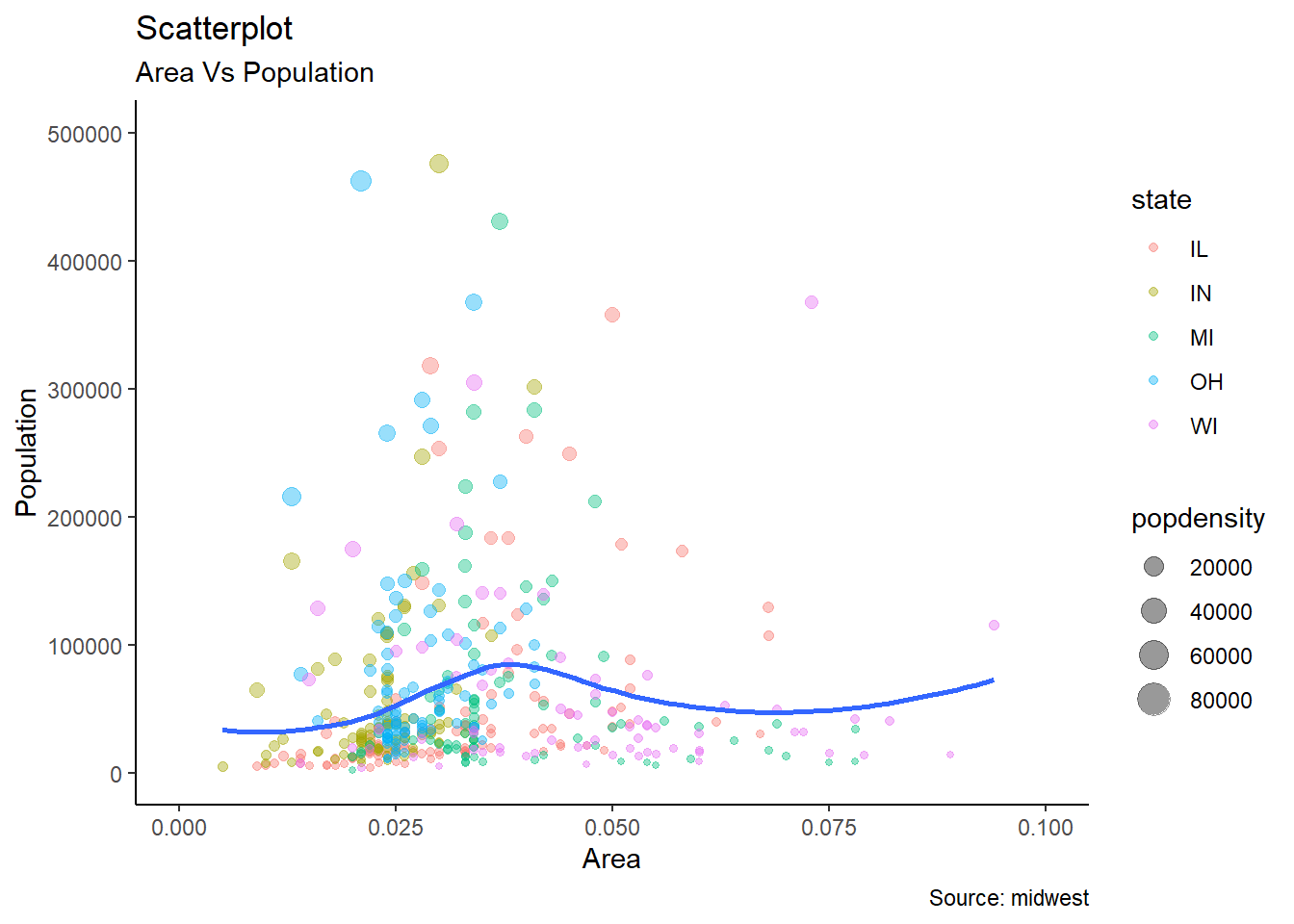
5.10.5 Exercise 5 (without answers, I will post the answer next week, you don’t need to submit any of exercises. We don’t have any Quiz this week.)
Using the iris dataset in the datasets package (dataset package belongs to Base R and so you don’t need to download the package), replicate the plot below using the following settings:
- Set
size = 6for the size of points - Set
alpha = 0.5 - Use
theme_minimal()
(iris is another famous dataset in R. You may google or check the this link to learn more about the dataset)
ggplot(iris, aes(x=Sepal.Length, y=Sepal.Width, color=Species, shape = Species)) +
    geom_point(size=6, alpha = 0.5) +
    labs(title="Scatterplot",
         subtitle="Sepal.Length Vs Sepal.Width",
         caption = "Source: iris") +
    theme_minimal()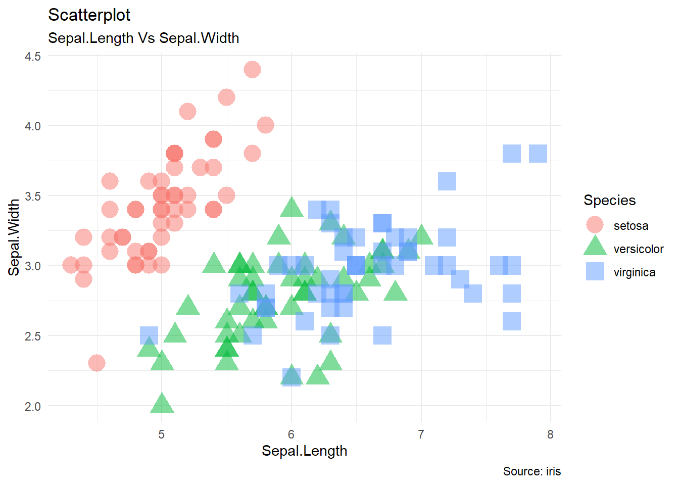
5.10.6 Exercise 6 (without answers, I will post the answer next week, you don’t need to submit any of exercises. We don’t have any Quiz this week.)
Using the heightweight dataset in the gcookbook package, replicate the plot below using the following settings:
- Set
size = 3of points - Set
alpha = 0.5 - Use
theme_classic()
ggplot(heightweight, aes(x=heightIn , y=weightLb, color=sex)) +
    geom_point(size=3, alpha = 0.5) +
    geom_smooth(method = "lm", se = FALSE) +
    labs(title="Scatterplot",
         subtitle="Weight Vs Height",
         caption = "Source: heightweight"
    ) +
    theme_classic()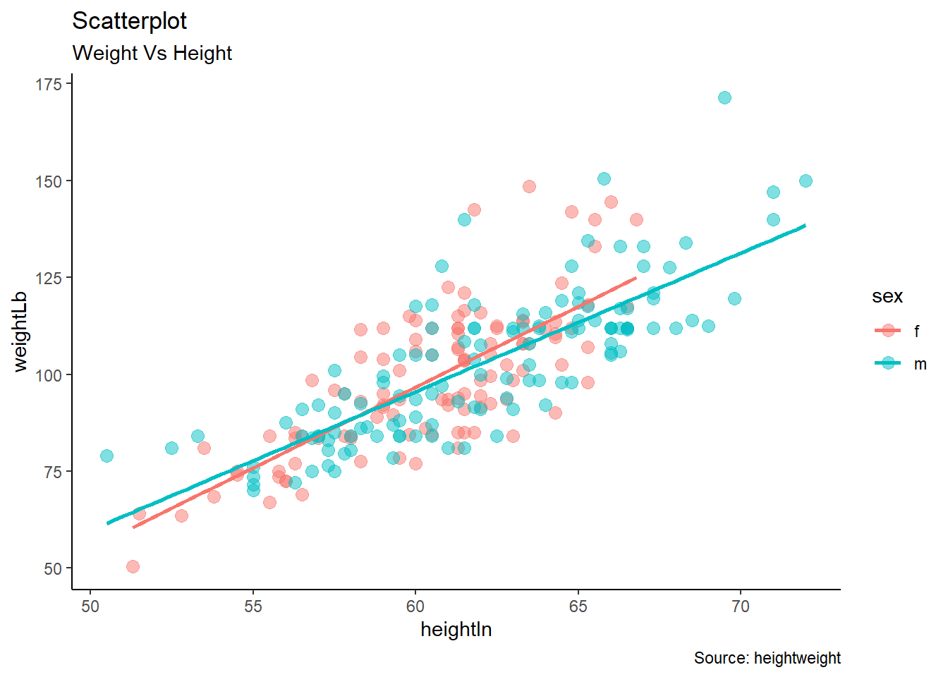
5.10.7 Exercise 7 (without answers, I will post the answer next week, you don’t need to submit any of exercises. We don’t have any Quiz this week.)
Using the mpg dataset in the ggplot2 package, replicate the plot below using the following settings:
- Set
width = 0.5for the width of bars - Rotate tick labels in the x-axis by 65 degree
- Use
palette = "Spectral"for color - Use
theme_minimal()
ggplot(mpg, aes(manufacturer)) + geom_bar(aes(fill=class), width = 0.5) +
  theme(axis.text.x = element_text(angle=65)) +
  labs(title="Barplot",
       subtitle="Manufacturer across Vehicle Classes") +
  scale_fill_brewer(palette = "Spectral") +
  theme_minimal() +
theme(axis.text.x = element_text(angle=65, vjust=0.6)) 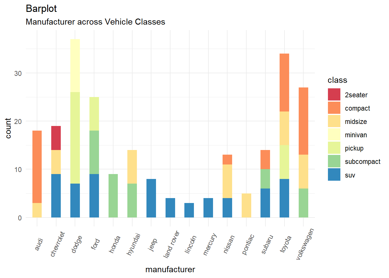
5.10.8 Exercise 8 (without answers, I will post the answer next week, you don’t need to submit any of exercises. We don’t have any Quiz this week.)
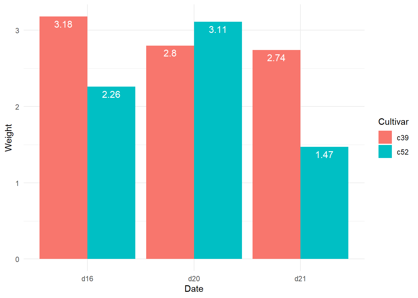
Using the cabbage_exp dataset in the gcookbook package, replicate the plot below using the following settings:
- You need
geom_text(aes(label = Weight), colour = "white", size = 4, vjust = 1.5, position = position_dodge(.9))to put text labels. - Use
theme_minimal()
ggplot(cabbage_exp, aes(x = Date, y = Weight, fill = Cultivar)) +
  geom_bar(position = "dodge", stat = "identity") +
  geom_text(aes(label = Weight), colour = "white", size = 4, vjust = 1.5, position = position_dodge(.9)) + theme_minimal()