Chapter 2 Temperature
First off, we will be looking at a possible correlation between higher annual temperatures and greater annual wildfire numbers and destruction. The data presented is of the United States from 1985-2019.
2.1 Coding
options(scipen = 999)

library(readr)
library(magrittr)
library(dplyr)
library(ggplot2)
library(stringr)
Here I simply set an option to have R print graph tick mark values in numeric notation instead of scientific/exponential. Then it’s just librarying packages used late in the code.
setwd('~/workspace/bookdown-demo-main')

wildfire <- read.csv("federal_costs.csv")

temp <- read.csv("climdiv_national_year.csv")

lessTemp <- temp %>%
  filter(year >= 1985)

lessWildfire <- wildfire %>%
  filter(Year < 2020)
Read in the two datasets that will be used for this part of the project, then filter them so each only has data for a set year range.
df <- bind_cols(lessTemp, lessWildfire)

df1 <- subset(df, select = -c(Year, index, tempc, ForestService, DOIAgencies))

df2 <- df1
Here I simply combine the two filtered dataframes, then remove some unnessecary columns.
df2$Fires <- gsub(","," ", df2$Fires)
df2$Fires <- gsub(" ","", df2$Fires)
df2$Fires <- as.integer(df2$Fires)

df2$Acres <- gsub(","," ", df2$Acres)
df2$Acres <- gsub(" ","", df2$Acres)
df2$Acres <- as.integer(df2$Acres)

df2$Total <- substr(df2$Total, 2, nchar(df2$Total))
df2$Total <- gsub(","," ", df2$Total)
df2$Total <- gsub(" ","", df2$Total)
df2$Total <- substr(df2$Total, 1, nchar(df2$Total) - 6)
df2$Total <- as.integer(df2$Total)
Now I clean up the data, using the gsub() function to remove commas, and the substr() function to remove dollar signs and shorten the Total so it can be expressed in millions of dollars (the raw number in pure dollars is too large for R to handle as an integer). After this cleaning, I use as.integer() to convert the strings of numbers into numeric data which can be graphed easier (and also allows me to make a trendline).
2.2 Graphing
ggplot(df2, aes(x = year, y = temp)) + geom_point(col = 'red') +
  geom_smooth(formula = y ~ x, method = lm, col = 'orange') +
  ylab("Temperature (°F)") +
  scale_y_continuous(labels = scales::comma)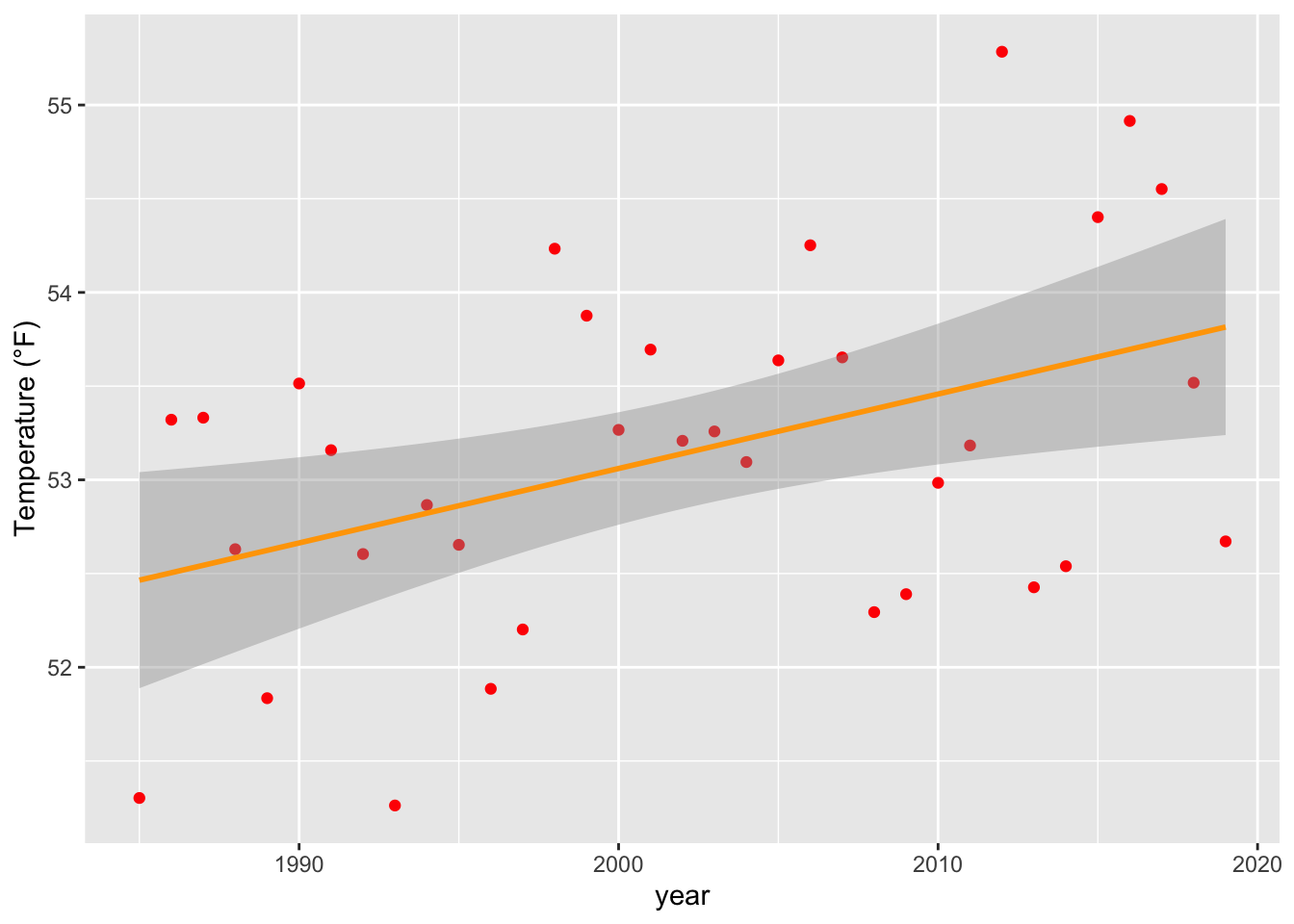
First up we have a simple graph showing the steady increase of annual temperature in the US over the past 30+ years. This simply serves as a reminder as to the rate of climate change in the US, and that any correlation with temperature is also therefore a correlation with time so long as climate change persists.
ggplot(df2, aes(x = temp, y = Fires)) + geom_point(col = 'red') +
  geom_smooth(formula = y ~ x, method = lm, col = 'orange') +
  xlab("Temperature (°F)") +
  scale_y_continuous(labels = scales::comma)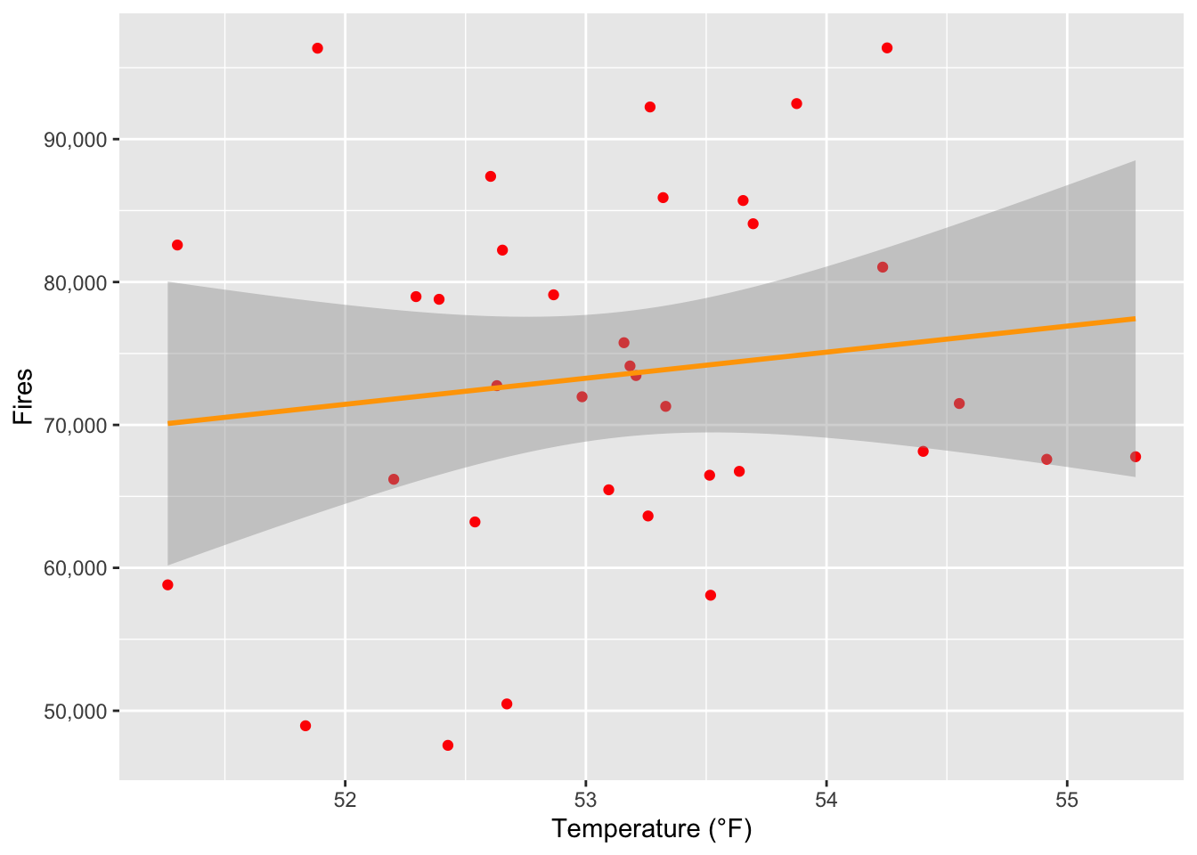
Next we have our graph plotting the number of fires per year against the average temperature from each year. There is a slight linear correlation between the two, and as shown by the graph an increase of a mere 3 degrees Farenheit would cause around 6,000 more fires per year on average, which is no small amount.
ggplot(df2, aes(x = temp, y = Acres)) + geom_point(col = 'red') +
  geom_smooth(formula = y ~ x, method = lm, col = 'orange') +
  xlab("Temperature (°F)") +
  scale_y_continuous(labels = scales::comma)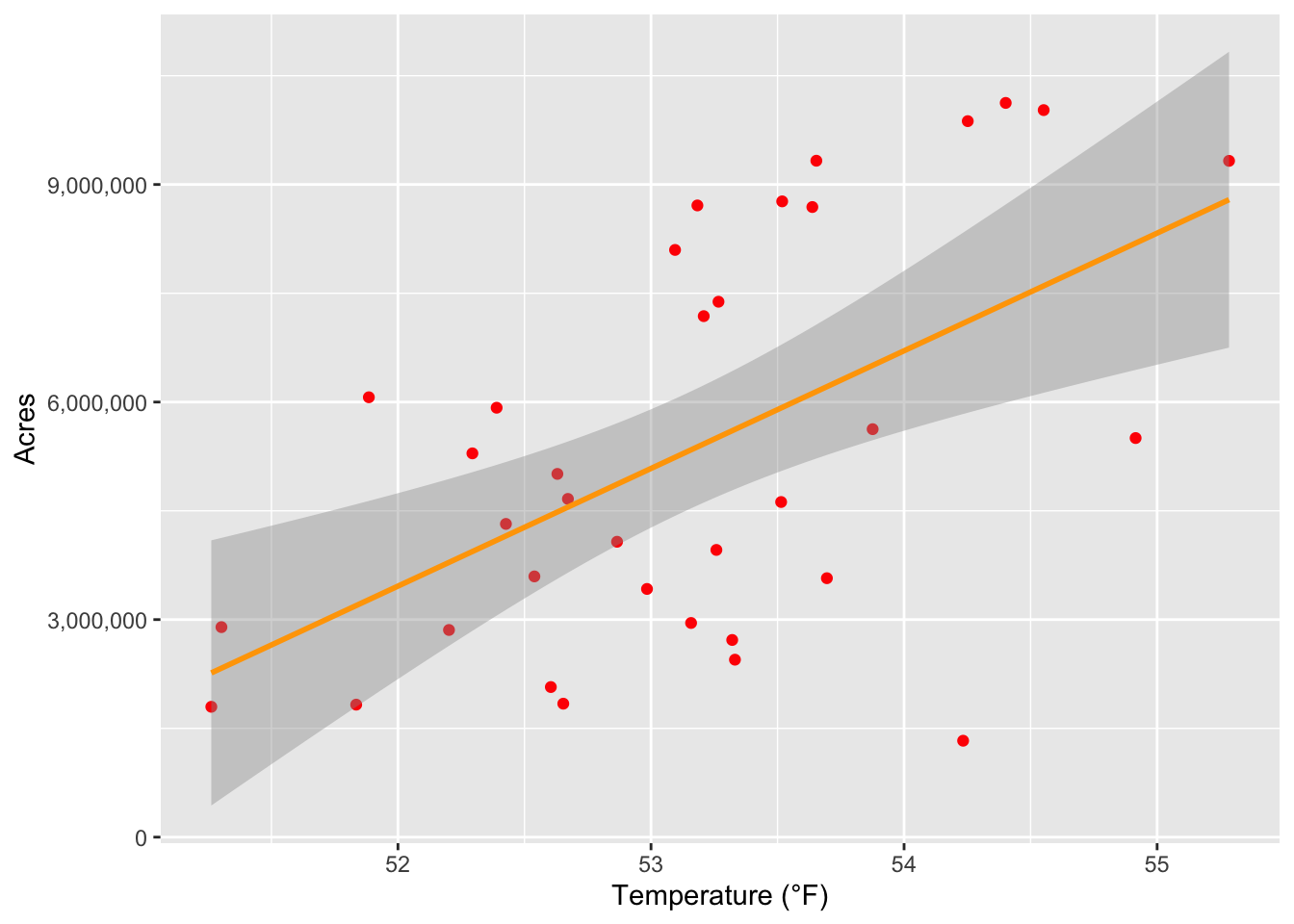
Now we have the graph of acres, or the area affected, by fires in a given year, also plotted against temperature. However, this time the correlation is striking. The graph’s trendline predicts that if the average temperature for a year was 52°F, there would be around 3,500,000 acres affected by fires that year. Compare that to a 55°F year, which is predicted to have nearly 9,000,000 acres affected in that year. For comparison, that is around a difference of 8,300 square miles, or roughly the area of New Jersey. The total area affected of a 55°F year (9,000,000 acres), is larger than Maryland in size. Even by conservative global warming projections, the US will still experience significant heating, and that area affected will only grow.
ggplot(df2, aes(x = temp, y = Total)) + geom_point(col = 'red') +
  geom_smooth(formula = y ~ x, method = lm, col = 'orange') +
  xlab("Temperature (°F)") +
  ylab("Costs of Damages (in millions of dollars)") +
  scale_y_continuous(labels = scales::comma)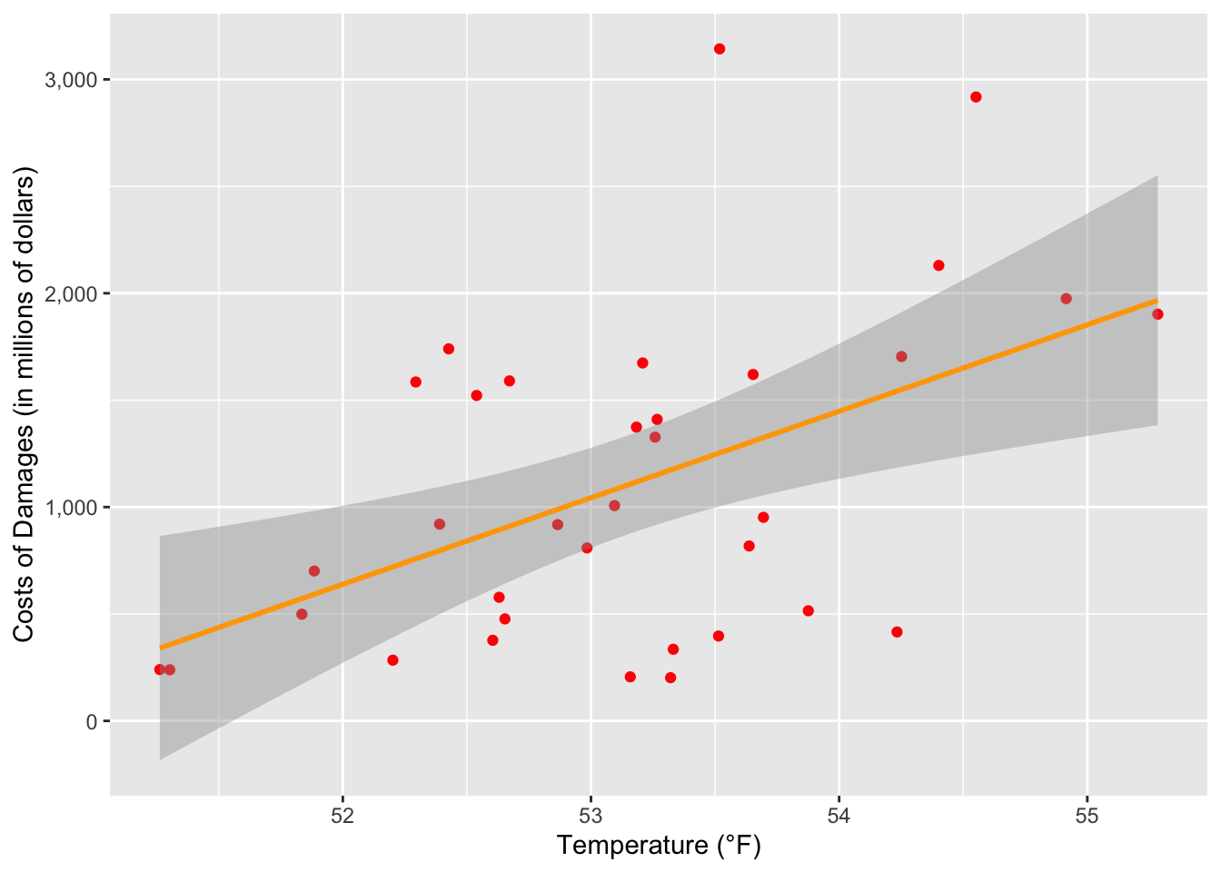
Lastly, we have a graph showing the costs of fighting fires and the damages they incur across the US every year, also plotted against temperature. What the graph shows us here is also of massive concern. Once again using our marks of 52°F and 55°F, in years with those average temperatures the US would spend around 600 million dollars and 1.8 billion dollars respectively. Those three degrees just about triple the cost of fires in the US each year. This means that global warming causing wildfires isn’t just an issue of safety, but also finance.