3 Visualizations
In order to cover the first of the goals in this project, “to construct a web dashboard to visualize the evolution of the main air pollution indicators in the city of Gijón” I chose Tableau software as the main tool.
I created a Tableau story for each pollutant with Tableau Desktop (student license). And I published them on my Tableau Public personal site.
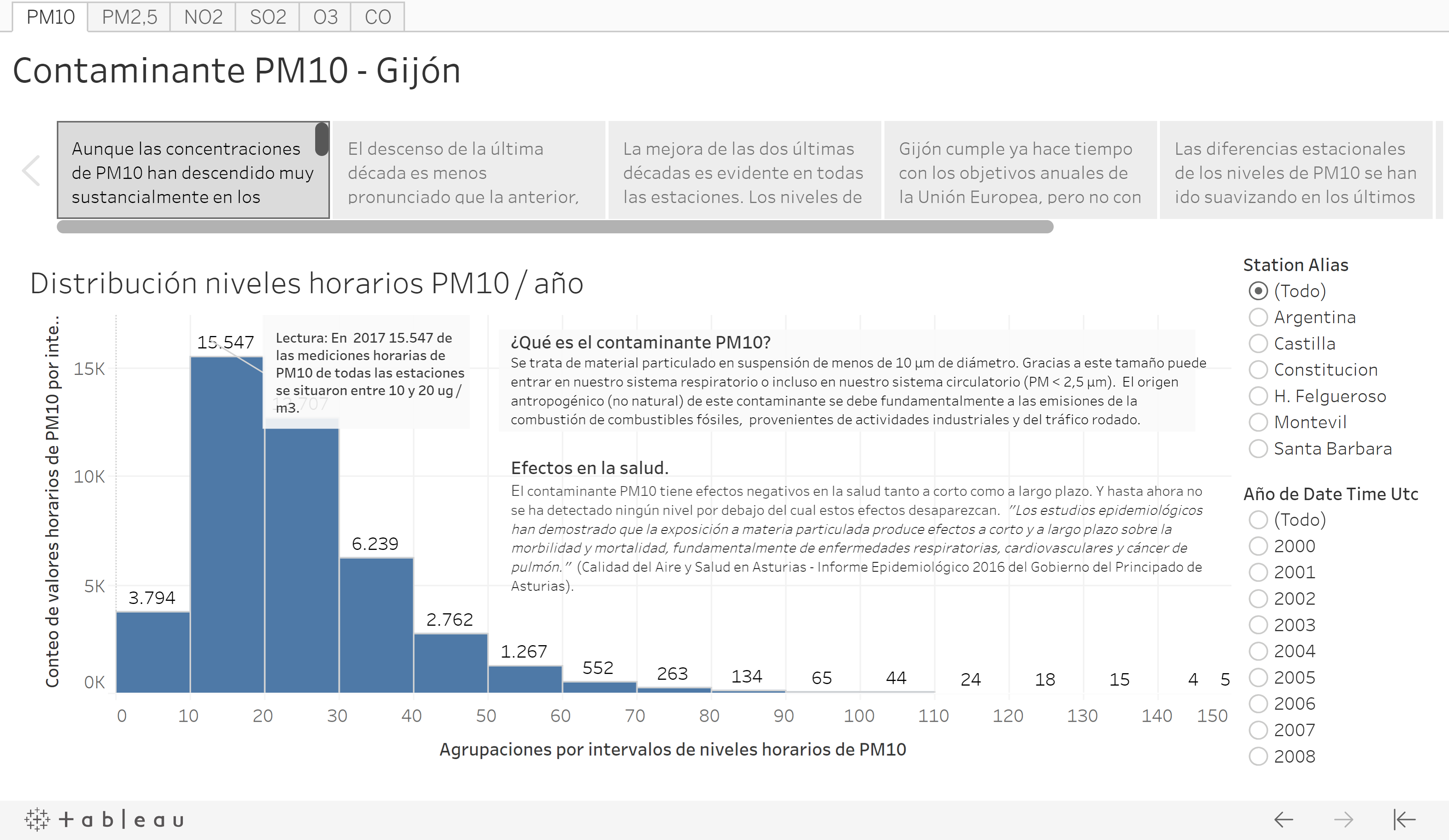
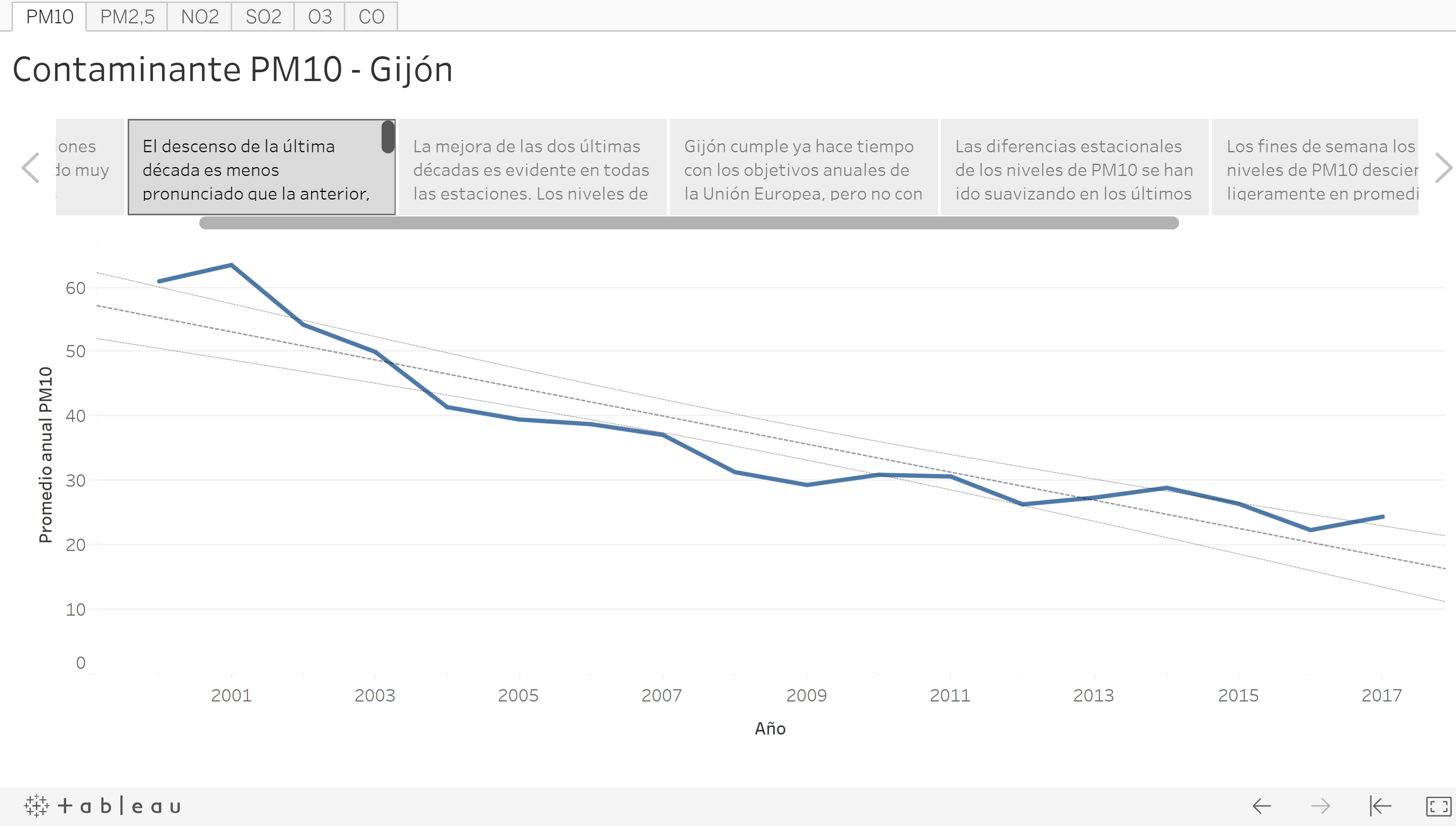
Each story shows a brief description of each pollutant, the evolution of its levels during the last two decades, the non-compliance with the EU standards or the WHO advice and several visualizations to show its seasonal components.
All the stories are saved in the same Tableau workbook. Therefore, in order to access each pollutant dashboard you only have to click on the corresponding tab.
The datasets used on these visualizations were prepared with R code. You can consult this code in the section “6 Gathering and Cleaning Data” of this document or in the rmd file “10_Gathering_and_Cleaning_Data” saved in the project Github repository.
Tableau Public stories:
If you want to consult the published stories on the Tableau site you only have to click on the link below:
The data visualization is a basic but powerful tool for any data science project. So, beyond the Tableau dashboards, I used the graphic visualizations of data for very different purposes ranging from basic data exploration -looking for quality data problems-, to looking for data trends and seasonality or graphically checking the accuracy of a model.
Some of these visualizations are included in this document but most of them are embedded in the R and Python code.