Chapter 5 Combine across active topics
Now, we need to combine disease probabilities across active topics, keeping track of disease which have occurred:
active_topics=Topic_activity
D <- dim(active_topics)[1]  # Number of individuals
V <- dim(beta)[2]  # Number of diseases
T <- dim(active_topics)[3]  # Number of time points

# Initialize the combined probabilities array
combined_probabilities <- array(0, c(D, V, T))

# Disease occurrence tracker (0: not occurred, 1: occurred)
disease_occurred <- array(0, c(D, V,T))
disease_occurred_tracker=array(0, c(D, V))


for (d in 1:D) {
  for (v in 1:V) {
    for (t in 1:T) {
      # Check if the disease has already occurred for this individual
      if (disease_occurred_tracker[d, v] != 0) {
        # Disease has occurred; keep probability at 0
        combined_probabilities[d, v, t] <- 0
      } else {
        # Combine probabilities from active topics

        active_probs <- beta_prime[d, , v, t] * active_topics[d, , t]
        combined_probabilities_dvt=1 - prod(1 - active_probs)
        disease=rbinom(1,size = 1,prob=combined_probabilities_dvt)
        combined_probabilities[d, v, t] <- 1 - prod(1 - active_probs)

        # Check if disease occurs at this time point
        if (disease == 1) {  # Define your threshold for disease occurrence
          disease_occurred[d, v,t:T] <- 1
          disease_occurred_tracker[d, v] <- t
          # Mark the disease as occurred
        }
      }
    }
  }
}


# Assume disease_occurred is an array with dimensions D x V x T, and we are only interested in the first disease for simplicity
disease_occurred_matrix <- disease_occurred[, 1, ]  # Taking only the first disease for plotting


disease_data=melt(disease_occurred_matrix)
colnames(disease_data)=c("Individual","Time","Disease_Occurred")

ggplot(disease_data, aes(x = Time, y = Individual, fill = as.factor(Disease_Occurred))) +
  geom_tile() +  # This creates the heatmap effect
  scale_fill_manual(values = c("0" = "white", "1" = "red"), name = "Disease Occurred") +
  labs(title = "Disease Occurrence Over Time for Disease 1", x = "Time Point", y = "Individual") +
  theme_minimal() +
  theme(axis.text.x = element_text(angle = 90, hjust = 1))  # Rotate x-axis text for readability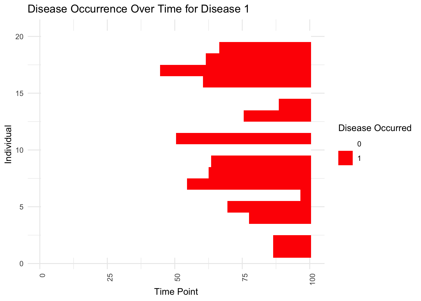
Show first age of occurrence:
disease_occurrence_df <- data.frame(expand.grid(Individual = 1:D, Disease = 1:V, Time = 1:T),
                                    Occurred = as.vector(disease_occurred))

# Plotting
ggplot(disease_occurrence_df[disease_occurrence_df$Individual%in%sample(levels(as.factor(disease_occurrence_df$Individual)),3),], aes(x = Time, y = Disease, fill = factor(Occurred))) +
  geom_tile() +  # Creates a heatmap
  scale_fill_manual(values = c('0' = 'white', '1' = 'red')) +  # Color for not occurred and occurred
  labs(fill = "Disease Occurrence", x = "Time Point", y = "Disease", title = "Disease Occurrence Over Time") +
  theme_minimal() +
  theme(axis.text.x = element_text(angle = 90, hjust = 1))  +facet_wrap(~Individual)# Rotate x-axis text if there are many time points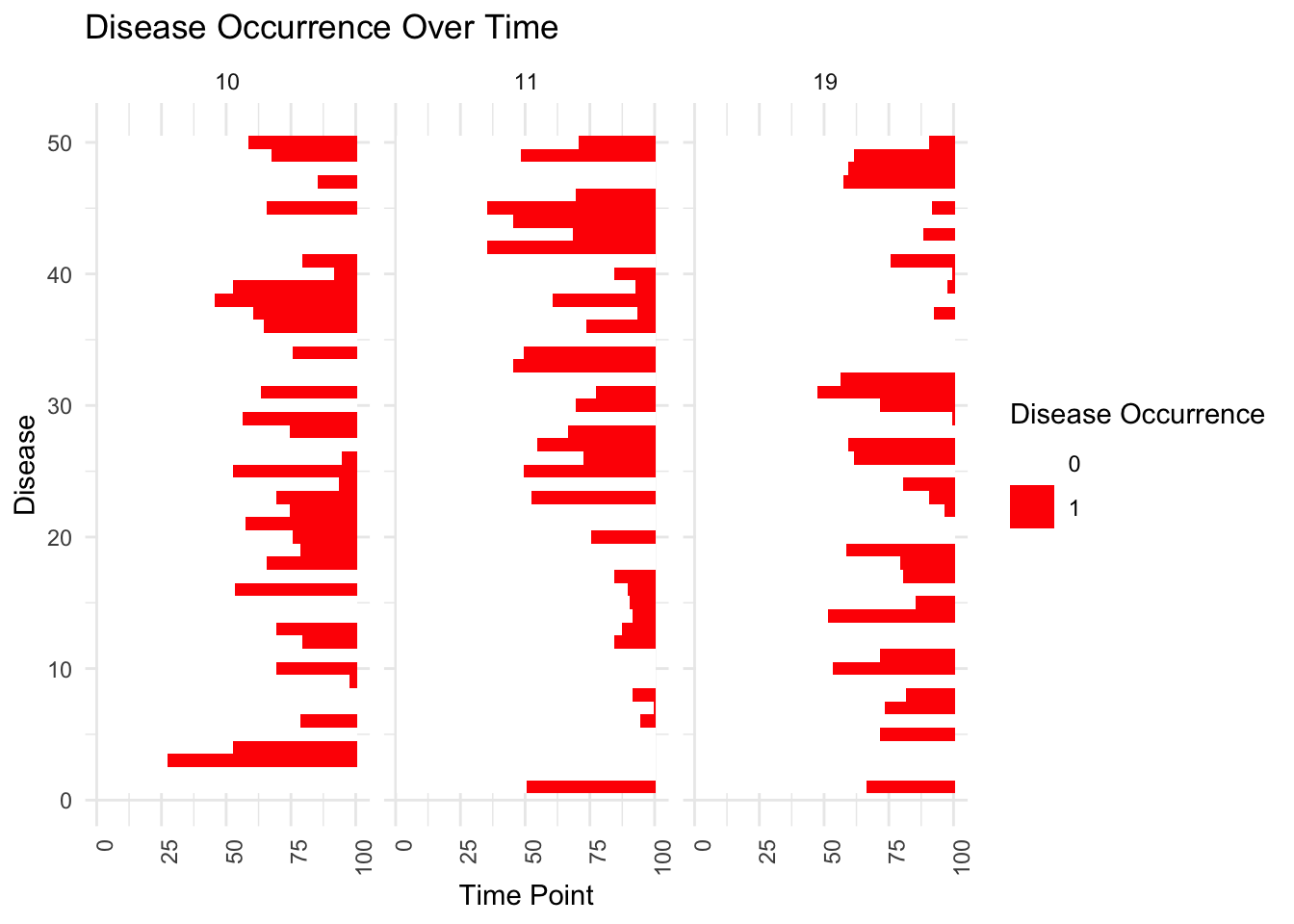
mean_combined_probabilities <- apply(combined_probabilities, 3, mean)
plot(mean_combined_probabilities, type = "b", col = "blue", pch = 19,
main = "Mean Combined Probabilities Over Time", xlab = "Age", ylab = "Mean Combined Probability")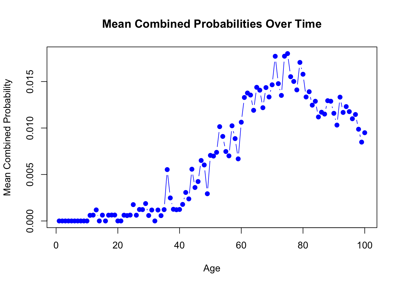
Now we plot the start and stop of a disease:
# Create a dataset for plotting
disease_occurrence_df <- data.frame(expand.grid(Individual = 1:D, Disease = 1:V, Time = 1:T),
                                    Occurred = as.vector(disease_occurred))

# Filter to only include time points after the first occurrence of each disease
disease_start_end <- disease_occurrence_df %>%
  group_by(Individual, Disease) %>%
  summarise(Start = min(Time[Occurred == 1]), End = max(Time[Occurred == 1])) %>%
  filter(!is.infinite(Start)) %>%
  mutate(End = ifelse(End < T, T, End))
## `summarise()` has grouped output by 'Individual'. You can override using the
## `.groups` argument.# To plot a single individual's diseases over time
individual_sample <- which.min(rowSums(gamma))
individual_disease_start_end <- disease_start_end %>% filter(Individual == individual_sample)
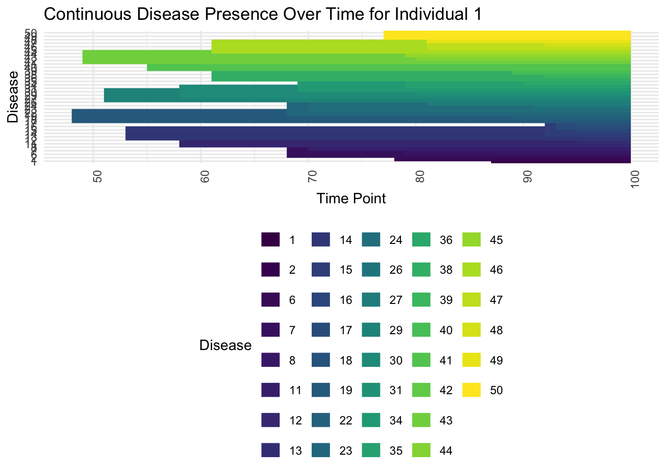
ggplot(individual_disease_start_end, aes(x = Start, xend = End, y = as.factor(Disease), yend = as.factor(Disease), color = as.factor(Disease))) +
geom_segment(size = 5) +
scale_color_viridis_d(name = "Disease") +
labs(title = paste("Continuous Disease Presence Over Time for Individual", individual_sample), x = "Time Point", y = "Disease") +
theme_minimal() +
theme(axis.text.x = element_text(angle = 90, hjust = 1), legend.position = "bottom")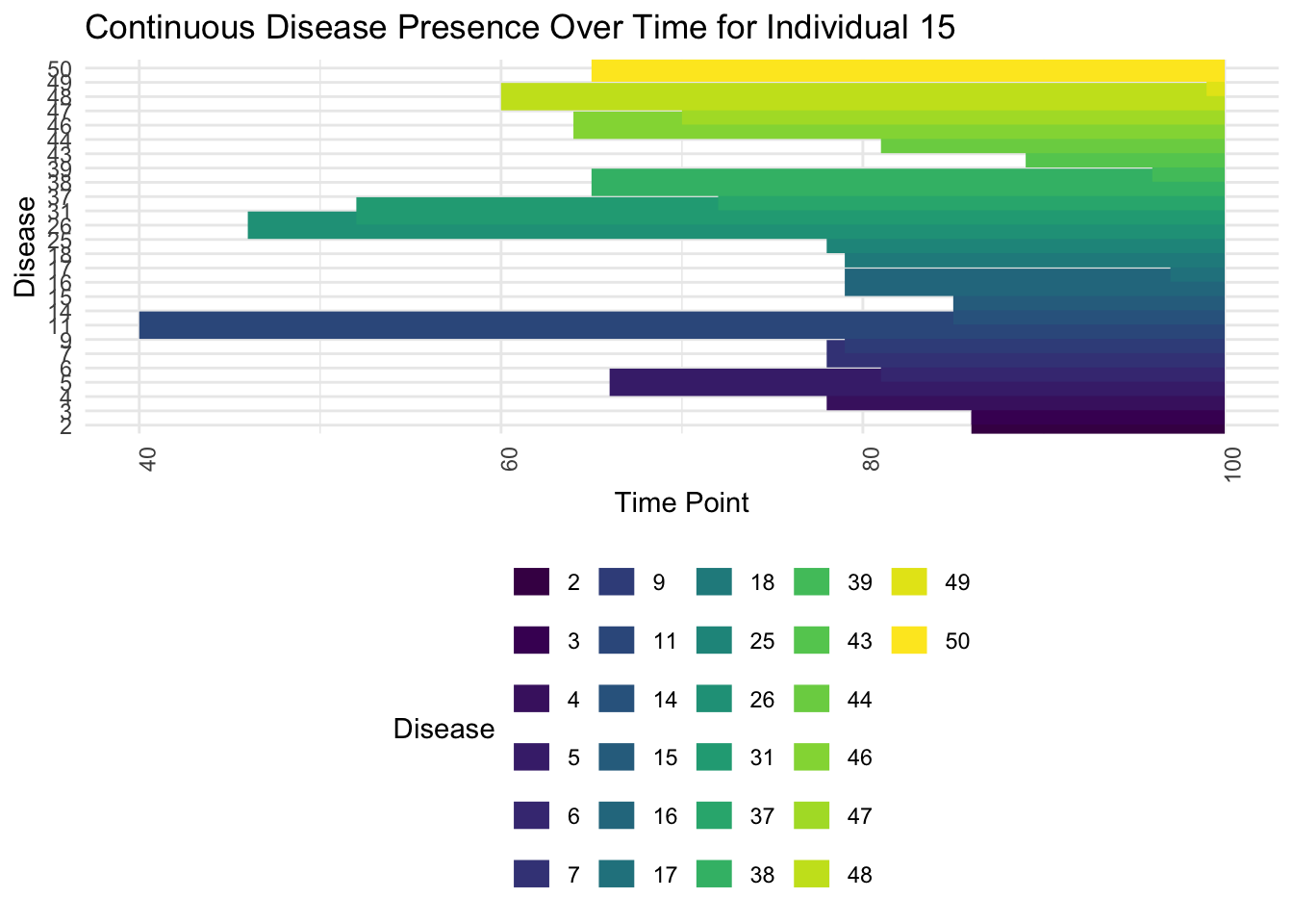
Now look at someone with high loadings on many topics:
individual_sample <- which.max(rowSums(gamma))
individual_disease_start_end <- disease_start_end %>% filter(Individual == individual_sample)

ggplot(individual_disease_start_end, aes(x = Start, xend = End, y = as.factor(Disease), yend = as.factor(Disease), color = as.factor(Disease))) +
  geom_segment(size = 5) +
  scale_color_viridis_d(name = "Disease") +
  labs(title = paste("Continuous Disease Presence Over Time for Individual", individual_sample), x = "Time Point", y = "Disease") +
  theme_minimal() +
  theme(axis.text.x = element_text(angle = 90, hjust = 1), legend.position = "bottom")