Embed plots and diagrams from ggplot2 in Shiny apps
Make your plots interactive using Plotly
Explore issues using the power of interactive visualization dashboards
Visualize a regression analysis in Shiny
1 Interactive visualization: The core of Shiny
Shiny offers the perfect basis for visualization
Plots can be modified using UI inputs
Seamless integration of interactivity elements (e.g. pan, zoom)
Dashboards facilitate the idea of side-by-side comparison or provision of context
1.1 Good practice examples
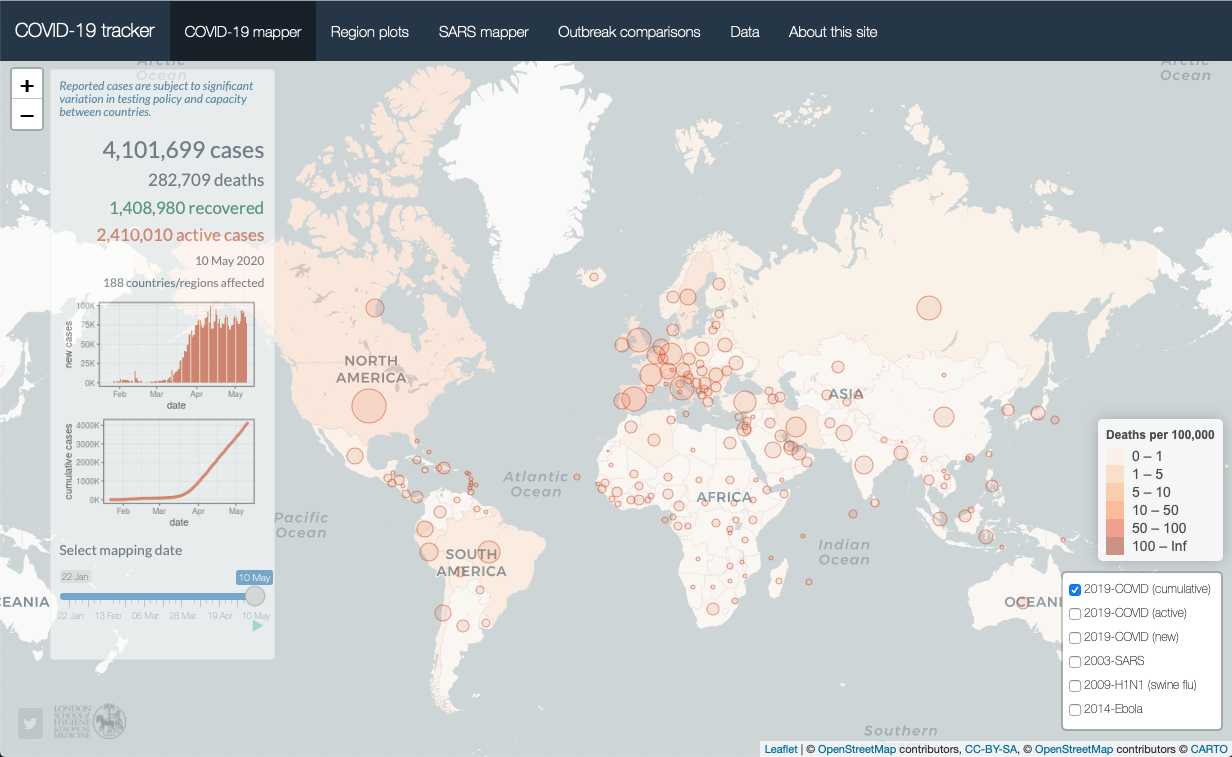
Examples of these concepts can be seen in many Shiny apps, one example is Edward Parker’s COVID-19 tracker
Exercise
Explore the COVID-19 tracker. Do you think this is a good Shiny app? If so, why? If not, why not?
COVID-19 Tracker
1.2 Current app state
Unlike the previous sections, we will extend the existing app code step by step
The code chunk below includes the current app state including the intro and table tabs
Quick recap:
In section 3, we added an introduction tab that contains background info on the app
In section 4, we added a table tab using the DT package
In this section, we will add a tab that analyzes Guerry using all sorts of visualization
Full code for the current app state
library(shiny)library(htmltools)library(bs4Dash)library(shinyWidgets)library(Guerry)library(sf)library(dplyr)library(GGally)# 1 Data preparation ----## Load & clean data ----variable_names <-list(Crime_pers ="Crime against persons", Crime_prop ="Crime against property", Literacy ="Literacy", Donations ="Donations to the poor", Infants ="Illegitimate births", Suicides ="Suicides", Wealth ="Tax / capita", Commerce ="Commerce & Industry", Clergy ="Clergy", Crime_parents ="Crime against parents", Infanticide ="Infanticides", Donation_clergy ="Donations to the clergy", Lottery ="Wager on Royal Lottery", Desertion ="Military desertion", Instruction ="Instruction", Prostitutes ="Prostitutes", Distance ="Distance to paris", Area ="Area", Pop1831 ="Population")data_guerry <- Guerry::gfrance85 %>%st_as_sf() %>%as_tibble() %>%st_as_sf(crs =27572) %>%mutate(Region =case_match( Region,"C"~"Central","E"~"East","N"~"North","S"~"South","W"~"West" )) %>%select(-c("COUNT", "dept", "AVE_ID_GEO", "CODE_DEPT")) %>%select(Region:Department, all_of(names(variable_names)))## Prep data (Tab: Tabulate data) ----data_guerry_tabulate <- data_guerry %>%st_drop_geometry() %>%mutate(across(.cols =all_of(names(variable_names)), round, 2))## Prep data (Tab: Map data) ----data_guerry_region <- data_guerry %>%group_by(Region) %>%summarise(across(.cols =all_of(names(variable_names)),function(x) {if (cur_column() %in%c("Area", "Pop1831")) {sum(x) } else {mean(x) } } ))## Prepare palettes ----## Used for mappingpals <-list(Sequential = RColorBrewer::brewer.pal.info %>%filter(category %in%"seq") %>%row.names(),Viridis =c("Magma", "Inferno", "Plasma", "Viridis","Cividis", "Rocket", "Mako", "Turbo"))## Prepare modebar clean-up ----## Used for modellingplotly_buttons <-c("sendDataToCloud", "zoom2d", "select2d", "lasso2d", "autoScale2d","hoverClosestCartesian", "hoverCompareCartesian", "resetScale2d")# 3 UI ----ui <-dashboardPage(title ="The Guerry Dashboard",## 3.1 Header ----header =dashboardHeader(title =tagList(img(src ="../workshop-logo.png", width =35, height =35),span("The Guerry Dashboard", class ="brand-text") ) ),## 3.2 Sidebar ----sidebar =dashboardSidebar(id ="sidebar",sidebarMenu(id ="sidebarMenu",menuItem(tabName ="tab_intro", text ="Introduction", icon =icon("home")),menuItem(tabName ="tab_tabulate", text ="Tabulate data", icon =icon("table")),flat =TRUE ),minified =TRUE,collapsed =TRUE,fixed =FALSE,skin ="light" ),## 3.3 Body ----body =dashboardBody(tabItems(### 3.1.1 Tab: Introduction ----tabItem(tabName ="tab_intro",jumbotron(title ="The Guerry Dashboard",lead ="A Shiny app to explore the classic Guerry dataset.",status ="info",btnName =NULL ),fluidRow(column(width =1),column(width =6,box(title ="About",status ="primary",width =12,blockQuote(HTML("André-Michel Guerry was a French lawyer and amateur statistician. Together with Adolphe Quetelet he may be regarded as the founder of moral statistics which led to the development of criminology, sociology and ultimately, modern social science. <br>— Wikipedia: <a href='https://en.wikipedia.org/wiki/Andr%C3%A9-Michel_Guerry'>André-Michel Guerry</a>"),color ="primary"),p(HTML("Andre-Michel Guerry (1833) was the first to systematically collect and analyze social data on such things as crime, literacy and suicide with the view to determining social laws and the relations among these variables. The Guerry data frame comprises a collection of 'moral variables' (cf. <i><a href='https://en.wikipedia.org/wiki/Moral_statistics'>moral statistics</a></i>) on the 86 departments of France around 1830. A few additional variables have been added from other sources. In total the data frame has 86 observations (the departments of France) on 23 variables <i>(Source: <code>?Guerry</code>)</i>. In this app, we aim to explore Guerry’s data using spatial exploration and regression modelling.")),hr(),accordion(id ="accord",accordionItem(title ="References",status ="primary",solidHeader =FALSE,"The following sources are referenced in this app:", tags$ul(class ="list-style: none",style ="margin-left: -30px;",p("Angeville, A. (1836). Essai sur la Statistique de la Population française Paris: F. Doufour."),p("Guerry, A.-M. (1833). Essai sur la statistique morale de la France Paris: Crochard. English translation: Hugh P. Whitt and Victor W. Reinking, Lewiston, N.Y. : Edwin Mellen Press, 2002."),p("Parent-Duchatelet, A. (1836). De la prostitution dans la ville de Paris, 3rd ed, 1857, p. 32, 36"),p("Palsky, G. (2008). Connections and exchanges in European thematic cartography. The case of 19th century choropleth maps. Belgeo 3-4, 413-426.") ) ),accordionItem(title ="Details",status ="primary",solidHeader =FALSE,p("This app was created as part of a Shiny workshop held in July 2023"),p("Last update: June 2023"),p("Further information about the data can be found",a("here.", href ="https://www.datavis.ca/gallery/guerry/guerrydat.html")) ) ) ) ),column(width =4,box(title ="André Michel Guerry",status ="primary",width =12, tags$img(src ="../guerry.jpg", width ="100%"),p("Source: Palsky (2008)") ) ) ) ),### 3.3.2 Tab: Tabulate data ----tabItem(tabName ="tab_tabulate",fluidRow(#### Inputs(s) ----pickerInput("tab_tabulate_select",label ="Filter variables",choices =setNames(names(variable_names), variable_names),options =pickerOptions(actionsBox =TRUE,windowPadding =c(30, 0, 0, 0),liveSearch =TRUE,selectedTextFormat ="count",countSelectedText ="{0} variables selected",noneSelectedText ="No filters applied" ),inline =TRUE,multiple =TRUE ) ),hr(),#### Output(s) (Data table) ---- DT::dataTableOutput("tab_tabulate_table") ) ) # end tabItems ),## 3.4 Footer (bottom)----footer =dashboardFooter(left =span("This dashboard was created by Jonas Lieth and Paul Bauer. Find the source code",a("here.", href ="https://github.com/paulcbauer/shiny_workshop/tree/main/shinyapps/guerry"),"It is based on data from the",a("Guerry R package.", href ="https://cran.r-project.org/web/packages/Guerry/index.html") ) ),## 3.5 Controlbar (top)----controlbar =dashboardControlbar(div(class ="p-3", skinSelector()),skin ="light" ) )# 4 Server ----server <-function(input, output, session) {## 4.1 Tabulate data ----### Variable selection ---- tab <-reactive({ var <- input$tab_tabulate_select data_table <- data_guerry_tabulateif (!is.null(var)) { data_table <- data_table[, var] } data_table })### Create table---- dt <-reactive({ tab <-tab() ridx <-ifelse("Department"%in%names(tab), 3, 1) DT::datatable( tab,class ="hover",extensions =c("Buttons"),selection ="none",filter =list(position ="top", clear =FALSE),style ="bootstrap4",rownames =FALSE,options =list(dom ="Brtip",deferRender =TRUE,scroller =TRUE,buttons =list(list(extend ="copy", text ="Copy to clipboard"),list(extend ="pdf", text ="Save as PDF"),list(extend ="csv", text ="Save as CSV"),list(extend ="excel", text ="Save as JSON", action = DT::JS(" function (e, dt, button, config) { var data = dt.buttons.exportData(); $.fn.dataTable.fileSave( new Blob([JSON.stringify(data)]), 'Shiny dashboard.json' ); } ")) ) ) ) })### Render table---- output$tab_tabulate_table <- DT::renderDataTable(dt(), server =FALSE)## 4.2 Model data ----# New code goes here :)}shinyApp(ui, server)
Inserting plots in Shiny apps works just like any other UI component
You need two things: plotOutput() (or similar) in the UI and renderPlot() (or similar) in the server function
plotOutput() creates the empty element in the UI where the plot will go
renderPlot() renders the plot and updates the UI element every time a reactive dependency is invalidated
2.1 A new section for the Guerry app
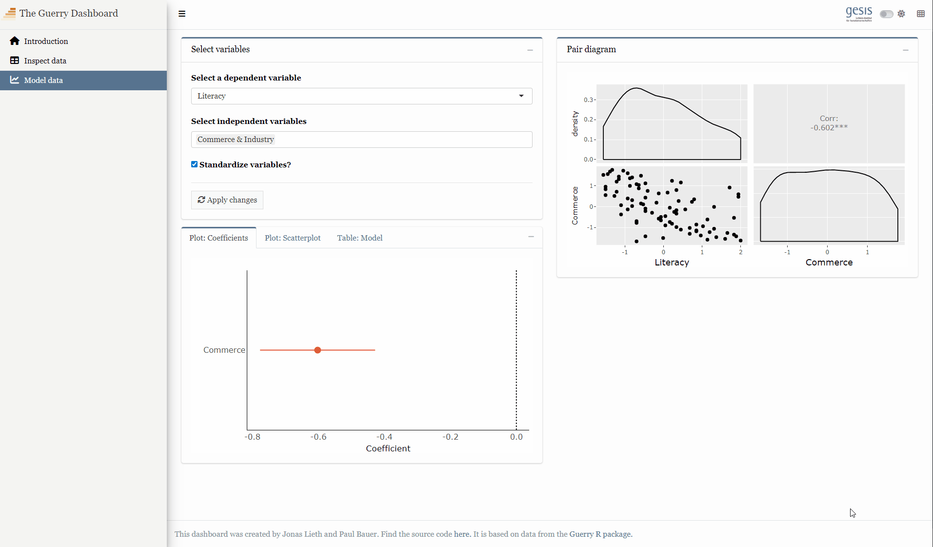
To exemplify what Shiny can do with visualizations, we add a new tab to the app called “Model data”
The goal is to explore the relationships among Guerry variables
Question: If you think about a Shiny app that explores the relationships within a dataset, what types of visualizations come into your mind first?
2.2 Setting up the UI element
Taking our Shiny app as an example, we add another tab:
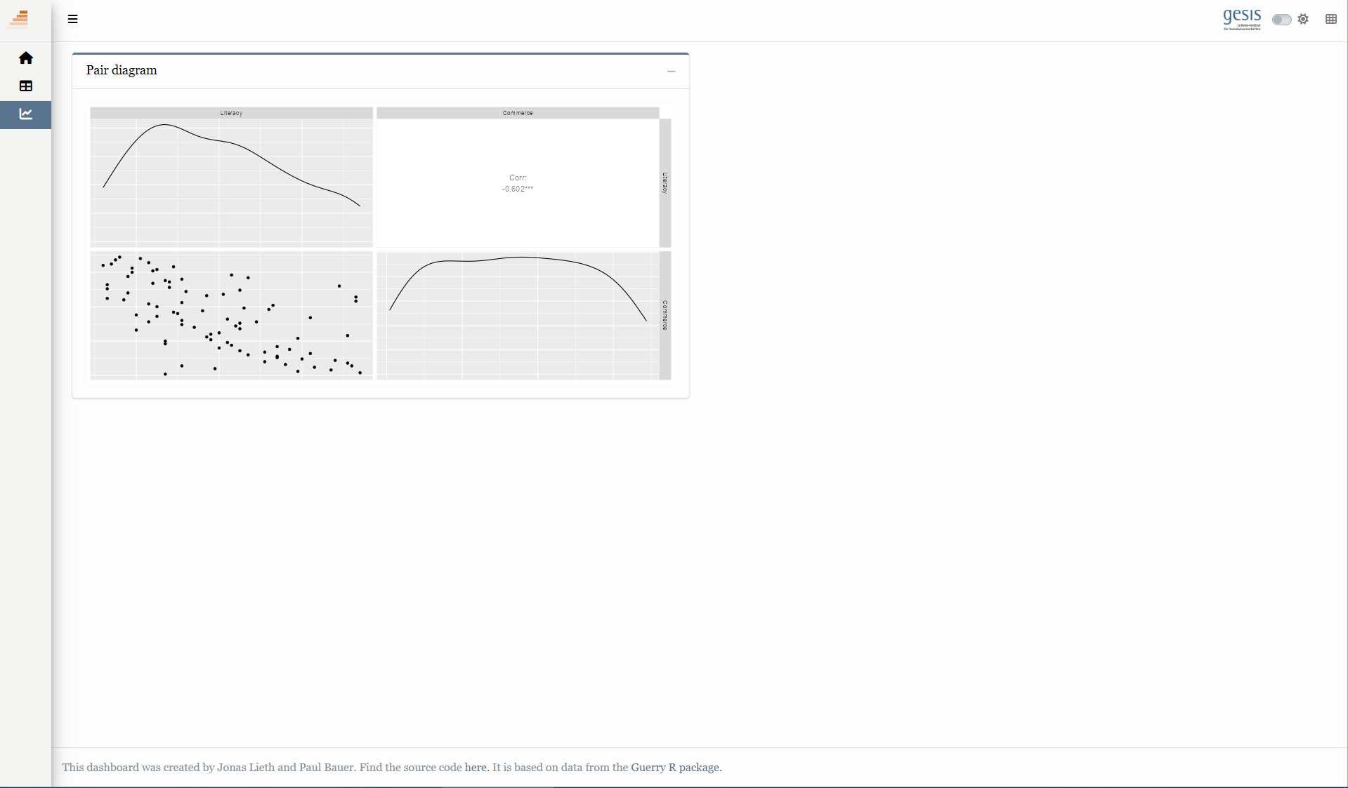
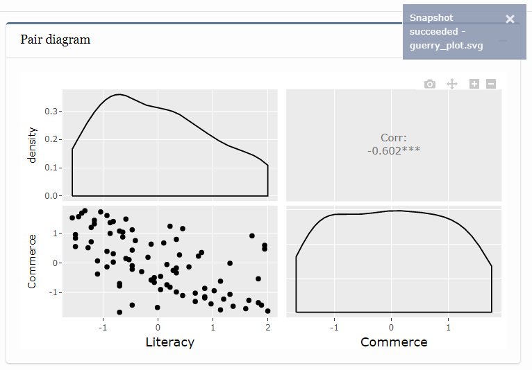
model <-tabItem("tab_model",fluidRow(column(width =6,box(width =12,title ="Pair diagram",status ="primary",plotOutput("pairplot") ) ) ))
1
Create a tab item called “tab_model”
2
Create an initial layout containing a fluid row with one column and one box
3
Create a plot output widget
The newly created tab Item has the tab name tab_model
We already created other tabs item called tab_intro and tab_tabulate, so we can tell where our new tab item goes:
dashboardPage(header =dashboardHeader(title =tagList(img(src ="workshop-logo.png", width =35, height =35),span("The Guerry Dashboard", class ="brand-text") ) ),sidebar =dashboardSidebar(id ="sidebar",sidebarMenu(id ="sidebarMenu",menuItem(tabName ="tab_intro", text ="Introduction", icon =icon("home")),menuItem(tabName ="tab_tabulate", text ="Tabulate data", icon =icon("table")),menuItem(tabName ="tab_model", text ="Model data", icon ="chart-line") ) ),body =dashboardBody(# Note: Tab contents omitted to maintain readability!tabItems(tabItem(tabName ="tab_intro"),tabItem(tabname ="tab_tabulate"), model ) ))
1
Create the respective menu items in the sidebar. Don’t forget to match the tab names!
2
Create the tab items within the body. The function tabItems() contains all tab objects. We add our newly created tab_model object after the introduction. Again, the order and names of tabItem()s corresponds to the order and names of menuItem()s!
2.3 Filling with contents
Pretty easy so far!
On the server side we do the plotting
Here, we use ggpairs from the GGally package, but you can use anything that produces a plot
The renderPlot() function accepts an expression that produces a plot
2
Clean the data before plotting
3
ggpairs() creates a ggplot2 object which starts a plotting device in its print method
2.4 Full code
Full code for basic plotting
library(shiny)library(htmltools)library(bs4Dash)library(shinyWidgets)library(Guerry)library(sf)library(dplyr)library(GGally)# 1 Data preparation ----## Load & clean data ----variable_names <-list(Crime_pers ="Crime against persons", Crime_prop ="Crime against property", Literacy ="Literacy", Donations ="Donations to the poor", Infants ="Illegitimate births", Suicides ="Suicides", Wealth ="Tax / capita", Commerce ="Commerce & Industry", Clergy ="Clergy", Crime_parents ="Crime against parents", Infanticide ="Infanticides", Donation_clergy ="Donations to the clergy", Lottery ="Wager on Royal Lottery", Desertion ="Military desertion", Instruction ="Instruction", Prostitutes ="Prostitutes", Distance ="Distance to paris", Area ="Area", Pop1831 ="Population")data_guerry <- Guerry::gfrance85 %>%st_as_sf() %>%as_tibble() %>%st_as_sf(crs =27572) %>%mutate(Region =case_match( Region,"C"~"Central","E"~"East","N"~"North","S"~"South","W"~"West" )) %>%select(-c("COUNT", "dept", "AVE_ID_GEO", "CODE_DEPT")) %>%select(Region:Department, all_of(names(variable_names)))## Prep data (Tab: Tabulate data) ----data_guerry_tabulate <- data_guerry %>%st_drop_geometry() %>%mutate(across(.cols =all_of(names(variable_names)), round, 2))## Prep data (Tab: Map data) ----data_guerry_region <- data_guerry %>%group_by(Region) %>%summarise(across(.cols =all_of(names(variable_names)),function(x) {if (cur_column() %in%c("Area", "Pop1831")) {sum(x) } else {mean(x) } } ))## Prepare palettes ----## Used for mappingpals <-list(Sequential = RColorBrewer::brewer.pal.info %>%filter(category %in%"seq") %>%row.names(),Viridis =c("Magma", "Inferno", "Plasma", "Viridis","Cividis", "Rocket", "Mako", "Turbo"))## Prepare modebar clean-up ----## Used for modellingplotly_buttons <-c("sendDataToCloud", "zoom2d", "select2d", "lasso2d", "autoScale2d","hoverClosestCartesian", "hoverCompareCartesian", "resetScale2d")# 3 UI ----ui <-dashboardPage(title ="The Guerry Dashboard",## 3.1 Header ----header =dashboardHeader(title =tagList(img(src ="../workshop-logo.png", width =35, height =35),span("The Guerry Dashboard", class ="brand-text") ) ),## 3.2 Sidebar ----sidebar =dashboardSidebar(id ="sidebar",sidebarMenu(id ="sidebarMenu",menuItem(tabName ="tab_intro", text ="Introduction", icon =icon("home")),menuItem(tabName ="tab_tabulate", text ="Tabulate data", icon =icon("table")),menuItem(tabName ="tab_model", text ="Model data", icon =icon("chart-line")),flat =TRUE ),minified =TRUE,collapsed =TRUE,fixed =FALSE,skin ="light" ),## 3.3 Body ----body =dashboardBody(tabItems(### 3.1.1 Tab: Introduction ----tabItem(tabName ="tab_intro",jumbotron(title ="The Guerry Dashboard",lead ="A Shiny app to explore the classic Guerry dataset.",status ="info",btnName =NULL ),fluidRow(column(width =1),column(width =6,box(title ="About",status ="primary",width =12,blockQuote(HTML("André-Michel Guerry was a French lawyer and amateur statistician. Together with Adolphe Quetelet he may be regarded as the founder of moral statistics which led to the development of criminology, sociology and ultimately, modern social science. <br>— Wikipedia: <a href='https://en.wikipedia.org/wiki/Andr%C3%A9-Michel_Guerry'>André-Michel Guerry</a>"),color ="primary"),p(HTML("Andre-Michel Guerry (1833) was the first to systematically collect and analyze social data on such things as crime, literacy and suicide with the view to determining social laws and the relations among these variables. The Guerry data frame comprises a collection of 'moral variables' (cf. <i><a href='https://en.wikipedia.org/wiki/Moral_statistics'>moral statistics</a></i>) on the 86 departments of France around 1830. A few additional variables have been added from other sources. In total the data frame has 86 observations (the departments of France) on 23 variables <i>(Source: <code>?Guerry</code>)</i>. In this app, we aim to explore Guerry’s data using spatial exploration and regression modelling.")),hr(),accordion(id ="accord",accordionItem(title ="References",status ="primary",solidHeader =FALSE,"The following sources are referenced in this app:", tags$ul(class ="list-style: none",style ="margin-left: -30px;",p("Angeville, A. (1836). Essai sur la Statistique de la Population française Paris: F. Doufour."),p("Guerry, A.-M. (1833). Essai sur la statistique morale de la France Paris: Crochard. English translation: Hugh P. Whitt and Victor W. Reinking, Lewiston, N.Y. : Edwin Mellen Press, 2002."),p("Parent-Duchatelet, A. (1836). De la prostitution dans la ville de Paris, 3rd ed, 1857, p. 32, 36"),p("Palsky, G. (2008). Connections and exchanges in European thematic cartography. The case of 19th century choropleth maps. Belgeo 3-4, 413-426.") ) ),accordionItem(title ="Details",status ="primary",solidHeader =FALSE,p("This app was created as part of a Shiny workshop held in July 2023"),p("Last update: June 2023"),p("Further information about the data can be found",a("here.", href ="https://www.datavis.ca/gallery/guerry/guerrydat.html")) ) ) ) ),column(width =4,box(title ="André Michel Guerry",status ="primary",width =12, tags$img(src ="../guerry.jpg", width ="100%"),p("Source: Palsky (2008)") ) ) ) ),### 3.3.2 Tab: Tabulate data ----tabItem(tabName ="tab_tabulate",fluidRow(#### Inputs(s) ----pickerInput("tab_tabulate_select",label ="Filter variables",choices =setNames(names(variable_names), variable_names),options =pickerOptions(actionsBox =TRUE,windowPadding =c(30, 0, 0, 0),liveSearch =TRUE,selectedTextFormat ="count",countSelectedText ="{0} variables selected",noneSelectedText ="No filters applied" ),inline =TRUE,multiple =TRUE ) ),hr(),#### Output(s) (Data table) ---- DT::dataTableOutput("tab_tabulate_table") ),### 3.3.3 Tab: Model data ----tabItem(tabName ="tab_model",fluidRow(column(width =6,##### Box: Pair diagramm ----box(width =12,title ="Pair diagram",status ="primary",plotOutput("pairplot") ) ) ) ) ) # end tabItems ),## 3.4 Footer (bottom)----footer =dashboardFooter(left =span("This dashboard was created by Jonas Lieth and Paul Bauer. Find the source code",a("here.", href ="https://github.com/paulcbauer/shiny_workshop/tree/main/shinyapps/guerry"),"It is based on data from the",a("Guerry R package.", href ="https://cran.r-project.org/web/packages/Guerry/index.html") ) ),## 3.5 Controlbar (top)----controlbar =dashboardControlbar(div(class ="p-3", skinSelector()),skin ="light" ) )# 4 Server ----server <-function(input, output, session) {## 4.1 Tabulate data ----### Variable selection ---- tab <-reactive({ var <- input$tab_tabulate_select data_table <- data_guerry_tabulateif (!is.null(var)) { data_table <- data_table[, var] } data_table })### Create table---- dt <-reactive({ tab <-tab() ridx <-ifelse("Department"%in%names(tab), 3, 1) DT::datatable( tab,class ="hover",extensions =c("Buttons"),selection ="none",filter =list(position ="top", clear =FALSE),style ="bootstrap4",rownames =FALSE,options =list(dom ="Brtip",deferRender =TRUE,scroller =TRUE,buttons =list(list(extend ="copy", text ="Copy to clipboard"),list(extend ="pdf", text ="Save as PDF"),list(extend ="csv", text ="Save as CSV"),list(extend ="excel", text ="Save as JSON", action = DT::JS(" function (e, dt, button, config) { var data = dt.buttons.exportData(); $.fn.dataTable.fileSave( new Blob([JSON.stringify(data)]), 'Shiny dashboard.json' ); } ")) ) ) ) })### Render table---- output$tab_tabulate_table <- DT::renderDataTable(dt(), server =FALSE)## 4.2 Model data ----### Pair diagram ---- output$pairplot <-renderPlot({ dt <-st_drop_geometry(data_guerry[c("Literacy", "Commerce")]) GGally::ggpairs(dt, axisLabels ="none") })}shinyApp(ui, server)
2.5 Limitations
The code to create a plot in a Shiny app is quite simple so far, but has not many advantages over plain plotting in the R console
To really make it shine, we need three features:
Reactivity
Interactivity
Contextuality
3 Reactivity
Reactivity means adding reactive dependencies
Currently, we hardcode the variables, but we can also make the user decide on them
3.1 Adding UI inputs
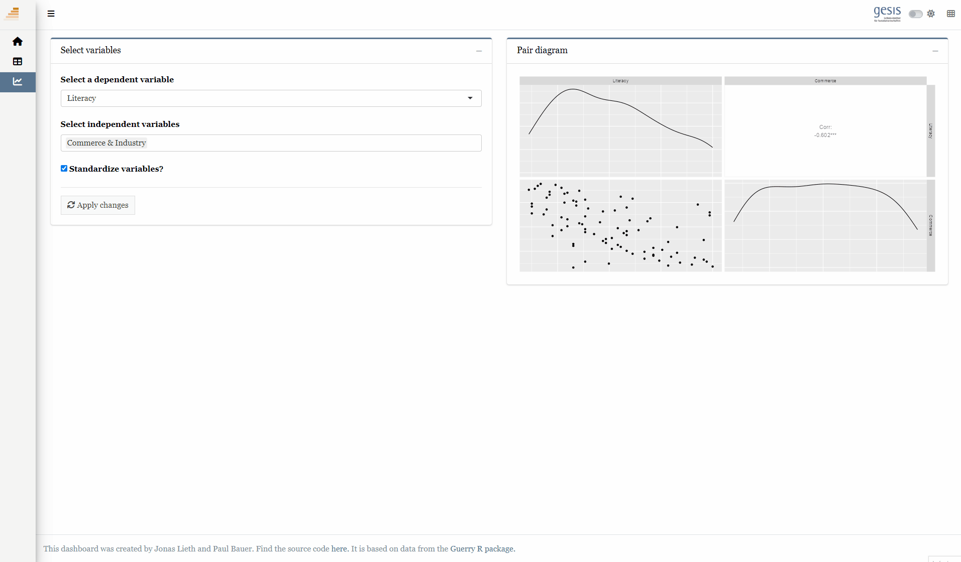
Here, we add three user inputs
selectInput() to select a single x variable (defaults to Literacy)
selectizeInput() to select multiple y variables (defaults to Commerce)
Create a new column + box to hold our new input UI
2
Create a selectInput() to select a single x variable. By passing a named list to the choices argument, the list names are shown to the user and the list values are sent to the server!
3
Create a selectizeInput() to select multiple y variables
4
Create a checkboxInput() to let users decide whether to standardize variables or not
5
Create an actionButton() that needs to be pressed for changes to take effect
3.2 Accessing the new UI inputs
On the server side, we need to deal with the new inputs
Question: Which new UI inputs did we add? How can we access them on the server side?
We add a new reactive that cleans the data
Note
bindEvent ensures that the user input is only applied when the actionButton() is pressed! You can try to remove this safety measure and observe how the plot struggles to keep up when selecting multiple variables.
dat <-reactive({ x <- input$model_x y <- input$model_y dt <- sf::st_drop_geometry(guerry)[c(x, y)]if (input$model_std) dt <- datawizard::standardise(dt) dt}) %>%bindEvent(input$refresh, ignoreNULL =FALSE)output$pairplot <-renderPlot({ GGally::ggpairs(dat(), axisLabels ="none")})
1
Create a reactive expression that takes care of data cleaning and stores the cleaned data in a reactive object called dat
2
Execute the reactive expression (and thus update dat), if and only if the refresh button is pressed
3
Create a pairs plot using the newly created dat() object. This is the same as the dt dataframe that we used before with the difference that dat() updates every time input$model_x, input$model_y or input$model_std are changed.
The plot now reacts to user input and updates its appearance when the user selection changes!
3.3 Full code
Full code for reactive plotting
library(shiny)library(htmltools)library(bs4Dash)library(shinyWidgets)library(Guerry)library(sf)library(dplyr)library(plotly)library(GGally)# 1 Data preparation ----## Load & clean data ----variable_names <-list(Crime_pers ="Crime against persons", Crime_prop ="Crime against property", Literacy ="Literacy", Donations ="Donations to the poor", Infants ="Illegitimate births", Suicides ="Suicides", Wealth ="Tax / capita", Commerce ="Commerce & Industry", Clergy ="Clergy", Crime_parents ="Crime against parents", Infanticide ="Infanticides", Donation_clergy ="Donations to the clergy", Lottery ="Wager on Royal Lottery", Desertion ="Military desertion", Instruction ="Instruction", Prostitutes ="Prostitutes", Distance ="Distance to paris", Area ="Area", Pop1831 ="Population")data_guerry <- Guerry::gfrance85 %>%st_as_sf() %>%as_tibble() %>%st_as_sf(crs =27572) %>%mutate(Region =case_match( Region,"C"~"Central","E"~"East","N"~"North","S"~"South","W"~"West" )) %>%select(-c("COUNT", "dept", "AVE_ID_GEO", "CODE_DEPT")) %>%select(Region:Department, all_of(names(variable_names)))## Prep data (Tab: Tabulate data) ----data_guerry_tabulate <- data_guerry %>%st_drop_geometry() %>%mutate(across(.cols =all_of(names(variable_names)), round, 2))## Prepare modebar clean-up ----## Used for modellingplotly_buttons <-c("sendDataToCloud", "zoom2d", "select2d", "lasso2d", "autoScale2d","hoverClosestCartesian", "hoverCompareCartesian", "resetScale2d")# 3 UI ----ui <-dashboardPage(title ="The Guerry Dashboard",## 3.1 Header ----header =dashboardHeader(title =tagList(img(src ="../workshop-logo.png", width =35, height =35),span("The Guerry Dashboard", class ="brand-text") ) ),## 3.2 Sidebar ----sidebar =dashboardSidebar(id ="sidebar",sidebarMenu(id ="sidebarMenu",menuItem(tabName ="tab_intro", text ="Introduction", icon =icon("home")),menuItem(tabName ="tab_tabulate", text ="Tabulate data", icon =icon("table")),menuItem(tabName ="tab_model", text ="Model data", icon =icon("chart-line")),flat =TRUE ),minified =TRUE,collapsed =TRUE,fixed =FALSE,skin ="light" ),## 3.3 Body ----body =dashboardBody(tabItems(### 3.1.1 Tab: Introduction ----tabItem(tabName ="tab_intro",jumbotron(title ="The Guerry Dashboard",lead ="A Shiny app to explore the classic Guerry dataset.",status ="info",btnName =NULL ),fluidRow(column(width =1),column(width =6,box(title ="About",status ="primary",width =12,blockQuote(HTML("André-Michel Guerry was a French lawyer and amateur statistician. Together with Adolphe Quetelet he may be regarded as the founder of moral statistics which led to the development of criminology, sociology and ultimately, modern social science. <br>— Wikipedia: <a href='https://en.wikipedia.org/wiki/Andr%C3%A9-Michel_Guerry'>André-Michel Guerry</a>"),color ="primary"),p(HTML("Andre-Michel Guerry (1833) was the first to systematically collect and analyze social data on such things as crime, literacy and suicide with the view to determining social laws and the relations among these variables. The Guerry data frame comprises a collection of 'moral variables' (cf. <i><a href='https://en.wikipedia.org/wiki/Moral_statistics'>moral statistics</a></i>) on the 86 departments of France around 1830. A few additional variables have been added from other sources. In total the data frame has 86 observations (the departments of France) on 23 variables <i>(Source: <code>?Guerry</code>)</i>. In this app, we aim to explore Guerry’s data using spatial exploration and regression modelling.")),hr(),accordion(id ="accord",accordionItem(title ="References",status ="primary",solidHeader =FALSE,"The following sources are referenced in this app:", tags$ul(class ="list-style: none",style ="margin-left: -30px;",p("Angeville, A. (1836). Essai sur la Statistique de la Population française Paris: F. Doufour."),p("Guerry, A.-M. (1833). Essai sur la statistique morale de la France Paris: Crochard. English translation: Hugh P. Whitt and Victor W. Reinking, Lewiston, N.Y. : Edwin Mellen Press, 2002."),p("Parent-Duchatelet, A. (1836). De la prostitution dans la ville de Paris, 3rd ed, 1857, p. 32, 36"),p("Palsky, G. (2008). Connections and exchanges in European thematic cartography. The case of 19th century choropleth maps. Belgeo 3-4, 413-426.") ) ),accordionItem(title ="Details",status ="primary",solidHeader =FALSE,p("This app was created as part of a Shiny workshop held in July 2023"),p("Last update: June 2023"),p("Further information about the data can be found",a("here.", href ="https://www.datavis.ca/gallery/guerry/guerrydat.html")) ) ) ) ),column(width =4,box(title ="André Michel Guerry",status ="primary",width =12, tags$img(src ="../guerry.jpg", width ="100%"),p("Source: Palsky (2008)") ) ) ) ),### 3.3.2 Tab: Tabulate data ----tabItem(tabName ="tab_tabulate",fluidRow(#### Inputs(s) ----pickerInput("tab_tabulate_select",label ="Filter variables",choices =setNames(names(variable_names), variable_names),options =pickerOptions(actionsBox =TRUE,windowPadding =c(30, 0, 0, 0),liveSearch =TRUE,selectedTextFormat ="count",countSelectedText ="{0} variables selected",noneSelectedText ="No filters applied" ),inline =TRUE,multiple =TRUE ) ),hr(),#### Output(s) (Data table) ---- DT::dataTableOutput("tab_tabulate_table") ),### 3.3.3 Tab: Model data ----tabItem(tabName ="tab_model",fluidRow(column(width =6,#### Inputs(s) ----box(width =12,title ="Select variables",status ="primary",selectInput("model_x",label ="Select a dependent variable",choices =setNames(names(variable_names), variable_names),selected ="Literacy" ),selectizeInput("model_y",label ="Select independent variables",choices =setNames(names(variable_names), variable_names),multiple =TRUE,selected ="Commerce" ),checkboxInput("model_std",label ="Standardize variables?",value =TRUE ),hr(),actionButton("refresh",label ="Apply changes",icon =icon("refresh"),flat =TRUE ) ) ),column(width =6,##### Box: Pair diagramm ----box(width =12,title ="Pair diagram",status ="primary",plotOutput("pairplot") )# A fourth box can go here :) ) ) ) ) # end tabItems ),## 3.4 Footer (bottom)----footer =dashboardFooter(left =span("This dashboard was created by Jonas Lieth and Paul Bauer. Find the source code",a("here.", href ="https://github.com/paulcbauer/shiny_workshop/tree/main/shinyapps/guerry"),"It is based on data from the",a("Guerry R package.", href ="https://cran.r-project.org/web/packages/Guerry/index.html") ) ),## 3.5 Controlbar (top)----controlbar =dashboardControlbar(div(class ="p-3", skinSelector()),skin ="light" ) )# 4 Server ----server <-function(input, output, session) {## 4.1 Tabulate data ----### Variable selection ---- tab <-reactive({ var <- input$tab_tabulate_select data_table <- data_guerry_tabulateif (!is.null(var)) { data_table <- data_table[, var] } data_table })### Create table---- dt <-reactive({ tab <-tab() ridx <-ifelse("Department"%in%names(tab), 3, 1) DT::datatable( tab,class ="hover",extensions =c("Buttons"),selection ="none",filter =list(position ="top", clear =FALSE),style ="bootstrap4",rownames =FALSE,options =list(dom ="Brtip",deferRender =TRUE,scroller =TRUE,buttons =list(list(extend ="copy", text ="Copy to clipboard"),list(extend ="pdf", text ="Save as PDF"),list(extend ="csv", text ="Save as CSV"),list(extend ="excel", text ="Save as JSON", action = DT::JS(" function (e, dt, button, config) { var data = dt.buttons.exportData(); $.fn.dataTable.fileSave( new Blob([JSON.stringify(data)]), 'Shiny dashboard.json' ); } ")) ) ) ) })### Render table---- output$tab_tabulate_table <- DT::renderDataTable(dt(), server =FALSE)## 4.2 Model data ----### Define & estimate model ---- dat <-reactive({ x <- input$model_x y <- input$model_y dt <- sf::st_drop_geometry(data_guerry)[c(x, y)]if (input$model_std) dt <- datawizard::standardise(dt) dt }) %>%bindEvent(input$refresh, ignoreNULL =FALSE)### Pair diagram ---- output$pairplot <-renderPlot({ GGally::ggpairs(dat(), axisLabels ="none") })}shinyApp(ui, server)
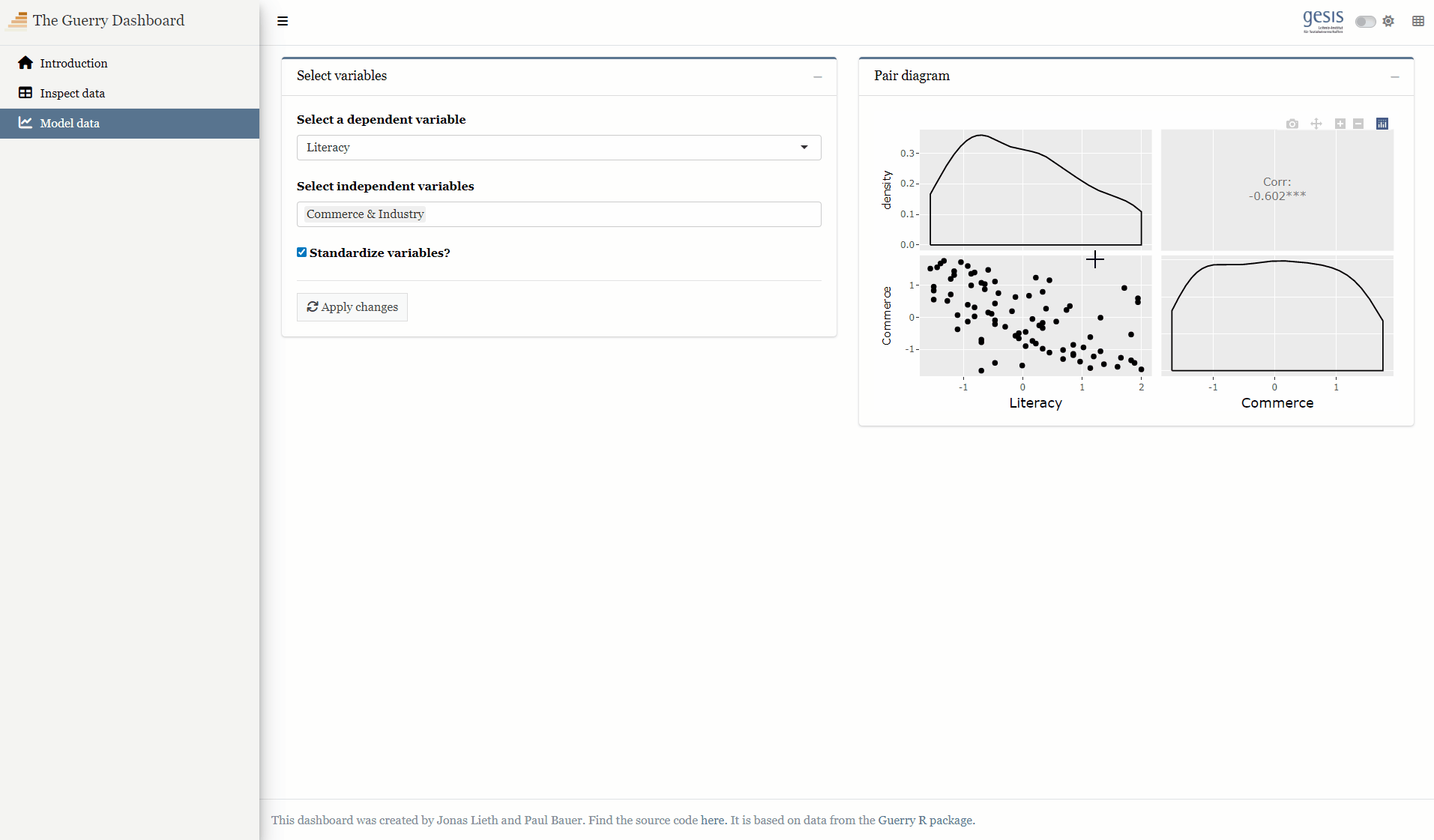
4 Interactivity
Currently, our plot is a static image
Static images are fine for reports or print articles, but Shiny features much more than that
Base Shiny features interactive components like click, double click, hover or brush events (see Chapter 7.1 in Mastering Shiny)
Here, we’d like to go a bit further and implement Plotly plots
4.1 Plotly
Plotly is an open-source library to create charts that can be interacted with in various ways
It supports several programming languages including R and works seamlessly with Shiny
This is the only thing that changes on the UI side when implementing Plotly. Plotly does not produce regular static plots and thus needs a special output widget.
4.3ggplotly on the server side
Plotly introduces a very comprehensive plotting system centered around the plot_ly() function
Lucky for us, all we have to do is call ggplotly() on our ggplot object to convert it to a plotly object
dat <-reactive({ x <- input$model_x y <- input$model_y dt <- sf::st_drop_geometry(guerry)[c(x, y)]if (input$model_std) dt <- datawizard::standardise(dt) dt}) %>%bindEvent(input$refresh, ignoreNULL =FALSE)output$pairplot <- plotly::renderPlotly({ p <- GGally::ggpairs(dat(), axisLabels ="none") plotly::ggplotly(p)})
1
As Plotly plots are not static plots, we need to use a special rendering function called plotly::renderPlotly()
2
Just as on the UI side, we need not change much on the server side. Just wrap your ggplot2 object in a call to plotly::ggplotly().
4.4 Extending Plotly
So far we made ggplot2 plots and converted them to Plotly charts using a single function call
Many aspects of Plotly charts remain out of control as we are not using the plot_ly() function
4.4.1 Plotly’s customization functions
We can extend Plotly objects using three functions:
layout() changes the plot organisation (think ggplot2::theme()), e.g.:
colors, sizes, fonts, positions, titles, ratios and alignment of all kinds of plot elements
updatemenus adds buttons or drop down menus that can change the plot style or layout (see here for examples)
sliders adds sliders that can be useful for time series (see here for examples)
Changes the output of snapshots taken of the plot. Setting height and width to NULL keeps the aspect ratio of the plot as it is shown in the app.
4
Enables zooming through scrolling
4.5 Full code
Full code for interactive visualization
library(shiny)library(htmltools)library(bs4Dash)library(shinyWidgets)library(Guerry)library(sf)library(dplyr)library(plotly)library(GGally)library(datawizard)# 1 Data preparation ----## Load & clean data ----variable_names <-list(Crime_pers ="Crime against persons", Crime_prop ="Crime against property", Literacy ="Literacy", Donations ="Donations to the poor", Infants ="Illegitimate births", Suicides ="Suicides", Wealth ="Tax / capita", Commerce ="Commerce & Industry", Clergy ="Clergy", Crime_parents ="Crime against parents", Infanticide ="Infanticides", Donation_clergy ="Donations to the clergy", Lottery ="Wager on Royal Lottery", Desertion ="Military desertion", Instruction ="Instruction", Prostitutes ="Prostitutes", Distance ="Distance to paris", Area ="Area", Pop1831 ="Population")data_guerry <- Guerry::gfrance85 %>%st_as_sf() %>%as_tibble() %>%st_as_sf(crs =27572) %>%mutate(Region =case_match( Region,"C"~"Central","E"~"East","N"~"North","S"~"South","W"~"West" )) %>%select(-c("COUNT", "dept", "AVE_ID_GEO", "CODE_DEPT")) %>%select(Region:Department, all_of(names(variable_names)))## Prep data (Tab: Tabulate data) ----data_guerry_tabulate <- data_guerry %>%st_drop_geometry() %>%mutate(across(.cols =all_of(names(variable_names)), round, 2))## Prepare modebar clean-up ----## Used for modellingplotly_buttons <-c("sendDataToCloud", "zoom2d", "select2d", "lasso2d", "autoScale2d","hoverClosestCartesian", "hoverCompareCartesian", "resetScale2d")# 3 UI ----ui <-dashboardPage(title ="The Guerry Dashboard",## 3.1 Header ----header =dashboardHeader(title =tagList(img(src ="../workshop-logo.png", width =35, height =35),span("The Guerry Dashboard", class ="brand-text") ) ),## 3.2 Sidebar ----sidebar =dashboardSidebar(id ="sidebar",sidebarMenu(id ="sidebarMenu",menuItem(tabName ="tab_intro", text ="Introduction", icon =icon("home")),menuItem(tabName ="tab_tabulate", text ="Tabulate data", icon =icon("table")),menuItem(tabName ="tab_model", text ="Model data", icon =icon("chart-line")),flat =TRUE ),minified =TRUE,collapsed =TRUE,fixed =FALSE,skin ="light" ),## 3.3 Body ----body =dashboardBody(tabItems(### 3.1.1 Tab: Introduction ----tabItem(tabName ="tab_intro",jumbotron(title ="The Guerry Dashboard",lead ="A Shiny app to explore the classic Guerry dataset.",status ="info",btnName =NULL ),fluidRow(column(width =1),column(width =6,box(title ="About",status ="primary",width =12,blockQuote(HTML("André-Michel Guerry was a French lawyer and amateur statistician. Together with Adolphe Quetelet he may be regarded as the founder of moral statistics which led to the development of criminology, sociology and ultimately, modern social science. <br>— Wikipedia: <a href='https://en.wikipedia.org/wiki/Andr%C3%A9-Michel_Guerry'>André-Michel Guerry</a>"),color ="primary"),p(HTML("Andre-Michel Guerry (1833) was the first to systematically collect and analyze social data on such things as crime, literacy and suicide with the view to determining social laws and the relations among these variables. The Guerry data frame comprises a collection of 'moral variables' (cf. <i><a href='https://en.wikipedia.org/wiki/Moral_statistics'>moral statistics</a></i>) on the 86 departments of France around 1830. A few additional variables have been added from other sources. In total the data frame has 86 observations (the departments of France) on 23 variables <i>(Source: <code>?Guerry</code>)</i>. In this app, we aim to explore Guerry’s data using spatial exploration and regression modelling.")),hr(),accordion(id ="accord",accordionItem(title ="References",status ="primary",solidHeader =FALSE,"The following sources are referenced in this app:", tags$ul(class ="list-style: none",style ="margin-left: -30px;",p("Angeville, A. (1836). Essai sur la Statistique de la Population française Paris: F. Doufour."),p("Guerry, A.-M. (1833). Essai sur la statistique morale de la France Paris: Crochard. English translation: Hugh P. Whitt and Victor W. Reinking, Lewiston, N.Y. : Edwin Mellen Press, 2002."),p("Parent-Duchatelet, A. (1836). De la prostitution dans la ville de Paris, 3rd ed, 1857, p. 32, 36"),p("Palsky, G. (2008). Connections and exchanges in European thematic cartography. The case of 19th century choropleth maps. Belgeo 3-4, 413-426.") ) ),accordionItem(title ="Details",status ="primary",solidHeader =FALSE,p("This app was created as part of a Shiny workshop held in July 2023"),p("Last update: June 2023"),p("Further information about the data can be found",a("here.", href ="https://www.datavis.ca/gallery/guerry/guerrydat.html")) ) ) ) ),column(width =4,box(title ="André Michel Guerry",status ="primary",width =12, tags$img(src ="../guerry.jpg", width ="100%"),p("Source: Palsky (2008)") ) ) ) ),### 3.3.2 Tab: Tabulate data ----tabItem(tabName ="tab_tabulate",fluidRow(#### Inputs(s) ----pickerInput("tab_tabulate_select",label ="Filter variables",choices =setNames(names(variable_names), variable_names),options =pickerOptions(actionsBox =TRUE,windowPadding =c(30, 0, 0, 0),liveSearch =TRUE,selectedTextFormat ="count",countSelectedText ="{0} variables selected",noneSelectedText ="No filters applied" ),inline =TRUE,multiple =TRUE ) ),hr(),#### Output(s) (Data table) ---- DT::dataTableOutput("tab_tabulate_table") ),### 3.3.3 Tab: Model data ----tabItem(tabName ="tab_model",fluidRow(column(width =6,#### Inputs(s) ----box(width =12,title ="Select variables",status ="primary",selectInput("model_x",label ="Select a dependent variable",choices =setNames(names(variable_names), variable_names),selected ="Literacy" ),selectizeInput("model_y",label ="Select independent variables",choices =setNames(names(variable_names), variable_names),multiple =TRUE,selected ="Commerce" ),checkboxInput("model_std",label ="Standardize variables?",value =TRUE ),hr(),actionButton("refresh",label ="Apply changes",icon =icon("refresh"),flat =TRUE ) ) ),column(width =6,##### Box: Pair diagramm ----box(width =12,title ="Pair diagram",status ="primary", plotly::plotlyOutput("pairplot") )# A fourth box can go here :) ) ) ) ) # end tabItems ),## 3.4 Footer (bottom)----footer =dashboardFooter(left =span("This dashboard was created by Jonas Lieth and Paul Bauer. Find the source code",a("here.", href ="https://github.com/paulcbauer/shiny_workshop/tree/main/shinyapps/guerry"),"It is based on data from the",a("Guerry R package.", href ="https://cran.r-project.org/web/packages/Guerry/index.html") ) ),## 3.5 Controlbar (top)----controlbar =dashboardControlbar(div(class ="p-3", skinSelector()),skin ="light" ) )# 4 Server ----server <-function(input, output, session) {## 4.1 Tabulate data ----### Variable selection ---- tab <-reactive({ var <- input$tab_tabulate_select data_table <- data_guerry_tabulateif (!is.null(var)) { data_table <- data_table[, var] } data_table })### Create table---- dt <-reactive({ tab <-tab() ridx <-ifelse("Department"%in%names(tab), 3, 1) DT::datatable( tab,class ="hover",extensions =c("Buttons"),selection ="none",filter =list(position ="top", clear =FALSE),style ="bootstrap4",rownames =FALSE,options =list(dom ="Brtip",deferRender =TRUE,scroller =TRUE,buttons =list(list(extend ="copy", text ="Copy to clipboard"),list(extend ="pdf", text ="Save as PDF"),list(extend ="csv", text ="Save as CSV"),list(extend ="excel", text ="Save as JSON", action = DT::JS(" function (e, dt, button, config) { var data = dt.buttons.exportData(); $.fn.dataTable.fileSave( new Blob([JSON.stringify(data)]), 'Shiny dashboard.json' ); } ")) ) ) ) })### Render table---- output$tab_tabulate_table <- DT::renderDataTable(dt(), server =FALSE)## 4.2 Model data ----### Define & estimate model ---- dat <-reactive({ x <- input$model_x y <- input$model_y dt <- sf::st_drop_geometry(data_guerry)[c(x, y)]if (input$model_std) dt <- datawizard::standardise(dt) dt }) %>%bindEvent(input$refresh, ignoreNULL =FALSE)### Pair diagram ---- output$pairplot <- plotly::renderPlotly({ p <- GGally::ggpairs(dat(), axisLabels ="none")ggplotly(p) %>%config(modeBarButtonsToRemove = plotly_buttons,displaylogo =FALSE,toImageButtonOptions =list(format ="svg",filename ="guerry_plot",height =NULL,width =NULL ),scrollZoom =TRUE ) })}shinyApp(ui, server)
5 Contextuality
By contextuality, we loosely understand how we perceive charts in context
Just showing a simple graph can be more than enough to convey a message
In many cases though, we need more than one figure to lead an argument
A lot of the times it helps to see figures side-by-side
Regular plotting: Interactivity and reactivity possible, but no contextuality
Embedded plotting: Contextuality provided, but interactivity and reactivity mostly impossible (e.g. in a report or a paper)
5.1 Good practices
Appsilon’s US bee colony monitor provides an easy way to compare aggregated numbers, between-state and within-state distributions side-by-side
With a little bit of creativity, Shiny can be a very competent story teller (for an impressive example, take a look at John Coene’s Freedom of Press Shiny app)
5.2 Extending the layout
Here, we will extend our lonely plot with a regression analysis to tell the full story of the associations of the Guerry indicators
We add three types of visualization: a coefficient plot, a scatter plot and a regression table
The three plots are tucked in a tabBox, a bs4Dash::box that supports tab panels
Adds a new tabBox() which can contain multiple tabPanel()
2
Specify the appearance of the tabs. pills fills the entire tab panel with the status color while tabs is more subtle in its coloring.
3
Add a tab that holds a Plotly coefficient plot
4
Add a tab that holds a Plotly scatter plot
5
Add a tab that holds a HTML regression table
5.3 Digesting the new layout
Question: What did we add here? Which outputs need to be filled with content?
On the server side, we extend our reactive object with a linear regression model
mparams <-reactive({ x <- input$model_x y <- input$model_y dt <- sf::st_drop_geometry(guerry)[c(x, y)]if (input$model_std) dt <- datawizard::standardise(dt) form <-as.formula(paste(x, "~", paste(y, collapse =" + "))) mod <-lm(form, data = dt)list(x = x, y = y, data = dt, model = mod)}) %>%bindEvent(input$refresh, ignoreNULL =FALSE)
1
We renamed the dat() reactive object to mparams() as it now holds multiple arguments instead of just one dataframe
2
Create a formula and produce the linear regression output
3
Return a list of arguments to be used for the outputs
5.4 Creating the output
From this point, we can chuck the mparams reactive object into all the rendering functions
### Pair diagram ----output$pairplot <-renderPlotly({ p <- GGally::ggpairs(mparams()$data, axisLabels ="none")ggplotly(p)})### Plot: Coefficientplot ----output$coefficientplot <-renderPlotly({ params <-mparams() dt <- params$data x <- params$x y <- params$y p <-plot(parameters::model_parameters(params$model))ggplotly(p)})### Plot: Scatterplot ----output$scatterplot <-renderPlotly({ params <-mparams() dt <- params$data dt_labels <- params$data_labels x <- params$x y <- params$yif (length(y) ==1) { p <-ggplot(params$data,aes(x = .data[[params$x]],y = .data[[params$y]])) +geom_point() +geom_smooth() +theme_light() } else { p <-ggplot() +theme_void() +annotate("text",label ="Cannot create scatterplot.\nMore than two variables selected.",x =0, y =0,size =5,colour ="red",hjust =0.5,vjust =0.5) +xlab(NULL) }ggplotly(p)})### Table: Regression ----output$tableregression <-renderUI({ params <-mparams()HTML(modelsummary(dvnames(list(params$model)),gof_omit ="AIC|BIC|Log|Adj|RMSE" ))})
1
Again, we need to change the input to the ggpairs() function as the name and structure of the reactive object has changed.
2
Create a Plotly coefficient plot using the parameters package
3
Create a Plotly scatter plot for bi-variate regression. If more than one y variable is selected, an empty plot and a warning message is created.
4
Create a model table using the modelsummary package and prepare it for HTML rendering.
5.5 Full code
Full code for contextual visualization
library(shiny)library(htmltools)library(bs4Dash)library(shinyWidgets)library(Guerry)library(sf)library(dplyr)library(plotly)library(ggplot2)library(GGally)library(datawizard)library(parameters)library(performance)library(modelsummary)# 1 Data preparation ----## Load & clean data ----variable_names <-list(Crime_pers ="Crime against persons", Crime_prop ="Crime against property", Literacy ="Literacy", Donations ="Donations to the poor", Infants ="Illegitimate births", Suicides ="Suicides", Wealth ="Tax / capita", Commerce ="Commerce & Industry", Clergy ="Clergy", Crime_parents ="Crime against parents", Infanticide ="Infanticides", Donation_clergy ="Donations to the clergy", Lottery ="Wager on Royal Lottery", Desertion ="Military desertion", Instruction ="Instruction", Prostitutes ="Prostitutes", Distance ="Distance to paris", Area ="Area", Pop1831 ="Population")data_guerry <- Guerry::gfrance85 %>%st_as_sf() %>%as_tibble() %>%st_as_sf(crs =27572) %>%mutate(Region =case_match( Region,"C"~"Central","E"~"East","N"~"North","S"~"South","W"~"West" )) %>%select(-c("COUNT", "dept", "AVE_ID_GEO", "CODE_DEPT")) %>%select(Region:Department, all_of(names(variable_names)))## Prep data (Tab: Tabulate data) ----data_guerry_tabulate <- data_guerry %>%st_drop_geometry() %>%mutate(across(.cols =all_of(names(variable_names)), round, 2))## Prepare modebar clean-up ----## Used for modellingplotly_buttons <-c("sendDataToCloud", "zoom2d", "select2d", "lasso2d", "autoScale2d","hoverClosestCartesian", "hoverCompareCartesian", "resetScale2d")# 3 UI ----ui <-dashboardPage(title ="The Guerry Dashboard",## 3.1 Header ----header =dashboardHeader(title =tagList(img(src ="../workshop-logo.png", width =35, height =35),span("The Guerry Dashboard", class ="brand-text") ) ),## 3.2 Sidebar ----sidebar =dashboardSidebar(id ="sidebar",sidebarMenu(id ="sidebarMenu",menuItem(tabName ="tab_intro", text ="Introduction", icon =icon("home")),menuItem(tabName ="tab_tabulate", text ="Tabulate data", icon =icon("table")),menuItem(tabName ="tab_model", text ="Model data", icon =icon("chart-line")),flat =TRUE ),minified =TRUE,collapsed =TRUE,fixed =FALSE,skin ="light" ),## 3.3 Body ----body =dashboardBody(tabItems(### 3.1.1 Tab: Introduction ----tabItem(tabName ="tab_intro",jumbotron(title ="The Guerry Dashboard",lead ="A Shiny app to explore the classic Guerry dataset.",status ="info",btnName =NULL ),fluidRow(column(width =1),column(width =6,box(title ="About",status ="primary",width =12,blockQuote(HTML("André-Michel Guerry was a French lawyer and amateur statistician. Together with Adolphe Quetelet he may be regarded as the founder of moral statistics which led to the development of criminology, sociology and ultimately, modern social science. <br>— Wikipedia: <a href='https://en.wikipedia.org/wiki/Andr%C3%A9-Michel_Guerry'>André-Michel Guerry</a>"),color ="primary"),p(HTML("Andre-Michel Guerry (1833) was the first to systematically collect and analyze social data on such things as crime, literacy and suicide with the view to determining social laws and the relations among these variables. The Guerry data frame comprises a collection of 'moral variables' (cf. <i><a href='https://en.wikipedia.org/wiki/Moral_statistics'>moral statistics</a></i>) on the 86 departments of France around 1830. A few additional variables have been added from other sources. In total the data frame has 86 observations (the departments of France) on 23 variables <i>(Source: <code>?Guerry</code>)</i>. In this app, we aim to explore Guerry’s data using spatial exploration and regression modelling.")),hr(),accordion(id ="accord",accordionItem(title ="References",status ="primary",solidHeader =FALSE,"The following sources are referenced in this app:", tags$ul(class ="list-style: none",style ="margin-left: -30px;",p("Angeville, A. (1836). Essai sur la Statistique de la Population française Paris: F. Doufour."),p("Guerry, A.-M. (1833). Essai sur la statistique morale de la France Paris: Crochard. English translation: Hugh P. Whitt and Victor W. Reinking, Lewiston, N.Y. : Edwin Mellen Press, 2002."),p("Parent-Duchatelet, A. (1836). De la prostitution dans la ville de Paris, 3rd ed, 1857, p. 32, 36"),p("Palsky, G. (2008). Connections and exchanges in European thematic cartography. The case of 19th century choropleth maps. Belgeo 3-4, 413-426.") ) ),accordionItem(title ="Details",status ="primary",solidHeader =FALSE,p("This app was created as part of a Shiny workshop held in July 2023"),p("Last update: June 2023"),p("Further information about the data can be found",a("here.", href ="https://www.datavis.ca/gallery/guerry/guerrydat.html")) ) ) ) ),column(width =4,box(title ="André Michel Guerry",status ="primary",width =12, tags$img(src ="../guerry.jpg", width ="100%"),p("Source: Palsky (2008)") ) ) ) ),### 3.3.2 Tab: Tabulate data ----tabItem(tabName ="tab_tabulate",fluidRow(#### Inputs(s) ----pickerInput("tab_tabulate_select",label ="Filter variables",choices =setNames(names(variable_names), variable_names),options =pickerOptions(actionsBox =TRUE,windowPadding =c(30, 0, 0, 0),liveSearch =TRUE,selectedTextFormat ="count",countSelectedText ="{0} variables selected",noneSelectedText ="No filters applied" ),inline =TRUE,multiple =TRUE ) ),hr(),#### Output(s) (Data table) ---- DT::dataTableOutput("tab_tabulate_table") ),### 3.3.3 Tab: Model data ----tabItem(tabName ="tab_model",fluidRow(column(width =6,#### Inputs(s) ----box(width =12,title ="Select variables",status ="primary",selectInput("model_x",label ="Select a dependent variable",choices =setNames(names(variable_names), variable_names),selected ="Literacy" ),selectizeInput("model_y",label ="Select independent variables",choices =setNames(names(variable_names), variable_names),multiple =TRUE,selected ="Commerce" ),checkboxInput("model_std",label ="Standardize variables?",value =TRUE ),hr(),actionButton("refresh",label ="Apply changes",icon =icon("refresh"),flat =TRUE ) ),#### Outputs(s) ----tabBox(status ="primary",type ="tabs",title ="Model analysis",side ="right",width =12,##### Tabpanel: Coefficient plot ----tabPanel(title ="Plot: Coefficients", plotly::plotlyOutput("coefficientplot") ),##### Tabpanel: Scatterplot ----tabPanel(title ="Plot: Scatterplot", plotly::plotlyOutput("scatterplot") ),##### Tabpanel: Table: Regression ----tabPanel(title ="Table: Model",htmlOutput("tableregression") ) ) ),column(width =6,##### Box: Pair diagramm ----box(width =12,title ="Pair diagram",status ="primary", plotly::plotlyOutput("pairplot") )# A fourth box can go here :) ) ) ) ) # end tabItems ),## 3.4 Footer (bottom)----footer =dashboardFooter(left =span("This dashboard was created by Jonas Lieth and Paul Bauer. Find the source code",a("here.", href ="https://github.com/paulcbauer/shiny_workshop/tree/main/shinyapps/guerry"),"It is based on data from the",a("Guerry R package.", href ="https://cran.r-project.org/web/packages/Guerry/index.html") ) ),## 3.5 Controlbar (top)----controlbar =dashboardControlbar(div(class ="p-3", skinSelector()),skin ="light" ) )# 4 Server ----server <-function(input, output, session) {## 4.1 Tabulate data ----### Variable selection ---- tab <-reactive({ var <- input$tab_tabulate_select data_table <- data_guerry_tabulateif (!is.null(var)) { data_table <- data_table[, var] } data_table })### Create table---- dt <-reactive({ tab <-tab() ridx <-ifelse("Department"%in%names(tab), 3, 1) DT::datatable( tab,class ="hover",extensions =c("Buttons"),selection ="none",filter =list(position ="top", clear =FALSE),style ="bootstrap4",rownames =FALSE,options =list(dom ="Brtip",deferRender =TRUE,scroller =TRUE,buttons =list(list(extend ="copy", text ="Copy to clipboard"),list(extend ="pdf", text ="Save as PDF"),list(extend ="csv", text ="Save as CSV"),list(extend ="excel", text ="Save as JSON", action = DT::JS(" function (e, dt, button, config) { var data = dt.buttons.exportData(); $.fn.dataTable.fileSave( new Blob([JSON.stringify(data)]), 'Shiny dashboard.json' ); } ")) ) ) ) })### Render table---- output$tab_tabulate_table <- DT::renderDataTable(dt(), server =FALSE)## 4.2 Model data ----### Define & estimate model ---- mparams <-reactive({ x <- input$model_x y <- input$model_y dt <- sf::st_drop_geometry(data_guerry)[c(x, y)] dt_labels <- sf::st_drop_geometry(data_guerry)[c("Department", "Region")]if (input$model_std) dt <- datawizard::standardise(dt) form <-as.formula(paste(x, "~", paste(y, collapse =" + "))) mod <-lm(form, data = dt)list(x = x,y = y,data = dt,data_labels = dt_labels,model = mod ) }) %>%bindEvent(input$refresh, ignoreNULL =FALSE)### Pair diagram ---- output$pairplot <- plotly::renderPlotly({ params <-mparams() dt <- params$data dt_labels <- params$data_labels p <- GGally::ggpairs(params$data, axisLabels ="none")ggplotly(p) %>%config(modeBarButtonsToRemove = plotly_buttons,displaylogo =FALSE) })### Plot: Coefficientplot ---- output$coefficientplot <-renderPlotly({ params <-mparams() dt <- params$data x <- params$x y <- params$y p <-plot(parameters::model_parameters(params$model))ggplotly(p) %>%config(modeBarButtonsToRemove = plotly_buttons,displaylogo =FALSE) })### Plot: Scatterplot ---- output$scatterplot <-renderPlotly({ params <-mparams() dt <- params$data dt_labels <- params$data_labels x <- params$x y <- params$yif (length(y) ==1) { p <-ggplot(params$data, aes(x = .data[[params$x]], y = .data[[params$y]])) +geom_point(aes(text =paste0("Department: ", dt_labels[["Department"]],"<br>Region: ", dt_labels[["Region"]])),color ="black") +geom_smooth() +geom_smooth(method ="lm") +theme_light() } else { p <-ggplot() +theme_void() +annotate("text", label ="Cannot create scatterplot.\nMore than two variables selected.", x =0, y =0, size =5, colour ="red",hjust =0.5,vjust =0.5) +xlab(NULL) }ggplotly(p) %>%config(modeBarButtonsToRemove = plotly_buttons,displaylogo =FALSE) })### Table: Regression ---- output$tableregression <-renderUI({ params <-mparams()HTML(modelsummary(dvnames(list(params$model)),gof_omit ="AIC|BIC|Log|Adj|RMSE" )) })}shinyApp(ui, server)
6 Exercises
Exercise 1
Thinking back to our initial visualization structure (data selection, data exploration, data modelling, ???), what could be a good last step? What type of visualization can enhance our understanding of the relationship among the Guerry variables? Write down your ideas along with possible types of visualizations.
The respective plotly functions are plotly::plotlyOutput() and plotly::renderPlotly()
Exercise 4
Implement the visualization from exercise 1 within the new box from exercise 2. Create your plot using ggplot2 and convert it to a plotly chart using ggplotly()
Exercise 5
Remove all mode bar buttons except “Zoom in” and “Zoom out” from the new visualization of exercise 4
Tip
The relevant function is plotly::config()
Call schema() and explore object -> config to find out about ways to remove mode bar buttons
A list of modebar buttons is provided on Plotly’s GitHub repository or under object -> layout -> layoutAttributes -> modebar -> remove
Solution
To remove modebar buttons, we need to change the plotly::config() of the generated plot output:
Change the axis width of the new graph from exercise 4 to 5 pixels and color to #000
Note
The relevant function is plotly::layout()
Call schema() and explore object -> layout -> layoutAttributes to find out about ways to change the axis layout
Solution
To change the axis width, we need to change the plotly::layout() of the plotly object. Determining which option controls the axis layout is a tricky question. To do that, we can explore the plotly::schema(). In this case, the relevant option is found unter object -> layout -> layoutAttributes -> xaxis/yaxis -> linewidth/linecolor. Then, just add a layout to the plot object and change the relevant options:
Currently, we have three input widgets to change the appearance of plots: model_x, model_y, and model_std. Implement another input widget that allows users to manipulate the data, output or the plot appearance.
Tip
Should the new input widget change all plots or just a selection of plots? Should the new widgets control the way data is cleaned (e.g. normalising), analysed (e.g. different modelling approaches) or displayed (e.g. plot theming)?